TYPE DESIGN INFORMATION PAGE last updated on Fri May 1 17:48:15 EDT 2026
FONT RECOGNITION VIA FONT MOOSE
|
|
|
|
Goudy Old Style and Goudy Old Style Italic
Goudy Old Style is a typeface designed by Frederic Goudy in 1915. Goudy Old Style Italic followed in 1916. Inspired by the Froben capitals believed to have been cut by Peter Schoeffer the Younger, son of Gutenberg's apprentice, this design is neither strictly a Venetian nor an Aldine. Bitstream: The archaic approach and lack of the Aldine model lead us to place the face in the Venetian group. The design owes more to Goudy than to Schoeffer. Berry, Johnson and Jaspert write: [American Typefounders 1915-1916; Monotype; Intertype (F)] The capitals were modelled on Renaissance lettering, as F.W. Goudy himself relates. The serifs are small. The lower case is marred, as the designer himself says, by its short descenders. The ear of the g projects upwards. The italic is nearly upright, in fact m and n are upright. Goudy's designs were cut by Robert Wiebking, as indeed most of his work after 1911 until 1926, whereafter Goudy also cut his own types. Several bold versions were designed by Morris F. Benton. Goudy Catalogue is one of M.F. Benton's adaptations. The Q has the external tail seen in other Goudy designs. The lower-case g has the ear pointing north-east. Descenders are short. The italic is of slight inclination. There is a swash G, and the vertical m and n and cursive v and w are Goudy forms. Goudy Handtooled is a shaded letter based on this design. Mac McGrew: Goudy Oldstyle was Goudy's 25th design, but his first for ATF, drawn in 1915. He based it on a few letters of classic form which he had copied from a portrait painting, although later he was never able to identify the exact source. He says, "The face, as finally produced, was, I felt, almost as great an innovation in type as my Kennerley. ...I am almost satisfied that the design is a good one, marred only by the short descenders which I allowed the American Type Founders to inveigle me into giving p, q, g, j, and y---though only under protest." Monotype offers alternate long descenders for small sizes of its 1930 adaptation of this face, but these were probably not designed by Goudy himself. The typeface is distinguished by its slightly concave serifs, longer on one side than the other, and its diamond-shaped dots on i,j, and punctuation marks. ATF also provides a set of Greek caps, perhaps not designed by Goudy. Goudy Oldstyle Italic, issued in 1918, was a problem for the designer, who had previously attempted only two italic designs. In studying classic typefaces, he found that some of the best italics had little or no slope, but were distin- guished in other qualities. A slight inclination became standard in most of Goudy's italics. He says, "Taking the Aldine italic [developed by Aldus Manutius in 1500 from Italian cursive handwriting] as a starting point for my new font I began my work, and succeeded in producing an original letter which. believe, constituted the first distinctive italic in modern times." Goudy Cursive was designed by Goudy in 1916, on the suggestion that his Goudy Italic might have more utility if he added some characters to give it a still greater appearance of freedom and informality and something of the quality of hand lettering. Goudy Title was made by ATF by enlarging Goudy's small capitals to a height almost that of the type body, thereby increasing the weight of the letters. Goudy says, "To permit a larger typeface without kern, the 'Q' was redesigned at the foundry to a form which irritates me mightily." ATF credits this adaptation to Morris Benton, in 1918. Goudy Bold and its italic were designed by Benton in 1916 and 1919 respectively, as heavier companions to Goudy Oldstyle. They are probably the most popular and widely used members of the family. When these bold typefaces were put on Monotype in 1928, Sol Hess added a series of cursive capitals and terminals to the italic, comparable to Goudy Cursive. About 1940, Goudy Bold was modified by ATF to eliminate its few kerns; [...] a few letters were redesigned, while j was repositioned on the body. These are similar to the characters required by the matrices of Intertype and Ludlow. Goudy Catalogue and its italic were added by Benton in 1919 and 1921 as a medium weight of the same design. They are 15 percent heavier than the Oldstyle, just about the same as Goudy Title. In 1922, Goudy Handtooled and its italic were designed. This pair of typefaces, like Goudy Bold and Italic except for a white line in the heavy strokes, has been credited to Charles H. Becker by some authorities, and to Morris Benton and Wadsworth A. Parker by others. Again, Sol Hess added a set of cursive capitals and terminals to the Monotype version. In 1927 Benton further expanded the family with the addition of Goudy Extrabold and Italic. Ludlow simply calls its copies of Goudy Oldstyle and Goudy Bold its Number 11 series, cut in 1924. Digital versions: Goudy Old Style (Bitstream), Goudy Old Style (Monotype), Goudy Old Style SH (Scangraphic Digital Type Collection), Goudy Old Style SB (Scangraphic Digital Type Collection), Goudy Old Style (Adobe: individual weights are just called Goudy, Goudy Bold, etc.), Goudy Old Style (URW++), Goudy Old Style (Tilde), Goudy Old Style DT (1992, DTP Types), Goudy Old Style (Linotype), Gascogne Serial (Softmaker), Goudy Old Style (Softmaker), Goudy Old Style Two (Softmaker), Goudy Old Style Osf (Softmaker), Venetian 521 (Bitstream), Goudy Old Style (Corel), Goudy Old Style 14-point (2009, Barry Schwartz), LTC Goudy Oldstyle (Lanston Type Company). Digital versions of Goudy Catalogue: Goudy Catalogue (Linotype), Goudy Catalogue (Bitstream), Monotype Goudy Catalogue (Monotype), Goudy Catalogue EF (Elsner+Flake), G790 (SoftMaker). |
EXTERNAL LINKS |
| | |
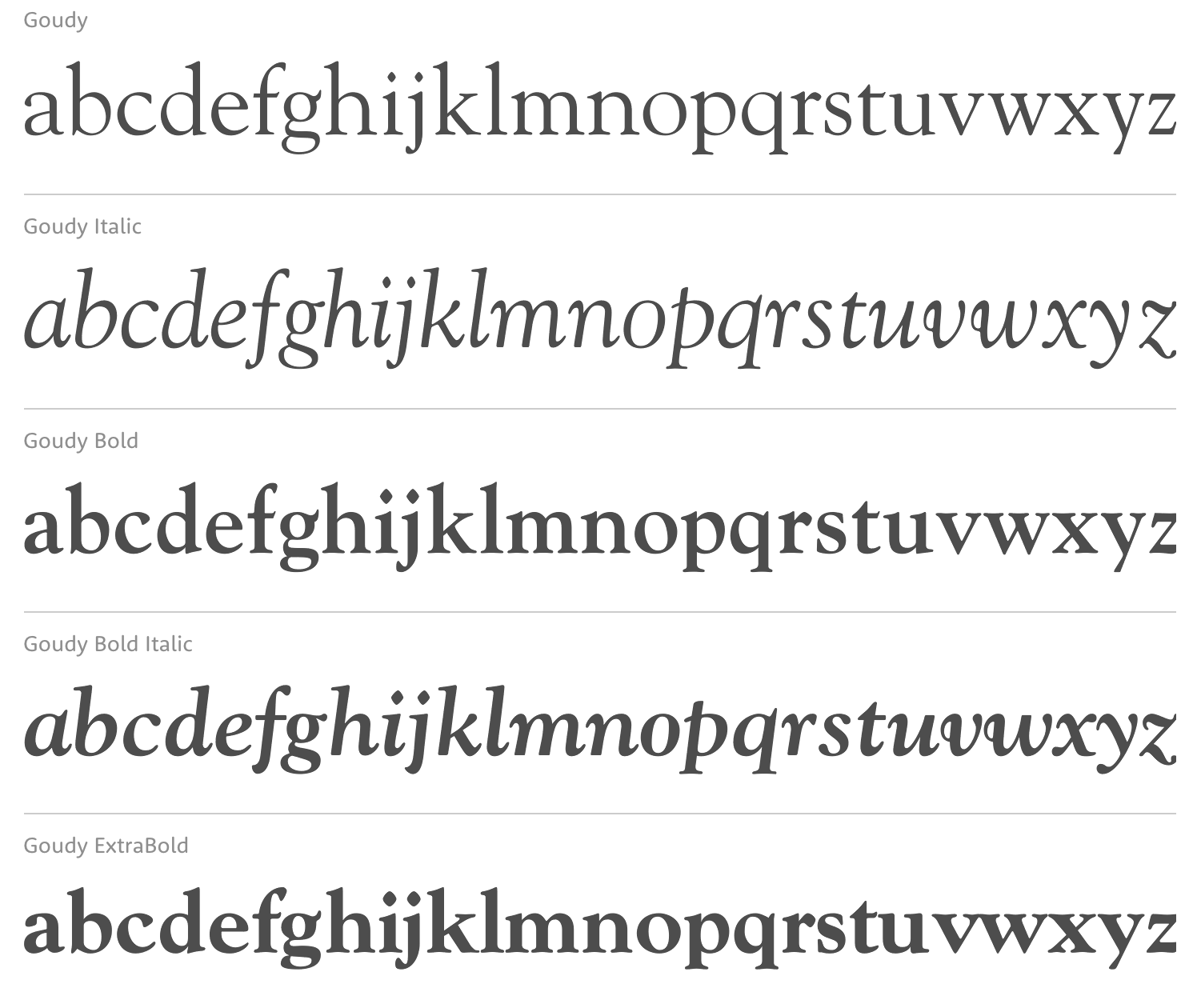
file name: Adobe Goudy
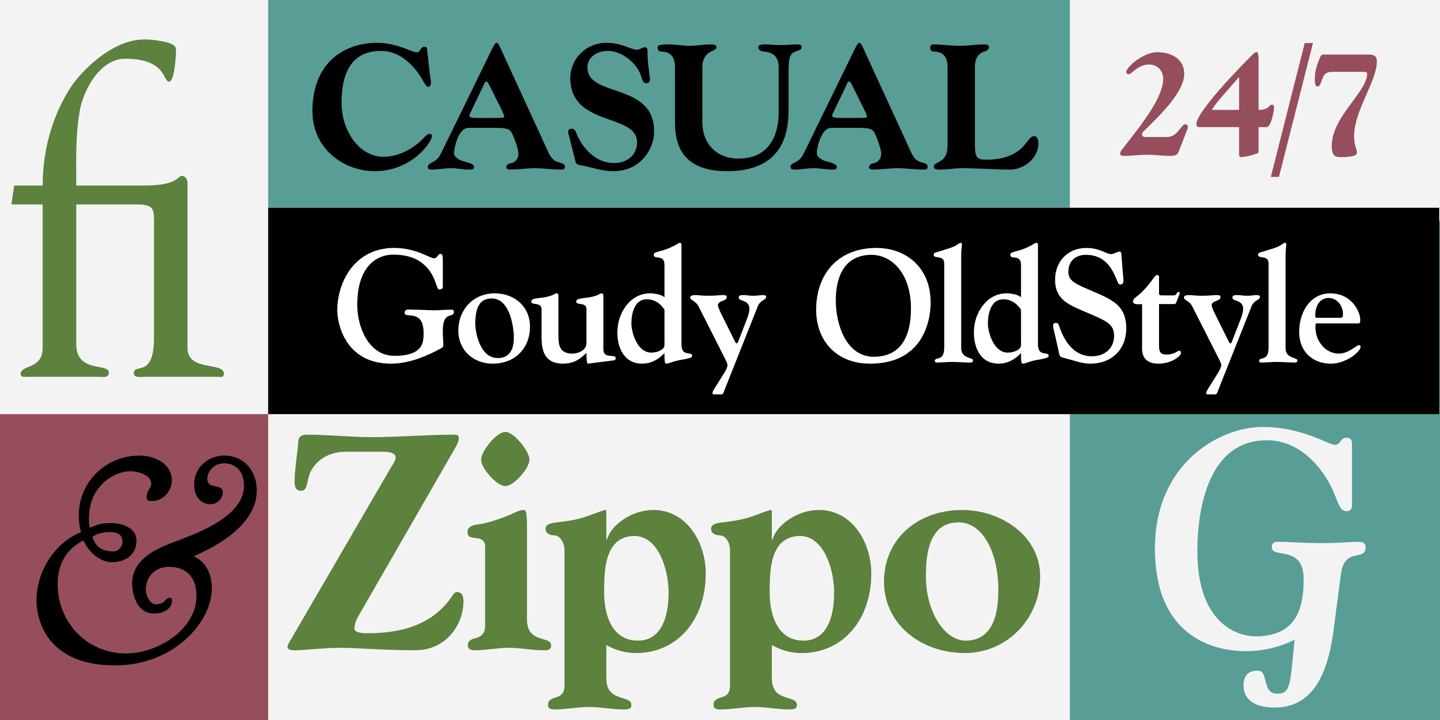
file name: Adobe Goudy Old Style 2000 131129
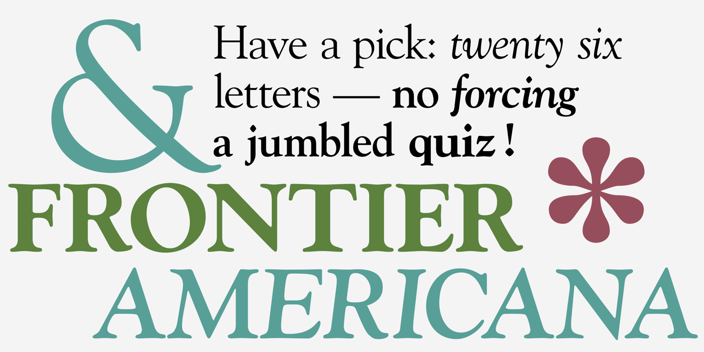
file name: Adobe Goudy Old Style 2000 131130

file name: Adobe Goudy Old Style 2000

file name: Frederic Goudy Goudy Old Style 1915
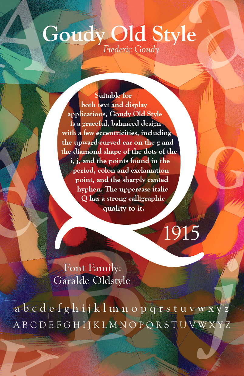
file name: Frederic Goudy Goudy Old Style 1915 Poster by Carrie Gilbert 2017
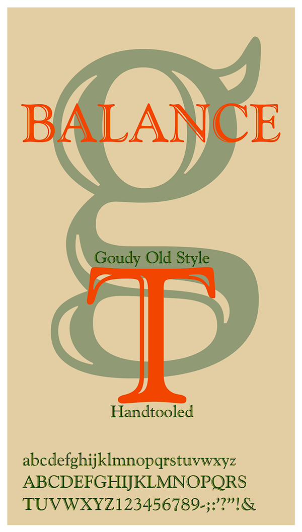
file name: Frederic Goudy Goudy Old Style 1915 Poster by Elizabeth Craven 2017
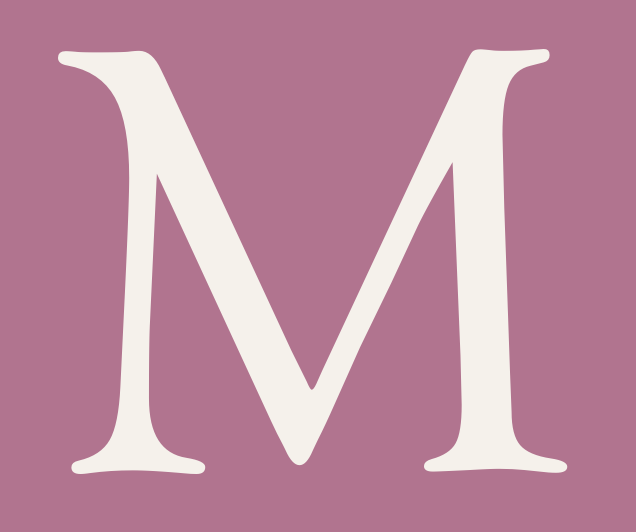
file name: Bitstream Goudy Old Style 2000 198013

file name: Bitstream Goudy Old Style 2000 198013
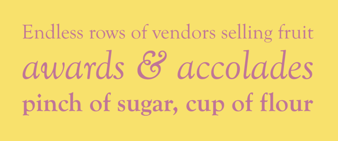
file name: Bitstream Goudy Old Style 2000 199040

file name: Bitstream Goudy Old Style 2000 199040

file name: Bitstream Goudy Old Style 2000 204851

file name: Bitstream Goudy Old Style 2000

file name: D T P Types Goudy Old Style D T 2003

file name: Lanston L T C Goudy Oldstyle Pro Bold 2005
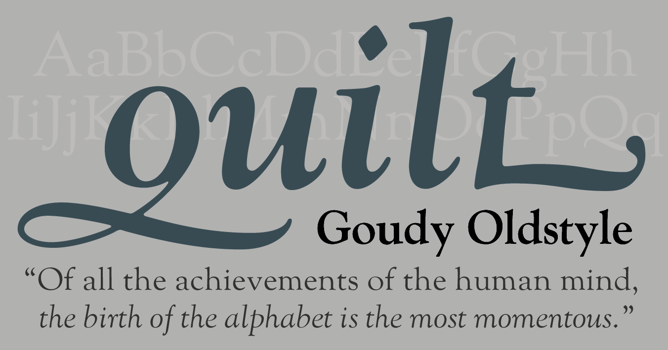
file name: Lanston L T C Goudy Oldstyle Pro Italic 2005 123197

file name: Lanston L T C Goudy Oldstyle Pro Italic 2005

file name: Monotype Goudy Old Style Italic 1915

file name: Monotype Goudy Old Style 2002
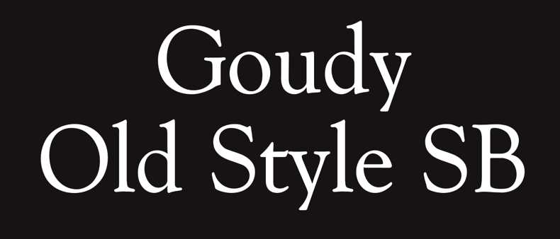
file name: Scangraphic Digital Type Collection Goudy Old Style S B 2005 180659

file name: Scangraphic Digital Type Collection Goudy Old Style S B 2005
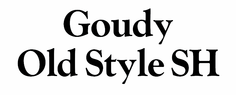
file name: Scangraphic Digital Type Collection Goudy Old Style S H 2005 180646

file name: Scangraphic Digital Type Collection Goudy Old Style S H 2005

file name: Tilde Goudy Old Style 2007
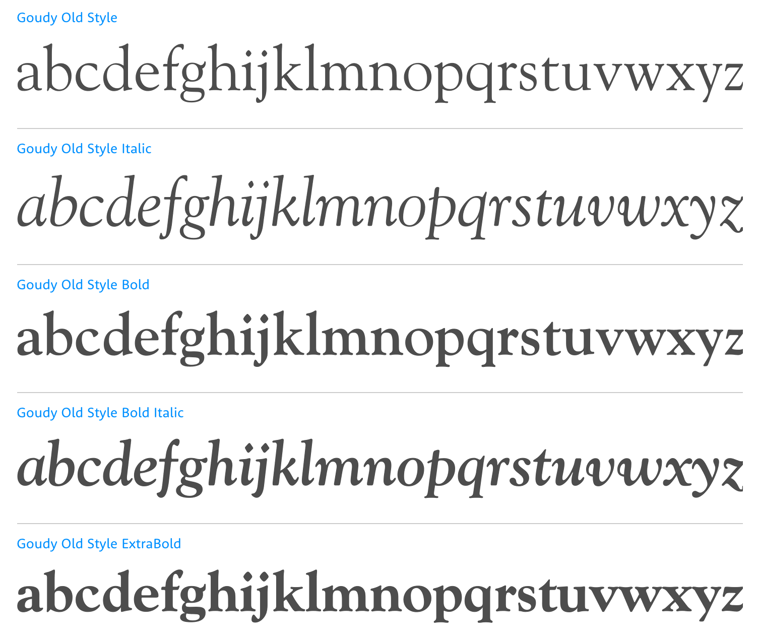
file name: Tllde Goudy Old Style
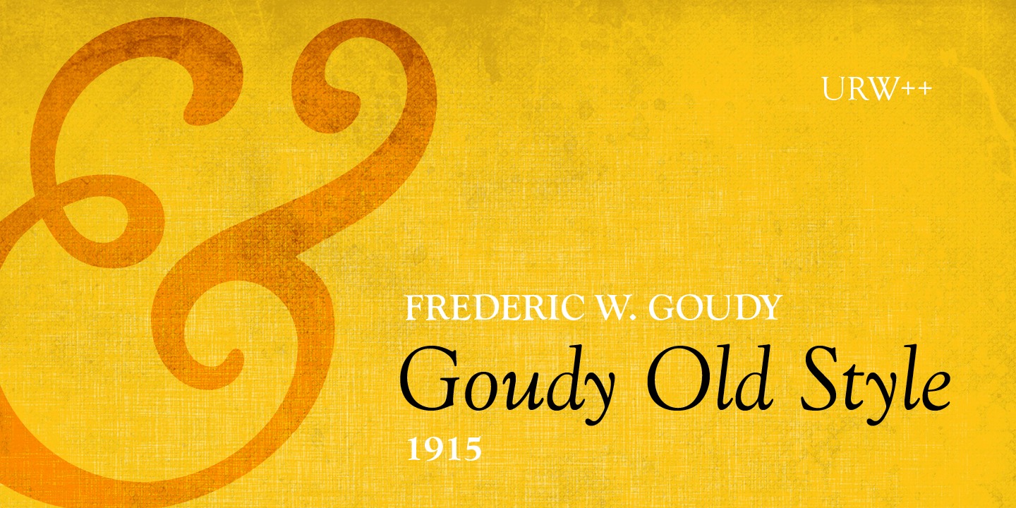
file name: U R W Goudy Old Style 2000 138722

file name: U R W Goudy Old Style 2000

file name: Frederic Goudy Goudy Bold Italic 1919

file name: Frederic Goudy Goudy Extra Bold 1925

file name: Bitstream Goudy Handtooled
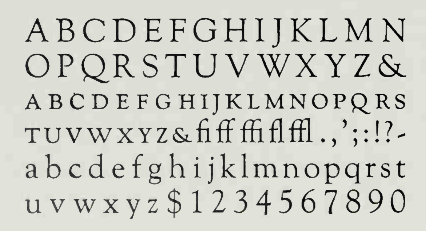
file name: Frederic Goudy Goudy Old Style 1915
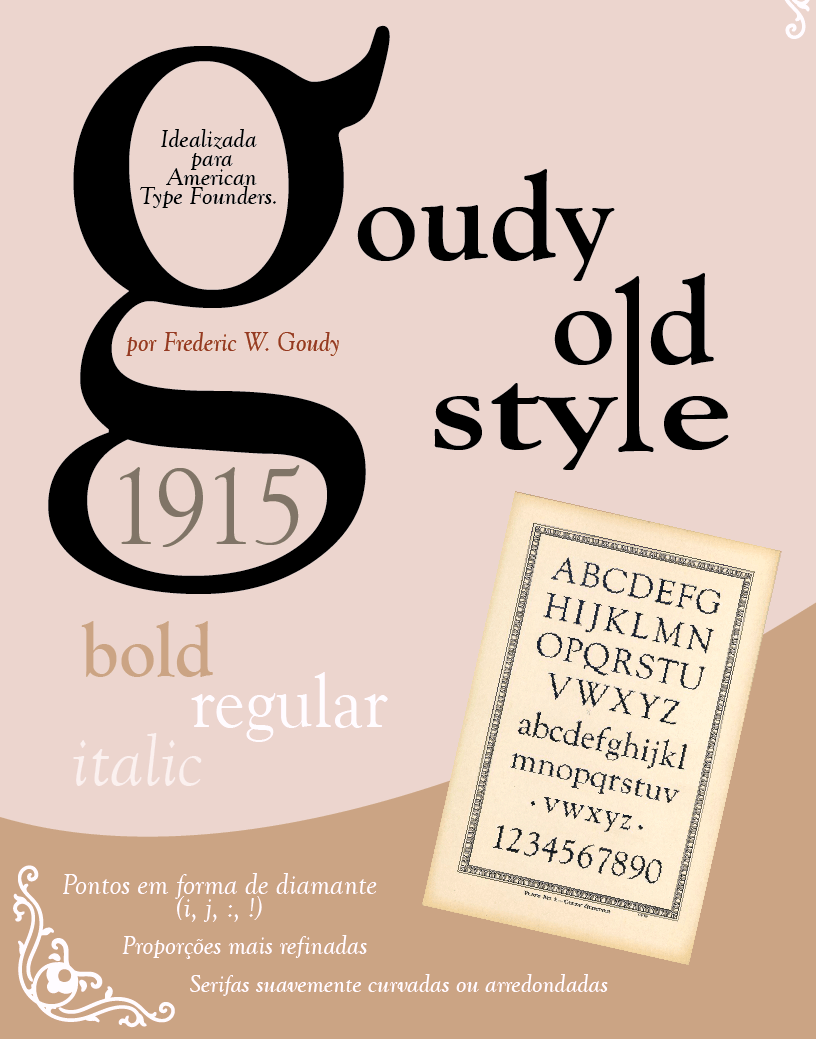
file name: Frederic Goudy Goudy Old Style 1915 Poster by Camila Rodrigues 2019
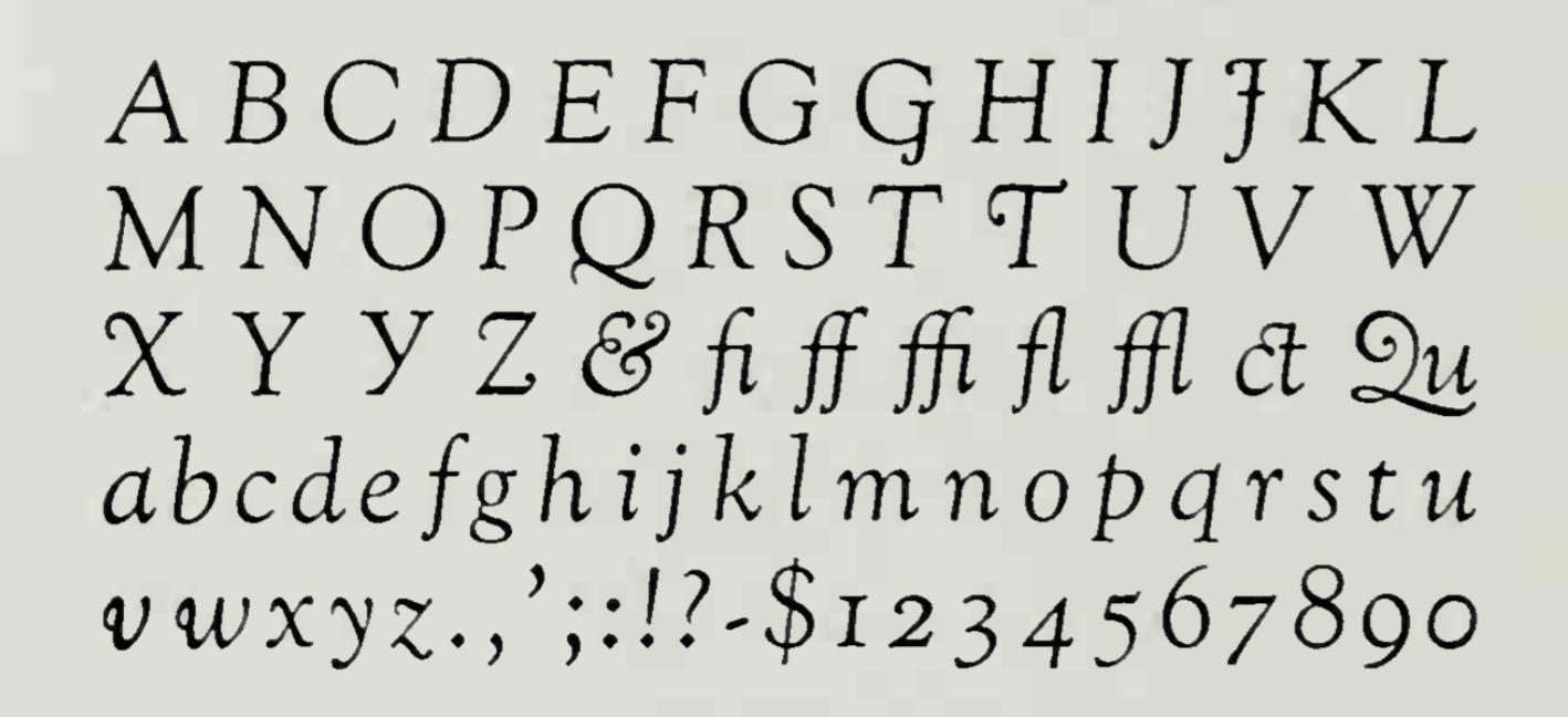
file name: Frederic Goudy Goudy Old Style Italic 1916
| | |
|
Luc Devroye ⦿ School of Computer Science ⦿ McGill University Montreal, Canada H3A 2K6 ⦿ lucdevroye@gmail.com ⦿ https://luc.devroye.org ⦿ https://luc.devroye.org/fonts.html |

