TYPE DESIGN INFORMATION PAGE last updated on Sun Jul 12 04:31:20 EDT 2026
FONT RECOGNITION VIA FONT MOOSE

|
|
|
||||||||||||||||||||||||||
|
The best commercial typefaces of 2018: Luc's selection
This is my own selection of the best commercial typefaces published in 2018, grouped by category. The list will grow until December 31, 2018.
|
EXTERNAL LINKS | ||||||||||||||||||||||||||
| | | ||||||||||||||||||||||||||


file name: Shiva Nallaperumal Faction 2018

file name: Shiva Nallaperumal Faction 2018b

file name: Shiva Nallaperumal Faction 2018c

file name: Shiva Nallaperumal Faction 2018d

file name: Shiva Nallaperumal Faction 2018e

file name: Kris Sowersby Maelstrom Sans Bold 2018

file name: Kris Sowersby Maelstrom 2018

file name: Kris Sowersby Maelstrom 2018

file name: Kris Sowersby The Future Mono02 2020

file name: Kris Sowersby The Future Mono02 2020

file name: Kris Sowersby The Future Mono02 2020

file name: Kris Sowersby The Future Mono02 2020

file name: Kris Sowersby The Future Mono02 2020

file name: Kris Sowersby The Future Mono02 2020

file name: Kris Sowersby The Future Mono02 2020

file name: Kris Sowersby The Future Mono02 2020

file name: Kris Sowersby The Future Mono02 2020

file name: Kris Sowersby The Future Mono02 2020

file name: Kris Sowersby The Future Mono02 2020

file name: Kris Sowersby The Future Mono02 2020

file name: Kris Sowersby The Future Mono01 2019

file name: Kris Sowersby The Future Mono01 2019

file name: Kris Sowersby The Future Mono01 2019

file name: Kris Sowersby The Future Mono01 2019

file name: Kris Sowersby The Future Mono01 2019

file name: Kris Sowersby The Future Mono01 Black 2019

file name: Kris Sowersby The Future Mono01 Black 2019

file name: Kris Sowersby The Future Mono01 Regular 2019

file name: Arphic Jing Xi Hei Hair Thin 2018

file name: Arphic Jing Xi Hei Hair Thin 2018b

file name: Arphic Jing Xi Hei Hair Thin 2018c

file name: Arphic Jing Xi Hei Hair Thin 2018h

file name: Arphic Jing Xi Hei Hair Thin 2018i

file name: Tobias Frere Jones Nina Stoessinger Conducto 2018

file name: Tobias Frere Jones Nina Stoessinger Conductor 2018

file name: Tobias Frere Jones Nina Stoessinger Conductor 2018

file name: Tobias Frere Jones Nina Stoessinger Conductor Bold Regular 2018

file name: Underground Agatha 2019

file name: Blazej Ostoja Lniski Studio Gambero 2018 286107

file name: Blazej Ostoja Lniski Studio Gambero 2018 286108 002

file name: Blazej Ostoja Lniski Studio Gambero 2018 286109

file name: Blazej Ostoja Lniski Studio Gambero 2018 286110 002

file name: Blazej Ostoja Lniski Studio Gambero 2018 286111 002

file name: Blazej Ostoja Lniski Studio Gambero 2018

file name: David Engelby Space Show 2018 285621

file name: David Engelby Space Show 2018 285622

file name: David Engelby Space Show 2018 285623

file name: David Engelby Space Show 2018 285624

file name: David Engelby Space Show 2018 285625

file name: David Engelby Foundry Space Show 2018

file name: Henrik Kubel Foundation Sans Number44 Thin 2018

file name: Henrik Kubel Foundation Sans Thin 2018

file name: Henrik Kubel Foundation Sans Wide Thin 2018

file name: Henrik Kubel Foundation Sans Wide Thin 2018

file name: Henrik Kubel Foundation Serif Didot Thin 2018

file name: Henrik Kubel Foundation Serif Thin Foundation Serif Didot Thin 2018

file name: Henrik Kubel Foundation Serif Thin 2018

file name: Henrik Kubel Foundation Serif Thin 2018

file name: Henrik Kubel Foundation Thin 2018

file name: Ryoichi Tsunekawa Dr Slab 2018

file name: Ryoichi Tsunekawa Dr Slab 2018

file name: Ryoichi Tsunekawa Dr Slab 2018e

file name: Ryoichi Tsunekawa Dr Slab 2018f

file name: Ryoichi Tsunekawa Dr Slab 2018g

file name: Ryoichi Tsunekawa Dr Slab 2018h

file name: Ryoichi Tsunekawa Dr Slab 2018n

file name: Ryoichi Tsunekawa Dr Slab 2018o

file name: Ryoichi Tsunekawa Dr Slab 2018r

file name: Theerawat Aksornsanan Pojvibulsiri Z T Anussaowaree 2018

file name: Theerawat Aksornsanan Pojvibulsiri Z T Anussaowaree 2018

file name: Theerawat Aksornsanan Pojvibulsiri Z T Anussaowaree 2018

file name: Theerawat Aksornsanan Pojvibulsiri Z T Anussaowaree 2018

file name: Theerawat Aksornsanan Pojvibulsiri Z T Anussaowaree 2018

file name: Sukjana Almunandar Malikon 2018 1

file name: Sukjana Almunandar Malikon 2018 2

file name: Sukjana Almunandar Malikon 2018 6

file name: Sukjana Almunandar Malikon 2018 7

file name: Sukjana Almunandar Malikon 2018

file name: Christian Schwartz Graphik Wide 2018

file name: Christian Schwartz Graphik Wide 2018
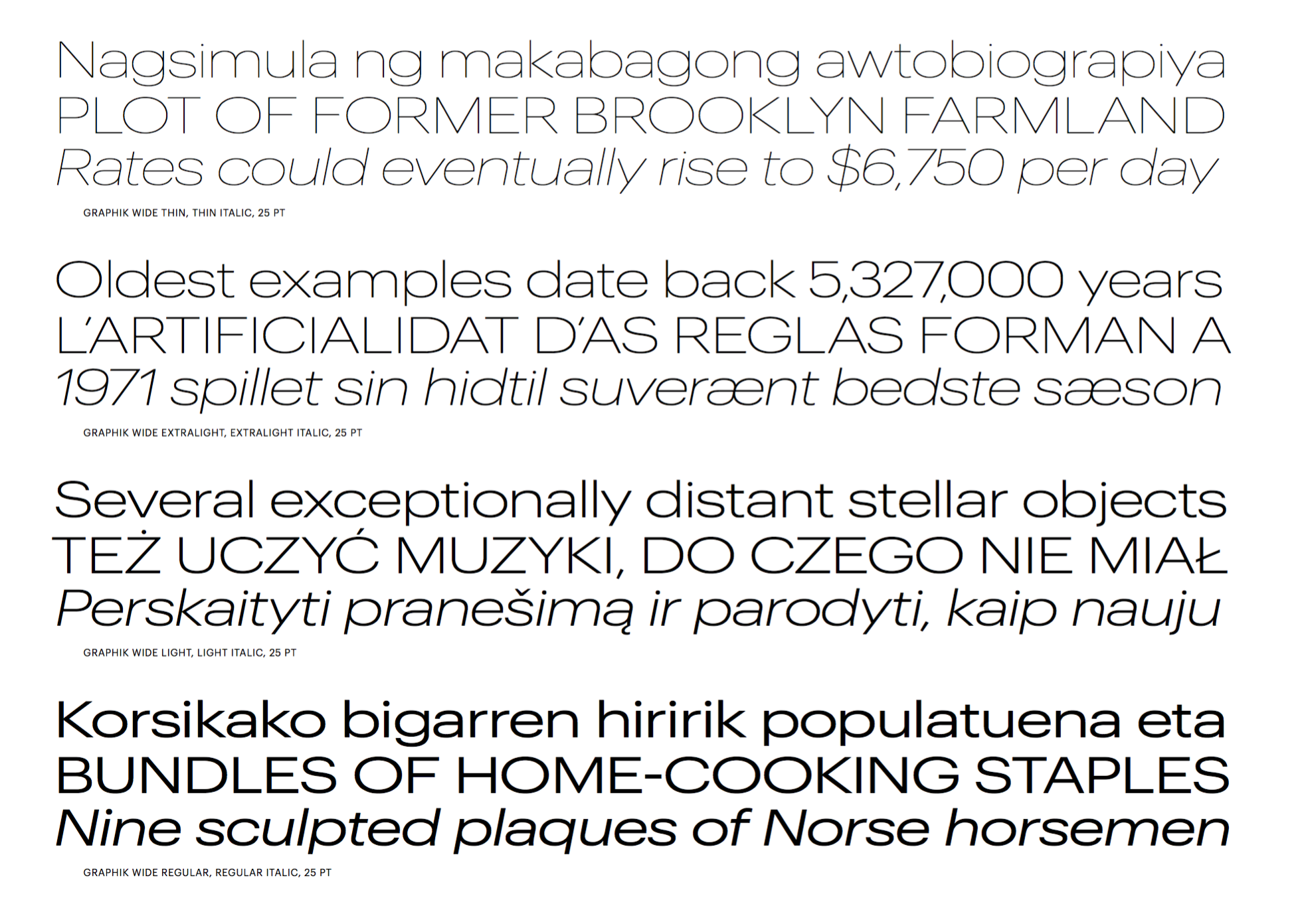
file name: Christian Schwartz Graphik Wide 2018
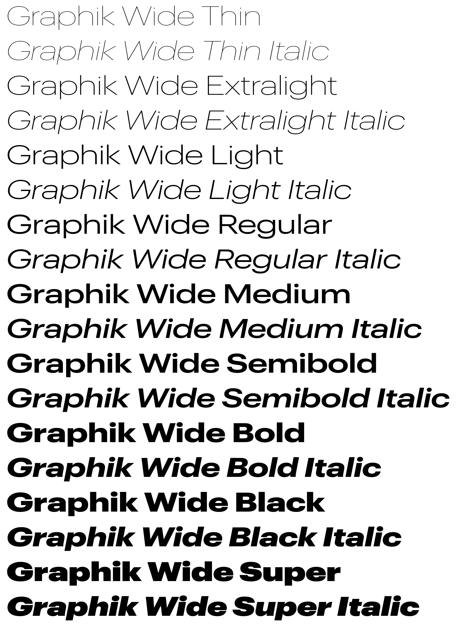
file name: Christian Schwartz Graphik Wide 2018

file name: Kris Sowersby Heldane 2018

file name: Kris Sowersby Heldane 2018

file name: Kris Sowersby Heldane 2018

file name: Kris Sowersby Heldane 2018

file name: Kris Sowersby Heldane 2018

file name: Naima Ben Ayed Dalton Maag Mokoko 2018

file name: Naima Ben Ayed Dalton Maag Mokoko 2018
file name: Mathieu Cortat Yorick 2018
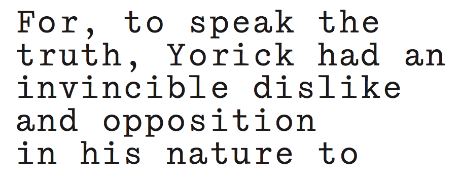
file name: Mathieu Cortat Yorick 2018e
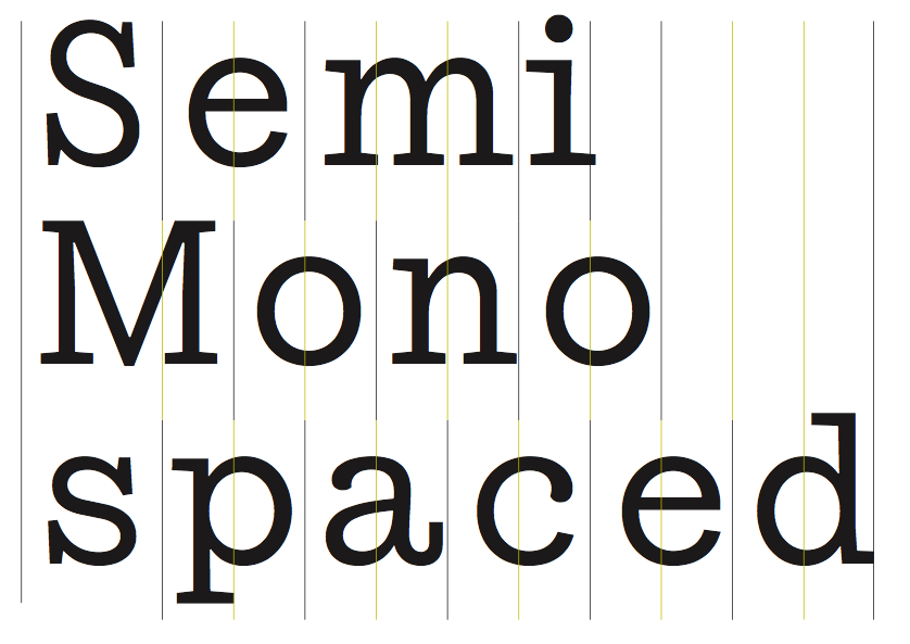
file name: Mathieu Cortat Yorick 2018f
file name: Mathieu Cortat Yorick 2018g

file name: Diego Aravena Salvador Rodriguez Hermann 2018 282455

file name: Diego Aravena Salvador Rodriguez Hermann 2018 282456

file name: Diego Aravena Salvador Rodriguez Hermann 2018 282459

file name: Diego Aravena Salvador Rodriguez Hermann 2018 282462 002

file name: Diego Aravena Salvador Rodriguez Hermann 2018 282463

file name: Diego Aravena Salvador Rodriguez Hermann 2018 282464

file name: Francesco Canovaro Andrea Tartarelli Extenda 2018 282642

file name: Francesco Canovaro Andrea Tartarelli Extenda 2018 282647

file name: Francesco Canovaro Andrea Tartarelli Extenda 2018 282648

file name: Francesco Canovaro Andrea Tartarelli Extenda 2018 282649

file name: Francesco Canovaro Andrea Tartarelli Extenda 2018 282656

file name: Francesco Canovaro Andrea Tartarelli Extenda 2018 282657

file name: Francesco Canovaro Andrea Tartarelli Extenda 2018 282780

file name: Paulo Goode Eurocine 2018 282509

file name: Paulo Goode Eurocine 2018 282513 002

file name: Paulo Goode Eurocine 2018 282517

file name: Paulo Goode Eurocine 2018 282523

file name: Paulo Goode Eurocine 2018

file name: Yanina Arabena Guille Vizzari No Molestar 2018

file name: Yanina Arabena Guille Vizzari No Molestar 2018b

file name: Yanina Arabena Guille Vizzari No Molestar 2018g

file name: Yanina Arabena Guille Vizzari No Molestar 2018g

file name: Yanina Arabena Guille Vizzari No Molestar 2018h

file name: Haratzopoulos Panayiotis C F Panoptik 2018

file name: Haratzopoulos Panayiotis C F Panoptik 2018

file name: Haratzopoulos Panayiotis C F Panoptik 2018

file name: Haratzopoulos Panayiotis C F Panoptik 2018

file name: Haratzopoulos Panayiotis C F Panoptik Greek 2018

file name: Holger Koenigsdoerfer Renommee 2018

file name: Yai Salinas Mercurio S V G 2018

file name: Yai Salinas Mercurio S V G 2018

file name: Yai Salinas Mercurio S V G 2018b

file name: Yai Salinas Mercurio S V G 2018g

file name: Yai Salinas Mercurio S V G 2018h

file name: Yai Salinas Mercurio S V G 2018i

file name: Yai Salinas Mercurio S V G 2018o

file name: Nikola Kostic Rizado Script 2018 281948

file name: Nikola Kostic Rizado Script 2018 281954

file name: Nikola Kostic Rizado Script 2018 281955 002

file name: Nikola Kostic Rizado Script 2018 281957

file name: Nikola Kostic Rizado Script 2018

file name: Dan Jones Neometric 2018 281755

file name: Dan Jones Neometric 2018 281757

file name: Dan Jones Neometric 2018 281763

file name: Dan Jones Neometric 2018 281764

file name: Dan Jones Neometric 2018 281765 002

file name: Dan Jones Neometric 2018 281768

file name: Dan Jones Neometric 2018

file name: Degi Kurniawan Rabsy 2018

file name: Degi Kurniawan Rabsy 2018

file name: Degi Kurniawan Rabsy 2018

file name: Degi Kurniawan Rabsy 2018

file name: Degi Kurniawan Rabsy 2018

file name: Degi Kurniawan Rabsy 2018

file name: Degi Kurniawan Rabsy 2018

file name: Degi Kurniawan Rabsy 2018

file name: Juri Zaech Cobbler

file name: Juri Zaech Cobbler 2018 281175

file name: Juri Zaech Cobbler 2018 281178

file name: Juri Zaech Cobbler 2018 281181

file name: Juri Zaech Cobbler 2018 281184

file name: Juri Zaech Cobbler 2018 281187 002

file name: Juri Zaech Cobbler 2018 281188

file name: Juri Zaech Cobbler 2018 281189 002

file name: Juri Zaech Cobbler 2018

file name: Max Phillips Ballinger Mono 2

file name: Max Phillips Ballinger Mono 2018

file name: Max Phillips Ballinger Mono 21

file name: Max Phillips Ballinger Mono 281242

file name: Max Phillips Ballinger Mono 281243

file name: Max Phillips Ballinger Mono 281245

file name: Typotheque November Stencil 2018

file name: Typotheque November Stencil 2018b

file name: Typotheque November Stencil 2018c

file name: Typotheque November Stencil 2018d

file name: Typotheque November Stencil 2018e

file name: Typotheque November Stencil 2018f

file name: Typotheque November Stencil 2018g

file name: Typotheque November Stencil 2018h
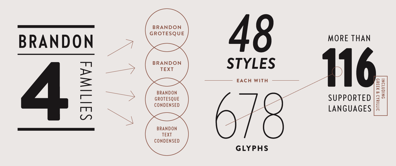
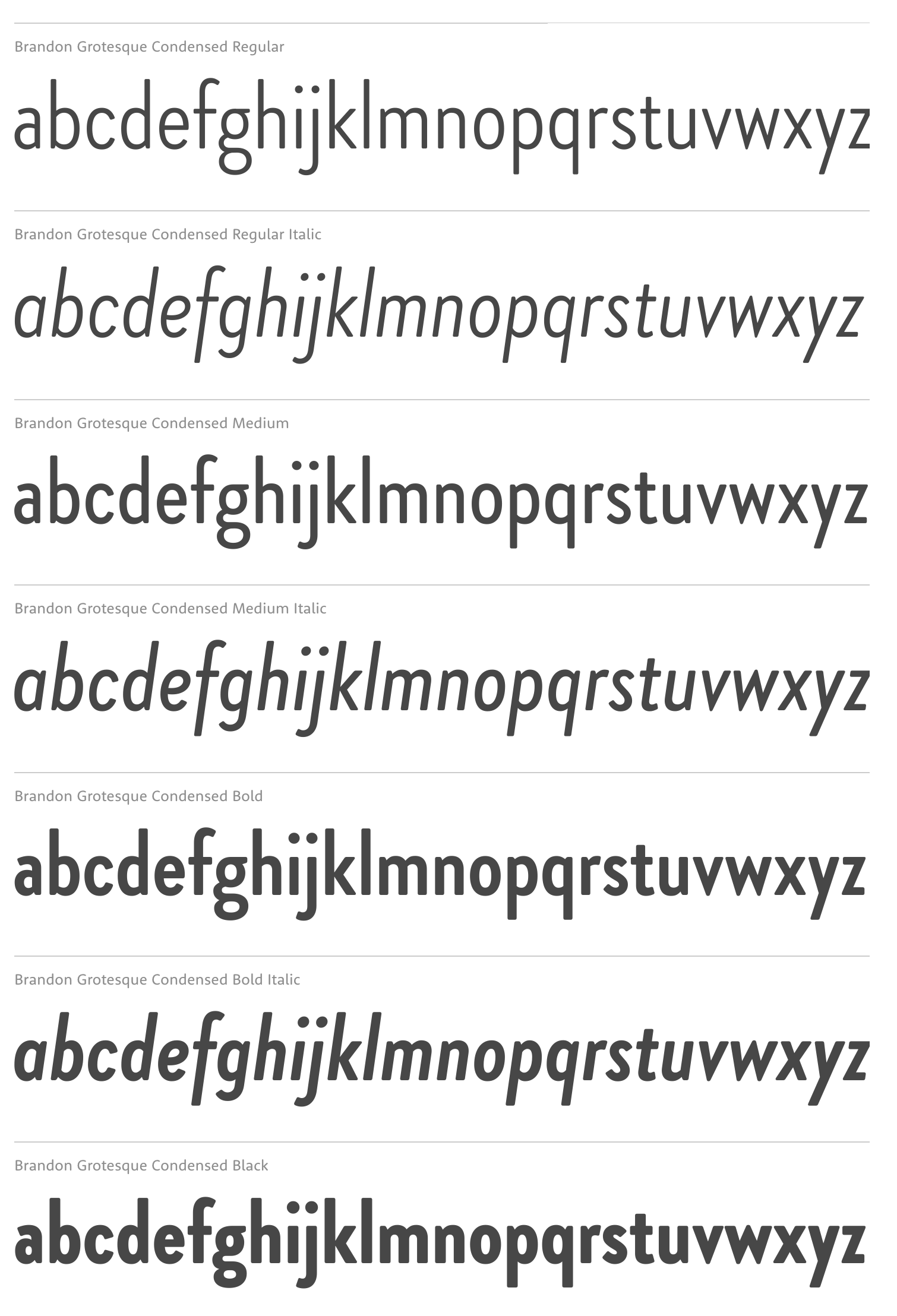
file name: Hannes Von Doehren Brandon Grotesque Condensed 2018
file name: Hannes Von Doehren Brandon Grotesque Condensed 2018 280188

file name: Hannes Von Doehren Brandon Grotesque Condensed 2018 280190

file name: Hannes Von Doehren Brandon Grotesque Condensed 2018 280191

file name: Hannes Von Doehren Brandon Grotesque Condensed 2018 280192
file name: Hannes Von Doehren Brandon Grotesque Condensed 2018b

file name: Hannes Von Doehren Brandon Grotesque Condensed 2018

file name: Anita Jurgeleit Umba Soft 2018 279488

file name: Anita Jurgeleit Umba Soft 2018 279489

file name: Anita Jurgeleit Umba Soft 2018 279490 002

file name: Anita Jurgeleit Umba Soft 2018 279491

file name: Anita Jurgeleit Umba Soft 2018 280293

file name: Anita Jurgeleit Umba Soft 2018
file name: Fontsmith F S Ostro 2018
file name: Fontsmith F S Ostro 2018b

file name: Fontsmith F S Ostro 2018c

file name: Fontsmith F S Ostro 2018d

file name: Fontsmith F S Ostro 2018e

file name: Fontsmith F S Ostro 2018l

file name: Fontsmith F S Ostro 2018n

file name: Alexandra Korolkova Manvel Shmavonyan Fact 2018 279286

file name: Para Type Fact 2018 279287

file name: Para Type Fact 2018 279288 002

file name: Para Type Fact 2018 279289

file name: Ilya Naumoff Ekster 2018 279342

file name: Ilya Naumoff Ekster 2018 279373

file name: Ilya Naumoff Ekster 2018 279374

file name: Ilya Naumoff Ekster 2018 279375 002

file name: Ilya Naumoff Ekster 2018 279376 002

file name: Ilya Naumoff Ekster 2018 279377

file name: Ilya Naumoff Ekster 2018 279381

file name: Andy Lethbridge Stuart De Rosario F S Koopman 2018

file name: Andy Lethbridge Stuart De Rosario F S Koopman 2018b

file name: Andy Lethbridge Stuart De Rosario F S Koopman 2018c

file name: Andy Lethbridge Stuart De Rosario F S Koopman 2018i

file name: Andy Lethbridge Stuart De Rosario F S Koopman 2018j

file name: Andy Lethbridge Stuart De Rosario F S Koopman 2018n

file name: Andy Lethbridge Stuart De Rosario F S Koopman 2018o

file name: Andy Lethbridge Stuart De Rosario F S Koopman 2018s

file name: Rodrigo Araya Salas Franco Jonas Hernandez Andrey Kudryavtsev Ding 2018

file name: Rodrigo Araya Salas Franco Jonas Hernandez Andrey Kudryavtsev Ding 2018a

file name: Rodrigo Araya Salas Franco Jonas Hernandez Andrey Kudryavtsev Ding 2018b

file name: Rodrigo Araya Salas Franco Jonas Hernandez Andrey Kudryavtsev Ding 2018c

file name: Rodrigo Araya Salas Franco Jonas Hernandez Andrey Kudryavtsev Ding 2018d

file name: Tipo Type Fieldwork 2018 278737

file name: Tipo Type Fieldwork 2018 278742

file name: Tipo Type Fieldwork 2018 278756

file name: Tipo Type Fieldwork 2018 278759

file name: Tipo Type Fieldwork 2018 278762

file name: Tipo Type Fieldwork 2018 278763

file name: Tipo Type Fieldwork 2018 278764

file name: Tipo Type Fieldwork 2018

file name: Patrick Seymour Atrium 2018

file name: Patrick Seymour Atrium 2018e

file name: Patrick Seymour Atrium 2018f

file name: Patrick Seymour Atrium 2018g

file name: Patrick Seymour Atrium 2018h

file name: Type Type T T Firs Neue 2018 277552

file name: Type Type T T Firs Neue 2018 277553 002

file name: Type Type T T Firs Neue 2018 277554 002

file name: Type Type T T Firs Neue 2018

file name: Minjoo Ham Monotype Seol Sans 2018 276878

file name: Minjoo Ham Monotype Seol Sans 2018 276878

file name: Monotype Seol Sans 2018 276873

file name: Monotype Seol Sans 2018 276874

file name: Monotype Seol Sans 2018 276877

file name: Monotype Seol Sans 2018

file name: Michael Wallner Apnea 2018 270486

file name: Michael Wallner Apnea 2018 270487

file name: The Type Fetish Apnea 2018 270489 002

file name: The Type Fetish Apnea 2018 270493 002

file name: Letter Maker Calton Stencil 2018 276453

file name: Linotype Trade Gothic Inline 2018 274470 002

file name: Linotype Trade Gothic Inline 2018 274472 002

file name: Linotype Trade Gothic Inline 2018 274473

file name: Linotype Trade Gothic Inline 2018 274474

file name: Linotype Trade Gothic Inline 2018

file name: Lynne Yun Trade Gothic Inline 2018 274473

file name: Alex Ivanov Jamaica Script 2018

file name: Alex Ivanov Jamaica Script 2018b

file name: Alex Ivanov Jamaica Script 2018b

file name: Alex Ivanov Jamaica Script 2018e
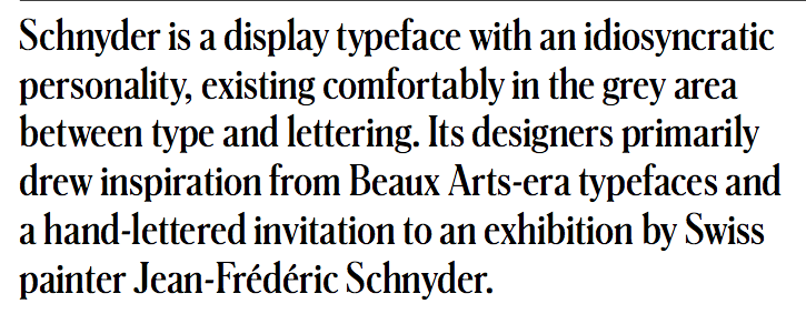
file name: Berton Hasebe Christian Schwartz Schnyder 2013 2018
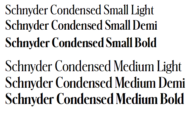
file name: Berton Hasebe Christian Schwartz Schnyder 2013 2018b
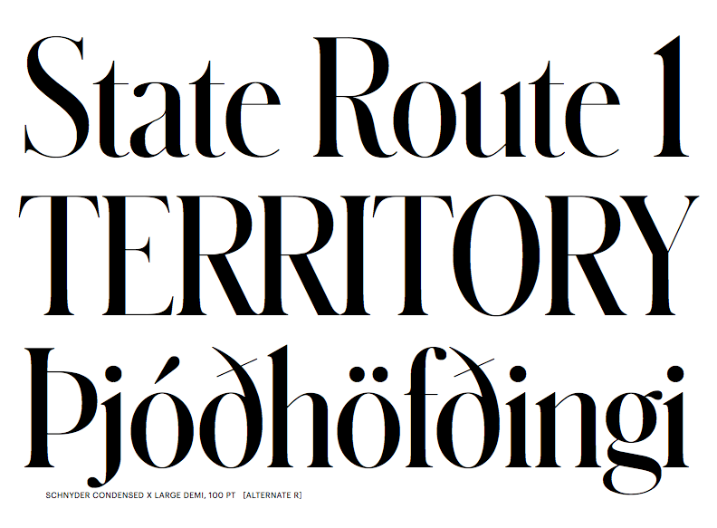
file name: Berton Hasebe Christian Schwartz Schnyder 2013 2018c
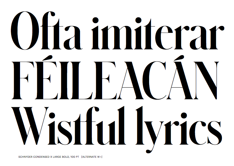
file name: Berton Hasebe Christian Schwartz Schnyder 2013 2018d

file name: Ricky Rinaldi Saturday Night 2018

file name: Ricky Rinaldi Saturday Night 2018

file name: Ricky Rinaldi Saturday Night 2018b

file name: Jan Maack Ivy Mode 2018

file name: Jan Maack Ivy Mode 2018

file name: Jan Maack Ivy Mode 2018

file name: Teuku Riski Firmana Aston Script 2018

file name: Teuku Riski Firmana Aston Script 2018b

file name: Teuku Riski Firmana Aston Script 2018g

file name: Teuku Riski Firmana Aston Script 2018h

file name: Teuku Riski Firmana Aston Script 2018l

file name: Sukjana Almunandar William Duke 2018

file name: Sukjana Almunandar William Duke 2018

file name: Sukjana Almunandar William Duke 2018b

file name: Sukjana Almunandar William Duke 2018c

file name: Sukjana Almunandar William Duke 2018d

file name: Ilya Naumoff Ulm Grotesk 2018

file name: Ilya Naumoff Ulm Grotesk 2018 275849

file name: Ilya Naumoff Ulm Grotesk 2018 275848

file name: Ilya Naumoff Ulm Grotesk 2018 275850

file name: Indian Type Foundry Ulm Grotesk 2018 275856 002

file name: Indian Type Foundry Ulm Grotesk 2018 275857

file name: Indian Type Foundry Ulm Grotesk 2018

file name: Rodrigo Lopez Fuentes Wozniak 2018 275216

file name: Rodrigo Lopez Fuentes Wozniak 2018 275219

file name: Rodrigo Lopez Fuentes Wozniak 2018 275228

file name: Rodrigo Lopez Fuentes Wozniak 2018 275229

file name: Rodrigo Lopez Fuentes Wozniak 2018 275232

file name: Rodrigo Lopez Fuentes Wozniak 2018 275233

file name: Rodrigo Lopez Fuentes Wozniak 2018 275531

file name: Rodrigo Lopez Fuentes Wozniak 2018 275532

file name: Untype Wozniak 2018

file name: Mathieu Desjardins Formula Condensed 2018

file name: Mathieu Desjardins Formula Condensed 2018a

file name: Mathieu Desjardins Formula Condensed 2018b

file name: Mathieu Desjardins Formula Condensed 2018c

file name: Mathieu Desjardins Formula Condensed 2018h

file name: Mathieu Desjardins Formula Condensed 2018i

file name: Cosimo Lorenzo Pancini Calligraphunk 2018

file name: Cosimo Lorenzo Pancini Calligraphunk 2018

file name: Cosimo Lorenzo Pancini Calligraphunk 2018

file name: Cosimo Lorenzo Pancini Calligraphunk 2018f

file name: Cosimo Lorenzo Pancini Calligraphunk 2018g

file name: Katja Renko Igor Dekhtiarenko Contrast 2018e 2

file name: Katja Renko Igor Dekhtiarenko Contrast 2018e

file name: Katja Renko Igor Dekhtiarenko Solomkasans 2018

file name: Katja Renko Igor Dekhtiarenko Solomkasans 2018b

file name: Katja Renko Igor Dekhtiarenko Solomkasans 2018c

file name: Lecter Johnson X X I I Geom Slab 2018 272914

file name: Lecter Johnson X X I I Geom Slab 2018 272915

file name: Lecter Johnson X X I I Geom Slab 2018 272916

file name: Ryoichi Tsunekawa Code Saver 2018

file name: Ryoichi Tsunekawa Code Saver 2018b

file name: Ryoichi Tsunekawa Code Saver 2018c

file name: Ryoichi Tsunekawa Code Saver 2018d

file name: Ryoichi Tsunekawa Code Saver 2018e

file name: Ryoichi Tsunekawa Code Saver 2018f

file name: Ryoichi Tsunekawa Code Saver 2018g

file name: Ryoichi Tsunekawa Code Saver 2018h

file name: Ryoichi Tsunekawa Code Saver 2018i

file name: Richard Olocco Arzachel 2017

file name: Richard Olocco Arzachel 2017b

file name: Richard Olocco Arzachel 2017g

file name: Richard Olocco Arzachel 2017h

file name: Richard Olocco Arzachel 2017i

file name: Richard Olocco Arzachel Black 2017

file name: Cosimo Lorenzo Pancini Andrea Tartarelli Radcliffe 2018 273309

file name: Cosimo Lorenzo Pancini Andrea Tartarelli Radcliffe 2018 273311

file name: Cosimo Lorenzo Pancini Andrea Tartarelli Radcliffe 2018 273315

file name: Cosimo Lorenzo Pancini Andrea Tartarelli Radcliffe 2018 273316

file name: Cosimo Lorenzo Pancini Andrea Tartarelli Radcliffe 2018 273318

file name: Cosimo Lorenzo Pancini Andrea Tartarelli Radcliffe 2018 273325

file name: Cosimo Lorenzo Pancini Andrea Tartarelli Radcliffe 2018 273327

file name: Zetafonts Radcliffe 2018

file name: Alfonso Garcia Multiple 2018 272548

file name: Alfonso Garcia Multiple 2018 272549

file name: Alfonso Garcia Multiple 2018 272558

file name: Alfonso Garcia Multiple 2018 272559

file name: Alfonso Garcia Multiple 2018 272561

file name: Alfonso Garcia Multiple 2018

file name: Alfonso Garcia Multiple Slab 2018

file name: Maria Carla Mazzitelli Decoupe 2018

file name: Maria Carla Mazzitelli Decoupe 2018

file name: Maria Carla Mazzitelli Decoupe 2018b

file name: Maria Carla Mazzitelli Decoupe 2018c

file name: Maria Carla Mazzitelli Decoupe 2018e

file name: Mateusz Machalski Bilbao 2018e

file name: Mateusz Machalski Bilbao 2018f

file name: Mateusz Machalski Bilbao 2018g

file name: Mateusz Machalski Bilbao 2018h

file name: Mateusz Machalski Bilbao 2018i

file name: Ramiro Espinoza Reiher Headline 2018

file name: Ramiro Espinoza Reiher Headline 2018

file name: Ramiro Espinoza Reiher Headline 2018f

file name: Ramiro Espinoza Reiher Headline Black Black Italic 2018
file name: Ramiro Espinoza Reiher Headline Italic 2018

file name: Ramiro Espinoza Reiher Headline Light Light Italic 2018

file name: Ramiro Espinoza Reiher Open 2018

file name: Mark Simonson Acme Gothic 2018

file name: Mark Simonson Acme Gothic 2018b

file name: Mark Simonson Acme Gothic 2018c

file name: Mark Simonson Acme Gothic 2018d

file name: Mark Simonson Acme Gothic Condensed 2018

file name: Aldo De Losa Nougat Script 2018

file name: Aldo De Losa Nougat Script 2018

file name: Aldo De Losa Nougat Script 2018h

file name: Aldo De Losa Nougat Script 2018i

file name: Aldo De Losa Nougat Script 2018j

file name: Aldo De Losa Nougat Script 2018k

file name: Aldo De Losa Nougat Script 2018q

file name: Vika Usmanova Type Type T T Nooks 2018

file name: Vika Usmanova Type Type T T Nooks 2018b

file name: Vika Usmanova Type Type T T Nooks 2018c

file name: Vika Usmanova Type Type T T Nooks 2018j

file name: Vika Usmanova Type Type T T Nooks 2018k

file name: Vika Usmanova Type Type T T Nooks 2018l

file name: Vika Usmanova Type Type T T Nooks 2018m

file name: Vika Usmanova Type Type T T Nooks 2018n

file name: Mostafa E L Abasiry Lafeef 2018

file name: Mostafa E L Abasiry Lafeef 2018b

file name: Mostafa E L Abasiry Lafeef 2018h

file name: Mostafa E L Abasiry Lafeef 2018i

file name: Mostafa E L Abasiry Lafeef 2018j

file name: Mostafa E L Abasiry Lafeef 2018o

file name: Alde Saputro Srikonitta Script 2018

file name: Alde Saputro Srikonitta Script 2018b

file name: Alde Saputro Srikonitta Script 2018c

file name: Alde Saputro Srikonitta Script 2018d

file name: Alde Saputro Srikonitta Script 2018e

file name: Alde Saputro Srikonitta Script 2018f

file name: Sam Parrett Crush S V G 2018

file name: Sam Parrett Crush S V G 2018b

file name: Sam Parrett Crush S V G 2018c

file name: Sam Parrett Crush S V G 2018d

file name: Jochen Schuss Schuss Sans C G Poster Black 2018 267966

file name: Jochen Schuss Schuss Sans C G Poster Black 2018 267969

file name: Jochen Schuss Schuss Sans C G Poster Black 2018 267979

file name: Jochen Schuss Schuss Sans C G Poster Black 2018

file name: Archetype Foundry Dita Grotesk Mono 2018b

file name: Archetype Foundry Dita Grotesk Mono 2018i

file name: Archetype Foundry Dita Grotesk Mono 2018k

file name: Archetype Foundry Dita Grotesk Mono 2018l

file name: Sofia Mohr Blauth 2018 268218

file name: Sofia Mohr Blauth 2018 268226

file name: Sofia Mohr Blauth 2018 268227

file name: Sofia Mohr Blauth 2018 268228

file name: Sofia Mohr Blauth 2018 268230

file name: Sofia Mohr Blauth 2018 268231

file name: Sofia Mohr Blauth 2018 268233

file name: Sofia Mohr Blauth Black 2018

file name: Charles Nix Carl Crossgrove Juan Villanueva Lynne Yun Walbaum 2018 266394

file name: Charles Nix Carl Crossgrove Juan Villanueva Lynne Yun Walbaum 2018 266395

file name: Charles Nix Carl Crossgrove Juan Villanueva Lynne Yun Walbaum 2018 266396

file name: Charles Nix Carl Crossgrove Juan Villanueva Lynne Yun Walbaum 2018 266397
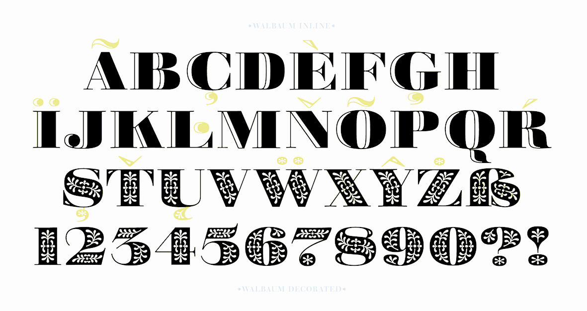
file name: Charles Nix Carl Crossgrove Juan Villanueva Lynne Yun Walbaum 2018 266398
file name: Charles Nix Carl Crossgrove Juan Villanueva Lynne Yun Walbaum 2018 266401

file name: Dusan Jelesijevic Lumier Rounded 2019 266930

file name: Dusan Jelesijevic Lumier Rounded 2019 266931

file name: Dusan Jelesijevic Lumier Rounded 2019 266932

file name: Dusan Jelesijevic Lumier Rounded 2019 266933

file name: Dusan Jelesijevic Lumier Rounded 2019 266934

file name: Dusan Jelesijevic Lumier Rounded 2019 266935

file name: Dusan Jelesijevic Lumier Rounded 2019

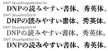
file name: Dai Nippon Printing Co D M T Shuei4 Go 2018

file name: Dai Nippon Printing Co D M T Shuei Anti 2018

file name: Dai Nippon Printing Co D M T Shuei Gothic 2018

file name: Dai Nippon Printing Co D M T Shuei Mincho 2018

file name: Dai Nippon Printing Co D M T Shuei Shogo Mincho 2018b

file name: Dai Nippon Printing Co Shuei 2018 267450

file name: Cosimo Lorenzo Pancini Andrea Tartarelli Blacker 2018 01

file name: Cosimo Lorenzo Pancini Andrea Tartarelli Blacker 2018 02

file name: Cosimo Lorenzo Pancini Andrea Tartarelli Blacker 2018 04

file name: Cosimo Lorenzo Pancini Andrea Tartarelli Blacker 2018 04

file name: Cosimo Lorenzo Pancini Andrea Tartarelli Blacker 2018 05

file name: Cosimo Lorenzo Pancini Andrea Tartarelli Blacker 2018 06

file name: Cosimo Lorenzo Pancini Andrea Tartarelli Blacker 2018 07

file name: Cosimo Lorenzo Pancini Andrea Tartarelli Blacker 2018 09

file name: Cosimo Lorenzo Pancini Andrea Tartarelli Blacker 2018 102

file name: Cosimo Lorenzo Pancini Andrea Tartarelli Blacker 2018 11

file name: Cosimo Lorenzo Pancini Andrea Tartarelli Blacker 2018 12

file name: Cosimo Lorenzo Pancini Andrea Tartarelli Blacker 2018 13

file name: Cosimo Lorenzo Pancini Andrea Tartarelli Blacker 2018 15

file name: Cosimo Lorenzo Pancini Andrea Tartarelli Blacker 2018 16

file name: Cosimo Lorenzo Pancini Andrea Tartarelli Blacker 2018 17

file name: Jakob Runge Cera Condensed Compact Pro 2018 265049

file name: Jakob Runge Cera Condensed Compact Pro 2018 265051

file name: Jakob Runge Cera Condensed Compact Pro 2018 265052

file name: Jakob Runge Cera Condensed Compact Pro 2018 265053

file name: Jakob Runge Cera Condensed Compact Pro 2018 265054

file name: Jakob Runge Cera Condensed Compact Pro 2018 265055

file name: Jakob Runge Cera Condensed Compact Pro 2018 265056

file name: Jakob Runge Cera Condensed Compact Pro 2018 265057

file name: Jakob Runge Cera Condensed Compact Pro 2018 265058

file name: Jakob Runge Cera Condensed Compact Pro 2018

file name: Alex Camacho Origen 2018

file name: Alex Camacho Origen 2018g

file name: Alex Camacho Origen 2018h

file name: Alex Camacho Smilie

file name: Frode Helland Symphonie Grotesque 2018b

file name: Frode Helland Symphonie Grotesque 2018c

file name: Frode Helland Symphonie Grotesque 2018d

file name: Frode Helland Symphonie Grotesque 2018e

file name: Alejandro Paul Speakeasy 2018

file name: Alejandro Paul Speakeasy 2018c

file name: Alejandro Paul Speakeasy 2018d

file name: Alejandro Paul Speakeasy 2018e

file name: Alejandro Paul Speakeasy 2018el

file name: Alejandro Paul Speakeasy 2018w

file name: Alejandro Paul Speakeasy 2018y

file name: Dorine Sauzet Quentin Schmerber Framboisier 2018

file name: Dorine Sauzet Quentin Schmerber Framboisier 2018b

file name: Dorine Sauzet Quentin Schmerber Framboisier 2018f

file name: Dorine Sauzet Quentin Schmerber Framboisier 2018g

file name: Kyle Wayne Benson Gooper 2018

file name: Kyle Wayne Benson Gooper 2018b

file name: Kyle Wayne Benson Gooper 2018f

file name: Kyle Wayne Benson Gooper 2018g

file name: Maximiliano Sproviero Pantera 2018 262790

file name: Maximiliano Sproviero Pantera 2018 262791

file name: Maximiliano Sproviero Pantera 2018 262792

file name: Maximiliano Sproviero Pantera 2018 262841

file name: Maximiliano Sproviero Pantera 2018 262843

file name: Maximiliano Sproviero Pantera 2018

file name: Maximiliano Sproviero Pantera 2018

file name: Tania Alvarez Tara 2018 263471

file name: Tania Alvarez Tara 2018 263472

file name: Tania Alvarez Tara 2018 263479

file name: Tania Alvarez Tara 2018

file name: Tania Alvarez Tara 2018

file name: Pedro Lobo Borba Neu 2018

file name: Pedro Lobo Borba Neu 2018b

file name: Pedro Lobo Borba Neu 2018f

file name: Pedro Lobo Borba Neu 2018g

file name: Pedro Lobo Borba Neu 2018h

file name: Ani Petrova Vocal 2018

file name: Ani Petrova Vocal 2018 262211

file name: Ani Petrova Vocal 2018 262211

file name: Ani Petrova Vocal 2018 62205

file name: Ani Petrova Vocal 2018 62208

file name: Ani Petrova Vocal 2018 62209

file name: Oscar Cobo Wete U T Morph 2018

file name: Oscar Cobo Wete U T Morph 2018a

file name: Oscar Cobo Wete U T Morph 2018b

file name: Oscar Cobo Wete U T Morph 2018c

file name: Oscar Cobo Wete U T Morph 2018d

file name: Piotr Lukaszkiewicz Mezalia 2018

file name: Piotr Lukaszkiewicz Mezalia 2018b

file name: Piotr Lukaszkiewicz Mezalia 2018g

file name: Piotr Lukaszkiewicz Mezalia 2018h

file name: Piotr Lukaszkiewicz Mezalia 2018i

file name: Maxim Schepin Made Bruno 2018

file name: Maxim Schepin Made Bruno 2018b

file name: Maxim Schepin Made Bruno 2018c

file name: Maxim Schepin Made Bruno 2018d

file name: Pedro Leal Foreday 2018

file name: Pedro Leal Foreday 2018g

file name: Pedro Leal Foreday 2018h

file name: Pedro Leal Foreday 2018i

file name: Pedro Leal Foreday 2018k

file name: Pedro Leal Foreday 2018l

file name: Linda Hintz Toshi Omagari Neue Plak 2018 261428

file name: Linda Hintz Toshi Omagari Neue Plak 2018 after Paul Renner Plak 1928 261423

file name: Linda Hintz Toshi Omagari Neue Plak 2018 after Paul Renner Plak 1928 261423

file name: Natanael Gama Point 2018

file name: Natanael Gama Point 2018b

file name: Natanael Gama Point 2018c

file name: Natanael Gama Point 2018d

file name: Seniors Studio Elisabetta Script 2018

file name: Seniors Studio Elisabetta Script 2018a

file name: Seniors Studio Elisabetta Script 2018b

file name: Seniors Studio Elisabetta Script 2018c

file name: Seniors Studio Elisabetta Script 2018d

file name: Timothy Donaldson Pointyhead 2018 259763

file name: Timothy Donaldson Pointyhead 2018 259764

file name: Timothy Donaldson Pointyhead 2018 259765

file name: Timothy Donaldson Pointyhead 2018 259766

file name: Timothy Donaldson Pointyhead 2018 259767

file name: Timothy Donaldson Pointyhead 2018

file name: Nikola Kostic Roc Grotesk 2018

file name: Nikola Kostic Roc Grotesk 2018 260219

file name: Nikola Kostic Roc Grotesk 2018 260220

file name: Nikola Kostic Roc Grotesk 2018 260229

file name: Nikola Kostic Roc Grotesk 2018 260230

file name: Nikola Kostic Roc Grotesk Compressed Heavy 2018

file name: Atipo Musetta 2018

file name: Atipo Musetta 2018b

file name: Atipo Musetta 2018c

file name: Atipo Musetta 2018d

file name: Sabina Chipara Britney 2018

file name: Sabina Chipara Britney 2018b

file name: Sabina Chipara Britney 2018e

file name: Sabina Chipara Britney 2018f

file name: Alexander Lubovenko Clincher Mono 2018

file name: Alexander Lubovenko Clincher Mono 2018b

file name: Teddy Derkert Doughy 2018

file name: Teddy Derkert Doughy 2018b

file name: Teddy Derkert Doughy 2018c

file name: Teddy Derkert Doughy 2018d

file name: Teddy Derkert Doughy 2018r

file name: Leandro Castelao Alejandro Paul Maquina 2018

file name: Leandro Castelao Alejandro Paul Maquina 2018 L D

file name: Leandro Castelao Alejandro Paul Maquina 2018b

file name: Leandro Castelao Alejandro Paul Maquina 2018c

file name: Leandro Castelao Alejandro Paul Maquina 2018d

file name: Leandro Castelao Alejandro Paul Maquina 2018e

file name: Leandro Castelao Alejandro Paul Maquina 2018f

file name: Leandro Castelao Alejandro Paul Maquina 2018g

file name: Leandro Castelao Alejandro Paul Maquina 2018h

file name: Leandro Castelao Alejandro Paul Maquina 2018i

file name: Leandro Castelao Alejandro Paul Maquina 2018j

file name: Leandro Castelao Alejandro Paul Maquina 2018k

file name: Leandro Castelao Alejandro Paul Maquina 2018l

file name: Leandro Castelao Alejandro Paul Maquina 2018m

file name: Leandro Castelao Alejandro Paul Maquina 2018m

file name: Leandro Castelao Alejandro Paul Maquina 2018n

file name: George Tulloch Cunaeus 2018a

file name: George Tulloch Cunaeus 2018b

file name: George Tulloch Cunaeus 2018c

file name: George Tulloch Cunaeus 2018d

file name: Mans Greback Conture Script 2018 258002

file name: Mans Greback Conture Script 2018 258003

file name: Mans Greback Conture Script 2018

file name: Juergen Adolph Vianova Slab Pro 2018 254567

file name: Juergen Adolph Vianova Slab Pro 2018 254568

file name: Juergen Adolph Vianova Slab Pro 2018 254571

file name: Juergen Adolph Vianova Slab Pro 2018

file name: Juan Pablo De Gregorio Biscotti 2018

file name: Juan Pablo De Gregorio Biscotti 2018b

file name: Juan Pablo De Gregorio Biscotti 2018g

file name: Steve Matteson Tory 2018 after Frederic Goudy Tory Text 1935 257272

file name: Steve Matteson Tory 2018 after Frederic Goudy Tory Text 1935 257273

file name: Steve Matteson Tory 2018 after Frederic Goudy Tory Text 1935 257274

file name: Steve Matteson Tory 2018 after Frederic Goudy Tory Text 1935 257295

file name: Steve Matteson Tory 2018 after Frederic Goudy Tory Text 1935

file name: Juan Pablo De Gregorio Biscotti 2018h

file name: Fontfabric Gilam 2018 257849

file name: Fontfabric Gilam 2018 257884

file name: Fontfabric Gilam 2018

file name: Ivan Petrov Plamen Motev Svetoslav Simov Gilam 2018a

file name: Ivan Petrov Plamen Motev Svetoslav Simov Gilam 2018b

file name: Jorge Cisterna Bruno Jara Lumiere 2018

file name: Jorge Cisterna Bruno Jara Lumiere 2018 257162

file name: Jorge Cisterna Bruno Jara Lumiere 2018 257163

file name: Jorge Cisterna Bruno Jara Lumiere 2018 257164

file name: Jorge Cisterna Bruno Jara Lumiere 2018 257165

file name: Jorge Cisterna Bruno Jara Lumiere 2018 257166 1

file name: Jorge Cisterna Bruno Jara Lumiere 2018 257166

file name: Jorge Cisterna Bruno Jara Lumiere 2018 257167

file name: Jorge Cisterna Bruno Jara Lumiere 2018 257169

file name: Jorge Cisterna Bruno Jara Lumiere 2018 257176

file name: Jorge Cisterna Bruno Jara Lumiere 2018 257185

file name: Jorge Cisterna Bruno Jara Lumiere 2018 257186

file name: Jorge Cisterna Bruno Jara Lumiere 2018 257187

file name: Latinotype Lumiere 2018

file name: Jamie Clarke Rig Solid 2018 256584

file name: Jamie Clarke Rig Solid 2018 256890

file name: Jamie Clarke Rig Solid 2018 256891

file name: Jamie Clarke Rig Solid 2018 256921

file name: Felipe Sanzana Salvador Rodriguez Helios Antique Helios Stencil 2018 256787

file name: Felipe Sanzana Salvador Rodriguez Helios Antique Helios Stencil 2018 256797

file name: Felipe Sanzana Salvador Rodriguez Helios Antique Helios Stencil 2018 256802

file name: Felipe Sanzana Salvador Rodriguez Helios Stencil 2018 256807

file name: Felipe Sanzana Salvador Rodriguez Helios Stencil Black 2018

file name: Lu Ronderos Elisetta 2018

file name: Lu Ronderos Elisetta 2018b

file name: Lu Ronderos Elisetta 2018i

file name: Lu Ronderos Elisetta 2018j

file name: Lu Ronderos Elisetta 2018k

file name: Lu Ronderos Elisetta 2018l

file name: Richard Miller Intervogue 2018 256487

file name: Richard Miller Intervogue 2018 256489

file name: Richard Miller Intervogue 2018 256496

file name: Richard Miller Intervogue 2018 256497

file name: Richard Miller Intervogue 2018

file name: Richard Miller Intervogue Alt Black 2018

file name: Olivier Gourvat Rival Slab 2018

file name: Olivier Gourvat Rival Slab 2018b

file name: Olivier Gourvat Rival Slab 2018f

file name: Olivier Gourvat Rival Slab 2018g

file name: Olivier Gourvat Rival Slab 2018h

file name: Daniel Hernandez Peckham 2018

file name: Daniel Hernandez Peckham 2018f

file name: Daniel Hernandez Peckham 2018g

file name: Daniel Hernandez Peckham 2018h

file name: Daniel Hernandez Peckham Heavy 2018

file name: Lucas Sharp Sharp Slab 2018

file name: Lucas Sharp Sharp Slab 2018b

file name: Lucas Sharp Sharp Slab 2018c

file name: Lucas Sharp Sharp Slab 2018h

file name: Lucas Sharp Sharp Slab 2018i

file name: Lucas Sharp Sharp Slab 2018j

file name: Sukjana Almunandar Bulgattie 2018

file name: Sukjana Almunandar Bulgattie 2018b

file name: Sukjana Almunandar Bulgattie 2018c

file name: Sukjana Almunandar Bulgattie 2018d

file name: Swiss Typefaces Ikanseeyouall 2018

file name: Swiss Typefaces Ikanseeyouall 2018b

file name: Swiss Typefaces Ikanseeyouall 2018c

file name: Atipo Basier 2018

file name: Atipo Basier 2018b

file name: Atipo Basier 2018g

file name: Atipo Basier 2018h

file name: Black Foundry Clother 2017 2018

file name: Black Foundry Clother 2017 2018a

file name: Black Foundry Clother 2017 2018b

file name: Black Foundry Clother 2017 2018c

file name: Black Foundry Clother 2017 2018f

file name: Black Foundry Clother 2017 2018g

file name: Black Foundry Clother 2017 2018h

file name: Black Foundry Clother 2017

file name: Black Foundry Clother 2017b

file name: Black Foundry Clother Black 2017

file name: Francesco Canovaro Aristotelica Display 2018

file name: Cosimo Lorenzo Pancini Andrea Tartarelli Aristotelica 2018

file name: Cosimo Lorenzo Pancini Andrea Tartarelli Aristotelica 2018

file name: Cosimo Lorenzo Pancini Andrea Tartarelli Aristotelica 2018

file name: Cosimo Lorenzo Pancini Andrea Tartarelli Aristotelica 2018

file name: Cosimo Lorenzo Pancini Andrea Tartarelli Aristotelica 2018

file name: Cosimo Lorenzo Pancini Andrea Tartarelli Aristotelica 2018

file name: Cosimo Lorenzo Pancini Andrea Tartarelli Aristotelica 2018

file name: Cosimo Lorenzo Pancini Andrea Tartarelli Aristotelica 2018

file name: Cosimo Lorenzo Pancini Andrea Tartarelli Aristotelica 2018

file name: Cosimo Lorenzo Pancini Andrea Tartarelli Aristotelica 2018

file name: Cosimo Lorenzo Pancini Andrea Tartarelli Aristotelica 2018

file name: Cosimo Lorenzo Pancini Andrea Tartarelli Aristotelica 2018b

file name: Cosimo Lorenzo Pancini Andrea Tartarelli Aristotelica 2018c

file name: Cosimo Lorenzo Pancini Andrea Tartarelli Aristotelica 2018d

file name: Cosimo Lorenzo Pancini Andrea Tartarelli Aristotelica 2018e

file name: Cosimo Lorenzo Pancini Andrea Tartarelli Aristotelica 2018k

file name: Petr Van Blokland Upgrade 2018

file name: Petr Van Blokland Upgrade 2018b

file name: Petr Van Blokland Upgrade 2018c

file name: Max Phillips Pressio Stencil 2018 255593

file name: Max Phillips Pressio Stencil 2018 255594

file name: Max Phillips Pressio Stencil 2018

file name: Max Phillips Pressio Stencil Compressed 2018

file name: Max Phillips Pressio Stencil No55 Black 2018

file name: Dave Rowland Engria 2018 255461

file name: Dave Rowland Engria 2018 255463

file name: Dave Rowland Engria 2018 255465

file name: Dave Rowland Engria 2018

file name: Dave Rowland Engria 2018a

file name: Merk Mansoon Karima 2018

file name: Merk Mansoon Karima 2018b

file name: Merk Mansoon Karima 2018c

file name: Merk Mansoon Karima 2018e

file name: D M Rachmath Hasya D Ellena 2018

file name: D M Rachmath Hasya D Ellena 2018b

file name: David Jonathan Ross Extraordinaire 2018

file name: David Jonathan Ross Extraordinaire 2018b

file name: David Jonathan Ross Extraordinaire 2018c

file name: Johannes Neumeier Silta 2018

file name: Johannes Neumeier Silta 2018b

file name: Johannes Neumeier Silta 2018c

file name: Mirela Belova Svetoslav Simov Mont 2018 254661

file name: Mirela Belova Svetoslav Simov Mont 2018 254662

file name: Mirela Belova Svetoslav Simov Mont 2018 254671

file name: Mirela Belova Svetoslav Simov Mont 2018 254740

file name: Mirela Belova Svetoslav Simov Mont 2018

file name: Studio Kmzero Anaphora Stencil Thin 2016

file name: Francesco Canovaro Cosimo Lorenzo Pancini Andrea Tartarelli Anaphora 2018

file name: Francesco Canovaro Cosimo Lorenzo Pancini Andrea Tartarelli Anaphora 2018b

file name: Francesco Canovaro Cosimo Lorenzo Pancini Andrea Tartarelli Anaphora 2018j

file name: Francesco Canovaro Cosimo Lorenzo Pancini Andrea Tartarelli Anaphora 2018k

file name: Francesco Canovaro Cosimo Lorenzo Pancini Andrea Tartarelli Anaphora 2018l

file name: Julia Martinez Diana Salvador Rodriguez Fuse V.2 Printed 2018 254400

file name: Julia Martinez Diana Salvador Rodriguez Fuse V.2 Printed 2018 254401

file name: Julia Martinez Diana Salvador Rodriguez Fuse V.2 Printed 2018 254411

file name: Julia Martinez Diana Salvador Rodriguez Fuse V.2 Printed 2018

file name: Riley Cran Mort Modern 2018

file name: Riley Cran Mort Modern 2018b

file name: Riley Cran Mort Modern 2018c

file name: Riley Cran Mort Modern 2018d

file name: Riley Cran Mort Modern 2018e

file name: Diego Sanz Salas Papaia 2018

file name: Diego Sanz Salas Papaia 2018b

file name: Diego Sanz Salas Papaia 2018c

file name: Diego Sanz Salas Papaia 2018d

file name: Diego Sanz Salas Papaia 2018h

file name: Diego Sanz Salas Papaia 2018i

file name: Daniel Reed D R Bulk 2017

file name: Daniel Reed D R Bulk 2017b

file name: Daniel Reed D R Bulk 2017c

file name: Daniel Reed D R Bulk 2017j

file name: Daniel Reed D R Bulk 2017l

file name: Fenotype Sonder 2018

file name: Fenotype Sonder 2018a

file name: Fenotype Sonder 2018b

file name: Fenotype Sonder 2018c
| | |
|
Luc Devroye ⦿ School of Computer Science ⦿ McGill University Montreal, Canada H3A 2K6 ⦿ lucdevroye@gmail.com ⦿ https://luc.devroye.org ⦿ https://luc.devroye.org/fonts.html |