TYPE DESIGN INFORMATION PAGE last updated on Thu Apr 16 22:21:50 EDT 2026
FONT RECOGNITION VIA FONT MOOSE
|
|
|
|
Tim Ripper
Tim Ripper (b. 1986) is a type designer at Commercial Type in New York. He has an MFA in graphic design from the Yale School of Art (2015) and an AB in physics from Amherst College (2009). At Yale, he discovered a passion for type design through a class with Tobias Frere-Jones and Matthew Carter, and was a designer at Frere-Jones Type before joining Commercial Type in 2016. His typefaces:
|
EXTERNAL LINKS |
| | |
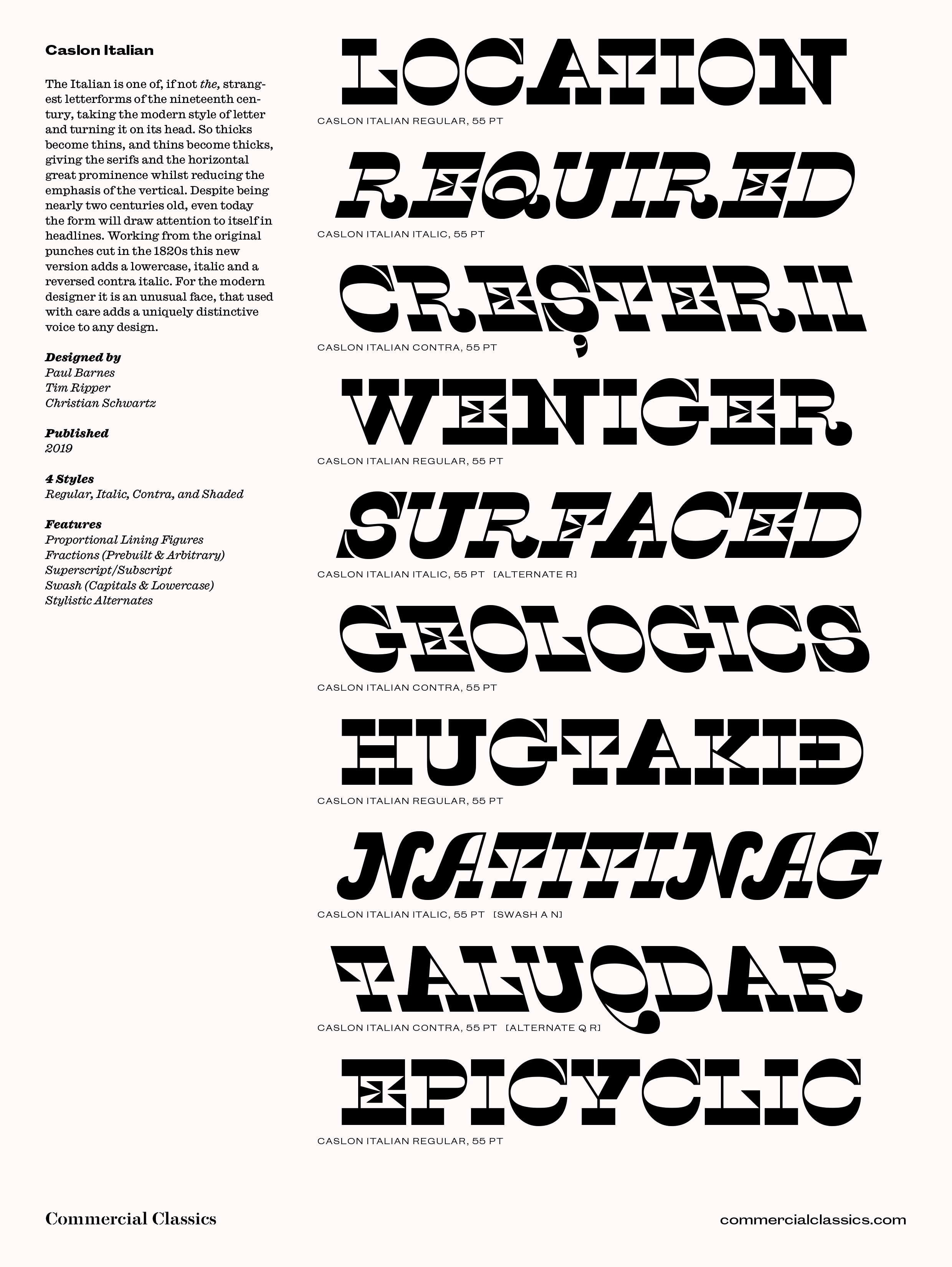
file name: Paul Barnes Tim Ripper Christian Schwartz Caslon Italian 2019

file name: Paul Barnes Tim Ripper Christian Schwartz Caslon Italian 2019

file name: Paul Barnes Tim Ripper Caslon Antique 2019
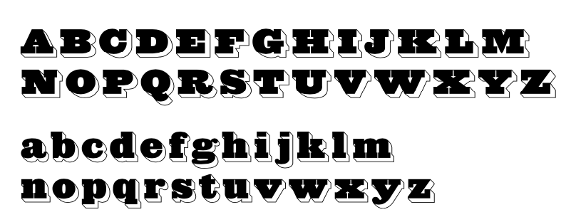
file name: Paul Barnes Tim Ripper Caslon Antique Inverse 2019

file name: Paul Barnes Tim Ripper Caslon Antique Inverse 2019
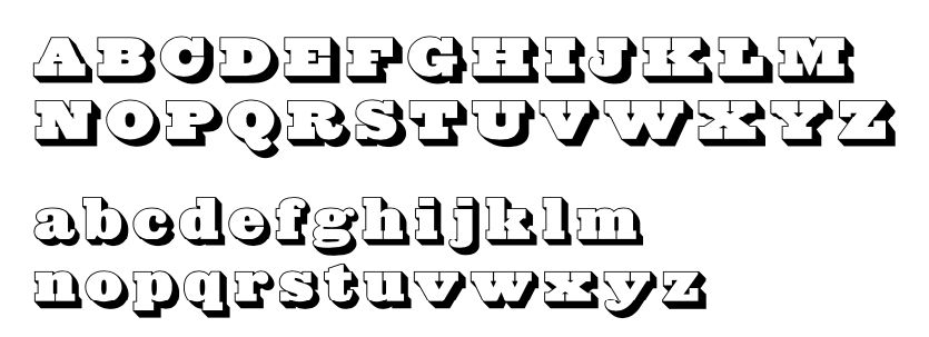
file name: Paul Barnes Tim Ripper Caslon Antique Shaded 2019
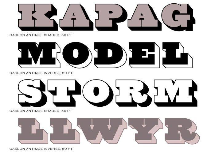
file name: Paul Barnes Tim Ripper Caslon Antique Shaded 2019
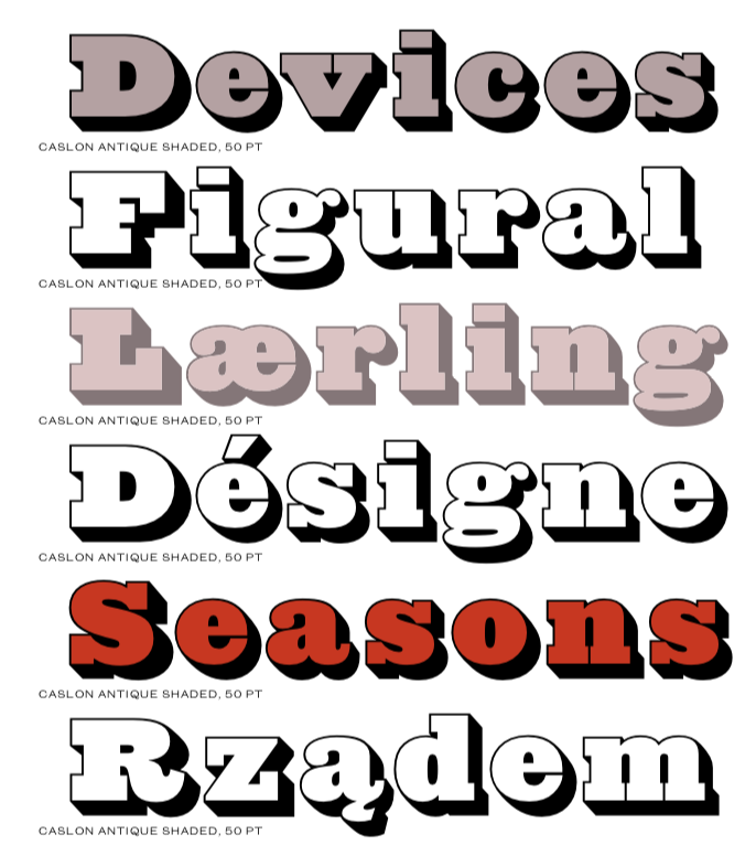
file name: Paul Barnes Tim Ripper Caslon Antique Shaded 2019
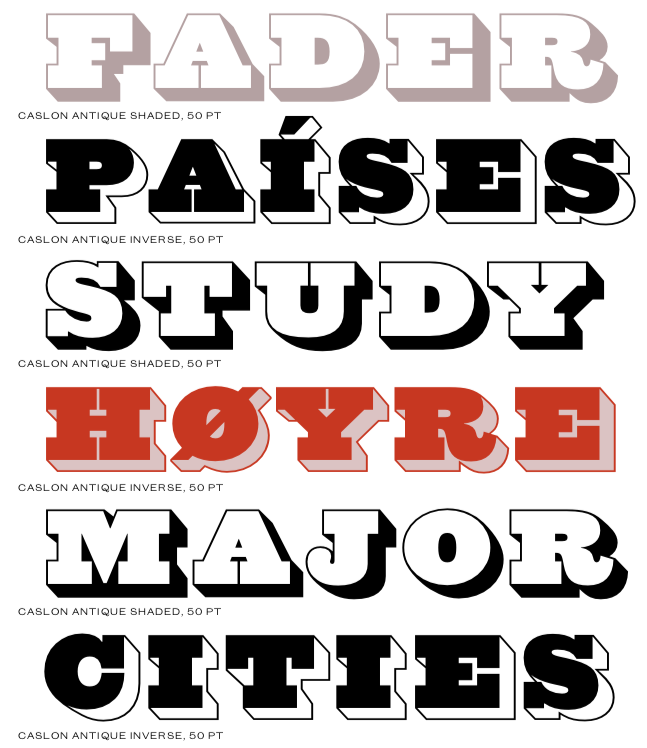
file name: Paul Barnes Tim Ripper Caslon Antique Shaded 2019

file name: Tim Ripper G H Guardian Headline 2017

file name: Tim Ripper G H Guardian Headline 2017b

file name: Tim Ripper G H Guardian Headline 2017c

file name: Tim Ripper G H Guardian Headline 2017d

file name: Tim Ripper G H Guardian Headline 2017e

file name: Tim Ripper G H Guardian Headline 2017f

file name: Tim Ripper G H Guardian Headline Black 2017

file name: Tim Ripper G H Guardian Headline Medium 2017

file name: Tim Ripper Corridor Hand 2013

file name: Tim Ripper Corridor Hand 2013

file name: Tim Ripper Corridor Oldstyle 2013

file name: Tim Ripper Corridor Oldstyle 2013
| | |
|
Luc Devroye ⦿ School of Computer Science ⦿ McGill University Montreal, Canada H3A 2K6 ⦿ lucdevroye@gmail.com ⦿ https://luc.devroye.org ⦿ https://luc.devroye.org/fonts.html |

