TYPE DESIGN INFORMATION PAGE last updated on Wed May 6 16:32:41 EDT 2026
FONT RECOGNITION VIA FONT MOOSE
|
|
|
||||||||||||||||||||||||||
|
The best commercial typefaces of 2019: Luc's selection
This is my own selection of the best commercial typefaces published in 2019, grouped by category.
|
EXTERNAL LINKS | ||||||||||||||||||||||||||
| | | ||||||||||||||||||||||||||

file name: Abo Daniel Curious Monkey 2020

file name: Abo Daniel Humble Boys 2020 3

file name: Abo Daniel Humble Boys 2020 5

file name: Abo Daniel Humble Boys 2020

file name: Abo Daniel Lovely Purple 2020 1

file name: Abo Daniel Under Summer 2020 3

file name: Abo Daniel Under Summer 2020

file name: Type Together L F T Etica Mono 2020 347347

file name: Type Together L F T Etica Mono 2020 347350

file name: Type Together L F T Etica Mono 2020

file name: Wilton Foundry Zentral 2019 304771 002

file name: Wilton Foundry Zentral 2019 304772 002

file name: Wilton Foundry Zentral 2019 304773

file name: Wilton Foundry Zentral 2019 304774 002

file name: Wilton Foundry Zentral 2019 304775

file name: Wilton Foundry Zentral 2019

file name: Mark Simonson Etna 2020

file name: Mark Simonson Etna 2020 1

file name: Mark Simonson Etna 2020 2

file name: Mark Simonson Etna 2020 3

file name: Mark Simonson Etna 2020 5

file name: Mark Simonson Etna X X Condensed 2020

file name: Paul Barnes Greg Gazdowicz Caslon Ionic 2019

file name: Paul Barnes Greg Gazdowicz Caslon Ionic 2019
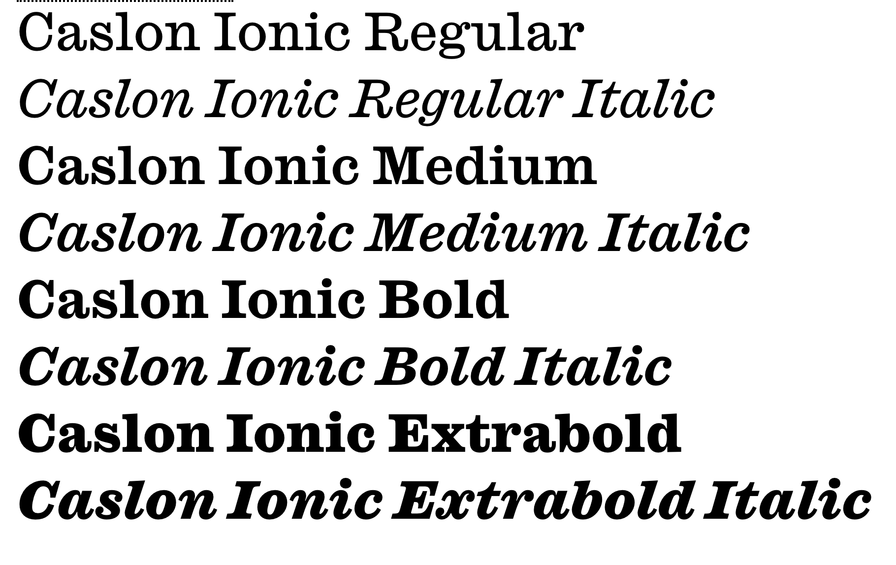
file name: Paul Barnes Greg Gazdowicz Caslon Ionic 2019

file name: Olcar Alcaide Palio 2019

file name: Henrik Kubel A2 Record Gothic 2019

file name: Henrik Kubel A2 Record Gothic 2019

file name: Henrik Kubel A2 Record Gothic 2019

file name: Henrik Kubel A2 Record Gothic 2019

file name: Henrik Kubel A2 Record Gothic 2019

file name: Henrik Kubel A2 Record Gothic 2019 1

file name: Henrik Kubel A2 Record Gothic 2019 10

file name: Henrik Kubel A2 Record Gothic 2019 7

file name: Henrik Kubel A2 Record Gothic 2019 9

file name: Jerome Knebusch Almost 2012 2019

file name: Jerome Knebusch Almost 2012 2019

file name: Jerome Knebusch Almost 2012 2019

file name: Jerome Knebusch Almost 2012 2019

file name: Jerome Knebusch Almost 2012 2019

file name: Jerome Knebusch Almost 2012 2019

file name: Mateusz Machalski Gaultier 2019

file name: Mateusz Machalski Gaultier 2019

file name: Mateusz Machalski Gaultier 2019

file name: Mateusz Machalski Gaultier 2019

file name: Mateusz Machalski Gaultier 2019

file name: Mateusz Machalski Gaultier Extra Light 2019

file name: Mateusz Machalski Gaultier Heavy 2019

file name: Andreu Balius Juan Luis Blanco Tuqbal Pro 2015 2019

file name: Andreu Balius Juan Luis Blanco Tuqbal Pro 2015 2019

file name: Andreu Balius Juan Luis Blanco Tuqbal Pro 2015 2019

file name: Andreu Balius Juan Luis Blanco Tuqbal Pro 2015 2019

file name: Andreu Balius Juan Luis Blanco Tuqbal Pro 2015 2019

file name: Andreu Balius Juan Luis Blanco Tuqbal Pro Bold 2019

file name: Eurotypo Palio 2019 332359

file name: Eurotypo Palio 2019 332360

file name: Eurotypo Palio 2019 332361

file name: Eurotypo Palio 2019 332362

file name: Eurotypo Palio 2019 332363

file name: Eurotypo Palio 2019

file name: Erasmo Ciufo Arkit 2019 332015

file name: Erasmo Ciufo Arkit 2019 332017

file name: Erasmo Ciufo Arkit 2019 332019 002

file name: Erasmo Ciufo Arkit 2019 332021

file name: Erasmo Ciufo Arkit 2019 332022

file name: Erasmo Ciufo Arkit 2019

file name: Latinotype Moranga 2019 331879

file name: Latinotype Moranga 2019 331880

file name: Latinotype Moranga 2019 331881

file name: Latinotype Moranga 2019 331882

file name: Latinotype Moranga 2019 331883

file name: Latinotype Moranga 2019

file name: Jeremy Dooley Schorel 2020 331475

file name: Jeremy Dooley Schorel 2020 331476 002

file name: Jeremy Dooley Schorel 2020 331477

file name: Jeremy Dooley Schorel 2020 331478 002

file name: Jeremy Dooley Schorel 2020 331479 002

file name: Jeremy Dooley Schorel 2020

file name: Almarkha Type Cherolina 2020 330414

file name: Almarkha Type Cherolina 2020 330417

file name: Almarkha Type Cherolina 2019 330426

file name: Almarkha Type Cherolina 2019

file name: William Montrose Old School Grotesk 2019

file name: William Montrose Old School Grotesk 2019

file name: William Montrose Old School Grotesk 2019

file name: William Montrose Old School Grotesk 2019

file name: William Montrose Old School Grotesk 2019

file name: William Montrose Old School Grotesk 2019

file name: Letter Collective Grafema L C 2019 329207

file name: Letter Collective Grafema L C 2019 329209 002

file name: Letter Collective Grafema L C 2019

file name: Archer Zuo Inscribing Song 2019

file name: Archer Zuo Inscribing Song 2019

file name: Archer Zuo Inscribing Song 2019

file name: Archer Zuo Inscribing Song 2019

file name: Archer Zuo Inscribing Song 2019

file name: Archer Zuo Inscribing Song 2019

file name: Archer Zuo Inscribing Song 2019

file name: Jacklina Jekova Todor Georgiev Grafema L C 2019 3

file name: Jacklina Jekova Todor Georgiev Grafema L C 2019 329200

file name: Jacklina Jekova Todor Georgiev Grafema L C 2019 329202

file name: Jacklina Jekova Todor Georgiev Grafema L C 2019 329203

file name: Jacklina Jekova Todor Georgiev Grafema L C 2019 329204

file name: Rodrigo Lopez Fuentes Tectonic 2019 328862

file name: Rodrigo Lopez Fuentes Tectonic 2019

file name: Rodrigo Lopez Fuentes Tectonic 2019 328861

file name: Rodrigo Lopez Fuentes Tectonic 2019 328863

file name: Untype Tectonic 2019 328863

file name: Untype Tectonic 2019 328864

file name: Untype Tectonic 2019 328865

file name: Untype Tectonic 2019 328866

file name: Untype Tectonic 2019 328867

file name: Untype Tectonic 2019

file name: Kris Sowersby Soehne 2019

file name: Kris Sowersby Soehne 2019

file name: Kris Sowersby Soehne 2019

file name: Kris Sowersby Soehne 2019

file name: Kris Sowersby Soehne 2019

file name: Kris Sowersby Soehne 2019

file name: Kris Sowersby Soehne 2019

file name: Kris Sowersby Soehne 2019

file name: Kris Sowersby Soehne 2019

file name: Kris Sowersby Soehne Fett 2019

file name: Nyapa Tanzil Behofeel 2019 328115

file name: Nyapa Tanzil Behofeel 2019 328116

file name: Nyapa Tanzil Behofeel 2019 328121

file name: Tanziladd Behofeel 2019 328122 002

file name: Tanziladd Behofeel 2019 328123

file name: Tanziladd Behofeel 2019 328124

file name: Tanziladd Behofeel 2019 328125 002

file name: Tanziladd Behofeel 2019 328126

file name: Tanziladd Behofeel 2019

file name: Ondrej Chory Buum 2019 326923

file name: Ondrej Chory Buum 2019 326924

file name: Ondrej Chory Buum 2019 326931

file name: Ondrej Chory Buum 2019 326932

file name: Ondrej Chory Buum 2019 326933

file name: Ondrej Chory Buum 2019

file name: Luis Bandovas Ahimsa 2019 327793

file name: Luis Bandovas Ahimsa 2019 327794

file name: Luis Bandovas Ahimsa 2019 327795

file name: Luis Bandovas Ahimsa 2019 327803

file name: Luis Bandovas Ahimsa 2019

file name: Satori T F Ahimsa 2019

file name: Nick Cooke Saltaire 2019

file name: Nick Cooke Saltaire 2019

file name: Nick Cooke Saltaire 2019

file name: Nick Cooke Saltaire 2019

file name: Nick Cooke Saltaire 2019

file name: Kimya Gandhi Chikki 2019

file name: Kimya Gandhi Chikki 2019

file name: Kimya Gandhi Chikki 2019

file name: Kimya Gandhi Chikki 2019

file name: Mateo Broillet Nero Alto 2019

file name: Mateo Broillet Nero Alto 2019

file name: Mateo Broillet Nero Alto 2019

file name: Mateo Broillet Nero Alto 2019

file name: Mateo Broillet Nero Alto 2019

file name: Neil Summerour Hype 2019

file name: Neil Summerour Hype0100 Bold 2019

file name: Neil Summerour Hype1200 Hairline 2019

file name: Neil Summerour Hype1700 Ultra 2019

file name: Cosimo Lorenzo Pancini Hagrid 2019

file name: Cosimo Lorenzo Pancini Hagrid 2019

file name: Cosimo Lorenzo Pancini Hagrid 2019

file name: Cosimo Lorenzo Pancini Hagrid 2019

file name: Cosimo Lorenzo Pancini Hagrid 2019

file name: Cosimo Lorenzo Pancini Hagrid 2019

file name: Mathieu Desjardins Hatton 2019

file name: Mathieu Desjardins Hatton 2019

file name: Mathieu Desjardins Hatton 2019

file name: Mathieu Desjardins Hatton 2019

file name: Mathieu Desjardins Hatton 2019

file name: Mathieu Desjardins Hatton 2019

file name: Pedro Leal Akut 2019

file name: Pedro Leal Akut 2019

file name: Pedro Leal Akut 2019

file name: Pedro Leal Akut 2019

file name: Pedro Leal Akut 2019

file name: Pedro Leal Akut 2019

file name: Pedro Leal Akut 2019

file name: Ramiro Espinoza Dejanire 2019

file name: Ramiro Espinoza Dejanire 2019

file name: Ramiro Espinoza Dejanire 2019 5

file name: Ramiro Espinoza Dejanire 2019 6

file name: Ramiro Espinoza Dejanire 2019 7

file name: Ramiro Espinoza Dejanire 2019 8

file name: Ramiro Espinoza Dejanire 2019

file name: Alejandro Paul Replete Sans 2019

file name: Alejandro Paul Replete Sans 2019

file name: Alejandro Paul Replete Sans 2019

file name: Alejandro Paul Replete Sans 2019

file name: Alejandro Paul Replete Sans 2019

file name: Alejandro Paul Replete Sans 2019

file name: Alejandro Paul Replete Sans 2019

file name: Alejandro Paul Replete Sans 2019

file name: Alejandro Paul Replete Sans 2019

file name: Mateusz Machalski Promo 2019

file name: Mateusz Machalski Promo 2019

file name: Mateusz Machalski Promo 2019

file name: Mateusz Machalski Promo 2019

file name: Mateusz Machalski Promo 2019

file name: Lucas Descroix Fragen 2019

file name: Lucas Descroix Fragen 2019

file name: Lucas Descroix Fragen 2019

file name: Lucas Descroix Fragen 2019

file name: Lucas Descroix Fragen 2019

file name: Lucas Descroix Fragen 2019

file name: Garage Fonts Freight Big Cmp Pro 2019 322693

file name: Garage Fonts Freight Big Cmp Pro 2019 322696 002

file name: Garage Fonts Freight Big Cmp Pro 2019 322697

file name: Garage Fonts Freight Big Cmp Pro 2019

file name: Robby Woodard Phils Fonts Freight Big Compressed Pro 2019

file name: Robby Woodard Phils Fonts Freight Big Compressed Pro 2019

file name: Robby Woodard Phils Fonts Freight Big Compressed Pro 2019

file name: Cosimo Lorenzo Pancini Andrea Tartarelli Blacker Pro 2019

file name: Cosimo Lorenzo Pancini Andrea Tartarelli Blacker Pro 2019

file name: Cosimo Lorenzo Pancini Andrea Tartarelli Blacker Pro 2019

file name: Cosimo Lorenzo Pancini Andrea Tartarelli Blacker Pro 2019

file name: Cosimo Lorenzo Pancini Andrea Tartarelli Blacker Pro 2019

file name: Cosimo Lorenzo Pancini Andrea Tartarelli Blacker Pro 2019

file name: Cosimo Lorenzo Pancini Andrea Tartarelli Blacker Pro 2019

file name: Zetafonts Blacker Pro 2019 321428 002

file name: Zetafonts Blacker Pro 2019 321430

file name: Zetafonts Blacker Pro 2019 321432

file name: Zetafonts Blacker Pro 2019

file name: Mathieu Cortat Molitor 2019
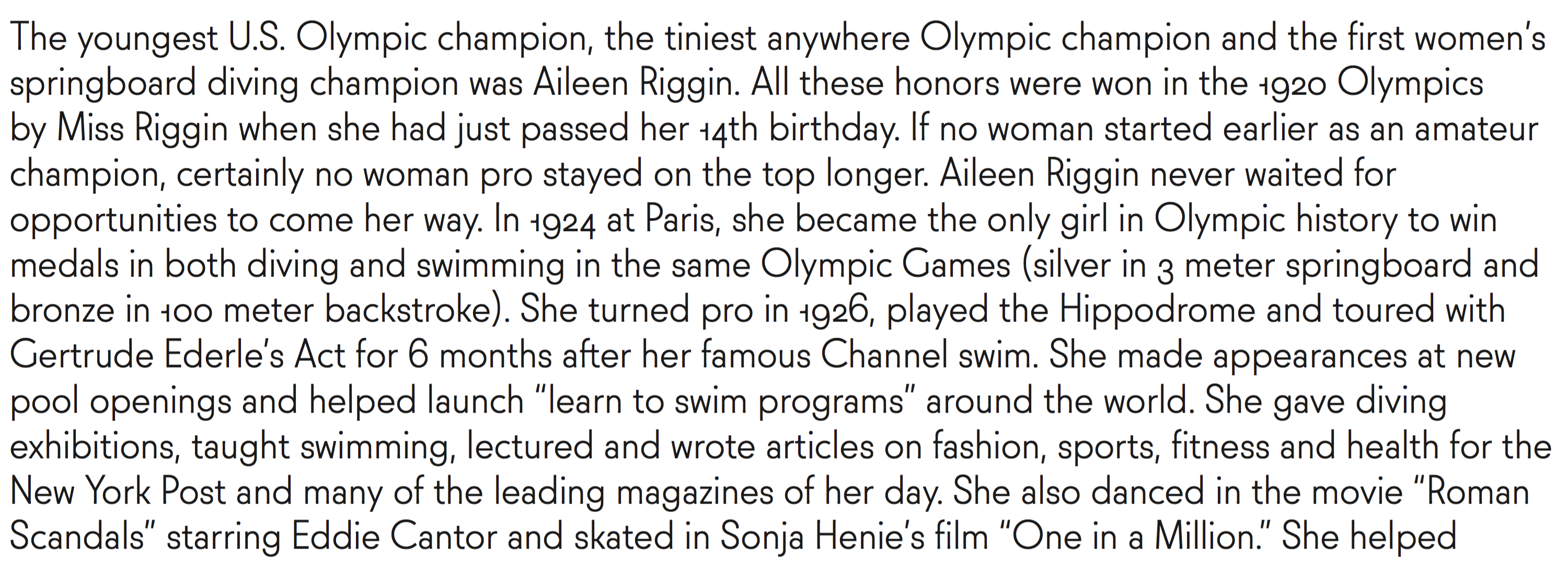
file name: Mathieu Cortat Molitor 2019
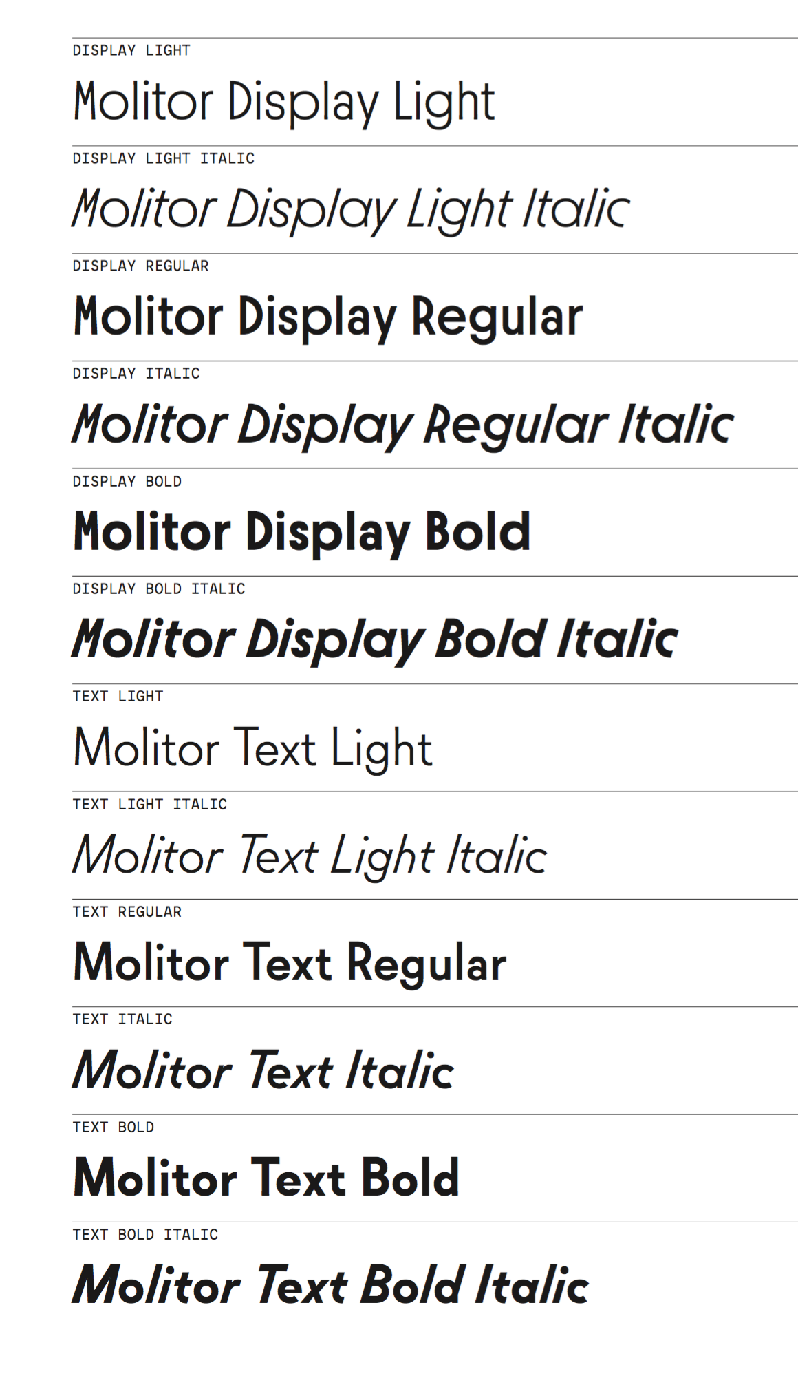
file name: Mathieu Cortat Molitor 2019

file name: Mathieu Cortat Molitor 2019

file name: Mathieu Cortat Molitor 2019

file name: Mathieu Cortat Molitor 2019

file name: Shiva Nallaperumal Rekall 2019

file name: Shiva Nallaperumal Rekall 2019

file name: Shiva Nallaperumal Rekall 2019

file name: Shiva Nallaperumal Rekall 2019

file name: Ilham Herry Moister 2019

file name: Ilham Herry Moister 2019

file name: Ilham Herry Moister 2019

file name: Ilham Herry Moister 2019 321047

file name: Ilham Herry Moister 2019 321048 002

file name: Ilham Herry Moister 2019 321051

file name: Ilham Herry Moister 2019

file name: Panos Vassiliou P F Marlet 2019

file name: Panos Vassiliou P F Marlet 2019

file name: Panos Vassiliou P F Marlet 2019

file name: Panos Vassiliou P F Marlet 2019

file name: Panos Vassiliou P F Marlet 2019

file name: Panos Vassiliou P F Marlet 2019

file name: Panos Vassiliou P F Marlet 2019

file name: Panos Vassiliou P F Marlet 2019

file name: Type Type T T Interfaces Variable Mono 2019

file name: Type Type T T Interfaces Variable 2019

file name: Type Type T T Interfaces Variable 2019

file name: Rick Banks F37 Moon 2019

file name: Rick Banks F37 Moon 2019

file name: Rick Banks F37 Moon 2019

file name: Rick Banks F37 Moon 2019

file name: Rick Banks F37 Moon 2019

file name: Goran Soderstrom Ivar Display 2019

file name: Goran Soderstrom Ivar Display 2019

file name: Goran Soderstrom Ivar Display Condensed 2019

file name: Goran Soderstrom Ivar Soft 2019

file name: Goran Soderstrom Ivar Text Bold 2019

file name: Degarism Studio Regio Mono 2019 318814

file name: Degarism Studio Regio Mono 2019 318815 002

file name: Degarism Studio Regio Mono 2019

file name: Deni Anggara Regio Mono 2019 3

file name: Deni Anggara Regio Mono 2019 318820

file name: Deni Anggara Regio Mono 2019 318827

file name: Deni Anggara Regio Mono 2019 318828

file name: Aarya Purohit Styro 2019 318041 002

file name: Aarya Purohit Styro 2019 318042 002

file name: Aarya Purohit Styro 2019 318043 002

file name: Aarya Purohit Styro 2019

file name: Matthew Carter Shotaro Nakano Kunihiko Okano Role Serif Text Medium 2019

file name: Matthew Carter Shotaro Nakano Kunihiko Okano Role Slab 2019

file name: Jeremy Tankard Brucker 2019

file name: Jeremy Tankard Brucker 2019

file name: Jeremy Tankard Brucker 2019
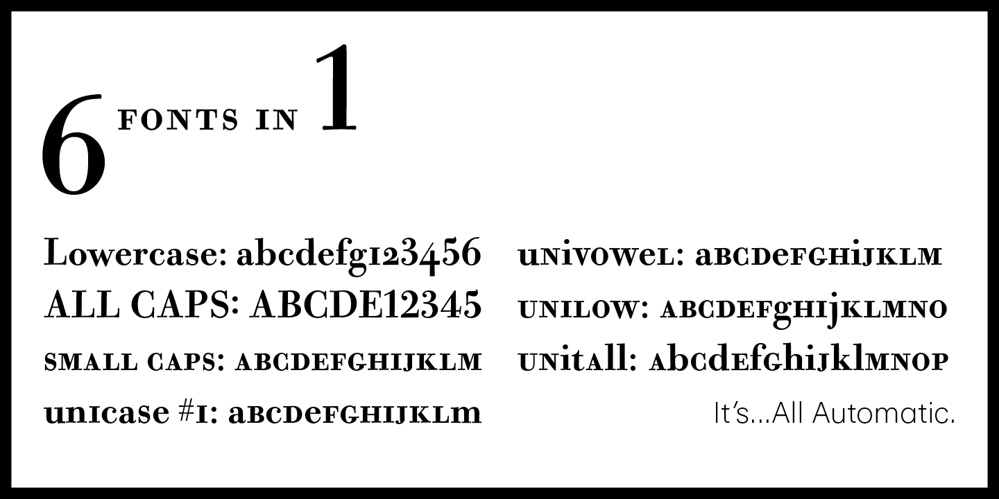
file name: California Type Foundry C A L Bodoni Casale 2019 315118

file name: California Type Foundry C A L Bodoni Casale 2019 315121 002

file name: California Type Foundry C A L Bodoni Casale 2019 315122 002

file name: California Type Foundry C A L Bodoni Casale 2019

file name: Paul Harpin L D N Mammoth 2019

file name: Paul Harpin L D N Mammoth Woodblock 2019

file name: Paul Harpin L D N Mammoth Woodblock 2019

file name: Paul Harpin London Fatface 2019

file name: Paul Harpin London Fatface 2019

file name: Paul Harpin London Fatface 2019

file name: Paul Harpin London Fatface 2019

file name: Dominika Langosz Heneczek Pro 2018

file name: Dominika Langosz Heneczek Pro 2018

file name: Dominika Langosz Heneczek Pro 2018

file name: Dominika Langosz Heneczek Pro 2018

file name: Dominika Langosz Heneczek Pro Black 2018
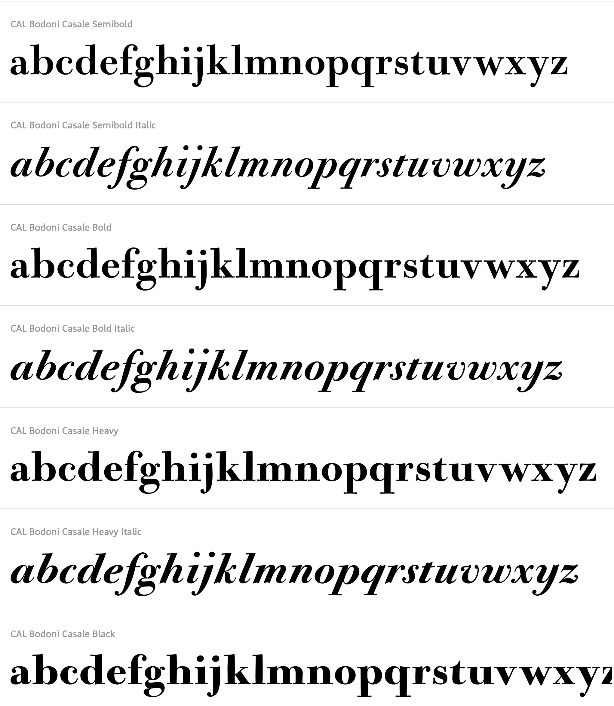
file name: Dave Lawrence C A L Bodoni Casale 2019
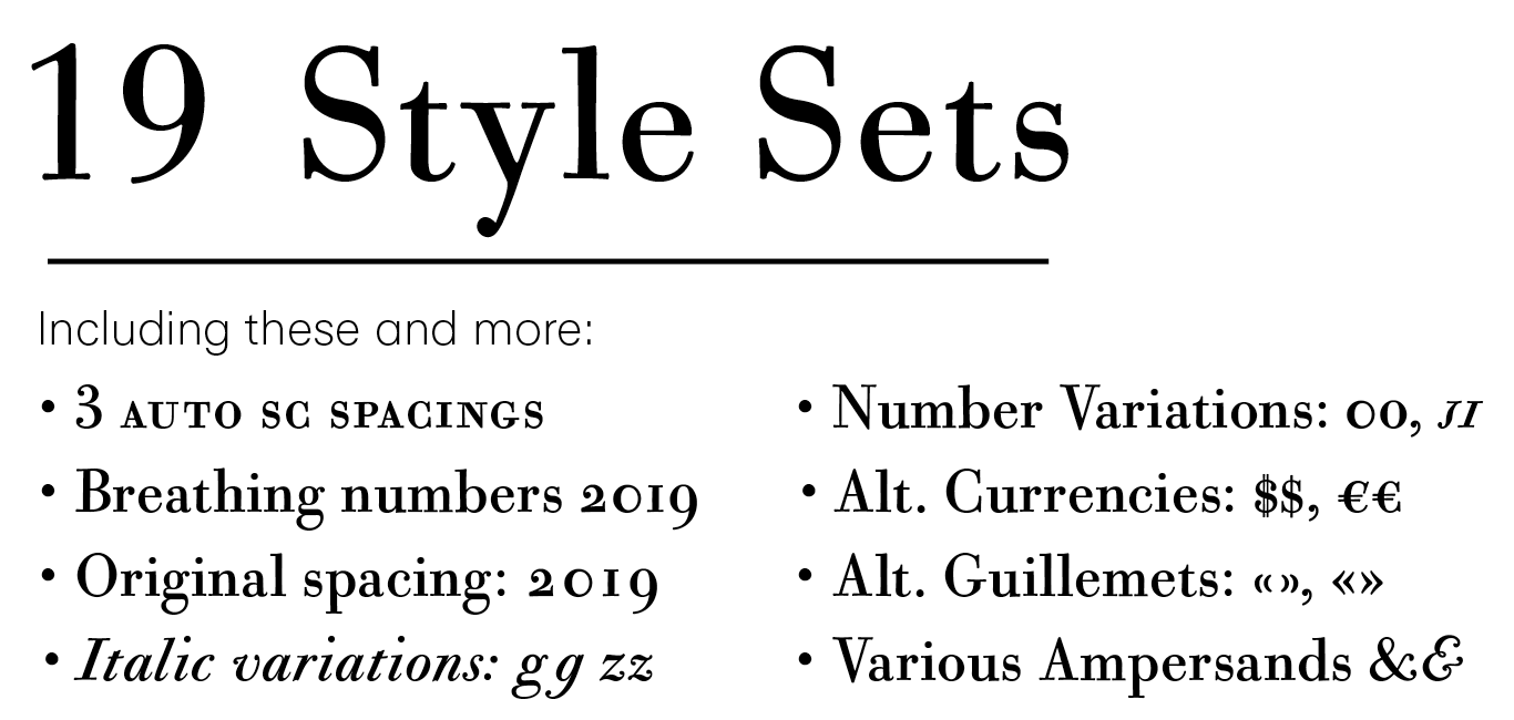
file name: Dave Lawrence C A L Bodoni Casale 2019 315117
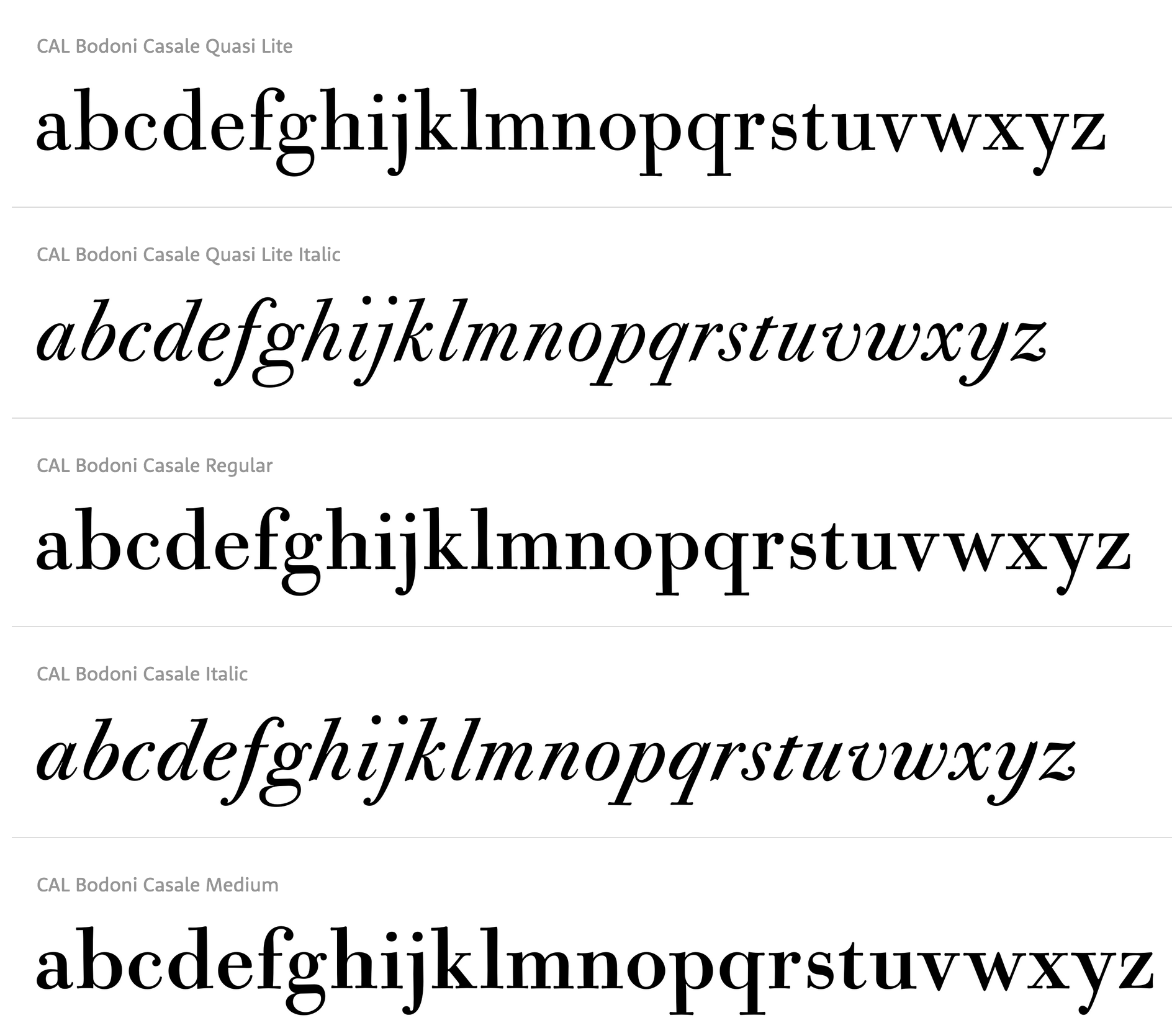
file name: Dave Lawrence C A L Bodoni Casale 2019

file name: Roch Modrzejewski Montreux Grotesk 2019

file name: Roch Modrzejewski Montreux Grotesk 2019

file name: Roch Modrzejewski Montreux Grotesk 2019

file name: Roch Modrzejewski Montreux Grotesk 2019

file name: Roch Modrzejewski Montreux Grotesk 2019

file name: Roch Modrzejewski Montreux Grotesk 2019

file name: Roch Modrzejewski Montreux Grotesk 2019

file name: Roch Modrzejewski Montreux Grotesk 2019

file name: Roch Modrzejewski Montreux Grotesk 2019

file name: Roch Modrzejewski Montreux Grotesk 2019

file name: Roch Modrzejewski Montreux Grotesk 2019

file name: Roch Modrzejewski Montreux Grotesk 2019

file name: Roch Modrzejewski Montreux Grotesk 2019

file name: Hurme Design Hurme Fin 2019

file name: Hurme Design Hurme Fin 2019

file name: Hurme Design Hurme Fin Mono 2019

file name: Michael Abbink Paul Van Der Laan F F Kievit Serif 2019 3

file name: Michael Abbink Paul Van Der Laan F F Kievit Serif 2019 314352

file name: Michael Abbink Paul Van Der Laan F F Kievit Serif 2019 33

file name: Michael Abbink Paul Van Der Laan F F Kievit Serif 2019

file name: Pintassilgo Prints Pieches 2019 313985 002

file name: Pintassilgo Prints Pieches 2019 313988

file name: Pintassilgo Prints Pieches 2019

file name: Hidetaka Yamasaki Luke 2019

file name: Hidetaka Yamasaki Luke 2019

file name: Hidetaka Yamasaki Luke 2019 314835 002

file name: Hidetaka Yamasaki Luke 2019 314836

file name: Hidetaka Yamasaki Luke 2019

file name: Black Foundry Galien 2019

file name: Black Foundry Galien 2019

file name: Black Foundry Galien 2019

file name: Black Foundry Galien 2019

file name: Black Foundry Galien 2019

file name: Black Foundry Galien 2019

file name: Black Foundry Galien 2019

file name: Black Foundry Galien 2019

file name: Ricardo Marcin Erica Jung Pieches 2019

file name: Ricardo Marcin Erica Jung Pieches 2019

file name: Ricardo Marcin Erica Jung Pieches 2019

file name: Ricardo Marcin Erica Jung Pieches 2019

file name: Samo Acko Diana Ovezea Passenger Sans 2019

file name: Samo Acko Diana Ovezea Passenger Sans 2019

file name: Samo Acko Diana Ovezea Passenger Sans 2019

file name: Samo Acko Diana Ovezea Passenger Sans 2019 313695 002

file name: Samo Acko Diana Ovezea Passenger Sans 2019 313696

file name: Samo Acko Diana Ovezea Passenger Sans 2019 313699

file name: Samo Acko Diana Ovezea Passenger Sans 2019

file name: Franziska Weitgruber Roba 2019

file name: Franziska Weitgruber Roba 2019

file name: Franziska Weitgruber Roba 2019

file name: Franziska Weitgruber Roba 2019

file name: Franziska Weitgruber Roba 2019

file name: Minjoo Ham Dunkel 2019

file name: Minjoo Ham Dunkel 2019

file name: Minjoo Ham Dunkel 2019

file name: Minjoo Ham Dunkel 2019

file name: Minjoo Ham Dunkel 2019

file name: Minjoo Ham Dunkel 2019

file name: Minjoo Ham Dunkel 2019

file name: Manuel Eduardo Corradine Austera Text 2019

file name: Manuel Eduardo Corradine Austera Text 2019

file name: Manuel Eduardo Corradine Austera Text 2019

file name: Manuel Eduardo Corradine Austera Text 2019

file name: Manuel Eduardo Corradine Austera Text 2019

file name: Manuel Eduardo Corradine Austera Text 2019

file name: Manuel Eduardo Corradine Austera Text 2019

file name: Miguel Reyes Ayer Poster 2019

file name: Miguel Reyes Ayer Poster Angular 2019

file name: Miguel Reyes Ayer Poster Angular 2019

file name: Schraube Bremer Presse 2019 289181

file name: Schraube Bremer Presse 2019 289184 002

file name: Schraube Bremer Presse 2019

file name: Dorothee Schraudner Bremer Presse 2019 after Willy Wiegand

file name: Moshik Nadav Lingerie Wild Pro 2019

file name: Moshik Nadav Lingerie Wild Pro 2019

file name: Moshik Nadav Lingerie Wild Pro 2019

file name: Moshik Nadav Lingerie Wild Pro 2019

file name: Moshik Nadav Lingerie Wild Pro 2019

file name: Rare Bird Font Foundry Rare Bird Specimen V I 2019 312094 002

file name: Rare Bird Font Foundry Rare Bird Specimen V I 2019 312095

file name: Rare Bird Font Foundry Rare Bird Specimen V I 2019 312096

file name: Rare Bird Font Foundry Rare Bird Specimen V I 2019

file name: Vika Usmanova T T Frantz 2019 312739

file name: Vika Usmanova T T Frantz 2019 312740

file name: Vika Usmanova T T Frantz 2019 312748

file name: Vika Usmanova T T Frantz 2019 312749

file name: Vika Usmanova T T Frantz 2019

file name: Romulo Gobira Hatchway 2019 311556

file name: Romulo Gobira Hatchway 2019 311566 002

file name: Romulo Gobira Hatchway 2019 311567 002

file name: Romulo Gobira Hatchway 2019 311568 002

file name: Romulo Gobira Hatchway 2019 311569

file name: Romulo Gobira Hatchway 2019 311570

file name: Romulo Gobira Hatchway 2019

file name: Sabrtype Allagia 2019

file name: Sabrtype Allagia 2019

file name: Sabrtype Allagia 2019

file name: Sabrtype Allagia 2019

file name: Veronika Burian Jose Scaglione Azza Alameddine Catalpa 2019

file name: Veronika Burian Jose Scaglione Azza Alameddine Catalpa 2019

file name: Veronika Burian Jose Scaglione Azza Alameddine Catalpa 2019

file name: Veronika Burian Jose Scaglione Azza Alameddine Catalpa 2019

file name: Veronika Burian Jose Scaglione Azza Alameddine Catalpa 2019

file name: Veronika Burian Jose Scaglione Azza Alameddine Catalpa 2019

file name: Veronika Burian Jose Scaglione Azza Alameddine Catalpa 2019

file name: Veronika Burian Jose Scaglione Azza Alameddine Catalpa 2019

file name: Veronika Burian Jose Scaglione Azza Alameddine Catalpa 2019

file name: Etcetera Type Company Etc Imbue 2019

file name: Etcetera Type Company Etc Imbue 2019

file name: Etcetera Type Company Etc Imbue 2019

file name: Etcetera Type Company Etc Imbue 2019

file name: Etcetera Type Company Etc Imbue 2019

file name: Etcetera Type Company Etc Imbue 2019

file name: Ludwig Uebele Niko 2019

file name: Ludwig Uebele Niko 2019

file name: Ludwig Uebele Niko 2019

file name: Ludwig Uebele Niko 2019

file name: Ludwig Uebele Niko 2019

file name: Ludwig Uebele Niko 2019

file name: Ludwig Uebele Niko 2019

file name: Ludwig Uebele Niko 2019

file name: Ludwig Uebele Niko 2019

file name: Ludwig Uebele Niko 2019

file name: Lena Schmidt Schneidler Latein 2019 309477 002

file name: Lena Schmidt Schneidler Latein 2019 309480 002

file name: Lena Schmidt Schneidler Latein 2019 309481

file name: Lena Schmidt Schneidler Latein 2019 309482

file name: Lena Schmidt Schneidler Latein 2019 after F H E Schneidler Schneidler Latein 1916 309476

file name: Lena Schmidt Schneidler Latein 2019 after F H E Schneidler Schneidler Latein 1916 309477

file name: Lena Schmidt Schneidler Latein 2019 after F H E Schneidler Schneidler Latein 1916

file name: Lena Schmidt Schneidler Latein 2019

file name: Ani Dimitrova Vocal 2019 30

file name: Ani Dimitrova Vocal 2019 309252

file name: Ani Dimitrova Vocal 2019 309254

file name: Ani Dimitrova Vocal 2019 309256

file name: Ani Dimitrova Vocal 2019 309258

file name: Ani Dimitrova Vocal 2019 31

file name: Ani Dimitrova Vocal 2019

file name: Agung Syaifudin Hector Ink 2019

file name: Agung Syaifudin Hector Ink 2019

file name: Agung Syaifudin Hector Ink 2019

file name: Agung Syaifudin Hector Ink 2019

file name: Agung Syaifudin Hector Ink 2019

file name: Agung Syaifudin Hector Ink 2019

file name: Agung Syaifudin Hector Ink 2019

file name: Agung Syaifudin Moret 2019

file name: Michael Hagemann Marlin Geo 2019

file name: Michael Hagemann Marlin Geo 2019

file name: Michael Hagemann Marlin Geo 2019

file name: Michael Hagemann Marlin Geo 2019

file name: Michael Hagemann Marlin Geo Extra Black 2019

file name: Michael Hagemann Marlin Geo Medium 2019

file name: Michael Hagemann Marlin Geo S Q 2019

file name: Michael Hagemann Marlin Geo S Q Extra Black 2019

file name: Cosimo Lorenzo Pancini Francesco Canovaro Monterchi Book 2019

file name: Cosimo Lorenzo Pancini Andrea Tartarelli Maria Chiara Fantini Monterchi 2019

file name: Cosimo Lorenzo Pancini Andrea Tartarelli Maria Chiara Fantini Monterchi 2019

file name: Cosimo Lorenzo Pancini Andrea Tartarelli Maria Chiara Fantini Monterchi 2019

file name: Cosimo Lorenzo Pancini Andrea Tartarelli Maria Chiara Fantini Monterchi 2019

file name: Cosimo Lorenzo Pancini Andrea Tartarelli Maria Chiara Fantini Monterchi 2019

file name: Cosimo Lorenzo Pancini Andrea Tartarelli Maria Chiara Fantini Monterchi 2019

file name: Cosimo Lorenzo Pancini Andrea Tartarelli Maria Chiara Fantini Monterchi 2019

file name: Cosimo Lorenzo Pancini Andrea Tartarelli Maria Chiara Fantini Monterchi 2019

file name: Cosimo Lorenzo Pancini Andrea Tartarelli Maria Chiara Fantini Monterchi 2019

file name: Cosimo Lorenzo Pancini Andrea Tartarelli Maria Chiara Fantini Monterchi 2019

file name: Cosimo Lorenzo Pancini Andrea Tartarelli Maria Chiara Fantini Monterchi 2019

file name: Cosimo Lorenzo Pancini Andrea Tartarelli Maria Chiara Fantini Monterchi 2019

file name: Cosimo Lorenzo Pancini Andrea Tartarelli Maria Chiara Fantini Monterchi 2019

file name: Cosimo Lorenzo Pancini Andrea Tartarelli Maria Chiara Fantini Monterchi 2019

file name: Cosimo Lorenzo Pancini Andrea Tartarelli Maria Chiara Fantini Monterchi 2019

file name: Cosimo Lorenzo Pancini Andrea Tartarelli Maria Chiara Fantini Monterchi 2019

file name: Cosimo Lorenzo Pancini Andrea Tartarelli Maria Chiara Fantini Monterchi 2019

file name: Cosimo Lorenzo Pancini Andrea Tartarelli Maria Chiara Fantini Monterchi 2019

file name: Cosimo Lorenzo Pancini Andrea Tartarelli Maria Chiara Fantini Monterchi 2019

file name: Cosimo Lorenzo Pancini Andrea Tartarelli Maria Chiara Fantini Monterchi 2019

file name: Cosimo Lorenzo Pancini Andrea Tartarelli Maria Chiara Fantini Monterchi 2019

file name: Cosimo Lorenzo Pancini Andrea Tartarelli Maria Chiara Fantini Monterchi 2019

file name: Cosimo Lorenzo Pancini Andrea Tartarelli Maria Chiara Fantini Monterchi 2019

file name: Francois Rappo J Jannon 2019

file name: Francois Rappo J Jannon 2019

file name: Francois Rappo J Jannon 2019

file name: Francois Rappo J Jannon 2019

file name: Francois Rappo J Jannon 2019

file name: Francois Rappo J Jannon 2019

file name: Francois Rappo J Jannon 2019

file name: Francois Rappo J Jannon 2019

file name: D S Type Recita 2019

file name: D S Type Recita 2019

file name: D S Type Recita 2019

file name: D S Type Recita 2019

file name: D S Type Recita 2019

file name: D S Type Recita 2019

file name: D S Type Recita 2019

file name: D S Type Recita 2019

file name: D S Type Recita 2019

file name: Christian Dexter A T C Anais 2019

file name: Christian Dexter A T C Anais 2019

file name: Christian Dexter A T C Anais 2019

file name: Christian Dexter A T C Anais 2019

file name: Christian Dexter A T C Anais 2019

file name: Jose Manuel Uros Skope 2019 307311 002

file name: Jose Manuel Uros Skope 2019 307312

file name: Jose Manuel Uros Skope 2019 307313 002

file name: Jose Manuel Uros Skope 2019 307314

file name: Jose Manuel Uros Skope 2019 307315

file name: Mateusz Machalski Sigmund 2019

file name: Mateusz Machalski Sigmund 2019

file name: Mateusz Machalski Sigmund 2019

file name: Mateusz Machalski Sigmund 2019

file name: Mateusz Machalski Sigmund 2019

file name: Mateusz Machalski Sigmund 2019

file name: Mateusz Machalski Sigmund 2019

file name: Mateusz Machalski Sigmund 2019

file name: Mateusz Machalski Sigmund 2019

file name: Francois Rappo Rand Mono 2019

file name: Francois Rappo Rand Mono 2019

file name: D C Scarpelli Pamplemousse 2019

file name: D C Scarpelli Pamplemousse 2019 307261

file name: D C Scarpelli Pamplemousse 2019 307264 002

file name: D C Scarpelli Pamplemousse 2019 307265 002

file name: D C Scarpelli Pamplemousse 2019 307266

file name: D C Scarpelli Pamplemousse 2019 307267 002

file name: D C Scarpelli Pamplemousse 2019 307268 002

file name: D C Scarpelli Pamplemousse 2019

file name: Jason Vandenberg Marsden 2019 305845 002

file name: Jason Vandenberg Marsden 2019 305846 002

file name: Jason Vandenberg Marsden 2019 305847 002

file name: Jason Vandenberg Marsden 2019 305848 002

file name: Jason Vandenberg Marsden 2019

file name: Nissa Nana Elmira 2019 304817 002

file name: Nissa Nana Elmira 2019 304818 002

file name: Nissa Nana Elmira 2019 304819 002

file name: Nissa Nana Elmira 2019 304821 002

file name: Nissa Nana Elmira 2019

file name: Marta Sanchez Marco Radar 2019 289280 002

file name: Marta Sanchez Marco Radar 2019 289281

file name: Marta Sanchez Marco Radar 2019 289282

file name: Marta Sanchez Marco Radar 2019 after Carl Winkow Radio Grotesk 289278

file name: Marta Sanchez Marco Radar 2019 after Carl Winkow Radio Grotesk 289279

file name: Marta Sanchez Marco Radar 2019

file name: Parachute P F Grand Gothik 2019

file name: Parachute P F Grand Gothik 2019

file name: Parachute P F Grand Gothik 2019

file name: Parachute P F Grand Gothik 2019

file name: Parachute P F Grand Gothik 2019

file name: Parachute P F Grand Gothik 2019

file name: Pavel Korzhenko Nurnberg 2019 305127 002

file name: Pavel Korzhenko Nurnberg 2019 305129

file name: Pavel Korzhenko Nurnberg 2019 305130

file name: Pavel Korzhenko Nurnberg 2019 305131 002

file name: Pavel Korzhenko Nurnberg 2019

file name: Vintage Voyage Design Supply Nurnberg 2019

file name: Jordan Jelev Vassil Kateliev F M Bolyar Sans Pro 2019 303731

file name: Jordan Jelev Vassil Kateliev F M Bolyar Sans Pro 2019 303738

file name: Jordan Jelev Vassil Kateliev F M Bolyar Sans Pro 2019 303742

file name: Jordan Jelev Vassil Kateliev F M Bolyar Sans Pro 2019 303744

file name: Jordan Jelev Vassil Kateliev F M Bolyar Sans Pro 2019

file name: Michael Hochleitner Franziska Weitgruber Antonia 2019 1

file name: Michael Hochleitner Franziska Weitgruber Antonia 2019 2

file name: Michael Hochleitner Franziska Weitgruber Antonia 2019 3

file name: Michael Hochleitner Franziska Weitgruber Antonia 2019 4

file name: Michael Hochleitner Franziska Weitgruber Antonia 2019 5

file name: Michael Hochleitner Franziska Weitgruber Antonia 2019

file name: Michael Hochleitner Franziska Weitgruber. Antonia 2019

file name: Michael Hochleitner Franziska Weitgruber. Antonia 2019

file name: Michael Hochleitner Franziska Weitgruber. Antonia 2019

file name: Typejockeys Antonia 2019

file name: Typejockeys Antonia 2019

file name: Typejockeys Antonia 2019

file name: Typejockeys Antonia 2019

file name: Typejockeys Antonia 2019

file name: Typejockeys Antonia 2019

file name: Typejockeys Antonia 2019

file name: Typejockeys Antonia 2019

file name: Typejockeys Antonia 2019

file name: Emilie Rigaud Naoko 2019

file name: Emilie Rigaud Naoko 2019

file name: Emilie Rigaud Naoko 2019

file name: Emilie Rigaud Naoko 2019

file name: Emilie Rigaud Naoko 2019

file name: Emilie Rigaud Naoko 2019

file name: Emilie Rigaud Naoko 2019

file name: Emilie Rigaud Naoko 2019

file name: Emilie Rigaud Naoko 2019

file name: Andrea Braccaloni L F T Etica Mono 2019

file name: Andrea Braccaloni L F T Etica Mono 2019

file name: Andrea Braccaloni L F T Etica Mono 2019

file name: Andrea Braccaloni L F T Etica Mono 2019

file name: Andrea Braccaloni L F T Etica Mono 2019

file name: Andreas Seidel Wood Heinz No.4 2019 302388

file name: Andreas Seidel Wood Heinz No.4 2019 302391 002

file name: Andreas Seidel Wood Heinz No.4 2019 302392

file name: Andreas Seidel Wood Heinz No.4 2019

file name: Andreas Seidel Wood Heinz No4 2019 302382

file name: Andreas Seidel Wood Heinz No4 2019 302384

file name: Andreas Seidel Wood Heinz No4 2019 302386

file name: Jan Christian Bruun Rono 2019 3

file name: Jan Christian Bruun Rono 2019 14

file name: Jan Christian Bruun Rono 2019 15

file name: Jan Christian Bruun Rono 2019 16

file name: Jan Christian Bruun Rono 2019 2

file name: Jan Christian Bruun Rono 2019 8

file name: Jan Christian Bruun Rono 2019 9

file name: Jan Christian Bruun Rono 2019

file name: Gabriel Martinez Meave Wordless Script 2019

file name: Gabriel Martinez Meave Wordless Script 2019

file name: Gabriel Martinez Meave Wordless Script 2019

file name: Gabriel Martinez Meave Wordless Script 2019

file name: Gabriel Martinez Meave Wordless Script 2019

file name: Gabriel Martinez Meave Wordless Script 2019

file name: Gabriel Martinez Meave Wordless Script 2019

file name: Pompe Hedengren Goran Soderstrom Voir 2019

file name: Pompe Hedengren Goran Soderstrom Voir 2019

file name: Pompe Hedengren Goran Soderstrom Voir 2019

file name: Claes Nordenstam Svang 2019

file name: Claes Nordenstam Svang 2019

file name: Claes Nordenstam Svang 2019

file name: Claes Nordenstam Svang 2019

file name: Claes Nordenstam Svang 2019

file name: Mark Van Bronkhorst Igino Marini Ben Kiel A T F Franklin Gothic 2019 after Morris Fuller Benton Franklin Gothic 1905

file name: Mark Van Bronkhorst Igino Marini Ben Kiel A T F Franklin Gothic 2019 after Morris Fuller Benton Franklin Gothic 1905

file name: A T F Collection A T F Franklin Gothic 2019 300717

file name: A T F Collection A T F Franklin Gothic 2019 300718

file name: A T F Collection A T F Franklin Gothic 2019 300719

file name: A T F Collection A T F Franklin Gothic 2019 300721

file name: A T F Collection A T F Franklin Gothic 2019

file name: Rene Bieder Magnat 2019 300712

file name: Rene Bieder Magnat 2019 300713 002

file name: Rene Bieder Magnat 2019 300714

file name: Rene Bieder Magnat 2019 300715 002

file name: Rene Bieder Magnat 2019 300716 002

file name: Rene Bieder Magnat 2019

file name: Oleh Lishchuk Mazzard 2019 300189

file name: Oleh Lishchuk Mazzard 2019 300194

file name: Oleh Lishchuk Mazzard L 2019

file name: Pepper Type Mazzard 2019 300196

file name: Pepper Type Mazzard 2019 300200

file name: Pepper Type Mazzard 2019

file name: Dave Rowland Gigantic 2019 299770 002

file name: Dave Rowland Gigantic 2019 299774 002

file name: Dave Rowland Gigantic 2019 Dave Rowland Gigantic 2019 299769

file name: Dave Rowland Gigantic 2019

file name: Redy Studio Banda Neira 2019 300797

file name: Redy Studio Banda Neira 2019 300799 002

file name: Redy Studio Banda Neira 2019 300803

file name: Redy Studio Banda Neira 2019

file name: Mateusz Machalski Podium Sharp 2019

file name: Mateusz Machalski Podium Sharp 2019

file name: Mateusz Machalski Podium Sharp 2019

file name: Anita Jurgeleit Hyper 2019 299721

file name: Anita Jurgeleit Hyper 2019 299729 002

file name: Anita Jurgeleit Hyper 2019 299730

file name: Anita Jurgeleit Hyper 2019 299731

file name: Damien Gautier Plaax1 2019

file name: Damien Gautier Plaax1 Sathonay 2019

file name: Damien Gautier Plaax6 2019

file name: Damien Gautier Plaax6 Ney 2019

file name: Damien Gautier Plaax Foch 2019

file name: Damien Gautier Plaax Sathonay 2019

file name: Damien Gautier Plaax Sathonay 2019

file name: Damien Gautier Plaax Terme 2019

file name: Alexander Nedelev Corsa Grotesk 2019 298651

file name: Alexander Nedelev Corsa Grotesk 2019 298653

file name: Alexander Nedelev Corsa Grotesk 2019 298654 002

file name: Alexander Nedelev Corsa Grotesk 2019 298655 002

file name: Alexander Nedelev Corsa Grotesk 2019 298758

file name: Alexander Nedelev Corsa Grotesk 2019 298759

file name: Alexander Nedelev Corsa Grotesk 2019

file name: Bruno Jara Galeria 2019

file name: Bruno Jara Galeria 2019

file name: Bruno Jara Galeria 2019

file name: Bruno Jara Galeria 2019

file name: Bruno Jara Galeria 2019

file name: Bruno Jara Galeria 2019

file name: Bruno Jara Galeria 2019

file name: Bruno Jara Galeria 2019

file name: Latinotype Galeria 2019 299702 002

file name: Dino Dos Santos Pedro Leal Denso 2019

file name: Dino Dos Santos Pedro Leal Denso 2019

file name: Dino Dos Santos Pedro Leal Denso 2019

file name: Dino Dos Santos Pedro Leal Denso 2019

file name: Dino Dos Santos Pedro Leal Denso 2019

file name: Dino Dos Santos Pedro Leal Denso 2019

file name: Vasjen Katro Mathieu Desjardins Neue Machina 2019

file name: Vasjen Katro Mathieu Desjardins Neue Machina 2019

file name: Vasjen Katro Mathieu Desjardins Neue Machina 2019

file name: Vasjen Katro Mathieu Desjardins Neue Machina 2019

file name: Vasjen Katro Mathieu Desjardins Neue Machina 2019

file name: Vasjen Katro Mathieu Desjardins Neue Machina 2019

file name: Vasjen Katro Mathieu Desjardins Neue Machina 2019

file name: Vasjen Katro Mathieu Desjardins Neue Machina 2019

file name: Vasjen Katro Mathieu Desjardins Neue Machina 2019

file name: Latinotype Breton 2019 298208 002

file name: Latinotype Breton 2019 298209 002

file name: Latinotype Breton 2019 298210 002

file name: Latinotype Breton 2019

file name: Daniel Hernandez Rodrigo Fuenzalida Breton 2019

file name: Daniel Hernandez Rodrigo Fuenzalida Breton 2019

file name: Daniel Hernandez Rodrigo Fuenzalida Breton 2019

file name: Daniel Hernandez Rodrigo Fuenzalida Breton 2019

file name: Daniel Hernandez Rodrigo Fuenzalida Breton 2019

file name: Helene Marian P V C 2019

file name: Helene Marian P V C 2019

file name: Helene Marian P V C 2019

file name: Helene Marian P V C 2019

file name: Helene Marian P V C 2019

file name: Francesco Canovaro Andrea Tartarelli Klein 2019

file name: Francesco Canovaro Andrea Tartarelli Klein 2019

file name: Francesco Canovaro Andrea Tartarelli Klein 2019

file name: Francesco Canovaro Andrea Tartarelli Klein 2019

file name: Francesco Canovaro Andrea Tartarelli Klein 2019

file name: Francesco Canovaro Andrea Tartarelli Klein 2019

file name: Francesco Canovaro Andrea Tartarelli Klein 2019

file name: Francesco Canovaro Andrea Tartarelli Klein 2019

file name: Type Type T T Trailers 2019 293929 002

file name: Type Type T T Trailers 2019 293930

file name: Patrick Seymour Mint Soda 2019

file name: Patrick Seymour Mint Soda 2019

file name: Patrick Seymour Mint Soda 2019

file name: Patrick Seymour Mint Soda 2019

file name: Tracy Sabin P22 Schneeberger 2019

file name: Tracy Sabin P22 Schneeberger 2019

file name: Tracy Sabin P22 Schneeberger 2019

file name: Tracy Sabin P22 Schneeberger 2019

file name: Tracy Sabin P22 Schneeberger 2019

file name: Jimbo Bernaus Valent 2019

file name: Jimbo Bernaus Valent 2019

file name: Jimbo Bernaus Valent 2019

file name: Jimbo Bernaus Valent 2019

file name: Vika Usmanova T T Trailers 2019 293917

file name: Vika Usmanova T T Trailers 2019 293919

file name: Vika Usmanova T T Trailers 2019 293922

file name: Vika Usmanova T T Trailers 2019 293925

file name: Vika Usmanova T T Trailers 2019 293926

file name: Vika Usmanova T T Trailers Black 2019

file name: Vika Usmanova T T Trailers Variable 2019

file name: Mark Caneso Pika Ultra 2019

file name: Mark Caneso Pika Ultra 2019

file name: Mark Caneso Pika Ultra 2019

file name: Mark Caneso Pika Ultra 2019

file name: Pineungtype Kiramba 2019

file name: Pineungtype Kiramba 2019

file name: Pineungtype Kiramba 2019

file name: Pineungtype Kiramba 2019

file name: Pineungtype Kiramba 2019

file name: Lazar Dimitrijevic Kalli Sketch 2019 2

file name: Lazar Dimitrijevic Kalli Sketch 2019 293749

file name: Lazar Dimitrijevic Kalli Sketch 2019 293750

file name: Posterizer K G Kalli Sketch 2020 293751 002

file name: Posterizer K G Kalli Sketch 2020 293752 002

file name: Posterizer K G Kalli Sketch 2020 293753 002

file name: Posterizer K G Kalli Sketch 2020 293754 002

file name: Posterizer K G Kalli Sketch 2020 293755

file name: Posterizer K G Kalli Sketch 2020

file name: Dmitrii Mikitenko Sabina Aliyarova B P Black White 2019

file name: Dmitrii Mikitenko Sabina Aliyarova B P Black White 2019 292490 002

file name: Dmitrii Mikitenko Sabina Aliyarova B P Black White 2019 292491

file name: Dmitrii Mikitenko Sabina Aliyarova B P Black White 2019 292493

file name: Dmitrii Mikitenko Sabina Aliyarova B P Black White 2019 292494 002

file name: Dmitrii Mikitenko Sabina Aliyarova B P Black White 2019

file name: Luciano Perondi Riccardo Olocco Sole Sans 2018

file name: Luciano Perondi Riccardo Olocco Sole Sans 2018

file name: Luciano Perondi Riccardo Olocco Sole Sans 2018 293484

file name: Luciano Perondi Riccardo Olocco Sole Sans 2018 293485

file name: Luciano Perondi Riccardo Olocco Sole Sans 2018 293487 002

file name: Luciano Perondi Riccardo Olocco Sole Sans 2018 293488 002

file name: Luciano Perondi Riccardo Olocco Sole Sans 2018 293489 002

file name: Luciano Perondi Riccardo Olocco Sole Sans 2018 293491

file name: Luciano Perondi Riccardo Olocco Sole Sans 2018

file name: Luciano Perondi Riccardo Olocco Sole Sans 2018293486

file name: Diego Maldonado Couturier Poster 2019 292979

file name: Diego Maldonado Couturier Poster 2019 292980

file name: Diego Maldonado Couturier Poster 2019 292981

file name: Diego Maldonado Couturier Poster 2019 292982

file name: Diego Maldonado Couturier Poster 2019 292984

file name: Diego Maldonado Couturier Poster 2019 292985

file name: Panos Vassiliou P F Mellon 2019

file name: Panos Vassiliou P F Mellon 2019 290759

file name: Panos Vassiliou P F Mellon 2019 290765

file name: Panos Vassiliou P F Mellon 2019 290766 002

file name: Panos Vassiliou P F Mellon 2019 290767 002

file name: Panos Vassiliou P F Mellon 2019

file name: Muchsal Al Chalidi Ernesthuge 2019

file name: Muchsal Al Chalidi Ernesthuge 2019

file name: Muchsal Al Chalidi Ernesthuge 2019

file name: Muchsal Al Chalidi Ernesthuge 2019

file name: Muchsal Al Chalidi Ernesthuge 2019

file name: Muchsal Al Chalidi Ernesthuge 2019

file name: Muchsal Al Chalidi Ernesthuge 2019

file name: Muchsal Al Chalidi Ernesthuge 20190

file name: Alexander Slobzheninov Grafier 2019

file name: Alexander Slobzheninov Grafier 2019

file name: Alexander Slobzheninov Grafier 2019

file name: Alexander Slobzheninov Grafier 2019

file name: Alexander Slobzheninov Grafier 2019

file name: Alexander Slobzheninov Grafier 2019

file name: Ralph M Unger Orplid Pro 2019 after Hans Bohn Orplid 1929 290134

file name: Ralph M Unger Orplid Pro 2019 after Hans Bohn Orplid 1929 290138 002

file name: Ralph M Unger Orplid Pro 2019 after Hans Bohn Orplid 1929 290139 002

file name: Ralph M Unger Orplid Pro 2019

file name: Fontfabric Noah 2019 290412

file name: Fontfabric Noah 2019 290413 002

file name: Fontfabric Noah 2019 290416

file name: Fontfabric Noah 2019

file name: Fontfabric Noah Grotesque 2019

file name: Svet Simov Radomir Tinkov Stan Partalev Noah 2019 288472

file name: Svet Simov Radomir Tinkov Stan Partalev Noah 2019 290471

file name: Latinotype Majora 2019 290121 002

file name: Latinotype Majora 2019 290122 002

file name: Latinotype Majora 2019 290123 002

file name: Luis Bandovas Majora 2019 290118

file name: Luis Bandovas Majora 2019 290120

file name: Luis Bandovas Majora Stencil 2019

file name: Rick Banks F37 Factory 2019

file name: Rick Banks F37 Factory 2019

file name: Rick Banks F37 Factory 2019

file name: Rick Banks F37 Factory 2019

file name: Jean Renaud Cuaz Pagnol 2019 290513

file name: Jean Renaud Cuaz Pagnol 2019 290518

file name: Jean Renaud Cuaz Pagnol 2019 290519 002

file name: Jean Renaud Cuaz Pagnol 2019 290520

file name: Manh Nguyen Ao Dai 2019

file name: Manh Nguyen Ao Dai 2019

file name: Manh Nguyen Ao Dai 2019

file name: Manh Nguyen Ao Dai 2019

file name: Manh Nguyen Ao Dai 2019

file name: Manh Nguyen Ao Dai 2019

file name: Manh Nguyen Ao Dai 2019

file name: Sergio Leiva Whittle Radal 2019 288516

file name: Sergio Leiva Whittle Radal 2019 288521

file name: Sergio Leiva Whittle Radal 2019 288522

file name: Sergio Leiva Whittle Radal 2019 288525

file name: Sergio Leiva Whittle Radal 2019 288528

file name: Sergio Leiva Whittle Radal 2019

file name: Abo Daniel Romantically 2019

file name: Abo Daniel Romantically 2019b

file name: Abo Daniel Romantically 2019c

file name: Abo Daniel Romantically 2019d

file name: Abo Daniel Romantically 2019e

file name: Dalton Maag Lexia Mono 2018

file name: Dalton Maag Lexia Mono 2019 287507

file name: Dalton Maag Lexia Mono 2019

file name: Livius Dietzel Tom Hossfeld Graphit 2019 287636

file name: Livius Dietzel Tom Hossfeld Graphit 2019 287638

file name: Livius Dietzel Tom Hossfeld Graphit 2019 287640

file name: Livius Dietzel Tom Hossfeld Graphit 2019 287642 002

file name: Livius Dietzel Tom Hossfeld Graphit 2019 287643

file name: Livius Dietzel Tom Hossfeld Graphit 2019 287644 002

file name: Livius Dietzel Tom Hossfeld Graphit 2019 287645

file name: Livius Dietzel Tom Hossfeld Graphit 2019

file name: Genilson Lima Santos Hellen 2019 after Rudolf Koch Koch Antiqua 1922

file name: Genilson Lima Santos Hellen 2019 after Rudolf Koch Koch Antiqua 1922

file name: Genilson Lima Santos Hellen 2019 after Rudolf Koch Koch Antiqua 1922

file name: Genilson Lima Santos Hellen 2019 after Rudolf Koch Koch Antiqua 1922

file name: Genilson Lima Santos Hellen 2019 after Rudolf Koch Koch Antiqua 1922

file name: Genilson Lima Santos Hellen 2019 after Rudolf Koch Koch Antiqua 1922

file name: Genilson Lima Santos Hellen 2019 after Rudolf Koch Koch Antiqua 1922

file name: Genilson Lima Santos Hellen 2019 after Rudolf Koch Koch Antiqua 1922

file name: Ania Wielunska Lazarus 2019

file name: Ania Wielunska Lazarus 2019

file name: Ania Wielunska Lazarus 2019

file name: Ania Wielunska Lazarus 2019

file name: Ania Wielunska Lazarus 2019

file name: Ania Wielunska Lazarus 2019

file name: Ania Wielunska Lazarus 2019

file name: Zhalgas Kassymkulov K D Pempo 2019 286463

file name: Zhalgas Kassymkulov K D Pempo 2019 286464

file name: Zhalgas Kassymkulov K D Pempo 2019 286465

file name: Picador Disalina 2018 286341

file name: Picador Disalina 2018 286342

file name: Picador Disalina 2018 286343

file name: Picador Disalina 2018

file name: Mateusz Machalski Harpagan 2018

file name: Mateusz Machalski Harpagan 2018

file name: Mateusz Machalski Harpagan 2018

file name: Mateusz Machalski Harpagan 2018

file name: Mateusz Machalski Harpagan 2018
| | |
|
Luc Devroye ⦿ School of Computer Science ⦿ McGill University Montreal, Canada H3A 2K6 ⦿ lucdevroye@gmail.com ⦿ https://luc.devroye.org ⦿ https://luc.devroye.org/fonts.html |



 Hype (Neil Summerour). A total of 396 typefaces from ultra-condensed to wide, and hairlane to ultra-black.







 Role (Slab, Serif, Sans, Soft). By Matthew Carter, Shotaro Nakano and Kunihiko Okano at Morisawa.

