TYPE DESIGN INFORMATION PAGE last updated on Mon Jul 20 20:28:55 EDT 2026
FONT RECOGNITION VIA FONT MOOSE

|
|
|
|
|
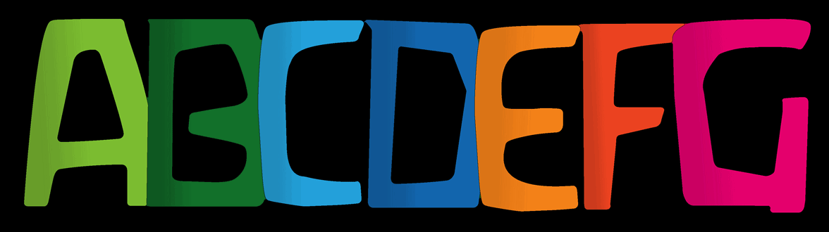
Typefaces related to Alberto Giacometti | ||
|
|
|
|
SWITCH TO INDEX FILE
Some typefaces were influenced by Giacometti's art:
| |
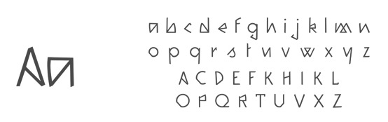
In 2013, she used Giacometti's sculptures to create a Giacometti lettering alphabet. Nahkoa (2013) is an angular typeface that is inspired by the native American culture. [Google] [More] ⦿ | |
Joachim Frank
| |
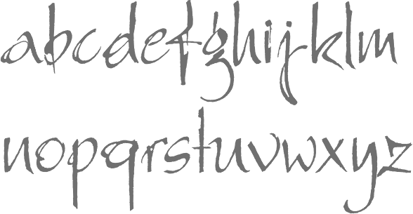
German designer (b. 1959, Frankfurt am Main). She studied at Hochschule für Gestaltung in Offenbach. Since 1989, she has worked as a freelance illustrator, designer, and cartoonist. Together with Sine Bergmann, she created the handwriting typeface Giacometti Letter (2008, Linotype). Klingspor link. Linotype link. [Google] [More] ⦿ | |
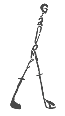
Stamford, CT-based graduate of Colby-Sawyer College and School of Visual Arts, New York. He created a typographic poster in Giacometti's style in 2013. [Google] [More] ⦿ | |
FontShop link. Klingspor link. [Google] [MyFonts] [More] ⦿ | |
Linotype link. FontShop link. Klingspor link. [Google] [MyFonts] [More] ⦿ | |
Waldorf Fonts
|
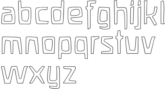
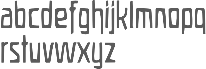
Mike Diaz pointed out that Waldorfschrift is really really close to Ingrid Liche's FF Liant (1995) about which FontFont writes: In 1976 Ingrid Liche began designing Liant Medium for the packaging of the natural cosmetic company Weleda AG in Germany. Since then this typeface has defined the corporate identity of Weleda worldwide and because of this company's prestige, the look to the entire natural cosmetic and biologically oriented industry. Because of a split of opinions in the international company in 1994, the mother company in Switzerland decided to introduce a new house face; thereby giving up the brand name recognition that had been established over twenty years... Because of the turn in events and since Liche still owned the rights to Liant, she decided to distribute the typeface exclusively over FontShop International. She re-digitized the font, adding several ligatures and expanding the typeface to a three weight family. The most noticable characteristic of the font is its lively lines, the forms for which are taken from nature. Within the individual characters there is an exchange of sinking and rising points, which are connected by taut curves. Typefaces from 2021: Wouldkat (a woodcut font inspired by an old house font of an anthroposophical hospital in Germany; soon after its release removed and renamed to Filirator). Typefaces from 2022: Skinni (high-waisted and hand-crafted, appropriate for Giacometti statues), Lui (a wide anthroposophic font), Zumbo (hand-crafted letters with an African theme), Lakrits (a primitive hand-printed font influenced by the LogosNazhdag font), Suki (emulating a children's hand). [Google] [MyFonts] [More] ⦿ |
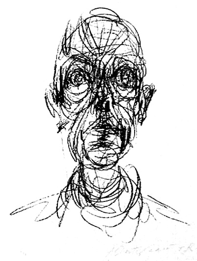
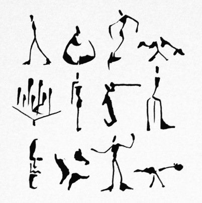
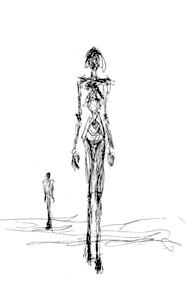 Swiss sculptor, painter, draughtsman, and printmaker, 1901-1966. He is known for his surrealist and expressionist work. His emaciated sculptures reflect a view that all modern life is empty and superficial.
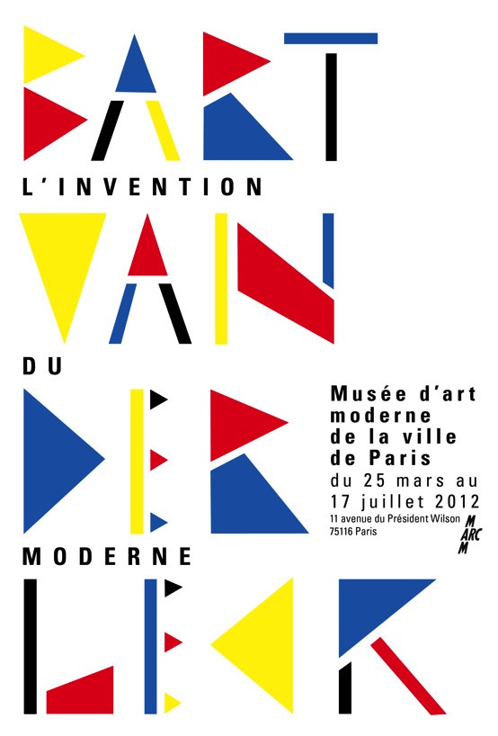
 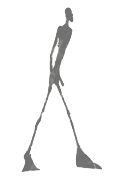 During her graphic design studies, Chloé Marchand (Paris) designed a poster in 2012 for the exhibition of
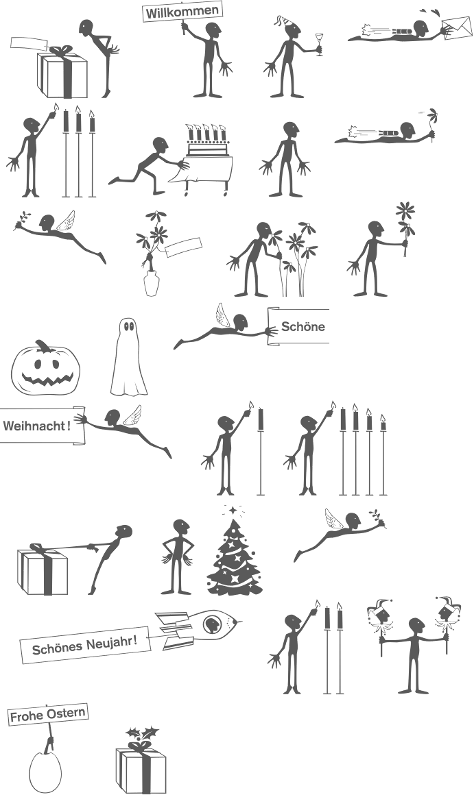
 German designer of the artsy dingbats typeface
  German graphic designer. Creator of the gorgeous
|
|
|
|