TYPE DESIGN INFORMATION PAGE last updated on Mon Jul 20 20:31:36 EDT 2026
FONT RECOGNITION VIA FONT MOOSE

|
|
|
|
|
Type design in Syria | ||
|
|
|
|
SWITCH TO INDEX FILE
Designer in Aleppo, Syria, who made these fonts for Arabic: A-Badie-Shahba (1990, Agfa), Joude, ABH-Ogaret-Light, Badie-Dimah-Normal, Badie-Falcon, Badiefont-Dima, Badiefont-Sabeel, SAHBA-NEW. All were done between 1993 and 2003. [Google] [More] ⦿ | |
Almedia Interactive (or: MAK Alagha, or: Applied Graphic Arts, or: AGA Fonts)
| Mohammad Alagha is Almedia Interactive (or: MAK Alagha, or: Applied Graphic Arts), an Arabic font producer active since 1994. The (beautiful!) AGA Fonts for Arabic are exclusively sold by Almedia Interactive Limited, which is based in the UK. His fonts include AGA-AbasanRegular, AGA-AladdinRegular, AGA-BattoutaRegular, AGA-DimnahRegular, AGA-FuratRegular, AGA-GranadaRegular, AGA-JuhynaRegular, AGA-KayrawanRegular, AGA-MashqBold, AGA-MashqRegular, AGA-NadaRegular, AGA-PetraRegular, AGA-RasheeqBold, AGA-SindibadRegular.
Another URL. Free font sublink. Fontspae link. Dafont link. Download here. The beautiful dingbat fonts AGA Arabesque and AGA Arabesque Desktop (1994-1996) are here and here. OFL link. [Google] [More] ⦿ |
Darío Manuel Muhafara
| |
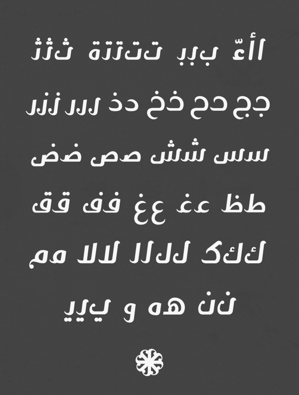
Designer based in Turkey who released the Latin / Arabic typeface Quarter Arabic in 2021 at the Syria Arabic type foundry. Quarter Arabic has glyphs that are entirely composed of quarter circles and line segments. [Google] [MyFonts] [More] ⦿ | |
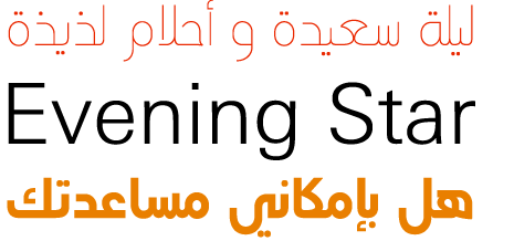
In 2014, Mamoun Sakkal (Sakkal Design) published the Arabic typeface Bustan (done with Mamoun Sakkal). Bustan is inspired by Kairawani Kufic and cursive Sunbuli. Bustan Bold, which was designed by Jamal Bustan, developed by Mamoun Sakkal and programmed by Aida Sakkal, won an award in the TDC 2015 Type Design competition and at Granshan 2016. [Google] [MyFonts] [More] ⦿ | |
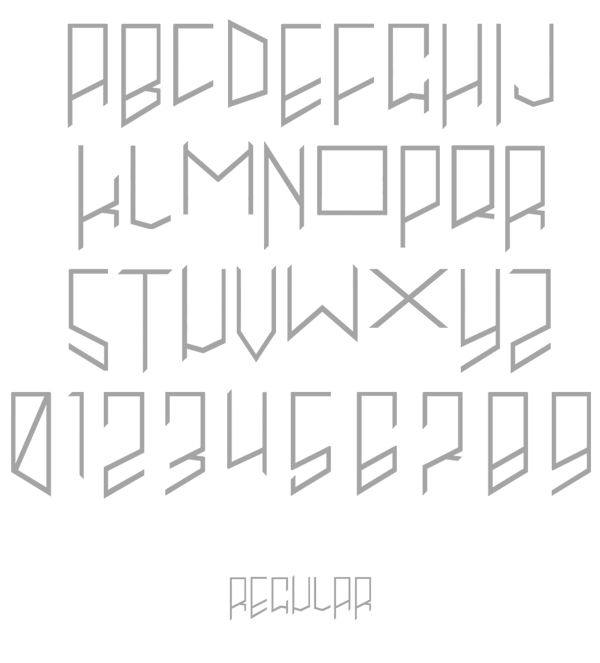
During his graphic design studies at Yarmok University in Irbid, Jordan, Syrian graphic designer Luay Byazeed created the free quarter circle Latin / Arabic typeface Quarter (2015). 1001 Free Fonts link. [Google] [More] ⦿ | |
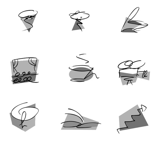
Damascus, Syria-born, 1993. As a graphic design student at the American University of Kuwait, Mai Ghannam created the display typeface Primitive Type (2015). [Google] [More] ⦿ | |
Mamoun Sakkal
| |
Maya Habbad, a Syrian graphic designer who graduated in Damascus but lives in Cairo, and Majdi Alkuzbari (Damascus, Syria) created a set of numbers called Spiral Numbers (2013). [Google] [More] ⦿ | |
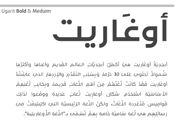
Michel Salloum (b. 1990, Damascus, Syria) completed a graduate degree in visual communications from the Faculty of Fin Arts (Damascus University) in 2014. In 2017 he joined the faculty in the Department of Arts and Graphics at the International University of Science and Technology. Based in Damascus, Michel Salloum designed MS Ugarit (2013, Arabic typeface) at the height of the civil war in Syria. [Google] [More] ⦿ | |
In 2021, Kostas Bartsokas, Mohamad Dakak and Pria Ravichandran set up Foundry 5 Limited. At Foundry 5, Dakak released Jali Arabic, Jali Greek and Jali Latin in 2021. I Love Typography link for Foundry 5. [Google] [MyFonts] [More] ⦿ | |
Mohammad Alagha
| |
Mohammad Alhaj Ahmad
| |
In 2017, he designed the free Arabic typeface Omar. Behance link. [Google] [More] ⦿ | |
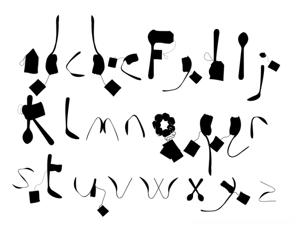
Syrian typographer and graphic designer in Chicago, who has also worked in Dubai and Toronto. Nermin holds a BSc in Visual Communications from the American University of Sharjah (UAE), as well as an MFA in Interdisciplinary Arts, Media and Design from OCAD. She created the cooking utensil alphading typeface Shai (2010). [Google] [More] ⦿ | |
In 2013, he created the straight-edged typeface POV. In 2015, he designed Steven for Blanc Marc, a marketing firm in Riyadh, Saudi Arabia. [Google] [More] ⦿ | |
From Encyclopaedia Britannica: Semitic script used in Palmyra, a city on the trade routes between Syria and Mesopotamia, from the 3rd to the 2nd century BC until shortly after the conquest of the city by the Romans in AD 272. Developed from the Aramaic alphabet, Palmyric had 22 letters and was written from right to left. It occurred in two forms: a rounded, cursive form derived from Aramaic about 250 BC and a decorative monumental form. [Google] [More] ⦿ | |
In 2018, Paul Hanslow, Ross Mills and John Hudson co-designed the free STIX Two family, which is based on Times Roman. After joining John Hudson's Tiro Typeworks, which is based in Vancouver, Paul Hanslow aided in the development of the text typeface Castoro (2020). Hudson writes: Castoro is a libre font family released under the SIL Open Font License. Castoro is a specific instance of an adaptive design developed for Tiro Typeworks' internal use as a base from which to generate tailored Latin companions for some of our non-European script types. The instance that has been expanded to create the Castoro fonts was initially made for the Indic fonts that we produced for Harvard University Press. In the Castoro version, we have retained the extensive diacritic set for transliteration of South Asian languages, and added additional characters for an increased number of European languages. The parent design here presented as the Castoro instance began as a synthesis of aspects of assorted Dutch types from the 16th through 18th Centuries. Castoro roman was designed by John Hudson, and the italic with his Tiro colleague Paul Hanslow, assisted by Kaja Slojewska. It is named Castoro after the busy beaver, a real workhorse in the Canadian forests. Google Fonts link. Skeena (2021) is a humanist sans typeface by John Hudson and Paul Hanslow that was developed for Microsoft for use as one of the default fonts in Office apps and Microsoft 365 products. In 2021, Ross Mills, Anna Giedrys and Paul Hanslow co-designed the 14-style sans family Laconia at Tiro Typeworks. Co-designer with John Hudson, Alice Savoie and Karsten Luecke of Brill (2011), Brill Greek (2021), Brill Cyrillic (2021) and Brill Latin (2021). This classic text typeface family was a winner at the TDC 2013 competition. Client: Koninklijke Brill NV, Leiden, The Netherlands. [Google] [More] ⦿ | |
Originally from Aleppo, Syria, Rami Tawil is now based in Frankfurt, where he designed the bold war-inspired slab serif typeface Bundeswehr (2017). [Google] [More] ⦿ | |
Sakkal Design
|
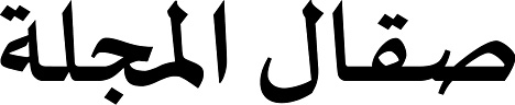
He designed the beautiful Sakkal Sameh Calligraphic font family, Sakkal Shilia (Linotype: an elaborate type system created to match Univers), Sakkal Maya, Sakkal Seta, Sakkal Kufi, Al-Futtaim, Arabtek, Sakkal Majalla (2005), Hasan Alquds (2004, with Hasan Abu Afash), MS Uighur (for Microsoft), and Baseet. Winner with Paul Nelson and John Hudson at the TDC2 2003 competition for Arabictype. He was also awarded there for the Arabic display font Sakkal Seta Pro. In 2004, his MS Uighur (Sakkal Design&Microsoft) won an award at TDC2 2004. In 2006, he won First Prize in the Letter Arts Review Annual International Competition: The winning artwork Rich and Poor, No. 8 is a computer-manipulated image of Square Kufi calligraphy, produced by the artist as a limited edition print in 2005. Square Kufi is a style of Arabic calligraphy that developed in the thirteenth century. AwanZaman (2016, Type Together) by Mammoul Sakkal (Arabic part) and Juliet Shen (Latin part) grew out of the Arabic newspaper type Awan Sakkal had designed on commission for a Kuwaiti newspaper in 2007. In 2014, Mamoun Sakkal published the Arabic typeface Bustan (done with Syrian calligrapher Jamal Bustan), which was inspired by Kairawani Kufic and cursive Sunbuli. Calibri Arabic (by Mamoun Sakkal and Aida Sakkal) won an award at Granshan 2016. [Google] [MyFonts] [More] ⦿ |
Arabic calligraphy pages by Mamoun Sakkal, an award winning architect and designer, born in Aleppo, Syria, who lectures on Islamic art and architecture at the University of Washington. Recommended visit. The site has a particularly nice description of the cursive styles like Naskh, Thuluth, Muhaqqaq, Nastaliq, and riq'a. Mamoun Sakkal's company touches on every aspect of Arab calligraphy and design. Calligraphy and font services. DecoType Professional Naskh (31 truetupe fonts, available in Word 6.0 for Windows). [Google] [MyFonts] [More] ⦿ | |
In 2012, she drew the Arabic display typeface Zaza. Sally is a custom-designed Latin / Arabic typeface produced by RTL Type in 2014. | |
Designer and printer at the Golden Eagle Press in Mount Vernon, NY, b. 1891, d. 1971. He created Anacreon (Golden Eagle Press), Syrisch (Merganthaler) and Charter. [Google] [More] ⦿ | |
Syria Arabic
| Despite its name, Mohammad Alhaj Ahmad's type foundry is based in Turkey. In 2019, he designed the Arabic typeface Althawra Fikra. [Google] [MyFonts] [More] ⦿ |
Tarek Samir Al-Sawwa
| |
Tipo
|
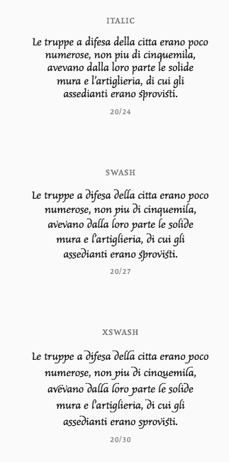
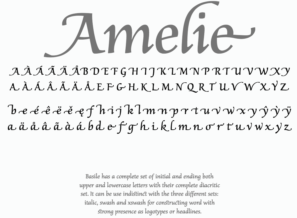
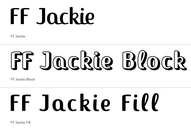
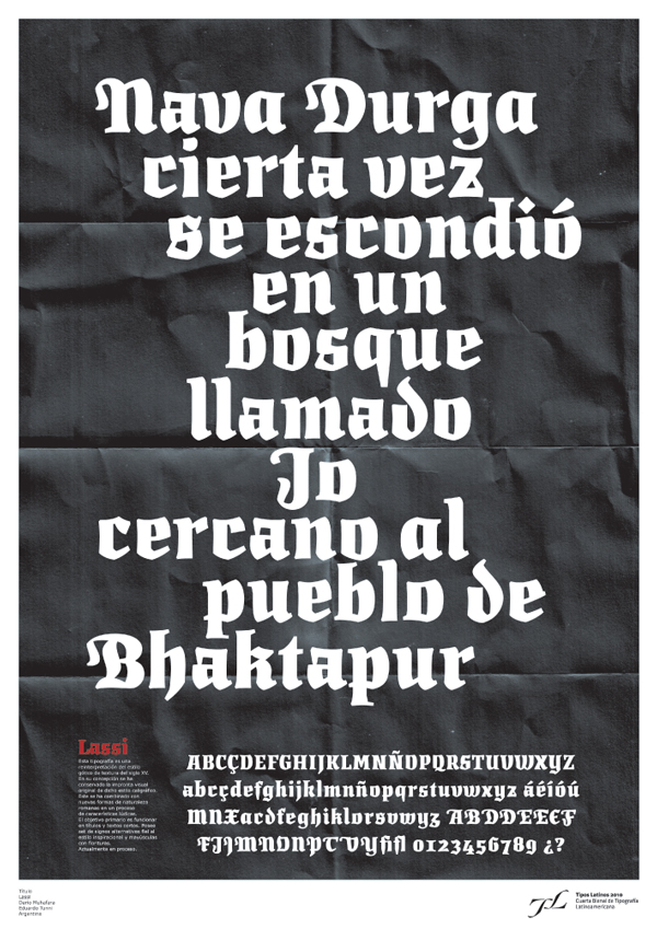
Klingspor link. Linotype link. FontShop link. MyFonts link. Behance link. Text types: Botija (Juan Montoreano, 2006: a 7-style sans family), Goudald (Aldus de Losa, 2006), Lineare Serif (9 styles serif typeface by Eduardo Tunni, 2006), Malena (a slab serif family by Felix Lentino and Darío M. Muhafara, 2006), Prima Sans (a sans typeface by Ariel Katena and Alejandro Lazos, 2006), Priscilla (Felix Lentino, 2000: a serif family), Overlock (2008, a rounded sans by Muhafara), Rosario (2000: a clean sans family by Pocho Gatti), Loreto (2009, by Eduardo Tunni and Pablo Cosgaya). Display/headline type: Overlock (Darío M. Muhafara, 2006, a sans family), Titulata (a fat typeface by Eduardo Tunni, 2006), Chaco (Ruben Fontana, 2008). Basile (a great chancery family, extended to a full OTF family with Swash and XSwash, and beginning and end glyphs in 2011), Average, Chaco and Think won awards at Tipos Latinos 2008. FF Jackie (2003-2009) is a connected upright signage script. Lassi Display (done with Eduardo Tunni) won an award at Tipos Latinos 2010. Balthazar (2011, Google Web Fonts) is a contemporary Copperplate Gothic serif typeface inspired by the kind of typefaces used by many bistros and cafes in New York City and Paris. Creations in 2012: Port Lligat Slab (2012, Google Web Fonts), Port Lligat Sans (2012, Google Web Fonts: a flared microserifed display sans). In 2013, they designed a custom font for the Faena Art Center in Buenos Aires. His typeface Argentina won an award at TDC 2014 and at Tipos Latinos 2014. View Dario Muhafara's typefaces. [Google] [MyFonts] [More] ⦿ |
Trajan Alphabet
|
|
TS Fonts (or: Fonttat)
|
Icon sets: Syrian & Turkish Sweets Icons (2020), Cafe Essentials (2020). |
Wolfgang Beinert
|

 [
[ Jamal Bustan (b. Qunietra, Syria) lives in Damascus. He was commissioned to write the Mushaf (Quran) of Sheikh Maktoum, published in Dubai in 2003. This Quran is praised for the legibility of its calligraphy. Known for his calligraphic compositions, often based on Kufic styles, he received an award for his Kufic work from Tehran's First International Calligraphy Festival in 2009. In addition to working as the head of the lettering section at the Cartography Department in Damascus for 25 years, Jamal Bustan is also a graphic designer who produces book and magazine covers, logos, and Arabic typefaces. He taught calligraphy at the College of Arts at the Arab International University in Damascus.
  Type designer from Syria who graduated from Damascus University and completed the
 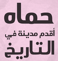 Istanbul, Turkey-based designer (originally from Hamah, Syria) of the
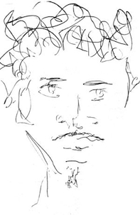
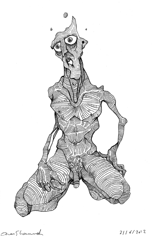
 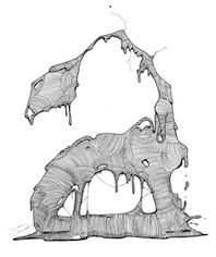 Born in Damascus, Syria, in 1992, the über-talented Omar Shammah studies Visual Communications (Graphic Design) in the Faculty of Fine Arts in Damascus. In 2012, at the height of the Syrian conflict, Omar created a disturbing yet hauntingly beautiful set of drawings in his
  Australian graduate of the type design program at the
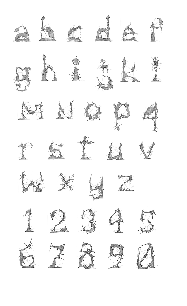
  Born in Aleppo, Syria,
  Dubai and damascus-based calligrapher and graphic designer who hand-drew some promising alphabets, such as
  [
[ Argentinian foundry, est. 2006 by Darío Manuel Muhafara and Eduardo Rodriguez Tunni, located in Buenos Aires. Muhafara gave two presentations at ATypI 2009 in Mexico City. Back in Buenos Aires, he runs two restaurants, and one wonders how he has the time for anything.
 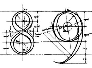 Wolfgang Beinert's piece in German on the Trajan all-caps alphabet (without H, J, K, U, W, Y, Z) created by Syrian engineer Apollodoros from Damaskus for the Roman Emperor Marcus Ulpius Traianus (53-117). The Trajan Column near the Basilica Ulpia in Rome dates from 113. People inspired by the elegant lettering include Fernando Ruano, Vespasiano Amphiarea, Wolfgang Fugger, Geoffroy Tory, Albrecht Dürer, Francesco Torniello, Luca Pacioli, Damiano da Moile, Leonardo da Vinci, Felice Feliciano, Claude Garamond, Jan Tschichold (see his book Meisterbuch der Schrift, Otto Maier Verlag, Ravensburg 1952), Günter Gerhard Lange (see his book Die römische Kapitalschrift, Jahresgabe der Typographischen Gesellschaft München, München 1983), and Carol Twombly (who made a digital font called Trajan at Adobe in 1989). [
 Or Tarek Alsawwa, founder of TS Fonts and of the type shop
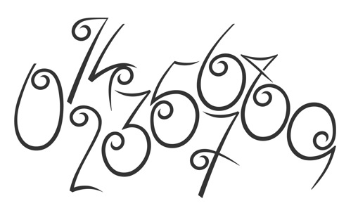
|
|
|
|