Positype
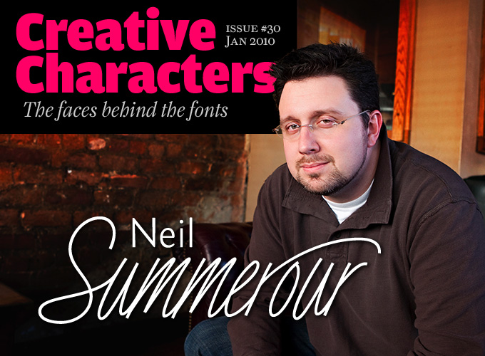
[Neil Summerour]

|
 Positype was founded in 2002 by Athens and/or Jefferson, GA-based designer and type designer Neil Summerour (b. 1972, Azores, Portugal). Neil began developing typefaces in 1996 with the 1996 Olympic Brick Paver Project proprietary typeface. He is the co-principal and senior designer of Athens-based interactive, design, and advertising agency Genetic:ICG. In the summer of 2003, he began teaching Advanced Electronic Design in the Graphic Design Department at The University of Georgia.
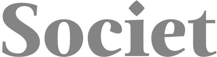
 Swash & Kern is the bespoke lettering and typeface design alter ego of Neil Summerour. In 2001, Neil published his first two type designs with [T-26] Digital Type Foundry in Chicago, IL. Since then, he has released tens of font families including hiragana and katakana fonts. Positype fonts are sold by Myfonts.com and [T-26]. Klingspor link. Facebook link. Blog. Behance link. Union Fonts link. The list of his fonts: - Aago (2017). A 54-style sans family.
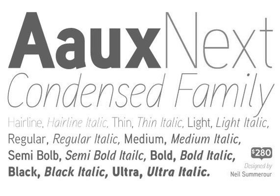
- Aaux, Aaux Office (2002), Aaux Pro (2004), Aaux Next (2009, 72 typefaces), Aaux Alphanumera, Aaux Emoticons.
- Agent Sans (2021). An economical 22-style sans intended to be warm although the name seems to contradict that.
- The Air superfamily (2011), which consists of 81 sans typefaces. Followed by Air Soft (2011), Air Pro (2021), Air Pro Condensed (2022) and Air Pro XCondensed (2022). He writes about Air: Heavily influenced by Summerour's Aaux Next typeface and Akzidenz-Grotesk, the typeface features a very efficient footprint, logical weight options, small caps, expanded numeral sets, extensive language support, and 5 total widths.
- Altar (8-weight Gothic family).
- Akagi (2008): 20 style sans family. Extended and refreshed in 2011 into Akagi Pro.
- AMP (at Union fonts).
- Anago (2012) is a softly rounded sans family, the product of a designer addicted to designing sans families.
- Anarcharsis (2002): a serif family inspired by incomplete rubbing made from a stone wall located in the Bahamas.
- Angel Script (2009, TypeTrust).
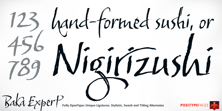
- Baka (2005, a fantastic scratchy handwriting face), Baka Too (2006; followed in 2010 by Baka Expert).
- The Bodoniesque family (Umbrella Type).
- Cherry Blossoms (2018). A crayon script.
- Claustrum (2003).
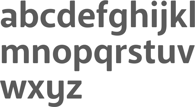
- Clear Sans (2013). Starting from a monoline rather geometric set of thin weights, this typeface family morphs into a more humanist beast, with a, b, d and g having a squeezed look at the intercepts. And maybe because of that, this unclassifiable typeface is quite appealing. Followed by Clear Sans Text and Clear Sans Screen.
- Courage (2019). A high contrast ultra black poster typeface.
- Couture (2015) and Couture Sans (2015). Summerour was charmed by Imre Reiner's Corvinus when he designed this extremely high-contrast pair of fashion mag typeface families together with Mary Catherine Pflug.
- Cynapse (2003; or Cynapse Pro. 2004, 12 weights). A sans family.
- In 2018, Martina Flor and Neil Summerour published the layerable Tuscan typeface family Decorata.
- Delphi (2014). A decorative multiline typeface by Lily Feinberg and Neil Summerour.
- Directors Gothic (2013, Lettering Inc). A large retro sans family.
- Donatora (2004).
- Dream Big (2019). A swashy script typeface with weathered edges.
- Ego (2003, octagonal family).
- Epic (2007-2009, a 12-style contemporary garalde).
- Ether, Ether Connected.
- Eva (2003).
- Filmotype Dancer (2012).
- Filmotype Harvard (2015). Based on a Filmotype brush script from 1955.
- Filmotype Horizon (2011).
- Flirt Script (2014). Flirt Script won an award at TDC 2014.
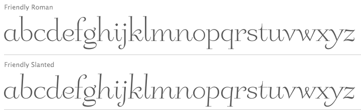
- Friendly (2012). In part based on Morris Fuller Benton's upright script typeface Announcement.
- Fugu (2009, rough-outlined script family, winner at TDC2 2010).
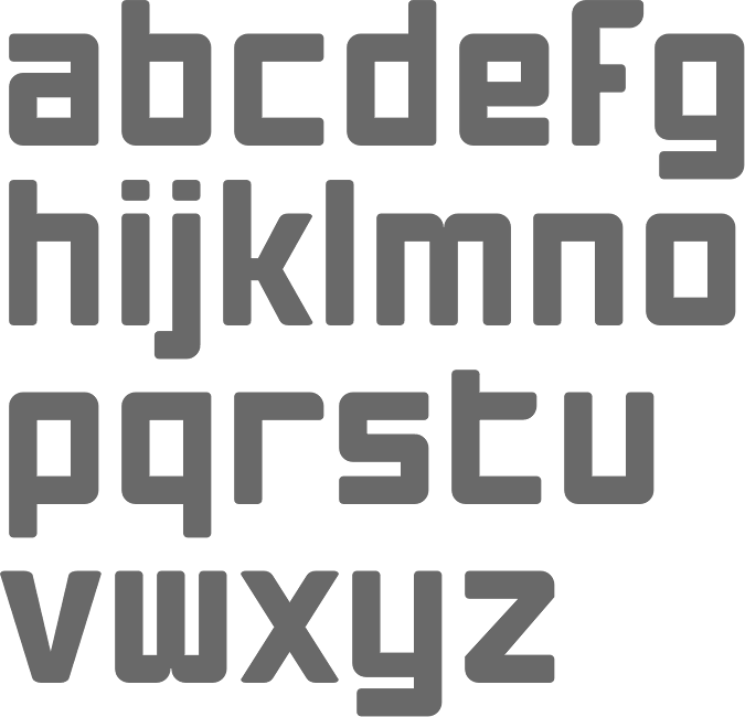
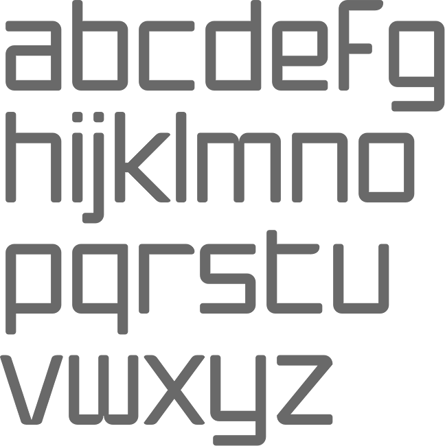
- Ginza (2008, a squarish techno family), and Ginza Narrow (2011).
- Good Karma (2017). A sumi brush font. See also Good Karma Smooth (2020).
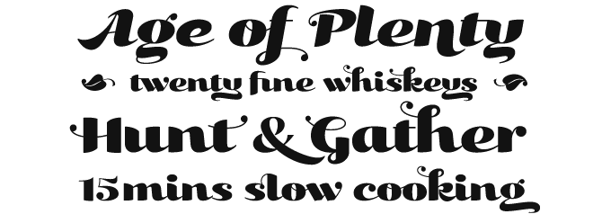
- Grava (2018, twenty fonts) and Grava Display: Quirky and sharp, Grava is Neil Summerour's injection of warmth within the geometric sans font category.
- Halogen (2012). An organic wide techno sans family. In 2014, he added Halogen Slab and Halogen Flare (flared). All have hairlines.
- Headcold (2004).
- Hype (2019). A collection of 432 low contrast gothic sans typefaces consisting of three subfamilies of 144 fonts each: Hype vol 1, Hype vol 2, Hype vol 3.
- Ice Cream (2021). A creamy vernacular non-connected script for food packaging.
- Iru1, Iru2.
- Juicy (T-26, 2004, brushdrawn family).
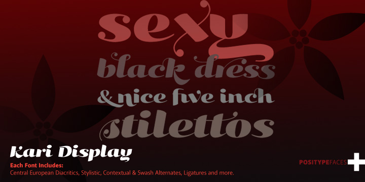
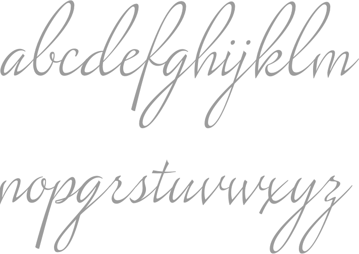
- Kari and Kari Pro (2005): a connected upright script. Kari Display (2009). Redrawn in 2020 and released as Kari (2020).
- Kryptk Flash (2003).
- Kurosawa Bastard, Kurosawa Hand, Kurosawa Sans, Kurosawa Serif, Kurosawa Hiragana, Kurosawa Katakana.
- Love Script (2014). A high energy high contrast brush pen / marker script. Love Script won an award in the TDC 2015 Type Design competition.
- Luce (2004).
- Lush Script (2011). A connected script inspired by the 1940s.
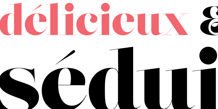
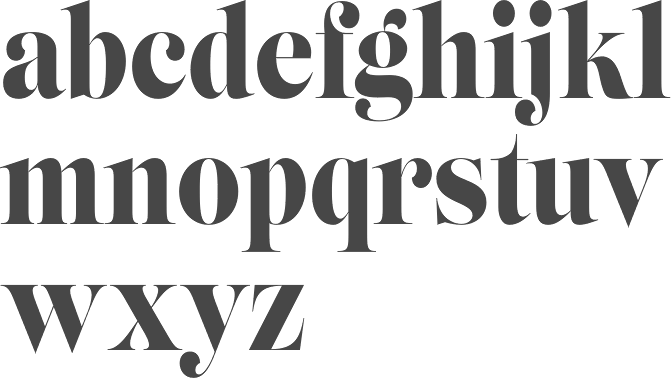
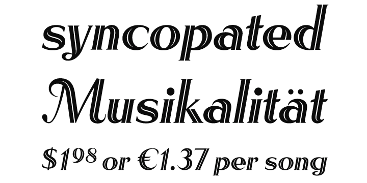
- Lust (2012), a curvy hight-contrast didone in the Pistilli style. Neil: The result yielded a rather diverse typographic gene pool: a little Scotch Modern, a little Didone and Didot, a dominant dose of Caslon, and a pinch of Baskerville-- all wrapped up in the leggy body of a Brazilian supermodel. A confident, self-reliant typeface that shows just enough to keep everyone staring and leave them wanting more. Followed by Lust Slim (2014). In 2015, these were extended to the large families Lust Pro [dedicated page] and Lust Pro Didone.
- Lust Script (2013). This is a curvier, sexier (Neil's words) version of Lust. For use in fashion magazines and large sizes.
- Macha (2012). A sans family. In 2015, this was followed by Lust Hedonist, which has Didone, Italic and Script sub-styles---the ultimate fashion mag typeface. In 2021, he added Lust Sans (a 12-style high-contrast fashion mag typeface family), Lust Didone (a 6-style contribution to the fat face genre), Lust Stencil (six styles), Lust Text (ten styles).
- The Type Trust: Magneta (2009, The Type Trust). Includes a Condensed subfamily.
- Marshmallow (2017). A super-creamy high-contrast script typeface straight from a parisian bonbonnerie.
- Murecho (2021). Murecho is a low-stroke contrast, flat terminal sans serif Japanese typeface designed for text settings in Japan. It covers Hiragana, Katakana, and Kanji (JOYO+). It also supports Latin, Cyrillic, and Greek.
- Muscle (2009, TypeTrust---a futuristic family).
- Nori (2010): a calligraphic brush typeface obtained by applying the Pilot Japan Kanji Fude brush pen on paper. It has over 1100 glyphs, 250 ligatures, 487 alternate characters, 125+ swash and titling alternates, lining and old style numerals. Awarded at TDC2 2011.
- Organic (2009). A rounded warm sans family. In 2021, he published the 16-style Organic Pro.
- Penumbra.
- Plastek (2004-2009).
- The R.E.M. Athens project involves three fonts published in 2009, REM Orange, REM Accelerate and REM Tourfont. They are based on ideas by Chris Bilheimer for the band R.E.M. (Michael Stipe and Chris Bilheimer). Both attended the fine arts program at the University of Georgia. Michael Stipe, singer and lyricist, formed R.E.M. in 1980. Bilheimer began working with the band in 1994.
- In 2019, Martina Flor and Neil Summerour released the extensive typeface family Ribbons at Positype.
- Romp (2009, condensed hand-printed).
- Reserve (2018). A text typeface family designed to accompany Summerour's Scotch typeface family.
- Rhythm (2011). An italic inline and solid display family based on ATF's Ratio (ca. 1930) and Herbert Thannhaeuser's Adastra (1928).
- Rough Love (2014). A brushy crayon script.
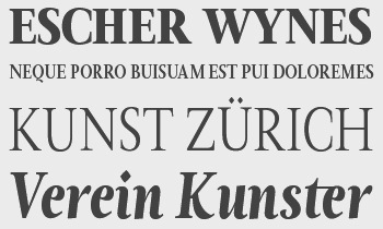
- Scotch (2017). An 31-style scotch roman typeface family consisting of Scotch Text, Scotch Display (more contrast), Scotch Deck (for subheads) and Scotch Dingbats. In 2020, he added Scotch Compressed to the set.
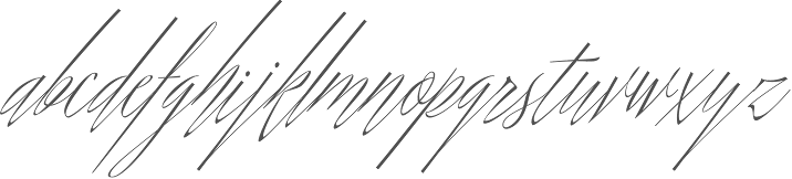
- Shameless (2013). A connected penmanship-style script.
- Sneakers (2003-2004): athletic lettering family. Also, Sneakers Script and Sneakers Max (2019: rounded and ultra fat).
- So Lovely (2019).
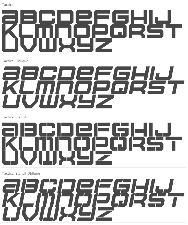
- Tactical (2011, octagonal mechanical face; +Stencil).
- In 2012, he won the Second Akashi Prize in the kanji (!!!) category of the Morisawa Type Design Competition for Tegaki. Tegaki also won at TDC 2013.
- Truss Ultra Light (2006): hairline architectural font.
- Vekta Serif (2009), Vekta Neo and Vekta Sans (2009, a sans family at TypeTrust).
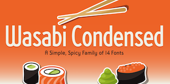
- Wasabi Condensed and Wasabi (2010): an organic elliptical family, based on Iru.
- Yumi (2003, techno font, Union Fonts).
His life in hiw own words: Neil Summerour is a type designer, lettering artist, calligrapher and designer based in Georgia, USA with one foot in Takamatsu, Japan. After graduating from The University of Georgia Lamar Dodd School of Art with a BFA in Graphic Design, he soon found himself opening his own studio to deal with the flow of freelance work. [...] Neil opened his personal type foundry, Positype, in 2000 to feed his ever-growing desire for type design. He later co-founded TypeTrust (2002) with Silas Dilworth as his addiction to type and lettering grew. [...] He was an adjunct art professor at The University of Georgia in graphic design and taught graphic design at the Governor's School for the Arts. [...] As a typeface designer, he has published over 60 typeface families and produced numerous custom typefaces for clients worldwide. [...] He has won the Type Directors Club Certificate of Excellence in Type Design in 2010 and 2011 for Fugu and Nori, respectively. Showcase of Neil Summerour's fonts. [Google]
[MyFonts]
[More] ⦿
|
words+pictures
[Gerry Chapleski]
|
Gerry Chapleski (b. Bahamas, 1957) used to make fonts under the names Gerry Chapleski Design and Editable Graphics. His foundry is now called Words++Pictures, and is located in Broomfield, CO. He specializes in grungy modifications of well-known styles. MyFonts sells these typefaces: Alien, Andalusia, Ave Maria, Babino, Babushka (2001), Bastante, Basterg, Blogger, Bodacious, Cabra, Chefic, Chiva, Circuit, Classico, Coalities, Cobrag, Conduct, Constitution, Cordoba, Crate, Curse, Decon, Domo, Dupe, Flash, Flute, Function, Geek, Geo, Geomed, Gross, Grotto, Gus, Highway, Hippie, Houdini, Ingots, Jose, Kinko, Kunkeltown (a stencil font), Kutztown, Leubner (2002), Lifer, Limbo, Liturgy, Marta, Mencilbold, Minsk (2001, like Babushka, a gorgeous Cyrillic imitation font), Moda, Muchobastante, Mypure, Obelika, Onesystem, Preacher, Prodigy, Qwerty, Random, Readme, Rescue, Seviche, Shrek, Sign, Spam, Spike, Student, Sweat, Topogigio (2002), Totti, Version2, Vindex, Vivacious, Zocrab. View Gerry Chapleski's typefaces. Klingspor link. Freeware fonts: Crate (a stencil font, 2001), Circuit (2001), Alien (2002), Onesystem (2002), Vindex (2002), Shrek (2002), Seviche (2001), Flute (stencil, 2001) and Supa (2002, OCR font). Fonts not listed above: Bank, Blanco, Blip, Bodega, Boot, Caslost, Deconstruct, Dente, Lagrima, Life, Liquor, Recog, Stenciloni, Tainted, Verve. [Google]
[MyFonts]
[More] ⦿
|


 [
[