 My friend bobistheowl writes:
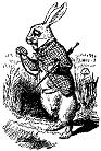
Sir John Tenniel's Alice in Wonderland was fonted by bobistheowl for Metaphase Brothel Graphix, October, 2007. In 1865, Tenniel (1820-1914) illustrated the first edition of Lewis Caroll's Alice in Wonderland. The first print run of 2,000 was shelved because Tenniel had objections over the print quality; a new edition, released in December of the same year but carrying an 1866 date, was quickly printed and became an instant best-seller, securing Tenniel's immortality in the process (Source: http://en.wikipedia.org/wiki/John_Tenniel). Sir John Tenniel's illustrations for Alices Adventures in Wonderland and Through the Looking-Glass are considered to be his finest and most enduring achievement. They must also rank among the world's best-known children's images. The Dalziel brothers were commissioned to engrave the boxwood blocks on which Tenniel had made his drawings. The engravers advised Lewis Carroll that the engraved blocks should not be used for printing the illustrations in the books but instead they would act as the masters from which electrotype copies would be made. It was from these electrotypes that all the illustrations in the Alice books were printed with a resultant loss of definition (Source: http://www.johntenniel.com/about.php). The images used in this font are in the Public Domain. This font is freeware. You may do anything you want with it, except claim the fonting as your own work.
My friend bobistheowl writes:
Sir John Tenniel's Alice in Wonderland was fonted by bobistheowl for Metaphase Brothel Graphix, October, 2007. In 1865, Tenniel (1820-1914) illustrated the first edition of Lewis Caroll's Alice in Wonderland. The first print run of 2,000 was shelved because Tenniel had objections over the print quality; a new edition, released in December of the same year but carrying an 1866 date, was quickly printed and became an instant best-seller, securing Tenniel's immortality in the process (Source: http://en.wikipedia.org/wiki/John_Tenniel). Sir John Tenniel's illustrations for Alices Adventures in Wonderland and Through the Looking-Glass are considered to be his finest and most enduring achievement. They must also rank among the world's best-known children's images. The Dalziel brothers were commissioned to engrave the boxwood blocks on which Tenniel had made his drawings. The engravers advised Lewis Carroll that the engraved blocks should not be used for printing the illustrations in the books but instead they would act as the masters from which electrotype copies would be made. It was from these electrotypes that all the illustrations in the Alice books were printed with a resultant loss of definition (Source: http://www.johntenniel.com/about.php). The images used in this font are in the Public Domain. This font is freeware. You may do anything you want with it, except claim the fonting as your own work.
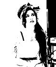
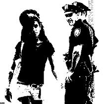
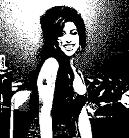
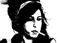
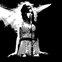 In January 2008, just around the time Amy Winehouse went into rehab, bobistheowl published AmyBats1 and AmyBats2. Quoting him: AmyBats are a tribute to Amy Winehouse, who, in my opinion, is the most important female vocalist since Janis Joplin, and possibly as far back as Billie Holiday. AmyBats3 through 5 appeared in February and March 2008. Expect many more in this series.
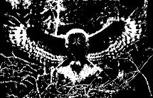
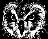
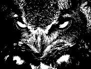 Fascinated with owls, "bobistheowl" set out to make a series of scanfonts based
on owls, appropriately called A Parliament of Owls (2008). He explains:
My name isn't bob, and I'm not an owl. Why I use that name is a long story, and it has nothing to do with my fonts. My mother used to collect owl figurines, and we had a family of Barn Owls living by our cottage. I wanted to see how well photographs of birds would convert to monochrome, and this series is the product of that experiment.
Fascinated with owls, "bobistheowl" set out to make a series of scanfonts based
on owls, appropriately called A Parliament of Owls (2008). He explains:
My name isn't bob, and I'm not an owl. Why I use that name is a long story, and it has nothing to do with my fonts. My mother used to collect owl figurines, and we had a family of Barn Owls living by our cottage. I wanted to see how well photographs of birds would convert to monochrome, and this series is the product of that experiment.
 In November 2007, bobistheowl digitized Alphabet Pornographique by Joseph Apoux, a Frenchman who created this naughty anti-religious all caps face ca. 1880. The original color figures can be seen here.
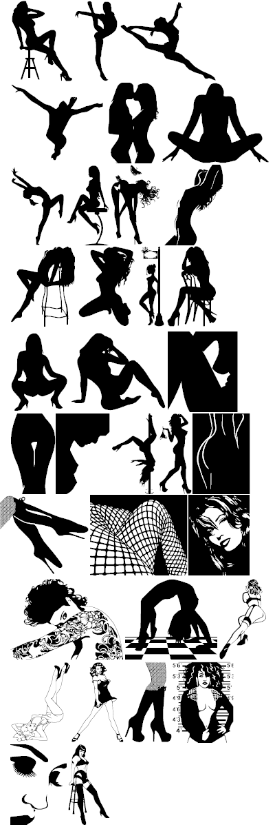
 In August 2012, bobistheowl finished his work on an erotic silhouette font
called Beauty Marks. His readme file reveals that many women are featured in this typeface, such as American gymnast Nastia Liukin, Bettie Page and Natalie Nunn. See also this character guide.
In August 2012, bobistheowl finished his work on an erotic silhouette font
called Beauty Marks. His readme file reveals that many women are featured in this typeface, such as American gymnast Nastia Liukin, Bettie Page and Natalie Nunn. See also this character guide.
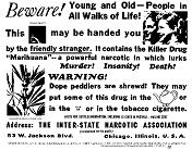 BewarethefriendlystrangerNorml and BewarethefriendlystrangerLandscape are copyright of The Inter-State Narcotics Association, c. 1936, Now in the Public Domain, this graphic was fonted by "breatheshempalot" for Metaphase Brothel Graphix in 2008. Use the lower case 'a' to create the glyph in each of the fonts.
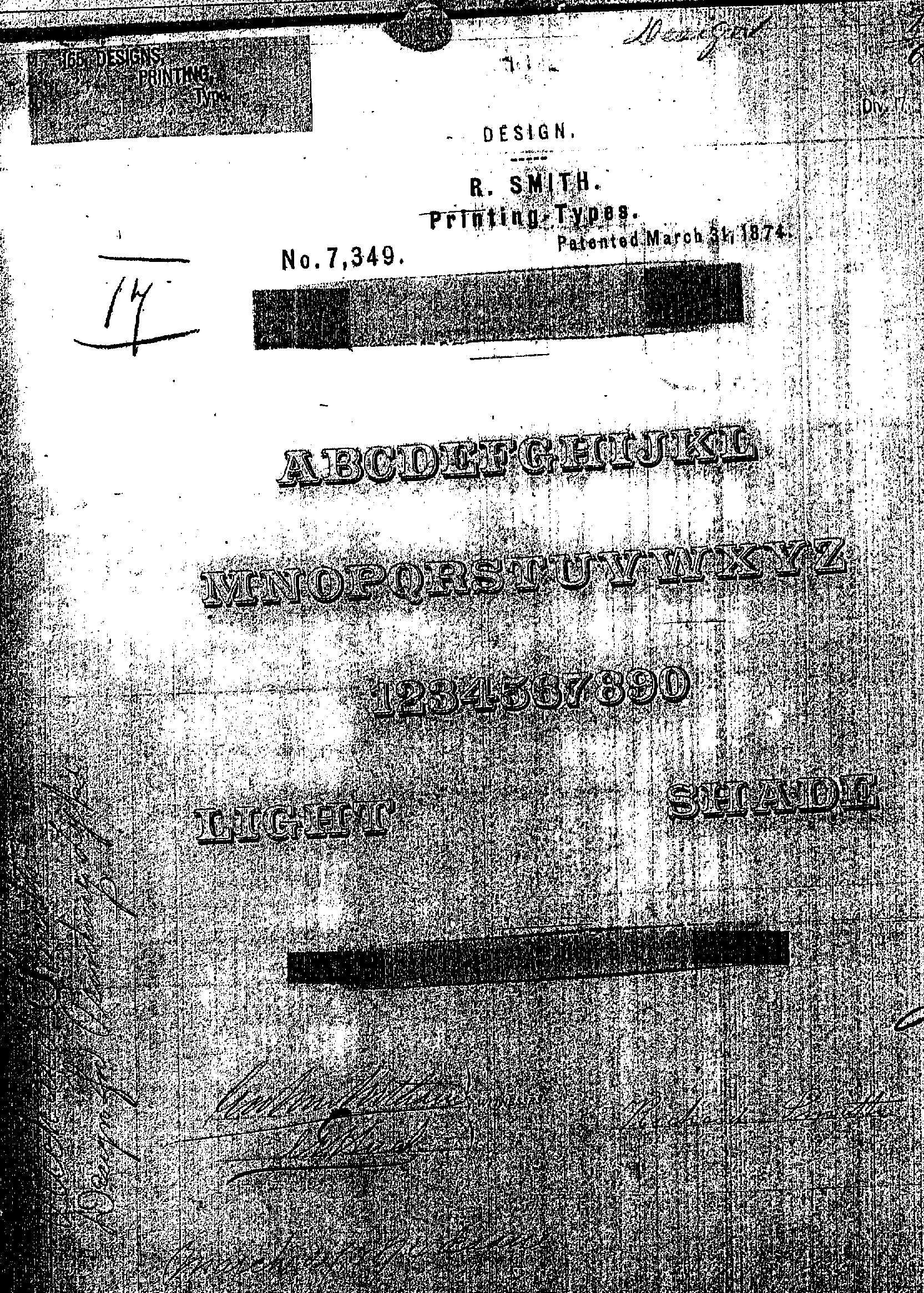
 Cabbagetown is Bobistheowl's masterpiece. Started in 2014, and released in 2016, it is named after an old (Victorian style) Irish immigrant neighborhood just east of downtown Toronto. Cabbagetown is based on the Victorian era typeface Light Shade (1874, Richard Smith of Mackellar, Smiths and Jordan in Philadelphia). It later appeared on page 17 in Dan X. Solo's The Solotype Catalog of 4,147 Display Typefaces as Night Shade. The first known digital version of this typeface was Nigel Sade SH (1993, Soft Horizons). Other versions include Shadowed Serif (1994, James Fordyce), Cameo Antique (2009, by Character), and Outstanding (2012, Bobistheowl). It grew out of Outstanding, and the family comprises Cabbagetown, CabbagetownBook, CabbagetownBookMicro, CabbagetownBookNano, CabbagetownBookStd, CabbagetownMicro, CabbagetownNano, CabbagetownSmCaps, CabbagetownSmCapsMicro, CabbagetownSmCapsNano, CabbagetownSmCapsStd, CabbagetownStd, CabbagetownStone, CabbagetownStoneMicro, CabbagetownStoneNano, and CabbagetownStoneStd. Dedicated directory with all the truetype files, specimen files, and documents.
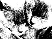 Scanbats of cats, 2008.
 The design of this font is based on the IBM system font Terminal, ca. 1981.
Terminal was the default font for Notepad until Windows Millenium Edition, and it is still used in DOS command prompt in 2010.
Additional information.
The design of this font is based on the IBM system font Terminal, ca. 1981.
Terminal was the default font for Notepad until Windows Millenium Edition, and it is still used in DOS command prompt in 2010.
Additional information.
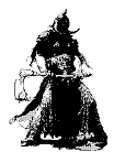
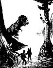 FrazettaBats by Frank Frazetta.
FrazettaBats is a series of fonts commemorating the 80th birthday of the World's foremost fantasy and science fiction artist, Frank Frazetta. Frank Frazetta was born on February 9, 1928, in Brooklyn, New York. His art talent was apparent at a young age, and his parents enrolled him in the Brooklyn Academy of Fine Arts at age 8. At age 16, Frazetta began drawing comic books professionally, a career which lasted through the mid 1950's, most memorably with EC Comics, mainly in collaboration with Al Williamson, Roy Krenkel, and Angelo Torres. Through the late 1950's and early 1960's, Frazetta assisted Al Capp on the L'il Abner newspaper comic strip, and also worked with Harvey Kurtzman and Bill Elder on Little Annie Fanny for Playboy, often uncredited.
In the mid 1960's, Lancer Books began to reprint the Conan series by Robert E. Howard, and Frazetta reached a whole new audience, as a paperbook book cover artist. During this time, he also drew many covers and frontpieces for Ace Books' editions of the science fiction books by Edgar Rice Burroughs, and if it had ever been in doubt, his reputation as a master of heroic fantasy art was assured.
Frank currently lives in the Pocono mountains of Pennsylvania, with his wife, Ellie, who has been the subject of many of his completed works and studies. Together, they maintain a small museum on the site of their estate.
Additional information. Character guide.
FrazettaBats by Frank Frazetta.
FrazettaBats is a series of fonts commemorating the 80th birthday of the World's foremost fantasy and science fiction artist, Frank Frazetta. Frank Frazetta was born on February 9, 1928, in Brooklyn, New York. His art talent was apparent at a young age, and his parents enrolled him in the Brooklyn Academy of Fine Arts at age 8. At age 16, Frazetta began drawing comic books professionally, a career which lasted through the mid 1950's, most memorably with EC Comics, mainly in collaboration with Al Williamson, Roy Krenkel, and Angelo Torres. Through the late 1950's and early 1960's, Frazetta assisted Al Capp on the L'il Abner newspaper comic strip, and also worked with Harvey Kurtzman and Bill Elder on Little Annie Fanny for Playboy, often uncredited.
In the mid 1960's, Lancer Books began to reprint the Conan series by Robert E. Howard, and Frazetta reached a whole new audience, as a paperbook book cover artist. During this time, he also drew many covers and frontpieces for Ace Books' editions of the science fiction books by Edgar Rice Burroughs, and if it had ever been in doubt, his reputation as a master of heroic fantasy art was assured.
Frank currently lives in the Pocono mountains of Pennsylvania, with his wife, Ellie, who has been the subject of many of his completed works and studies. Together, they maintain a small museum on the site of their estate.
Additional information. Character guide.
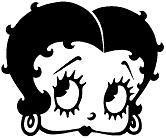 Grim Natwick Betty Boop (2008) is based on the famous 1930 cartoon character by Myron "Grim" Natwick (1890-1990). Natwick created Betty Boop for the Max Fleischer cartoon Dizzy Dishes. One of the pioneers of animated films, he was the lead animator for Walt Disney's Snow White and the Seven Dwarfs. The original drawing used for this font was Natwick's gift to Reg Hartt, the classic animated film specialist who lives in Toronto. He runs the CineForum there, a small, intimate theatre located in the living room of his home. When in Toronto, look for notices of his film schedules on telephone poles and building sites around town. An evening at the CineForum is a Torontonian experience not to be missed. There are three fonts in all.
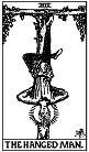
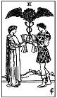 Made in 2007, these fonts feature the tarot cards made in 1909 by
Pamela Colman Smith for The Rider Company. Also known as the Rider-Waite-Smith Tarot.
Made in 2007, these fonts feature the tarot cards made in 1909 by
Pamela Colman Smith for The Rider Company. Also known as the Rider-Waite-Smith Tarot.
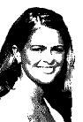
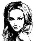 His first font, dating from August 2007, showing image-style glyphs of Hayden Panettiere about whom he writes: Best known for her role as Claire "The Cheerleader" Bennet on NBC's Heroes, Hayden has literally lived her life in front of the camera, in numerous commercials as a child, and a number of Disney movies through her early teens. She had notable recurring roles in the nearly unwatchable final season of Ally McBeal, and four appearances as the scheming Jessica on Malcolm in the Middle. The finished font will appear here soon.
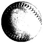 A softball scanfont made in 2008 for one of his friends.
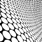 A geometric font made in 2007 and dedicated to the master of ornamental and geometric
fonts, Manfred Klein. From the readme file:
I was working on a different font when a found a picture on Flickr called Glass Snakeskin.
A geometric font made in 2007 and dedicated to the master of ornamental and geometric
fonts, Manfred Klein. From the readme file:
I was working on a different font when a found a picture on Flickr called Glass Snakeskin.
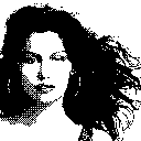 Fonted in 2007, this font has images of Corsican supermodel Laetitia Casta.
There are two beta fonts, LaetitiaBats1 and LaetitiaBats2. Final versions to follow.
Fonted in 2007, this font has images of Corsican supermodel Laetitia Casta.
There are two beta fonts, LaetitiaBats1 and LaetitiaBats2. Final versions to follow.
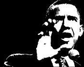 Done on November 5, 2008, one day after the historic election
of Barack Obama, this font has only one beautiful glyph.
Done on November 5, 2008, one day after the historic election
of Barack Obama, this font has only one beautiful glyph.
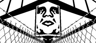 Obey is a huge family of scanbats finished in December 2009.
The Obey Giant concept and the Obey campaign are copyrighted
by Shepard Fairey in 1989. These fonts are freeware, but if you have any reason to use them commercially, you should get approval from Shepard Fairey.
Made with MS Paint and ScanFont 3.13 from source graphics that
were hand drawn or manually traced from images found on the Internet. No pre-existing vectors or scanned images were used.
Obey is a huge family of scanbats finished in December 2009.
The Obey Giant concept and the Obey campaign are copyrighted
by Shepard Fairey in 1989. These fonts are freeware, but if you have any reason to use them commercially, you should get approval from Shepard Fairey.
Made with MS Paint and ScanFont 3.13 from source graphics that
were hand drawn or manually traced from images found on the Internet. No pre-existing vectors or scanned images were used.
Frank Shepard Fairey (born February 15, 1970) is a contemporary artist, graphic designer, and illustrator who emerged from the skateboarding scene. He first became known for his "André the Giant Has a Posse" sticker campaign, in which he appropriated images from the comedic super market tabloid Weekly World News. His work became more widely known in the 2008 U.S. presidential election, specifically his Barack Obama "HOPE" poster. The Institute of Contemporary Art, Boston calls him one of today's best known and most influential street artists. His work is included in the collections at The Smithsonian, the Los Angeles County Museum of Art, the Museum of Modern Art in New York, and the Victoria and Albert Museum in London.
The genesis of the Obey campaign dates back to 1989, when a teenaged Shepard Fairey began to make vinyl skateboard stickers with the image of professional wrestler, André the Giant, accompanied by the slogan "André the Giant has a Posse", as an in-joke directed at hip hop and skater subculture, and then began clandestinely (and somewhat fanatically) propagating and posting them in Providence, Rhode Island and the rest of the Eastern United States.
List of fonts in the Obey Series: Obey3D, Obey3DAlt, ObeyAssorty, ObeyBalloon, ObeyBalloon2, ObeyDada, ObeyEssence, ObeyFaves, ObeyFunhouse, ObeyGalleria, ObeyGiantPoster, ObeyGiantPosterCondensed, ObeyPatterns, ObeyPears, ObeyPotpourri, ObeyPuzzle, ObeyRevolution, ObeyRockers, ObeyRorschach, ObeysTile, ObeyTown, ObeyTownAlt, ObeyTyrant, ObeyVenice, ObeyWrappers, ObeyXL1, ObeyXL2.
The original monochrome bitmap source graphics for this series are available here (as a zip file) and here (as a folder).
 A Victorian caps typeface based on Big Vintage Letters by bigletters.org. This typeface was scanned and the meticulously processed by hand to create outlines that are smooth as a baby's bottom.
 A one glyph font (2008) based on a scan of the Princess of Sweden.
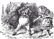 Created in 2007, the glyphs are based on images dating from 1871 by Sir John Tenniel for the first Edition of Lewis Carroll's Through the Looking Glass, and What Alice Found There. There are two fonts, Through the Looking Glass1 and Through the Looking Glass2.