| | |
Abneurone Typografix (or: Abneurone Trauma Types, or: Neurone Error, or: Abneurone Fluid Types, or: Cirque Traumaccord)

|
 French foundry on the margins of type society, obsessed with psychotherapeutic experiments, hyper-experimental, and indeed mental, typefaces. This outfit goes under various names. At FontStruct, where most of its fonts are produced, it is known as Neurone Error. At Dafont, it is known as Abneurone Fluid Types. Its commercial branch at MyFonts is called Abneurone Typografix or Abneurone Trauma Types.
 Their first commercial fonts are ATT49 Fanfare, ATT48 Thrax, ATT47 Candies, ATT46 Exlixir, ATT45 Transfix, ATT44 X-Cute, ATT43 Small Proteus, ATT42 Childhook, ATT41 Arcane, ATT40 Lysergic4a, ATT39 Liquor, ATT38 Once Upon A Damned, ATT37 Innocence, ATT36 Kidding, ATT35 Bestiaire (2011), ATT34 Lysergic 2a (2011), ATT33 Koan (2011), ATT32 Faun Call (2011), ATT31 Paraphilia (2011), ATT30 Lysergic 1b (2011), ATT29 Mad Hatter (2011), ATT28 Minimori (2011), ATT27 Tripton (2011), ATT26 Lysrergic3a (2011), ATT25 Multicoloured Rythm (2011), ATT24 Swallow (2011), ATT23 Artlien (2011), ATT22 Dopamine (2011), ATT21 ABTOY (2011), ATT20 Rankle (2011), ATT19 Ink Lust (2011), ATT18 Overabundance (2011), ATT17 Ink Circus (2011), ATT16 The Orgians (2011), ATT15 For Whom The Bell Tolls (2011), ATT10 Stereo (2011), ATT11 Heterodoxa (2011), ATT12 Psilocybine (2011), ATT13 Sync (2011), ATT14 Prehisto (2011), ATT8 Human Decay (2011), ATT9 Eroded Eclosion (2011), AT4 Parallax (2011), ATT7 Medieval Sweet Shop (2011), ATT6 Detected Future (2011), ATT5 Hard Sync (2011), ATT4 Chalice (2011), ATT3 Outer Christ (2011), ATT2 Macpanic (2011), ATT1 Nimal Nimoy (2011), AT54 Intermezzo (2011), AT26 Metamorph Candies (2011), AT29 Dystrogonyx (2011), AG2 Placenta (2011), AT17 Farandole (2011), AT27 Innocence (2011), AT3 Nuclear Project (2011), AT38 Nanogonyx (2011), AT49 Neuromicr (2011), AT16 Faun Call (2011), AG1 Neuroticons (2011), AT55 Neo Geo (2011), AT36 Mad Hatter (2011), AT51 Pharmaceutic (2011) and AT5 Childhook (2011). The FontStruct production in 2011: 00dot 5 TRANSFIX, 00dot 15 DYSTROPHIE POLYGONALE, 00dot 20 CURSED, 00dot 13 PARALLAX, 00dot 12 NUCLEAR TARGET, 00dot_7_nimal_nimoy, 00dot 17 SYNDROME F.K., 00dot 9 NEW TO, 00dot 6 DECLINE AND CODE, 00dot 3 ROBOX, 00dot 2 MINIDECO, 0dot 26 INKSECTS, 00dot 32 STEREO, 00dot 10 SMART PLAYGROUND, 00dot 33 FUTURE NOW, 00dot 23 BLING STREET, 00dot 4 TOXINE, 00dot 31 FAUN CALL, 00dot 19 ELIXIR, 00dot 30 DWARF LOGIC, 00dot 8 THRAX, 00dot 14 A NEW FORM OF BEAUTY, 00dot 22 HETERODOXA, 00dot 27 KIDDING, 00dot 21 INNOCENCE, 00dot 34 PICTORIAL ABUSE, 00ne Stretched Empty Cow (2011, a piano key stencil face), 00ne Empty Cow (2011), 00ne Medication (2011), 00ne Pills, 00ne Minipills, 00ne Stency, 00ne Neurelm, 000tag6 LYSERGIC, 000tag4 ROBOX, 000tag NUCLEAR WARFARE, 00ne dat / dot, 00ne Bat Kidding (+Stencil, +Stencil Quadrillé), 00ne Stencirc, 00ne Neurocirc Neue Deco, 00ne Neurocirc, 00ne Neurologo, 00ne Nutech, 00ne Nutech Black, 00ne Top Pix (+Clean), 00ne Not So Atroce Pixels (+Black), 00ne Videotech, 00ne Videotech Tamagochi, 0One Bad Video, 0One Exagg Superstrong, 00ne Blockollida, 00ne Minicut, 00ne Neuromoog, 00ne Exagg, 00ne XChurch, 00ne NeuroNeoq, 00ne Imprimante Matricielle, 00ne C64 NeurOOpart2, 00ne Heterodoxa, 00neZnorg, 00ne Znorg Heads, 00ne Zwrappearing (dotted and textured), 00neVideotech, A Present for Intaglio (2011, cloned from Intaglio's Wallachia), Inicial 1 (2010, an improvement of a typeface by Infotipografia), Neo Geo (2011), NE XS, NE 4x4 Technirement, NE Religious Migraine, NE Abtechre. NE Churching, NE Strange Light Pax Pact, NE Cellphone Cutie Punched Cards, NE Cellphone Cutie, NE Obl. NE Pax Pact, NE Pictorial Abuse, NE Charlie Chaplin Cybernetic Brains, NE Chaplin Cyborg, NE Unknown Remix, NE Neurofat, NE Neurocompressor, NE Neurocompressed Pictograms, NE Alien Orders, NE Filament Techneriment, NE Strange Light Pax Pact, NE The Eye, NE Moving Parallels, NE Alien Orders, NE Reordered Alien Orders, the NE New Newbix family, Parallax (2011). Typefaces made in 2012 at FontStruct: AFT1 Heterodoxa, AFT2 Forbidden Apple, AFT3 Kidding, AFT4 Spacelab Parallax, AFT5 Detected Future, AFT6 Lysergic 2b, AFT7 Lysergic 2a, AFT8 Transfix, AFT8 Smart Kids, AFT10 Candies, AFT12 Neo Geo, AFT13 Arcane, AFT15 Hard Sync, AFT17 Cortech Hallucination, AFT18 Lysergic1b, AFT20 Abtech, AFT21 Bling Chief Story, AFT22 Ink Lust, AFT23 Faun Call, AFT24 Toying, AFT27 Fluffy Clown, AFT30 Koan, AFT31 Innocence, AFT33 ETPheuneHeume, AFT34 Neuromicr, AFT35 Tripton, AFT36 Intermezzo, AFT37 Rankle, AFT38 Dark Rankle, AFT39 Rankle Distone, AFT40 Smart Kids, AFT41 Smart Playground, AFT42 Lysergic 4a, AFT43 Small Proteus, AFT44 Lysergic 3a, AFT45 New Forgee, AFT46 Space Connect, AFT47 Mondrian Drone, AFT48 Bark At The Code, AFT49 Stereo, AFT50 Artlien, AFT51 Liquor, AFT52 Neuromecha, AFT53 Lysergic 1a, AFT54 Dinoxyde, AFT55 Human Decay, AFT56 Eroded Eclosion, AFT57 Outer Christ, AFT58 Boing Code, AFT59 Nimal Nimoy, AFT60 X-Church, AFT61 Macpanic, AFT62 Lovely Breeze, AFT63 Mad Hatter, AFT64 The Orgians, AFT65 Chalice, AFT66 Ssaammothrax, AFT67 Panthrax, AFT68 Less Is More Neuromicr 2, AFT69 Paraphilia, AFT70 Psilocybine, AFT71 Childhook, AFT72 Once Upon A Damned, AFT73 For Whom The Bell Tolls, AFT74 Medieval sweetshop, AFT75 Nanoprehistoryx, AFT76 Pictorial Abuse, AFT77 Bestiaire, AFT78 Fanfare From Outer Space, AFT79 X-Cute, AFT80 Medication, AFT81 Wrong DNA, AFT82 Wrong DNA, AFT83 Minimal Disto, AFT84 Abacadabra, AFT85 Pharmaceutical, AFT86 Code Flu, AFT89 High-Diving Blindness, AFT90 Nopix, AFT91 Floppy Disk O, AFT100 Farewell dawn, AFT104 Locked-in Glow, AFT105 Vivant, AFT106 Sharp Gloss, AFT107 Madame Guillotine, AFT108 Newbic, AFT109 Ataxie, AFT110 Strenuous MICR, AFT111 Effaceur, AFT113 Zeppelin Legacy, AFT1010 Jabbering, AFTN1, BUT1 Quarx, BUT2 Newbix, BUT3 Disto Matricielle, BUT4 Tomono, BUT5 Blurred Clown, BUT7 Religious Pill, BUT8 Nopix (octagonal), BUT9 Tipi Video, BUT10 Slanxic Acid, BUT11 Metamphetamental, BUT12 Znorgs, BUT13 Soyokaze, BUT15 Stick Tech, BUT16 Uninteresting Tech. In the Testament series from 2012 until 2013, we mention Testament 132 New Indication, Testament 131 The New Orgians, Testament 128 Camphre, Testament 126 Neuromoog, Testament 122 Dissecting Geometry, Testament 115 Placenta Numérique, Testament 116 Abnormal Fairy, Testament 109 Madame Guillotine, Testament 85 Axone, Testament 84 Keen, Testament 83 Minimixture, Testament 52 Neuromecha, Testament 51 Liquor, Testament 50 Artlien, Testament 49 Stereo, Testament 48 Bark At The Code, Testament 56 Eroded Eclosion, Testament 55 Lysergic 1a, Testament 54 Inflated, Testament 59 Nimal Nimoy, Testament 60 X-Church, Testament 64 The Orgians, Testament 67 Panthrax, Testament 66 Human Decay, Testament 69 Chalice, Testament 47 Mondrian Drone, Testament 44 Lysergic3a, Testament 42 Lysergic 4a, Testament 27 Arcane, Testament 11 Minimori, Testament 8 Transfix, Testament 7 Lysergic2a, Testament 6 Lysergic 2b [The Lysergic series is about very large (around 200 cases high) grid pixel fonts with a severe inclination to psychedelism], Testament B Formaldehyde, Testament C Neuroticons, Testament Artefact, Testament Back Home, Testament 1 Heterodoxa, and Testament 12 Neo Geo. He also created an Archive series in 2012, which features an ornamental caps typeface called Archive 10, a geometric typeface called Archive 5, TEST PPain, and a textured typeface called Archive 8. He has a Trauma series that features Trauma 145 Razzmatazz Architect, Trauma 126 Lysergeek Boy, Trauma 127 Lysergeek Girl. Typefaces from 2014: Trauma 155 Overly, Trauma 151 Migraine Bit. In 2017, Abneurone allowed me to host his 120-strong Abtox series, which grew out of the FontStruct collection between 2014 and 2016. Download directory. All fonts in one zip file. The complete list: Abtox 1 ATAXIE, Abtox 10 GRIEF, Abtox 100 CORRODED SPACESHIP_0, Abtox 101 LYSERGIC GAMMA_1, Abtox 102 TOXIC DATA, Abtox 103 NEUROTIC CHURCH_3, Abtox 104 SCHIZOPHRENIA TYPE_1, Abtox 105 TWO STAGES OF CONTAMINATION_2, Abtox 106 DINOXYDE_1, Abtox 107 FAUN CALL_0, Abtox 108 SMART KIDS_9, Abtox 109 FORBIDDEN APPLE_1, Abtox 11 SANTA CLAWS, Abtox 110 DYSTOPIAN GEOMETRY_0, Abtox 111 CHEMICAL ABERRATION_1, Abtox 112 DOUBLE-DEALING_3, Abtox 113 FORBIDDEN PLANET_4, Abtox 114 KARMIC_4, Abtox 115 DIZZY MOLECULES, Abtox 116 COMPUTING ELSEWHERE_0, Abtox 117 DEEP LOW_2, Abtox 118 MODULOTNIK, Abtox 119 DATACIDE_3, Abtox 12 CLOUD BLOOD, Abtox 120 CLOSE ENCOUNTERS_7, Abtox 13 CHILDHOOK_C, Abtox 14 BACTERIA_0, Abtox 15 ALCESTE_3, Abtox 16 PSILOCYBINE_1, Abtox 17 AXONE_1E, Abtox 18 GALACTIC ORGAN_0, Abtox 19 NEUROMOOG_1, Abtox 2 TANTRISME_1, Abtox 20 UFOLOGY, Abtox 21 PAIN PDJ_4, Abtox 22 MY VALENTINE_0, Abtox 23 SUCROKID, Abtox 24 FLOPPY DISK CODE, Abtox 25 VERKIDGO, Abtox 26 NEO GEO_1, Abtox 27 MANDRAGORE_F, Abtox 28 HORNS TO COME_1, Abtox 29 NITROX BEAT_7, Abtox 3 DECORATORIO, Abtox 30 FLYBUTTER_1, Abtox 31 MATRIX YELL_0, Abtox 32 BUBBLE GUMMY_A, Abtox 33 SPAWN_2, Abtox 34 SQUARRY_0, Abtox 35 BUBONIC AK47_0, Abtox 36 VINAIGRE GOTHIQUE_3, Abtox 37 NEO POMPOUS, Abtox 38 EFFACEUR GLUED_1, Abtox 39 EFFACEUR BAROQUE_8, Abtox 4 OVERLY_6, Abtox 40 EFFACEUR SOLID_3, Abtox 41 EFFACEUR CODA_5, Abtox 42 DARK ATROXID_1, Abtox 43 LUMINOUS ATROXID_9, Abtox 44 DRUGGED UP ATROXID_0, Abtox 45 NEUROMECHANIC, Abtox 46 CAMPHRE_4, Abtox 47 FEAST OF UNIQUE RITES, Abtox 48 CHALICE, Abtox 49 SPACE DRUG_0, Abtox 5 NEW PUPPY_0, Abtox 50 TRONIXHALLEY_1, Abtox 51 NO DUMMY, Abtox 52 LOST CHILDHOOD_1, Abtox 53 TRAUMATOLOGY_0, Abtox 54 THE NEW ORGIANS_7, Abtox 55 AMOEBA PUNK_2, Abtox 56 MEDICATION, Abtox 57 SIDE EFFECTS_3, Abtox 58 RE-VOLT_1, Abtox 59 CYBERNODE_1, Abtox 6 RAZZMATAZZ ARCHITECT_1, Abtox 60 OUTER CHRIST, Abtox 61 NEW CIRCUS_0, Abtox 62 ART DRONE, Abtox 63 COAXIAL_2, Abtox 64 PONG !_2, Abtox 65 LYSERGEEK GIRL_0, Abtox 66 NEWBIC_1, Abtox 67 BRAIN SURGERY_4, Abtox 68 RETROFUTURE PRECIOUS_0, Abtox 69 TRIPTONITE_2, Abtox 7 LOG_3, Abtox 70 NEUROMICR_8, Abtox 71 HUMAN DECAY, Abtox 72 INK LUST_0, Abtox 73 PANTHEIST_2, Abtox 74 X-CUTE_6, Abtox 75 DATAXY_4, Abtox 76 FRAGRANCE_0, Abtox 77 TOOTH AXIS_2, Abtox 78 MADAME GUILLOTINE_0, Abtox 79 NARCO_2, Abtox 8 KOAN, Abtox 80 GENOMETRY_1, Abtox 81 SAFE TRAIN_4, Abtox 82 NO ISLAND, Abtox 83 LOCKED-IN GLOW_5, Abtox 84 ABNORMAL FAIRY_A, Abtox 85 ACME_0, Abtox 86 GLITCHY ELIXIR_1, Abtox 87 BLACK ELIXIR, Abtox 88 NEW INDUCTION_0, Abtox 89 MECAMYTHIC_3, Abtox 9 ABSTEREO_4, Abtox 90 MEDIEVAL SWEETSHOP, Abtox 91 PARAPHILIA_0, Abtox 92 HARD SYNC_3, Abtox 93 SECT TOY_1, Abtox 94 ARTEFACT_2, Abtox 95 SPACE LAB, Abtox 96 WAX, Abtox 97 E.T. PHEUNE HEUME_C, Abtox 98 COLD FLOWERS_2, Abtox 99 INJECTING DOPAMINE_0, Abtox ALIEN TOYS_14, Abtox NEUROTICONS_13, Abtox X-HEADZ_37. Dafont link. [Google]
[MyFonts]
[More] ⦿
|
Akram Kamil Kareem
|
Iraq-based type designer whose typefaces are hosted on our site. All his fonts are free for personal use. For non-personal use, please send an email to akramalzohiri@gmail.com. The list of his typefaces: - Akram K1 (2021). The designer writes: The font represents the first alphabet in the Mandaic language---its name is A-Atha which means "he came". This one is the first font I made. It is the base for my other fonts. The Mandaic script is thought to have evolved between the first and second century BC from either a cursive form of Aramaic (as did Syriac) or from the Parthian chancery script. It was developed by members of the Mandaean faith of southern Mesopotamia to write the Mandaic language for liturgical purposes. Download Akram K1.
[Google]
[More] ⦿
|
Amazon fonts
[Dalton Maag]
|
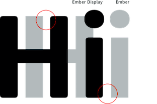
 The Amazon fonts can be freely downloaded. They consist of:
 - Amazon Ember (2015), a workhorse sans family. Originally developed by Dalton Maag for the Kindle Oasis, released in 2016. Followed in 2017 by Amazon Ember Condensed and Amazon Ember Display, and in 2018 by Amazon Ember Duospace and Amazon Ember Mono.
- Bookerly LCD and Bookerly Display (2015-2017). Also by Dalton Maag, a text typeface for the Fire tablet.
- The Japanese font family Amazon Shin Go developed by Morisawa in 2017.
Downloads: [Google]
[More] ⦿
|
Analia S. Wainer Criscuolo
|
Buenos Aires, Argentina-based creator (aka Anita Wainer) of the following free fonts, hosted at my site: Perfect Match (2009, glyphs made from matches), John Lennon (2006, John Lennon's handwriting and drawings), AHDN (2005, based on the album A Hard Day's Night), and JAMONdelMAR (2006, dingbats for fans of the Beatles). Typophile. Analia plays in the band Jamon del Mar. Alternate URL of Jamon del Mar. Dafont link. Fontspace link. [Google]
[More] ⦿
|
Andy Voelkle
|
Stone carver from Houston, Texas, who designed a full roman alphabet in 2001 as an alternative for Trajan for stone carvers. Ray Larabie then created Texhenge (2001) according to Andy's specifications, while Andy tested the font out on real marble. In Andy's own words: I approached Ray Larabie by email in early 2001 and asked him to produce a "texhenge" font for our project here in Texas, to build the first full-size stone circle in over 2000 years. I wanted a modern font to replace Trajan as the ideal stonecarving font for our age. He and I labored over the design of the three special symbols (dagger, double dagger, per mille sign) for several months until Ray's final design, represented in these two fonts, which are in my opinion beautiful and perfect. The main stone was to be a smooth limestone, but in 2001 I began laying out a test in six inch high lettering on carrara marble, a text of Ray's perfect Latin and "et" sign, and a tribute to my lovely wife Kathy. The test was interrupted and postponed until 2008 when I carved it. The bench sits outside our home, just off the sidewalk. It is a popular resting spot for us senior citizens, and we have seen young lovers enjoying a moment alone in quiet conversation. I am honored to have this font, and to have carved it first. Much more is planned for the font as the Texhenge.com stone circle project progresses over the years. The bench in which "Kathy and Andy" is carved is dedicated by Andy to Kathy McKee. Download these fonts here: Texhenge-Bold, Texhenge-Tight. Or go to this dedicated directory. [Google]
[More] ⦿
|
Arphic Technology: Free fonts
|
Four high-quality Chinese TrueType fonts generously provided by Arphic Technology (Taipei, Taiwan) to the Free Software community under the "Arphic Public License". The four free Chinese truetype fonts are about 10MB each: ZenKai-Medium, BousungEG-Light-GB, GBZenKai-Medium, ShanHeiSun-Light. Alternate URL. One more site. Yet another URL. This site has a file called fireflysung, which has the full Chinese font AR PL New Sung (1994-1999). CTAN download site. The license states: Everyone is permitted to copy and distribute verbatim copies of this license document, but changing it is forbidden. So I am hosting the fonts on my site: Download these fonts: AR-PL-KaitiM-Big5, AR-PL-KaitiM-GB, AR-PL-Mingti2L-Big5, AR-PL-SungtiL-GB. A large zip file with these fonts. [Google]
[More] ⦿
|
Bernard Desruisseaux
[MetamorFont]
|
[More] ⦿
|
Brian M. Zick
|
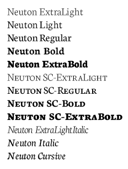 Tennessee-based type designer, b. 1991, PA, who died on February 24, 2023. Before moving to Tennessee, he was based in Newton County, AR. Brian Zick's typefaces include the Times-Roman like family Neuton (2010-2011, which contains both Latin and Hebrew versions; free at Google Web Fonts). Other typefaces by Zick: the Helvetica clone Zikketica (2010), Alpine Text (2011, a sans), Lubitel (2011, Hebrew face), Takt (2011), Recut (2011) and the ultra-fat titling font Zut (2010).
 Kernest link. My own link to him. Google font directory link. Font Squirrel link. Devian tart link. [Google]
[More] ⦿
|
Coji Morishita
[M+ Fonts]
|
 [More] ⦿
|
CybaPeeCreations (or: Typoasis)
[Petra Heidorn]
|
 CybaPee is the nom de plume of Petra Heidorn who lives near Hamburg. She has created many typefaces (listed below) between 1997 and 2005 and has cooperated with several type designers on interesting projects. She is undoubtedly best known for her successful web site Typoasis (discontinued in 2016), where one could download her own creations, and those of her many friends. Petra was also heavily involved in several attempts to revive blackletter fonts, in cooperation with Manfred Klein, Dieter Steffmann, Paul Lloyd and others. She organized several revivals of the typefaces of Rudolf Koch and Ernst Schneidler. She also managed the extensive web presence of Manfred Klein.
 In 2016, she allowed me to host her fonts on my site. Download page. Download all her fonts in one zip file. Her typefaces: - AlphanatismConHeads (2001). Stamped style.
- ArabDancesMediumItalic (2002). An Arabic simulation typeface done with Manfred Klain's assistance.
- Azimech (1999).
- Bauernschrift (2004). After a 1911 typeface from Bauersche Giesserei.
- Bayreuth (2003). A nice scan-version of Bayreuth Fraktur by Ernst Schneidler for C.E. Weber in 1932.
- Bibelschrift (2004). Codesigned with Manfred Klein, Bibelschrift revives a Fraktur from 1926-1928 used by the Bremer Presse, est. 1911. The Bremer Presse was bombed by the Americans in 1944.
- BirthdayGreetz (1999).
- Brahms Gotisch (2005). A blackletter typeface co-designed with Manfred Klein. It is a revival of a 1937 Genzsch&Heyse typeface designed by Heinz Beck.
- Burte Fraktur (2003). After Christian Heinrich Kleukens for the Mainzer Presse, 1928.
- CalliBrush (1999).
- Camouflage (1999). Textured.
- Chaos-Theorie (2000). A Halloween or vampire font.
- Charon (1999). An angry and / or scary typeface.
- Crystopian.
- CursedKuerbis (1999).
- Cyclin (2000). An ironwork font.
- DecoCaps (1999). Ornamental caps.
- DeutscheDruckschrift (2004). A revival of Heinz König's 1888 blackletter typeface for Genzsch&Heyse.
- DeutscherSchmuck (2004). Codesigned with Manfred Klein, this ornamental dingbat font is a revival and extension of the Schmuck für Deutsche Druckschrift by Eduard Ege, Genzsch and Heyse, 1922.
- DiamondDreams (1999). A pearly all caps typeface.
- Ellipsoideogram (2000). An italic headline sans.
- Epitough (1999). A sans.
- Extemplary (1999).
- Funtastique (1999). An exagerrated, almost bubbkly, art nouveau typeface.
- Gondoliere (2000). A light-hearted poster typeface.
- Gotika (2005). After Reiner's 1933 blackletter typeface for Bauer.
- Greex (1999). A Greek emulation typeface.
- Hans Sachs Gotisch (2005). Based on a typeface by that name of Albert Auspurg, 1911, Genzsch&Heyse.
- Hartwig-Schrift (2005). A blackletter typeface that revives Hartwig Poppelbaum's Hartwig Schrift from 1927-1928.
- Hasenchartbreaker (1999). A handcrafted typeface.
- Heimat (2005). After Wilhelm Weimar's Heimat from 1917, Genzsch&Heyse.
- HelvAssim (1999). A naughty take on Helvetica to needle Linotype.
- Hohenzollern (2004). Based on Carl Albert Fahrenwaldt's blackletter typeface for Bauersche Giesserei, 1902.
- HollandGotisch (2005). Designed together with with Manfred Klein, this is a revival of the textura typeface Nederduits (aka Fleischmann Gotisch) by Johann Michael Fleischmann, ca. 1750.
- InkyDinky (1999).
- IsleOfTheDead (1999). An angular handcrafted typeface reminiscent of the movie titling of Dr. Caligari.
- Jaecker-Schrift (2005). Revival of the 1912 blackletter typeface by Wilhelm Jaecker for D. Stempel.
- Kleukens-Fraktur (2004). A Schwabacher based on a design by Friedrich Wilhelm Kleukens, 1910.
- KrasniFellows (1999). An old Slavonic emulation typeface.
- KuehneRevised (2003). A blackletter typeface.
- LadyIce-Italic, LadyIce-SmallCaps, LadyIce, LadyIceRevisited, LadyIceRevisitedUpper. An organic monoline sans typeface family developed together with Apostrophe.
- Leibniz-Fraktur (2003). A Schwabacher typeface based on a house font at Genzsch & Heyse, 1912.
- LeontineLoew. A warm and plump informal typeface.
- LightBats (1999). Dingbats.
- Lupinus (1999).
- Lurzing-Initials (1997). A decorative caps typeface based on a 1908 typeface by Karl Lürzing that depicts naked figures.
- Manuskript Gotisch (2004). A revival of a 1514 Textura typeface by Wolfgang Hopyl, which was a house typeface at the Bauersche Giesserei in 1899.
- ModerneSchwabacher (2005). After a ca. 1900 typeface by the Otto Weisert foundry called Moderne Halbfette Schwabacher.
- MonkeyHouseParty (2001).
- MothproofScript (1999). A calligraphic typeface. The name is a take on frostmoth, one of Petra Heidorn's early aliases.
- MuseAsis (2002). Artsy fartsy.
- Napapiiri (1999).
- Neudeutsch (2004). After a 1900 original by Otto Hupp for Genzsch&Heyse.
- NeueFraktur, NeueFrakturExtraBold (2004). Revivals of typefaces by Johannes Wagner Schriftgiesserei in 1927.
- NinjaLine (2000). An outlined graffiti typeface.
- Nordland (2005). Based on a typeface by Heinz Beck for Trennert&Sohn, 1935.
- Oetztype (1999). German expressionist. Named after the Tyrolian Iceman, Oetzi.
- Oktoberfest (1999).
- Pachyderm (1999). A nice ultra-fat typeface.
- PeesCelticItalic, PeesCelticPlain, PeesCelticOutline (1999). Ornamental Celtic caps.
- Pegypta, Pegyptienne (1999). Hieroglyph-inspired typewriter fonts.
- PostmoderneFraktur (1999).
- Rammstein (1999). A tall condensed typeface.
- ResPublica (2000).
- RoteFlora (1999). Garffiti style typeface.
- RoyalGothic (1999). A swashy set of initials.
- SadLisa. A kitchen tile font designed to support Lisa Jenkins in a copyright battle.
- Sagittarius (1999). An arrowed typeface.
- SailingJunco (1999). A stencil typeface.
- Scalper-Bold, Scalper, ScalperInk (2001). Grunge style.
- SchmalfetteGotisch (2004). Codesigned with Manfred Klein, this semi-Textura typeface is based on a type of Ernst Schneidler.
- SchneidlerInitialen (2004). After F.H.E. Schneidler.
- Schneidler Schwabacher (2004). After F.H.E. Schneidler.
- SchwabachDeko (2005). This is Verzierte Schwabacher by Carl Kloberg, Leipzig, 1891. In 2005, Petra co-designed a similar revival of Verzierte Schwabacher with James Arboghast, simply called Verzierte Schwabacher. Her SchwabachDeko attempted to be as close as possible to the original.
- Scoglietto (1999). A text typeface.
- SerpentisBlack (2004). Digitization of a typeface by E.W. Tieffenbach for Officina Serpentis, 1913. This in turn is based on a Gotico-Antiqua by Peter Schoeffers (Mainz, 1462) which was refined in the late 15th century by Creussner and Koberger.
- SlimlinerMicro (1999).
- Smoke-Rasterized-Medium (2001). Degraded and textured.
- SoftAutumn (1999).
- Stoertebeker (1999). A mediaeval typeface with a rough outline.
- SunnySide (2000).
- Symphonie (2005). A digitization of Imre Reiner's Symphonie from 1938 (renamed Stradivarius in 1945).
- TaraType (1999). A lapidary typeface named after Petra's friend, Sabine Taranowski.
- Teutonia (2004). Based on a typeface by Roos & Junge, ca. 1900.
- TipTop (2004). Based on a typeface from Schriftgiesserei Julius Klinkhardt, Leipzig, ca. 1900. Virtually identical to Teutonia.
- ToolTime (1999). Dingbats.
- TypesourceFanclub (2001). A heavy semi-slab serif.
- Urdeutsch (2004). A rounded blackletter typeface based on Urdeutsch (1924-1925, Adolf Heimberg for Genzsch&Heyse).
- Vogeler Caps (2002). Based on Heinrich Vogeler's decorative blackletter caps typeface Jugendstil Initialen (1905).
- Weiss-Gotisch (2004). A revival of E.R. Weiss's typeface by that name, published in 1936 at the Bauersche Giesserei.
- WelcomeY2K (2000). A casual typeface.
- XmasTerpiece, XmasTerpieceSwashes (2001). A Fraktur font based on Rhapsodie by Ilse Schuele.
Dafont link. Klingspor link. Fontspace link. [Google]
[More] ⦿
|
Dalton Maag
[Amazon fonts]
|
 [More] ⦿
|
Debbie Montique
[Moonlight Designs]
|
 [More] ⦿
|
Dick Pape
[Dick Pape]
|
 Dallas, Texas-basedc Dick Pape (b. 1938) has been digitizing images and alphabets for many years. His typefaces include many revivals, all very true to the original images. Early in 2013, we agreed to host his 1,600 fonts on our site. Storage alone is initially of the order of 700 megabytes. Because of the sheer size of the collection, we have a download section, easily accessible for both individual or batch downloads. In addition, we have subpages with discussion, information and images. The typefaces have been partitioned into these groups: Aboriginal Art, Aesop, Aridi, Artville, Ben-Tour, Binny & Ronaldson, Briar Press, British Museum, Buddhist Images, Butterfly, Carbajo, Celtic Designs, DXS-Art Deco Display (alphabets), DXS-Celtic and Medieval, Daniels-Segura, Design Elements, Digital clipart, Dover Publications, FHA, Fonto Fonts, French Alphabets, Go Media, Graffiti Words, Hula Fonts, Hunt Bros 101, Incredible Pulps, Individual Artists, KCK, LFD, LHF Ornaments, Mada Alpha-a-day, Mayan Signs, Mindofone-Other, Misc Alphabets, Misc Silhouettes, Misc Symbols, Moderne-Solo, Music Song Covers, Myth & Fantasy, Neubau, Octopus, Paul Lacroix, Pepin Press, Rattlesnake Jack's Western, Schneidmeister, Sketch Type-HandDrawn, Sonja Steiner-Welz, Soviet Posters, Super Fonts, Traditional Turkish Designs, Trees-silhouettes, Tribal Tattoo, USF Decorative Fonts, ViaFaceDon, Viking Design, Virgin Vectors, Walden Font, Zelek.
 Download here. [Google]
[More] ⦿
|
Dick Pape
[Dick Pape]
|
[More] ⦿
|
Dongbin Han
|
Korean graphic designer based in the Netherlands and South Korea. In 2021, he was commissioned by Het Nieuwe Instituut Rotterdam to develop a set of NEN 3225 digital fonts. His free fonts are called NEN 3225 Schreefloze Mager and NEN 3225 Schreefloze Vet. [Google]
[More] ⦿
|
Eccentrical
|
 An orphaned arts and crafts font, identical to the digital fonts all called Eccentric published by Monotype (Agfa), Solotype, and Adobe. Of course, all these digital fonts are copies of the original typeface from 1881 by Gustav F. Schroeder for Central Type Foundry. Download the font here. [Google]
[More] ⦿
An orphaned arts and crafts font, identical to the digital fonts all called Eccentric published by Monotype (Agfa), Solotype, and Adobe. Of course, all these digital fonts are copies of the original typeface from 1881 by Gustav F. Schroeder for Central Type Foundry. Download the font here. [Google]
[More] ⦿
|
ESRI fonts
|
ESRI is the Environmental Systems Research Institute. It sells the ArcGIS software for GIS-related problems. In the late nineties, one could download free map fonts. The ESRI fonts contain mainly map and weather icons, and were made between 1996 and 1998. The set: ESRI AMFMGas, ESRI Cartography, ESRI Caves1, ESRI Climate&Precipitation, ESRI CrimeAnalysis, ESRI Environmental&Icons, ESRI Geology, ESRI GeologyAGSO1, ESRI GeometricSymbols, ESRI HazardousMaterials, ESRI IGL Font16, ESRI IGL Font20, ESRI IGL Font21, ESRI IGL Font22, ESRI IGL Font23, ESRI IGL Font24, ESRI IGL Font25, ESRI MilSym02, ESRI OilGasWater, ESRI OilGasWater, ESRI SDS2.001, ESRI SDS2.002, ESRI Surveyor, ESRI SvenskaKartSymboler1, ESRI Transportation&Civic, ESRI TransportationMunicipal, ESRI USMUTCD2, ESRI Weather. [Google]
[More] ⦿
|
Ethno Multimedia
[Vijayakumar Sinnathurai]
|
Publisher of Indic fonts, who set up Ethno fonts. He studied mechanical engineering at University of Sri Lanka in Peradeniya, Sri Lanka (1978) and chemical engineering at the University of Toronto (1981). He settled in Canada, and obtained a Ph.D. in chemical engineering from the University of Toronto in 2005. He had a lifelong interest in mathematical modeling and type design. Vijayakumar died in 2017. Some of his Tamil fonts could be found at R. Padmakumar's archive. In 2017, after his death, Vijayakumar's family granted me permission to place the collection on my site for free download. There are sometimes multiple versions of the same font, with minor changes. All of these are included too. The list: - Aabohi Adaanaa (1993)
- Anantha Shanmugathas (1993, with Ranjan Shivakumar&EPICS)
- Ananthabairavi (1994, with Ranjan Shivakumar)
- Boopalam (1994)
- Chunnakan (1995)
- DenukaPC (1995)
- Dheepa
- Gayathri.
- Geethapria (1993)
- Hamsathvani (1995, with B. Gnanapandithan)
- Hemawathy
- Hindolam (1995)
- Janaranjani
- Kalyani (1994)
- Kamaas (1993, with Ranjan Shivakumar)
- Karaharapriya (1994)
- Keeravani (1994, with B. Gnanapandithan)
- Lathangi
- Madhuvanthi (1992)
- Mohanam (1993, with Ranjan Shivakumar)
- Nagananthini (1994, with Nicolas)
- Needhimathi (1995)
- Ranjani (1992)
- Rasihapriya (1993)
- Sahaanaa (1995)
- Sangeetha
- Saraswathy (1993)
- Sevvanthi
- Sindhubairavi (1995)
Missing are Adankappidaari (1993, with Ranjan Shivakumar), Kilavi (1993), Malayamarutham (1994), Pichchaikari (1993, with Nicolas), Shanmugapriya (1993, with B. Gnanapandithan), Sindhu (1993), Sngarabaranam (1993), TML Helv Plain (1992). His fonts were developed on Commodore 64, on which one could not make the long N (Moonu suzhi N) as a single character and the result was a non-symmetric placement of the pulli (the dot). Vijayakumar continued that style in his fonts so he could easily recognize his work anywhere. That asymmetric pulli also led to the demise of his typefaces. A link has been set up to raise funds for the Vijayakumar scholarship at the University of Toronto to honour his memory. Download link. [Google]
[More] ⦿
|
Eugene Herrera
|
Delano, CA-based designer of Yujkore Handwriting (2009), which was made with Fontifier. All his fonts in one zip file. Direct access to YUJKORE0.eot and to yujkorehandwriting.ttf. This file contains Mac-specific versions of the font. [Google]
[More] ⦿
|
European Space Agency
|
 Free custom-designed fonts for the European Space Agency:
 - The original set: ESAProgramme (1995), ESASubtitle (1996), ESATitle (1996). The designers are anonymous. I am hosting these here.
- NotesESA: the corporate font, used for titles, subheads and some special text. Developed between 2004 and 2008 by Ole Schaefer.
- Notes Style: A logo font by Ole Schaefer published in 2005.
- Din Pro Bold and Regular (Albert-Jan Pool for FontShop, 2005) which cover Latin, Greek and Cyrillic.
- The Sans (1994-2006): Four free weights by Lucas DeGroot.
- Reykjavik One (2001, Stefan Kjartansson) for captions.
- Verdana and Georgia used as system fonts.
[Google]
[More] ⦿
|
Florian Kretlow
|
Designer of the free music text font Nepomuk (2014), a didone in the style of Computer Modern. Hosted at my site: Nepumok Italic. Nepumok Regular. [Google]
[More] ⦿
|
Frogii
[Frogii's Free Fonts]
|
[More] ⦿
|
Frogii's Free Fonts
[Frogii]
|
 Frogii is the designer of some free typefaces between 2001 and 2005. They were stored at Moorstation until that web site disappeared. I am now hosting that collection:
 - 26 Famous Peeps (2002). Caricature dingbat font.
- Abstract.
- Alphadings made in 2002: AlphaBaby, AlphaCar, AlphaDishes, AlphaFlowers, AlphaRope, AlphaWizard.
- BearyLoveable.
- BlackFrog.
- BouquetInitials.
- ChefTurkey (2001).
- Chilluns (2005).
- FlowerShower (2001).
- Fontanesi (2003). Ornamental caps. After Aldo Novarese's Fontanesi from 1951.
- FrillyDillies.
- Frogii's-Froggeroo (2001).
- FrogiiCapsNumbers (2001).
- FrogiiChristmas (2001).
- FrogiisFrogCapsDingfont.
- FrogiisFroggers.
- Futurex (2002). A font designed at Apostrophic Labs.
- Iranian Hand-Lettered (2001). Based on Hand-Lettered by Siynn bar-Diyonn (Dennis Ortiz-Lopez).
- OrnamentalNo2 (2003).
- PosterLinguini (2001).
- Pumpkinese.
- SantasGiftCaps.
- ShapeAbet.
- WhyOhWhy.
[Google]
[More] ⦿
|
Geckodude (or: Sleepy Gecko)
[Steve Harrison]
|
 Steve "Gecko" Harrison of the Sleepy Gecko Chillout Bar on Cam Nam island off Hoi An, and also Danang, Vietnam, b. 1952, designed these typefaces:
 - Rocodecoco (2019). An art deco, Broadway style typeface based on a hybrid of Grock (1935) and Roco (1973).
- Motter Alustyle. After a 1972 font by Othmar Motter.
- Rabbit Moon (2019). Based on a few glyphs drawn by Kenneth Anger for an alternative film).
- In 2020, he did a proper revival of Gene Eidy's iconic oriental simulation typeface Sukiyaki (1968, Lettergraphics), which can be downloaded here.
- Together with Blair Massey, he designed the Victorian typeface Brand New Memorial (2020), which improves on Dan Solo's Memorial
- Razor Face (2020). A revival of the spurred film font Scott Gothic (Photolettering). Free download.
- Castaway (2020). A huge improvement and extension of Dan X. Solo's Stowaway, in Inline, Fill, Solid and Outline styles. Free download.
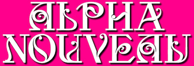
- Alpha Nouveau (2020). A free all caps art nouveau typeface based on old signage.
- Bergling Nouveau Display (2020). An ornamental art nouveau typeface based on an alphabet by John M. Bergling (1923). Download.
- Skedaddle (2020). An all caps sans. Download.
- Balsamic Display (2020). A tall all caps display serif. Download.
- Snicket Initials (2020). After an alphabet called Initial Letters by John O. Ohnimus (1906). Download.
- Typefaces modeled after Ross F. George: Doolally (2020; Ross F. George, 1938), Dawdling (2020; Ross F. George, 1935), Dawdling Snowflake (2020; Ross F. George, 1935), Bogeyed (2021: art deco), Faffinabout (2021).
- Seraphime (2017). Download.
- Skaliwag Display (2020). A decorative art nouveau typeface inspired by an alphabet in John M. Bergling's Art Alphabets and Lettering (1914, 1918, 1923). Download.
- Astrologos (2021). An exquisite zodiac symbol font.
- Cordwrangler (2021). A display typeface inspired by Kenneth Williams from the "Carry On" movies.
- Lettres Ornes Blonde, Lettres Ornes Noire and Lettres Ornes Lignes (2021). Three exquisite decorative caps typefaces modeled after Joseph Gillé's Lettres Ornées (1820).
- Ruffinit (2021). An alphabet for emulating mural signage.
- Floral Poppl (2021). Steve's attempt to decorate one of the Friedrich Poppl faces, making it all flowery.
- Odessa (2021). A joyous and prototypical art nouveau typeface.
- Hullabaloo (2021). A nearly art nouveau typeface from Dan X. Solo's treasure chest of oldies but goodies.
- Doubleback Display (2021). A revival and clean-up of a Letraset rub down lettering typeface.
- The prismatic typeface family Stripes (2021). This is an enormous expansion of the similarly named typeface Stripes (1972, Tony Wenman), which was made available by Letraset for dry-transfer lettering as part of Letragraphica 11 in 1973. It comprises eleven fonts from a nine-stripe version (note: Wenman had eight prismatic lines) down to a solid one-line version. Along the same lines, he created the prismatic typefaces Sixty Eight and Sixty Eight Plus (2021) based on Lance Wyman's lettering for the 1968 Mexico Olympics.
- Schlubert Rounded and Schlubert Round Stencil (2021). Two squarish typefaces.
- Vermin (2021). Based on an old typeface called Voodoo.
- Geometricfix Eighteen and GeometricfixThirtySix (2021). Textured typefaces based on geometric / techno designs by Brazilian designer Danilo Gusmão Silveira.
[Google]
[More] ⦿
|
George Douros
[Unicode Fonts for Ancient Scripts]
|
 [More] ⦿
|
GSC ArcInfo Symbolsets
|
Publisher in 2001 of the free map symbol fonts: GSC1, GSC10, GSC2, GSC3, GSC4, GSC5, GSC6, GSC7, GSC8, GSC9. Local download. [Google]
[More] ⦿
|
IBM Plex
[Mike Abbink]
|
 A large free font family created by Mike Abbink and Bold Monday (Paul van der Laan and Pieter van Rosmalen) for IBM's new corporate identity in 2017. It includes the IBM Plex Sans, IBM Plex Serif, IBM Plex Sans Variable, and IBM Plex Mono subfamilies. Aneliza (2018) is a fork that has a single storey g in the italics.
 A later modification / fork is Perplexed by Peter Hull in 2018. Github link. IBM link. Direct download at Github. CTAN link. Local download. IBM Plex Mono at Google Fonts. IBM Plex Sans at Google Fonts. IBM Plex Sans Condensed at Google Fonts. IBM Plex Serif at Google Fonts. CTAN link for TeX support. IBM Plex won an award at TDC Typeface Design 2018. In 2021, Google Fonts added various multilingual versions of IBM PLex: IBM Plex Sans Devanagari (by Mike Abbink, Paul van der Laan, Pieter van Rosmalen, Erin McLaughlin), IBM Plex Sans Arabic (by Mike Abbink, Paul van der Laan, Pieter van Rosmalen, Wael Morcos, Khajak Apelian), IBM Plex Sans Hebrew (by Mike Abbink, Paul van der Laan, Pieter van Rosmalen, Yanek Iontef), IBM Plex Sans KR (by Mike Abbink; Paul van der Laan; Pieter van Rosmalen; Wujin Sim; Chorong Kim; Dohee Lee), IBM Plex Sans Thai (by Mike Abbink, Paul van der Laan, Pieter van Rosmalen, Ben Mitchell, Mark Frömberg), IBM Plex Sans Thai Looped (by Mike Abbink, Paul van der Laan, Pieter van Rosmalen, Ben Mitchell, Mark Frömberg). Google Fonts link. [Google]
[More] ⦿
|
Jako Olivier
|
Jacobus Alwyn Kruger Olivier is the South African designer of ZAsymbolsAriel (2002) and ZAsymbolsRoman (2002). These have (had) diacritics useful for these South African languages: isiNdebele, isiZulu, Sepedi, Setswana and Tshivenda. Currently, Jako Olivier is an Adviser: Higher Education at the Commonwealth of Learning, Burnaby, Canada. Before this he lead the UNESCO Chair on Multimodal Learning and Open Educational Resources (OER) and was a Professor at North-West University, South Africa until August 2022. His research interests include open and distance learning, self-directed learning, multimodal learning, OER, blended learning, e-learning, multiliteracies, multicultural education, language planning and subtitling. At one point, he was based in Sasolburg, South Africa. CV. [Google]
[More] ⦿
|
John Colletti
[QualiType]
|
[More] ⦿
|
Liquitype
|
Liquitype (Germany) made the experimental font Maerchen, the Cinema de Paris alphabet, as well as the free font CP Mono (2009), which was inspired by British carplates. Since the license of CP Mono says, You are free to copy, distribute, display, and perform the work and to make derivative works, under the following conditions: Attribution. You must give the original author credit, I am making a copy of the font family available here: CP Mono download. Kernest link. Abstract Fonts link. Font Squirrel link. [Google]
[More] ⦿
|
Lucent---ATT
|
At the Lucent (was: ATT) site, one could download ATTOCRB (1995), a strange creature in which both O and Q are stabbed. [Google]
[More] ⦿
|
M+ Fonts
[Coji Morishita]
|
 Free font producer in Japan that started out as a bitmap font specilaist. The M+ Fonts Project is jointly run by Coji Morishita, Hiroki Kanou, Imazu Kazuyuki and Taro Muraoka.
 All fonts are totally free: Unlimited permission is granted to use, copy, and distribute them, with or without modification, either commercially or noncommercially. . Download page. Free monospaced and variable width outline fonts containing kana, kanji (97% coverage of jinmeiyo), Chinese (81% coverage of traditional Chinese), Korean, Cyrillic, Greek, Hebrew, and Latin (sans), all made between 2006 and 2016 and still being developed: mplus-1p-black, mplus-1p-bold, mplus-1p-heavy, mplus-1p-light, mplus-1p-medium, mplus-1p-regular, mplus-1p-thin, mplus-2p-black, mplus-2p-bold, mplus-2p-heavy, mplus-2p-light, mplus-2p-medium, mplus-2p-regular, mplus-2p-thin. In 2018, they published MPlusRounded1c at Google Fonts. Additions in 2021: M Plus Code Latin, M Plus 1 Code. Mplus 1 Code is a sans serif programming font with seven weights from Thin to Bold, supporting 5,700+ kanjis for Japanese with GF Latin Plus. iM Plus Code Latin is a multi-weight programming font for Latin only. Both have variable fonts as well. Open Font Library link. Local download of the M+ family. Google Fonts link. Github link. [Google]
[More] ⦿
|
Majlis Research Center
[Reza Arani]
|
CEO of Tahavolgaran Arse Ettelaat in Tehran. His old site offered two free fonts: Sin-Titr-Bold (1997, Sina Dadras), and Mellat (1999, Majlis Research Center by Reza Arani). He explains that he was one of the first people to solve the problem of Persian scripts on web pages, and that his fonts were designed for that purpose, mainly. With permission of Arani, we offer the truetype versions of these fonts for free download: Mellat, Sin Titr Bold. [Google]
[More] ⦿
|
Manfred Klein: Font Hosting
|
 In July 2017, Typoasis / Moorstation shut down. Run by Petra Heidorn out of Hamburg, Germany, it hosted her own fonts, as well as those of the popular and talented type designer and artist Manfred Klein (Frankfurt, Germany). Manfred, who was an active type designer from the late 1990s until about 2007, created over 3600 fonts in that period. Those fonts are now hosted at my site, thanks to Petra Heidorn. Manfred's oeuvre is too large to consume and analyze in one sitting or even one month.
 This zip file contains all his fonts. For those interested in particular styles, please visit this web page for downloads of individual fonts, or fonts grouped by these themes: 3d, Africa, aliens, animals, architecture, arrows, astrology, birds, calligraphy, cave style, codex, Christmas, dada, decorative caps, didone style, dingbats, display style, Egypt, eyes, fists, Fraktur, handcrafted typefaces, Karla, kids, Laurens, masks, medieval styles, Mexico, monsters, native themes, ornaments, painters, peace, people, pixel fonts, runes, Sans, serif, slab, stencil, stone age, typewriter, uncial, wood and woodcuts. [Google]
[More] ⦿
|
MetamorFont
[Bernard Desruisseaux]
|
 With Bernard Desruisseaux we developed a randomized PostScript type 3 font in 1996 that incorporates various interesting parameter choices. Because of its conceptual closeness with Knuth's Metafont, Bernard's font family is called MetamorFont. This font introduces randomness in every glyph, a nice feature of type 3 fonts not available in truetype or type 1. Bernard finished about three glyphs per week, because each glyph is an intricate program that had to be tested and retested. The font has six major multiple master axes or parameters: the amount of randomness, the stress angle, the contrast ratio, the stroke thickness, the outline mode, and the jumpiness of the glyphs. There are ten minor parameters, for a total of 9132 lines of PostScript code. For each setting of the parameters, the font is fully random: each glyph produced is never repeated! In the end, after a visit to Jacques André's lab at INRIA in Rennes, and lots of hard work, in October 1996, Bernard published one of the best Masters theses in the area of font software ever written. In January 2008, the software, the fonts, and the thesis (entitled Random dynamic fonts) were made available to the public. [Google]
[More] ⦿
With Bernard Desruisseaux we developed a randomized PostScript type 3 font in 1996 that incorporates various interesting parameter choices. Because of its conceptual closeness with Knuth's Metafont, Bernard's font family is called MetamorFont. This font introduces randomness in every glyph, a nice feature of type 3 fonts not available in truetype or type 1. Bernard finished about three glyphs per week, because each glyph is an intricate program that had to be tested and retested. The font has six major multiple master axes or parameters: the amount of randomness, the stress angle, the contrast ratio, the stroke thickness, the outline mode, and the jumpiness of the glyphs. There are ten minor parameters, for a total of 9132 lines of PostScript code. For each setting of the parameters, the font is fully random: each glyph produced is never repeated! In the end, after a visit to Jacques André's lab at INRIA in Rennes, and lots of hard work, in October 1996, Bernard published one of the best Masters theses in the area of font software ever written. In January 2008, the software, the fonts, and the thesis (entitled Random dynamic fonts) were made available to the public. [Google]
[More] ⦿
|
Metaphase Brothel Graphix
|
 bobistheowl (lower case b) is the Ontario-based designer of the dingbat fonts HaydenPanettiereBats (2007, about 30 headshots of Hayden Panettiere) and LaetitiaBats1 and 2 (2007, based on images of Corsican supermodel Laetitia Casta). He also digitized the Rider-Waite-Smith Tarot (copyright Pamela Colman Smith for The Rider Company, 1909) in 2007 as Gypsy-Tarot-Major-Arcana, Gypsy-Tarot-Minor-Arcana, Gypsy-Tarot-Minor-Arcana-Inverted. Other fonts: Through the Looking Glass (2007, based on images dating from 1871 by Sir John Tenniel for the first Edition of Lewis Carroll's Through the Looking Glass, and What Alice Found There), Alice in Wonderland (2007, based on Sir John Tenniel's 1865 illustrations of Lewis Carroll's Alice in Wonderland), Apoux (2007, a digitization of the naughty all-caps collection of letters by Joseph Apoux, ca. 1880, called Alphabet Pornographique), KleinKarpets (2007, a snake skin-based geometric pattern font dedicated to Manfred Klein), AmyBats 1 though 4 (2008, Amy Winehouse scanbats), JessicasSoftballFont (2008, softball scanbats), GrimNatwickBettyBoop (2008, a Betty Boop dingbat font), Obey (2009---a huge family of scanbats), SINSofBOBCO (2008, a one glyph font made for Bob Dobbs), Woodland Creatures (2008, forest animals), Princess Madeleine of Sweden (2008). In 2010, he added FixCystNeon, a typeface that emulates Terminal, the 1981 IBM systems font.
 In 2012, he made MockingJay XL (a single glyph dingbat face), Outstanding (a Victorian caps set that looks like a rounded version of Ernst Voelker's Vineta (1973)), and Beauty Marks (an erotic silhouette scanbat font). In 2016, he finally published Cabbagetown, which he started in 2014. Cabbagetown is based on Light Shade (1874, Richard Smith). It later appeared in Dan X. Solo's The Solotype Catalog of 4,147 Display Typefaces on page 17 as Night Shade. The first known digital version of this typeface was Nigel SadeSH (1993, Soft Horizons). Other versions include Shadowed Serif (1994, James Fordyce), Cameo Antique (2009, by Character), and Outstanding (2012, Bobistheowl). Link at Dafont. Fontspace link. Abstract Fonts link. Devian Tart link. [Google]
[More] ⦿
|
Mike Abbink
[IBM Plex]
|
[More] ⦿
|
Moonlight Designs
[Debbie Montique]
|
 Debbie Montique (Deborah C. Montique) designed these free original dingbats in 1998-1999: ArtistsWorld, Christmas-Debbie, Christmas3, Corners, DCM_SchoolTime, DesignDings, DesignDings2, DesignDings3, DesignDings4, Dividers, Dividers3, Dividers4, DividersTwo, DovesandStuff, FishingAnyone, FloralDesign, OrnateDesigns-Debbie, Printer Ornaments Debbie, PrinterOrnamentsbyDebbie2, PrinterOrnamentsbyDebbie3 (very useful floral dingbats for texts!), SquareCaps_DCM, TrucksforJudyS, Western-DCM. MD Button Mania and MD Lavish Lines were created in 2000.
 Her web site disappeared after she lost her computer and everything else in hurricane Katrina. However, the fonts were already out in the wild. Thanks to helpful fans, she recovered all of her fonts. In January 2013, she agreed that I could host her typefaces. Dafont link. Fontspace link. Decomania link. Download Debbie Montique's typefaces. [Google]
[More] ⦿
|
MusiQwik Fonts
[Robert Allgeyer]
|
Robert Allgeyer's MusiQwik series of music fonts (2001-2008) is now hosted by me. In 2009, Allgeyer wrote: Welcome to my now-obsolete home page. In early 2009, I removed my web site from the Internet. I have done enough of it, and reached the stage in my life where I want to spend time doing other things. I have left this page for a couple of extra months, so that occasional visitors can find it, before I finally remove everything. I now live in Ormond Beach, Florida USA. Formerly, I was in Aptos, California USA. My name is prominent on the Internet due to my music fonts, fiction, essays, and travel comments. However, do not confuse me with the Midwestern jazz musician, the artist, the dancer, or any number of others with my same name. His free fonts besides MusiQwik and MusiSync, include Bongos, FretQwik, and MusiTone, all made in 2001. NWC Scriptorium has further fonts by him: NWslur (2002), Romital (2002, text font). In 2005, he added NoteHedz. Fontspace link. [Google]
[More] ⦿
|
Neda Juraydini
|
Neda Juraydini is an artist with a BFA from Maryland Institute College of Art in Visual Communications/Graphic Design. In 2001, she created the dingbat typeface Chalice. The chalice is a symbol for Unitarian Universalists and the chalices in this typeface were collected from various churches in this denomination. This [expired] site explained the origin of this symbol. To preserve the font, Neda gave me permission to store it at my site so that it can be distributed world-wide. Chalice.zip contains the original TrueType file by Neda Juraydini, together with her original readme file. In addition, it contains an Opentype version and a PostScript type 1 version generated by Luc Devroye in March 2009. No guarantees! [Google]
[More] ⦿
|
NRCS Map Symbols
|
NRCS (the Natural Resource and Conservation Service) used to have Free truetype fonts with map symbols: NRCSPlanning, NRCSSSURGO, NRCSADHOC (1999). Local download. [Google]
[More] ⦿
|
Pablo Impallari
|
 Very prolific Argentinian type designer (b. 1976) located in Rosario. His extensive repertoire:
 - In 2010, he embarked upon an open source font project about a connected retro / signage script Lobster, which features carefully crafted opentype ligatures. In 2011, he added the upright script family Lobster Two. Alexei Vanyashin and Gayaneh Bagdasaryan added support for Russian, Ukrainian, Belarusian, Macedonian, Moldovan, and Serbian languages. Open Font Library link for Lobster.
- At the end of 2010, together with Edgar Tolentino (Mexico), he started a commercial font project about Terminal Dosis [or simply Dosis], a monoline basic and simple sans, now available at Google Web Fonts.
- Cabin (2010) is a free humanist sans face in the style of Gill. It was followed by Cabin Sketch (+Bold) in 2011. Open Font Library link for Cabin. For TeX support, see here.
- Dancing Script (2011) is an informal script in the spirit of Murray Hill or Mistral.
- Quattrocento (2011) is a classic roman titling face. Quattrocento Sans (2011) is a monoline sans. Quattrocento has been suggested by some as a free replacement of Friz Quadrata. CTAN link. Open Font Library link.
- Miltonian and Miltonian Tattoo (2011) are fun hand-printed typefaces.
- Creations from 2012: Poetsen One (signage face), Domine (Google Web Fonts; he says that It's is friendly in appearance because it combines the classic elements of familiar typefaces that have been in use from more than 100 years like Clarendon, Century, Cheltenham and Clearface), New Rocker (Google Web Fonts: blackletter tattoo font), Monda (Google Web Fonts and GitHub, a free sans family), Milonga (Google Web Fonts: a Victorian font inspired by the art of the tangueros), Ranchers (retro poster typeface at Google Web Fonts and Open Font Library, co-designed with Brenda Gallo), Petit Formal Script (Google Web Fonts), Cantora (Google Web Fonts: a friendly semi formal, semi condensed, semi sans serif; see also the Open Font Library), Kaushan Script (a readable brush script that is free at Google Web Fonts), Racing Sans (a techno typeface that conjures up speed; co-designed with Rodrigo Fuenzalida, it is free at Google Web Fonts and Open Font Library), Life Savers (Google Web Fonts).
- Libre Baskerville (2012, Google Web Fonts and CTAN) was developed together with Rodrigo Fuenzalida. It is based on 1941 ATF specimens, but it has a taller x height, wider counters and minor contrast that allows it to work on small sizes in any screen.
- Pablo Impallari and Rodrigo Fuenzalida extended McInerney's Raleway. Download here and at Open Font Library.
- Libre Caslon (2012) in four styles. See also the TeX support files for this free typeface. Co-developed by Rodrigo Fuenzalida and Pablo Impallari.
- Clement Numbers (2013). A commercial didone set of numbers from a 1838 specimen book by Fonderie Clément.
- The 45-font typeface family Encode Sans (2014, with Andres Torresi), its 5x9 matrix ranging from Compressed to Wide, and Thin to Black. Extended in 2019 to Plata Sans.
- Libre Bodoni (2014) was developed by Pablo Impallari and Rodrigo Fuenzalida based on Morris Fuller Benton's Bodoni types---they optimized the glyphs for use on the web. Github link. Google Fonts link.
- Caveat (2015, free handcrafted Google Font), Caveat Brush.
- Libre Clarendon is being planned.
- Amiko (2015). A Latin / Devanagari sans / screen typeface by Pablo Impallari, Rodrigo Fuenzalida and Andres Torresi. Github link.
- In 2016, Google Fonts published the free Latin / Bengali signage font Galada (2015). It is based on Pablo Impallari's Lobster (for Latin). The Bengali was developed as a studio collaboration by Jeremie Hornus, Yoann Minet, and Juan Bruce at Black Foundry in France. Github link.
- Libre Franklin (2016, Google Fonts). A large free typeface family that revives Morris Fuller Benton's Franklin Gothic (1912). Github link.
Dafont link. Fontspace link. Google font directory link. Klingspor link. Abstract Fonts link. Fontsquirrel link. Google Plus link. On Snot and Fonts link. Another Google Plus link. Creative Market link Behance link. Blog. Home page. [Google]
[More] ⦿
|
Pepe Tzintzun
|
 Mexico City-based designer of the typeface family Doit Slab (2013), in which all glyphs have stab wounds. He also created the thin modular typeface Line (2013-2014). In 2016, he designed the handcrafted typeface Fernanda and the textura typeface Cacastrofica Textere. The latter typeface gets the Mon Pote award for 2016 (Mon Pote stands for Most Original Name Prize Of the Trump Era, and is awarded annually starting in 2016 by the office of Luc Devroye). In 2018, he published Dania Stencil.
 In 2019, Pepe released the gorgeous brush script font Mateo Caramelo. Pepe allowed me to host his font Line. Download Line. [Google]
[More] ⦿
|
Per Olof Rizell
|
Per Olof Rizell's free runic fonts Runar and OlofR, truetype for Windows. [Google]
[More] ⦿
|
Petra Heidorn
[CybaPeeCreations (or: Typoasis)]
|
 [More] ⦿
|
QualiType
[John Colletti]
|
 Southfield, MI-based company founded in 1991 by John Colletti. The 150-strong collection of their fonts was created in 1992, a few years after the Bitstream/Corel collection. Their web page stated: Founded in 1991 as a digital type foundry and developer of leading font management software tools for Windows, QualiType Software has been a pioneer in Windows font management technology with their FontHandler software and the patented QualiType Font Sentry system for Automatic Font Management. In 2000, the company entered into an agreement with Extensis Group at CreativePro.com, which grants Extensis the exclusive rights to market and develop future versions of QualiType FontHandler. This was a de facto takeover.
 In 2009, Colletti agreed to let me host the collection for free download. The Qualitype font package from 1992 was rejuvenated in 2009 and repackaged with OpenType versions. Qualitype's license. CTAN link (maintained by Daniel Benjamin Miller). Downloads: In addition, we have the same fonts as above with the original (shorter, Windows DOS 8.3) file names: truetype, opentype, type 1. For those interested in lists and encyclopedic information: the font names are QTAbbie, QTAgateType-Bold, QTAgateType-Italic, QTAgateType, QTAncientOlive-Bold, QTAncientOlive, QTAntiquePost, QTArabian, QTArnieB, QTArtiston, QTAtchen, QTAvanti-Italic, QTAvanti, QTBasker-Bold, QTBasker-Italic, QTBasker, QTBeckman, QTBengal-Bold, QTBengal, QTBlackForest, QTBlimpo, QTBodini-Bold, QTBodini-Italic, QTBodini, QTBodiniPoster-Italic, QTBodiniPoster, QTBookmann-Bold, QTBookmann-BoldItalic, QTBookmann-Italic, QTBookmann, QTBoulevard, QTBrushStroke, QTCaligulatype, QTCanaithtype, QTCascadetype, QTCaslan-Bold, QTCaslan-BoldItalic, QTCaslan-Italic, QTCaslan, QTCaslanOpen, QTCasual, QTChanceryType-Bold, QTChanceryType-Italic, QTChanceryType, QTChicagoland, QTClaytablet, QTCloisteredMonk, QTCoronation, QTDeuce, QTDingBits, QTDoghaus, QTDoghausHeavy, QTDoghausLight, QTDublinIrish, QTEraType-Bold, QTEraType, QTEurotype-Bold, QTEurotype, QTFloraline-Bold, QTFloraline, QTFlorencia, QTFraktur, QTFrank, QTFrankHeavy, QTFrizQuad-Bold, QTFrizQuad, QTFuture-Italic, QTFuture, QTFuturePoster, QTGaromand-Bold, QTGaromand-BoldItalic, QTGaromand-Italic, QTGaromand, QTGhoulFace, QTGraphLite, QTGraveure-Bold, QTGraveure, QTGreece, QTHandwriting, QTHeidelbergType, QTHelvet-Black, QTHelvet-BoldOutline, QTHelvetCnd-Black, QTHelvetCnd-Light, QTHelvetCnd, QTHoboken, QTHowardType, QTHowardTypeFat, QTImpromptu, QTJupiter, QTKooper-Italic, QTKooper, QTKorrin-Italic, QTKorrin, QTKung-Fu, QTLautrecType, QTLetterGoth-Bold, QTLetterGoth-BoldItalic, QTLetterGoth-Italic, QTLetterGoth, QTLinoscroll, QTLinostroke, QTLondonScroll, QTMagicMarker, QTMerryScript, QTMilitary, QTOKCorral-Cnd, QTOKCorral-Ext, QTOKCorral, QTOldGoudy-Bold, QTOldGoudy-Italic, QTOldGoudy, QTOptimum-Bold, QTOptimum-BoldItalic, QTOptimum-Italic, QTOptimum, QTPalatine-Bold, QTPalatine-Italic, QTPalatine, QTPandora, QTParisFrance, QTPeignoir-Lite, QTPeignoir, QTPiltdown, QTPristine-Bold, QTPristine-BoldItalic, QTPristine-Italic, QTPristine, QTRobotic2000, QTSanDiego, QTSchoolCentury-Bold, QTSchoolCentury-BoldItalic, QTSchoolCentury-Italic, QTSchoolCentury, QTSlogantype, QTSnowCaps, QTStoryTimeCaps, QTTechtone-Bold, QTTechtone-BoldItalic, QTTechtone-Italic, QTTechtone, QTTheatre, QTTimeOutline, QTTumbleweed, QTUSA-Uncial, QTVagaRound-Bold, QTVagaRound, QTWeise-Bold, QTWeise-Italic, QTWeise, QTWestEnd. [Google]
[More] ⦿
|
Reza Arani
[Majlis Research Center]
|
[More] ⦿
|
Richard Hunter
|
 Type designer in the phototype era, who created Hunter in 1976 at Letraset. From a scan, an anonymous designer made Hunter and Hunter Black in 1998. [Google]
[More] ⦿
Type designer in the phototype era, who created Hunter in 1976 at Letraset. From a scan, an anonymous designer made Hunter and Hunter Black in 1998. [Google]
[More] ⦿
|
Robert Allgeyer
[MusiQwik Fonts]
|
[More] ⦿
|
Sebastian Big
|
 Romanian designer of the free experimental typeface Tartarium (2016), which takes inspiration from the Tartaria tablets. Wikipedia writes: The Tartaria tablets are three tablets, discovered in 1961 by archaeologist Nicolae Vlassa at a Neolithic site in the village of Tartaria, about 30 km from Alba Iulia in Romania. The tablets, dated to around 5300 BC, bear incised symbols---the Vinca symbols--and have been the subject of considerable controversy among archaeologists, some of whom claim that the symbols represent the earliest known form of writing in the world. [Google]
[More] ⦿
Romanian designer of the free experimental typeface Tartarium (2016), which takes inspiration from the Tartaria tablets. Wikipedia writes: The Tartaria tablets are three tablets, discovered in 1961 by archaeologist Nicolae Vlassa at a Neolithic site in the village of Tartaria, about 30 km from Alba Iulia in Romania. The tablets, dated to around 5300 BC, bear incised symbols---the Vinca symbols--and have been the subject of considerable controversy among archaeologists, some of whom claim that the symbols represent the earliest known form of writing in the world. [Google]
[More] ⦿
|
Steve Harrison
[Geckodude (or: Sleepy Gecko)]
|
 [More] ⦿
|
Thomas E. Harvey
|
Thomas Harvey designed many fonts in the 1990s and explained: These 47 fonts were created for personal and business use in the early 1990s. I did not expect that they would still be usable in modern operating systems 25 years later. There is a chance they may even outlive me! The fonts fall into three categories of creation: totally original; digitized versions of 19th and early 20th century hot type (metal) fonts; plus some alternative digitizations of more modern fonts. His fonts are free for personal use (not including a personal business) or charitable and non-profit usage. Any other usage in a for-profit situation (whether net profits have actually occurred or not) requires a commercial license for a modest one-time fee: please contact Thomas. License information. Local download directory. Download all fonts in one zip file. He designed the following typefaces: - Akenaten (1993: a slab serif)
- Athenian. After Titania (1906, Haas).
- Ballers
- Balloons
- BeesWax (1992-1993: a play on Dave Farey's ITC Beesknees from 1991).
- BlackNib (1993)
- BoldPact (1993: a condensed version of Geoffrey Lee's Impact)
- Bosworth (1992-1993: a medium weight geometric sans)
- BoxOnBox
- BroadBay (1993: a take on Morris Fuller Benton's Broadway)
- Bulge
- CairoFont
- Calendar
- Cindybob
- Coliseum (1992-1993)
- Comaro (1992-1993: after Aldo Novarese's Stop, 1970-1971)
- Daughty
- Deborah (1992-1993: a far niece of Geoffrey Lee's Impact)
- DingMaps (1994: silhouettes of the American states)
- EZBorder
- Fettash
- FontSale
- Gael (uncial, Celtic: a version of Victor Hammer's American Uncial, 1943)
- Grammara (1993: techno, squarish, very close to Also Novarese's Eurostile)
- HigherUp
- HolyMoly
- Inscruta
- JBarrett
- JoeLouis
- Marbold (1992-1993: a revival of Michael Chave's avant garde typeface Marvin, 1969)
- Mirisch (an informal Western style slab serif, related to Expo)
- Mottek (1992-1993)
- NewForum (various weights)
- Nite Club (1992: a stylish art deco caps face)
- Panelite (1993)
- Pisan (1992-1993: a brush script)
- Rhinofon
- RikyTiky
- Romanche (1992-1993; after Central Type Foundry's Quaint Roman)
- RufCrate (a rough stencil font)
- Swashett (1993: after Werner Rebhuhn's brush script Fox from 1953)
- Tall Deco (1993: loosely based on Daniel Pelavin's art deco typeface ITC Anna, 1991).
- TomsHand
- Vascon
Fontsquirrel link. Abstract Fonts link. [Google]
[More] ⦿
|
Three Mile Island
|
 In 1999, a gang of people including Graham Meade, upset with the font policing efforts of Three Islands Press, made Bush Toad, which looks like (but is different from) their Treefrog. Bush Toad (1999) may be found on several archives. I am hosting the Three Mile Island font collection here. The set also includes Rave Party (2002), ChocolatFromHelvetica (2002), HeilVertica, Nightmare in Blend Mode (2003), and the chancery-inspired Feldicouth family (2002). [Google]
[More] ⦿
In 1999, a gang of people including Graham Meade, upset with the font policing efforts of Three Islands Press, made Bush Toad, which looks like (but is different from) their Treefrog. Bush Toad (1999) may be found on several archives. I am hosting the Three Mile Island font collection here. The set also includes Rave Party (2002), ChocolatFromHelvetica (2002), HeilVertica, Nightmare in Blend Mode (2003), and the chancery-inspired Feldicouth family (2002). [Google]
[More] ⦿
|
TT Norms Black
|
 Hosting TT Norms Black for free under the MIT license. TT Norms was designed and released in 2017 by TypeType. The designers, Ivan Gladkikh and Pavel Emelyanov, had technical assistance from Olexa Volochay, Nadyr Rakhimov and Dmitriy Greshnev. [Google]
[More] ⦿
Hosting TT Norms Black for free under the MIT license. TT Norms was designed and released in 2017 by TypeType. The designers, Ivan Gladkikh and Pavel Emelyanov, had technical assistance from Olexa Volochay, Nadyr Rakhimov and Dmitriy Greshnev. [Google]
[More] ⦿
|
Unicode Fonts for Ancient Scripts
[George Douros]
|
 This is a fantastic source of free high-quality fonts for scripts of the greater Aegean vicinity, Egyptian Hieroglyphs, Meroitic, Sumero-Akkadian Cuneiform, Musical Symbols and all Symbol Blocks in the Unicode Standard. George Douros is their Greek font designer. His free fonts come with this exemplary footnote: In lieu of a licence: Fonts in this site are offered free for any use; they may be opened, edited, modified, regenerated, posted, packaged and redistributed. Many of his fonts contributed to important section in the GNU Freefont project. Here is the list:
 - Abidos (2018). An attempt to catalogue about 8000 Egyptian hieroglyps. His Nilus font (2018) catalogues the Gardiner hieroglyphs.
- Aegean (2007-2012). Covers Basic Latin, Greek and Coptic, Greek Extended, some Punctuation and other Symbols, Linear B Syllabary, Linear B Ideograms, Aegean Numbers, Ancient Greek Numbers, Ancient Symbols, Phaistos Disc, Lycian, Carian, Old Italic, Ugaritic, Old Persian, Cypriot Syllabary, Phoenician, Lydian, Archaic Greek Musical Notation. Other things in it: Linear A, Cretan Hieroglyphs, Cypro-Minoan, Ancient Greek Alphabets, Phrygian, Old Italic Alphabets (Cumaean, Archaic Etruscan, Neo Etruscan, Ancient Latin, Lugano, Faliscan, Marsiliana, Messapic, Middle Adriatic South Picene, North Picene, Oscan, Umbrian), the Arkalochori Axe and Anatolian Hieroglyphs.
- Aegyptus (2007-2020) and Gardiner. Over 7000 hieroglyphs. In addition, we have Basic Latin, Greek and Coptic, Egyptian Transliteration characters, some punctuation and other symbols.
- Akkadian (2007). Basic Latin, Greek and Coptic, some Punctuation and other Symbols, Ugaritic, Cuneiform, Cuneiform Numbers and Punctuation.
- Alexander (2007, text typeface built around the Greek letters originally designed by Alexander Wilson in 1744; compare with Wilson Greek (1996, Matthew Carter) and Junicode (2006, Peter S. Baker)). The Latin and Cyrillic parts are based on Garamond.
- Alfios. Lowercase upright Greek were designed in 1805 by Firmin Didot (1764-1836) and cut by Walfard and Vibert. The typeface, together with a complete printing house, was donated in 1821 to the new Greek state by Didot's son, Ambroise Firmin Didot (1790-1876). Lowercase italic Greek were designed in 1802 by Richard Porson (1757-1808) and cut by Richard Austin. They were first used by Cambridge University Press in 1810. Capitals, Latin and Cyrillic, as well as the complete bold weights, have been designed in an attempt to create a well-balanced font. The font covers the Windows Glyph List, Greek Extended, various typographic extras and some Open Type features (Numerators, Denominators, Fractions, Old Style Figures, Historical Forms, Stylistic Alternates, Ligatures); it is available in regular, italic, bold and bold italic.
- Anaktoria. Douros: Grecs du roi was designed by Claude Garamond (1480-1561) between 1541 and 1544, commissioned by king Francis I of France, for the exclusive use by the Imprimerie Nationale in Paris. Greek in Akaktoria is based on a modern version of Grecs du roi prepared by Mindaugas Strockis in 2001. Lowercase Latin stems from the titles in the 1623 First Folio Edition of Shakespeare. Scott Mann & Peter Guither prepared a modern version for The Illinois Shakespeare Festival in 1995. Cyrillic has been designed to match the above Greek and Latin.
- Analecta (2007, Byzantine style). An ecclesiastic scripts font, in Byzantine uncial style, covering Basic Latin, Greek and Coptic, some Punctuation and other Symbols, Coptic, typographica varia, Specials, Gothic and Deseret.
- Anatolian
- Aroania: In 1927, Victor Julius Scholderer (1880-1971), on behalf of the Society for the Promotion of Greek Studies, got involved in choosing and consulting the design and production of a Greek type called New Hellenic cut by the Lanston Monotype Corporation. He chose the revival of a round, and almost monoline type which had first appeared in 1492 in the edition of Macrobius, ascribable to the printing shop of Giovanni Rosso (Joannes Rubeus) in Venice. Aroania is a modern recast of Victor Scholderer's New Hellenic font, on the basis of Verdana.
- Asea (2020, Latin-Greek-Cyrillic). A modern font based on Firmin Didot's Greek type.
- Assyrian.
- Atavyros. Douros writes: Robert Granjon (1513-1589) produced his Parangonne Greque typeface (garmond size) at the instigation of Christophe Plantin as a counterpart to Garamond's Grec du roi, in Antwerp Holland, between 1560--1565. It was used in Plantin's multilingual Bible of 1572. Versions of Granjon's type were used for the 1692 edition of Diogenes Laertius and for the Greek-Dutch edition of the New Testament in 1698, both published by Henric Wetstenium in Amsterdam. A digital revival was prepared by Ralph P. Hancock for his Vusillus font in 1999. Latin and Cyrillic are based on a Goudy typeface.
- Avdira. Douros: Upright is based on the lowercase Greek letters in the typeface used by Demetrios Damilas for the edition of Isocrates, published in Milan in 1493. A digital revival was prepared by Ralph P. Hancock for his Milan (Mediolanum) font in 2000. Italic Greek were designed in 1802 by Richard Porson (1757-1808) and cut by Richard Austin. They were first used by Cambridge University Press in 1810.
- Maya. Maya covers the glyphs in J. Eric S. Thompson's A Catalog of Maya Hieroglyphs (1962, University of Oklahoma Press).
- MusicalSymbols (2007) or Musica (2013). Basic Latin, Greek and Coptic, some Punctuation and other Symbols, Byzantine Musical Symbols, (Western) Musical Symbols, Archaic Greek Musical Notation. There is also the Greek musical notation font EE Music (2018) for Hellenic ecclesiastic music.
- UnicodeSymbols (2007, in the Computer Modern style) and UniDings (2013). It has every imaginable symbol: Basic Latin, Latin-1 Supplement, Latin Extended-A, IPA Extensions, Greek, Cyrillic, Cyrillic Supplementary, General Punctuation, Superscripts and Subscripts, Combining Diacritical Marks for Symbols, Letterlike Symbols, Number Forms, Arrows, Mathematical Operators, Miscellaneous Technical, Control Pictures, Optical Character Recognition, Box Drawing, Block Elements, Geometric Shapes, Miscellaneous Symbols, Dingbats, Miscellaneous Mathematical Symbols-A, Supplemental Arrows-A, Supplemental Arrows-B, Miscellaneous Mathematical Symbols-B, Supplemental Mathematical Operators, Miscellaneous Symbols and Arrows, CJK Symbols and Punctuation, Yijing Hexagram Symbols, Vertical Forms, Combining Half Marks, CJK Compatibility Forms, Specials, Tai Xuan Jing Symbols, Counting Rod Numerals, Mathematical Alphanumeric Symbols, Mahjong Tile Symbols, Domino Tile Symbols.
- Symbola (2013) is an unbelievably rich font. It contains Basic Latin, IPA Extensions, Spacing Modifier Letters, Combining Diacritical Marks, Greek and Coptic, Cyrillic, Cyrillic Supplement, General Punctuation, Superscripts and Subscripts, Currency Symbols, Combining Diacritical Marks for Symbols, Letterlike Symbols, Number Forms, Arrows, Mathematical Operators, Miscellaneous Technical, Control Pictures, Optical Character Recognition, Box Drawing, Block Elements, Geometric Shapes, Miscellaneous Symbols, Dingbats, Miscellaneous Mathematical Symbols-A, Supplemental Arrows-A, Braille Patterns, Supplemental Arrows-B, Miscellaneous Mathematical Symbols-B, Supplemental Mathematical Operators, Miscellaneous Symbols and Arrows, Supplemental Punctuation, Yijing Hexagram Symbols, Combining Half Marks, Specials, Byzantine Musical Symbols, Musical Symbols, Ancient Greek Musical Notation, Tai Xuan Jing Symbols, Counting Rod Numerals, Mathematical Alphanumeric Symbols, Mahjong Tiles, Domino Tiles, Playing Cards, Miscellaneous Symbols And Pictographs, Emoticons, Ornamental Dingbats, Transport And Map Symbols, Alchemical Symbols, Geometric Shapes Extended, Supplemental Arrows, and Symbols of occasional mathematical interest. It is one of a hanful fonts that dares to have a glyph that shows the middle finger. Github link for free download. see also Symbola Goomoji (2013).
- Unidings. Various glyphs and icons.
Since George permits redistribution, I am offering his work for download here. [Google]
[More] ⦿
|
USGS
|
The map dingbat font USGS hy (1994). [Google]
[More] ⦿
|
Vijayakumar Sinnathurai
[Ethno Multimedia]
|
[More] ⦿
|

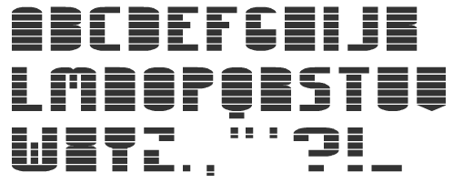
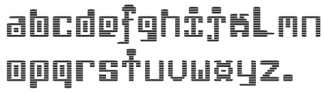
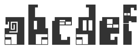
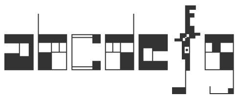
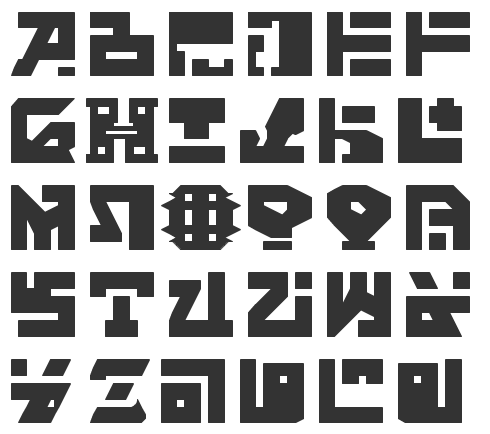
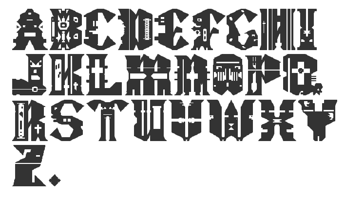
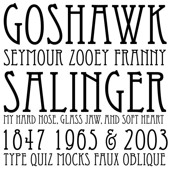
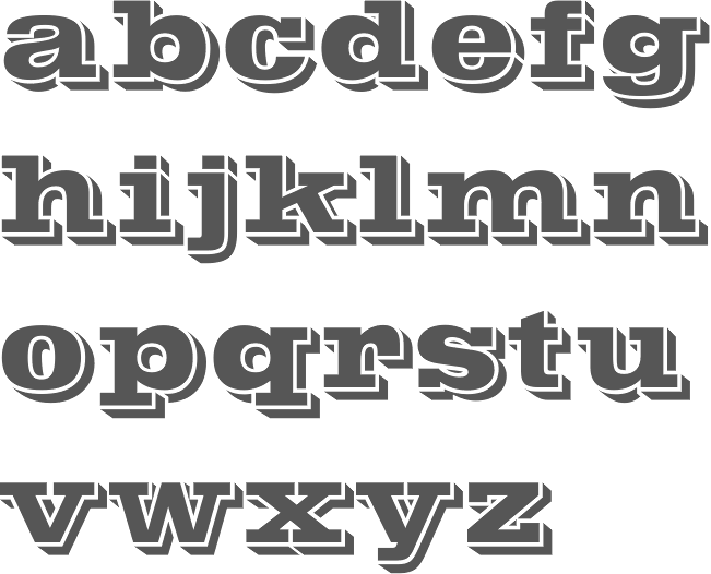
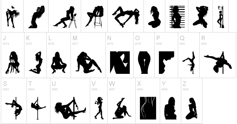
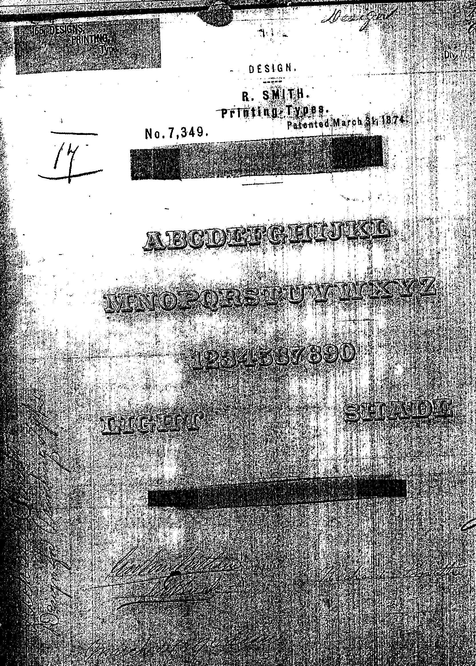
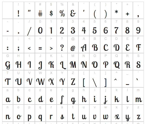
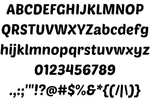
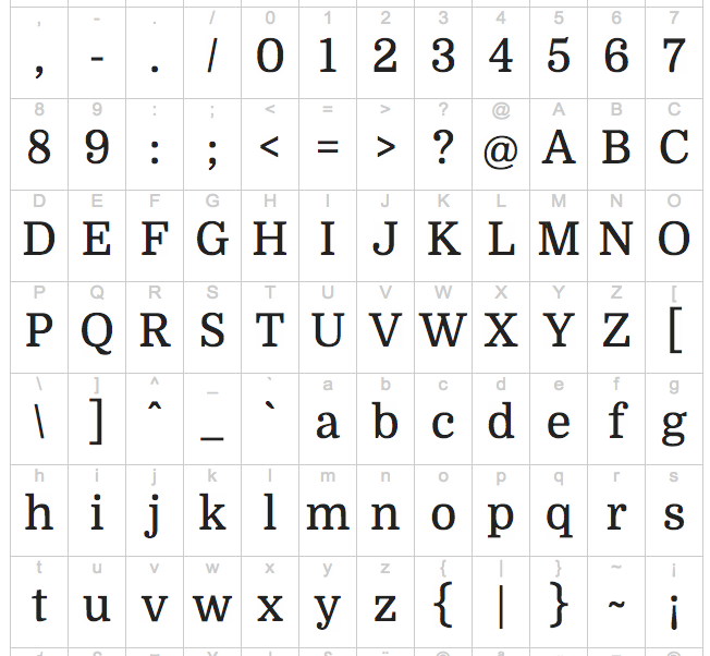
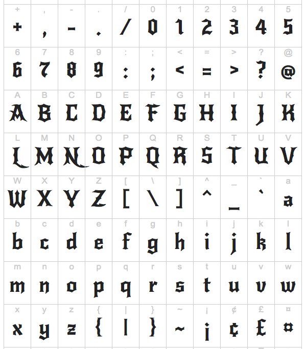
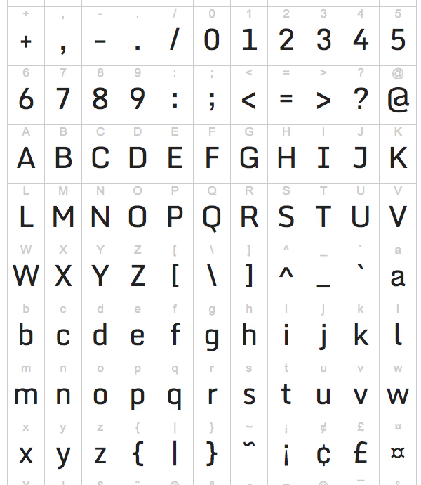
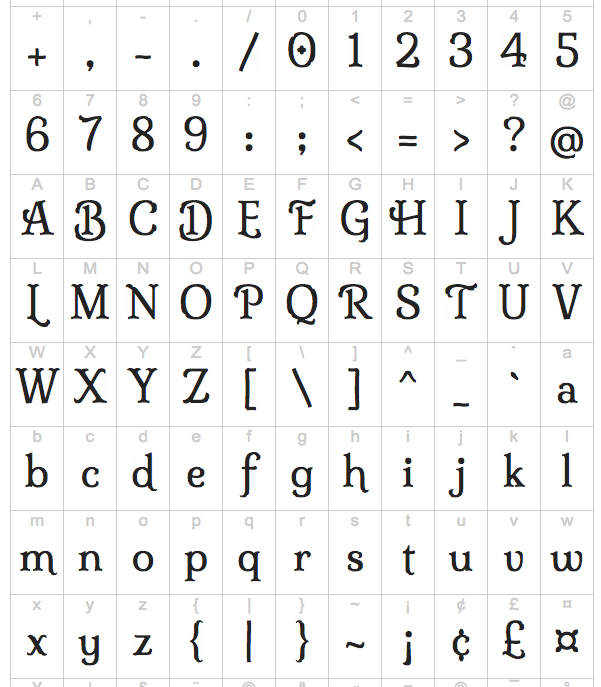
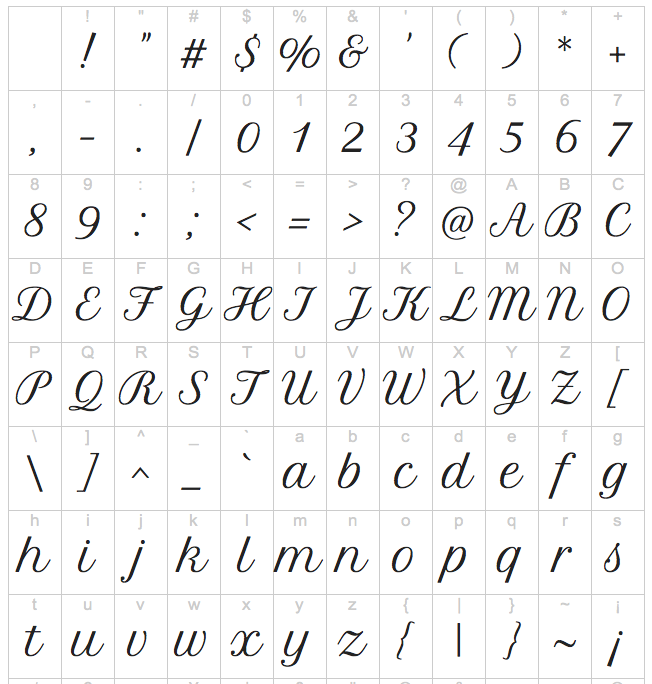
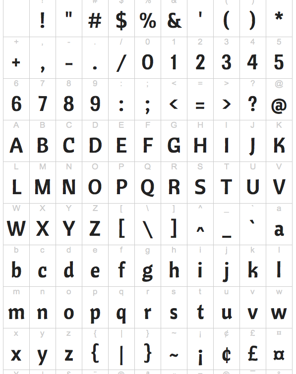
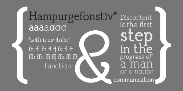
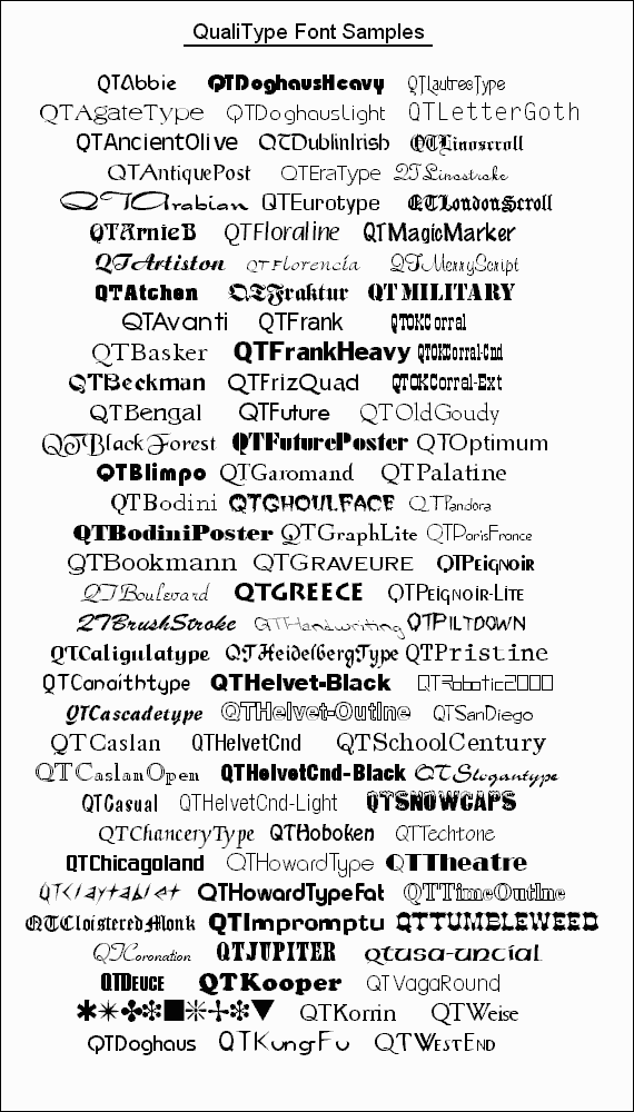
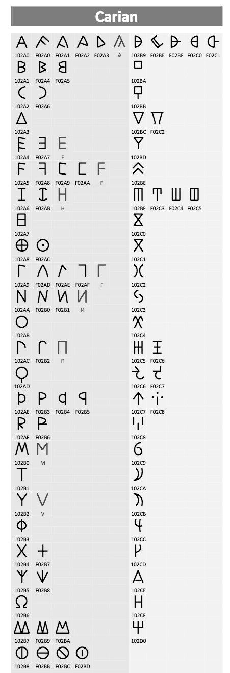
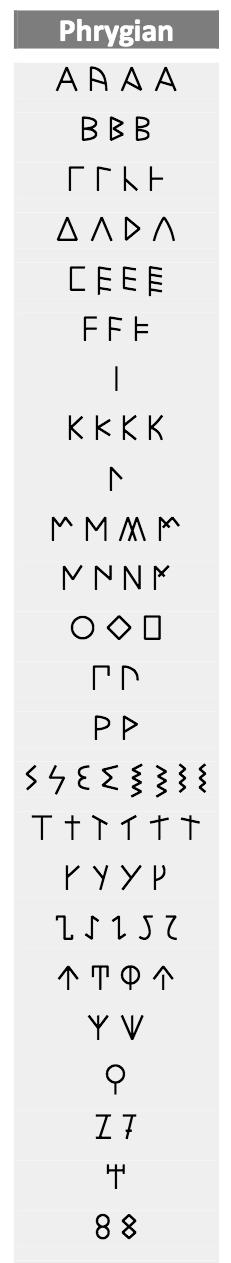
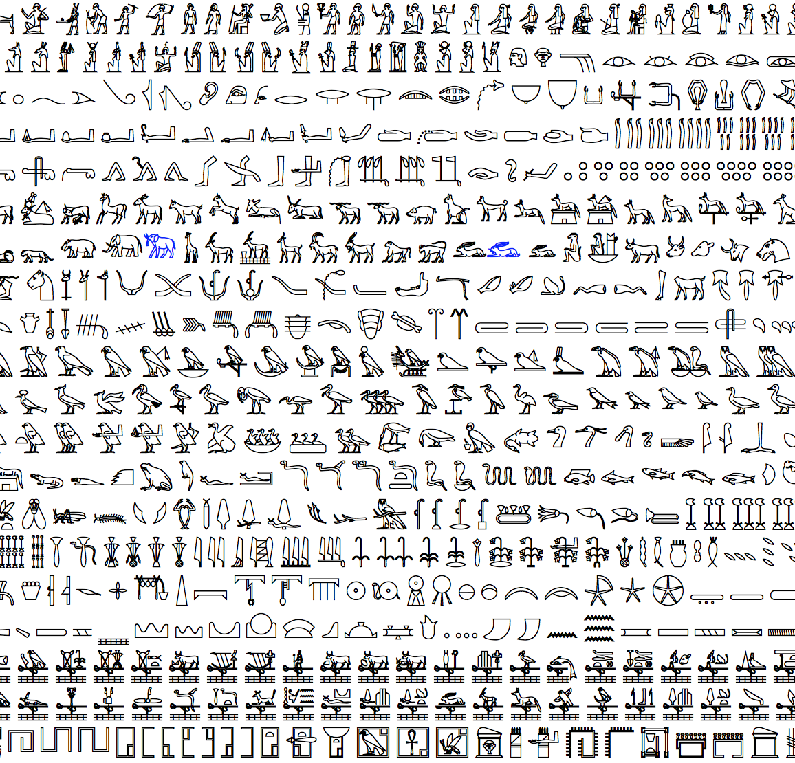
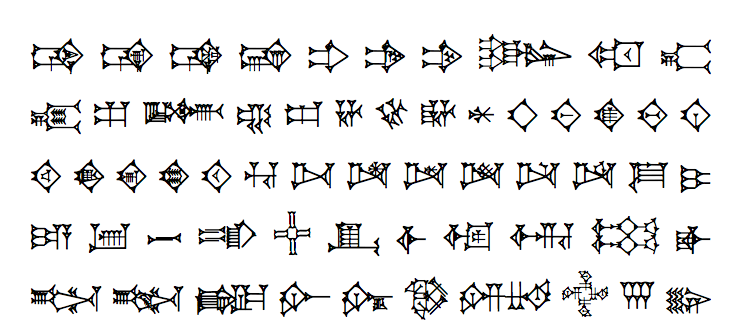
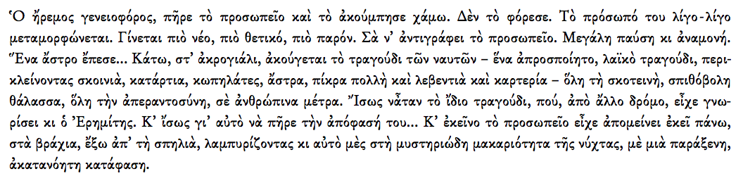
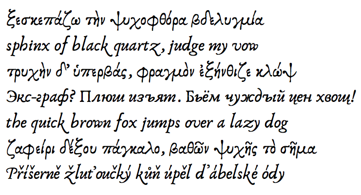
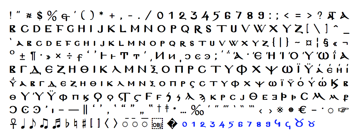
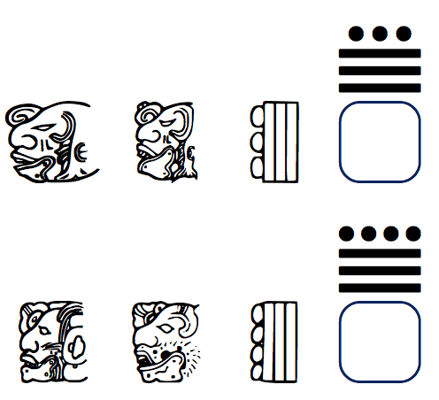
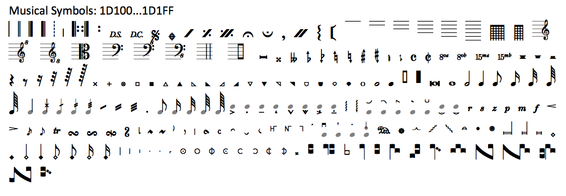
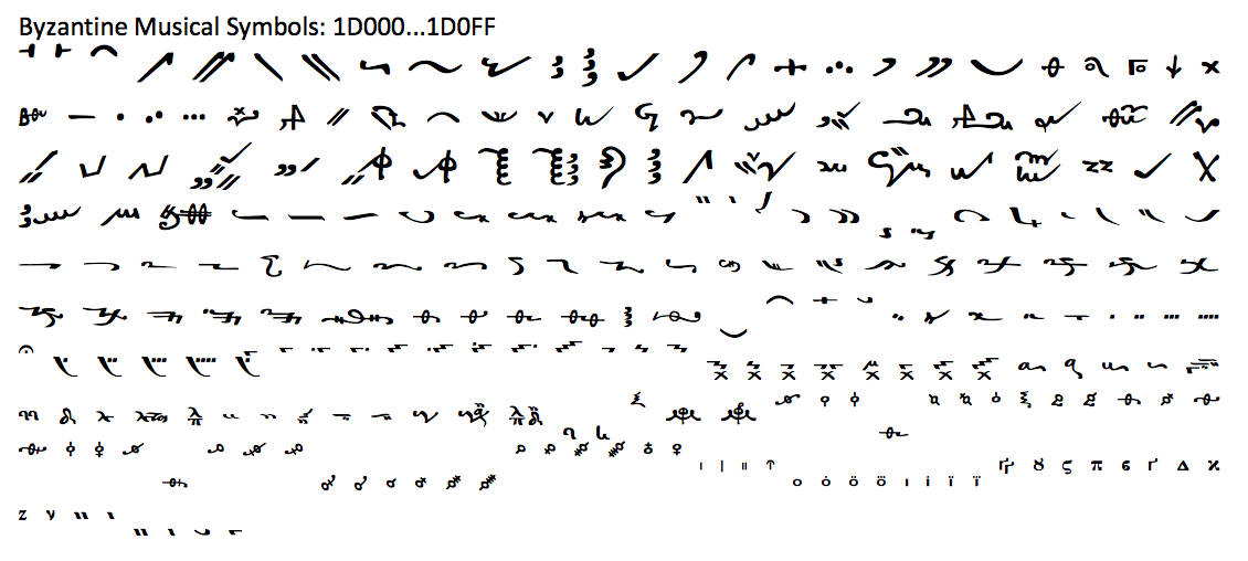