TYPE DESIGN INFORMATION PAGE last updated on Mon Mar 9 15:59:19 EDT 2026
FONT RECOGNITION VIA FONT MOOSE
|
|
|
|
|
Cuneiform simulation typefaces | ||
|
|
|
|
SWITCH TO INDEX FILE
Alphabetum
| Juan-José Marcos García (b. Salamanca, Spain, 1963) is a professor of classics at the University of Plasencia in Spain. He has developed one of the most complete Unicode fonts named ALPHABETUM Unicode for linguistics and classical languages (classical&medieval Latin, ancient Greek, Etruscan, Oscan, Umbrian, Faliscan, Messapic, Picene, Iberic, Celtiberic, Gothic, Runic, Modern Greek, Cyrillic, Devanagari-based languages, Old&Middle English, Hebrew, Sanskrit, IPA, Ogham, Ugaritic, Old Persian, Old Church Slavonic, Brahmi, Glagolitic, Ogham, ancient Greek Avestan, Kharoshti, Old Norse, Old Icelandic, Old Danish and Old Nordic in general, Bengali, Hindi, Marathi, Phoenician, Cypriot, Linear B with plans for Glagolitic). This font has over 5000 glyphs, and contains most characters that concern classicists (rare symbols, signs for metrics, epigraphical symbols, "Saxon" typeface for Old English, etcetera). A demo font can be downloaded [see also Lucius Hartmann's place]. His Greek font Grammata (2002) is now called Ellenike. He also created a package of fonts for Latin paleography (medieval handwriting on parchments): Capitalis Elegans, Capitalis Rustica, Capitalis Monumentalis, Antiqua Cursiva Romana, Nova Cursiva Romana (2014), Uncialis, Semiuncialis, Beneventana Minuscula, Visigothica Minuscula, Luxoviensis Minuscula, Insularis Minuscula, Insularis Majuscula, Carolingia Minuscula, Gothica Textura Quadrata, Gothica Textura Prescissa, Gothica Rotunda, Gothica Bastarda, Gothica Cursiva, Bastarda Anglicana (2014) and Humanistica Antiqua. PDF entitled Fonts For Latin Palaeography (2008-2014), in which Marcos gives an enjoyable historic overview. Alphabetum is not Marcos's only excursion into type design. In 2011, he created two simulation fonts called Sefarad and Al Andalus which imitate Hebrew and Arabic calligraphy, respectively. Cyrillic OCS (2012) is a pair of Latin fonts that emulate Old Church Slavonic (old Cyrillic). In 2013, he created Cuneus, a cuneiform simulation typeface. Paleographic fonts for Greek (2014) has ten fonts designed by Marcos: Angular Uncial, Biblical Uncial, Coptic Uncial, Papyrus Uncial, Round Uncial, Slavonic Uncial, Sloping Uncial, Minuscule IX, Minuscule XI and Minuscule XV. These fonts are representative of the main styles of Greek handwriting used during the Classical World and Middle Ages on papyrus and parchments. There is also a short manual of Greek Paleography (71 pages) which explains the development of Greek handwriting from the fourth century B.C. to the invention of printing with movable type in the middle of the fifteenth A.D. He wrote a text book entitled History of Greek Typography: From the Invention of Printing to the Digital Age (in Spanish; second edition, 2018). See also here and here. [Google] [More] ⦿ |
Cuneus
|
|
Areia, PB, Brazil-based designer, b. 1989. His typefaces include Nike90 (2013, inspired by ancient cuneiform writing from Mesopotamia) and Nexus FPS (2017, based on segmented rounded glyphs that emulate DNA). [Google] [More] ⦿ | |
Creator of these typefaces:
Behance link. Devian tart link. Home page. Dafont link. Old home page. Fontspace link. Abstract Fonts link. Creative Market link. [Google] [More] ⦿ | |
Juan-José Marcos García
| |
Juan-José Marcos García
| |
Aka L'Invisible. Creator of the free cuneiform-inspired typeface Nineveh (2015). [Google] [More] ⦿ | |
During his studies at German University in Cairo, Egypt, Ma El-Maraghi created the Arabic typeface Akkad (2015), which was inspired by the cuneiform writing in Iraq. [Google] [More] ⦿ | |
During her studies under Nikola Djurek at the School of Design in Zagreb in 2010, Marina Jukic designed an experimental layered font, Nabucco. She writes: Nabucco is a revival typeface taken from a poster for Giuseppe Verdi's opera Nabucco Boris Bucan made for the Croatian National Theatre in Split. Boris Bucan is a renowned artist, painter and graphic designer from Croatia, famous for his peculiar approach in designing posters for cultural events. This silk-screen poster was made in 1983, and it was most likely inspired by Babylonian art and cuneiform script. The use of silk-screen caused a slight shift in printing of these bichrome letterforms, which was an inspiration for designing a layering font that contains two layers taken from the poster and an outline construction layer that provides many ways of combining them. [Google] [More] ⦿ | |
Zhengzhou, China-based designer of a vintage alphabet in 2014. He/she also drew a cuneiform alphabet in 2014. In 2015 he published the oriental simulation font ABR, the all caps typeface OHBI (Ox Hide Bronze Ingot), the experimental Honeycomb font, the cuneiform numeral typeface MQ (2015), and the flared all caps typeface EAG for Latin--the name EAG for elegant ancient Greek, though, is misleading. Home page. Another link. At Behance, we find the name Carpenter Baker. Home page. [Google] [More] ⦿ | |
Shuji Kikuchi
| |
Sugargliderz
|
Free fonts: Frail (2011, a 6-style grungified didone family), Cuneiform (2006-2008, this is a cuneiform simulation font), Fragment Core, Proto Uncertain (handwriting), Shears, Unnamed. Commercial fonts: Puchiflit (2020: a typewriter slab serif that according to Kikuchi is a felt tip pen font), Pinch Remix (2020: hand-printed), Oddlini (2019: a 360-style basic grotesk family that covers all widths; it has obliques instead of italics), Oddlini 2 (2019), Knock Type (2017, a kana-Latin-Braille transcription font), Du (2016, a hand-printed font), Magendfret (2016, a warm typewriter family), Artlessness (2015), Bush (2014), Nora Pen (2014, a didone influenced by Walbaum), Uncertain Felttip (2008), the Palindrome family (2006, experimental), Pinch (2007, hand-printed), ScratchWithTheCoin (2007, grunge), Bagworm (2007, four styles, influenced by Tekton), Decay (2008, grunge), Beg Before (2008, grunge), Beg After (2008, grunge), Phoebus Palast (2008), Kropotkin (2008, 24 styles of a sturdy early 20th century grotesk), Rebuild-Square (2009, totally square family), Ponytail (2009, rounded), Violadabraccio (2009, serif), Lettera, Bush, Long Haul Trucker (2009, alphading/logo font), Michel (2009, didone). |
|
|
|
|
|


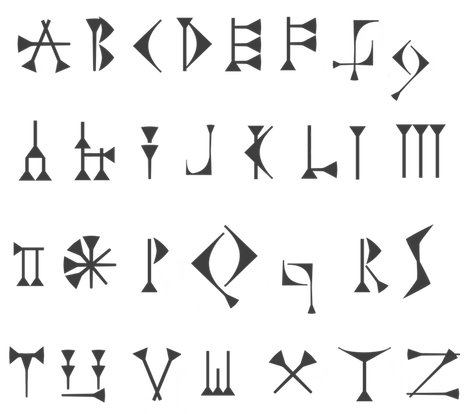
 Cuneiform simulation typeface made in 2013 by Juan-José Marcos García (Plasencia, Spain). [
 Designer from from Puyo, Ecuador, b. 1991, known as Darko Juan. He made numerous free fonts.
 [
[