|
Warren Chappell
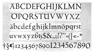
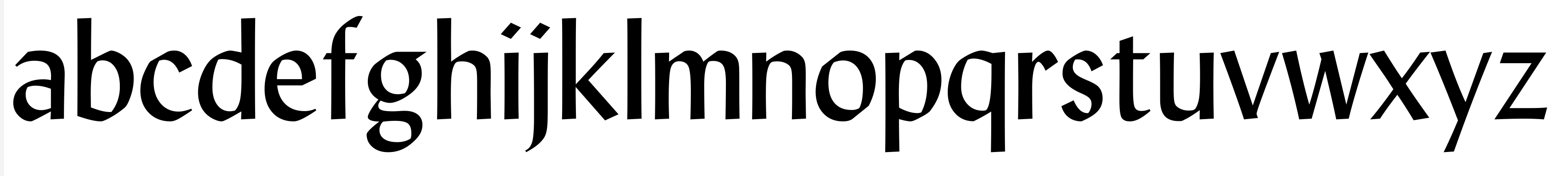
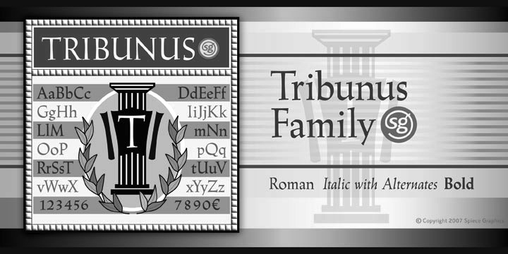
Born in Richmond, VA, 1904, d. Charlottesville, VA, 1991. Typographer, illustrator, letterer, and type designer. He made two type families: - Trajanus (1939-1940, for Stempel). McGrew on Trajanus: Trajanus was designed by Warren Chappell, New York illustrator and letterer, in 1939, and cast by Stempel in Germany. It has the basic form of classic Venetian letters, but with a nervous, pen-drawn, contemporary quality. Ascenders are fairly long but descenders are short. The narrow italic lowercase shows a calligraphic quality in particular. There is an extra little flick of the pen at the end of crossbars of f and t; caps M and N have no serifs on their apexes; and cap U is lowercase in form. Trajanus is named for the Roman emperor whose accomplishments are immortalized in classic letters on the Trajan column. The three versions are also made by German Linotype, but have not received much attention in America. For revivals, see Tribunus SG by Jim Spiece and Linotype Trajanus (probably close to the original design as Linotype absorbed Stempel).
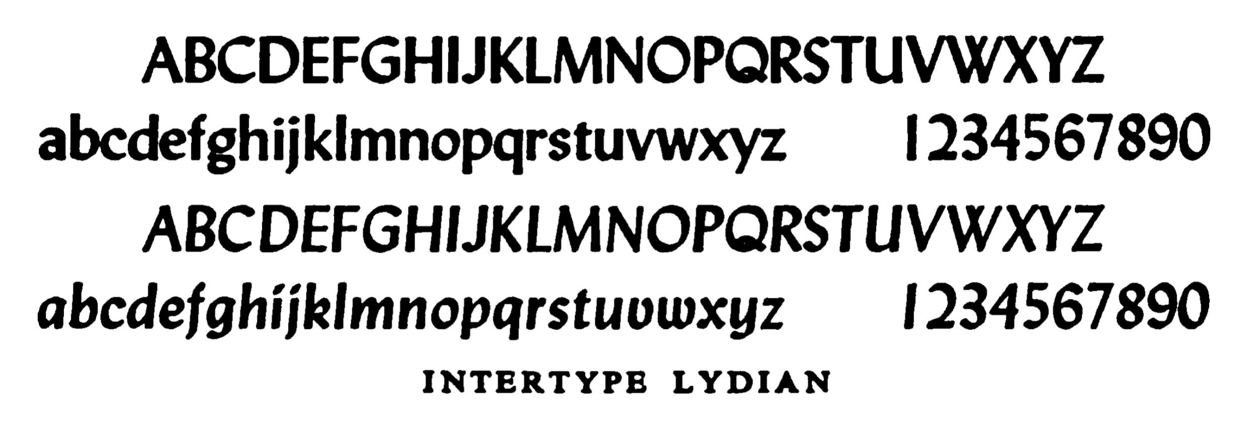
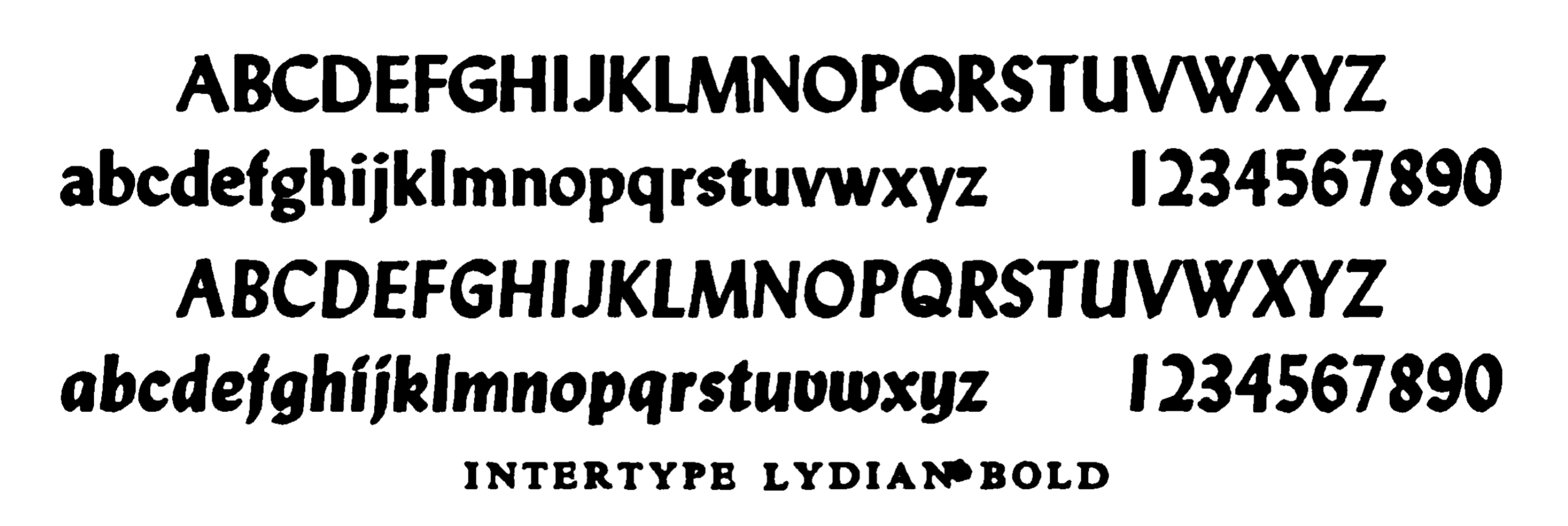
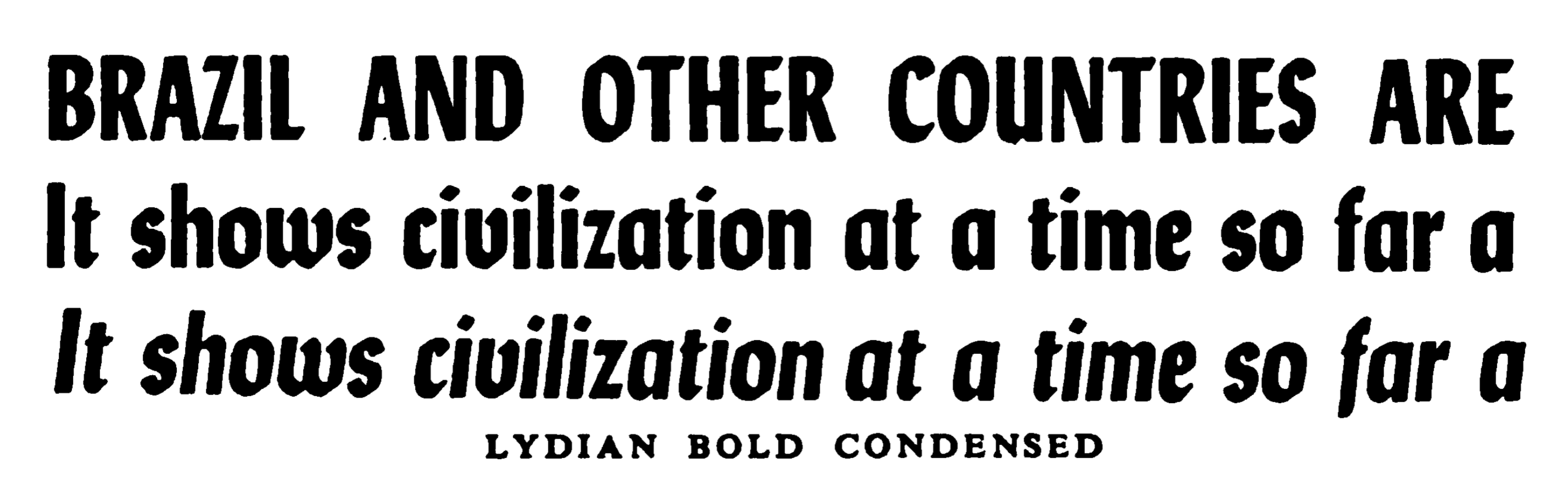
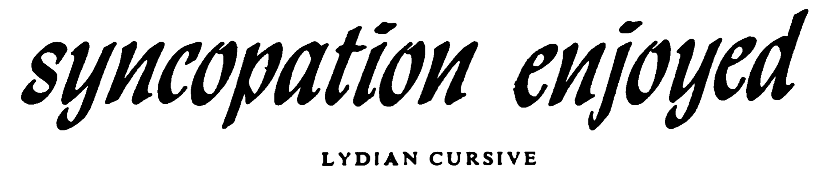
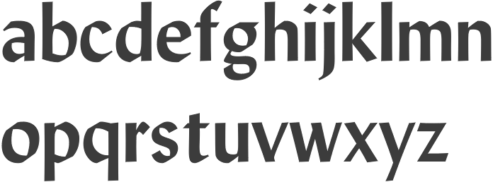
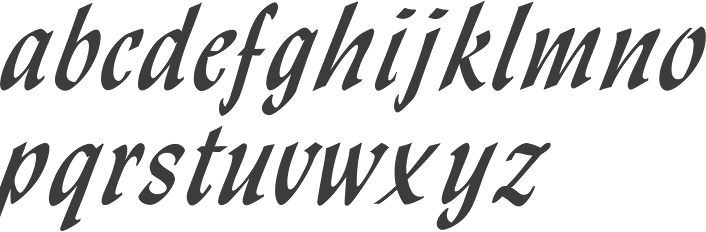
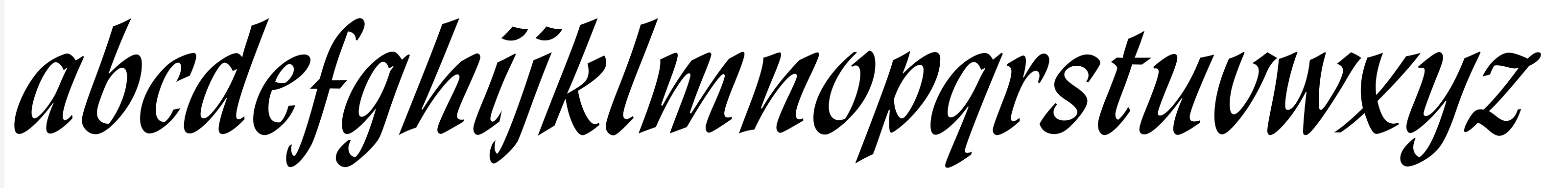
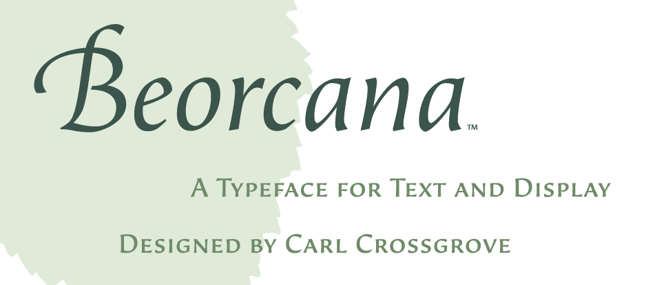
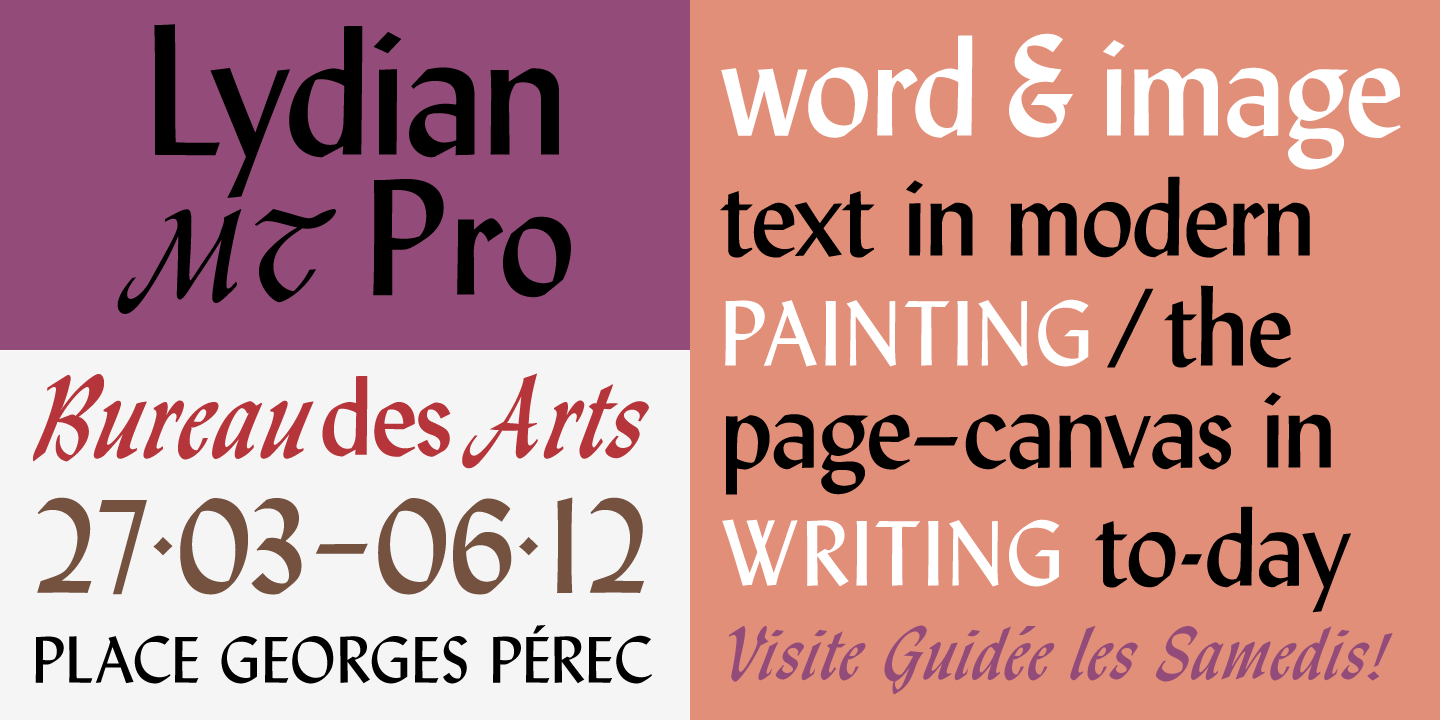
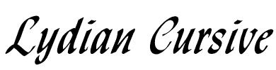
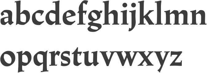
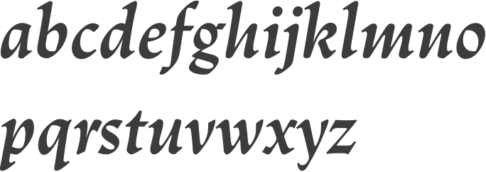
- Lydian (1938, ATF) and Lydian Cursive (1940). McGrew writes: The Lydian series is a brilliant and popular calligraphic style designed by Warren Chappell for ATF. The lighter weight and italic were designed in 1938; bold and italic in 1939. They have the appearance of being lettered with a broad pen held at a 45-degree angle, but the ends of vertical strokes are square, improving legibility and stability. This is probably the most popular thick-and-thin serifless letter of American origin, though the concept is more popular in Europe. Oldstyle figures were made for these four Lydians, but were fonted separately and very rarely used. These four typefaces were copied by Intertype in an unusually large range of sizes for a slug machine, and from these matrices some suppliers cast fonts of type for handsetting. Lydian is named for the designer's wife, Lydia. Compare Czarin, Stellar, Radiant, Optima, Samson, Valiant. Lydian Cursive was drawn by the same designer in 1940. Although it gives the appearance of having been drawn with the same sort of pen as the regular series, it is much freer and more calligraphic, with a style unmatched by any other American script or cursive face. Lydian Bold Condensed was designed in 1946, also by Chappell, but not marketed until 1949. It has the general character of the earlier typefaces, but with much more emphasis on the vertical strokes. This gives the lowercase a suggestion of the effect of a simplified German blackletter. Digital versions:
- Lydian and Lydian Cursive by Bitstream. The early versions of Lydian and Lydian Cursive were called Granite, Lisbon, Granite Cursive and Lisbon Cursive.
- Lydian and Lydian Cursive by Tilde. These are identical to the Bitstream fonts.
- Monotype Lydian.
- Manofa (2018, Mariya Pigoulevskaya for The Northern Block). This bold family was inspired by Lydian.
- MPI Sardis (2013). By mpressinteractive. Inspired by Lydian.
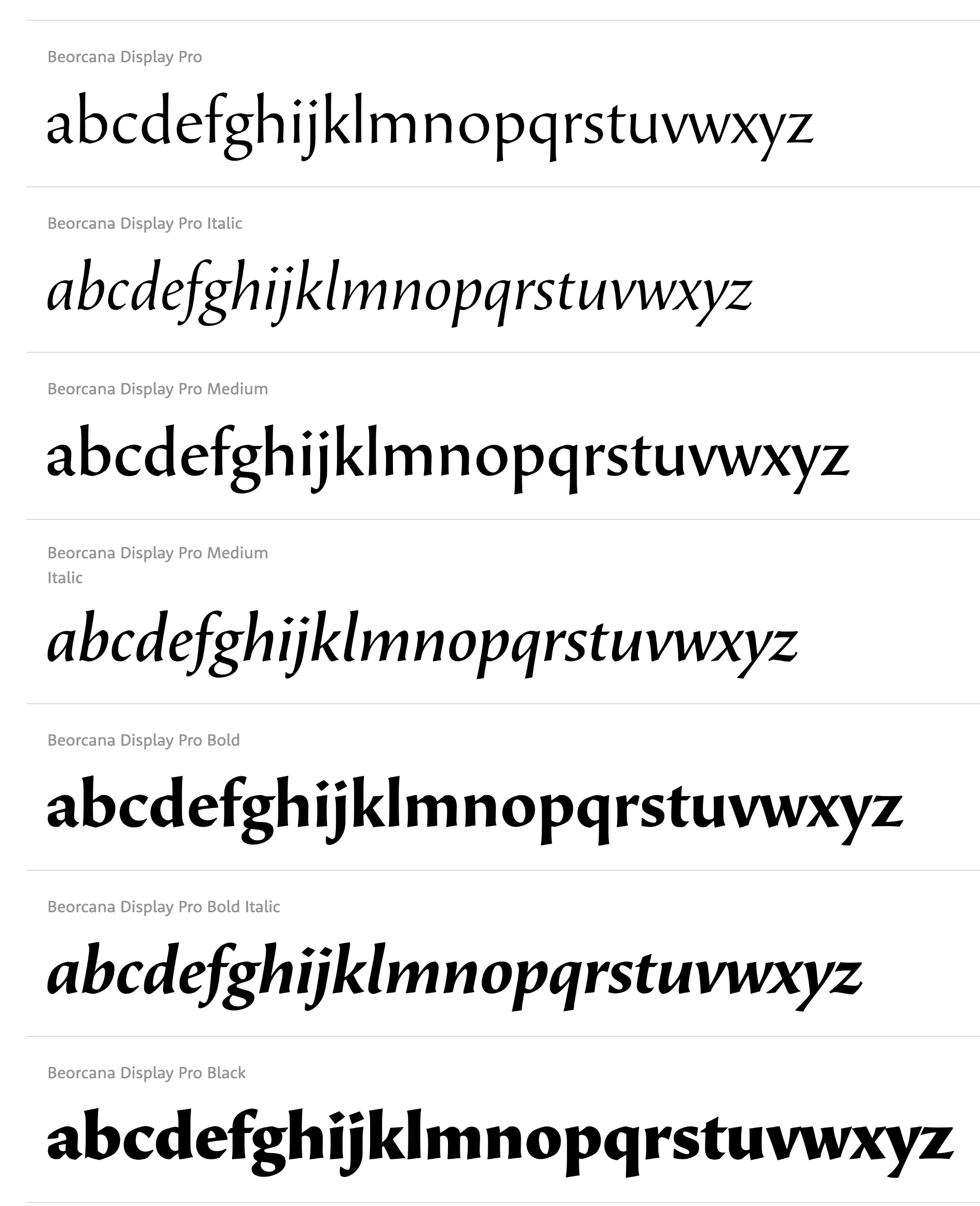
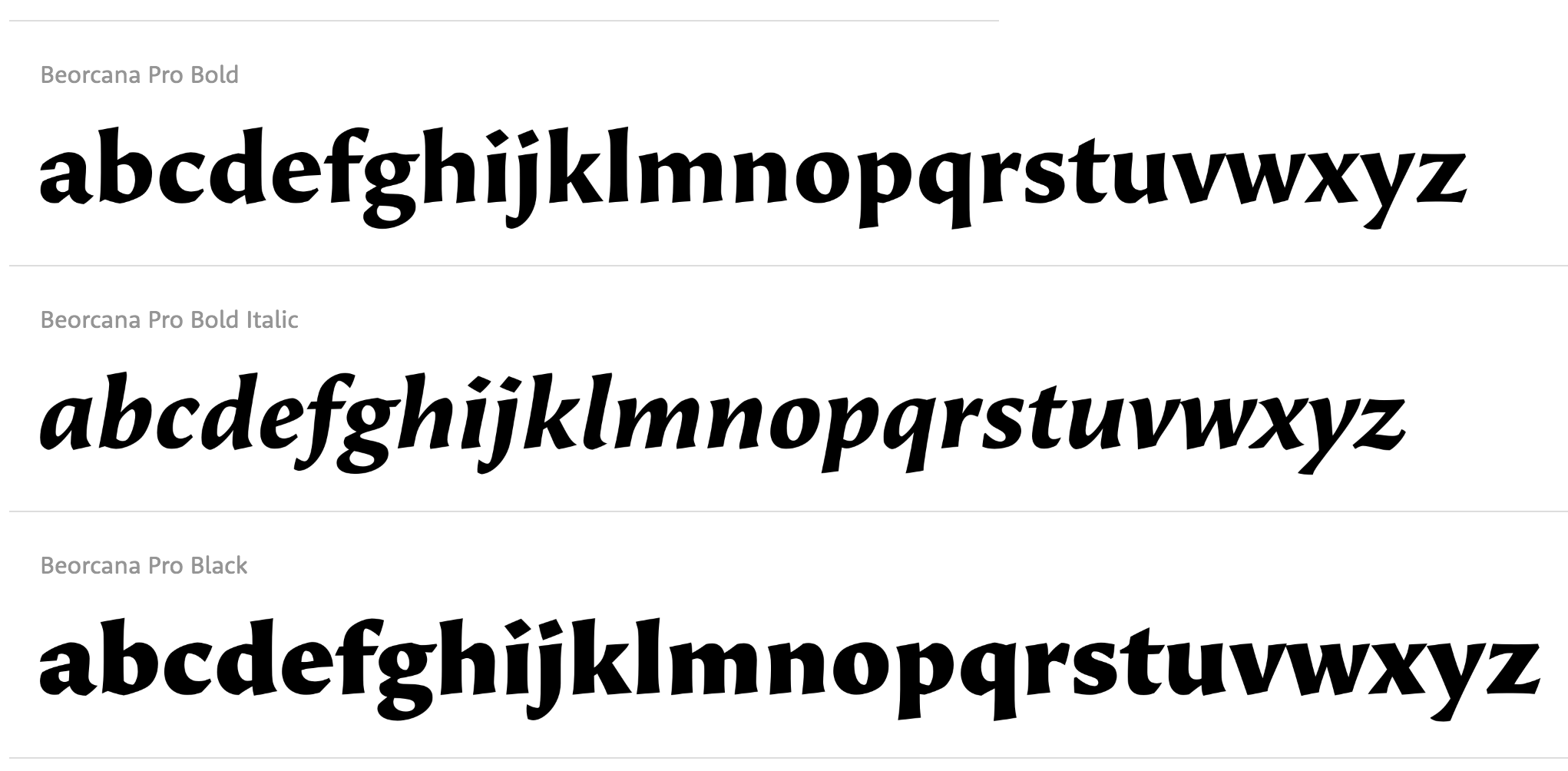
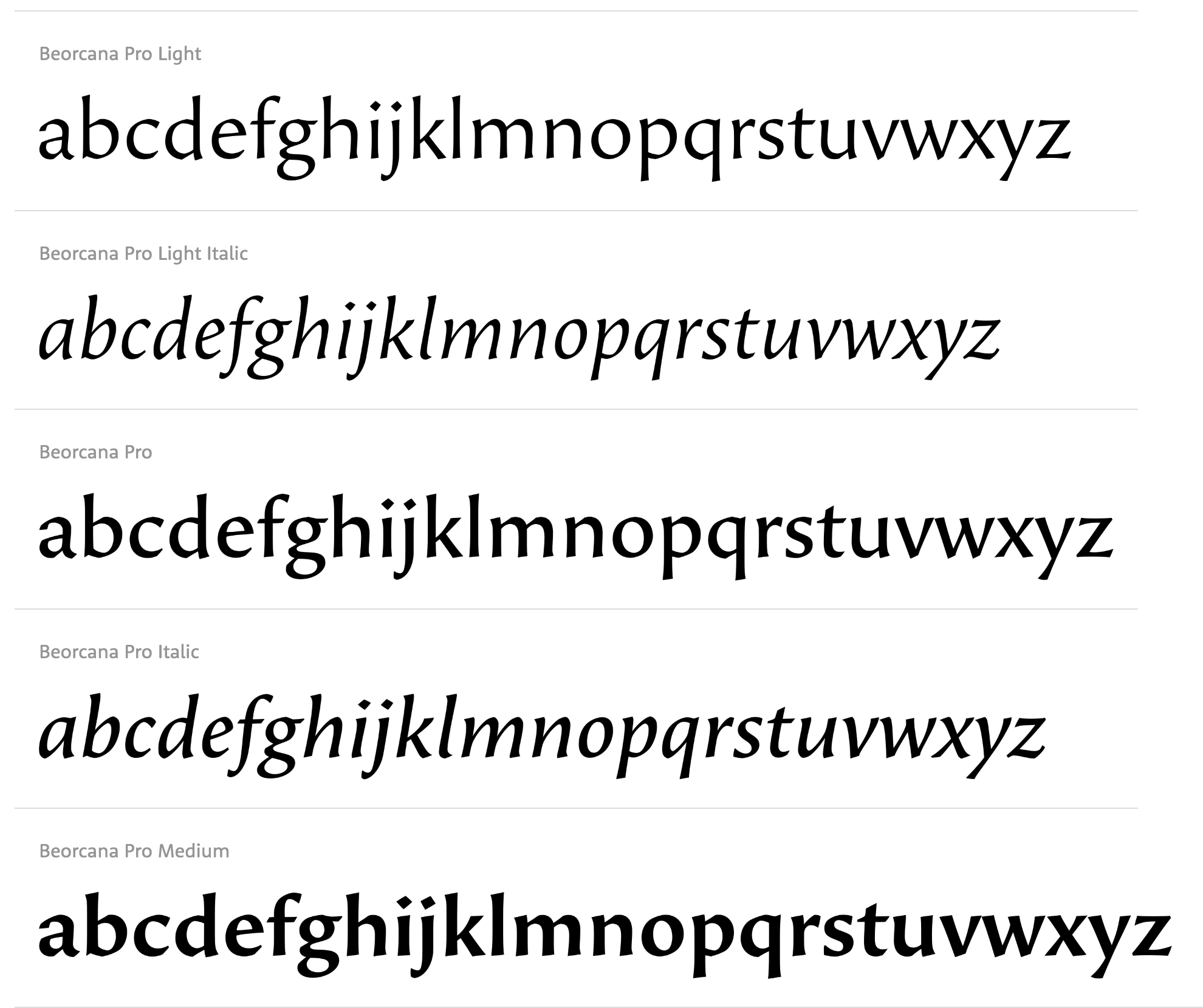
- Beorcana Pro (2006, Carl Crossgrove). A distant relative of Lydian.
- Libris ADF. A free family by Arkandis.
- Lydia Bold Condensed (2013, Benjamin Critton).
- OPTI Lydian Cursive (Castcraft).
Chappell studied under Koch in 1931-1932 and worked briefly for him afterwards. This page states that he designed a font called Eichenauer (for Gustav Eichenauer, who cut the type in lead) in 1955, but it was never manufactured and released. This face, tentatively named Eichenauer, was shown in Chappell's book A Short History of the Printed Word. Klingspor file on him (PDF). FontShop link. View Warren Chappell's typefaces.
|
EXTERNAL LINKS
Warren Chappell
 [Designer info] [Designer info]
Monotype link
Klingspor Museum page
MyFonts search
Monotype search
Fontspring search
Google search
INTERNAL LINKS
Type designers ⦿
Type designers ⦿
Type scene in Virginia ⦿
Type scene in New York ⦿
German type scene ⦿
Typefaces inspired by the Trajan column in Rome ⦿
Books on type design ⦿
Venetian or antiqua typefaces ⦿
Calligraphic typefaces ⦿
|
