TYPE DESIGN INFORMATION PAGE last updated on Fri Jul 11 19:06:59 EDT 2025
FONT RECOGNITION VIA FONT MOOSE

|
|
|
|
Delve Fonts (was: Delve Media Arts)
[Delve Withrington]
Delve Withrington (Alameda, CA; b. 1970, Asheville, NC) studied at Savannah College of Art and Design, designed signage, print projects and web pages in addition to designing custom typefaces, worked for Fontshop, and in 2004, joined the type team at Agfa Monotype, which morphed into Monotype Imaging, Redwood City, CA. From Asheville, NC, he moved around and ended up in San Francisco. In 1996, he founded Delve Fonts in Berkeley, CA (in fact, Delve Media Arts, and later renamed Delve Fonts). He has collected a virtually complete list of books on typography. Author index. MyFonts link. Designer of these typefaces:
|
EXTERNAL LINKS |
| | |

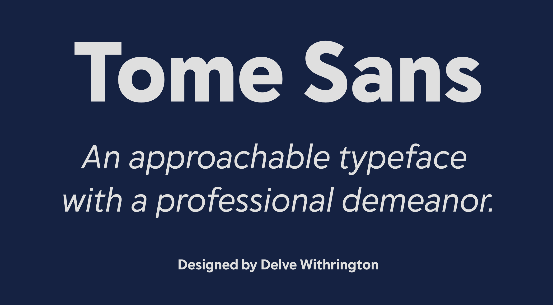
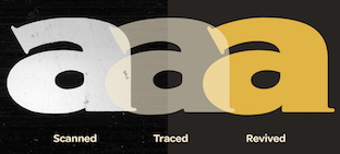
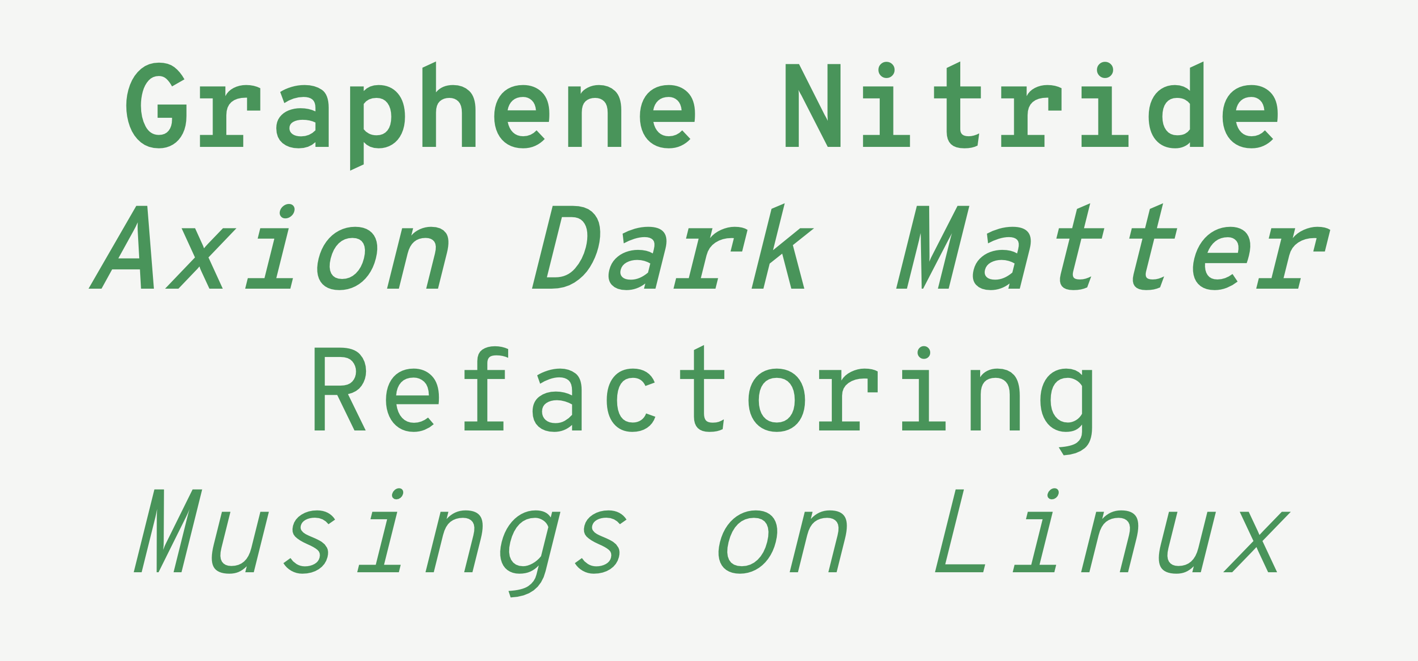
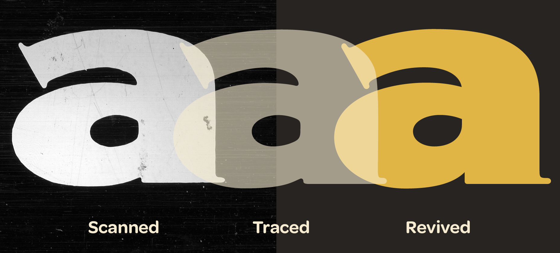
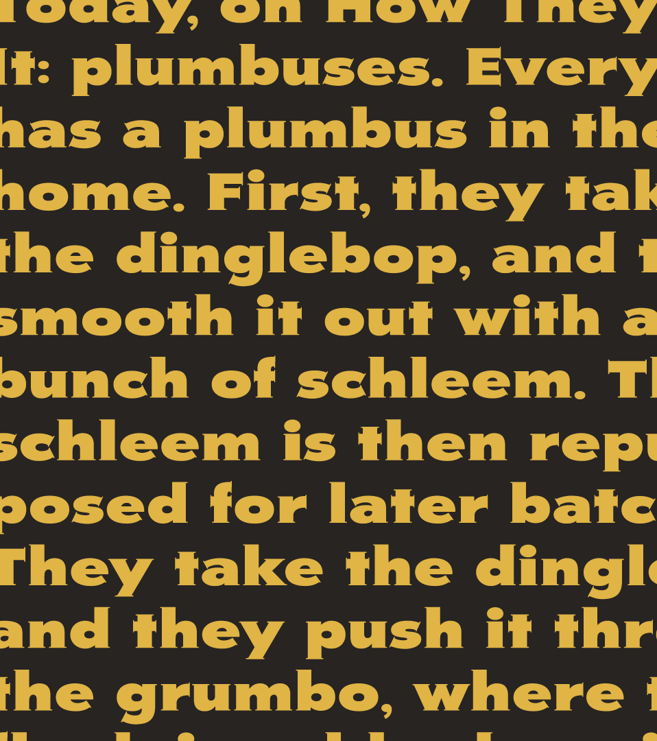
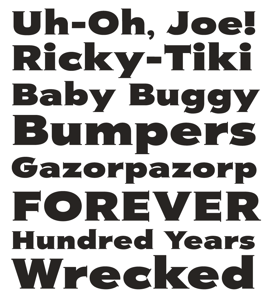
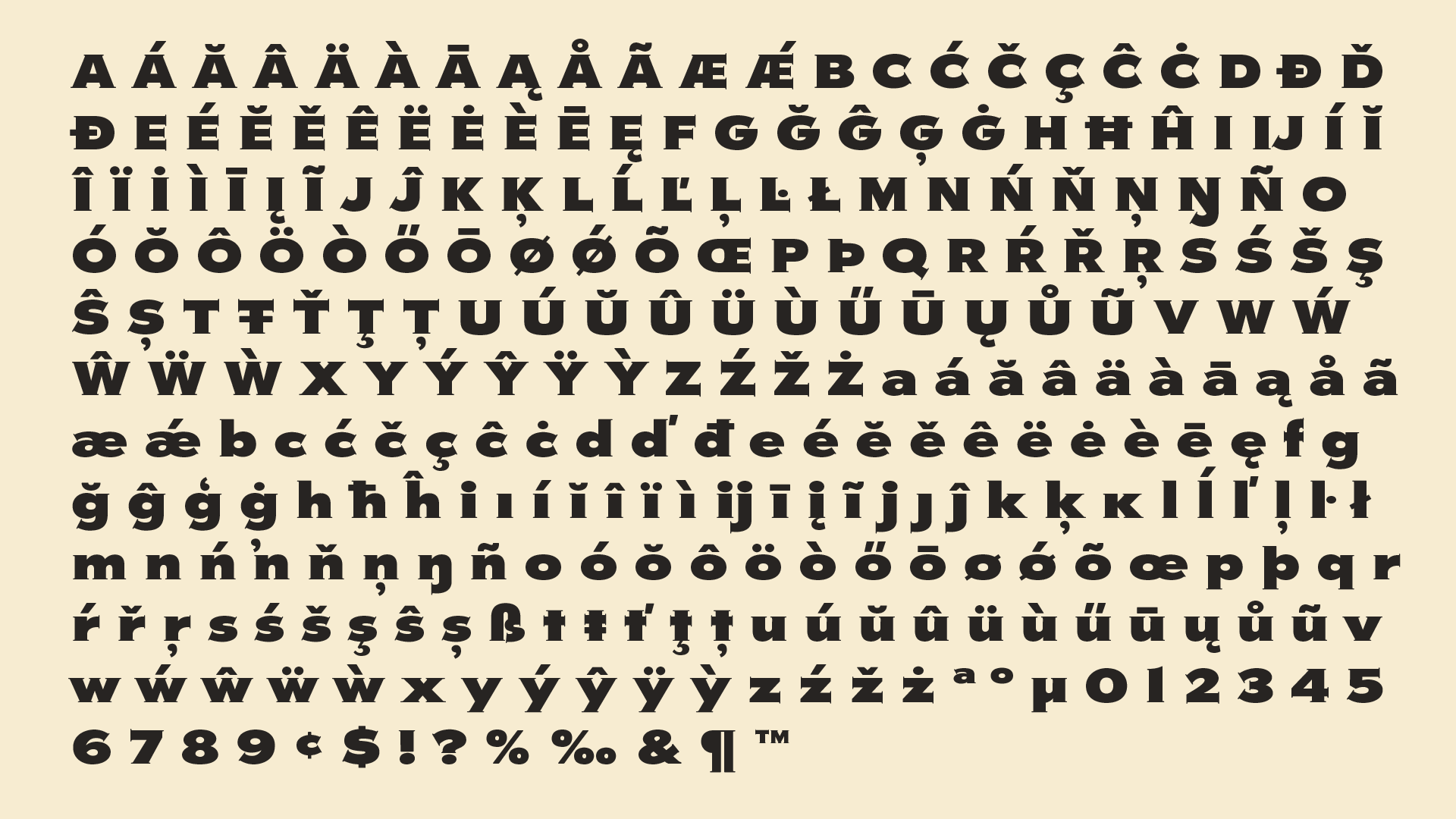
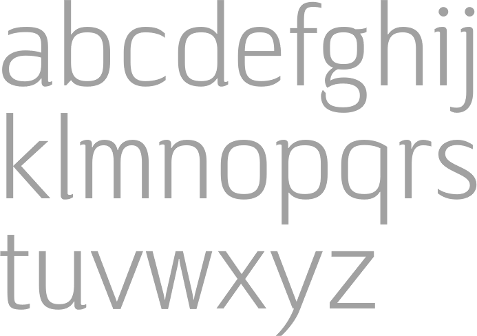
file name: Delve Withrington Tome Sans 2020

file name: Delve Withrington Tome Sans 2020
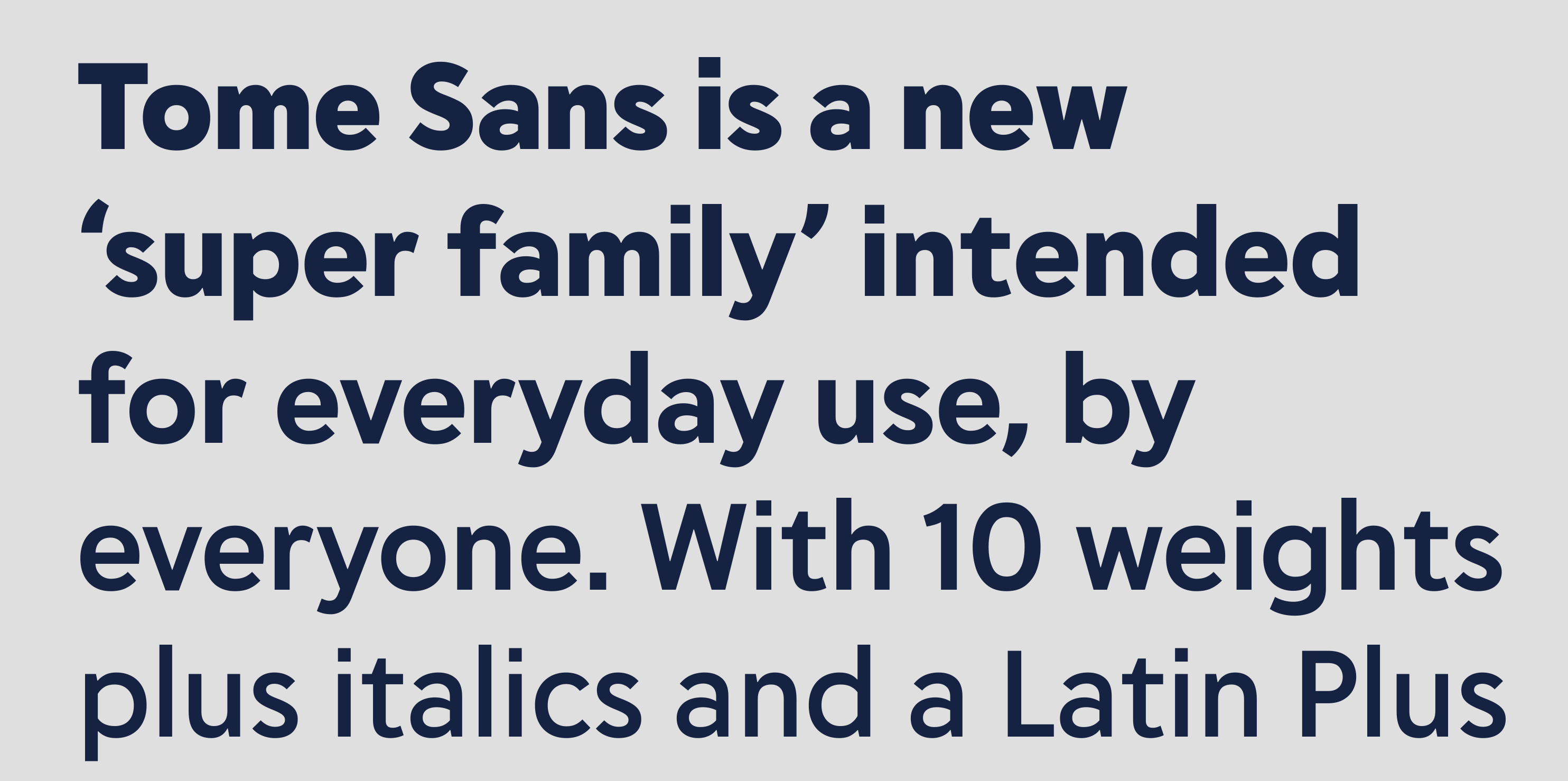
file name: Delve Withrington Tome Sans 2020
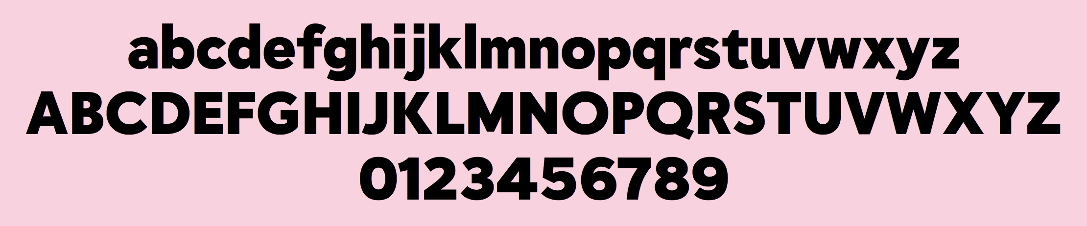
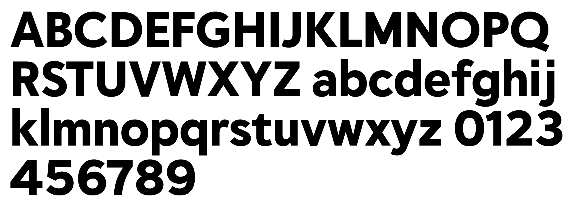
file name: Delve Withrington Tome Sans Black 2020
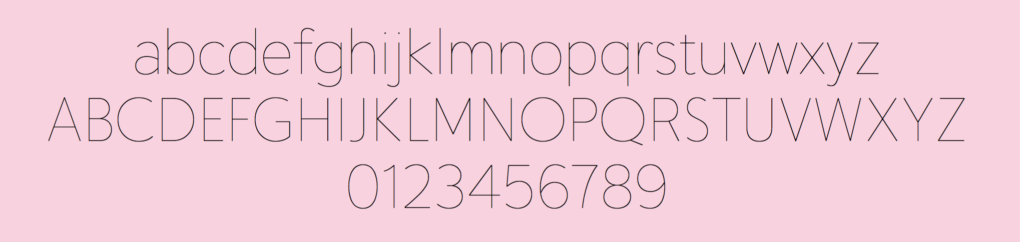
file name: Delve Withrington Tome Sans Extra Thin 2020
file name: Delve Withrington Tome Sans 2020

file name: Delve Withrington Blasphemy Initials 2009d
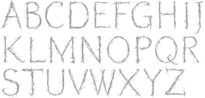
file name: Delve Withrington Blasphemy Initials 2009
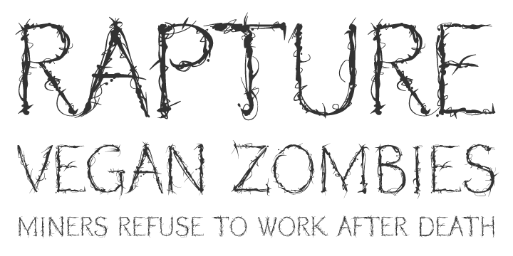
file name: Delve Withrington Blasphemy Initials 2009b
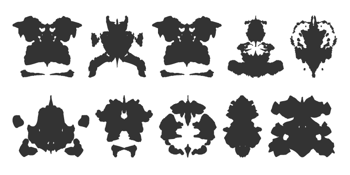
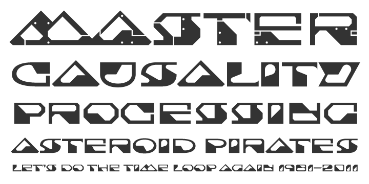
file name: Delve Withrington Blot Test 1999
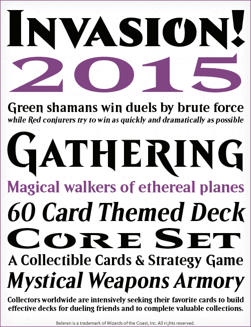
file name: Delve Fonts Beleren 2015
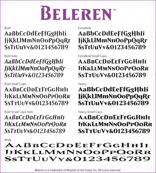
file name: Delve Fonts Beleren 2015b
file name: Delve Withrington Cody 1999
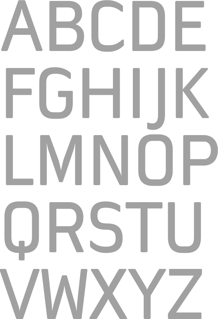
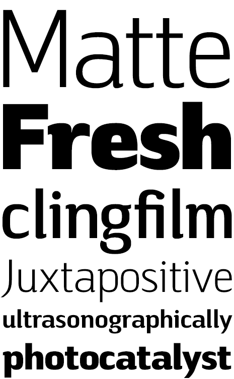
file name: Delve Fonts Overpass Mono 2020

file name: Delve Fonts Overpass Mono 2020
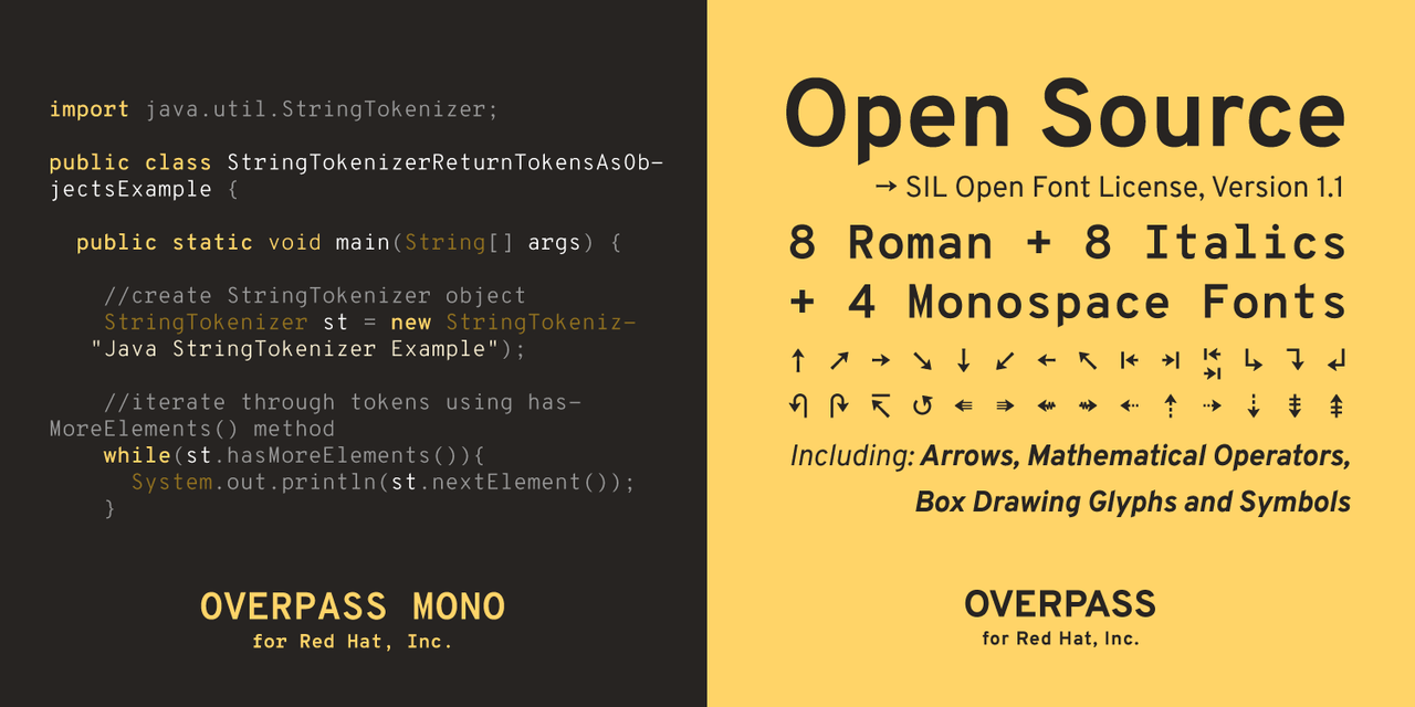
file name: Delve Fonts Overpass Mono 2020
file name: Delve Withrington, Dave Bailey Overpass Mono Bold 2016
file name: Delve Withrington, Thomas Jockin Overpass 2016

file name: Delve Fonts Filmotype Washington
file name: Delve Fonts Filmotype Washington
file name: Delve Fonts Filmotype Washington
file name: Delve Fonts Filmotype Washington
file name: Delve Fonts Filmotype Washington
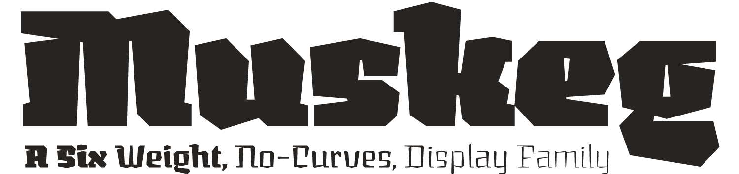
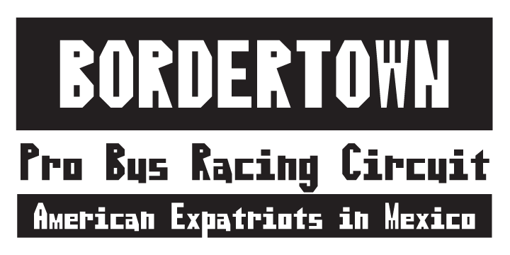
file name: Delve Withrington Muskeg

file name: Delve Withrington Muskeg
file name: Delve Withrington Muskeg

file name: Delve Withrington Muskeg
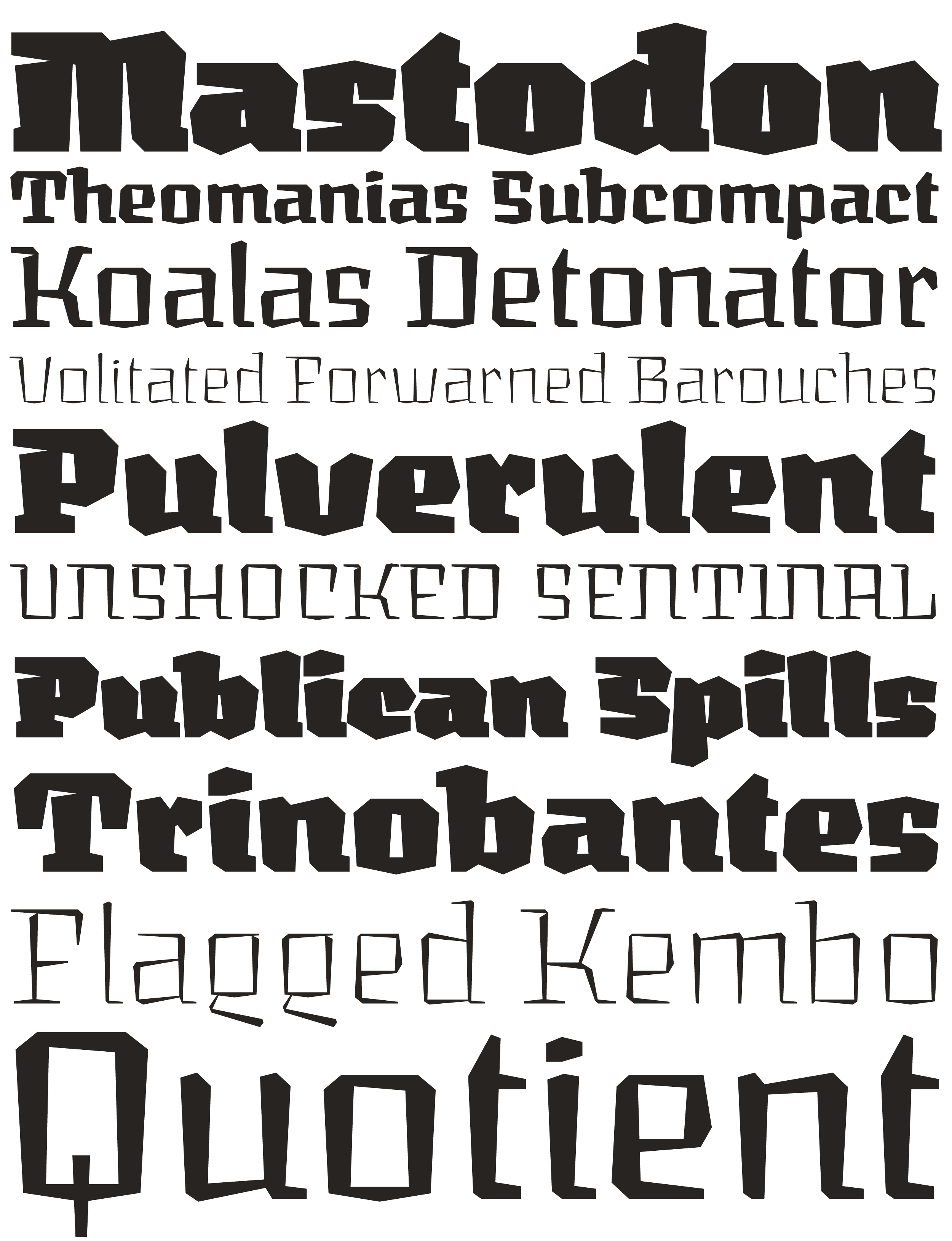
file name: Delve Withrington Muskeg
file name: Delve Withrington Muskeg
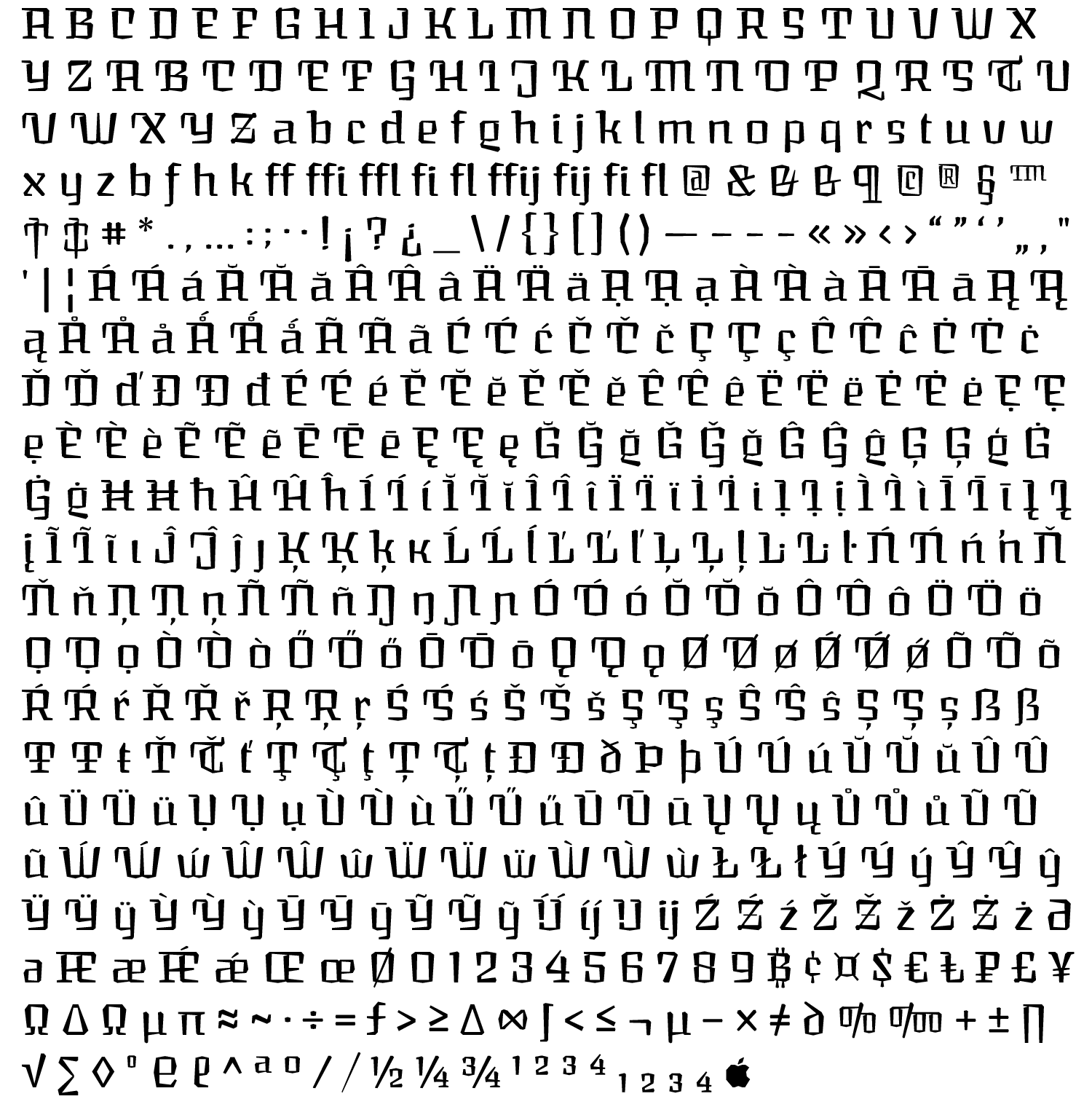
file name: Delve Withrington Muskeg
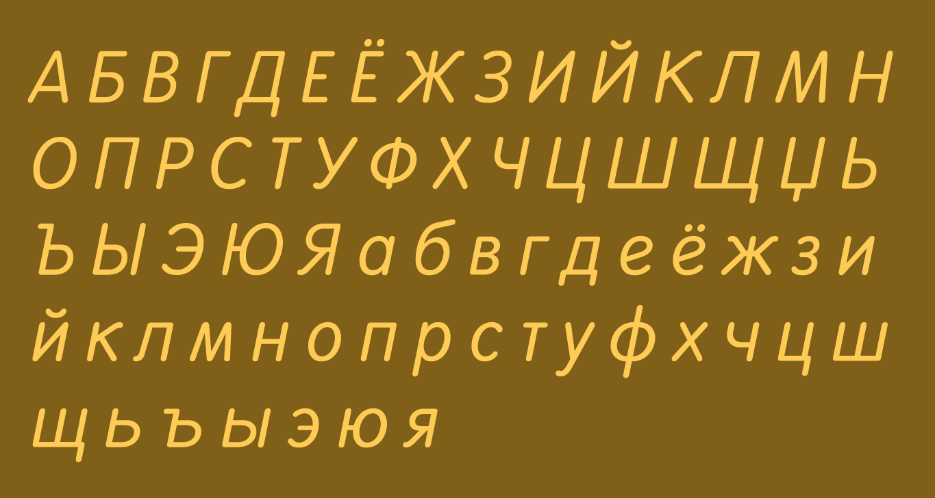
file name: Delve Withrington Smith Nephew Cyrillic 2015
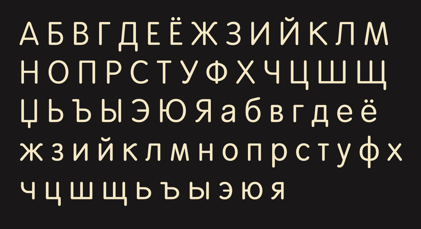
file name: Delve Withrington Smith Nephew Cyrillic 2015b
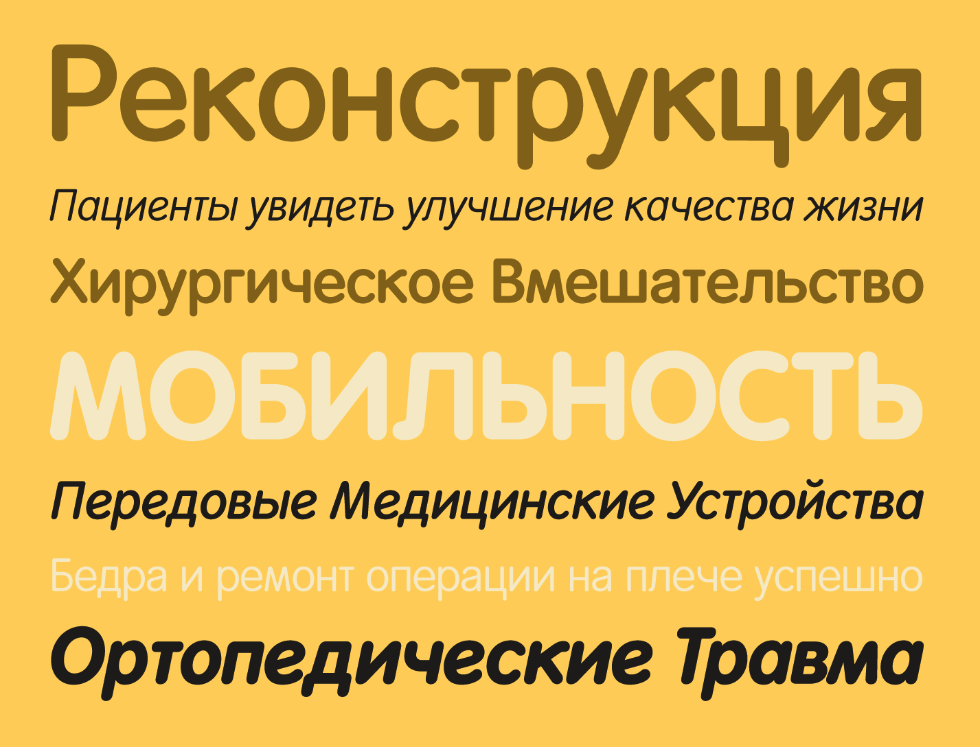
file name: Delve Withrington Smith Nephew Cyrillic 2015c
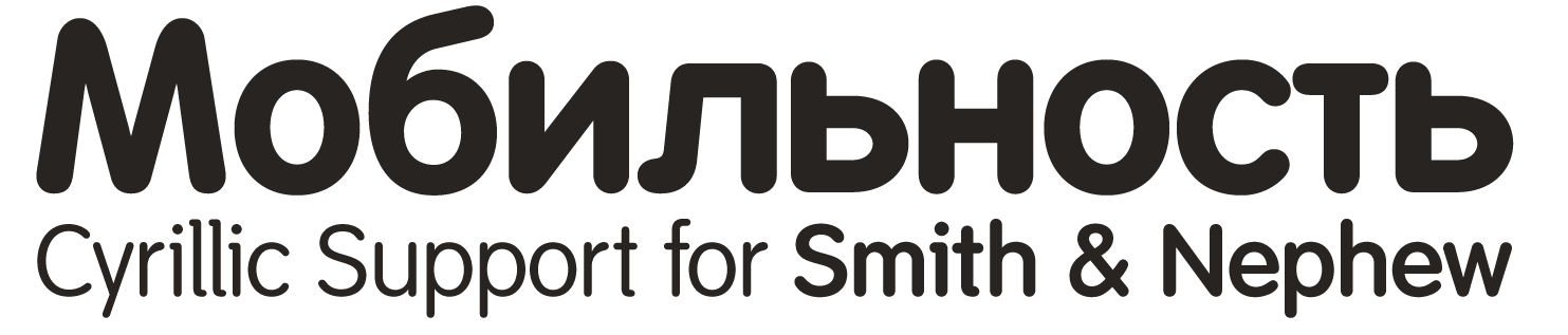
file name: Delve Withrington Smith Nephew Cyrillic 2015d
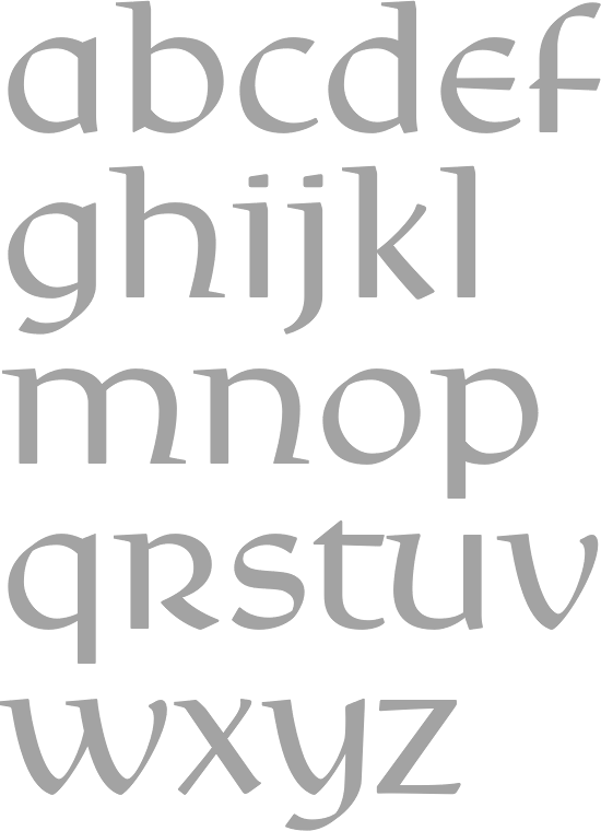
file name: Delve Withrington Rieven Uncial
file name: Delve Withrington Peso 1999
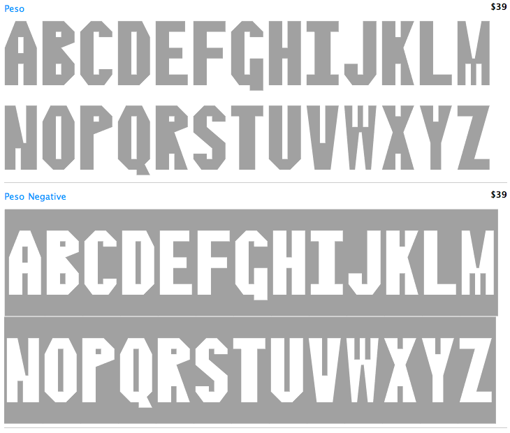
file name: Delve Withrington Peso 1999
file name: Joachim Muller Lance Cortina 2011
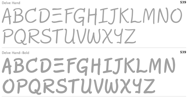
file name: Delve Withrington Delve Hand 2003
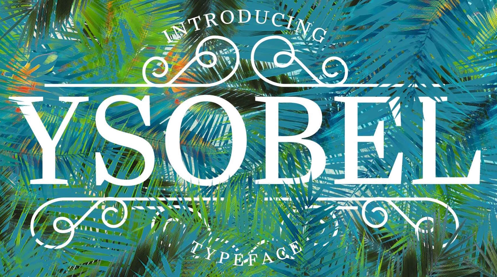
file name: Robin Nicholas Delve Withrington Alice Savoie Ysobel 2009f

file name: Robin Nicholas Ysobel Etext Pro 2013
file name: Delve Withrington Quara 2009
file name: Delve Withrington Tilden Sans 2009
file name: Delve Withrington Tilden Sans 2009c

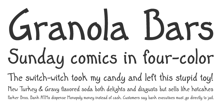
file name: Delve Withrington Pic

file name: Delve Withrington Pic
| | |
|
Luc Devroye ⦿ School of Computer Science ⦿ McGill University Montreal, Canada H3A 2K6 ⦿ lucdevroye@gmail.com ⦿ https://luc.devroye.org ⦿ https://luc.devroye.org/fonts.html |