|
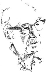
Robert Hunter Middleton

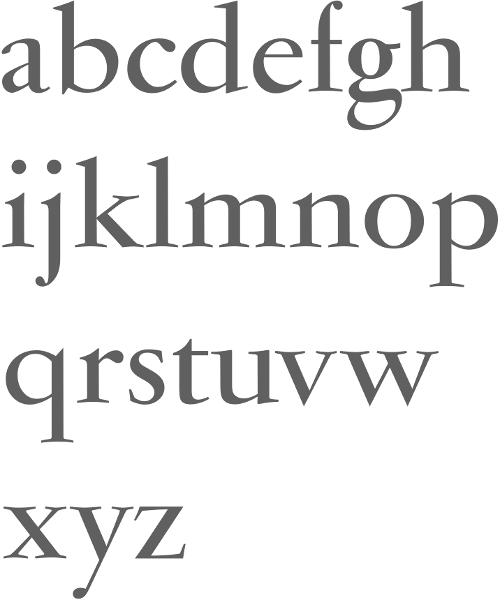
American designer (b. Glasgow, 1898, d. Chicago, 1985), who spent his entire life at Ludlow Typograph Company (retiring in 1971) and built an impressive type library, creating over 100 typefaces. He received a doctorate in Fine Arts from Transylvania University. Ludlow hired him in 1923, where he became type director in 1993. He retired from the Ludlow Typograph Company in 1971. At Ludlow, he had to create solid commercial variations of existing typefaces for the Ludlow machine and come up with practical new designs. Bio by Nicholas Fabian. One can also consult the M.A. dissertation of Stephen Glenn Crook at the University of Chicago, entitled "The contribution of R. Runter Middleton to typeface design and printing in America" (1980), which lists his 98 typefaces of his 24 type familes. His oeuvre: - Eusebius (1924). This page explains that Ernst Detterer started work for Ludlow on Nicolas Jenson in 1924. Middleton drew Nicolas Jenson Italic at Ludlow in 1929, followed by Bold, Bold Italic, and Roman Open series in later years. In 1937 the family was renamed Eusebius. Nicolas Jenson SG is a revival at Spiece Graphics in 1995 by Jim Spiece.
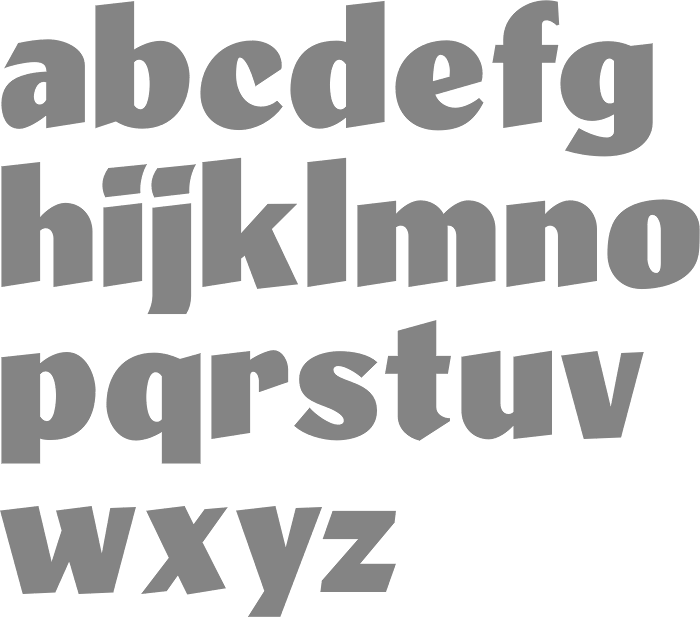
- Ludlow Black (1924). Mac McGrew: Ludlow Black was designed by Robert H. Middleton for Ludlow in 1924. It is very similar to Cooper Black, the most apparent differences being the concave serifs and the greater slant of the italic. Also compare Pabst Extra Bold.
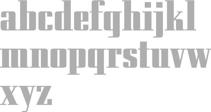
- Cameo (1927, a chiselled font). Mac McGrew: Cameo was designed by R. Hunter Middleton for Ludlow in 1926. It is derived from a heavy version of Caslon, with a thin white line within the left side of each heavy stroke, giving a very pleasing appearance. A 1926 Ludlow ad says of it, "Designed and punches produced in our own plant". Apparently it was the first, or one of the first, so produced. Compare Caslon Shaded, Caslon Openface, Caslon Shadow Title, Gravure, Narciss.
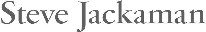
- Caslon Extra Condensed. See Caslon RR Extra Condensed by Steve Jackaman.
- Delphian Open Titling (1928).
- Stellar (1929, a serifless roman done 29 years before Zapf's Optima!). Mac McGrew: Stellar and Stellar Bold were designed by R. Hunter Middleton for Ludlow in 1929 as a less severe alternative to the monotone sans-serifs which were coming into great popularity. There is moderate thick-and-thin contrast, and strokes flare slightly toward the ends, while ascenders and descenders are fairly long; all this gives a feeling of warmth and pleasantness. Cap M is widely splayed, and sloping strokes are cut off at an angle. An alternate A, E, and H in both weights have the crossbar extended beyond the left upright, and there is an alternate U without the extended vertical stroke. Compare Optima, Lydian, Radiant.
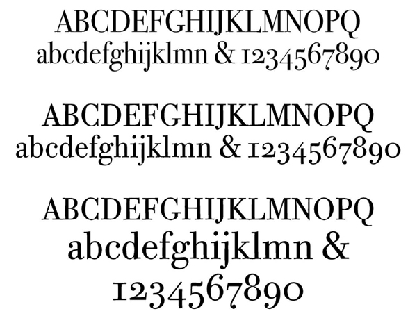
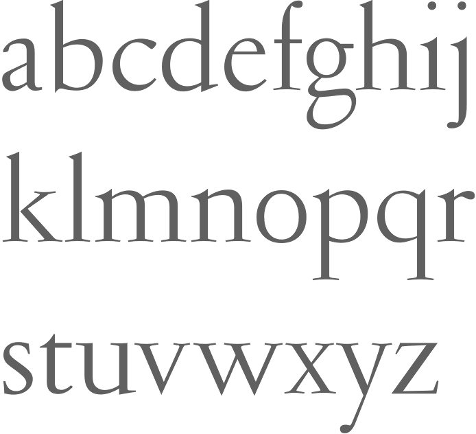
- Garamond (1929-1930, see the Font Bureau revival FB Garamond, and Steve Jackaman's Garamond RR Light).
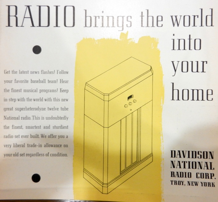
- Tempo (1930-42, a sans family) and Tempo Heavy Inline (1935). Mac McGrew: Tempo is Ludlow's answer to the sans serifs which gained popularity in the late 1920s. The entire series was designed by R. Hunter Middleton, director of Ludlow's department of typeface design. The Light, Medium, and Bold weights were introduced in 1930, Heavy and several variations in 1931, and other variations over the next decade or more. They are generally a little different from other sans serifs, and include some innovations not found elsewhere. The most distinctive characteristics are found in the Light Italic and Medium Italic, which have a somewhat more calligraphic feeling and less stiff formality than other such typefaces, and which also offer alternate cursive capitals, rare in sans serifs. But there are more inconsistencies in Tempo than most other families. For instance, the Light, Medium, Bold, and Heavy Italics are designed with a moderate slope of 10 degrees to fit straight matrices without too much gap between letters; this works well enough in the lighter weights, but produces a loose effect in the more rigid heavier weights. But the two largest sizes of Tempo Bold Italic and some of the other italics are designed to fit italic matrices with a slant of 17 degrees, which is rather excessive for sans serifs, especially the condensed versions, although it is handled well. Variant Oblique characters are available for Medium Italic which get away from the calligraphic feeling; only these and none of the cursive characters are made in (Tempo continues) the largest sizes. Tempo Bold Extended and Black Extended show the influ- ence of other European grotesques, with much greater x-height and some characters unlike those in the normal and condensed widths. There are a number of alternate characters for many of the Tempos. especially in the Medium, Bold, and Heavy weights; their use converts Tempo to an approximation of Kabel or other series. But a few alternates are not enough to create the effect of Futura, apparently demanded by some users, so Tempo Alternate was created in several weights, and introduced about 1960. This is close to Futura, except that the italic has Ludlow's 17-degree slant, much greater than Futura's usual 8 degrees. This family-within-a-family also has some alternate characters in some weights, to further convert the typeface into an approximation of other European grotesques. Tempo has been quite popular with newspapers, and to a lesser extent for general commercial printing. Compare Futura, Sans Serif, Erbar, etc. Also see Umbra.
- Karnak (1931-42, a slab serif family). Mac McGrew: Karnak is a family of square-serif types designed by Robert H. Middleton for Ludlow, beginning in 1931, when the light and medium weights were introduced, with other weights and widths announced as late as 1942. Like Stymie, the other extensive American square-serif series, it is derived from Memphis, and all three series are very similar. Most members of the Karnak family are most easily distinguished by the cap G. Karnak italics are also distinguished by a greater slant to fit Ludlow's 17-degree matrices, except 14-point and smaller in Karnak Intermediate Italic and Medium Italic, which are made on straight matrices and slant about 10 degrees. Light and medium weights have several alternate round capitals as shown; the very narrow Karnak Obelisk also has comparable alternate round AEMNW. Compare Cairo, Memphis, Stymie. One magazine article speaks of Karnak Open, but this has not been found in any Ludlow literature.
- Lafayette (1932).
- Mayfair Cursive (1932). Revived as Mayfair (2006, Rebecca Alaccari, Canada Type).
- Umbra (1932). Mac McGrew: Umbra was designed by Robert H. Middleton for Ludlow in 1932. It is essentially a shadow version of Tempo Light, in which the basic letter is "invisible" but there is a strong shadow to the lower right of each stroke. Compare Shadow. Images: URW Umbra.
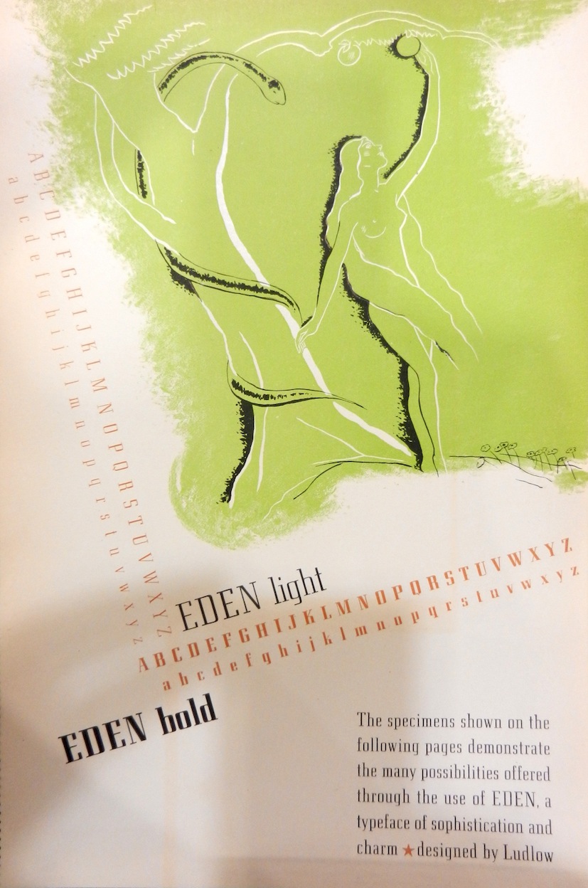
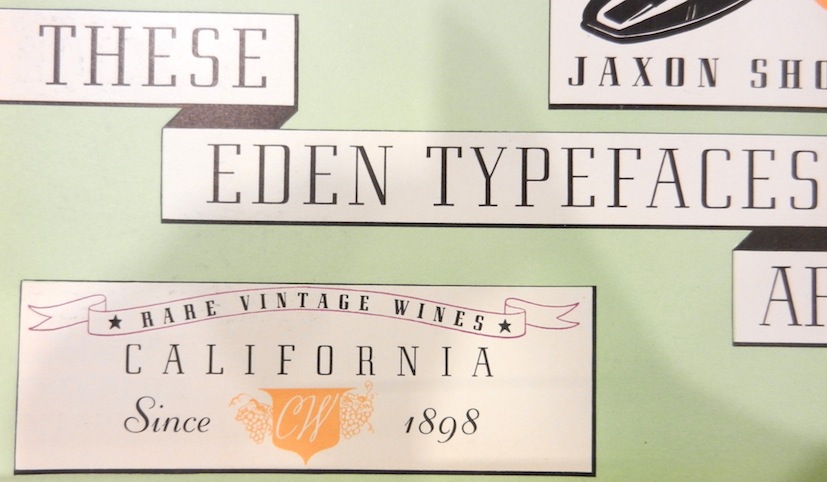
- Eden (1934, a squarish didone). See digital revivals by Jason Castle called Eden Light and Eden Bold, 1990, and by Steve Jackaman and Ashley Muir at Red Rooster called Eden Pro (2010).
- Mandate (1934).
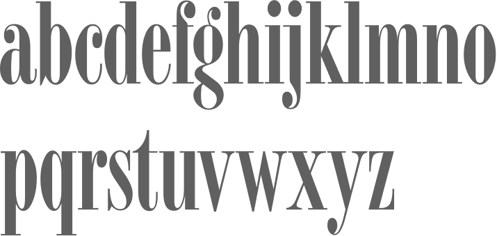
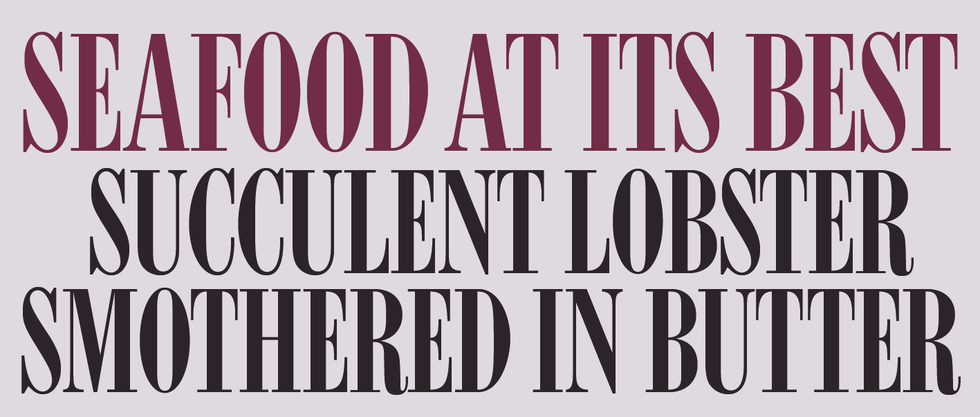
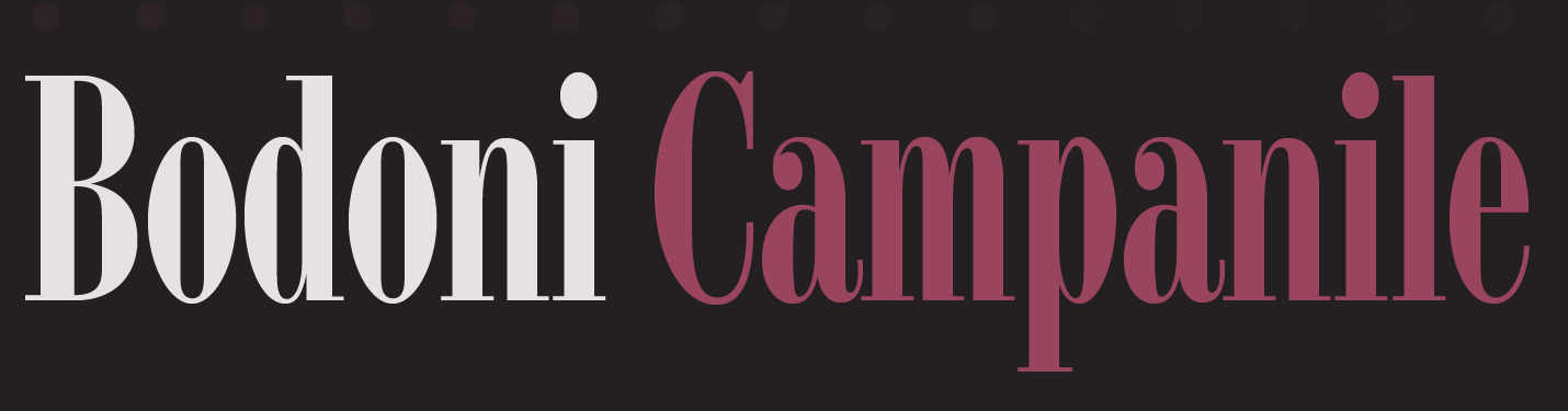
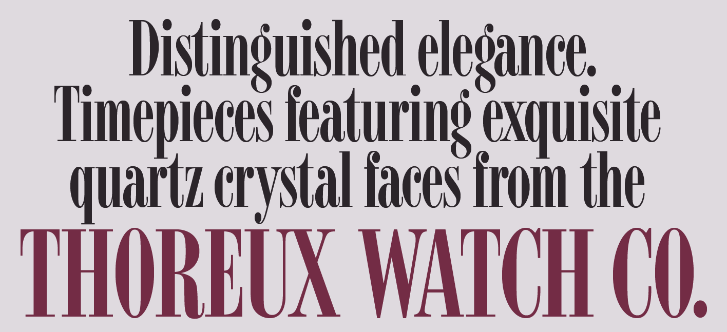
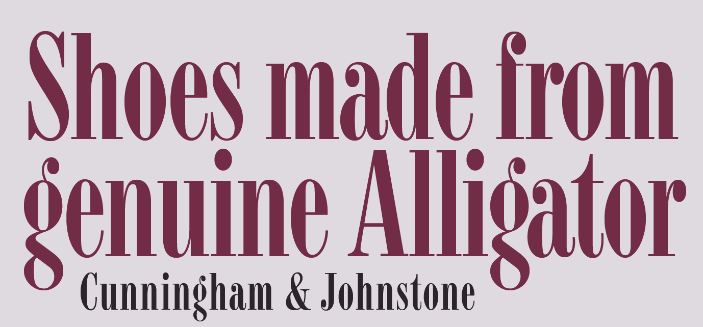
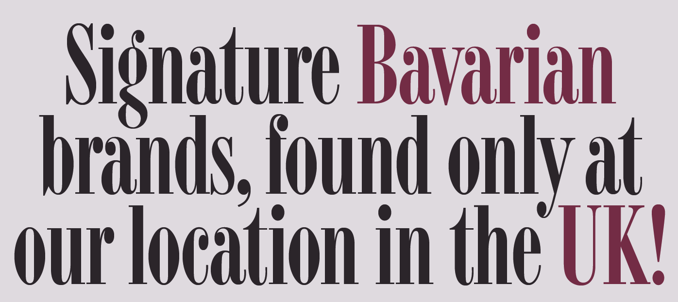
- Ludlow Bodoni (1936; see Bodoni Black Condensed by Steve Jackaman, and Modern 735 (Bitstream's version of Middleton's Bodoni)). Bodoni Campanile (1930; see Bodoni Campanile Pro (1998 and 2017) by Steve Jackaman). Bodoni Modern (1930). See a digital revival called PL Modern Heavy Condensed.
- Coronet (1937). This is Ribbon 131 in the Bitstream collection and Coronet by Steve Jackaman.
- Flair (1941).
- Admiral Script (1953).
- Condensed Gothic Outline (1953).
- Cloister Open Face (1920).
- Florentine Cursive (1956). See Florentine Cursive by Steve Jackaman.
- Formal Script (1956).
- Radiant (1938, see EF Radiant at Elsner+Flake, and Radiant RR at the Red Rooster foundry). McGrew: Radiant was designed by Robert H. Middleton for Ludlow, and introduced in 1938, with additional members of the family being added over the following two or three years. It is a precise, thick-and-thin, serifless style, express- ing the modem spirit of the forties while breaking away from the ubiquitous monotone sans-serifs. Radiant Medium is actually about as light as possible to maintain thick-and-thin contrast, but bold and heavy weights offer substantial contrast. All upright versions have as alternates the round forms of AKMNRW, as shown with some of the specimens. Italics have the standard 17-degree slant of Ludlow italic mats, which is rather extreme for serifless typefaces, except for small sizes of Medium Italic, which are made on straight mats and are redesigned with about 10-degree slope. Like most Ludlow typefaces, all versions of this typeface have fractions and percent marks available as extras. Thick-and-thin serifless typefaces are rare in this country. Compare the older Globe Gothic; also Empire, Stellar, Lydian, Optima, and Czarin, which aren't really in the same category.
- Record Gothic (1927-61).
- Samson (1940). Mac McGrew: Samson is a very bold, sturdy typeface designed by R. Hunter Middleton in 1940 for Ludlow. It is derived from lettering done with a broad pen, and retains much of that feeling. The name was chosen to denote power and strength. It has been popular for newspaper advertising in particular. Compare Lydian, Valiant. An interpolation between a signage typeface and a poster face, it was revived as Ashkelon NF (2011, Nick Curtis).
- Square Gothic.
- Stencil (1937-1938). A Cyrillic was made by Victor Kharyk.
- Wave (1962), a connected brush script. Digitizations include Coffee Script (2006) and Middleton Brush (2010), both by Patrick Griffin at Canada Type. Mac McGrew: Wave was designed for Ludlow in 1962 by Robert H. Middleton. It is a 1 medium-weight script, not quite joining, with a brush-drawn appearance and thick-and-thin contrast. The apparent angle is quite a bit more than the 17-degree slope of Ludlow matrices, but letters fit together compactly without noticeable looseness, and form smoothly flowing words. Compare Brush. Mandate, Kaufmann Bold.
- Andromaque. Mac McGrew explains Andromaque's genesis: Andromaque is a cursive form of uncial letter, mixing Greek forms of aeklmnstz with Roman forms of the other letters, yet retaining legibility and harmony. The original size was cut by Victor Hammer and cast in France. The 14-point size was begun by Hammer, but left unfinished at his death. The font was completed by his long-time friend, R. Hunter Middleton, in the early 1980s, and cast by Paul H. Duensing. Paul Baker did a digital version of Andromaque in 1995.
Among his books: - "Making Printer's Typefaces" (1938, The Black Cat press, Chicago, IL). In this book, he shows his own creations for Ludlow matrices, and talks about typography in general.
- Chicago Letter Founding (1937, The Black Cat Press, Chicago, IL). Middleton calls Chicago the printing center of the nation, and goes on in this small booklet about the lives and contributions of people like Robert Wiebking, Frederic Goudy, Bruce Rogers, Oswald Cooper, and himself.
Linotype link. Drawing. View the typefaces made by Robert Hunter Middleton.
|
EXTERNAL LINKS
Robert Hunter Middleton
 [Designer info] [Designer info]
MyFonts search
Monotype search
Fontspring search
Google search
INTERNAL LINKS
Type designers ⦿
Type designers ⦿
Stencil fonts ⦿
Type in Scotland ⦿
Type scene in Illinois ⦿
Brush script typefaces ⦿
Modern style [Bodoni, Didot, Walbaum, Thorowgood, Computer Modern, etc.] ⦿
Cooper Black ⦿
Garalde or Garamond typefaces ⦿
Venetian or antiqua typefaces ⦿
Caslon ⦿
Chiseled fonts ⦿
|
