TYPE DESIGN INFORMATION PAGE last updated on Sat Jun 22 21:39:21 EDT 2024
FONT RECOGNITION VIA FONT MOOSE

|
|
|
|
Microsoft
Seattle-based company involved to some extent in typography. Until 2002, the fonts developed by them were free. That is no longer the case. They are major players in multilingual typeface development, type for on-screen use, and type formats such as OpenType. A listing of their typefaces:
The information below was written by Microsoft itself. The Typography Group at Microsoft is responsible for both fonts and the font rendering systems in Windows. Since version 3.1 the primary font system built into Windows has been the TrueType system, licensed from Apple in a deal (with hindsight) remarkably beneficial to Microsoft. Working with Monotype, the Microsoft Typography Group produced fine TrueType versions of Arial, Times New Roman and Courier New, tuned to be extremely legible on the screen; these were all ready for the launch of Windows 3.1. Since then these core fonts have been developed to cover more and more of the world's languages. In the mid-1990s under Robert Norton a program of truly new type designs was begun, using TrueType technology to render faithfully the bitmaps and outlines designed by Matthew Carter (Verdana, Georgia, Tahoma) and by in-house designer Vincent Connare (Trebuchet, Comic Sans). Until August 2002 these core fonts were offered freely over the Web, where they made an undoubtedly positive contribution in terms of legibility and font choice. In 1996 the OpenType initiative with Adobe was announced; this is touted as "the end of the font wars", whereby advanced multilingual text layout becomes available, native rendering of PostScript fonts becomes part of Windows 2000, and unwieldy font formats are rationalized. In 1998 the group announced ClearType. This is a very ingenious method to increase legibility on color LCD screens, individually targeting the 3 subpixels (red, green and blue) that make up each pixel. Such a leap forward in readability on these screens is a crucial element to the success of nascent eBook technology. Simon Daniels at the Group's website keeps font fans and font developers up to date with most aspects of the digital typography scene, and communicates the technicalities of how fonts work in Windows. Updating us about the current (October 2000) activity of the Group, Simon notes: 1999 saw several members of the group leave to join Microsoft's eBooks group. These included technical lead Greg Hitchcock, developers Beat Stamm and Paul Linerud as well as former Monotype hinters Michael Duggan and Geraldine Wade. On August 12, 2002 Microsoft discontinued the free availability of the core fonts, noting that the downloads were being abused in terms of their end-user license agreements. Most commentators took this to mean the company objected to the fact that the fonts were being installed with Linux distributions. |
EXTERNAL LINKS |
| | |


file name: Vincent Connare Trebuchet Bold 1996
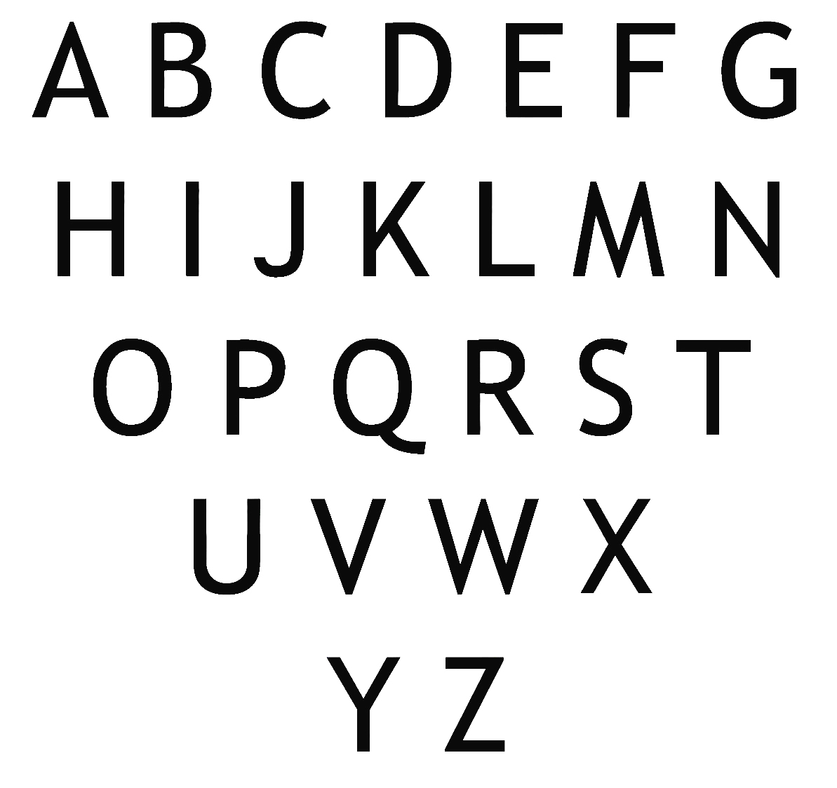
file name: Vincent Connare Trebuchet Bold 1996 2

file name: Vincent Connare Trebuchet Bold 1996 Poster by Vijesh Unkorth 2016
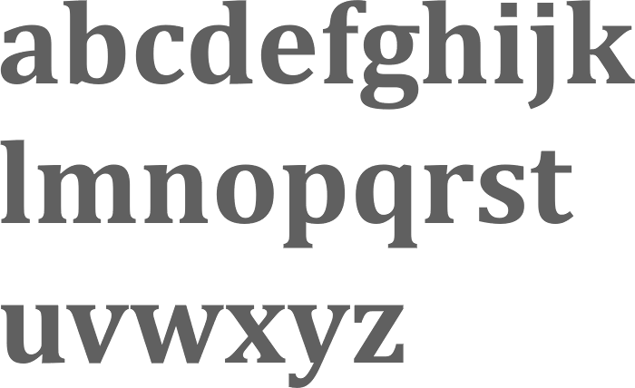
file name: Jelle Bosma Steve Matteson Robin Nicholas Cambria Bold 2006
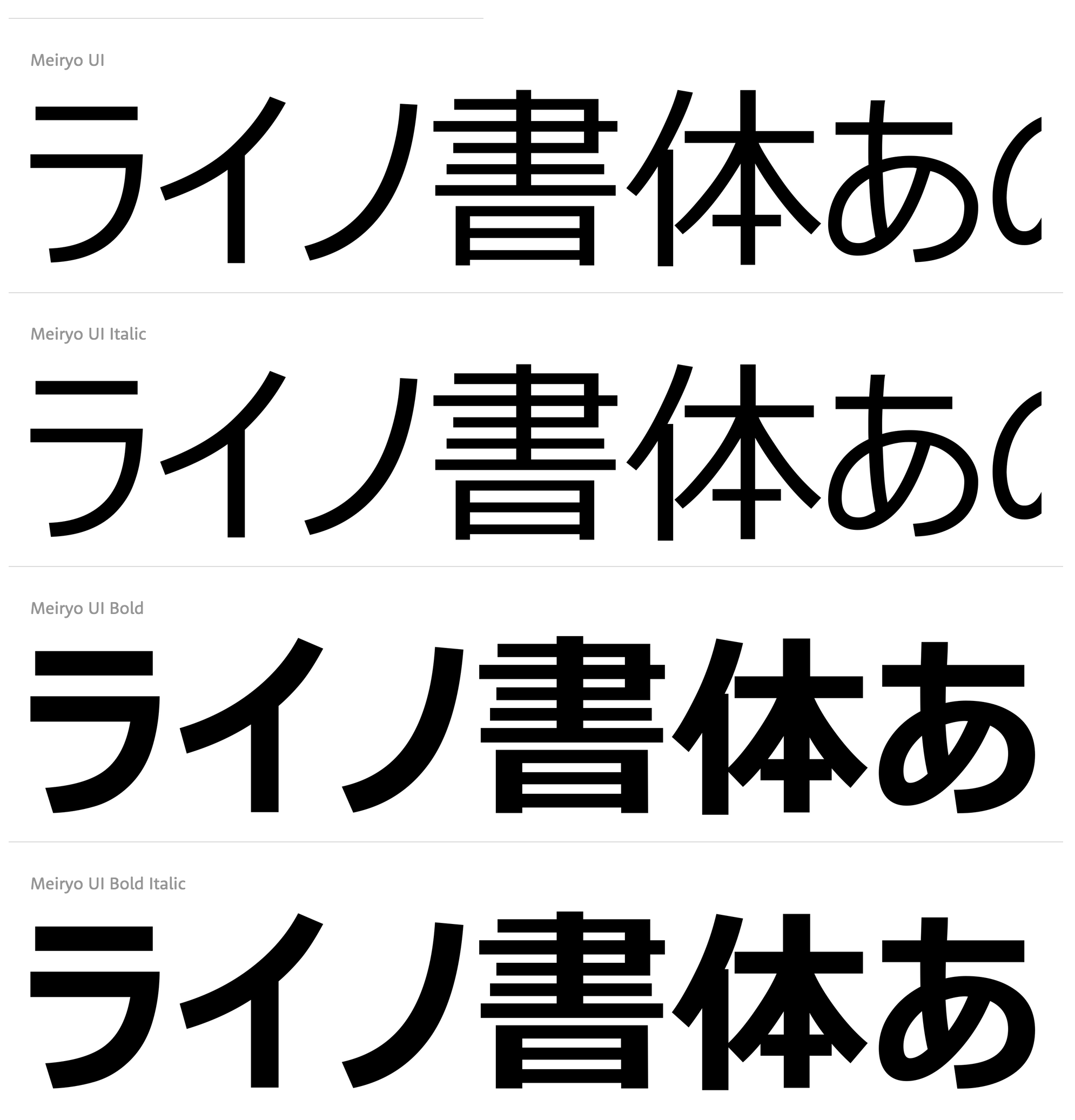
file name: Microsoft Meiryo U I 2020

file name: Microsoft Meiryo U I 2020
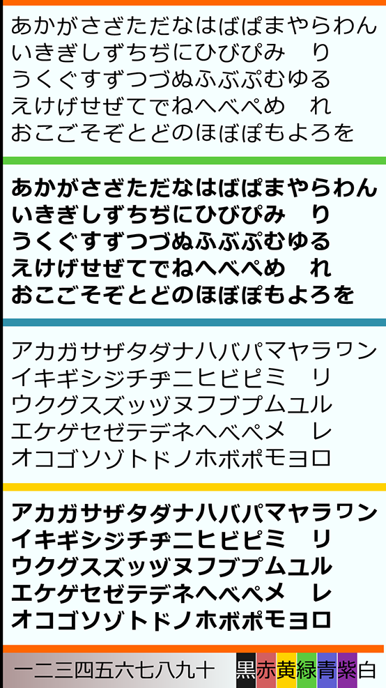
file name: Eiichi Kono Matthew Carter Meiryo 2005 poster by Yohance Hernando 2017
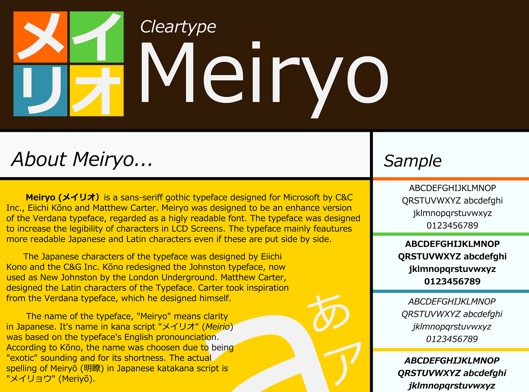
file name: Eiichi Kono Matthew Carter Meiryo 2005 poster by Yohance Hernando 2017b
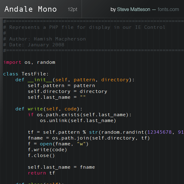
file name: Steve Matteson Andale Mono
| | |
|
Luc Devroye ⦿ School of Computer Science ⦿ McGill University Montreal, Canada H3A 2K6 ⦿ lucdevroye@gmail.com ⦿ http://luc.devroye.org ⦿ http://luc.devroye.org/fonts.html |