TYPE DESIGN INFORMATION PAGE last updated on Sun Jul 12 22:13:44 EDT 2026
FONT RECOGNITION VIA FONT MOOSE

|
|
|
|
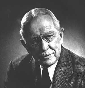
Bruce Rogers
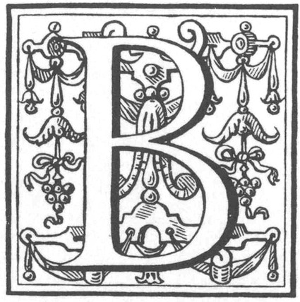
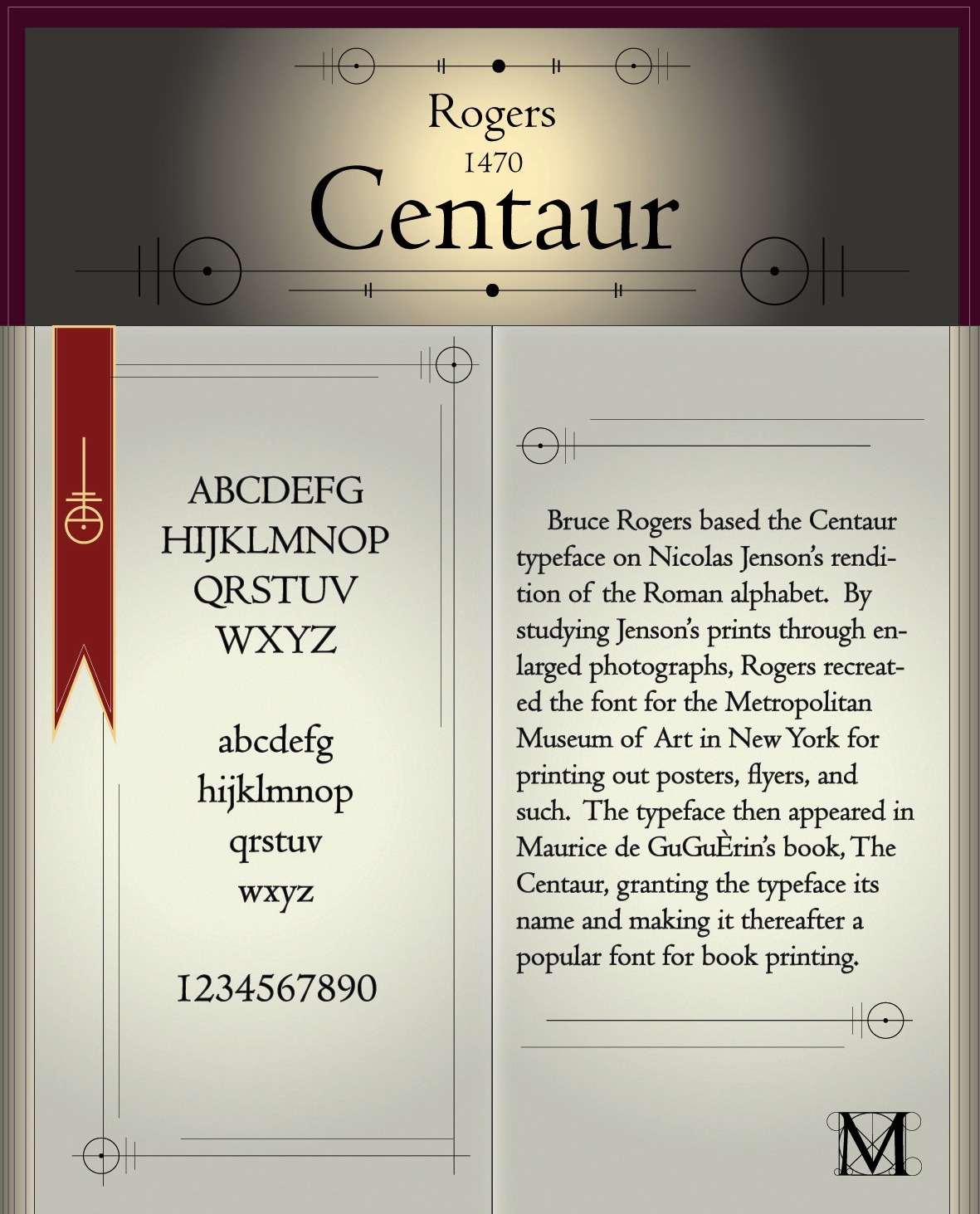
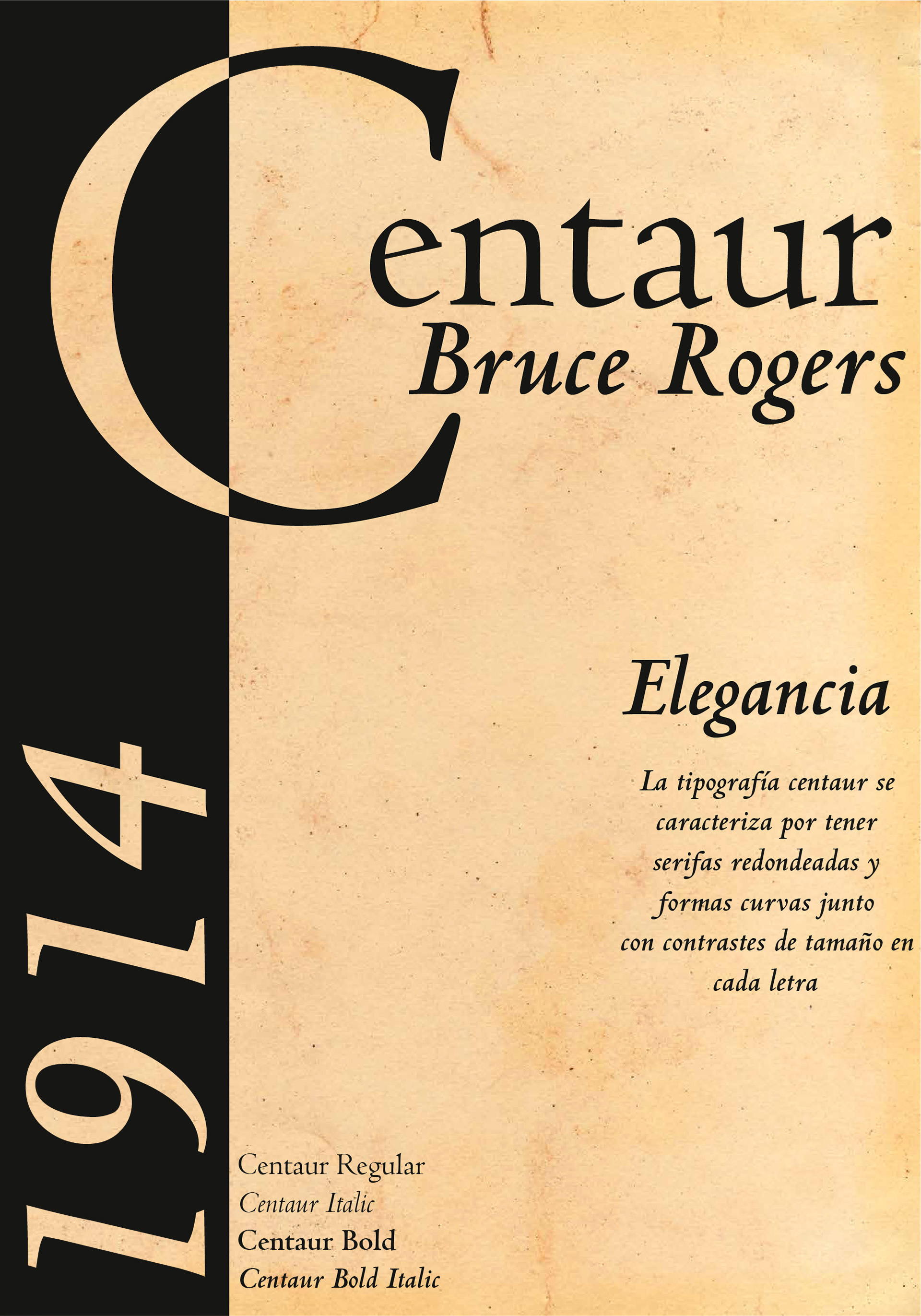
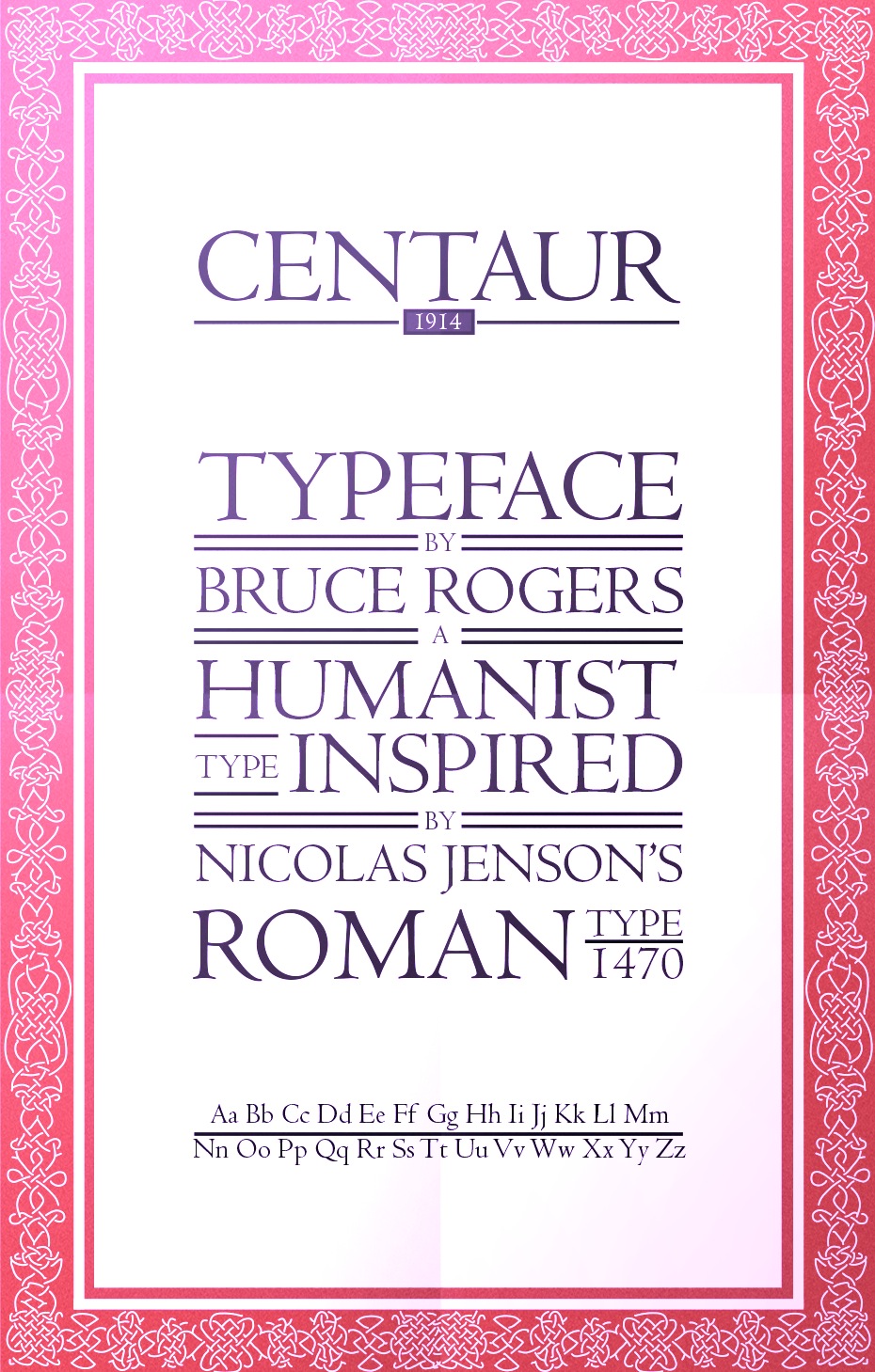
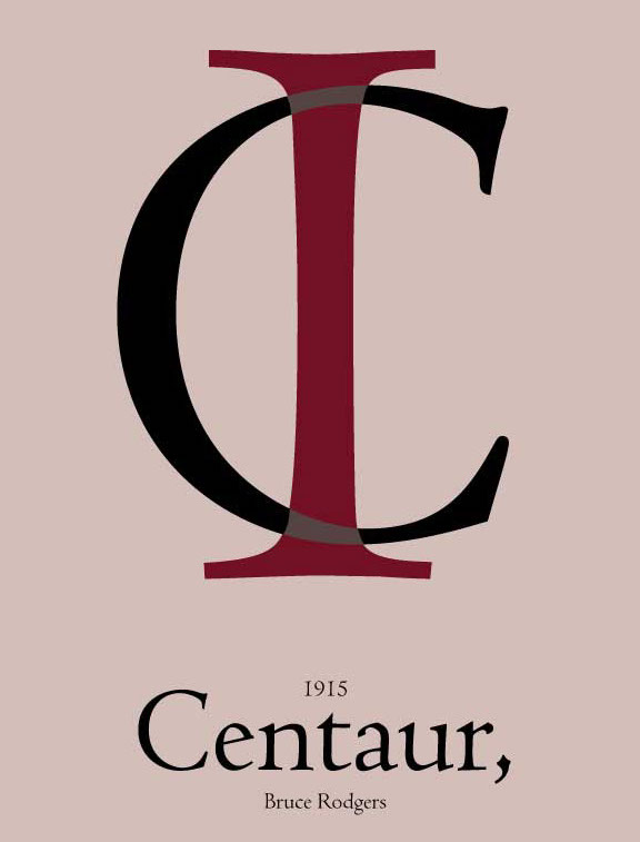
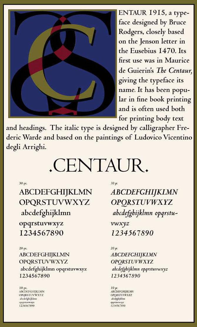
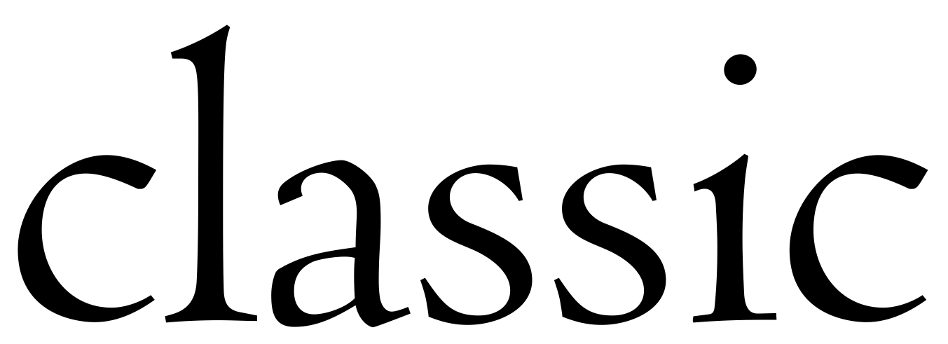
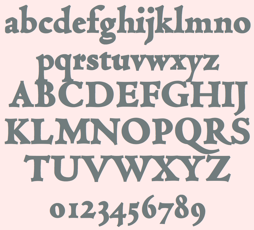
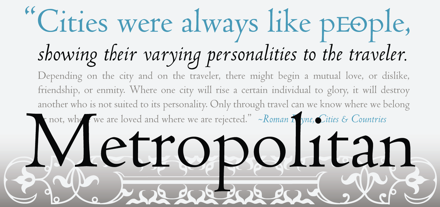
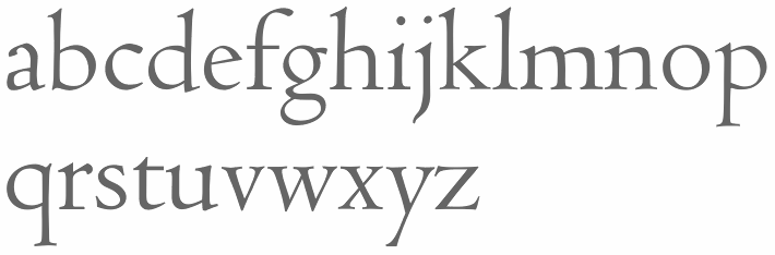
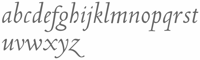
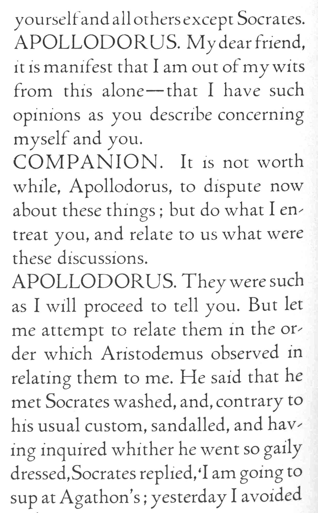
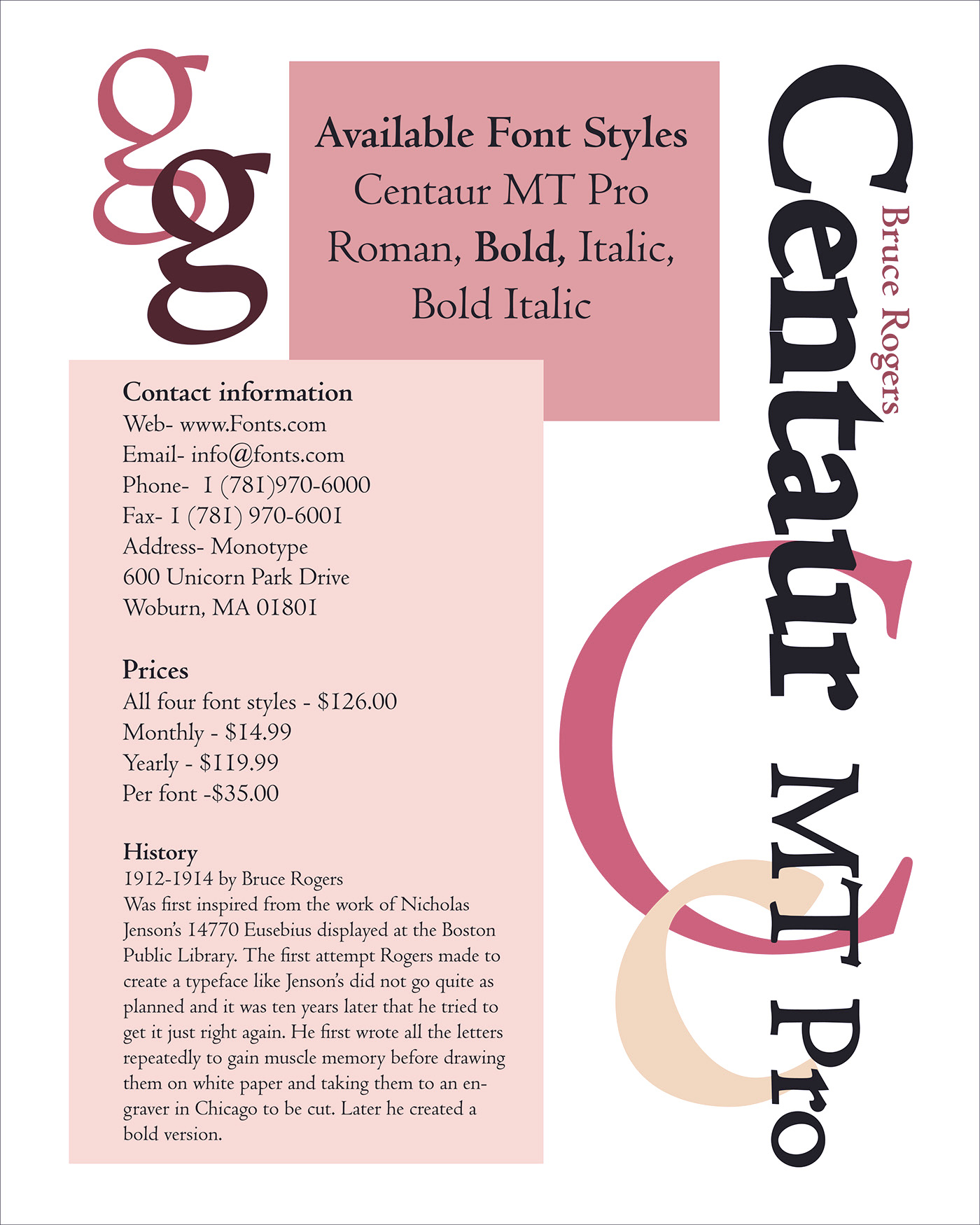
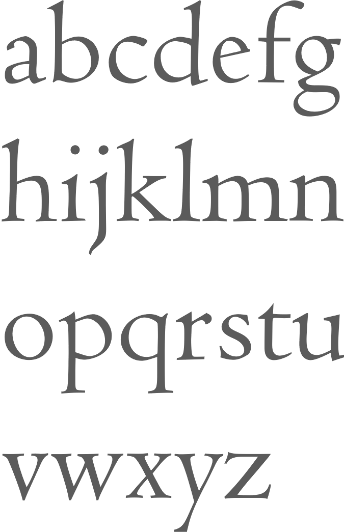
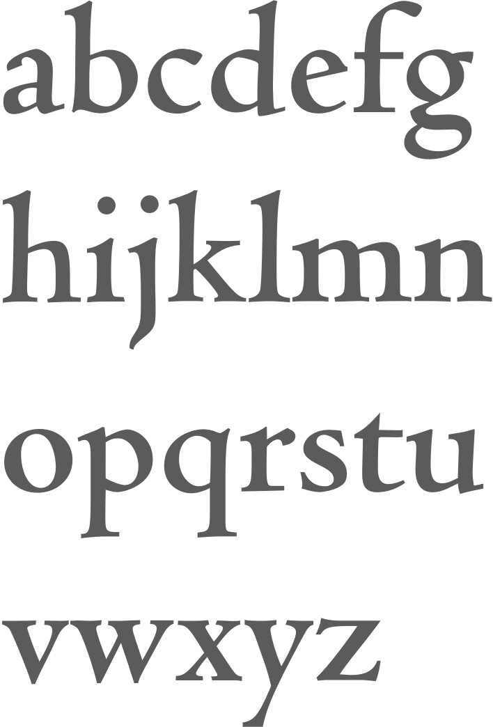
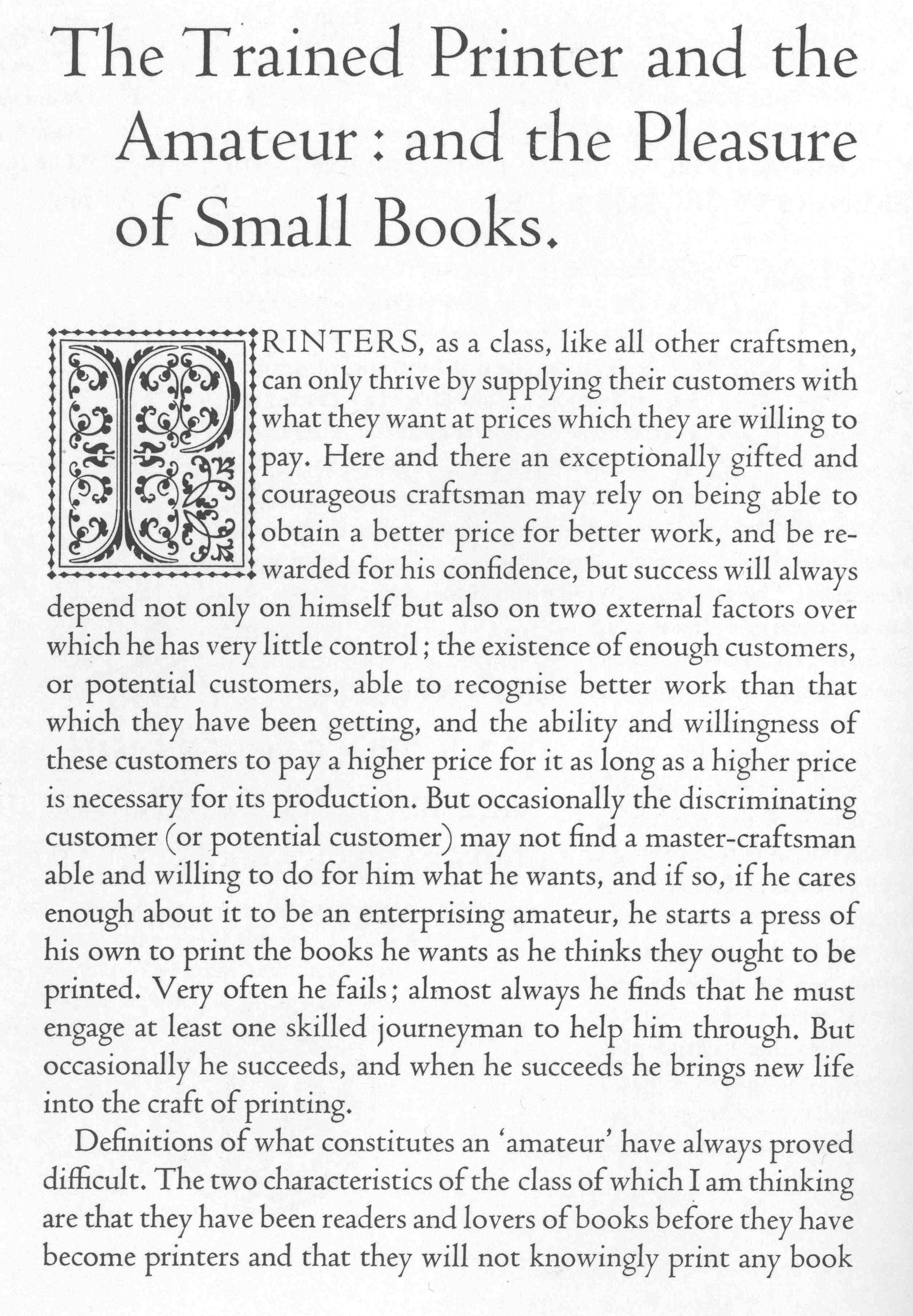
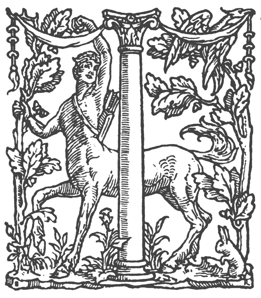
Albert Bruce Rogers was a celebrated American type and book designer (b. 1870, Linnwood, IN, d. 1957, New Fairfield, CT). A graduate from Purdue in 1890, he worked in book design. It was not until 1901 that he cut his first typeface, Montaigne, a Venetian style typeface named for the first book it appeared in, a 1903 limited edition of The Essays of Montaigne. In 1912, Rogers moved to New York City where he worked both as an independent designer and as house designer for the Metropolitan Museum of Art. It was for the Museum's 1915 limited edition of Maurice de Guérin's The Centaur that he designed his most famous type-face, Centaur (1914). Like Montaigne, it was based on the Venetian typefaces of Nicolas Jenson. Wikipedia: Rogers considered this typeface to be a substantial improvement on his early Montaigne, both because his design had matured and because, on the advice of Frederic Goudy, he had employed Robert Wiebking as the punch-cutter, and Rogers used Centaur extensively for the rest of his career. The Centaur was produced by Rogers in Dyke Mill at Carl Rollins' Montague Press and is now one of the most collectible books ever printed. In subsequent years, he designed books for Mount Vernon Press, and Harvard University Press, and served as typographic advisor at Lanston Monotype. To produce the Oxford Lectern Bible for Oxford University Press, an italic complement to Centaur was needed. Wikipedia: As he did not feel capable of designing the sort of chancery typeface that he thought appropriate, Rogers chose to pair Centaur with Frederic Warde's Arrighi, a pairing retained to this day. Rogers died in New Fairfield, CT, and donated his books and papers to Purdue University, where they are in the Beinecke Rare Book and manuscript Library. His typefaces:
|
EXTERNAL LINKS |
| | |

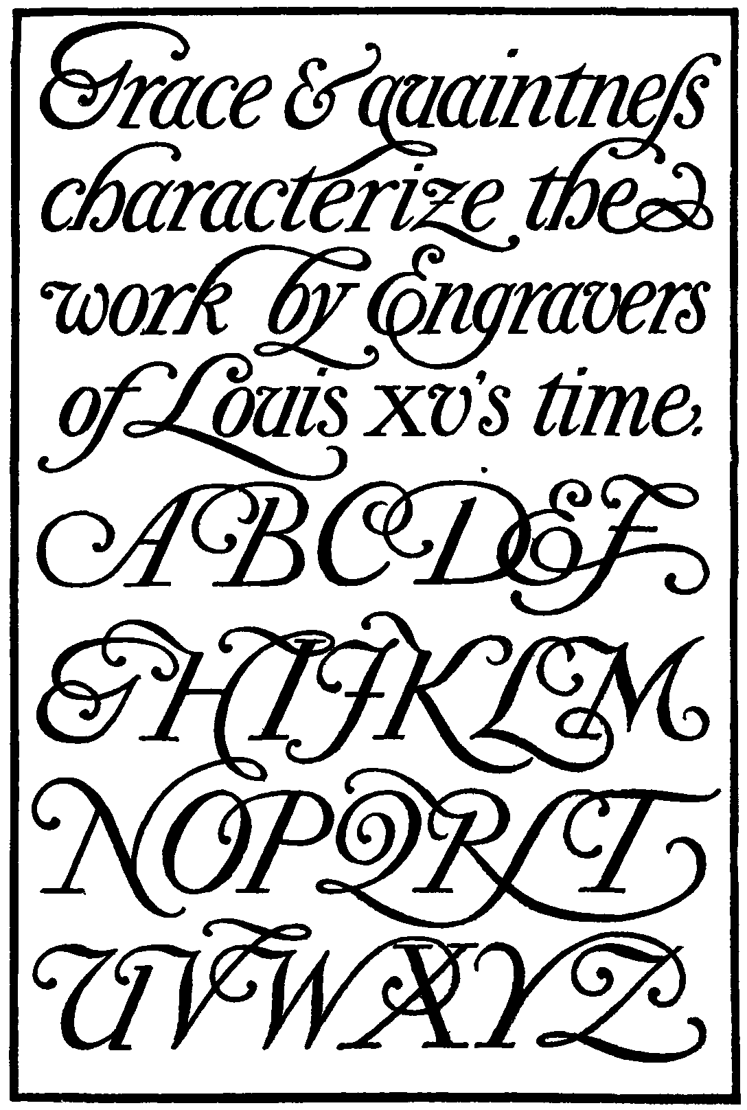
file name: Bruce Rogers Modern American Script
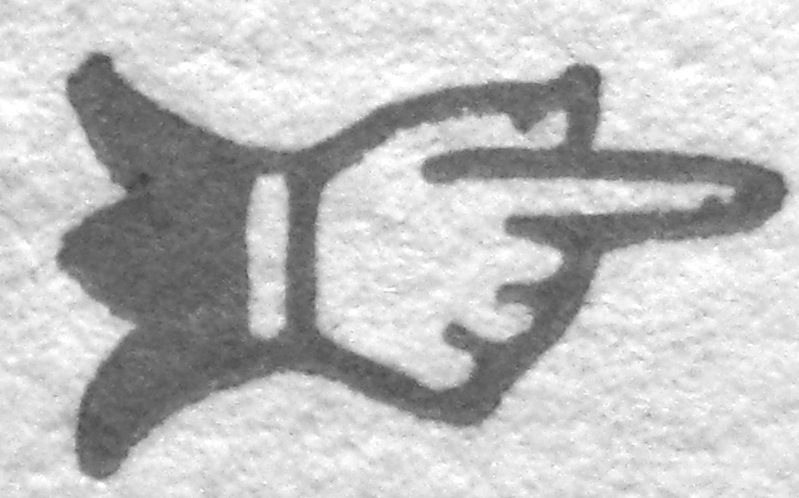
file name: Bruce Rogers Fist 1933
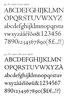
file name: Bruce Rogers Centaur vs Robert Slimbach Adobe Jenson
file name: Bruce Rogers Centaur 1914 Poster by Kristy Kong 2016
file name: Bruce Rogers Centaur 1914 poster by Jean Pierre Fonseca 2019
file name: Bruce Rogers Centaur 1914 Poster by Lina Pardo 2015
file name: Bruce Rgers Centaur 1914 Poster by Shae Strauss 2016
file name: Bruce Rogers Centaur 1914 Poster by Daria Leonov 2018
file name: Bruce Rogers Centaur 1914 Poster by Daria Leonov 2018b
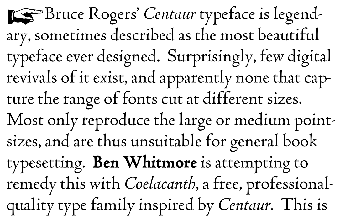
file name: Ben Whitmore Coelacanth 2014
file name: Ben Whitmore Coelacanth 2014b
file name: Ben Whitmore Coelacanth 2014c
file name: Ben Whitmore Coelacanth Heavy14p 2014
file name: Bruce Rogers L T C Fleurons Rogers Lanston 2005
file name: Bruce Rogers Lanston Frederic Warde L T C Metropolitan P22 2005
file name: Bruce Rogers Lanston Frederic Warde L T C Metropolitan P22 2005b
file name: Bruce Rogers Lanston Frederic Warde L T C Metropolitan P22 2005c
file name: Bruce Rogers Pic
file name: Bruce Rogers Montaigne Trial 1902
file name: Bruce Rogers Montaigne Trial 1908
file name: Monotype Centaur M T Pro after Bruce Rogers 1912 1914 Poster by Addalee Carter 2016
file name: Nicolas Jenson Bruce Rogers Frederic Warde Monotype Centaur 1928 1930
file name: Nicolas Jenson Bruce Rogers Frederic Warde Monotype Centaur Bold 1928 1930
file name: Lanston Monotype Centaur First Appearance 1929
file name: Jerry Kelly Misha Beletsky The Noblest Roman Cover 2014
file name: Jerry Kelly Misha Beletsky The Noblest Roman Cover 2014b

file name: Centaur Scanby Fontasm 2010

file name: Soft Maker Cambridge Serial 2010
file name: Soft Maker Cambridge Serial 2010b
| | |
|
Luc Devroye ⦿ School of Computer Science ⦿ McGill University Montreal, Canada H3A 2K6 ⦿ lucdevroye@gmail.com ⦿ https://luc.devroye.org ⦿ https://luc.devroye.org/fonts.html |