TYPE DESIGN INFORMATION PAGE last updated on Sat Jul 20 13:59:16 EDT 2024
FONT RECOGNITION VIA FONT MOOSE

|
|
|
|
Jeff Levine: Additional typefaces
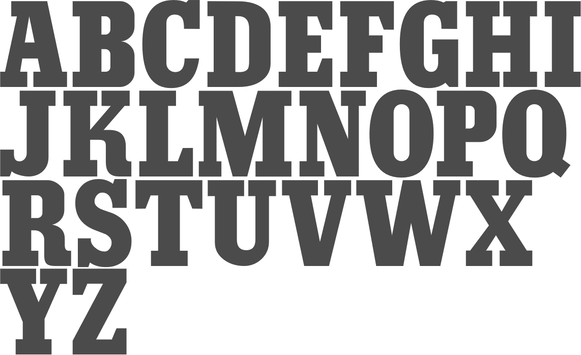
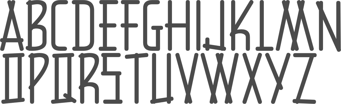
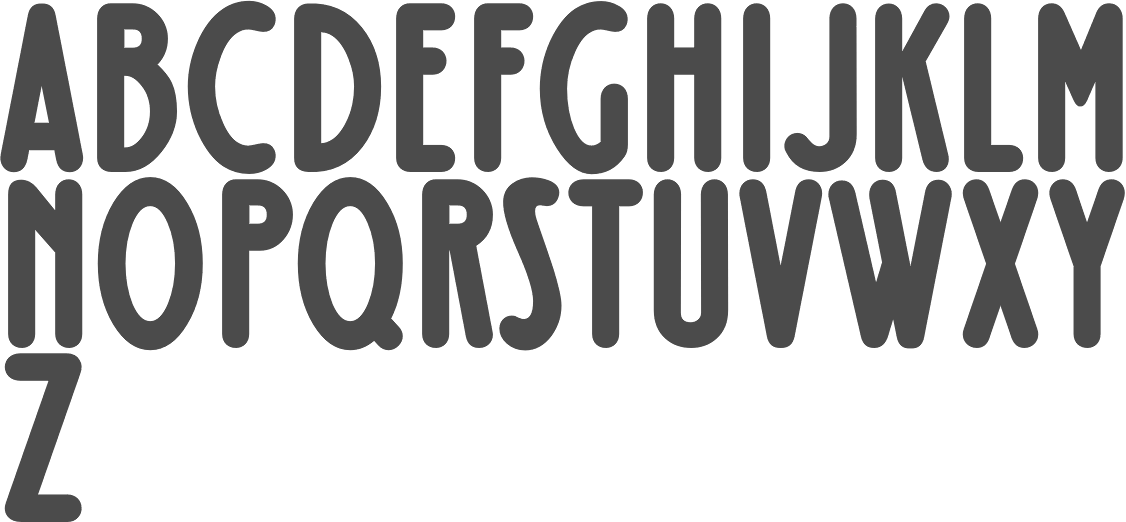
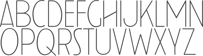
[Jeff Levine]
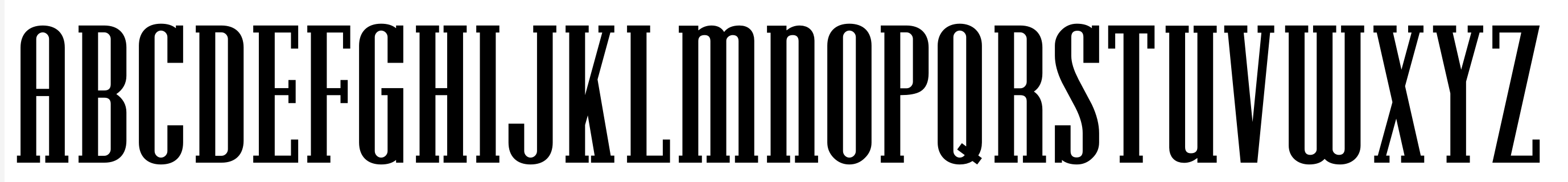
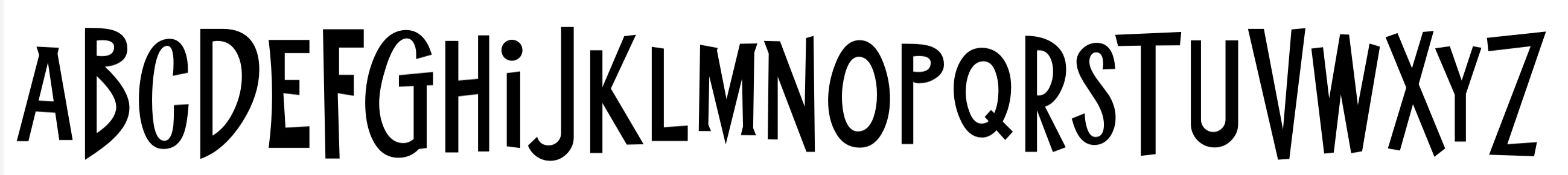
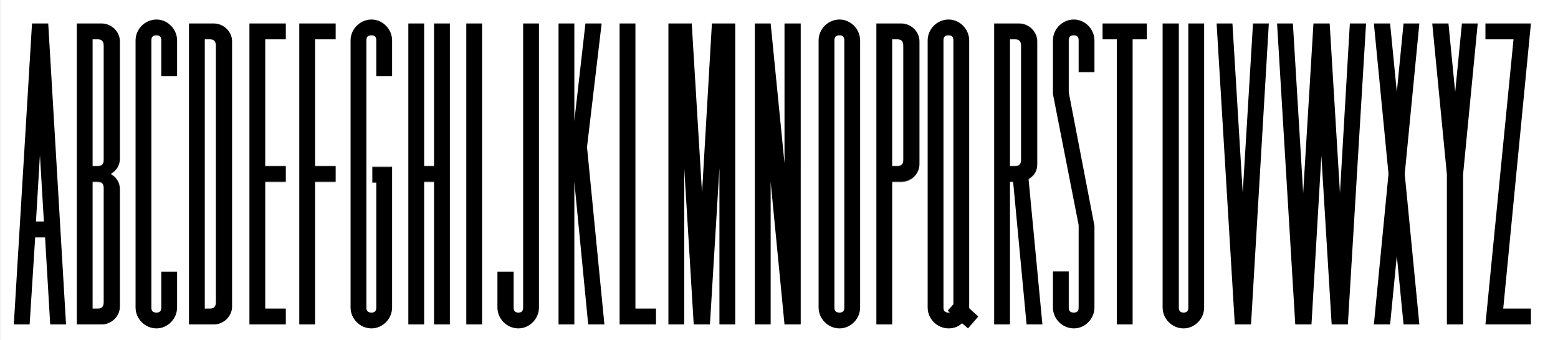
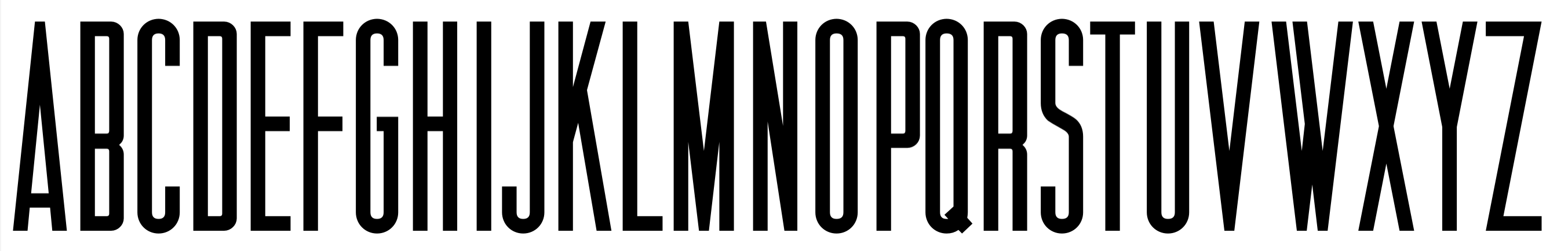
This is a list of fonts by Jeff Levine not categorized anywhere else on my pages.
|
EXTERNAL LINKS |
| | |


file name: Jeff Levine Keyden Drop Caps J N L 2021

file name: Jeff Levine Typemonger J N L 2022

file name: Jeff Levine Catalog Sheet J N L 2022

file name: Jeff Levine Order Form J N L 2022

file name: Jeff Levine Brochure Sans J N L 2022

file name: Jeff Levine Electric Newspaper J N L 2021

file name: Jeff Levine Privilege Sign J N L 2021

file name: Jeff Levine Privilege Sign Two J N L 2021

file name: Jeff Levine Silent Film J N L 2021

file name: Jeff Levine Coffee Bar J N L 2021

file name: Jeff Levine Cruise Director J N L 2021

file name: Jeff Levine Movie Show J N L 2021
file name: Jeff Levine Office Staff J N L 2021

file name: Jeff Levine Theater Tickets J N L 2021
file name: Jeff Levine Teenagers J N L 2021

file name: Jeff Levine Business Letter J N L 2021

file name: Jeff Levine Counter Service J N L 2021

file name: Jeff Levine Dance Records J N L 2021
file name: Jeff Levine Federal Agent J N L 2021

file name: Jeff Levine French Song J N L 2021

file name: Jeff Levine Lettering Lesson J N L 2021
file name: Jeff Levine Local News J N L 2021

file name: Jeff Levine Morning Edition J N L 2021

file name: Jeff Levine Newspaper Publisher J N L 2021

file name: Jeff Levine Newsreel Text J N L 2021

file name: Jeff Levine Off Duty J N L 2021

file name: Jeff Levine Office Work J N L 2021

file name: Jeff Levine Parking Lot Sale J N L 2021
file name: Jeff Levine Sales Convention J N L 2021

file name: Jeff Levine Shutterbug J N L 2021

file name: Jeff Levine Sign Expert J N L 2021

file name: Jeff Levine Sitting Pretty J N L 2018
file name: Jeff Levine Special Edition J N L 2021

file name: Jeff Levine Stage Show J N L 2021

file name: Jeff Levine Tabloid Edition J N L 2021

file name: Jeff Levine Rotisserie Menu J N L 2021

file name: Jeff Levine Show Card Pen J N L 2021

file name: Jeff Levine Show Card Sans J N L 2021
file name: Jeff Levine Stylish Title J N L 2021

file name: Jeff Levine Political Poster J N L 2021

file name: Jeff Levine Adventure Film J N L 2021

file name: Jeff Levine Egg Farm J N L 2021

file name: Jeff Levine No Entry J N L 2021

file name: Jeff Levine Retirement J N L 2021

file name: Jeff Levine Sightseeing Boat J N L 2021

file name: Jeff Levine Sporting Event J N L 2021

file name: Jeff Levine Vacation Resort J N L 2021

file name: Jeff Levine So Unusual J N L 2021

file name: Jeff Levine Detective Client J N L 2021

file name: Jeff Levine Packaged Cookies J N L 2021

file name: Jeff Levine Stenographer J N L 2021

file name: Jeff Levine Train Car J N L 2021

file name: Jeff Levine Musical Comedy J N L 2021

file name: Jeff Levine Announcement Board J N L 2018

file name: Jeff Levine French Cinema J N L 2021

file name: Jeff Levine Golden Moment J N L 2021

file name: Jeff Levine Legal Brief J N L 2021
file name: Jeff Levine Oversimplified J N L 2019

file name: Jeff Levine Screenwriter J N L 2021

file name: Jeff Levine Summer Holiday J N L 2021

file name: Jeff Levine Formal Invite J N L 2021

file name: Jeff Levine Informational Sans J N L 2021

file name: Jeff Levine Roadside Diner J N L 2021

file name: Jeff Levine Teen Years J N L 2021

file name: Jeff Levine Winkle Picker J N L 2021

file name: Jeff Levine Boss Jock J N L 2021

file name: Jeff Levine People Talk J N L 2021

file name: Jeff Levine News Ticker J N L 2021

file name: Jeff Levine Free Form Retro J N L 2021

file name: Jeff Levine Rock Concert J N L 2021

file name: Jeff Levine Show Card Freehand J N L 2021

file name: Jeff Levine Goose Creek J N L 2021

file name: Jeff Levine Post Production J N L 2021

file name: Jeff Levine Road Picture J N L 2021

file name: Jeff Levine Evening Event J N L 2021

file name: Jeff Levine British Cinema J N L 2021

file name: Jeff Levine Wireline J N L 2021

file name: Jeff Levine Photo Developer J N L 2021

file name: Jeff Levine Summertime Breeze J N L 2021

file name: Jeff Levine Late Hours J N L 2021
file name: Jeff Levine Pacific Atoll J N L 2021

file name: Jeff Levine Date Book J N L 2021

file name: Jeff Levine Arrow Callouts J N L 2021

file name: Jeff Levine Novelty Nouveau J N L 2021

file name: Jeff Levine Dual Line Roman J N L 2021

file name: Jeff Levine Show Poster J N L 2021

file name: Jeff Levine Nouveau Date J N L 2021

file name: Jeff Levine Bandmaster J N L 2021

file name: Jeff Levine Drafting Class J N L 2021

file name: Jeff Levine Retail Monoline J N L 2021

file name: Jeff Levine Retail Price J N L 2021
file name: Jeff Levine Fancy Show Card J N L 2021 3

file name: Jeff Levine Fancy Show Card J N L 2021

file name: Jeff Levine Template Basic J N L 2021

file name: Jeff Levine Silent Movies J N L 2021

file name: Jeff Levine Specimen Book J N L 2020

file name: Jeff Levine Gothic Grotesk J N L 2020

file name: Jeff Levine Columnist J N L 2020

file name: Jeff Levine Merchant Trade J N L 2020

file name: Jeff Levine Manufacturer J N L 2020

file name: Jeff Levine File Clerk J N L 2020

file name: Jeff Levine Display Board J N L 2020

file name: Jeff Levine Schoolroom J N L 2020

file name: Jeff Levine Poster Project J N L 2020

file name: Letterfreshstudio Childa Script 2020 1

file name: Letterfreshstudio Childa Script 2020

file name: Jeff Levine Tenement J N L 2020
file name: Miguel Hernandez Joaquin Conteras Soto A A Actual Mono 2020
file name: Naum Type Strikt 2020 1

file name: Naum Type Strikt 2020
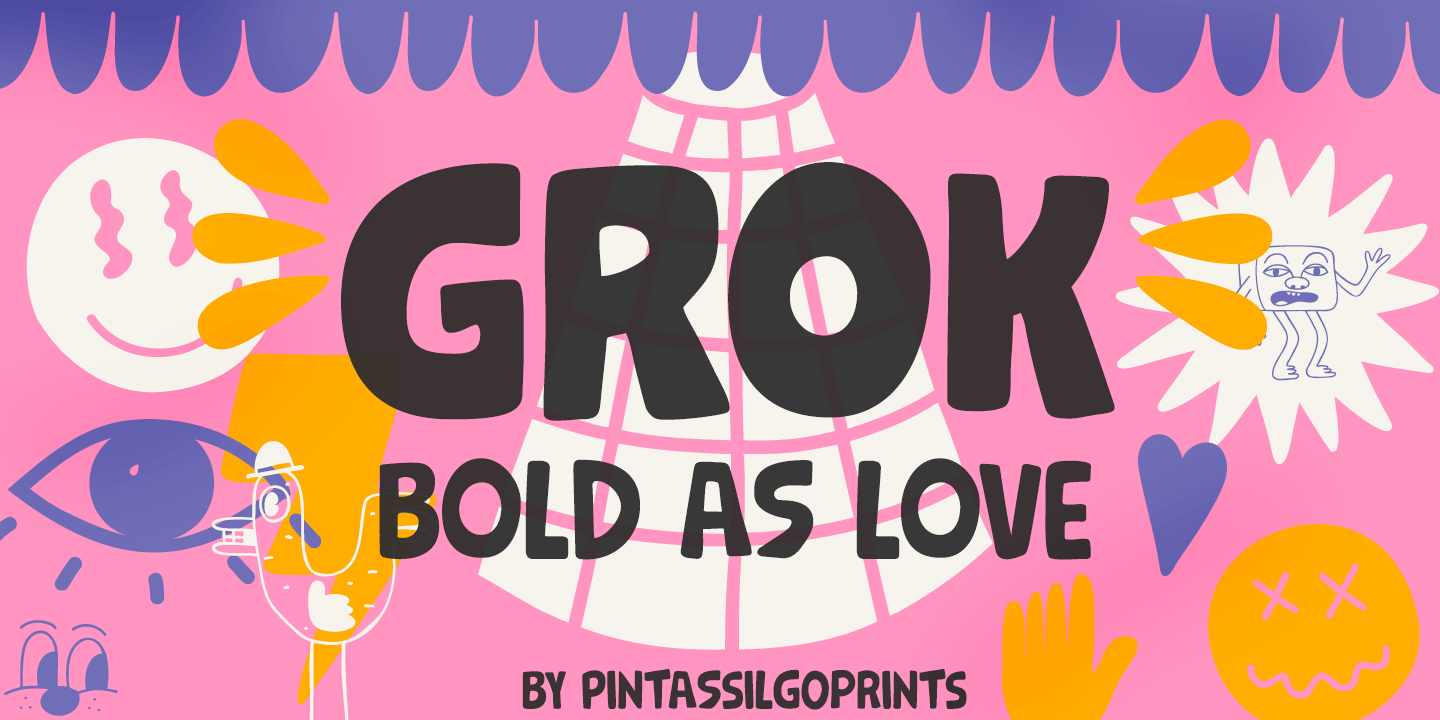
file name: Pintassilgo Prints Grok 2020 1
file name: Pintassilgo Prints Grok 2020 5

file name: Pintassilgo Prints Grok 2020

file name: Jeff Levine Weekend Date J N L 2020

file name: Jeff Levine Fruit Juice J N L 2020

file name: Jeff Levine New Car Tag J N L 2020

file name: Jeff Levine Formal Notice J N L 2020

file name: Jeff Levine Store Clerk J N L 2020

file name: Jeff Levine Merrymakers J N L 2020

file name: Jeff Levine Chunky Nouveau J N L 2020

file name: Jeff Levine Sportsboard J N L 2020

file name: Jeff Levine Incarceration J N L 2020

file name: Jeff Levine Swing Vote J N L 2020

file name: Jeff Levine Burlesk Queen J N L 2020
file name: Jeff N Levine Department Store J N L 2019
file name: Jeff Levine Slab Compact J N L 2019

file name: Jeff Levine Recording Artist J N L 2019

file name: Jeff Levine Retail Packaging J N L 2019

file name: Jeff Levine Bookkeeping J N L 2019

file name: Jeff Levine Danish Script Initials J N L 2019

file name: Jeff Levine Diamond Callouts J N L 2019

file name: Jeff Levine Marching Band J N L 2019

file name: Jeff Levine Marching Band J N L 2019
file name: Jeff Levine Marching Band J N L 2019

file name: Jeff Levine New Thin Roman J N L 2019

file name: Jeff Levine Nouveau Lettering J N L 2019

file name: Jeff Levine Reveler J N L 2019

file name: Jeff Levine Bookkeeper J N L 2019

file name: Jeff Levine Doggone It J N L 2019

file name: Jeff Levine French Calligraphic J N L 2019

file name: Jeff Levine Quick Titling J N L 2019

file name: Jeff Levine Radio Show J N L 2019

file name: Jeff Levine Library Book Initials J N L 2018

file name: Jeff Levine Retail Shop J N L 2018

file name: Jeff Levine Toy Decals J N L 2018

file name: Jeff Levine Desk Job J N L 2018

file name: Jeff Levine Toy Letters J N L 2018

file name: Jeff Levine Home Economics J N L 2018

file name: Jeff Levine Colmar J N L 2018

file name: Jeff Levine Eccentric Sans J N L 2018

file name: Jeff Levine French Slab Serif J N L 2018

file name: Jeff Levine Monthly Statement J N L 2018

file name: Jeff Levine Subscription J N L 2018

file name: Jeff Levine Topographic Sans J N L 2018

file name: Jeff Levine Criminal Intent J N L 2018

file name: Jeff Levine Arrevederci J N L 2018

file name: Jeff Levine Outline Sans J N L 2018

file name: Jeff Levine Series A Signage J N L 2018

file name: Jeff Levine College Nouveau J N L 2018

file name: Jeff Levine Stationer J N L 2018

file name: Jeff Levine Deco Template J N L 2018

file name: Jeff Levine Ritz Slab Serif J N L 2018

file name: Jeff Levine Sunshine Susie J N L 2018

file name: Jeff Levine Ball Game J N L 2018

file name: Jeff Levine Last Date J N L 2018

file name: Jeff Levine Courtship J N L 2018

file name: Jeff Levine Crepe Paper J N L 2018

file name: Jeff Levine Nouveau Fashion J N L 2018

file name: Jeff Levine Nouveau Standard J N L 2018

file name: Jeff Levine Old Tijuana J N L 2018

file name: Jeff Levine Pen Elegant J N L 2018

file name: Jeff Levine Curtain Up J N L 2018

file name: Jeff Levine Schoolyard Blues J N L 2018

file name: Jeff Levine What A Night J N L 2018

file name: Jeff Levine Two Step Nouveau J N L 2018

file name: Jeff Levine Mystery Show J N L 2018

file name: Jeff Levine Old Songs J N L 2018

file name: Jeff Levine Evening Walk J N L 2018

file name: Jeff Levine Retro Packaging J N L 2018

file name: Jeff Levine Antique Show Card J N L 2018

file name: Jeff Levine Poster Contoured J N L 2018

file name: Jeff Levine Semi Calligraphic J N L 2018

file name: Jeff Levine Handmade Headline J N L 2018

file name: Jeff Levine Monster Movies J N L 2018

file name: Jeff Levine Art Techno J N L 2017

file name: Jeff Levine Bulk Weight J N L 2018

file name: Jeff Levine Inline Square J N L 2018

file name: Jeff Levine Overton J N L 2018
file name: Jeff Levine Transcendental J N L 2018

file name: Jeff Levine Decalcomania J N L 2017

file name: Jeff Levine Nouveau Handlettered J N L 2017

file name: Jeff Levine Serif Callouts J N L 2017

file name: Jeff Levine Shelf Tags J N L 2017

file name: Jeff Levine Marketing Strategy J N L 2017

file name: Jeff Levine Manual Typewriter J N L 2018

file name: Jeff Levine Pacific Island J N L 2017

file name: Jeff Levine Electrostatic J N L 2017

file name: Jeff Levine Midnite Movie J N L 2017

file name: Jeff Levine Jungle Drums J N L 2017

file name: Jeff Levine Katz Pajamas J N L 2017

file name: Jeff Levine Bit Part J N L 2017

file name: Jeff Levine Brush Off J N L 2017

file name: Jeff Levine News Crew J N L 2017

file name: Jeff Levine Rhineland Roman J N L 2017

file name: Jeff Levine Utility Signage J N L 2017

file name: Jeff Levine Winter Garden J N L 2017

file name: Jeff Levine Composer J N L 2017

file name: Jeff Levine Dreamy J N L 2017

file name: Jeff Levine Go Home J N L 2017

file name: Jeff Levine Nouveau Romance J N L 2017

file name: Jeff Levine Second Guess J N L 2017

file name: Jeff Levine Vaudevillian J N L 2017

file name: Jeff Levine Yankee Doodle Boy J N L 2017

file name: Jeff Levine Showmanship J N L 2017

file name: Jeff Levine Snow Job J N L 2017

file name: Jeff Levine Penny Wise J N L 2017

file name: Jeff Levine Impecunious J N L 2017

file name: Jeff Levine Overnight J N L 2017

file name: Jeff Levine Stickball J N L 2017

file name: Jeff Levine Dip Pen J N L 2017

file name: Jeff Levine Elite Resort J N L 2017

file name: Jeff Levine Nouveau Square J N L 2017

file name: Jeff Levine Running Board J N L 2017

file name: Jeff Levine Conscription J N L 2017

file name: Jeff Levine Kids Activities J N L 2017

file name: Jeff Levine Location J N L 2017

file name: Jeff Levine Bitmap Typewriter J N L 2017

file name: Jeff Levine Late Breaking News J N L 2016

file name: Jeff Levine Front Row J N L 2017

file name: Jeff Levine Inlet J N L 2017

file name: Jeff Levine Junior Clerk J N L 2017

file name: Jeff Levine Legal Eagle J N L 2017

file name: Jeff Levine Ordinary Gothic J N L 2017

file name: Jeff Levine Song Vendor J N L 2017

file name: Jeff Levine Fancy Free J N L 2016

file name: Jeff Levine Slim Nouveau J N L 2017

file name: Jeff Levine First Responder J N L 2017

file name: Jeff Levine Hotel Suite J N L 2017

file name: Jeff Levine Pen Gothic J N L 2017

file name: Jeff Levine Pen Gothic J N L 2017b

file name: Jeff Levine Scandals J N L 2017

file name: Jeff Levine Song Merchant J N L 2017

file name: Jeff Levine Brookside J N L 2016

file name: Jeff Levine Just Great J N L 2016

file name: Jeff Levine Bold Display Sans J N L 2016

file name: Jeff Levine Newsbreaker J N L 2016

file name: Jeff Levine Limited Appeal J N L 2016

file name: Jeff Levine Adhesive Serif Letters J N L 2015

file name: Jeff Levine Thinly Disguised J N L 2016

file name: Jeff Levine Catalog Serif J N L 2015

file name: Jeff Levine Durable J N L 2016

file name: Jeff Levine Punch Tape J N L 2016

file name: Jeff Levine Frantic Pace J N L 2016

file name: Jeff Levine Gift List J N L 2016

file name: Jeff Levine Old Bodoni Wide J N L 2016

file name: Jeff Levine Old Bodoni Wide J N L 2016b

file name: Jeff Levine Short Subject J N L 2016

file name: Jeff Levine Song Stylist J N L 2016

file name: Jeff Levine Washington Heights J N L 2016

file name: Jeff Levine Take Charge J N L 2015

file name: Jeff Levine Headstone Roman J N L 2015

file name: Jeff Levine Red Border Labels J N L 2015

file name: Jeff Levine Circuletter J N L 2016

file name: Jeff Levine Eat More Fruit J N L 2016

file name: Jeff Levine Packaged Goods J N L 2016

file name: Jeff Levine Alleway J N L 2012

file name: Jeff Levine Lamp Post J N L 2012 after Post Oldstyle 1901

file name: Jeff Levine Partial Eclipse J N L 2012

file name: Jeff Levine Poster Plain J N L 2012

file name: Jeff Levine Rail Bum J N L 2016

file name: Jeff Levine Cocktail Hour J N L 2016

file name: Jeff Levine Two Cents Plain J N L 2012

file name: Jeff Levine Stamped Metal J N L 2012

file name: Jeff Levine Afternoon Edition J N L 2015

file name: Jeff Levine Evening Paper J N L 2015

file name: Jeff Levine Morning Paper J N L 2015

file name: Jeff Levine Press Run J N L 2015

file name: Jeff Levine Tabloid Press J N L 2015

file name: Jeff Levine Song Publisher J N L 2015

file name: Jeff Levine Handmade Caslon J N L 2014

file name: Jeff Levine Sign Template J N L 2015

file name: Jeff Levine Slim Chance J N L 2015

file name: Jeff Levine Island Time J N L 2014

file name: Jeff Levine Collected Catchwords J N L 2016

file name: Jeff Levine Erosion J N L 2016

file name: Jeff Levine Junior Detective J N L 2016

file name: Jeff Levine Metalform Gothic J N L 2016

file name: Jeff Levine School Project J N L 2015

file name: Jeff Levine Dance Lesson J N L 2015

file name: Jeff Levine Innerspring J N L 2015

file name: Jeff Levine Marble Cutter J N L 2015

file name: Jeff Levine Pool Deck J N L 2015

file name: Jeff Levine Wild About Myself J N L 2014

file name: Jeff Levine Bit Player J N L 2015

file name: Jeff Levine Brass Rail J N L 2015

file name: Jeff Levine Musical Score J N L 2015

file name: Jeff Levine Go To Town J N L 2015

file name: Jeff Levine Junior Printer J N L 2015

file name: Jeff Levine Long And Thin Initials J N L 2015

file name: Jeff Levine Port Of Call J N L 2015

file name: Jeff Levine Broadcast J N L 2015

file name: Jeff Levine Handbills And Posters J N L 2015

file name: Jeff Levine Lettering Pen J N L 2015

file name: Jeff Levine Soda Fountain J N L 2015

file name: Jeff Levine Vintage Price Tags J N L 2015

file name: Jeff Levine Intrigue J N L 2014
file name: Jeff Levine Art Deco Monograms J N L 2015
file name: Jeff Levine Moving Message J N L 2015
file name: Jeff Levine Print Shop Cuts J N L 2015
file name: Jeff Levine Brazil Nut J N L 2015
file name: Jeff Levine Diamondwood J N L 2015

file name: Jeff Levine Model Railroad J N L 2015
file name: Jeff Levine Restaurant And Lounge J N L 2015

file name: Jeff Levine Industriality J N L 2015

file name: Jeff Levine Southwest Serenade J N L 2015

file name: Jeff Levine Classification J N L 2015

file name: Jeff Levine Sea Cruise J N L 2015

file name: Jeff Levine Shareholder J N L 2015

file name: Jeff Levine Typewriter Sans J N L 2015

file name: Jeff Levine Bum Steer J N L 2015

file name: Jeff Levine Casual Tune J N L 2015

file name: Jeff Levine Nouveau Roundcorner J N L 2015

file name: Jeff Levine Concierge J N L 2014

file name: Jeff Levine Liebestraum J N L 2014

file name: Jeff Levine Liebestraum J N L 2014b

file name: Jeff Levine Songbook J N L 2014

file name: Jeff Levine Greenwich Village J N L 2014

file name: Jeff Levine Pop Tune J N L 2014

file name: Jeff Levine Snorkel J N L 2014

file name: Jeff Levine Blue Orchid J N L 2015
file name: Jeff Levine Katydid J N L 2015

file name: Jeff Levine Tall And Narrow J N L 2015

file name: Jeff Levine Terrace J N L 2015

file name: Jeff Levine Park Slope J N L 2014 12 17

file name: Jeff Levine Newsreel Caps J N L 2014

file name: Jeff Levine Pleasant Valley Sunday J N L 2014

file name: Jeff Levine Deco Of Tomorrow J N L 2014 12 17

file name: Jeff Levine Vododeo J N L 2014 12 17

file name: Jeff Levine Raccoon Coat J N L 2014 12 17

file name: Jeff Levine Candle Wax J N L 2014

file name: Jeff Levine Theater Lights J N L 2014
file name: Jeff Levine Tunesmith J N L 2014

file name: Jeff Levine Marking Device J N L 2014

file name: Jeff Levine Musical Arrangements J N L 2014

file name: Jeff Levine Charmer J N L 2014

file name: Jeff Levine Maryland J N L 2014

file name: Jeff Levine Tea Time J N L 2014
file name: Jeff Levine Best Bet J N L 2014

file name: Jeff Levine Popularity J N L 2014
file name: Jeff Levine Rustic Inn J N L 2014
file name: Jeff Levine Song Plugger J N L 2014

file name: Jeff Levine Poster Inline J N L 2014

file name: Jeff Levine Arts District J N L 2014

file name: Jeff Levine Jalopy J N L 2014

file name: Jeff Levine Merchandising J N L 2014
file name: Jeff Levine Monoline Rounded J N L 2014
file name: Jeff Levine Savings And Loan J N L 2014

file name: Jeff Levine Ciribiribin J N L 2014
file name: Jeff Levine Guadalajara J N L 2014

file name: Jeff Levine Narrow Minded J N L 2014

file name: Jeff Levine Performer J N L 2014

file name: Jeff Levine Bonehead J N L 2013

file name: Jeff Levine Gene Condensed 2014

file name: Jeff Levine Made In Japan J N L 2014

file name: Jeff Levine Newark J N L 2014
file name: Jeff Levine Parfum De Paris J N L 2014

file name: Jeff Levine Simplicity J N L 2014

file name: Jeff Levine Display Roman J N L 2014

file name: Jeff Levine Gift Wrap J N L 2014

file name: Jeff Levine Sales Pitch J N L 2014

file name: Jeff Levine Zoning Department J N L 2012

file name: Jeff Levine Axelby J N L 2013

file name: Jeff Levine Type Wronger J N L 2013

file name: Jeff Levine Window Sign J N L 2013
file name: Jeff Levine Barricade 2011

file name: Jeff Levine Bluesman J N L 2014

file name: Jeff Levine Matchbook J N L 2014

file name: Jeff Levine Matchbook J N L 2014b

file name: Jeff Levine Unpretentious J N L 2014

file name: Jeff N Levine Solid Serif J N L 2014

file name: Jeff N Levine Stonecut J N L 2014

file name: Jeff Levine Halliday J N L 2013

file name: Jeff Levine Streeter J N L 2013

file name: Jeff Levine Longacre J N L 2013

file name: Jeff Levine Margate J N L 2013

file name: Jeff Levine Technopen J N L 2013

file name: Jeff Levine Moderator J N L 2013

file name: Jeff Levine Arcaro J N L 2013

file name: Jeff Levine Lakeland J N L 2013

file name: Jeff Levine Popstix J N L 2013

file name: Jeff Levine Promotional Copy J N L 2012

file name: Jeff Levine Public Utility J N L 2012

file name: Jeff Levine adhesive letters J N L 2011

file name: Jeff Levine gilbert J N L 2011

file name: Jeff Levine inline lettering J N L 2011

file name: Jeff Levine plastic template J N L 2011

file name: Jeff Levine presentation J N L 2011

file name: Jeff Levine title block sans J N L 2011

file name: Jeff Levine Swing Band J N L 2013

file name: Jeff Levine Tea Bag J N L 2013

file name: Jeff Levine Yard Sale J N L 2013

file name: Jeff Levine Highbrow Cafetorium J N L 2009

file name: Jeff Levine Informational Gothic J N L 2013

file name: Jeff Levine Mc Cadden J N L 2013

file name: Jeff Levine Reprint J N L 2013

file name: Jeff Levine Sales Slip J N L 2013

file name: Jeff Levine Fastenating J N L 2012

file name: Jeff Levine Recreation J N L 2013

file name: Jeff Levine Salad Bar J N L 2013

file name: Jeff Levine Monthly Meeting J N L 2013

file name: Jeff Levine Nondescript J N L 2012

file name: Jeff Levine Winery J N L 2012

file name: Jeff Levine Simply Grotesk Condensed J N L 2012

file name: Jeff Levine Generic Gothic J N L 2013

file name: Jeff Levine Generic Gothic J N L 2013b

file name: Jeff Levine Fence Post J N L 2012

file name: Jeff Levine Shipping Carton J N L 2012

file name: Jeff Levine Lecture Hall J N L 2012

file name: Jeff Levine Newsworthy J N L 2011

file name: Jeff Levine Used Cars 2010

file name: Jeff Levine Pleasantville J N L 2012

file name: Jeff Levine Tiler J N L 2012

file name: Ray Larabie Jeff Levine Urmeba J N L 2012

file name: Ray Larabie Camulogen 2012

file name: Jeff Levine Type Vendor J N L 2011

file name: Ray Larabie Gameness 2012

file name: Jeff Levine Dance Hall J N L 2011

file name: Jeff Levine Sandcastle J N L 2011

file name: Jeff Levine Technerd J N L 2011

file name: Jeff Levine Technerd J N L 2011
file name: Jeff Levine Technerd J N L 2011

file name: Jeff Levine Callouts J N L 2011

file name: Jeff Levine Fun And Games J N L 2011
file name: Jeff Levine Tribal Council J N L 2011

file name: Jeff Levine Work Force J N L 2011

file name: Jeff Levine Fincastle J N L 2011

file name: Jeff Levine Emporia J N L 2011c

file name: Jeff Levine Fordham J N L 2011

file name: Jeff Levine Interoffie Memo 2011

file name: Jeff Levine Weeneez J N L 2011

file name: Jeff Levine Flipboard J N L 2011

file name: Jeff Levine Gummed Alphabet J N L 2011

file name: Jeff Levine Notification J N L 2011

file name: Jeff Levine Record Promotion J N L 2011

file name: Jeff Levine Type Catalog J N L 2011

file name: Jeff Levine Brushmark 2011

file name: Jeff Levine Editorial Comment J N L 2009

file name: J N Levine Case Closed 2011

file name: Jeff Levine Newsprint J N L 2011

file name: Jeff Levine Proofreader J N L 2011

file name: Jeff Levine Rendering J N L 2011

file name: Jeff Levine Personal Note J N L 2011

file name: Jeff Levine Patriotica J N L 2011

file name: Jeff Levine Reverberation J N L 2011
file name: Jeff Levine Deskplate J N L 2011

file name: Jeff Levine Handmade Gothic J N L 2011

file name: Jeff Levine Handmade Roman J N L 2011

file name: Jeff Levine Roundpoint Pen J N L 2011

file name: Jeff Levine Edessa J N L 2009

file name: Jeff Levine Typesetter J N L 2011

file name: Jeff Levine Thin Mint J N L 2011

file name: Jeff Levine Food Vendor J N L 2011

file name: Jeff Levine Key Largo J N L 2011

file name: Jeff Levine Alton J N L 2010

file name: Jeff Levine Duonor J N L 2010

file name: Jeff Levine Gummed Letters J N L 2010

file name: Jeff Levine Nyack Monoline J N L 2010

file name: Jeff Levine Quorfid J N L 2010
file name: Jeff Levine Teterboro J N L 2010

file name: Jeff Levine Trilium J N L 2010h

file name: Jell Levine Nyack J N L 2010

file name: Jeff Levine Groovy3 D Caps J N L 2010

file name: Jeff Levine Groovy Happening J N L 2005

file name: Jeff Levine Frankly Ornate J N L 2010

file name: Jeff Levine Pavement J N L 2010

file name: Jeff Levine Plastic Display J N L 2010

file name: Jeff Levine Arch Creek J N L 2010

file name: Jeff Levine Corkboard J N L 2010

file name: Jeff Levine Naroid Initials J N L 2010

file name: Jeff Levine Diamond Jim J N L 2010

file name: Jeff Levine Spring Fashion J N L 2010

file name: Jeff Levine Kiddie Blokz J N L 2010

file name: Jeff Levine Linem Up J N L 2010

file name: Jeff Levine Rural Route J N L 2010
| | |
|
Luc Devroye ⦿ School of Computer Science ⦿ McGill University Montreal, Canada H3A 2K6 ⦿ lucdevroye@gmail.com ⦿ http://luc.devroye.org ⦿ http://luc.devroye.org/fonts.html |