| | |
Alf R. Becker

|
Alf Becker (b. St. Louis, IL, d. 1959, St. Petersburg, FL) was a sign artist in the 1930's and 40's. Beginning in January 1932, at the request of editor E. Thomas Kelly, Becker supplied the Signs of the Times (The National Journal of Display Advertising) magazine's new Art and Design section with an alphabet a month, a project initially predicted to last only two years. Misjudging the popularity of the series, it instead ran for 27 years, ending finally two months before Becker's death in 1959, for a total of 320 alphabets. In late 1941, just ten years after the first alphabet was published, 100 of those alphabets were compiled and published in book form under the title 100 Alphabets, by Alf R. Becker. The American Sign Museum shows the following death notice, taken from the April 1959 issue of Signs of the Times: A chapter of almost 27 years of extensive influence upon the development of sign and outdoor advertising lettering came to a close March 10 in the passing of Alf R. Becker, whose alphabets had been presented consistently in Signs of the Times since January, 1932. Death came in St. Petersburg, FL, where he had been hospitalized since last November. The funeral services were in St. Louis, March 16. Mr. Becker had operated a commercial sign business in East St. Louis, IL., and was widely known for his lettering ability when requested 27 years ago by the late E. Thomas Kelley, then editor of Signs of the Times, to do a series of alphabets for the magazine. They had estimated that 24 alphabets which would be presented in a period of two years would serve the purpose. The series was so enthusiastically received and so many readers urged continuation that it was projected indefinitely to eventually each a total of 320 before failing health of Mr. Becker forced him to give up that creative work. His last alphabet for ST appeared in the January issue this year. Countless are the signmen and women who broadened the horizons of their lettering ability by thorough study of Mr. Becker's alphabet. In 1941, his book, "100 Alphabets" was published by Signs of the Times, and all 3,000 copies that were printed were sold out long ago. Numerous requests have been received for a reprinting, but in view of the changes of time in lettering styles, it has not been considered advisable. Mr. Becker's failing health in 1957 influenced him and Mrs. Becker moving to St. Petersburg, where they bought a home, and where he went into semi-retirement. His love of the sign business was such that he continued his alphabets in spite of the problems of his illness. Many of his typefaces have art deco influences. LHF Monogram at Letterhead is a digital version of one of his fonts. Other digitizations include Whomp (2006) and Buffet Script (2006) by Alejandro Paul (Sudtipos) and Daffadowndilly (2007) and Stony Island NF (after Becker's art deco typeface Chicago Modern), Quaint Notions (2003), and Shaq Attack NF (2011, a wood plank font) by Nick Curtis. The Fontry (James Stirling and/or Adkins) is undertaking a grand digitization project, and releases free and pay fonts with names that start with ARB, followed by the font number, the font name, and the month and year of issue. In The Fontry's ARB series, we find ARB-187 Moderne Caps AUG-47 (2013, didone), ARB-85 Poster Script (2011, after a 1939 typeface by Becker), ARB 70 Modern Poster, ARB 93 Steel Moderne, ARB 44 Chicago Modern, ARB 66 Neon (2010, after a 1937 font, +Block, +Line), ARB 85 Modern Poster JAN-39 (2011, after Modern Poster Script, 1939), and ARB 67 Modern Roman, and ARB08ExtremeRomanAUG-32CASNormal (2009; the original is from 1932). Jeff Levine created a number of typefaces based on Becker's work as well: Show Card Casual JNL (2018: based on a single stroke brush alphabet by Alf Becker), Casual Signage JNL (2018), Modern English JNL (2018), Kanona JNL (2010), Karaoke JNL (2010), Mocombo JNL (2010). John Davis created LHF Pipeline (2012) based on Becker's designs. Kaitlin Sims designed LHF Becker No. 45 (2015). Various of Becker's alphabets were at the basis of some digital fonts by Noah Johnson at Practical Lettering Studio, designed ca. 2026. These have numbered names such as No. 37 Alf Becker, No. 41 Alf Becker, No. 55 Alf Becker, No. 137 Alf Becker and No. 210 Alf Becker. FontShop link. Catalog of some of his digitized typefaces. View the digital typefaces that are based on Becker's work. Showcase of Alf R. Becker's fonts. [Google]
[MyFonts]
[More] ⦿
|
Alpha-Blox
|
 In 1944, American Type Founders (ATF) introduced Alpha-Blox. Quoting Jennifer Farrell, this is an impressive system of both solid and linear shapes that could be combined to create all manner of typefaces, ornament and pattern in 1- or 2-colors. The design possibilities were endless and limited only to the imagination of the printer/designer.
 Digital revivals of this modular typeface family include [Google]
[More] ⦿
|
Antique Embellishments
[Jeff Levine]
|
 A font made in 2009 by Jeff Levine, which includes a gorgeous fist. [Google]
[MyFonts]
[More] ⦿
A font made in 2009 by Jeff Levine, which includes a gorgeous fist. [Google]
[MyFonts]
[More] ⦿
|
A.V. Haight
[Inland Type Foundry]
|
 [MyFonts]
[More] ⦿
[MyFonts]
[More] ⦿
|
Barnhart Brothers&Spindler (or: BB&S)
|
 Chicago-based foundry, which grew out of The Great Western Type Foundry in 1868 when the Barnhart brothers (newspaper publishers in Iowa who came to Chicago as advertising agents) bought out the Toepfer family in 1868. They retained Herman Spindler as the foreman, since he was the only typefounder in the group. Aggressive in business, BB&S became the largest foundry in Chicago. Book of type specimens. Comprising a large variety of superior copper-mixed types, rules, borders, galleys, printing presses, electric-welded chases, paper and card cutters, wood goods, book binding machinery etc., together with valuable information to the craft. Specimen book no.9 (1907) is a 1048-page monster catalog (see also here and here and here). Some pictures from Type Barnhart Type Foundry Co. New York City: Superior Copper-Mixed Type (1908). In 1913, they published Preferred Type Faces.
 BB&S was purchased by ATF about 1911 and it operated independently until about 1930. Typophile page on them. Text file with a list of the typefaces in their Catalog 25 (1925). Discussion of some of their typefaces and digitizations: - Engravers Upright Script, a ronde style alphabet, was revived in 2006 by Nick Curtis as Bon Mot NF.
- Hazel Script, a primary school didactic connected script, digitized in 2006 by Paul Hunt as P22 Allyson (discussed here).
- They made the (sloppy) old-look garalde typeface Fifteenth Century in 1897, which turned into Caslon Antique (American Type Founders). A digital version can be had at MyFonts, but who made it? MyFonts also offers Caslon Open Face (originally, 1915).
- One of their best known designers was Oswald B. Cooper who made Cooper Black (1921) and Cooper Old Style (1919-1924), with characteristically blurred rounded serifs. He also made Cooper Hilite (shaded), Cooper 570 (fat), Cooper 579 (outline), Cooper Tooled Italic (shaded) and Cooper Black Italic 571.
- Delysian NF (2004, Nick Curtis) revives their Greeting Card typeface from the BBS catalog of 1923.
- Lining Gothic No. 71 (1907) is a grotesque typeface with panache. It was digitized by Nick Curtis as Cerulean NF (2007).
- Mazurka NF (2004, Nick Curtis) is a combination of two typefaces from the same catalog, Swagger Capitals, designed by Carl S. Junge, for the uppercase and Gothic Novelty Title for the lowercase.
- Racine (1903) was revived by Nick Curtis as Kenosha Antique (2004).
- Archer (1905) was revived by Nick Curtis as Grand Rapids (2005).
- Umbra (1907) was revived by Nick Curtis as Shady Lady NF (2005). Monotype's Umbra is based on a later metal version by Ludlow though.
- One of their blackletter typefaces is Waldorf Text (1914).
- Steelplate, a monocase engraved US dollar bill-style face, ca. 1900 at BBS, was revived by Nick Curtis as Smackeroo NF (2005).
- Ernst Lauschke designed the oriental look typeface Dormer in 1888 at the Great Western Foundry. BB&S renamed it Pekin. HiH digitized it in 2005. Pekin also is the name of Dan Solo's revival.
- Freak (1889, The Great Western Type Foundry) was renamed Bamboo by BB&S. A digital version by Tom Wallace is also called Freak (2005).
- Parsons (1918, Will Ransom) was digitized by Jess Latham.
- Wedge Gothic ML (1893). An oriental simulation font. It was not in the 1907 catalog but reappeared in 1925 as Japanette. According to McGrew, Wedge Gothic was originally created for the Chicago Herald newspaper. Digital versions: Japanette (Infinitype), OPTI Japanette 5 (CastCraft), Wedge Gothic (2010, Tom Wallace), Japanette (2012, SoftMaker).
- Clearcut Shaded Capitals (1920s, Will Ransom). Extended to a full font by Nick Curtis in 2005 as Ransom Clearcut NF).
- Dotted Roman (1897, a Victorian typeface) was revived as Miss Dottie NF by Nick Curtis in 2014.
- The decorative wood type typeface French Antique, featured in the 1905 catalog, and originally due to William H. Page. Digital versions by Woodentype (Jordan Davies) and Nick Curtis (whose version of French Antique Extended is called Fran Tique NF (2008)).
- The wedge-serifed typeface Vulcan (1884) was revived by Nick Curtis in 2014 as Vulkan NF.
- Jeff Levine's Millinery JNL (2022) is based on the art nouveau font Sterling showcased in the 1907 Barnhart Brothers & Spindler specimen book.
Wiki page. List of all BB&S typefaces compiled by the American Amateur Press Association in 2009. This includes a PDF file and an Excel spreadsheet. Digital typefaces that descend from Barnhart / BBS. [Google]
[MyFonts]
[More] ⦿
|
Display Material Company
|
Company located in New York City, and St. Paul, MN, which sold stencils as standard equipment with the Style A-029 Stencillor. In 1930, they published the lettering book Display material catalogue. In 2013, Jeff Levine designed the typeface Floorwalker JNL, which is based on stencils made in 1926 by Display Material Company. [Google]
[More] ⦿
|
Eric-Jean Müller
|
Author of 50 Alphabete fuer Techniker und Fachschulen. Flickr link. Digital typefaces that are based on some of these alphabets include Eleckatrical Banana JNL (2021, Jeff Levine), Strike (ca. 2019, by Nick Sherman) and Simula Sans (2018, by Jillian Kaimo). [Google]
[More] ⦿
|
Esterbrook Pen Company
|
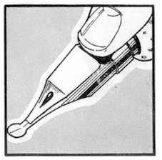 Publisher of Alphabets and Lettering with Esterbrook Drawlet Pens (1918; local download) and Drawlet Portfolio (1930s). Drawlet pens were Esterbrook's answer to the popular Speedball lettering pens, and the booklet was an instructional manual on hand lettering with the pen nibs.
 Digital typefaces influenced by Drawlet Portfolio include Jeff Levine's Art Class JNL (2014) and Technopen JNL (2013). [Google]
[More] ⦿
|
Evgeny Domnikov
[Hightower.Ru]
|
[More] ⦿
|
E-Z Letter Stencil Company
|
Stencil company from the 20th century that grew out of the Stencil-It company. Jeff Levine writes: Formed by Bernie Aronson [a relative of the Libauers who owned the Stenso Lettering Company and who once worked for them] along with a financial partner (noted artist) Sidney Levyne, the company [Stencil-It] was soon put out of existence by a court action. It re-emerged in 1956 as the E-Z Letter Stencil Company and existed until the 1990s. Jeff Levine used their Stencil-It line of lettering guides produced in 1955 for Stencil Package JNL (2015). [Google]
[More] ⦿
|
Falstaff
|
Falstaff is an English fat face type produced by the Monotype Corporation in 1931 [some say 1935]. Monotype later added the textured party font Falstaff Festival. Digital versions: Falstaff (Adobe), Falstaff (Monotype). Later derivations and extensions include two typefaces by Frantisek Storm, Hercules (2001) and Trivia Serif (2012), and Business Lunch JNL (2021) by Jeff Levine. [Google]
[More] ⦿
|
Georges Léculier
|
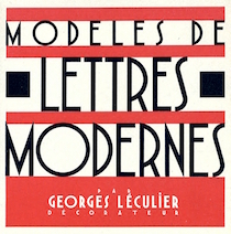 French author of the art deco lettering book Modèles de lettres modernes par Georges Léculier (1925). Typefaces based on his alphabets include
 [Google]
[More] ⦿
|
Harry B. Wright
|
Author of the instruction book Lettering 60 Plates in a Variety of Alphabets (1950, Pitman Publishing Corporation. New York, NY). Reprinted in 1962. Digital revivals were undertaken by Jeff Levine. These include [Google]
[More] ⦿
|
Hightower.Ru
[Evgeny Domnikov]
|
Evgeny Domnikov (Hightower.Ru) designed many free pixel fonts, including Copyright, Copyright Bold, Dots, BigDots and Terminal, all with Cyrillic versions. FON format only. He cyrillized Jeffrey N. Levine's font Festival Nights JL in 2002. [Google]
[More] ⦿
|
Inland Type Foundry
[A.V. Haight]
|
 The Inland Type Foundry in Saint Louis was established in 1892 by the three sons of Carl Schraubstadter (1827-1897), William A. Schraubstadter (1864-1957), Oswald Schraubstadter (1868-1955) and Carl Schraubs Jr. (1862-1947). Carl had run the Central Type Foundry in Saint Louis and sold it to ATF (American Type Founders) in 1892, and the sons reacted by setting up Inland. Until 1911, Inland was one of the most successful foundries in the United States. In 1911 Inland was purchased by ATF and its equipment divided between that foundry and Barnhart Brothers and Spindler (BBS). A.V. Haight (Poughkeepsie) designed Rogers (art nouveau) at Inland Type foundry in 1902. He also designed Haight. Nicholas J. Werner, who used to work for Central, also created many designs at Inland. Look for "Specimen book and catalog, a price list of printers' supplies, showing types and rules in which are embodied all the latest styles ... among which ... may be especially mentioned the casting of types on standard line and unit sets." (1902, 464 pages), Specimen Book and Catalog. A Price List of Printers Supplies, Showing Types and Rules in which Are Embodied all the Latest Ideas that Enable the Printer to Produce Superior Work in a most Economical Manner Among which Betterments May Be Especially Mentioned the Casting of Types on Standard Line and Unit Sets (St. Louis, 1897) (a free copy is here and here) and Specimen Book and Catalog. A Price List of Printers Supplies, Type, Rules and Accessories of the Very Latest Designs which Facilitate the Economical Production of Superior Printing. A Notable Improvement Is the Casting of All Type on Standard Line&Unit Sets (St. Louis, 1907). MyFonts page.
 Scans of some typefaces: Becker (art nouveau), Blanchard Italic [Blanchard was revived in 2013 by Paulo W as Blanchard Inland], Commercial Script, Edwards (art nouveau), Inland, Lightface Blanchard, Matthews (1902: revived in 2019 by Chuck Mountain as Cotrell CF), Extended Studley (revived by Chuck Mountain in 2019 as Dukas CF, and by Jeff Levine in 2008 as Bayview JNL), Rogers (art nouveau), Poster French Oldstyle (1897 catalog), Poster Ionic (1897 catalog), Poster Latin Antique (1897 catalog), Pacific Bikes (ornaments, 1897 catalog), Recut Caslon (1907, as taken from the 1923 ATF catalog), Drew (1910, from the 1923 ATF catalog: a digital version called Droobie NF was created by Nick Curtis in 2014), Title Shaded Litho (1911), Litho Roman (1907), Gothic No.578 (1898), Pen Print (1911), Blair (1900; Condensed Blair was revived in 2022 by Jeff Levine as Generic Sans JNL), Mitchell (1906, a bold version of the all caps grotesque face Blair; digitally revived by Nick Curtis in 2015 as Mitchell NF), Comstock (1902), Inland Copperplate (1901), Shaw Text (1907). Commentaries by Mac McGrew on some of the typefaces: - Gothic No. 578: Gothic No. 578 was shown as Gothic No.8 by Inland in 1898 as "the latest candidate for the printer's favor; a popular old typeface entirely recut." It was shown until 1941. It is a bold weight, and is quite similar to Standard Bold which as an import from Germany was very popular in this country in the 1950s. It is also similar to Comstock, but without the added outline. Keystone called it Standard Gothic, although it is not identical to the German face. As a nineteenth-century gothic, the cap G had no crossbar. Paragon Gothic is the same design, without lowercase, cast as a title face.
- Pen Print: Pen Print and Pen Print Bold were introduced by Inland Type Foundry in 1911, with the latter thought to have been the last typeface cut by that foundry before its sale to ATF. Pen Print Open was designed for ATF in 1921 by Morris Benton, and includes open versions of all the characters shown for the bold. The series has more the appearance of rather crude brush lettering than pen "printing," but the inclusion of an open version is contrary to the conception; perhaps it was intended for two-color printing. The letters have a slight backslant. The bold was also cut by Intertype, in 1927. Compare Dom Casual.
- Blair: Blair was advertised in 1900 by Inland Type Foundry as new and original, calling it "an exact imitation of the small gothic letter now so popular with engravers for stylish stationery." Its production was continued by ATF until the 1950s. It is similar to Copperplate Gothic Light, but without the tiny serifs of that face. Litho Gothic is the same design but with lowercase. Mitchell (1906) is the same design but slightly heavier. The condensed version was produced in 1903 or earlier. Hansen copied Blair as Card Gothic No.2. Compare Lightline Gothic.
- Comstock: Comstock was advertised by Inland Type Foundry in 1902 as "a striking novelty, our brand new face." It was revived by ATF in 1957. It is a medium weight conventional gothic, distinguished by a hairline surrounding each letter. The G lacks a crossbar, typical of many nineteenth-century gothics. The design was sponsored by A. H. Comstock of Omaha, according to a review at the time of its introduction. Condensed Comstock was introduced by Inland in 1905, but patented in the name of William A. Schraubstadter in 1908. It has no lowercase, but the design is more contemporary. Monotype has copied both typefaces, but Monotype Comstock Condensed is in 18-point only, without figures. In both foundry typefaces, there are several sizes on 12-point body; No.1 is the largest in regular, but No.1 is the smallest in Condensed. In 1911, a copy of Comstock was issued by Bauer in Germany under the name Astoria, revived in 1957.
- Inland Copperplate: Inland Copperplate is a shaded Old English typeface, first shown by Inland Type Foundry in November 1901. It is similar to Typo Text (q.v.). although the specimen here, reproduced from an over-inked showing, doesn't reveal the shading.
- Mac McGrew writes: Matthews is a very heavy, thick-and-thin, serifless type introduced by Inland Type Foundry in 1901. It is somewhat similar to the later Globe Gothic (Bold-in fact it is more carefully designed and seems to agree better with the lighter Globe Gothics than the latter typeface does. ATF cast both typefaces for a while after acquiring Inland in 1912, as well as Condensed Matthews, which Inland had introduced in 1903 as "a new gothic letter." The specimen of Matthews shown here is from a font showing considerable wear, with rounded corners. Compare Radiant Heavy. For a digital revival, see Merchant Trade JNL (2020, Jeff Levine).
- Shaw Text: Shaw Text was introduced by Inland Type Foundry in 1907 as its "latest novelty," although it is a rather conventional Old English face, a little heavier than Wedding Text, and a little lighter and fancier than Engravers Old English. After Inland merged with ATF, Shaw Text continued to be shown until 1954. Compare Plate Text.
- Litho Antique (1910). Mac McGrew: Rockwell Antique was a reissue of Litho Antique, cut by William Schraubstadter for Inland Type Foundry and introduced in January 1910 when it was advertised as the "newest typeface; one of our best; closely imitating steelplate and lithography." In the late 1920s similar typefaces became popular in Europe, and some were imported into the United States. Morris Benton of ATF added several characters to the old Inland face, matrices of which were then in ATF's vaults, and it was reissued in 1931 as Rockwell Antique. But Benton saw that something more was needed, and redrew it as Stymie Bold (q.v.) in the same year. The alternate characters which were added to Rockwell are the same ones now shown with Stymie Bold. Monotype copied Rockwell but erroneously called it Stymie Bold in some literature, and there has been confusion between the two typefaces ever since; the latter name is often applied to fonts of Rockwell cast on Monotype machines by secondary suppliers. Indicative of this confusion, Stymie Bold Italic on Mono is series 1891, corresponding to Rockwell series 189, while Stymie Bold is 790. English Monotype has several weights of Rockwell, a square serif family which differs from this typeface and should not be confused with it; see Imports in Appendix. Antique Shaded (q. v.) is sometimes called Rockwell Antique Shaded.
- Herald Extra Condensed (1909). An octagonal typeface.
- Extra Condensed Title Gothic No.12.
[Google]
[MyFonts]
[More] ⦿
|
Jeff Levine
[Antique Embellishments]
|
[MyFonts]
[More] ⦿
|
Jeff Levine
[Stenso Lettering Company]
|
[More] ⦿
|
Jeff Levine
|
 Prolific type designer in Florida, b. New York, 1952. His fonts were originally free and consisted largely of dingbats. Around 2005 he went commercial, and now sells his work (over 350 fonts as of 2009) via MyFonts. He has branched out into several font styles, with a soft spot for stencil fonts, fonts for signage, art deco, and fonts for advertising. Born in New York, his family moved to Florida in 1963, where he has been ever since.
 An interview. Alternate URL. Yet another URL with his early free fonts. My pages on him. Dafont link. Abstract Fonts link. MyFonts link. Klingspor link. [Google]
[MyFonts]
[More] ⦿
|
Jeff Levine
[Jeff Levine: Stencil typefaces]
|
 [MyFonts]
[More] ⦿
[MyFonts]
[More] ⦿
|
Jeff Levine
[Jeff Levine: Blackletter typefaces]
|
[MyFonts]
[More] ⦿
|
Jeff Levine
[Jeff Levine: Groovy -- Psychedelic typefaces]
|
[MyFonts]
[More] ⦿
|
Jeff Levine
[Jeff Levine: Oriental simulation typefaces]
|
 [MyFonts]
[More] ⦿
[MyFonts]
[More] ⦿
|
Jeff Levine
[Jeff Levine: Art Deco Typefaces]
|
 [MyFonts]
[More] ⦿
[MyFonts]
[More] ⦿
|
Jeff Levine
[Jeff Levine: Dingbats and Alphadings]
|
 [MyFonts]
[More] ⦿
[MyFonts]
[More] ⦿
|
Jeff Levine
[Jeff Levine: The Eckhardt Series]
|
[MyFonts]
[More] ⦿
|
Jeff Levine
[Jeff Levine: Western style typefaces]
|
 [MyFonts]
[More] ⦿
[MyFonts]
[More] ⦿
|
Jeff Levine
[Jeff Levine: Athletic lettering typefaces]
|
[MyFonts]
[More] ⦿
|
Jeff Levine
[Jeff Levine: Octagonal typefaces]
|
 [MyFonts]
[More] ⦿
[MyFonts]
[More] ⦿
|
Jeff Levine
[Jeff Levine: Art nouveau types]
|
[MyFonts]
[More] ⦿
|
Jeff Levine
[Jeff Levine: Wood type]
|
 [MyFonts]
[More] ⦿
[MyFonts]
[More] ⦿
|
Jeff Levine
[Jeff Levine: Alf R. Becker fonts]
|
[MyFonts]
[More] ⦿
|
Jeff Levine
[Jeff Levine: Signage]
|
[MyFonts]
[More] ⦿
|
Jeff Levine
[Jeff Levine: Comic book and cartoon typefaces]
|
[MyFonts]
[More] ⦿
|
Jeff Levine
[Jeff Levine: Additional typefaces]
|
 [MyFonts]
[More] ⦿
[MyFonts]
[More] ⦿
|
Jeff Levine: Additional typefaces
[Jeff Levine]
|
 This is a list of fonts by Jeff Levine not categorized anywhere else on my pages.
 - A: Adelanto JNL (2009), Adhesive Letters JNL (2011), Adhesive Serif Letters JNL (2015), Adventure Film JNL (2021: a casual sans based on the titles and credits for Texas Across the River, 1966), Afternoon Edition JNL (2015), Air Circus JNL, Aisle Seats JNL (2006, based on letters cut by the Redikut Letter Company of Hawthorne, CA), Album Cover JNL (2008), Alleway JNL (2012, a condensed sans), Allograph JNL (2007), Alphacal JNL (2008, outlined, and like Juneway JNL, based on water-applied decals once made by the Duro Decal Company (now Duro Art Industries) of Chicago), Alton JNL (2010: a bold display sans), Amateur Printer JNL (2007, grunge), Ampersorts JNL (2011: ampersands), And So Forth JNL (2011), Anecdote JNL (2009), Announcement Board JNL (2018: white-on-black), Antique Packaging JNL (2019: Victorian), Antique Price Tags JNL (2019), Arcaro JNL (2013, a calligraphic typeface based on the movie credits of the ABC TV series Naked City, 1958-1963, starring detective Frank Arcaro), Antique Show Card JNL (2018: based on an alphabet from the first Speedball Lettering Book in 1915), Arch Creek JNL (2010, an all caps revival of Beton), Ardball (2006), Arrevederci JNL (2018), Arrow Callouts JNL (2021: an arrow-themed alphading font), Art Deco Monograms JNL (2015), Arte Critique JNL (2009), Artist Colony JNL (2009), Arts District JNL (2014), Art Student JNL (2010), Art Techno JNL (2017), Astrospy JNL (2008: techno), Awkward Gothic JNL (2008), Axelby JNL (2013).
- B: Backpage Article JNL (2010), Bal Harbour JNL (2008), Balcony Seats JNL (2007, narrow retro sans), Ball Game JNL (2018), Bandmaster JNL (2021: based on the opening movie titles from the 1940 musical comedy Strike up the Band starring Judy Garland and Mickey Rooney), Barricade (2011, a great shadowed caps face), Bayview JNL (2008, based on Inland Type Foundry's Studley), Best Bet JNL (2014, a slab serif redesign of Beton), Bike Decals JNL (2008), Billing and Shipping JNL (2010), Bingo Player JNL (2010), Birch Beer JNL (2008), Bitmap Typewriter JNL (2017), Bit Part JNL (2017: extra condensed), Bit Player JNL (extra-condensed tall poster font) (2015), Bloktor Mosaik JNL (2007), Blue Parrot (2006), Bluesman JNL (2014: based on the lettering of the blues album "I'm Jimmy Reed" released on the legendary Vee-Jay label out of Chicago), Bold Display Sans JNL (2016: based on an imge in a Speedball book), Bonehead JNL (2013, bones), Bookkeeper JNL (2019: based on R. Hunter Middleton's slab serif, Karnak), Bookkeeping JNL (2019, like an extra bold version of R. Hunter Middleton's slab serif Karnak (1936)), Boss Jock JNL (2021: an informal font based on the title and credits from the 1965 film Strange Bedfellows), Box Lunch JNL, Brass Rail JNL (2015), Brazil Nut JNL (2015), British Cinema JNL (2021, based on the hand lettered titles and credits from the 1945 British film The Way to the Stars), British Vehicle JNL (2020; based on the UK license plate font created by Charles Wright in 1935; with Ahmed Eraqi), Broadcast JNL (2015), Broadletter JNL (2009), Brochure Sans JNL (2022: based on Sans Serif No.7 from the 1921 Miller & Richard type specimen book), Brogado (2006), Brookside JNL (2016), Brushmark JNL (2011), Brush Off JNL (2017), Bulk Weight JNL (2017), Bum Steer JNL (2015), Burger Joint (2006), Burger Royale JNL (2007), Burlesk Queen JNL (2020: blocked letters), Business Helpers JNL (2014), Business Letter JNL (2021: based on the squarish typeface Geometric in the 1894 catalog of the John Ryan Foundry in Baltimore, MD).
- C: Calendar Blocks JNL (2009), Calling Card JNL (2010), Callouts JNL (2011, in Circle and Square styles; white letters on black background), Canby (2006, a squarish caps face), Candle Wax JNL (2014, based on the movie poster for Bell, Book and Candle starring James Stewart), Cast And Crew JNL (2015, condensed monoline), Cast Shadow JNL (2010), Casual Lunch JNL (2009), Casual Friday JNL (2008, roman lettering), Casual Tune JNL (2015), Catalog Serif JNL (2015), Catalog Sheet JNL (2022: based on an extra condensed serif typeface from the 1892 MacKellar, Smiths & Jordan type foundry specimen book), Catch Words JNL (2009), Channel Tuning JNL (1999), Channel Surfing JNL (2010), Charlies Bar BQ JNL (2008, heavy slab serif), Charmer JNL (2014), Chive Turkey JNL (2007), Chunky Nouveau JNL (2020), Circuletter JNL (2016), Ciribiribin JNL (2014), Classification JNL (2015), Classroom JNL (2009), Cling Vinyl JNL (2009), Coal Train (2004), Cocktail Hour JNL (2016, a beatnik typeface based on the opening title for the 1962 Blake Edwards film Days of Wine and Roses starring Jack Lemmon and Lee Remick), Coffee Bar JNL (2021: a squarish typeface), Coldfield JNL (2008), College Nouveau JNL (2018), Colmar JNL (2018), Columnist JNL (2020, after Morris Fuller Benton's News Gothic, 1908, ATF), Commentary JNL (2010, almost typewriter type---easy on the eye), Composer JNL (2017), Concierge JNL (2014), Conscription JNL (2017), Corkboard JNL (2010: a rounded all caps family), Cornfield JNL (2008), Crepe Paper JNL (2018), Criminal Intent JNL (2018: based on the trailer of the 1942 movie Mr. and Mrs. North), Crown Heights JNL (2007, slab serif caps), Cruise Director JNL (2021: an inline typeface based on a hand-lettered title on the poster for the 1933 musical comedy film Melody Cruise), Courtship JNL (2018), Cover Letter JNL (2019), Curtain Up JNL (2018), Cyberglass (2010, techno), Cybrox JNL (2012, grunge).
- D: Dance Hall JNL (2011), Dance Lesson JNL (2015, a wedge serif in the style of Latin Wide), Rotisserie Menu JNL (2021: based on a 1928 menu for the restaurant Rotisserie Du Cardinal), Dangits JNL (2009), Danish Script Initials JNL (2019, based on letters designed by Copenhagen-born industrial artist and letterer Gustav Boerge Jensen (1898-1954), Date Book JNL (2021; based on the credits of the movie The Awful Truth, 1937), Decal (2006), Decalcomania JNL (2017), Deco Of Tomorrow JNL (2014), Deconstructed JNL (2012), Decorative Panels JNL (2009), Deco Template JNL (2018: squarish), Deerfield JNL (2006, Bank Gothic style), Department Store JNL (2019), Desk Jockey JNL (2008), Deskplate JNL (2011: an all caps copperplate font), Desk Job JNL (2018), Detective Client JNL (2021: based on the cast credits of the 1941 film, The Maltese Falcon), Detention JNL (2007, hand-printed), Diamond Callouts JNL (2019, letters in triangles), Diamond Jim (2010), Diamondwood JNL (2015, rhombic), Dip Pen JNL (2017, rounded, handcrafted), Disclaimer JNL (2010, condensed thin headline face), Display Board JNL (2020: based on Paul Renner's Futura Display from 1932), Display Inline JNL (2009), Displayced (2006, LED font), Display Roman JNL (2014), Doggone It JNL (2019: based on the movie posters for the 1962 film, Mono Cane), Do It Yourself JNL (2008), Doo Wop Initials JNL (2007), Doowop (2006), Dormitory Decals JNL (2009), Double Take JNL (2008), Drafting Class JNL (2021: based on an all caps alphabet in The Essentials of Lettering by Thomas E. French and Robert Meiklejohn (circa 1912)), Dreamy JNL (2017), Dual Line Roman JNL (2021: an inline titling typeface), Duonor JNL (2010), Durable JNL (2016, based on a 1940s cover of a catalog for the Duro Decal Company of Chicago).
- E: Eastport JNL (2019: an interpretation of Morris Fuller Benton's 1931 classic, Stymie Extra Bold), Eat More Fruit JNL (2016), Eccentric Sans JNL (2018), Edessa JNL (2009: chiseled stone look, faux Greek), Editorial Comment JNL (2009, grotesk caps-only headline face), Edits and Credits JNL (2008), Egg Farm JNL (2021: based on the opening titles and credits of the 1947 film comedy The Egg and I), Electric Newspaper JNL (2021: a dot matrix font based on the moving message board electric newspaper from 1931 installed by the Los Angeles Times---in partnership with the Richfield Oil Company---on its building), Electrostatic JNL (2017, textured), Elite Resort JNL (2017, slab serif), Elsinor (2006), Endless Journey JNL (2009), Ensemble Inline JNL (2014), Entitled JNL (2007, squarish as in Bank Gothic), Evening Edition JNL (2009), Evening Event JNL (2021; based on hand lettering from the title credits for the 1950 film All about Eve), Evening Paper JNL (2015), Evening Walk JNL (2018), Expressions (smilies).
- F: Factual JNL (2010,headline face), Fairgrounds (2006), Fancy Free JNL (2016: decorative caps), Fancy Show Card JNL (2021), Farragut JNL (2008, hairline geometric), Fastenating JNL (2012, paper clip font), Federal Agent JNL (2021: a condensed typeface based on the opening title of the 1959 premiere season of The Untouchables), Feltboard JNL (2008), Fence Post JNL (2012), Festival Nights (fancy letters), File Clerk JNL (2020, Jeff Levine: based on Cushing (1897)), File Folder JNL (2010, Bank Gothic style family), Film Crew JNL (2009), Fincastle JNL (2011, all caps sans titling face), First Responder JNL (2017: a left-slanted version of Catalog JNL), Flagstaff JNL (2010), Flatbush Beanery (2006), Flipboard JNL (2011), Flivver (2006, a slab-serif display font), Floor Tiles JNL (2009), Florida (2006, retro), Food Vendor JNL (2011), Fordham JNL (2011, all caps slab serif), Formal Invite JNL (2021: thin, condensed serif lettering found in a 1937 magazine ad for Chris Craft boats), Formal Notice JNL (2020: a revival of an alphabet by Samuel Welo in Studio Handbook for Artists and Advertisers), Frankly Plain JNL and Franky Ornate JNL (2010, all caps typefaces after Franklin Gothic), Frantic Pace JNL (2016, a bouncy retro party font), Free Form Retro JNL (2021: an all caps sans based on the titles and credits from the 1960 French film Le Passage Du Rhin), French Calligraphic JNL (2019), French Cinema JNL, French Serif Moderne JNL (2009), French Slab Serif JNL (2018: based on the 1934 French lettering instruction book L'Art du Tracé Rationnel de la Lettre), French Song JNL (2021: a whimsical typeface based on the titles and credits of the 1952 British comedy Song of Paris), Freunlaven JNL (2006, psychedelic), Front Row JNL (2017: a tall condensed typeface that reinterprets Morris Fuller Benton's Empire from 1937), Fruit Juice JNL (2020), Fun and Games (2011, a casual retro typeface redrawn from the lettering found on the cover of a 1935 Speedball Lettering Pen book).
- G: Gene Condensed JNL (2014), Generic Sans JNL (2022: modeled after Condensed Blair from the 1907 specimen book of the Inland Type Foundry), Generic Gothic JNL (2013: an interpretation of Franklin Gothic Condensed), Genesee JNL (2010), Gift List JNL (2016), Gift Wrap JNL (2014), Gilbert JNL (2011, after Eric Gill's sans), Go Home JNL (2017), Good Sport JNL (2019), Goose Creek JNL (2021: based on hand lettered credits from the 1942 British film comedy The Goose Steps Out), Go To Town JNL (casual inline type style) (2015), Gothic Grotesk JNL (2020; a revival of Royal Gothic (1930s, Stevens, Shanks & Sons), which in turn was based on Charter Oak (1899, Keystone Foundry)), Greenwich Village JNL (2014), Groovy 3D Caps JNL, Groovy Happening JNL (2005, psychedelic, in the style of Action Is), Groovy Summer (2006, a casual sans), Guadalajara JNL (2014, a Mexican party font), GummedAlphabet JNL (2011), Gummed Letters JNL (2010).
- H: Halavah Twist JNL (2007; see also its extension Zydeco JNL in 2009), Hallandale (2006), Halliday JNL (2013: an outlined typeface based on Beton Open Condensed), Handbills And Posters JNL (2015), Handmade Caslon JNL (2015), Handmade Dropshadow JNL (2010), Handmade Gothic JNL (2011, inspired by lettering samples in a 1941 Speedball Lettering Pen instructional booklet), Handmade Headline JNL (2018: a 1940s style typeface), Handmade Roman JNL (2011), Hand Stamped JNL (2006, rubber stamp look), Hanford (2010, a sans headline family), Hash and Beans JNL (2007), Headstone Roman JNL (2015), Hectonoid JL (2008), Heller Sans JNL (2019: after an experimental alphabet by Steven Heller), Highbrow Cafetorium JNL (2009), Hippie Comics JNL (2021: based on poster lettering in the 1920 edition of How to Paint Signs and Sho Cards by E. C. Matthews), Home Address JNL (2019), Home Economics JNL (2018), Home Room JNL (2009), Horse Puckey JNL (2008), Hotel Suite JNL (2017), Hoxie JNL (2008).
- I-J: Impecunious JNL (2017), Impressionable JNL (2012, based on a rubber stamp set), Incarceration JNL (2020), Industriality JNL (2015), Informational Gothic (2013: The Wood-Regan Instruments Company (Wrico) of New Jersey manufactured for decades a line of lettering kits called the Wrico Sign Maker. With only special ink pens, plastic templates and a template guide anyone could letter clean, clear signs, posters and notices. This typeface is based on one of those kits), Informational Sans JNL (2021: squarish, caps only), Initial Seals JNL (2012), Inkpad Letters JNL (2011), Inline Lettering JNL (2011, inspired by the opening title of a classic 1940s horror film, The Invisible Man's Revenge), Inlet JNL (2017), Inline Square JNL (2017), Innerspring JNL (2015), Intermediate JNL (2019: based on a home movie titling kit from circa the 1950s or 1960s called the Magna Tech Titler Number 312, modeled after Futura Bold), Interoffice Memo (2011), Intrigue JNL (2014, based on the hand-lettered movie titles from one of the William Powell / Myrna Loy Thin Man series of films), Island Time JNL (2015), Jalopy (2014), Jive Jump (2006), Jobseeker JNL (2011: hand-printed), Juneway (2006, modeled after a set of water-applied decals made by the Duro Decal Company of Chicago), Jungle Drums JNL (2017, African theme), Junior Printer JNL (2015), Just Great JNL (2016: angular display typeface).
- K-L: Katydid JNL (2015, a connect-the-dots typeface), Katz Pajamas JNL (2017), Keyden Drop Caps JNL (2021: a set of slab serif framed capitals based on John Alden Initials, shown in the 1906 edition of the Keystone Type Foundry specimen book), Key Largo JNL (2011, all caps slab serif), Lakeland JNL (2013), Kiddie Blokz JNL (2010), Kids Activities JNL (2017, handcrafted), Lamp Post JNL (2012, an interpretation of Post Old Style, ca. 1901), Last Date JNL (2018), Lasting Impression JNL (2008), Late Breaking News JNL (2016, headline sans), Late Hours JNL (2021: inspired by the hand lettered titles for the 1961 film The Children's Hour), Lecture Hall JNL (2012), Lefferts (2006, squarish display face), Legal Brief JNL (2021), Legal Eagle JNL (2017, with engraved lines), Les Folies JNL (2009, Victorian), Lettering Lesson JNL (2021: a bold serif typeface based on the 1922 instructional booklet from the St. Louis Show Card School), Lettering Pen JNL (2015, handcrafted), Library Book Initials JNL (2018: Library Book Initials JNL was modeled from examples of Sidney Gaunt's Publicity Initials; originally sold in metal type by Barnhart Brothers and Spindler as a companion to the Publicity Gothic typeface), Liebestraum JNL (2014, a decorative caps font), Limited Appeal JNL (2016), Linem Up (2010), Lobby Card JNL (2010), Local News JNL (2021: a condensed sans based on the hand lettered title for the 1954 film Power of the Press), Location JNL (2017), Longbranch Initials (2006, for decorative monograms), Longacre JNL (2013, fat rounded sans), Long And Thin Initials JNL (2015), Loose Leaf JNL (2010), Love Notes JNL (2011: alphadings), Luminum JNL (2007).
- M: Made in Japan (2014), Mailbox Letters JNL (2008), Main Feature JNL (2017, a marquee sans), Mainline JNL (2014), Manual Typewriter JNL (2017: allegedly after a 1933 example by Morris Fuller Benton), Manufactory JNL (2019, a wedge serif not unlike the ones used in advertizing in the late 19th century), Manufacturer JNL (2020: a reinterpretation of the Extra Bold Extended weight of Bauersche's Venus Grotesk (ca. 1907)), Marble Cutter JNL (2015, based on dies used for stamping text into marble headstones or other monuments manufactured by The Vermont Marble Company (Vermarco), which operated from the 1880s until 1976), Marching Band JNL (2019), Margate JNL (2013, based on water-applied decals manufactured in 1962 by the American Decalcomania Company for Goodyear), Marketing Strategy JNL (2017), Marking Device JNL (2014), Maryland JNL (2014), Matchbook JNL (2014: based on lettering on a matchbook from the Carrousel Restaurant in Miami Beach), Mayville JNL (2009), McCadden JNL (2013, inspired by the hand-lettered credits for the George Burns and Gracie Allen Show [1950-1958]), Meal Ticket JNL (2008, squarish), Merchandiser JNL (2010), Merchandising JNL (2014, brush signage script), Merchant Trade JNL (2020, after the Matthews Series by Inland Type Foundry, 1901), Merrymakers JNL (2020), Midnite Movie JNL (2017, inspired by the hand lettered title credits from the 1961 Hammer Pictures film Curse of the Werewolf), Millport (2006, squarish display face), Mimeograph Template JNL (2019: based on a plastic lettering guide manufactured by the Albert Blake Dick Company of Chicago), Misdirection JNL (2009), Mixed Messages JNL (2007, ransom note), Mocombo JNL (2010, an African look typeface that is a slightly modified version of one of the numerous alphabets created by the late Alf R. Becker for Signs of the Times Magazine during the period of the 1930s through the 1950s), Model Railroad JNL (2015), Moderator JNL (2013), Modern Appliances JNL (2014), Monoline Rounded JNL (2014), Monster Movies JNL (2018: a Halloween font), Monthly Meeting JNL (2013), Monthly Newsletter JNL (2011), Monthly Statement JNL (2018: based on the 1934 French lettering instruction book L'Art du Tracé Rationnel de la Lettre), Morning Edition JNL (2021), Morning Paper JNL (2015), Morningside Heights JNL (2015), Morningstar JNL (2012, named after Jeff's friend, Estella Dawn Roberts of Stella Roberts Fonts), Movieland JNL (2008), Movie Night JNL (2011), Movie Set JNL (2021: an all caps wedge serif based on a 1911 movie poster for the film How Bella Was Won), Movie Show JNL (2021: an all caps wedge serif based on a 1911 movie poster for the film How Bella Was Won), Moving Message JNL (2015, dot matrix typeface), Musical Arrangements JNL (2014), Musical Comedy JNL (2021: hand-printed), Musical Score JNL (2015), Music Course (2019), Mystery Show JNL (2018: modeled after the hand lettered titles found on various early episodes of the 1950s TV suspense program Alfred Hitchcock Presents).
- N: Naroid Initials JNL (2010, one of the most ultra-compressed sets of initials available in digital type), Narrow Minded JNL (2014), National Spirit JNL (2009), Newark JNL (2014: a strong slab serif), New Car Tag JNL (2020: based on the new license plates in Florida, which were introduced in 2018), Newsbreak JNL (2008), Newsbreaker JNL (2016; a vintage newspaper titling typeface), News Crew JNL (2017), Newshawk JNL (2007, a condensed sans), Newspaper Publisher JNL (2021: based on a headline in the 1917 edition of Logansport, Indiana Pharos-Observer), Newsprint JNL (2011), Newsreel Caps JNL (2014), Newsreel Text JNL (2021), News Ticker JNL (2021: based on the New York Times Square ticker operational in the 1930s), Newsworthy JNL (2011: a condensed headline sans), New Thin Roman JNL (2019, based on an alphabet called Compressed Roman in Essentials of Lettering, 1912), Nightcap JNL (2011), Nighthawk JNL (2009, a retro headline sans), No Entry JNL (2021: a bold blocky slab serif based on the hand lettered titles and credits from the 1958 war film The Young Lions), Nondescript JNL (2012), Nouveau Date JNL (2021: arts and crafts style), Nouveau Fashion JNL (2018), Nouveau Spur JNL (2019: neither art nouveau nor spurred), Nouveau Standard JNL (2018), Nouveau Handlettered JNL (2017), Nouveau Lettering JNL (2019, based on a 1916 slab serif alphabet by Thomas Wood Stevens), Nouveau Romance JNL (2017), Nouveau Roundcorner JNL (2015), Nouveau Square JNL (2017, squarish), Nouveau Standard JNL (2018), Nouveau Work JNL (2018), Nouveau Years JNL (2019), Nouveau Yorke JNL (2015), Novelty Nouveau JNL (2021), Now Playing JNL (2010).
- O: Oblogram JNL (2008, techno), Occidental Tourist JNL (2009), Odditype JNL (2006, computer simulation), Off Duty JNL (2021: based on the hand lettering from the titles and credits of the 1964 French film comedy Le Gendarme de Saint-Tropez), Office Staff JNL (2021: a version [with serifs added] of Popularity JNL---a condensed art deco design based on a popular typeface known as Radiant), Office Space JNL (2021: based on Condensed Edina from the 1921 Miller & Richard type specimen book), Office Work JNL (2021: a squarish typeface based on the title and credits of the 1965 film Mirage), Off The Wall JNL (2008). Old Bodoni Wide JNL (2016), Old Songs JNL (2018), Old Tijuana JNL (2018: in the serape style of pseudo-Mexican lettering found on ad designs of the 1930s and 1940s), Order Form JNL (2021: after MacKellar, Smiths & Jordan's Lining Gothic Extended from their 1892 catalog), Ordinary Gothic JNL (2017: gaspipe style), Outline Sans JNL (2018), Overnight JNL (2017), Oversimplified JNL (2019), Overton JNL (2017, based on early letter designs of Rudolf Wolf).
- P-Q: Pacific Atoll JNL (2021: a stylized slab serif type design based on the movie title lettering for the 1942 wartime film Pacific Rendezvous), Pacific Island JNL (2017: a tiki font based on the sheet music cover for the title song from the 1957 Marlon Brando movie Sayonara), Packaged Cookies JNL (2021; based on the first Oreo Sandwich package from 1923), Packaged Goods JNL (2016), Park Slope JNL (2014), Parfum de Paris JNL (2014), Paint Store JNL (2006), Parking Lot Sale JNL (2021: a flag font), Parkitechture (2006), Part and Parcel JNL (2009), Partial Eclipse JNL (2012), Patriotica JNL (2011, American flag face), Pavement JNL (2010, based on the extra-condensed lettering used on roadway information signs as revised by the U.S. Government in 2000), Pendraw Roman (2006), Pen Elegant JNL (2018, after an alphabet from a 1918 lettering instruction book by William Hugh Gordon), Pen Gothic JNL (2017: a rounded sans), Penmanshift JNL (2006, ronde style), Pen Nib Square JNL (2019), Penny Wise JNL (2017), Pen Sans Rounded (2019: based on a Speedball book from 1940), People Talk JNL (2021; a squarish all caps typeface based on a title card with cast credits for the 1935 movie The Whole Town Talking starring Edward G. Robinson and Jean Arthur), Performer JNL (2014, re-drawn from condensed hand lettering found on a piece of vintage sheet music), Personal Invitation JNL, Personalization (2019: a squarish typeface), Personal Note JNL (2011), Photo Developer JNL (2021), Picz JNL (2009), Pillow Puff JNL (2008, fluffy and cloud-like lettering), Pistol Twelve JNL (2008), Pitkin JNL (2006, a hand-lettered sans), Plastic Display JNL (2010, sketched from photo examples in an old sales promotion sheet for the Movitex Do-It-Yourself Plastic Sign Kit by Pryor Marking Products of Chicago), Plastic Template JNL (2011), Pleasantville JNL (2012, a condensed slab serif), Pocket Initials JNL (2008), Podunk JNL (2007), Political Poster JNL (2021: a condensed casual sans inspired by the hand lettering on a 1940 campaign poster for Franklin Delano Roosevelt), Pool Deck JNL (2015), Popstix JNL (2013), Pop Tune JNL (2014), Popularity JNL (2014, after Radiant), Port Of Call JNL (2015), Postal JNL (2009, white on black, as on stamps), Poster Contoured JNL (2018), Poster Pen JNL (2017), Poster Inline JNL (2014), Poster Plain JNL (2012), Poster Project JNL (2020), Post Production JNL (2021: a slab serif modeled after title card of the 1950 Humphrey Bogart and Gloria Grahame drama In a Lonely Place), Prehysteric JNL (2010), Presentation JNL (2011, a slabby family), Press Run JNL (2015, a reinterpretation of the classic typeface Cheltenham Condensed), Pricing Labels JNL (2010), Printed Letters (2006, made from stamped impressions made by a 1940s childrens sign making set), Printing Set JNL (2006, based on a rubber stamp alphabet), Printing Sorts JNL (2009), Prismatiq JNL (2009, shadow face), Privilege Sign JNL (2021: based on above-the-store signage for many newspaper stands, soda shops, candy stores, luncheonettes and pharmacies of the 1950s and early 1960s), Privilege Sign Two JNL (2021: based on decorative signage for many drive-ins, motels, food stores and other businesses of the 1940s), Promotional Copy JNL (2012), Proofreader JNL (2011, a rounded slab serif face), Prospect Heights JNL (2015), Public Notice JNL (2009), Public Transportation JNL (2008), Public Utility JNL (2012), Public Works JNL (2007: emulates the hand-cut lettering silk screened onto metal), Publication JNL (2010, a revival of DeVinne, 1890), Punch Tape JNL (2016, dot matrix font), Quick Meal (2019: a hand lettered interpretation of Morris Fuller Benton's 1905 design Miehle Extra Condensed Title), Quick Poster JNL (2019), Quick Response JNL (2015, based on QR codes), Quick Titling JNL (2019), Quorfid JNL (2010).
- R: Raccoon Coat JNL (2014), Radio Interference (2019: grungy), Radio Show JNL (2019: based on a logo from the TV show Car 54 Where Are You?), Rail Bum JNL (2016, basically Morris Fuller Benton's Hobo with slab serifs added), Railway Station (2019: a spurred wedge serif), Recording Artist JNL (2019), Record Jacket JNL, Recreation JNL (2013, outlined shadow face), Red Border Labels JNL (2015), Rendering (2011, architectural draftman's lettering), Reprint JNL (2013), Restaurant And Lounge JNL (2015, handcrafted), Retail Merchant (2006), Retail Monoline JNL (2021: a stylish thin headline typeface), Retail Packaging JNL (2019), Recruitment JNL, Retail Price JNL (2021, +Inline; for catchy price cards), Retail Shop JNL (2018: based on vintage New York City neon signage), Retirement JNL (2021: a flared headline typeface based on the hand lettered film credits for the 1937 movie Make Way for Tomorrow), Retro Packaging JNL (2018), Retro Resort JNL (2011), Reveler JNL (2019), Reverberation JNL (2011, horizontally striped face), Reverse Calendar Blocks JNL (2011), Rhineland Roman JNL (2017), Ritz Slab Serif JNL (2018), Road Picture JNL (2021: modeled after the hand lettered title and credits for the 1940 Bob Hope-Bing Crosby semi-musical comedy Road to Singapore), Roadside Diner JNL (2021: a signpainting font in the style of pre-war Miami), Rockaway JNL (2006, titling sans), Rock Concert JNL (2021; an all caps curly Victorian typeface inspired by the opening title and credits for the 1964 motion picture comedy Send Me No Flowers starring Rock Hudson, Doris Day, and Tony Randall), Roma Initial Caps JNL (2009), Rotisserie Menu JNL (2021: based on a 1928 menu for the restaurant Rotisserie Du Cardinal), Rough Print JNL (2012, rubber stamp lettering), Roundpoint Pen JNL (2011, based on instructional lettering found in an old Speedball Pen textbook), Roughshod (2006), Running Board JNL (2017, monoline, pen-lettered), Rural Route JNL (2010), Rustic Inn JNL (2014).
- S: Salad Bar JNL (2013), Sales Convention JNL (2021: a squarish typeface based on a menu printed in 1937 for the Starlight Room of the Waldorf-Astoria in New York City), Sales Pitch JNL (2014), Sales Slip JNL (2013), Sandcastle JNL (2011), Sans Poster Bold + 3D, Savings And Loan JNL (2014), Scandals JNL (2017), School Project JNL (2015, based on self-adhesive poster board letters once made by the E-Z Letter Stencil Company and sold under the name Quik Stik), Schoolroom JNL (2020: a school font based on the type style used for the Superior Sign and Chart Printer No. 929), School Age (2019: based on Trixy Toy Educator, a 1930s-era set of letters and numbers for teaching children, manufactured by the Durrel Company of Gardner, MA), Schoolyard Blues JNL (2018), Sea Cruise JNL (2015), Scoreboard JNL (2014: dot matrix typeface), Screentext JNL (2010, pixel), Screenwriter JNL (2021; based on the all caps hand lettered credits from the 1950 Humphrey Bogart film In a Lonely Place), Second Guess JNL (2017), Second Impression JNL (2008), Sennetarium JNL (2008, after lettering in a Charlie Chaplin movie), Semi Calligraphic JNL (2018), Sentzoff Coupon (2006, stitched), Series A Signage JNL (2018: this is based on Highway Gothic, also known as FHWA, by the United States Federal Highway Administration; the widths varied from A (condensed) to F (wide), but A was discontinued, hence the motivation to create Series A Signage), Serif Callouts JNL (2017), Sew What JNL (2010, stitching face), Shareholder JNL (2015), Shelf Numbers JNL (2008), Shelf Tags JNL (2017), Shicken Zoop JNL (2008, Hebrew), Shipping Carton JNL (2012), Sign and Poster JNL (2009, die-cut letters), Sign and Display JNL (2019: a companion of Sign and Poster), Shopkeeper JNL (2010, after a a vintage rubber stamp sign and chart printing set), Shopping Guide (2019), Short Subject JNL (2016, based on some hand-lettered title cards from various vintage Columbia Pictures two-reel comedies), Show Card Freehand JNL 2021; based on the title and credits for the 1951 Dick Powell and Rhonda Fleming film Cry Danger), Show Card Pen JNL (2021: based on an alphabet in the 1920 edition of How to Paint Signs and Sho Cards by E. C. Matthews), Show Card Sans JNL (2021: based on an alphabet in the 1922 book Modern Show Card Writing), Showmanship JNL (2017), Show Poster JNL (2021: A vernacular typeface based on a design from the 1960 edition of Samuel Welo's Studio Handbook for Artists and Advertisers), Shutterbug JNL (2021: a blocky typeface based on the signage of Jerry Lewis's Camera Exchange on Vine Street in Hollywood in 1950), Sightseeing Boat JNL (2021: based on the titles and credits for the 1966 romantic comedy The Glass Bottom Boat), Sign Expert JNL (2021: based on an alphabet in The Expert Sign Painter, 1922), Sign Studio JNL (2019: a multiline typeface modeled after an alphabet found in Martin Meijer's Album de Lettres Arti (1949)), Sign Template JNL (2015, based on one of the many plastic lettering guides manufactured by the now-defunct Wright-Regan Instrument Company also known as Wrico), Silent Film JNL (2021: a display slab serif used by the Uptown Theater in Wichita, Kansas, in 1928), Silent Movies JNL (2021; a rounded monolinear sans of the interbellum period), Silly Behavior (2019: a shaded bouncy letter font that revives a 1930 alphabet from 100 Alphabets Publicitaires dessinés par M. Moullet), Simplicity JNL (2014), Simply Grotesk JNL (2012, Peignotian), Simply Nouveau JNL (2017), Slab Compact JNL (2019), Sleuth JNL (2013, after the trailer for the 1936 movie After The Thin Man), Slim Chance JNL (2015, an ultra-narrow font based on an image of vintage packaging for Aquapruf Ear Drum Protectors), Slim Nouveau JNL (2017), Snack Shop JNL (2007, the retro diner look in a bold outline face), Snorkel JNL (2014), Snow Job JNL (2017, inspired by the hand-lettered titles for the 1964 Rankin-Bass animated holiday classic Rudolph the Red Nosed Reindeer), Socialite JNL (2009), Soda Fountain JNL (2015, bilined), Solid Serif JNL (2014), Songbook JNL (2014), Song Composer JNL (2017), Song Merchant JNL (2017), Song Plugger JNL (2014), Song Publisher JNL (2015), Song Stylist JNL (2016), Song Vendor JNL (2017), So Unusual JNL (2021: based on the hand lettered credits for the 1942 film comedy I Married a Witch), Southwest Serenade JNL (2015), Special Edition JNL (2021: based on a newspaper headline font used in 1924), Specimen Book JNL (2020: based on Lining Antique (1889. Illinois Type Foundry) and Central Lining Antique (1892, Central Type Foundry)), SplintersJL (2004), Sporting Event JNL (2021: a slab serif based on the title and credits of a British boxing film from 1953 called The Square Ring), Sportsboard JNL (2020: a flipboard font), Sport Shaded JNL (2009), Spring Fashion JNL (2010), Spring Season JNL (2020: textured caps), Spur Handlettered JNL (2008), Squarity JNL (2008), Stage Production JNL (2020), Stage Show JNL (2021: based on the movie credits for 9 Garcons...Un Coeur starring Edith Piaf), Stamp of Approval JNL (2007), Stamped Metal JNL (2012, beveled), Starlight Sans, Stationer JNL (2018), Stellator JNL (2006, a high-tech modular font), Stenographer JNL (2021: close to Bank Gothic Condensed), Stickball JNL (2017), Stonecut JNL (2014), Store Clerk JNL (2020: outlined), Store Tags JNL (2011), Streetcar JNL (2019: a vintage railroad wagon lettering font), Streeter JNL (2013, based on Beton Bold Condensed), Stylish Title JNL (2021: based on the cover title of the July 1935 issue of Harper's Bazaar), Subscription JNL (2018), Summer Holiday JNL (2021; based on the hand lettered production credits for the 1930 film Holiday), Summertime Breeze JNL (2021: based on the opening title sequence for the 1958 film The Long, Hot Summer), Sunlight JNL, Sunny South JNL (2015), Sunshine Susie JNL (2018), Supporting Cast JNL (2011), Surf Bum (2019), Swing Band JNL (2013: inspired by the title lettering from "Hi-De-Ho", a 1930s all-black cast film starring legendary bandleader Cab Calloway), Swing Vote JNL (2020: a beatnik font).
- T: Tabloid Edition JNL (2021: based on a headline newspaper font from UK's Daily Mail in 1918), Tabloid News (2019: an all caps condensed slab serif), Tabloid Press JNL (2015), Take Charge JNL (2016, based on the opening title card for the 1936 film The Charge of the Light Brigade starring Errol Flynn, Olivia de Havilland, Donald Crisp and David Niven), Tallahassee Chassis JNL (2007, modeled from a toy rubber stamp set imported from Japan), Tall And Narrow JNL (2015), Tamiami JNL (2009, Victorian, known as "Cuba"), Tea Bag JNL (2013), Tea Time JNL (2014), Technerd JNL (2011, a thin technical/mechanical face), Technopen JNL (2013: a rounded techno sans from a 1929 instructional booklet for the Esterbrook Drawlet Pens), Teenagers JNL (2021: a beatnik font that was inspired by the hand lettered opening credits for The Many Loves of Dobie Gillis, a teen-oriented television comedy that ran from 1959 to 1963 on CBS), Teen Years JNL (2021: a blocky sans inspired by the hand lettered name for the Joyce Records label (circa 1956)), Template Basic JNL (2021: a simple sans), Template Sans (2019: based on a lettering template by the Wright-Regan Instrument Company (Wrico)), Template Shadow (2019), Tenement JNL (2020: based on a Cooper Black style alphabet by Harry Lawrence Gage that was shown in Thomas Woods Stevens's book Lettering (1916)), Terrace JNL (2015), Terror JNL, That Stuff JNL (2009), Theater Lights JNL (2014), Theater Tickets JNL (2021: Based on the marquee signage for Detroit's Majestic Theater built in 1934), Theatrics JNL (2009, 3d face), Thin Mint JNL (2011), Thinly Disguised JNL (2016), Three Day Pass JNL (2009), Tiler JNL (2012, a gridded face), Title Block Sans JNL (2011, an avant-garde titling face), Too Much Information JNL (2007), Top Billing JNL (2008, dot matrix), Top Forty (2019: handcrafted), Topographic Sans JNL (2018: a mapmaking sans featured in a U.S. Army Corps of Engineers topographic drafting manual), Toucan Tango JNL (2007, multiline face), Tough Guy (2006, shaded titling face), Tough Stuff JNL (2008), Toy Decals JNL (2018), Toy Letters JNL (2018: based on die-cut letters and number by Village Toys (circa 1930s or 1940s)), Toyprint JNL (2009, grunge), Trade Journal JNL (2010), Trade Printer JNL (2007, Victorian-era sans emulation), Train Car JNL (2021: based on the hand-lettered opening credits of Alfred Hitchcock's Strangers on a Train (1951)), Transactive JNL (2007, dot matrix), Transcendental JNL (2017), Tribal Council JNL (2011, jungle lettering with a linocut look), Trilium JNL (2010, triline face), Tropicano JNL (2013, a wavy typeface), Tunesmith JNL (2014, Victorian), Twelve Oaks (2006), Two Cents Plain JNL (2012), Two Reeler JNL (2006; see also its follow-up typeface Positive Vibe JNL, 2007, both modeled after title cards of an early Charlie Chaplin movie), Two Step Nouveau JNL (2018), Type Catalog (2011, bilined all caps face), Typemonger JNL (2022: based on Two Line Sans Serif from the British type specimen book of Vincent Figgins (circa 1860)), Typesetter JNL (2011), Type Vendor JNL (2012), Typewriter Sans JNL (2015), Type Wronger JNL (2013, old typewriter typeface).
- U-V: Unpretentious JNL (2014), Urmeba JNL (2012, named after amoebas and co-designed with Ray Larabie; a barf font), Used Cars (2012), Utica JNL (2010, squarish all caps face), Vacation Resort JNL (2021: based on the hand lettered cast and production credits for the 1942 musicl comedy Holiday Inn starring Bing Crosby and Fred Astaire), Vaudevillian JNL (2017), Utility Signage JNL (2017), Vehicle JNL (2010, a condensed block font as for car plates), Vendor JNL (2010, Victorian era ribbon face), Vertical Roundpoint JNL (2011, found in a 1941 edition of the Speedball Lettering Pen instruction book and re-drawn digitally by Jeff Levine), Victorian Typewriter JNL (2020), Vintage Designs JNL (2009, dingbat which has some fists), Vintage Price Tags JNL (2015), Vododeo JNL (2014).
- W: Washington Heights JNL (2016), Wavely (2010), Weekend Date JNL (2020), Weeneez JNL (2011, wiener-shaped glyhs), Welcome Home JNL (2009), Werble JNL (2010), What A Night JNL (2018), Whoosh JNL (2007), Wild About Myself JNL (2015), Willoughby JNL (2006, based on 1950s toothpaste lettering), Window Sign JNL (2013), Wine Cellar JNL (2014), Winery JNL (2012: a soft-serifed caps face), Winkle Picker JNL (2021: a cut paper font based on the 1963 movie poster for an Italian documentary called Sexy Nudo), Winter Garden JNL (2017), Wireline JNL (2021: a paperclip font), Wire Mesh JNL (2009), Work Force JNL (2011), Wynwood JNL (2009).
- X-Y: Yankee Doodle Boy JNL (2017), Yard Sale JNL (2013), Yargo JNL (2009, hand-printed), Yayazout JNL (2008, fun titling face), Yorso Square JNL (2007).
- Z: Zera JNL (2007, intersecting rings), Zodor JNL (2010), Zoning Department JNL (2012), Zydeco JNL (2009).
[Google]
[MyFonts]
[More] ⦿
|
Jeff Levine: Alf R. Becker fonts
[Jeff Levine]
|
Jeff Levine created a number of typefaces that were based on alphabets created by the late Alf R. Becker for Signs of the Times Magazine during the period of the 1930s through the 1950s. These incude Casual Signage JNL (2018), Film Noir JNL (2010, counterless geometric art deco style), Hexide JNL (2011, a fat hexagonal design), Kanona JNL (2010), Karaoke JNL (2010), Mocombo JNL (2010, African look), Modern English JNL (2018), Nightspot JNL (2011, an art deco headline face), Patriotica JNL (2011, a stars and stripes face), Police JNL (2010, caps only 3d shadow typeface after a design by Alf R. Becker), Roadblock JNL (2011), Show Card Casual JNL (2018: based on a single stroke brush alphabet by Alf Becker), Tradewinds JNL (2010, African look), Udsed Cars (2010, comic book style caps). [Google]
[MyFonts]
[More] ⦿
|
Jeff Levine: Art Deco Typefaces
[Jeff Levine]
|
 Art deco is another style that appeals to Jeff Levine. He has created some beauties:
 - Acceptable JNL (2014).
- Afterword JNL (2021). An art deco typeface based on a card shown in the 1931 gangster film The Public Enemy.
- Aircheck (2006, retro CBS font).
- Airliner JNL (2008, all caps, based on a promotional postcard for Kitty Davis' Airliner - a popular Miami Beach night spot of the 1940s).
- Allerton (2019).
- Aparcero JNL (2015).
- Apparel JNL (2020). An art deco stencil.
- Artistry JNL (2017).
- Art Class JNL (2014). Art Class JNL was re-created from the titling of a lettering booklet called Drawlet Portfolio, published by the Esterbrook Pen Company in the 1930s. Drawlet pens were Esterbrook's answer to the popular Speedball lettering pens, and the booklet was an instructional manual on hand lettering with the pen nibs.
- Art Event JNL (2021). Based on a 1930s WPA (Works Progress Administration) poster advertising an exhibit of New Jersey area posters. It had its main lettering rendered in a very condensed hand lettered interpretation of Futura Black.
- Art Lover JNL (2007, based on an art deco typeface from a Dan Solo book).
- Art Materials JNL (2021). Based on the cover of the 1930s-era Catalog of Artists' Materials from Ernst H. Friedrichs, Inc. in New York.
- Art Museum JNL (2016).
- Artwork Stencil JNL (2018, based on an art deco stencil alphabet by Georges Léculier, 1939).
- Autumn Song JNL (2019).
- Bandleader JNL (2014).
- Bandshell JNL (2020).
- Bargain Shopping (2019). Based on an old storefront sign of F.W. Woolworth.
- Barn Dance JNL (2018).
- Bay Ridge JNL (2015).
- Beachfront Hotel JNL (2018).
- Bed And Bath JNL (2016, from the hand-lettered name on a 1930s-era tin for Cadet condoms).
- Belmont JNL.
- Bensonhurst JNL (2016).
- Big Band JNL (2011) is a brash typeface that is based on a lettering example found in a 1941 Speedball Lettering Pen instruction book.
- Bill of Fare JNL (2021). A stylish art deco serif based on a 1942 menu cover for the restaurant at the Biltmore Hotel in Los Angeles.
- Blue Orchid JNL (2015).
- Borough Park JNL (2014).
- Brand X JNL (2013),
- Brookhurst (2006, compressed art deco font).
- Cabana Club (2006, Miami Deco inspired font with a razor-thin double outline).
- Cafe Society JNL and Cafe Society Monoline JNL (2014).
- California Bound JNL (2015). Based on the hand lettering found on the side of the old California Zephyr passenger trains.
- Canarsie JNL (2006, a hand-lettered art deco face), Canarsie Slab JNL (2001).
- Casting Call JNL (2015).
- Casual Deco JNL (2019).
- Catalog JNL (2012). A blocky headline typeface.
- Central Park JNL (2014).
- Changing Times JNL (2017).
- Chanson De Paris JNL (2018).
- Chinese Song JNL (2019).
- Chocolate Bar JNL (2016).
- Clean Deco JNL (2020).
- Cleveland Neon JNL (2016, based on the art deco neon sign for the iconic Clevelander Hotel located in the Art Deco district of Miami Beach).
- Club Lunch JNL (2016).
- Common Area JNL (2015).
- Contintental Gothic (2006).
- Cortland JNL (2009): modeled [in part] from lettering spotted in the opening credits of Columbia Pictures 1945 Batman serial.
- Counter Servive JNL (2021).
- Courtroom JNL (2021). Based on the hand lettered opening title for the 1935 Perry Mason movie, The Case of the Lucky Legs.
- Cover Art JNL (2016). Based on a cover of an art deco era Portuguese magazine called Illustracao.
- Cover Charge JNL.
- Crestview Six JNL (2010). And its outline and shadow versions called Gramercy Eight JNL (2010).
- Cut Stencil JNL (2011).
- Dance and Sing JNL (2021). An art deco stencil based on a 1932 fan magazine from Spain entitled Films Selectos.
- Dance Band JNL (2017).
- Dance Moderne JNL (2020). An art deco typeface based on an alphabet in Portfolio of Alphabet Designs for Artists, Architects, Designers & Craftsmen (1938, Irene K. Ames).
- Dance Number JNL (2015).
- Dance Partner JNL (2015). Based a movie poster for the 1935 RKO picture "Roberta" starring Fred Astaire and Ginger Rogers, which in turn was based on the hit 1933 stage play that introduced the song Smoke Gets in Your Eyes. The play itself was based on the Alice Duer Miller novel Gowns by Roberta.
- Dance Routine (2019).
- Dance Time JNL (2021). Based on an appearance poster from 1936 for the Benny Goodman orchestra.
- Dancing Girl JNL (2021). An art deco font based on a poster for the 1930 film Show Girl in Hollywood.
- Dancing Marathon JNL (2021). An art deco font based on the cover of the 1932 sheet music for Dancing Marathon.
- Date Night JNL (2016, based on the opening title card for the 1931s pre-code movie drama Other Men's Women starring Mary Astor, Regis Toomey, James Cagney and Joan Blondell.
- Deco Days JNL (2018).
- Deco Design JNL (2020).
- Deco Diva JNL (2020).
- Deco Drop Caps JNL (2018). Based on an alphabet shown in Modèles de lettres modernes par Georges Léculier (1925).
- Deco Eccentrique JNL (2018) and Deco Multiline JNL (2018).
- Deco Banner JNL (2016), Deco Edition JNL (2017), Deco Moderne JNL (2017), Deco Nights JNL (2017), Deco Pen JNL (2017), Deco Redux JNL (2020: an all caps counterless art deco typeface), Deco Revisited JNL (2020).
- Deco Romance JNL (2020).
- Deco Roundpoint JNL (2018), Deco Semi Serif JNL (2017).
- Deco Signage JNL (2021).
- Deco Sketch JNL (2020).
- Deco Spot Initials JNL (2020). A set of rounded art deco initials set inside circular borders, after Georges Léculier's Modèles de Lettres Modernes.
- Deco Hotel JNL (2015). A hairline deco typeface.
- Deco Geometric Stencil JNL (2015).
- Deco Style JNL (2018).
- Deco Paragraph Initials JNL (2015).
- Deco Pennant Initials JNL (2013).
- Deco Elongated JNL (2013).
- Deco Triline JNL (2017).
- Deco Wide JNL (2020). Based on an alphabet in Georges Léculier's Models of Modern Letters.
- Delancey JNL (2014). Inline and squarish.
- Design District (2006, art deco inspired design elements).
- Desk Clerk JNL (2010).
- Dine and Dance JNL (2015). Supper club deco, multilined.
- Dining Out JNL (2021). An art deco sans based on a 1940s ad flier for the Los Angeles restaurant Lucca Paris Inn.
- Direkta JNL (2012).
- Dip Pen Deco JNL (2019). Made with a round nib pen.
- Discotheque JNL (2018).
- Double Bill JNL (2013). Inspired by the promotional movie trailer for 1938 gangster comedy A Slight Case of Murder starring Edward G. Robinson.
- Double Line Deco JNL (2015).
- Drawing Tablet JNL (2011).
- Dress Shirt JNL (2018).
- Drexel JNL (2018).
- Dual Line Deco JNL (2017).
- Dutch Deco JNL (2020). Based on Anton Kurvers's hand lettering on the front cover of the 1927 magazine Het Vlaamsche Volstooneel.
- East Village JNL (2016).
- East To West JNL (2014).
- Easy Living JNL (2015).
- Easy Money JNL (2014).
- Erratic JNL (2014).
- Estella JNL (2008, starry art deco version of Farragut JNL). Jeff writes: Her father named her Estella Dawn, or morning star. She truly shines bright, for as the owner of Stella Roberts Fonts, she has dedicated part of her net profits to helping her siblings pay for their medication; they both suffer from Cystic Fibrosis and diabetes. Calm in spirit, loyal to friends and family, nurturing and caring, Stella has been a friend of Jeff Levine's for years. His Estella JNL font was dedicated to her, as is this other namesake font, Morningstar JNL.
- Eckhardt Showcard JNL (2008).
- Evening Gown JNL (2015). Based on an ad for the 1935 musical "Roberta" starring Fred Astaire and Ginger Rogers.
- Evening Initials JNL (2015).
- Evening Out JNL (2018).
- Evening Wear JNL (2014).
- Family Deco JNL (2021). Inspired by the bold art deco hand lettering of the movie credits for the 1936 Laurel and Hardy comedy Our Relations.
- Fancy Dancing JNL (2015). Based on sheet music titling for the 1938 movie musical "Carefree" starring Fred Astaire and Ginger Rogers.
- Fancy Deco JNL (2018: based on the 1934 French lettering book L'Art du Tracé Rationnel de la Lettre by D. Duvillé).
- Fancy Roman JNL (2018).
- Fashionable JNL (2016, art deco: based on print ads for the Hickok Jewelry Company).
- Fashion Statement JNL (2018).
- Faux Decaux (2007, fat art deco).
- Favorite Hangout JNL (2009).
- Film Noir (2010). A counterless art deco typeface based on Alf R. Becker's examples.
- Fine And Dandy JNL (2018, curly art deco).
- Fine Dining JNL (2016: inspired by the opening titles for the 1940 Barbara Stanwyck-Fred MacMurray film Remember the Night).
- Fine Food (2019).
- Finery JNL (2014).
- Flirtation Walk JNL (2018).
- Floorwalker JNL (2013). Based on stencils made in 1926 by Display Material Company of St. Paul, MN.
- Flower Shop JNL (2021).
- Foreign Film JNL (2021). An art deco typeface based on opening credits for the 1936 French drama La Belle Equipe.
- Formal Dance JNL (2018, Dutch deco).
- Formal Event JNL (2021). Based on hand lettered actors' credits on a title card from the 1937 film Shall We Dance.
- Free Form Deco (2019).
- French Bistro JNL (2018, based on the 1934 French lettering instruction book L'Art du Tracé Rationnel de la Lettre).
- French Deco JNL (2018).
- French Geometric JNL (2018, based on an art deco alphabet by Georges Léculier, 1939).
- French Pastry JNL (2015).
- French Wine JNL (2018).
- Frisco Bay JNL (2007, a nice art deco).
- Funny Business JNL (2018).
- Funny Papers JNL (2017).
- Gambling Resort JNL (2014).
- Gidley (2007).
- Golden Beach JNL (2015).
- Golden Moment JNL (2021). An art deco font based on the hand lettered cast credits for the 1939 film Golden Boy starring Barbara Stanwyck, Adolphe Menjou, William Holden and Lee J. Cobb.
- Golden Opportunity JNL (2015).
- Golden Years JNL (2021).
- Graduating Class JNL (2017).
- Grand Central JNL (2010): multi-line Art Deco font is reminiscent of all of the glitz and glamour associated with Manhattan in the 1930s and 1940s.
- Hatchery JNL (2016).
- Hollenbeck JNL (2008).
- Hollywood Revue JNL (2015). Inspired by a movie poster for The Hollywood Revue of 1929.
- Home Movies JNL (2012). Based on 1950s cling vinyl letters made by the Clingtite Letters Company of Chicago.
- Horse Drawn Carriage JNL (2016. Based on the title card for a 1935 Bette Davis feature entitled The Girl from 10th Avenue.
- Hotel District JNL (2016).
- Huntington (2006, an art deco typeface inspired by the opening titles of the film Casablanca).
- Hybrid Deco JNL (2020).
- Industrial Arts JNL (2017). An interpretation of Morris Fuller Benton's Phenix American, 1935.
- Informational Sign JNL (2016).
- Inline Retro JNL (2019).
- Jams And Jellies JNL (2016).
- Jazz Guitar JNL (2020).
- Jazz Trumpeter JNL (2021; an art deco typeface modeled after the title card for the 1945 movie comedy The Horn Blows at Midnight starring Jack Benny).
- Juke Joint JNL (2014).
- Junior Clerk JNL (2017).
- Kiddie Show JNL (2017).
- Last Tango JNL (2021).
- Lauderdale JNL (2013).
- Light Line Deco JNL (2018).
- Limousine JNL (2010, counterless, caps only).
- Lobby Poster JNL (2021). Based on hand lettered cast credits for the 1932 George Arliss film The Man Who Played God.
- Local Jeweler JNL (2021). Thin art deco caps.
- Love Song JNL (2014).
- Malagueña Stencil JNL (2015).
- Mantequilla JNL (2021). Pure art deco lettering modeled after the cover of the 1924 edition of Joaquin Belda's novel, La Hora del Abandono.
- Maplehurst JNL (2010): a beautiful rounded ultra-fat face.
- Market JNL (2009).
- Metalworker JNL (2009), and its star-spangled derived face, NationalSpiritJNL (2009).
- Metalet Modern JNL (2008, based on the letters found within the Metalet Movie Titling Set manufactured by the Modern Display Advertising Company of Hollywood, California circa the 1940s. Each stamped metal letter would be affixed to the background surface via the use of miniature magnets. Once in place, titles for home movies or slides could be photographed, the letters then returned to their storage area in their box.).
- Midtown JNL (2010) and its serifed version, Crosstown JNL (2010).
- Millbrae JNL (2015). Named after the old Millbrae Theater in Millbrae City, CA.
- Modular Deco JNL (2018). Based on an alphabet shown in Modèles de lettres modernes par Georges Léculier (1925).
- Monoline Deco JNL (2014).
- Monthly Adventures JNL (2012).
- Moonlit Night JNL (2017).
- Moonlit Walk JNL (2017).
- More Deco Lettering JNL (2015).
- Movie Classic JNL (2021). Based on hand lettered title card from the 1935 melodrama Magnificent Obsession.
- Movie House JNL (2013). A trilined typeface.
- Movie Matinee JNL (2021). A marquee font based on a 1926 trade ad for the silent comedy The Nut-Cracker starring Edward Everett Horton.
- Movie Musical JNL (2021).
- Movie Screen JNL (2020). An art deco typeface based on the hand-lettered opening titles from the 1944 Laurel and Hardy comedy The Big Noise.
- Movie Set JNL (2021). Based on the hand lettered title on the poster for the 1929 film comedy Why Leave Home?.
- Mulholland JNL (2015).
- Musical Number JNL (2015) and Musical Prelude JNL (2017), Music Lesson JNL (2020).
- Nameplate JNL (2016).
- Narrow Deco JNL (2019).
- Nice and Easy JNL (2021). Based on art deco hand lettered title and credits for the 1937 film Easy Living starring Jean Arthur and Edward Arnold.
- Night Life JNL (2012).
- Nightspot JNL (2011). A bilined headline typeface based on lettering by Alf R. Becker.
- Nightowl JNL (2011): a headline font encased in rectangles inspired by an Art Deco hand-lettered alphabet found in a 1941 edition of the Speedball Lettering Pen instruction book.
- Nouveau Poster JNL (2011). based on an alphabet found in Modern Pen Lettering (1915, C. Howard Hunt pen company).
- Nyack (2010, Inline, Solid, Monoline): tall, caps only.
- Paducah JNL (2021). Based on hand lettered screen credits for the 1940 film The Proud Valley.
- Parisian Playboy JNL (2017).
- Parkitecture JNL (2006): counterless and fat.
- Park West JNL (2020). An art deco slab serif.
- Party Invite JNL (2016).
- Passenger Train JNL (2021). Based on a 1940s travel poster for the Florida East Coast Railway.
- Pencil Pusher JNL (2014).
- Pen Lettering Sans JNL (2017, handcrafted art deco).
- Pen Work JNL (2017).
- Penwrite JNL (2017).
- Performing Arts JNL (2018).
- Perfume Counter JNL (2017).
- Periodical JNL (2016). Based on a cover of a 1920s Spanish magazine called Nuevo Mundo.
- Period Piece JNL (2015).
- Piano Lesson JNL (2015).
- Piano Solo JNL (2015).
- Pin Spotter JNL (2021: art deco).
- Oceanfront Property JNL (2017).
- Office Visit JNL (2021).
- Playwright JNL (2010): Levine's version of Broadway.
- Old Miami Beach JNL (2012). Based on signs of the Roney Plaza hotel in South Miami Beach.
- On The Town JNL (2016).
- Opening Night JNL (2013).
- Ormond JNL (2011) and Ormond Inline JNL (2011). The latter is a blackboard bold style face.
- Pocatello JNL (2016. Based on the cast and crew credits for Presenting Lily Mars (1943), (starring Judy Garland and Van Heflin.
- Pocomoke JNL (2015).
- Ornate Deco (2019). Based on an alphabet by Martin Meijer in Album de Lettres Arti (1949).
- Postmodern Moderne (2019). Based on an alphabet by Paul Carlyle and Guy Oring in their 1935 book, Letters and Lettering.
- Poultry And Fish JNL (2016).
- Presswork JNL (2020).
- Private Eye JNL (2019). Based on signage seen in 77 Sunset Strip, an ABC series that ran from 1958 until 1964.
- Prospect Park JNL (2015).
- Quite Animated JNL (2016).
- Radio Singer JNL (2017).
- Rail Service JNL (2021). Based on extra bold, squared art deco sans hand lettering found on a 1940s travel poster for the Pennsylvania Railroad.
- Rail Travel JNL (2021). Based on a hand lettered 1930s travel poster from the Pennsylvania Railroad.
- Railway Depot JNL (2018: based on the 1934 French lettering instruction book L'Art du Tracé Rationnel de la Lettre).
- Regal Suite (2006, display art deco).
- Retail Establishment JNL (2021). Based on the 1935 catalog for Vitrolite. LI>Revelry Deco JNL (2021). Based on the dust jacket for the 1926 book Revelry.
- Rhythmic Revue JNL (2018).
- Ridgewood JNL (2012).
- Ritz Stencil JNL (2011).
- Riverside JNL (2017).
- Romance Song JNL (2021). An art deco sans serif lettering used for the opening titles of the 1941 melodrama Penny Serenade starring Cary Grant.
- Roney JNL (2008, a stylized version of his own art deco typeface Metalet Modern).
- Screen Star JNL (2020). A rounded monolinear art deco typeface.
- Seahawk JNL (2019).
- Screenplay JNL (2010): modeled after the signage seen in an old photo of the RKO movie studios building circa the 1930s.
- Service Deluxe JNL (2015).
- Sheet Music JNL (2011).
- Shopping Spree JNL (2016). Inspired by the hand lettering on the title card for the 1938 film Fast Company starring Melvyn Douglas and Florence Rice.
- Show Biz JNL (2013).
- Show Card Deco JNL (2017).
- Showgirl JNL (2011). Based on the neon letters of a 1940s marquee.
- Showpiece JNL (2014).
- Signage JNL (2013). A stencil in the style of Futura Stencil.
- Silver Screen Deco JNL (2020).
- Sleuth JNL (2013, after the trailer for the 1936 movie After The Thin Man).
- Social Gathering JNL (2016).
- Society Column JNL (2016. Based on the title card for the 1938 screwball comedy Four's a Crowd starring Errol Flynn, Olivia de Havilland and Rosalind Russell.
- Solid Deco JNL (2016).
- Song Album JNL (2016).
- Song And Dance JNL (2014).
- Song Sheet JNL (2014).
- Deco Drop Caps JNL (2018). Based on an alphabet shown in Modèles de lettres modernes par Georges Léculier (1925).
- Space Deco JNL.
- Stage Play JNL (2015).
- Summerhaven JNL (2009).
- Social Club JNL (2021). Based on a movie poster for the 1934 comedy/crime drama Jimmy the Gent starring James Cagney.
- Society Dame JNL (2008).
- Solitude JNL (2015).
- Song Folio JNL.
- Stationery Department JNL (2015).
- Streamlined Stencil JNL (2015).
- Striptease JNL (2012). A 1930s burlesque show marquee typeface.
- Stagehand JNL (2014).
- Stocks and Bonds JNL (2021). Based on the hand lettered opening title for the 1935 movie Thanks a Million.
- Structural Glass JNL (2020). An art deco typeface based on a 6-letter example from a 1931 Vitrolite catalog.
- Student Council JNL (2021). Based on a lithographed cardboard sign (circa 1930s) for Spizz Sparkling Water, a bottled seltzer from the Dr. Pepper Bottling Company of Lexington, Kentucky.
- Stuffed Shirt JNL (2013).
- Stylette JNL (2007, an art deco typeface after Stylor JNL).
- Stylor JNL (2006, hairline art deco).
- Suggestion Box JNL (2015).
- Supper Club JNL (2007).
- Swing Era JNL (2015).
- Table Fortu JNL (2007, art deco stencil).
- Tall Order JNL (2015, a revival of Raleigh).
- Tanawonda JNL (2010).
- Tarpon Springs JNL (2021).
- Theater Bar JNL (2021).
- Thoroughfare JNL (2014).
- Ticket Booth JNL (2016). Based on the opening title card for 1940's Two Girls on Broadway.
- Tin Pan Alley JNL (2014).
- Top Hat JNL (after Art Lover JNL).
- Totally Deco JNL (2017).
- Town And Country JNL (2014).
- Transit Station JNL (2021). Based on a neon sign above the Greyhound bus terminal entrance in a 1930s New York City photo.
- Travel Brochure JNL (2016, based on a vintage booklet from the Japan Tourist Bureau entitled How to See Matsushima and Environs).
- Travel Plans JNL (2021). An art deco typeface based on a 1930s travel poster from American Airlines.
- Triborough JNL (2008).
- Tropical Tourist (2011). A 1934 advertisement for the Roney Plaza Hotel at 23rd Street and Collins Avenue on Miami Beach yielded the inspiration for Tropical Tourist JNL.
- Type Uncommon JNL (2015).
- Upscale JNL (2014, based on a 1939 alphabet by Sanford Ink Company).
- Uptown JNL (2013). Based on the book Sixty Alphabets (1944).
- Tap Water JNL (2016).
- Thin Line Deco JNL (2016).
- Throughway JNL (2020). A revival of an art deco alphabet from A Portfolio of Alphabet Designs for Artists, Architects, Designers & Craftsmen (Irene K. Ames, 1938).
- Top Tune JNL (2018).
- Torrid Tango JNL (2018).
- Uptown Line JNL (2015), Uptown Residence JNL (2015), and Uptown Review JNL (2017).
- Van Wyck JNL (2008).
- Variety Store JNL (2015).
- Vaudeville JNL (2012).
- Vocalist JNL (2014).
- Weekend Plans JNL (2020).
- Westbrook JNL (2012, a monoline all-caps typeface).
- Western Suburbs JNL (2021). An art deco typeface based on the cover of a 1932 edition of Sunset Magazine.
- Window Dressing JNL (2012).
- Window Treatment JNL (2013). A Broadway style marquee face.
- Wingate JNL (2006, a narrow monolinear art deco type).
- Wonderful JNL (2014).
- Words And Music JNL (2014). Based on the 1934 sheet music for I'll String Along with You from the Dick Powell-Ginger Rogers musical 20 Million Sweethearts.
- World Travel JNL (2021: inspired by the hand lettering found on a 1930s travel poster promoting visits to India).
[Google]
[MyFonts]
[More] ⦿
|
Jeff Levine: Art nouveau types
[Jeff Levine]
|
 Art nouveau typefaces by Jeff Levine:
 [Google]
[MyFonts]
[More] ⦿
|
Jeff Levine: Athletic lettering typefaces
[Jeff Levine]
|
 Athletic lettering typefaces by Jeff Levine: All Pro JNL (2009), Base Runner JNL (2008), Bases Loaded JNL (2017, a contour outline variant of Ebbets JNL, which was in turn a stylized variant of the retro-inspired Base Runner JNL), College Game JNL (2021: a varsity font based on the hand lettered credits for the 1940 horror film The Invisible Woman), Ebbets JNL (2009), Forward Passed JNL (2007), Hayfork JNL (2011, based on wood type sans typefaces from the 1880s), Home Field JNL (2010, outline), Old Sport JNL (2018: an octagonal sports font, after a 1930 alphabet from 100 Alphabets Publicitaires dessinés par M. Moullet), Return Pass JNL (2007), Rushing Pass JNL (2007), Sporting Chance JNL (2011), Sporting Life JNL (2006), Sports Jock JNL (2013), Sports Play JNL (2012), Stadium JNL (2011), Varsity Show JNL (2021: based on the movie trailer for Varsity Show in 1937), Winning Team JNL (2015). [Google]
[MyFonts]
[More] ⦿
Athletic lettering typefaces by Jeff Levine: All Pro JNL (2009), Base Runner JNL (2008), Bases Loaded JNL (2017, a contour outline variant of Ebbets JNL, which was in turn a stylized variant of the retro-inspired Base Runner JNL), College Game JNL (2021: a varsity font based on the hand lettered credits for the 1940 horror film The Invisible Woman), Ebbets JNL (2009), Forward Passed JNL (2007), Hayfork JNL (2011, based on wood type sans typefaces from the 1880s), Home Field JNL (2010, outline), Old Sport JNL (2018: an octagonal sports font, after a 1930 alphabet from 100 Alphabets Publicitaires dessinés par M. Moullet), Return Pass JNL (2007), Rushing Pass JNL (2007), Sporting Chance JNL (2011), Sporting Life JNL (2006), Sports Jock JNL (2013), Sports Play JNL (2012), Stadium JNL (2011), Varsity Show JNL (2021: based on the movie trailer for Varsity Show in 1937), Winning Team JNL (2015). [Google]
[MyFonts]
[More] ⦿
|
Jeff Levine: Blackletter typefaces
[Jeff Levine]
|
Blackletter typefaces by Jeff Levine: [Google]
[MyFonts]
[More] ⦿
|
Jeff Levine: Comic book and cartoon typefaces
[Jeff Levine]
|
Comic book or cartoon letters by Jeff Levine: Afterthought JNL (2013), Art Department JNL (2011, after a Speedball book; very similar to Spumoni LP (1990, LetterPerfect)), Beat Poet JNL (2011), Cartoonist JNL (2012), Cartoon Nouveau JNL (2020), Cartoon Panel JNL (2015), Costumed Hero JNL (2018, vintage comic book style), Coupon Clipper JNL (2010), Doowop JNL (2006), Greatest Hits JNL (2008), Hayride JNL (2014), Jacaranda JNL (2009), Miss Rhythm (2013, funky typeface), Nobody Home JNL (2011), Nouveau Cartoon JNL (2020: based on an alphabet by Samuel Welo seen in Studio Handbook ?~@~S Letter and Design for Artists and Advertisers), Now Appearing JNL (2010), Opportoonity JNL (2009), Personal Message JNL (2015, inspired by the calligraphic / cartoon poster art of Santa Fe's Randall Hasson), Pratfall (2019), Prankster JNL (2012), Playful JNL (2014), Sign Work JNL (2018), Sock Hop (2009), Stand Up JNL (2013), Toon In JNL (2009), Tooned Out JNL (2009), Treasure House JNL (2018: inspired by the hand-lettered title on the cover of a mid-1950s comic book that in turn was based on the popular children's TV host Captain Kangaroo), Vintage Comics JNL (2021). [Google]
[MyFonts]
[More] ⦿
|
Jeff Levine: Dingbats and Alphadings
[Jeff Levine]
|
 Before 2006, Jeff Levine was mostly known for his free dingbats, having made over one hundred of them. He keeps making them, but now commercially, and less frequently. The list is long though:
  Dingbats: 50s Yesterdings, Action is the Sequel, ActionIsJL, Alpha Test, Another Dingbat Font JL, Antique Decorations JNL (2012), Antique Embellishments JNL (2009, nice 1800 style dings, including a great fist), Antique Ornaments JNL (2009), Antique Stencils JNL (2013), Apartment-Life-JL, Arrow Callouts JNL (2021: an arrow-themed alphading font), Artsy Parts JL, Attention Getters JNL (2009), Auto-Store-JL, Bachelor Pad, Bank-Visit-JL, Bijou, Boat Decals JNL (2008, squarish), BookshelfTitlesJL, BottomsUp!JL, Buttons-and-Switches-JL, Carnival Days, Cartoon Cavalcade (2014), City-Signs-JL, Classic Clips JNL (2015), Clown Alley JNL (2009, clown typefaces), Cobb-Shinn-Stock-Cuts (7 fonts), Collected-Dings-JL, Columbia Shuttle Memorial Font (2003), CroakersJL, DecoPics, Decorative Arrows JNL (2011), Decorative Elements JL, Dekka Dense, Desk Draswer JNL (2010), Ding Dong Dingbats, Dingdangits JNL, Dingfont100JL, Dingits JNL (2009, flags), DiskettesJL, Doctor's-Dings-JL, Dont Bug Me JNL (2009), Double Nines JNL (2011, a domino tile font), Drug-Store-Items-JL, ElectricalItemsJL, Embossing Seals JNL (2014), Error-MessagesJL, Even More Dings JL, FloorTilePatternsJL, FontCollectingJL (2003), Frantic, FunInTheSunJL, Funny-Faces-JL, Fun Signs JNL (2013: comprises twenty-six humorous signs from a 1930s-era sales list of products manufactured by the Koehler Sign Company of St. Louis, Missouri), Geometric Patterns JNL (2013), GoingPostalJL, Got A Ding For You JL, Graphic Arts JL, Grocery-Items-JL, Handbill JNL, Handy Dandies JNL (2014: fists), Hurricane-Preparations-JL, Ink Spots JNL (2013), It's Your Ding JL, JeffreyPrintJL (8 fonts), JewishCultureJL, Kilroy Was Here JL (very funny), Law-and-Order-JL, Leathercrafter JNL, Letter Delivery JNL (2014), Letterpress Assistants JNL (2015), Letterpress Assortment JNL (2016), Letterpress Cuts JNL (2015), Letterpress Embellishments JNL (2014), Letterpress Illustrations JNL (2015), Letterpressers JNL (2015), Letterpress Extras JNL (2014), Letterpress Helpers (2014), Letterpress Nostalgics JNL (2015), Letterpress Ornamentals JNL (2014), Letterpress Pieces JNL (2015), Letterpress Retro JNL (2015), Letterpress Sorts JNL (2016), Letterpress Stock Cuts JNL (2015), Lifeline, LittleBalerina, Loung-Lizards-Lite-JL, Message Helpers JNL (2014), Messages&Memos JL, Militaria JNL (2014), Miscellany JNL (2012), Mixed Bag O' Dings JL, Monthly Calendar JNL, Mordings JNL (2010: this includes weather dings, snow dingbats, and a beautiful quill), More Antique Stencils JNL (2013), More Printing Helpers JNL (2010, has some fists), Mr.MuellerJL, Old Favorites JNL (2009, fists), Old Labels JNL (2019), One Ding After Another JL, Opz Popz JNL (2019: 52 geometric dingbats), Outer Space JL, OuterSpace, Picnics-&-Parties-JL, Pictora JNL (2009, dings), Point Made JNL (2011, fists and arrows), Point of Sale JNL (2013), Point Taken JNL (2009, fists), Price Tag JNL (2011), Print Art JNL (2013: contains nice fists), Print Assistants JNL (2013), Print Damosel (2013), Print Embellishments JNL (2013), Print Enhancers JNL (2013), Printers Assistants JNL (2015), Printers Decorations JNL (2015), Printers Choice (2014), Printers Dingbats JNL (2015), Printers Drawer JNL (2015), Printers Helpers JNL (2015), Printers Helpmates JNL (2014, with many fists), Printers Impressions (2014), Print Helpers JNL (2013), Printers Leftovers JNL (2013), Printers Lot JNL (2014), Printers Parts JNL (2013), Printers Pictures JNL (2014), Printers Playthings JNL (2014), Printers Playtoys JNL (2014), Print Promoters JNL (2015), Print Sellers JNL (2015), Printers Stock Cuts JNL (2015), Printers Stuff JNL, Print Illustrations JNL (2013), Printing Extras JNL (2009), Printing Press Cuts JNL (2013), Printing Press Designs JLN (2013), Printing Press Elements JNL (2013), Print Marks JNL (2013), Print Oddities JNL (2014), Print Partners JNL (2014), Print Shop Classics JNL (2013), Print Shop Cuts JNL (2015), Print Shop Delights JNL (2015), Print Shop Parts JNL (2012), Print Shop Relics JNL (2014), Print Shop Sorts JNL (2015), Print Shop Treasures JNL (2015), Print Spots (2013), Printy Things JNL (2013), Prismatiq JNL, Rail Line JNL (2014), Ranger Ray's Rocketeers JL, Remnants-JL, Remnant Sorts JNL (2011: contains many nice fists and plumes), Screen Scrawls JL, Sendit Safely JNL (2010), Service Men JNL (2015), Shinn Kickers (2014: after Cobb Shinn's cartoon characters), Shopping Center JL, Sign Helpers JNL (2009, a collection of silhouette images carefully redrawn from two distinct sources, the Webway sogn kits of the Holes-Webway Company of St. Cloud, MN, and the cling vinyl sign kits made in the 1950s and 1960s by the Joseph Struhl Company (now known as Magic Master Industries)), Silhouettes&StuffJL, Silly-Symbology-II, Silly-Symbology-JL, SimplerTimesJL, Sixties Pin Buttons JNL (2018), Sixties Symbols JNL (2009), SmallTalkJL, Son of the Bride of Foo JL, Star Time, Star Time 3 and 4, Star Time Too, Storm-Track-JL, Sunbursts JNL (2013), SunDings, Sundings2JL, SymbologicaJL (2003, has smilies), TaxingMomentsJL, TeeVeeSet, Thataway JNL (2020: arrows), These Foolish Dings JL, Things-Collected-JL, TimePiecesJL, Toddler JNL, Top 40 JL, Trinkets JL, Tune Up JNL (2015: a musical symbol font), Typesetter Helpers JNL (2014), Typesetter Trinkets JNL (2014), Typesetter Treasures JNL (2014), Typesetter Ornaments JNL (2012), Type Toys JNL (2015), Type Warmers JNL (2015), Vintage Stencil Borders JNL (2016), Vintage Stencil Motifs (2014), VitaminShopJL, Voter JNL (2020), Whatzis JNL (2009, question marks), Winner-Take-All-JL. Dingbats: 50s Yesterdings, Action is the Sequel, ActionIsJL, Alpha Test, Another Dingbat Font JL, Antique Decorations JNL (2012), Antique Embellishments JNL (2009, nice 1800 style dings, including a great fist), Antique Ornaments JNL (2009), Antique Stencils JNL (2013), Apartment-Life-JL, Arrow Callouts JNL (2021: an arrow-themed alphading font), Artsy Parts JL, Attention Getters JNL (2009), Auto-Store-JL, Bachelor Pad, Bank-Visit-JL, Bijou, Boat Decals JNL (2008, squarish), BookshelfTitlesJL, BottomsUp!JL, Buttons-and-Switches-JL, Carnival Days, Cartoon Cavalcade (2014), City-Signs-JL, Classic Clips JNL (2015), Clown Alley JNL (2009, clown typefaces), Cobb-Shinn-Stock-Cuts (7 fonts), Collected-Dings-JL, Columbia Shuttle Memorial Font (2003), CroakersJL, DecoPics, Decorative Arrows JNL (2011), Decorative Elements JL, Dekka Dense, Desk Draswer JNL (2010), Ding Dong Dingbats, Dingdangits JNL, Dingfont100JL, Dingits JNL (2009, flags), DiskettesJL, Doctor's-Dings-JL, Dont Bug Me JNL (2009), Double Nines JNL (2011, a domino tile font), Drug-Store-Items-JL, ElectricalItemsJL, Embossing Seals JNL (2014), Error-MessagesJL, Even More Dings JL, FloorTilePatternsJL, FontCollectingJL (2003), Frantic, FunInTheSunJL, Funny-Faces-JL, Fun Signs JNL (2013: comprises twenty-six humorous signs from a 1930s-era sales list of products manufactured by the Koehler Sign Company of St. Louis, Missouri), Geometric Patterns JNL (2013), GoingPostalJL, Got A Ding For You JL, Graphic Arts JL, Grocery-Items-JL, Handbill JNL, Handy Dandies JNL (2014: fists), Hurricane-Preparations-JL, Ink Spots JNL (2013), It's Your Ding JL, JeffreyPrintJL (8 fonts), JewishCultureJL, Kilroy Was Here JL (very funny), Law-and-Order-JL, Leathercrafter JNL, Letter Delivery JNL (2014), Letterpress Assistants JNL (2015), Letterpress Assortment JNL (2016), Letterpress Cuts JNL (2015), Letterpress Embellishments JNL (2014), Letterpress Illustrations JNL (2015), Letterpressers JNL (2015), Letterpress Extras JNL (2014), Letterpress Helpers (2014), Letterpress Nostalgics JNL (2015), Letterpress Ornamentals JNL (2014), Letterpress Pieces JNL (2015), Letterpress Retro JNL (2015), Letterpress Sorts JNL (2016), Letterpress Stock Cuts JNL (2015), Lifeline, LittleBalerina, Loung-Lizards-Lite-JL, Message Helpers JNL (2014), Messages&Memos JL, Militaria JNL (2014), Miscellany JNL (2012), Mixed Bag O' Dings JL, Monthly Calendar JNL, Mordings JNL (2010: this includes weather dings, snow dingbats, and a beautiful quill), More Antique Stencils JNL (2013), More Printing Helpers JNL (2010, has some fists), Mr.MuellerJL, Old Favorites JNL (2009, fists), Old Labels JNL (2019), One Ding After Another JL, Opz Popz JNL (2019: 52 geometric dingbats), Outer Space JL, OuterSpace, Picnics-&-Parties-JL, Pictora JNL (2009, dings), Point Made JNL (2011, fists and arrows), Point of Sale JNL (2013), Point Taken JNL (2009, fists), Price Tag JNL (2011), Print Art JNL (2013: contains nice fists), Print Assistants JNL (2013), Print Damosel (2013), Print Embellishments JNL (2013), Print Enhancers JNL (2013), Printers Assistants JNL (2015), Printers Decorations JNL (2015), Printers Choice (2014), Printers Dingbats JNL (2015), Printers Drawer JNL (2015), Printers Helpers JNL (2015), Printers Helpmates JNL (2014, with many fists), Printers Impressions (2014), Print Helpers JNL (2013), Printers Leftovers JNL (2013), Printers Lot JNL (2014), Printers Parts JNL (2013), Printers Pictures JNL (2014), Printers Playthings JNL (2014), Printers Playtoys JNL (2014), Print Promoters JNL (2015), Print Sellers JNL (2015), Printers Stock Cuts JNL (2015), Printers Stuff JNL, Print Illustrations JNL (2013), Printing Extras JNL (2009), Printing Press Cuts JNL (2013), Printing Press Designs JLN (2013), Printing Press Elements JNL (2013), Print Marks JNL (2013), Print Oddities JNL (2014), Print Partners JNL (2014), Print Shop Classics JNL (2013), Print Shop Cuts JNL (2015), Print Shop Delights JNL (2015), Print Shop Parts JNL (2012), Print Shop Relics JNL (2014), Print Shop Sorts JNL (2015), Print Shop Treasures JNL (2015), Print Spots (2013), Printy Things JNL (2013), Prismatiq JNL, Rail Line JNL (2014), Ranger Ray's Rocketeers JL, Remnants-JL, Remnant Sorts JNL (2011: contains many nice fists and plumes), Screen Scrawls JL, Sendit Safely JNL (2010), Service Men JNL (2015), Shinn Kickers (2014: after Cobb Shinn's cartoon characters), Shopping Center JL, Sign Helpers JNL (2009, a collection of silhouette images carefully redrawn from two distinct sources, the Webway sogn kits of the Holes-Webway Company of St. Cloud, MN, and the cling vinyl sign kits made in the 1950s and 1960s by the Joseph Struhl Company (now known as Magic Master Industries)), Silhouettes&StuffJL, Silly-Symbology-II, Silly-Symbology-JL, SimplerTimesJL, Sixties Pin Buttons JNL (2018), Sixties Symbols JNL (2009), SmallTalkJL, Son of the Bride of Foo JL, Star Time, Star Time 3 and 4, Star Time Too, Storm-Track-JL, Sunbursts JNL (2013), SunDings, Sundings2JL, SymbologicaJL (2003, has smilies), TaxingMomentsJL, TeeVeeSet, Thataway JNL (2020: arrows), These Foolish Dings JL, Things-Collected-JL, TimePiecesJL, Toddler JNL, Top 40 JL, Trinkets JL, Tune Up JNL (2015: a musical symbol font), Typesetter Helpers JNL (2014), Typesetter Trinkets JNL (2014), Typesetter Treasures JNL (2014), Typesetter Ornaments JNL (2012), Type Toys JNL (2015), Type Warmers JNL (2015), Vintage Stencil Borders JNL (2016), Vintage Stencil Motifs (2014), VitaminShopJL, Voter JNL (2020), Whatzis JNL (2009, question marks), Winner-Take-All-JL. - Alphadings: Dentist (2020), Looky Here JNL (2009, alphadings), Love Notes JNL (2011), Sensual Initials JNL (2009, alphadings after his own French Art Initials JNL), Suninitials JNL (2008: alphadings), Eurasian Stenciinitials JNL (2010).
[Google]
[MyFonts]
[More] ⦿
|
Jeff Levine: Groovy -- Psychedelic typefaces
[Jeff Levine]
|
Psychedelic typefaces by Jeff Levine start with the free typeface he did with Brad Nelson (Brain Eaters) called Action Is. This was based a title page for a commemorative photo album of images from the 60's TV music show Where the Action Is, formerly hosted by Jeff's employer at the time, singer-writer-producer Steve Alaimo. Brad Nelson gave Jeff his blessing to re-work and take Action Is into the realm of commercial type. Newly improved and re-released as Groovy Happening JNL, it became one of Jeff's better selling type designs. A simplified version is called Groovy Summer JNL, both done around 2005. In 2010, he published Groovy 3D Caps JNL, and in 2015 Endless Sixties JNL (inspired by a poster for a surfing movie entitled Planet Aura). Hippie Freak JNL (2016) is based on the title card for Tod Browning's Freaks. Trippy Hippie JNL (2021) is from a German lettering book 50 Alphabete für Techniker und Fachschulen by Eric-Jean Müller. [Google]
[MyFonts]
[More] ⦿
|
Jeff Levine: Octagonal typefaces
[Jeff Levine]
|
 Octagonal typefaces made by Jeff Levine: Air Corps JNL (2014, featuring retro letters and numbers from military aircraft), Amateur Lettering JNL (2018), Arvada JNL (2009), Bike Tag JNL (2013), Borough Hall (2006), Case Lot JNL (2015), Celluloid NL (2010), Chamferwood JNL (2015), Condensed Chamfer JNL (2018), Convicted JNL (2021: a condensed, chamfered sans serif type design inspired by opening credits from the 1940 film Convicted), Diagon JNL (2007), Directory Board JNL (2010), Eckhardt Poster Display JNL (2011), Game Rules JNL (2021: an octagonal typeface based on the opening credits for the 1955 Western film The Man from Bitter Ridge), Ghost Sign JNL (2020: a spurred octagonal typeface based on the faded lettering of an antique brick wall sign for Homer Hardware in Homer, NY), Government Issue (2006), Hayfork JNL (2011, based on wood type sans typefaces from the 1880s), Industrialist JNL (2014), Inventory JNL (2007), KP Duty (2006), Local Druggist JNL (2021), Mailbox Letters Two JNL (2008), Mechanized JNL (2011), Mixed Drinks JNL (2013), Moving Van JNL (2010), New Car Tag JNL (2020: based on the new license plates in Florida, which were introduced in 2018), Oven Plate JNL (2013: Oven Plate JNL solidifies the outline lettering of Stove Plate JNL; based on the logo for Red Star Oil Stoves and found on an old letterpress cut), Poster Chamfer JNL (2012, a condensed octagonal face), Quirkley JNL (2006), School Activities JNL (2020: octagonal), Sentiment JNL (2017), Shopping Basket JNL (2016), Stadium JNL (2011), Staple Remover (2013), Stove Plate JNL (2013), Techno Retro (2015), Transcribed JNL (2015), Wall Sign JNL (2012), Wide Chamfer JNL (2021: a chamfered typeface based on a 1902 sign painting book). [Google]
[MyFonts]
[More] ⦿
Octagonal typefaces made by Jeff Levine: Air Corps JNL (2014, featuring retro letters and numbers from military aircraft), Amateur Lettering JNL (2018), Arvada JNL (2009), Bike Tag JNL (2013), Borough Hall (2006), Case Lot JNL (2015), Celluloid NL (2010), Chamferwood JNL (2015), Condensed Chamfer JNL (2018), Convicted JNL (2021: a condensed, chamfered sans serif type design inspired by opening credits from the 1940 film Convicted), Diagon JNL (2007), Directory Board JNL (2010), Eckhardt Poster Display JNL (2011), Game Rules JNL (2021: an octagonal typeface based on the opening credits for the 1955 Western film The Man from Bitter Ridge), Ghost Sign JNL (2020: a spurred octagonal typeface based on the faded lettering of an antique brick wall sign for Homer Hardware in Homer, NY), Government Issue (2006), Hayfork JNL (2011, based on wood type sans typefaces from the 1880s), Industrialist JNL (2014), Inventory JNL (2007), KP Duty (2006), Local Druggist JNL (2021), Mailbox Letters Two JNL (2008), Mechanized JNL (2011), Mixed Drinks JNL (2013), Moving Van JNL (2010), New Car Tag JNL (2020: based on the new license plates in Florida, which were introduced in 2018), Oven Plate JNL (2013: Oven Plate JNL solidifies the outline lettering of Stove Plate JNL; based on the logo for Red Star Oil Stoves and found on an old letterpress cut), Poster Chamfer JNL (2012, a condensed octagonal face), Quirkley JNL (2006), School Activities JNL (2020: octagonal), Sentiment JNL (2017), Shopping Basket JNL (2016), Stadium JNL (2011), Staple Remover (2013), Stove Plate JNL (2013), Techno Retro (2015), Transcribed JNL (2015), Wall Sign JNL (2012), Wide Chamfer JNL (2021: a chamfered typeface based on a 1902 sign painting book). [Google]
[MyFonts]
[More] ⦿
|
Jeff Levine: Oriental simulation typefaces
[Jeff Levine]
|
 Oriental simulation typefaces made by Jeff Levine include Asian Imports JNL (2018), China Doll JNL (2011, after a 1960 Speedball Pen lettering instruction book), China Dragon JNL (2013), Chinese Herbs JNL (2010), Chinese Menu JNL (2009), Chu Ching San JNL (2017), Fong Shay Noon JNL (2007), Ginseng JNL (2012), Martial Arts JNL (2017), Mystic East JNL (2016, an oriental simulation typeface based on the cast credits for the 1954 film Hell's Half Acre featuring Wendell Corey, Evelyn Keyes and Elsa Lanchester), Rice Bowl JNL (2009), Rice Wine JNL (2017), Sea of Japan JNL (2020), Shanghai JNL (2014), Kwun Tong JNL (2014). [Google]
[MyFonts]
[More] ⦿
Oriental simulation typefaces made by Jeff Levine include Asian Imports JNL (2018), China Doll JNL (2011, after a 1960 Speedball Pen lettering instruction book), China Dragon JNL (2013), Chinese Herbs JNL (2010), Chinese Menu JNL (2009), Chu Ching San JNL (2017), Fong Shay Noon JNL (2007), Ginseng JNL (2012), Martial Arts JNL (2017), Mystic East JNL (2016, an oriental simulation typeface based on the cast credits for the 1954 film Hell's Half Acre featuring Wendell Corey, Evelyn Keyes and Elsa Lanchester), Rice Bowl JNL (2009), Rice Wine JNL (2017), Sea of Japan JNL (2020), Shanghai JNL (2014), Kwun Tong JNL (2014). [Google]
[MyFonts]
[More] ⦿
|
Jeff Levine: Signage
[Jeff Levine]
|
Signage typography has also attracted the attention of Jeff Levine. Here are some typefaces in that category: Brushmark JNL, Dollar Days JNL (2015, based on the National Show Card Writer sign making set), Cleveland Neon JNL (2016, based on the art deco neon sign for the iconic Clevelander Hotel located in the Art Deco district of Miami Beach), Dubois JNL (2007: DuBois JNL is based on hand lettering designed by Albert DuBois of New York City, and originally titled Round Block, which was found in an old sign painting design book from the early 1900s and has been translated to digital form by Jeff Levine), Eckhardt Brushletter JNL (2011), Eckhardt Casual JNL (2011), Haute Couture JNL (2009; see Signboard JNL for similar lettering), Koehler Sans (2006, a grotesk inspired by a set of cardboard sign kit letters made by the Koehler Sign Company of Missouri in the late 1940 or early 1950s), Laughter JNL (2011), Lettering Project JNL (2015, based on one of the many sign making kit templates made by the Wood-Regan Instrument Company also known as Wrico), Merchandising JNL (2014, brush signage script), Moving Headlines JNL (2015: a marquee lightbulb font inspired by the news ticker at Times square and the 1933 Warner Bothers film Picture Snatcher starring James Cagney), Night Sign JNL (2011, neon sign font), Sheldrake JNL (2006, condensed; the outline version is Sign Decal JNL, 2009), Sign Artist (2006), Sign Crafter JNL (2009, and its reworking, Sign Trade JNL), Sign Crafters JNL (2011), Sign Display Casual JNL (2014), Sign Engraver JNL (2011, a rounded sans), Sign Kit (2006, based on the Webway Font Cabinet sign lettering system), Sign Letters JNL (2016, based on the decals manufactured by the Duro Decal Company of Chicago), Sign Maker JNL (2009), Sign Project JNL (2011, based on decals by the Meyercord Decal Company of Chicago), Sign Sans JNL (2016), Signboard JNL (2008, based on die-cut cardboard display lettering once made by the Duro Decal Company (now Duro Art Industries) of Chicago), Signed JNL (2005), Sign Letterer JNL (2010), Sign Merchant JNL (2013), Sign Painter JNL (2010, based on a sales catalog sheet from the American Decalcomania Company, ca. 1950), Signed Production JNL (2009), Sign Shop JNL (2010, retro), Sign Card JNL (2011, mad by adding slabs to Sign Shop JNL), Sign Designer JNL (2012), Sign Man JNL (2010, hairline face), Sign Writer JNL (2012), Stock Signs JNL (2011), Market JNL (2009), Waite Park JNL (2010, also based on the Webway Font Cabinet sign lettering system), Fountain Service JNL (2010). [Google]
[MyFonts]
[More] ⦿
|
Jeff Levine: Stencil typefaces
[Jeff Levine]
|
 Jeff Levine may well be the most prolific stencil font designer alive today. His passion for this nook of type design is clear from his writings. The stencil typefaces made by Jeff Levine include Adverse Stencil JNL, Advertising Stencil JNL (2019), Amateur Stencil JNL (2010), Amusement Ride Stencil JNL (2016), Art Event JNL (2021: a Futura Black typeface see on a a 1930s WPA (Works Progress Administration) poster advertising), Artwork Stencil JNL (2018, based on an art deco stencil alphabet by Georges Léculier, 1939), Aussie Stencil JNL (2020), Back Lot Stencil JNL (2021: a hand lettered slab serif stencil design based on the titles and credits from the 1954 film Human Desire), Baggage Claim JNL (2021), Basic Stencil JNL (2018: based on a stencil sold by Dymo ca. 1968), Belle Epoque Stencil JNL (2019: based on an old ad for Cointreau Triple Sec Liquor), Bold Metal Stencil JNL (2017), Book Report (2006), Another Stencil JNL (2014), Antique Stencils JNL (2013), Antique Stencil Borders JNL (2018), Antique Stencil Borders Two JNL (2020), Aussie Stencil JNL (2020), Boot Camp JNL (2012, army stencil based on a set of vintage brass interlocking stencils made by the Stafford Manufacturing Company), Brass Stencil (2011, an army stencil face), Brassmark Stencil JNL (2015), Brattleboro Stencil JNL (2015, after a stencil punch die manufactured by S.M. Spencer & Co. of Brattleboro, VT, circa 1868), British Stencil JNL (2010), Cardboard Cutouts JNL (2007), Cartage Stencil JNL (2018), Carton Stencil JNL (2013), Case Closed (2011), Casemark Stencil JNL (2019: after an image of a hand made antique shipping stencil used by the Bridgeport Brass Company of Bridgeport, CT), Casual Stencil JNL (2013), Censorship JNL (2011), Clarenwood Stencil JNL (2015), Class Project (2006), Claim Check JNL (2009), Classroom Stencil JNL (2016), Cold Case JNL, Common Stencil JNL (2016, a grungy military stencil), Condensed Stencil JNL (2011), Confirmation JNL (2008), Corporal JNL (2009), Craft Project (2006, stencil design dingbats), Crude Stencil JNL (2016), Customs Agent JNL (2021: based on a hand lettered, condensed stencil title on a movie poster for the 1950 film Customs Agent), Cut Paper Stencil JNL (2011), Czech Stencil JNL (2015, modeled after Patrona Grotesk (1930, Czechoslovakia)), Deco Revisited JNL (2020), Delivered JNL (2005), Detective Bureau JNL (2016, based on the hand-lettered title card for 1951's Detective Story directed by William Wyler), De Vinne Stencil JNL (2010), Dijon Stencil JNL (2018), Dive Gear Stencil JNL (2015), Dual Line Stencil JNL (2020), Dry Goods Stencil JNL (2019), Duffle Bag JNL (2008: military stencil), Easy Stencil JNL (2021: based on a hand lettered example from the 1922 publication Modern Show Card Writing), Educator JNL (2010), Etched Stencil JNL (2020), Euro Stencil JNL (2021), Eutaw Stencil JNL (2021: based on the cover of the folio for the Stenso School Set, ca. 1940), Evidence JNL (2009), Excess Baggage JNL (2009), Farming Stencil JNL (2014), Favorite Stencil JNL (2015, modeled after Ludlow Stencil), Federal Case JNL (2008), Flatsider JNL (2012, a blocky stencil), Flocking Stencil JNL (2020), Folk Singer JNL, Franklin Stencil JNL (2017), Freightyard Stencil JNL (2019), French Shipping Stencil JNL (2019), French Stencil JNL (2010), French Stencil Moderne JNL (2019), French Stencil Sans JNL (2015), French Stencil Serif JNL (2019), Garment Bag Stencil JNL (2019), Grounds Crew Stencil JNL (an octagonal military stencil typeface) (2021), Hand Cut Stencil JNL (2016), Handmade Stencil JNL (2021: inspired by the hand lettered opening credits of the 1954 film Human Desire), Hitchcock Stencil JNL (2016, based on on the movie poster for Alfred Hitchcock's 1955 dark comedy-thriller The Trouble with Harry), Import Stencil JNL (2019), Industrial Stencil JNL (2019), In Shipment JNL (army stencil), Interboro JNL (2010), Investigator JNL (2010), Jailbreak JNL (2010, a stencil version of his wood typeface Hoosegow), Kashigata Stencils JNL (2012: based on round Japanese stencils), Kiddie Stencil JNL (2019: based on Letters and Numbers Stencil Book by Hampton Publishing Company of New York, ca. 1948), Lancashire Stencil JNL (2021: based on a 1950 stencil by The Butterfly Brand in the UK), Lettering Guide JNL (2007), Lumberyard Stencil JNL (2016), Maintenance Stencil JNL (2021: as seen in the 1938 Three Stooges comedy Tassels in the Air), Maitre d Stencil JNL (2019, based on an alphabet by Martin Meijer from 1949), Malagueña Stencil JNL (2015, art deco), Marketing Stencil (2019), Marking Stencil JNL (2014), Mechanical Stencil JNL (2014), Mess Hall JNL (2007), Metalmark Stencil JNL (2015), Metal Stencil JNL (2011, white on black), Meter Room JNL (2015), Midwest Railway JNL (2020), Mondawmin JNL (2010), More Antique Stencils JNL (2013: dingbats), Municipal Pool JNL (2021: a geometric solid font based on cement block lettering used by the Lowell Municipal Pool in Boise, Idaho), Mystery Stencil JNL (2010), Mystery Writer JNL (2021: based on the hand lettered title from the cover of a 1947 issue of Ellery Queen's Mystery Magazine), Nameplate Stencil JNL (2021), Narrow Roman Stencil JNL (2015), Narrow Stencil JNL (2011), Nature Stencils JNL (2013), Nouveau Semi Stencil JNL (2017), Nouveau Stencil JNL (2017), Nouveau Stencil Ornate JNL (2019), No Parking JNL (2011), North End Stencil JNL (2019), Nottingham Stencil JNL (2011), Odd Stencil JNL (2018), Oil Barrel JNL (2011), Old Brass Stencil JNL (2021), Old Chisholm JNL (2012, an old brass ornamental stencil), Old Spur Stencil JNL (2020), Old Trail JNL (2022: based on an antique metal marking Western style stencil [circa late 1890s or early 1900s] manufactured by Wolfe Brothers, Cumberland, MD), On Your Mark JNL (2021: a stencil font based on a vintage sign for J. Yormark Shoes), Open Case JNL (2016: like Cold Case JNL (2009), it is based based on sets of lettering stencils designed and manufactured by the Huntington Oil Cured Stencil Company (originally of Huntington, New York and later of Delray Beach, Florida)), Packed JNL (2005), Paris Stencil JNL (2017), Pekoe JNL (2020: a revival of Tea Chest (1939, Robert Harling, Stephenson Blake type foundry)), Pendleton JNL (2011, an octagonal stencil typeface created from some scant images found on military machinery housed at the Marine Corps Mechanized Museum at Camp Pendleton, CA), Picturesque Stencil JNL (2019), Print Shop Stencil JNL (2013), Railyard Stencil JNL (2009), Paper Stencil JNL (2010), Parking Lot Stencil JNL (2013), Patrol Car Stencil JNL (2019), Play Day Stencil JNL (2019), Raider Stencil JNL (2016, based on the dust jacket for the 1929 Western novel The Raider by Charles Alden Seltzer), Rail Route Stencil JNL (2015), Ramshackle JNL (2010), Record Promotion JNL (2011), Refinery Stencil JNL (2018), Reform School JNL (2020), Retail Stencil JNL (2015), Ritz Stencil JNL (2011, art deco style), Road Repair JNL (2021: based on the opening credits from the 1954 film Drive a Crooked Road), Roman Stencil JNL (2016), Rubbish JNL (2007, grunge stencil), (2013), Sandwell Stencil JNL (2020), Saskatoon Stencil JNL (2015), Saw Mill Stencil JNL (2016), Schoolmarm (2006), Schoolyard Stencil JNL (2017), Science Fair (2006, a filled stencil font), Secret File JNL (2021: based on stenciled hand lettering in the credits for the 1965 Michael Caine spy thriller The Ipcress File), Shipped JNL (2005), Show Card Stencil JNL (2018), Signage JNL (2013, Futura Stencil style typeface), Sign Stencil JNL (2013), Simple Stencil JNL (2014), Sixties Stencil JNL (2014), Sloppy Stencil (2010, grunge stencil similar to Packed JNL), Soldier Stencil JNL (2018), Solid Stencil JNL (2021: after a stencil font by Robert Libauer of the Stenso Lettering Company, 1962), Spur Stencil JNL (2015), Stamped Brass Stencil JNL (2015), Steel Stencil JNL (2012), StencilBoard JNL (2010), Stencil Box JNL (2014), Stencil Chamfer JNL (2020), Stencil Cutter JNL (2019), Stencil Deco (2008, a modification of Cardboard Cutouts JNL), Stencil Decor JNL (2019), Stencil Designs JNL (2012, vintage dingbats), Stencil Edition JNL (2021: based on the cover title for a 1950s British glamour magazine called Beauty Parade), Stencil Extras (2013), Stencil Gothic, Stencil Machine JNL (2013), Stencil Maker JNL (2013), Stencil Mark JNL (2011, based on a stencil by Meyer and Wenthe from Chicago), Stencil Modernistic JNL (art deco), Stencilbats JNL (2005), Stencil Monograms JNL (2011), Stencil Package JNL (2015, after a 1955 example by the Stencil-It company), Stencil Piece JNL (2016), Stencil Plate JNL (2013), Stencil Press JNL (2011, based on just a few existing sample punches from a 1920s stencil machine made by the Diagraph-Bradley company), Stencil Product JNL (2018), Stencil Project JNL (2013, stencil ornaments), Stencil Set JNL (2013), Stencil Sheet JNL (2013), Stencilvania JNL (2006), Stencil Work JNL (2014), Stenson (2006, a stencil seen in rubber stamp shops), Storage (2006), Stovepipe Stencil JNL (2017), Streamlined Stencil JNL (2015), Strong Stencil JNL (2013), Study Hall (2006), Supplier Stencil JNL (2019), Surface Stencil JNL (2016), Sussex Semi Stencil JNL (2019), Sutton Place JNL (2016), Table Fortu JNL (2008, a stunning art deco stencil), Talent Stencil (2019), Tanker Stencil JNL (2016), Teacher JNL (2009), Template Moderne JNL (2020: a stencil style in the Futura Black genre based on an etched wax stencil by the mimeograph duplicating machine manufacturer A.B. Dick), Templit JNL, Term Paper (2006), Theatrical Stencil JNL (2016), Tin Lizzie JNL (2013, stencil-style automobile logos), Tin Stencil JNL (2015), Titling Stencil JNL (2019), Tote Bag JNL (2006), Trade Stencil (2019), Tramp Steamer JNL (2007), Trencher JNL (2011, based on hand-cut stencils spray-painted onto a vintage 1947 Cleveland Trencher acquired by the Marine Corps Mechanized Museum at Camp Pendleton, CA), Trocadero JNL (2009, inspired by an early 1950s photo showing the signage for the Trocadero Restaurant located on Liberty Avenue and 23rd Street in Miami Beach), Trooper JNL (2009), JNL Turntable Stencil (2019), Tuxedo Stencil JNL (2018), Ultra Thin Stencil JNL (2012), Van Alt (2006, described as a geostencil, Futura Blacular kind of setup but from way before that style got Rennerized), Western Adventure (2006, classic stencil from the 1950s), Wine Vat Stencil JNL (2018), Wood Stencil (2019), Work Crew Stencil JNL (2015), Xmas Stencils JNL (2007, stencil dingbats). [Google]
[MyFonts]
[More] ⦿
Jeff Levine may well be the most prolific stencil font designer alive today. His passion for this nook of type design is clear from his writings. The stencil typefaces made by Jeff Levine include Adverse Stencil JNL, Advertising Stencil JNL (2019), Amateur Stencil JNL (2010), Amusement Ride Stencil JNL (2016), Art Event JNL (2021: a Futura Black typeface see on a a 1930s WPA (Works Progress Administration) poster advertising), Artwork Stencil JNL (2018, based on an art deco stencil alphabet by Georges Léculier, 1939), Aussie Stencil JNL (2020), Back Lot Stencil JNL (2021: a hand lettered slab serif stencil design based on the titles and credits from the 1954 film Human Desire), Baggage Claim JNL (2021), Basic Stencil JNL (2018: based on a stencil sold by Dymo ca. 1968), Belle Epoque Stencil JNL (2019: based on an old ad for Cointreau Triple Sec Liquor), Bold Metal Stencil JNL (2017), Book Report (2006), Another Stencil JNL (2014), Antique Stencils JNL (2013), Antique Stencil Borders JNL (2018), Antique Stencil Borders Two JNL (2020), Aussie Stencil JNL (2020), Boot Camp JNL (2012, army stencil based on a set of vintage brass interlocking stencils made by the Stafford Manufacturing Company), Brass Stencil (2011, an army stencil face), Brassmark Stencil JNL (2015), Brattleboro Stencil JNL (2015, after a stencil punch die manufactured by S.M. Spencer & Co. of Brattleboro, VT, circa 1868), British Stencil JNL (2010), Cardboard Cutouts JNL (2007), Cartage Stencil JNL (2018), Carton Stencil JNL (2013), Case Closed (2011), Casemark Stencil JNL (2019: after an image of a hand made antique shipping stencil used by the Bridgeport Brass Company of Bridgeport, CT), Casual Stencil JNL (2013), Censorship JNL (2011), Clarenwood Stencil JNL (2015), Class Project (2006), Claim Check JNL (2009), Classroom Stencil JNL (2016), Cold Case JNL, Common Stencil JNL (2016, a grungy military stencil), Condensed Stencil JNL (2011), Confirmation JNL (2008), Corporal JNL (2009), Craft Project (2006, stencil design dingbats), Crude Stencil JNL (2016), Customs Agent JNL (2021: based on a hand lettered, condensed stencil title on a movie poster for the 1950 film Customs Agent), Cut Paper Stencil JNL (2011), Czech Stencil JNL (2015, modeled after Patrona Grotesk (1930, Czechoslovakia)), Deco Revisited JNL (2020), Delivered JNL (2005), Detective Bureau JNL (2016, based on the hand-lettered title card for 1951's Detective Story directed by William Wyler), De Vinne Stencil JNL (2010), Dijon Stencil JNL (2018), Dive Gear Stencil JNL (2015), Dual Line Stencil JNL (2020), Dry Goods Stencil JNL (2019), Duffle Bag JNL (2008: military stencil), Easy Stencil JNL (2021: based on a hand lettered example from the 1922 publication Modern Show Card Writing), Educator JNL (2010), Etched Stencil JNL (2020), Euro Stencil JNL (2021), Eutaw Stencil JNL (2021: based on the cover of the folio for the Stenso School Set, ca. 1940), Evidence JNL (2009), Excess Baggage JNL (2009), Farming Stencil JNL (2014), Favorite Stencil JNL (2015, modeled after Ludlow Stencil), Federal Case JNL (2008), Flatsider JNL (2012, a blocky stencil), Flocking Stencil JNL (2020), Folk Singer JNL, Franklin Stencil JNL (2017), Freightyard Stencil JNL (2019), French Shipping Stencil JNL (2019), French Stencil JNL (2010), French Stencil Moderne JNL (2019), French Stencil Sans JNL (2015), French Stencil Serif JNL (2019), Garment Bag Stencil JNL (2019), Grounds Crew Stencil JNL (an octagonal military stencil typeface) (2021), Hand Cut Stencil JNL (2016), Handmade Stencil JNL (2021: inspired by the hand lettered opening credits of the 1954 film Human Desire), Hitchcock Stencil JNL (2016, based on on the movie poster for Alfred Hitchcock's 1955 dark comedy-thriller The Trouble with Harry), Import Stencil JNL (2019), Industrial Stencil JNL (2019), In Shipment JNL (army stencil), Interboro JNL (2010), Investigator JNL (2010), Jailbreak JNL (2010, a stencil version of his wood typeface Hoosegow), Kashigata Stencils JNL (2012: based on round Japanese stencils), Kiddie Stencil JNL (2019: based on Letters and Numbers Stencil Book by Hampton Publishing Company of New York, ca. 1948), Lancashire Stencil JNL (2021: based on a 1950 stencil by The Butterfly Brand in the UK), Lettering Guide JNL (2007), Lumberyard Stencil JNL (2016), Maintenance Stencil JNL (2021: as seen in the 1938 Three Stooges comedy Tassels in the Air), Maitre d Stencil JNL (2019, based on an alphabet by Martin Meijer from 1949), Malagueña Stencil JNL (2015, art deco), Marketing Stencil (2019), Marking Stencil JNL (2014), Mechanical Stencil JNL (2014), Mess Hall JNL (2007), Metalmark Stencil JNL (2015), Metal Stencil JNL (2011, white on black), Meter Room JNL (2015), Midwest Railway JNL (2020), Mondawmin JNL (2010), More Antique Stencils JNL (2013: dingbats), Municipal Pool JNL (2021: a geometric solid font based on cement block lettering used by the Lowell Municipal Pool in Boise, Idaho), Mystery Stencil JNL (2010), Mystery Writer JNL (2021: based on the hand lettered title from the cover of a 1947 issue of Ellery Queen's Mystery Magazine), Nameplate Stencil JNL (2021), Narrow Roman Stencil JNL (2015), Narrow Stencil JNL (2011), Nature Stencils JNL (2013), Nouveau Semi Stencil JNL (2017), Nouveau Stencil JNL (2017), Nouveau Stencil Ornate JNL (2019), No Parking JNL (2011), North End Stencil JNL (2019), Nottingham Stencil JNL (2011), Odd Stencil JNL (2018), Oil Barrel JNL (2011), Old Brass Stencil JNL (2021), Old Chisholm JNL (2012, an old brass ornamental stencil), Old Spur Stencil JNL (2020), Old Trail JNL (2022: based on an antique metal marking Western style stencil [circa late 1890s or early 1900s] manufactured by Wolfe Brothers, Cumberland, MD), On Your Mark JNL (2021: a stencil font based on a vintage sign for J. Yormark Shoes), Open Case JNL (2016: like Cold Case JNL (2009), it is based based on sets of lettering stencils designed and manufactured by the Huntington Oil Cured Stencil Company (originally of Huntington, New York and later of Delray Beach, Florida)), Packed JNL (2005), Paris Stencil JNL (2017), Pekoe JNL (2020: a revival of Tea Chest (1939, Robert Harling, Stephenson Blake type foundry)), Pendleton JNL (2011, an octagonal stencil typeface created from some scant images found on military machinery housed at the Marine Corps Mechanized Museum at Camp Pendleton, CA), Picturesque Stencil JNL (2019), Print Shop Stencil JNL (2013), Railyard Stencil JNL (2009), Paper Stencil JNL (2010), Parking Lot Stencil JNL (2013), Patrol Car Stencil JNL (2019), Play Day Stencil JNL (2019), Raider Stencil JNL (2016, based on the dust jacket for the 1929 Western novel The Raider by Charles Alden Seltzer), Rail Route Stencil JNL (2015), Ramshackle JNL (2010), Record Promotion JNL (2011), Refinery Stencil JNL (2018), Reform School JNL (2020), Retail Stencil JNL (2015), Ritz Stencil JNL (2011, art deco style), Road Repair JNL (2021: based on the opening credits from the 1954 film Drive a Crooked Road), Roman Stencil JNL (2016), Rubbish JNL (2007, grunge stencil), (2013), Sandwell Stencil JNL (2020), Saskatoon Stencil JNL (2015), Saw Mill Stencil JNL (2016), Schoolmarm (2006), Schoolyard Stencil JNL (2017), Science Fair (2006, a filled stencil font), Secret File JNL (2021: based on stenciled hand lettering in the credits for the 1965 Michael Caine spy thriller The Ipcress File), Shipped JNL (2005), Show Card Stencil JNL (2018), Signage JNL (2013, Futura Stencil style typeface), Sign Stencil JNL (2013), Simple Stencil JNL (2014), Sixties Stencil JNL (2014), Sloppy Stencil (2010, grunge stencil similar to Packed JNL), Soldier Stencil JNL (2018), Solid Stencil JNL (2021: after a stencil font by Robert Libauer of the Stenso Lettering Company, 1962), Spur Stencil JNL (2015), Stamped Brass Stencil JNL (2015), Steel Stencil JNL (2012), StencilBoard JNL (2010), Stencil Box JNL (2014), Stencil Chamfer JNL (2020), Stencil Cutter JNL (2019), Stencil Deco (2008, a modification of Cardboard Cutouts JNL), Stencil Decor JNL (2019), Stencil Designs JNL (2012, vintage dingbats), Stencil Edition JNL (2021: based on the cover title for a 1950s British glamour magazine called Beauty Parade), Stencil Extras (2013), Stencil Gothic, Stencil Machine JNL (2013), Stencil Maker JNL (2013), Stencil Mark JNL (2011, based on a stencil by Meyer and Wenthe from Chicago), Stencil Modernistic JNL (art deco), Stencilbats JNL (2005), Stencil Monograms JNL (2011), Stencil Package JNL (2015, after a 1955 example by the Stencil-It company), Stencil Piece JNL (2016), Stencil Plate JNL (2013), Stencil Press JNL (2011, based on just a few existing sample punches from a 1920s stencil machine made by the Diagraph-Bradley company), Stencil Product JNL (2018), Stencil Project JNL (2013, stencil ornaments), Stencil Set JNL (2013), Stencil Sheet JNL (2013), Stencilvania JNL (2006), Stencil Work JNL (2014), Stenson (2006, a stencil seen in rubber stamp shops), Storage (2006), Stovepipe Stencil JNL (2017), Streamlined Stencil JNL (2015), Strong Stencil JNL (2013), Study Hall (2006), Supplier Stencil JNL (2019), Surface Stencil JNL (2016), Sussex Semi Stencil JNL (2019), Sutton Place JNL (2016), Table Fortu JNL (2008, a stunning art deco stencil), Talent Stencil (2019), Tanker Stencil JNL (2016), Teacher JNL (2009), Template Moderne JNL (2020: a stencil style in the Futura Black genre based on an etched wax stencil by the mimeograph duplicating machine manufacturer A.B. Dick), Templit JNL, Term Paper (2006), Theatrical Stencil JNL (2016), Tin Lizzie JNL (2013, stencil-style automobile logos), Tin Stencil JNL (2015), Titling Stencil JNL (2019), Tote Bag JNL (2006), Trade Stencil (2019), Tramp Steamer JNL (2007), Trencher JNL (2011, based on hand-cut stencils spray-painted onto a vintage 1947 Cleveland Trencher acquired by the Marine Corps Mechanized Museum at Camp Pendleton, CA), Trocadero JNL (2009, inspired by an early 1950s photo showing the signage for the Trocadero Restaurant located on Liberty Avenue and 23rd Street in Miami Beach), Trooper JNL (2009), JNL Turntable Stencil (2019), Tuxedo Stencil JNL (2018), Ultra Thin Stencil JNL (2012), Van Alt (2006, described as a geostencil, Futura Blacular kind of setup but from way before that style got Rennerized), Western Adventure (2006, classic stencil from the 1950s), Wine Vat Stencil JNL (2018), Wood Stencil (2019), Work Crew Stencil JNL (2015), Xmas Stencils JNL (2007, stencil dingbats). [Google]
[MyFonts]
[More] ⦿
|
Jeff Levine: The Eckhardt Series
[Jeff Levine]
|
 Between 2006 and 2009, Jeff Levine published the Eckhardt Series, named after his friend Albert Eckhardt, Jr. (1929-2005) who had owned Allied Signs in Miami, Florida from 1959 until his passing. Several fonts by Jeff Levine are based on lettering found in an old sign painting book:
 [Google]
[MyFonts]
[More] ⦿
|
Jeff Levine: Western style typefaces
[Jeff Levine]
|
 Western style typefaces made by Jeff Levine:
 - Badlands JNL (2017).
- Boonville JNL (2009, Western, wood type).
- Bootblack JNL (2007).
- Bootspur JNL (2006).
- Canarsie Slab JNL (2001) could pass for a heavily slabbed Western face.
- Cattle Call JNL (2019). A Tuscan typeface.
- Cattle Drive JNL (2011).
- Cattleman JNL (2013, a condensed French Clarendon).
- Cloverdale JNL (2009, Western, wood type).
- Faux Pas JNL (2020).
- Farmland JNL (2009).
- Frontiersman JNL (2011): A Tuscan face. See also Frontiersman JNL Black.
- Gemstone JNL (2016: Victorian, Tuscan).
- Gower Gulch JNL (2010).
- Grande Parade JNL (2009, Western style: a decorative version of Winnetka JNL).
- Grist Mill JNL (2009).
- Homesteader (2008).
- Hoosegow JNL (2009).
- Kalvesta JNL (2012).
- Lost Hills JNL (2008, a Wild West font based on Levine's own Brogado JNL).
- Mud Creek JNL (2020). Tuscan. Town Meeting JNL (2020) is an de-Tuscanized version of Mud Creek JNL.
- Mule Train JNL (2019).
- Oak Ridge JNL (2009).
- Pickfair JNL (2010) is based on the vintage wood type Vandenburgh Tuscan (circa 1867).
- Old Chisholm JNL (2012).
- Ornery Polecat JNL (2014).
- Overland Stage JNL (2011). A Tuscan stencil face.
- Overland Trail JNL (2020). An Italian typeface.
- Pen Nib Western JNL (2018).
- Primitive Tuscan JNL.
- Prospector JNL (2014).
- Rancher JNL (2013).
- Ranch Land JNL (2013). Based on a classical French Clarendon wood type.
- Rustic Setting JNL (2013).
- Saddle Tramp JNL (2013).
- Sagebrush (2014). modeled after French Clarendon wood types.
- Stablehand JNL (2010).
- Tamarac JNL (2006).
- Tent Show JNL (2014). Based on a French Clarendon wood style.
- Texarkana JNL (2011): based on a classic condensed wood type from the 1800s, and embellished with stars.
- Township JNL (2020). Based on the Western font French Antique Condensed.
- Turlock JNL (2007).
- Western Bevel JNL (2010).
- Western Block JNL (2010): Western, and almost octagonal.
- Western Railway JNL (2007).
- Western Sans JNL (2021). Based on classic Western wood types.
- JNL Western Territory (2019).
- Western Trail JNL (2020).
- Western Wood Type JNL (2015). Based on a letterpress font seen in Harry Potter and the Order of the Phoenix.
- Westward JNL (2014).
- Wood Tuscan JNL (2014).
[Google]
[MyFonts]
[More] ⦿
|
Jeff Levine: Wood type
[Jeff Levine]
|
 Digital renderings and simulations of wood type by Jeff Levine include Advertiser JNL (2009), Alderman JNL (2020: a wide slab serif typeface based on the classic wood type Antique Light Face Extended), Antique Unique JNL (2017, a revival of a wood type called Ten Line Antique Compressed No. 7), Blacksmith JNL (2011, based on a brass stencil image), Brenham JNL (2011), Buckdance JNL (2005, Tuscan), Bushwick JNL (2011, caps-only sans), Cattleman JNL (2013, a condensed French Clarendon), Cattle Trail JNL (2019: after Latin Condensed), Chamfer Engraved JNL (2020: a chamfered sans serif wood type design with a right side engraving line from the 1800s was found within the pages of the Thorowgood Foundry), Cherrywood JNL (2020: based on the classic Columbian from the William H. Page Wood Type Company (circa 1870), Cherrywood JNL is a bold slab serif type design), Clarenwood JNL (2014), Clarenwood Stencil (2015), Clarified JNL (2020; based on William H. Page's Clarendon Extended wood typeface), Compressed Wood JNL (2020: extrapolated from J.G. Cooley's Roman Triple Extra Condensed Fifty Line), County Clerk JNL (2020: after the vintage Hamilton wood typeface Gothic Special), Daily Tablet JNL (2014: based on wood type used for newspaper headlines), DuBois Block JNL (2008), Early Edition JNL (2020), Eccentric Wood Type JNL (2020), Elida JNL (2011, a didone all caps wood type family), Elk Grove JNL (2009, based on a wood type called Facade), Emporia JNL (2011), Engine Company JNL (2013), Final Edition JNL (2015), Fort Courage JNL (2014, a French Clarendon), Framingham JNL (2010, a widened version of Nostrand JNL), General Merchandise JNL (2020: after the condensed slab serif Antique X Condensed, ca. 1840, by Wells and Webb), General Merchant JNL (2013), Gristwood JNL (2015), Hayfork JNL (2011), Ingomar (2006), Lenorah JNL (2009), Local Printer JNL (2020: based on William Page's wood typeface Skeleton Antique, ca. 1865), Lockup JNL (2009), Longwood JNL (2014), News Event JNL (2020), Normandy Isle JNL (2011), Northfork JNL (2010, based on a William H. Page wood type alphabet called Parisian, circa 1857-58), Nostrand JNL (2009, condensed wood type), Notification JNL (2011), Nouveau Sans JNL (2014, art nouveau-inspired wood type), Octagonist (2020: a 3d beveled typeface that revives George Nesbitt's Octagon from 1838), Old Wood JNL (2013), Ornery Polecat JNL (2014: Western style), Page Printer JNL (2020: after William H. Page's Skeleton (1948)), Payson (2009), Pleasantwood JNL (2014), Presswood JNL (2020: based on the title font used on the cover of a specimen book issued by the Delittle Wood Type Company of York, England), Primitive Tuscan JNL (2014), Rachelle JNL (2009, Italian), Ranch Hand JNL (2013), Reverse Gothic JNL (2014), Roman Wood Type JNL (2012, in the Clarendon Condensed style), Rounded Sans Wood JNL (2015), Roundwood JNL (2020: spurred), Rustic Setting JNL (2013), Saddle Tramp JNL (2013), Sagebrush JNL (2014: modeled after French Clarendon), Sales Book JNL (2013), Sales Event JNL (2014), Sandalwood JNL (2020: based on a sans wood type seen in Rob Roy Kelly's American Wood Type), Shadowland JNL (2014), Shadowlawn JNL (2014), Sidewinder JNL (2013, an ultra-compressed wood type), Splinters JNL (2009, wood pieces), Slabserif Grotesk JNL (2020: based on a wood type design called Antique Light Face), Slabserif Wood JNL (2020), Stockville JNL (2012), Streamwood JNL (2014), Strongbox JNL (2009), Table Wood JNL (2020: based on the wood type Concave Tuscan Extra Condensed), Tamarac (2006, slab-serif wood type), Tent Show JNL (2014, based on a French Clarendon circus style), Teterboro JNL (2010; although built from scratch, this slab serif has a wood type feel), Texarkana JNL (2011, based on a classic condensed wood type from the 1800s, and embellished with stars), Topanga JNL (2010, ultra-condensed sans serif wood type), Trail Boss JNL (2011), Troubadour JNL (2011, ornamental wood type), Unadorned JNL (2017, an ornate spurred wood type font), Weekend Tabloid JNL (2009, a sans serif wood type), Western Wood Type JNL (2015, a Clarendon), West Fork JNL (2020: after Latin Extended by Hamilton, 1888), Westward JNL (2014: circus lettering typeface), Winnetka JNL (2009, octagonal wood type inspired by Cooley Antique Tuscan Condensed---a printer's wood type manufactured in 1859 by J.G. Cooley), Woodbranch JNL (2016), Wood Clarendon JNL (2020: after Hamilton Clarendon Condensed, 1899), Wood Condensed Grotesk (2014), Woodcraft JNL (2013), Wood Fancy Reverse JNL (2020), Wood Gothic JNL (2020: based on Hamilton Gothic Bold (Hamilton Wood Type Foundry, circa 1889), Woodhaven Initilas JNL (2014), Woodlawn JNL (2013, outlined), Wood Line JNL (2018, based on wood type), Woodline (2019: very different from Wood Line JNL), Woodmark JNL (2014: based on William H. Page's New Process No. 507), Wood Nouveau (2014), Wood Poster Display JNL (2014), Wood Rounded JNL (2020: an interpretation of Caslon Rounded), Wood Sans Narrow JNL (2017, based on examples of an extra condensed Hamilton Wood Type), Wood Serif Poster JNL (2020), Wood Stencil (2019), Wood Tuscan JNL (2014), Wood Type Bodoni JNL (2013), Wood Type Calendar JNL (2016), Wood Type Grotesk JNL (2014), Woodwork JNL (2014). [Google]
[MyFonts]
[More] ⦿
Digital renderings and simulations of wood type by Jeff Levine include Advertiser JNL (2009), Alderman JNL (2020: a wide slab serif typeface based on the classic wood type Antique Light Face Extended), Antique Unique JNL (2017, a revival of a wood type called Ten Line Antique Compressed No. 7), Blacksmith JNL (2011, based on a brass stencil image), Brenham JNL (2011), Buckdance JNL (2005, Tuscan), Bushwick JNL (2011, caps-only sans), Cattleman JNL (2013, a condensed French Clarendon), Cattle Trail JNL (2019: after Latin Condensed), Chamfer Engraved JNL (2020: a chamfered sans serif wood type design with a right side engraving line from the 1800s was found within the pages of the Thorowgood Foundry), Cherrywood JNL (2020: based on the classic Columbian from the William H. Page Wood Type Company (circa 1870), Cherrywood JNL is a bold slab serif type design), Clarenwood JNL (2014), Clarenwood Stencil (2015), Clarified JNL (2020; based on William H. Page's Clarendon Extended wood typeface), Compressed Wood JNL (2020: extrapolated from J.G. Cooley's Roman Triple Extra Condensed Fifty Line), County Clerk JNL (2020: after the vintage Hamilton wood typeface Gothic Special), Daily Tablet JNL (2014: based on wood type used for newspaper headlines), DuBois Block JNL (2008), Early Edition JNL (2020), Eccentric Wood Type JNL (2020), Elida JNL (2011, a didone all caps wood type family), Elk Grove JNL (2009, based on a wood type called Facade), Emporia JNL (2011), Engine Company JNL (2013), Final Edition JNL (2015), Fort Courage JNL (2014, a French Clarendon), Framingham JNL (2010, a widened version of Nostrand JNL), General Merchandise JNL (2020: after the condensed slab serif Antique X Condensed, ca. 1840, by Wells and Webb), General Merchant JNL (2013), Gristwood JNL (2015), Hayfork JNL (2011), Ingomar (2006), Lenorah JNL (2009), Local Printer JNL (2020: based on William Page's wood typeface Skeleton Antique, ca. 1865), Lockup JNL (2009), Longwood JNL (2014), News Event JNL (2020), Normandy Isle JNL (2011), Northfork JNL (2010, based on a William H. Page wood type alphabet called Parisian, circa 1857-58), Nostrand JNL (2009, condensed wood type), Notification JNL (2011), Nouveau Sans JNL (2014, art nouveau-inspired wood type), Octagonist (2020: a 3d beveled typeface that revives George Nesbitt's Octagon from 1838), Old Wood JNL (2013), Ornery Polecat JNL (2014: Western style), Page Printer JNL (2020: after William H. Page's Skeleton (1948)), Payson (2009), Pleasantwood JNL (2014), Presswood JNL (2020: based on the title font used on the cover of a specimen book issued by the Delittle Wood Type Company of York, England), Primitive Tuscan JNL (2014), Rachelle JNL (2009, Italian), Ranch Hand JNL (2013), Reverse Gothic JNL (2014), Roman Wood Type JNL (2012, in the Clarendon Condensed style), Rounded Sans Wood JNL (2015), Roundwood JNL (2020: spurred), Rustic Setting JNL (2013), Saddle Tramp JNL (2013), Sagebrush JNL (2014: modeled after French Clarendon), Sales Book JNL (2013), Sales Event JNL (2014), Sandalwood JNL (2020: based on a sans wood type seen in Rob Roy Kelly's American Wood Type), Shadowland JNL (2014), Shadowlawn JNL (2014), Sidewinder JNL (2013, an ultra-compressed wood type), Splinters JNL (2009, wood pieces), Slabserif Grotesk JNL (2020: based on a wood type design called Antique Light Face), Slabserif Wood JNL (2020), Stockville JNL (2012), Streamwood JNL (2014), Strongbox JNL (2009), Table Wood JNL (2020: based on the wood type Concave Tuscan Extra Condensed), Tamarac (2006, slab-serif wood type), Tent Show JNL (2014, based on a French Clarendon circus style), Teterboro JNL (2010; although built from scratch, this slab serif has a wood type feel), Texarkana JNL (2011, based on a classic condensed wood type from the 1800s, and embellished with stars), Topanga JNL (2010, ultra-condensed sans serif wood type), Trail Boss JNL (2011), Troubadour JNL (2011, ornamental wood type), Unadorned JNL (2017, an ornate spurred wood type font), Weekend Tabloid JNL (2009, a sans serif wood type), Western Wood Type JNL (2015, a Clarendon), West Fork JNL (2020: after Latin Extended by Hamilton, 1888), Westward JNL (2014: circus lettering typeface), Winnetka JNL (2009, octagonal wood type inspired by Cooley Antique Tuscan Condensed---a printer's wood type manufactured in 1859 by J.G. Cooley), Woodbranch JNL (2016), Wood Clarendon JNL (2020: after Hamilton Clarendon Condensed, 1899), Wood Condensed Grotesk (2014), Woodcraft JNL (2013), Wood Fancy Reverse JNL (2020), Wood Gothic JNL (2020: based on Hamilton Gothic Bold (Hamilton Wood Type Foundry, circa 1889), Woodhaven Initilas JNL (2014), Woodlawn JNL (2013, outlined), Wood Line JNL (2018, based on wood type), Woodline (2019: very different from Wood Line JNL), Woodmark JNL (2014: based on William H. Page's New Process No. 507), Wood Nouveau (2014), Wood Poster Display JNL (2014), Wood Rounded JNL (2020: an interpretation of Caslon Rounded), Wood Sans Narrow JNL (2017, based on examples of an extra condensed Hamilton Wood Type), Wood Serif Poster JNL (2020), Wood Stencil (2019), Wood Tuscan JNL (2014), Wood Type Bodoni JNL (2013), Wood Type Calendar JNL (2016), Wood Type Grotesk JNL (2014), Woodwork JNL (2014). [Google]
[MyFonts]
[More] ⦿
|
Jeff Levine: Works Projects Administration (WPA) typefaces
|
 The Works Progress Administration (called the Work Projects Administration or WPA after 1939) was the largest and most ambitious American New Deal agency, employing millions of unemployed people to carry out public works projects, including the construction of public buildings and roads. In a much smaller but more famous project, Federal Project Number One, the WPA employed musicians, artists, writers, actors and directors in large arts, drama, media, and literacy projects. These projects were designed to lead America out of the Depression. Various creations, covers, posters and lettering pieces related to the WPA, often in art deco style, led Jeff Levine to design this set of typefaces in 2016: Art Museum JNL, Basic Lettering JNL, Oil Painting JNL, On The Town JNL, Sanitation JNL, Art Project JNL, Art Topic JNL, Art Week JNL, Asbury Park JNL, Band Concert JNL (2020: based on a poster from the 1930s designed for the WPA Federal Art Project promoting free band concerts at the Brooklyn Museum in Brooklyn, NY), Concert Series JNL, Fall Fashion JNL, Sign Vendor JNL, Summer Program JNL, Tourist Cabin JNL, Visual Arts JNL, Art And Design JNL, Art Exhibit JNL, Clip Joint JNL, Euripedes JNL, Infrastructure JNL, Music Festival JNL, National Parks JNL (2018, based on a 1930s WPA poster), Newsmaker JNL, Parenting JNL (2016), Parks Department JNL, Talent Show JNL, Bensonhurst JNL, East Village JNL, Public Safety JNL, Sea Gate JNL, Sutton Place JNL, Tap Water JNL, Comic Opera JNL. [Google]
[More] ⦿
The Works Progress Administration (called the Work Projects Administration or WPA after 1939) was the largest and most ambitious American New Deal agency, employing millions of unemployed people to carry out public works projects, including the construction of public buildings and roads. In a much smaller but more famous project, Federal Project Number One, the WPA employed musicians, artists, writers, actors and directors in large arts, drama, media, and literacy projects. These projects were designed to lead America out of the Depression. Various creations, covers, posters and lettering pieces related to the WPA, often in art deco style, led Jeff Levine to design this set of typefaces in 2016: Art Museum JNL, Basic Lettering JNL, Oil Painting JNL, On The Town JNL, Sanitation JNL, Art Project JNL, Art Topic JNL, Art Week JNL, Asbury Park JNL, Band Concert JNL (2020: based on a poster from the 1930s designed for the WPA Federal Art Project promoting free band concerts at the Brooklyn Museum in Brooklyn, NY), Concert Series JNL, Fall Fashion JNL, Sign Vendor JNL, Summer Program JNL, Tourist Cabin JNL, Visual Arts JNL, Art And Design JNL, Art Exhibit JNL, Clip Joint JNL, Euripedes JNL, Infrastructure JNL, Music Festival JNL, National Parks JNL (2018, based on a 1930s WPA poster), Newsmaker JNL, Parenting JNL (2016), Parks Department JNL, Talent Show JNL, Bensonhurst JNL, East Village JNL, Public Safety JNL, Sea Gate JNL, Sutton Place JNL, Tap Water JNL, Comic Opera JNL. [Google]
[More] ⦿
|
John G. Cooley
|
American wood type designer/manufacturer from the 19th century, whose company started out in 1852 by taking over Edwin Allen in South Windham, CT. In 1864, he partners with Robert Lindsay, sells the South Windham factory, and moves to New York City as John B. Cooley and Co. In 1866, he enters into a partnership with Samuel T. Dauchy to become Cooley&Dauchy. In 1869, however, that company was bought by William Page, who ironically, had been Cooley's employee in 1855-1856. He published Specimens of Wood Type. Examples of their wood types: Antique Tuscan No. 1 (1859). Digital revivals: Jeff Levine's Winnetka JNL (2009) was inspired by Cooley Antique Tuscan Condensed from 1859. Compressed Wood JNL (2020, Jeff Levine) is extrapolated from J.G. Cooley's Roman Triple Extra Condensed Fifty Line. Finally, AWT Cooley Ant Tuscan XX Cond (2013) and AWT Cooley Grecian XX Condensed were released by Dick Pape. [Google]
[More] ⦿
|
M. Moullet
|
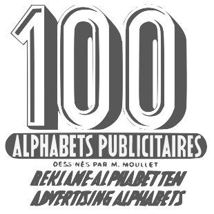 Author of 100 Alphabets Publicitaires Dessinés par M. Moullet (1946, Editions Caboni, Bruxelles). Alphabets from that book include Letters in relief, Fancy Character, Ornamental Antique (art deco), Fancy Antique (multiline art deco), Fancy Antique 2 (a different style altogether), Pochoir (stenciled).
 Some of Moullet's fonts were digitized by Dick Pape in 2011 and 2012 and can be downloaded here. Pape's fonts: FAA3DLettresEnRelief, FAAAllongees, FAAAllongeesBold, FAAAntiqueAllongee, FAAAntiqueGrasse, FAAAntiques, FAAAntiquesGrasses, FAABaroque3DInitiales, FAABlockLettresEnRelief, FAACameoHollow, FAACaracteresdeFantaisie, FAAChevauchantes, FAACubiques, FAAEcossaises, FAAEcritureGrasseEmoussee, FAAEgyptienneGrasse, FAAEgyptiennesEmoussees, FAAFantaisie, FAAFantaisieBlaireau, FAAFantaisieHardi, FAAFantaisieHaut, FAAFantasio, FAAFloralGothiqueInitiales, FAAFrenchMecane, FAAItalianHeavySlab, FAALettresAuCrayonItalic, FAALiberty, FAANormandes, FAANormandesAllongees, FAAOmbreeEnRelief, FAAOnciale, FAAOrientales, FAAPochoir, FAARomainClassique, FAARomainTypographique, FAScenesPaysannes, FAASerifEgyptienne, FAAVetteFantasieAntieke. Download page. Jeff Levine revived some of Moullet's typefaces: Silly Behavior (2019), Old Sport JNL (2018), Relaxation JNL (2017), Peppermill JNL (2017), Script Spot Initials JNL (2017), French Lettering JNL (2017), Martial Arts JNL (2017, an oriental simulation font), Relaxation JNL (2017). [Google]
[More] ⦿
|
Mimeograph
|
The mimeograph utilized a porous drum which inked the backside of a waxed stencil sheet. Unlike traditional stencils which have cut out areas that are directly inked or painted, a mimeo stencil has the area to be printed scratched away by removing the wax coating with a stylus. Digital fonts based on the plastic lettering templates of the mimeograph include - Mimeograph Lettering JNL (2020, Jeff Levine: based on one of the numerous plastic lettering templates once manufactured by the A.B. Dick Company of Chicago).
- Mimeograph Template JNL (2019: based on a plastic lettering guide manufactured by the Albert Blake Dick Company of Chicago).
- Interoffice Memo (2011, Jeff Levine).
[Google]
[More] ⦿
|
Modern Antique
|
Mac McGrew describes the slab serif Modern Antique: Modern Antique and Modern Antique Condensed were adapted to Monotype in 1909 from traditional typefaces dating from about 1820, commonly known simply as Antiques or Egyptians. They were forerunners of the square serifs, but closer to romans in general appearance, and were usually used for boldface emphasis with roman types, particularly modem romans. In most sizes these two Monotype typefaces are the same set width as each other, and have the same figures and points. Otherwise they differ only in the proportions of the C2 and C 1 arrangements, being good examples of adaptations to the basic Monotype unit system. (See "Practical Design Limitations" in Introduction.) Also see Bold Antique; and Latin Modern under Latin Bold Condensed. In 2015, Jeff Levine did a revival of Modern Antique No. 26 (1909, Monotype) called Antique Slabserif JNL. [Google]
[More] ⦿
|
Patrona Grotesk
|
A stencil typeface dating back to Czechoslovakia in the 1930s. It is shown in Stencil Type (Steven Heller and Louise Fili, Thames and Hudson). Jeff Levine made a digital revival in 2015 called Czech Stencil JNL. [Google]
[More] ⦿
|
Stella Roberts
[Stella Roberts Foundry]
|
[MyFonts]
[More] ⦿
|
Stella Roberts Foundry
[Stella Roberts]
|
 Type designer in Sunrise, FL, who created a coop style foundry for a charity that pays for the medical bills of her siblings. Some typefaces are made by guest designers such as Jeff Levine, Ray Larabie, Matt Yow, and Brad O. Nelson. The list of typefaces:
 - Ali SRF (2012). By Ray Larabie.
- Austrual SRF (2012). By Jeff Levine: star dingbats.
- Big Jim Roberts SRF (2012). Named after Stella's father, this is a seventies retro face.
- Cardholder Dispute SRF (2012). By Ray Larabie, based on his own old freeware font Cardholder Dispute SRF.
- Consonant SRF (2012). By Jeff Levine based on an old Ray Larabie font.
- Dastardly Deeds SRF (2012). A stick font by Ray Larabie and Jeff Levine.
- Devama SRF (2012). A mini-stenciled typeface by Ray Larabie.
- Dirty Money SRF (2012). A dollar bill font designed by Brad O. Nelson.
- Femi SRF (2012): a black monoline grotesk caps face.
- Fenimore SRF (2012). An art deco typeface by Jeff Levine, related to hius own Theater District JNL.
- Fitz Sans SRF (2012). By Matt Yow.
- Hem and Haw SRF (2012). A stitching font by Ray Larabie based on his earlier typeface Stitchen.
- Infantry SRF (2012). By Jeff Levine, an update of his old freeware dingbat font Infantry (1999).
- Mancave SRF (2012). A stone age typeface by Jeff Levine.
- Marginal Notes SRF (2012). A hand-printed typeface by Ray Larabie.
- Mevada SRF (2012). By Ray Larabie.
- Ovala SRF (2012). By Ray Larabie.
- Playya SRF (2012). A graffiti tag font by Ray Larabie.
- Ranger Rays Rocketeers SRF (2012). By Jeff Levine, based on an old freeware space-age dingbat font.
- Seminar SRF (2012). Jeff Levine overhauled a Peignotian / Optima-style typeface by Ray Larabie.
- Transaction SRF (2012). A dot matrix font by Ray Larabie.
- Wesley SRF (2012). A Ray Larabie original.
- Wrenchworks SRF (2012). Ray Larabie and Jeff Levine cooperated to bring this mechanical octagonal outline face.
View the typefaces at Stella Roberts Foundry. [Google]
[MyFonts]
[More] ⦿
|
Stencil fonts
|
Partial list of stencil fonts recently posted on abf: AGBook-Stencil (Adobe, 1992, and Berthold), AustralianFlyingCorpsStencil, BrideOfTheMonsterStencil (Harold Lohner, 1998), DeStijl-Stencil (P22, 1995), Dollar Store Stencil (Josh Wilhelm 1999), FuturaStencilICG (Image Club Graphics, 1995), FuturistStencil (WSI, 1996), GlaserStencil (URW, 1994), Rugged Stencil (The Font Emporium / Matt Dennewitz), SexySilouetteStencils (Darrian and California Cosmo, 1999), SprayStencil (SWFTE, 1995), Stencil Camera, Army Stencil, Stencil D (URW, 1994), Stencil Compress D (URW, 1994), Stencil Export (Allen R. Walden, 1993), Stencil Gothic BE (B.O. Nelson/Brain Eaters Font Co.&Jeff Levine, 1999), Stencil Sans (Agfa, 1995), StencilSansCondensed (WSI, 1996), StencilSet (SWFTE, 1995), Stencilcase (John Martz, Robotic Attack Fonts, 1997), Stenciled Out Left (Fantazia Concepts, 1993). [Google]
[More] ⦿
|
Stenso Lettering Company
[Jeff Levine]
|
Jeff Levine recalls the history of the Stenso Lettering Company, started in 1940 by Ruth Hormats and her brother, Robert Libauer. The quote below is from his text. Somewhere back around 1940, a young school teacher in Baltimore, Maryland made an observation The brass stencils she gave to her students to use in creative projects were giving them problems. Their crayons and colored pencils were not fitting into the narrow serifs (the small cross strokes) of the letters. Ruth Libauer Hormats had an idea. What if there were some stencils made of cardboard? What if the letters and numbers were slightly fatter especially in the serifs to allow for easy coloring? What if there were small holes slightly above and between each letter, number or punctuation mark to allow for precise spacing? After formulating her concept of such a stencil, Mrs. Hormats had two prototypes made up at a cost of ten dollars each a significant sum of money for the time. Soliciting many of the major stores and store chains around the country, she eventually received a reply from the F.W. Woolworth Company. The five-and-ten cent store giant was interested in her product, but needed to see one firsthand. As she shipped one of the two prototypes off to New York, all she could envision was ten dollars going away. Ruth did not put much stock in the chance of receiving an initial order, but she had presumed wrong. The Woolworth order had been the linchpin for launching the Stenso Lettering Company in the basement of her parents home at 2510 Elsinor Avenue in Baltimore. A small office was set up, and girls were hired to help stuff the stencils into their envelopes. Ruth Hormats once recalled to me during a telephone conversation that the whole family had even sat around the dinner table inserting the freshly die-cut stencils into their envelopes and packing them for resale. Robert Libauer remembered an anecdote from those early years: He was called inside from an afternoon of softball and other sports activities by his father and taken into the cellar of their home to package the stencils into individual envelopes to get them ready for shipment. Robert mumbled under his breath "son of a bitch" and resented being distracted from his play in order to do such menial work. His father was at the other end of the cellar and quietly responded to Roberts expletive with "My mother is not a bitch". Robert was horrified that his father had overheard him and answered, "Gee, Dad... I wasn't talking to you", wherein his father calmly replied, "Theres only two of us here". The Eugene B. Baehr Company was a major super-wholesaler [who also sold to other wholesalers] and became the first distributor of Stensos products. Morris Libauer had accompanied Ruth to New York in order to present a hand-made sample of her stencil to Eugene B. Baehr for his review and consideration. Baehr ordered 50 cartons of the stencils - packed one gross to the case. This order, along with the one from F.W. Woolworth is what got the company up and running. The Stenso Lettering Guide was so unique with its spacing holes (called indicators by Hormats) that she submitted her patent design in 1940 and was awarded a patent for her invention in 1942. In an unparalleled event, the prestigious Macys Department Store in Manhattan held a demonstration of this versatile new product. Manufacturing the stencils was not always a perfect task. The first die provided by Accurate Steel Rule Die (of New York) was too much for an ordinary press to handle and the press broke. To overcome this problem, the die was cut in half, and the stencils were die-cut in two parts to produce the final result. Morris Libauer (Ruth and Bobs father) was the unsung hero of the operation. While Ruth taught school and Robert solicited sales, the elder Libauer worked with the die makers and the printers in order to get their inventory produced. Morris Libauer was a retired furniture retailer and upholsterer whose business once took up a full city block in Baltimore. After selling the furniture business and living on a lifetime annuity, Morris Libauer wanted to venture into other projects. He initially manufactured and sold a line of furniture polish called Colonial, but became enamored with his daughters stencil invention. In 1946, Robert Libauer traveled the country promoting the line. A year later, in 1947, Morris Libauer passed away. It was then when Robert took full charge of the growing young company. His mother had been quite unhappy with the endless trucks pulling up to their modest home to pick up merchandise to be shipped, so eventually Robert Libauer moved Stenso into an abandoned grocery store, and after that to Baltimore's Industrial Building, where he purchased presses and hired a die-cutter. As sales grew, so did the diversity of the product line. The initial products included lettering guides in 1/2 inch, 3/4 inch, 1 inch and 1-1/2 inch Roman (serif) capital letters and numbers, a 1/2 inch Gothic (sans serif) card with capitals, lower case and numbers and a map of the United States. The 1/2 inch Gothic was discontinued and was replaced with a 3/4 inch offering, as there were problems at the time in having steel rule dies bent so precisely into small letter shapes. The stencils were offered individually or as small and large assortments known as combination sets. The average size of these stencil cards were approximately 8 inches by 10-1/2 inches. (Later products with letters larger than 3 inches were on stencil board stock of appropriately different sizes.) For a while, a stencil toy (Product #401) called Stenso Circus Animals was produced as well as other educational stencils during the 1940s. A special-run product in the early 1950s offered the Hebrew alphabet (Product #H-54). A unique stencil design was issued toward the end of the 1940s which allowed users to create letters in three different styles. Called 2 inch Solid Gothic, the letters and numbers were atypical of most stencil letters which had breaks within the letter forms. These letters were complete at least on their vertical sides and they were cut out as if resting on rails. The user would trace the sides of the letters, then use a straight edge to close off the tops and bottoms. The user was then encouraged to either leave the letters in outline form, fill them in, or color in the background hence the three-way application. The companys growth prompted Bob to purchase his own building at 1101 East 25th Street and install two Miehle presses and facilities to make cardboard boxes for his company as well as other clients. Previously, the various components were subcontracted and simply assembled at one location. The 1950s saw a large expansion of the product line to include different Roman and Gothic combination sets (with new sizes added) and Gothic sets ranging from 3 inches to 12 inches, as well as the addition of new lettering styles. Old English, Frontier (Western) and Modern Script (similar to the digital typeface Croissant) bolstered the range of lettering available to the consumer. A decorative stencil line was introduced in the mid-1950s for home crafters. As Alaska and Hawaii became states, an additional card was included with the Stenso Map of the United States (Product #50). In the 1950s, Libauer took a unique approach to marketing Stenso products... Using a Dun and Bradstreet directory, and seeking out retailers (such as 5 and 10 cent stores) with good credit ratings, he sent them a package containing an assortment of stencils worth $25.00 in wholesale value, a cover letter and a dollar bill pinned to the letter. The letter contained text somewhat similar to the following: Dear ___________, I cannot afford to have a salesman call on you personally. If you put these items on your counter, your customers will buy them. Should you accept this merchandise, your payment of $25.00 is due in return. In the event you do not accept this merchandise, the enclosed dollar bill will more than adequately cover the cost of returning them. Incredibly, over 40% of the unsolicited mailings were accepted, and Bob had one more marketing trick up his sleeve for those who hadn't either paid for or returned the unsolicited stencils. There was a series of twelve monthly letters sent to these retailers as reminders. The twelfth one would be addressed to the merchant, and the page left blank until you reached near the bottom of the page. One line was typed: I have said all I can say in the previous eleven letters. Over the years, stencil board was bought from any available source, and on one occasion Libauer had come across a warehouse full of the product, so he purchased it. This gave him enough raw material to supply the companys needs for a few years. By the early 1960s a Modern Gothic stencil was introduced with three alphabets all in Art Deco style available on one stencil card. This unique stencil [despite earlier problems with small steel rule dies] offered alphabets and numbers in 1/4 inch, 3/8 inch and 1/2 inch sizes. The 1/2 inch and 3/4 inch Roman stencils were re-tooled to provide both solid and stencil versions of the letters. Many intermediate sizes, previously available only in combination sets of their respective type style were now being sold as individual units. Around 1962, Robert Libauer merged his company with Ottenheimer Publishers of Owings Mills, Maryland; famous for their Vest Pocket Dictionaries. Although manufacturing was still done at the plant on East 25th Street for a time, by 1964 the operation of Stenso was moved into the Ottenheimer facilities and new packaging was then designed and introduced. Libauers original plan was to merge the two companies and then sell them to a larger company, and publisher McGraw-Hill showed an interest in such an acquisition. However, some third-generation members of the Ottenheimer family didn't want this sale to go through. Ottenheimer Publishers ran into some financial problems, and subsequently sold Stenso to the Dennison Manufacturing Company of Framingham, Massachusetts. Dennison took over Stenso in 1965. A 20 prefix was added to all product numbers to fit into Dennisons product identification system. From 1965 until the early 1980s, the Stenso line was nothing more than an addendum to Dennisons vast product line. Stencil board was replaced with file folder stock, and the dies which needed re-knifing periodically in order to maintain cutting quality were often left in disrepair. Finally, during the beginning years of the 1980s, the line was thoroughly overhauled. All of the old dies were scrapped, and new ones were manufactured. The largest size in the line was a 3 stencil, and the Gothic stencil was actually a version of Helvetica. The Roman products were actually fashioned after a stencil font designed originally in metal type, and later as a digital font. Stencil cards were now approximately 3-1/2 inches high by 8-1/2 inches wide, and were die cut and folded into plastic-wrapped packaging so that they were better suited to pegboard sales in small spaces. As the fortunes of Dennison faltered in the 1990s (no doubt due to over-expansion and fiscal irresponsibility), the onetime largest supplier of office products globally was forced to merge with the Avery Corporation (the originators of self-adhesive labels) in order to survive. The Stenso name was later dropped for the Avery name, and eventually discontinued. Part of the demise of the line can be attributed to the era of dry transfer lettering, and the digital revolution brought on by affordable home computers (where thousands of type typefaces are available). Ironically, the crafting and scrap booking craze has been steadily growing around the country, and various types of stencils have enjoyed steady sales due to a resurgence of interest and popularity in this type of medium, but it comes too late for a line which [for over sixty years] helped millions of school children, business owners, home hobbyists and just about anyone who needed legible lettering (but lacked the talent) letter like a pro. SOME AFTERTHOUGHTS: Christmas stencils were produced in the late 1950s, and sold fairly well seasonally, but Mr. Libauer recalled that if he had produced enough stock prior to the "holiday buying season" of around March and April, he could have increased sales greatly by soliciting them at trade shows for toy merchants. One idea Robert Libauer never got around to marketing was a puzzle toy similar to a jigsaw puzzle, but utilizing a pressure-sensitive material so the parts could be repositioned. Libauers one regret was not moving into the line of pressure-sensitive (stick-on) lettering, which eventually became a large retail market. Although he said he made a decent living from the stencil company, Bob felt he had lost money with the merger of the line to Ottenheimer Publishers, but he had more than made up for this by going to New York, joining a Park Avenue brokerage firm and getting into investment banking and other interests. At 86 [of this writing], Libauer is still working and not looking back to the past. Ruth Libauer Hormats passed away in 2004 at the age of 93. She had been living with her daughter in Ft. Lauderdale, FL and had been in poor health for some time. [Google]
[More] ⦿
|
William Hugh Gordon
|
Together with Ross F. George, William Hugh Gordon invented the Speedball pens in 1914, the first of which was patented in 1916. Born in Canada in the 1860s of Scottish parents, he emigrated to the United States in the 1870s and lived in Colorado Springs, Chicago, Los Angeles and Seattle. He died in 1920. To promote the pens, Gordon and George published an instructional book, Presenting the Speedball Pen with alphabets, drawings and designs produced with this wizard of lettercraft (1915). Author of Lettering for Commercial Purposes, Cincinnati, Ohio, 1918 [Open Library link; local download]. He liked full round ovals, condensed vertical elements and a slightly broken alignment. He was one of the main American designers of commercial lettering during the early part of the 20th century. His students included Ross F. George. PDF of that book. Digital typefaces based on his alphabets include Penina (2021, Mario Feliciano: a multi-contrast single weight delicate serif), Pen Elegant JNL (2018, by Jeff Levine; after an alphabet from a 1918 lettering instruction book by Gordon), Cowling Sans AOE (2017, Astigmatic), Gordoni (2016, James Greenwood), WHG Simpatico NF (2002, Nick Curtis), and Minstrel Poster NF (2002, Nick Curtis). Additional link, where we find his Black Face Poster alphabet from 1918. Biographical research by Alex Jay. [Google]
[MyFonts]
[More] ⦿
|


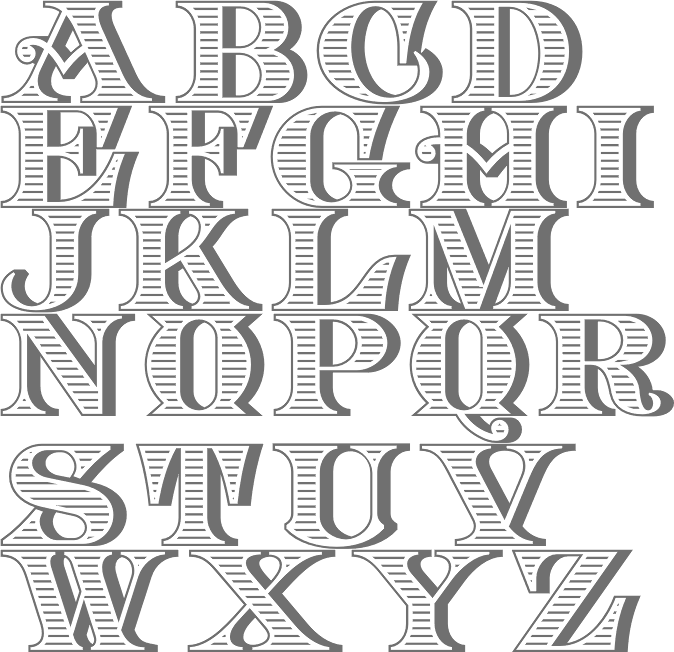
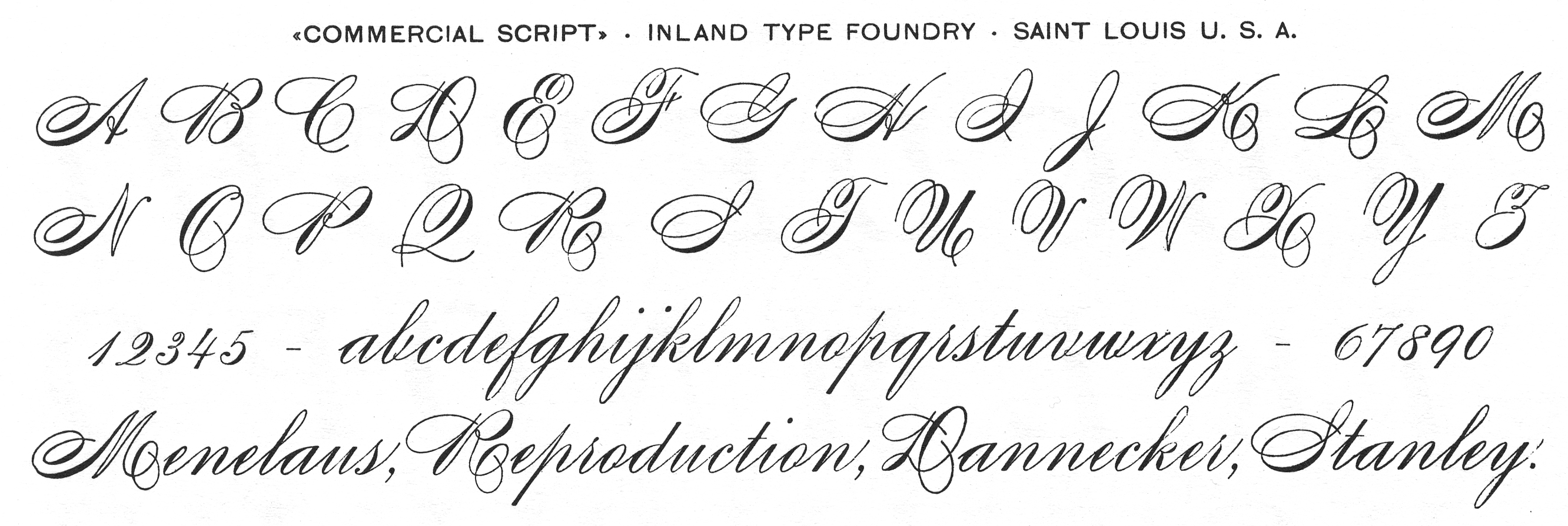
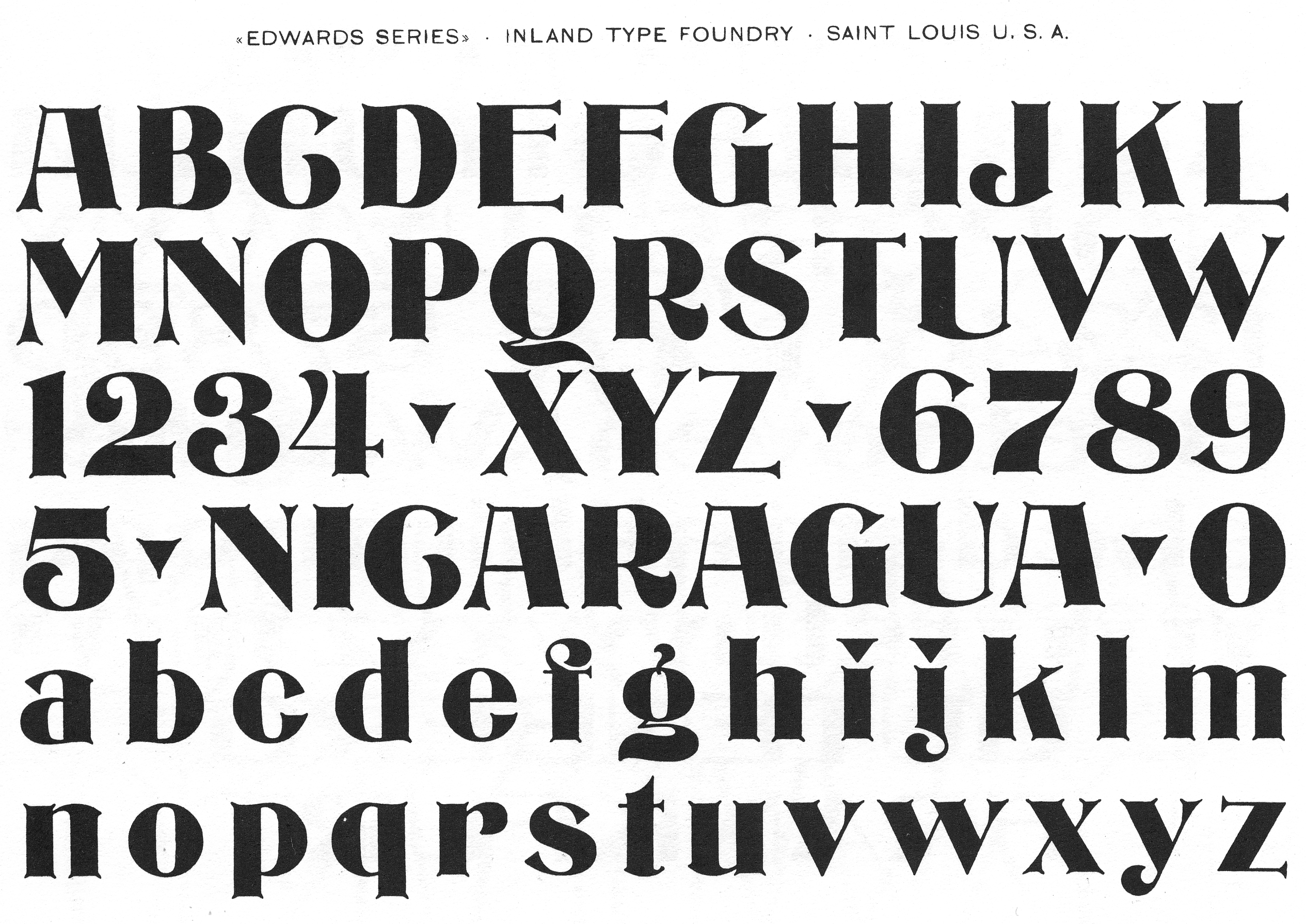
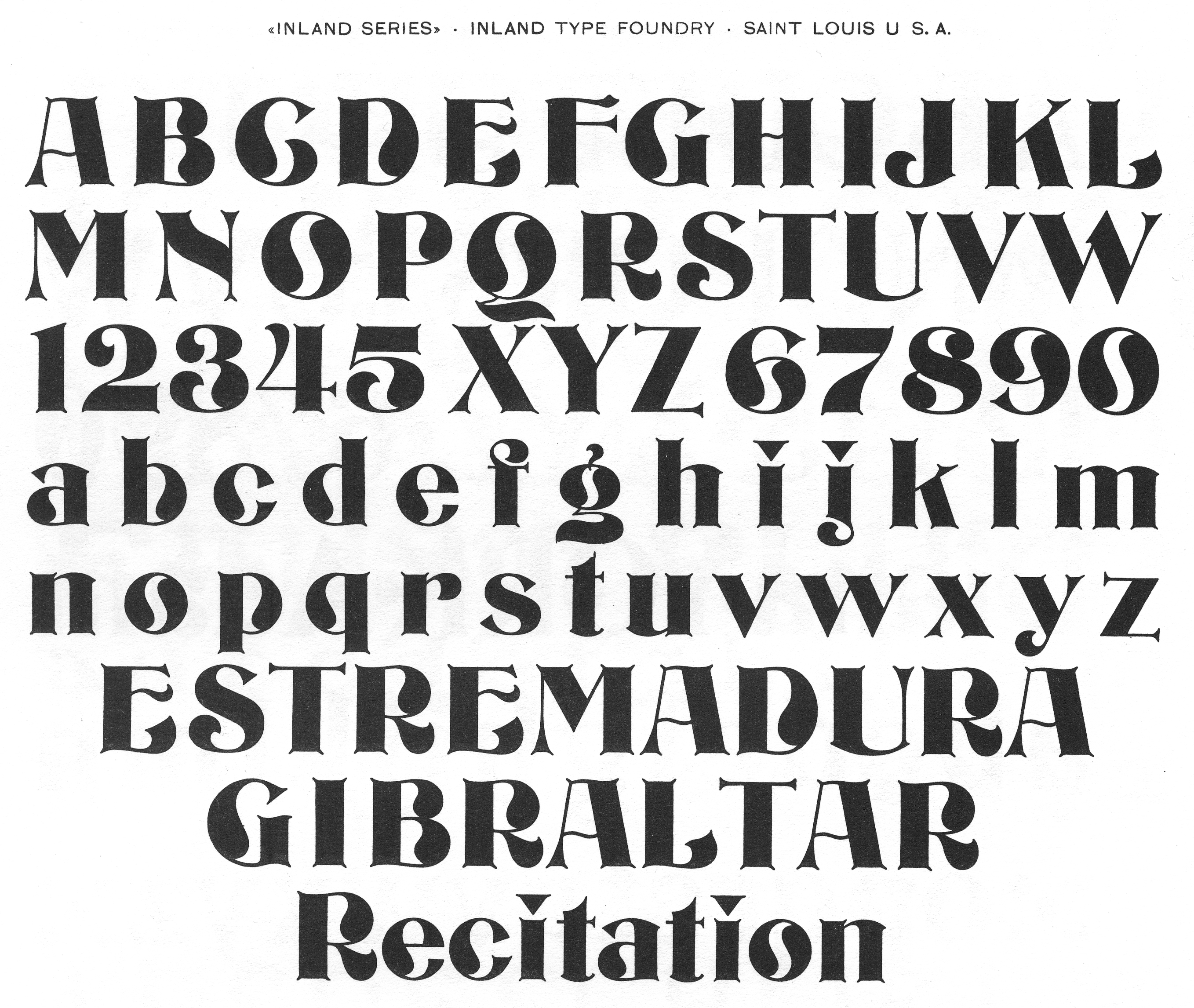
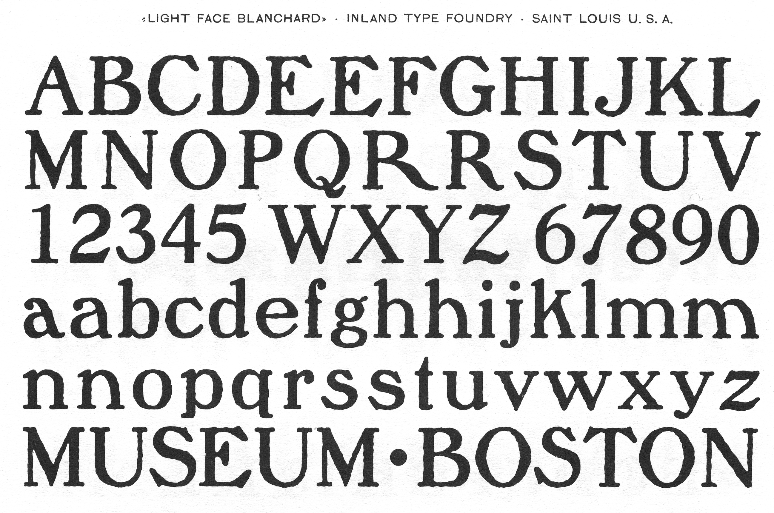
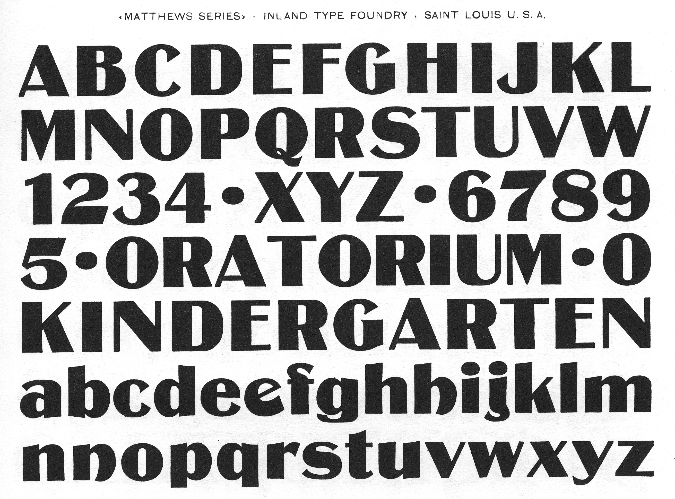
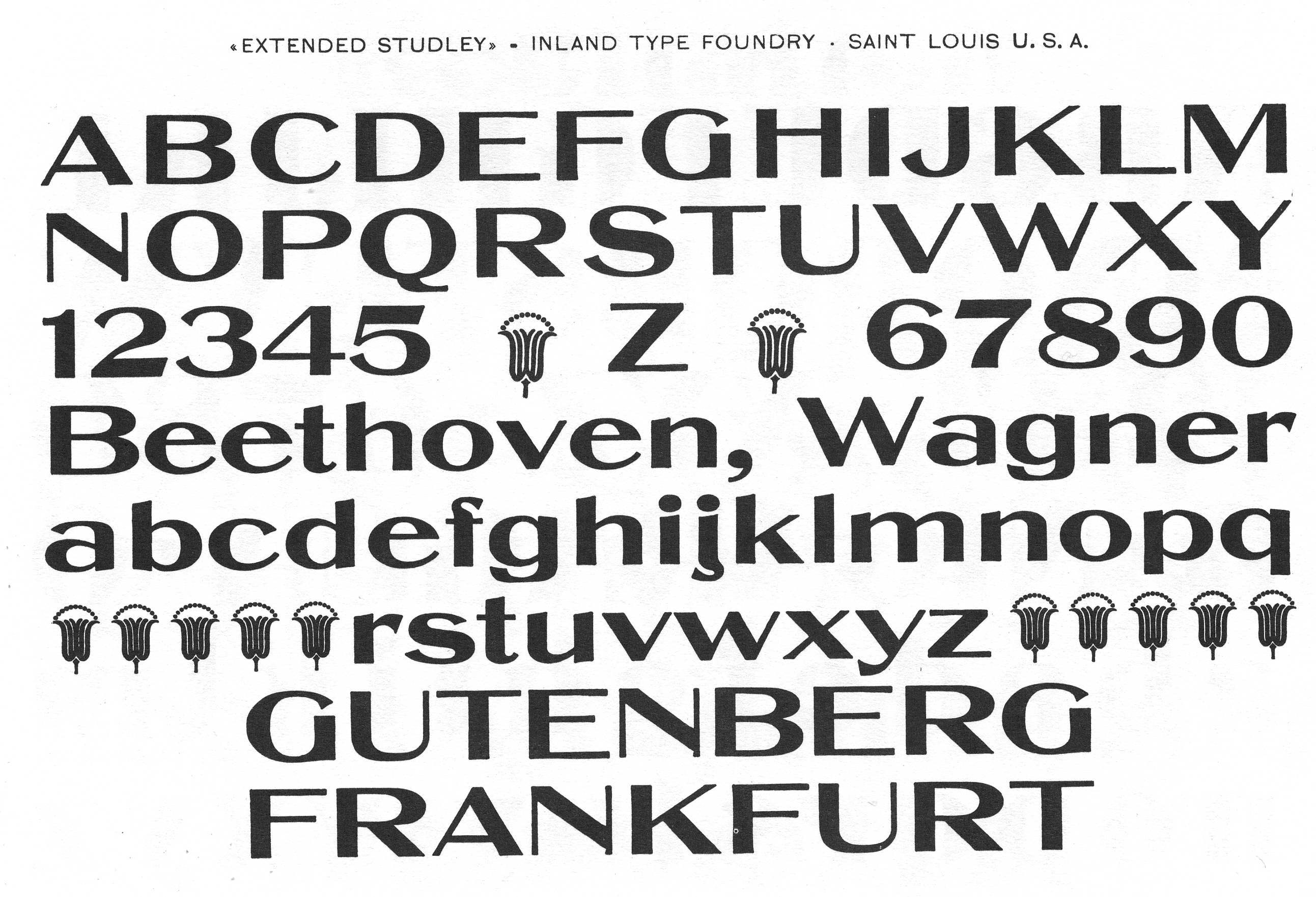
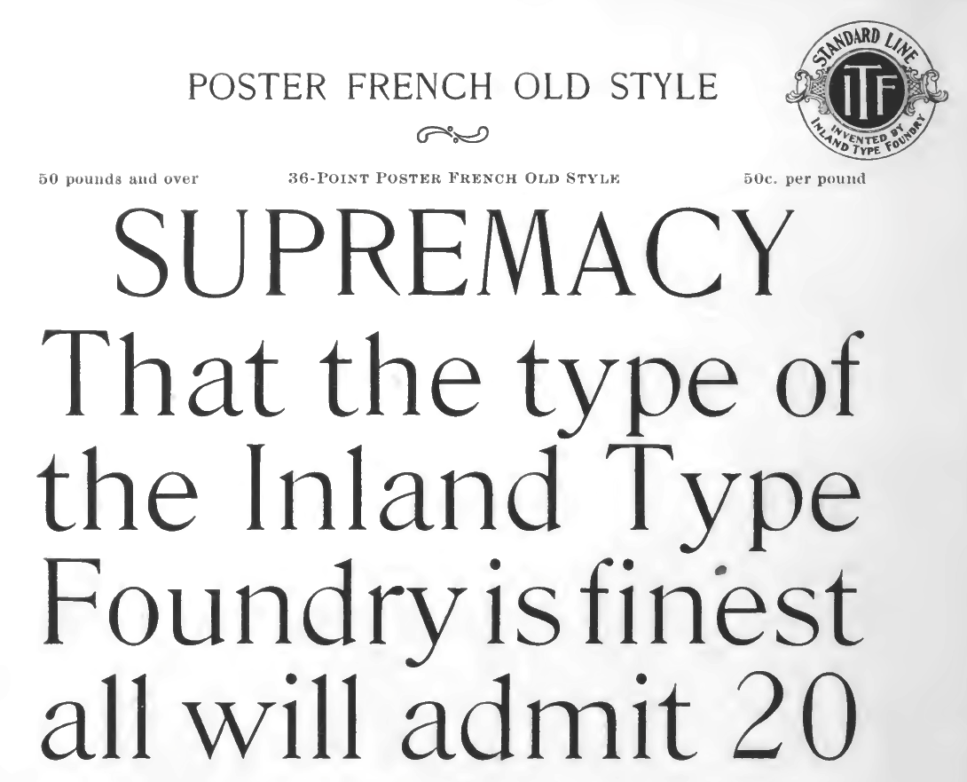
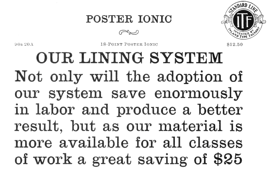
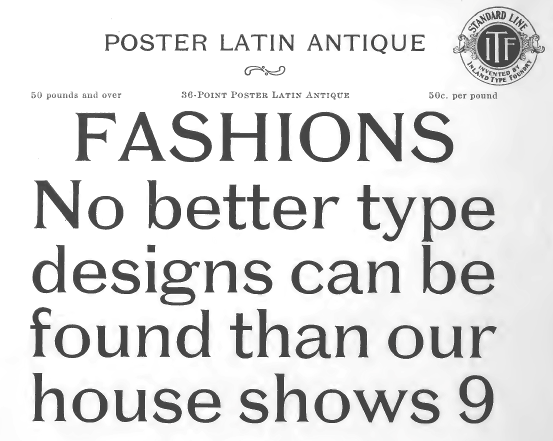
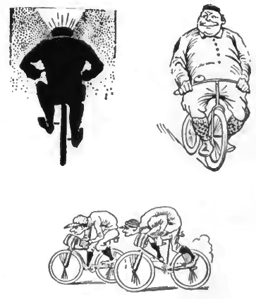
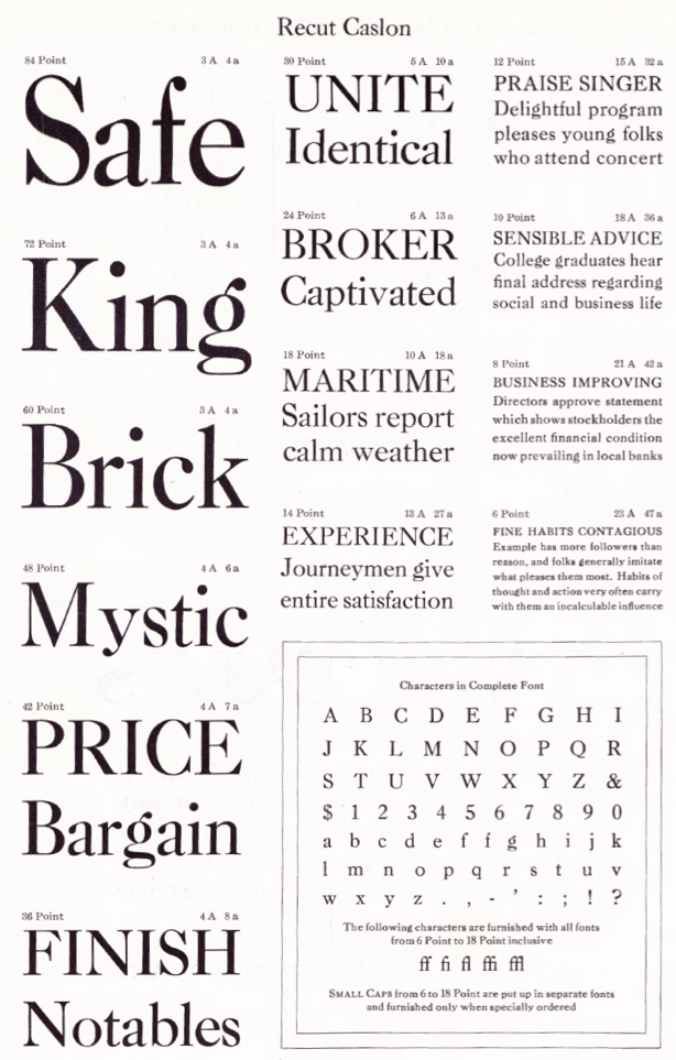
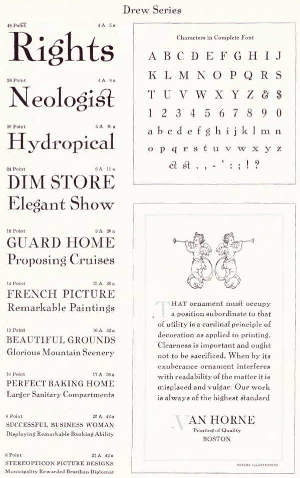
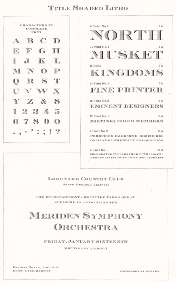
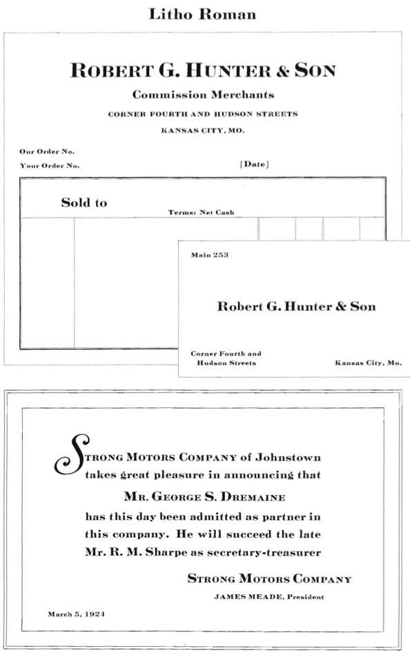
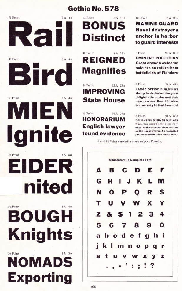
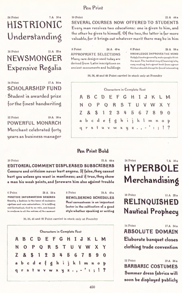
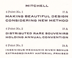
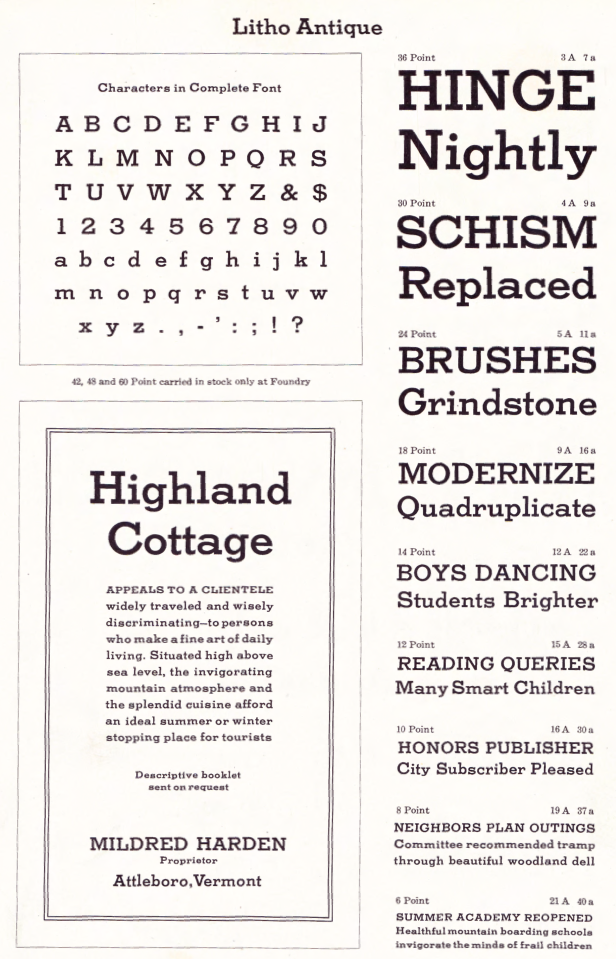
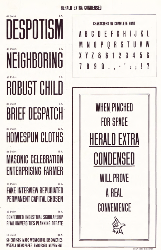
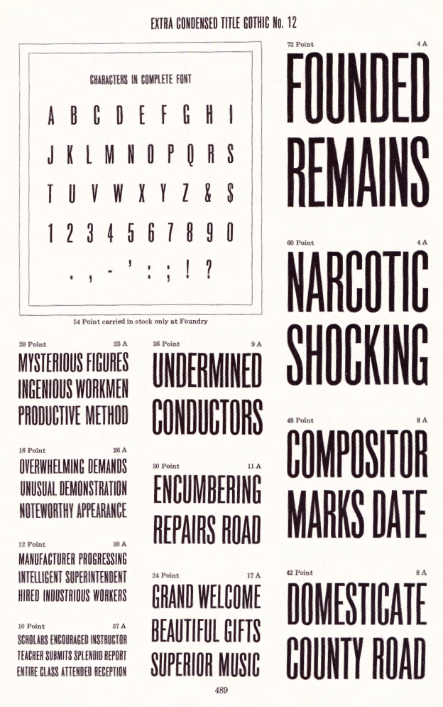
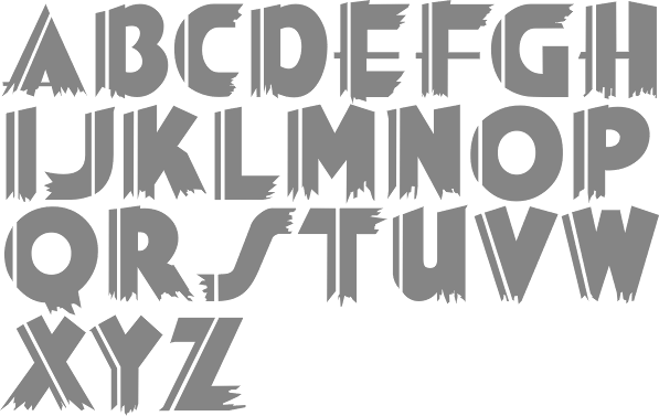
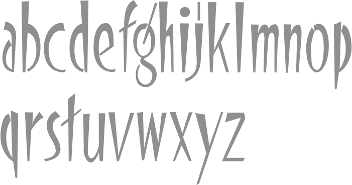
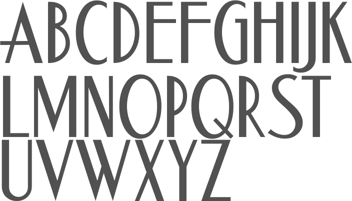
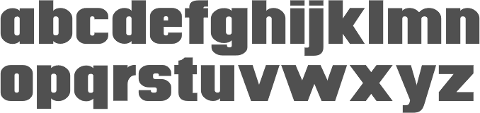
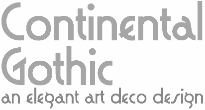
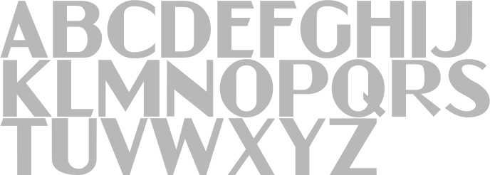
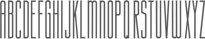
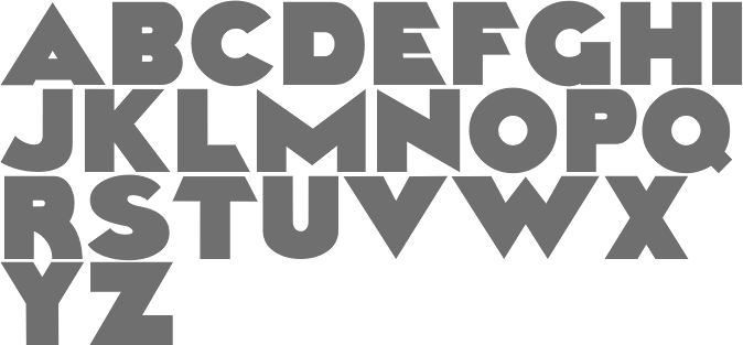
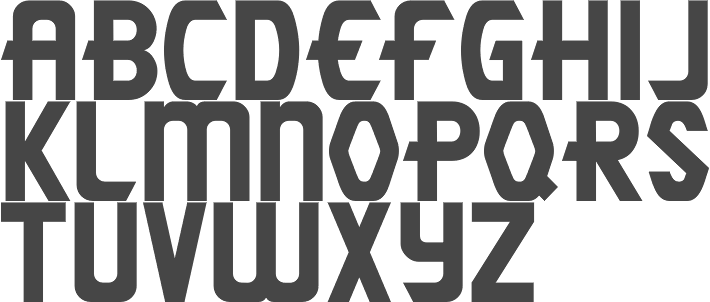
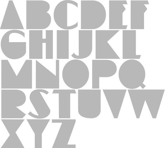
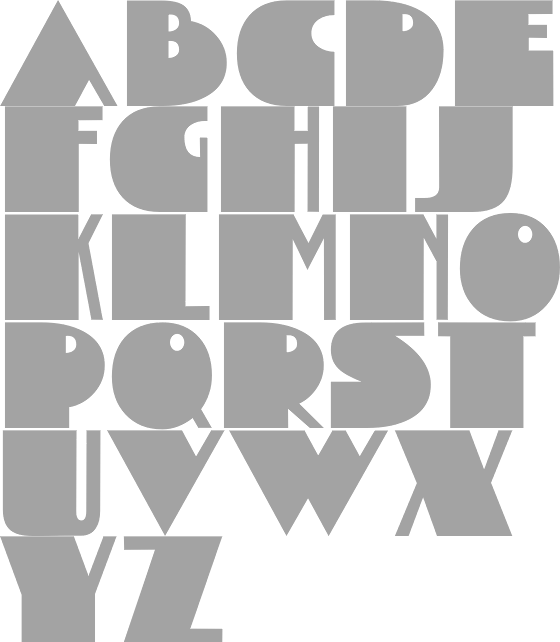
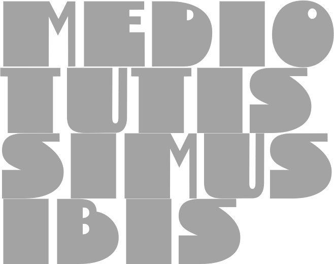
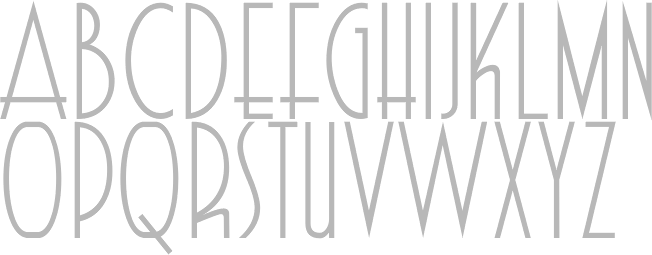
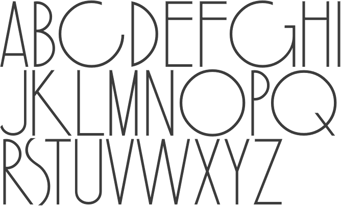
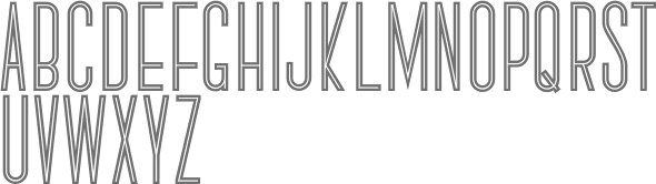
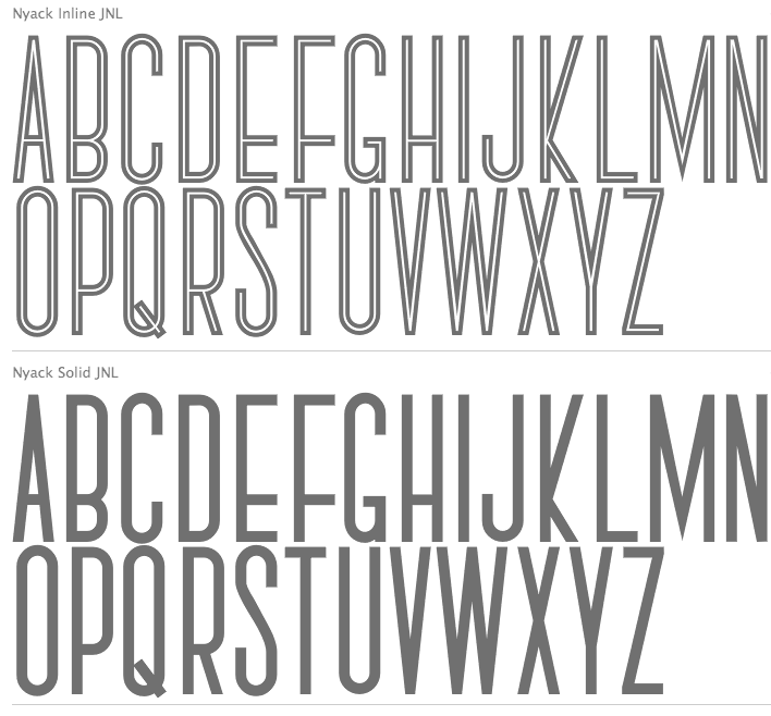
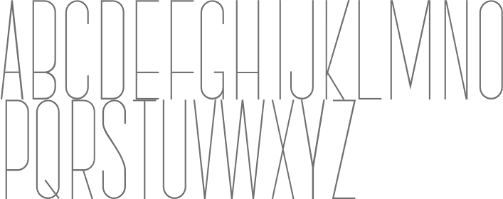
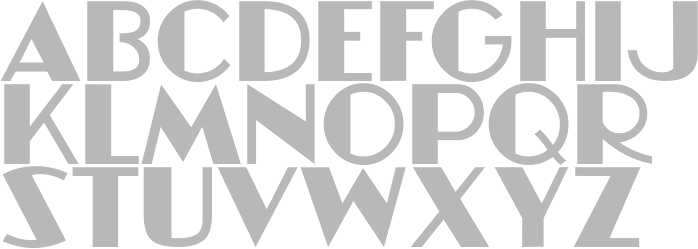
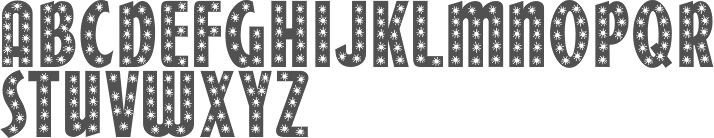
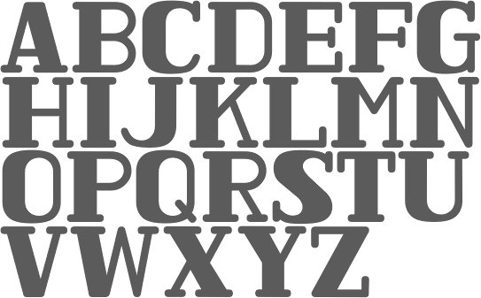
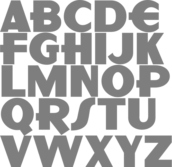
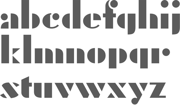
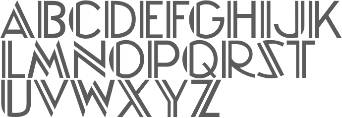
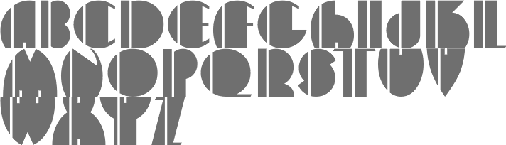
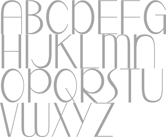
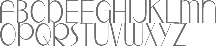
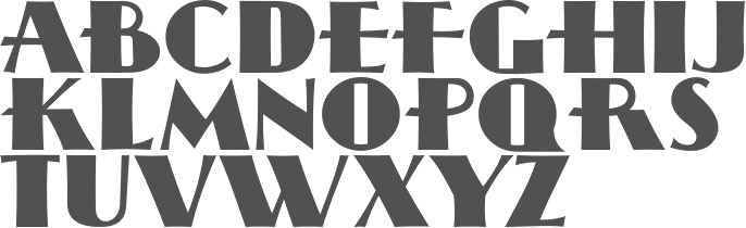
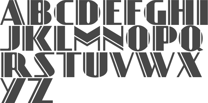
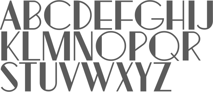
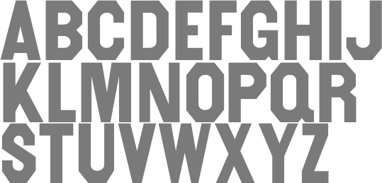
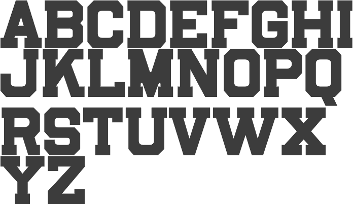
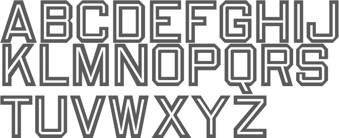
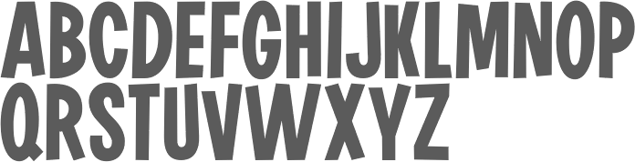
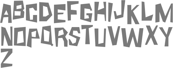
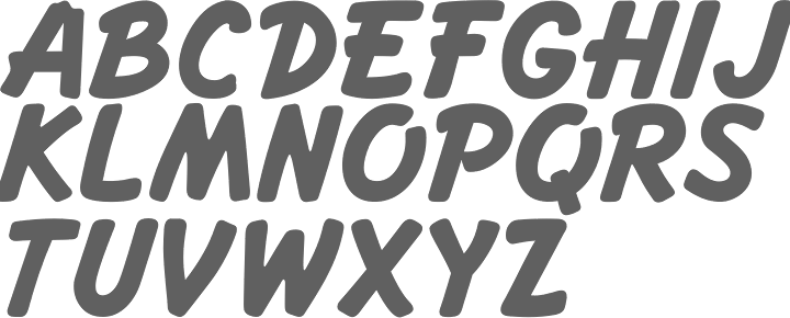
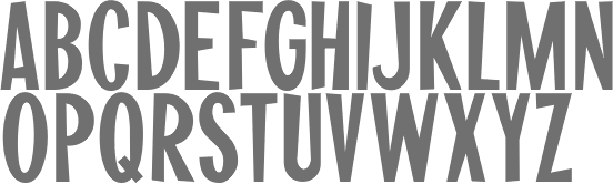
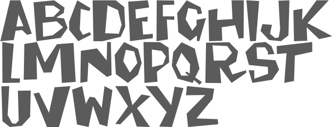
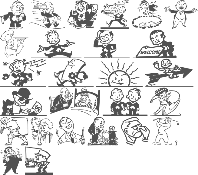
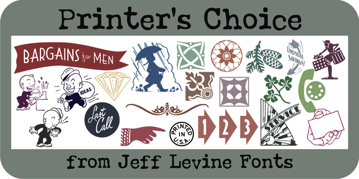
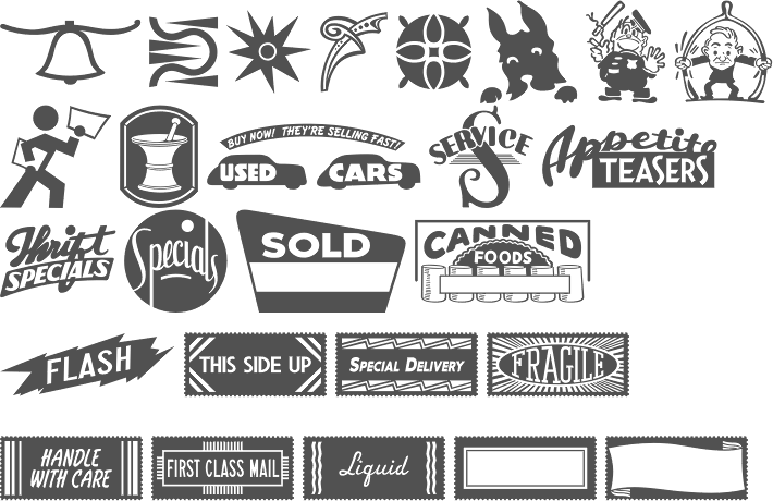
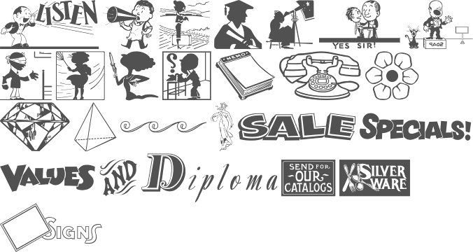
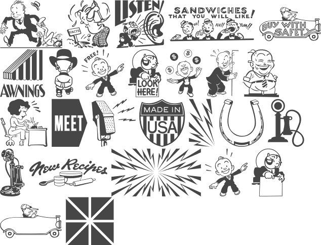
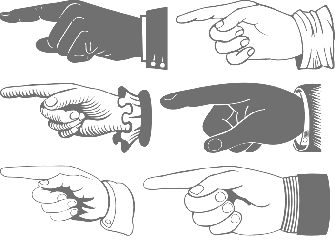
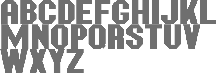
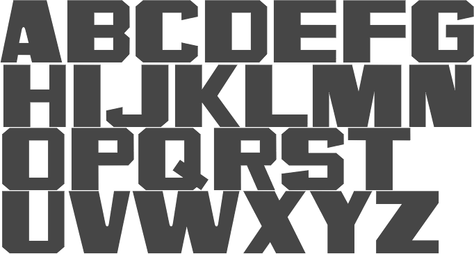
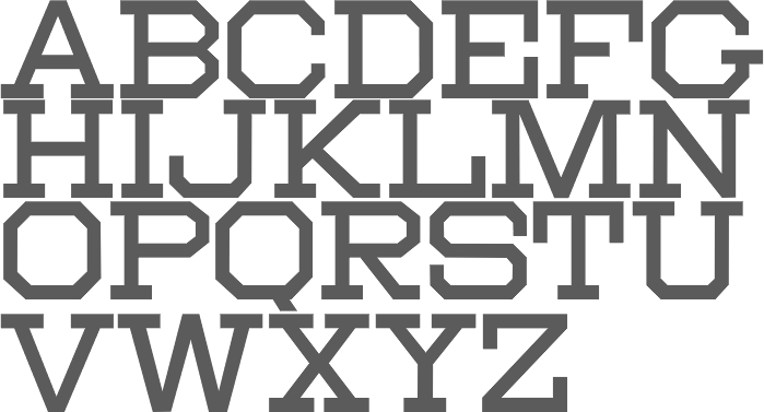
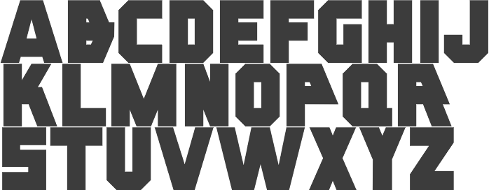
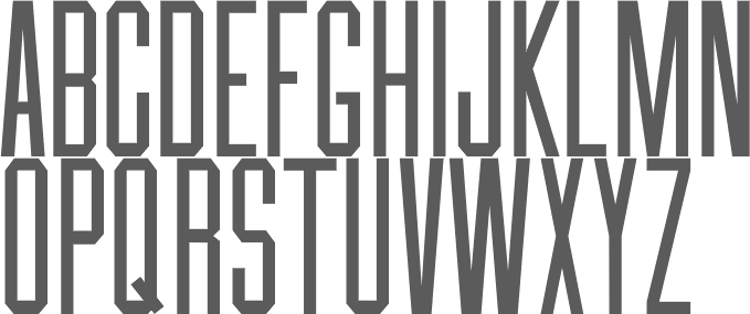
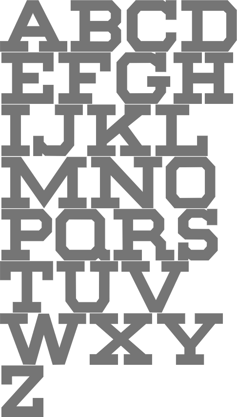
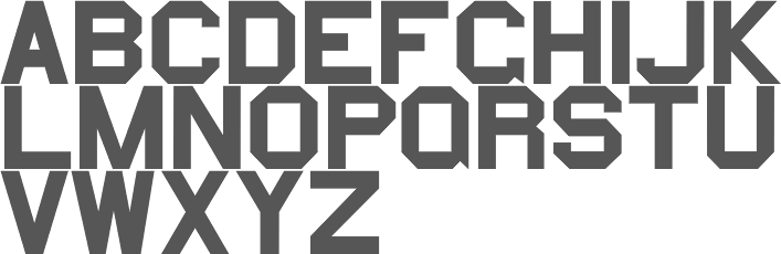
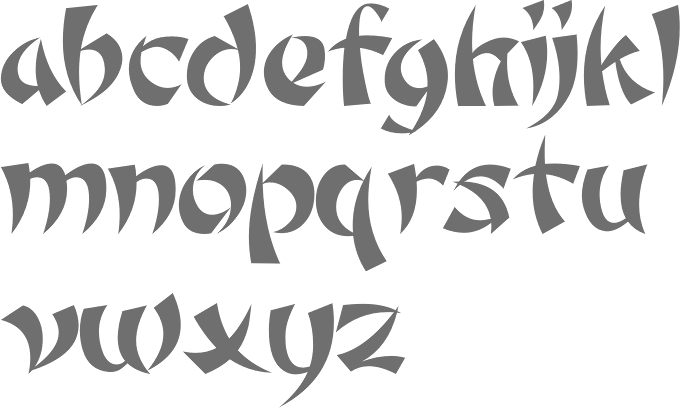
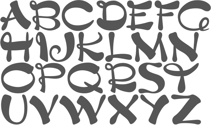
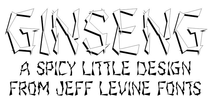
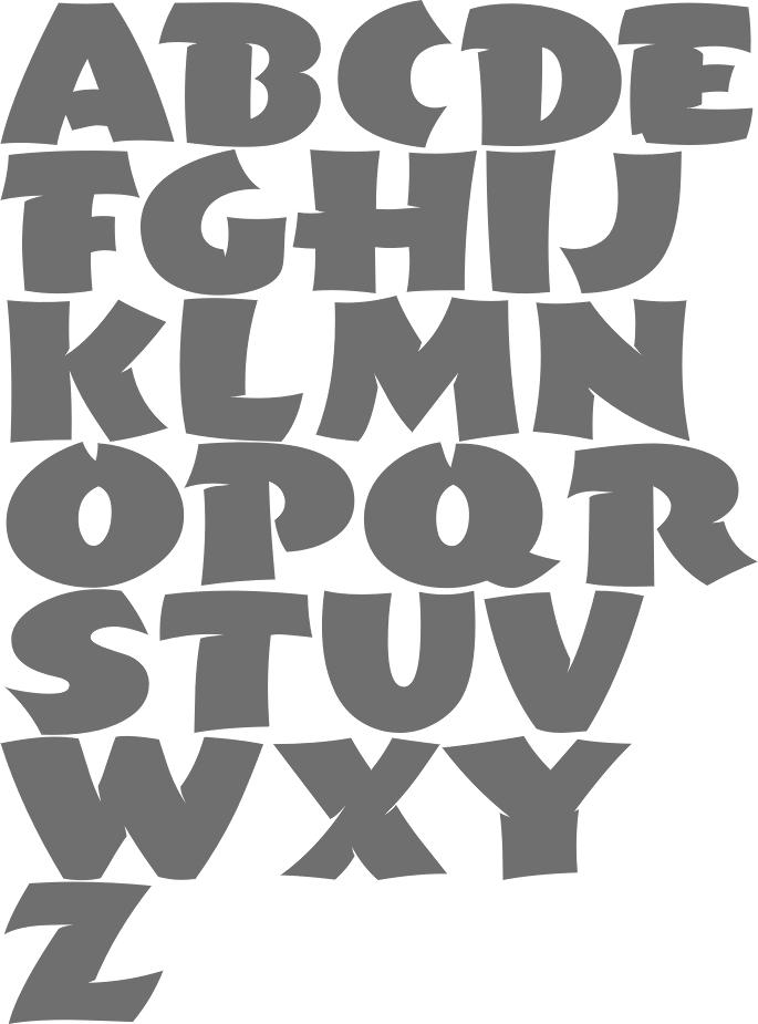
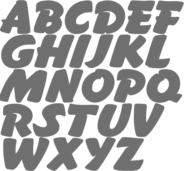
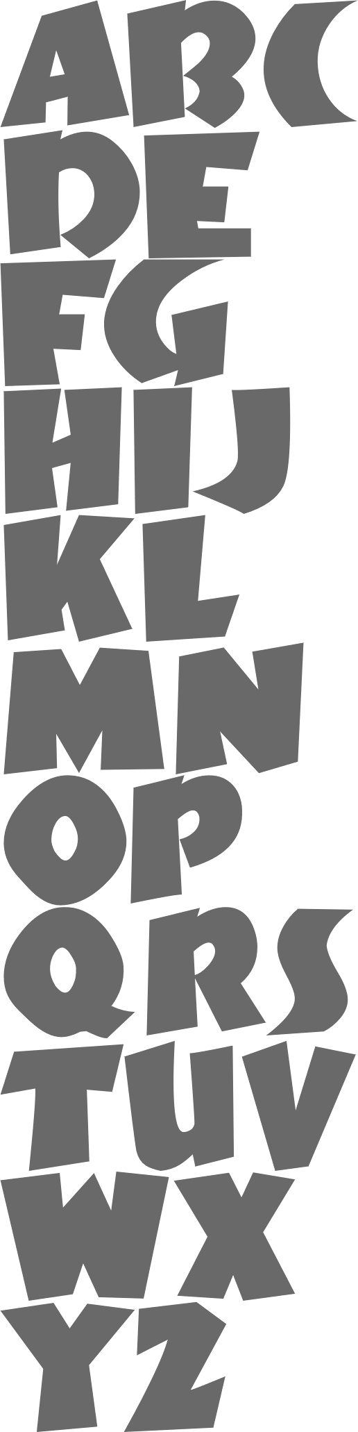
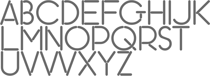
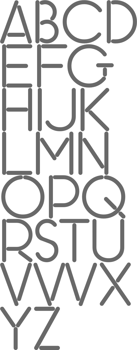
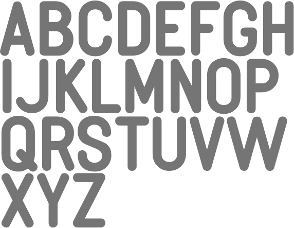
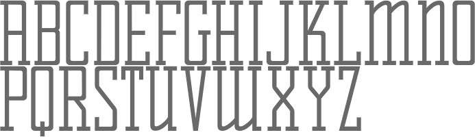
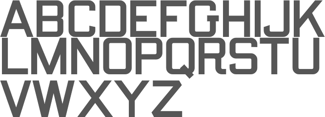
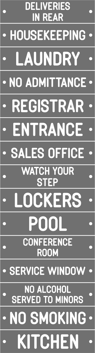
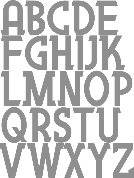
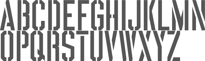
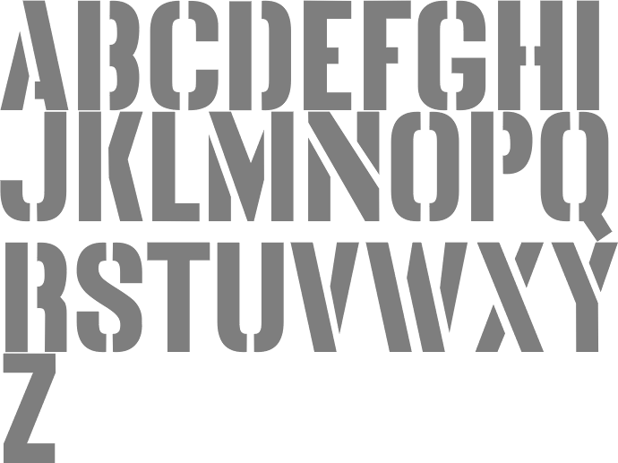
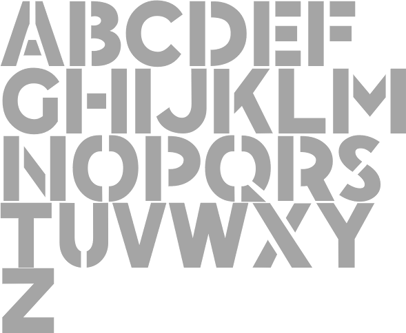
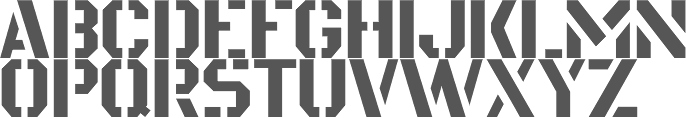
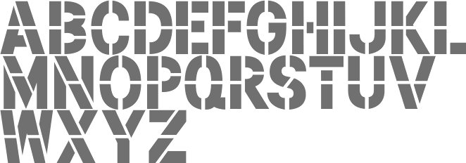
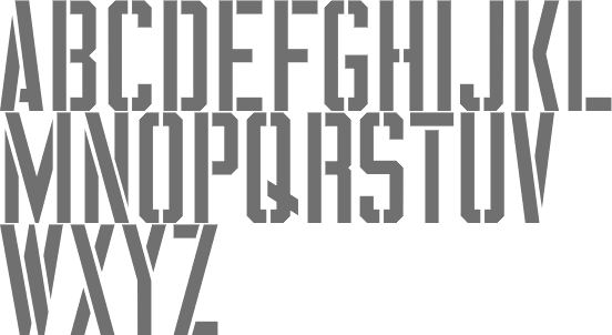
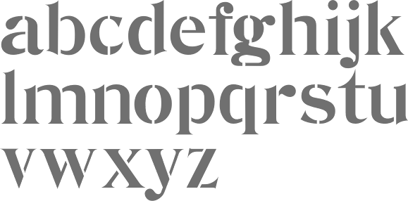
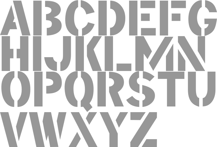
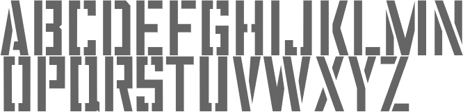
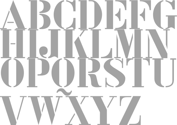
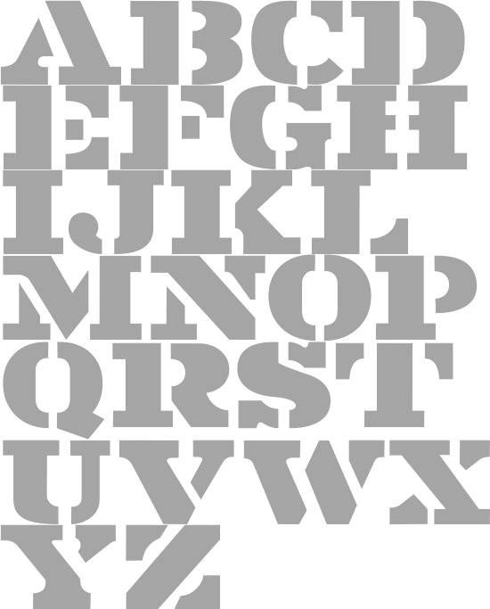
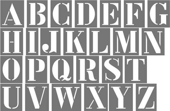
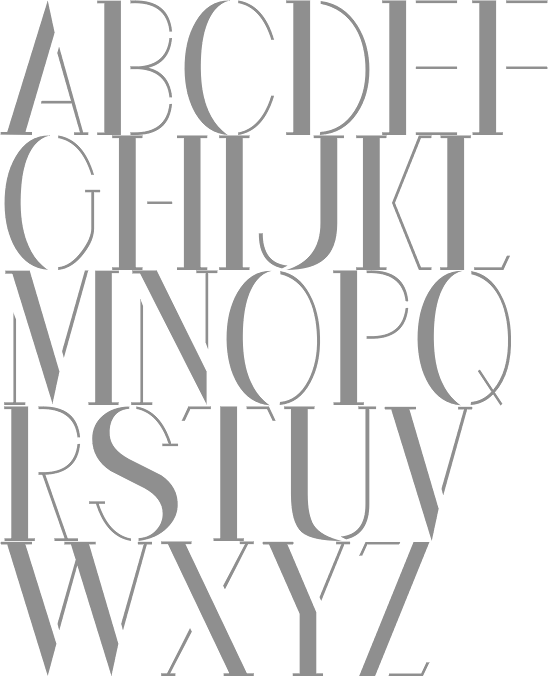
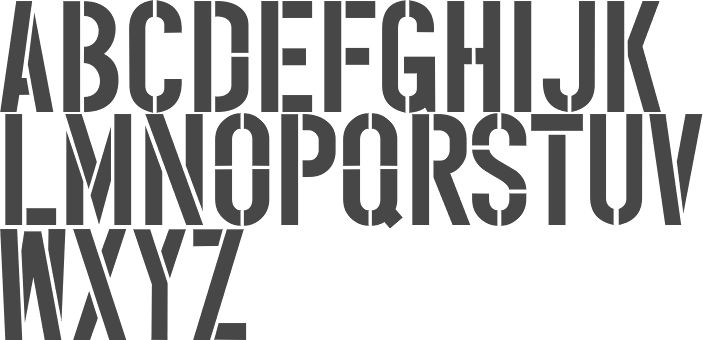
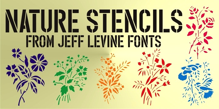
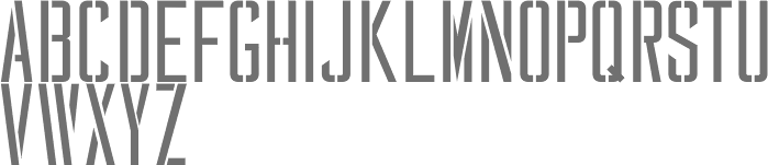
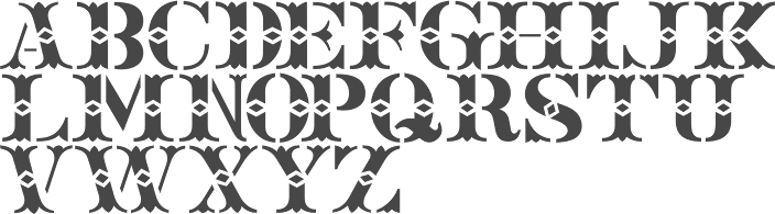
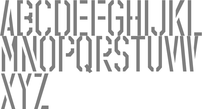
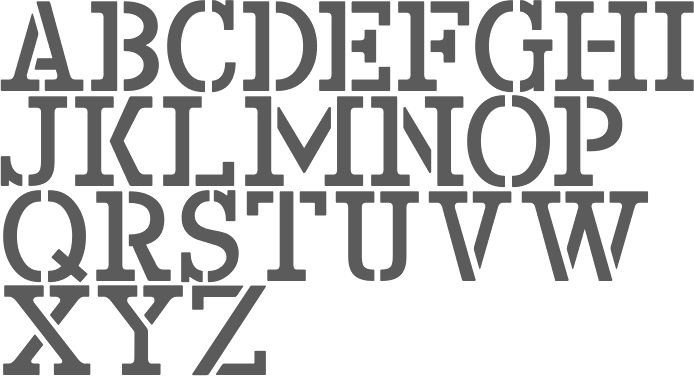
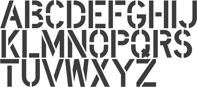
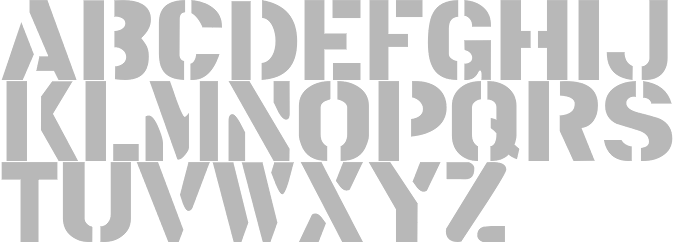
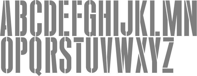
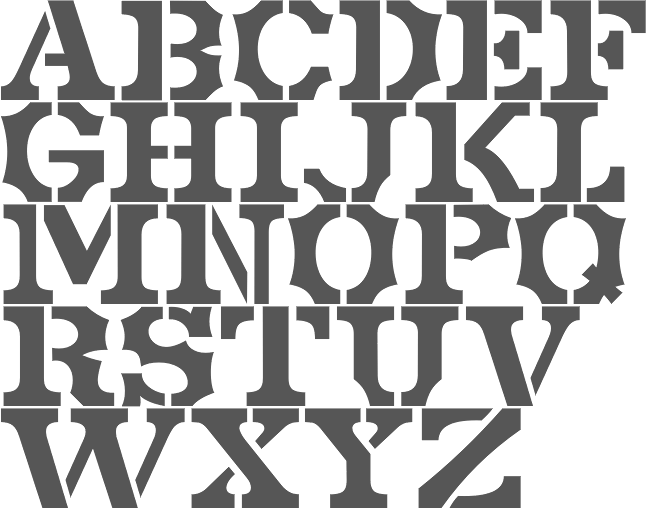
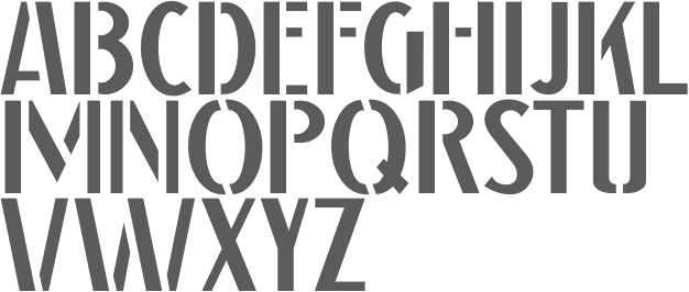
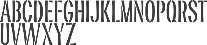
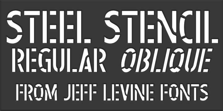
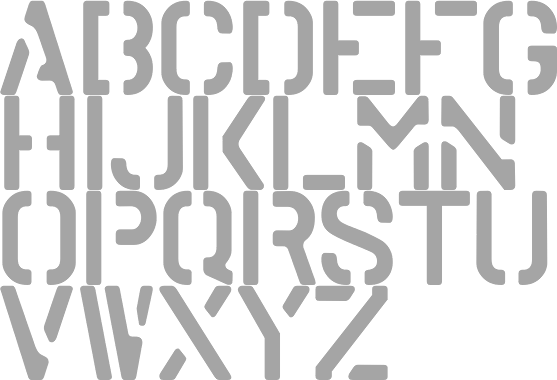
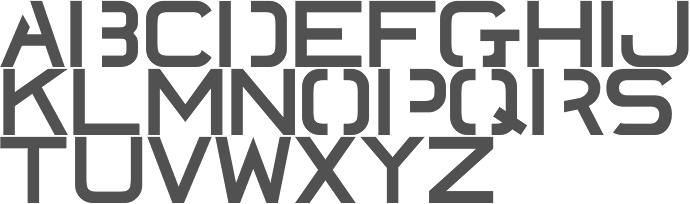
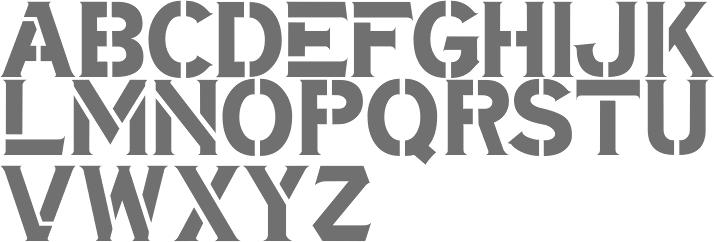
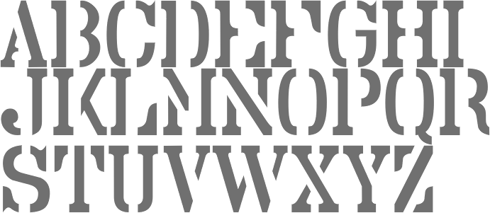
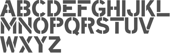
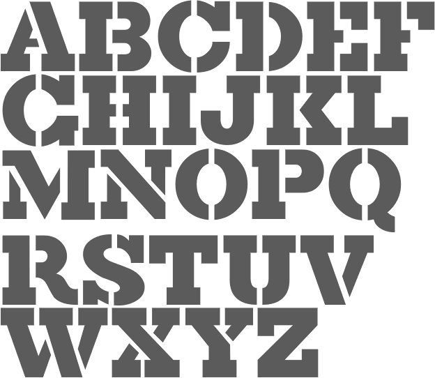
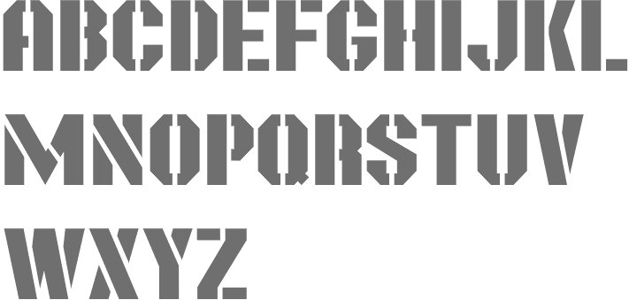
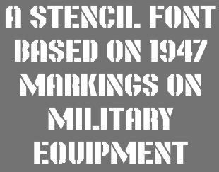
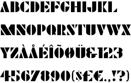
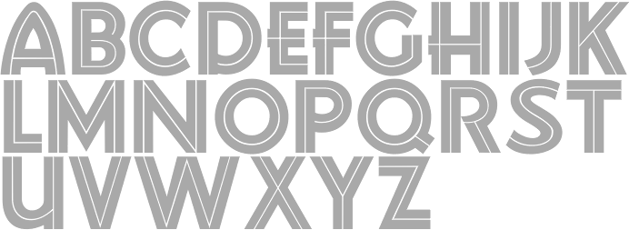
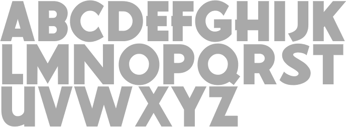
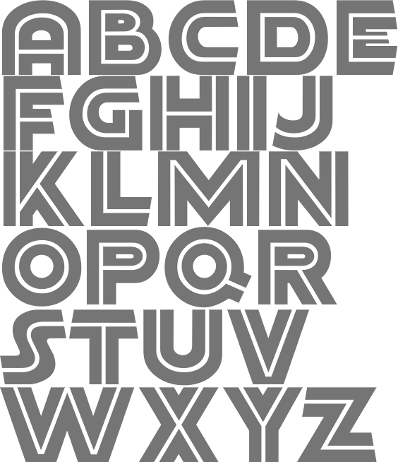
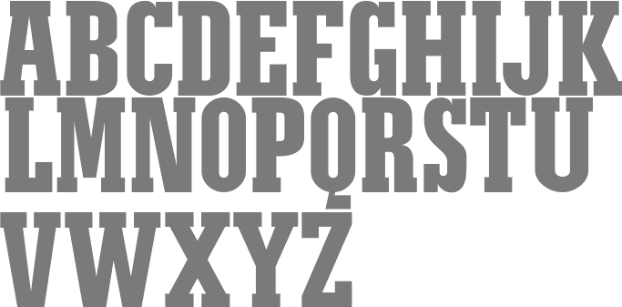
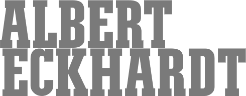
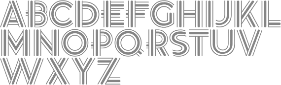
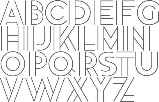
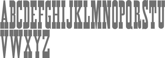
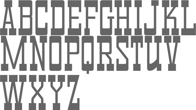
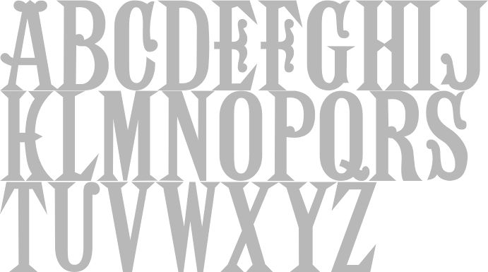
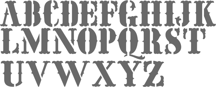
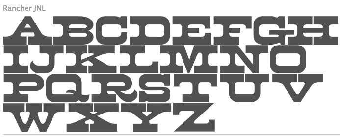
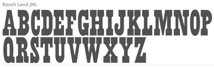
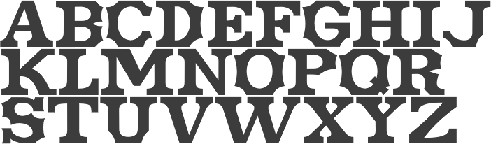
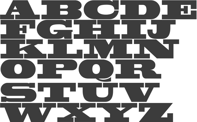
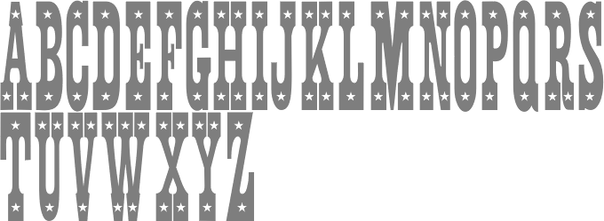
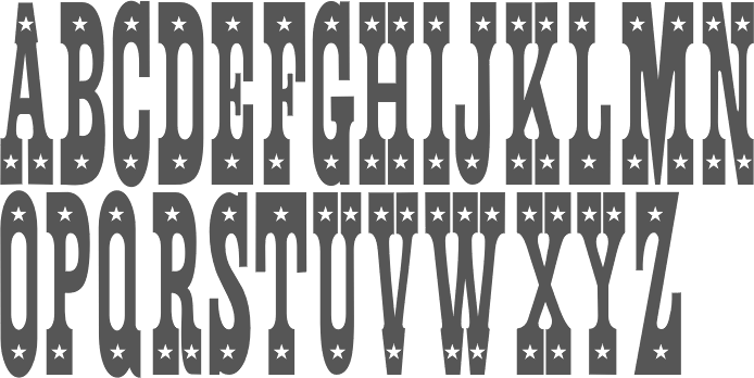
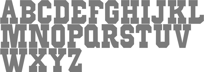
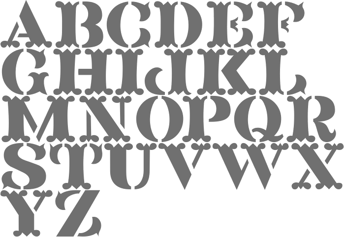
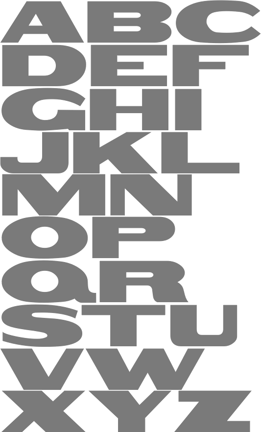
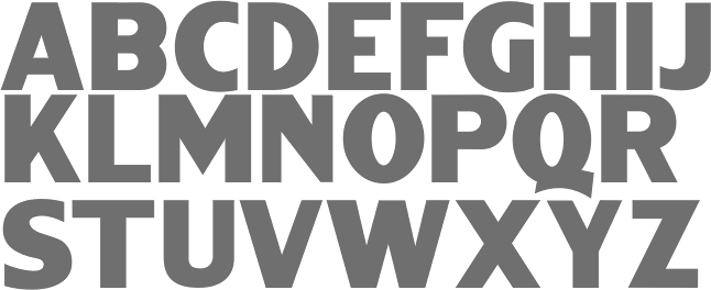
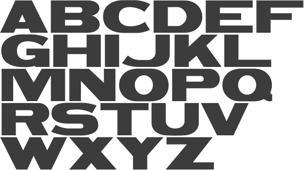
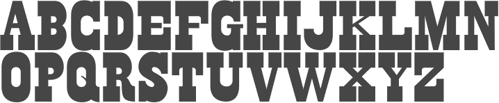
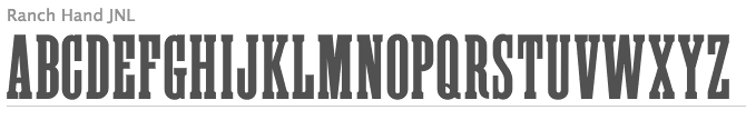
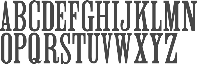
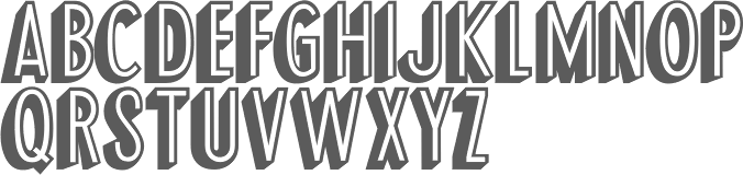
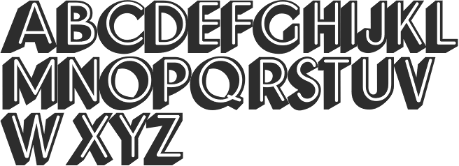
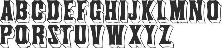
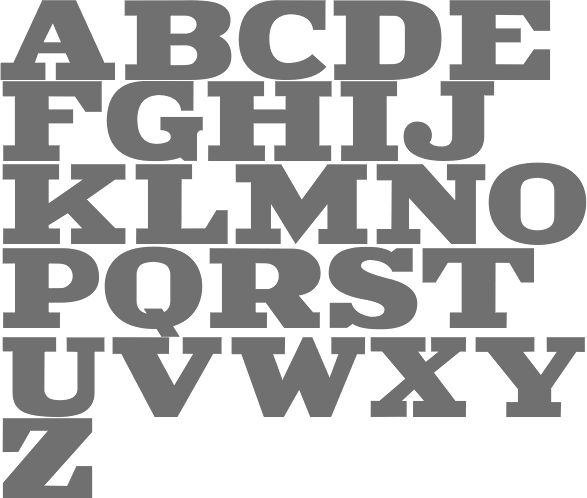
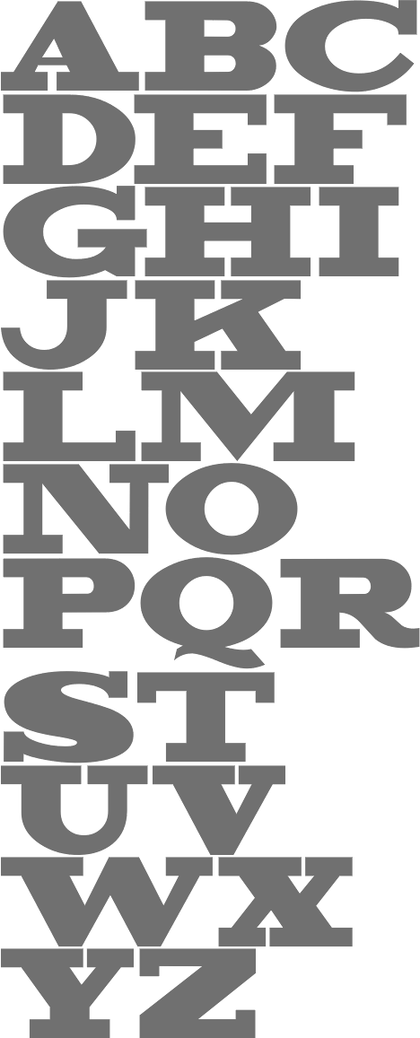
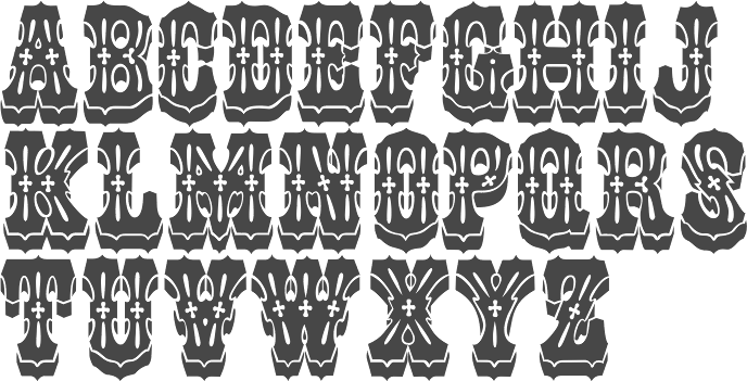
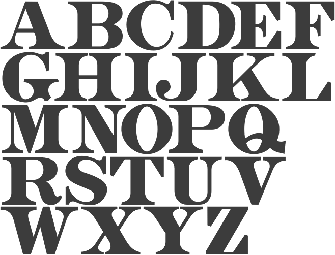
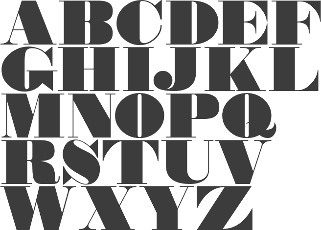
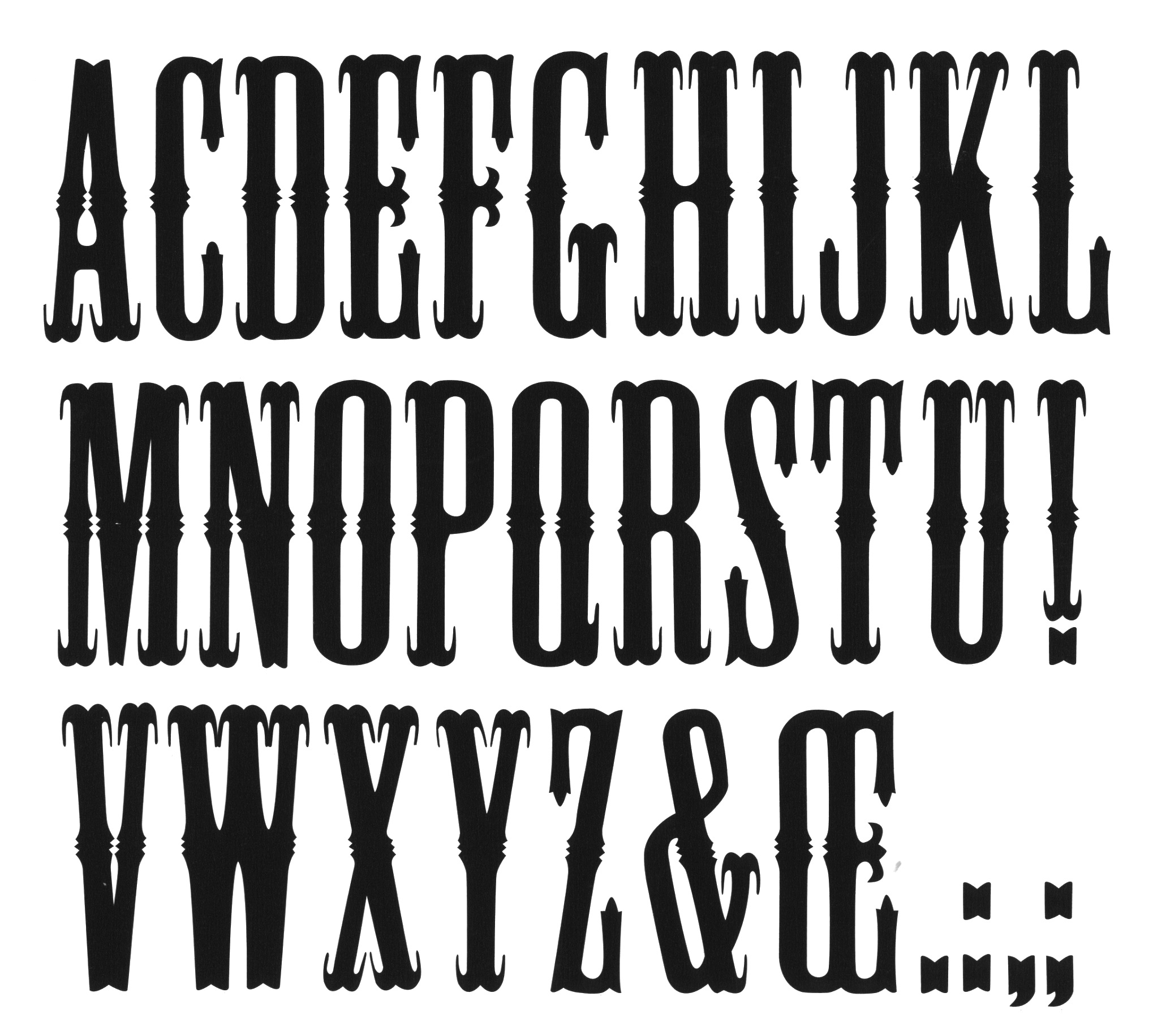
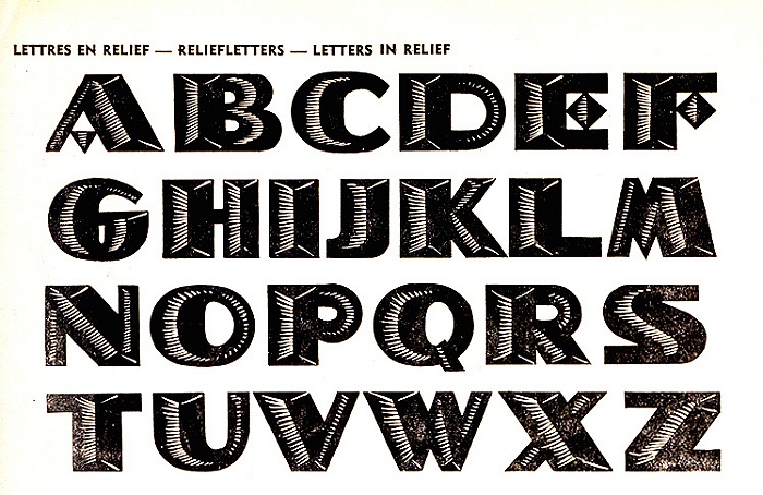
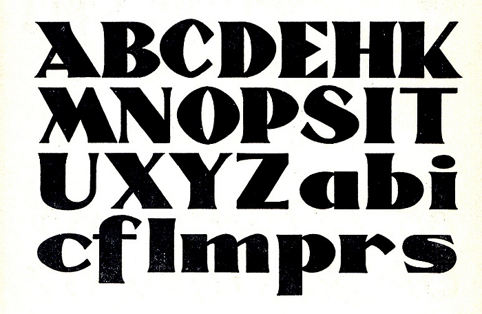
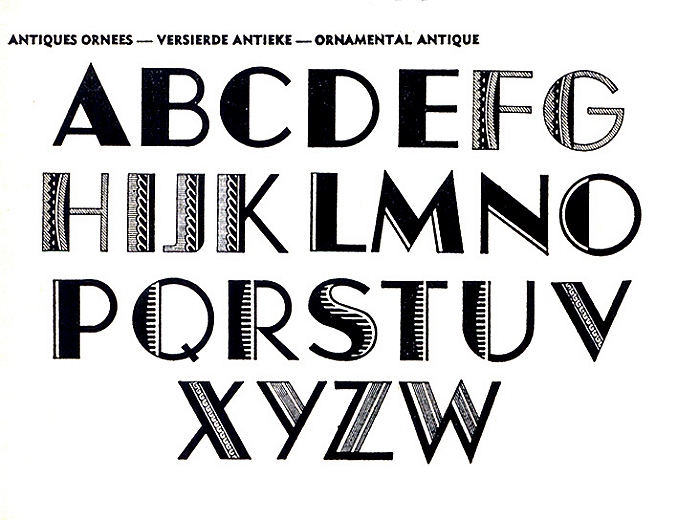
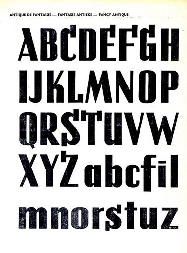
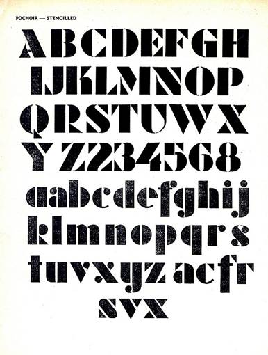
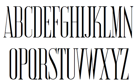
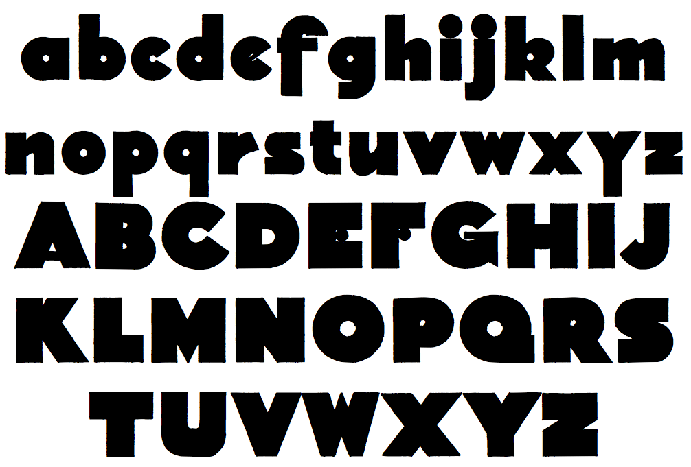
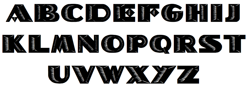
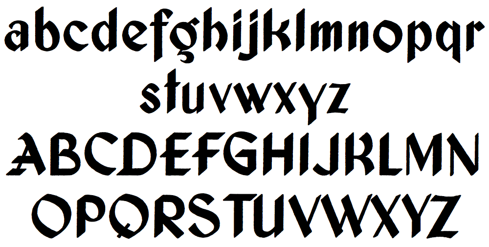
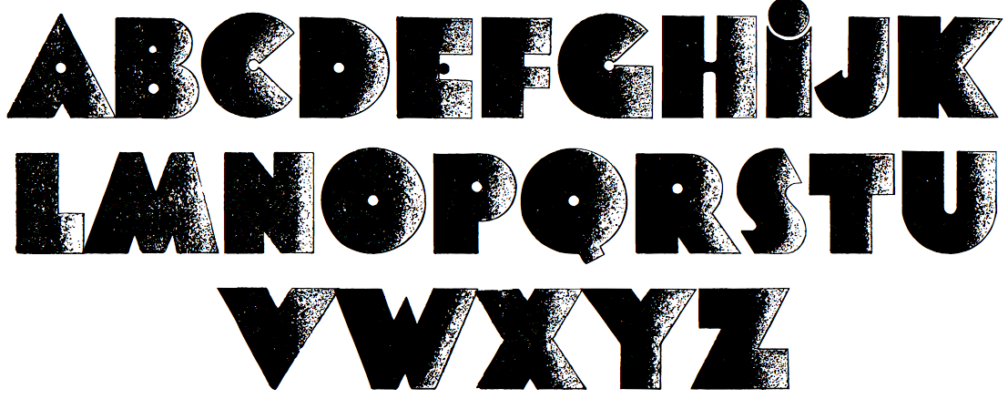
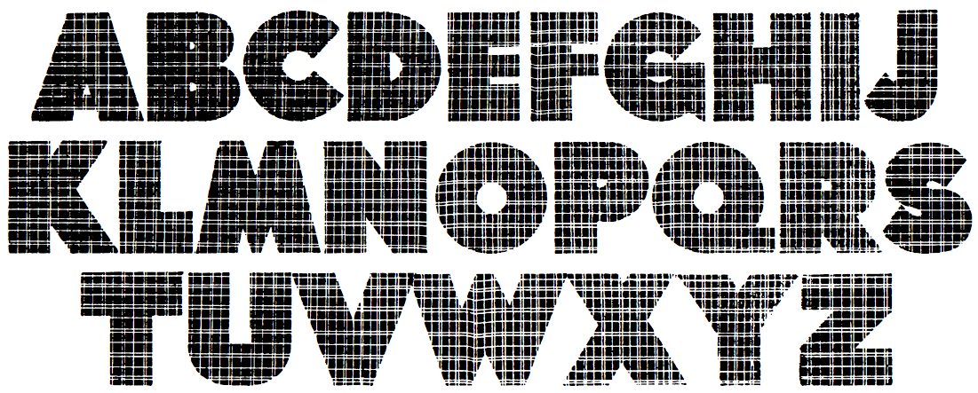
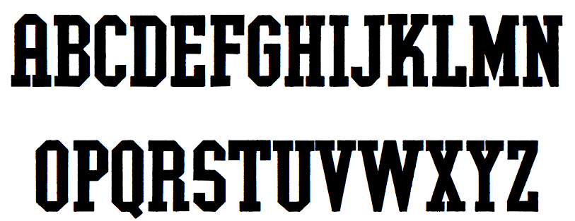
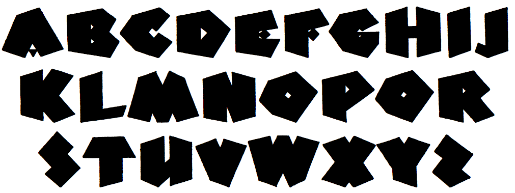
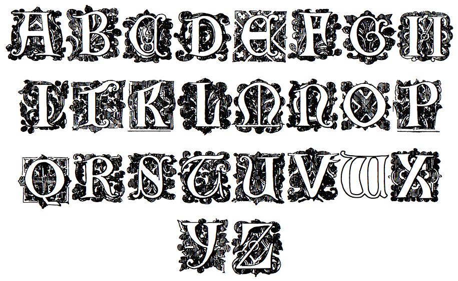
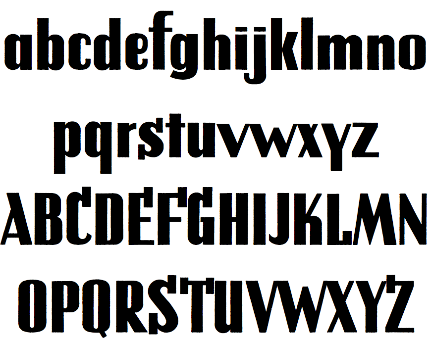
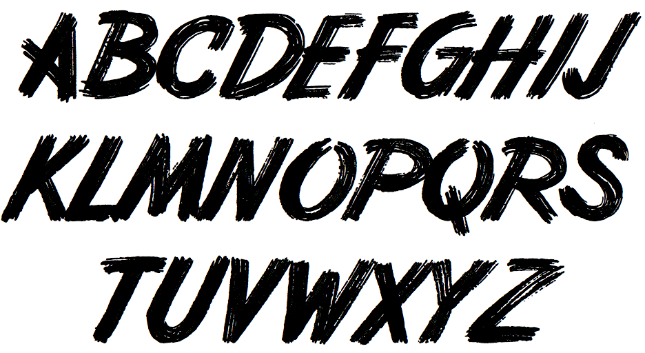
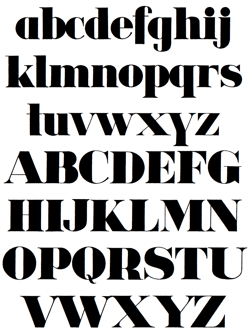
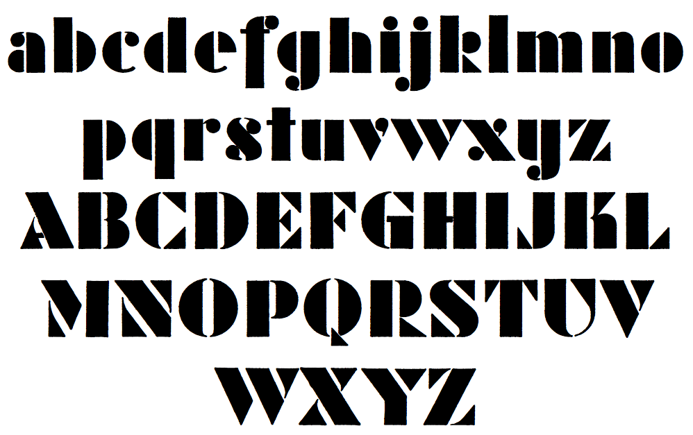
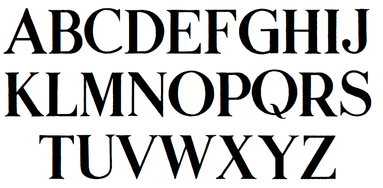
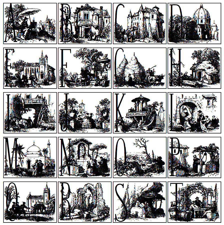
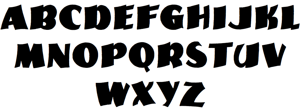
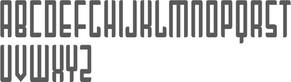
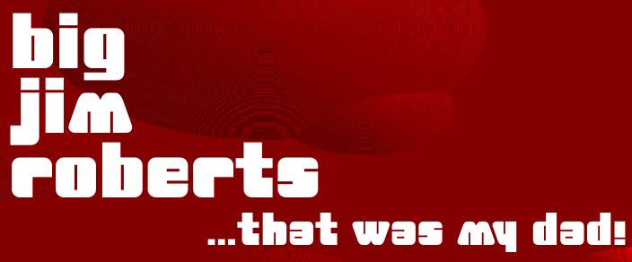
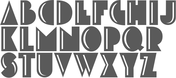
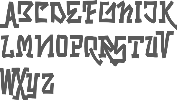
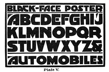