TYPE DESIGN INFORMATION PAGE last updated on Wed May 6 16:10:47 EDT 2026
FONT RECOGNITION VIA FONT MOOSE

|
|
|
|
Expert Alphabets
[George Abrams]
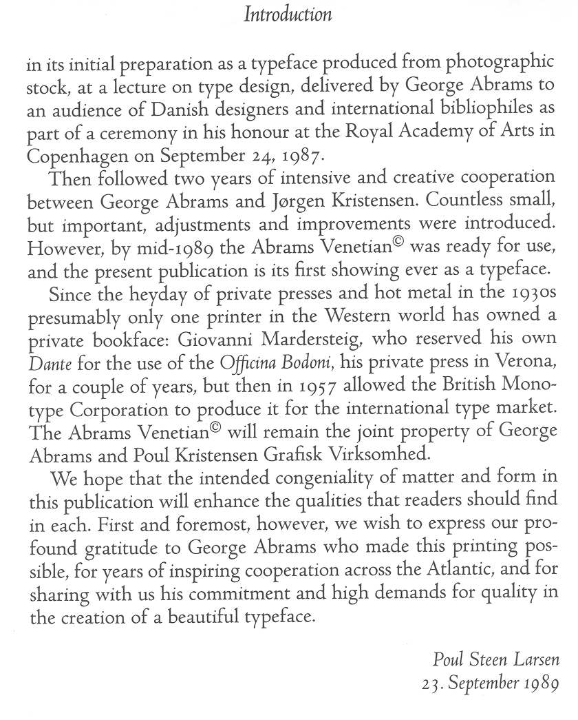
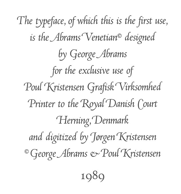
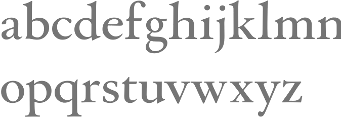
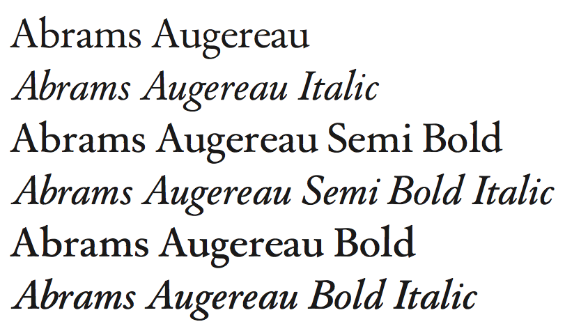
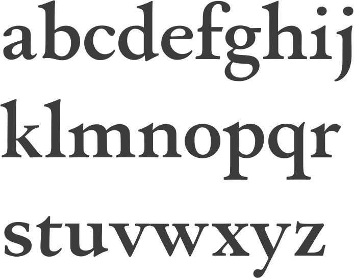
George Abrams (b. 1919 or 1920, Brooklyn, d. 2001, Manhasset, NY) is the designer of the gorgeous font families Augereau, Abrams Caslon and Venetian, at Expert Alphabets in Great Neck, NY. Abrams taught lettering and typeface design at the Parsons School of Design, the New School for Social Research and at the Columbia University Teachers College. He had over 50 years of Madison Avenue experience designing ads, logos, typography and lettering for Fortune 500 companies and more. His early typefaces were photo types published by Headliners in New York City. He died on June 7, 2001 at age 81. About Augereau: This is the only digitized typeface by George Abrams [in fact, the digitization is due to Charles Nix, for George Abrams]. Its 28 weights include over 2,000 sorts including expert, OsF,&alts. Augereau is named for Antoine Augereau, who was a typographer who had a few claims to fame - one was that he was Claude Garamonds teacher, and two was that he was sentenced to death for heresy in 1544. Heresy for a typographer in 1544 meant that he printed something that the king or the Pope didn't like and died for it. I would like to thank Poul Steen Larsen for clarifying the history of Abrams' Venetian: The Abrams Venetian was donated to Mr. Poul Kristensen of Herning (in Jutland), then Printer to the Royal Court (which he has ceased to be in 1995). You are right about the font being today locked to Poul Kristensen' old Linotron, from which not even Linotype experts brought in to unlock it, could get it out for conversion into an up-to-date digital font. So the font will disappear from the type arena when Kristensens Linotron one day breaks down. You can trust me, for I was the one who established the contact between George and Mr. Kristensen back in 1986. The font was first used in 1989 in a book by Martin Lowry, British renaissance historian, with the title Venetian Printing. George Abrams' chalk drawings of the entire alphabet in regular and italic were scanned, more precisely vectorised on-screen and downloaded in Denmark by the Kristensens and therefore, in one sense, could be called the first Danish complete font. A sample of the first use of Abrams' Venetian. A second sample from "Venetian Printing". Abrams Venetian was digitized at some point by Jorgen Kristensen for Poul Kristensen Grafisk Virksomhed Printer. Apostrophe wrote this about Abrams Caslon: This was actually reviewed by Caflish and, if I remember correctly, Mark vonBronkhorst, so there are at least 3 or 4 copies of it out there, other than the Abrams' estate original data. Sumner Stone once said that this is the best Caslon he has ever seen. At least he has seen it; I haven't. The typefaces by Abrams (Abrams Venetian and Augereau) are preserved in the New York City-based Abrams Legacy Collection (see also here). |
EXTERNAL LINKS |
| | |

file name: George Abrams Augereau Bold 1989
file name: George Abrams Abrams Augereau 1989

file name: George Abrams Augereau 1997
file name: George Abrams Augereau Extra Bold 1997

file name: Abrams Legacy Abrams Venetian 1989 after George Abrams
file name: Abrams Legacy Abrams Venetian 1989 after George Abrams
| | |
|
Luc Devroye ⦿ School of Computer Science ⦿ McGill University Montreal, Canada H3A 2K6 ⦿ lucdevroye@gmail.com ⦿ https://luc.devroye.org ⦿ https://luc.devroye.org/fonts.html |