TYPE DESIGN INFORMATION PAGE last updated on Wed May 6 16:12:15 EDT 2026
FONT RECOGNITION VIA FONT MOOSE

|
|
|
|
Jesse M. Ragan
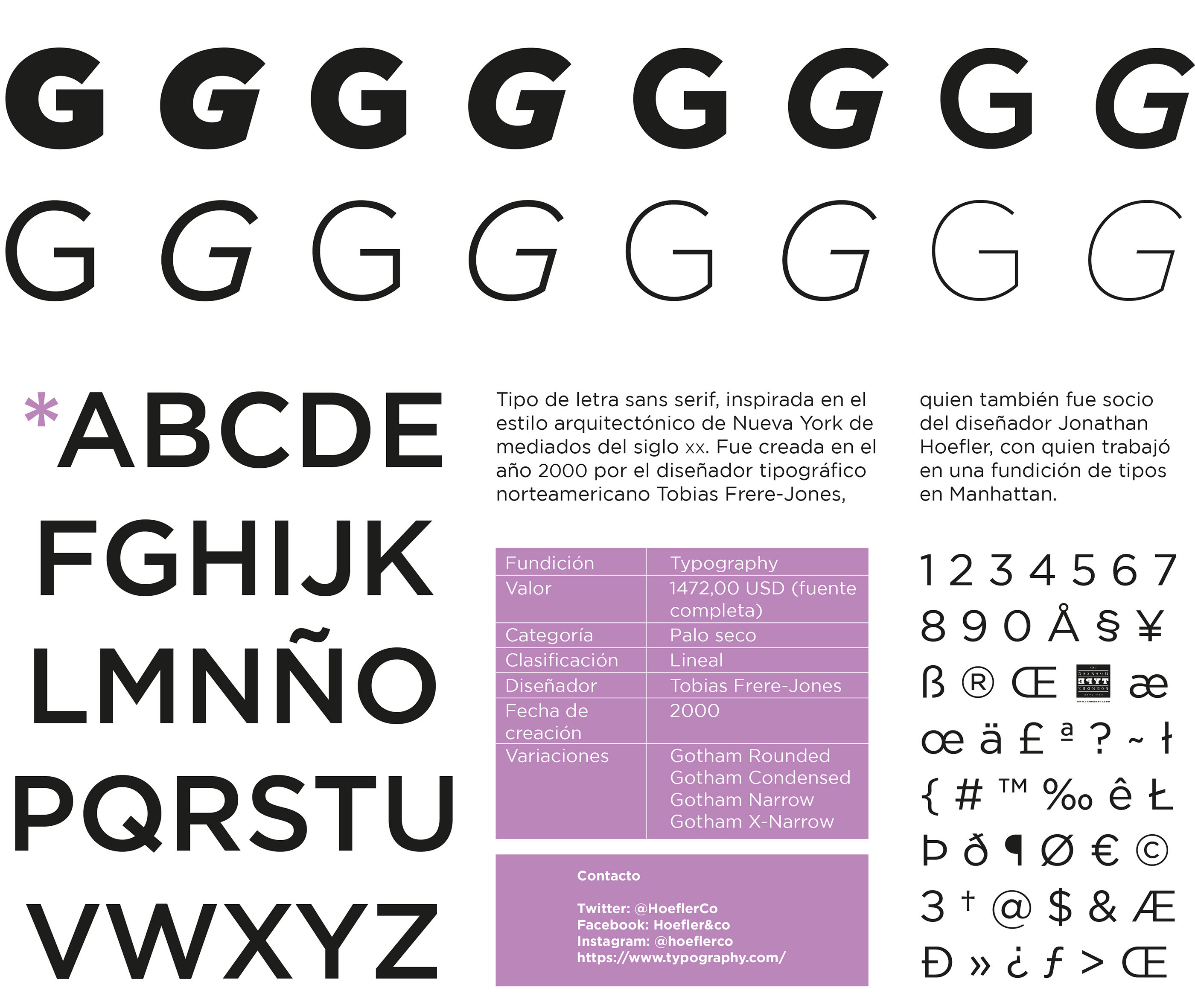
Originally from North Carolina (b. 1979), Jesse Ragan studied type design at Rhode Island School of Design. After college, Jesse designed typefaces at Hoefler&Frere-Jones, where he had a hand in Gotham, Archer, and several other families. Since 2005, he has worked independently in Brooklyn, developing typefaces and lettering for a variety of clients. His work can be found at Font Bureau, House Industries, and Darden Studio. He also teaches typeface design at Pratt Institute and Cooper Union. He won an award at Bukvaraz 2001 for Gotham, co-designed with Jonathan Hoefler and Tobias Frere-Jones. In 2017, he set up XYZ Type with Ben Kiel, who is based in Saint Louis, MO. XYZ Type is part of Type Network since 2018. His typefaces:
|
EXTERNAL LINKS |
| | |


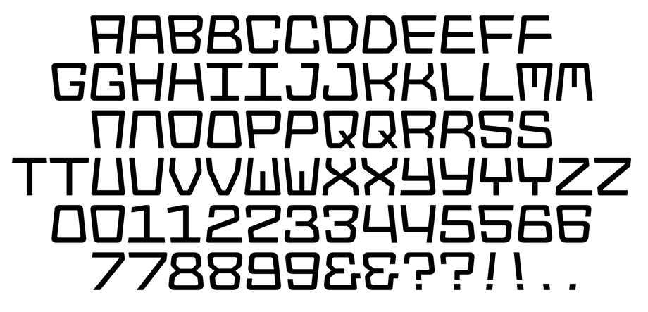
file name: Jesse Ragan Ben Kiel Polymode Sans 2021
file name: Jesse Ragan Ben Kiel Polymode Sans 2021
file name: Jesse Ragan Ben Kiel Polymode Sans 2021

file name: Jesse Ragan Ben Kiel Polymode Sans 2021
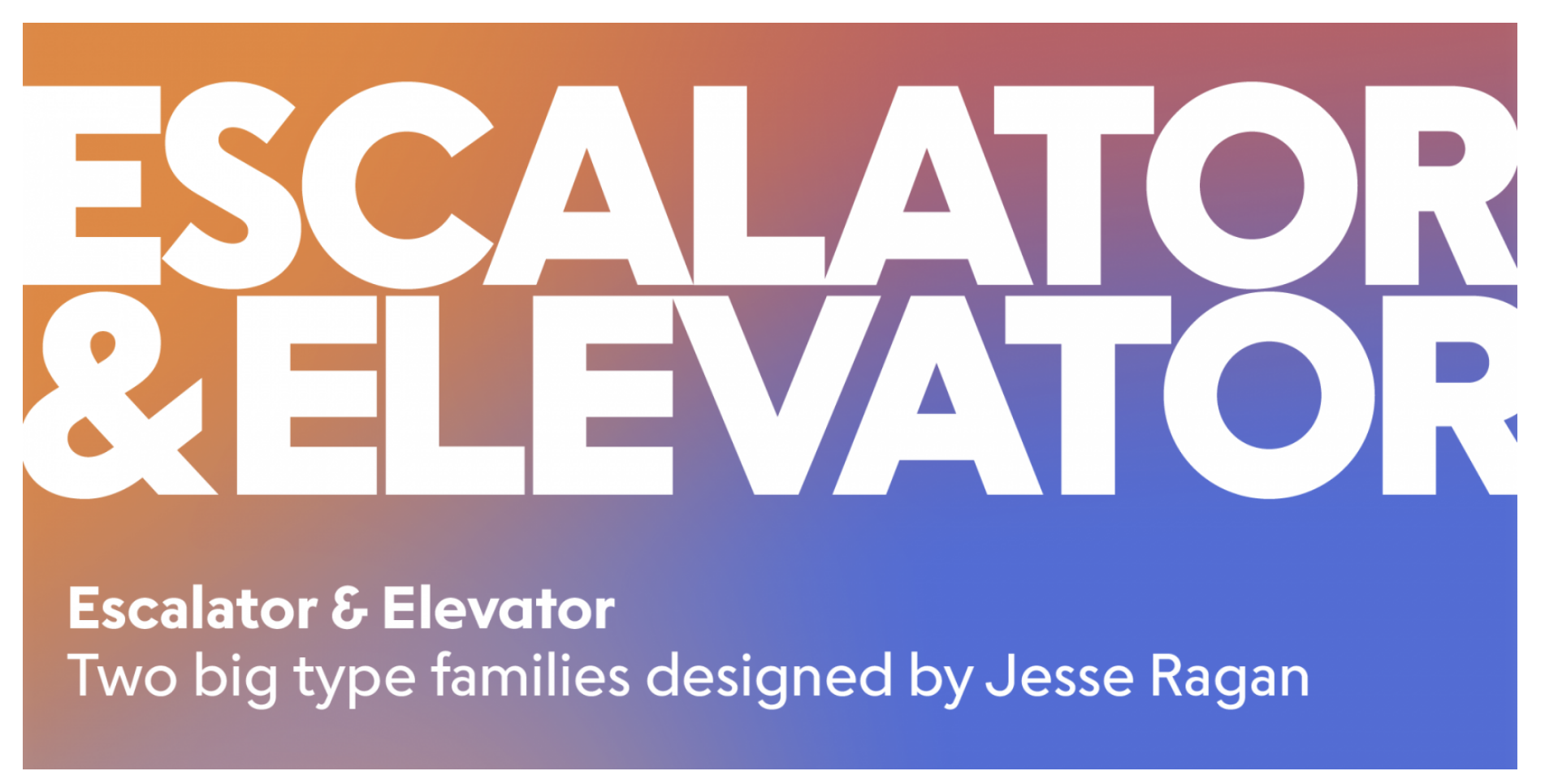
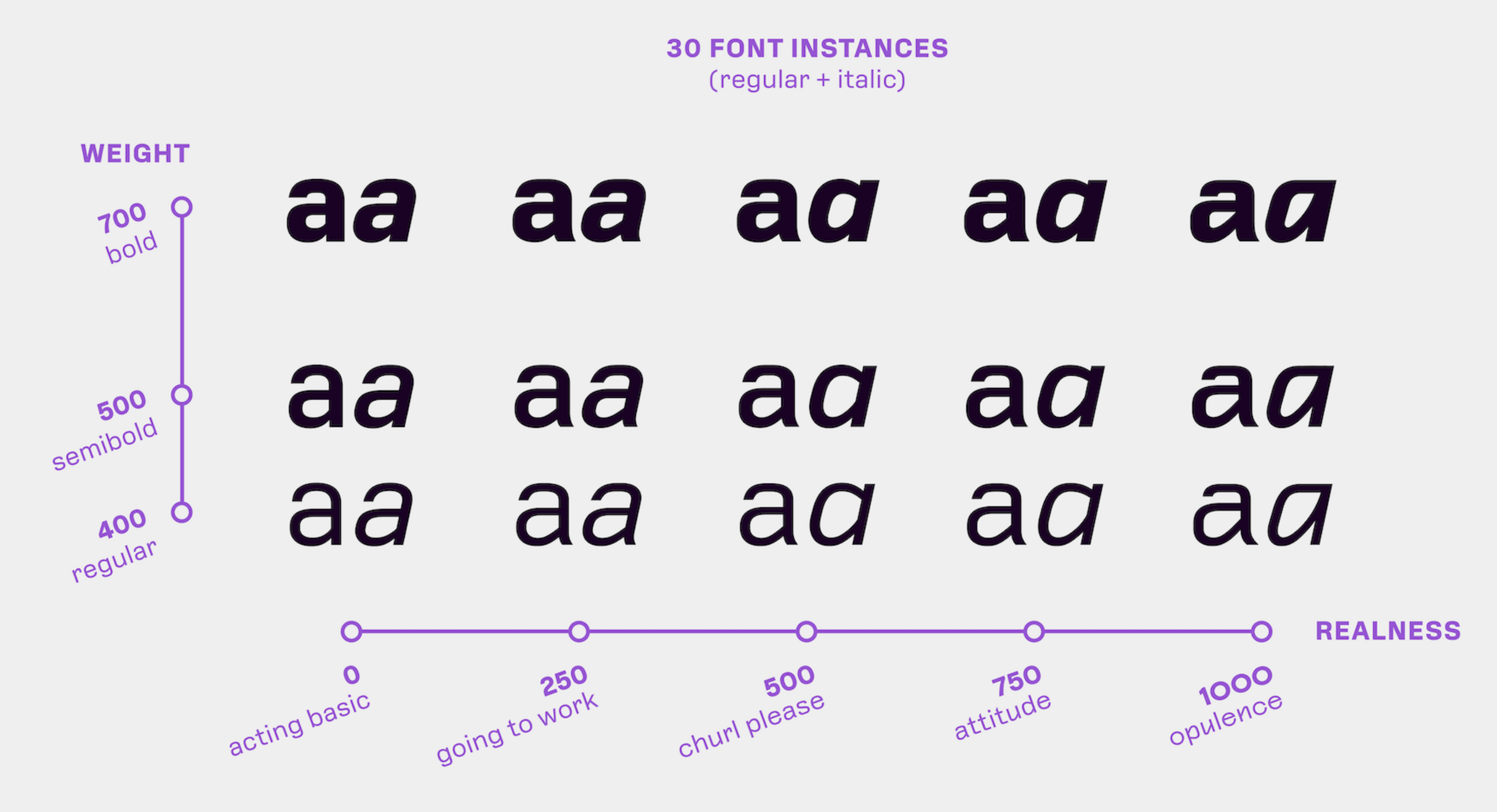
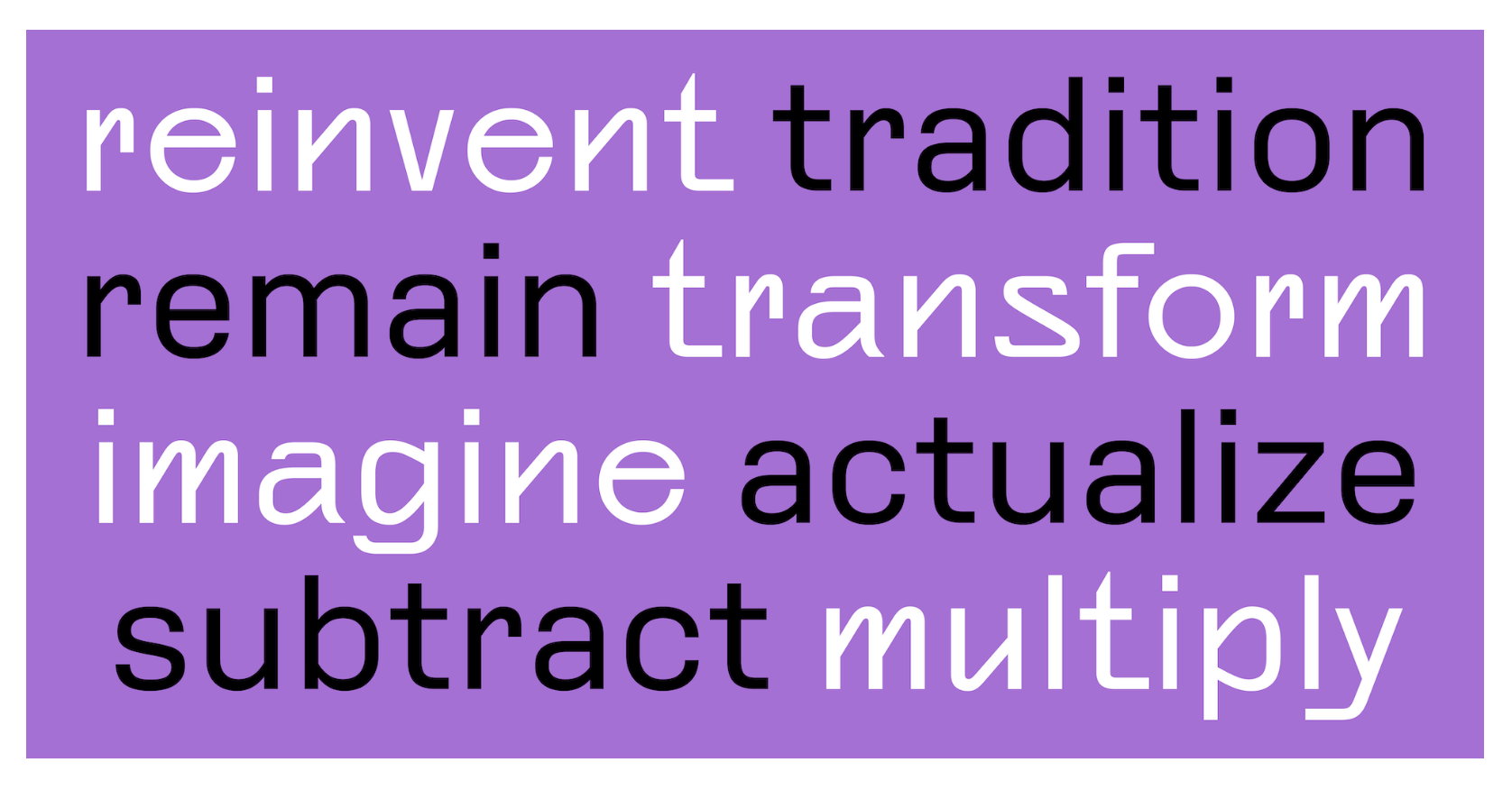
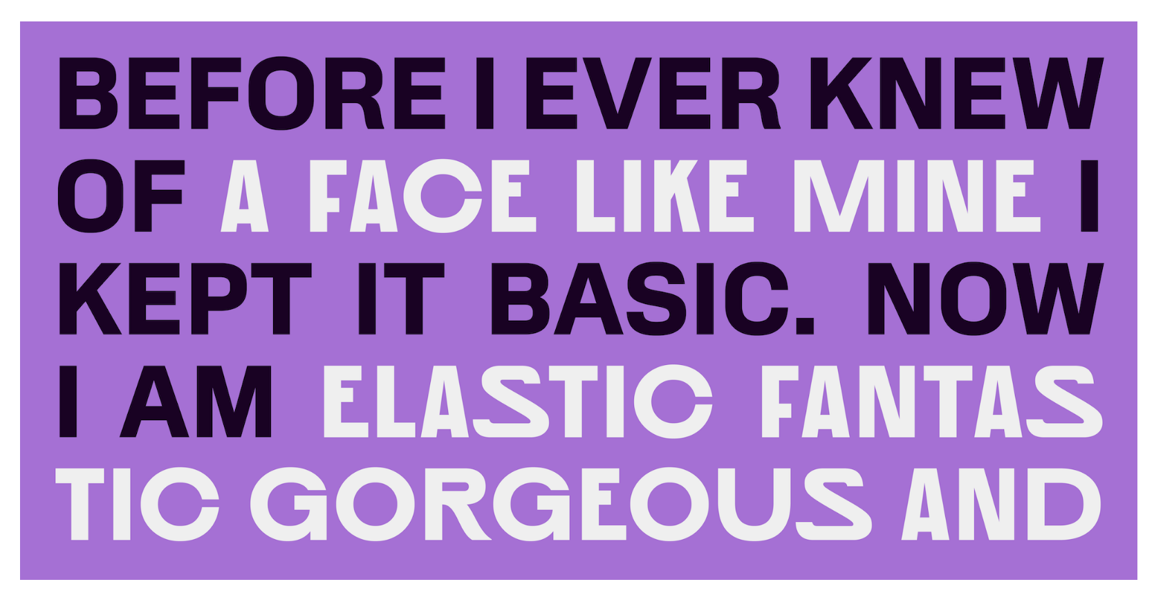
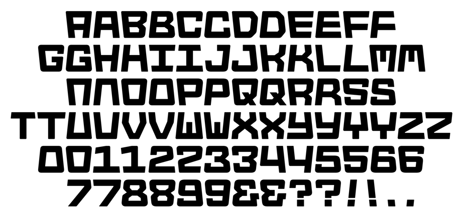
file name: Jesse Ragan Escalator Elevator 2022

file name: Jesse Ragan Escalator Elevator 2022
file name: Jesse Ragan Escalator Elevator 2021

file name: Jesse Ragan Escalator Elevator 2021
file name: Jesse Ragan Escalator Elevator 2021
file name: Jesse Ragan Escalator Elevator 2021

file name: Jesse Ragan Escalator Elevator 2021
file name: Jesse Ragan Escalator Elevator 2021

file name: Jesse Ragan Escalator Elevator 2021

file name: Jesse Ragan Escalator Elevator 2021
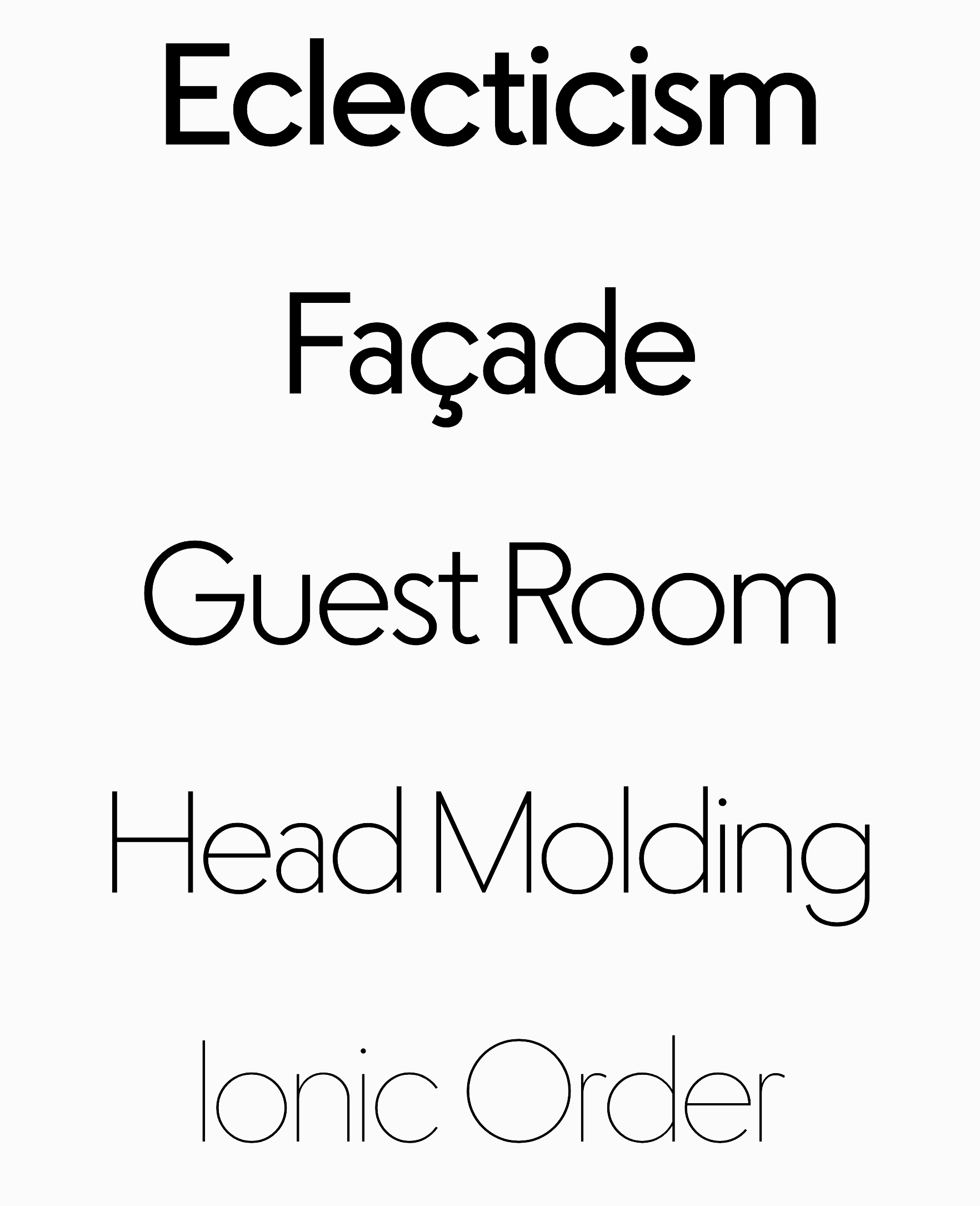
file name: Jesse Ragan Escalator Elevator 2021

file name: Jesse Ragan Escalator Elevator 2021

file name: Jesse Ragan Escalator Elevator 2021
file name: Jesse Ragan Escalator Elevator 2021
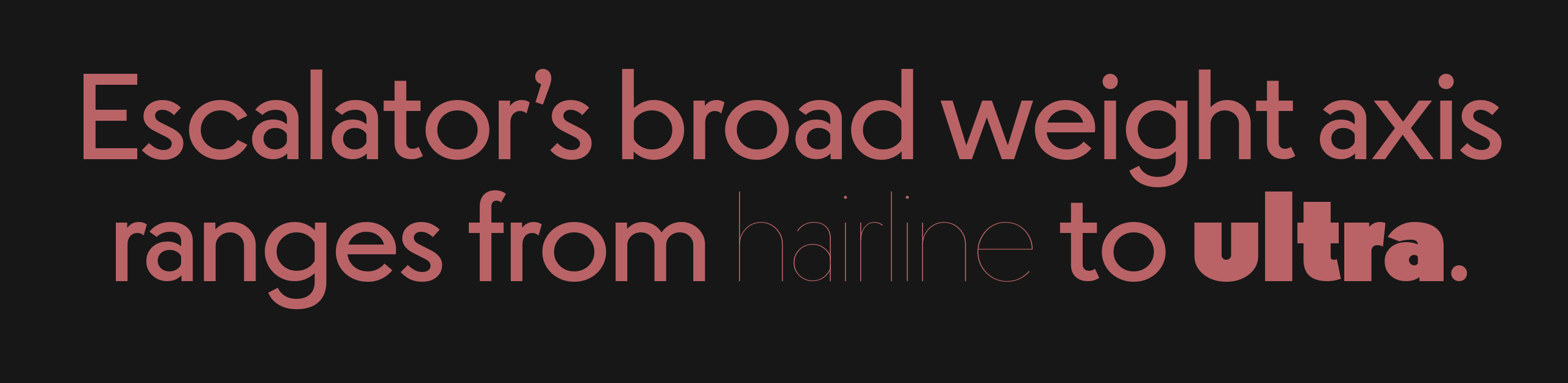
file name: Jesse Ragan Escalator Elevator 2021

file name: Jesse Ragan Escalator Elevator 2021

file name: Jesse Ragan Escalator Elevator 2021
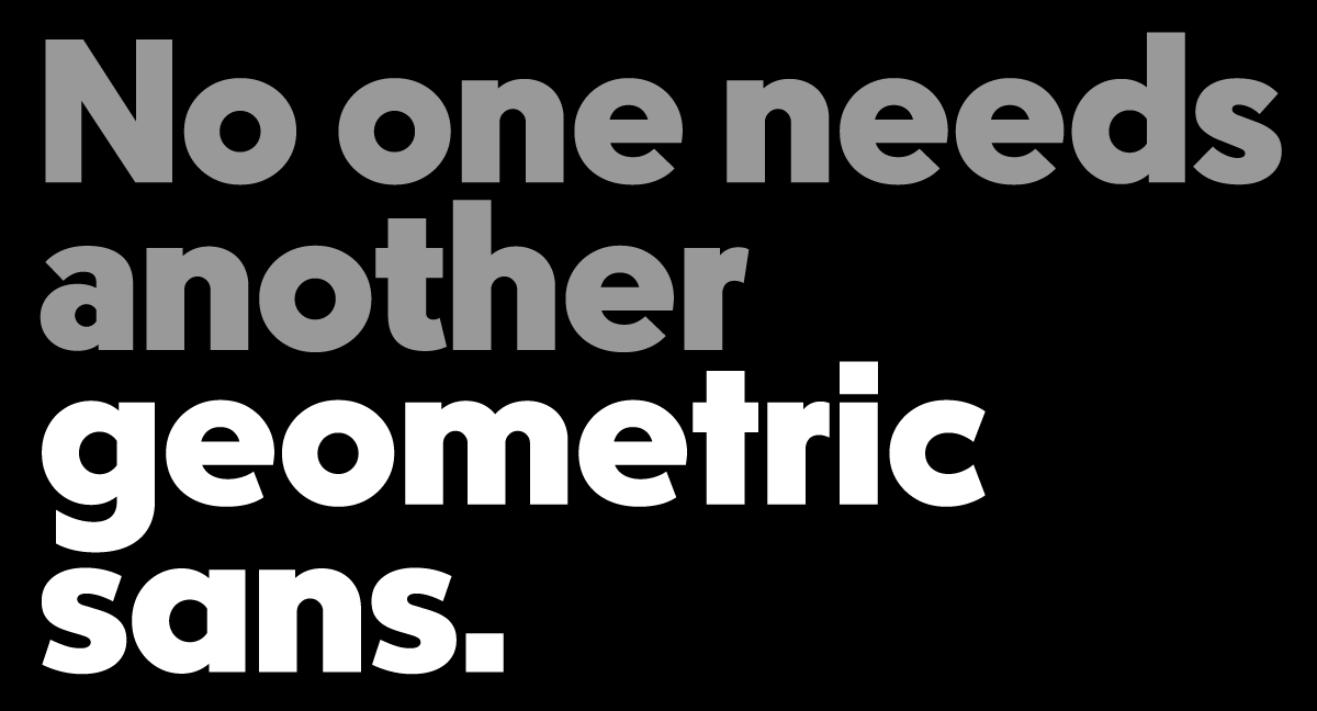
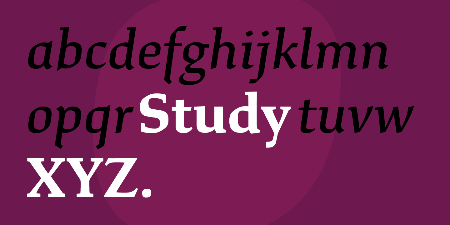
file name: Jesse Ragan Study 2018

file name: Jesse Ragan Study 2018b
file name: Jesse Ragan Study 2018c
file name: Jesse Ragan Study 2018d

file name: Jesse Ragan Study 2018e
file name: Jesse Ragan Study 2018f
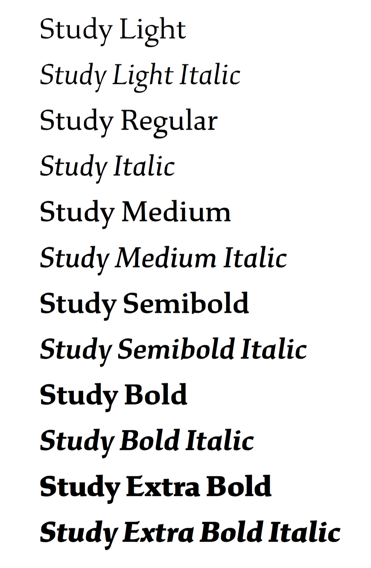
file name: Jesse Ragan Study 2018h
file name: Jesse Ragan Study 2018j
file name: Jesse Ragan Study 2018k
file name: Jesse Ragan Study 2018l

file name: Jesse Ragan Study 2018p

file name: Jesse Ragan Study 2018q
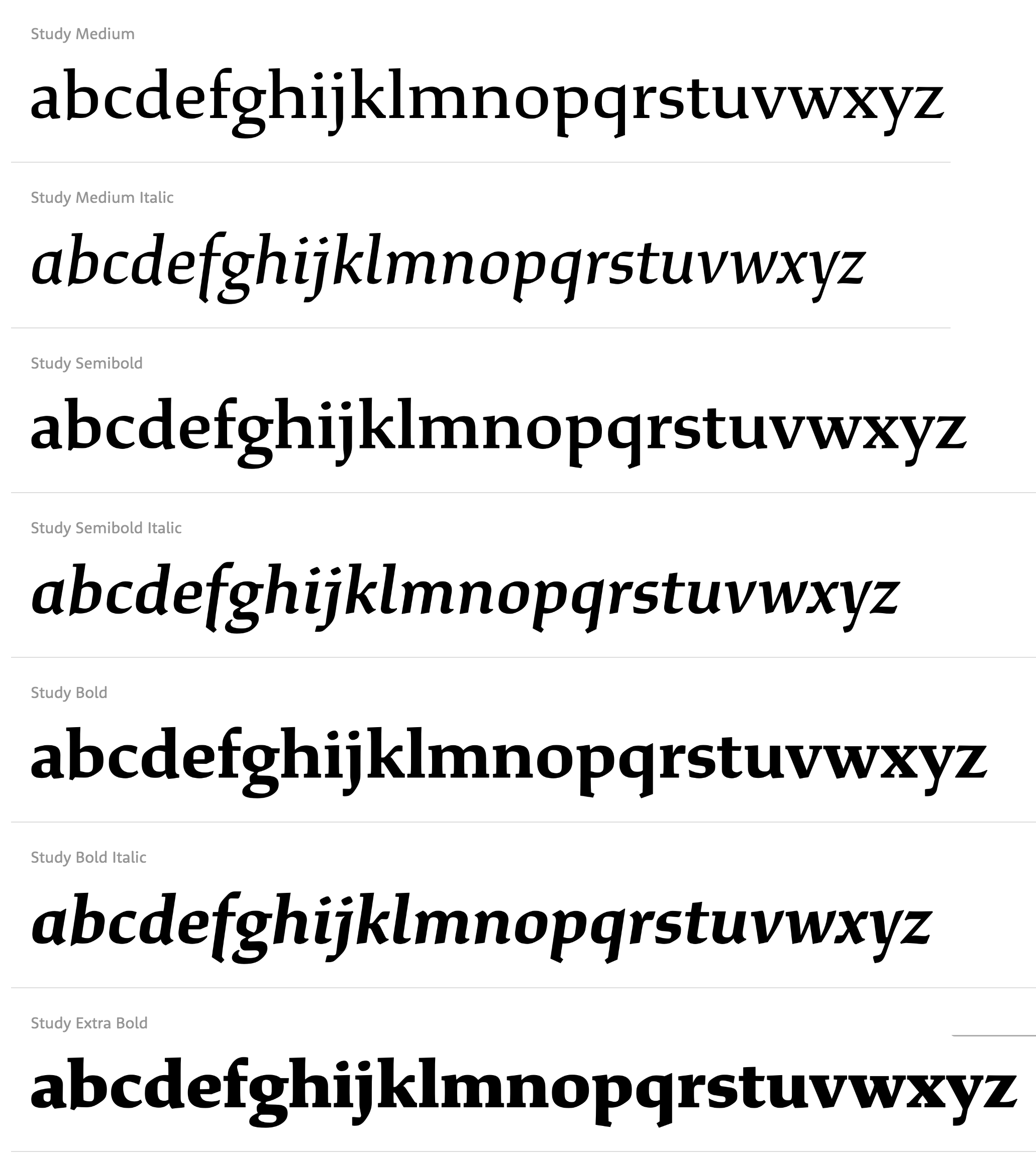
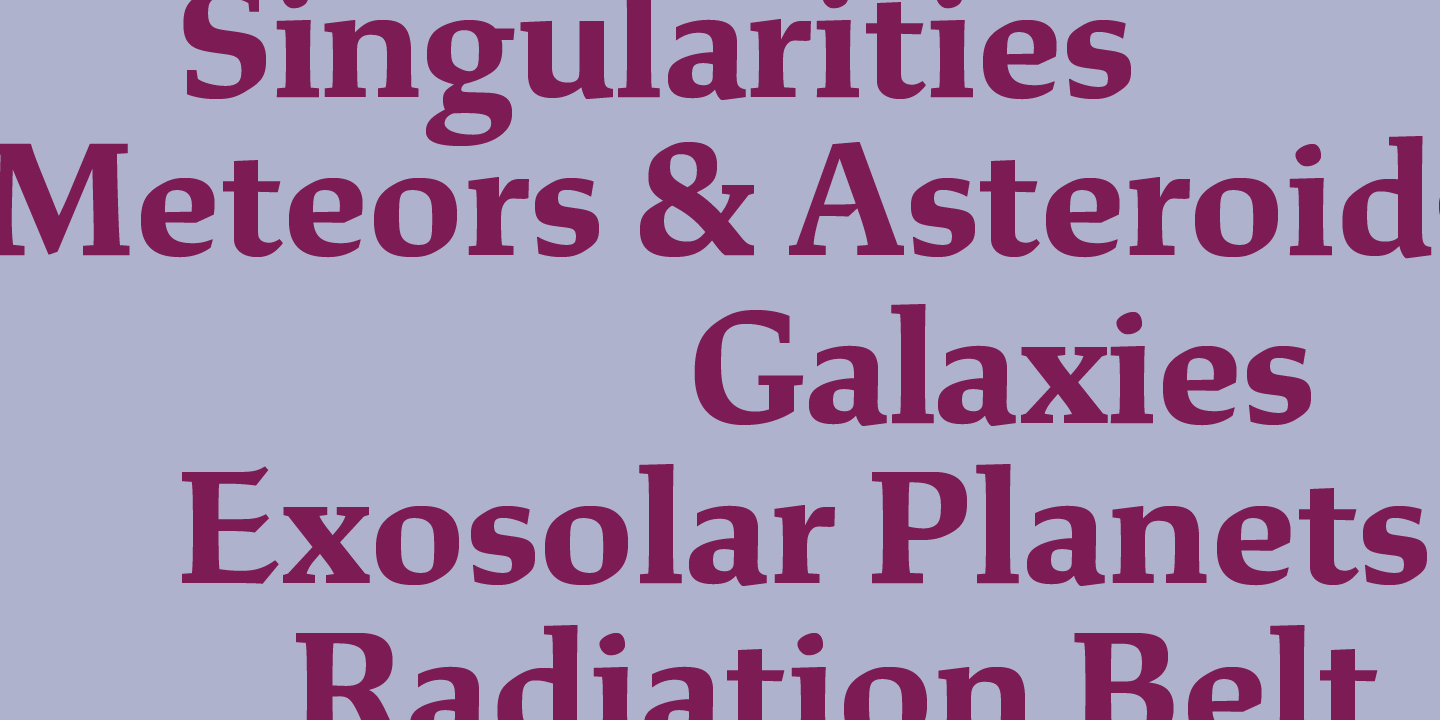
file name: Jesse Ragan Study 2020
file name: X Y Z Type Study 2020 1

file name: X Y Z Type Study 2020 2

file name: X Y Z Type Study 2020 3
file name: X Y Z Type Study 2020 4

file name: X Y Z Type Study 2020 5

file name: X Y Z Type Study 2020

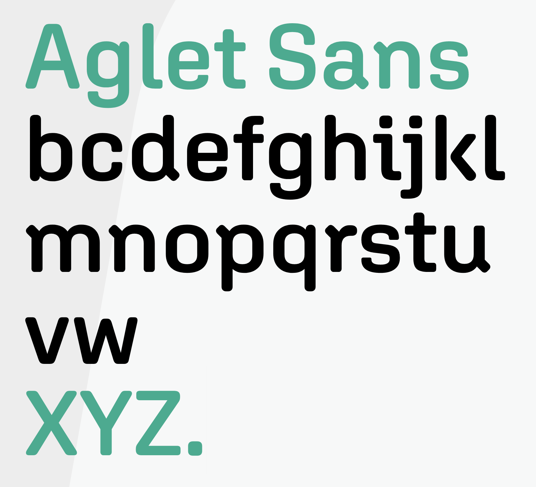
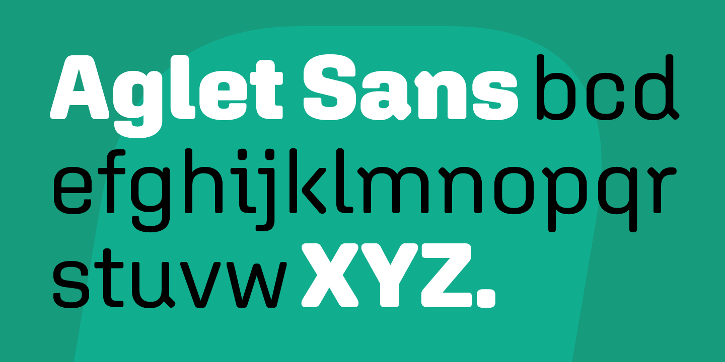
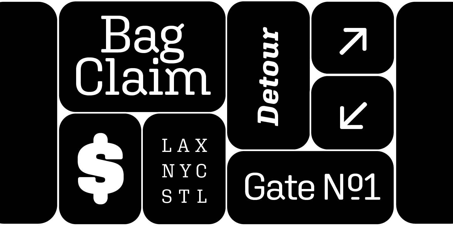
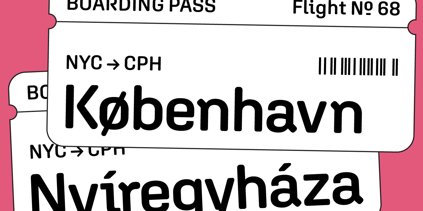
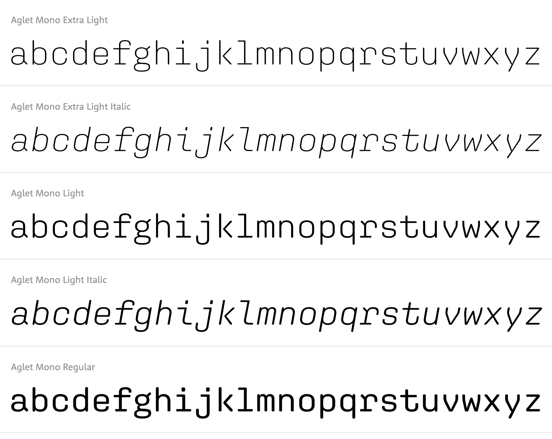
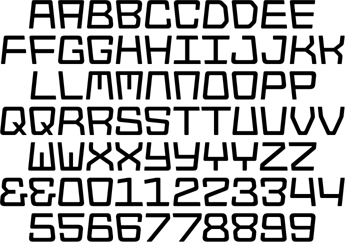
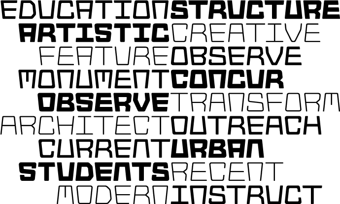
file name: Jesse Ragan Aglet Sans 2019
file name: Jesse Ragan Aglet Sans 2019

file name: Jesse Ragan Aglet Sans 2019
file name: Jesse Ragan Aglet Sans 2019
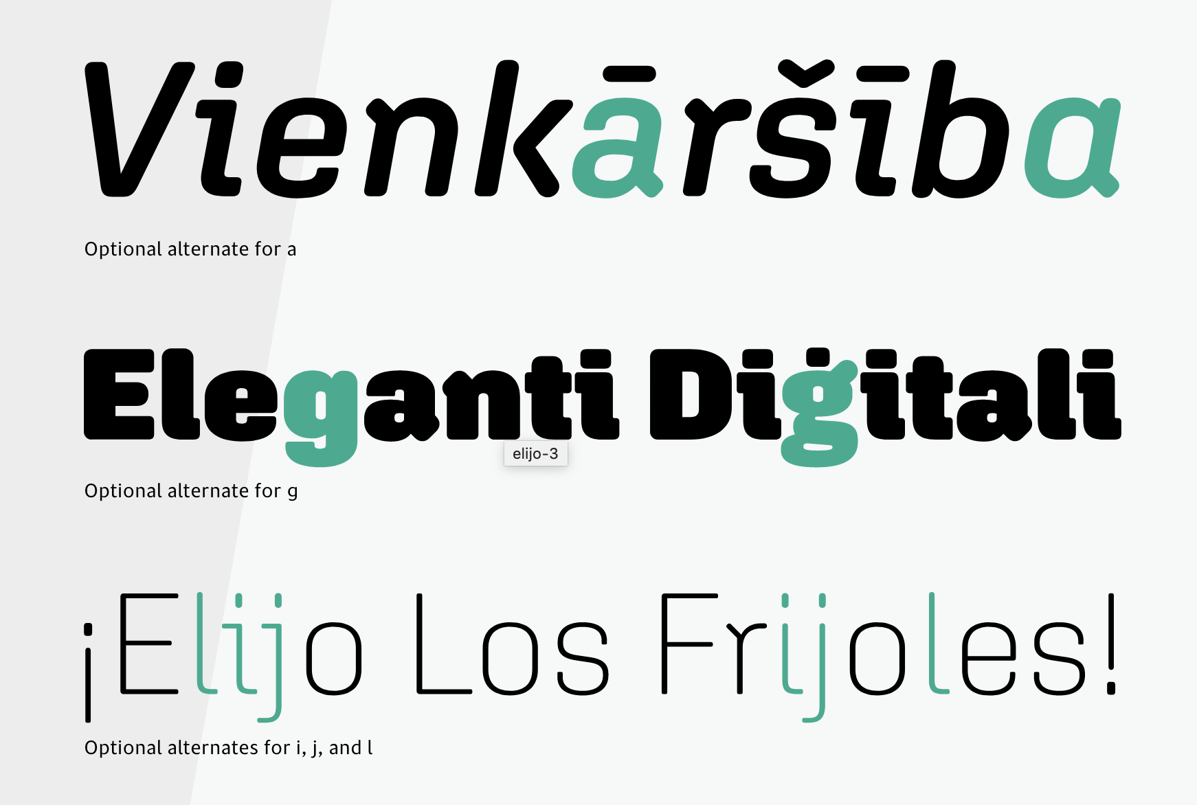
file name: Jesse Ragan Aglet Sans 2019
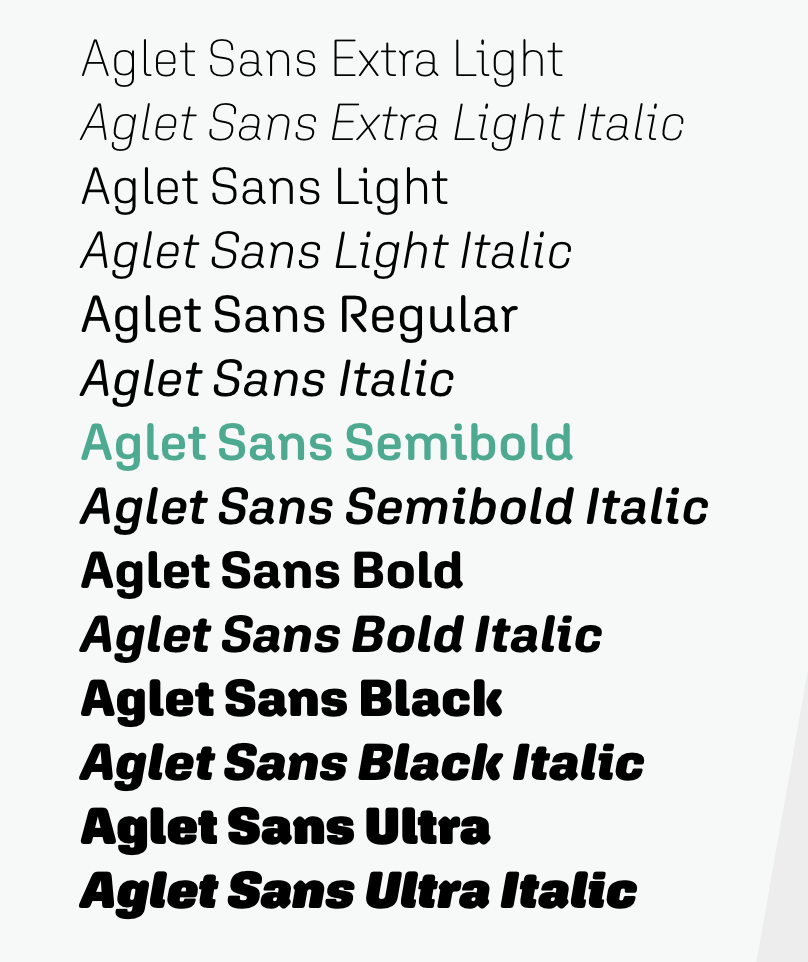
file name: Jesse Ragan Aglet Sans 2019
file name: X Y Z Type Aglet Sans 2020 1
file name: X Y Z Type Aglet Sans 2020 2

file name: X Y Z Type Aglet Sans 2020 3

file name: X Y Z Type Aglet Sans 2020 4

file name: X Y Z Type Aglet Sans 2020 5

file name: X Y Z Type Aglet Sans 2020
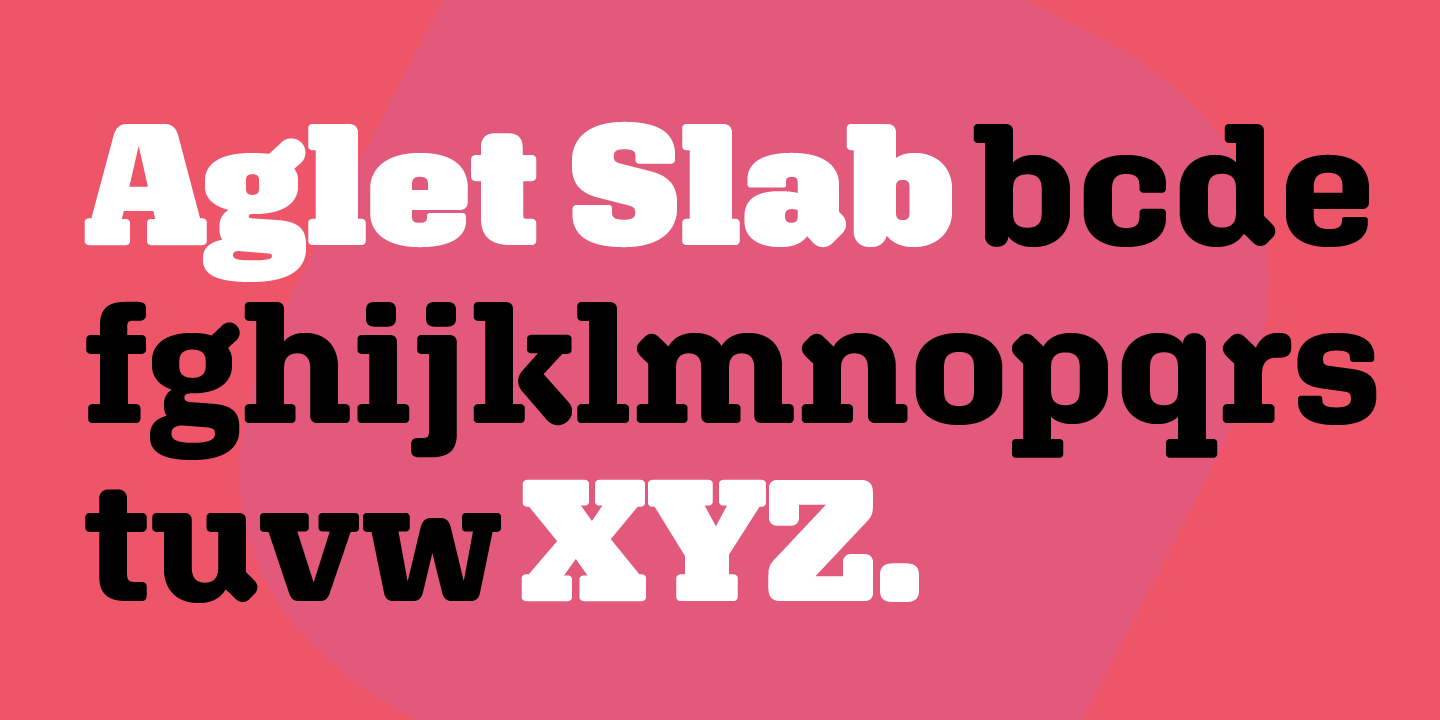
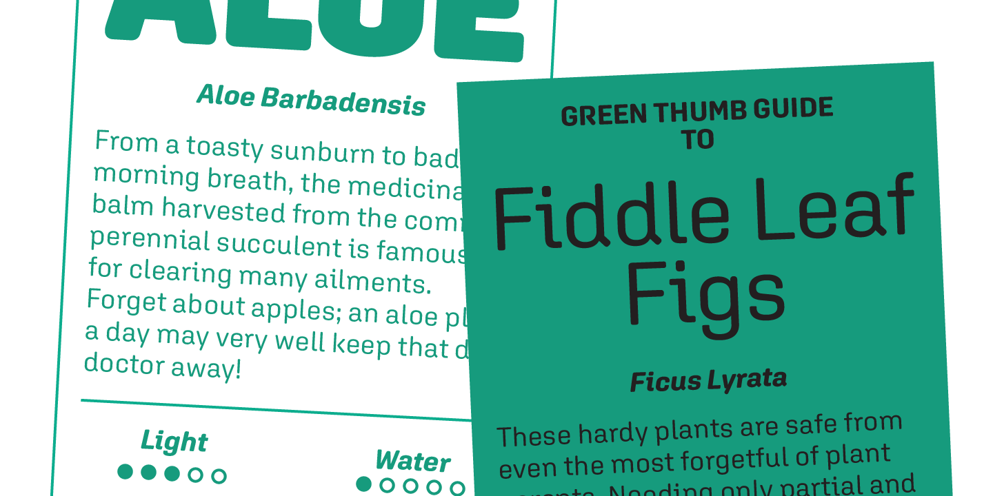
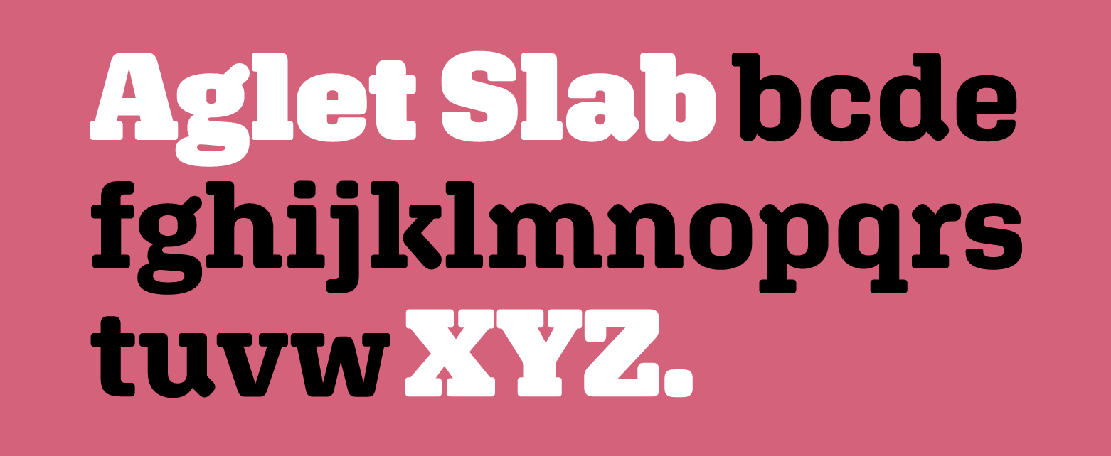
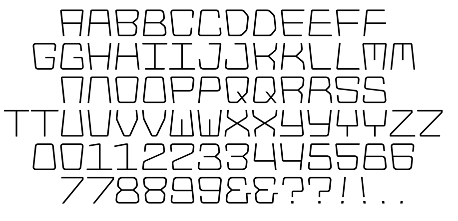
file name: X Y Z Type Aglet Slab 2020 1

file name: X Y Z Type Aglet Slab 2020 2
file name: X Y Z Type Aglet Slab 2020 3
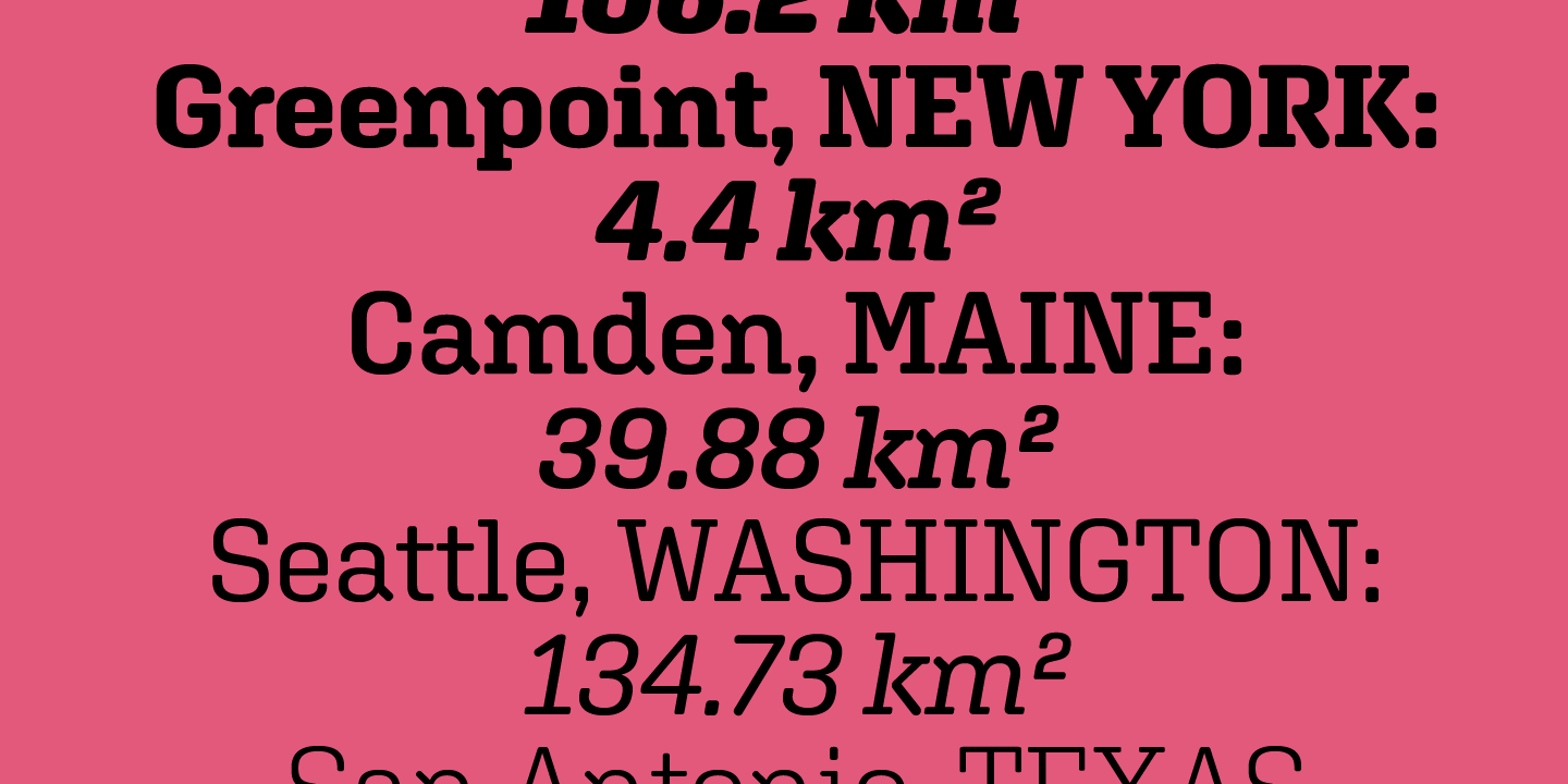
file name: X Y Z Type Aglet Slab 2020 4
file name: X Y Z Type Aglet Slab 2020 5

file name: X Y Z Type Aglet Slab 2020
file name: Xyz Type Aglet Slab 2017b
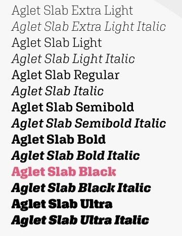
file name: Xyz Type Aglet Slab 2017

file name: Jesse Ragan Aglet Slab 2020

file name: Jesse Ragan Aglet Slab 2020
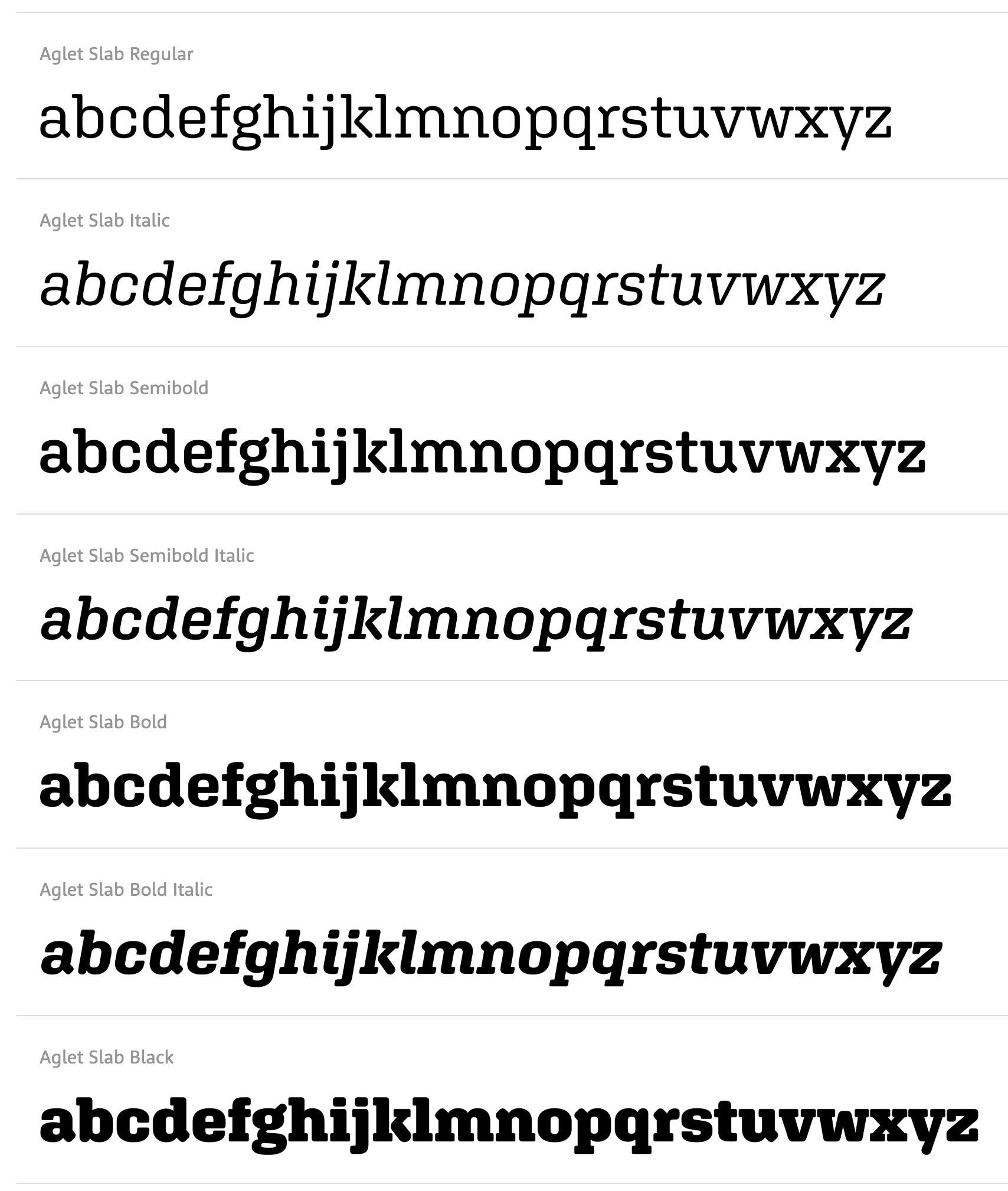
file name: Jesse Ragan Aglet Slab 2020
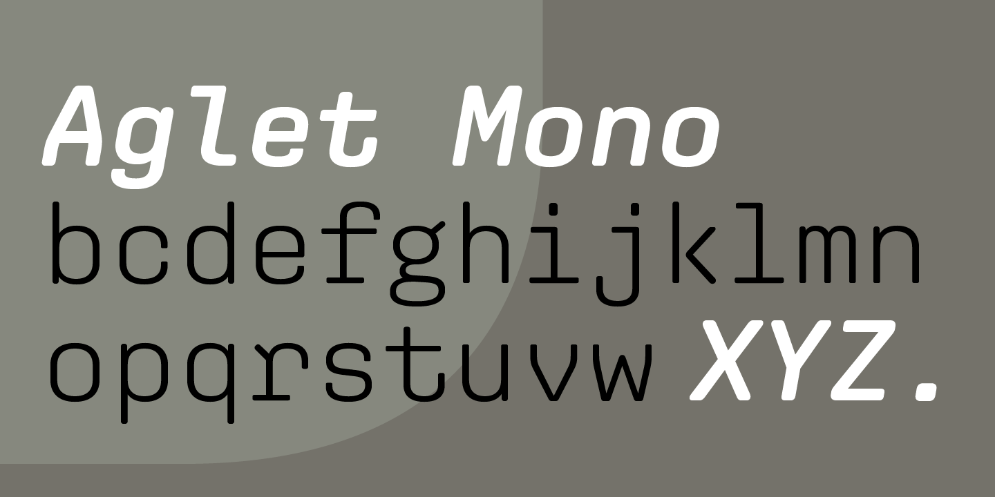
file name: X Y Z Type Aglet Mono 2020 1
file name: X Y Z Type Aglet Mono 2020 2

file name: X Y Z Type Aglet Mono 2020 3
file name: X Y Z Type Aglet Mono 2020 4
file name: X Y Z Type Aglet Mono 2020 5

file name: X Y Z Type Aglet Mono 2020
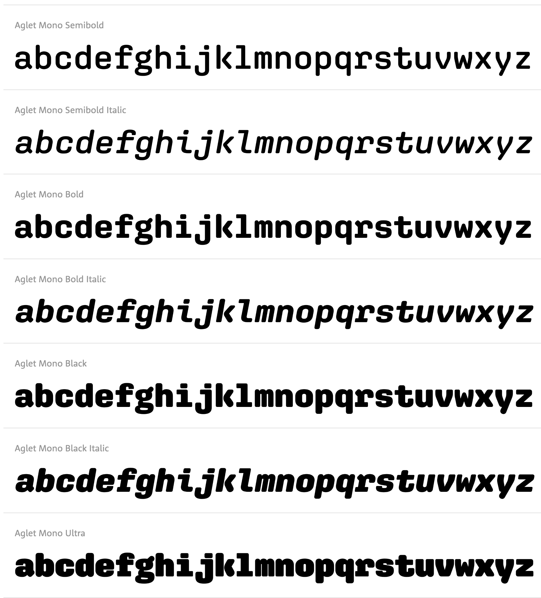
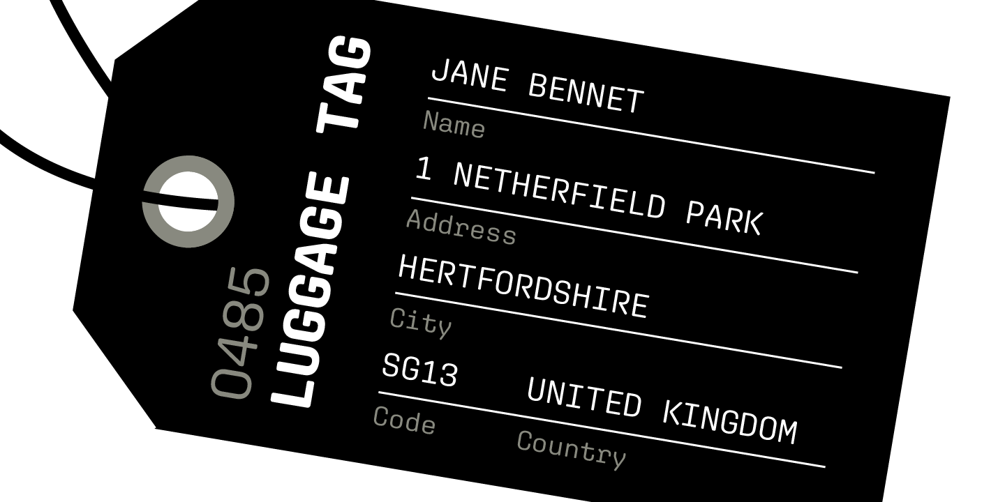
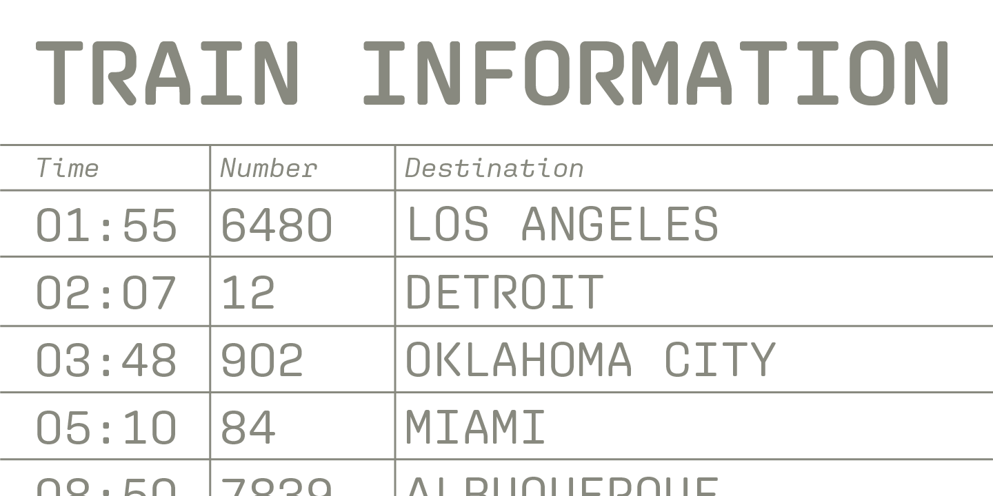
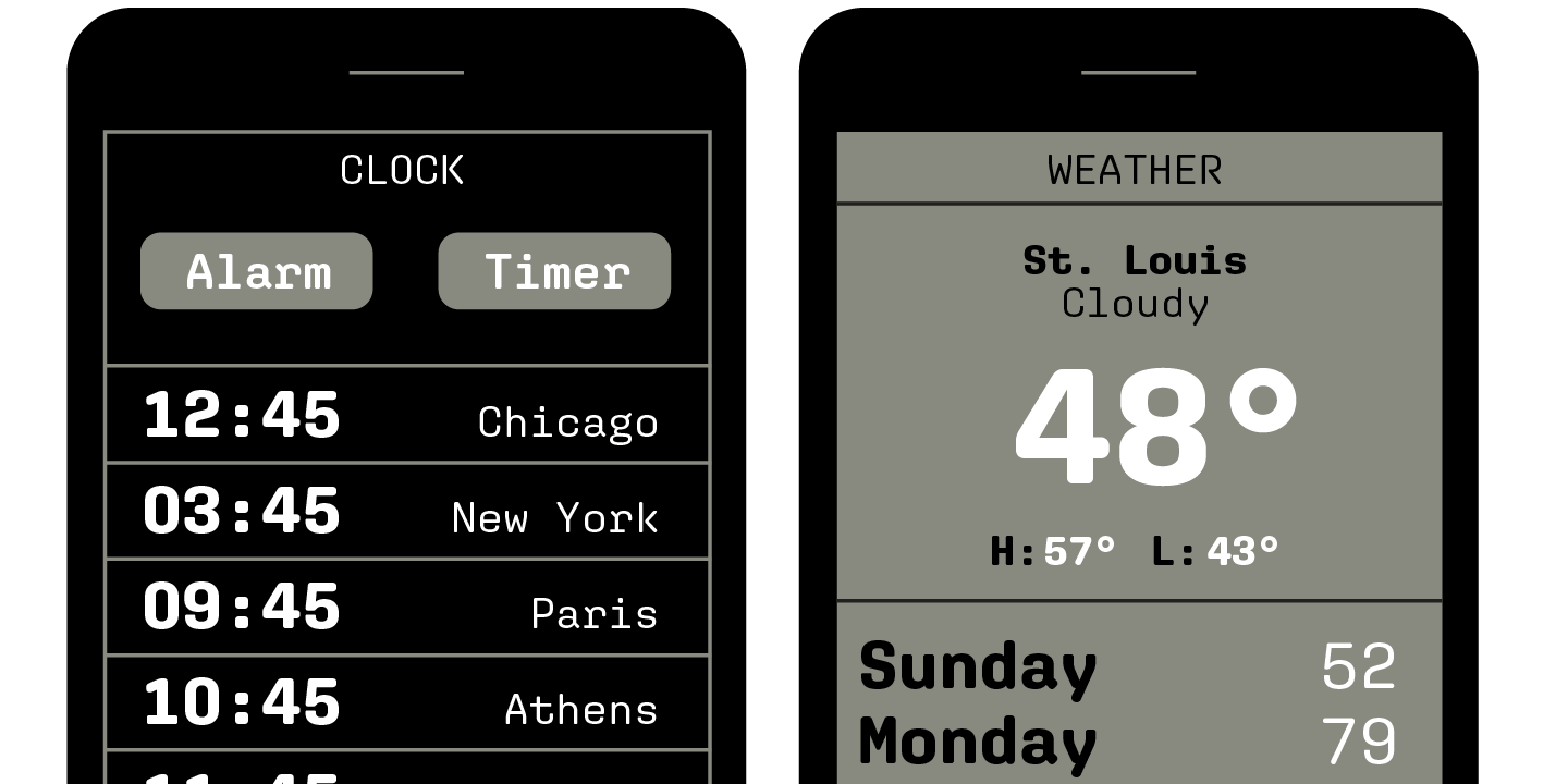
file name: Jesse Ragan Aglet Mono 2020
file name: Jesse Ragan Aglet Mono 2020

file name: X Y Z Type Cortado 202

file name: X Y Z Type Cortado 2020 1
file name: X Y Z Type Cortado 2020 3

file name: X Y Z Type Export 2020 1
file name: X Y Z Type Export 2020 2

file name: X Y Z Type Export 2020 3
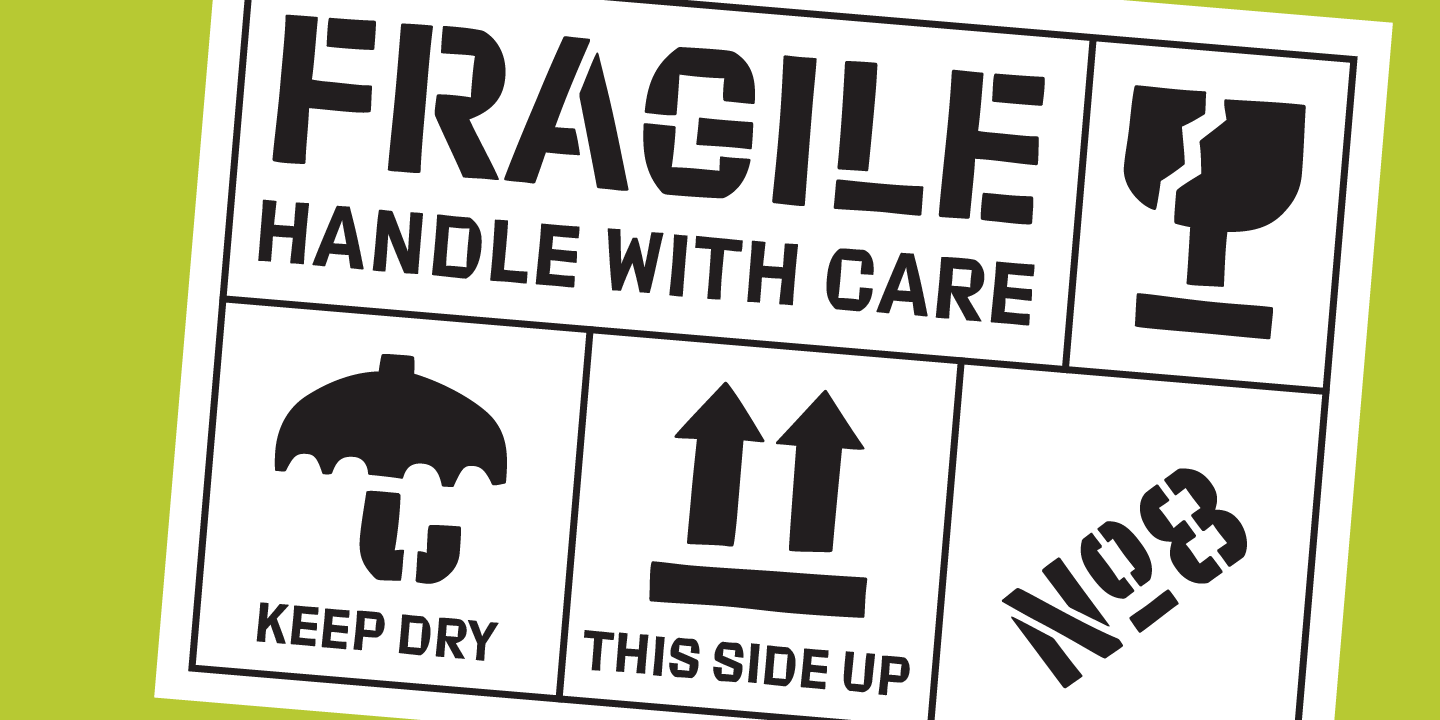
file name: X Y Z Type Export 2020 4

file name: X Y Z Type Export 2020 5

file name: X Y Z Type Export 2020
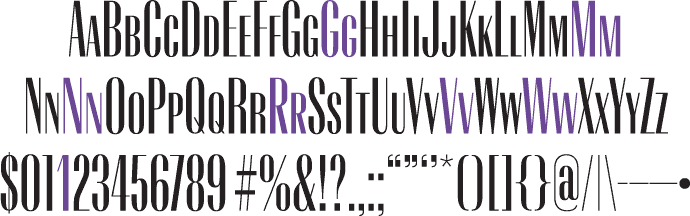
file name: Matteo Bologna Jesse Ragan Athenian Extended 2011

file name: Matteo Bologna Jesse Ragan Athenian Extended 2011b

file name: Matteo Bologna Jesse Ragan Athenian Extended 2011c
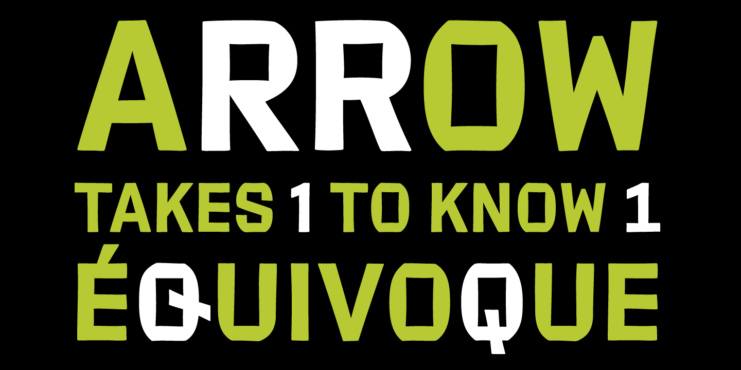
file name: Jesse Ragan Afri Sans 2011

file name: Jesse Ragan Afri Sans 2011b
file name: Jesse Ragan Afri Sans 2011c
file name: Jesse Ragan Afri Sans
file name: Jesse Ragan Afri Sans
file name: Jesse Ragan Afri Sans

file name: Jesse Ragan Afri Sans

file name: Jesse Ragan Afri Sans

file name: Jesse Ragan Boston Bruins 2006

file name: Jesse Ragan Boston Bruins 2006b

file name: Xyz Type Export 2017
file name: Jesse Ragan Export 2012

file name: Jesse Ragan Export 2012b

file name: Jesse Ragan Export 2012c

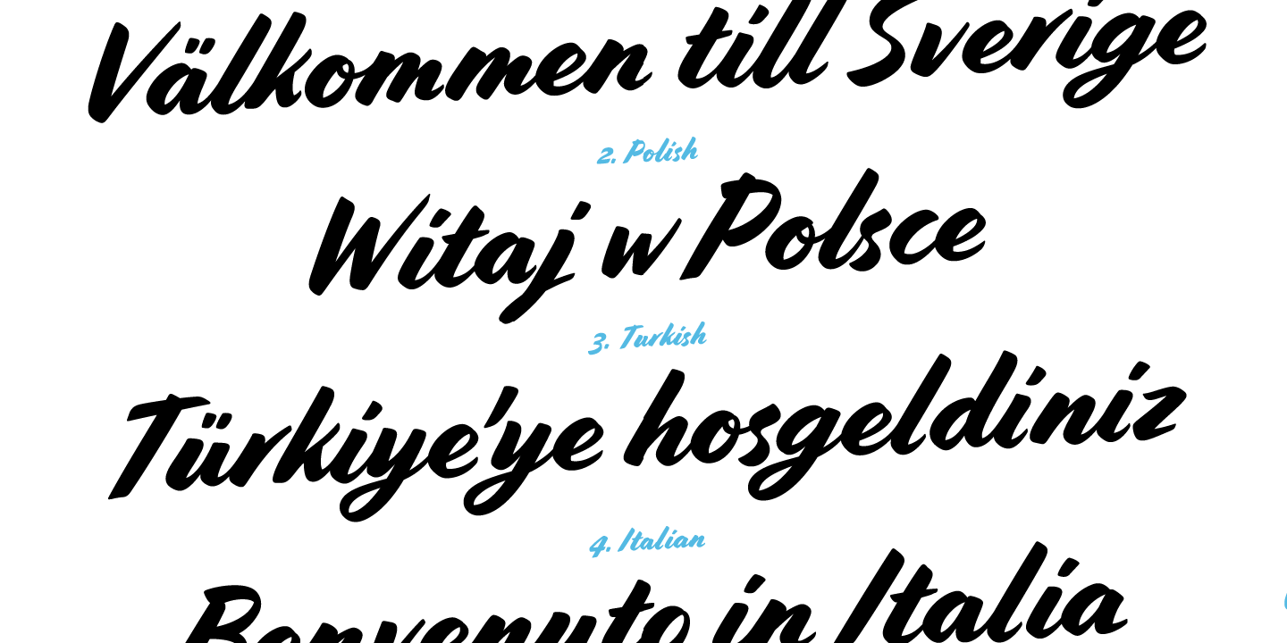
file name: Xyz Type Cortado 2017
file name: Jesse Ragan Ben Kiel Cortado Script 2013b

file name: Jesse Ragan Ben Kiel Cortado Script 2013c

file name: Jesse Ragan Ben Kiel Cortado Script 2013d

file name: Jesse Ragan Ben Kiel Cortado Script 2013e

file name: Jesse Ragan Ben Kiel Cortado Script 2013f
file name: Jesse Ragan Ben Kiel Cortado Script 2013g

file name: Jesse Ragan Ben Kiel Cortado Script 2013h

file name: Jesse Ragan Ben Kiel Cortado Script 2013j

file name: Jesse Ragan Ben Kiel Cortado Script 2013k

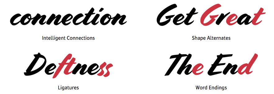
file name: Jesse Ragan Ben Kiel Carlstedt Script 2013

file name: Jesse Ragan Ben Kiel Carlstedt Script 2013b

file name: Jesse Ragan Ben Kiel Carlstedt Script 2013c
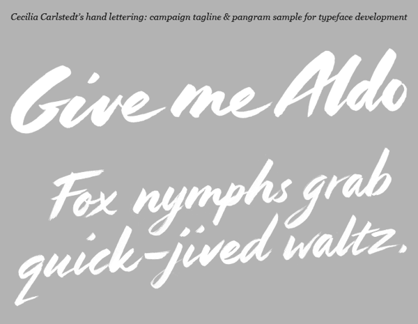
file name: Jesse Ragan Ben Kiel Carlstedt Script 2013d
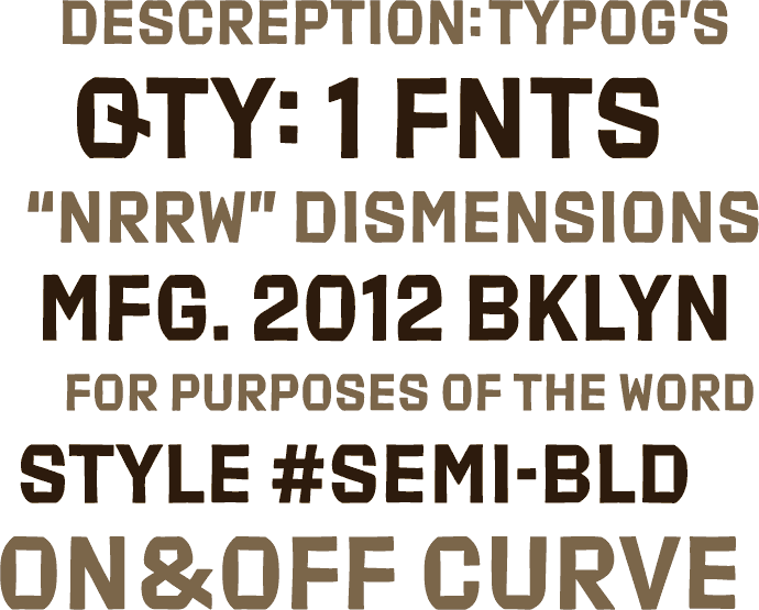
file name: Jesse Ragan Cedar 2020
file name: Jesse Ragan Cedar 2020
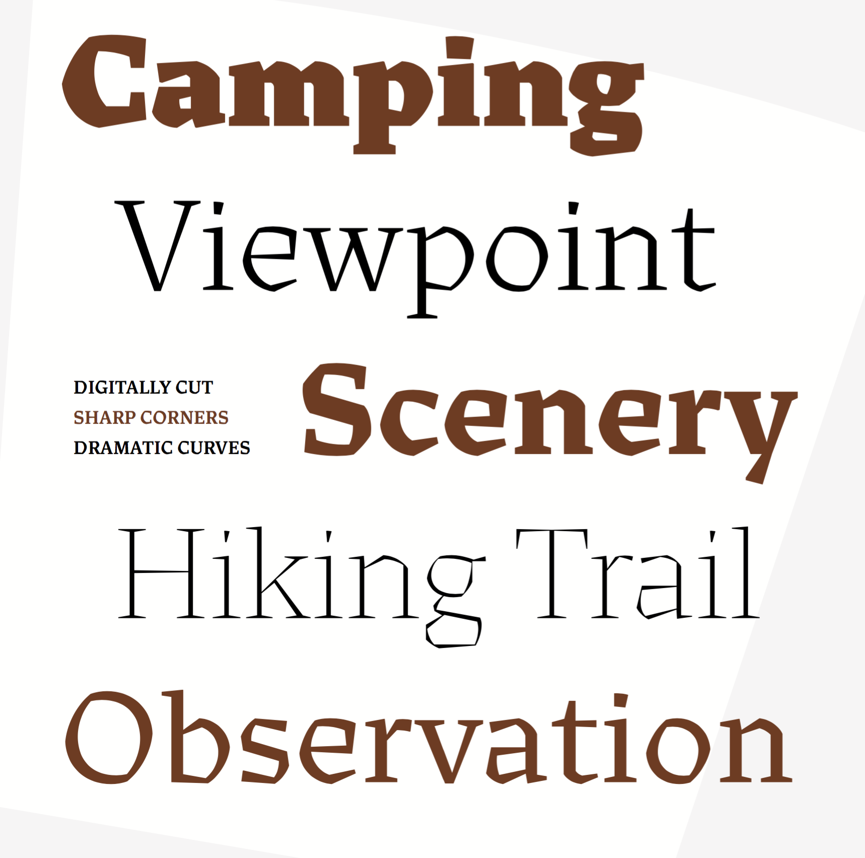
file name: Jesse Ragan Cedar 2020
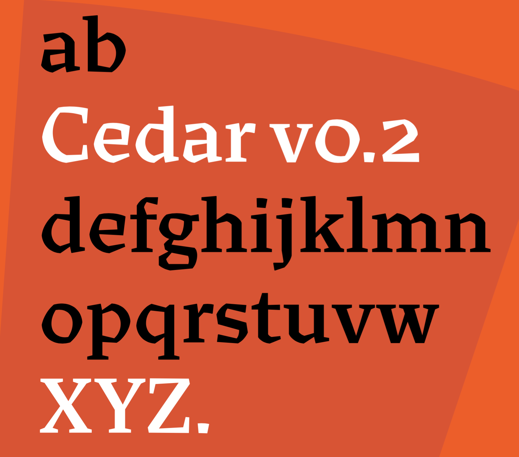
file name: Jesse Ragan Cedar 2020

file name: Jesse Ragan Cedar 2020
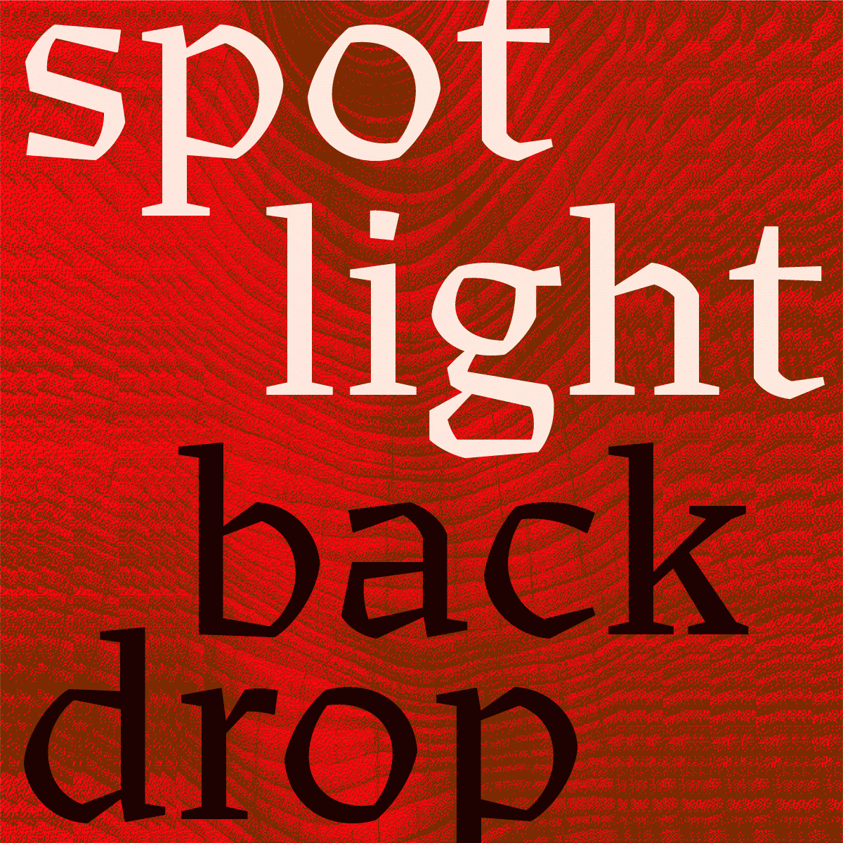
file name: Jesse Ragan Cedar 2020

file name: Jesse Ragan Cedar 2020
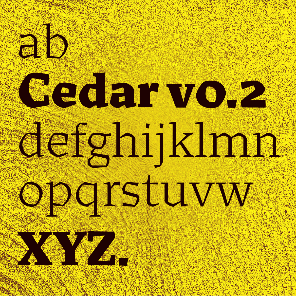
file name: Jesse Ragan Cedar 2020
file name: Jesse Ragan Cedar 2020
file name: Jesse Ragan Cedar 2020
file name: Jesse Ragan Cedar

file name: Jesse Ragan Decorated R 2009
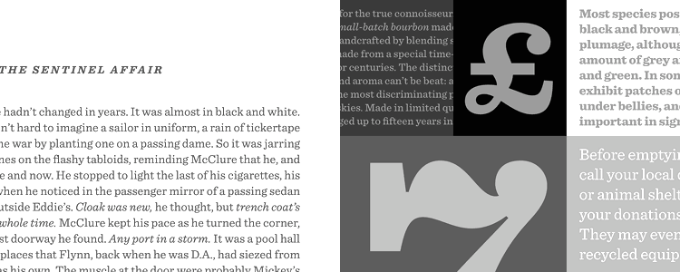
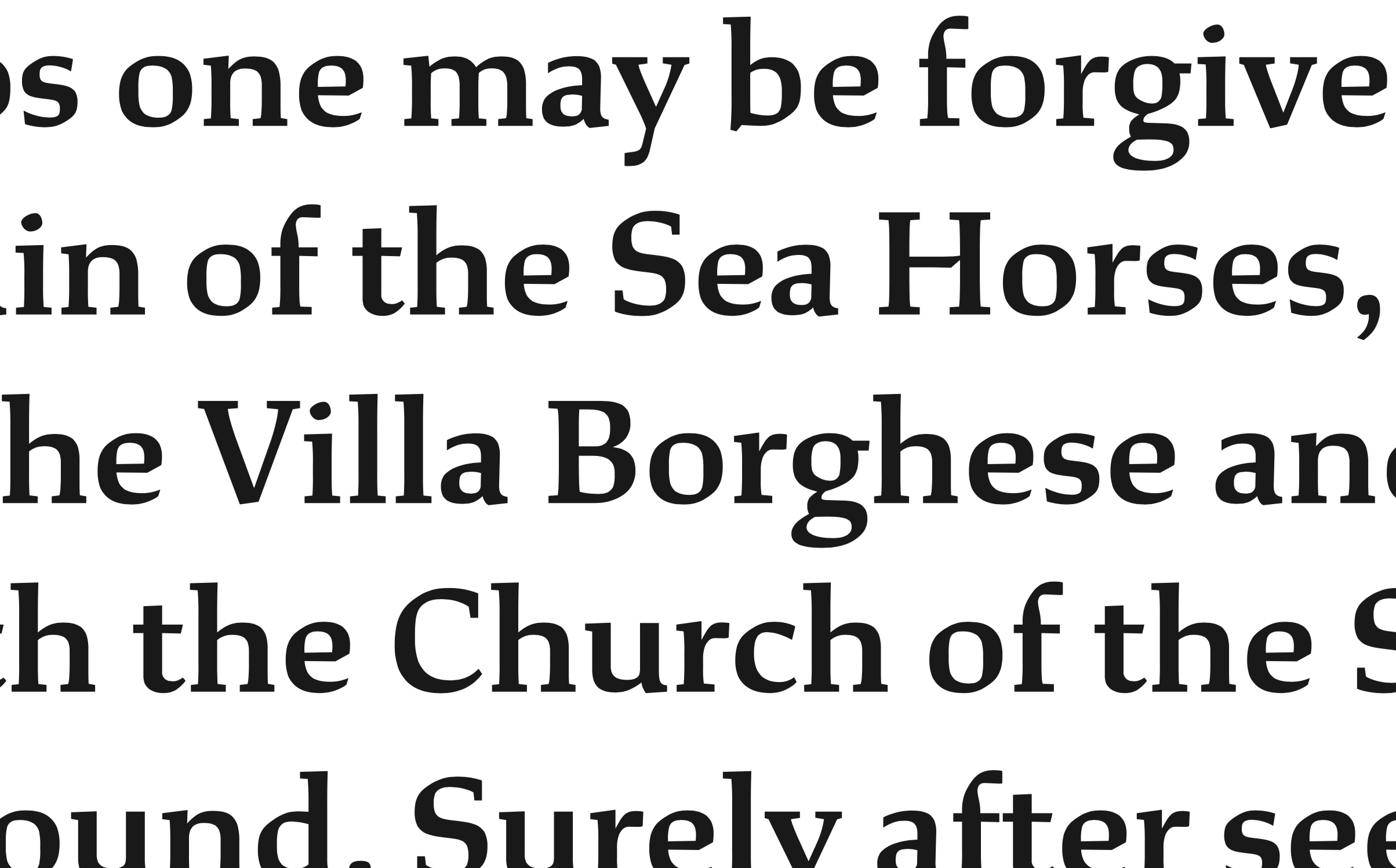
file name: Hoefler Frere Jones Sentinel 1999
file name: Hoefler Frere Jones Sentinel 1999b
file name: Hoefler Frere Jones Sentinel 1999c
file name: Hoefler Frere Jones Sentinel 1999d

file name: Hoefler Frere Jones Sentinel 1999e
file name: Hoefler Frere Jones Sentinel 1999f

file name: Hoefler Frere Jones Sentinel 1999g

file name: Hoefler Frere Jones Sentinel 1999h
file name: Hoefler Frere Jones Sentinel 1999i

file name: Hoefler Sentinel Ornaments 2020

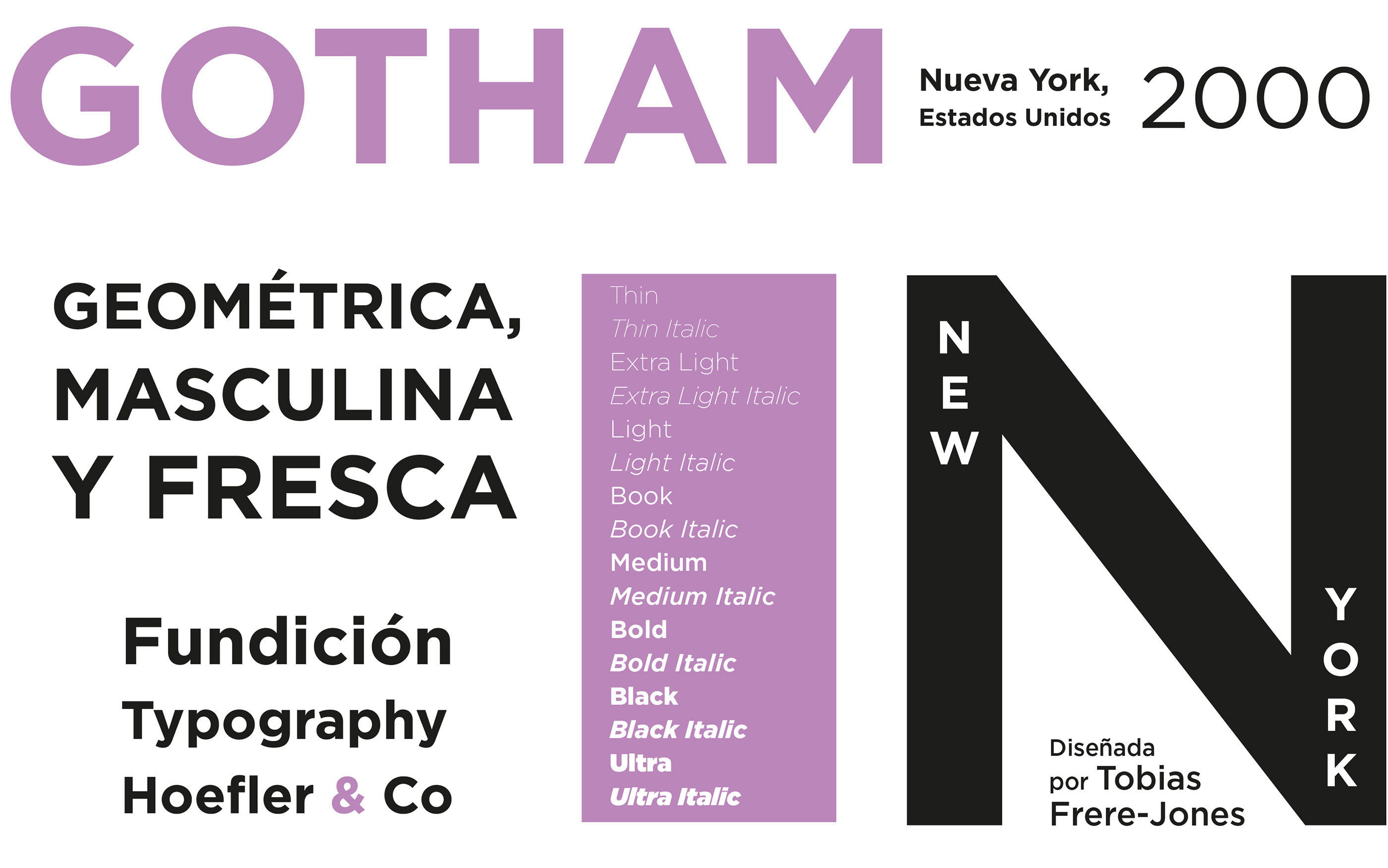
file name: Jesse Ragan Hoefler Frere Jones Typefaces 2001 2005
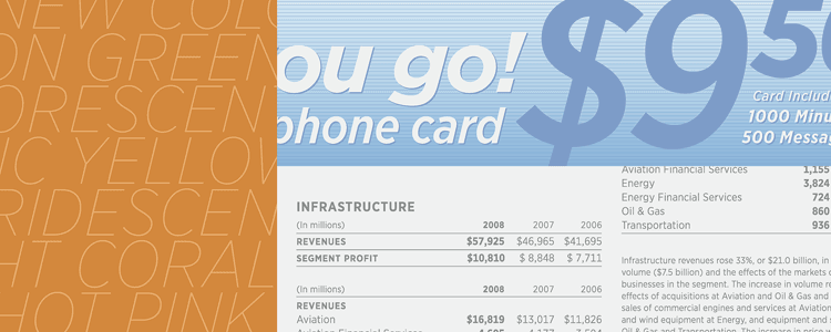
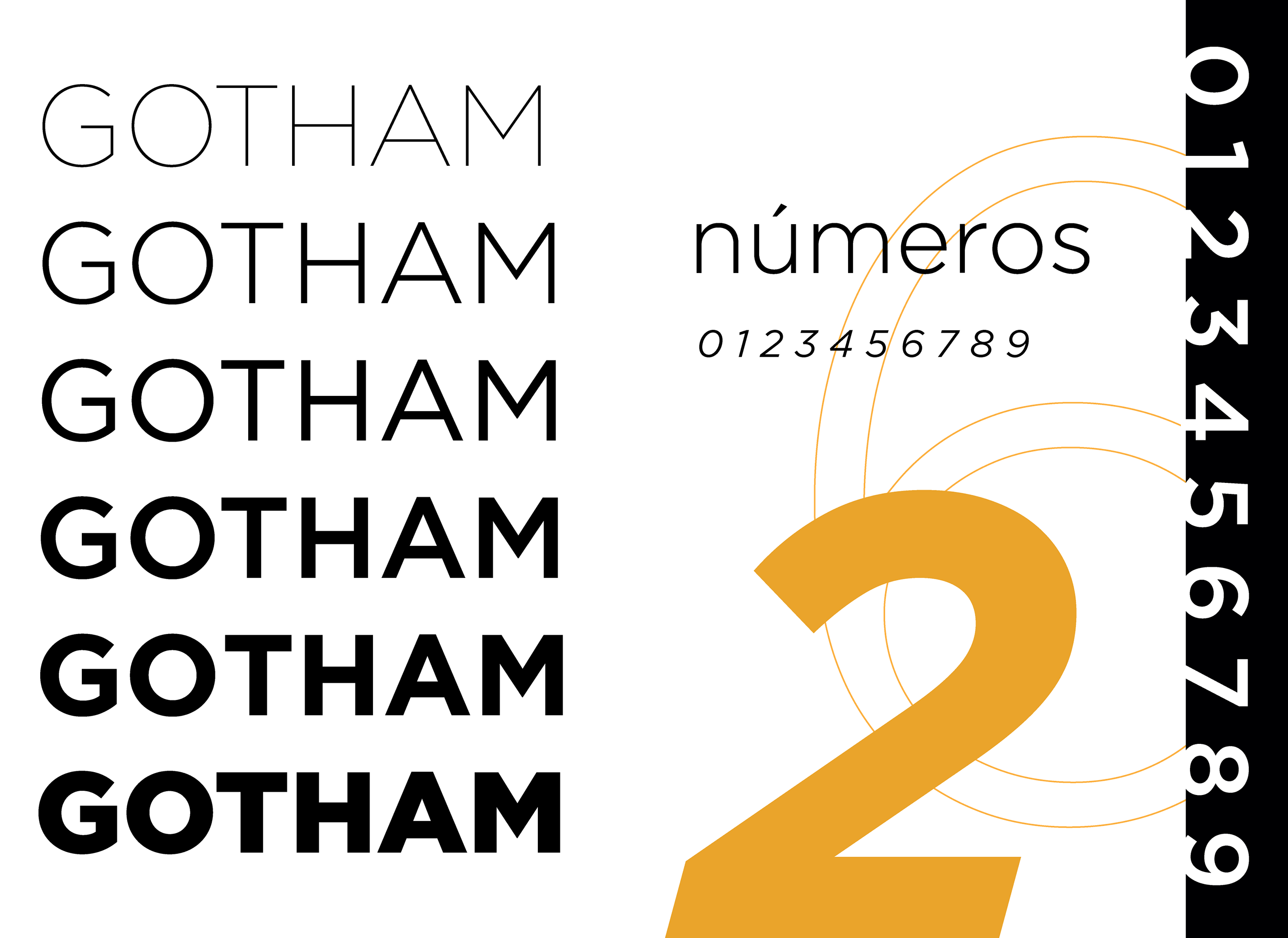
file name: Tobias Frere Jones Jesse M Ragan Gotham 2003 01

file name: Tobias Frere Jones Jesse M Ragan Gotham 2003 02
file name: Tobias Frere Jones Jesse M Ragan Gotham 2003 03

file name: Tobias Frere Jones Jesse M Ragan Gotham 2003 04

file name: Tobias Frere Jones Jesse M Ragan Gotham 2003 05
file name: Tobias Frere Jones Jesse M Ragan Gotham 2003 07

file name: Tobias Frere Jones Jesse M Ragan Gotham 2003 08
file name: Tobias Frere Jones Jesse M Ragan Gotham 2003 09
file name: Tobias Frere Jones Jesse M Ragan Gotham 2003 12
file name: Tobias Frere Jones Jesse M Ragan Gotham 2003 14
file name: Tobias Frere Jones Jesse M Ragan Gotham 2003 15
file name: Tobias Frere Jones Jesse M Ragan Gotham 2003 16

file name: Tobias Frere Jones Jesse M Ragan Gotham 2003 17
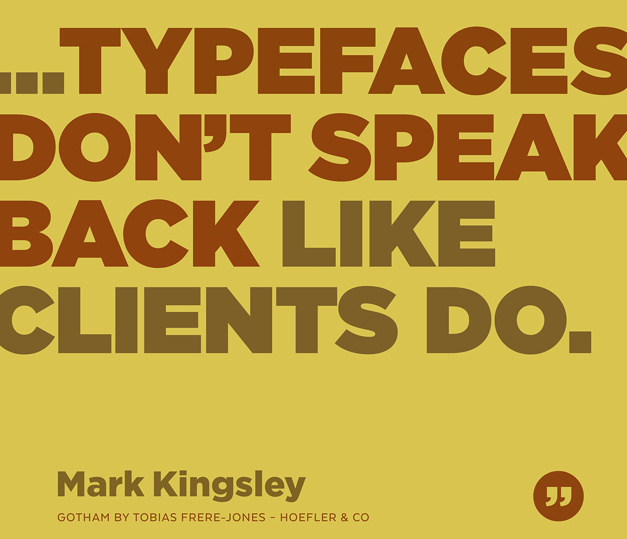
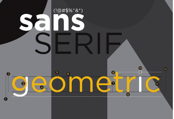
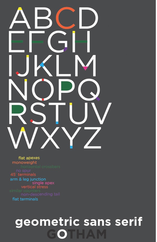
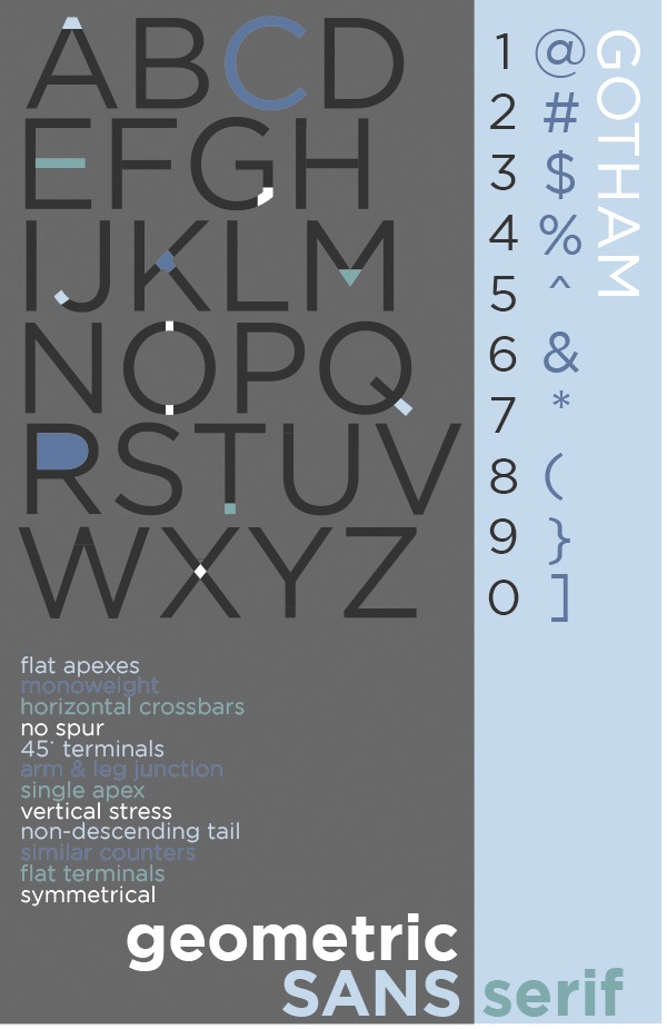
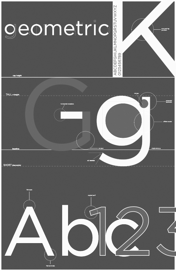
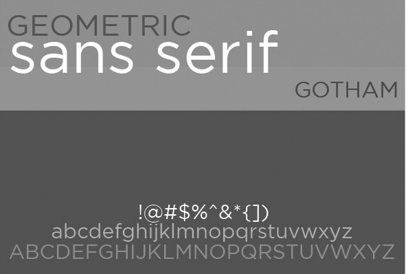
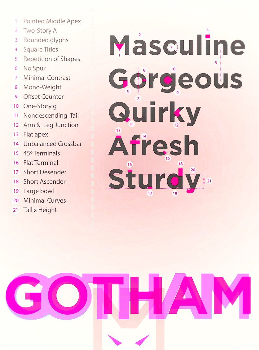
file name: Tobias Frere Jones Jesse M Ragan Gotham 2003 Poster by Bill Dawson 2015
file name: Tobias Frere Jones Jesse M Ragan Gotham 2003 Poster by Camila Cardoso 2018
file name: Tobias Frere Jones Jesse M Ragan Gotham 2000 poster by Catalina Mora Norembuena 2019
file name: Tobias Frere Jones Jesse M Ragan Gotham 2000 poster by Catalina Mora Norembuena 2019
file name: Tobias Frere Jones Jesse M Ragan Gotham 2000 poster by Catalina Mora Norembuena 2019
file name: Tobias Frere Jones Jesse M Ragan Gotham 2000 poster by Catalina Mora Norembuena 2019
file name: Tobias Frere Jones Jesse M Ragan Gotham 2000 poster by Catalina Mora Norembuena 2019
file name: Tobias Frere Jones Jesse M Ragan Gotham 2000 poster by Catalina Mora Norembuena 2019copy

file name: Hoefler Gotham Black 2003
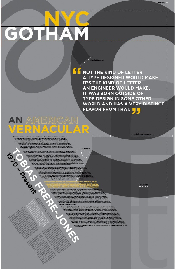
file name: Tobias Frere Jones Jesse M Ragan Gotham 2003 Poster by Jen Beck 2013b
file name: Tobias Frere Jones Jesse M Ragan Gotham 2003 Poster by Jen Beck 2013c

file name: Tobias Frere Jones Jesse M Ragan Gotham 2003 Poster by Jen Beck 2013e
file name: Tobias Frere Jones Jesse M Ragan Gotham 2003 Poster by Jen Beck 2013f
file name: Tobias Frere Jones Jesse M Ragan Gotham 2003 Poster by Jen Beck 2013g
file name: Tobias Frere Jones Jesse M Ragan Gotham 2003 Poster by Jen Beck 2013i
file name: Tobias Frere Jones Jesse M Ragan Gotham 2003 Poster by Jen Beck 2013j

file name: Tobias Frere Jones Jesse M Ragan Gotham 2003 Poster by Jen Beck 2013k
file name: Tobias Frere Jones Jesse M Ragan Gotham 2003 Poster by Oshana Kewal 2016

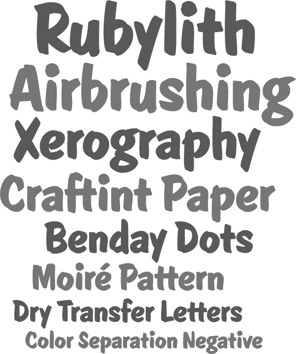
file name: Jesse Ragan Lettering 2009

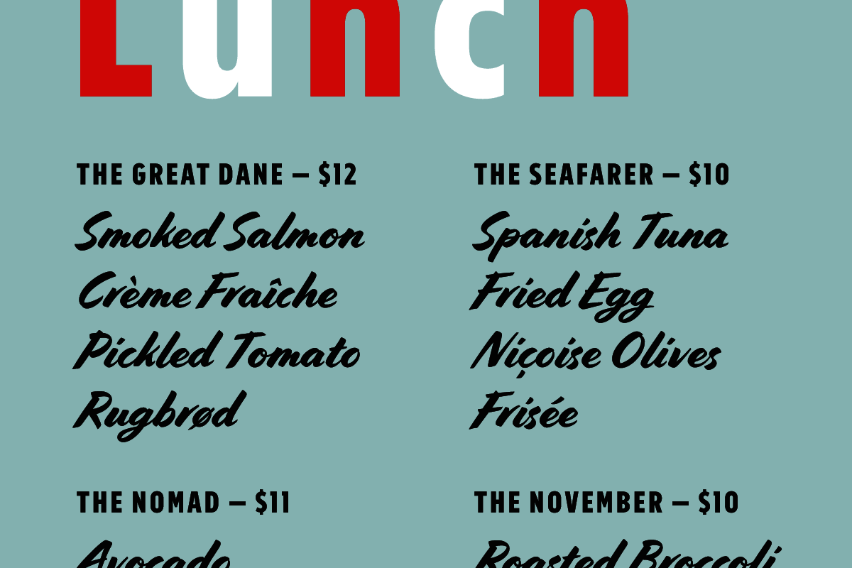
file name: Joshua Darden Jesse Ragan Omnes 2006

file name: Jesse Ragan Ruzicka Collection 2012
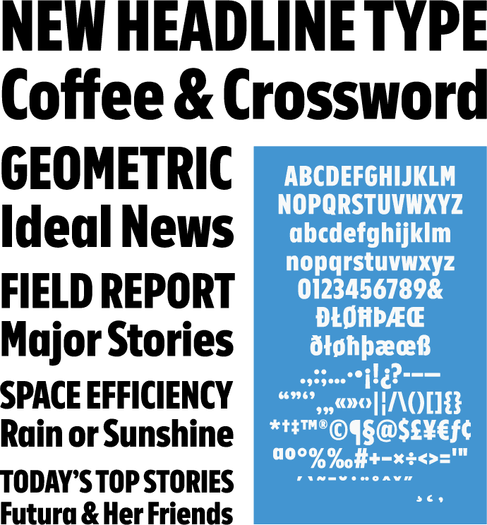
file name: Jesse Ragan U S A Today Condensed 2012

file name: Jesse Ragan U S A Today Condensed 2012b

file name: Jesse Ragan V Magazine 2011
file name: Jesse Ragan V Magazine 2011b

file name: Jesse Ragan V Magazine 2011c

file name: Jesse Ragan V Magazine 2011d

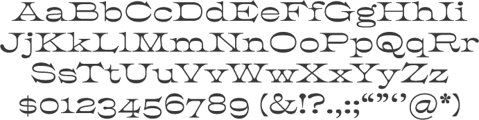
file name: Jesse Ragan Showcard Stunt 2008
file name: Jesse Ragan Showcard Stunt 2008b

file name: Jesse Ragan Showcard Stunt 2008c

file name: Jesse Ragan Pic
| | |
|
Luc Devroye ⦿ School of Computer Science ⦿ McGill University Montreal, Canada H3A 2K6 ⦿ lucdevroye@gmail.com ⦿ https://luc.devroye.org ⦿ https://luc.devroye.org/fonts.html |