TYPE DESIGN INFORMATION PAGE last updated on Sat Jun 22 21:43:55 EDT 2024
FONT RECOGNITION VIA FONT MOOSE

|
|
|
|
David Thometz's top 10 favorite text typefaces
|
EXTERNAL LINKS |
| | |

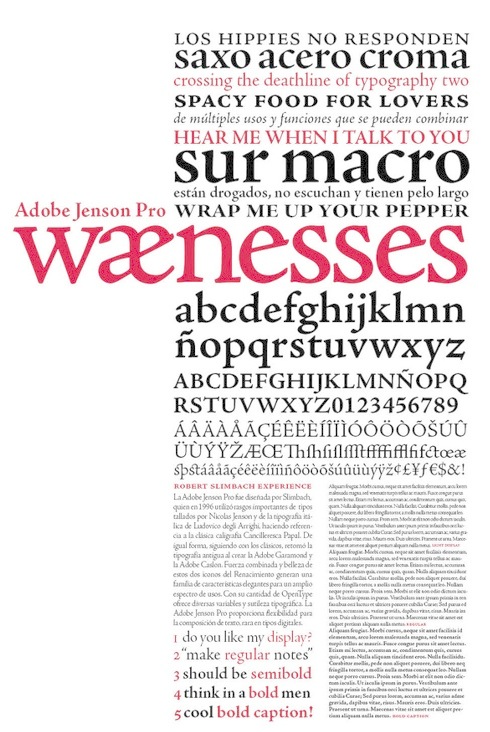
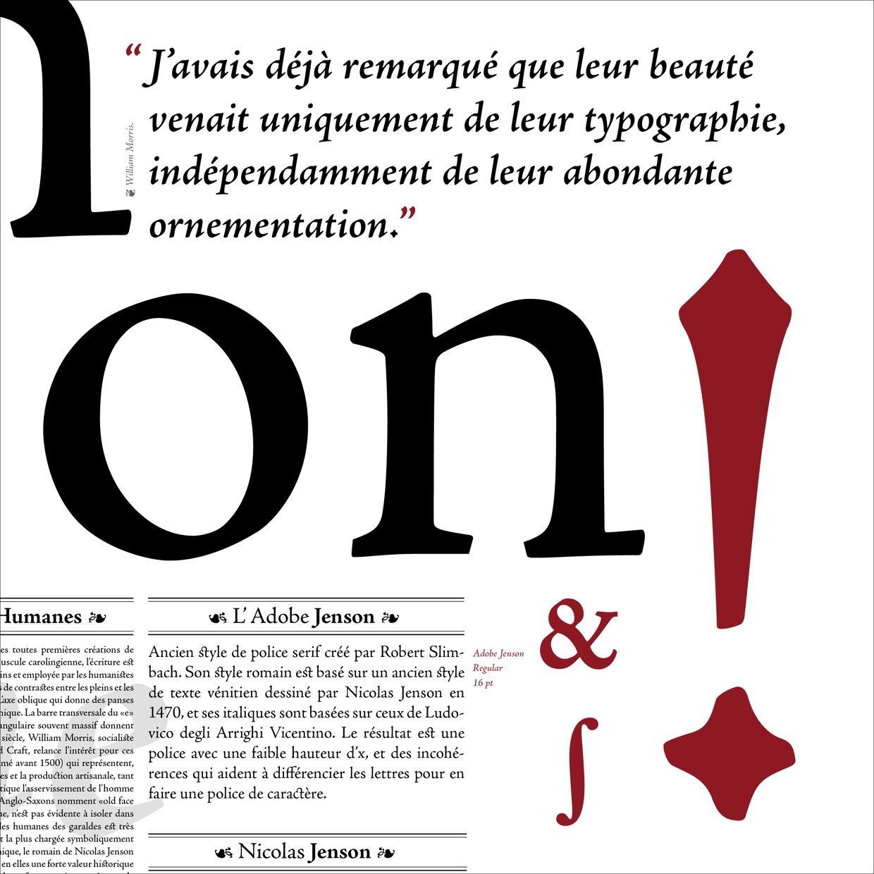
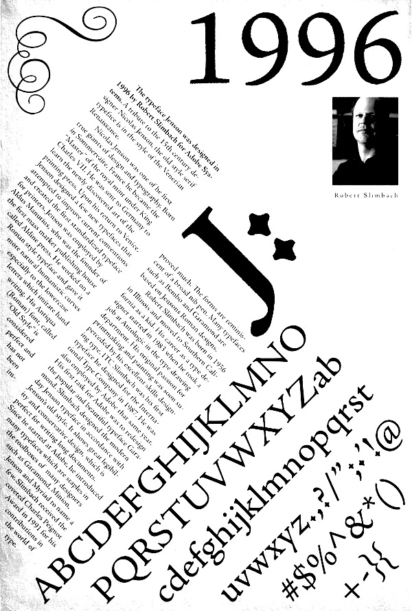
file name: Robert Slimbach Adobe Jenson Pro 1996 Poster by Gabriela Da Costa 2014
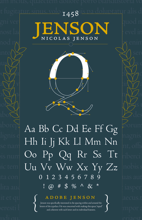
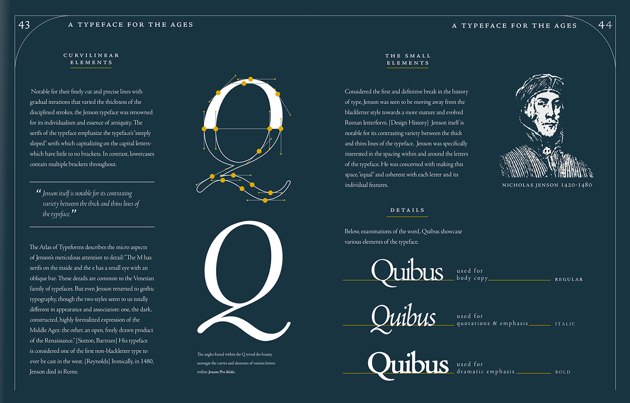
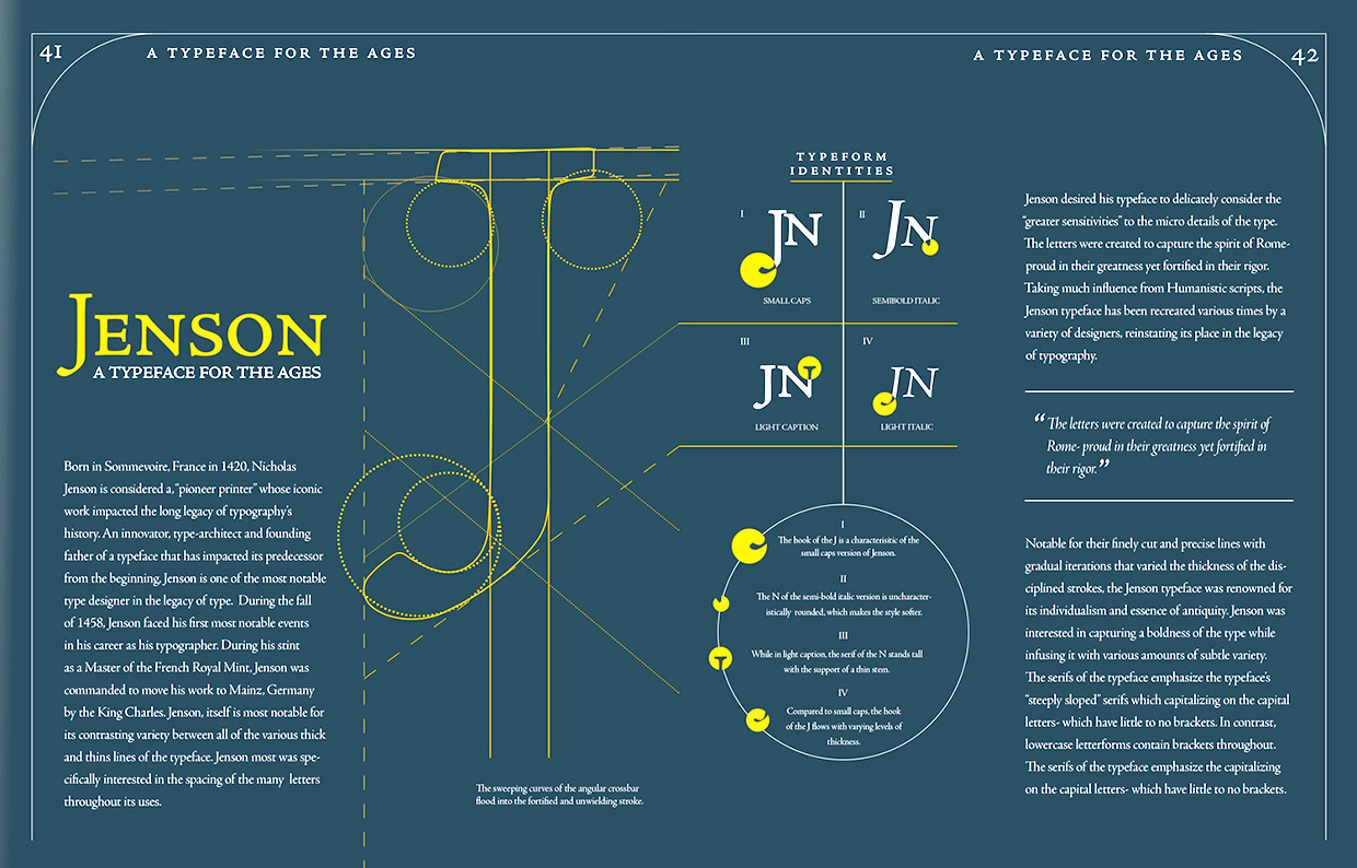
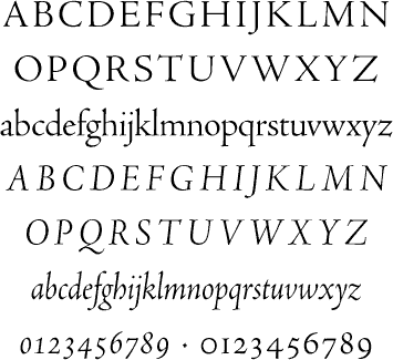
file name: Robert Slimbach Adobe Jenson Pro 1995 2000 Poster by Will Scharlott 2015
file name: Robert Slimbach Adobe Jenson Pro 1995 2000 Poster by Will Scharlott 2015b
file name: Robert Slimbach Adobe Jenson Pro 1995 2000 Poster by Will Scharlott 2015c
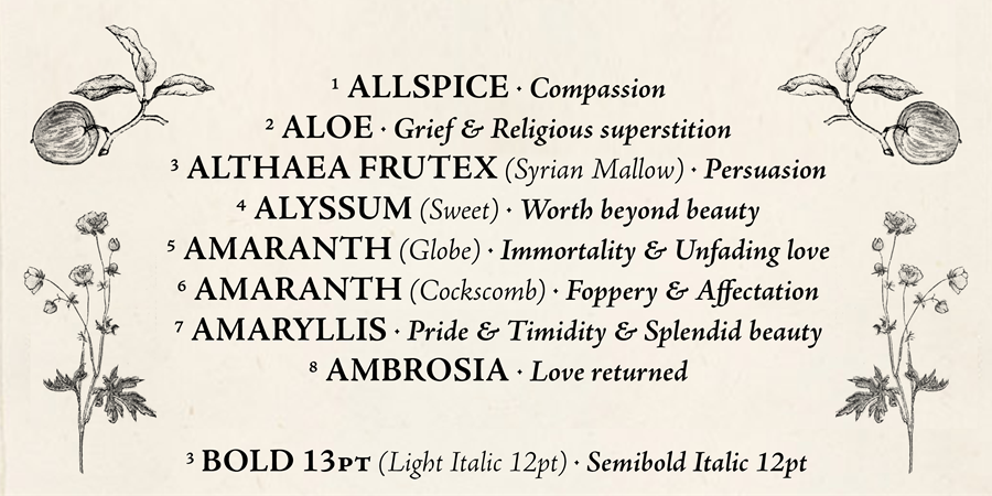
file name: Robert Slimbach Adobe Jenson Pro 1995 2000 Poster by Caroline Grimprel Anselme Calabrese 2014
file name: Robert Slimbach Adobe Jenson Pro 1995 2000 Poster by Caroline Grimprel Anselme Calabrese 2014b
file name: Robert Slimbach Adobe Jenson Pro 1995 2000 Poster by Caroline Grimprel Anselme Calabrese 2014c
file name: Robert Slimbach Adobe Jenson Pro 1995 2000 Poster by Caroline Grimprel Anselme Calabrese 2014d
file name: Robert Slimbach Adobe Jenson Pro 1995 2000 Poster by Caroline Grimprel Anselme Calabrese 2014e
file name: Robert Slimbch Adobe Jenson

file name: Robert Slimbach Adobe Jenson Pro 1995 2000
file name: Robert Slimbach Adobe Jenson Pro 1995 2000
file name: Carlos Perez Adobe Jenson Slimbach Jenson Poster 2011

file name: Linotype Stempel Garamond after Stempel Stempel Garamond 1925

file name: Linotype Stempel Garamond after Stempel Stempel Garamond 1925 3
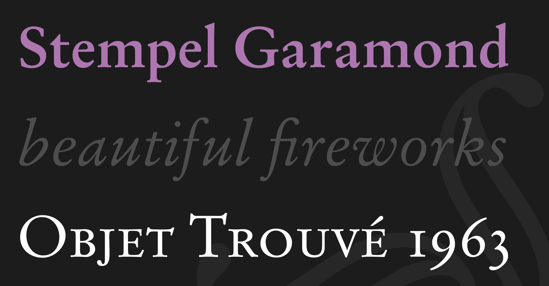
file name: Linotype Stempel Garamond after Stempel Stempel Garamond 1925
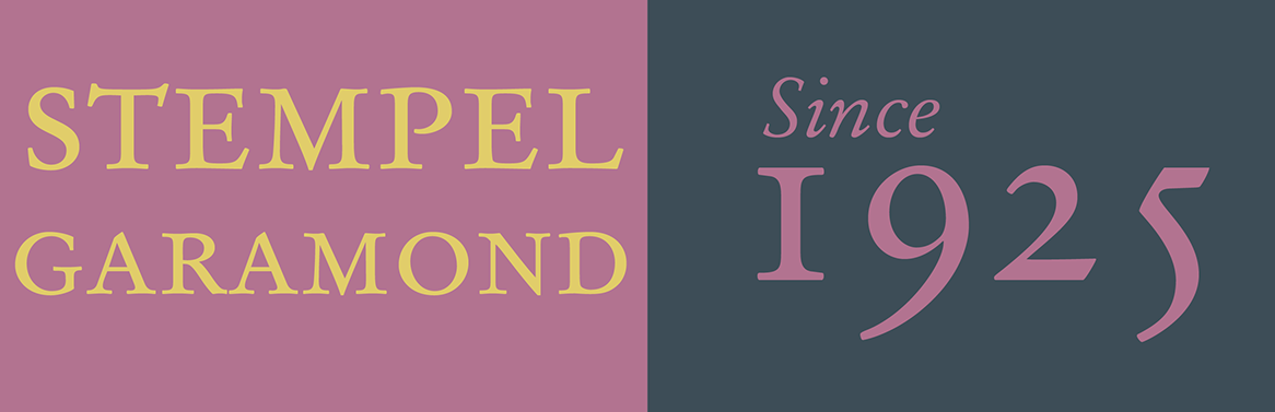
file name: Stempel Stempel Garamond 1925 Poster by Karin Thompson 2016

file name: Stempel Garamond 1925 1936 Stempel Garamond 1925 1936
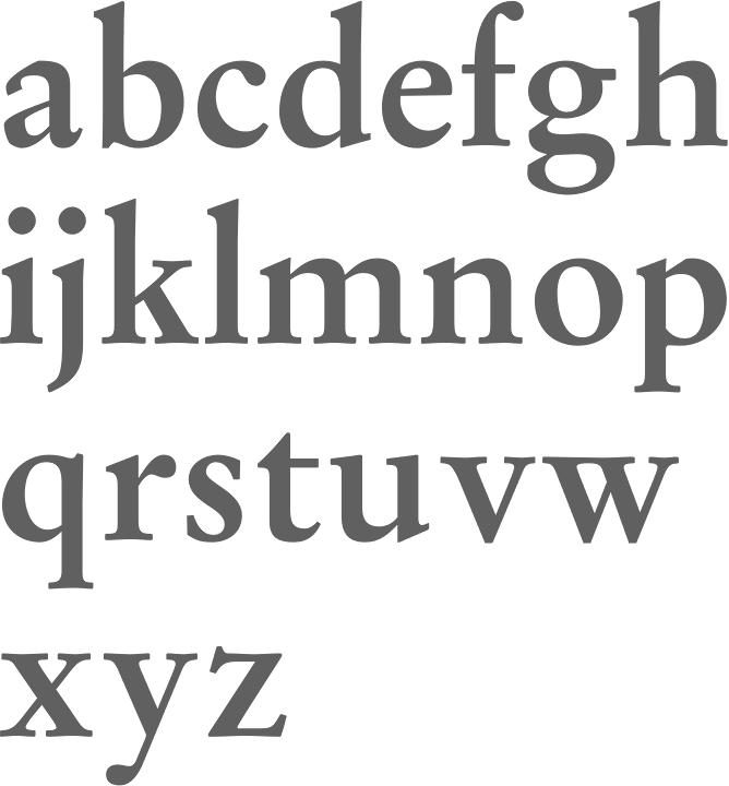
file name: Stempel Garamond 1925 1936 Stempel Garamond Bold 1925 1936
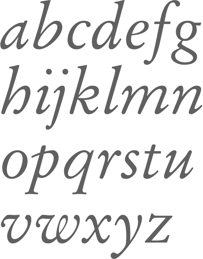
file name: Stempel Garamond 1925 1936 Stempel Garamond Italic O S F 1925 1936

file name: Monotype Perpetua Pro Titling Bold
file name: Monotype Perpetua Roman
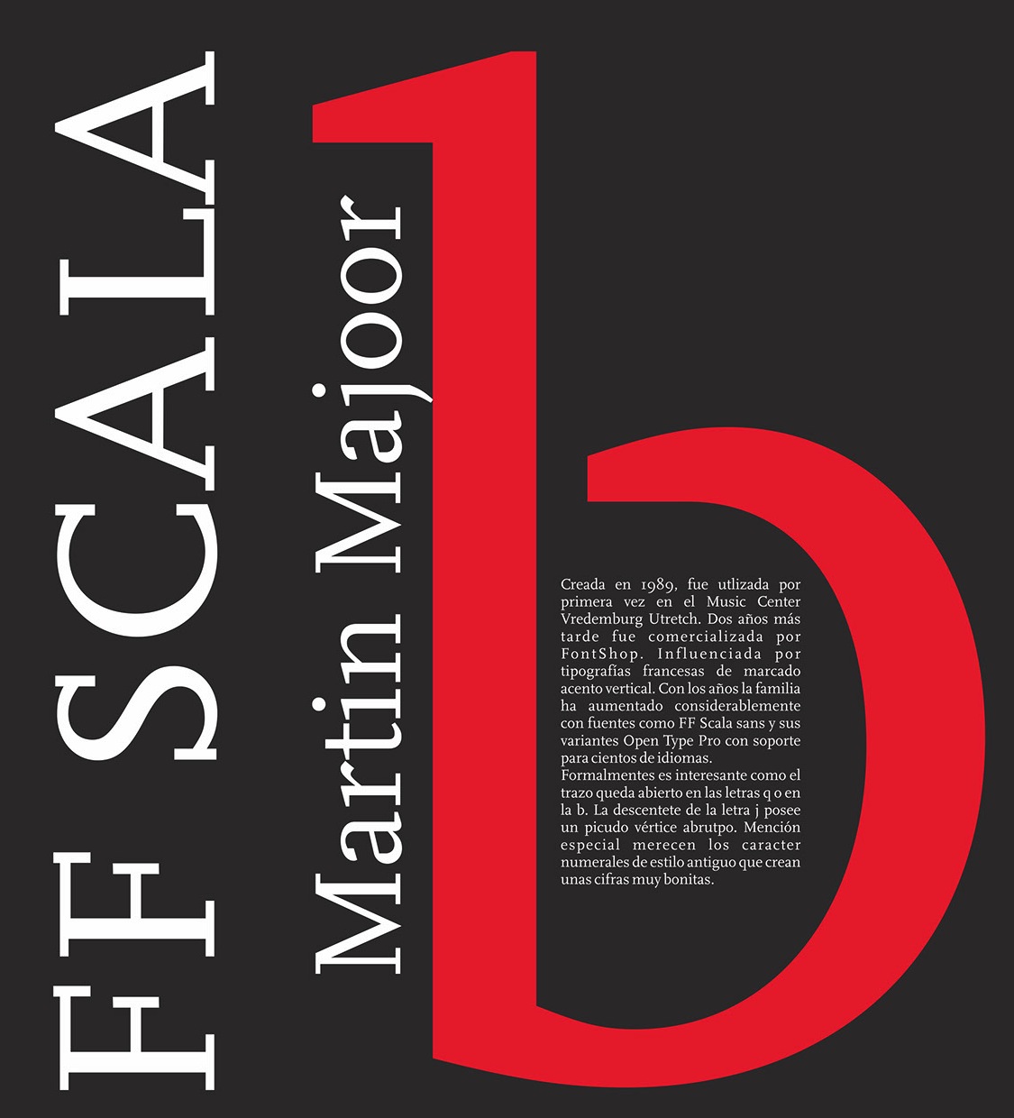
file name: Martin Majoor F F Scala 1989 Poster by Marina Morales 2015
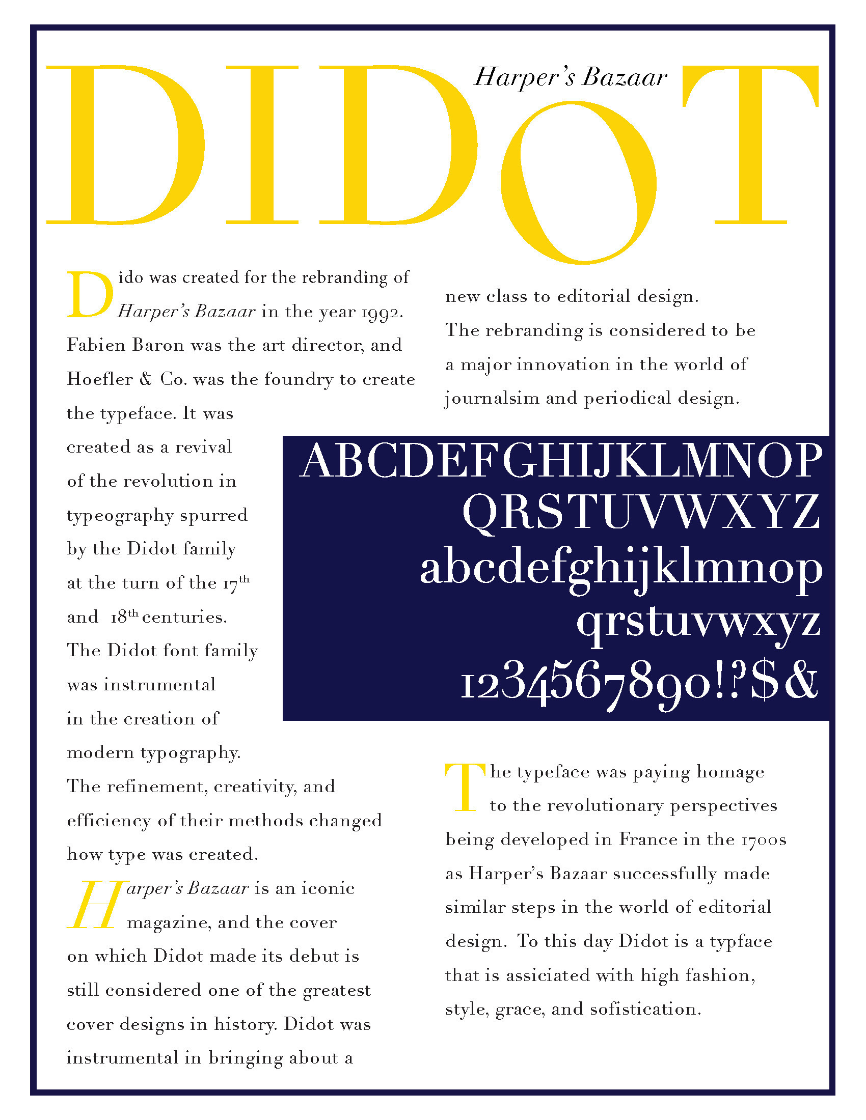
file name: Hoefler H T F Didot 1991 Poster by Tony Mungiguerra
file name: Hoefler H T F Didot 1991
file name: Hoefler H T F Didot 1991b
file name: Hoefler H T F Didot 1991c
file name: Berthold Bodoni B E Bold

file name: Berthold Bodoni B E Bold Condensed
file name: Berthold Bodoni Berthold B Q Medium
file name: Berthold Bodoni Berthold B Q
file name: Berthold Bodoni Berthold B Q Cond Bold

file name: Frantisek Storm Serapion 2002
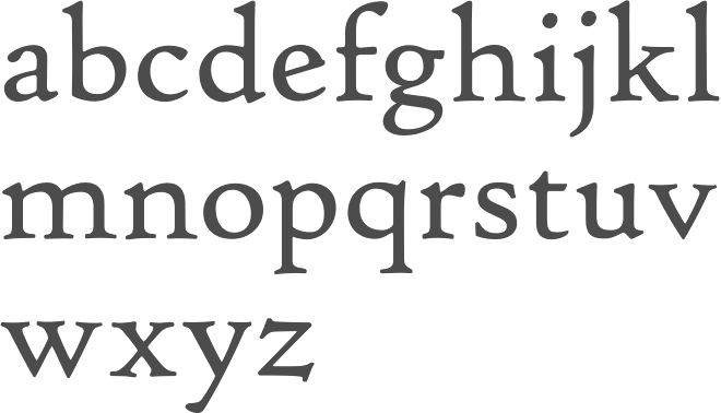
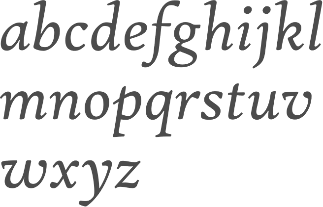
file name: Nicolas Jenson Bruce Rogers Frederic Warde Monotype Centaur 1928 1930
file name: Nicolas Jenson Bruce Rogers Frederic Warde Monotype Centaur Bold 1928 1930
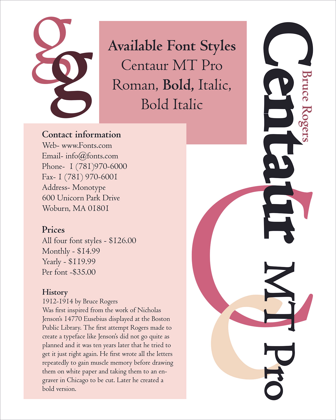
file name: Monotype Centaur M T Pro after Bruce Rogers 1912 1914 Poster by Addalee Carter 2016

file name: Tobias Frere Jones Hightower 1994

file name: Tobias Frere Jones Hightower 1994 1996
file name: Tobias Frere Jones Hightower 1994 1996b
file name: Tobias Frere Jones Hightower 1994 1996c

file name: Tobias Frere Jones Hightower 1994 1996d
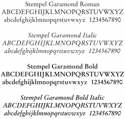
file name: Stempel Garamond
file name: Zuzana Licko Mrs Eaves 2002
file name: Zuzana Licko Mrs Eaves Bold 2002
file name: Zuzana Licko Mrs Eaves Caps 2002
| | |
|
Luc Devroye ⦿ School of Computer Science ⦿ McGill University Montreal, Canada H3A 2K6 ⦿ lucdevroye@gmail.com ⦿ http://luc.devroye.org ⦿ http://luc.devroye.org/fonts.html |