TYPE DESIGN INFORMATION PAGE last updated on Wed May 6 16:13:20 EDT 2026
FONT RECOGNITION VIA FONT MOOSE

|
|
|
|
Keystone Type Foundry
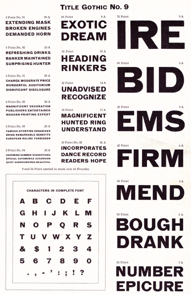
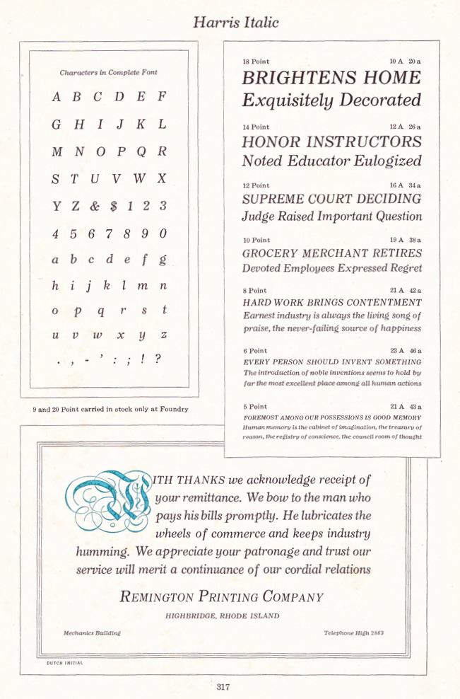
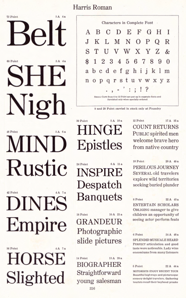
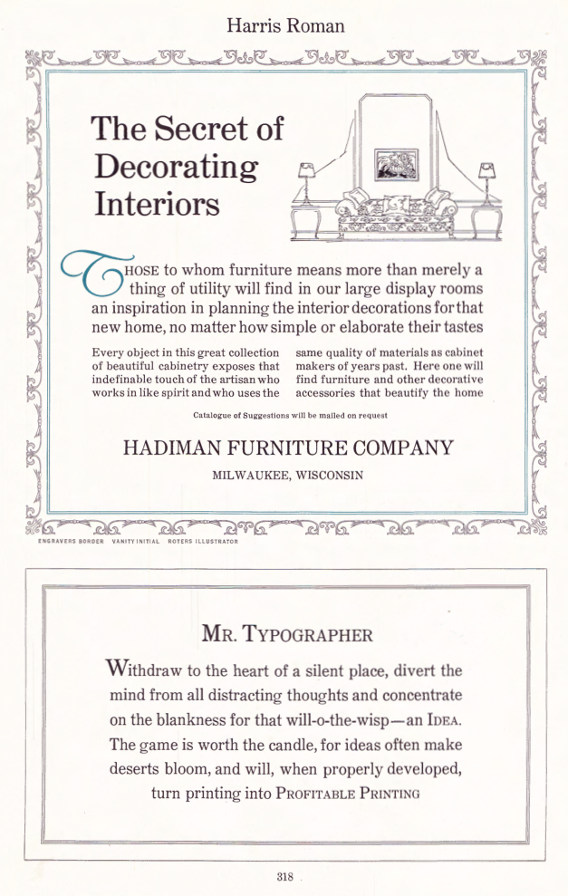
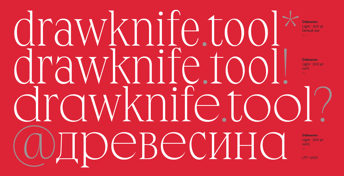
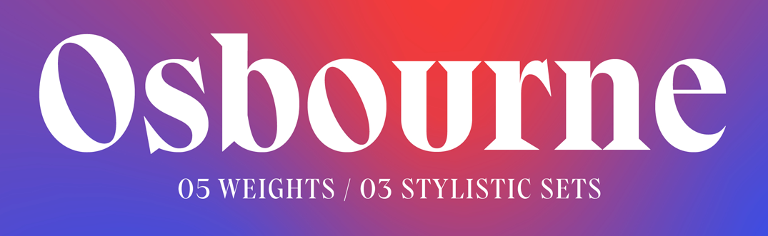
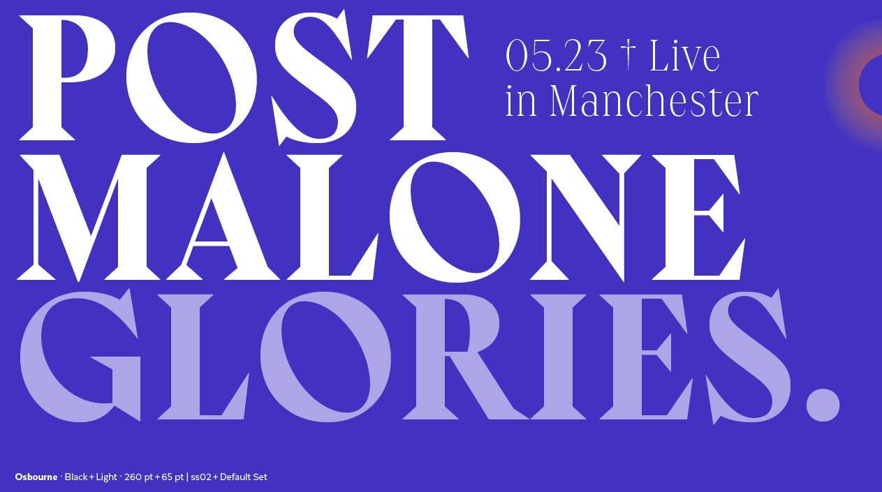
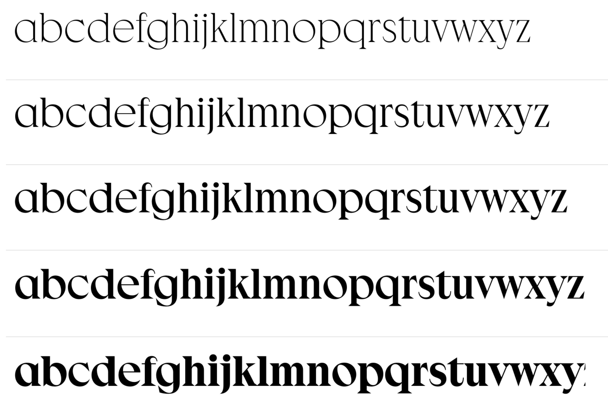
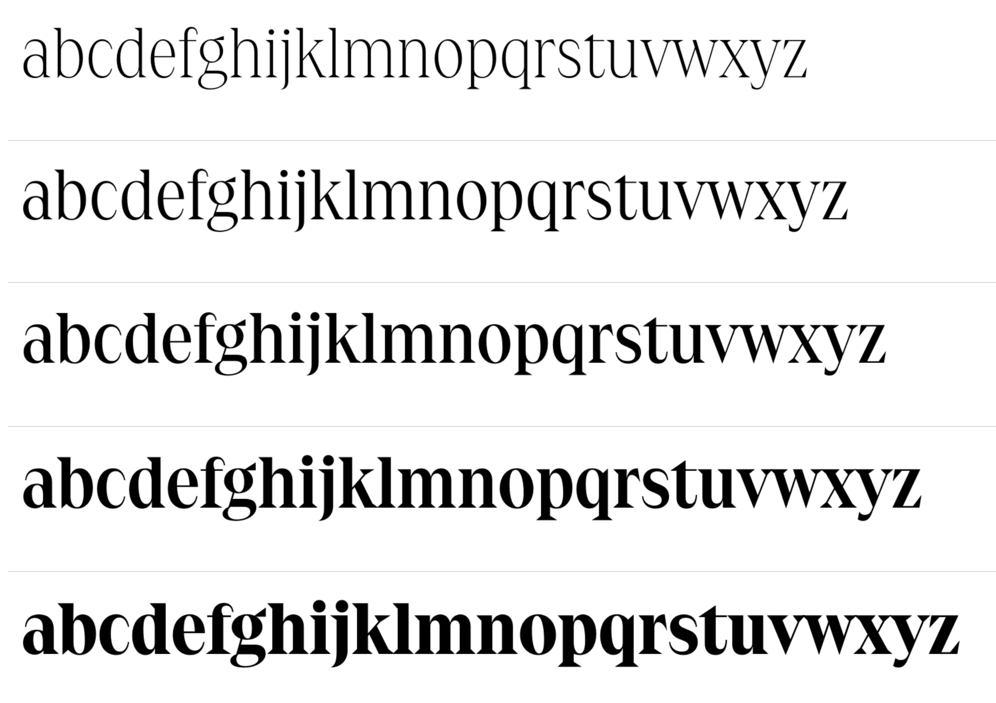
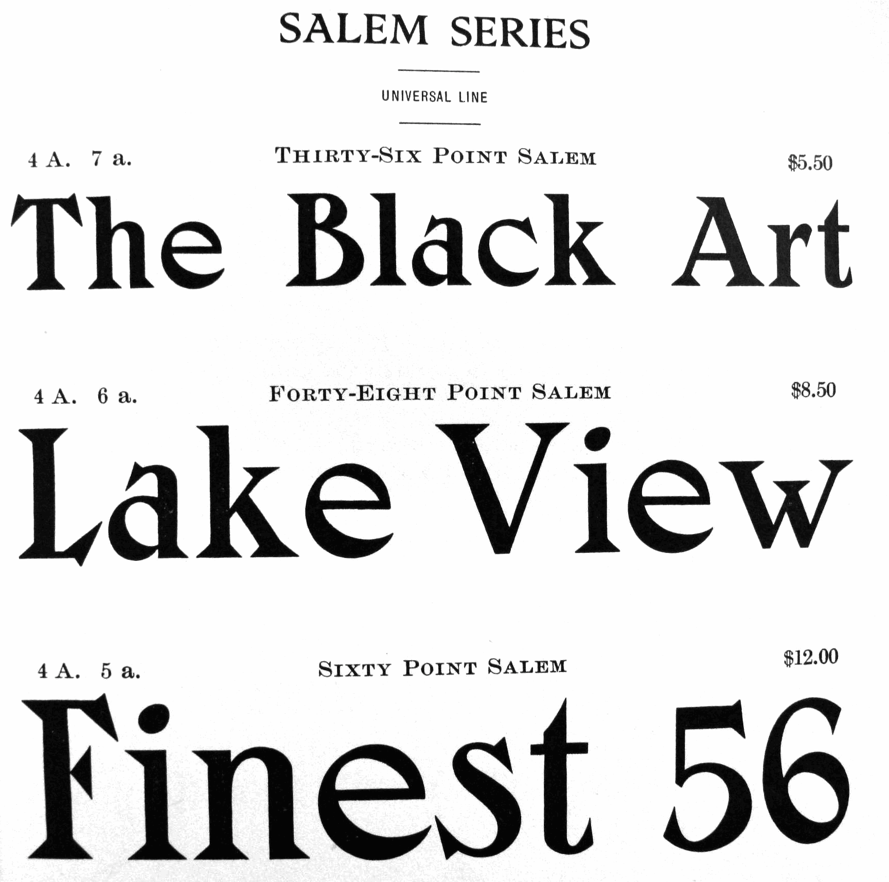
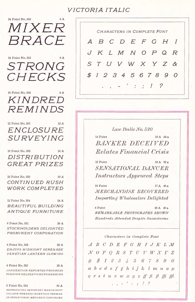
Philadelphia-based foundry, 1888-1917. The history of this short-lived foundry was told by James Eckmann in The Keystone Type Foundry, 1888-1917: a reprint [from] Printing&graphic arts, volume VI, number 1, February 1958 (Lunenburg, Vermont: The Stinehour Press, 1958). Their work appeared in Keystone Type Foundry, 1901 (362 pages), Abridged specimen book, type: nickel-alloy on universal line comprising a price list of types, borders, leads and slugs, brass rule, brass galleys; miscellaneous cuts and general supplies for printers (1906, 636 pages, see also here, here and here), A book of Keystone type typefaces (2nd ed., Philadelphia, ca. 1920), Catalogue and specimen book. Keystone products, consisting of type, material, furniture, complete line of miscellaneous supplies for printers and publishers, machinery and wood goods (Philadelphia, ca. 1910), See also Keystone Products Catalogue and Specimen Book, Consisting of Type, Material, Furniture, Complete Line of Miscellaneous Supplies for Printers and Publishers, Machinery and Wood Goods (1915). Typefaces: Admiral, Ayer (Mac McGrew: Ayer was introduced by Keystone Type Foundry in 1909, which said it was "named for F. Wayland Ayer, founder of Keystone Type Foundry and the great advertising agency which bears his name." The non-kerning italic was added in 1910.), Ben Franklin, Ben Franklin Condensed, Ben Franklin Open, Bulletin, Caslon Adbold, Caslon Adbold Extended, Caslon Adbold Extra Condensed, Caslon Bold, Caslon Bold Condensed, Caslon Bold Extended, Caslon Bold Italic, Caslon Lightface, Caslon Lightface Condensed, Caslon Lightface Italic, Caslon Title Extended, Charcoal, Charter Oak (1899), Compressed Gothic, Condensed Lining Gothic, Crayonette, Elite Typewriter, Gothic Condensed No. 3, Gothic No. 102, Gothic No. 114, Harris Italic (1910), Harris Roman (1909), Herculean Gothic, Italia Condensed (1906), John Alden Decorative Initials (1906), John Hancock, John Hancock Condensed, John Hancock Extended, John Hancock Outline, Keystone Gothic, Laureate (1906: revived in 2012 by Isabel Urbina), Lining Antique [Keystone], London Gothic (1910 or earlier), New Model Remington Typewriter, Outline, Outline Condensed, Remington, Remington Typewriter, Round Gothic (1884), Skeleton Lining Gothic, Skeleton Lining Gothic No. 19, Smith Premier, Title Gothic [Title Gothic No. 9, Condensed Title Gothic No. 11], Venezia, Washington Text (1902, blackletter), Washington Text Shaded. Digital pictures I took from the Specimen Book of Type (1903): Bulletin, Keystone Bikes, Boldface Cellini, Crayonette Open, Keystone Cyclers, Encore, Lining Antique, Lining Gothic, Outing Initials, Remington Typewriter, Remus, Ronde Initials, Salem (a wedge serif revived in 2021 by Latinotype as Osbourne), Venezia, Victoria Italic, Worcester. Catalog A-C, Catalog C-P, Catalog P-Z. Digitizations:
Comments by Mac McGrew:
|
EXTERNAL LINKS |
| | |

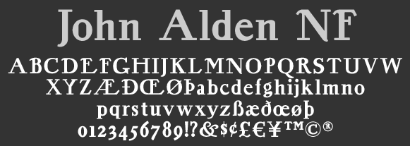
file name: Nick Curtis John Alden N F after A T F 1884
file name: Nick Curtis John Alden N F 2010 based on A T F1884

file name: Jeff Levine Keyden Drop Caps J N L 2021
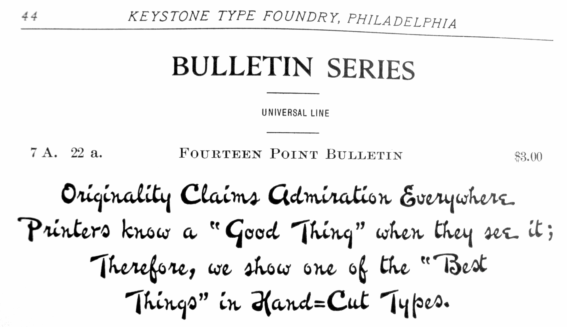
file name: Keystone Bulletin
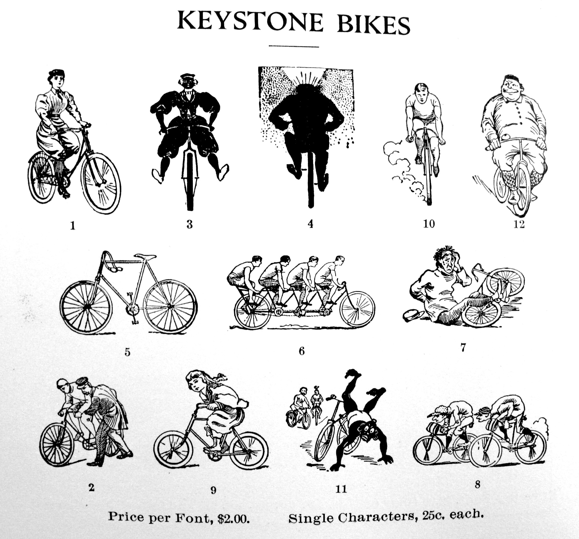
file name: Keystone Bikes
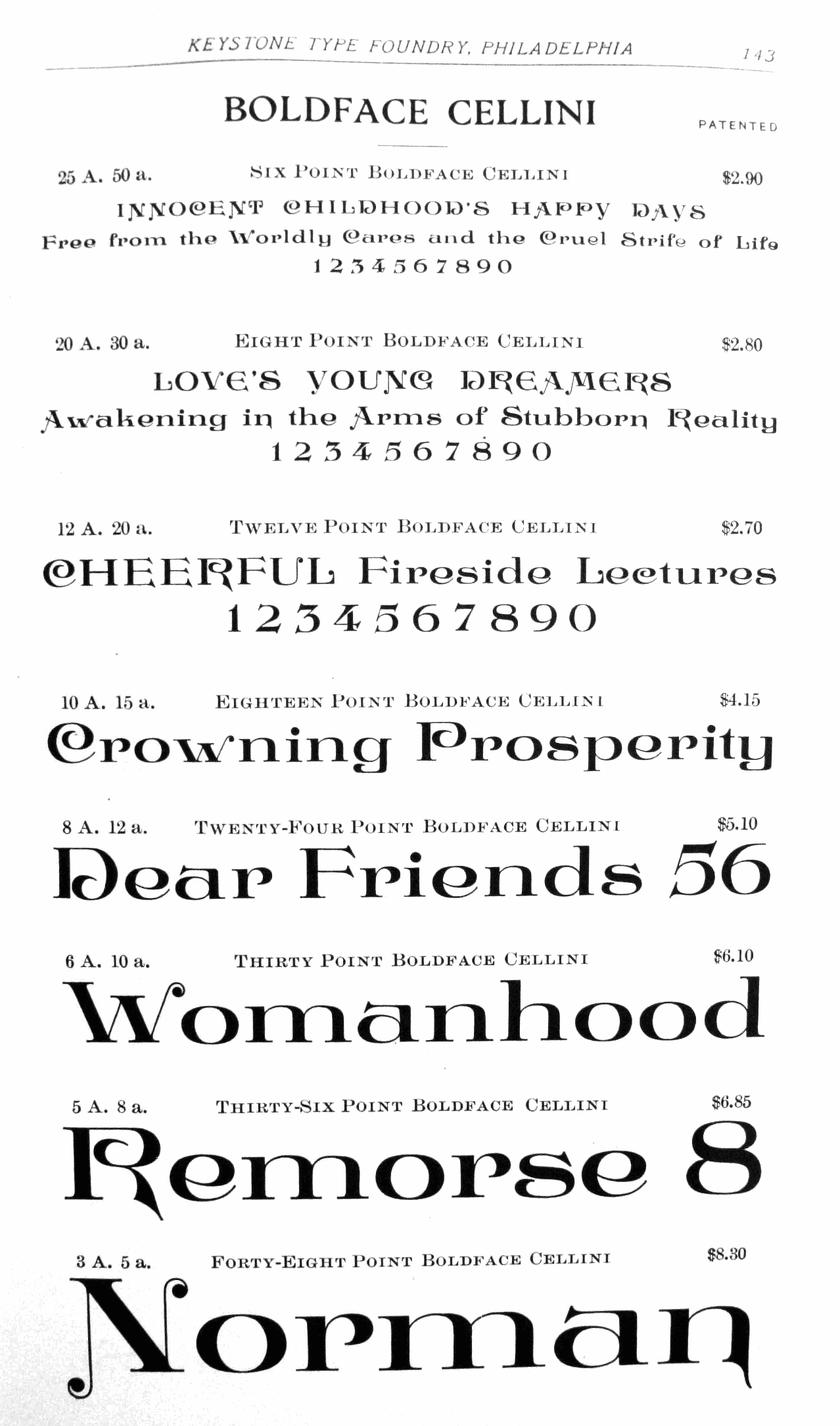
file name: Keystone Boldface Cellini
file name: Keystone Catalog I
file name: Keystone Catalog I I
file name: Keystone Catalog I V

file name: Keystone Crayonette Open
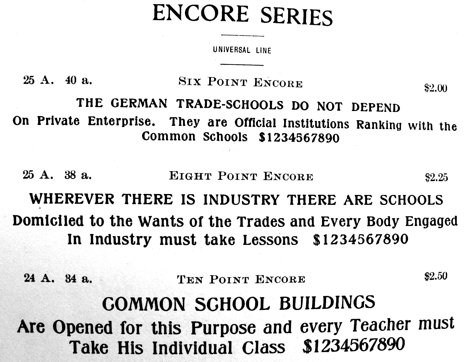
file name: Keystone Encore
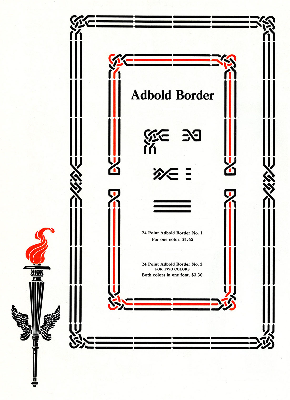
file name: Keystone Type Foundry Caslon Adbold Group
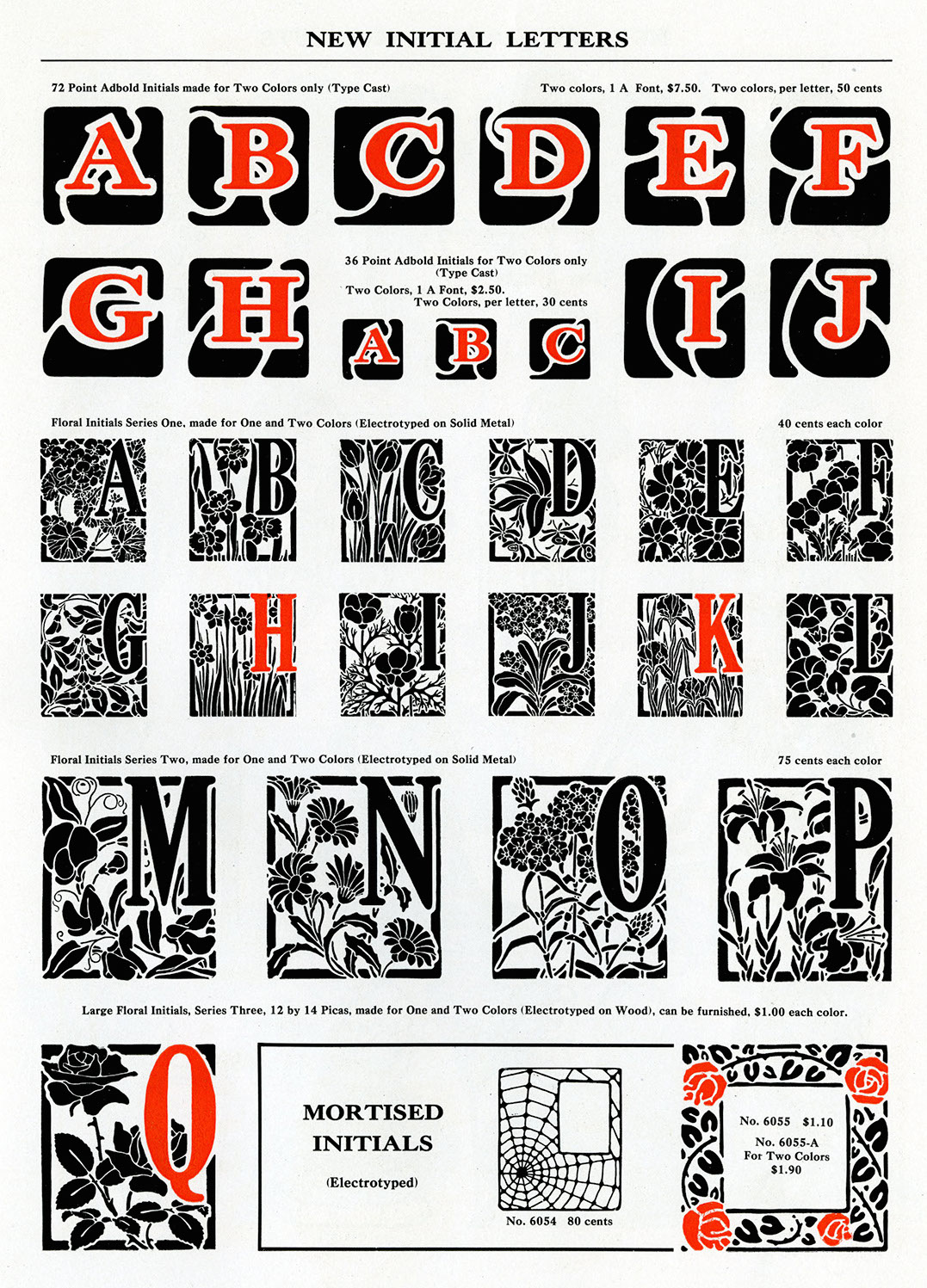
file name: Keystone Type Foundry Caslon Adbold Group
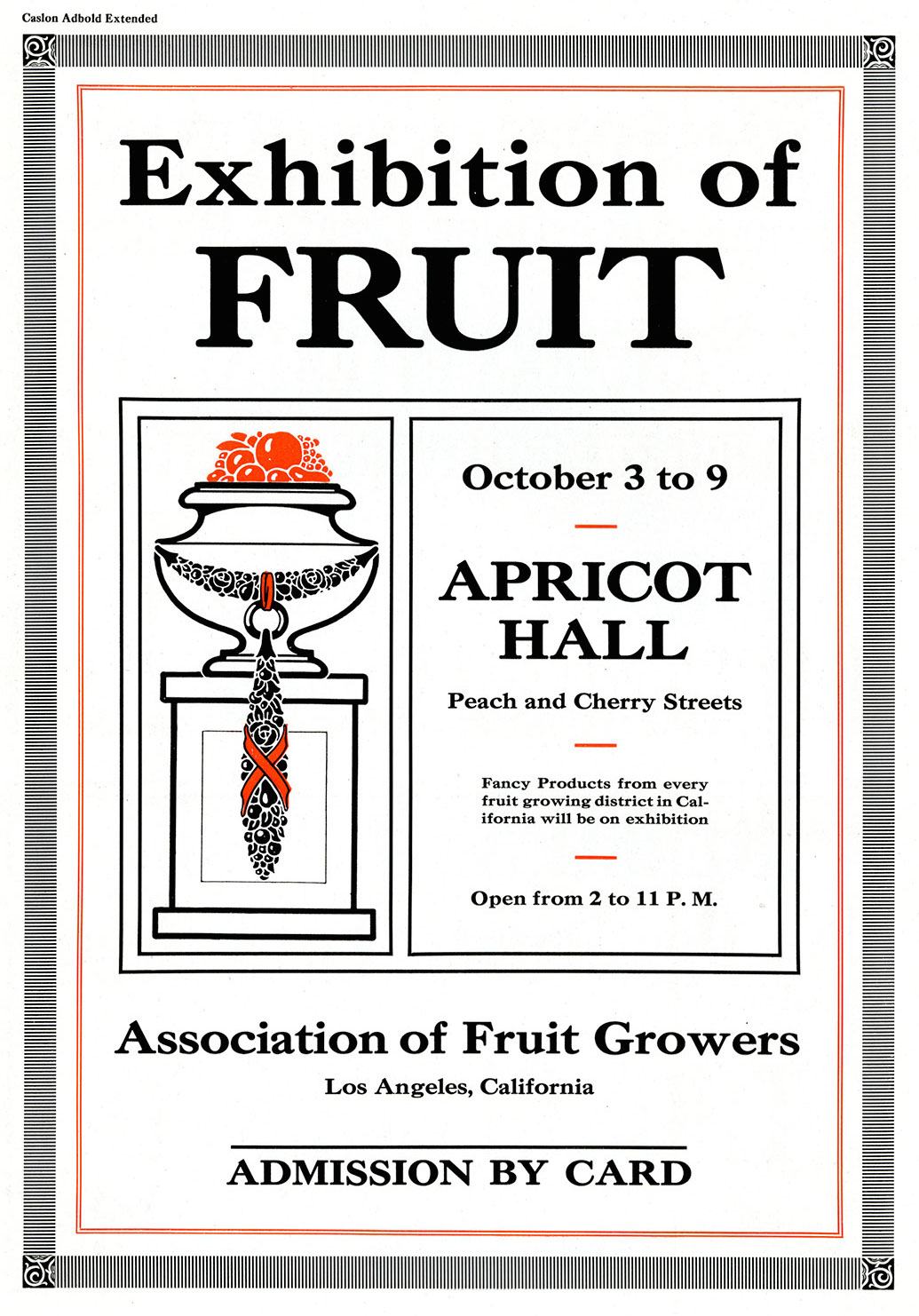
file name: Keystone Type Foundry Caslon Adbold Group
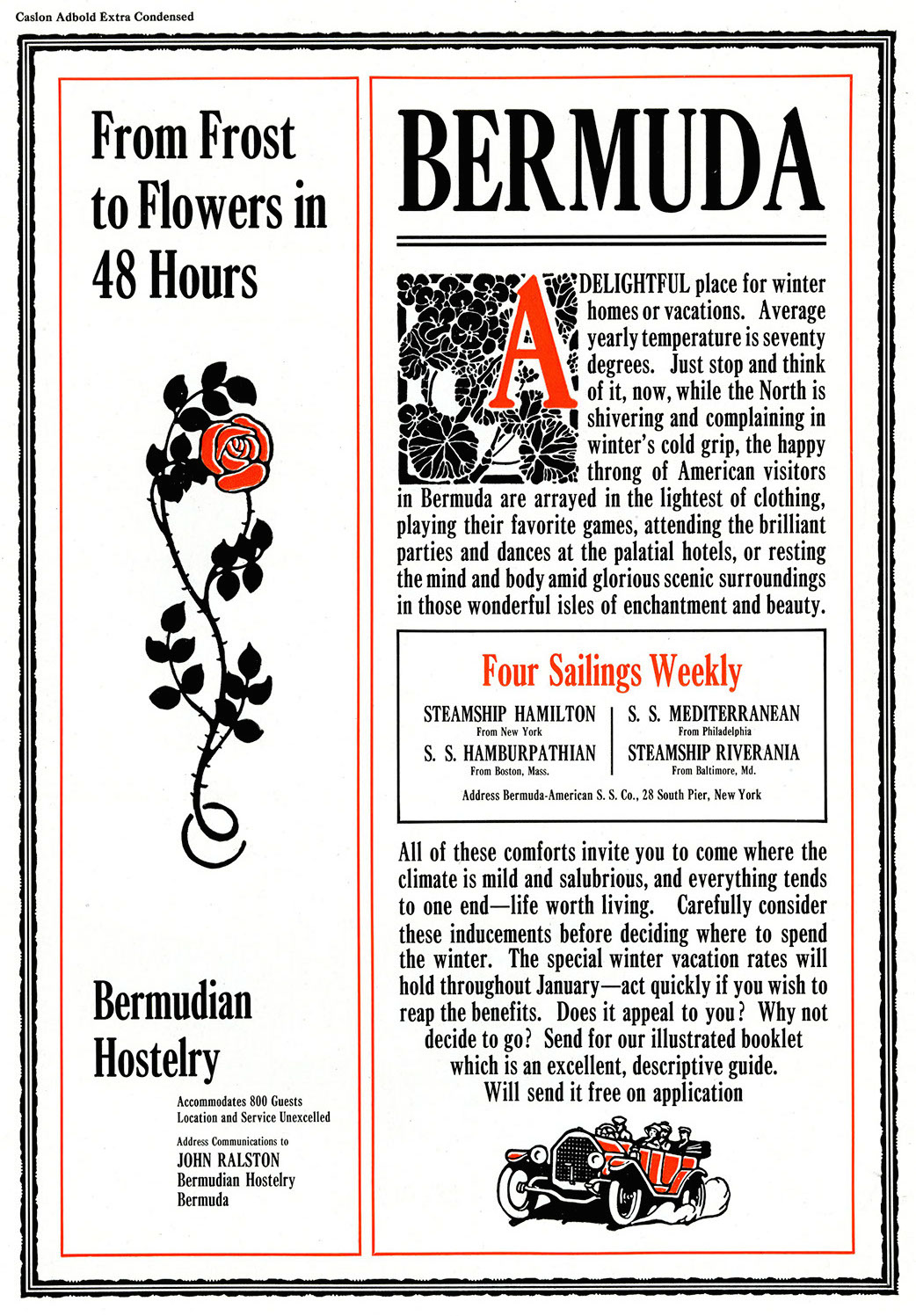
file name: Keystone Type Foundry Caslon Adbold Group
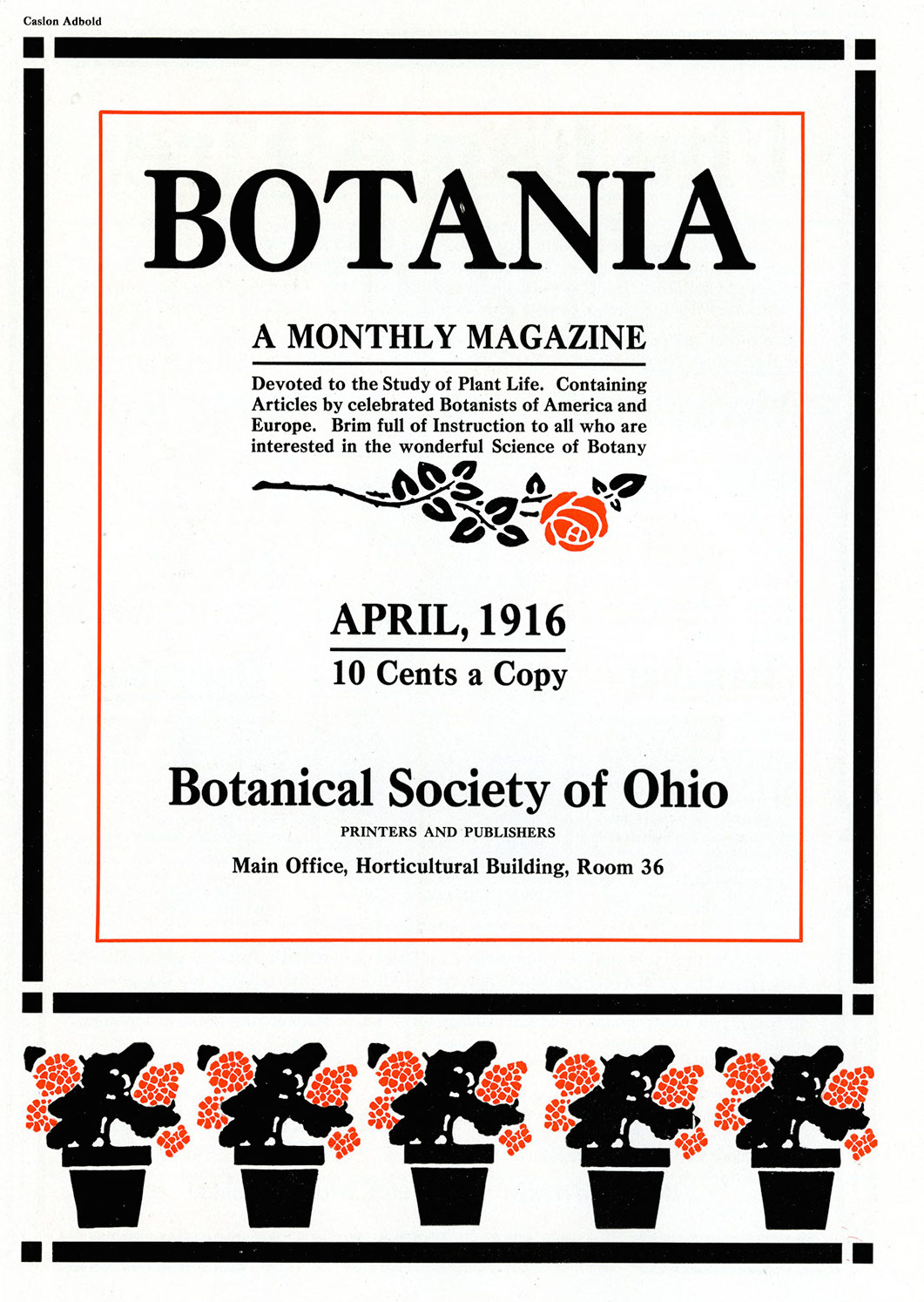
file name: Keystone Type Foundry Caslon Adbold Group
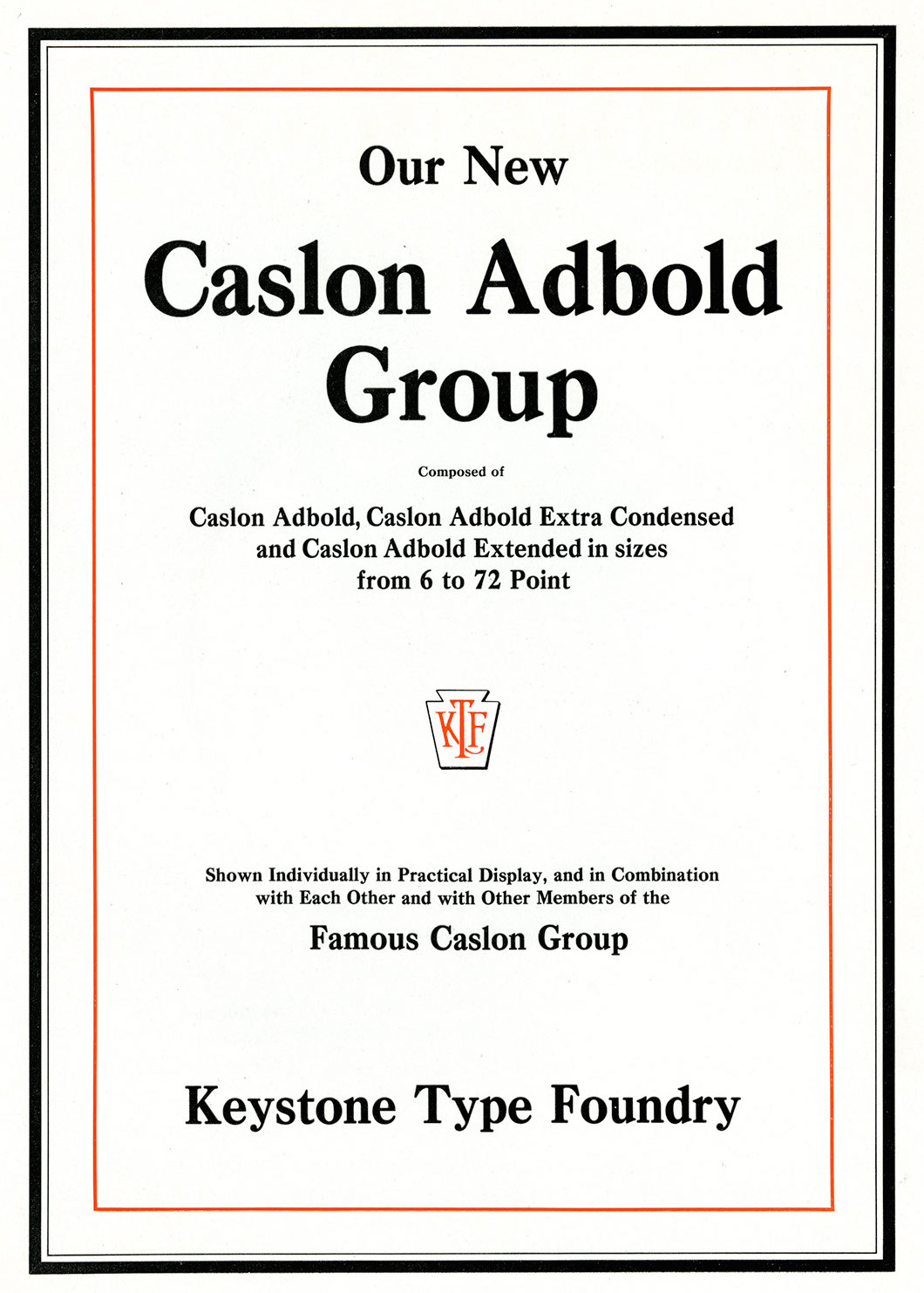
file name: Keystone Type Foundry Caslon Adbold Group

file name: Jeff Levine Gothic Grotesk J N L 2020

file name: Castcraft O P T I Charter Oak
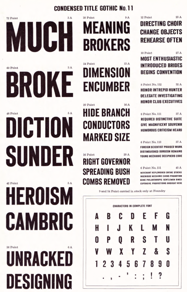
file name: Keystone Condensed Title Gothic No11 from A T F1923 Catalog
file name: Keystone Title Gothic No9 from A T F1923 Catalog
file name: Keystone Type Foundry Harris Italic 1910
file name: Keystone Type Foundry Harris Roman 1909
file name: Keystone Type Foundry Harris Roman 1909b
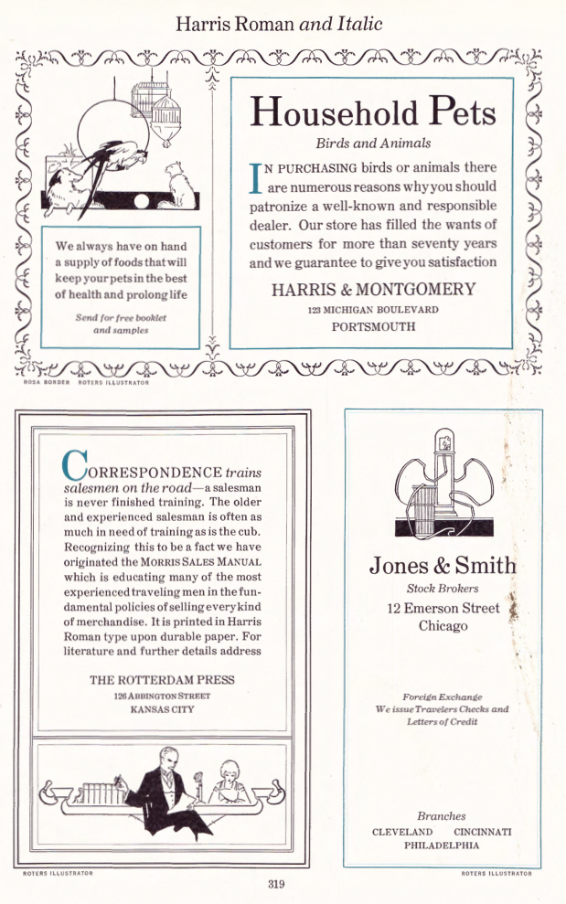
file name: Keystone Type Foundry Harris Roman 1909c
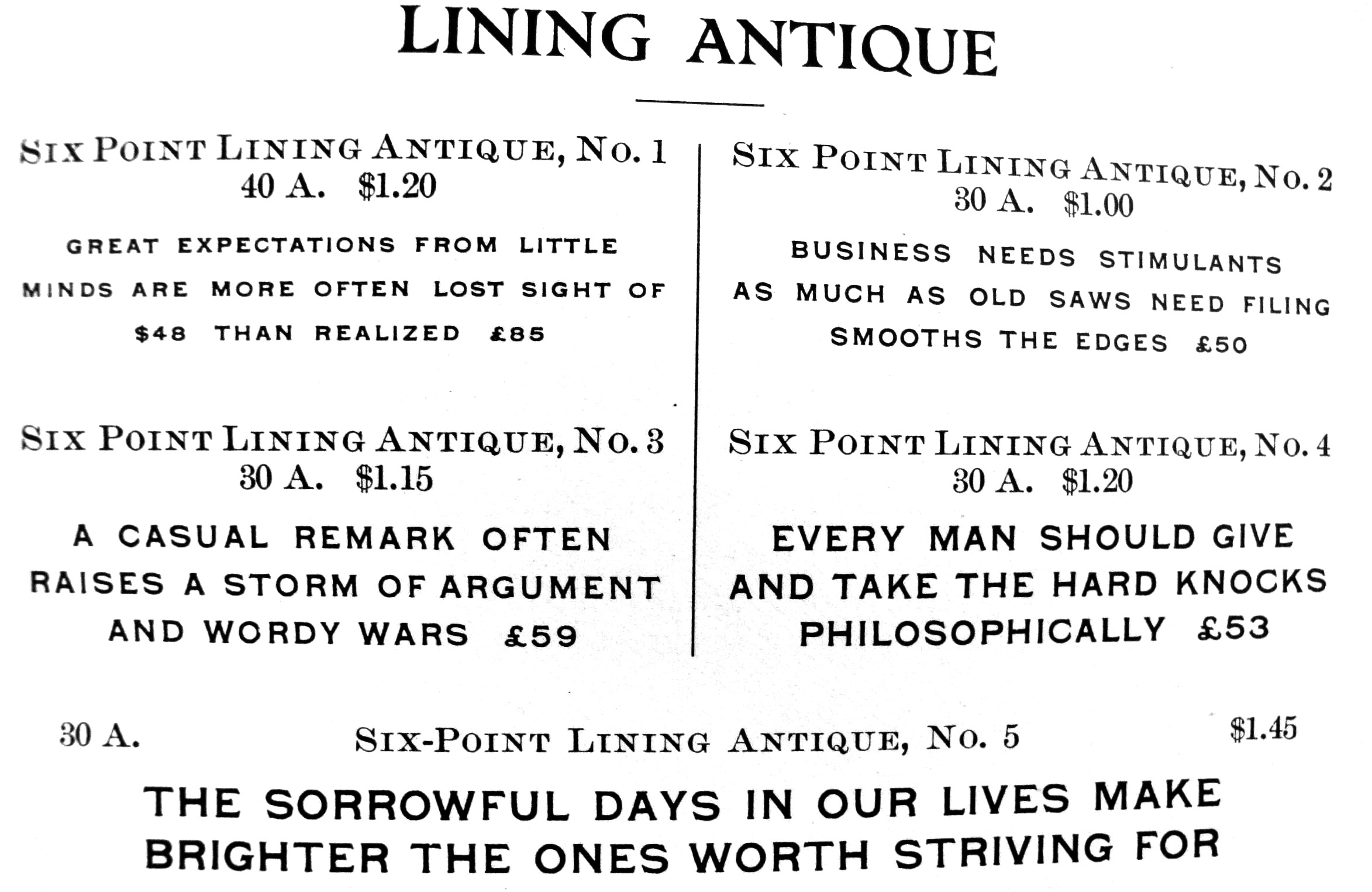
file name: Keystone Lining Antique
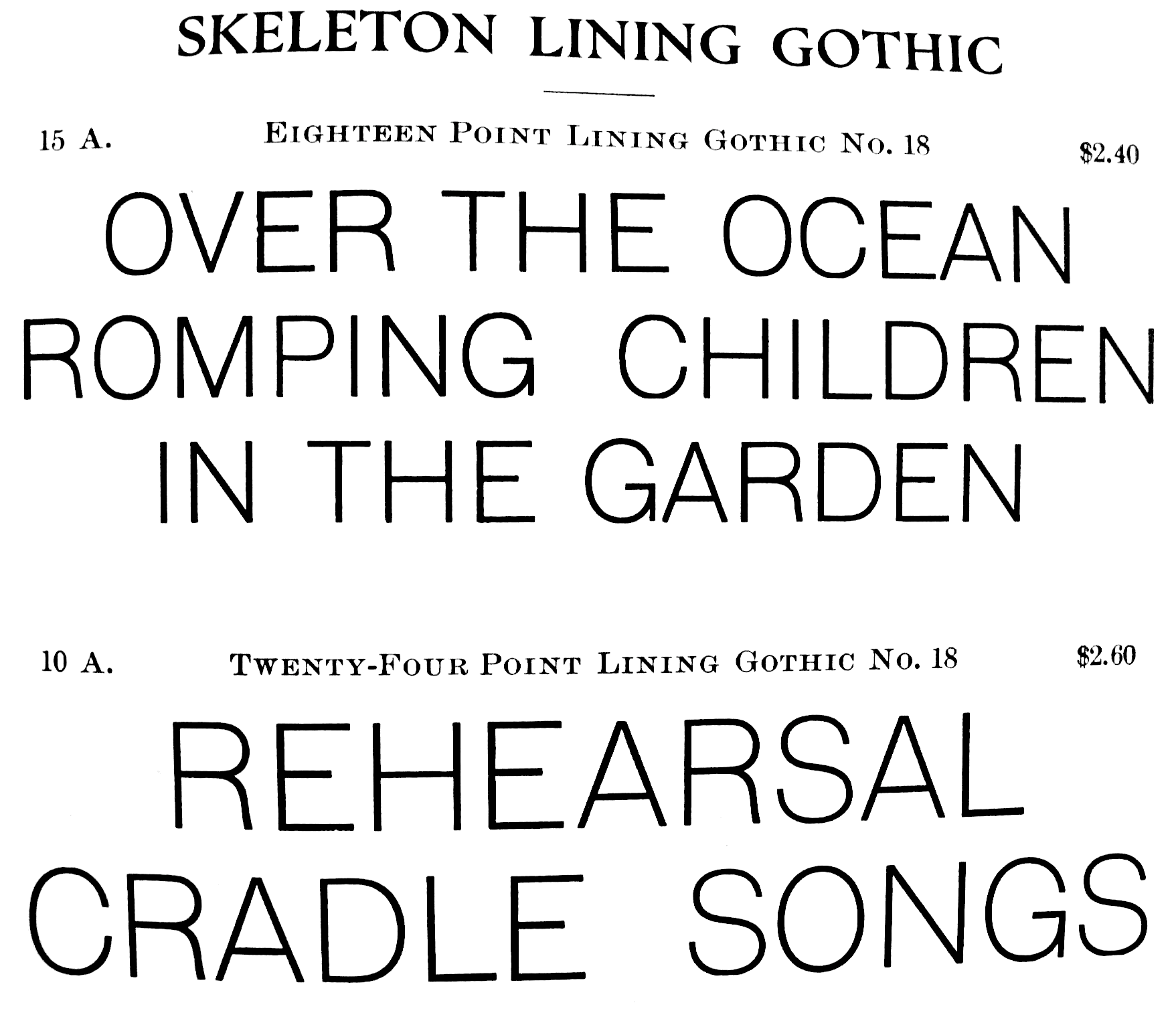
file name: Keystone Lining Gothic
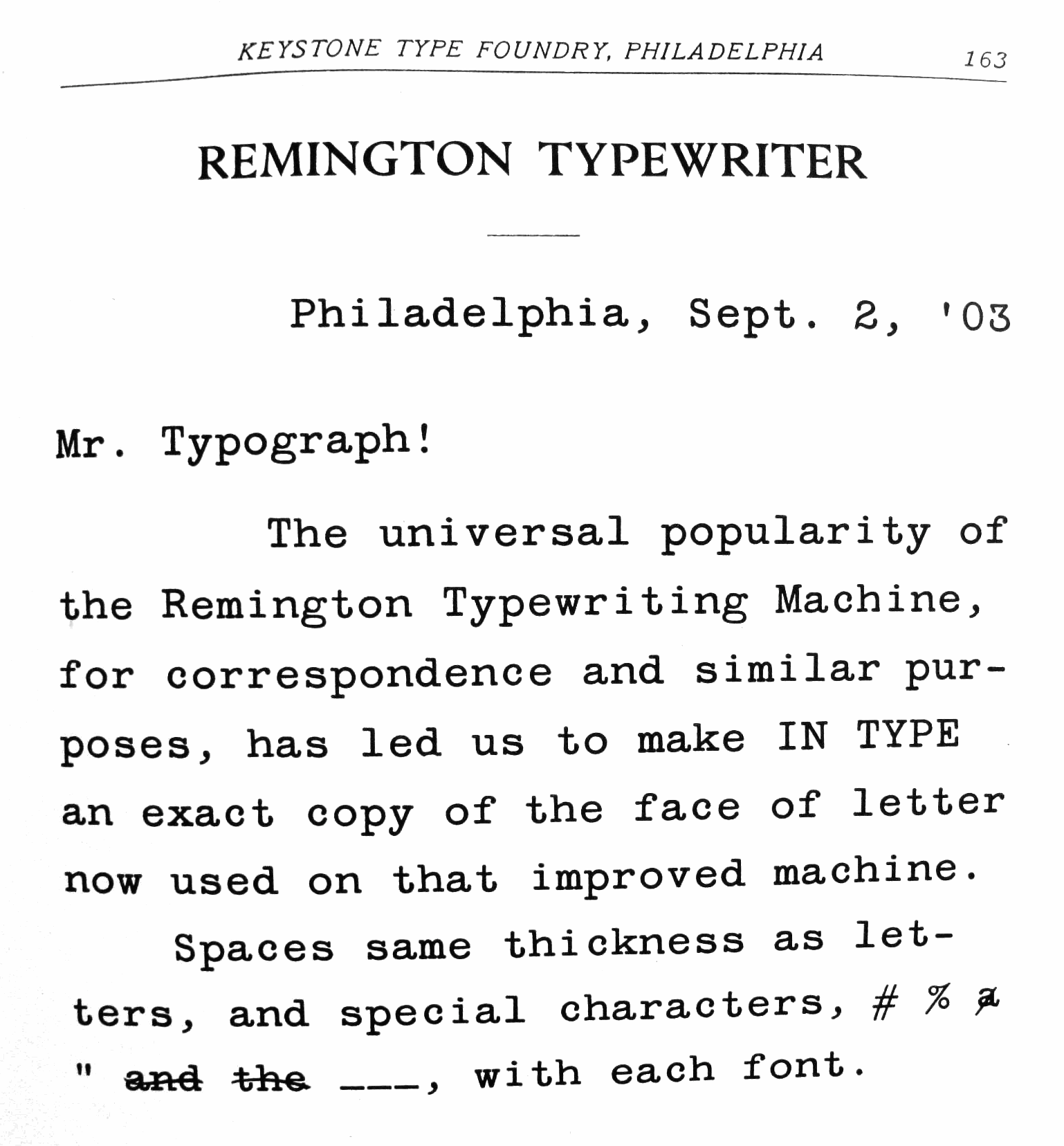
file name: Keystone Remington Typewriter
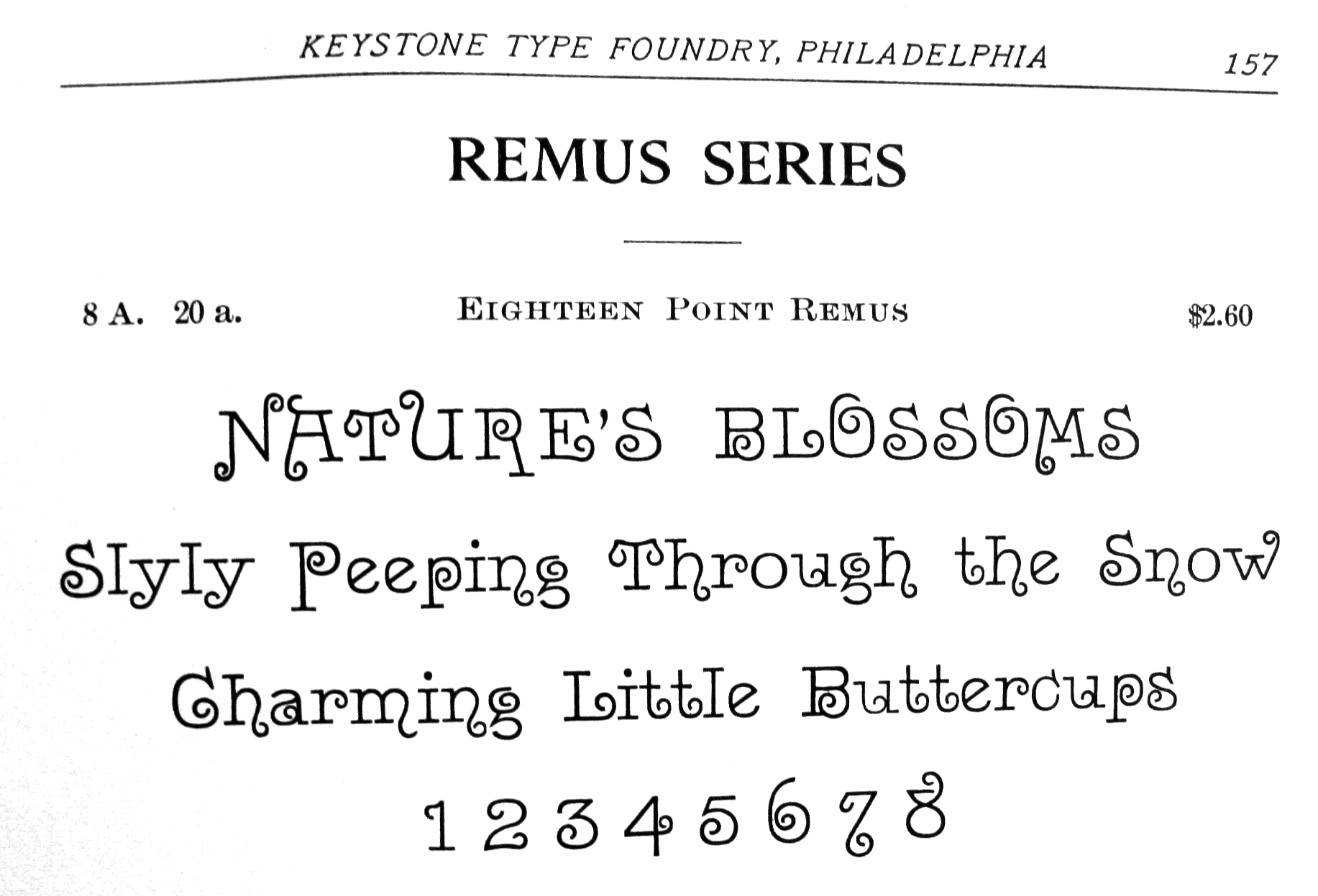
file name: Keystone Remus
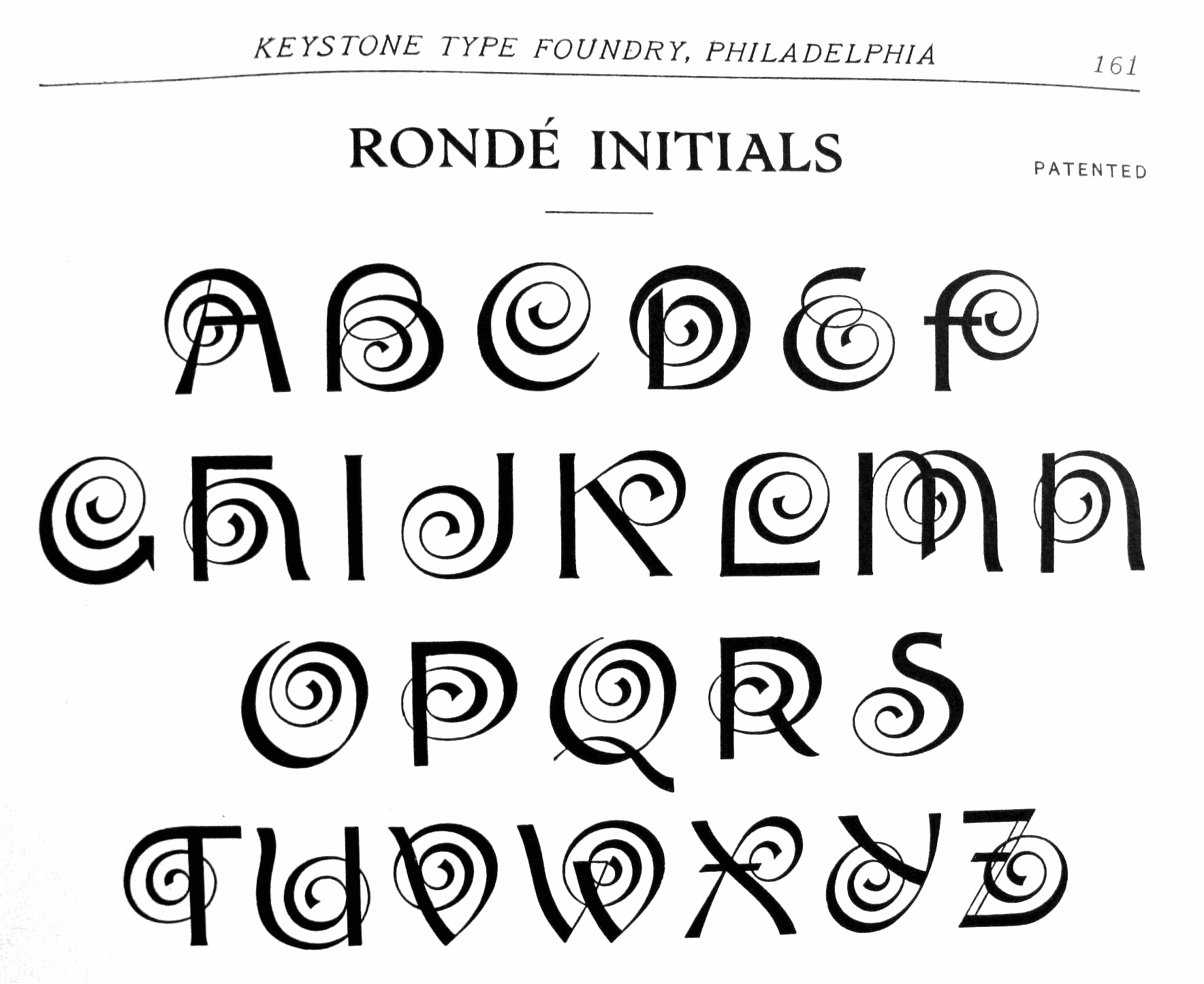
file name: Keystone Ronde Initials
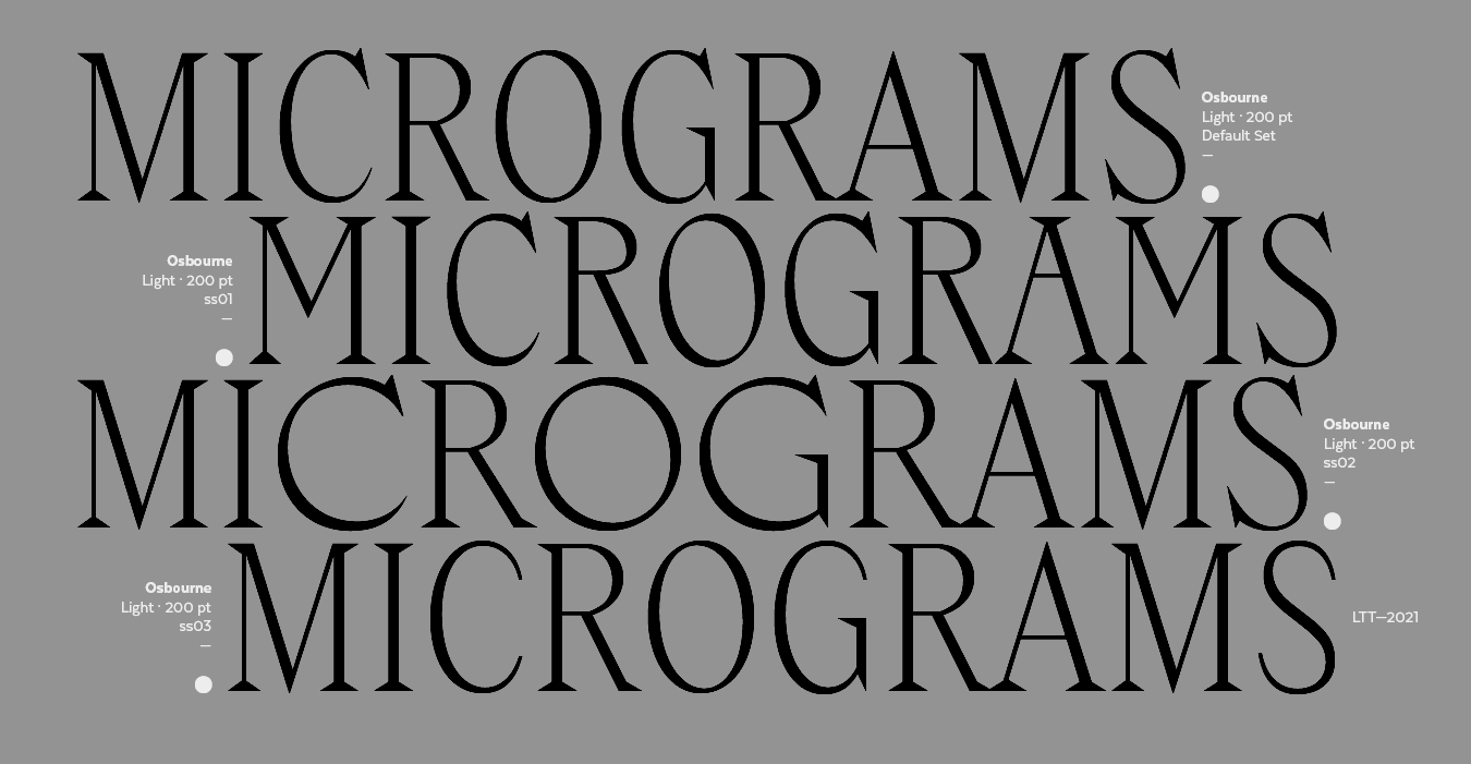
file name: Latinotype Osbourne 2021 after Keystone Type Foundry Salem
file name: Latinotype Osbourne 2021 after Keystone Type Foundry Salem
file name: Latinotype Osbourne 2021 after Keystone Type Foundry Salem
file name: Latinotype Osbourne 2021 after Keystone Type Foundry Salem
file name: Latinotype Osbourne 2021 after Keystone Type Foundry Salem
file name: Latinotype Osbourne 2021 after Keystone Type Foundry Salem
file name: Latinotype Osbourne 2021 after Keystone Type Foundry Salem
file name: Latinotype Osbourne 2021 after Keystone Type Foundry Salem
file name: Latinotype Osbourne 2021 after Keystone Type Foundry Salem
file name: Keystone Salem
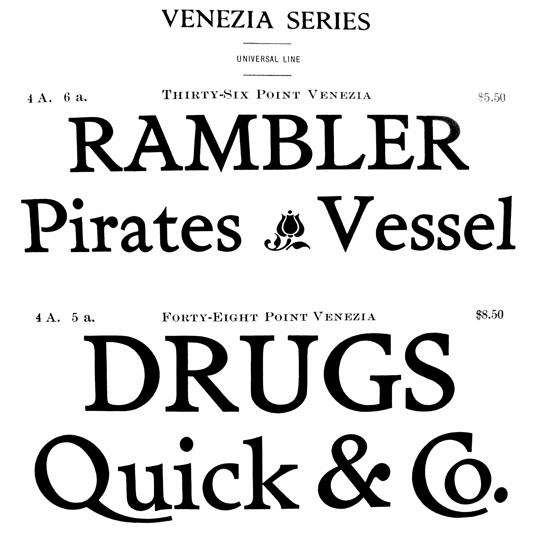
file name: Keystone Venezia
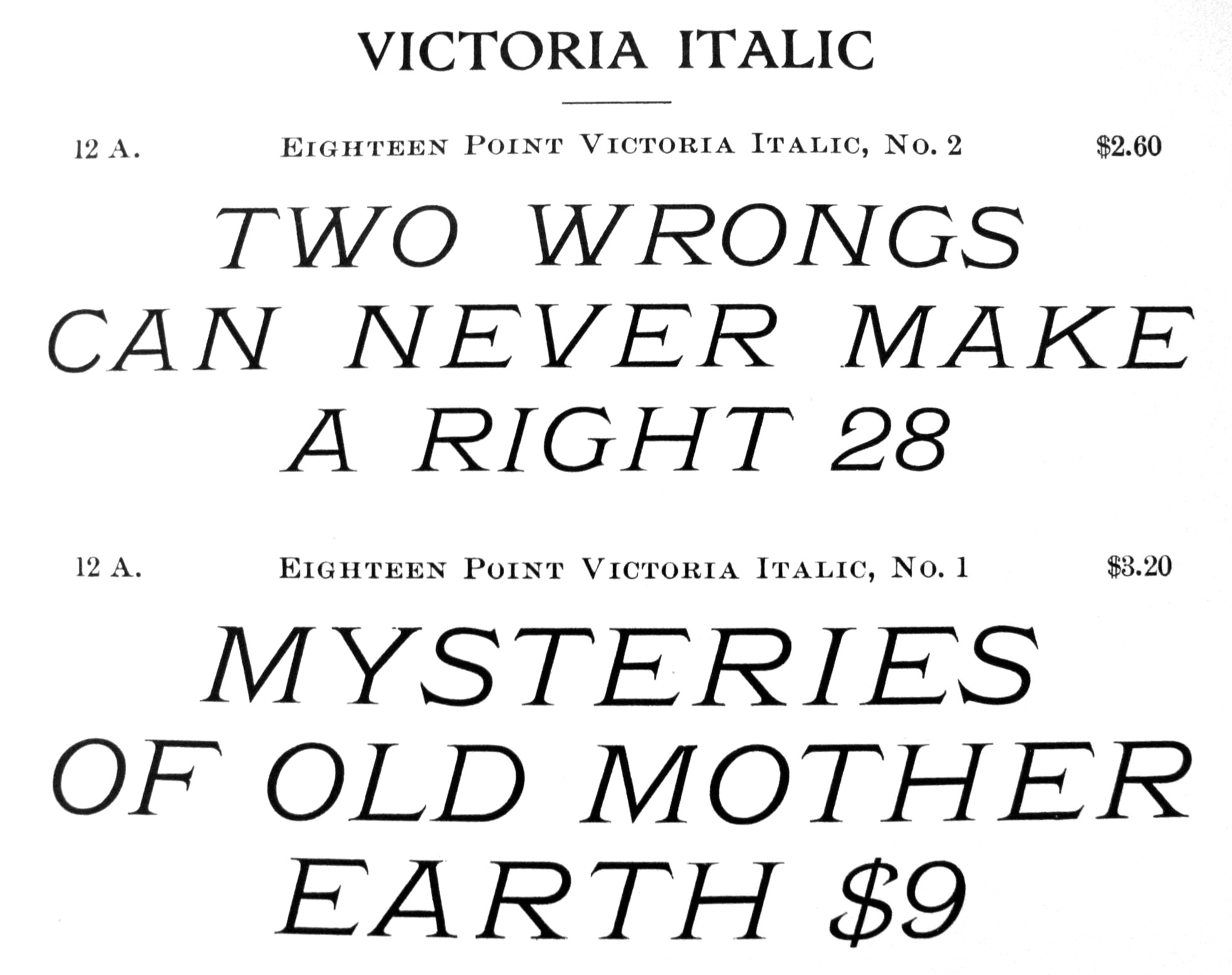
file name: Keystone Victoria Italic
file name: Gustave F Schroeder Victoria Italic 1891

file name: Keystone Worcester
file name: Mario Feliciano Miletus Grotesk 2020 2021 after Keystone Standard Gothic 1906

file name: Keystone Type Foundry Bikes

file name: Keystone Type Foundry Bikes
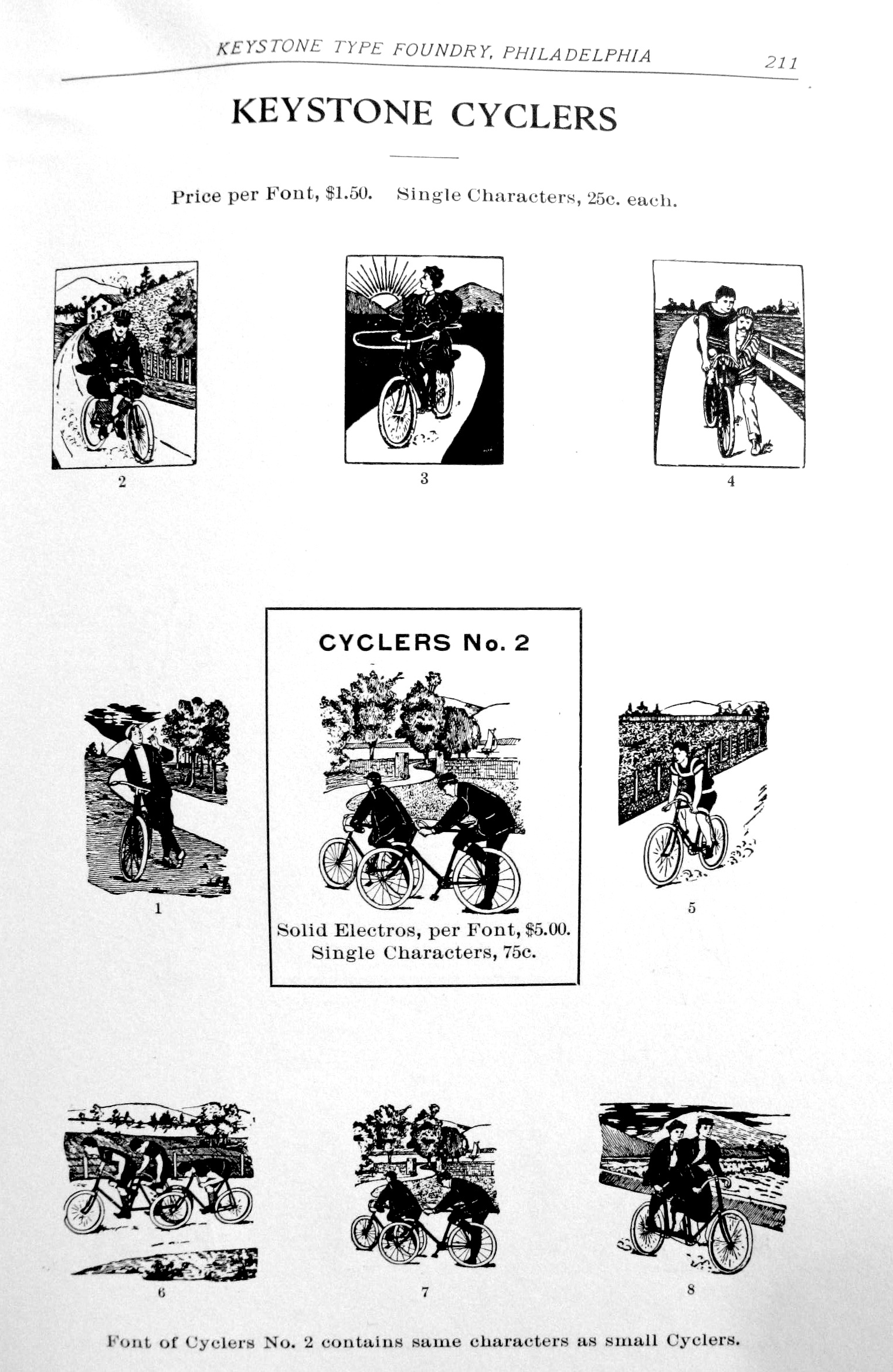
file name: Keystone Type Foundry Specimen Book Of Type 1903 Cyclers

file name: Keystone Type Foundry Specimen Book Of Type 1903 Outing Initials No1
file name: John Bomparte Emerge B F 2009 after Charles W Heergeist Admiral 1898

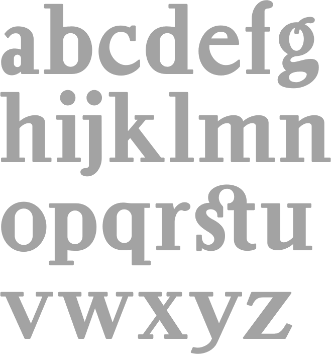
file name: Nick Curtis Old Softy N F 2010
| | |
|
Luc Devroye ⦿ School of Computer Science ⦿ McGill University Montreal, Canada H3A 2K6 ⦿ lucdevroye@gmail.com ⦿ https://luc.devroye.org ⦿ https://luc.devroye.org/fonts.html |