TYPE DESIGN INFORMATION PAGE last updated on Thu Jul 16 06:52:16 EDT 2026
FONT RECOGNITION VIA FONT MOOSE

|
|
|
|
K-Type
[Keith Bates]
K-Type is Keith Bates' (b. 1951, Liverpool) foundry in Manchester, UK, est. 2003. Keith works as an Art&Design teacher at a Salford High School. They custom design type, and sell some of their own creations. Commercial typefaces:
His free fonts:
Custom / corporate typefaces: With Liverpool-based art director Liz Harry, Bates created a personalized font, loosely based on Coco Sumner's handwritten capitals, for the band I Blame Coco. Medium and Semibold weights of Gill New Antique were commissioned by LPK Design Agency. Stepping Hill Hospital and Bates created Dials, a pictorial font to help hospital managers input data about improvements. A custom font was designed for Bolton Strategic Economic Partnership. Abstract Fonts link. View Keith Bates's typefaces. Dafont link. Yet another URL. Fontspace link. Fontsy link. Behance link. |
EXTERNAL LINKS |
| | |


file name: K Type Oxford Street 2021

file name: Keith Bates Chancery Lane 2021

file name: K Type Chancery Lane 2021 2

file name: K Type Chancery Lane 2021

file name: K Type Bowdon 2021 1

file name: K Type Bowdon 2021 2

file name: K Type Bowdon 2021
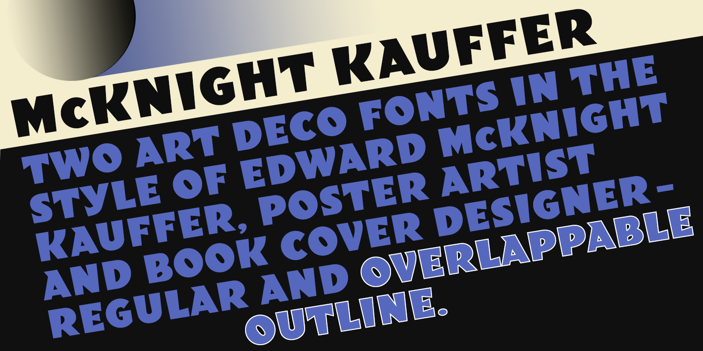
file name: K Type Mc Knight Kauffer 2021 1

file name: K Type Mc Knight Kauffer 2021 2
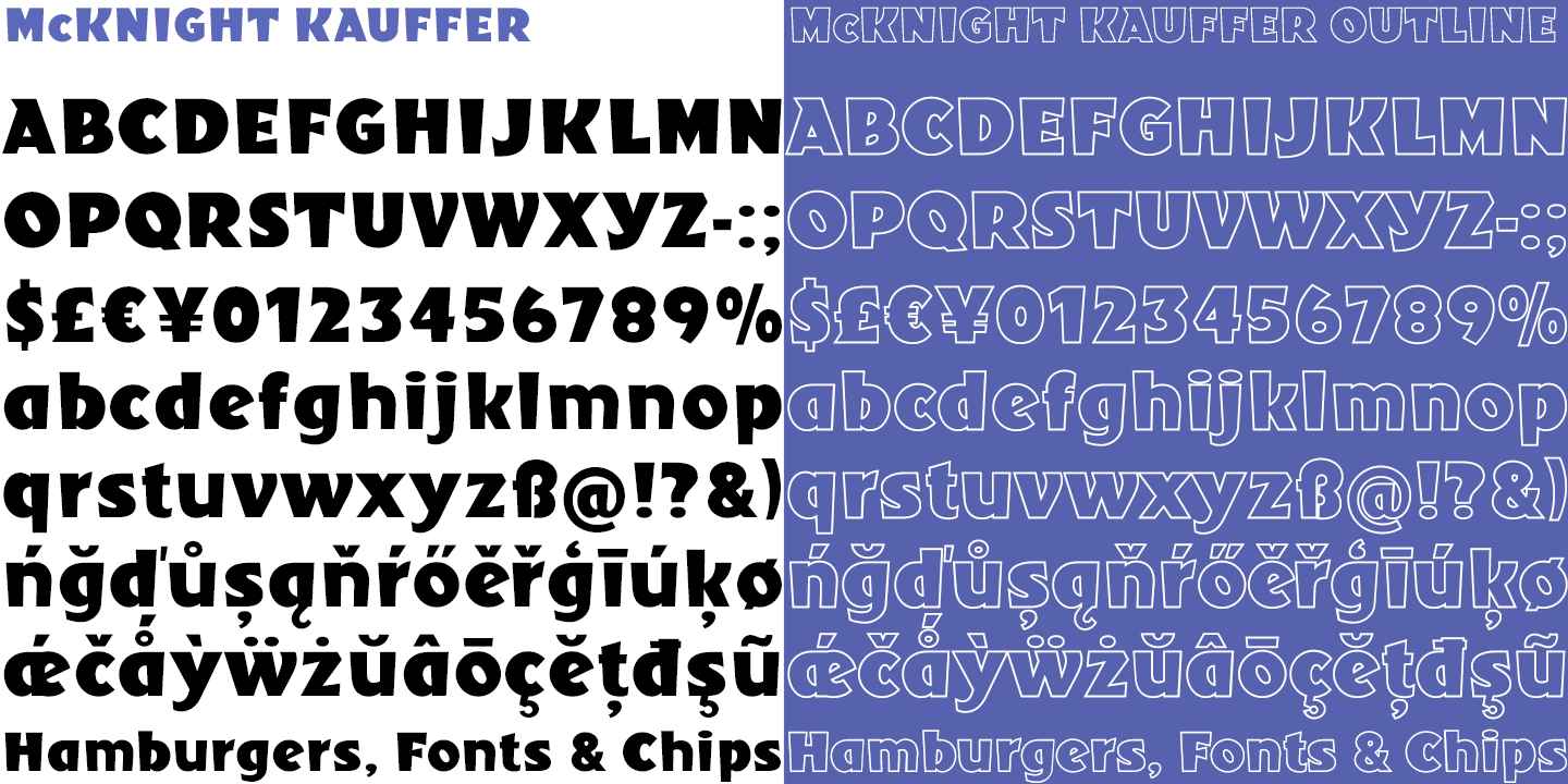
file name: K Type Mc Knight Kauffer 2021 5

file name: K Type Mc Knight Kauffer 2021

file name: K Type We The People 2021 1

file name: K Type We The People 2021 5

file name: K Type We The People 2021

file name: K Type Rima 2020 1

file name: K Type Rima 2020 4

file name: K Type Rima 2020 5

file name: K Type Rima 2020

file name: K Type Bricola 2020 3

file name: K Type Bricola 2020 5

file name: K Type Bricola 2020

file name: K Type Sam Suliman 2020 2

file name: K Type Sam Suliman 2020 3

file name: K Type Sam Suliman 2020 5

file name: K Type Sam Suliman 2020

file name: K Type Possible 2020 368921

file name: Keith Bates Possible 2020

file name: K Type Possible 2020 368922

file name: K Type Possible 2020

file name: K Type Monterey Pop 2020 339385

file name: K Type Monterey Pop 2020 339387

file name: K Type Monterey Pop 2020

file name: Keith Bates Monterey Pop 2020

file name: K Type Straight Line 2020 336366

file name: K Type Straight Line 2020 336370

file name: K Type Artist Hand 2019

file name: Keith Bates Mancunium 2019

file name: Keith Bates Mancunium 2019

file name: K Type Mancunium 2019

file name: Keith Bates Frank Bellamy 2009

file name: Keith Bates Frank Bellamy 2009 176416

file name: Keith Bates Cloudbuster 2019 315250

file name: Keith Bates Cloudbuster 2019 315252 002

file name: Keith Bates Cloudbuster 2019 315253

file name: Keith Bates Cloudbuster 2019

file name: Keith Bates Argot 2019 300073

file name: Keith Bates Argot 2019 300074

file name: Keith Bates Argot 2019 300075

file name: Keith Bates Argot Narrow 2019

file name: Keith Bates Argot Wide 2019 300068

file name: Keith Bates Argot Wide 2019

file name: Keith Bates Argot 2019

file name: K Type Argot Machine 2019 305397 002

file name: K Type Argot Machine 2019

file name: K Type Sexbomb 2018 282607

file name: K Type Sexbomb 2018 282608 002

file name: K Type Sexbomb 2018 282610

file name: K Type Sexbomb 2018 282611

file name: K Type Sexbomb 2018

file name: Keith Bates Banks Miles 2018 267144

file name: Keith Bates Banks Miles 2018 267147

file name: Keith Bates Banks Miles 2018

file name: Keith Bates Banks Miles Double Line 2018

file name: K Type Toppler 2018

file name: Keith Bates Toppler 2018 280549

file name: Keith Bates Toppler 2018 280551

file name: Keith Bates Toppler 2018 280552

file name: Keith Bates Toppler 2018 280554

file name: K Type Engravia 2018

file name: Keith Bates Engravia 2018 258595

file name: Keith Bates Engravia 2018 258598

file name: Keith Bates Engravia 2018 258599

file name: Keith Bates Engravia 2018 258600

file name: Keith Bates Engravia 2018

file name: K Type Curwen Sans 2018 257084

file name: K Type Curwen Sans 2018 257087

file name: K Type Curwen Sans 2018 257205

file name: K Type Curwen Sans 2018 257206

file name: K Type Curwen Sans 2018 257207

file name: K Type Curwen Sans 2018

file name: Keith Bates Mailart Rubberstamp Sans 2018 254133

file name: Keith Bates Mailart Rubberstamp Sans 2018 254138

file name: Keith Bates Mailart Rubberstamp Sans 2018

file name: Keith Bates Zinc 2018 254273

file name: Keith Bates Zinc 2018 254275

file name: Keith Bates Zinc 2018

file name: Keith Bates Romanica 2017 248887

file name: Keith Bates Romanica 2017 248888

file name: Keith Bates Romanica 2017 248891

file name: Keith Bates Romanica 2017

file name: Keith Bates Coinage Caps 2017 239305

file name: Keith Bates Coinage Caps 2017 239342

file name: Keith Bates Coinage Caps 2017
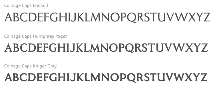
file name: Keith Bates Coinage Caps 2017

file name: Keith Bates Kindersley Sans 2017 228229

file name: Keith Bates Kindersley Sans 2017 228230

file name: Keith Bates Kindersley Sans 2017 228232

file name: Keith Bates Kindersley Sans 2017

file name: Keith Bates Example 2016 224269

file name: Keith Bates Example 2016

file name: Keith Bates Bank Of England 2012

file name: Keith Bates Bank Of England 2012b

file name: Keith Bates Bank Of England 2012

file name: Keith Bates Londinia 2016 216294

file name: Keith Bates Londinia 2016

file name: K Type Irish Penny 2016 215597

file name: K Type Irish Penny 2016 215599

file name: K Type Irish Penny 2016

file name: Keith Bates Taxicab 2016 206295

file name: Keith Bates Taxicab 2016

file name: Keith Bates Wildcat 2016

file name: Keith Bates Wildcat 2016 195345

file name: Keith Bates Wildcat 2016 195349

file name: Keith Bates Wildcat 2016

file name: K Type Licencia 2016 204588

file name: K Type Licencia 2016 204589

file name: K Type Licencia 2016 204590

file name: K Type Licencia 2016

file name: Keith Bates Sinkin Sans200 X Light 2014

file name: Keith Bates Sinkin Sans400 2014

file name: Keith Bates Sinkin Sans600 Semi Bold 2014

file name: Keith Bates Sinkin Sans900 X Black 2014

file name: Keith Bates Sinkin Sans Narrow100 Thin 2015

file name: Keith Bates Sinkin Sans Narrow800 Black 2015
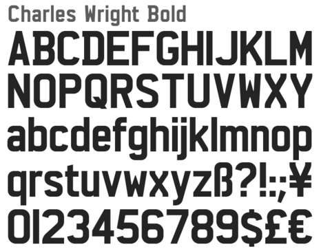
file name: Keith Bates Charles Wright Bold 2016
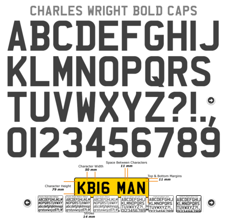
file name: Keith Bates Charles Wright Bold Caps 2016
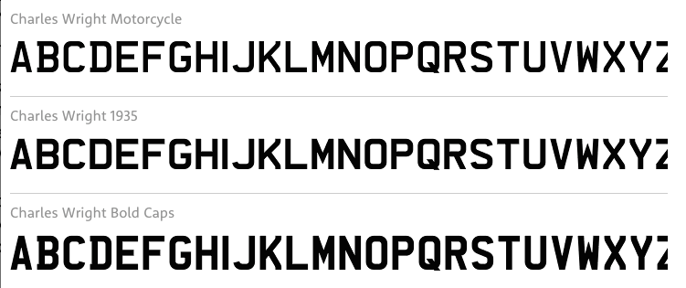
file name: Keith Bates Charles Wright 2016
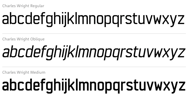
file name: Keith Bates Charles Wright 2016b
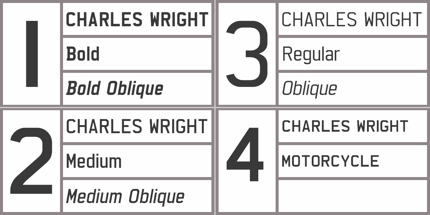
file name: Keith Bates Charles Wright 2016 202845
file name: Keith Bates Charles Wright 2016 202846
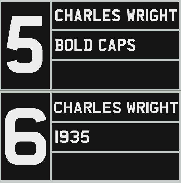
file name: Keith Bates Charles Wright 2016 202848
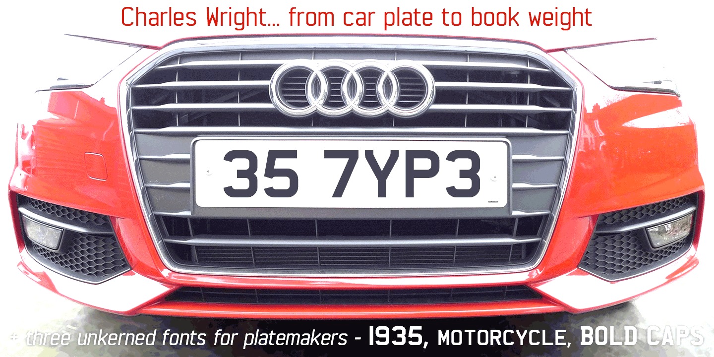
file name: Keith Bates Charles Wright 2016 202851
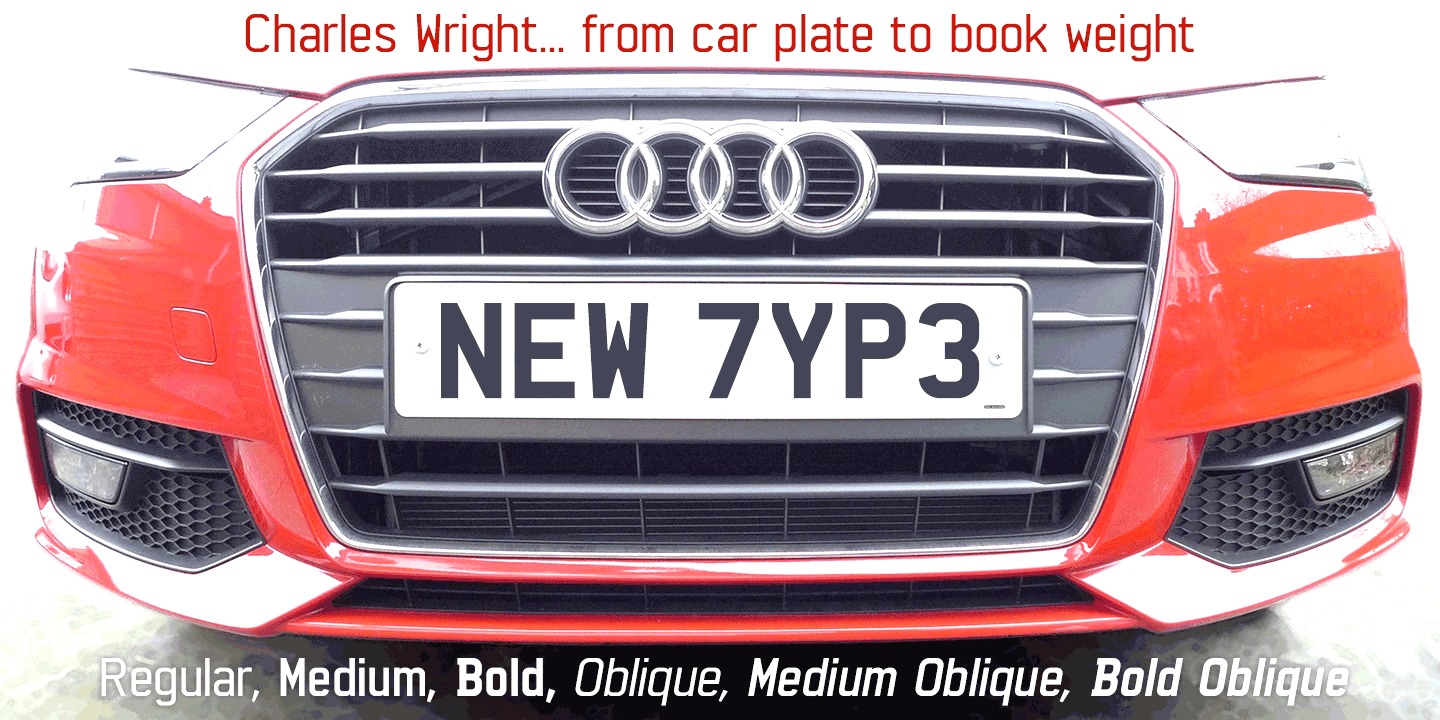
file name: Keith Bates Charles Wright 2016 202852

file name: Keith Bates Charles Wright 2016

file name: Keith Bates Lexie Readable 2006 189552

file name: Keith Bates Lexie Readable 2006 189553

file name: Keith Bates Lexie Readable 2006

file name: Keith Bates Lexie Readable 2015

file name: Keith Bates Lexie Readable 2015b

file name: Keith Bates Motorway 2015b
file name: Keith Bates Motorway Regular 2015

file name: K Type Motorway Bold 2016

file name: K Type Motorway Semi Bold 2016

file name: Keith Bates Keep Calm 2011 Poster by Simone Aiosa 2015b

file name: Keith Bates Keep Calm 2011 Poster by Simone Aioso 2015

file name: Keith Bates Keep Calm 2015

file name: Keith Bates Keep Calm 2011

file name: Keith Bates Keep Calm 2015a

file name: K Type Barbica 2015 191962

file name: K Type Barbica 2015 191964

file name: K Type Barbica 2015

file name: K Type Deansgate 2015 187610

file name: K Type Deansgate 2015

file name: Keith Bates Magica Medium 2015

file name: Keith Bates Adequate Extra Light 2012

file name: Keith Bates Adequate Medium 2012

file name: Keith Bates Penny Lane Bold 2014

file name: Keith Bates Provincial 2014

file name: Keith Bates Provincial Outline 2014

file name: Keith Bates Provincial Shaded 2014

file name: Keith Bates Sgt Peppers Lonely Hearts Club 2014

file name: Keith Bates Sgt Peppers Outline 2014

file name: Keith Bates Savor 2011

file name: Keith Bates Savor 2011b

file name: Keith Bates Brush Hand New 2013
file name: Keith Bates Wes Wilson 2007

file name: Keithbates Flip Flip Fill 2011

file name: K Type Ticketing 2011

file name: Keith Bates Oriel Chambers Liverpool

file name: Keith Bates Latinate 2013

file name: Keith Bates Latinate 2013b

file name: K Type Pop Cubism

file name: K Type Pop Cubism 2010

file name: Keith Bates Mythica Medium 2012

file name: Keith Bates Hapshash 2010

file name: Keith Bates Modulario 2010

file name: Keith Bates Adventruring

file name: Keith Bates Adventuring 2010

file name: K Type Adventuring 2010

file name: Keith Bates Dalek Pinpoint 2018 270782

file name: Keith Bates Dalek Pinpoint 2018

file name: Keith Bates Dalek 2005

file name: Keith Bates New Old English 2010

file name: K Type Runestone 2010

file name: Keith Bates Enamela 2013b

file name: Keith Bates Enamela 2013e

file name: Keith Bates Enamela Condensed 2013

file name: Keith Bates Enamela Condensed Bold 2013

file name: Keith Bates Enamela Condensed Medium 2013

file name: Keith Bates Poster Sans 2006

file name: Keith Bates Poster Sans 2006b

file name: Keith Bates Poster Sans Extreme 2006

file name: K Type Poster Sans Outline 2016

file name: Keith Bates Victor Moscoso 2008

file name: Keith Bates Bigfoot2005

file name: Keith Bates Building Loan b 2007

file name: Keith Bates Building Loan2007

file name: Keith Bates Modernist Stencil2009

file name: Keith Bates Modernist Stencil 2008 50279

file name: Keith Bates Modernist Stencil 2008

file name: Keith Bates Credit Card 2010

file name: Keith Bates Frank Bellamy 2009

file name: K Type Klee Print 2010

file name: Pic Keith Bates

file name: Keith Bates Bolton750 2010

file name: Keith Bates Cocos Sumner Capitals 2010

file name: Keith Bates Dials 2010

file name: Keith Bates Gill New Antique 2010

file name: Keith Bates Rick Griffin

file name: Keith Bates Runestone

file name: Keith Bates Zabars 2011
| | |
|
Luc Devroye ⦿ School of Computer Science ⦿ McGill University Montreal, Canada H3A 2K6 ⦿ lucdevroye@gmail.com ⦿ https://luc.devroye.org ⦿ https://luc.devroye.org/fonts.html |