TYPE DESIGN INFORMATION PAGE last updated on Mon Jun 8 18:03:12 EDT 2026
FONT RECOGNITION VIA FONT MOOSE

|
|
|
|
Sorkin Type (was: Eyebytes)
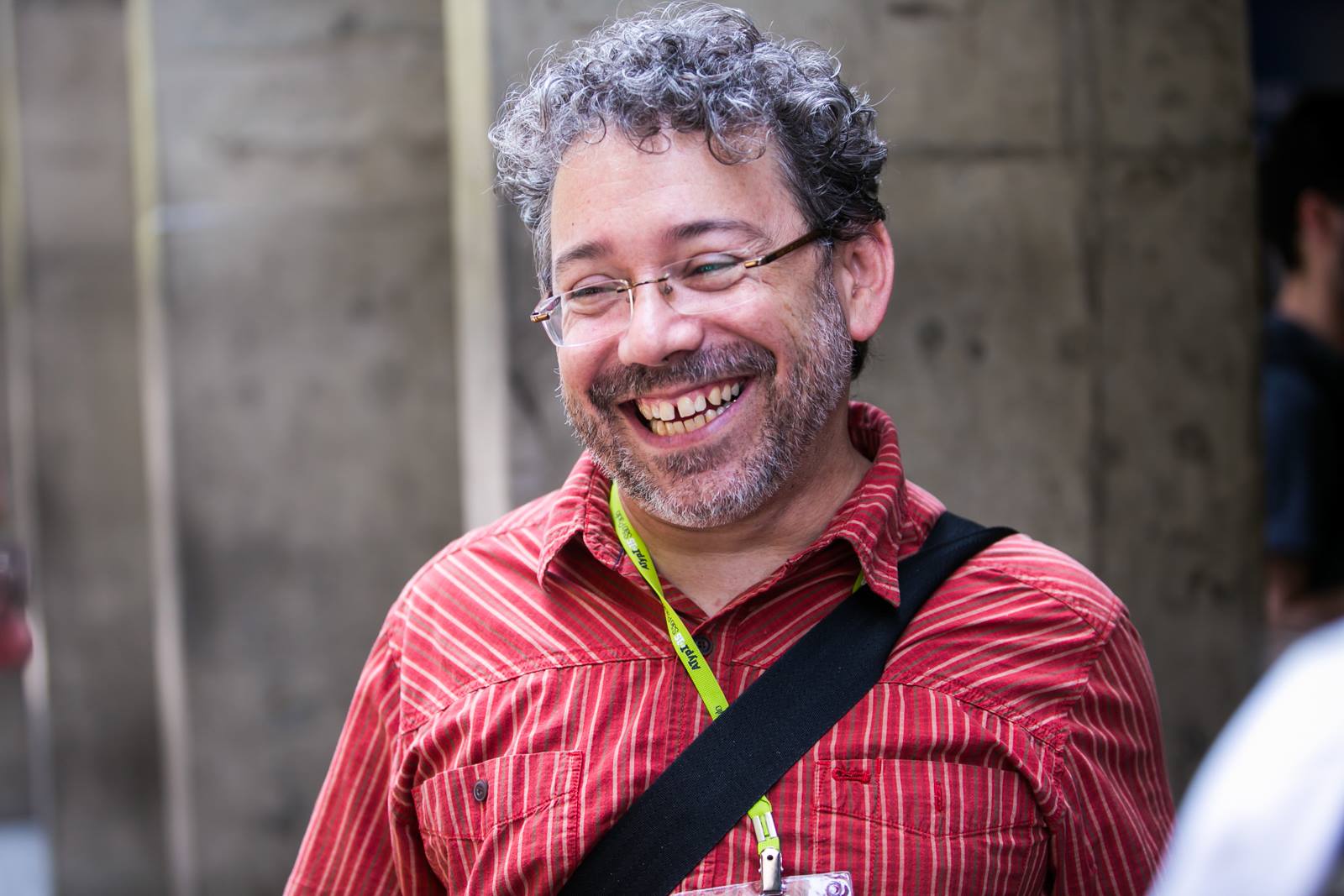
[Eben Sorkin]
Eben Sorkin obtained an MA in typeface design from The University of Reading (2009), based on his typeface Arrotino (2009). In 2015, he joined the faculty at Lesley University near Boston, MA, and lives in Easthampton, MA. Sorkin Type (was: Eyebytes, in Eagle River, Alaska) is run by him. His talk at ATypI 2008 in St. Petersburg was entitled Contextual alternatives. He writes about Arrotino: Arrotino begins with the forms of early Italian renaissance in the late 15th century. Their melody, generousity, and variety of shape and proportion are echoed in Arrotino. As a consequence of this Arrotino is not especially efficient, but it is comfortable. His typefaces and those by contributors at Sorkin Type:
Fontspace link. Fontsquirrel link. FontStruct link. Klingspor link. Dafont link. Eben spent February and March 2011 learning how to carve letters in stone from Lida Cardozo at the Cardozo Kindesley workshop, Cambridge UK, and collaborating with Lida on the typeface Pulle. The photographer photographed (in 2011, by Ralph Herrmann). |
EXTERNAL LINKS |
| | |

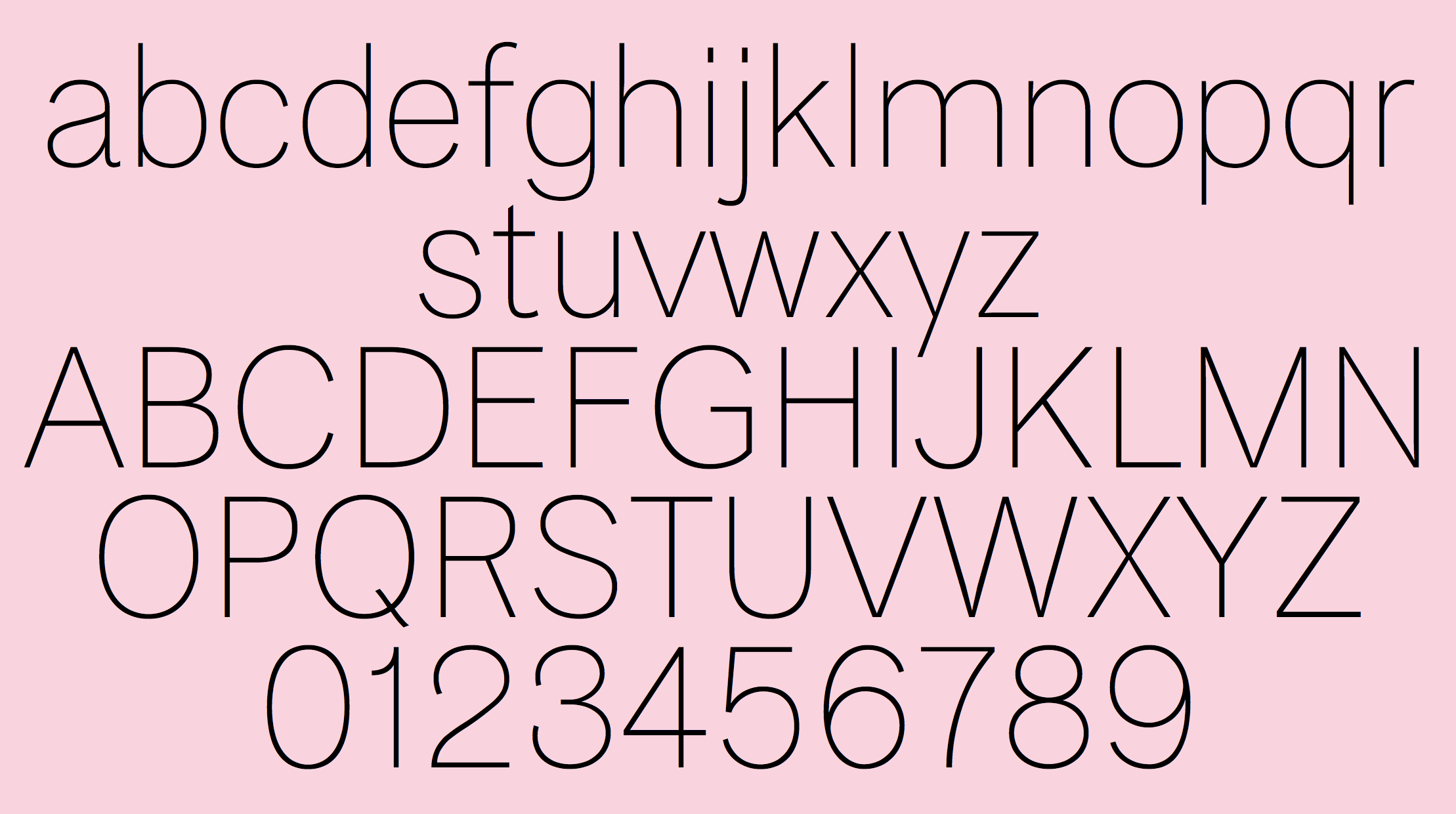
file name: Eben Sorkin Pria Ravichandran Inga Ploennigs Dan Reynolds Karow Extra Thin 2020
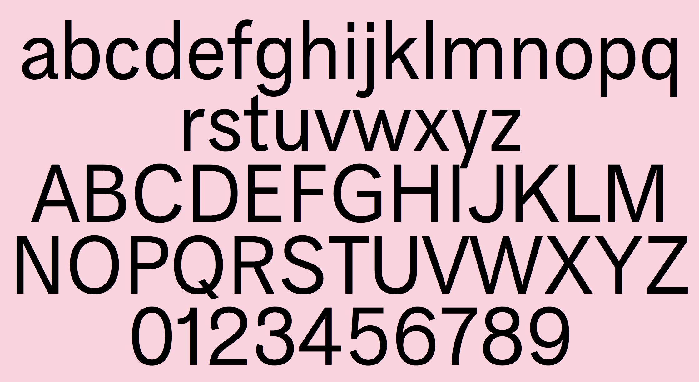
file name: Eben Sorkin Pria Ravichandran Inga Ploennigs Dan Reynolds Karow Light 2020
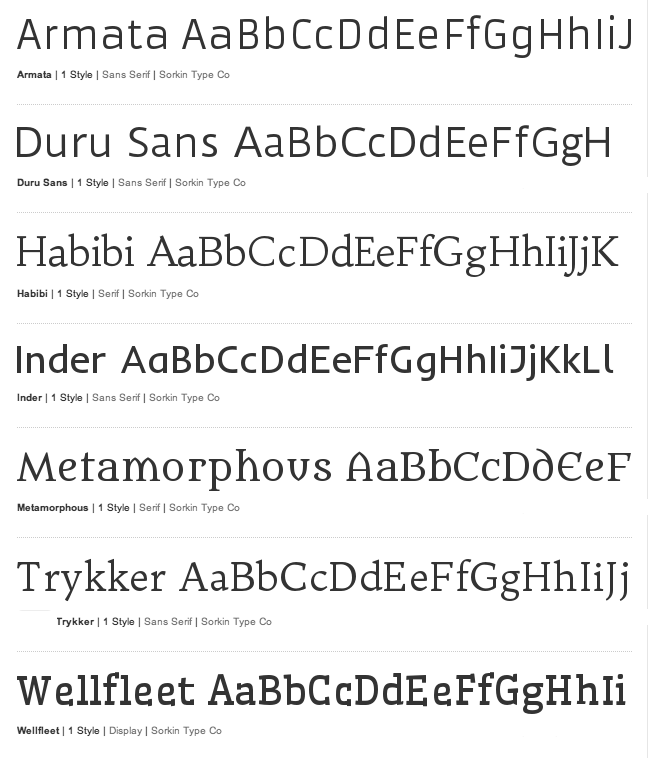
file name: Sorkin Type Catalog
file name: Sorkin Type Logo
file name: Joshua Darden Lucas Sharp Eben Sorkin Halyard 2017c
file name: Joshua Darden Lucas Sharp Eben Sorkin Halyard 2017d
file name: Joshua Darden Lucas Sharp Eben Sorkin Halyard 2017e
file name: Joshua Darden Lucas Sharp Eben Sorkin Halyard 2017f
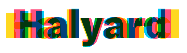
file name: Joshua Darden Lucas Sharp Eben Sorkin Halyard 2017h
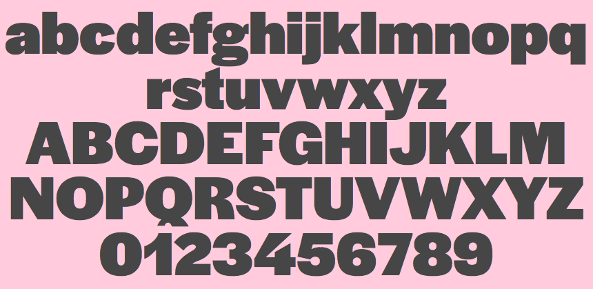
file name: Joshua Darden Lucas Sharp Eben Sorkin Halyard Display Black 2017
file name: Joshua Darden Lucas Sharp Eben Sorkin Halyard Display Black 2017g
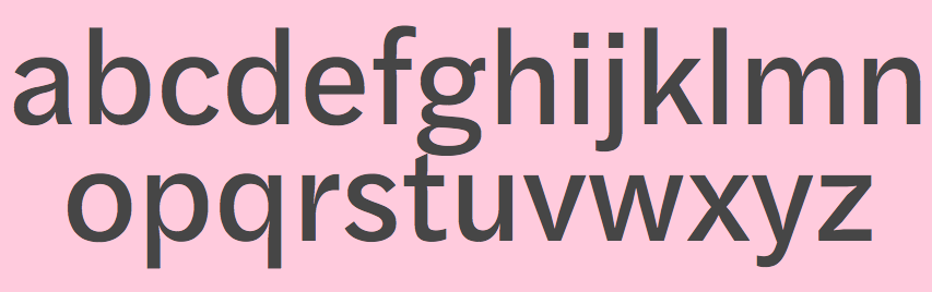
file name: Joshua Darden Lucas Sharp Eben Sorkin Halyard Text Regular 2017
file name: Eben Sorkin Pria Ravichandran Asar 2015
file name: Eben Sorkin Mirko Velimirovic Spline Sans 2021
file name: Eben Sorkin Mirko Velimirovic Spline Sans 2021
file name: Eben Sorkin Mirko Velimirovic Spline Sans 2021
file name: A Typ I2015 Eben Sorkin Photo by Luke Garcia Andre Hawk
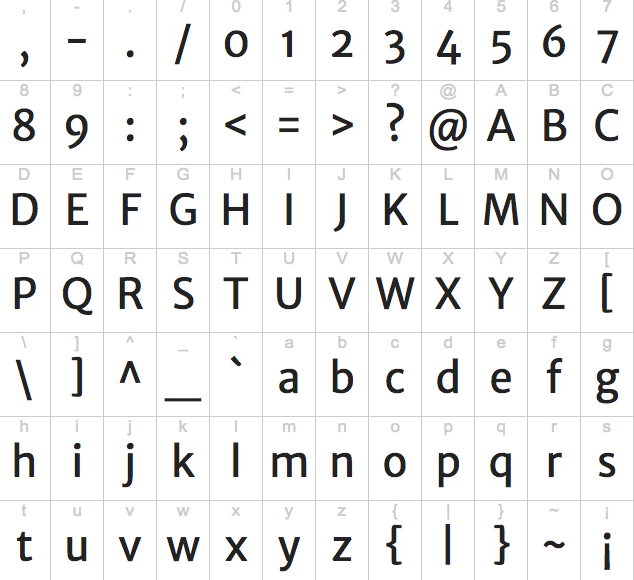
file name: Eben Sorkin Autour One 2011
file name: Eben Sorkin Limelight 2011
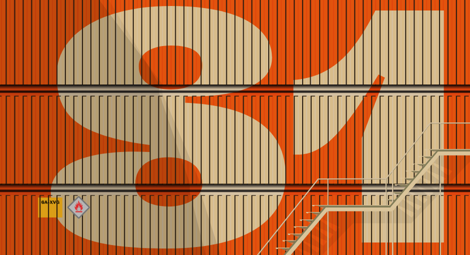
file name: Eben Sorkin Dekko 2014 2015
file name: Eben Sorkin Dekko 2014 2015b
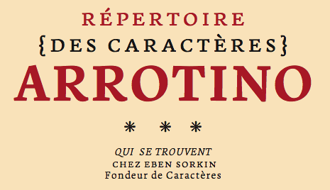
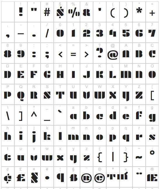
file name: Eben Sorkin Arrotino 2009b
file name: Eben Sorkin Arrotino 2009c
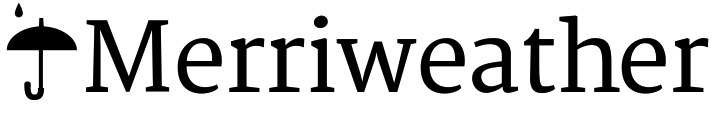
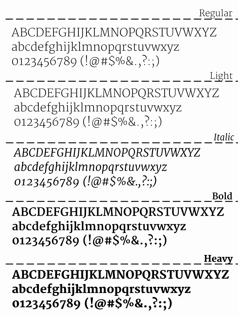
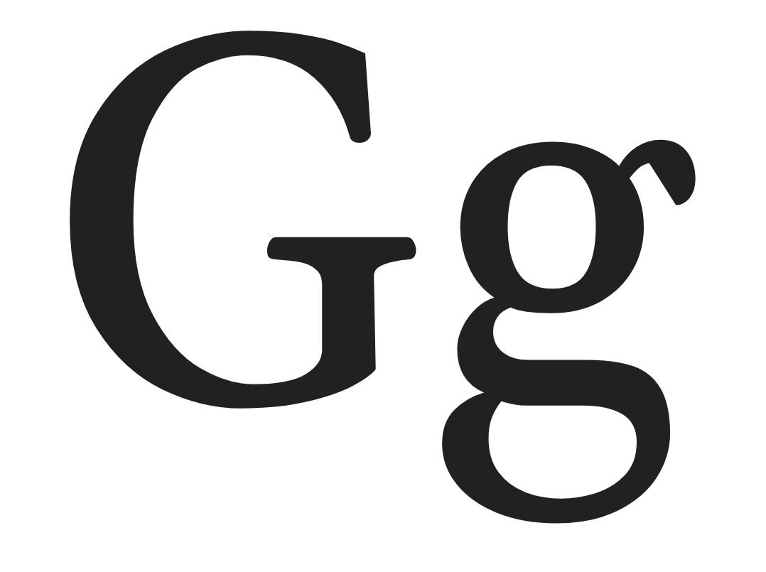
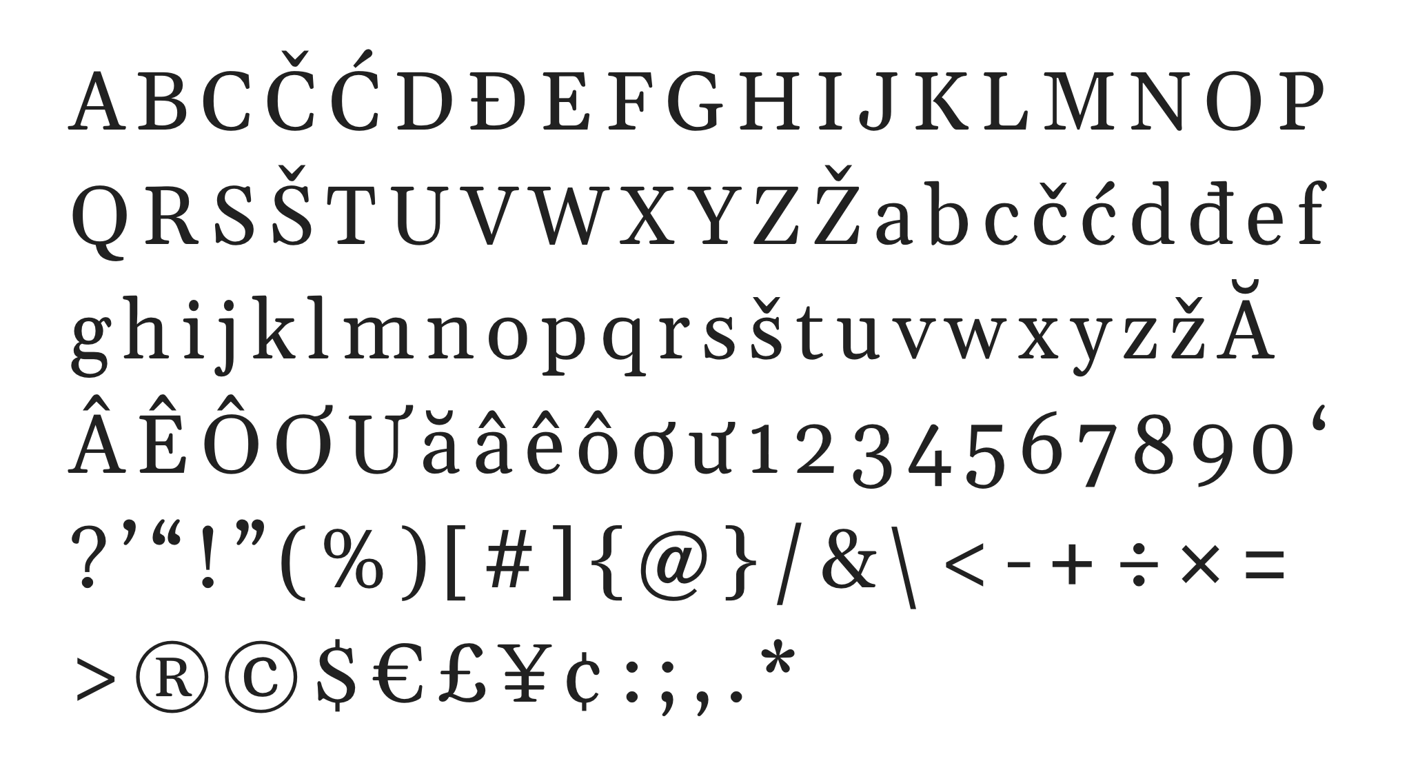
file name: Eben Sorkin Merriweather 2010
file name: Eben Sorkin Merriweather 2010b
file name: Eben Sorkin Merriweather Sans 2010b

file name: Eben Sorkin Merriweather Sans 2010
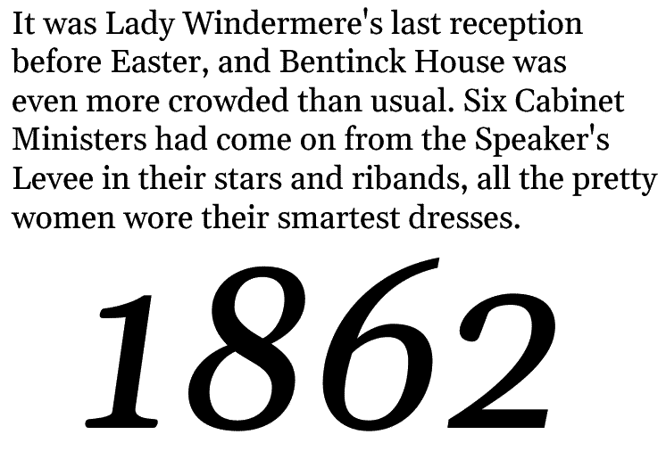
file name: Eben Sorkin Merriweather 2010 Poster by Luiz Felipe Severo 2014
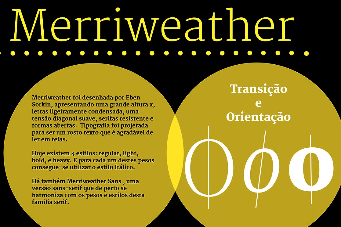
file name: Eben Sorkin Merriweather 2010 Poster by Luiz Felipe Severo 2014b
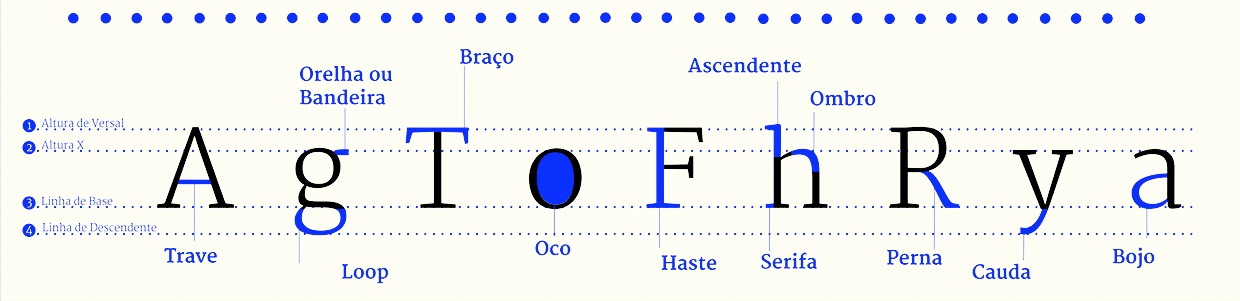
file name: Eben Sorkin Merriweather 2010 Poster by Luiz Felipe Severo 2014c
file name: Eben Sorkin Gelasio 2012
file name: Eben Sorkin Gelasio 2012
file name: Eben Sorkin Gelasio
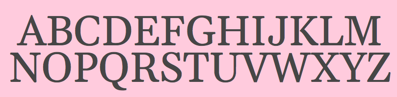
file name: Eben Sorkin Gelasio 2012
file name: Eben Sorkin Plaster 2011
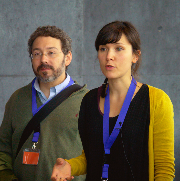
file name: Eben Sorkin Alice Savoie A Typ I2011 Photo by Ralph Herrmann
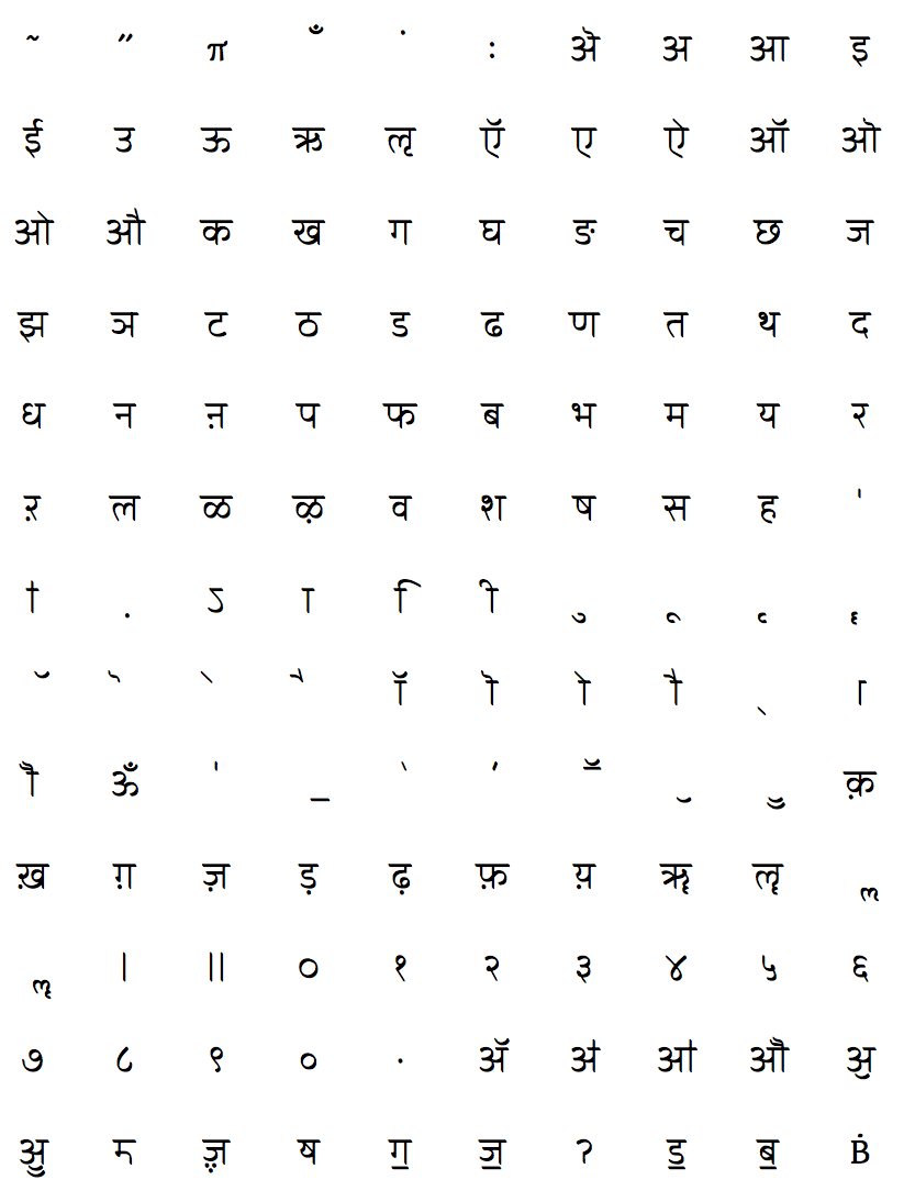
file name: Joshua Darden Eben Sorkin Viktoriya Grabowska John Hudson Maxim Zhukov Omnes Cyrillic 2006
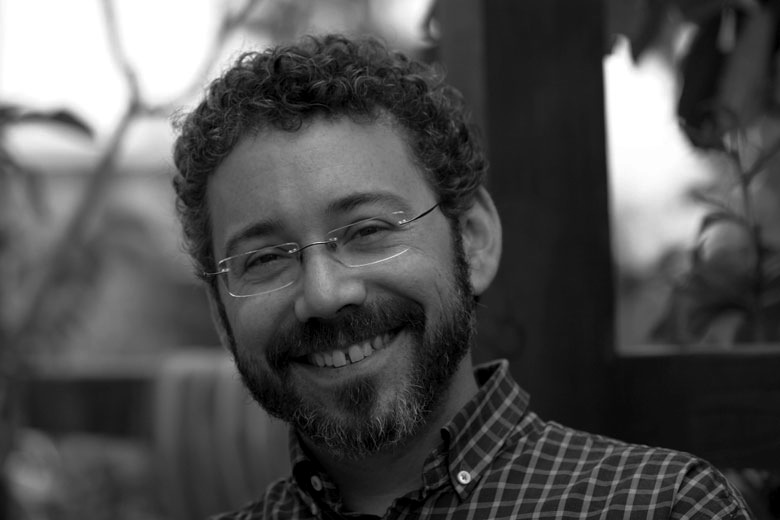
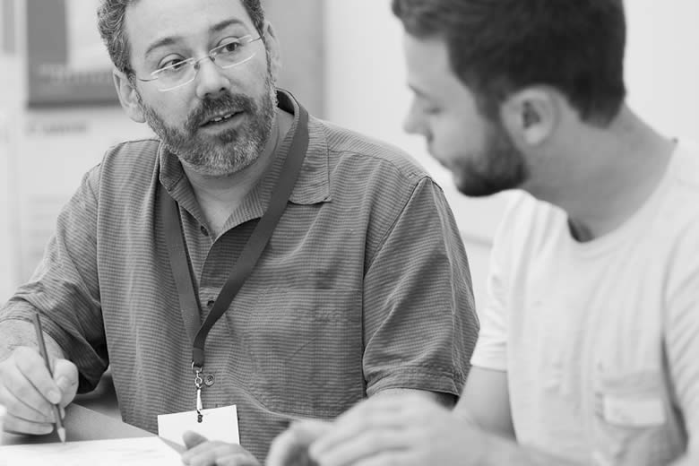
file name: Eben Sorkin Pic
file name: Eben Sorkin Pic
| | |
|
Luc Devroye ⦿ School of Computer Science ⦿ McGill University Montreal, Canada H3A 2K6 ⦿ lucdevroye@gmail.com ⦿ https://luc.devroye.org ⦿ https://luc.devroye.org/fonts.html |