TYPE DESIGN INFORMATION PAGE last updated on Tue May 5 11:45:43 EDT 2026
FONT RECOGNITION VIA FONT MOOSE
|
|
|
|
The Northern Block (TNB)
[Jonathan Hill]
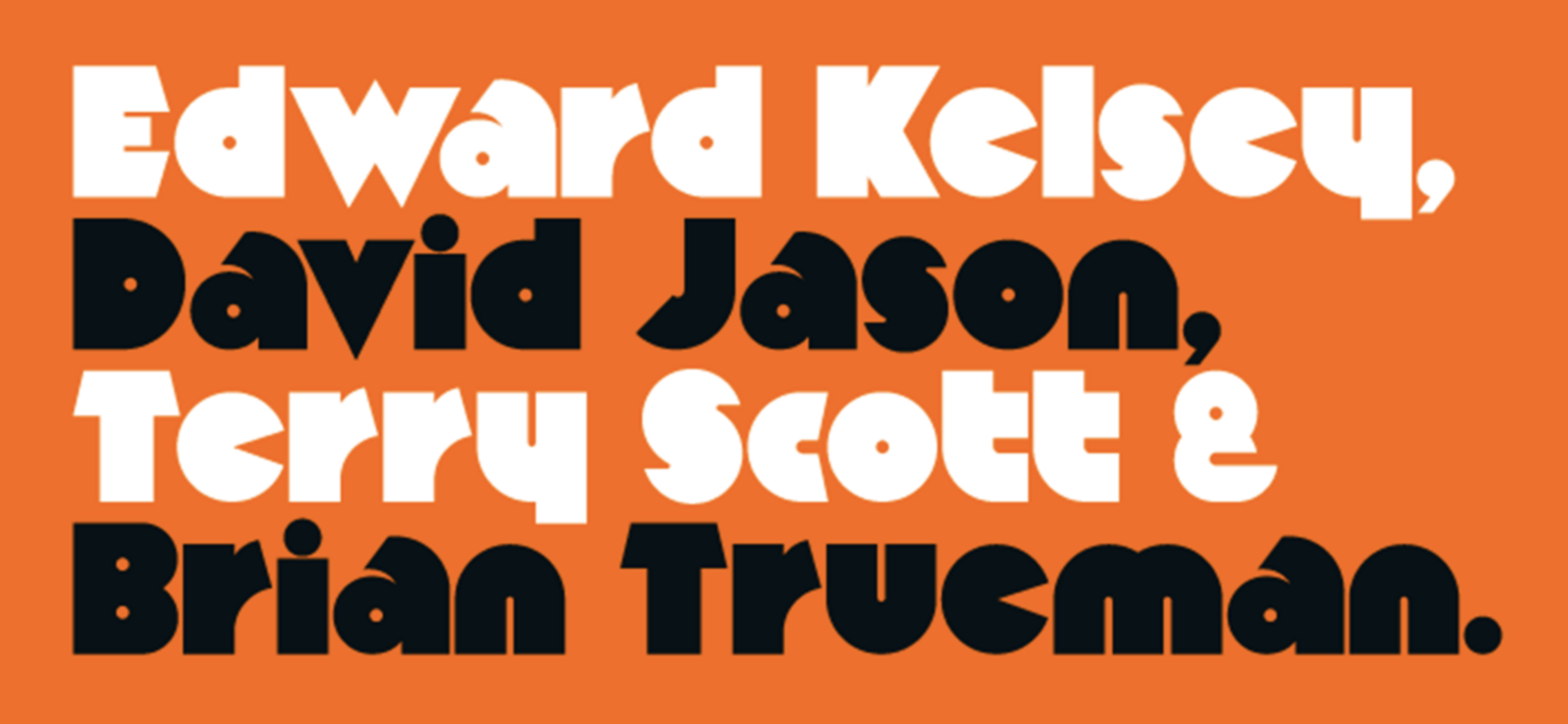
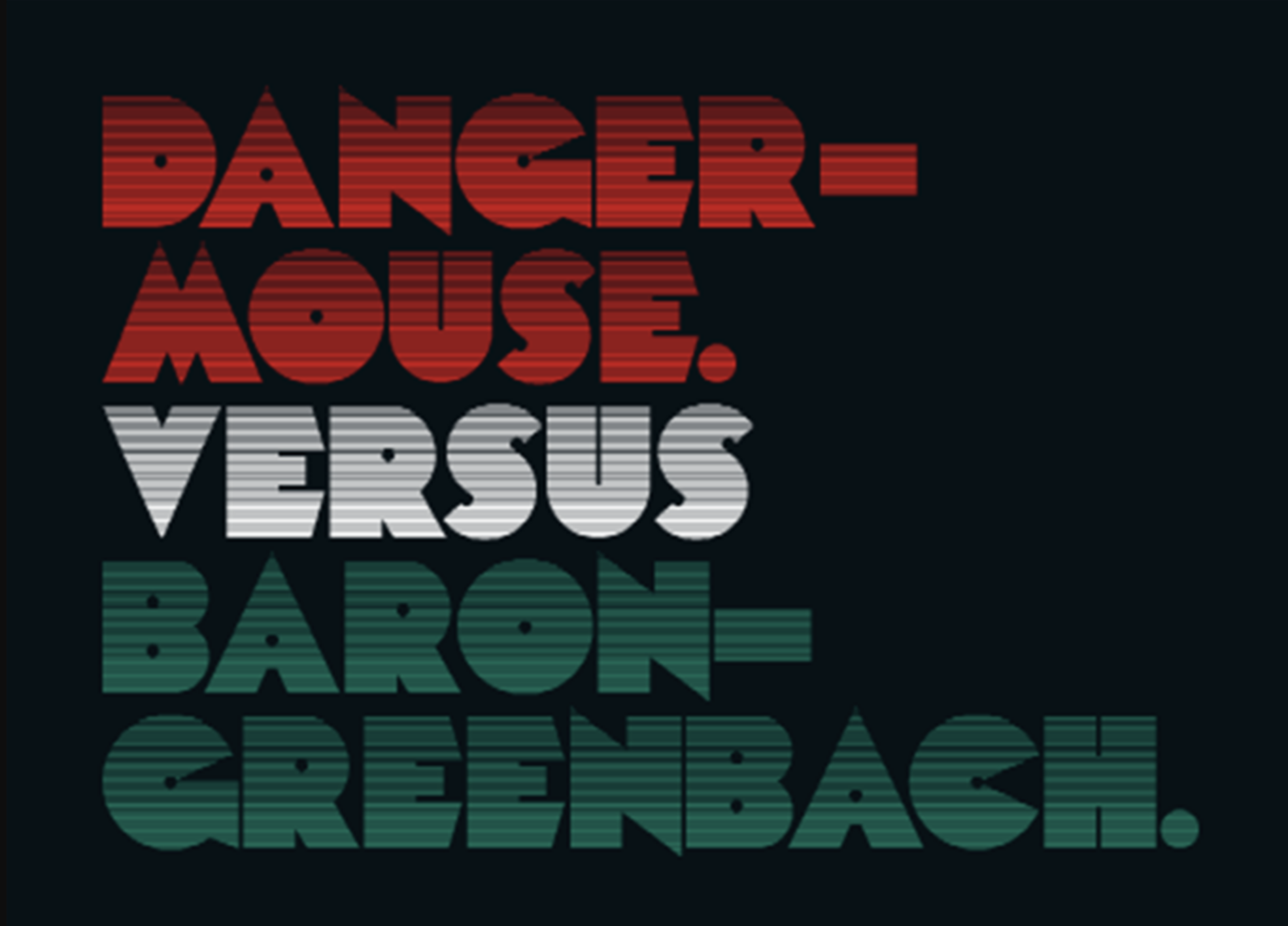
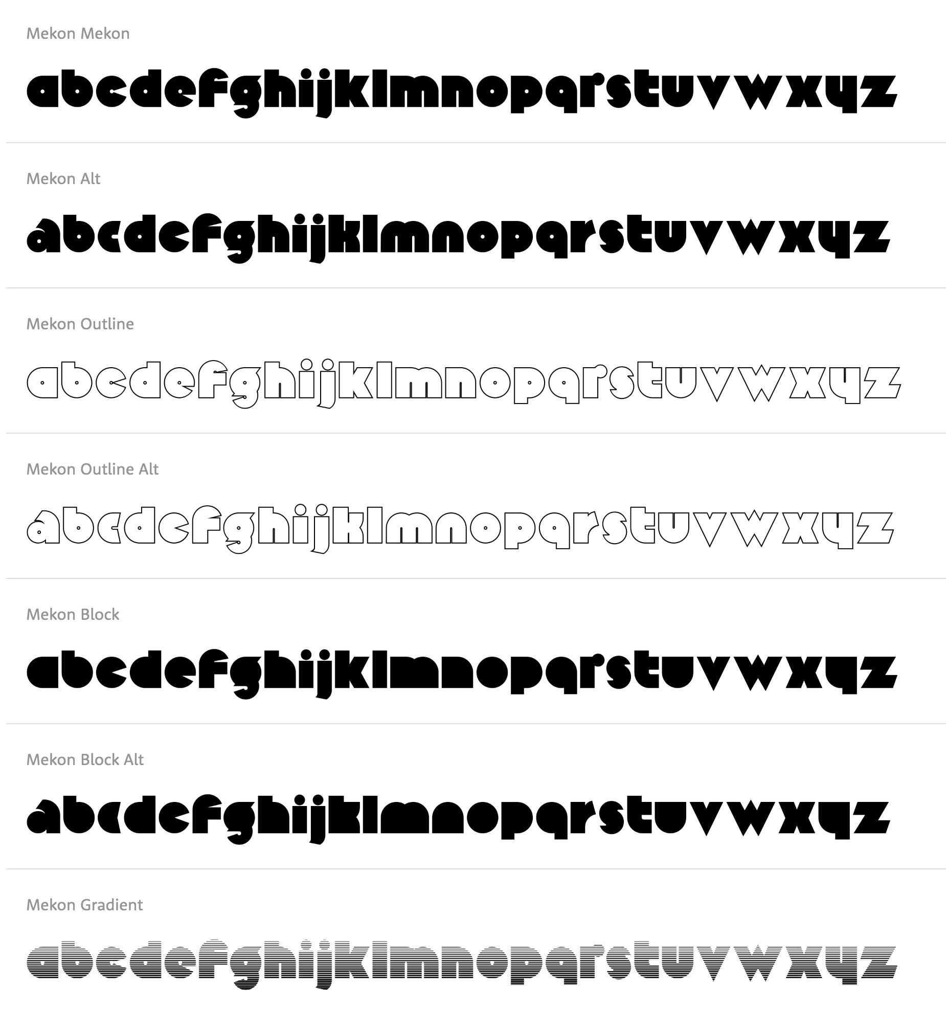
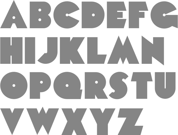
The Northern Block (TNB) is Jonathan Hill's foundry based in Leeds and/or Sheffield and/or Newcastle, UK, est. 2006. The designer and funder is Jonathan Hill (b. Sheffield, 1971) who lives in Newcastle-upon-Tyne, UK. Maria Pigoulevskaya joined The Northern Block as type designer in 2012. Home page. Free fonts by Jonathan Hill can be found at Dafont and Fontspace. Another Dafont link. MyFonts link. Hellofont link. Behance link. Klingspor link. Abstract Fonts link. Alternate URL. In 2010, he started FontStructing typefaces. His first was the grungy wooden plank typeface Timber Remnants. Also in this category is Laser Disco (2008, futuristic). Typefaces from 2006 until 2008: Sylar (2008, a techno family in 16 styles), Geta Robo (2008, a mechanical typeface influenced by Japanese animation), Arctic Patrol (angular family), Dokter Bryce (2008, octagonal and severe), Orange Royale (2008, 8 styles of fat techno and stencil fonts), CorTen (2008, octagonal ultra-fat stencil), QueueBrick (2008, LED simulation), Center Forward (2008, futuristic), Platform One (2008, a futuristic family), Line Wire (2008, octagonal, influenced by the work of Dutch designer #Wim Crouwel), StealWerks (2006, LED-inspired stencil face; published at T-26) and Blockout (2007, 5 weights of a futuristic blocky type family). In 2008, these were followed by more computer-related typefaces such as VideoTech (futuristic), JoyRider and AstroNaut (octagonal+futuristic, now at T-26). WerkHaus (2008) is a 5-style family inspired by the minimal sans typefaces of Herbert Bayer and the Bauhaus movement. Typefaces from 2009: Scriber (2009, octagonal techno family), Get A Robo (2009, a 10-weight mechanical family influenced by Japanese animation (Anime)), Ten Gu (2009, paperclip font remastered from the 1970's Letragraphica font Tangui), Orange Royal (2009, rounded stencil), VideoTech (2009, inspired by computer games for the Commodore 64), SkyWing (2009, rounded typeface inspired by Japanese computer console games, such as Captain Tsubasa created by Yoichi Takahashi), VanBerger (2009, an octagonal family influenced by the De Stijl movement), Logan Five (2009, techno family inspired by the 1976 sci-fi film Logan's Run), Zaius (2009, a bold sans family that includes a stencil style, all based on Ed Benguiat's work for the 1968 movie poster for Planet of the Apes), Oric Neo (2009, a free octagonal techno family; +Stencil), VanBerger Stencil (2009, a free geometric sans influenced by Theo Van Doesburg and the De Stijl movement), Aldo (2009, +Open: a bold stylized type typeface re-worked from the original 1970s movie poster The Battle For The Planet Of The Apes), Sylar Stencil. Typefaces from 2010: Intropol (2010; image), Arcle (a monoline organic sans), Hoxton (humanist sans family), Lintel (monoline sans family with a large x-height), Knul (monoline sans), Dohrma (a machismo geometric face; +Inline), Planer (a technical writing family), Otomo (a Japanese techno family that includes a stencil), Yodo (a geometric experimental family in 3 weights), Nu Order (a sans family that includes a very thin weight), PyeMan (2009, a piano key font named after the PacMan game), ProtoFet, DraftWerk (a minimal rounded typeface inspired by architecture and furniture detail drawings), DyeLine (a geometric face with a great hairline weight), Cobol (2010, great octagonal monowidth face), Draftwerk (architectural lettering), Olympik (a gorgeous multiline family based on Letraset's Optex, 1970), Kaine (a slab family inspired by 1960s spaghetti westerns: +Stencil, +Outline, +Italic +Block; Hill says that The grid template is based on Welt Extra Bold from Letraset with detailed changes, additional characters and new style variations.), Brion (a modernization and extension of A. Mailay's rounded sans font Arpad (1971, VGC); Kaine Block, the counterless version, is free at Dafont). Mekon (2010) is a fat sans display typeface with a free horizontally striped style. It revives and extends Peter Steiner's phototype Black Body (1973). MarkusLow (2010) is a revival and extension of Basilea (1965, Markus Low, VGC). Teletex (2010; +Ultra Light, +Light, +Medium) is a typewriter style slab serif whose design was influenced by Rockwell.
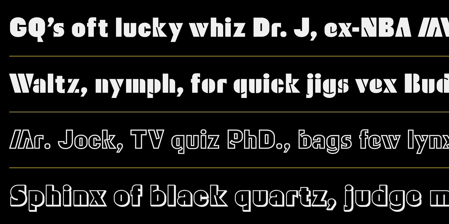
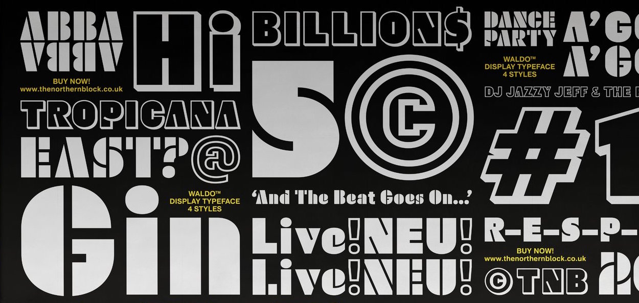
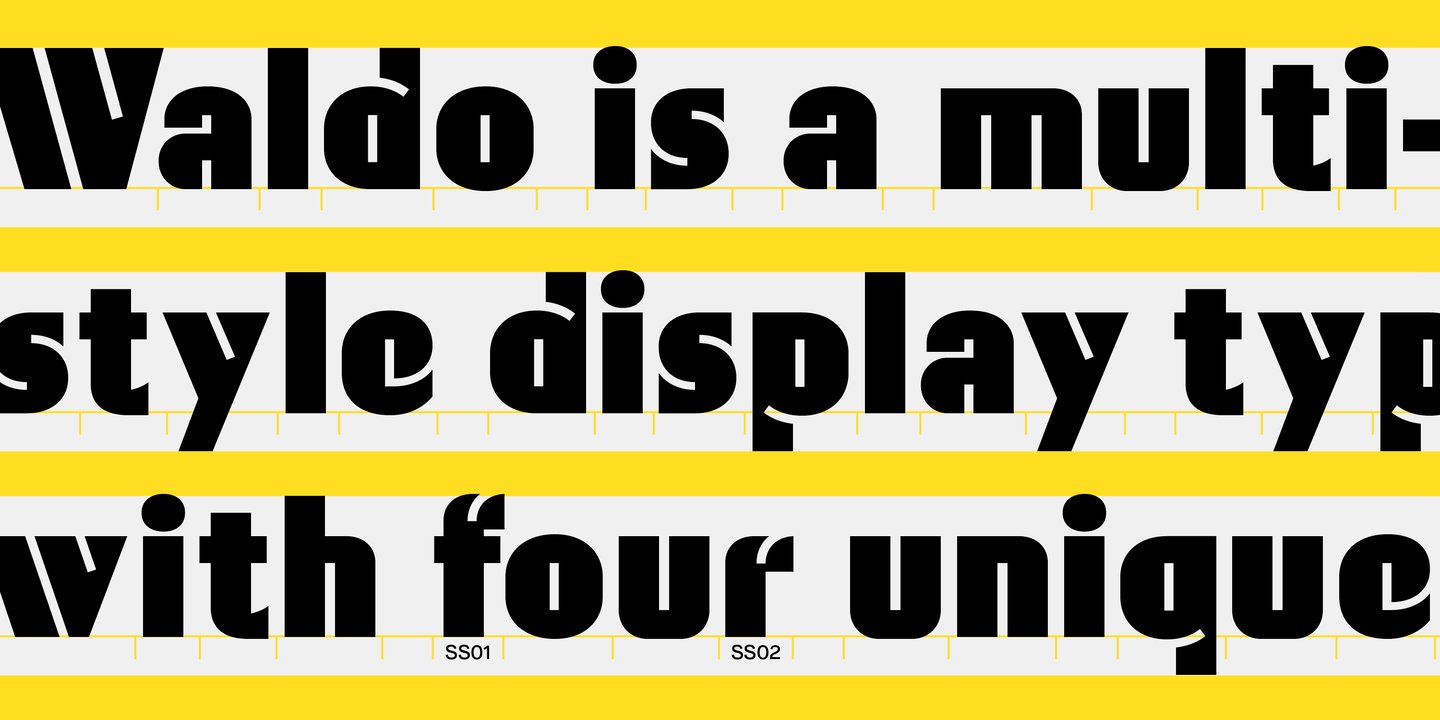
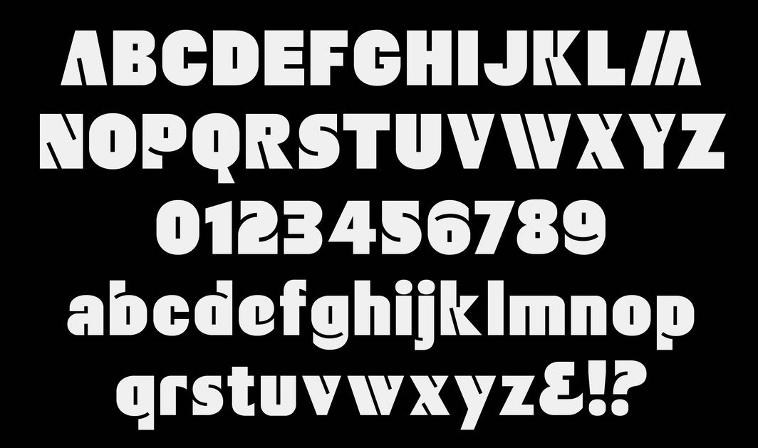
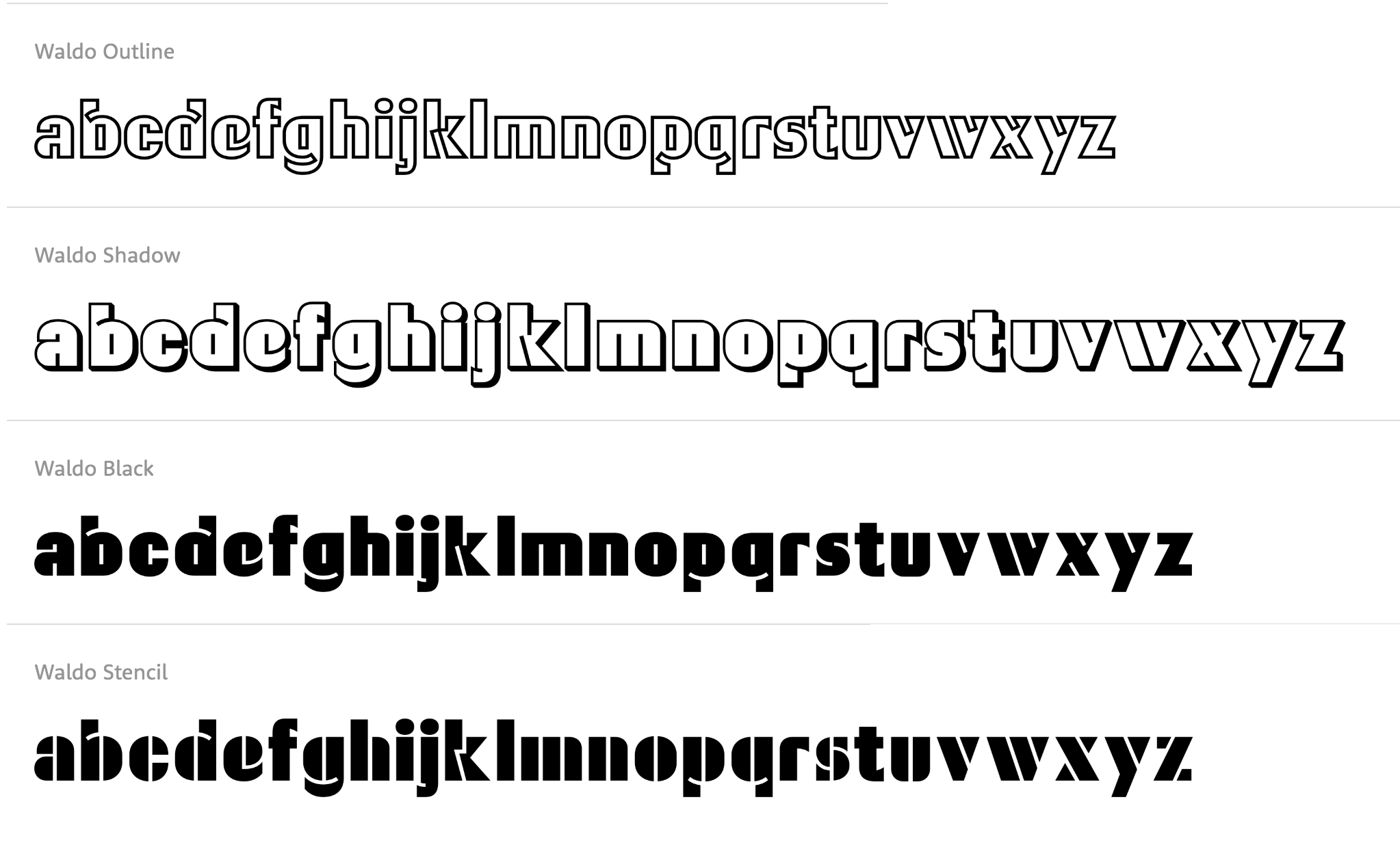
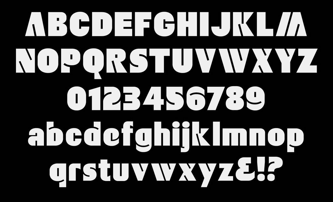
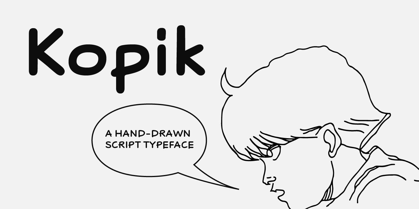
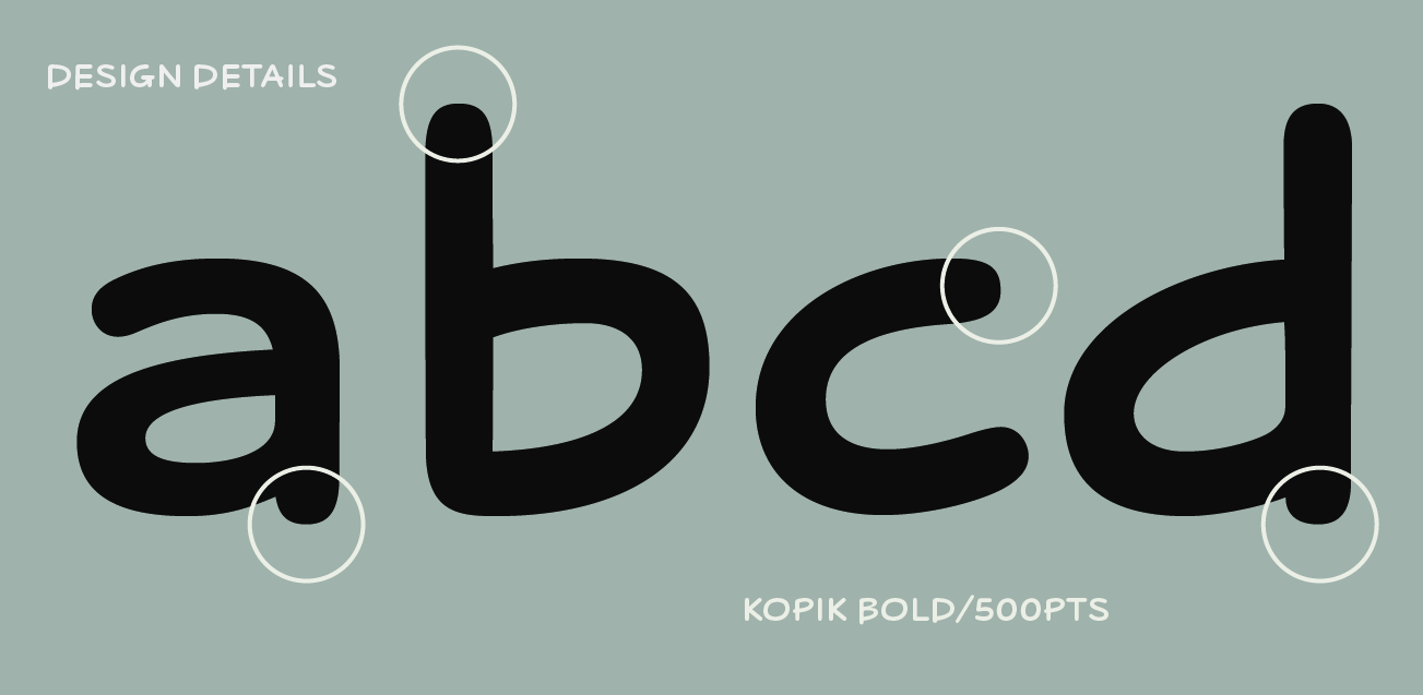
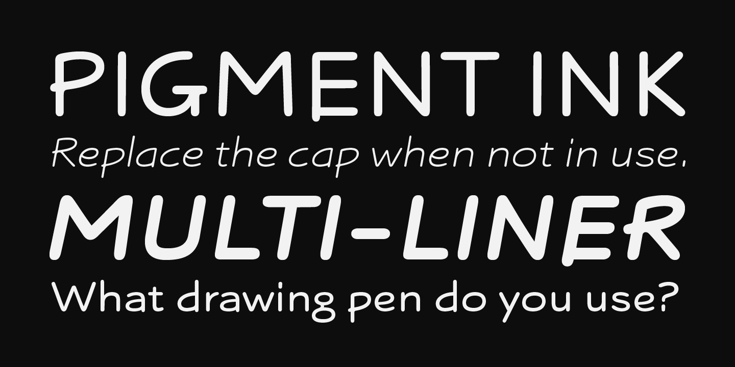
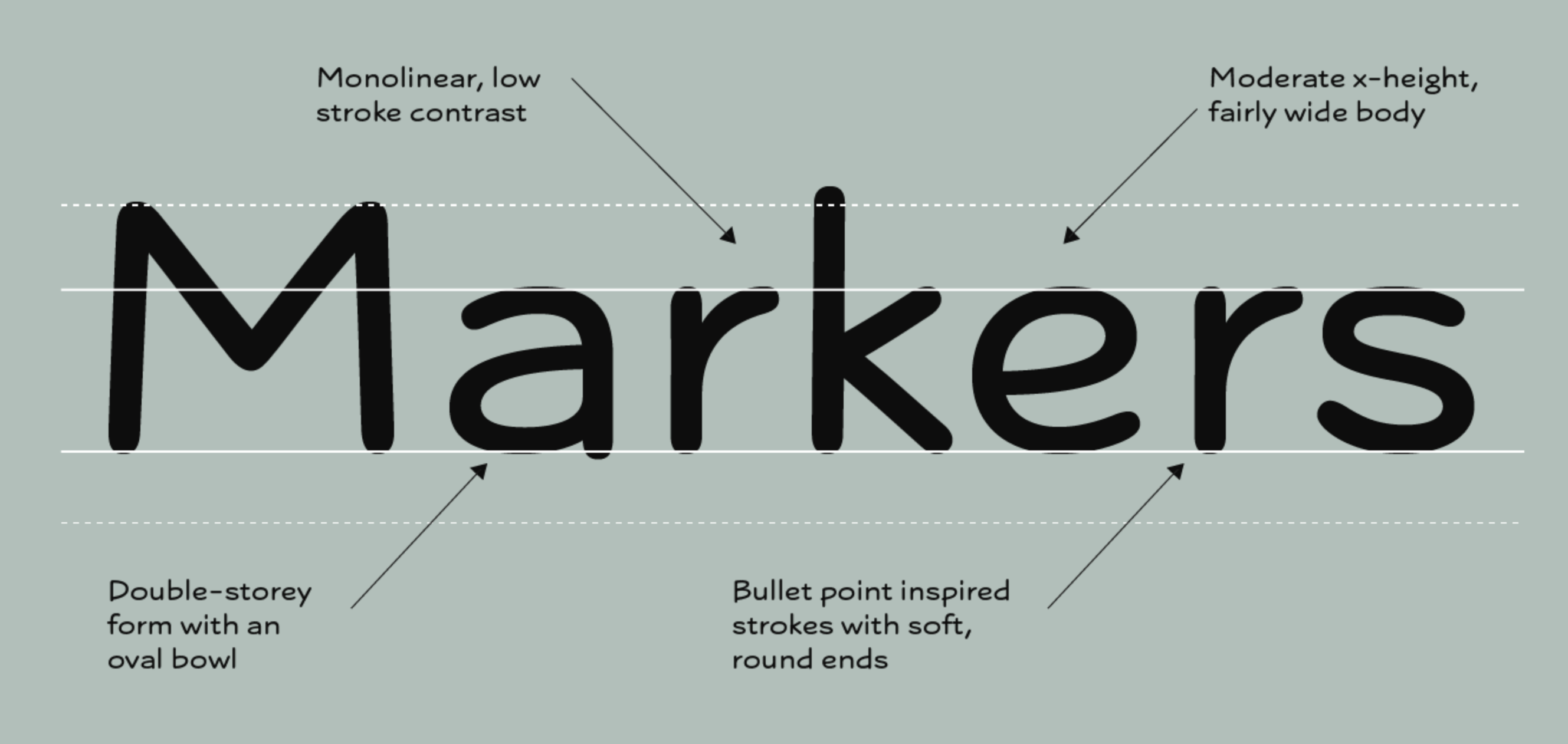
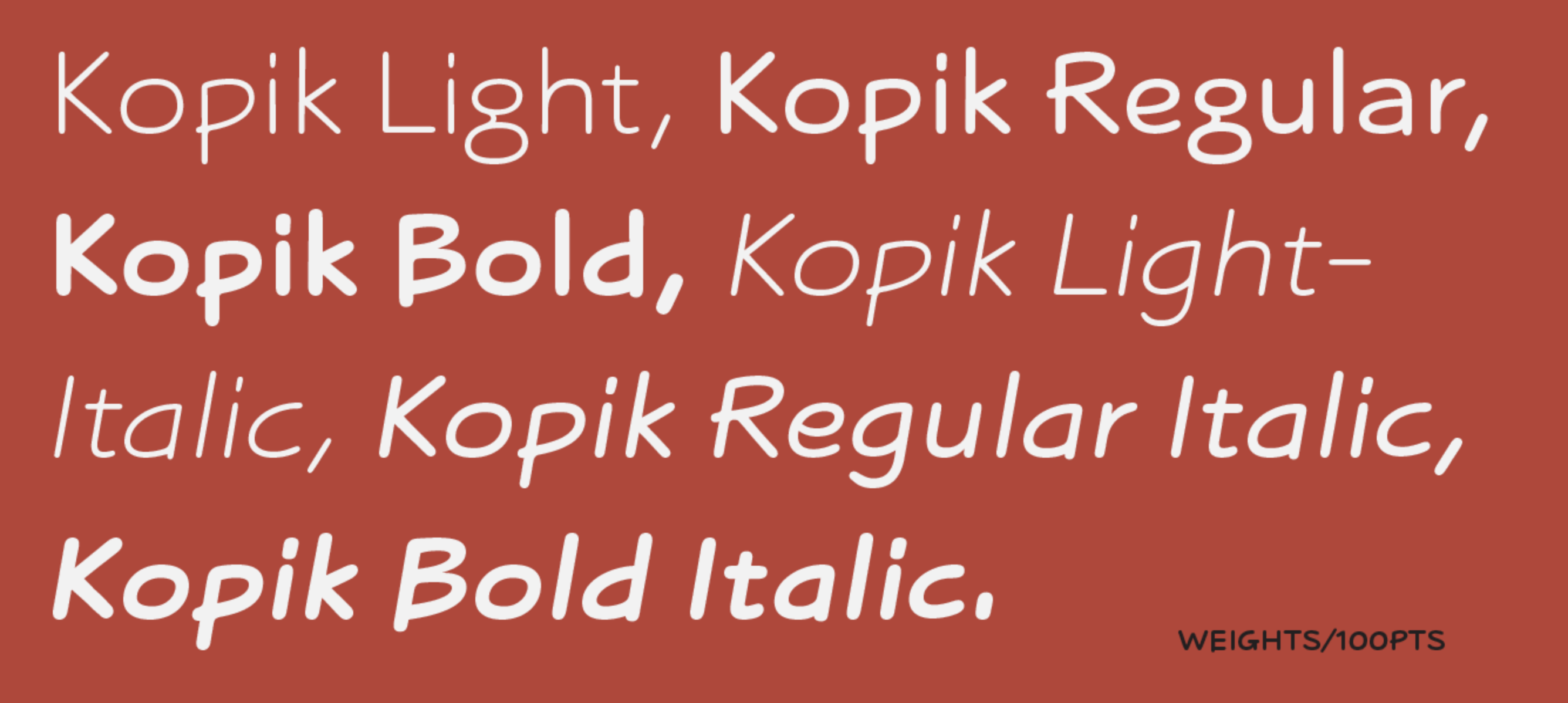
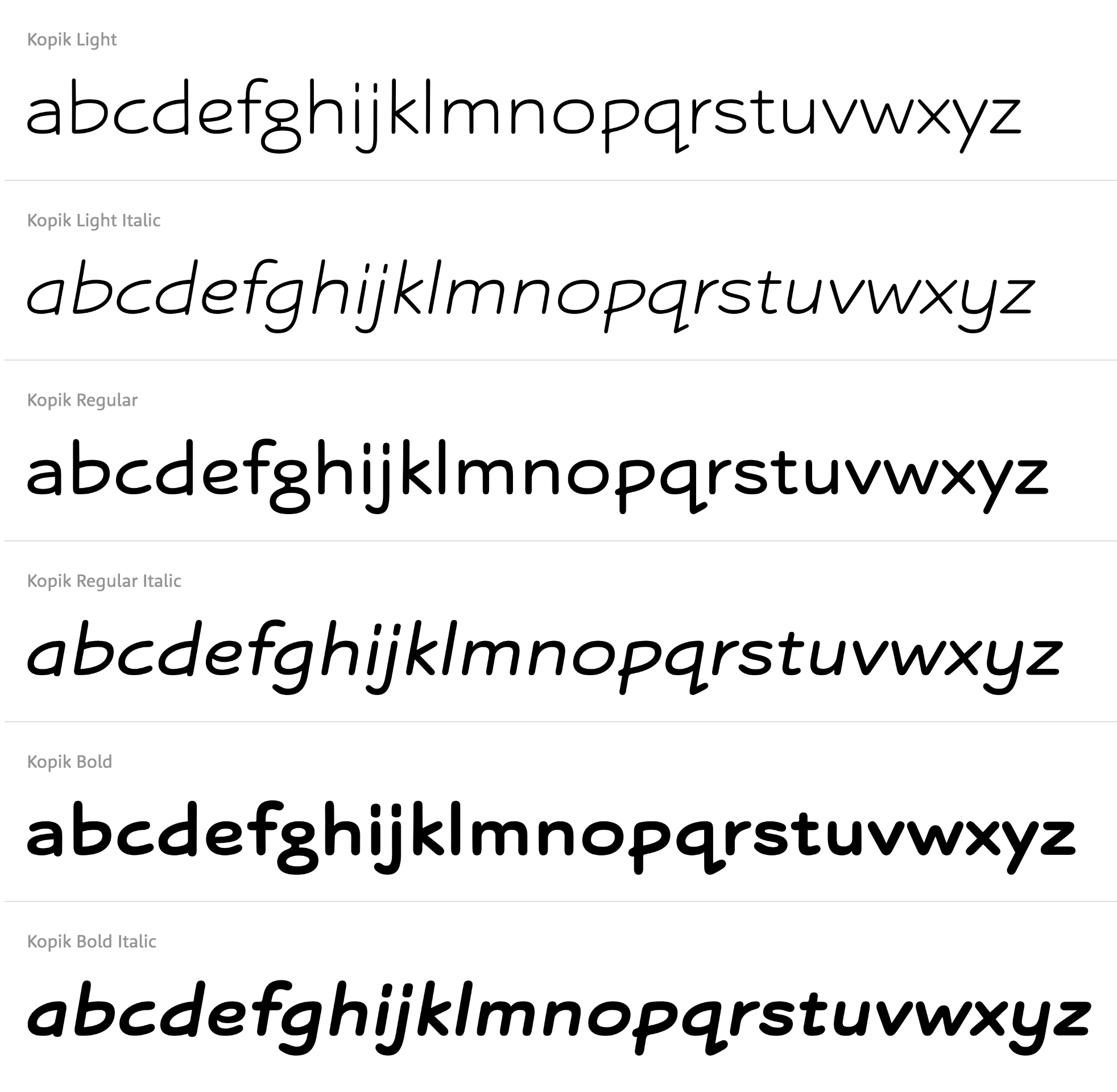
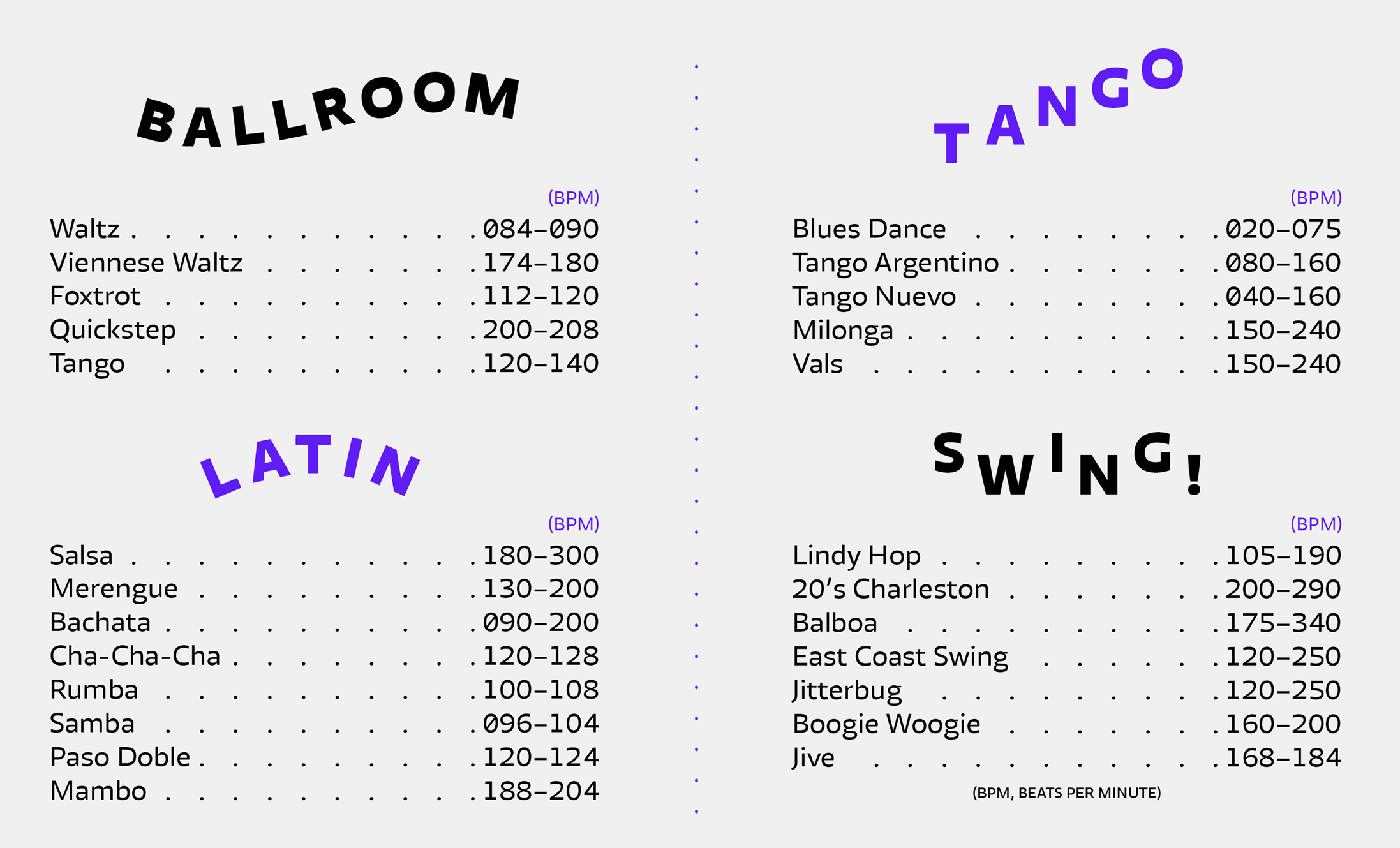
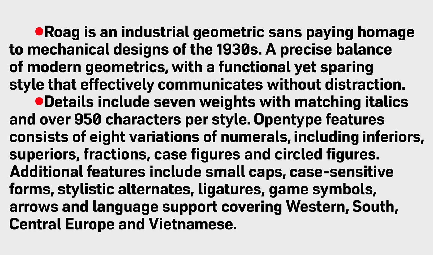
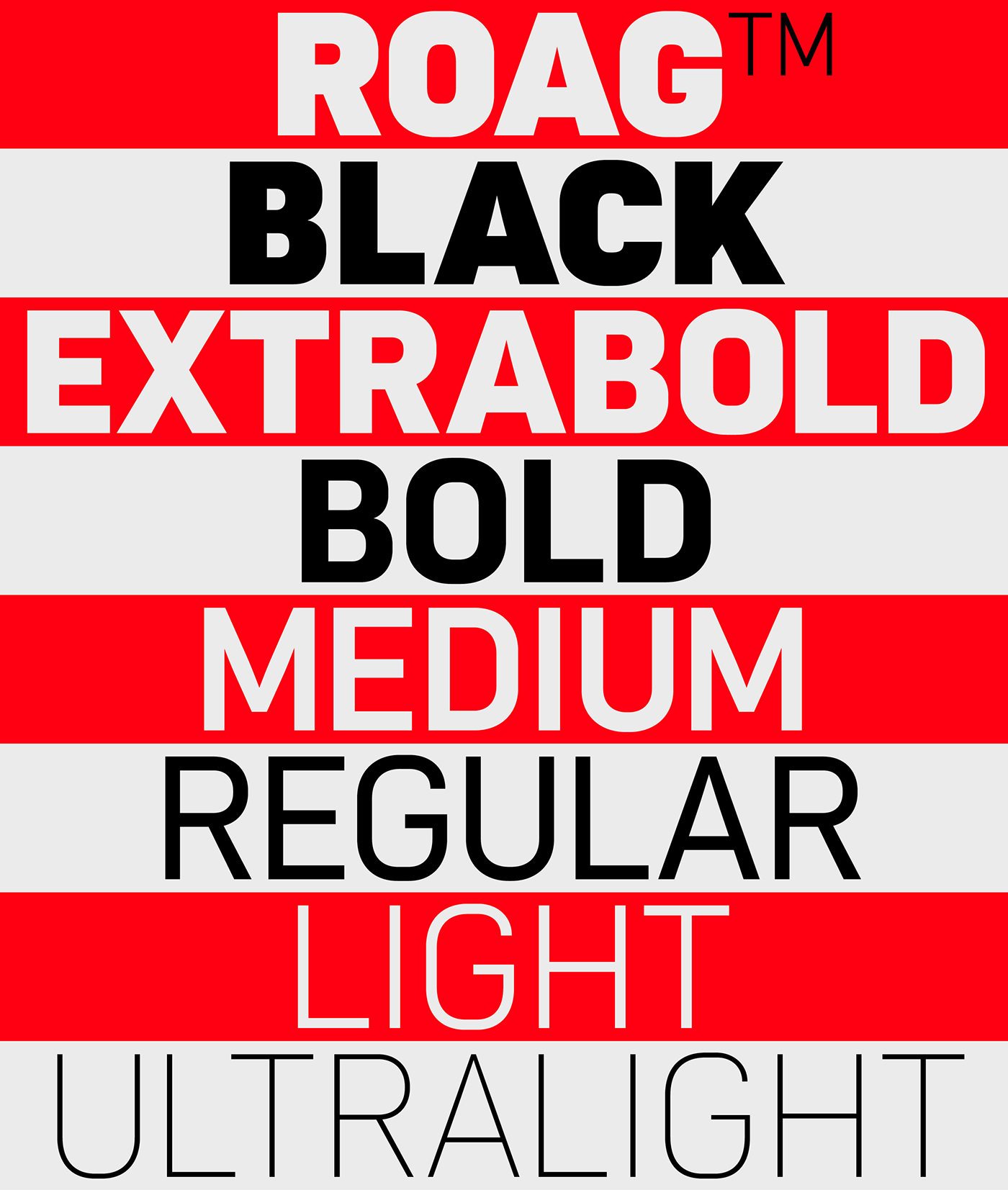
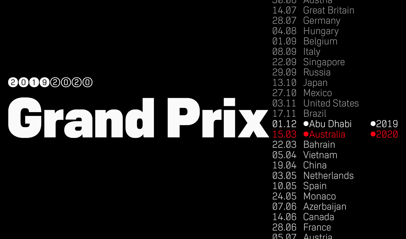
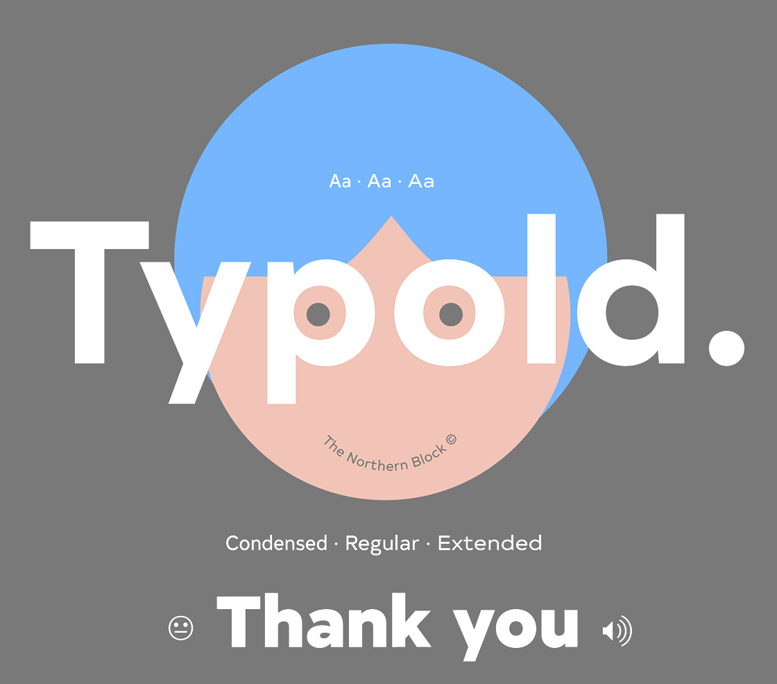
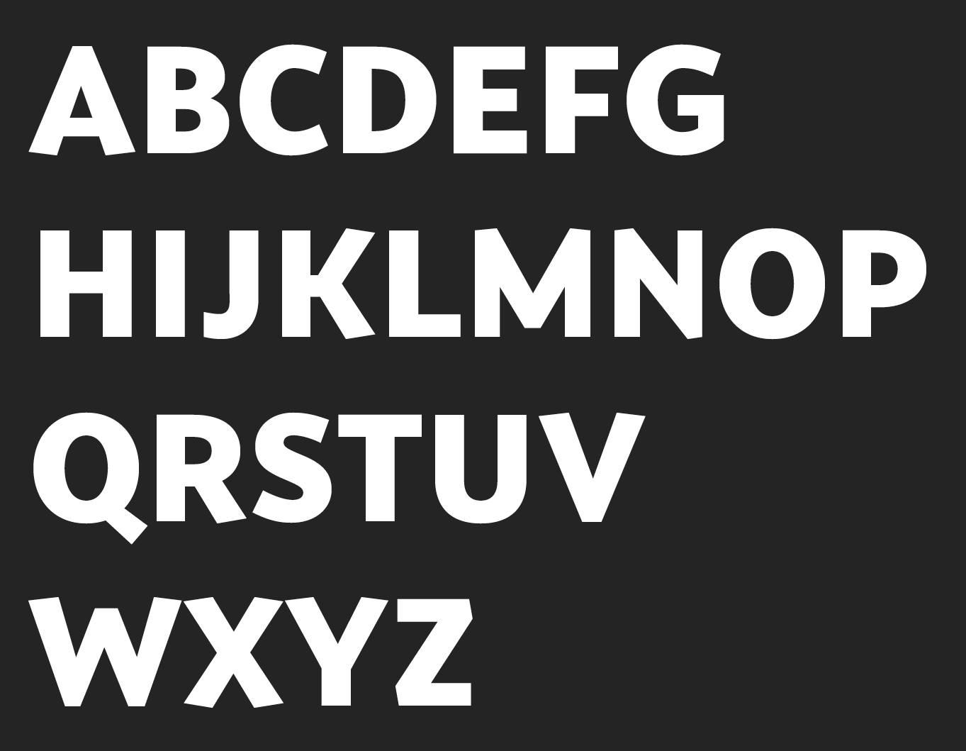
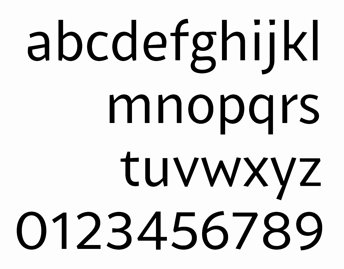
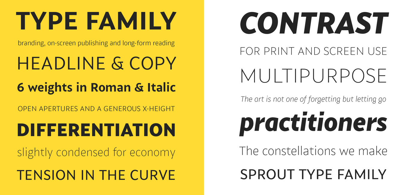
Jonathan Hill's most popular typefaces. Type designs done in 2012: Hackman (elliptical sans), Borda (octagonal), Savile (humanist sans), Metrik (a nice geometric---borderline organic---sans family), Metral (rounded octagonal typeface), Uniman, Kobern (a strong sans), Reznik (techno sans). Type designs from 2013 by Jonathan Hill: Nauman (a humanist sans family with attention paid to the triple (1, i, j)), Gunar, Nuber (followed in 2018 by Nuber Next), Eund (a modulated sans), Corbert (Bauhaus-inspired sans), Corbert Condensed. Typefaces from 2014: Byker (geometric sans), Schar (humanist sans), Loew (geometric information design sans; extended in 2018 by him and Donna Wearmouth to Loew Next (for Latin and Cyrillic) and Loew Next Arabic), Bitner (spurless organic sans named after bitcoins), Modum, Modum. Typefaces from 2015: Facto (a simple sans family with large x-height), Halcom (influenced by Futura), Scharf, Itoya. Typefaces from 2016: Syke Mono (a stylish monospaced typeface family), Oyko (an octagonal industrial typeface family), Kylo Sans, Syke (a sans typeface family), Hoxton North (a condensed humanist, very British, sans), Celdum (geometric sans). Typefaces from 2017: Tomarik, Typold. Typefaces from 2018: Paradroid, Sprout (a low-contrast 6-weight sans). Typefaces from 2019: Roag (an industrial geometric sans paying homage to mechanical designs of the 1930s), Syke (14-style sans), Scharf (a sturdy sans family), Mynor (a modern squarish sans inspired by machine-readable typefaces of the 1950s including OCR-A and B). Typefaces from 2020: Corbert Wide, Blom (a humanist sans family). Typefaces from 2021: Waldo (a 4-style bold, stencil-focused display typeface loosely based on a 1973 science fiction movie poster for The Battle For The Planet of The Apes), Nauman Neue (a 60-style humanist sans), Kopik (a comic book typeface with rounded forms; it was inspired by the 1960's architectural handwriting style practised by draftsmen), Duran (a 14-style geometric sans with built-in strength). Creative Fabrica link. View Jonathan Hill's typefaces. Another list of Jonathan Hill's fonts. Interview in 2014. |
EXTERNAL LINKS |
| | |

file name: The Northern Block Waldo 2021 1
file name: The Northern Block Waldo 2021 2
file name: The Northern Block Waldo 2021 3
file name: The Northern Block Waldo 2021
file name: The Northern Block Waldo 2021
file name: The Northern Block Waldo 2021

file name: The Northern Block Waldo 2021
file name: The Northern Block Waldo 2021 4

file name: The Northern Block Waldo 2021 5
file name: The Northern Block Kopik 2021 1
file name: The Northern Block Kopik 2021 2
file name: The Northern Block Kopik 2021 3
file name: Jonathan Hill Kopik 2021
file name: Jonathan Hill Kopik 2021
file name: Jonathan Hill Kopik 2021
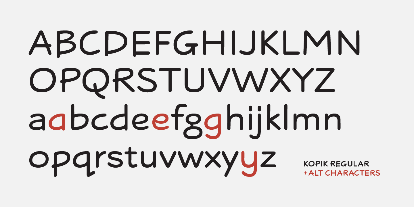
file name: The Northern Block Kopik 2021 4

file name: The Northern Block Kopik 2021
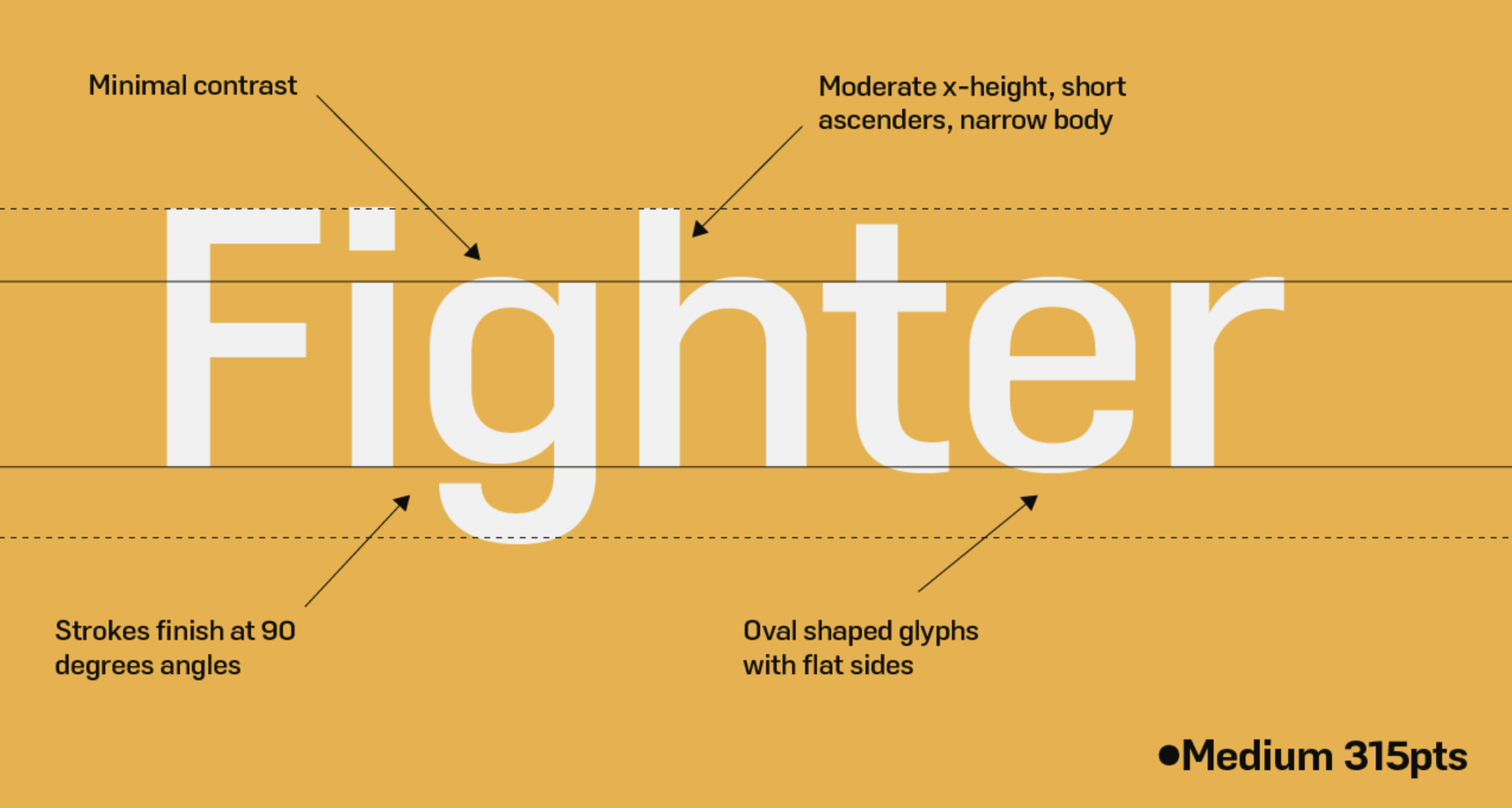
file name: Jonathan Hill Duran 2021

file name: Jonathan Hill Duran 2021

file name: Jonathan Hill Duran 2021
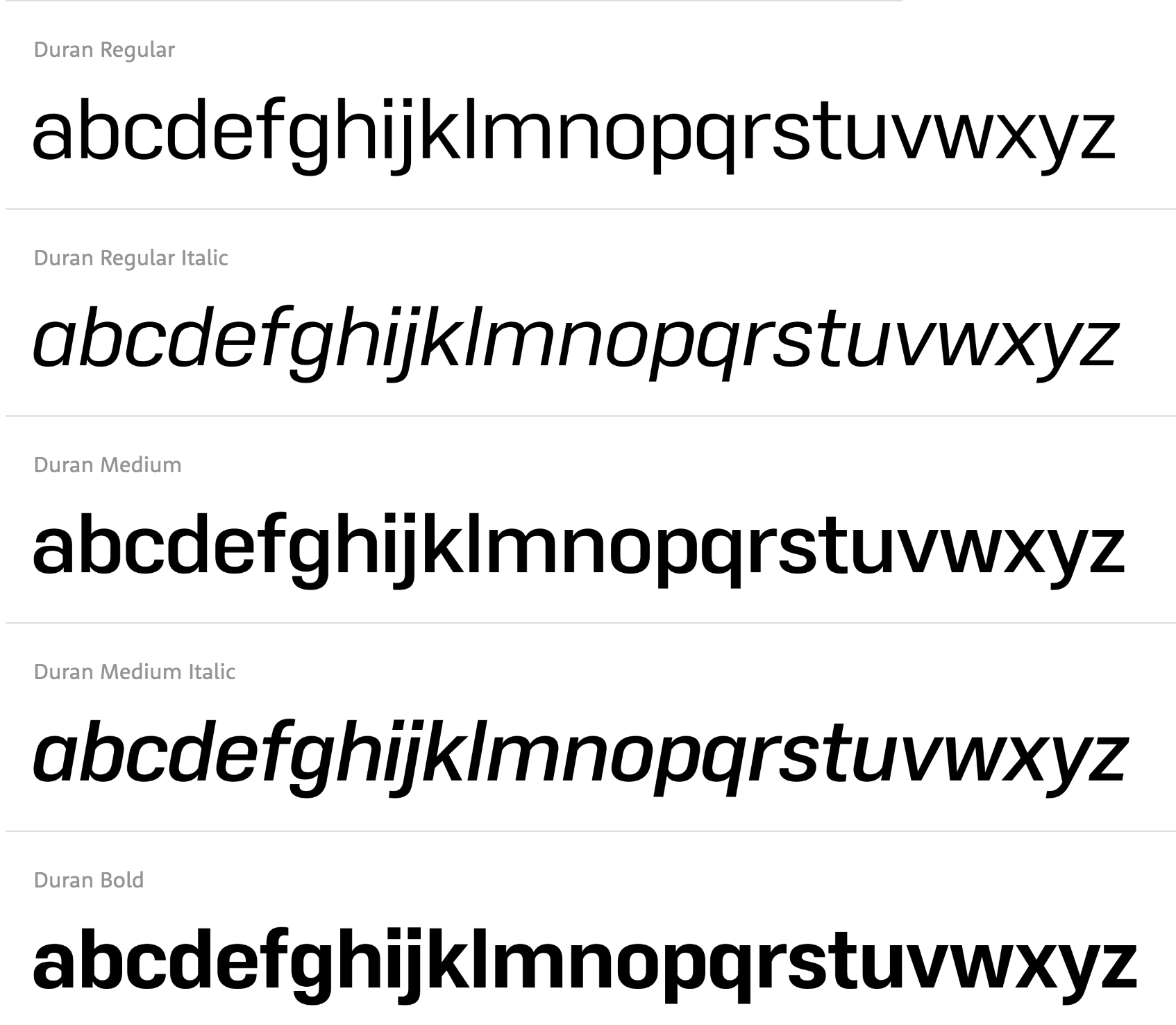
file name: Jonathan Hill Duran 2021
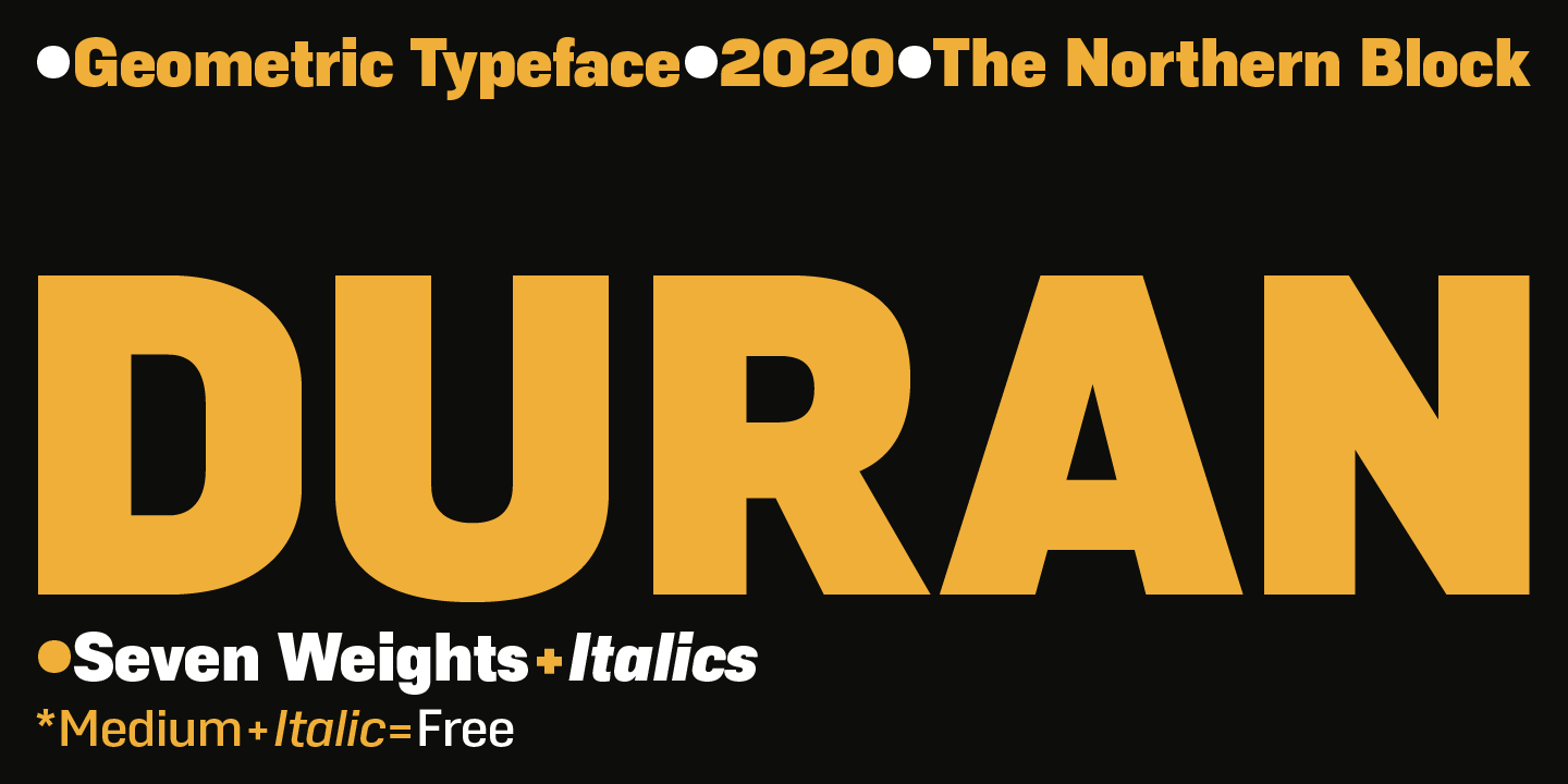
file name: The Northern Block Duran 2021 1
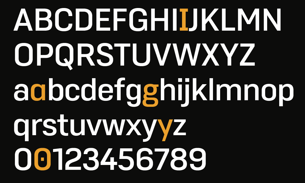
file name: The Northern Block Duran 2021 2
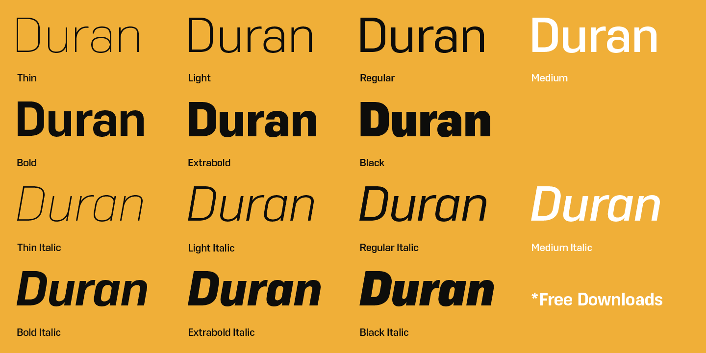
file name: The Northern Block Duran 2021 3
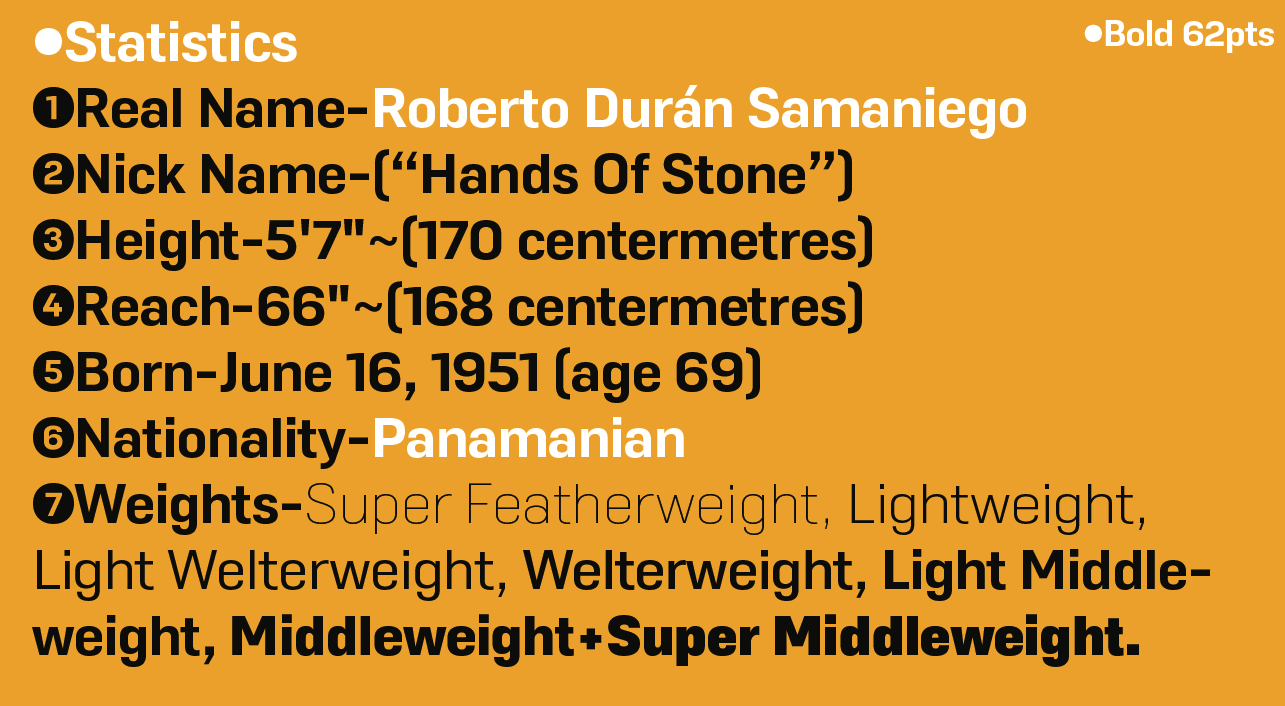
file name: The Northern Block Duran 2021 5

file name: The Northern Block Duran 2021

file name: Jonathan Hill Blom 2020
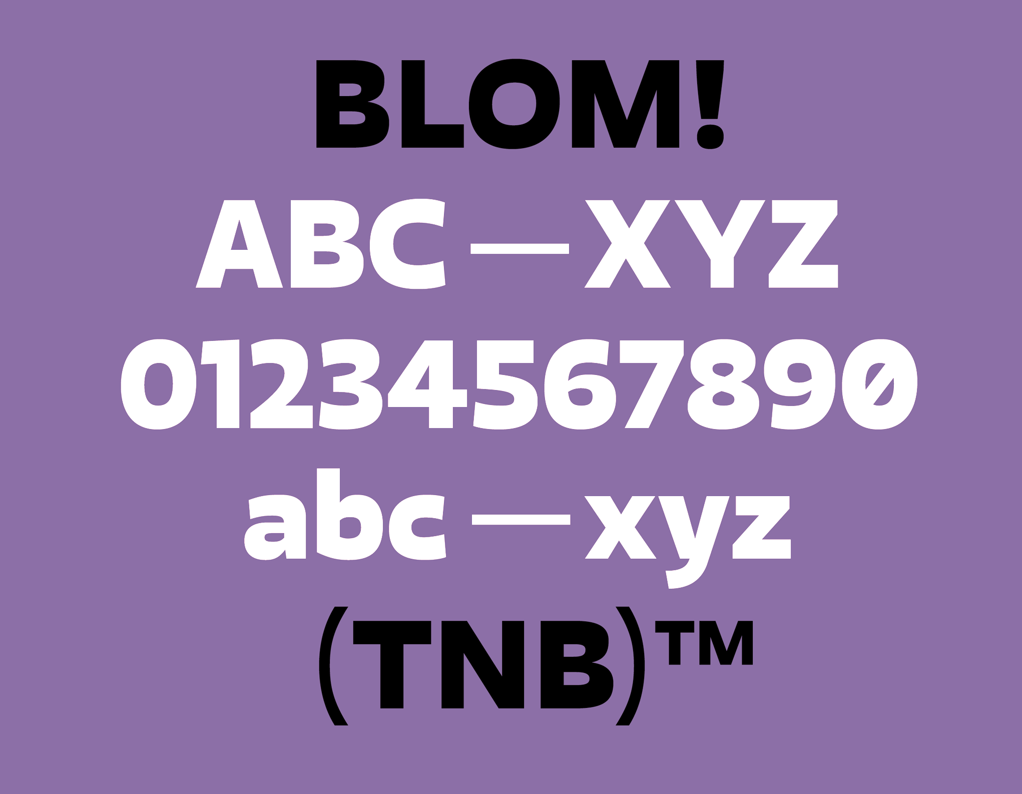
file name: Jonathan Hill Blom 2020

file name: Jonathan Hill Blom 2020
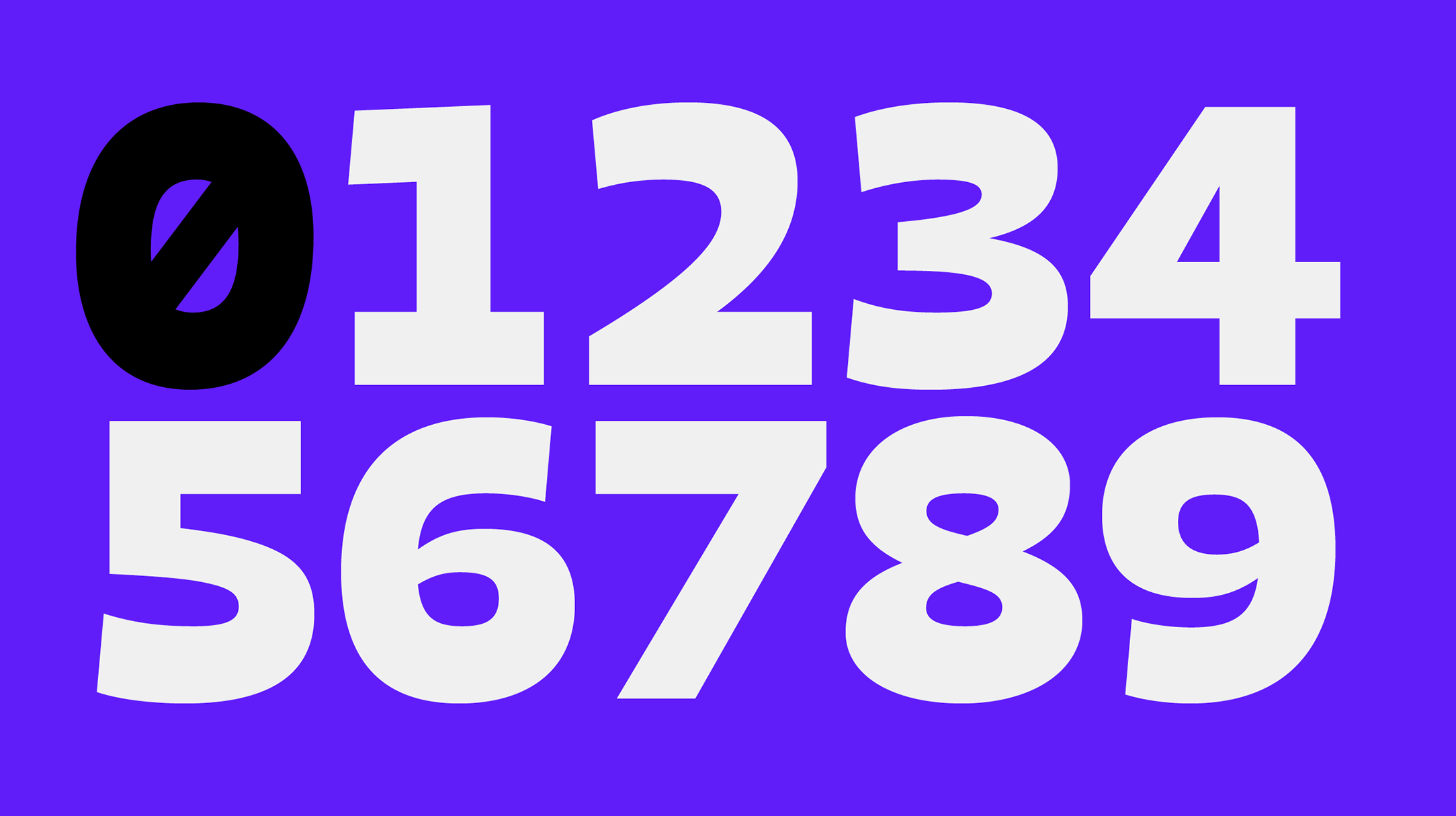
file name: Jonathan Hill Blom 2020
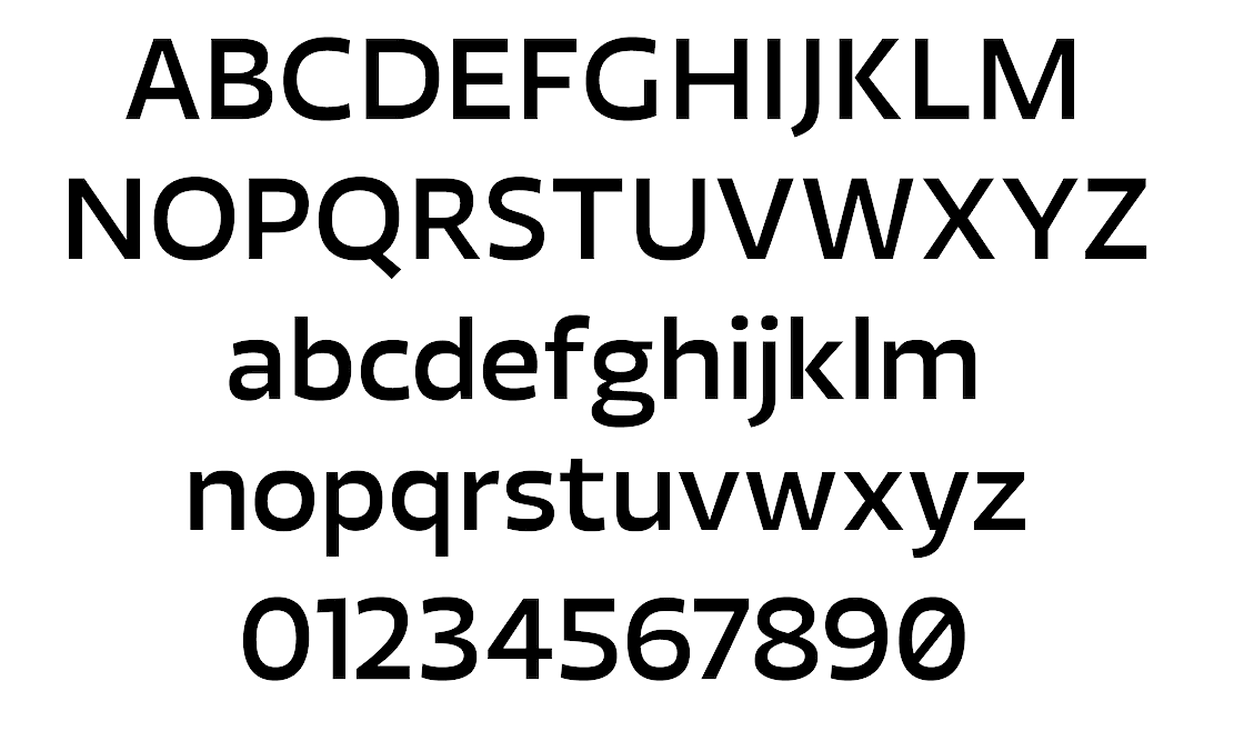
file name: The Northern Block Ltd Blom 2020 348130

file name: The Northern Block Ltd Blom 2020
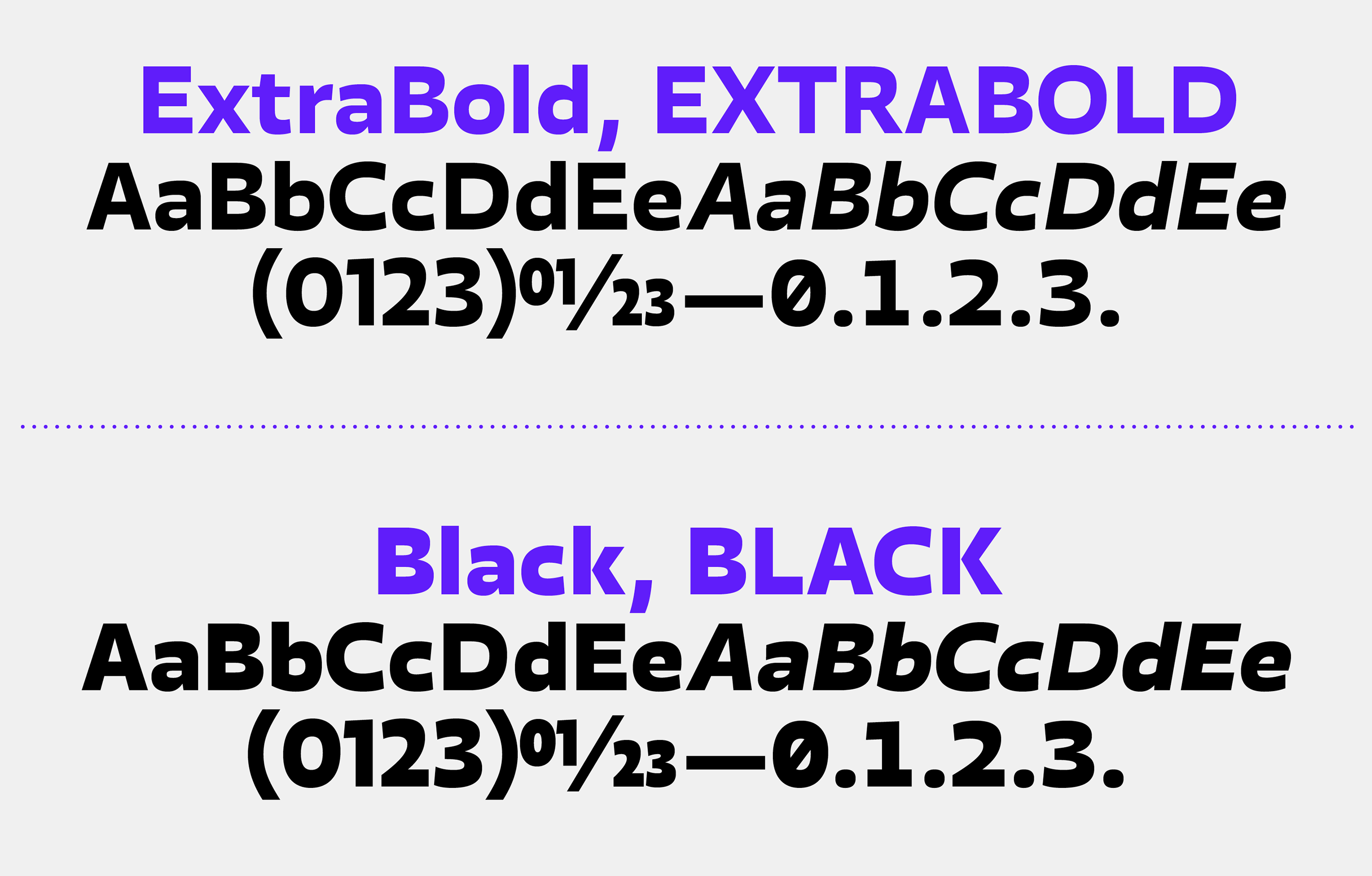
file name: Jonathan Hill Blom 2020
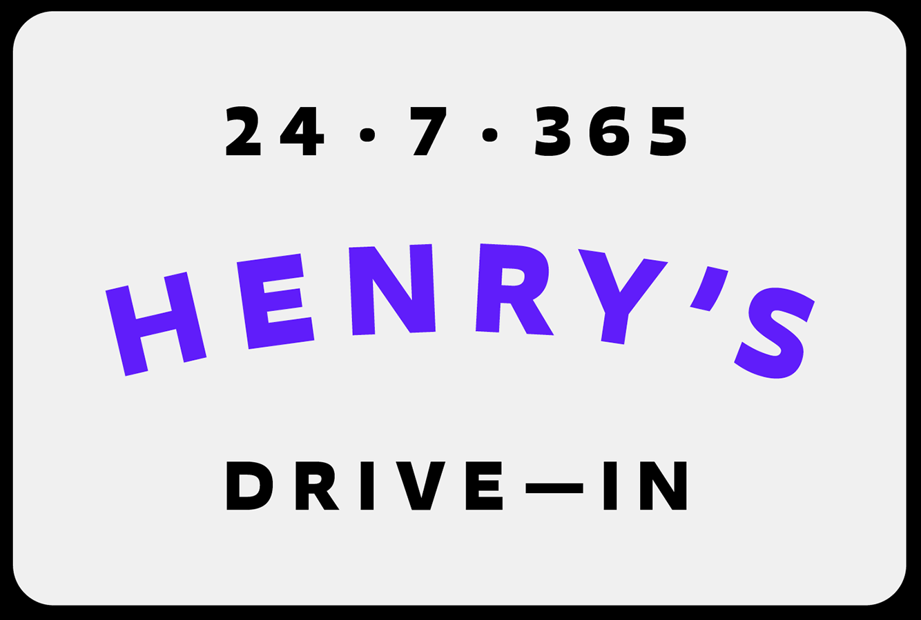
file name: Jonathan Hill Blom 2020

file name: Jonathan Hill Blom 2020
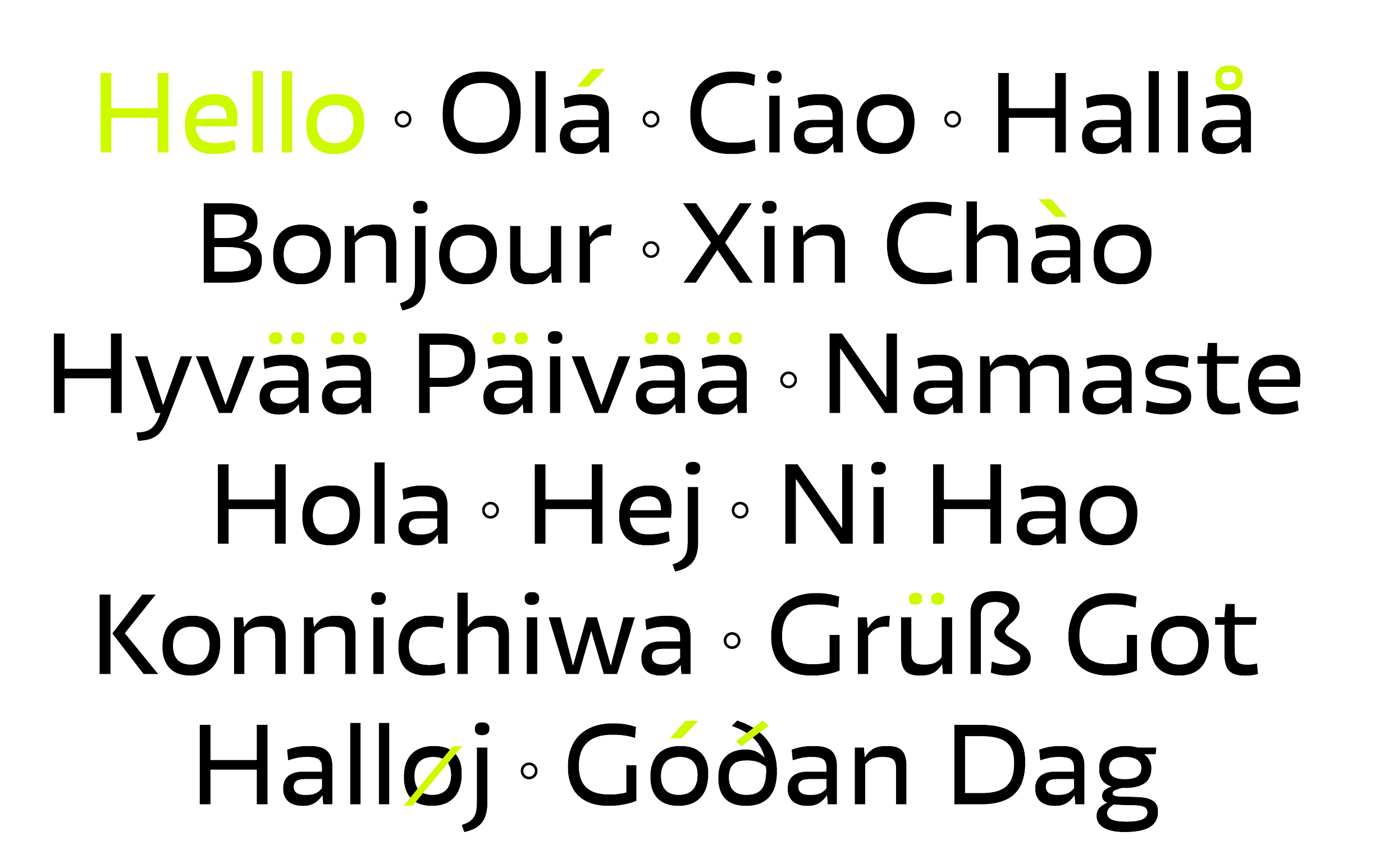
file name: Jonathan Hill Blom 2020
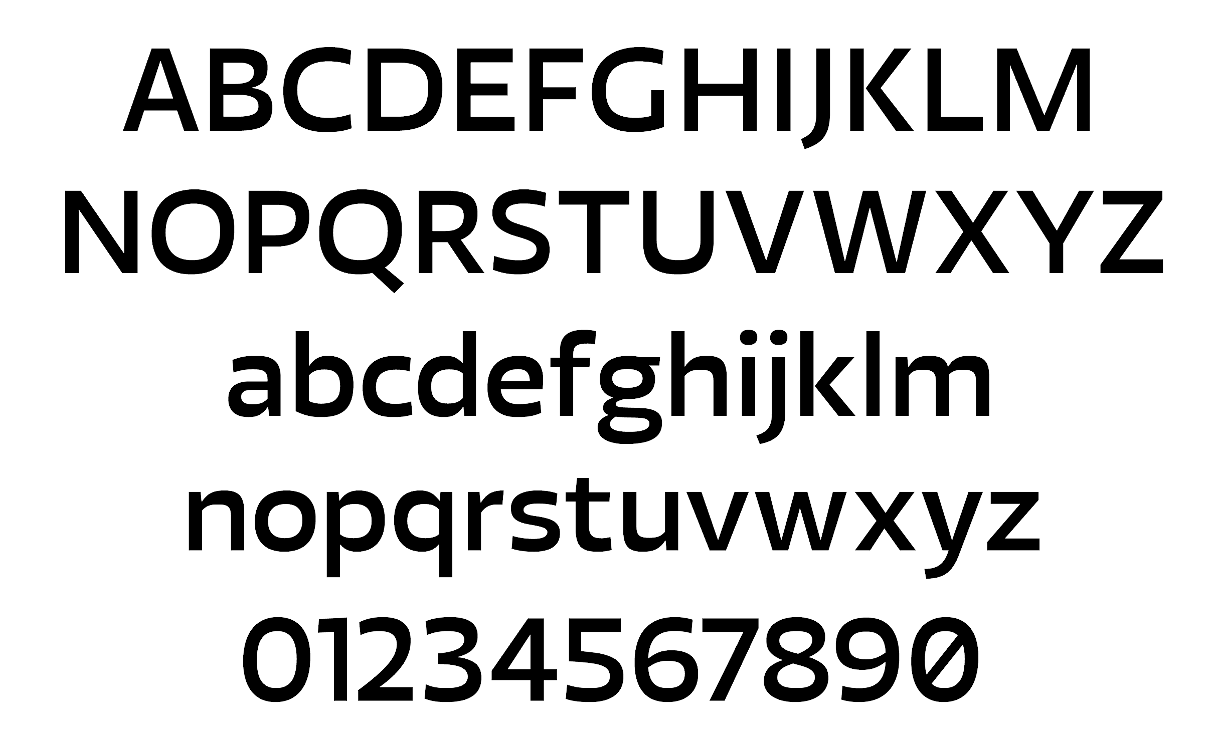
file name: Jonathan Hill Blom 2020
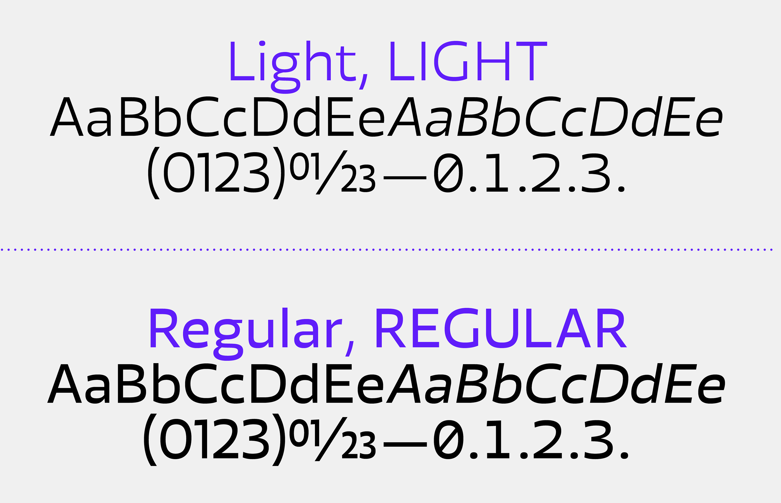
file name: Jonathan Hill Blom 2020
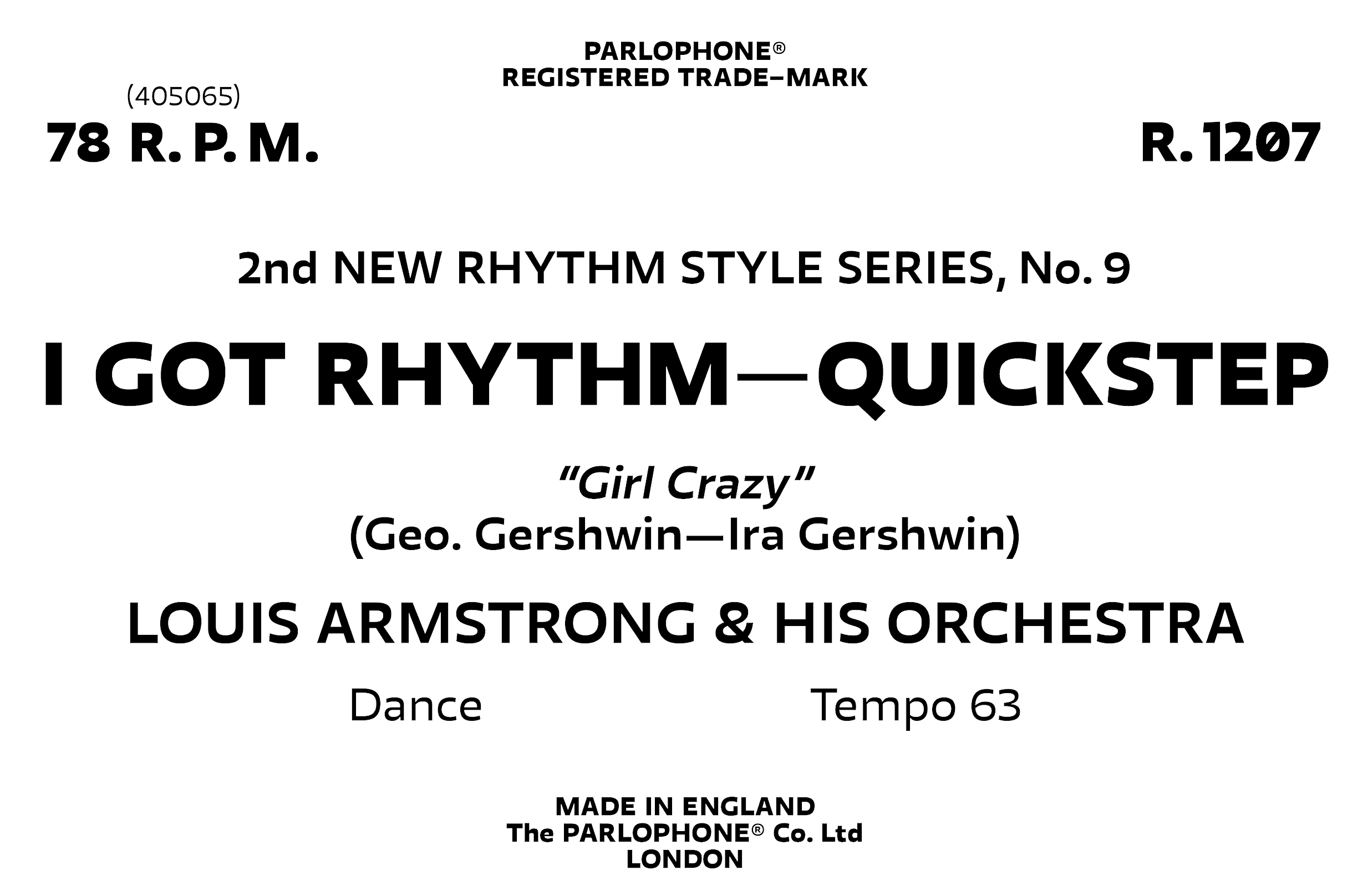
file name: Jonathan Hill Blom 2020
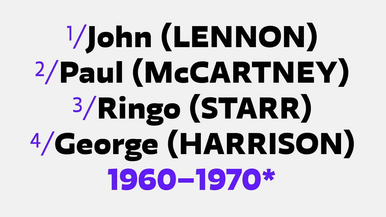
file name: Jonathan Hill Blom 2020
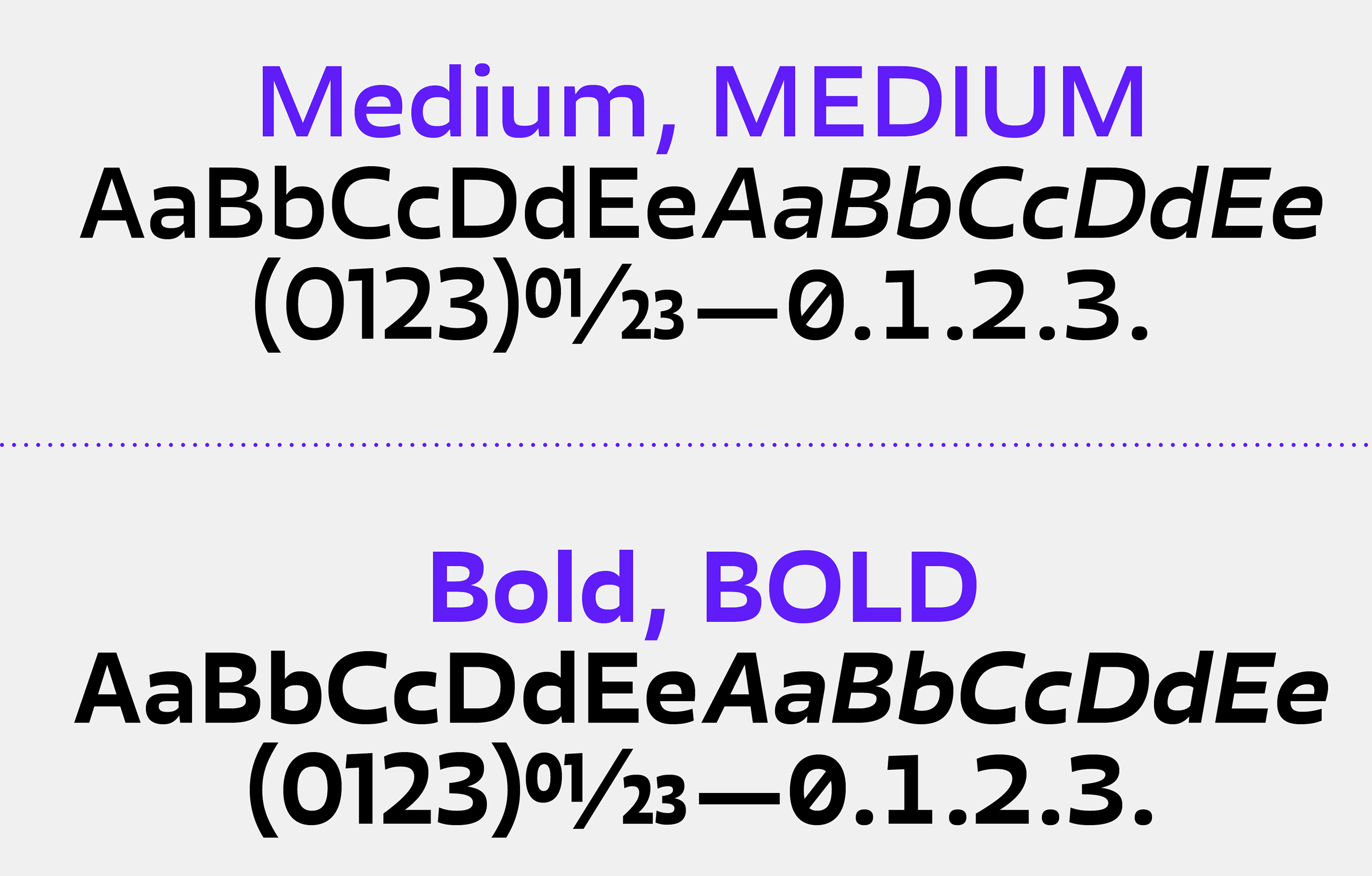
file name: Jonathan Hill Blom 2020
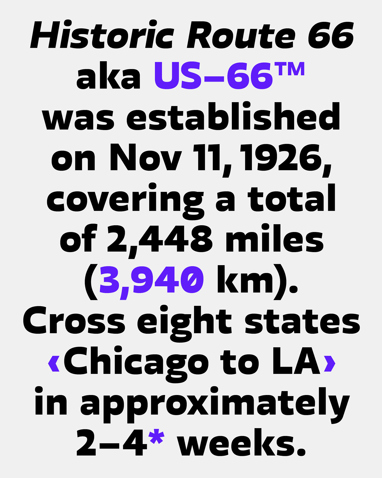
file name: Jonathan Hill Blom 2020

file name: Jonathan Hill Blom 2020
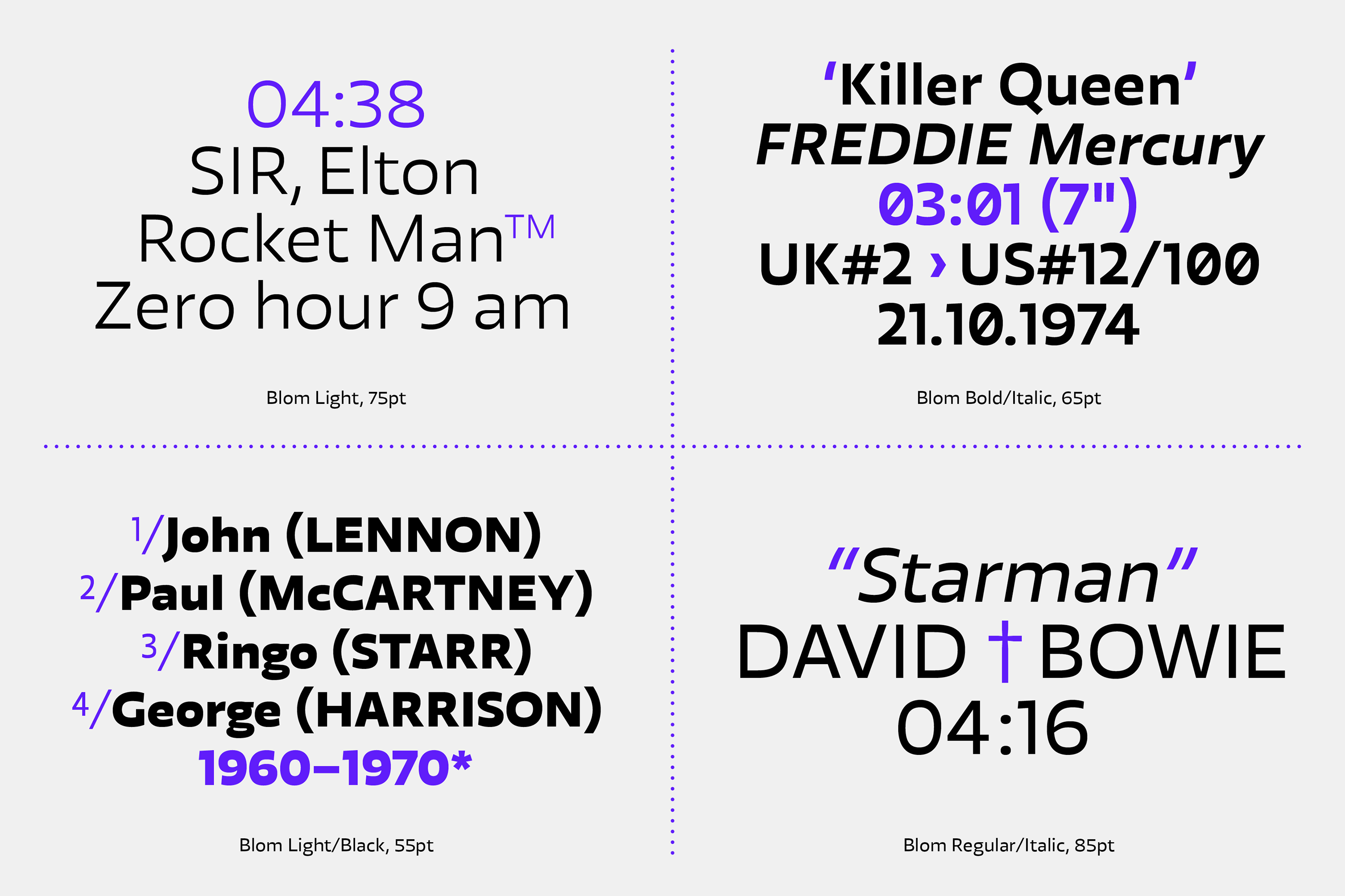
file name: Jonathan Hill Blom 2020
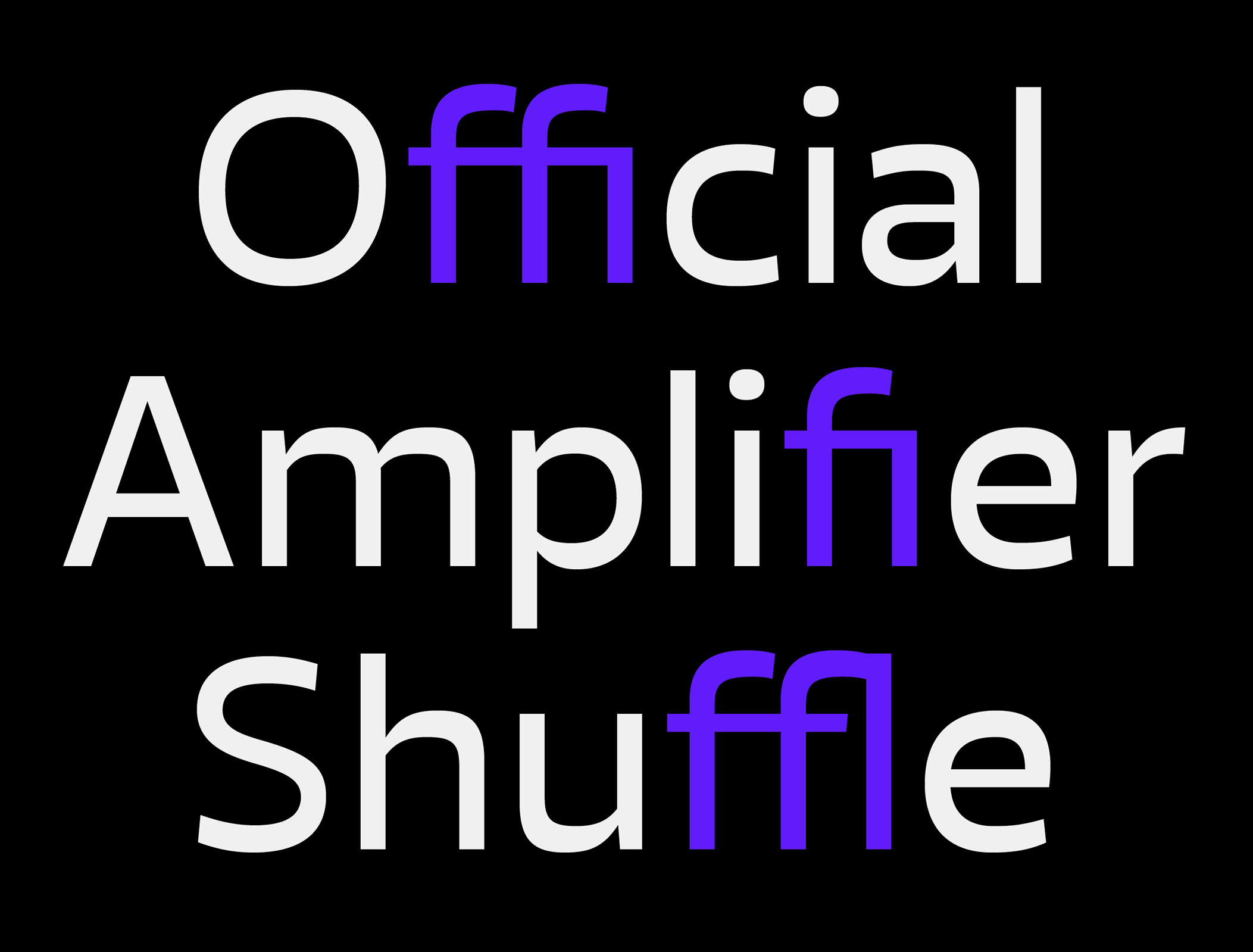
file name: Jonathan Hill Blom 2020
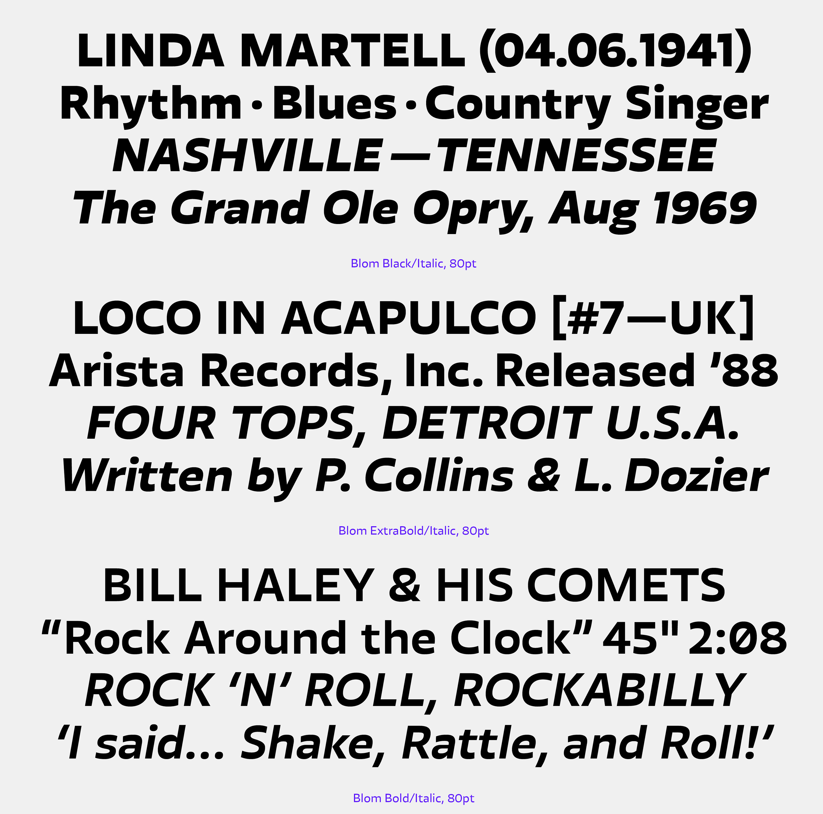
file name: Jonathan Hill Blom 2020
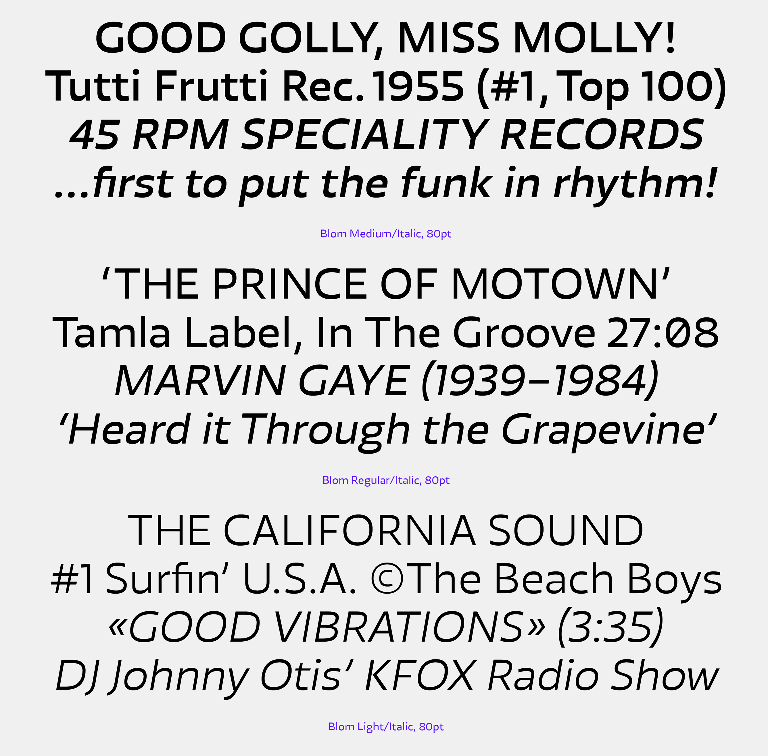
file name: Jonathan Hill Blom 2020
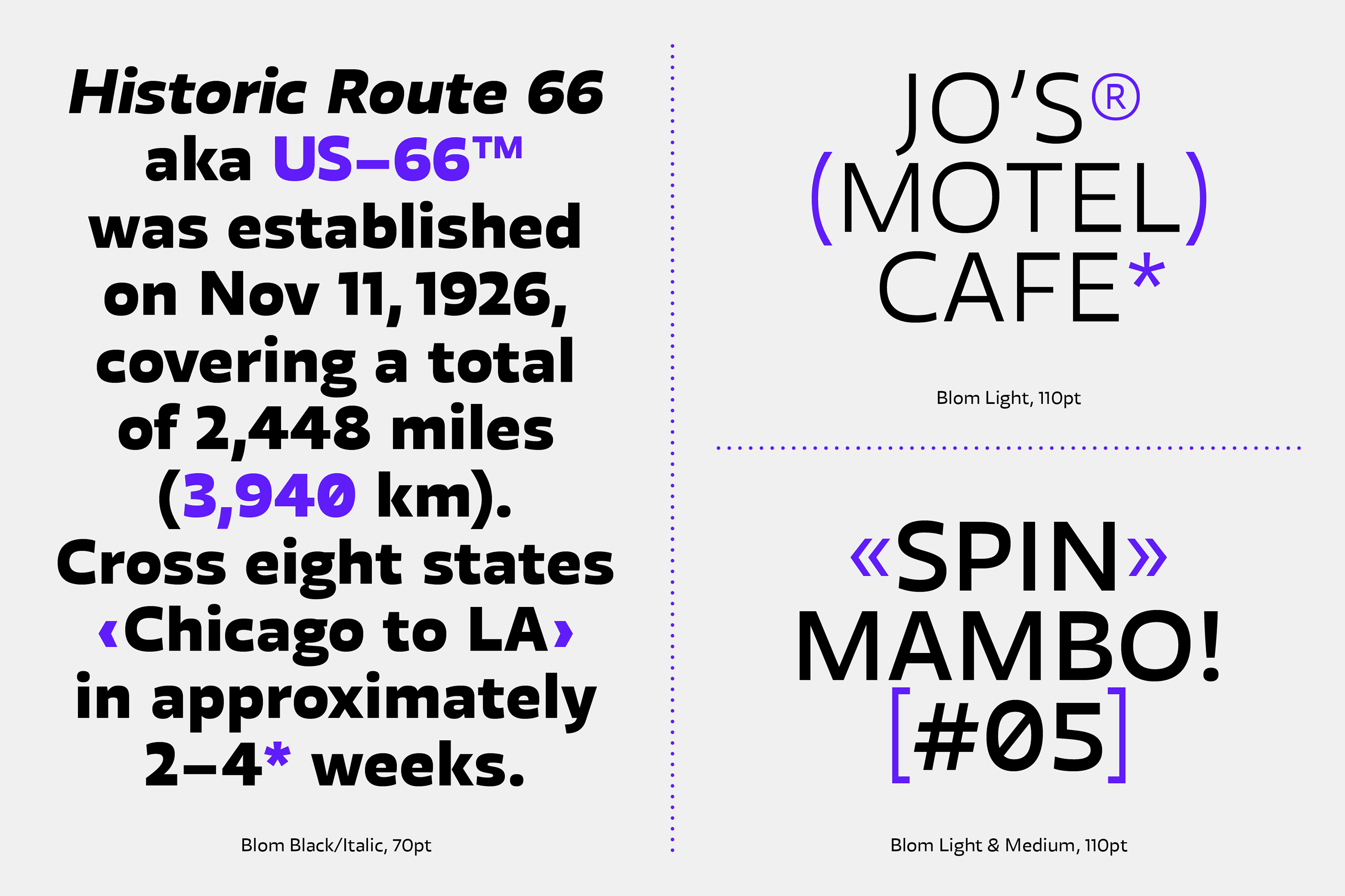
file name: Jonathan Hill Blom 2020
file name: Jonathan Hill Blom 2020
file name: The Northern Block Roag 2019

file name: The Northern Block Roag 2019

file name: The Northern Block Roag 2019
file name: The Northern Block Roag 2019

file name: The Northern Block Roag 2019

file name: The Northern Block Roag 2019
file name: The Northern Block Roag 2019
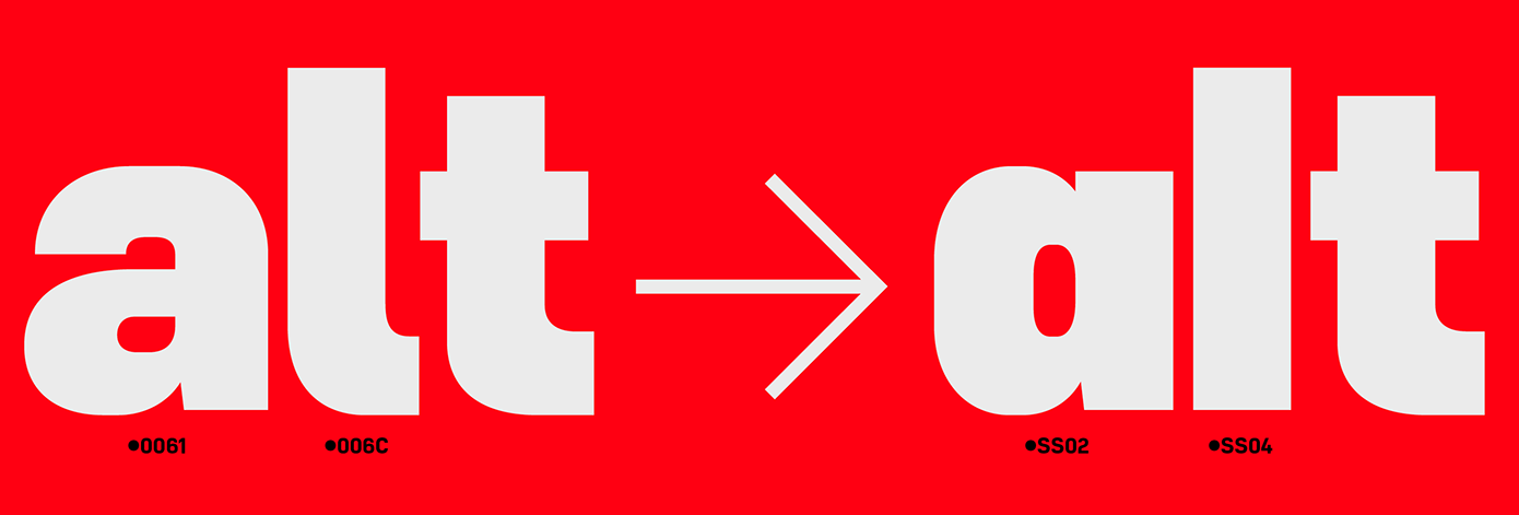
file name: The Northern Block Roag 2019
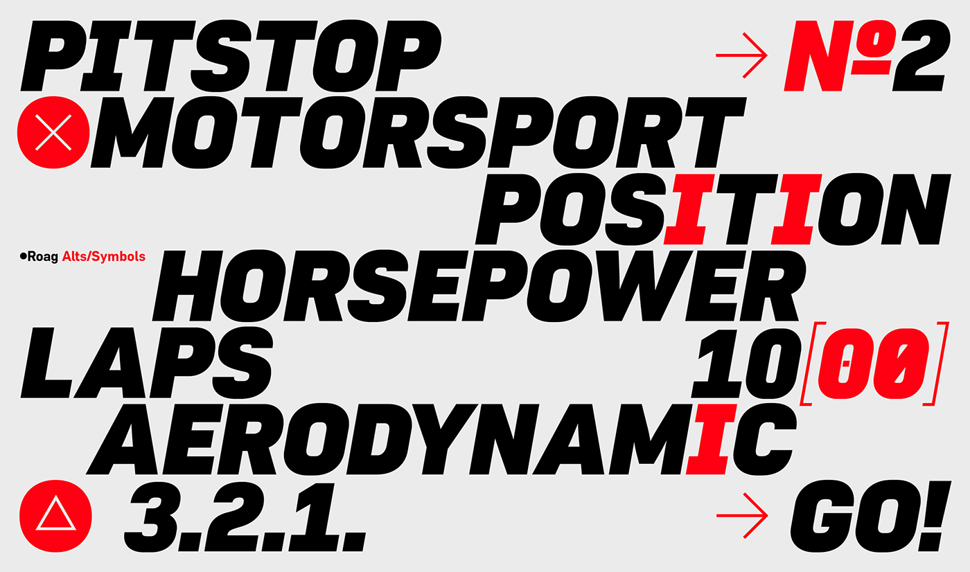
file name: The Northern Block Roag 2019

file name: The Northern Block Roag 2019
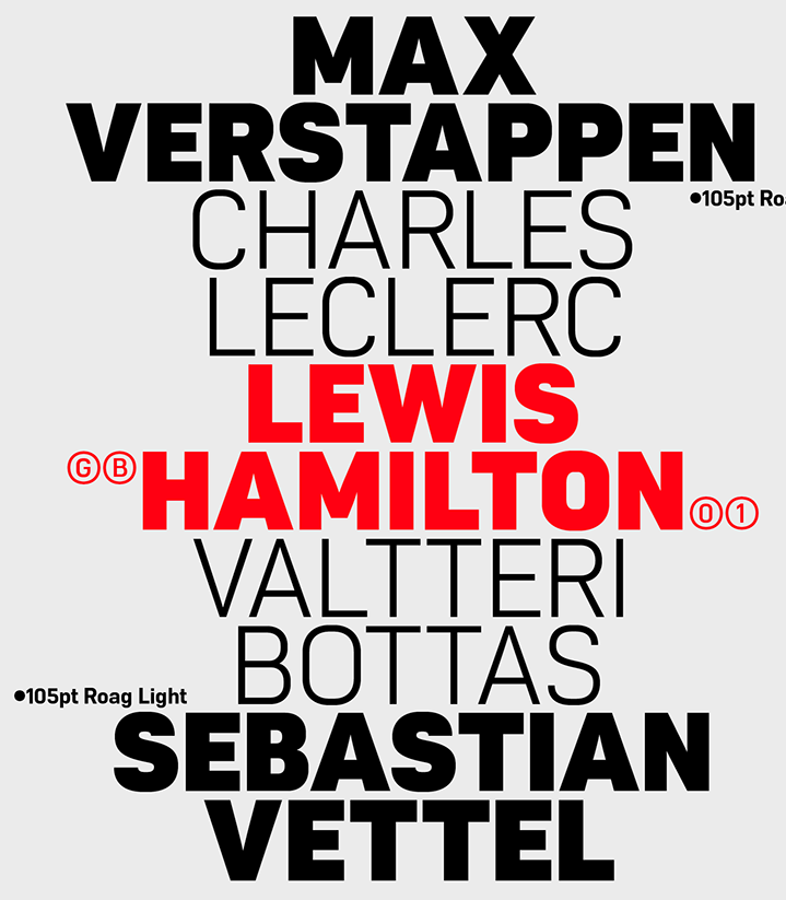
file name: The Northern Block Roag 2019
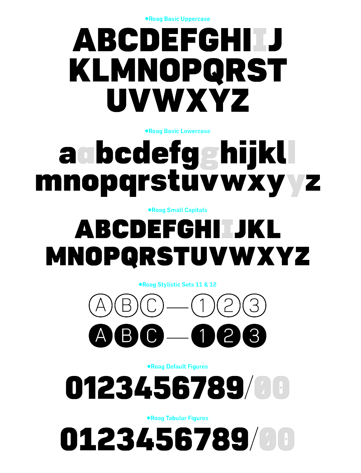
file name: The Northern Block Roag 2019
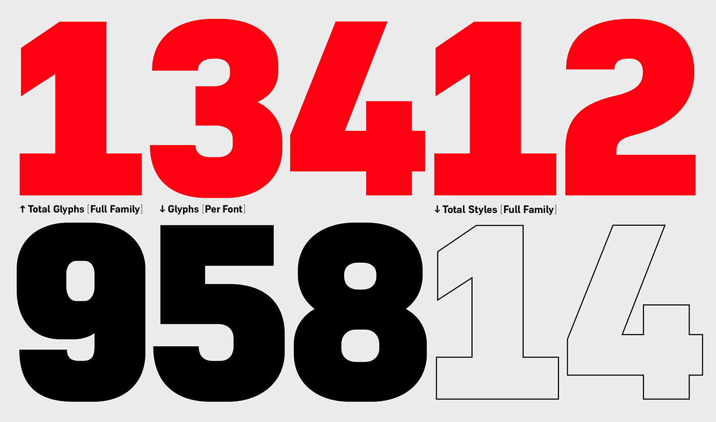
file name: The Northern Block Roag 2019
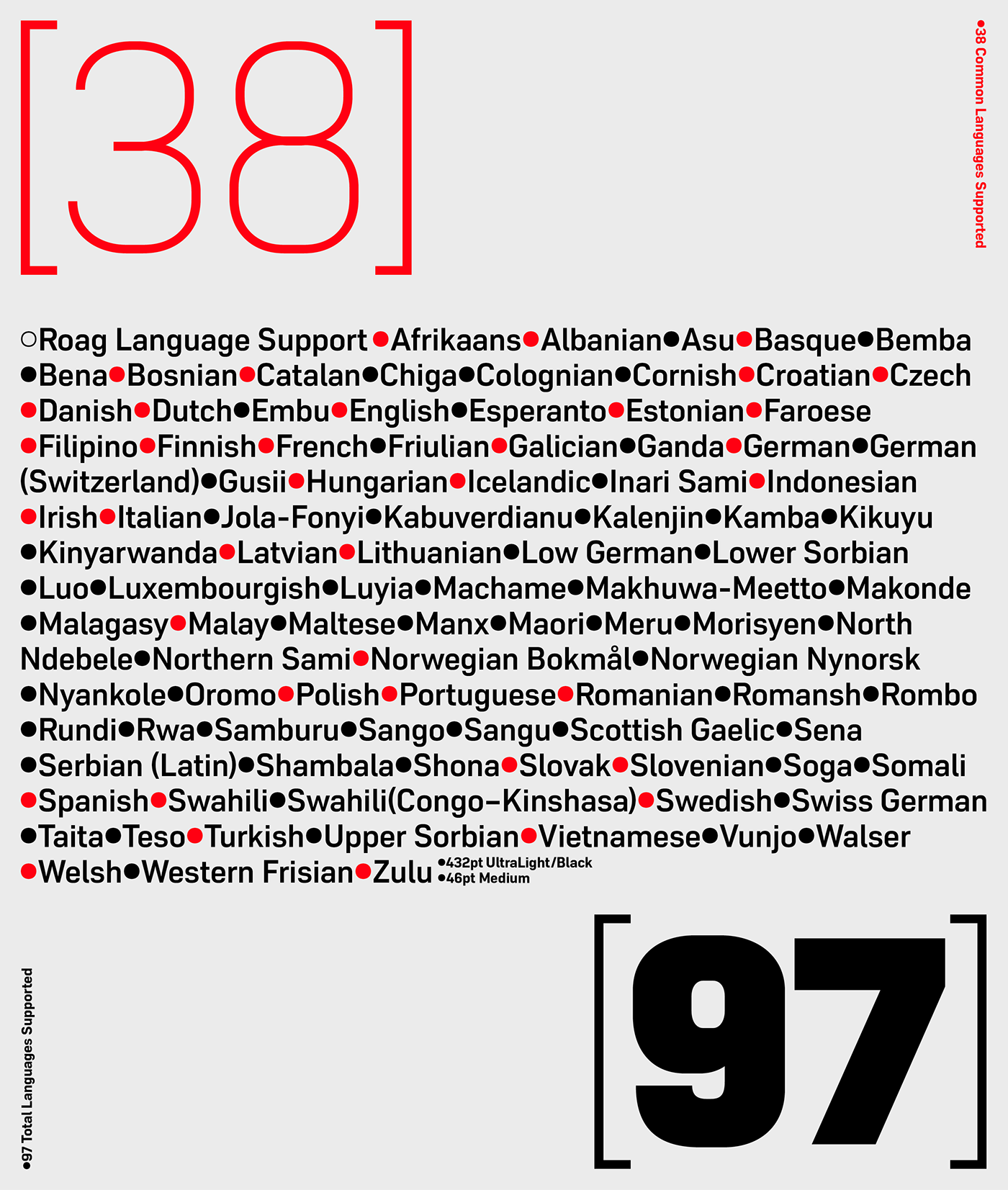
file name: The Northern Block Roag 2019

file name: The Northern Block Roag 2019
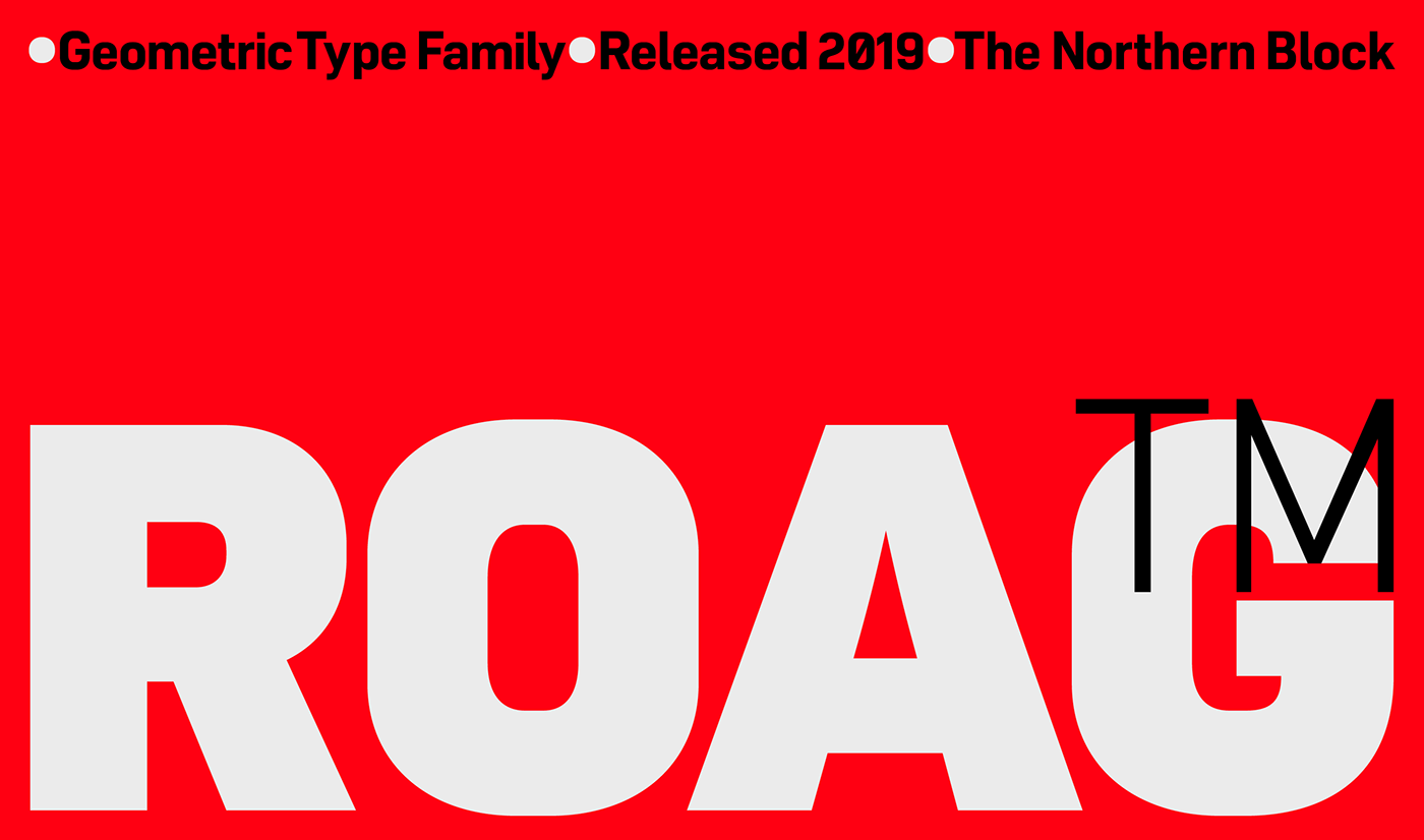
file name: The Northern Block Roag 2019
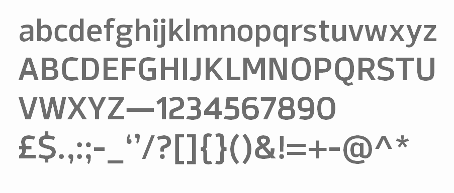
file name: The Northern Block Ltd Syke 2019 307342 002
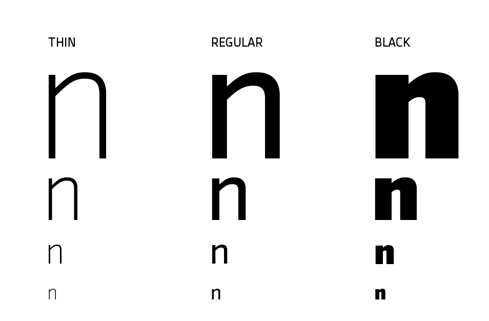
file name: The Northern Block Ltd Syke 2019 307343
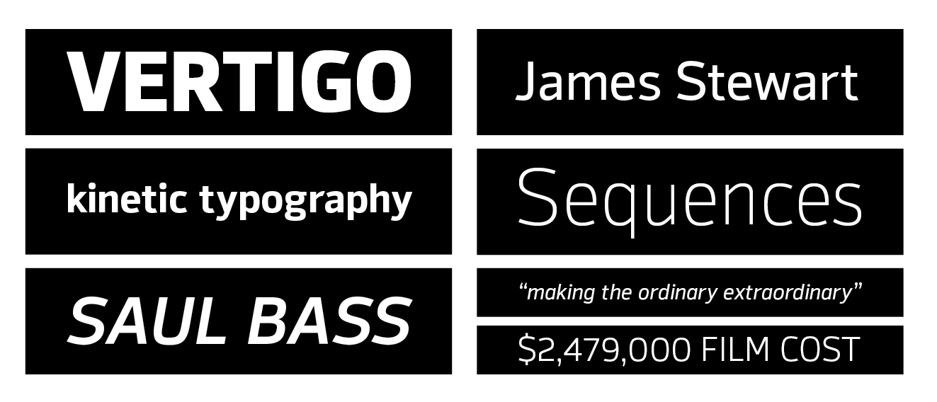
file name: The Northern Block Ltd Syke 2019 307344 002
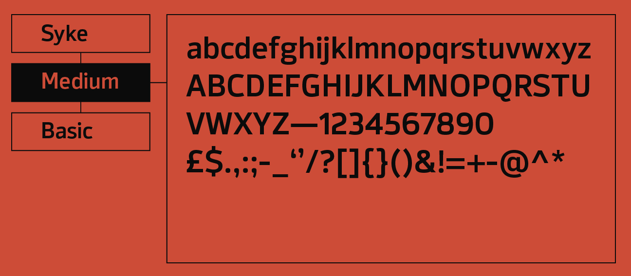
file name: The Northern Block Ltd Syke 2019 307345 002
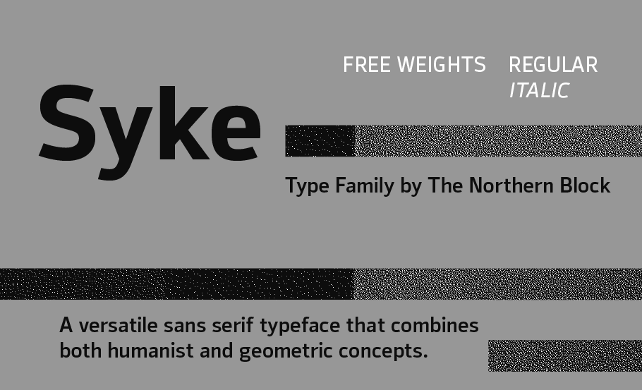
file name: The Northern Block Ltd Syke 2019 307346

file name: The Northern Block Ltd Syke 2019
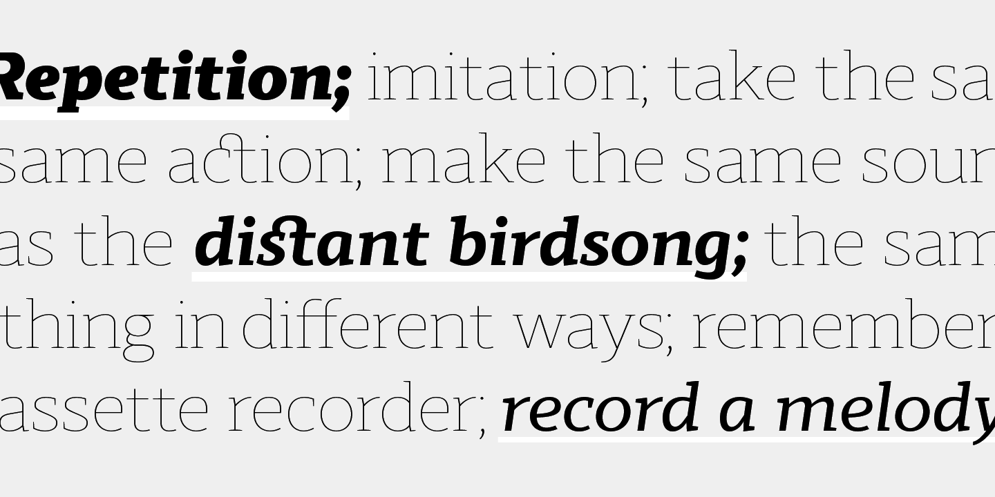
file name: The Northern Block Ltd Scharf 2019 303297
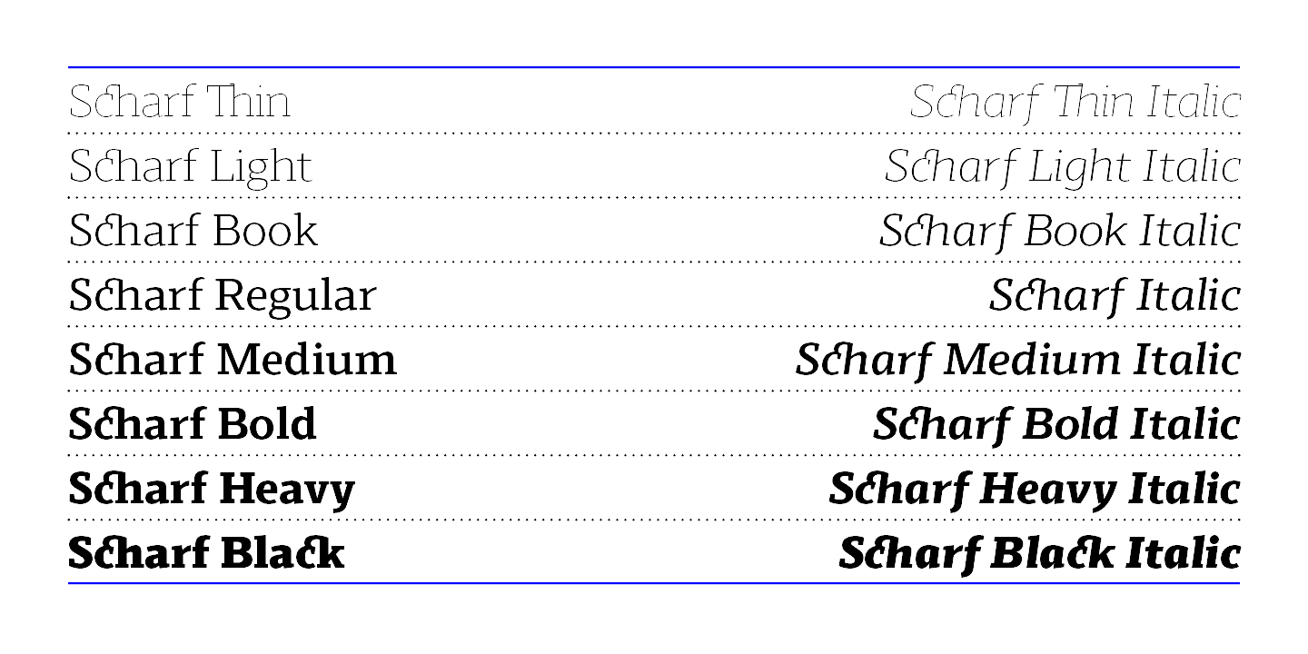
file name: The Northern Block Ltd Scharf 2019 303298

file name: The Northern Block Ltd Scharf 2019 303299
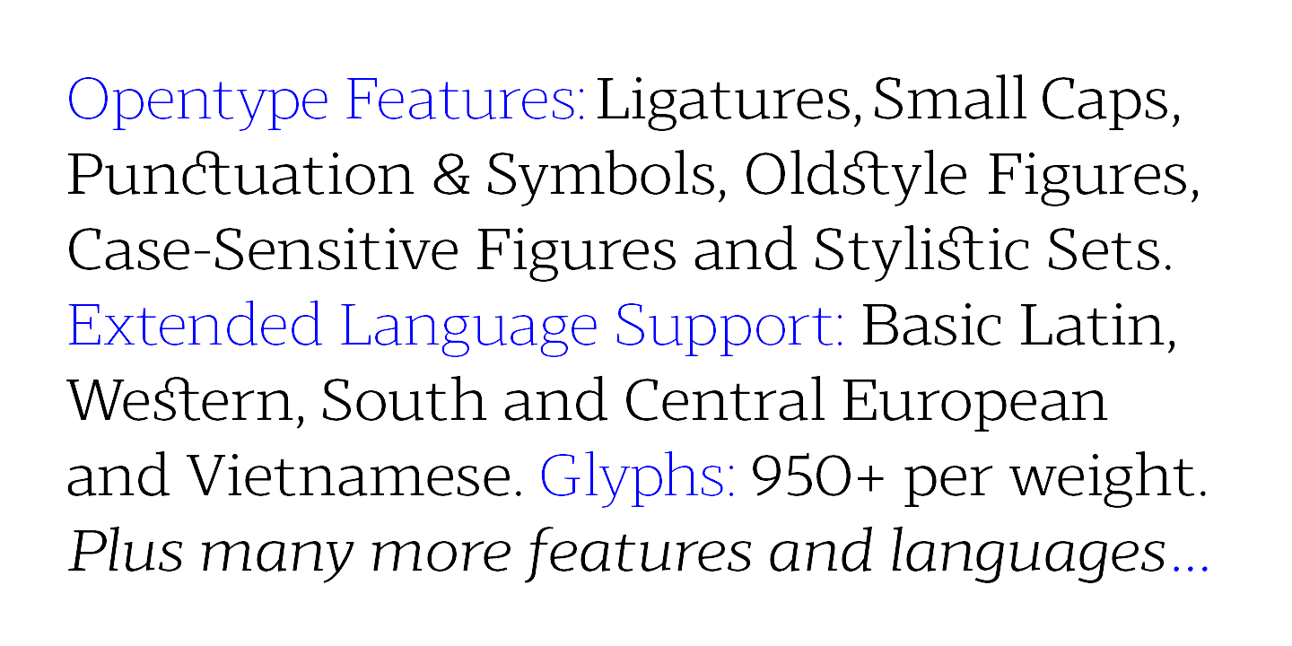
file name: The Northern Block Ltd Scharf 2019 303300 002

file name: The Northern Block Ltd Scharf 2019 303301

file name: The Northern Block Ltd Scharf 2019
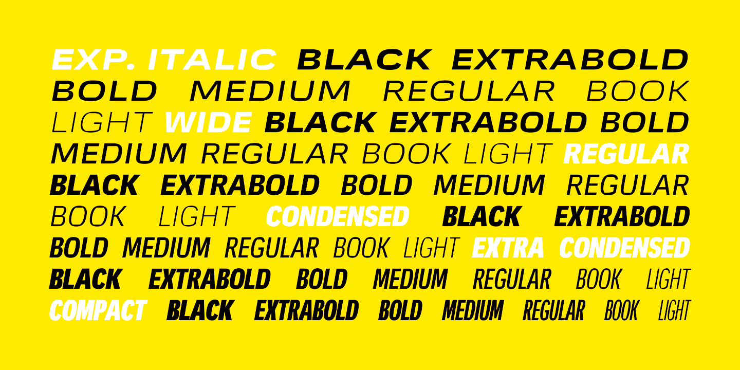
file name: Jonathan Hill Mynor 2019 292590

file name: Jonathan Hill Mynor 2019 292591
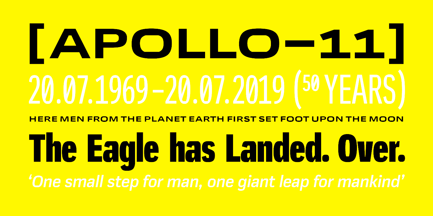
file name: Jonathan Hill Mynor 2019 292593 002
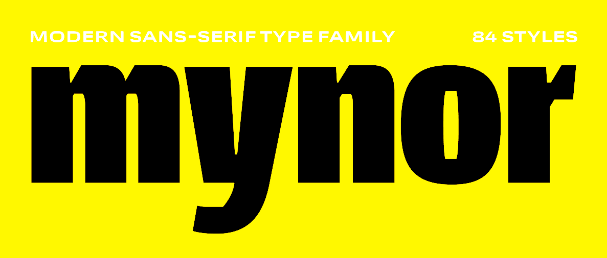
file name: Jonathan Hill Mynor 2019 292594

file name: Jonathan Hill Mynor 2019
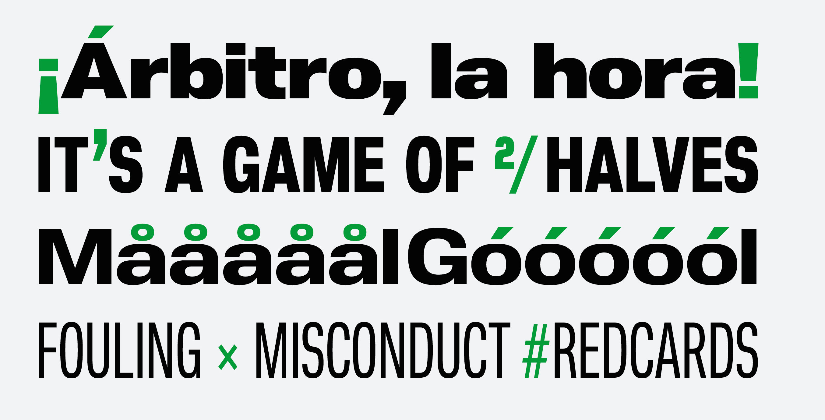
file name: Jonathan Hill Nuber Next 2018 283024
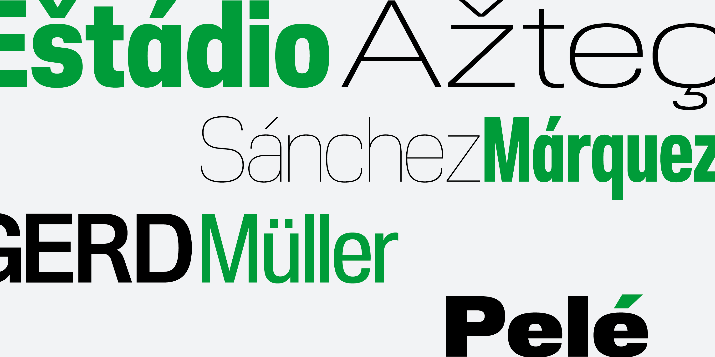
file name: Jonathan Hill Nuber Next 2018 283030

file name: Jonathan Hill Nuber Next 2018 283031

file name: Jonathan Hill Nuber Next Black 2018

file name: Jonathan Hill Nuber Next Demi Bold Extended 2018
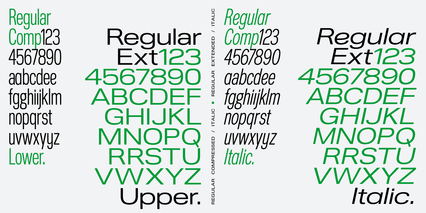
file name: The Northern Block Ltd Nuber Next 2018 283032
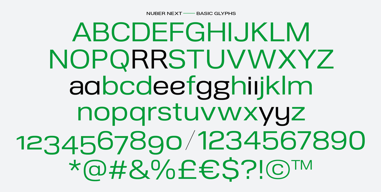
file name: The Northern Block Ltd Nuber Next 2018 283033
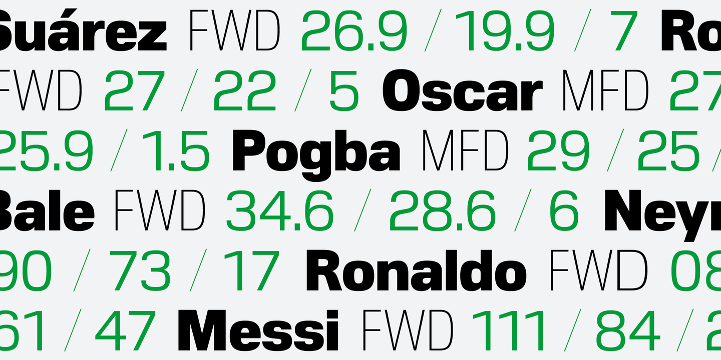
file name: The Northern Block Ltd Nuber Next 2018 283035 002
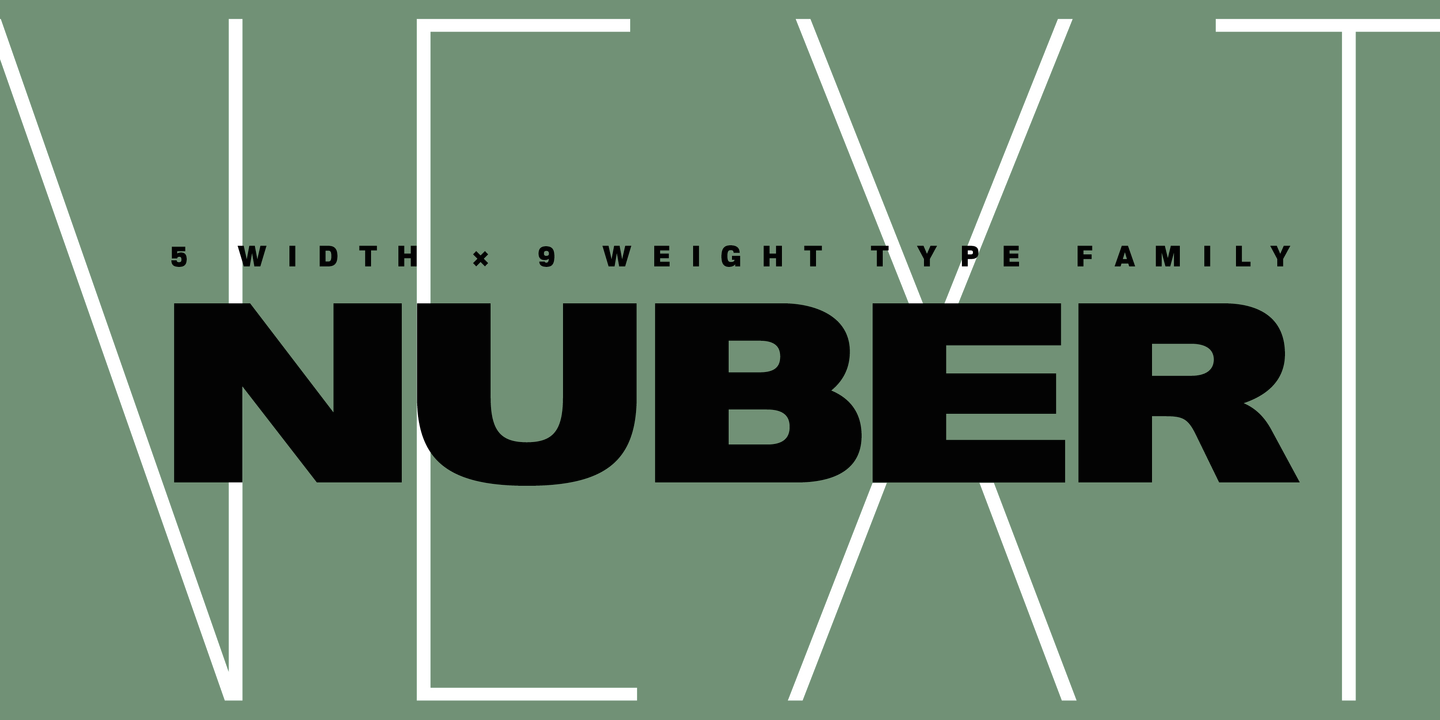
file name: The Northern Block Ltd Nuber Next 2018 283036 002

file name: The Northern Block Ltd Nuber Next 2018
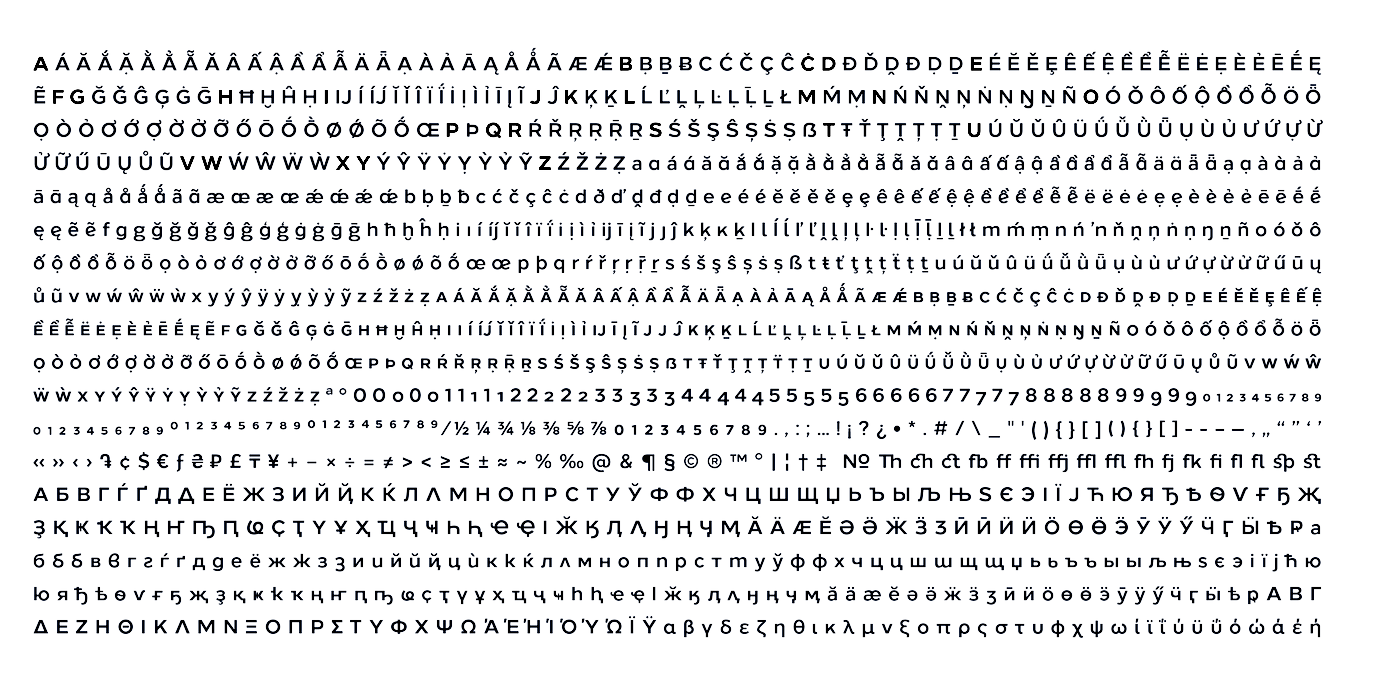
file name: The Northern Block Ltd Loew Next 2019 288636 002
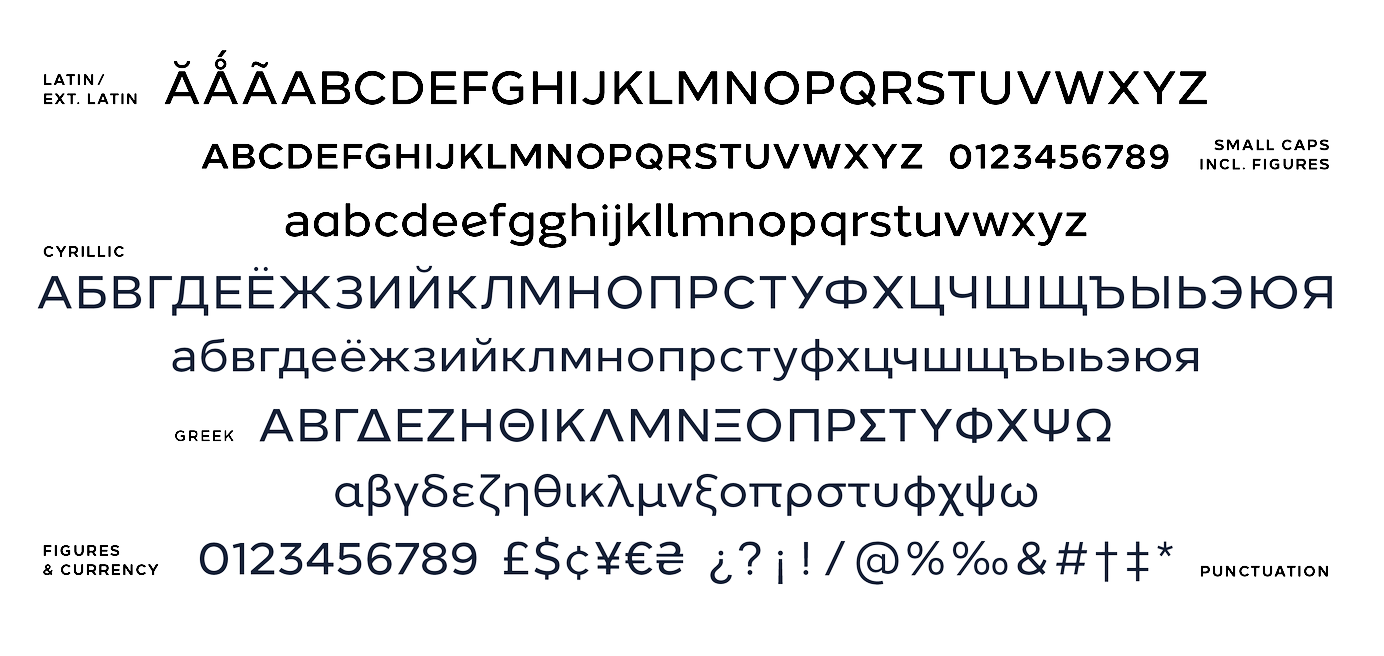
file name: The Northern Block Ltd Loew Next 2019 288637 002
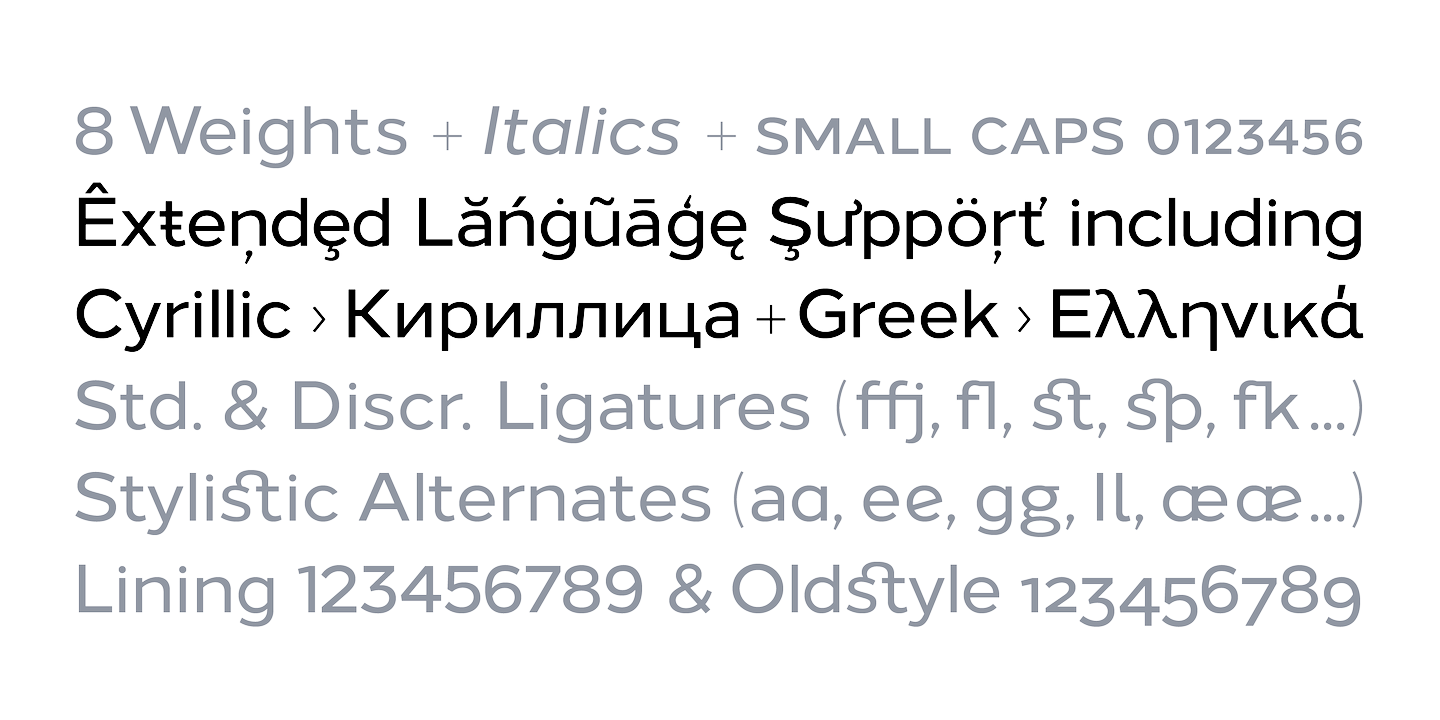
file name: The Northern Block Ltd Loew Next 2019 288639 002

file name: The Northern Block Ltd Loew Next 2019 288640

file name: The Northern Block Ltd Loew Next 2019

file name: Donna Wearmouth Jonathan Hill Loew Next Loew Next Arabic 2018 294303

file name: Donna Wearmouth Jonathan Hill Loew Next Loew Next Arabic 2018 294304
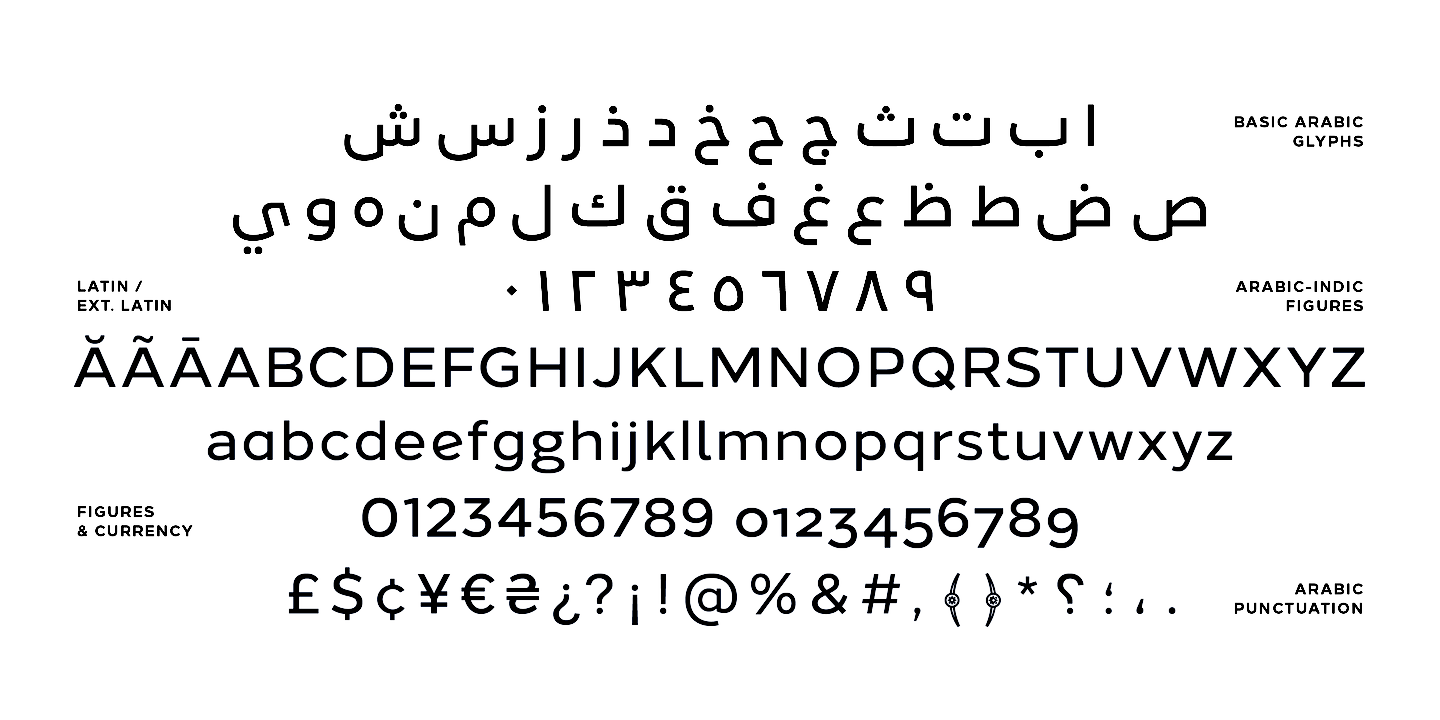
file name: The Northern Block Ltd Loew Next Arabic 2018 294308 002
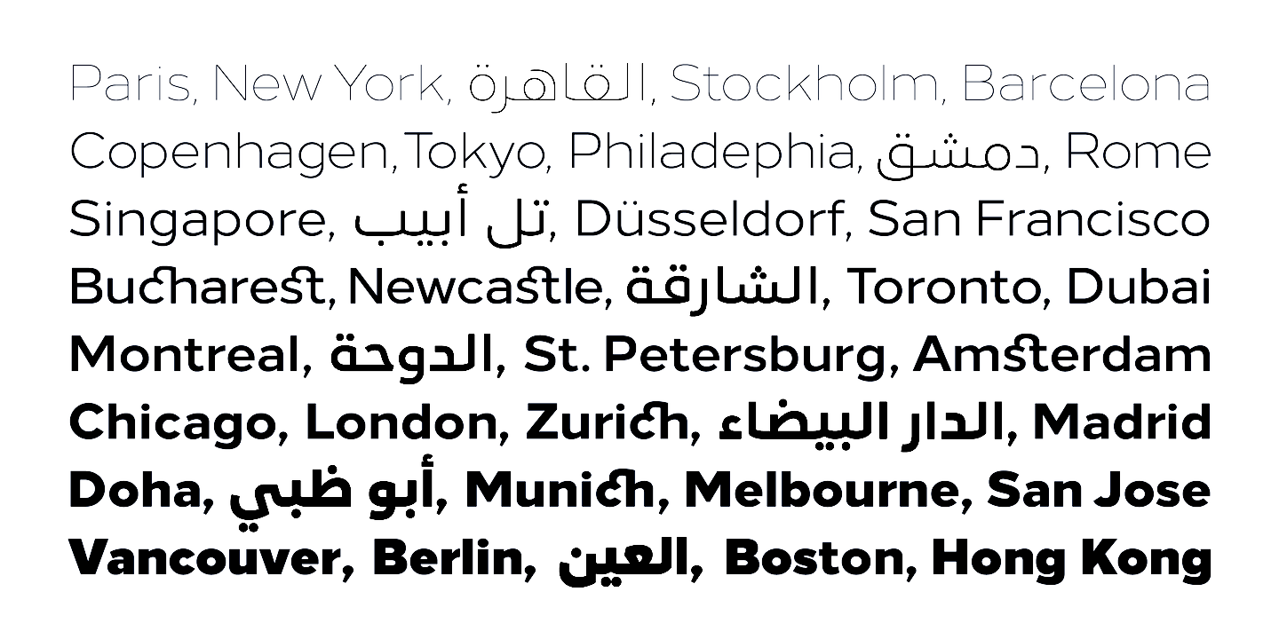
file name: The Northern Block Ltd Loew Next Arabic 2018 294310 002

file name: The Northern Block Ltd Loew Next Arabic 2018
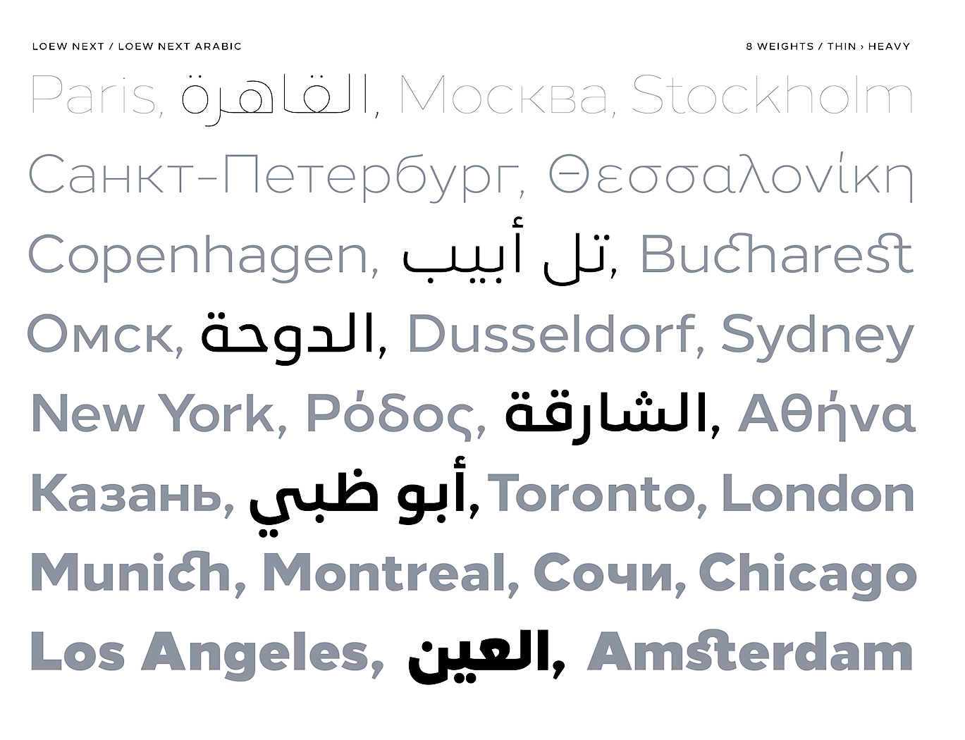
file name: Donna Wearmouth Jonathan Hill Loew Next Loew Next Arabic 2018

file name: Donna Wearmouth Jonathan Hill Loew Next Loew Next Arabic 2018b

file name: Donna Wearmouth Jonathan Hill Loew Next Loew Next Arabic 2018c

file name: Donna Wearmouth Jonathan Hill Loew Next Loew Next Arabic 2018d
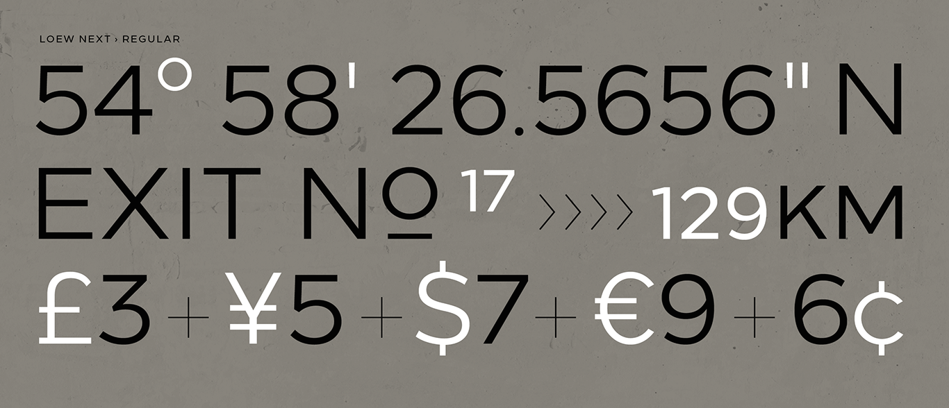
file name: Donna Wearmouth Jonathan Hill Loew Next Loew Next Arabic 2018e

file name: Donna Wearmouth Jonathan Hill Loew Next Loew Next Arabic 2018f
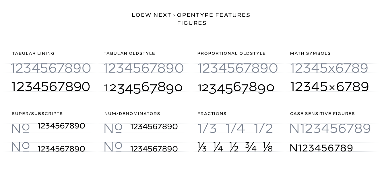
file name: Donna Wearmouth Jonathan Hill Loew Next Loew Next Arabic 2018g
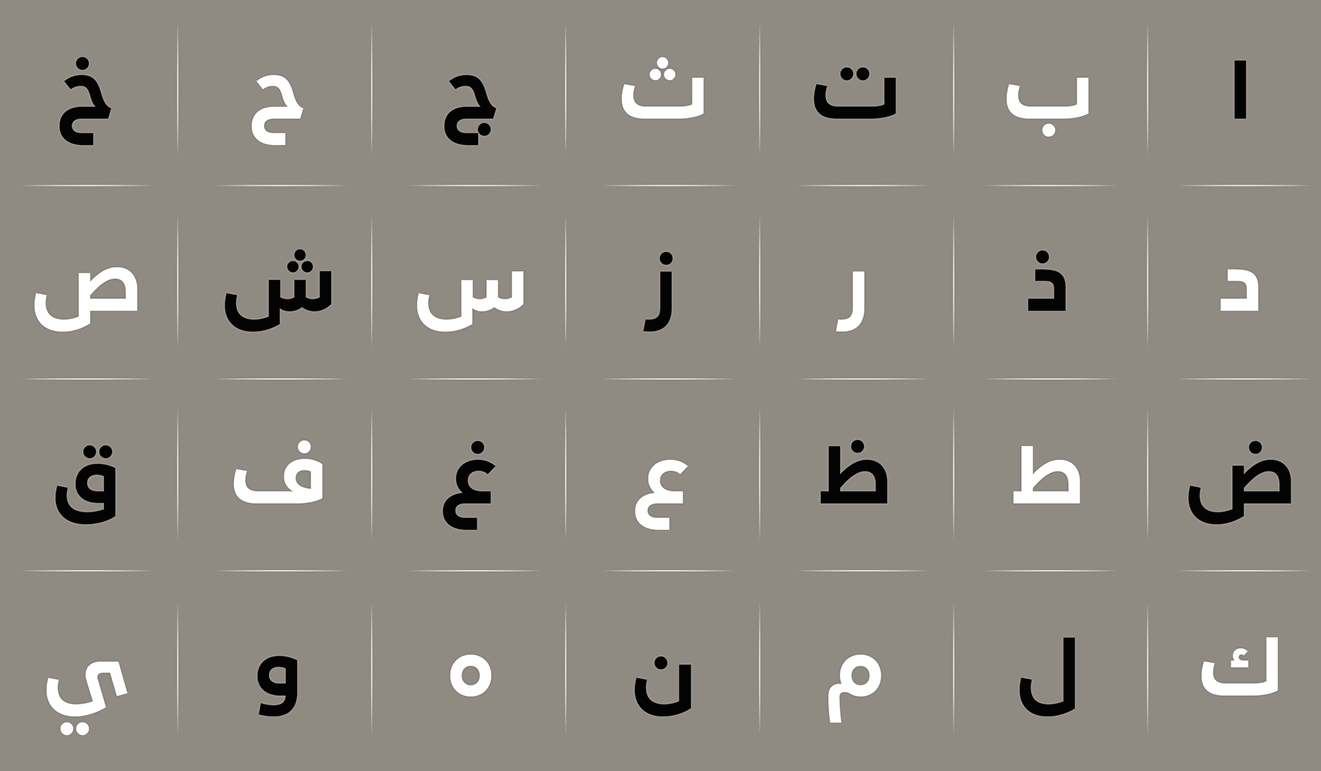
file name: Donna Wearmouth Jonathan Hill Loew Next Loew Next Arabic 2018h
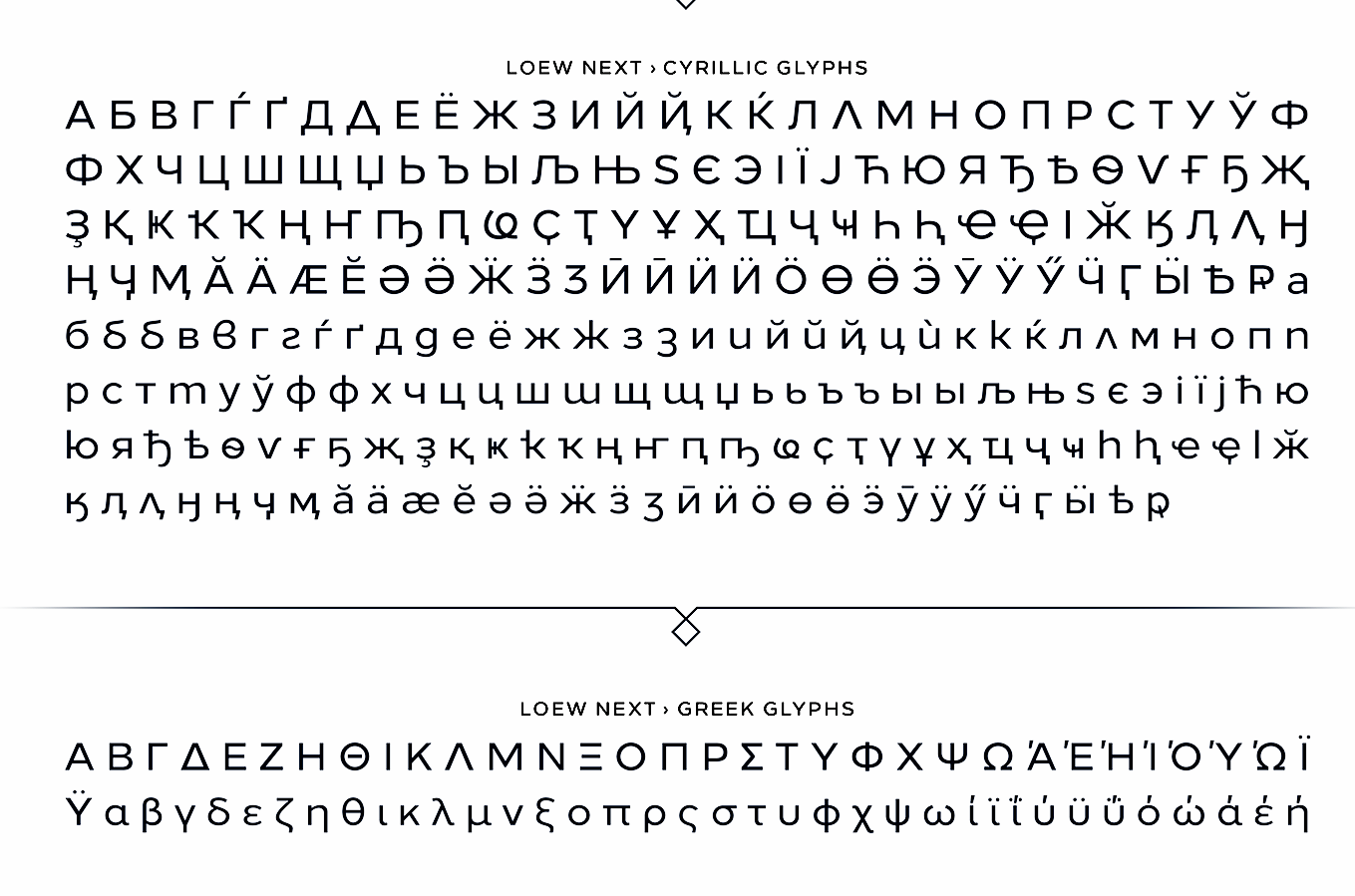
file name: Donna Wearmouth Jonathan Hill Loew Next Loew Next Arabic 2018i
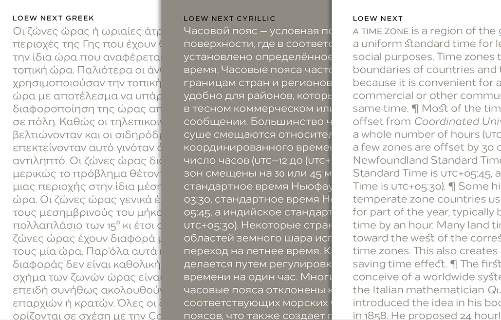
file name: Donna Wearmouth Jonathan Hill Loew Next Loew Next Arabic 2018j
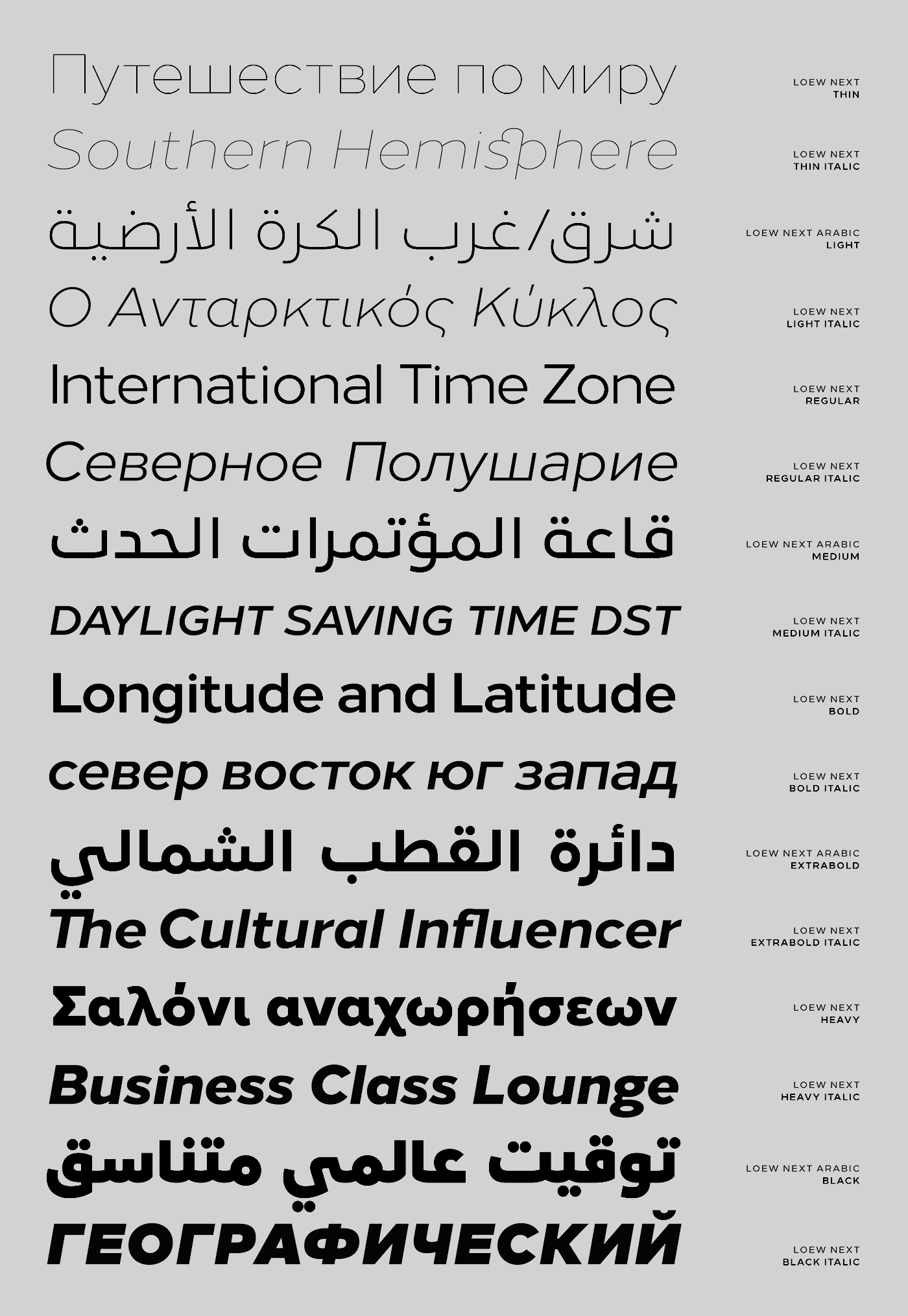
file name: Donna Wearmouth Jonathan Hill Loew Next Loew Next Arabic 2018k
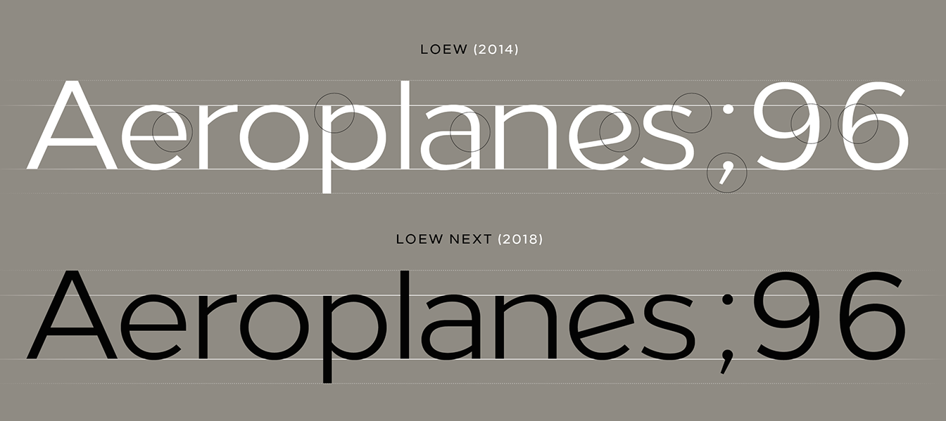
file name: Donna Wearmouth Jonathan Hill Loew Next Loew Next Arabic 2018l
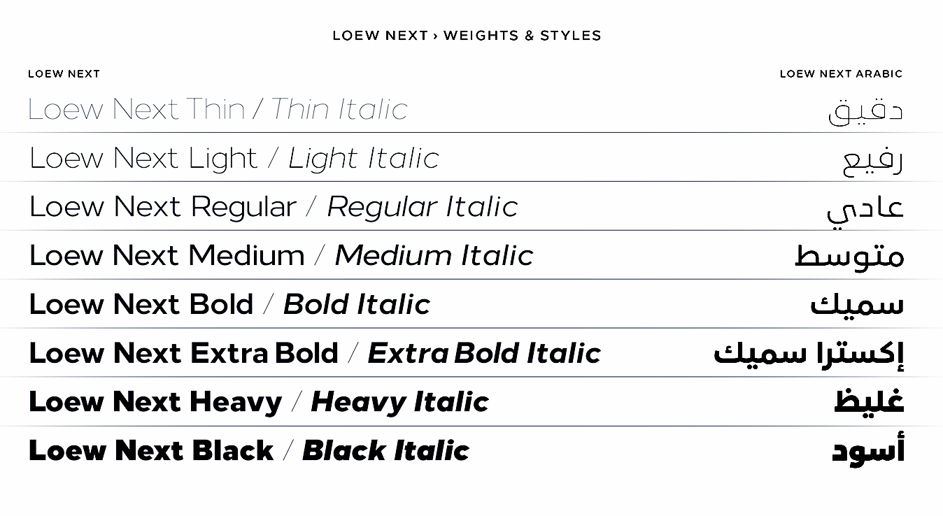
file name: Donna Wearmouth Jonathan Hill Loew Next Loew Next Arabic 2018m
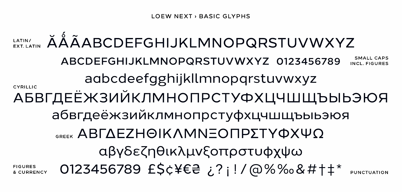
file name: Donna Wearmouth Jonathan Hill Loew Next Loew Next Arabic 2018n
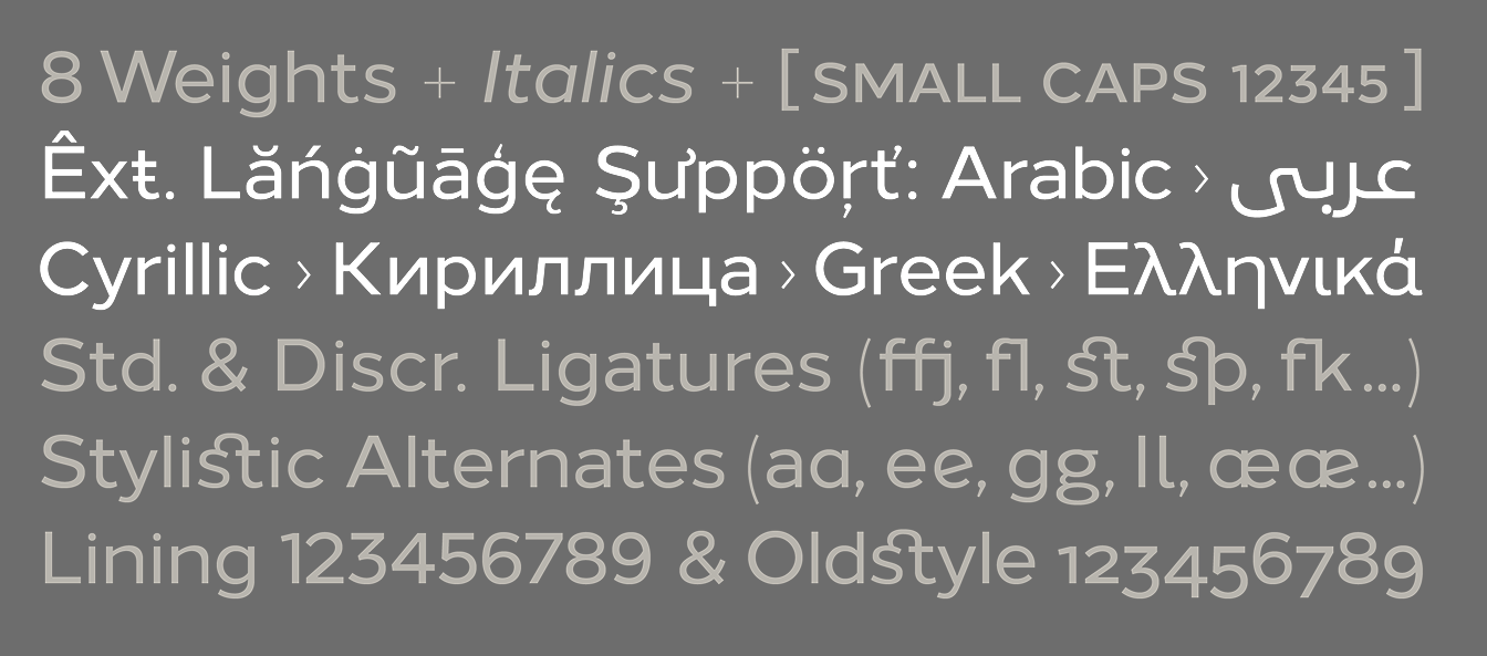
file name: Donna Wearmouth Jonathan Hill Loew Next Loew Next Arabic 2018o

file name: Donna Wearmouth Jonathan Hill Loew Next Loew Next Arabic 2018p
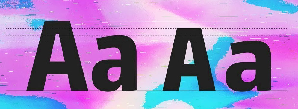
file name: Jonathan Hill Paradroid 2018
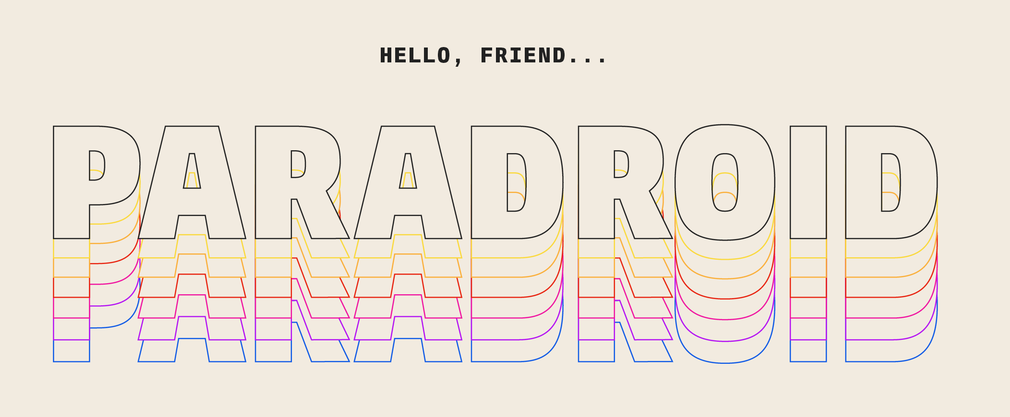
file name: Jonathan Hill Paradroid 2018 259274

file name: Jonathan Hill Paradroid 2018
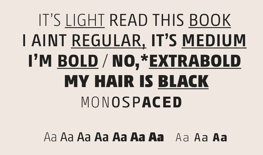
file name: Jonathan Hill Paradroid 2018b
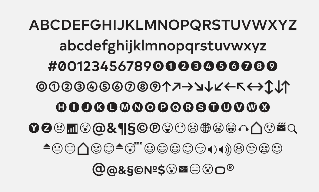
file name: The Northern Block Ltd Typold 2017 240021

file name: The Northern Block Ltd Typold 2017
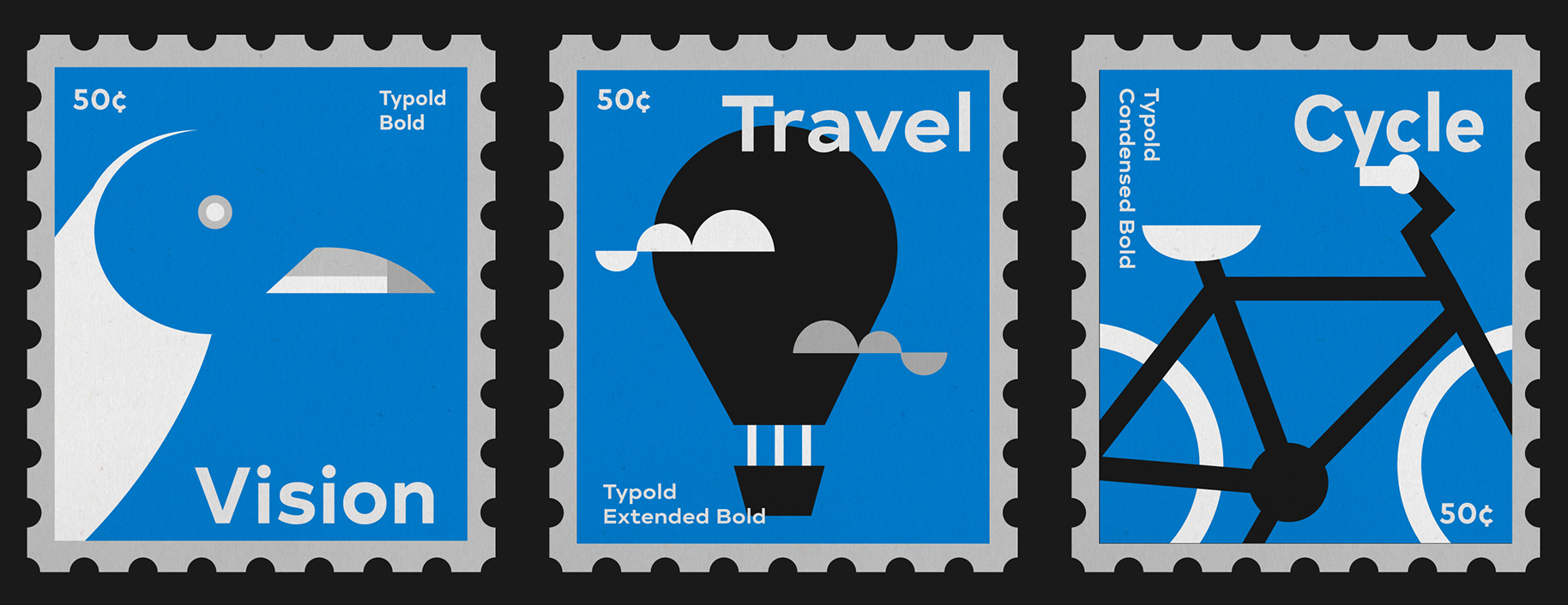
file name: Jonathan Hill Tom Sutton Typold 2017
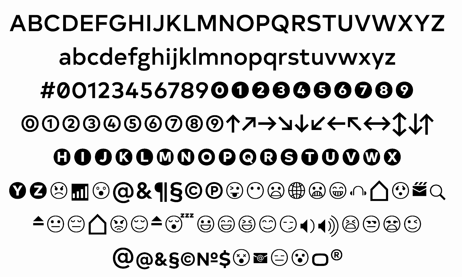
file name: Jonathan Hill Tom Sutton Typold 2017b
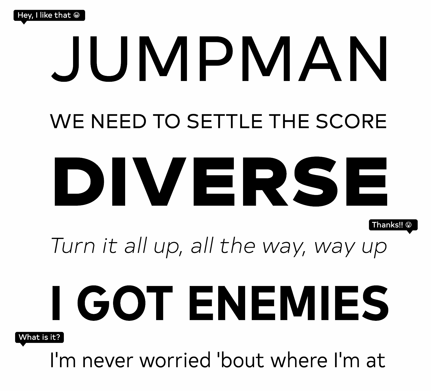
file name: Jonathan Hill Tom Sutton Typold 2017c
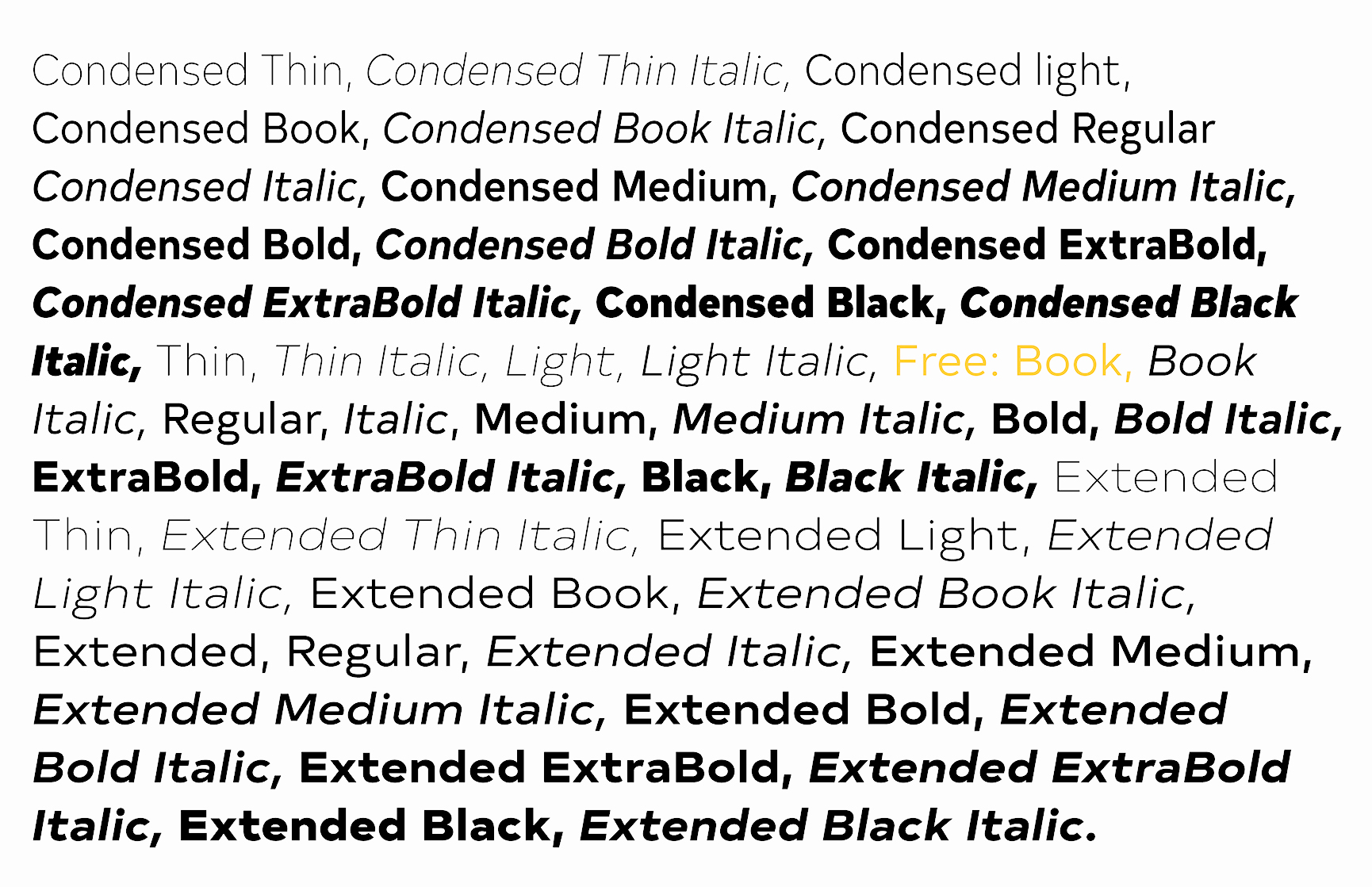
file name: Jonathan Hill Tom Sutton Typold 2017d
file name: Jonathan Hill Tom Sutton Typold 2017e
file name: The Northern Block Sprout 2018 257978
file name: The Northern Block Sprout 2018 257978
file name: The Northern Block Ltd Sprout 2018 257975

file name: The Northern Block Ltd Sprout 2018
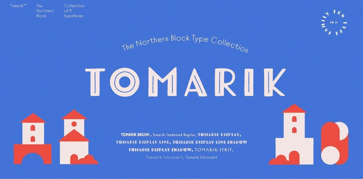
file name: The Northern Block Tomarik 2017
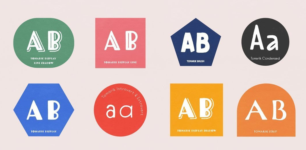
file name: The Northern Block Tomarik 2017b

file name: Jonathan Hill Regan Slab 2011

file name: Jonathan Hill Regan Slab 2011b
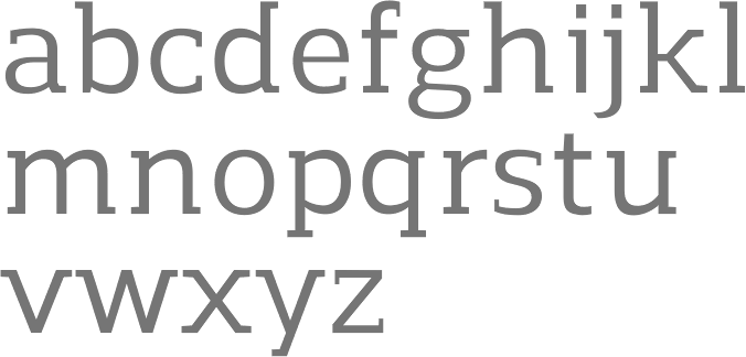
file name: Jonathan Hill Regan Slab Medium 2011

file name: Jonathan Hill Regan 2012
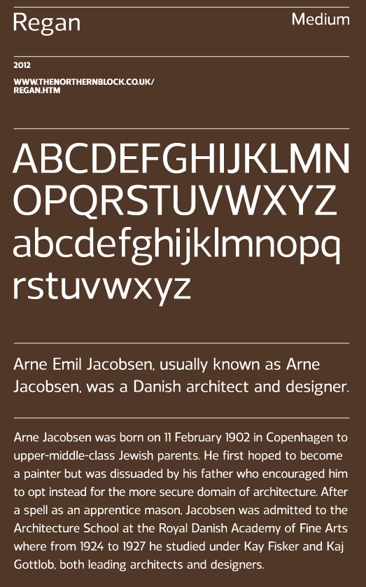
file name: Jonathan Hill Regan 2012b

file name: The Northern Block Ltd Oyko 2016 216453

file name: The Northern Block Ltd Oyko 2016 216455

file name: The Northern Block Ltd Oyko 2016 216457
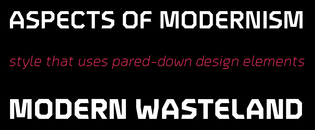
file name: The Northern Block Ltd Oyko 2016 216458
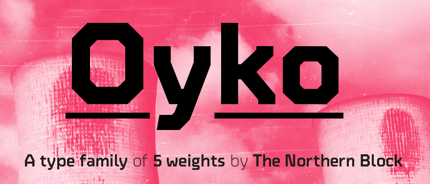
file name: The Northern Block Ltd Oyko 2016 216460

file name: The Northern Block Ltd Oyko 2016
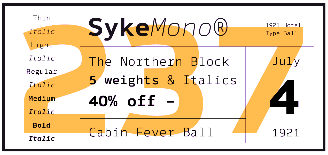
file name: The Northern Block Ltd Syke Mono 2016 218945

file name: The Northern Block Ltd Syke Mono 2016 218957
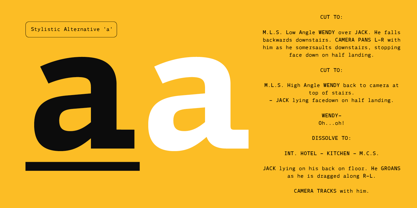
file name: The Northern Block Ltd Syke Mono 2016 218960

file name: The Northern Block Ltd Syke Mono 2016

file name: Jonathan Hill Syke Mono 2016 218965
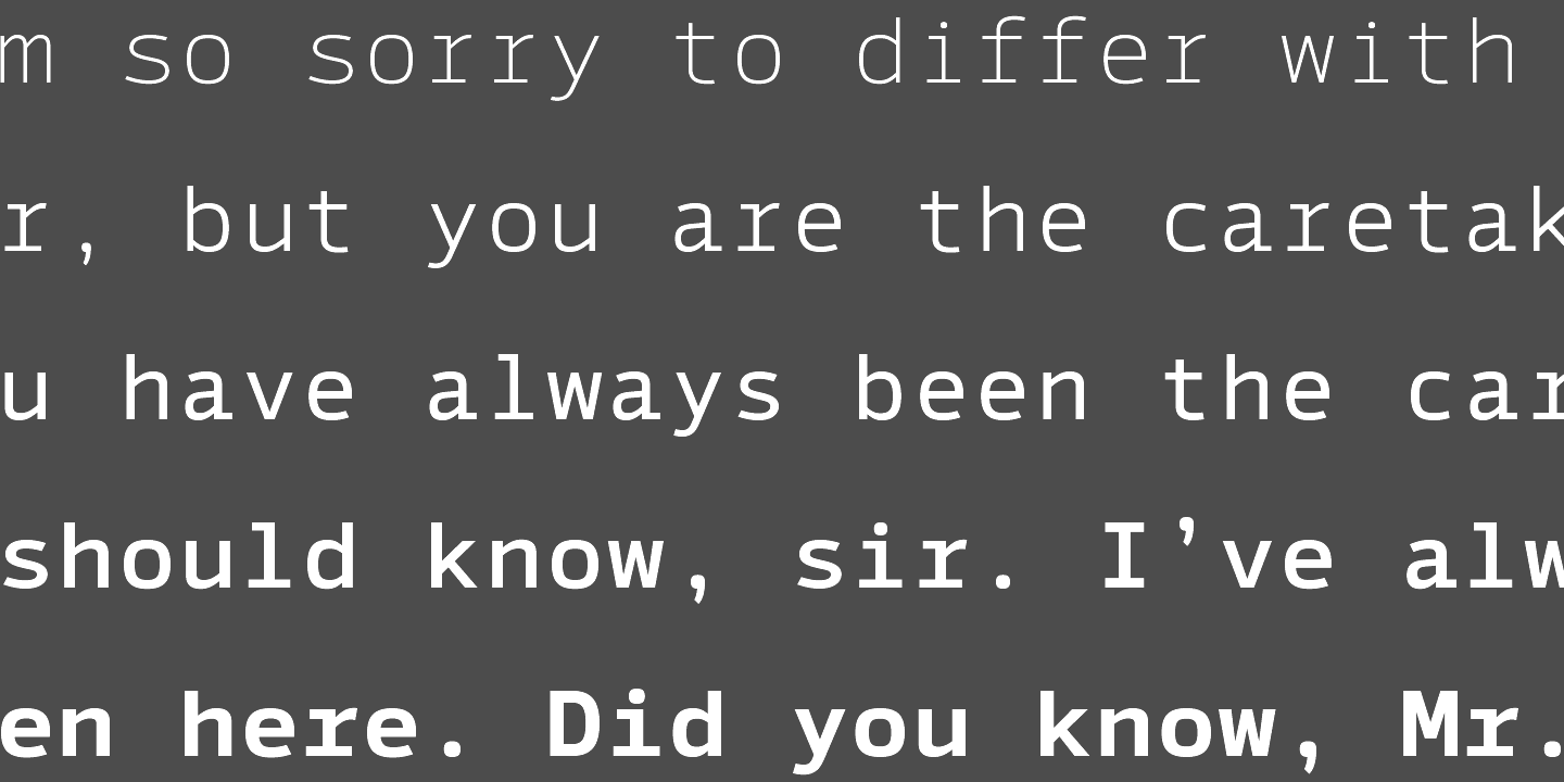
file name: Jonathan Hill Syke Mono 2016 218966
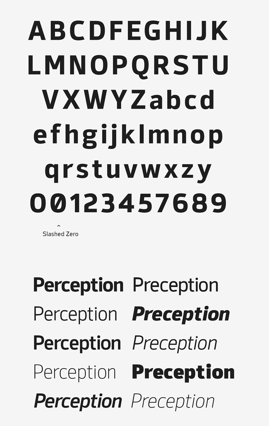
file name: Jonathan Hill Syke 2016
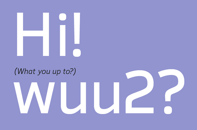
file name: Jonathan Hill Syke 2016b
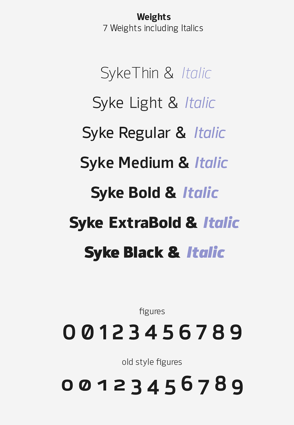
file name: Jonathan Hill Syke 2016c
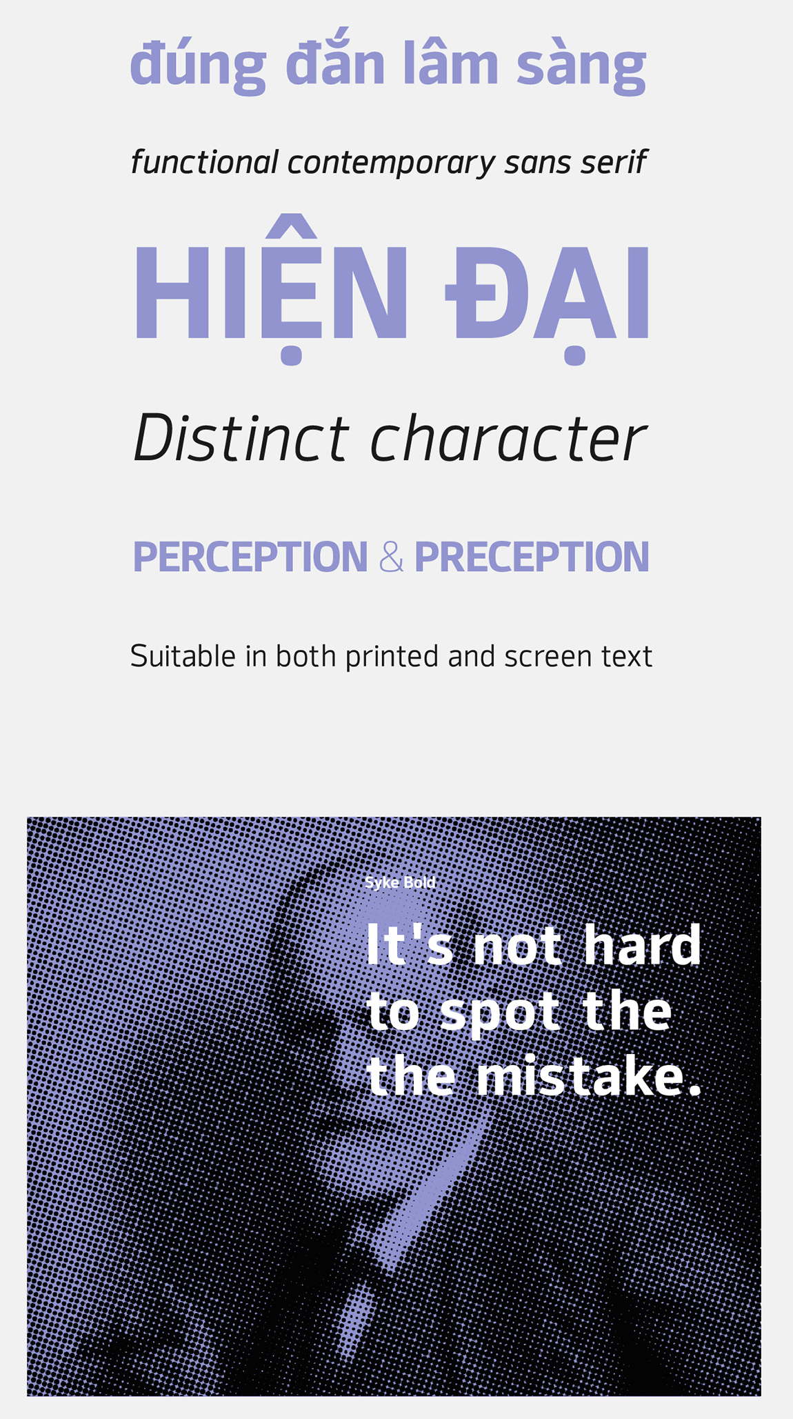
file name: Jonathan Hill Syke 2016d

file name: Jonathan Hill Syke 2016e
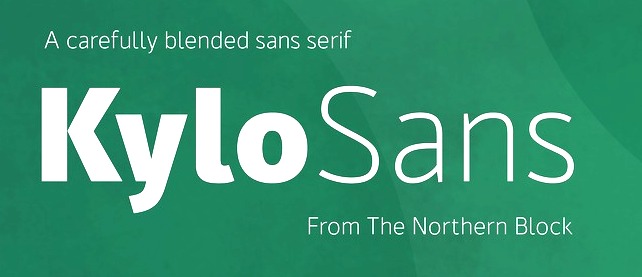
file name: The Northern Block Ltd Kylo Sans 2016 209702
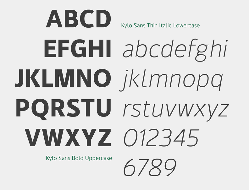
file name: The Northern Block Ltd Kylo Sans 2016 209703
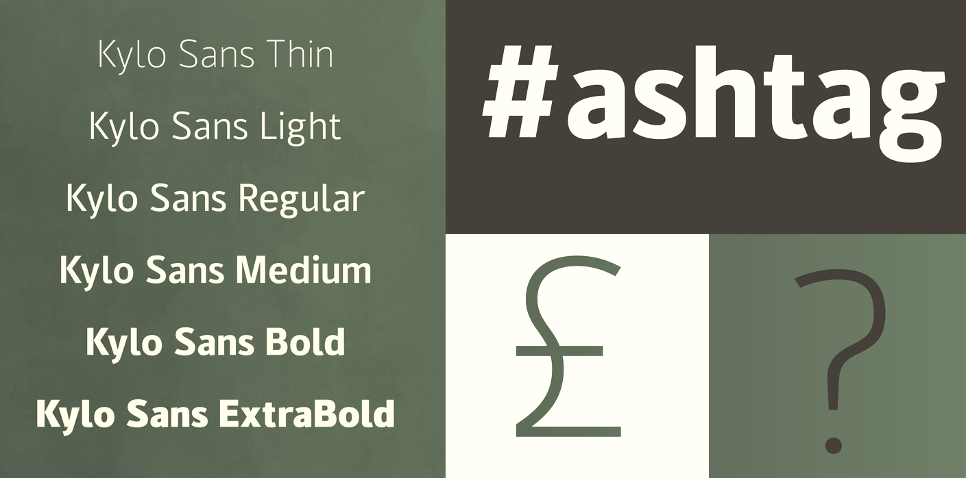
file name: The Northern Block Ltd Kylo Sans 2016 209704

file name: The Northern Block Ltd Kylo Sans 2016 209705

file name: The Northern Block Ltd Kylo Sans 2016 209709

file name: The Northern Block Ltd Kylo Sans 2016

file name: Jonathan Hill Hoxton North 2016 202318
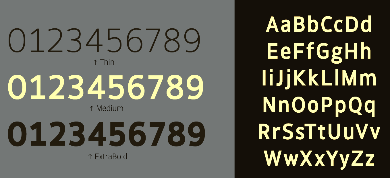
file name: Jonathan Hill Hoxton North 2016 202461
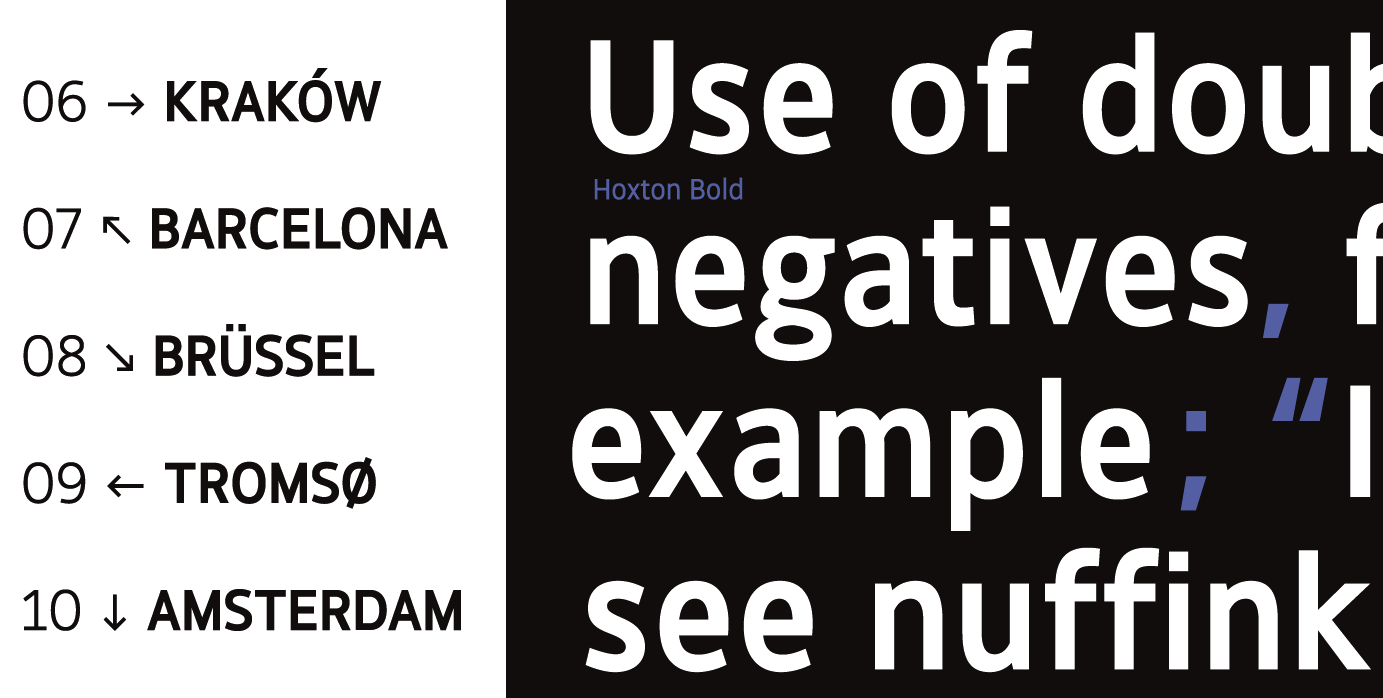
file name: Jonathan Hill Hoxton North 2016 202462

file name: Jonathan Hill Hoxton North 2016 202463
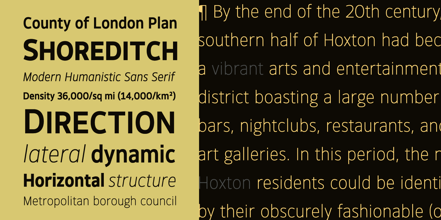
file name: Jonathan Hill Hoxton North 2016 202464

file name: Jonathan Hill Hoxton North 2016

file name: The Northern Block Ltd Facto 2015 189226
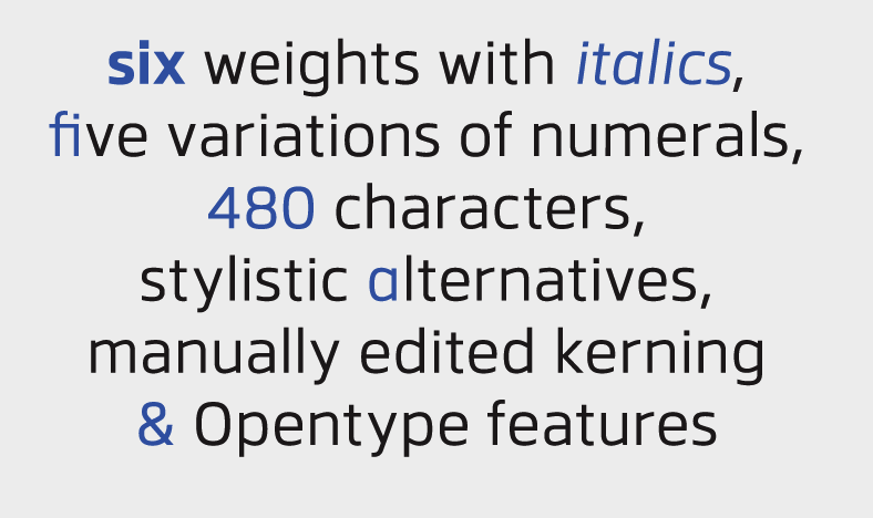
file name: The Northern Block Ltd Facto 2015 189332
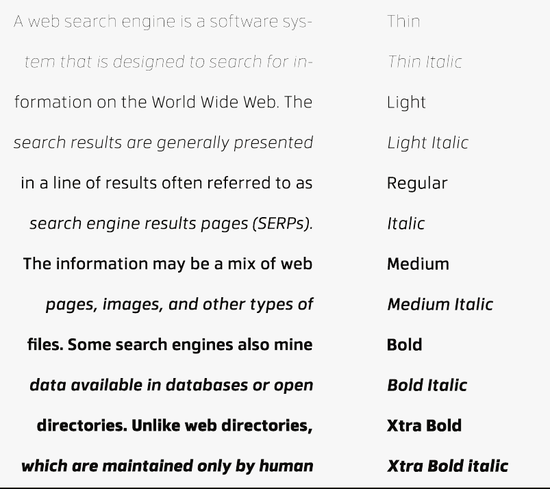
file name: The Northern Block Ltd Facto 2015 189334

file name: The Northern Block Ltd Facto 2015 189335

file name: The Northern Block Ltd Facto 2015

file name: Jonathan Hill Celdum 2016 197572

file name: Jonathan Hill Celdum 2016
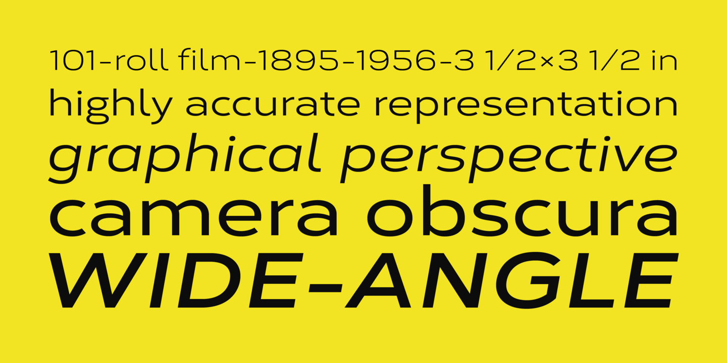
file name: The Northern Block Ltd Corbert Wide 2020 354984
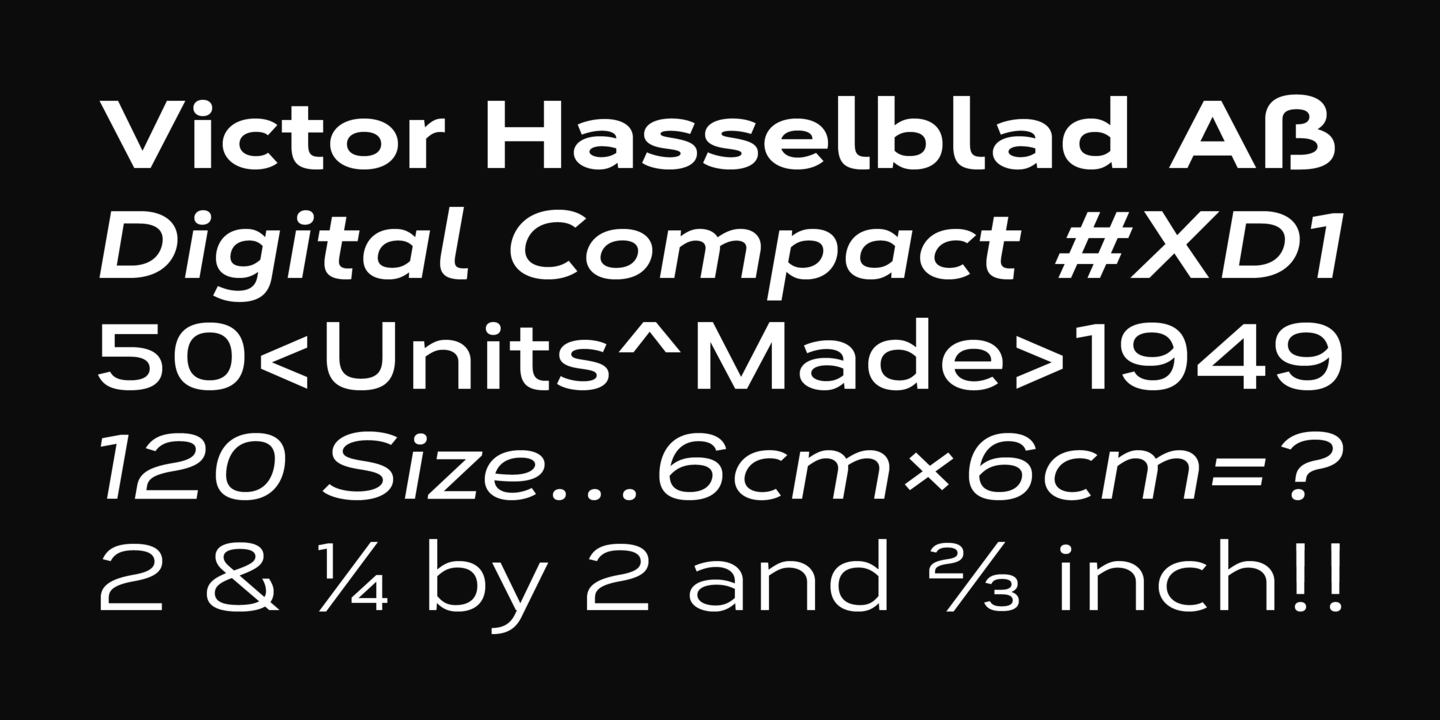
file name: The Northern Block Ltd Corbert Wide 2020 354985
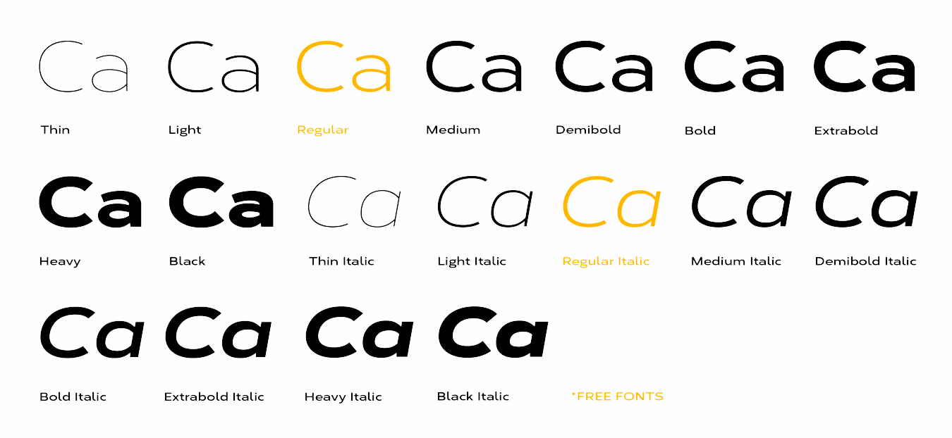
file name: The Northern Block Ltd Corbert Wide 2020 354986
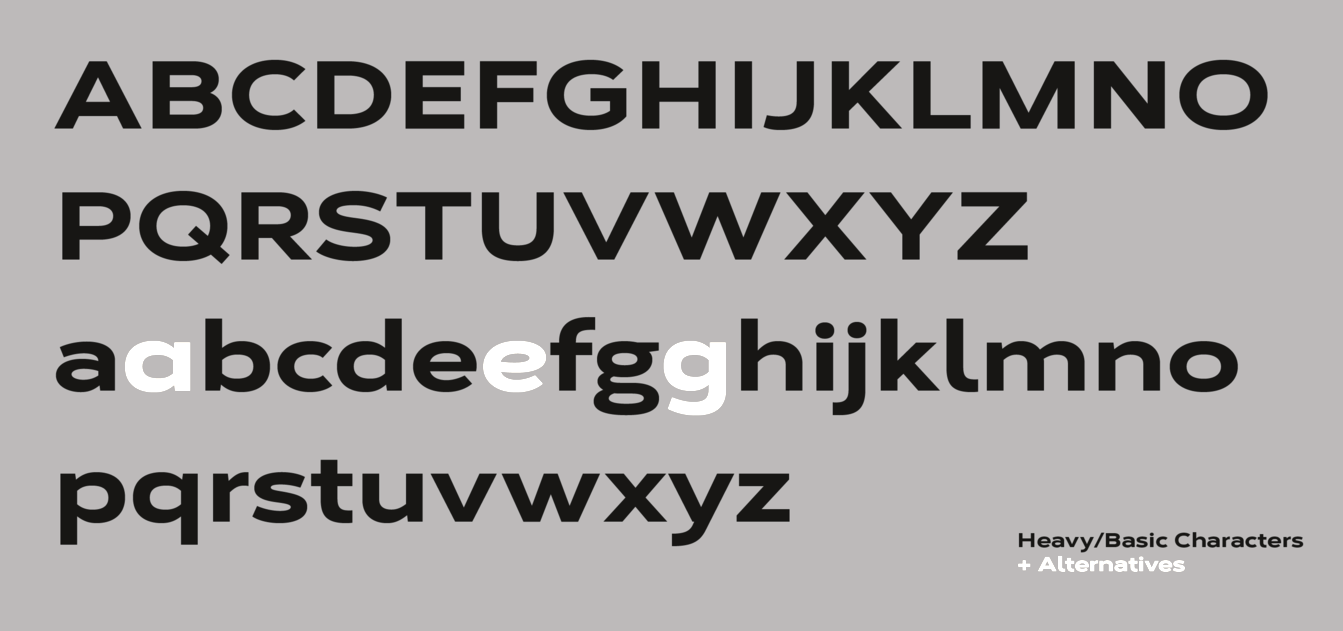
file name: The Northern Block Ltd Corbert Wide 2020 354987

file name: The Northern Block Ltd Corbert Wide 2020 354988
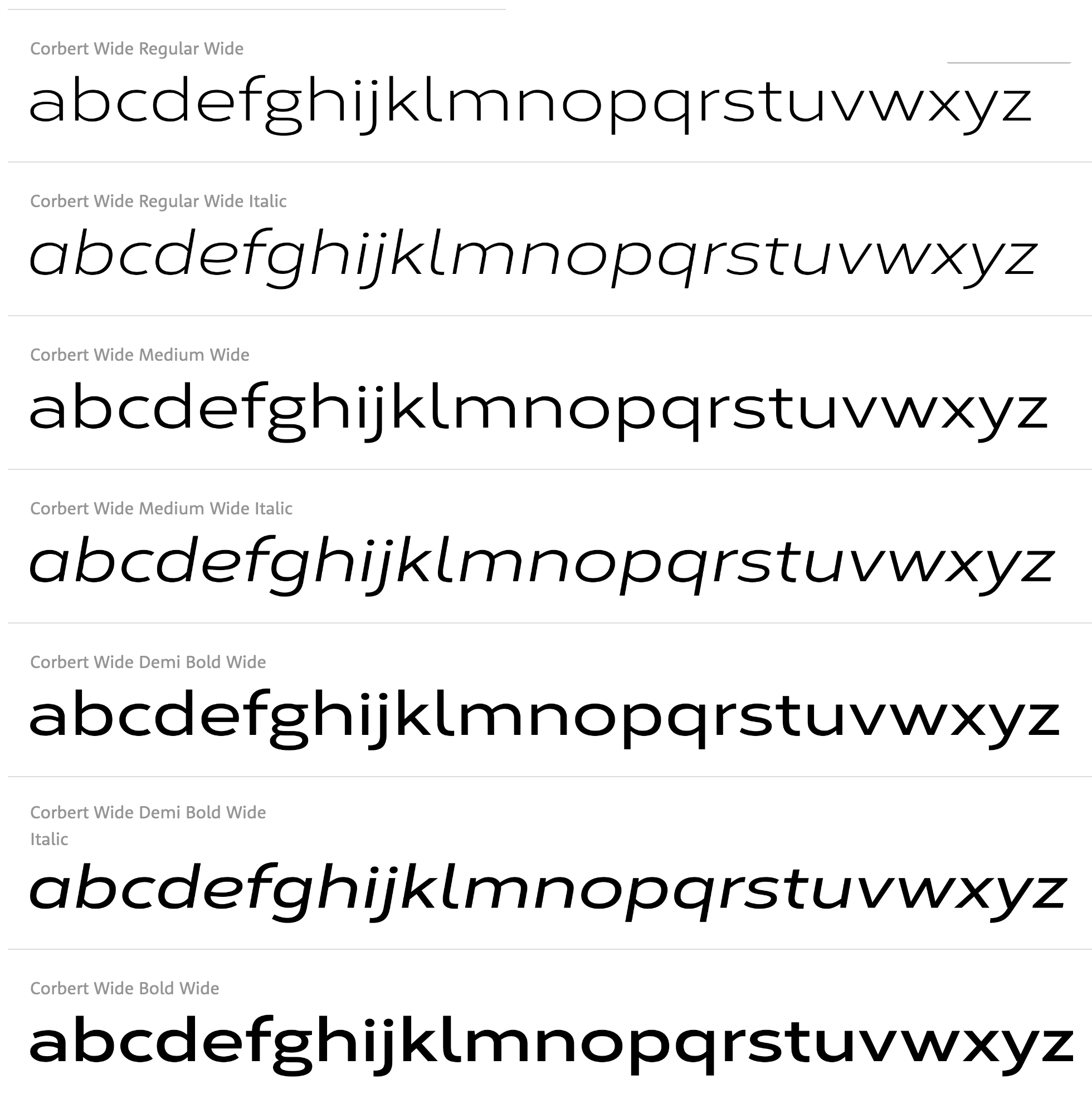
file name: Jonathan Hill Corbert Wide 2020
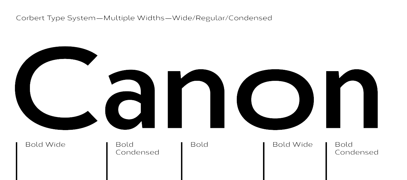
file name: Jonathan Hill Corbert Wide 2020 354980
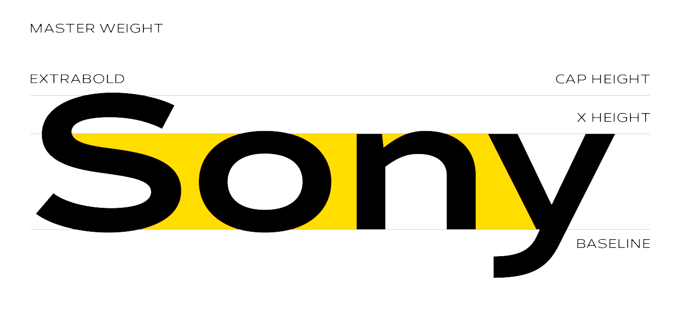
file name: Jonathan Hill Corbert Wide 2020 354981
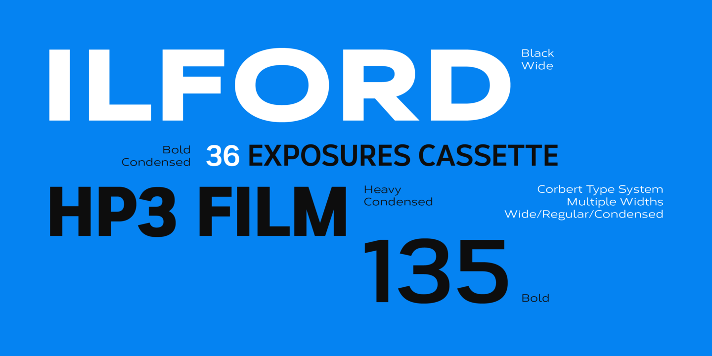
file name: Jonathan Hill Corbert Wide 2020 354982
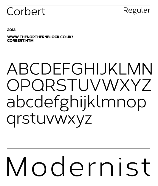
file name: Jonathan Hill Corbert 2013
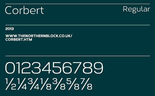
file name: Jonathan Hill Corbert 2013b

file name: Jonathan Hill Corbert 2013c

file name: Jonathan Hill Corbert Black 2013f
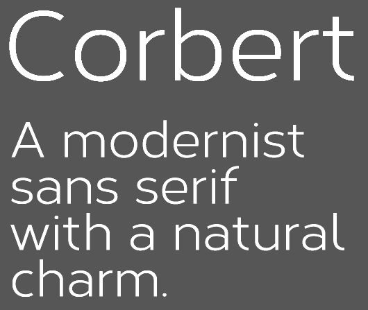
file name: Jonathan Hill Corbert 2013d
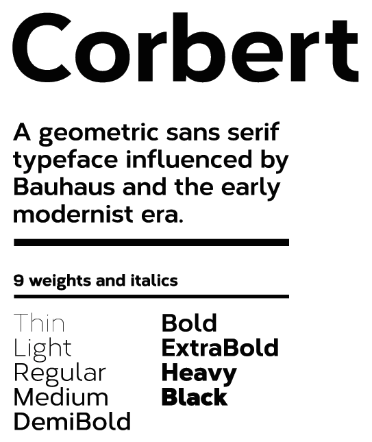
file name: Jonathan Hill Corbert 2013e
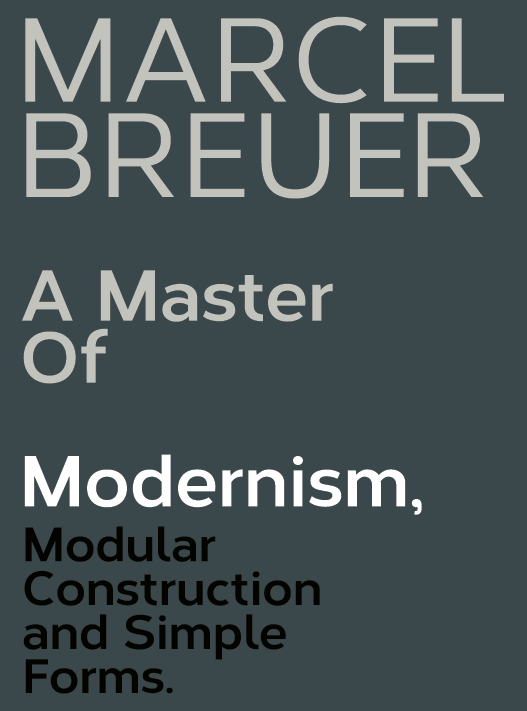
file name: Jonathan Hill Corbert 2013eb
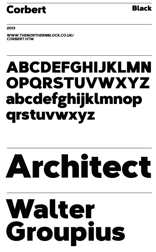
file name: Jonathan Hill Corbert Black 2013e
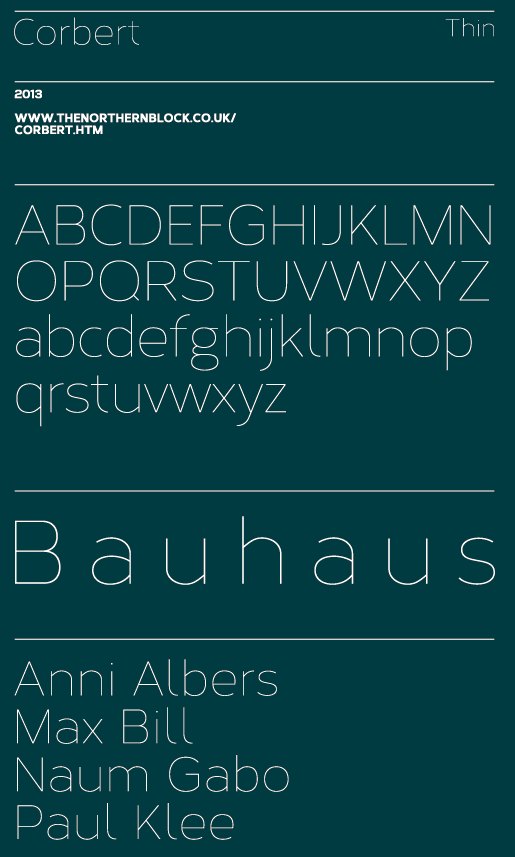
file name: Jonathan Hill Corbert Thin 2013e
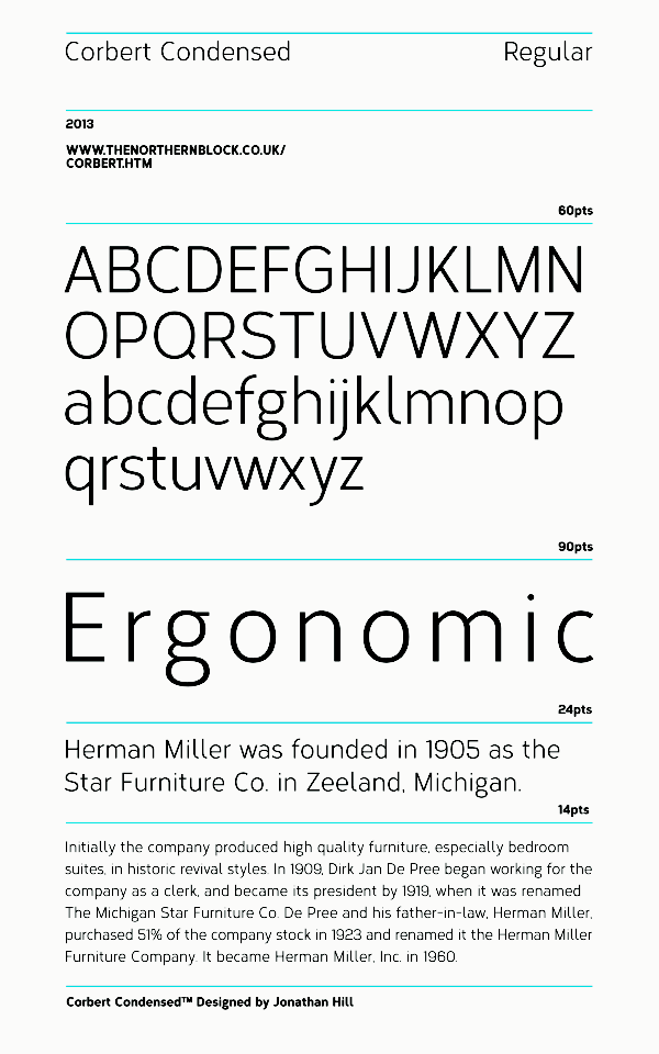
file name: Jonathan Hill Corbert Condensed 2013

file name: Jonathan Hill Corbert Condensed Medium 2013

file name: Jonathan Hill Corbert Condensed Medium 2013b
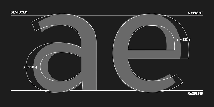
file name: Jonathan Hill Corbert Condensed Medium 2013c
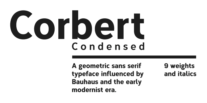
file name: Jonathan Hill Corbert Condensed Medium 2013d

file name: The Northern Block Ltd Halcom 2015 179944

file name: The Northern Block Ltd Halcom 2015 179973
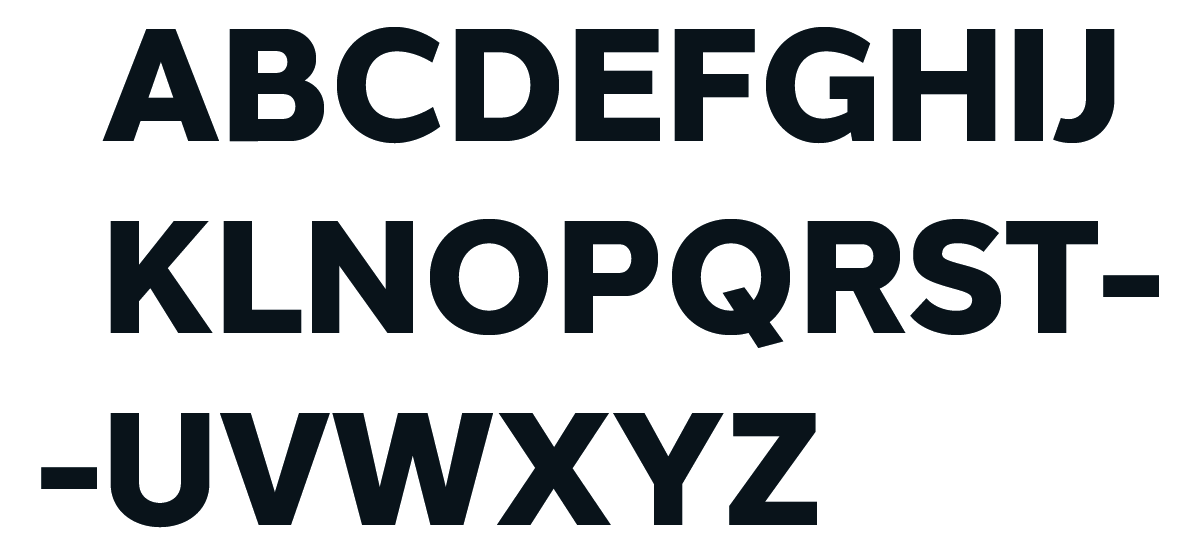
file name: The Northern Block Ltd Halcom 2015 179974
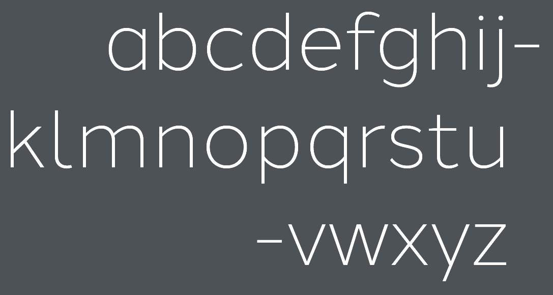
file name: The Northern Block Ltd Halcom 2015 179975

file name: The Northern Block Ltd Halcom 2015

file name: Jonathan Hill Itoya 2015
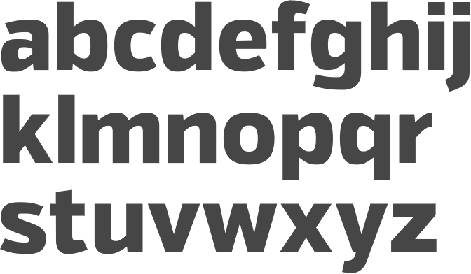
file name: Jonathan Hill Itoya Exra Bold 2015

file name: Jonathan Hill Byker Black 2014

file name: Jonathan Hill Byker Light 2014

file name: Jonathan Hill Scharf 2015
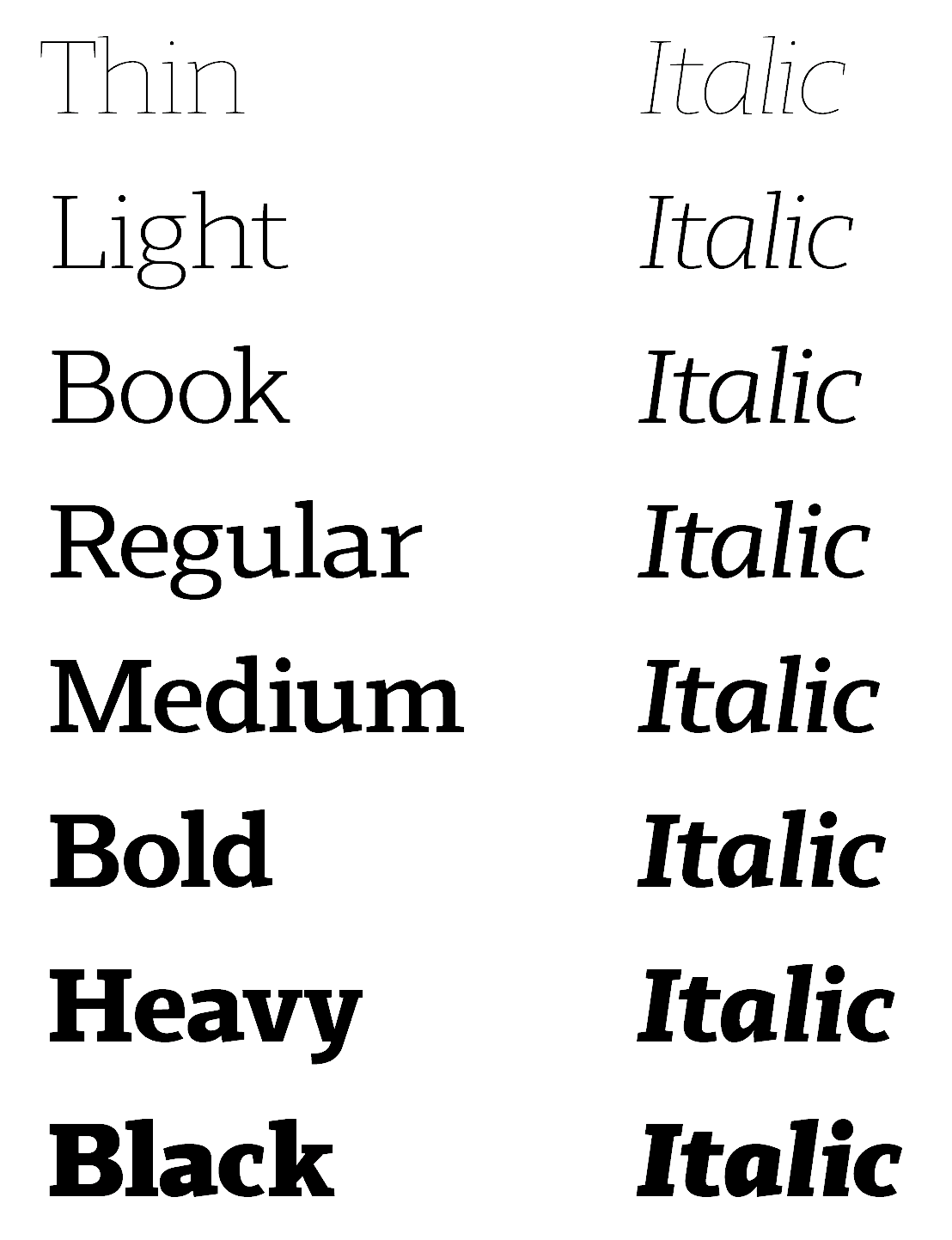
file name: Jonathan Hill Scharf 2015b
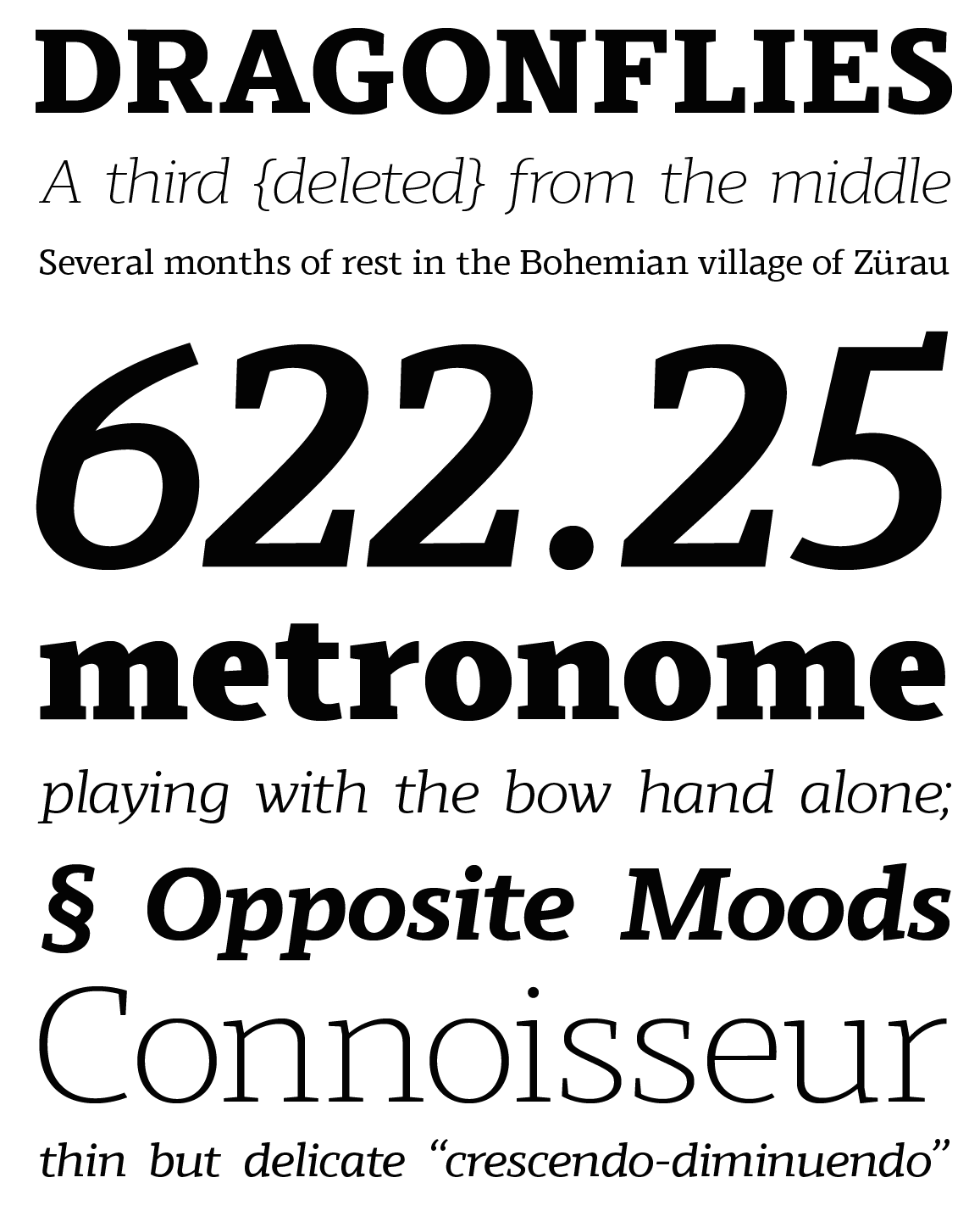
file name: Jonathan Hill Scharf 2015c
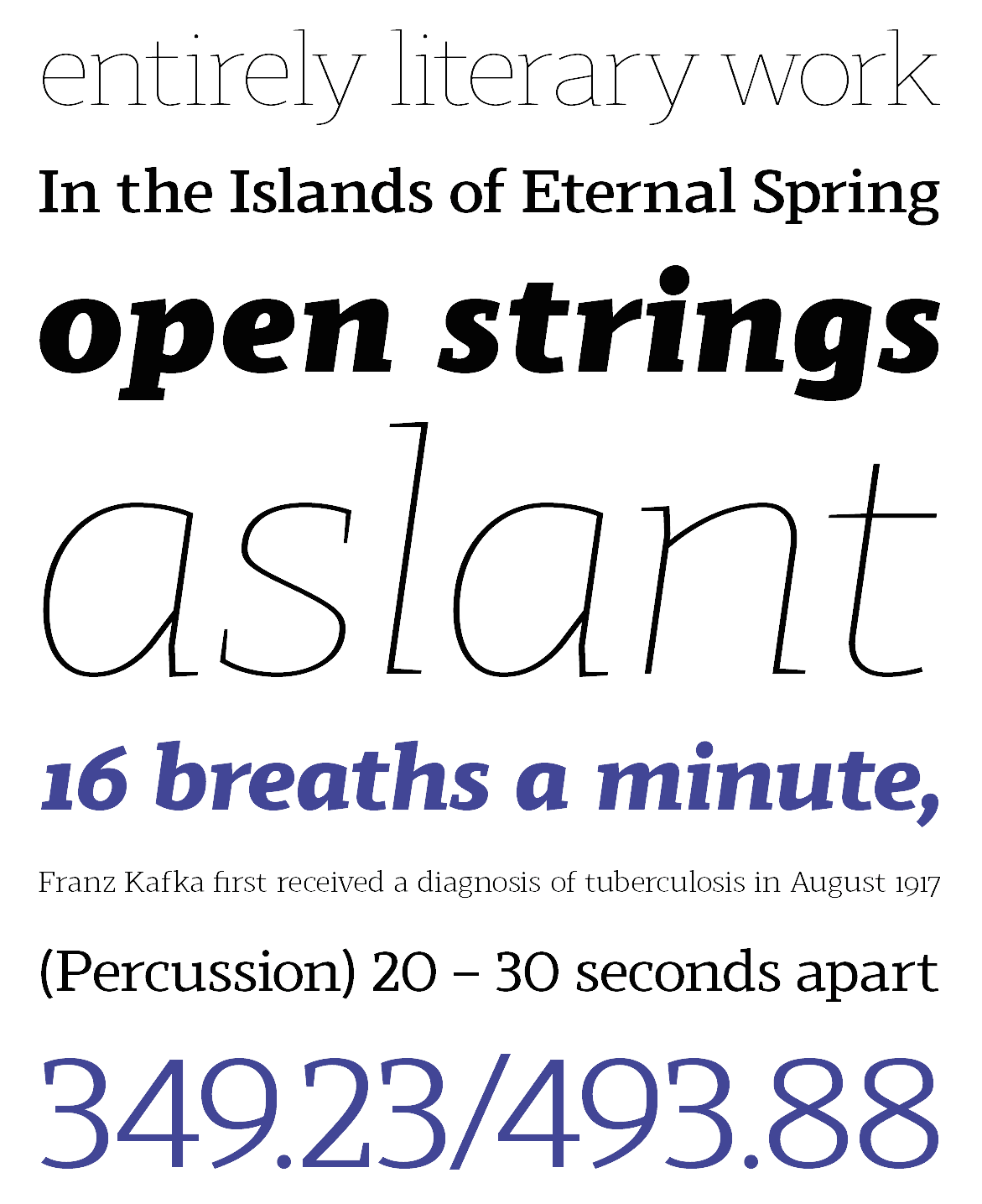
file name: Jonathan Hill Scharf 2015d
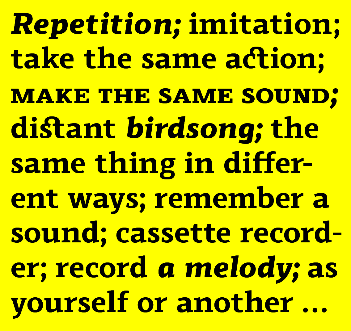
file name: Jonathan Hill Scharf 2015e
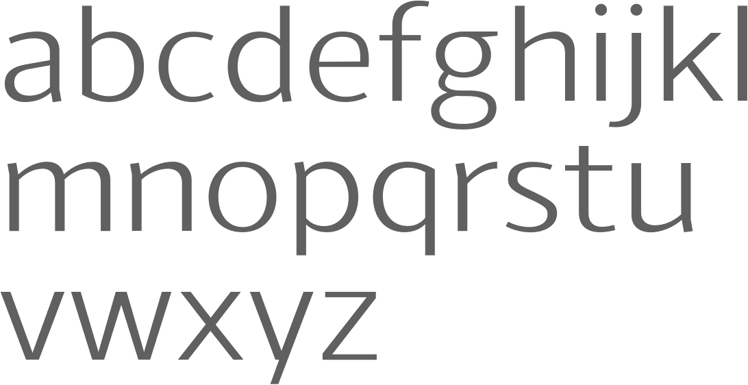
file name: The Northern Block Ltd Schar 2014

file name: Jonathan Hill Schar 2014
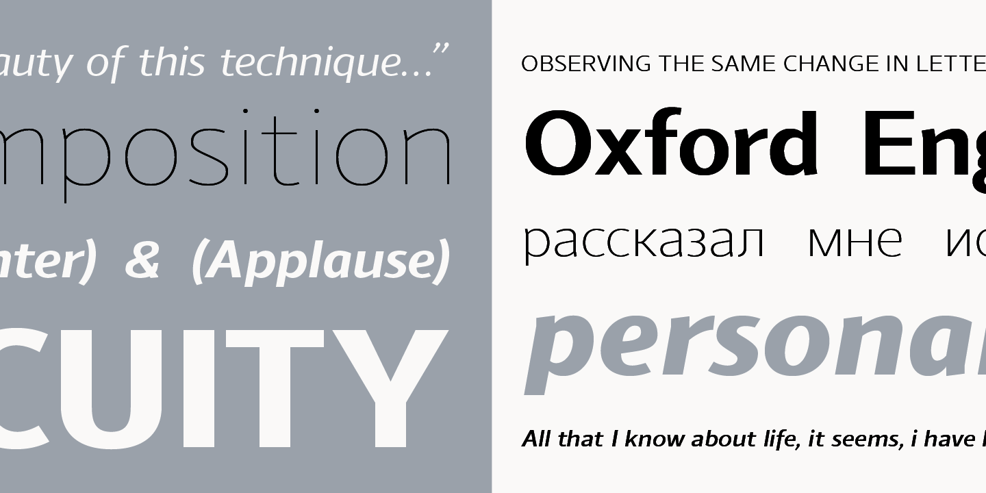
file name: Jonathan Hill Schar 2014b
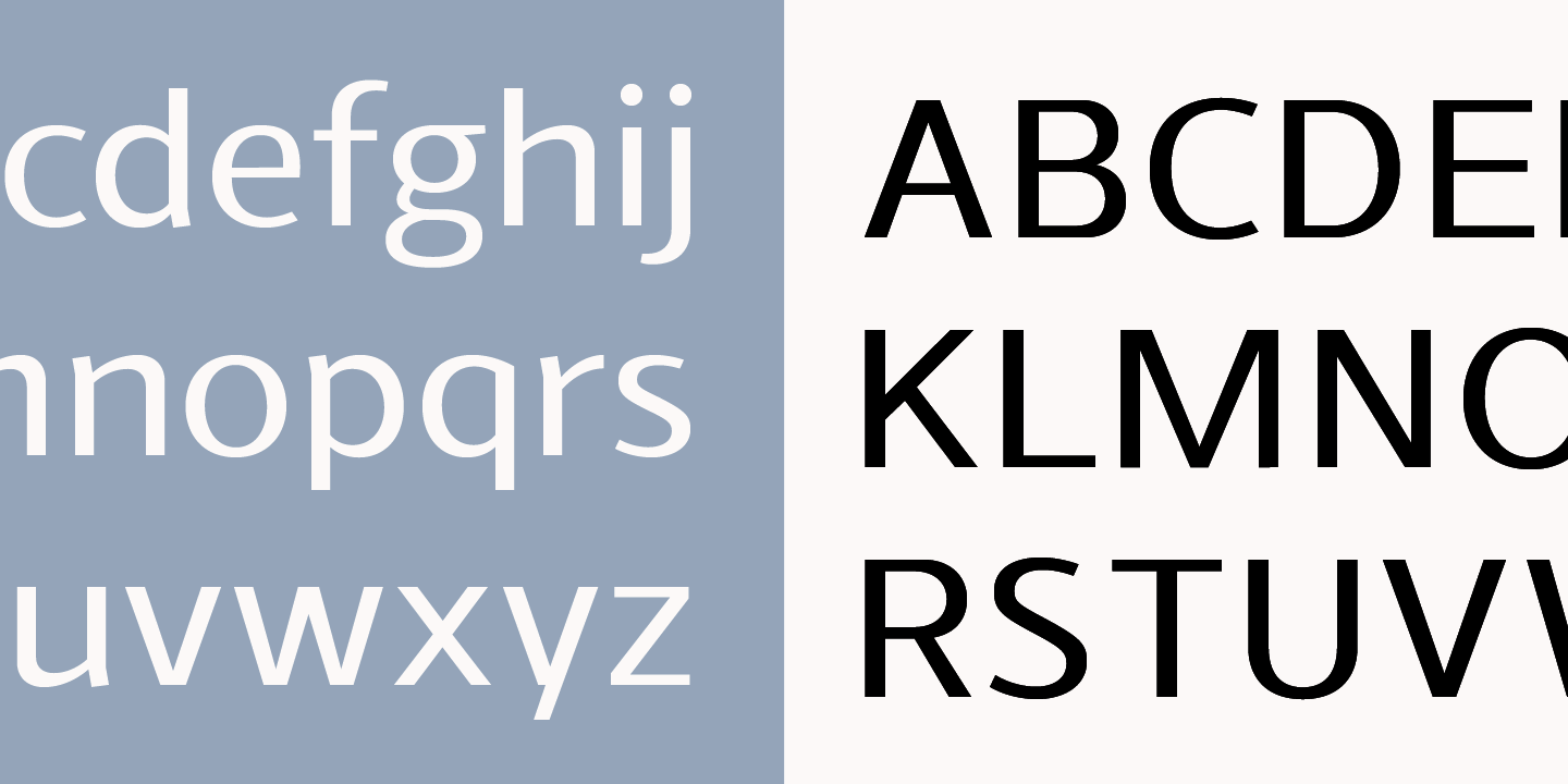
file name: Jonathan Hill Schar 2014c
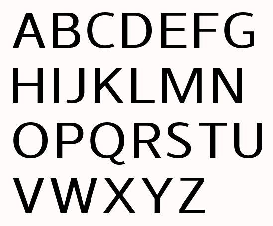
file name: Jonathan Hill Schar 2014d
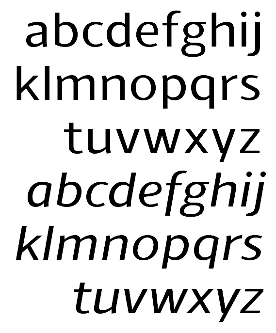
file name: Jonathan Hill Schar 2014e
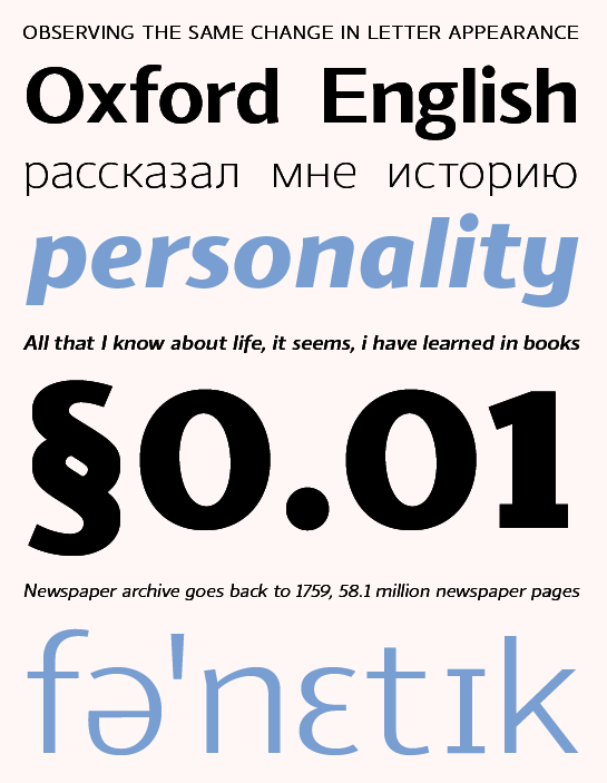
file name: Jonathan Hill Schar 2014f
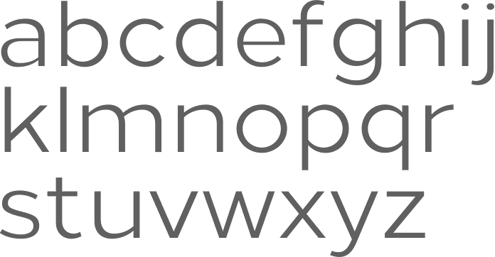
file name: Jonathan Hill Loew 2014
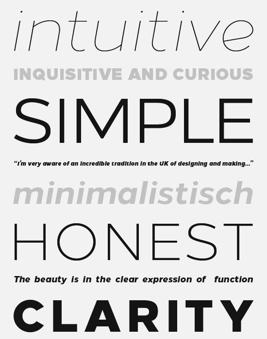
file name: Jonathan Hill Loew 2014b

file name: Jonathan Hill Loew 2014ba

file name: Jonathan Hill Loew 2014c
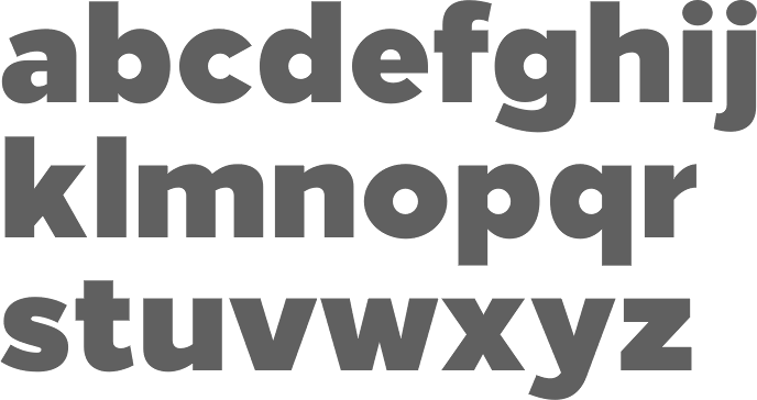
file name: Jonathan Hill Loew Black 2014

file name: Jonathan Hill Bitner 2014

file name: Jonathan Hill Bitner 2014b
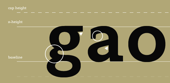
file name: Jonathan Hill Modum 2014d
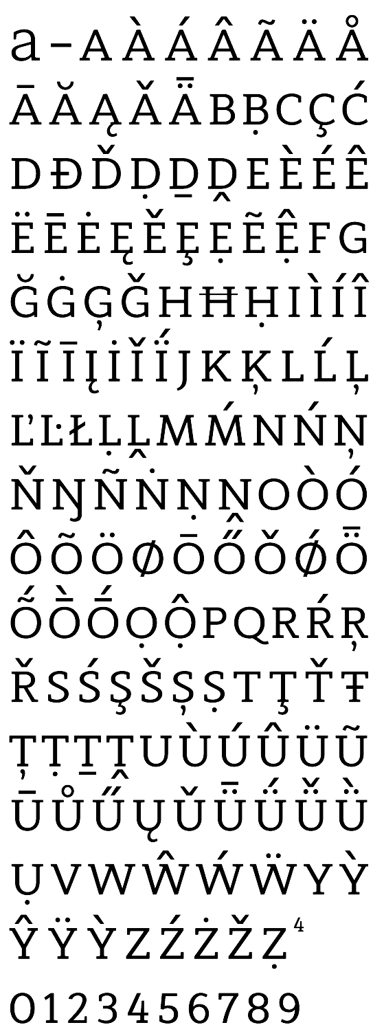
file name: Jonathan Hill Modum 2014e

file name: Jonathan Hill Modum 2014
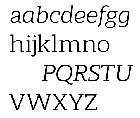
file name: Jonathan Hill Modum 2014b
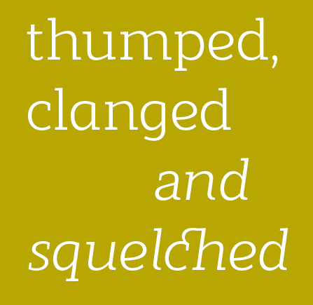
file name: Jonathan Hill Modum 2014c
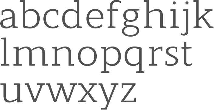
file name: Jonathan Hill Modum 2014
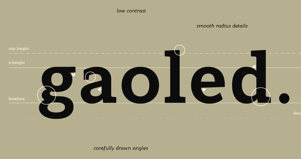
file name: Jonathan Hill Modum 2014b

file name: Jonathan Hill Modum 2014c
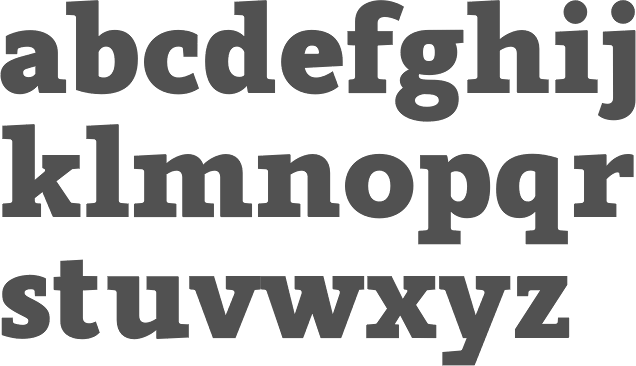
file name: Jonathan Hill Modum Black 2014

file name: The Northern Block Nauman Neue 2021 1
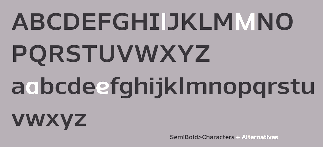
file name: The Northern Block Nauman Neue 2021 2
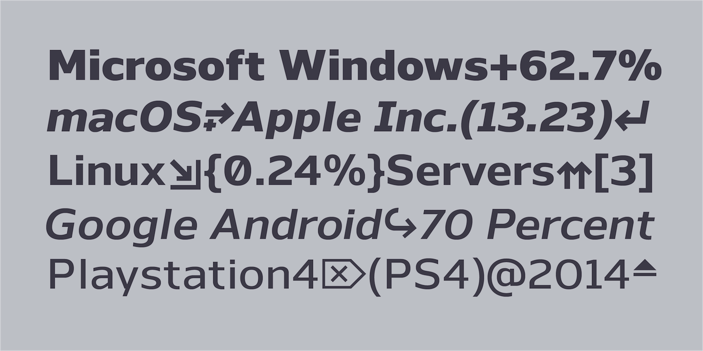
file name: The Northern Block Nauman Neue 2021 4
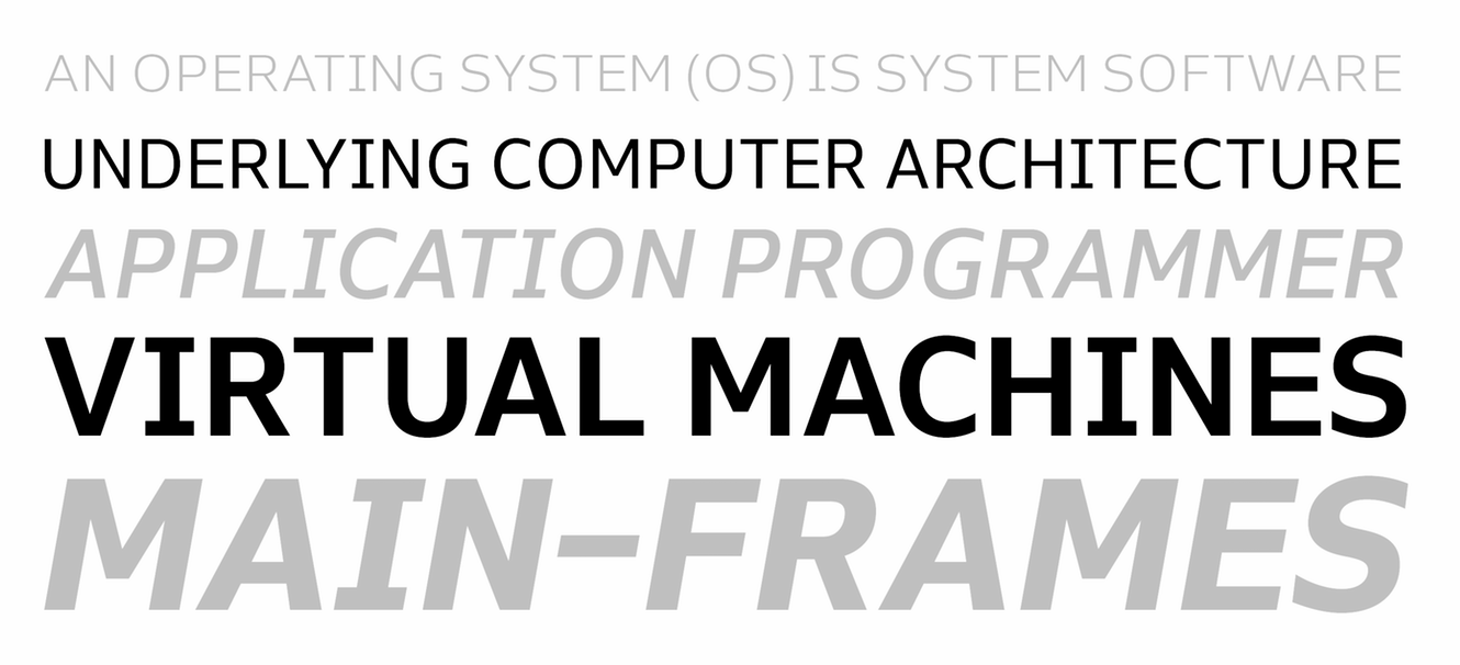
file name: The Northern Block Nauman Neue 2021 5

file name: The Northern Block Nauman Neue 2021

file name: Jonathan Hill Nauman Neue 2021
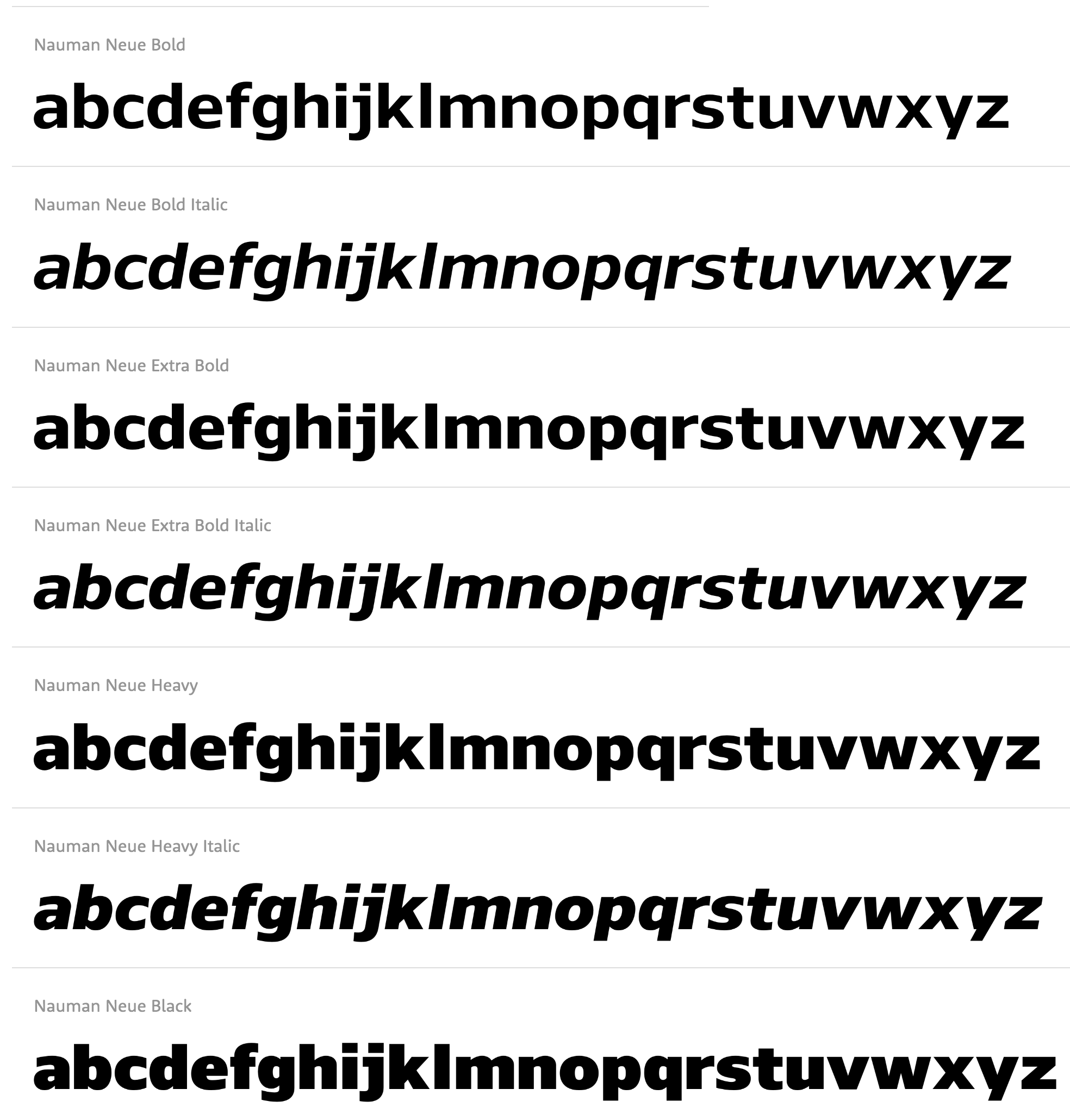
file name: Jonathan Hill Nauman Neue 2021
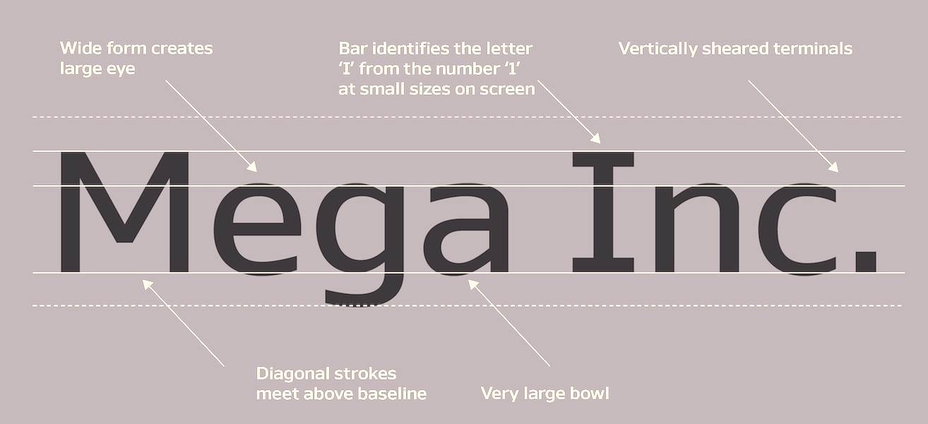
file name: Jonathan Hill Nauman Neue 2021
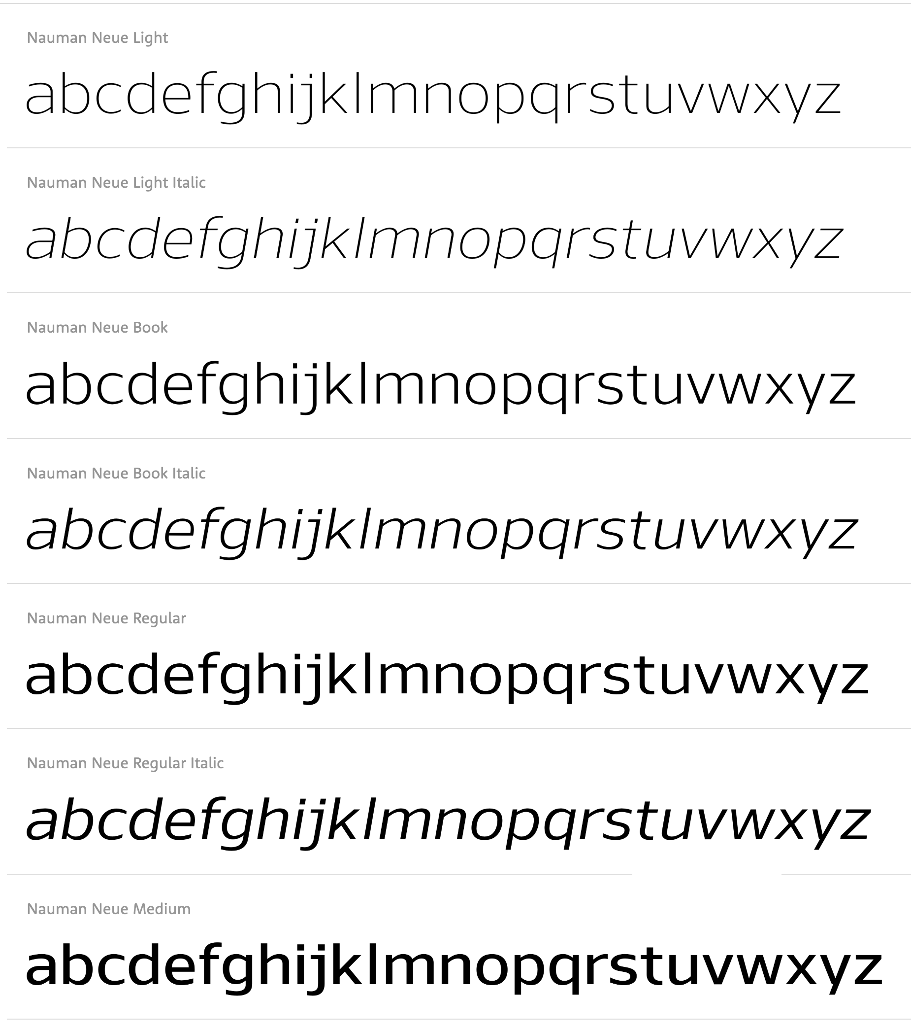
file name: Jonathan Hill Nauman Neue 2021
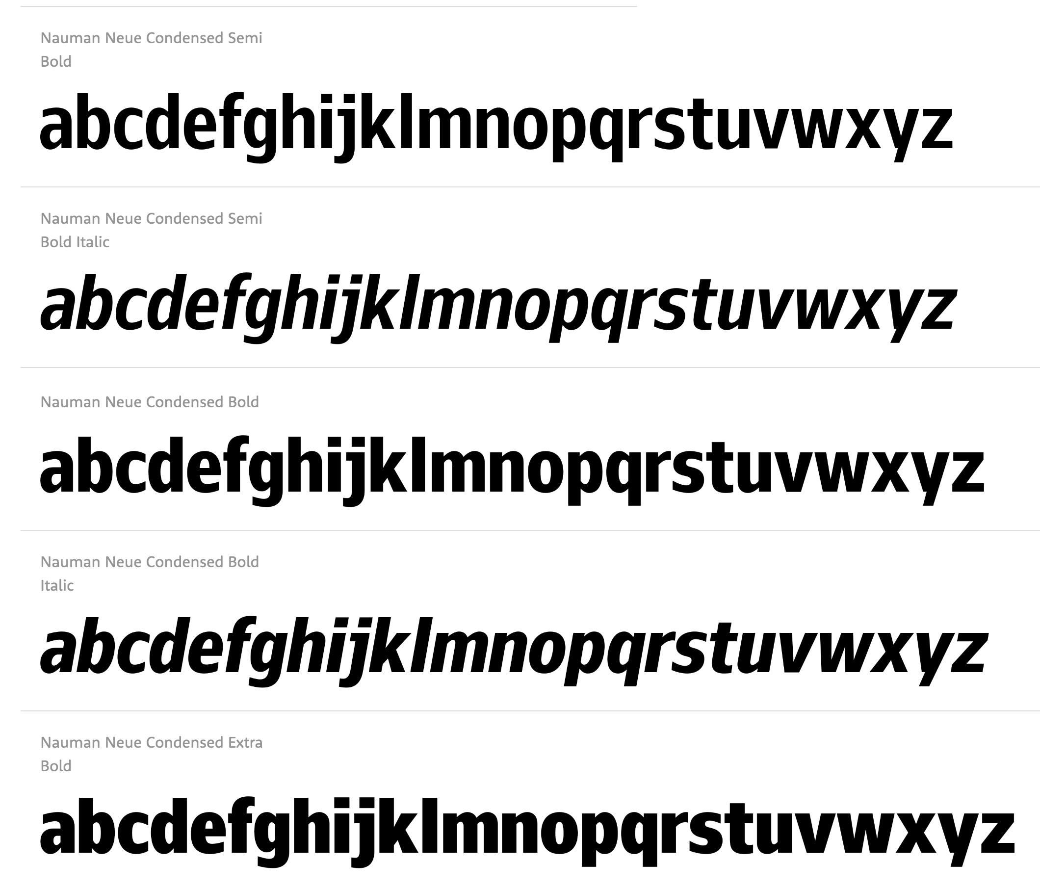
file name: Jonathan Hill Nauman Neue 2021

file name: Jonathan Hill Nauman 2013
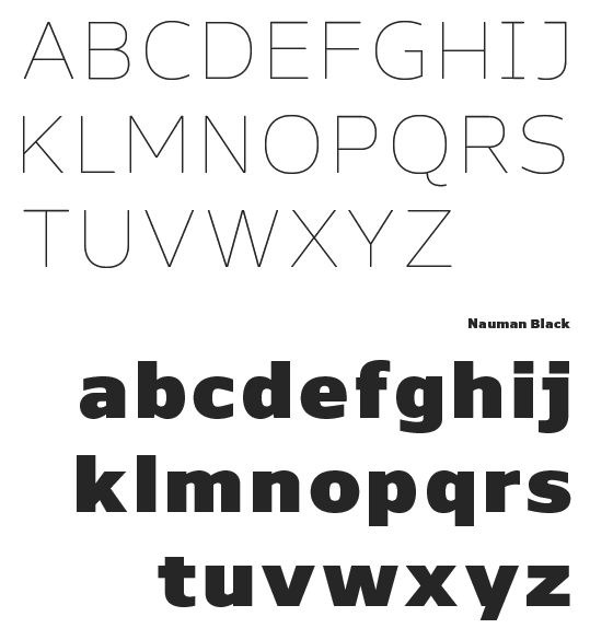
file name: Jonathan Hill Nauman 2013b
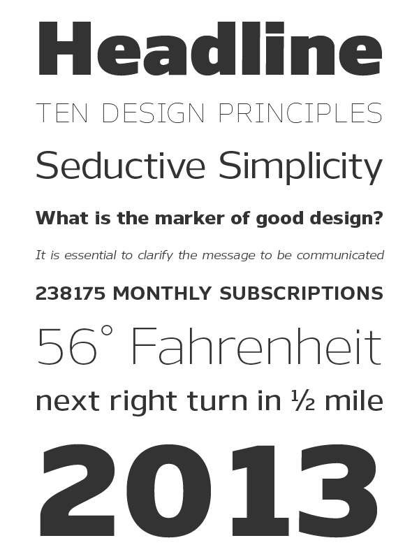
file name: Jonathan Hill Nauman 2013c
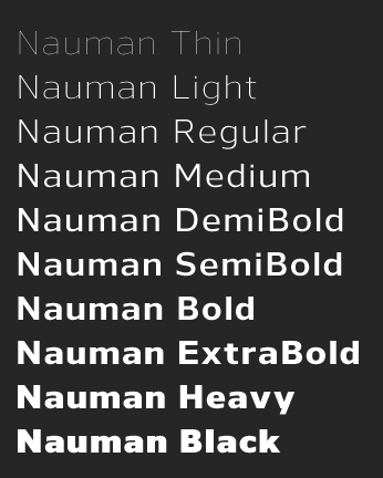
file name: Jonathan Hill Nauman 2013d

file name: Jonathan Hill Nauman 2013e

file name: Jonathan Hill Nauman Medium 2013
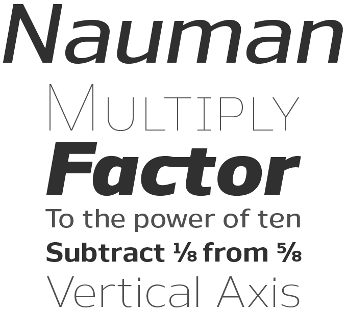
file name: Jonathan Hill Nauman 2013h

file name: Jonathan Hill Nauman Thin 2013

file name: Jonathan Hill Gunar 2013
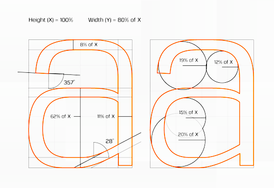
file name: Jonathan Hill Gunar 2013b

file name: Jonathan Hill Gunar 2013c

file name: Jonathan Hill Gunar Heavy 2013
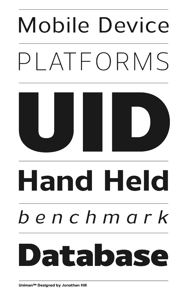
file name: Jonathan Hill Uniman 2012
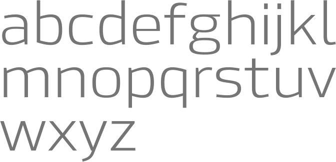
file name: Jonathan Hill Hackman 2012
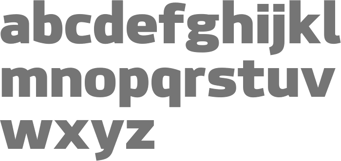
file name: Jonathan Hill Hackman Black 2012

file name: Jonathan Hill Hackman 2012b
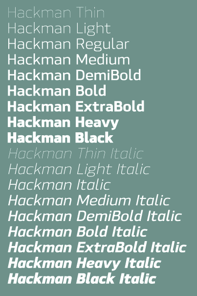
file name: Jonathan Hill Hackman 2012c
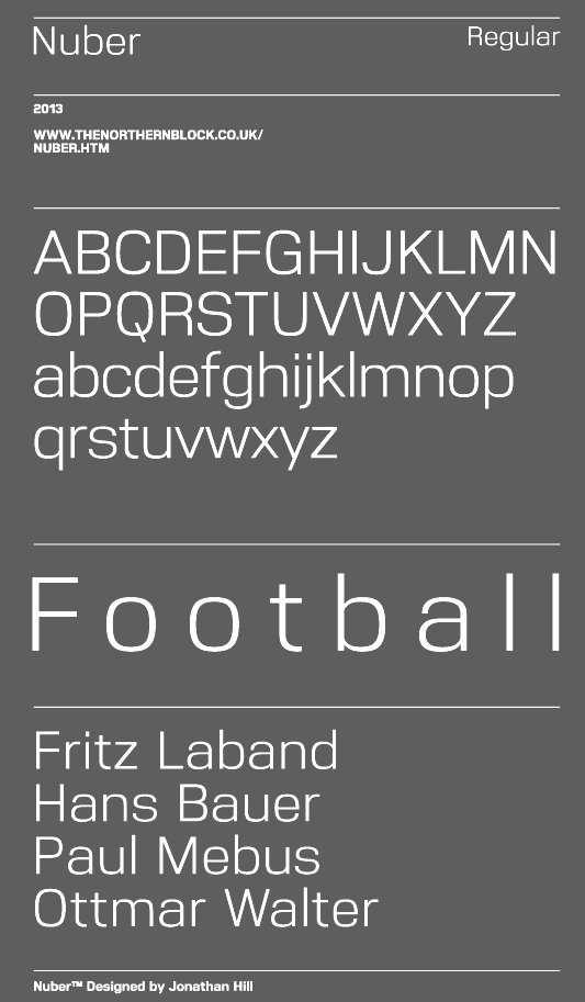
file name: Jonathan Hill Nuber 2013

file name: Jonathan Hill Nuber 2013b
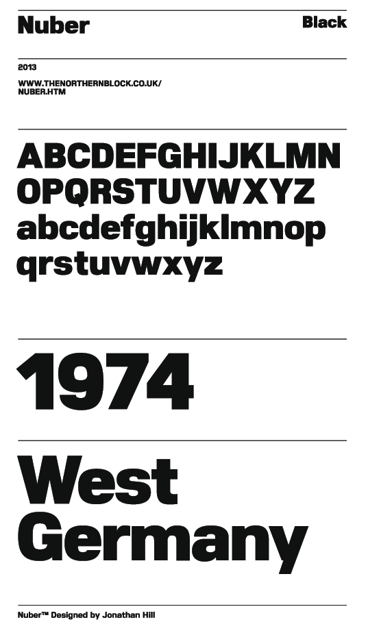
file name: Jonathan Hill Nuber Black 2013
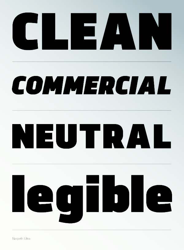
file name: Jonathan Hill Norpeth 2013

file name: Jonathan Hill Norpeth 2013b
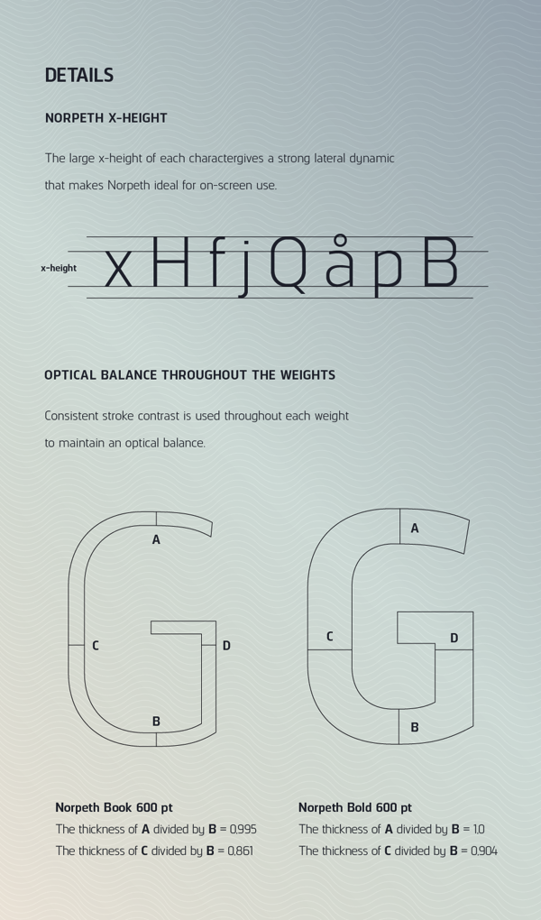
file name: Jonathan Hill Norpeth 2013c

file name: Jonathan Hill Norpeth 2013d
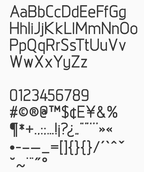
file name: Jonathan Hill Norpeth 2011
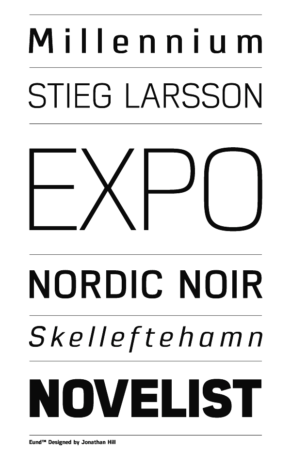
file name: Jonathan Hill Eund 2013
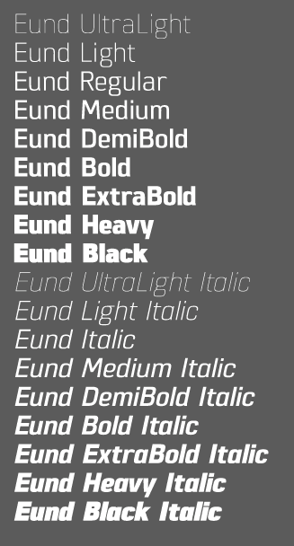
file name: Jonathan Hill Eund 2013b
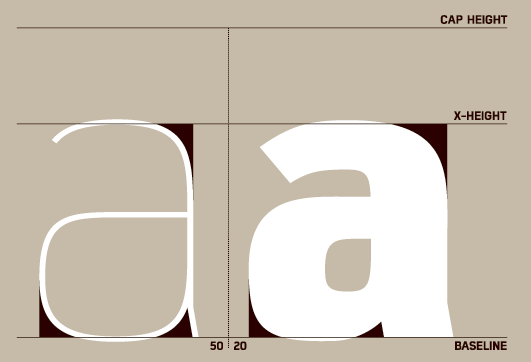
file name: Jonathan Hill Eund 2013c
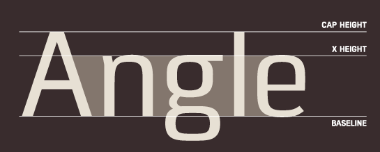
file name: Jonathan Hill Eund 2013d
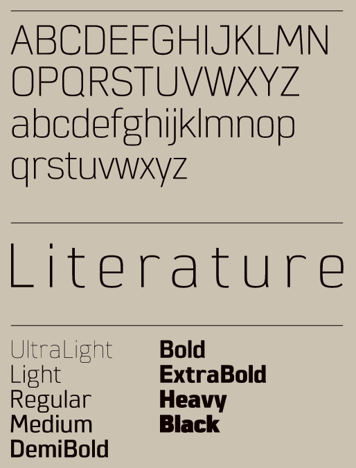
file name: Jonathan Hill Eund 2013f
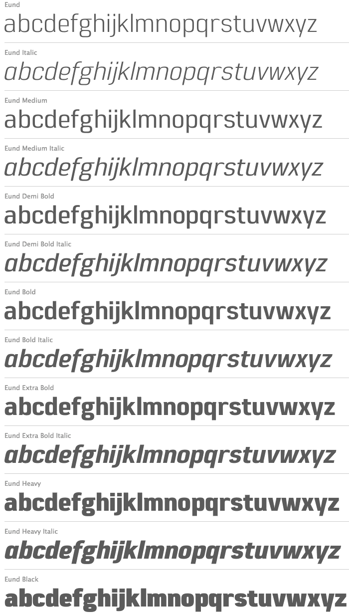
file name: Jonathan Hill Eund 2013h
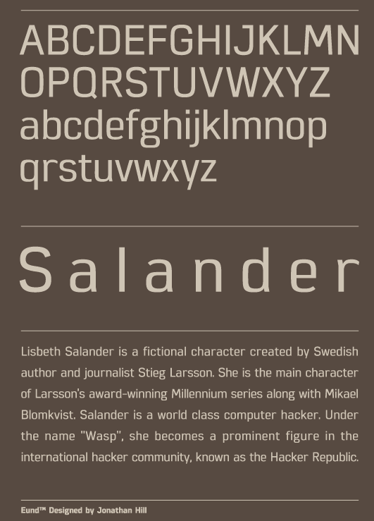
file name: Jonathan Hill Eund 2013g
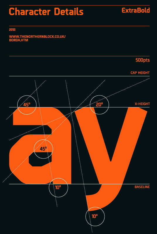
file name: Jonathan Hill Borda 2012
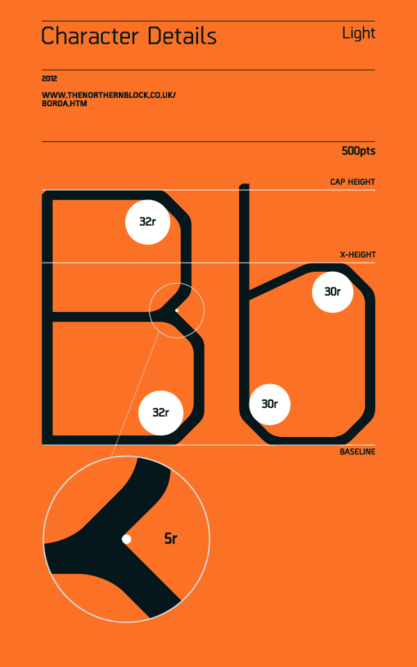
file name: Jonathan Hill Borda 2012b

file name: Jonathan Hill Borda 2012c
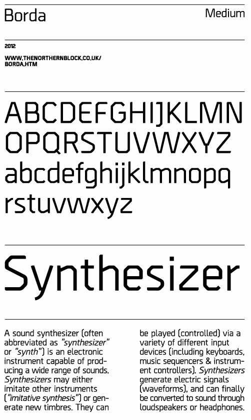
file name: Jonathan Hill Borda 2012d
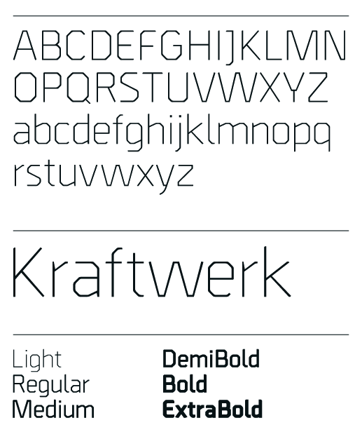
file name: Jonathan Hill Borda 2012e

file name: Jonathan Hill Reznik Black 2012
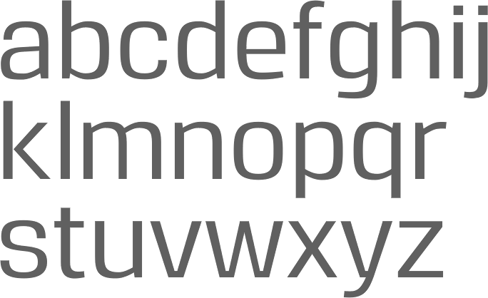
file name: Jonathan Hill Reznik Medium 2012
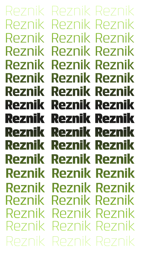
file name: Jonathan Hill Reznik 2012f

file name: Jonathan Hill Reznik 2012g
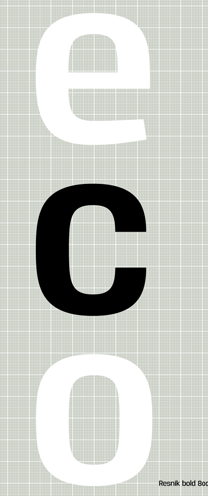
file name: Jonathan Hill Reznik 2012h
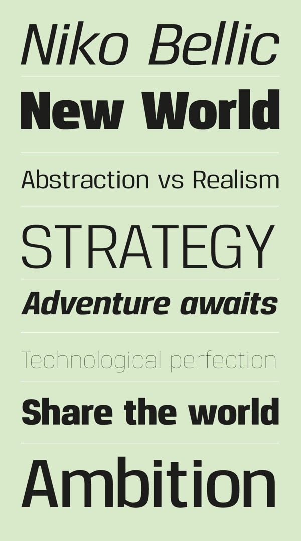
file name: Jonathan Hill Reznik 2012i
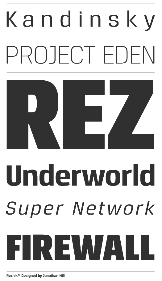
file name: Jonathan Hill Reznik 2012c
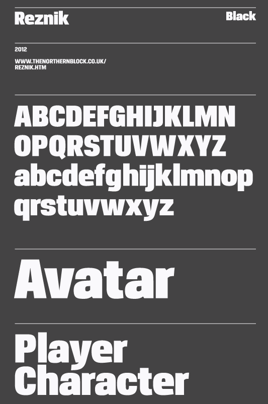
file name: Jonathan Hill Reznik 2012d
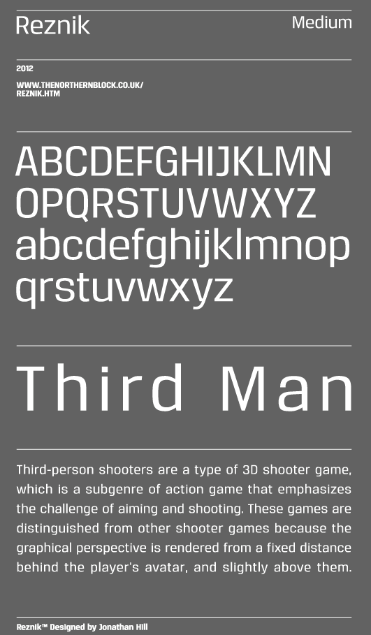
file name: Jonathan Hill Reznik 2012e

file name: Jonathan Hill Metral Medium 2012
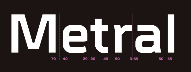
file name: Jonathan Hill Metral Medium 2012b
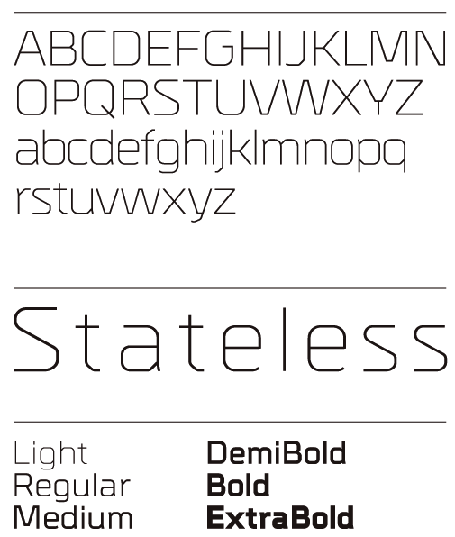
file name: Jonathan Hill Metrik 2012
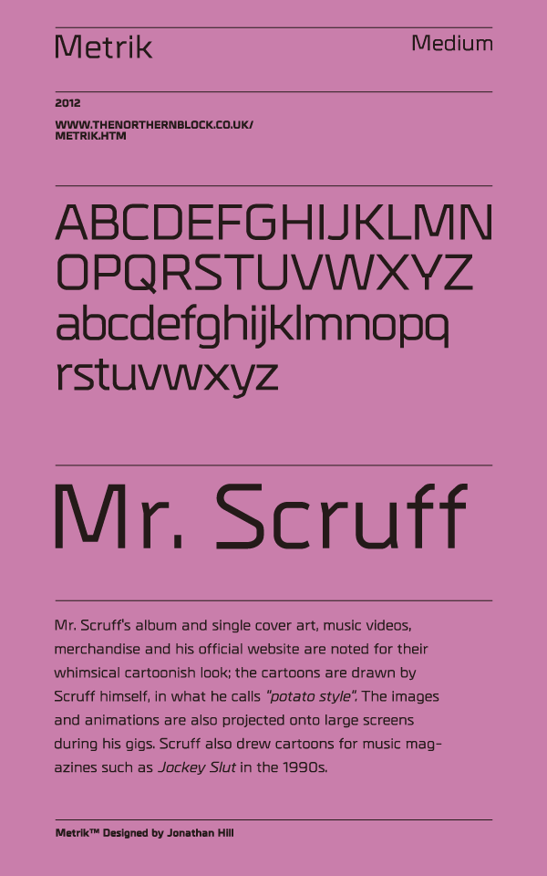
file name: Jonathan Hill Metrik 2012b

file name: Jonathan Hill Metrik 2012c
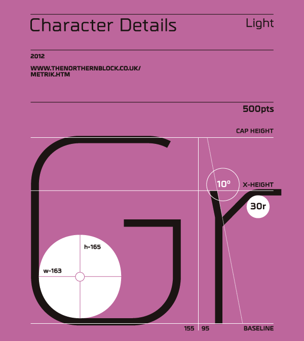
file name: Jonathan Hill Metrik 2012d
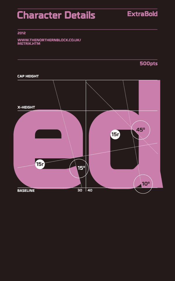
file name: Jonathan Hill Metrik 2012e
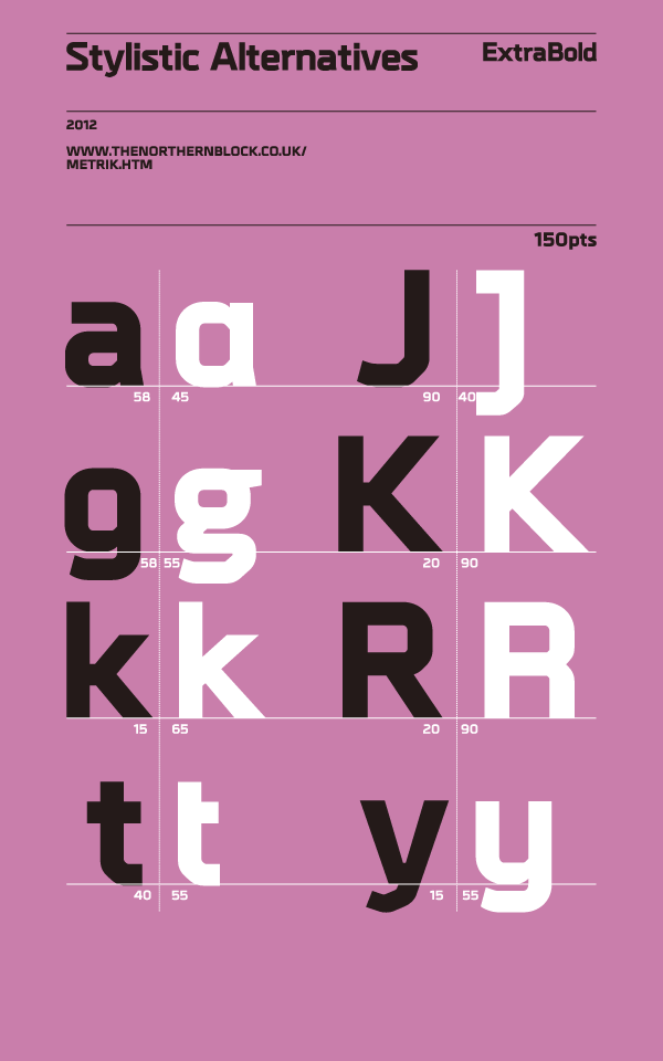
file name: Jonathan Hill Metrik 2012f
file name: Jonathan Hill Metrik 2012g

file name: Jonathan Hill Metrik Extra Bold 2012
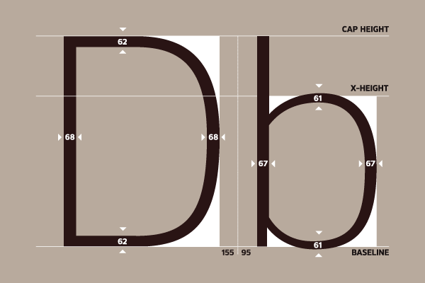
file name: Jonathan Hill Kobern 2012
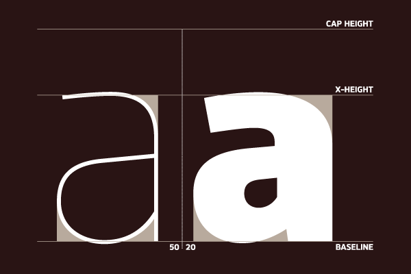
file name: Jonathan Hill Kobern 2012b
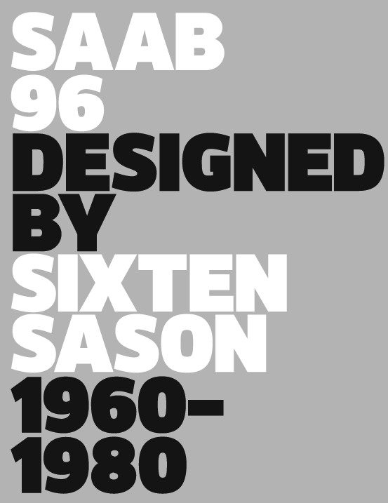
file name: Jonathan Hill Kobern 2012c

file name: Jonathan Hill Kobern 2012d
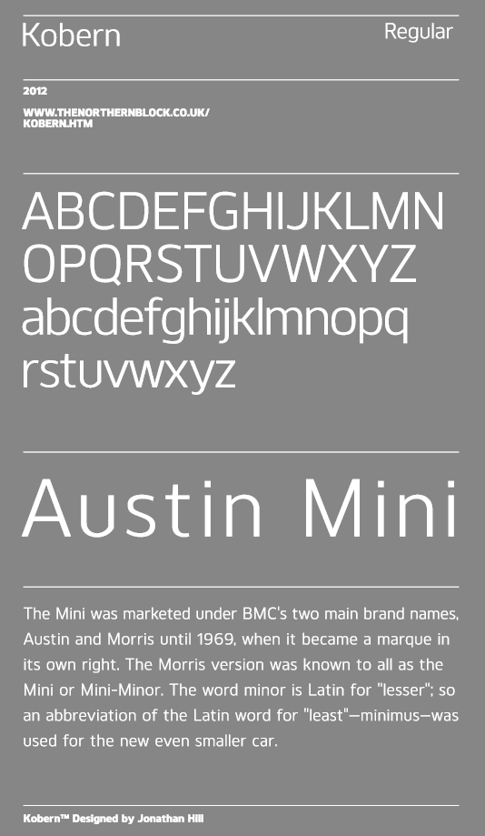
file name: Jonathan Hill Kobern 2012e
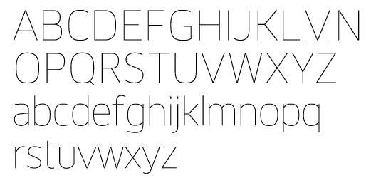
file name: Jonathan Hill Kobern 2012f

file name: Jonathan Hill Kobern 2012g
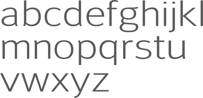
file name: Jonathan Hill Savile 2012
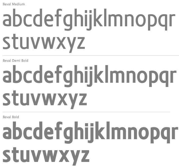
file name: Jonathan Hill Beval 2011
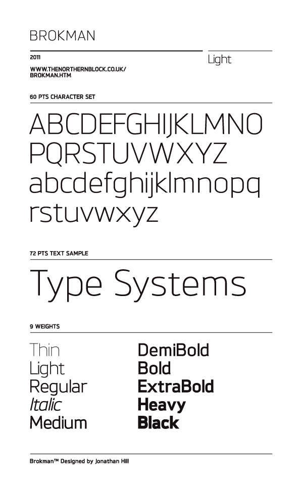
file name: Jonathan Hill Brokman 2011

file name: Jonathan Hill Brokman Black 2011h
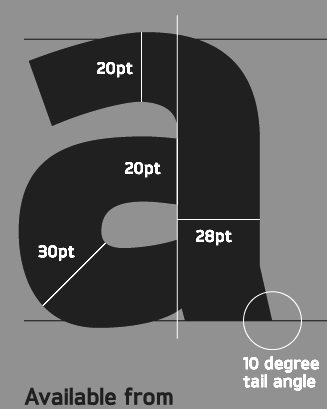
file name: Jonathan Hill Brokman 2011b
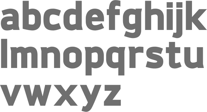
file name: Jonathan Hill Brokman Black 2011
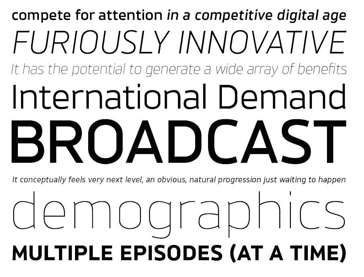
file name: Jonathan Hill Brokman 2011d
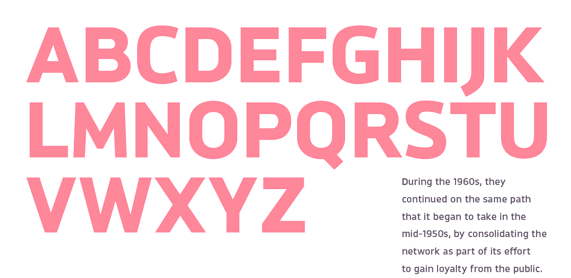
file name: Jonathan Hill Brokman 2011e
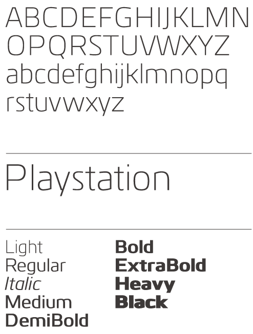
file name: Jonathan Hill Kuro 2011

file name: Jonathan Hill Kuro 2011c
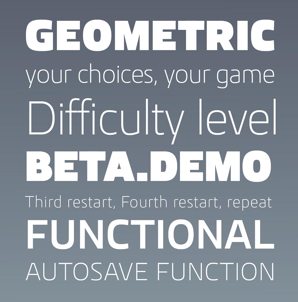
file name: Jonathan Hill Kuro 2011d
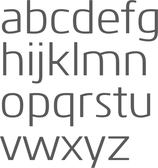
file name: Jonathan Hill Kuro 2011h
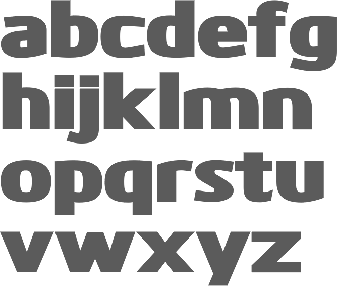
file name: Jonathan Hill Kuro Black 2011h
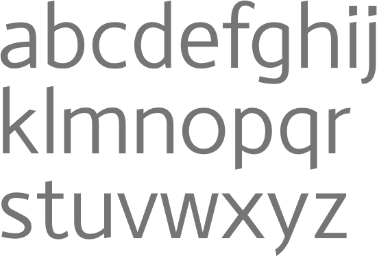
file name: Jonathan Hill Monsal 2011

file name: Jonathan Hill Tadao 2011
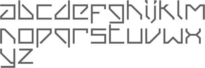
file name: Jonathan Hill Van Berger Stencil Bold 2009

file name: Jonathan Hill Vitro Extra Bold 2011
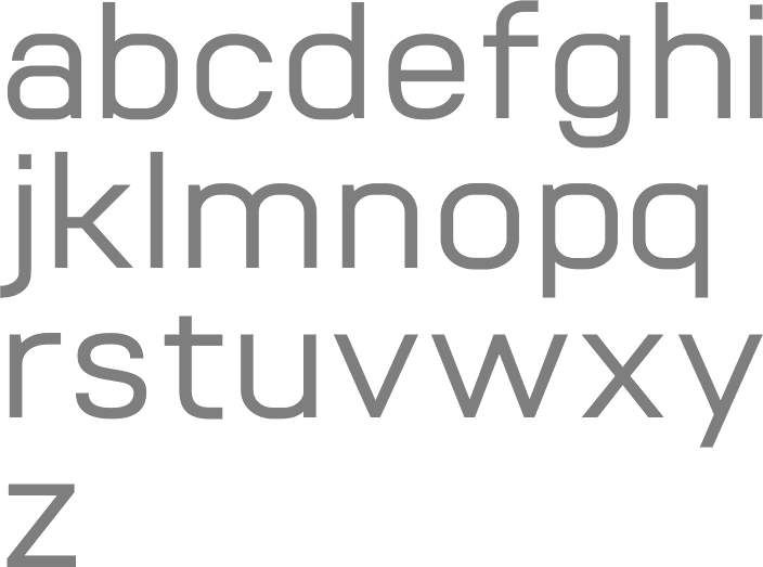
file name: Jonathan Hill Vitro Medium 2011
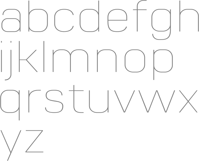
file name: Jonathan Hill Vitro Ultra Light 2011
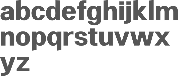
file name: Jonathan Hill Heltar Bold 2011
file name: Jonathan Hill Heltar 2011
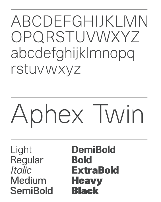
file name: Jonathan Hill Heltar 2011
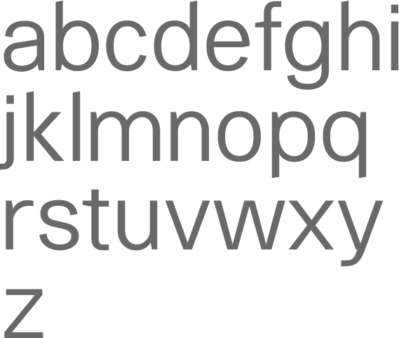
file name: The Northern Block Heltar 2011

file name: Jonathan Hill Tadao 2011b

file name: Jonathan Hill Tadao 2011c
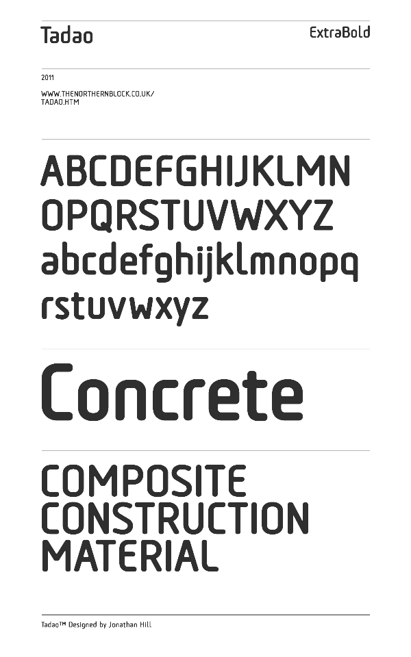
file name: Jonathan Hill Tadao 2011d
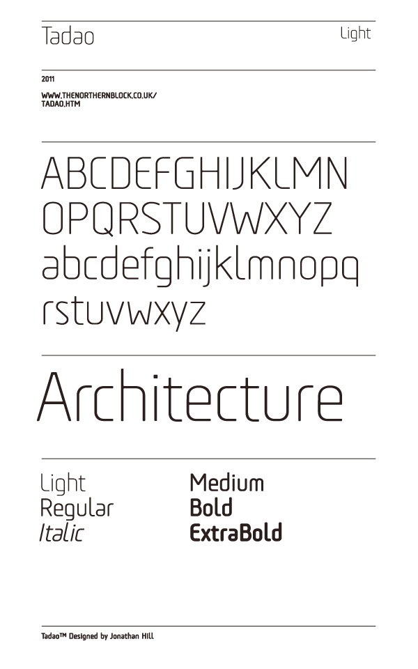
file name: Jonathan Hill Tadao 2011e
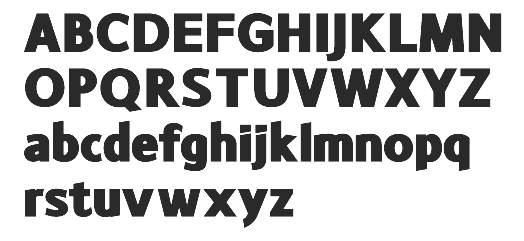
file name: Jonathan Hill Monsal 2011
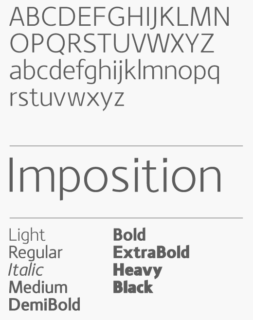
file name: Jonathan Hill Monsal 2011b
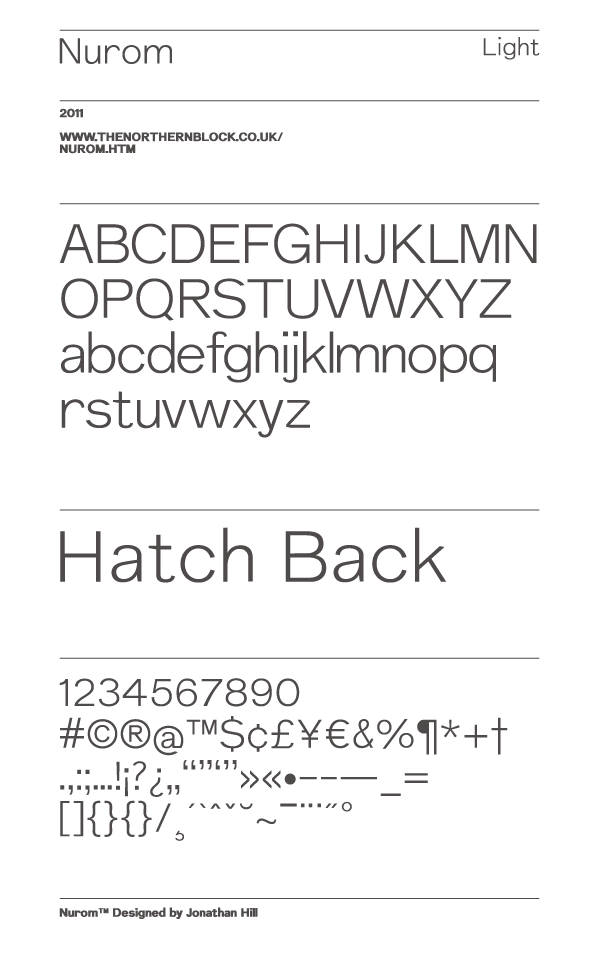
file name: Jonathan Hill Nurom 2011
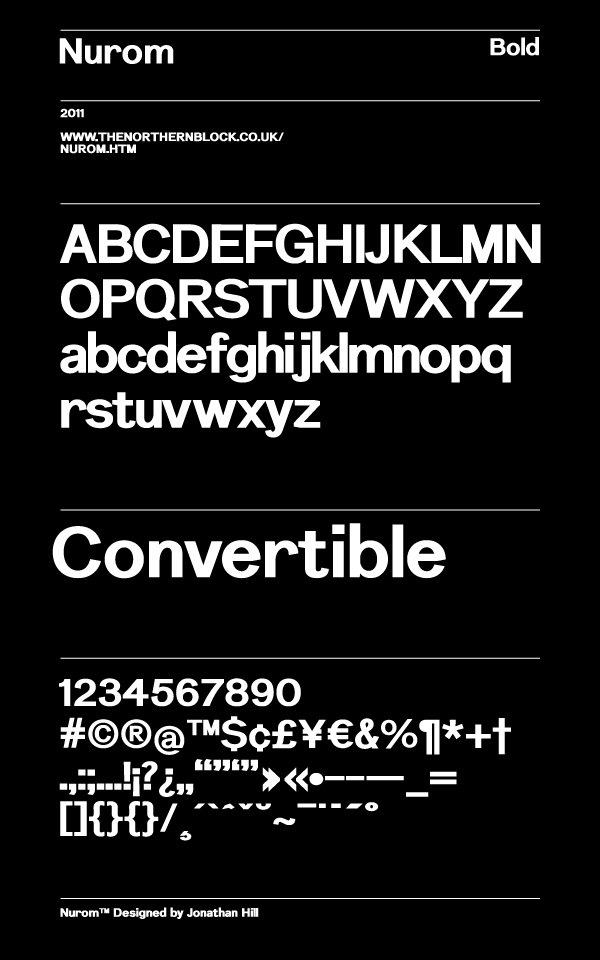
file name: Jonathan Hill Nurom Bold 2011
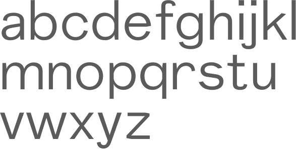
file name: Jonathan Hill Nurom 2011d
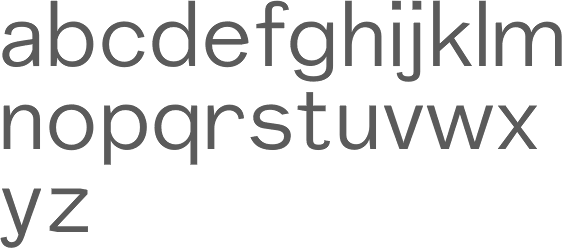
file name: The Northern Block Nurom 2011 10 06
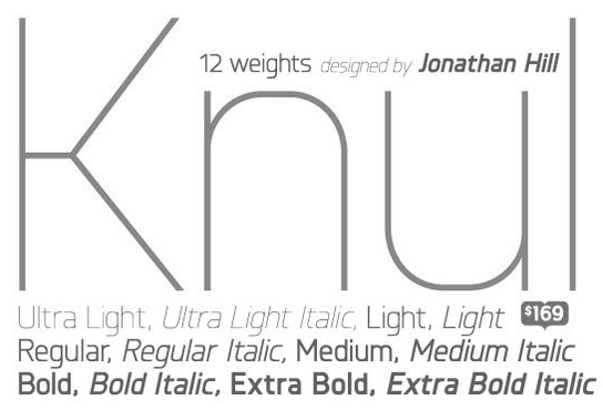
file name: Jonathan Hill Knul 2011d

file name: Jonathan Hill Vitro 2011

file name: Jonathan Hill Vitro 2011b
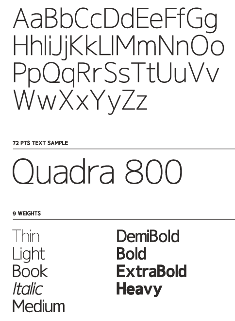
file name: Jonathan Hill Gelder Sans 2011
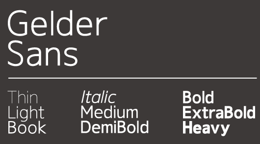
file name: Jonathan Hill Gelder Sans 2011

file name: Jonathan Hill Gelder Sans Heavy 2011
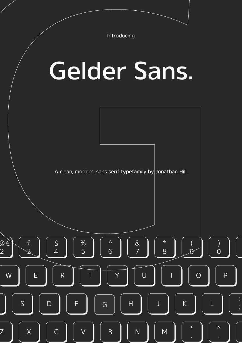
file name: Jonathan Hill Gelder Sans 2011b
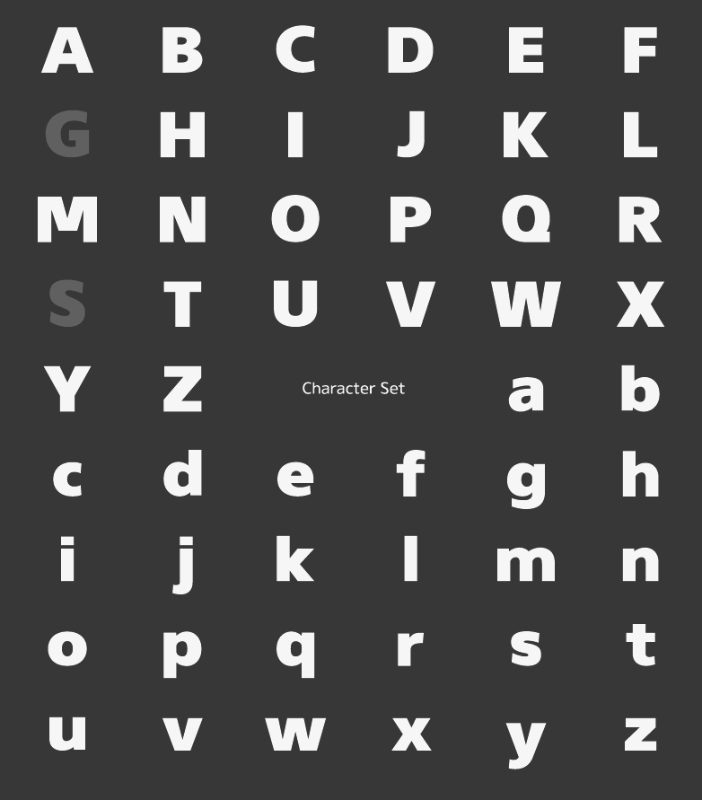
file name: Jonathan Hill Gelder Sans 2011c

file name: Jonathan Hill Gelder Sans 2011d

file name: Jonathan Hill Millar Extra Bold 2011

file name: Jonathan Hill Cobol Medium 2010
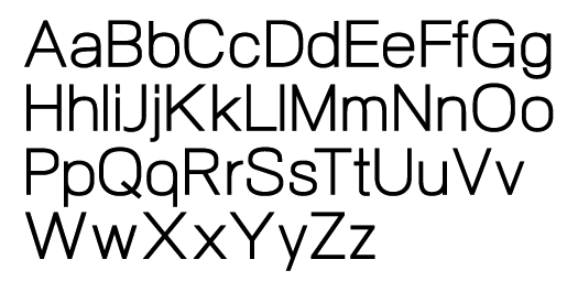
file name: Jonathan Hill Neo Gram 2011
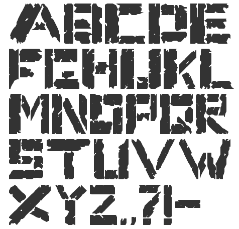
file name: Jonathan Hill Timber Remnants 2010

file name: Jonathan Hill Tondu Beta 2011
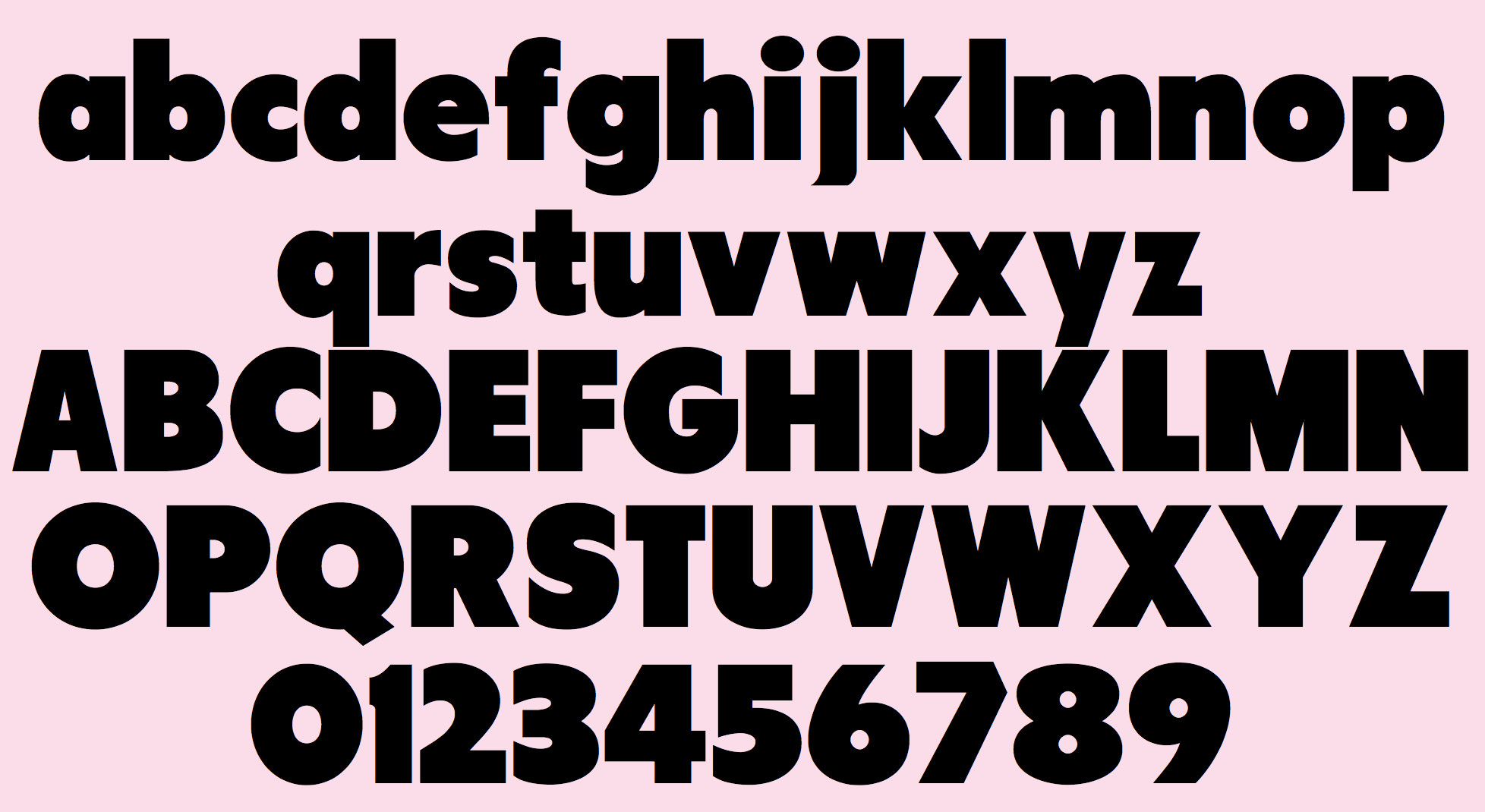
file name: Jonathan Hill Tondu Beta 2011b
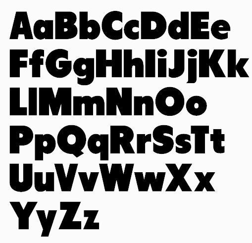
file name: Jonathan Hill Tondu 2011

file name: Jonathan Hill Tondu 2011b

file name: Jonathan Hill Tondu 2011c

file name: Jonathan Hill Tondu 2011d

file name: Jonathan Hill Gunar 2013d

file name: Jonathan Hill Knul 2011
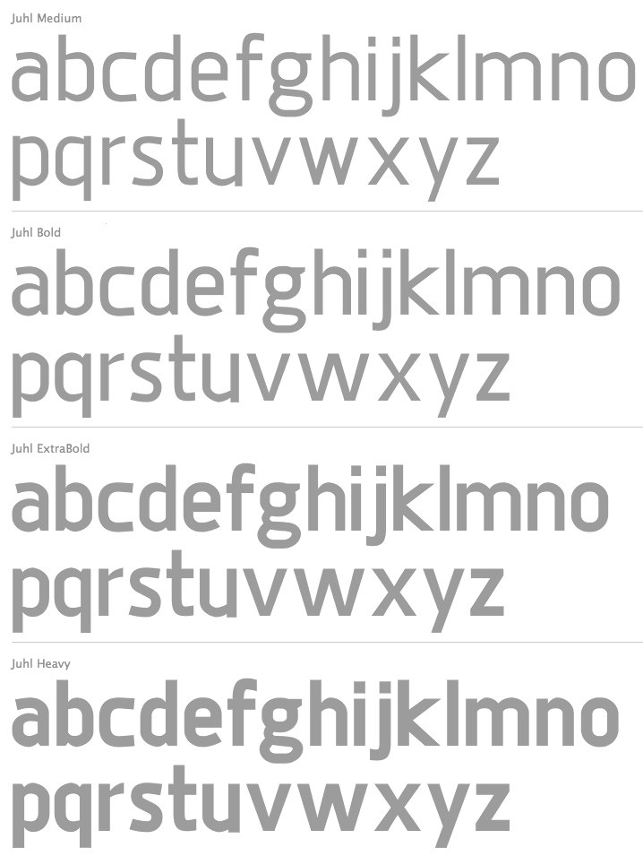
file name: Jonathan Hill Juhl 2011c
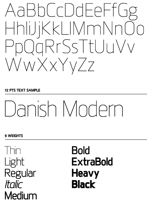
file name: Jonathan Hill Juhl Ultra Light 2011

file name: Jonathan Hill Juhl 2011
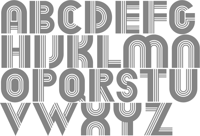
file name: Jonathan Hill Dekal 2011
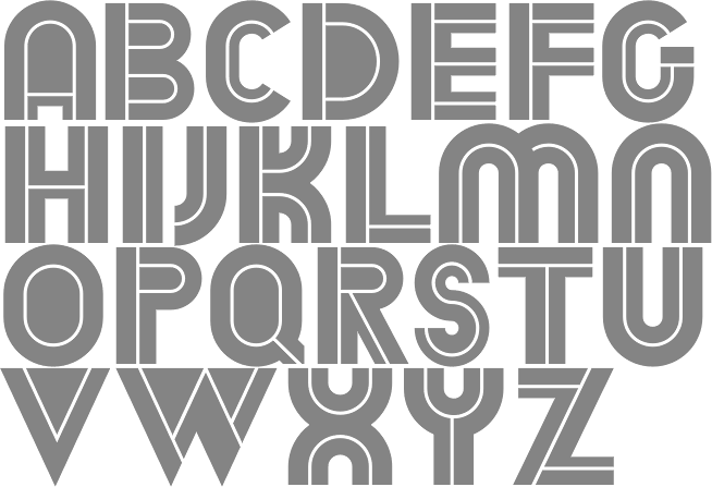
file name: Jonathan Hill Dekal Inline 2011
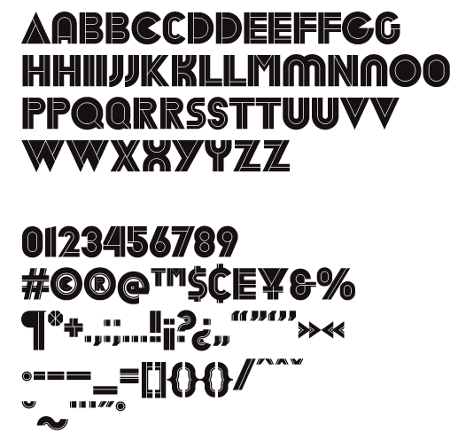
file name: Jonathan Hill Dekal Inline 2011b
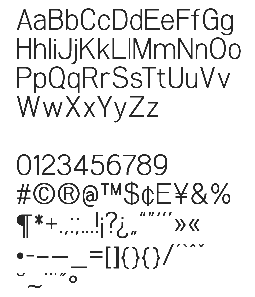
file name: Jonathan Hill Woolworth 2011
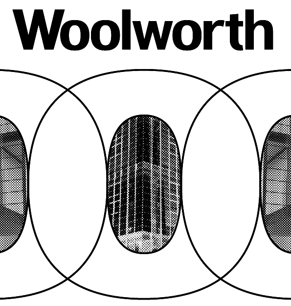
file name: Jonathan Hill Woolworth 2011b
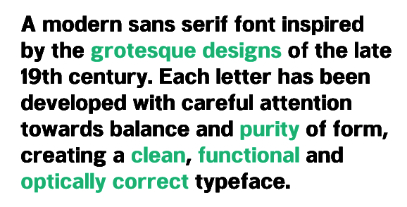
file name: Jonathan Hill Woolworth 2011c

file name: Jonathan Hill Woolworth 2011d

file name: Jonathan Hill Woolworth 2011e
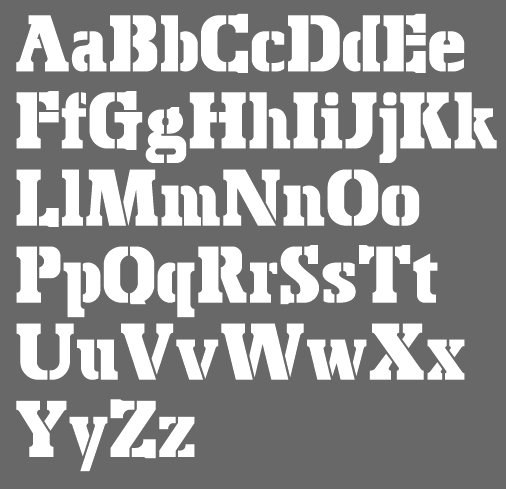
file name: Jonathan Hill Bosko Stencil 2011
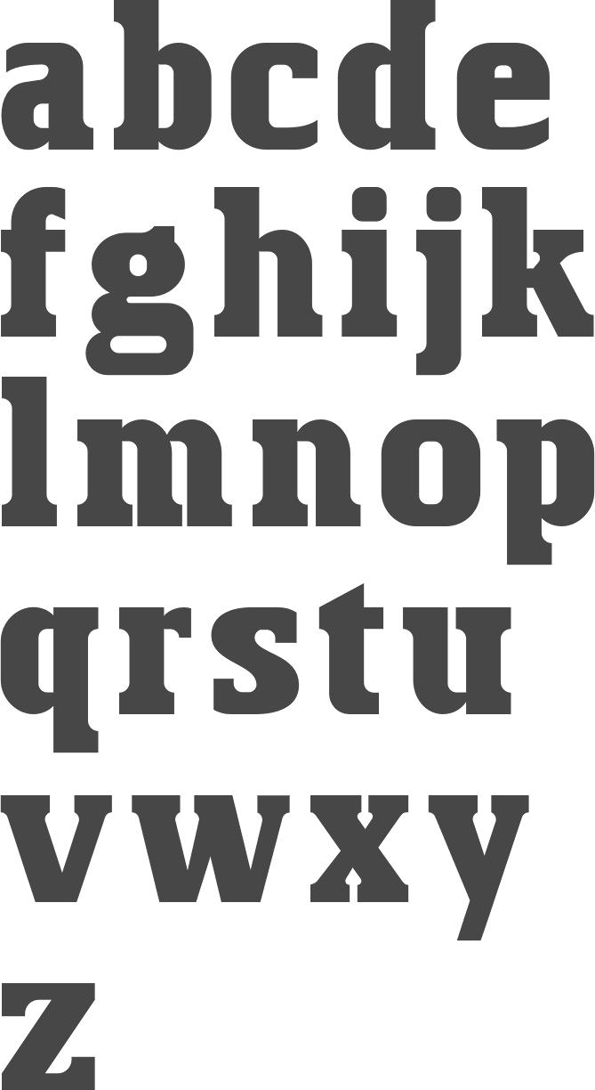
file name: Jonathan Hill Bosko 2010

file name: Jonathan Hill Bosko Stencil 2010
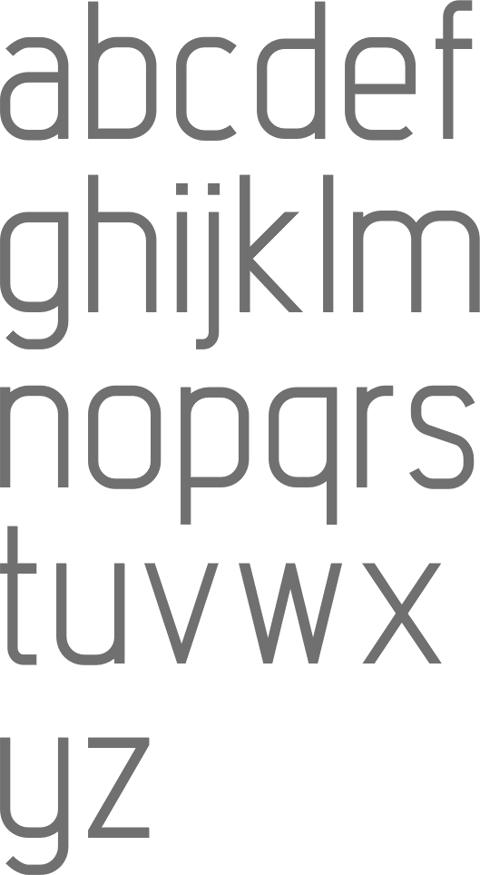
file name: Jonathan Hill Intropol 2010c
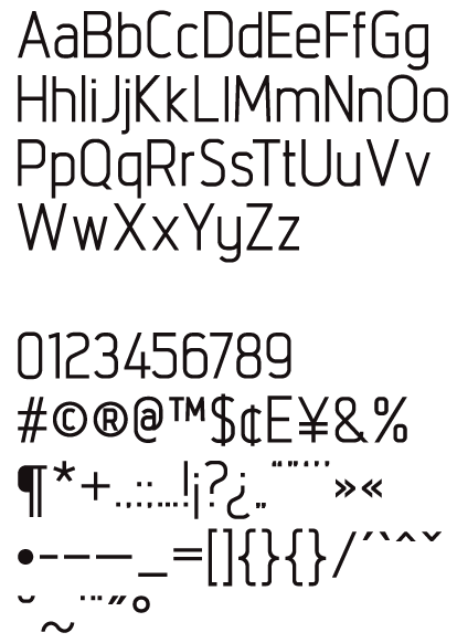
file name: Jonathan Hill Intropol 2010
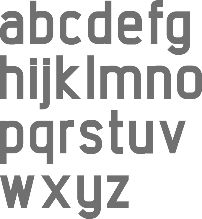
file name: Jonathan Hill Intropol Extra Bold 2010c

file name: Jonathan Hill Arcle Bold 2010
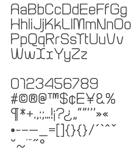
file name: Jonathan Hill Arcle Medium 2010
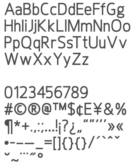
file name: Jonathan Hill Hoxton Medium 2010
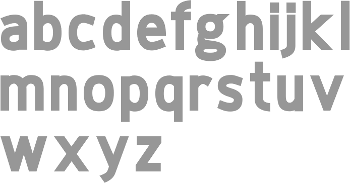
file name: Jonathan Hill Hoxton Extra Bold 2010
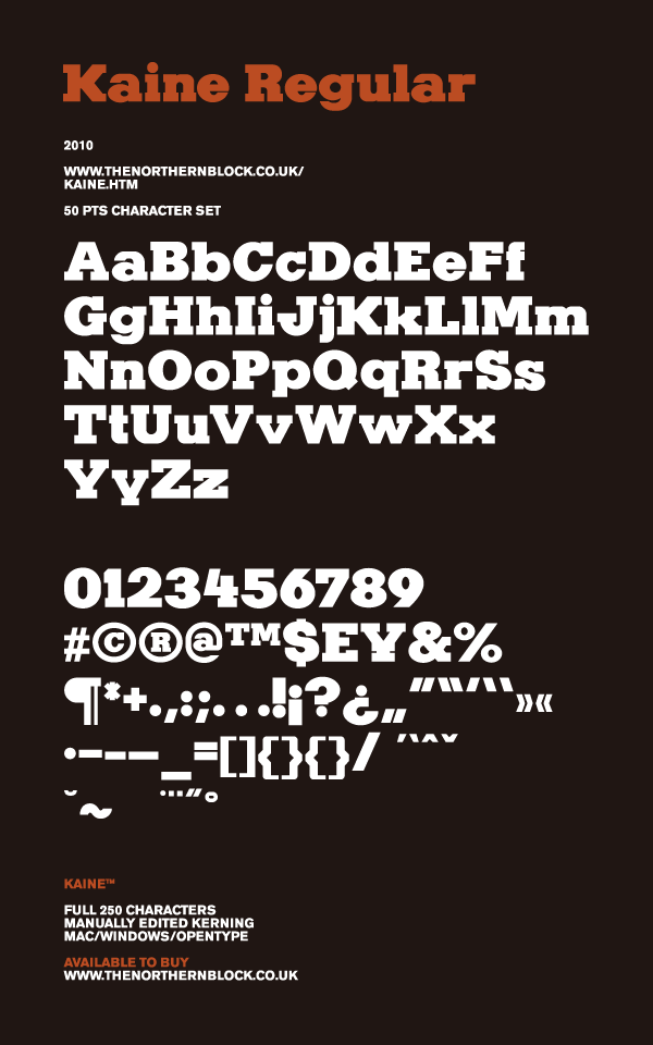
file name: Jonathan Hill Kaine Regular 2010
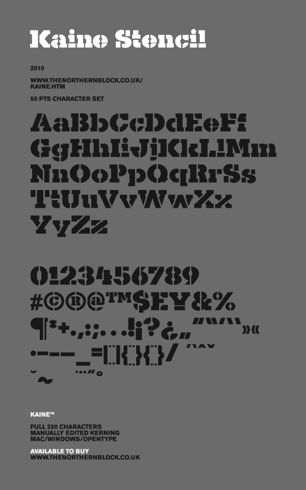
file name: Jonathan Hill Kaine Stencil 2010
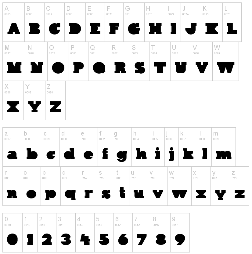
file name: Jonathan Hill kaine Block 2011
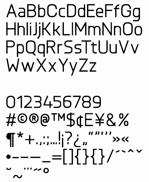
file name: Jonathan Hill Knul Medium 2010
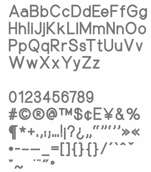
file name: Jonathan Hill Nu Order Bold 2010
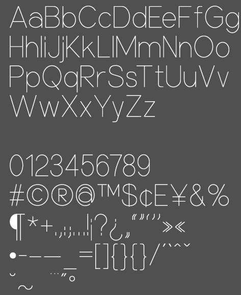
file name: Jonathan Hill Nu Order Thin 2010
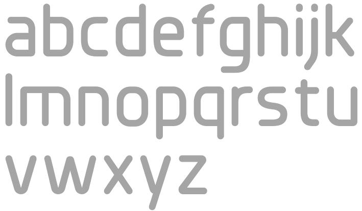
file name: Jonathan Hill Planer Bold 2010

file name: Jonathan Hill Planer Bold 2010b
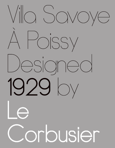
file name: Jonathan Hill Dye Line 2010
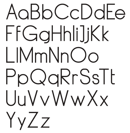
file name: Jonathan Hill Dye Line Regular 2010
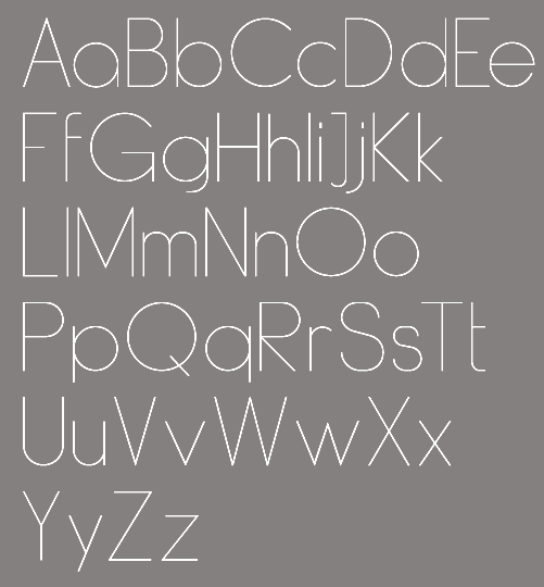
file name: Jonathan Hill Dye Line Ultra Light 2010
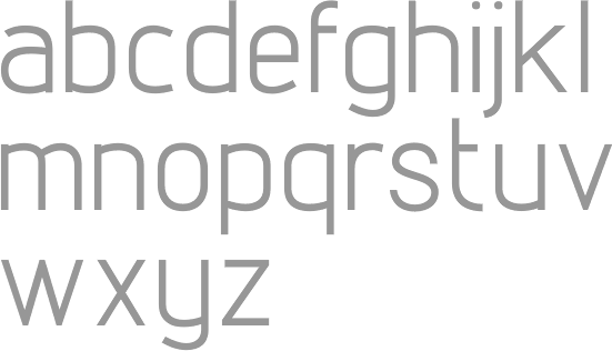
file name: Jonathan Hill Lintel 2010

file name: Jonathan Hill Lintel 2010b

file name: Jonthan Hill Dohrma 2010h
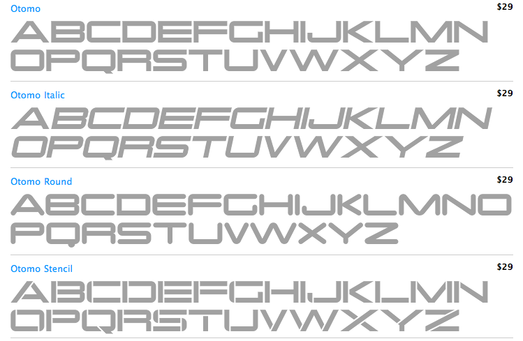
file name: Jonathan Hill Otomo 2010
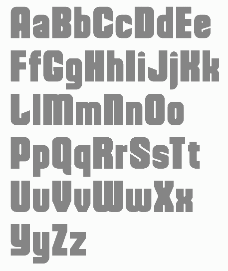
file name: Jonathan Hill Dohrma 2010
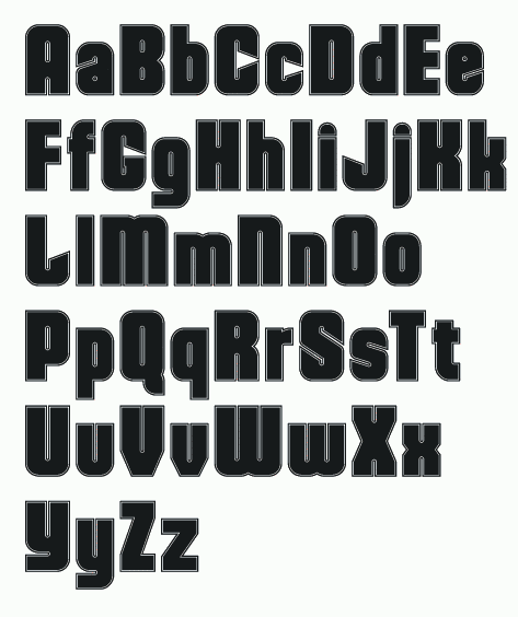
file name: Jonathan Hill Dohrma Inline 2010

file name: Jonathan Hill Aldo 2009
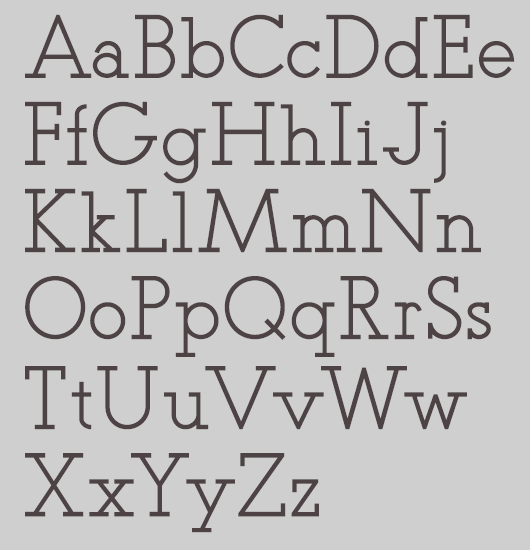
file name: Jonathan Hill Teletex 2010c
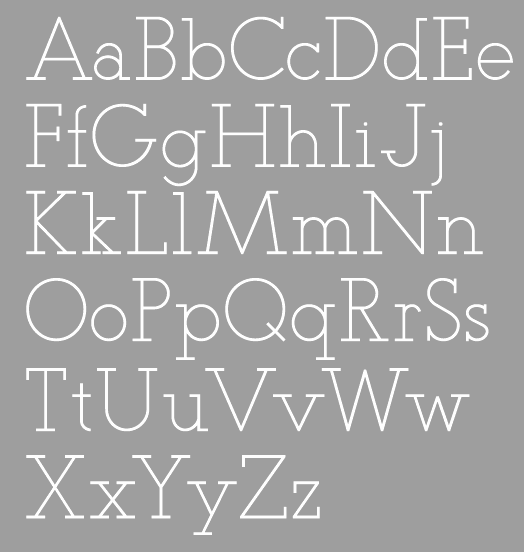
file name: Jonathan Hill Teletex Light 2010
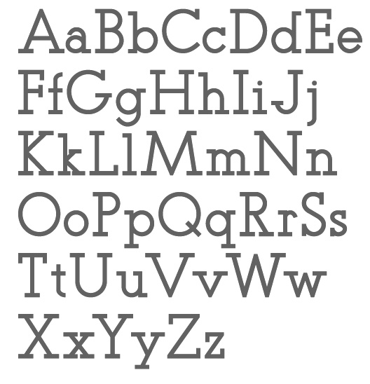
file name: Jonathan Hill Teletex Medium 2010a

file name: Jonathan Hill Teletex Ultra Light 2010a
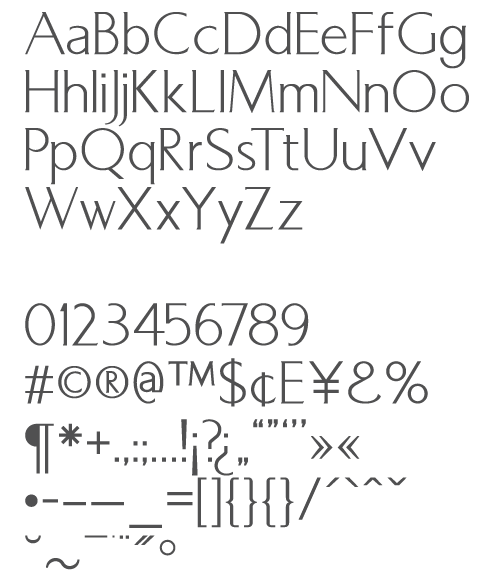
file name: Jonathan Hill Markus Low 2010

file name: Jonathan Hill Markus Low 2010b
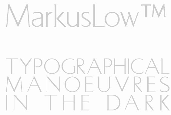
file name: Jonathan Hill Markus Low 2010c
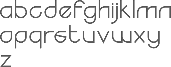
file name: The Northern Block Yodo 2011 10 06
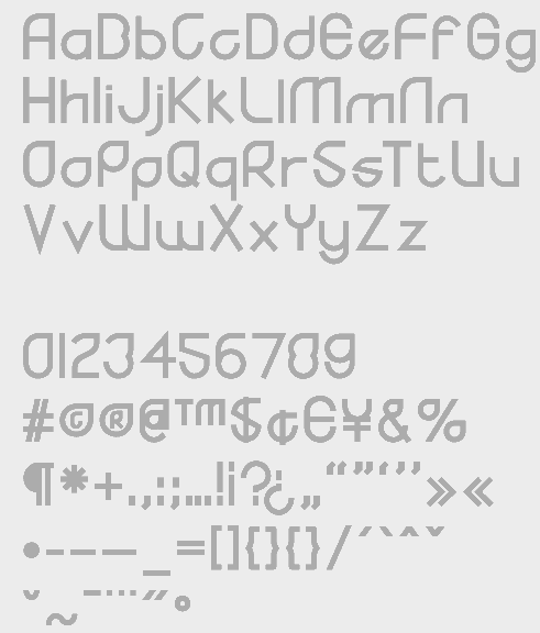
file name: Jonathan Hill Yodo Bold 2010
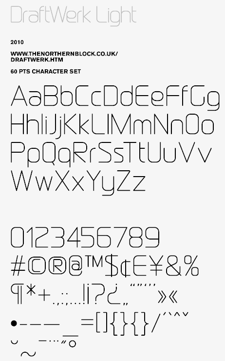
file name: Jonathan Hill Draftwerk Light 2010
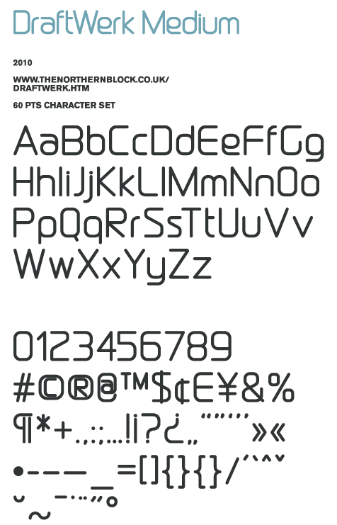
file name: Jonathan Hill Draftwerk Medium 2010
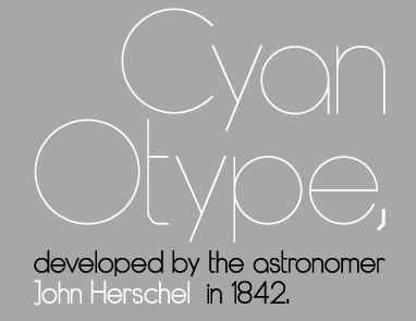
file name: Jonathan Hill Dye Line 2010d

file name: Jonathan Hill Olympik 2010
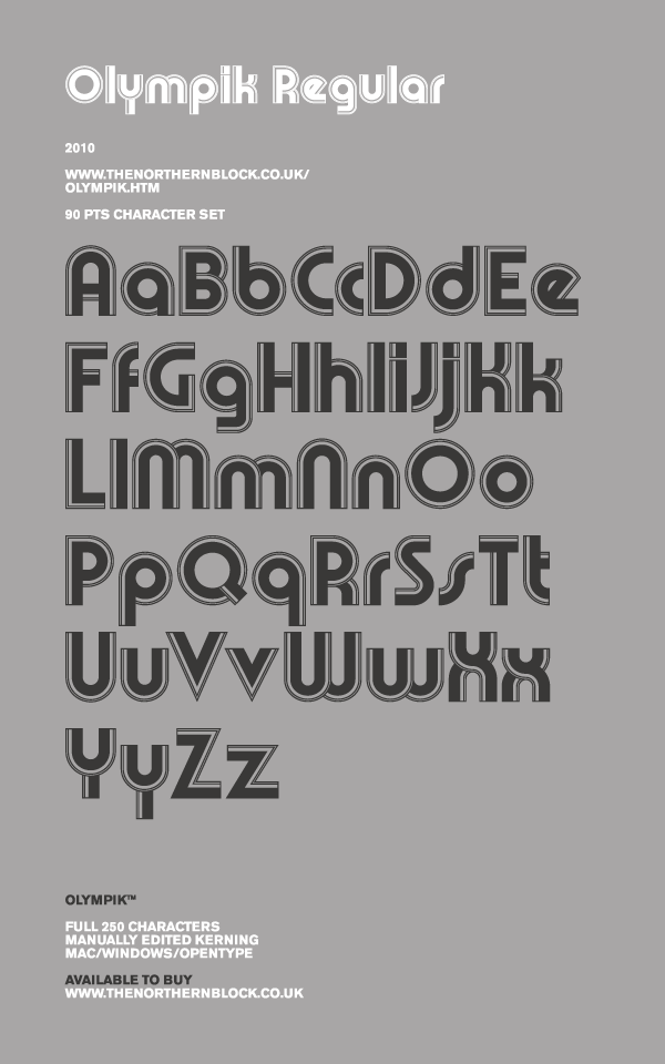
file name: Jonathan Hill Olympik 2010b
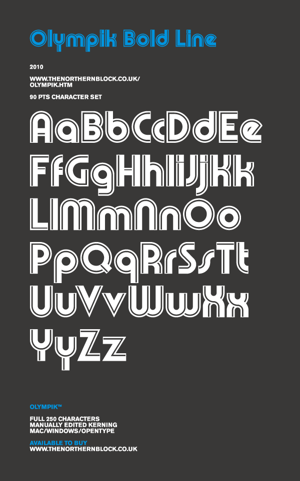
file name: Jonathan Hill Olympik 2010c

file name: Jonathan Hill Aldo 2009
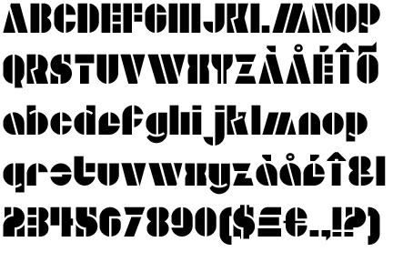
file name: Jonathan Hill Aldo Open 2009
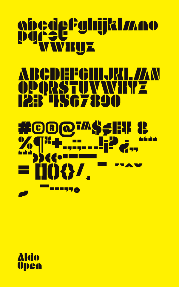
file name: Jonathan Hill Aldo Open 2009
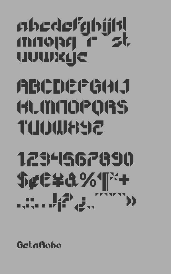
file name: Jonathan Hill Get A Robo 2009
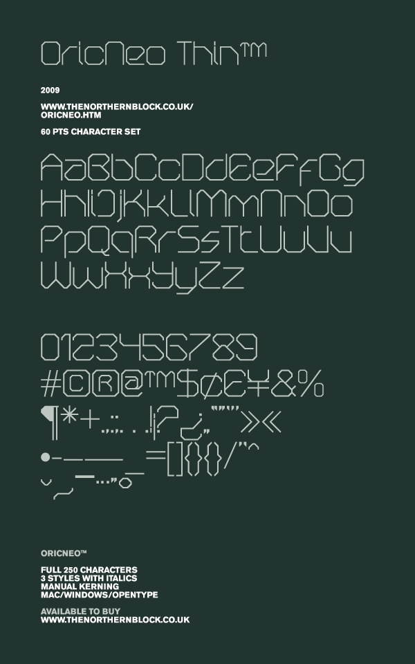
file name: Jonathan Hill Oric Neo Thin
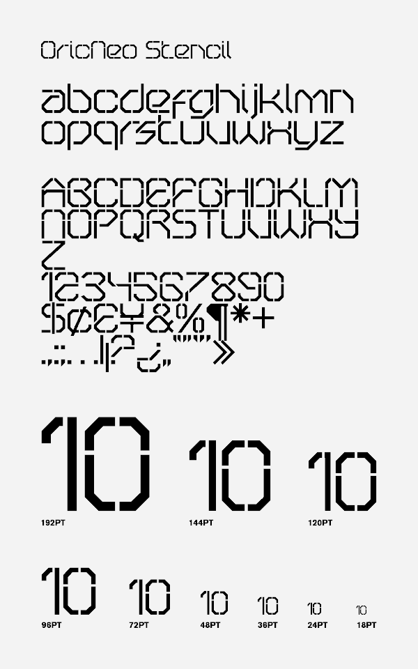
file name: Jonathan Hill Oric Neo Stencil 2009

file name: Oric Neo Stencil
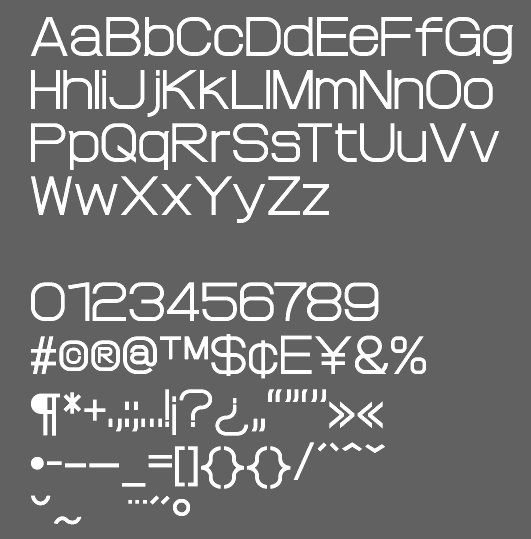
file name: Jonathan Hill Proto Fet 2010
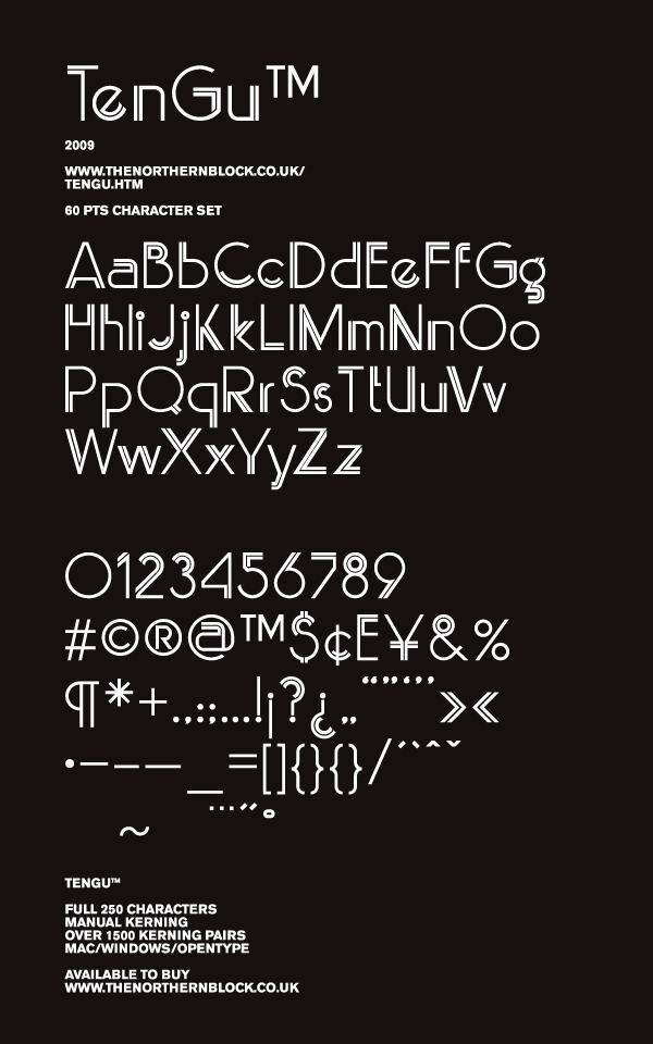
file name: Jonathan Hill Ten Gu 2009

file name: Jonathan Hill Zaius 2010
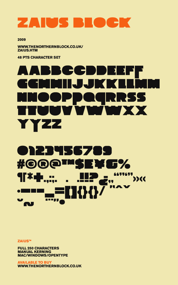
file name: Jonathan Hill Zaius Block 2010
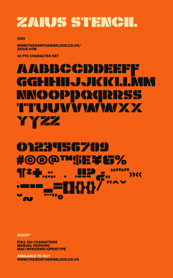
file name: Jonathan Hill Zaius Stencil 2010

file name: Jonathan Hill Zaius Stencil2009

file name: Zaius Stencil

file name: Jonathan Hill Scriber Bold Stencil 2009
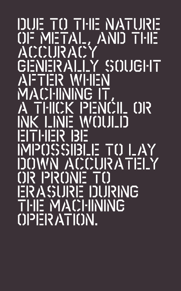
file name: Jonathan Hill Scriber Bold Stencil 2009b
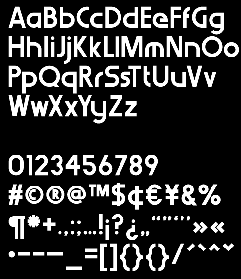
file name: Jonathan Hill Werk Haus 2008

file name: Jonathan Hill Sylar Stencil2009
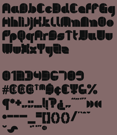
file name: Jonathan Hill Pye Man 2009

file name: Jonathan Hill Line Wire2009
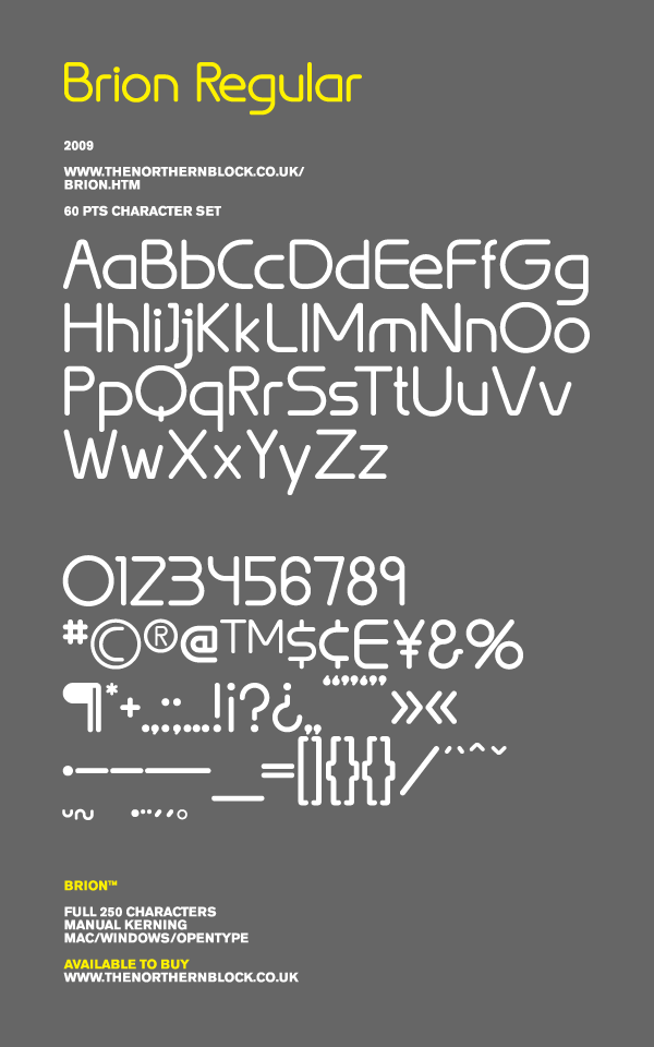
file name: Jonathan Hill Brion 2010
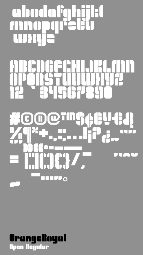
file name: Jonathan Hill Orange Royal2009
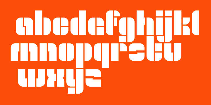
file name: Jonathan Hill Orange Royale 2008 42331
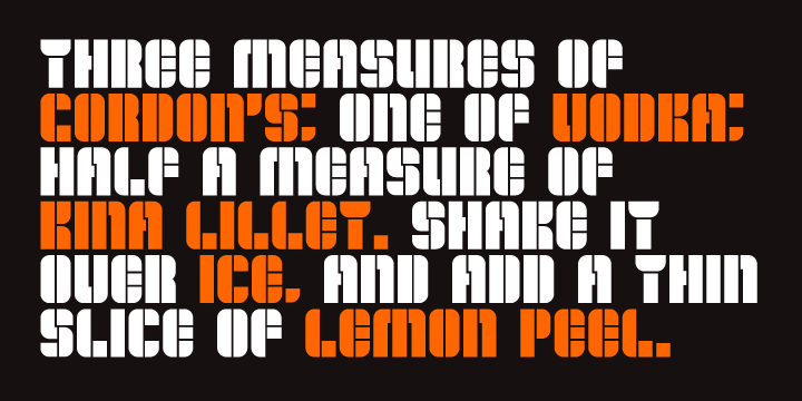
file name: Jonathan Hill Orange Royale 2008 42334

file name: Jonathan Hill Orange Royale 2008 42335

file name: Jonathan Hill Orange Royale 2008b

file name: Jonathan Hill Orange Royale 2008e

file name: T N B Laser Disco Extruded2008

file name: T N B Laser Disco Extruded2008b
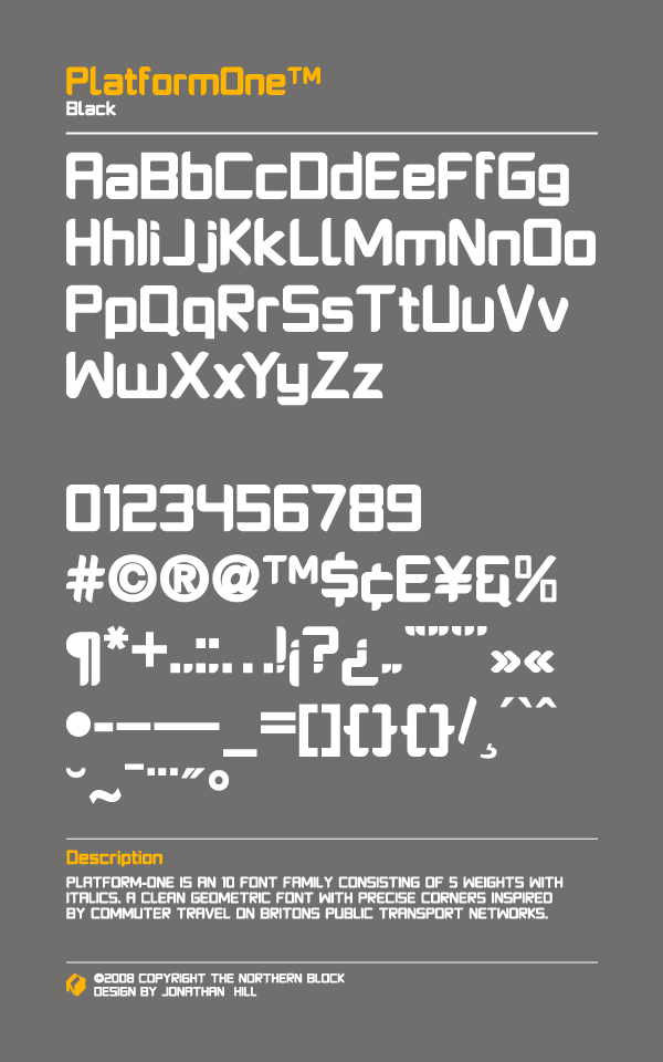
file name: Jonathan Hill Platform One2008
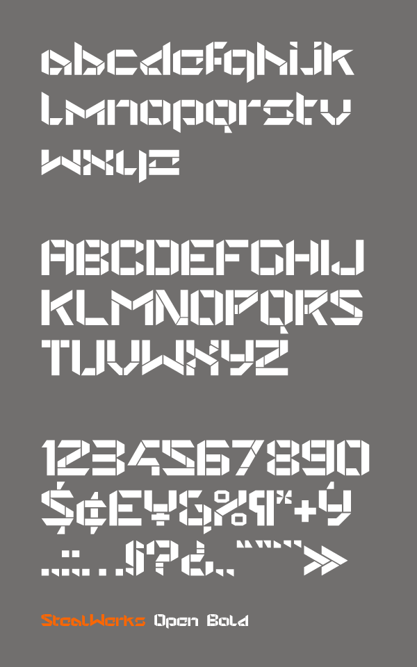
file name: Jonathan Hill Steal Werks2006

file name: Jonathan Hill Cor Ten2009
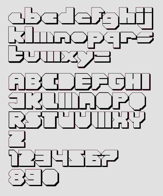
file name: Jonathan Hill Cor Ten2009b
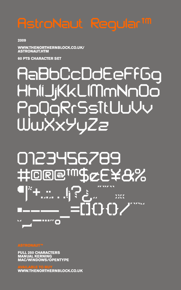
file name: Jonathan Hill Astronaut 2008
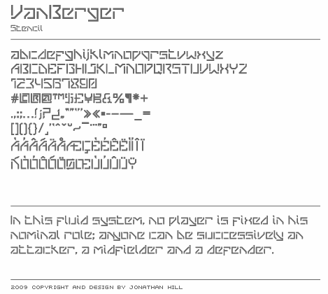
file name: Jonathan Hill Vanberger Stencil 2009

file name: Jonathan Hill Mekon 2010
file name: Jonathan Hill Mekon 2010

file name: Jonathan Hill Mekon 2010

file name: Jonathan Hill Mekon 2010
file name: Jonathan Hill Mekon 2010
file name: Jonathan Hill Mekon 2010
file name: Jonathan Hill Mekon 2010

file name: Jonathan Hill Mekon 2010d

file name: Jonathan Hill Mekon Gradient 2010

file name: Mariya V Pigoulevskaya Jonathan Hill Pic 2014
| | |
|
Luc Devroye ⦿ School of Computer Science ⦿ McGill University Montreal, Canada H3A 2K6 ⦿ lucdevroye@gmail.com ⦿ https://luc.devroye.org ⦿ https://luc.devroye.org/fonts.html |


 Typefaces from 2011: