|
Milieu Grotesque
[Timo Gaessner]
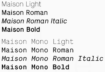
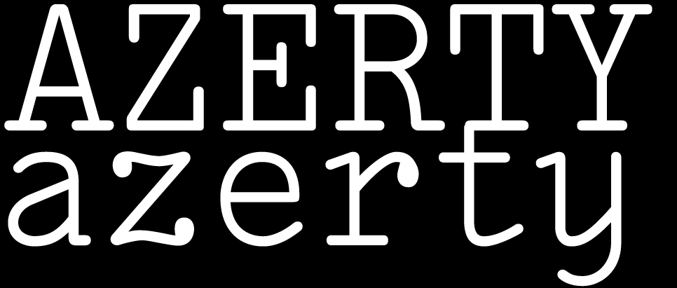
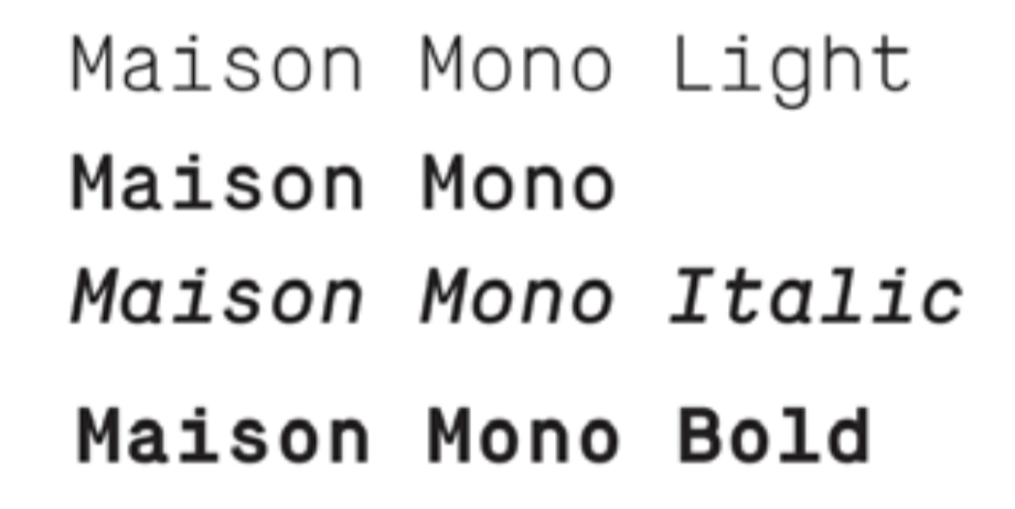
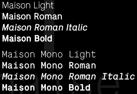
In 2010, designers Timo Gaessner (a graduate of Gerrit Rietveld Academy, Amsterdam) and Alexander Meyer started MilieuGrotesque (or: Meyer&Gässner) in Zurich, an independent platform for designers and editors, publishing and distributing a growing collection of typefaces and related publications. MilieuGrotesque reflects our ongoing interest and involvement with all things typographical in work and thought. The page features mainly typefaces designed by themselves: - Maison (2010) is a four weight proportional and a four weight monospaced aligned grotesque, based on a constructed principle to achieve an industrial flavour with a minimum of details and optical corrections. Originally designed for the use in the corporate design of Thomas Bendel Architect, Berlin, Maison evolved to a typeface that can be used for a large range of applications. By Gaessner.
- Chapeau (2010): a rounded face.
They write: The Chapeau Typeface has been inspired by a letter printed on the back of a Johnny Cash cover, that he had a addressed to his fans in Germany. Apparently, this record - released sometime mid seventies - contained most of Cash's songs he had composed during his time at the air-force in Landshut, Bavaria, during the american occupation shortly after World War II. However, this poor offset reproduction of an original typed letter worked as a base of this geometric drawn, proportional aligned typeface. By Gaessner. - Lacrima (2010, Alexander Meyer): an attractive typewriter type. Meyer writes: Lacrima is a rounded slab-serif typeface family with a classic modern, industrial charm. The whole family is based upon a typewriter specimen of the so called IBM Golfball Typeface, Light Italic. A handwritten inspired italic, with swash elements and characteristic ink-drop endings. The new digital interpretation is featuring two corresponding upright versions: Lacrima-Serif and Lacrima-Senza - each version is available in three distinctive weights; Light, Regular and Bold.
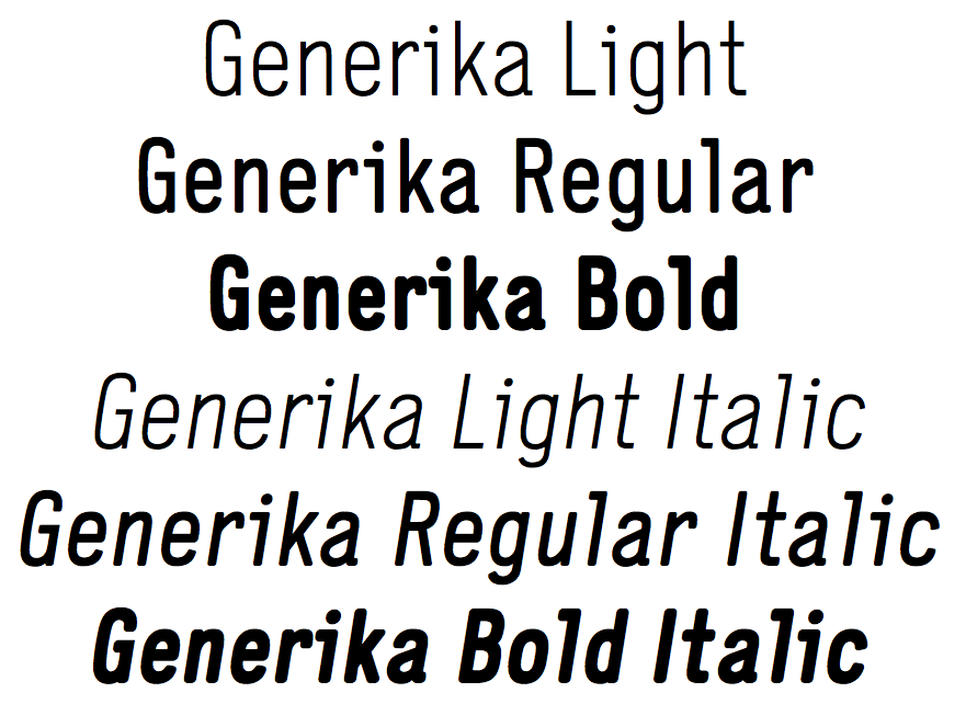
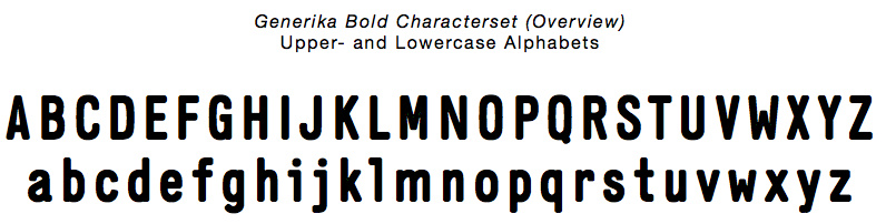
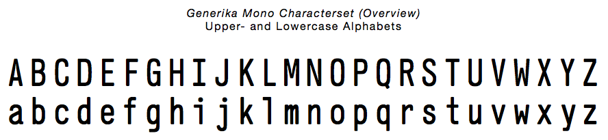
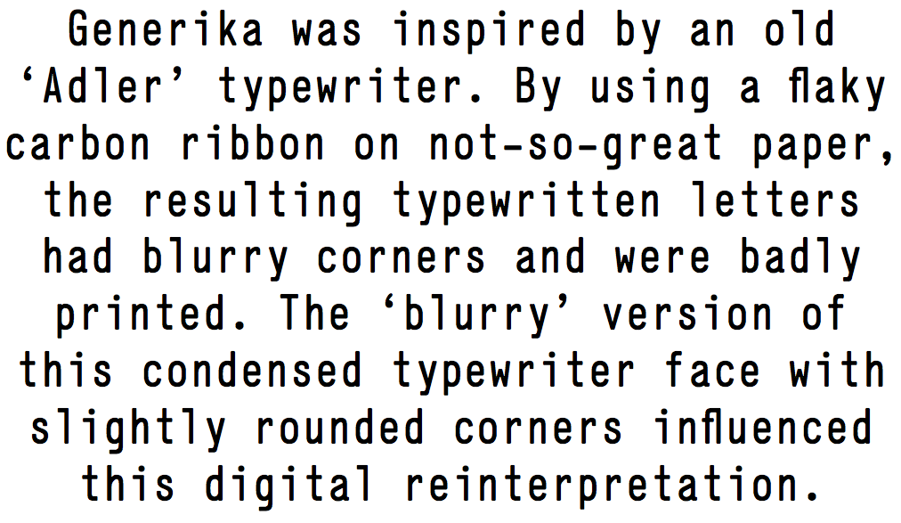
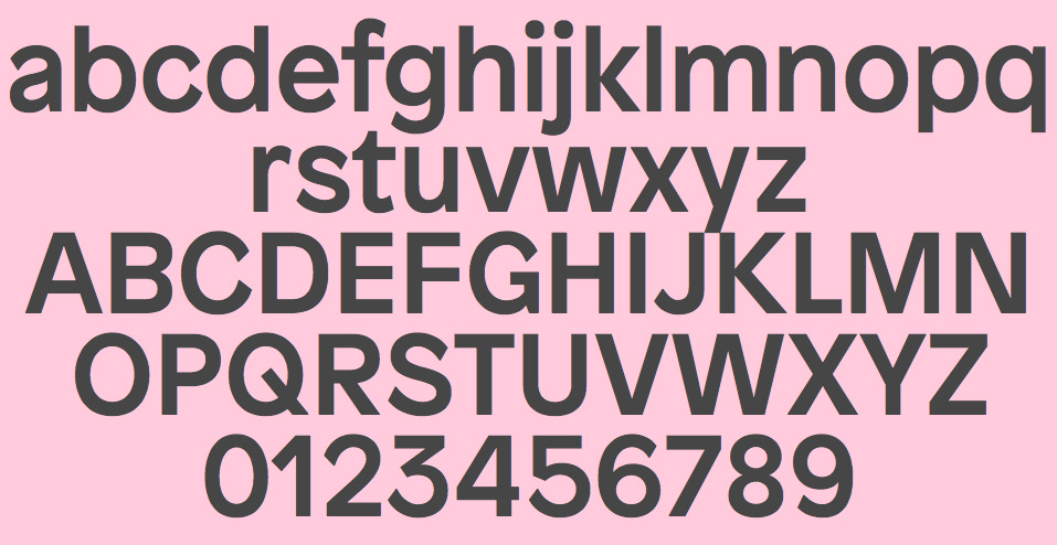
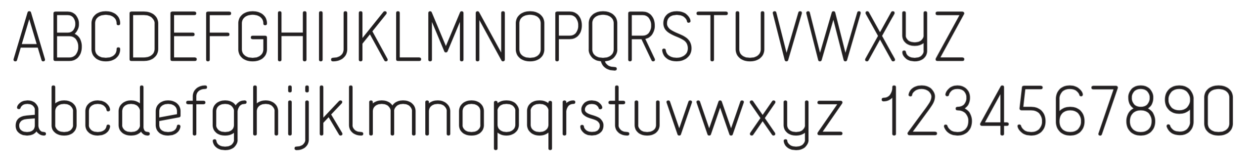
- Generika (Alexander Meyer, 2008): a rounded display sans. Meyer writes: Generika is inspired by an old Adler typewriter specimen. As an artefact of using a flaky carbon ribbon onto not-so-great paper, the actual outcome when used on the typewriter was badly printed with blurry corners. These blurry letterforms influenced the contemporary reinterpretation of this condensed and quite unusual typewriter typeface with its slightly rounded corners. The different weights are proportionately designed, making them useful for a diverse range of applications. Generika is also available as a monospaced version.
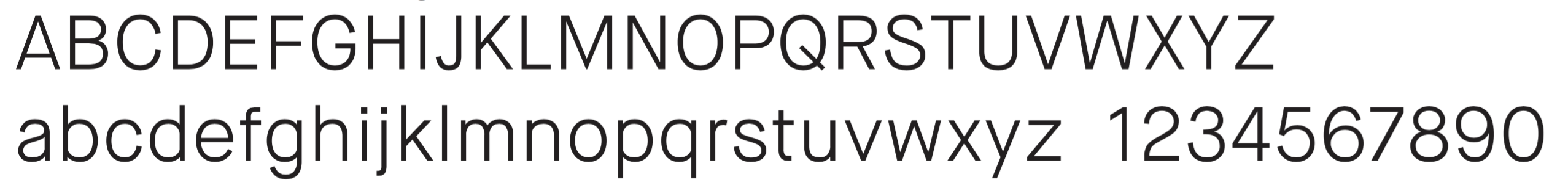
- Brezel Grotesk (2011) by Stefanie Preis/Burri-Preis is a sans serif typeface, inspired by the character of classic ninetheen-century grotesques, an unpretentious typestyle, completed by the regular, yet organic shape of a Bavarian pretzel. Readable in small point sizes, yet remarkable at larger sizes, the letters have distinctive terminals. Designed in four weights to function in all text settings, Brezel is suited for a wide range of applications. Unlike most sans serif typefaces of the 19th century Brezel Grotesk comes with a true italic.
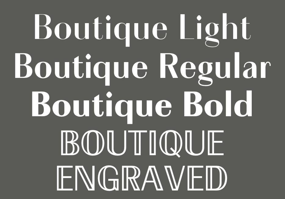
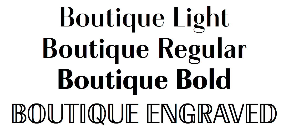
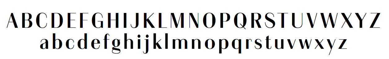
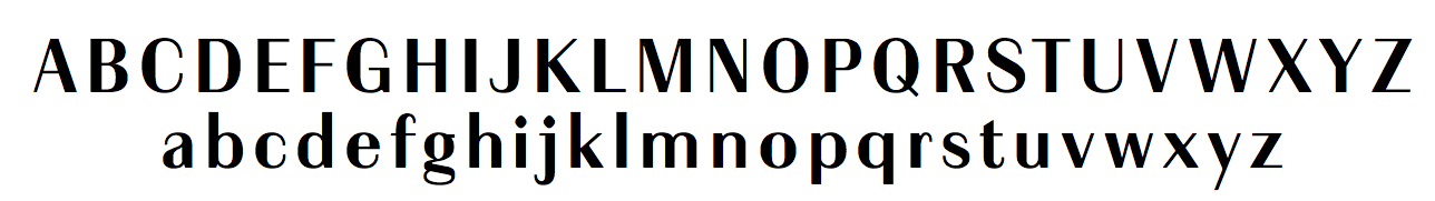
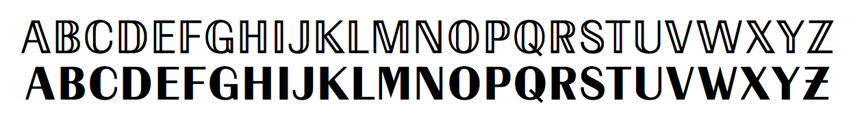
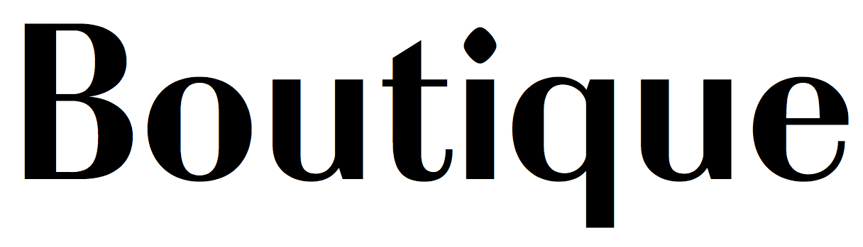
- Boutique (2012, Milieu Grotesque). A Peignotian typeface.
- Custom fonts: Amentype, Bendel, Heer Type, Kralice.
- Naiv (2006), done for Die Gestalten.
- Patron (2014), published by Milieu Grotesque.
- Julia.
- Balcony Dingbats.
- 123 Queen.
Klingspor link. Timo Gaessner's home page.
|
EXTERNAL LINKS
Milieu Grotesque
Klingspor Museum page
MyFonts search
Monotype search
Fontspring search
Google search
INTERNAL LINKS
Type blogs ⦿
Commercial fonts (small outfits) ⦿
Type designers ⦿
Type designers ⦿
Type design in Switzerland ⦿
Typewriter fonts ⦿
Monospaced fonts ⦿
|