TYPE DESIGN INFORMATION PAGE last updated on Sat Jul 20 14:18:45 EDT 2024
FONT RECOGNITION VIA FONT MOOSE

|
|
|
|
Lascaris
[Rolf Noyer]
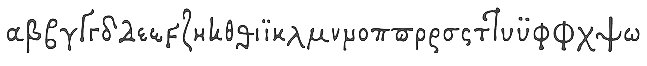
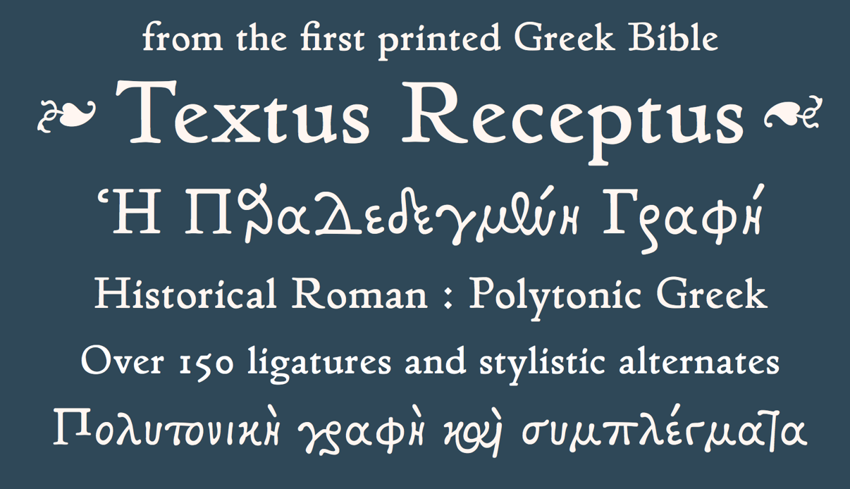
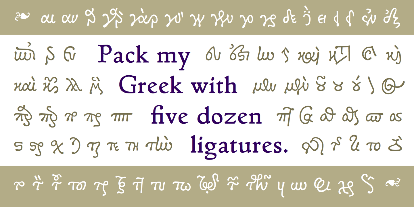
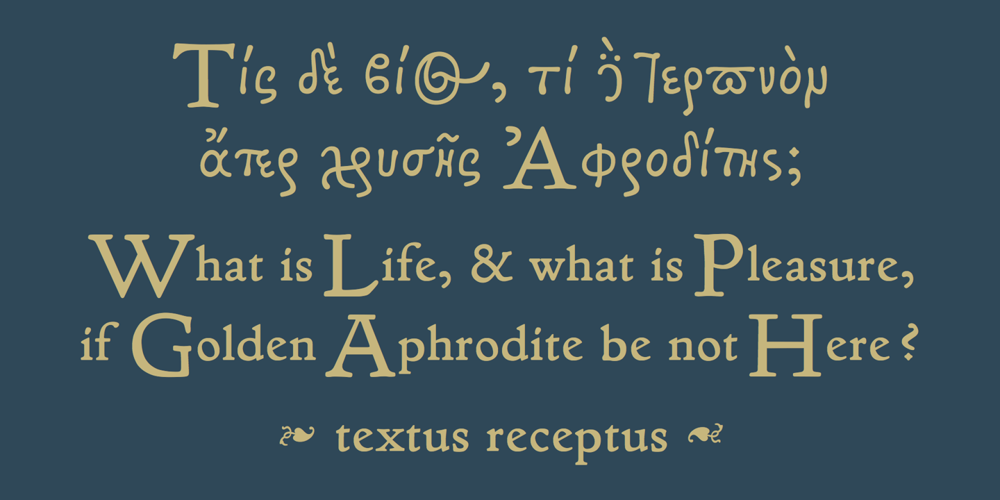
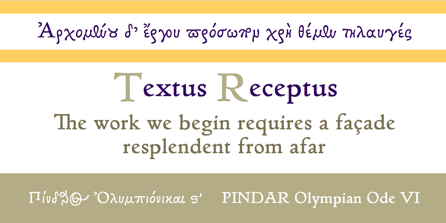
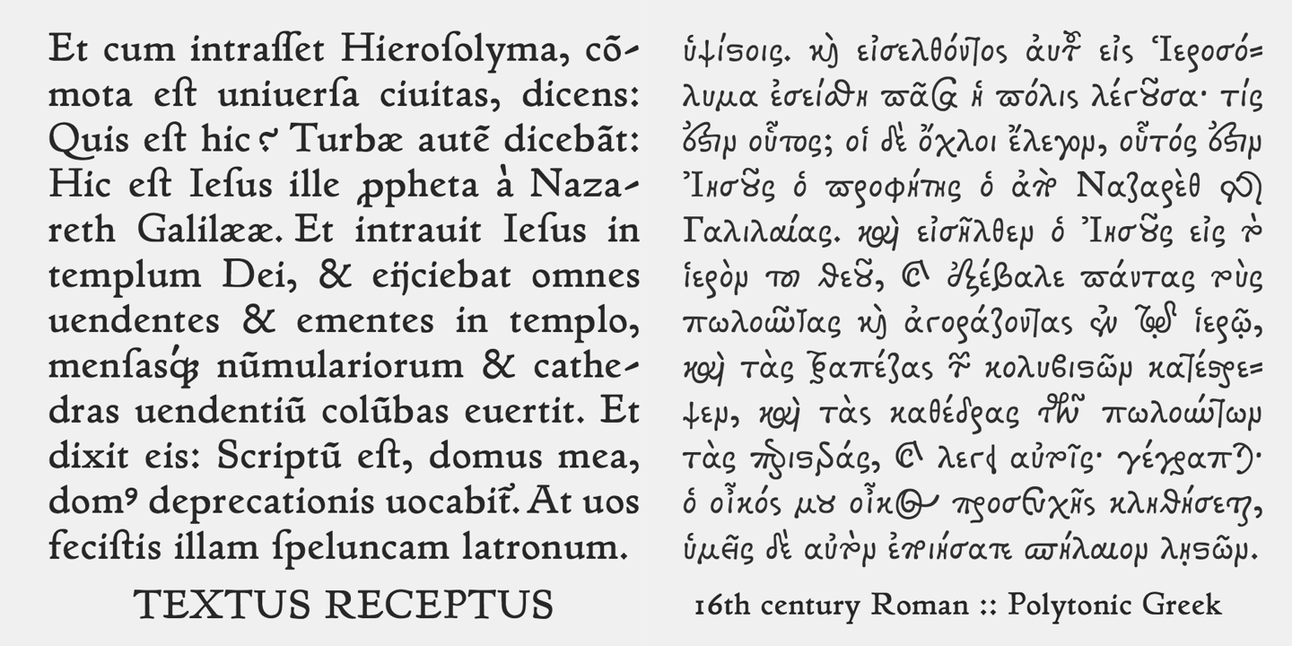
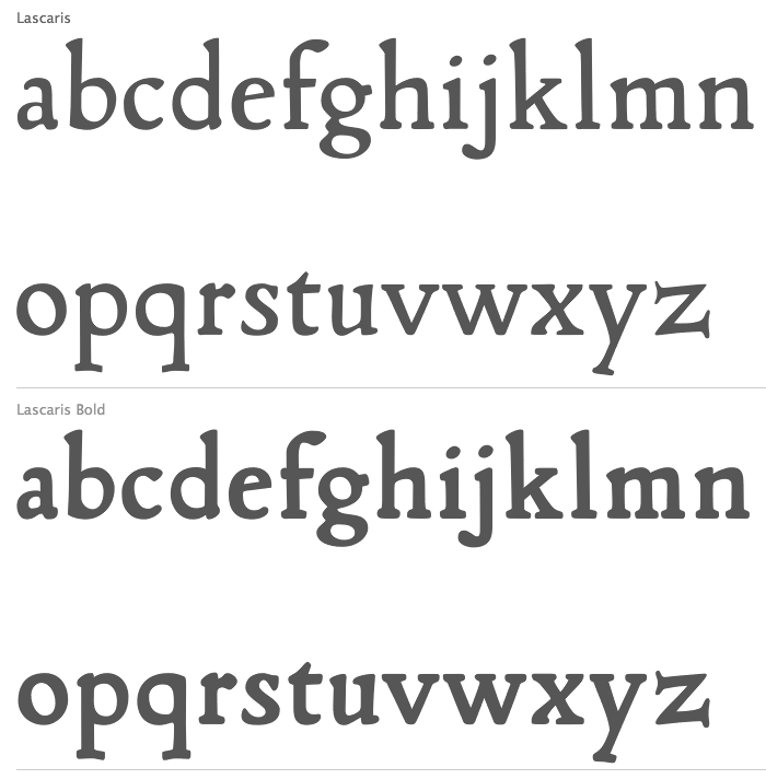
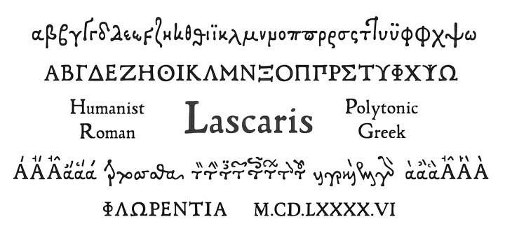
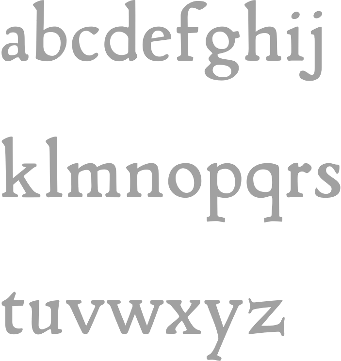
Lascaris is the foundry of Rolf Noyer in Philadelphia. The first typeface by Noyer is Lascaris (2010): Lascaris is a digital rendition of Janus Lascaris' type of 1494-1496, one of the earliest extant non-Aldine polytonic Greeks. The accompanying Roman, quirky and rich in color, was modeled on humanist types of late 15th century Florentine incunabula. In 2021, he published Textus Receptus, a historical revival based on the Roman and Greek types used by Johann Bebel (and later also Michael Isengrin) in Basel in the 1520s. Noyer writes: The Roman is a low-contrast medium-to-heavy Venetian reminiscent of Jenson or Golden Type. The unusual polytonic Greek, not previously digitized, is lighter in weight and supplied with all the ligatures and variants of the original. Yet when used without historial forms the Greek has a surprisingly contemporary feel: it is quirky and playful as a display face, but still easily legible in running text. Bebel's Greek extended and refined the one used for the first printed Greek New Testament, Desiderius Erasmus's Novum Instrumentum Omne, published in Basel in 1516 by Johann Froben. The name of the font was chosen in honor of this edition, which was so influential that it was later called the Textus Receptus, serving as the basis for Luther's German Bible in 1522 and much subsequent scholarship for over 300 years. Following 16th century practice, Textus Receptus contains 130 ligatures and stylistic alternates for Greek, accessible either with OpenType features or with five stylistic sets. The Greek capitals, often printed bare in early editions, have been equipped with accents and breathings for proper polytonic or monotonic typesetting. The Roman includes both standard and historical ligatures along with the abbreviations and diacritics typically employed in early printed Latin. For expanded language coverage it has the entire unicode Latin Extended range and part of Latin Extended-B. The capital A is surmounted by a horizontal stroke, as in some 16th century Italian designs, and the hyphen and question mark have both modern and historical form variants. |
EXTERNAL LINKS |
| | |

file name: Lascaris Textus Receptus 2021 1
file name: Lascaris Textus Receptus 2021 2
file name: Lascaris Textus Receptus 2021 3
file name: Lascaris Textus Receptus 2021 4
file name: Lascaris Textus Receptus 2021 5

file name: Lascaris Textus Receptus 2021

file name: Rolf Noyer Lascaris 2010
file name: Janus Lascaris Rolf Noyer Lascaris
file name: Rolf Noyer Lascaris 2010c
file name: Rolf Noyer Lascaris 2010b
| | |
|
Luc Devroye ⦿ School of Computer Science ⦿ McGill University Montreal, Canada H3A 2K6 ⦿ lucdevroye@gmail.com ⦿ http://luc.devroye.org ⦿ http://luc.devroye.org/fonts.html |