TYPE DESIGN INFORMATION PAGE last updated on Sat Jan 10 12:11:59 EST 2026
FONT RECOGNITION VIA FONT MOOSE
|
|
|
|
Coppers & Brasses
[Alexandre Saumier Demers]
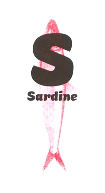
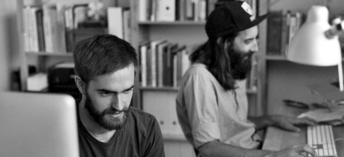
Quebec-based type type foundry Coppers & Brasses was set up in 2011 by Alexandre Saumier Demers and Étienne Aubert Bonn in the plateau area of Montreal. Both graduated from the graphic and type design program at UQAM in Montreal and went on do the Type and Media program at KABK in The Hague, The Netherlands. Creators of these typefaces in 2012: Martha (monospaced slabby grotesque done by both founders), Sardine (fat signage typeface by Bonn), Freitt (blackletter typeface by Bonn). Nicole (2012) is an elegant basic sans typeface by Olivier Mercier-Chan Kane. In 2013, Etienne graduated from the Type & Media program at KABK in Den Haag. In 2014, Alexandre in turn graduated from the Type & Media program at KABK. For his graduation, Alexandre developed the didone typeface family Lewis. He writes: Lewis is a typeface designed for mathematical typesetting, specifically for the TeX typesetting system. It consists of 3 text styles (Roman, Bold, Italic) and 3 math styles (Math Italic, Greek, Blackboard) for use as variables. The text Italic relates to the Roman while the Math Italic stand out with its cursive construction. Likewise, the Greek differentiate easily from Latin characters. The Blackboard inlines are adapted for text sizes with their wide and open cut. Lewis features many size variants and extending shapes, ideal in displayed equations. The list of their retail and custom fonts:
Alexandre spends most of his time since 2016 working on variable font projects for The Type Network (ex-Font Font Bureau). Home page of Alexandre Saumier Demers. Behance link for Coppers and Brasses. |
EXTERNAL LINKS |
| | |
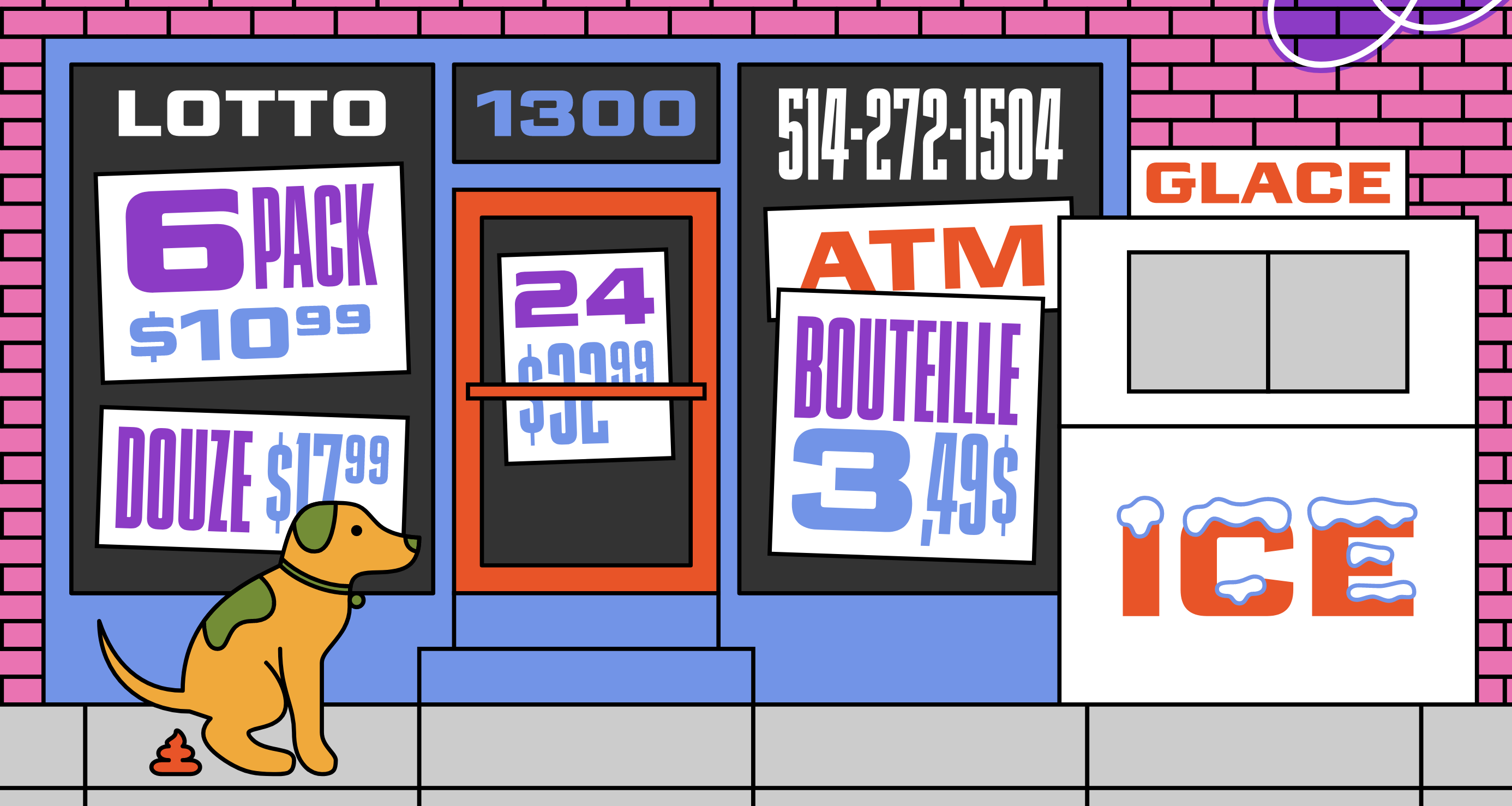
file name: Alexandre Saumier Demers Mortier 2021
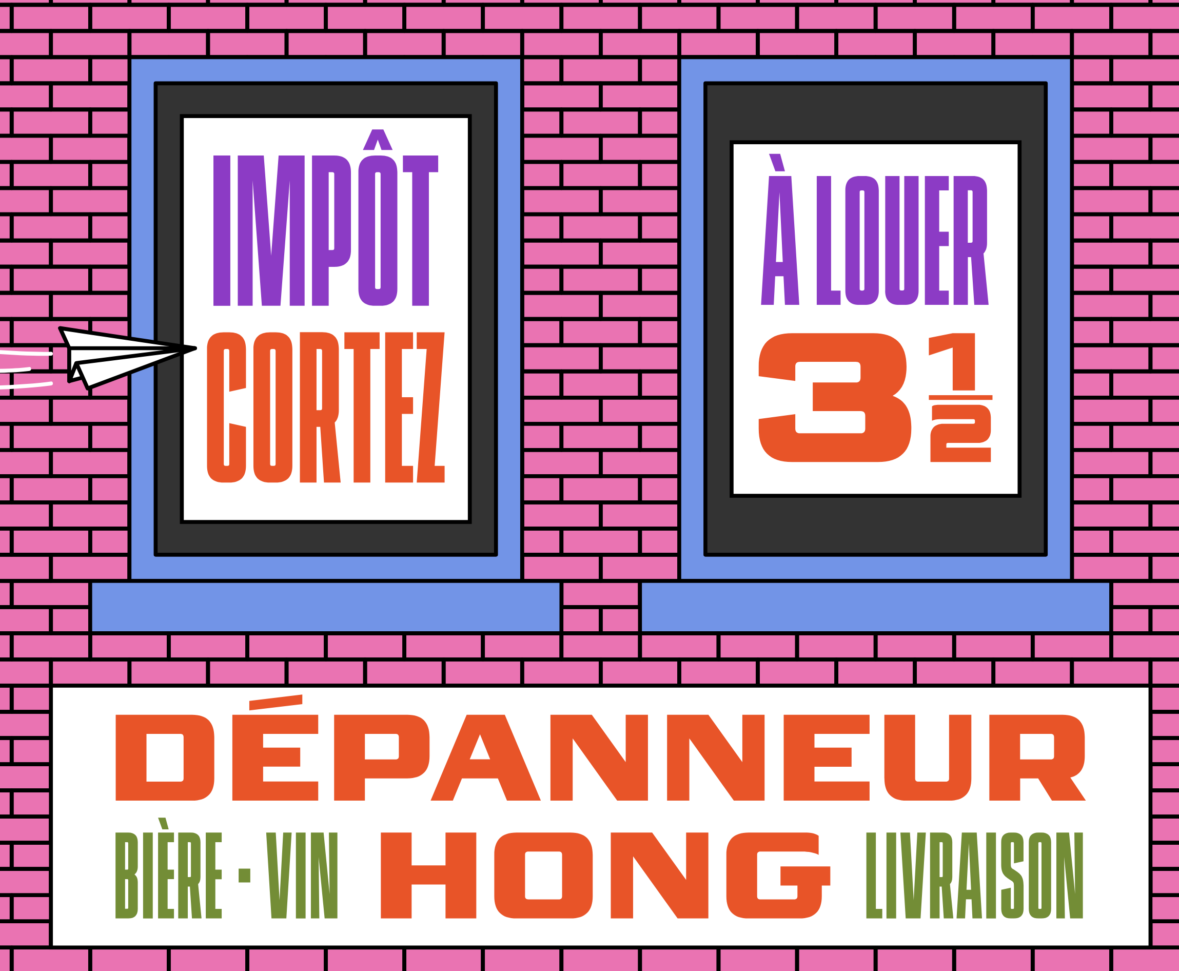
file name: Alexandre Saumier Demers Mortier 2021

file name: Alexandre Saumier Demers Mortier 2021
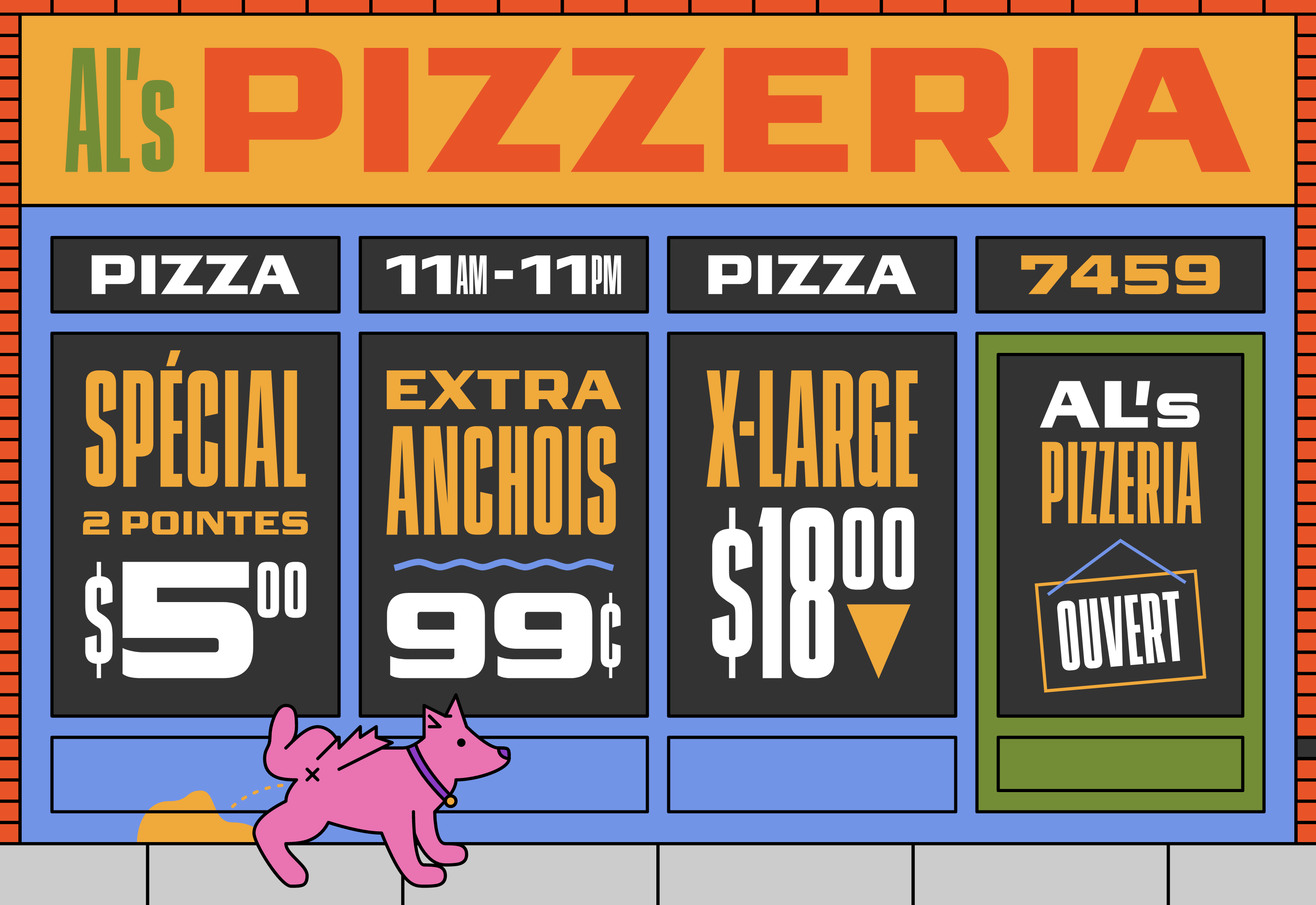
file name: Alexandre Saumier Demers Mortier 2021
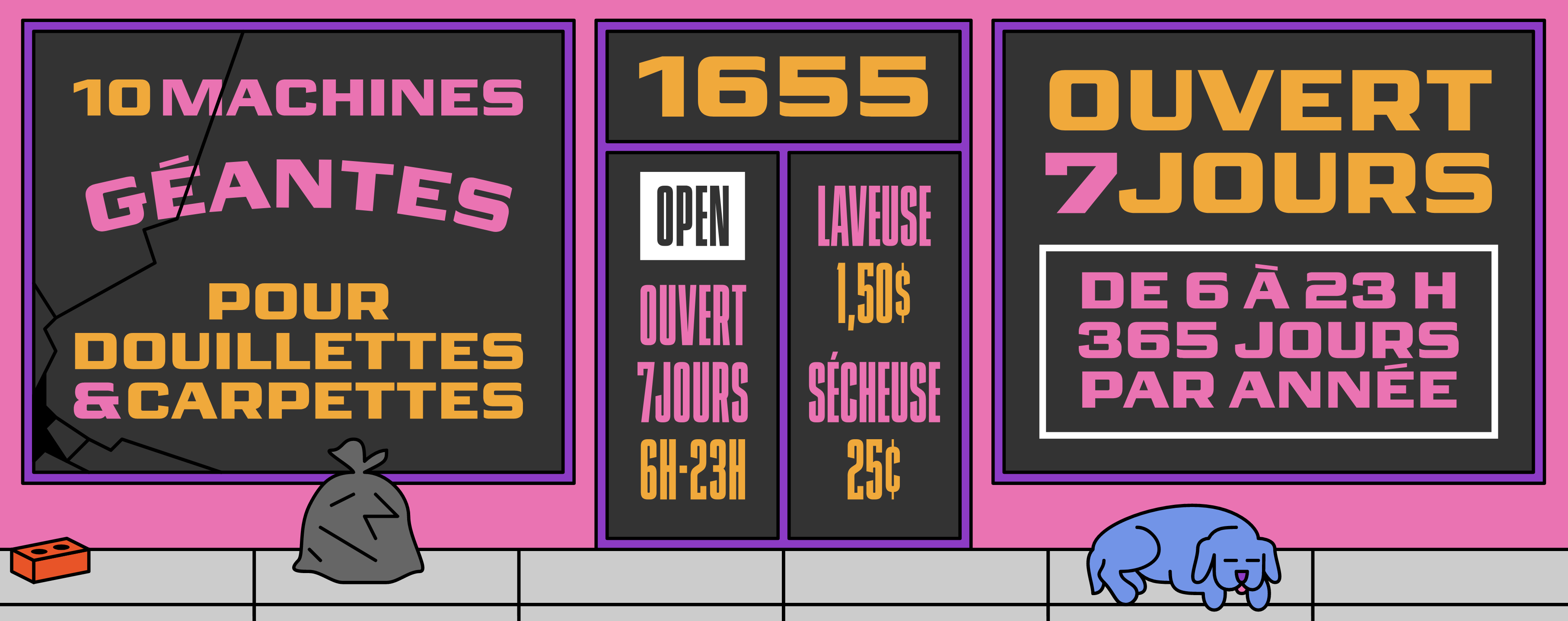
file name: Alexandre Saumier Demers Mortier 2021

file name: Alexandre Saumier Demers Mortier 2021
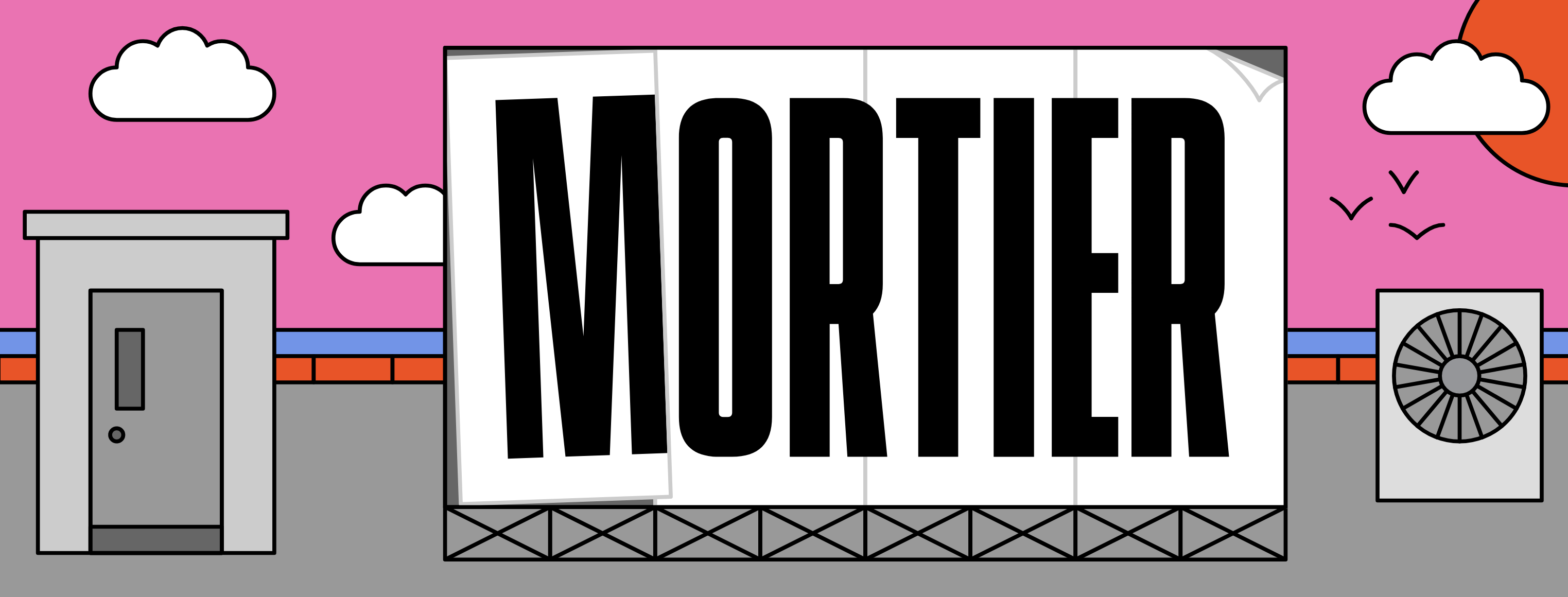
file name: Alexandre Saumier Demers Mortier 2021
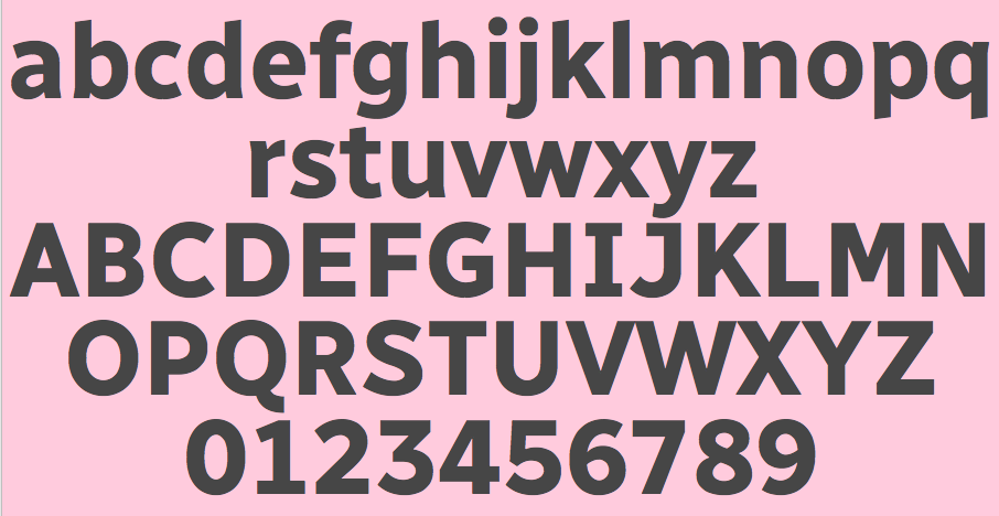
file name: Charles Daoud Etienne Aubert Bonn Alexandre Saumier Demers Radio Canada Bold 2017
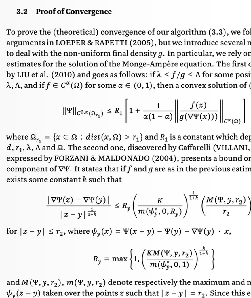
file name: Alexandre Saumier Demers Lewis 2014
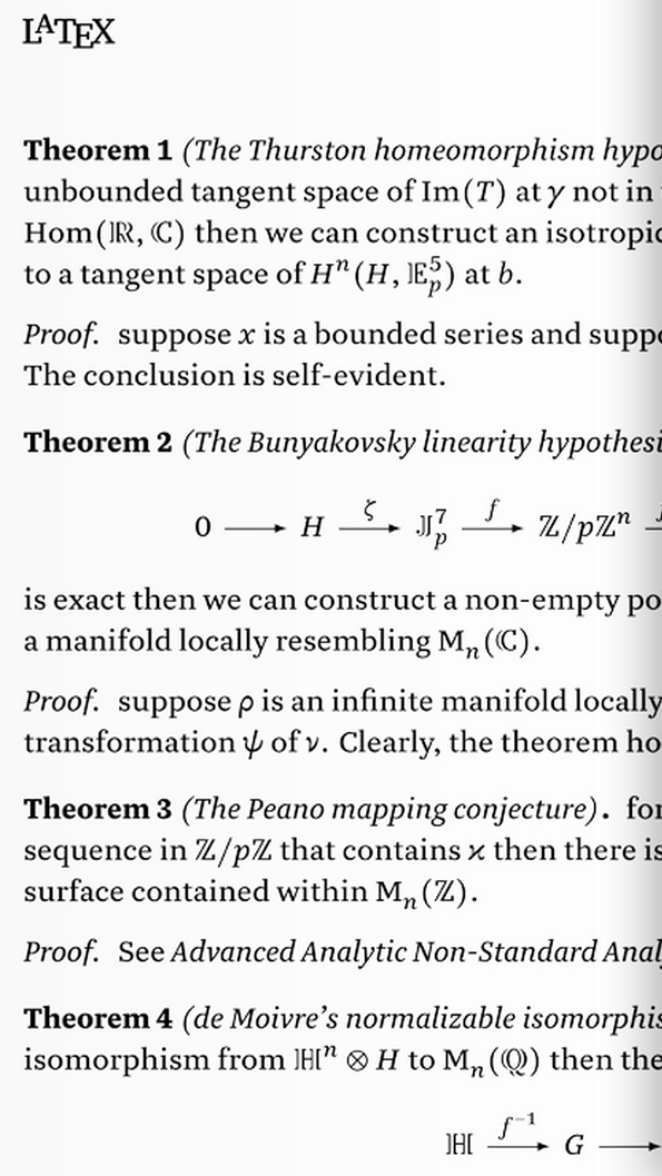
file name: Alexandre Saumier Demers Lewis 2014b

file name: Alexandre Saumier Demers Lewis 2014c
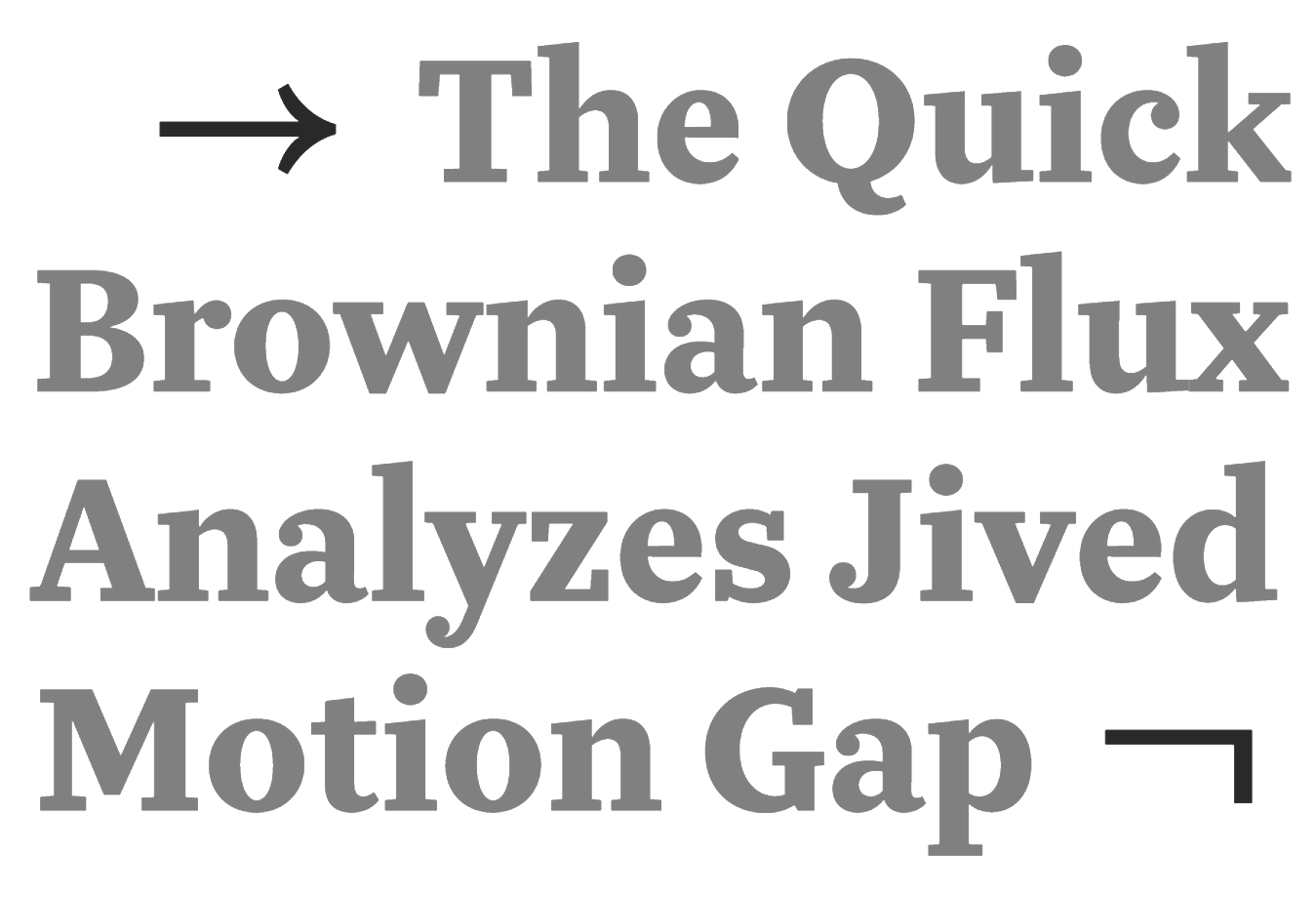
file name: Alexandre Saumier Demers Lewis 2014d
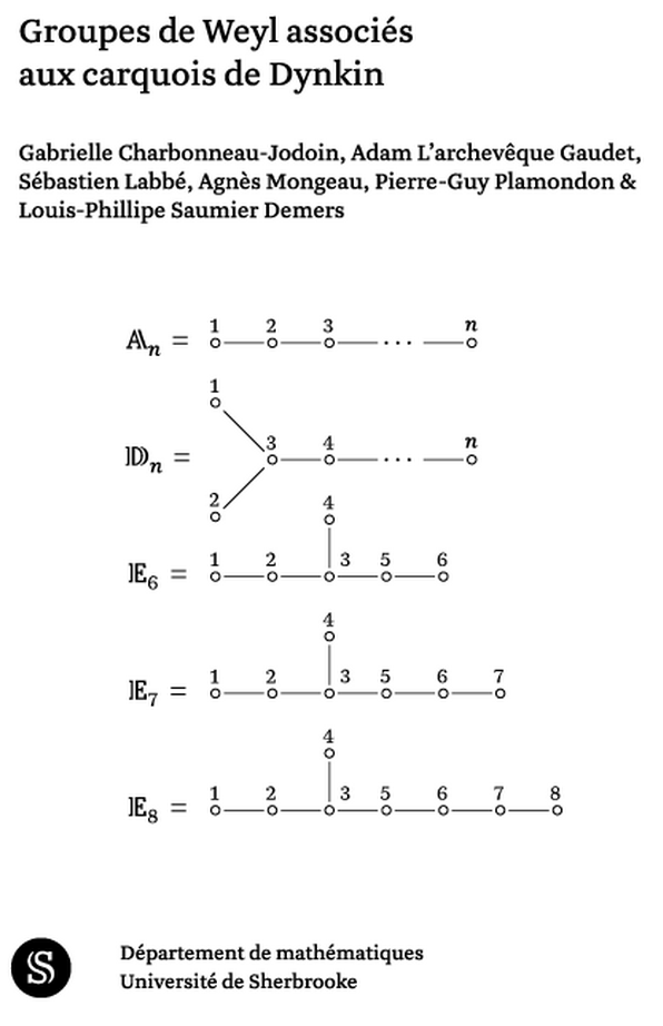
file name: Alexandre Saumier Demers Lewis 2014e
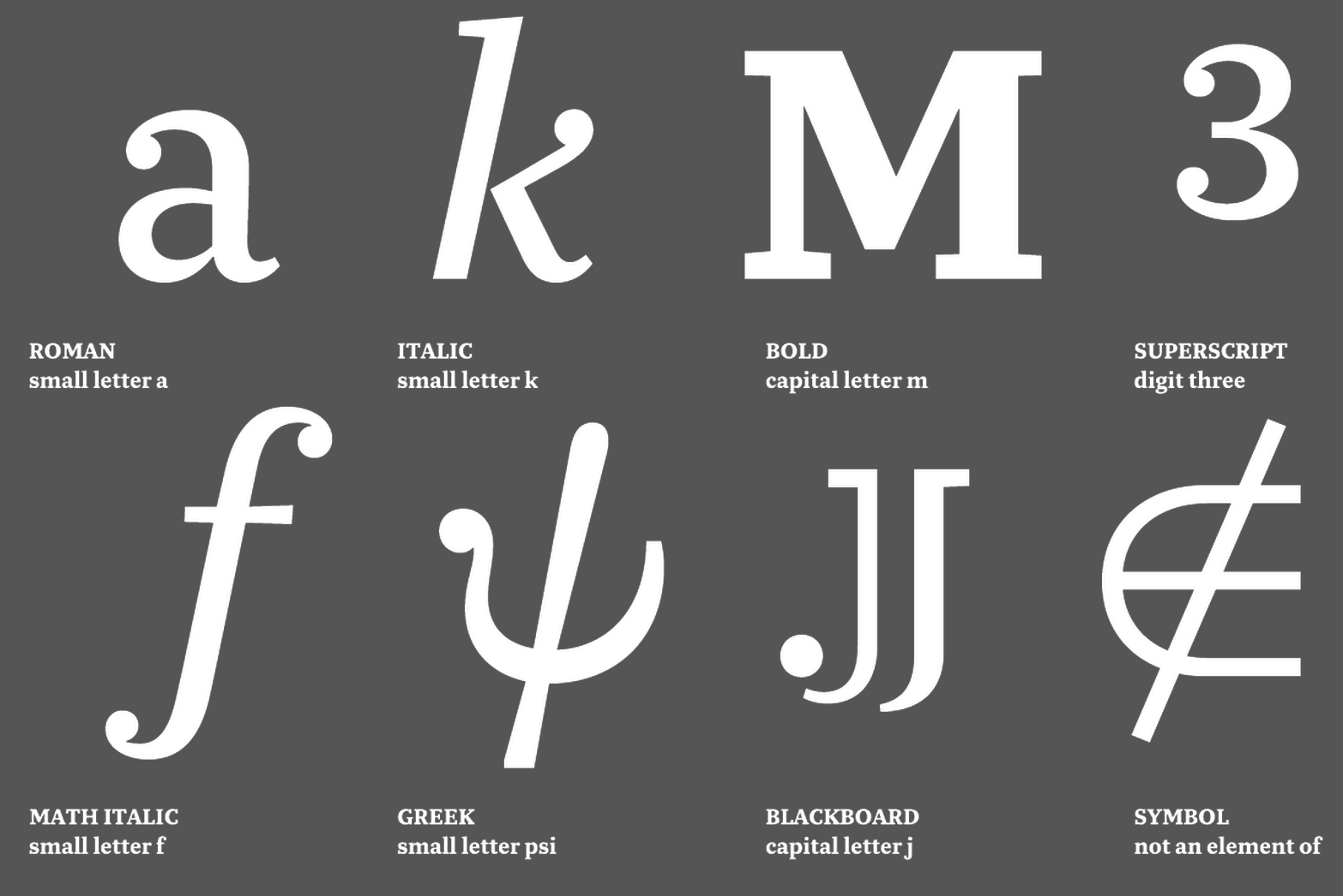
file name: Alexandre Saumier Demers Lewis 2014f
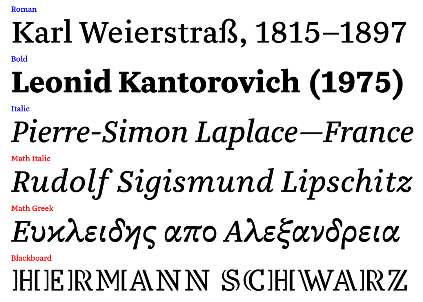
file name: Alexandre Saumier Demers Lewis 2014g

file name: Alexandre Saumier Demers Lewis 2014h
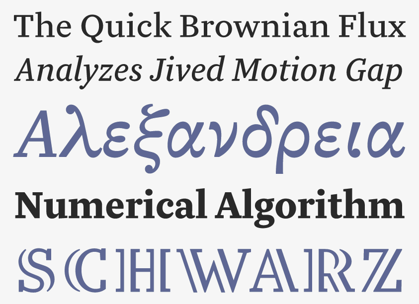
file name: Alexandre Saumier Demers Lewis 2014i
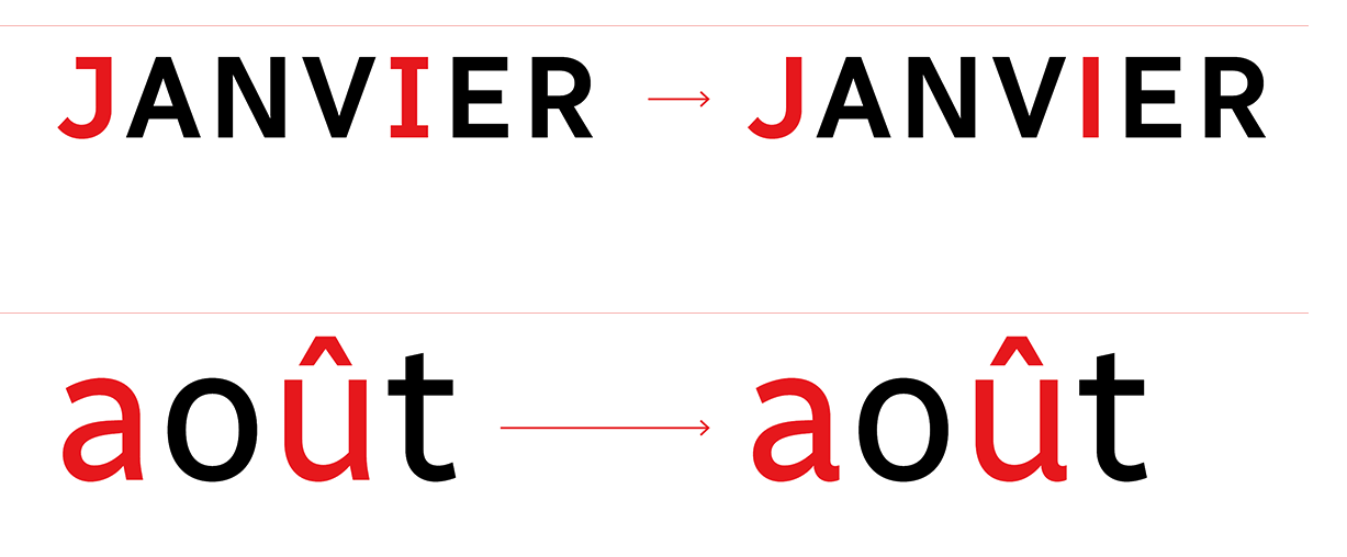
file name: Charles Daoud Alexandre Saumier Demers Radio Canada 2017
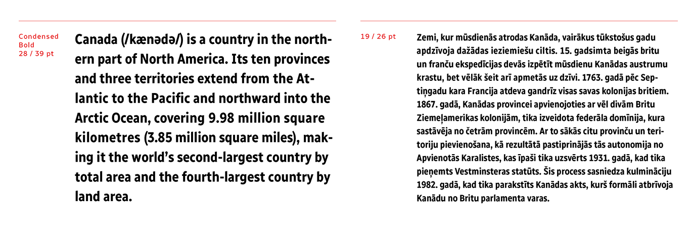
file name: Charles Daoud Alexandre Saumier Demers Radio Canada 2017b
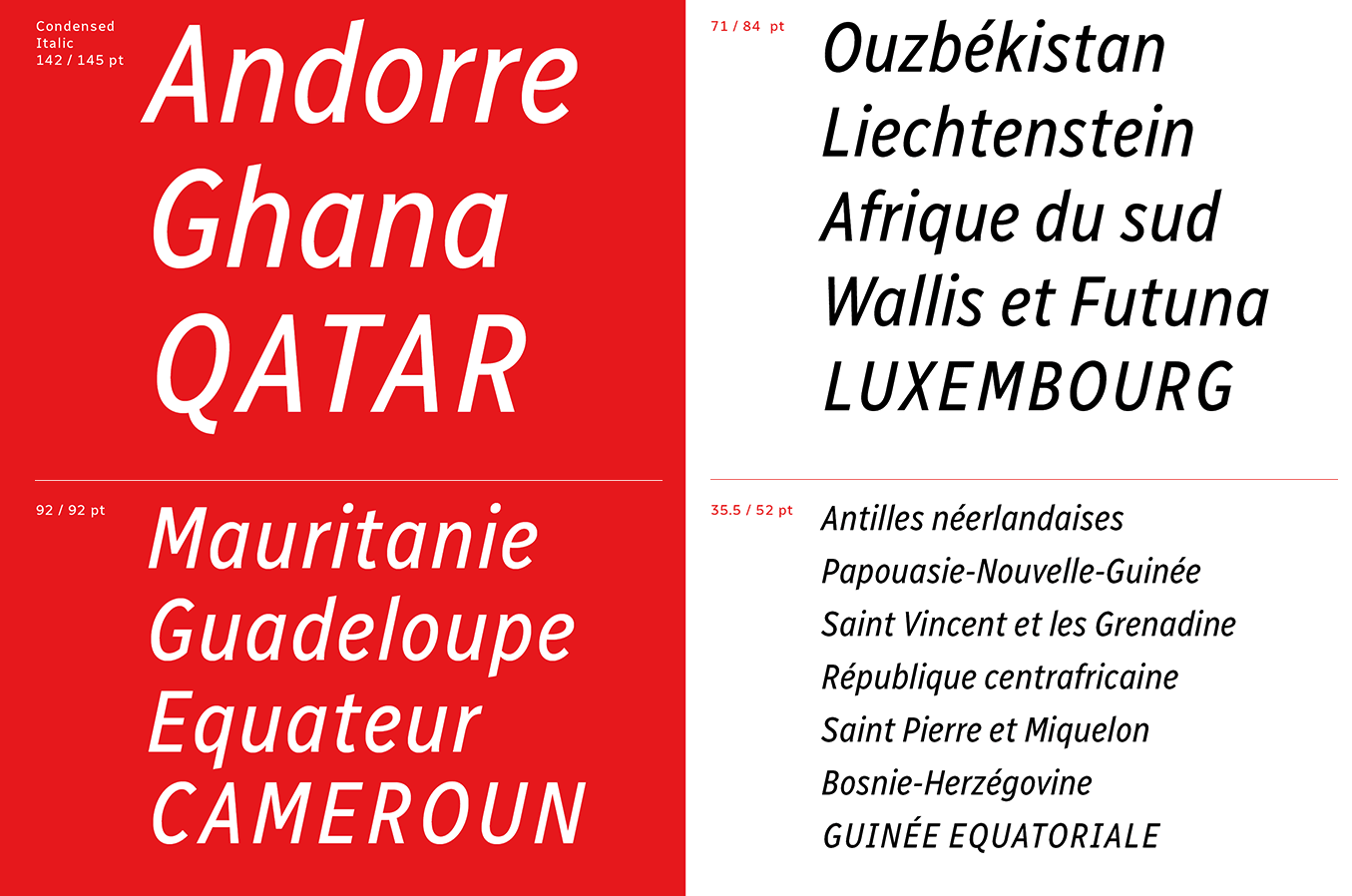
file name: Charles Daoud Alexandre Saumier Demers Radio Canada 2017c
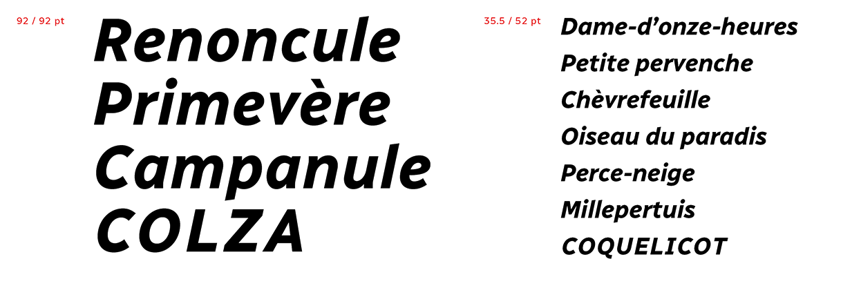
file name: Charles Daoud Alexandre Saumier Demers Radio Canada 2017d
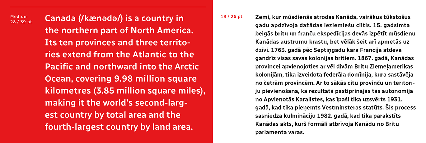
file name: Charles Daoud Alexandre Saumier Demers Radio Canada 2017e
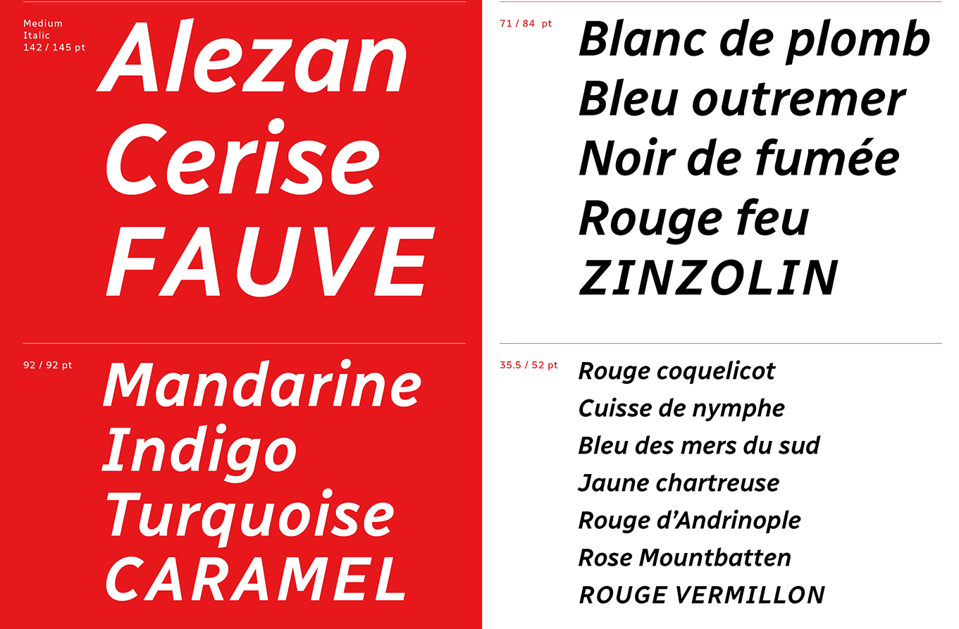
file name: Charles Daoud Alexandre Saumier Demers Radio Canada 2017f
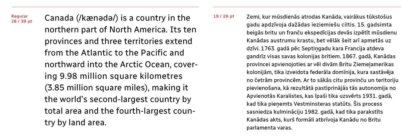
file name: Charles Daoud Alexandre Saumier Demers Radio Canada 2017g

file name: Charles Daoud Alexandre Saumier Demers Radio Canada 2017h
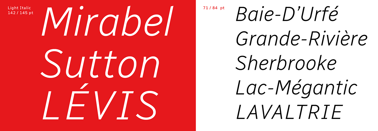
file name: Charles Daoud Alexandre Saumier Demers Radio Canada 2017i
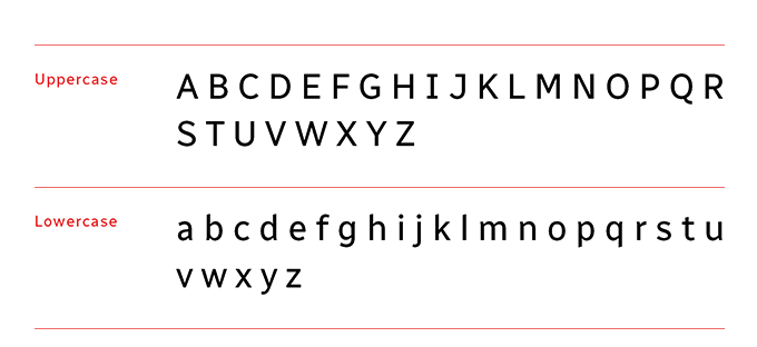
file name: Charles Daoud Alexandre Saumier Demers Radio Canada 2017j
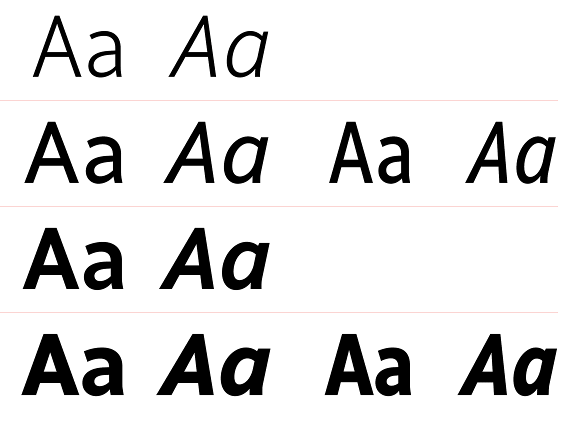
file name: Charles Daoud Alexandre Saumier Demers Radio Canada 2017k
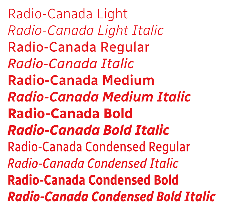
file name: Charles Daoud Alexandre Saumier Demers Radio Canada 2017l
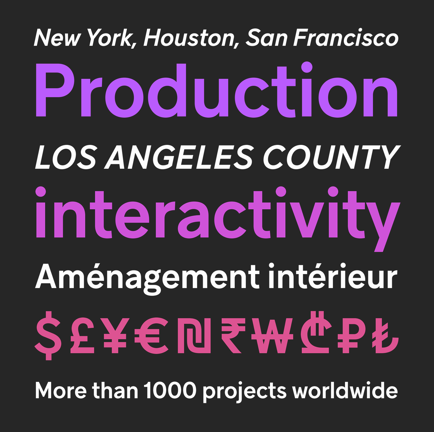
file name: Coppers Brasses G S M Grotesque 2016
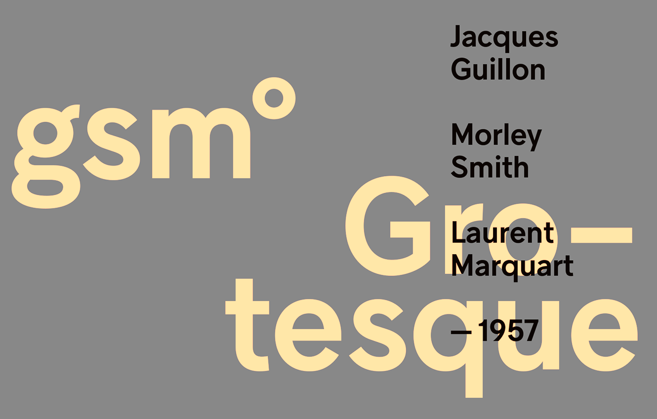
file name: Coppers Brasses G S M Grotesque 2016b

file name: Coppers Brasses G S M Grotesque 2016c

file name: Coppers Brasses G S M Grotesque 2016d

file name: Coppers Brasses G S M Grotesque 2016e
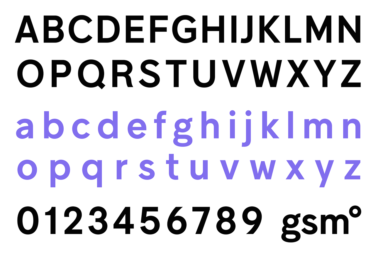
file name: Coppers Brasses G S M Grotesque 2016f
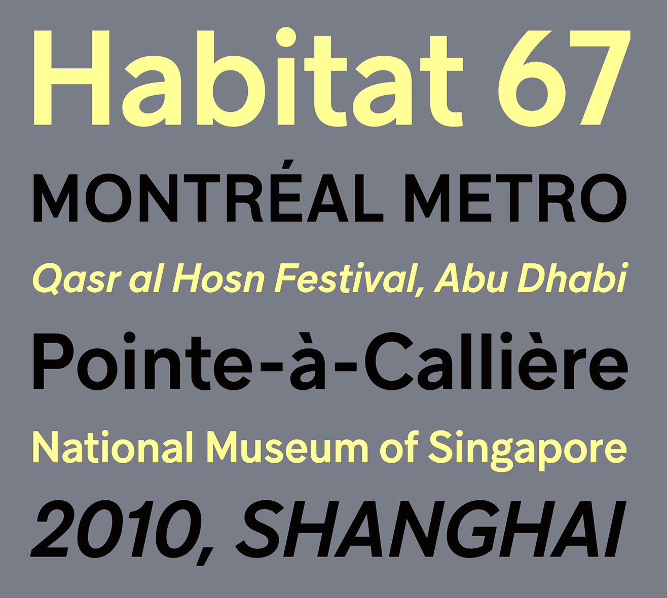
file name: Coppers Brasses G S M Grotesque 2016g
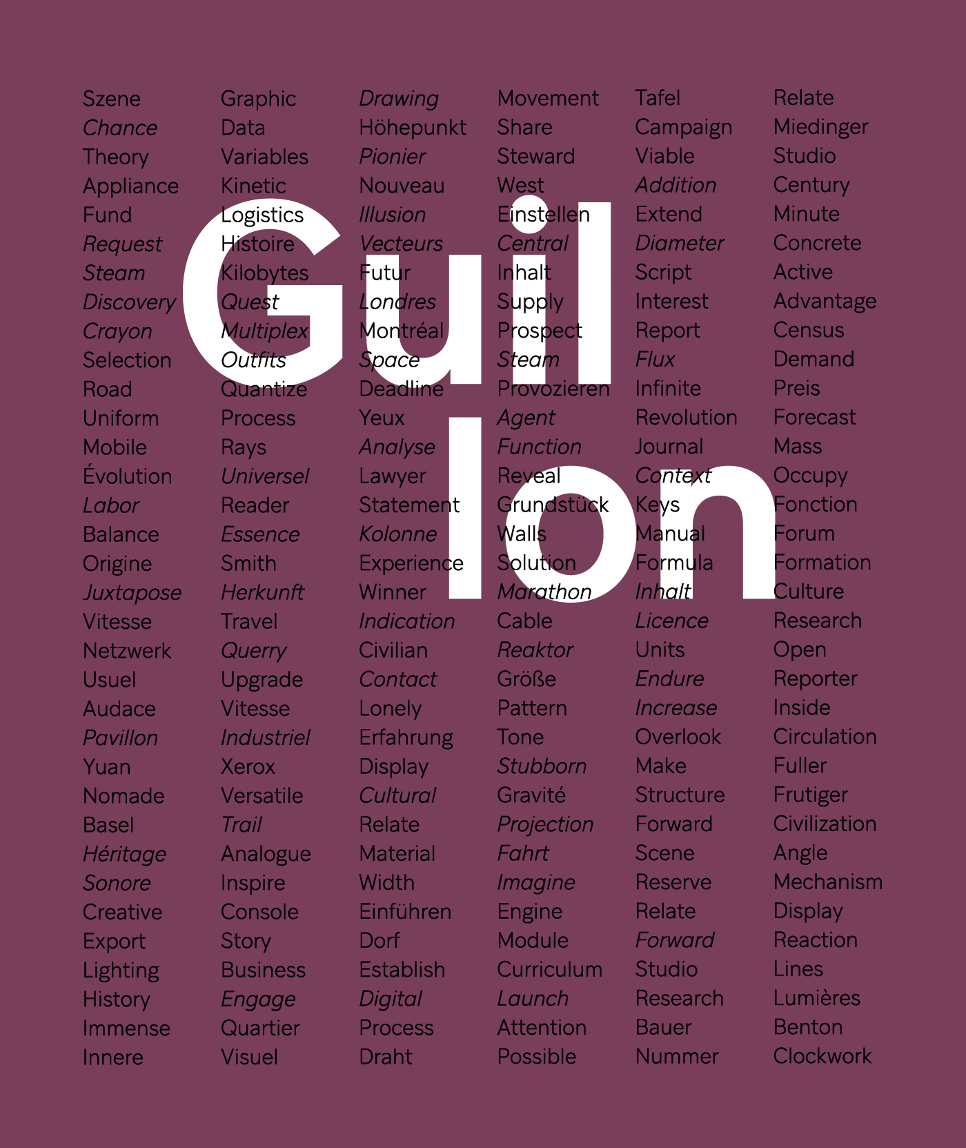
file name: Studio Feed Coppers Brasses Guillon 2016
file name: Studio Feed Coppers Brasses Guillon 2016b
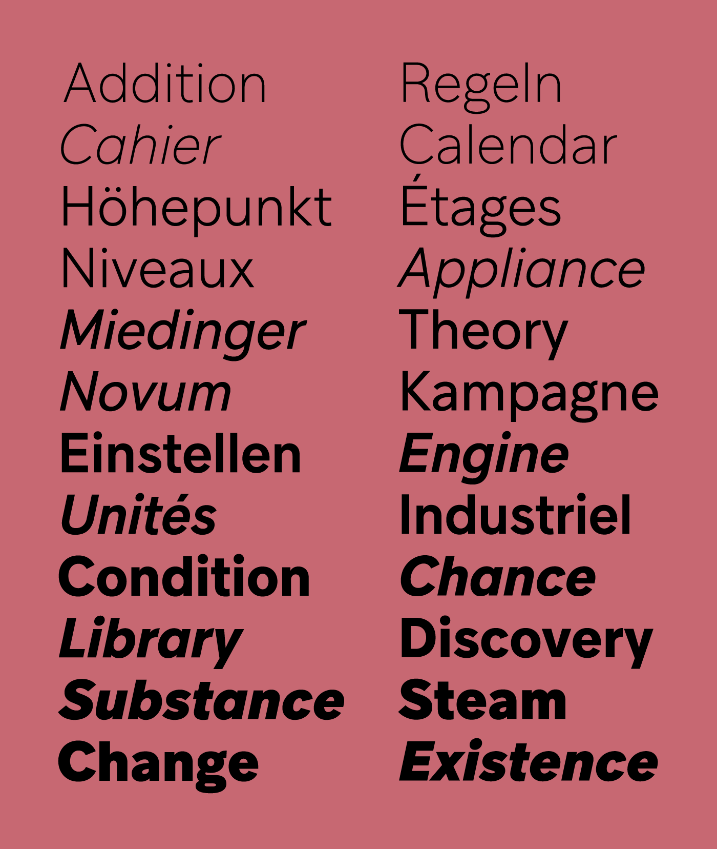
file name: Studio Feed Coppers Brasses Guillon 2016c
file name: Studio Feed Coppers Brasses Guillon 2016d

file name: Studio Feed Coppers Brasses Guillon 2016e
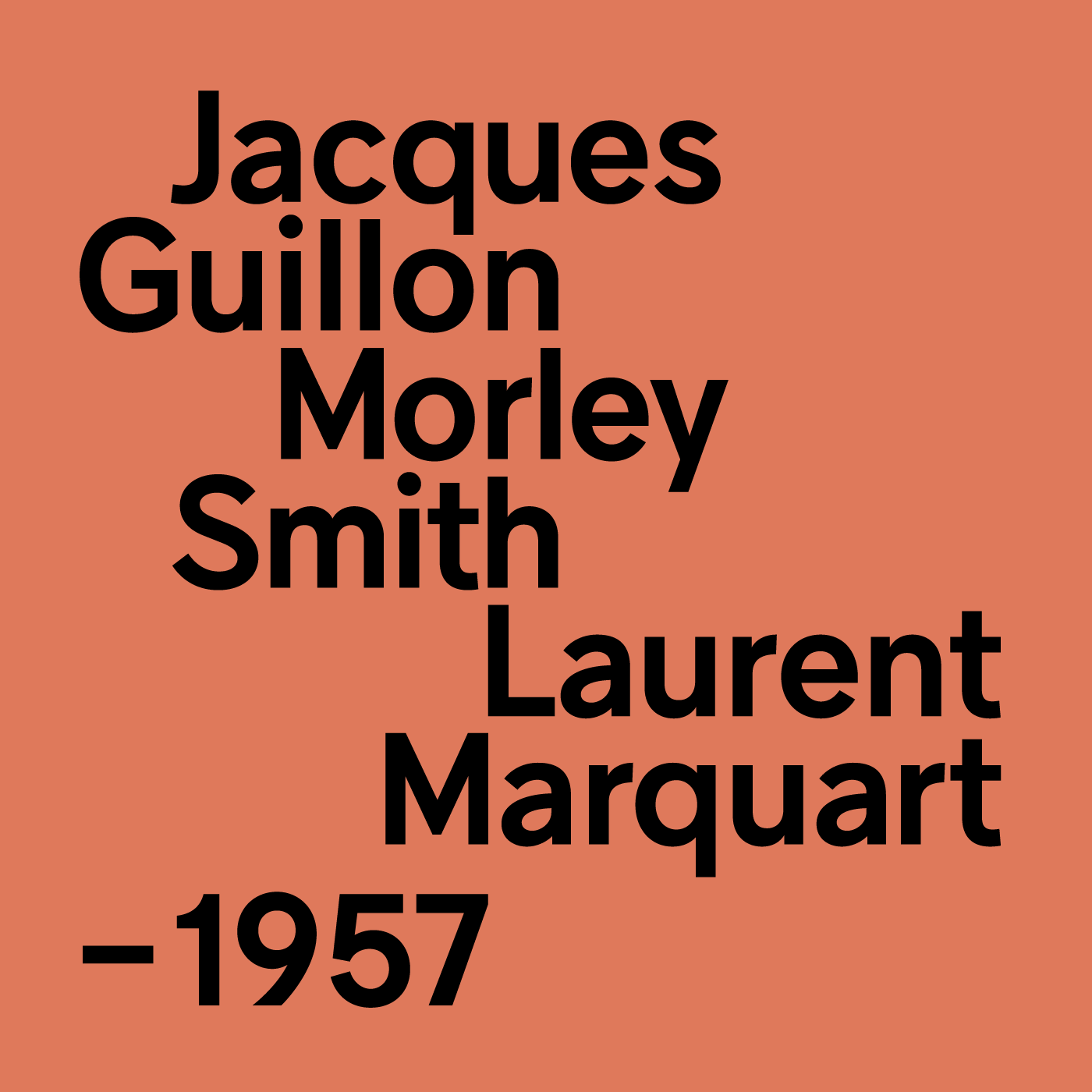
file name: Studio Feed Coppers Brasses Guillon 2016f

file name: Studio Feed Coppers Brasses Guillon 2016g
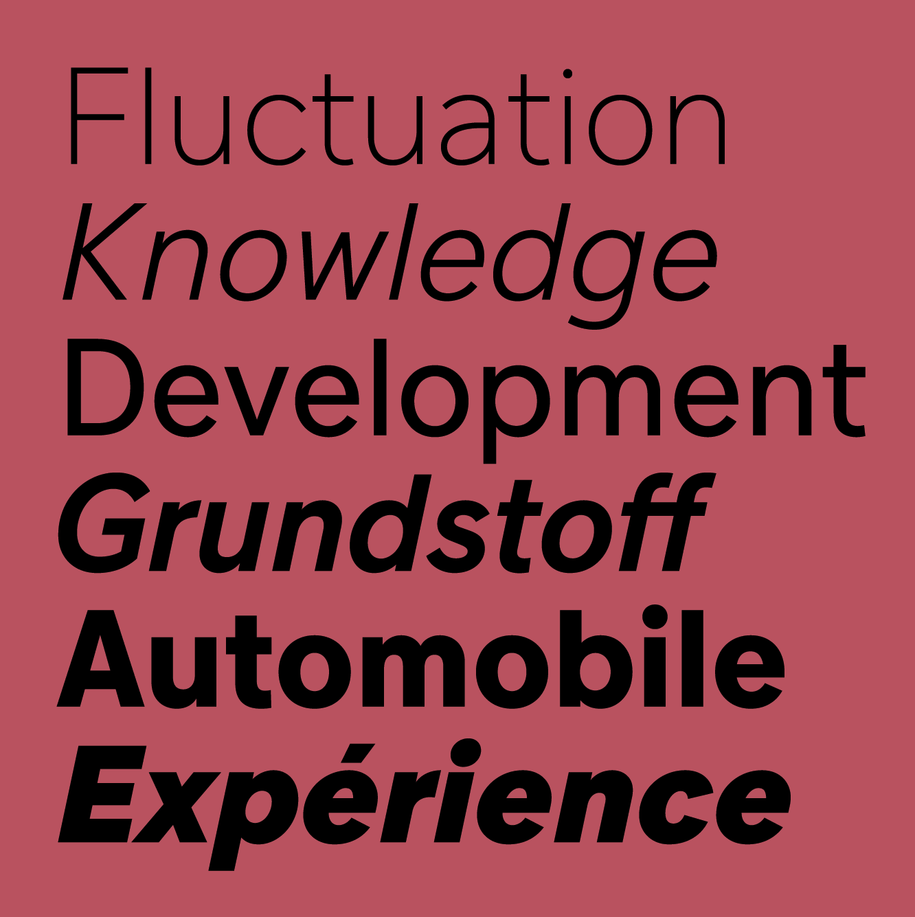
file name: Studio Feed Coppers Brasses Guillon 2016h

file name: Studio Feed Coppers Brasses Guillon 2016i

file name: Studio Feed Coppers Brasses Guillon 2016j
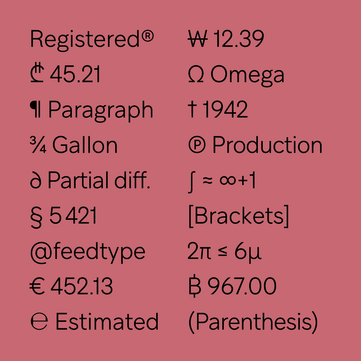
file name: Studio Feed Coppers Brasses Guillon 2016k
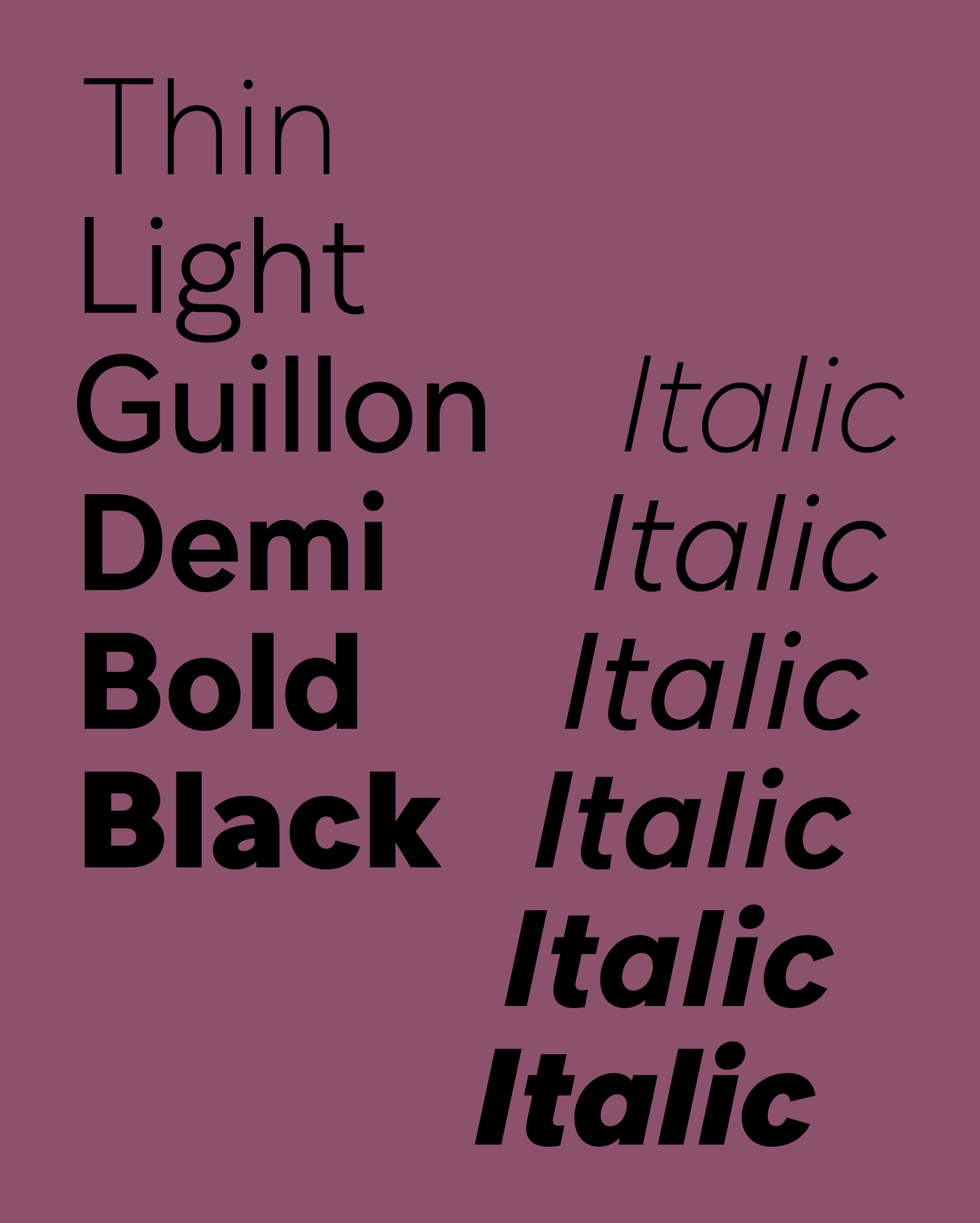
file name: Studio Feed Coppers Brasses Guillon 2016l

file name: Studio Feed Coppers Brasses Guillon Black 2016

file name: Studio Feed Coppers Brasses Guillon Regular 2016
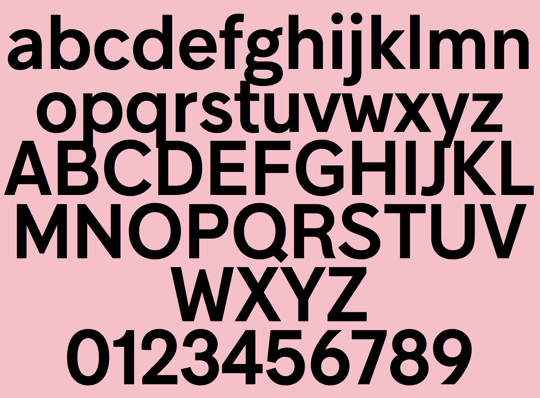
file name: Studio Feed Coppers Brasses Guillon Demi 2016

file name: Alexandre Saumier Demers V L N L Wurst 2015 179441
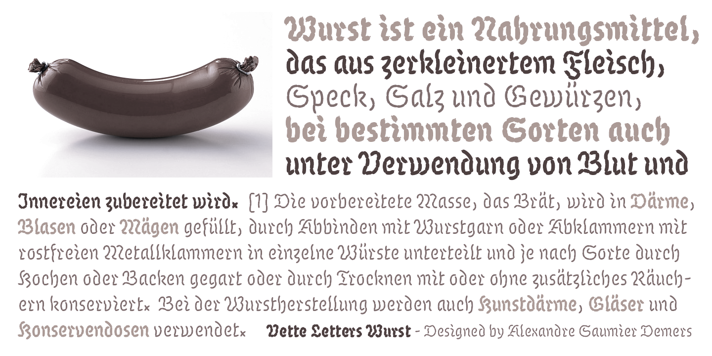
file name: Alexandre Saumier Demers V L N L Wurst 2015 179442
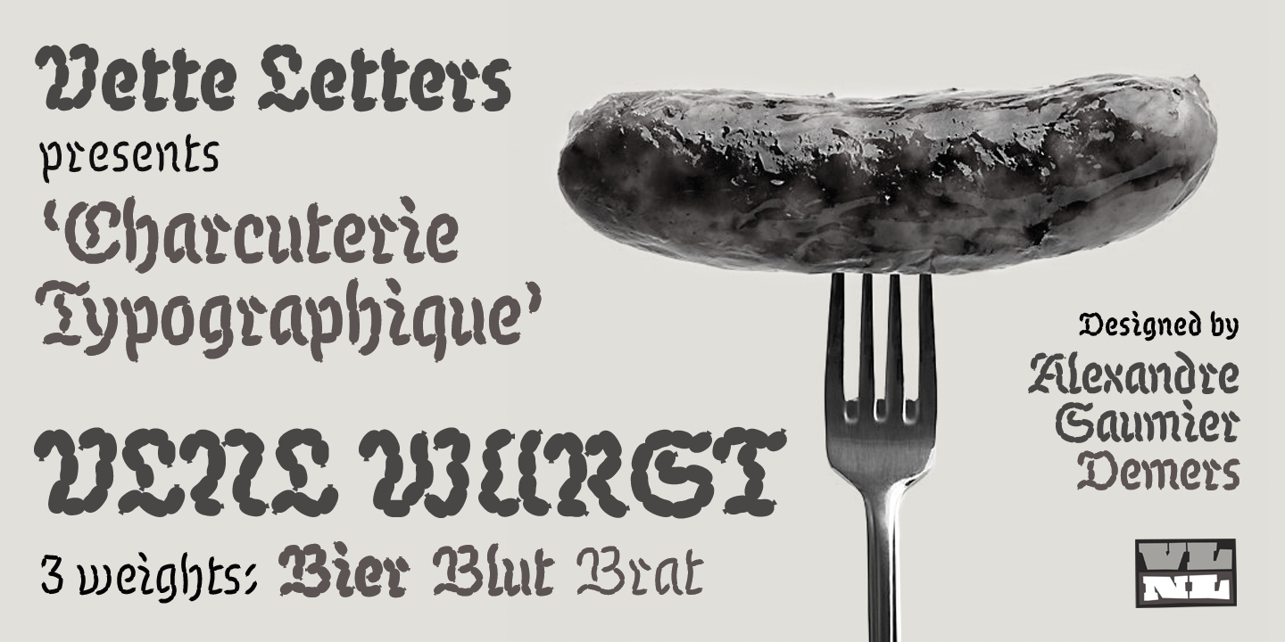
file name: Alexandre Saumier Demers V L N L Wurst 2015 179443

file name: Alexandre Saumier Demers V L N L Wurst 2015 179444

file name: Alexandre Saumier Demers V L N L Wurst 2015

file name: Coppers Brasses Maria Doreuli C C M Grotesk 2015
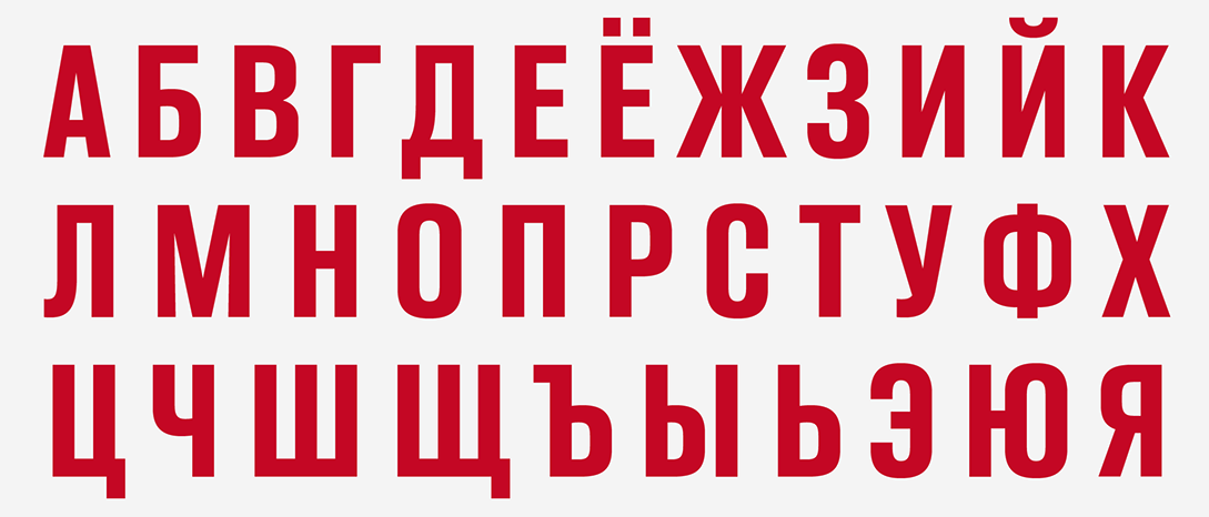
file name: Coppers Brasses Maria Doreuli C C M Grotesk 2015a

file name: Coppers Brasses Maria Doreuli C C M Grotesk 2015b
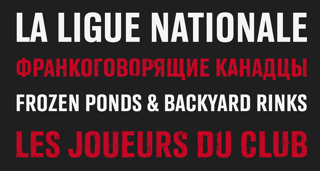
file name: Coppers Brasses Maria Doreuli C C M Grotesk 2015c

file name: Coppers Brasses Maria Doreuli C C M Grotesk 2015d
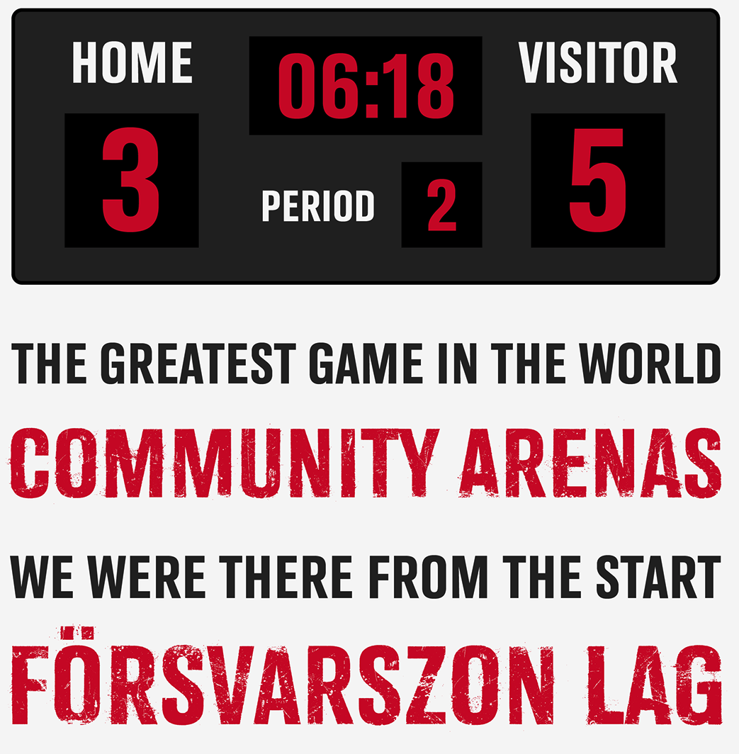
file name: Coppers Brasses Maria Doreuli C C M Grotesk 2015e
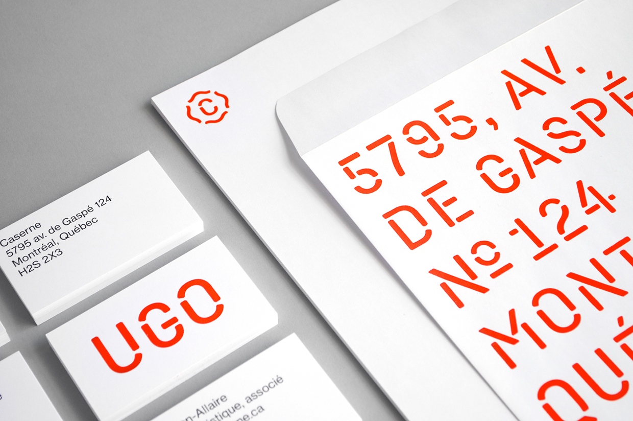
file name: Studio Caserne Coppers Brasses Caserne 2015

file name: Studio Caserne Coppers Brasses Caserne 2015b
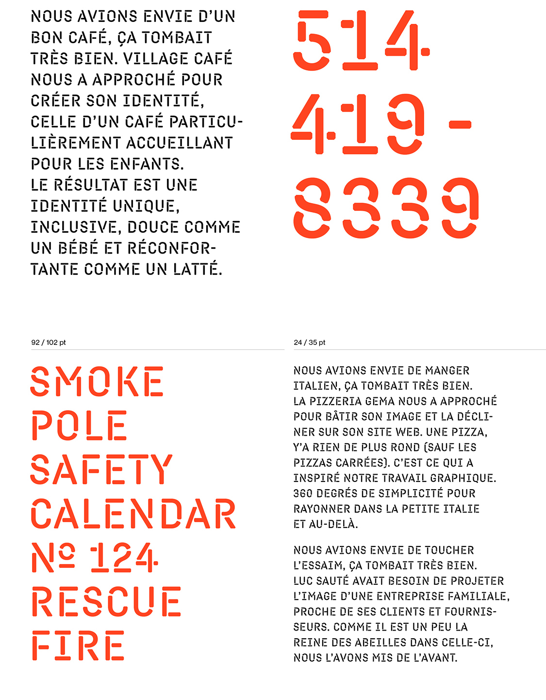
file name: Studio Caserne Coppers Brasses Caserne 2015c
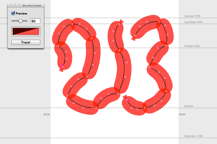
file name: Alexandre Saumier Demers Wurst Schreiiber Program 2015

file name: Alexandre Saumier Demers Alphonse 2014
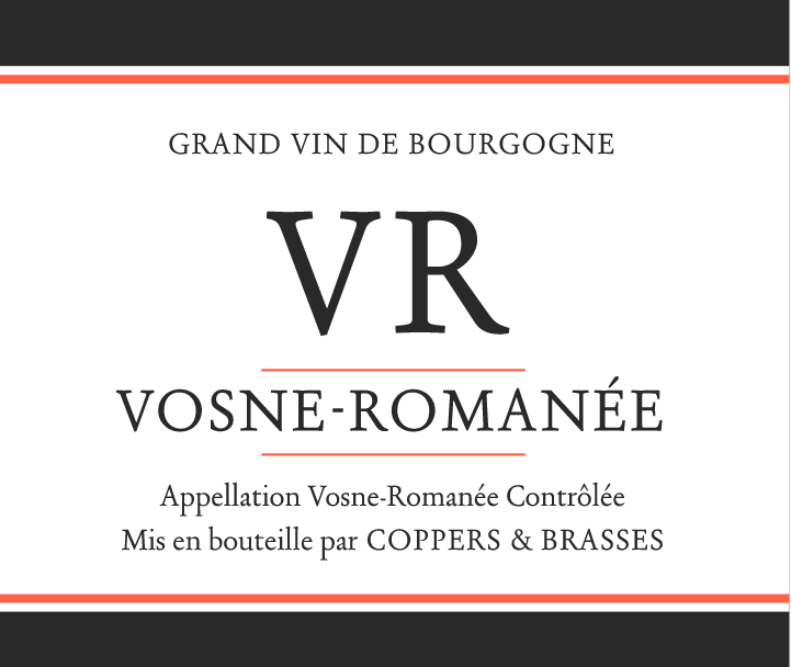
file name: Alexandre Saumier Demers Alphonse 2014b
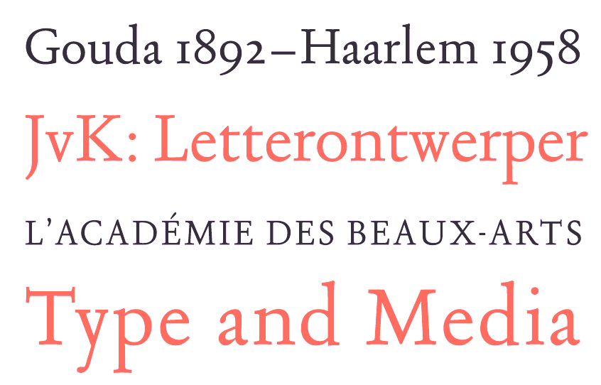
file name: Alexandre Saumier Demers Alphonse 2014c

file name: Alexandre Saumier Demers Alphonse 2014d
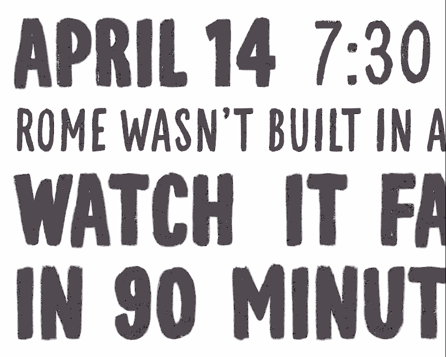
file name: Coppers Brasses M L S Soccer 2012
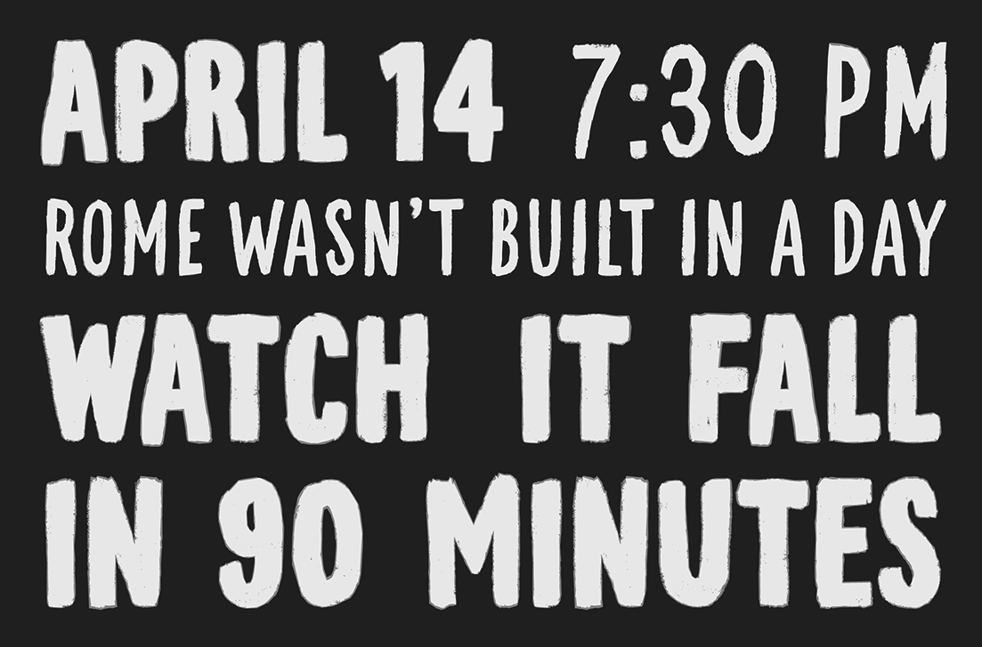
file name: Coppers Brasses M L S Soccer 2012b
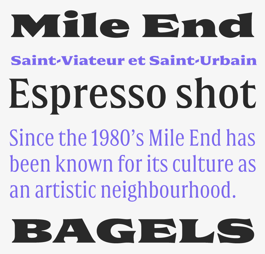
file name: Etienne Aubert Bonn Alexandre Saumier Demers Double 2015b
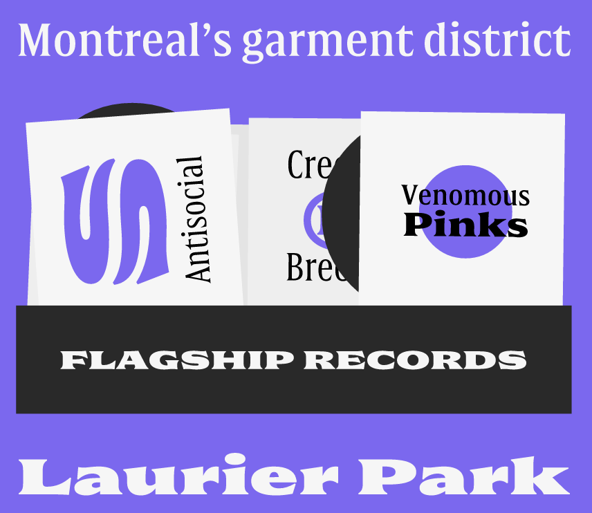
file name: Etienne Aubert Bonn Alexandre Saumier Demers Double 2015c
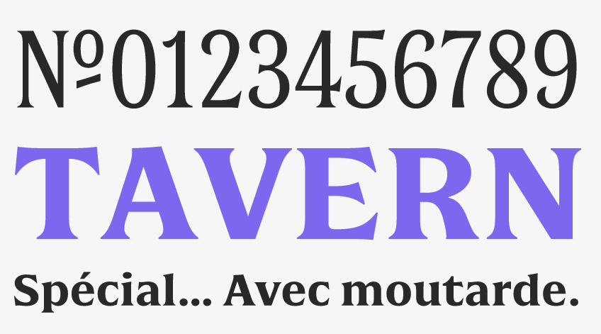
file name: Etienne Aubert Bonn Alexandre Saumier Demers Double 2015d
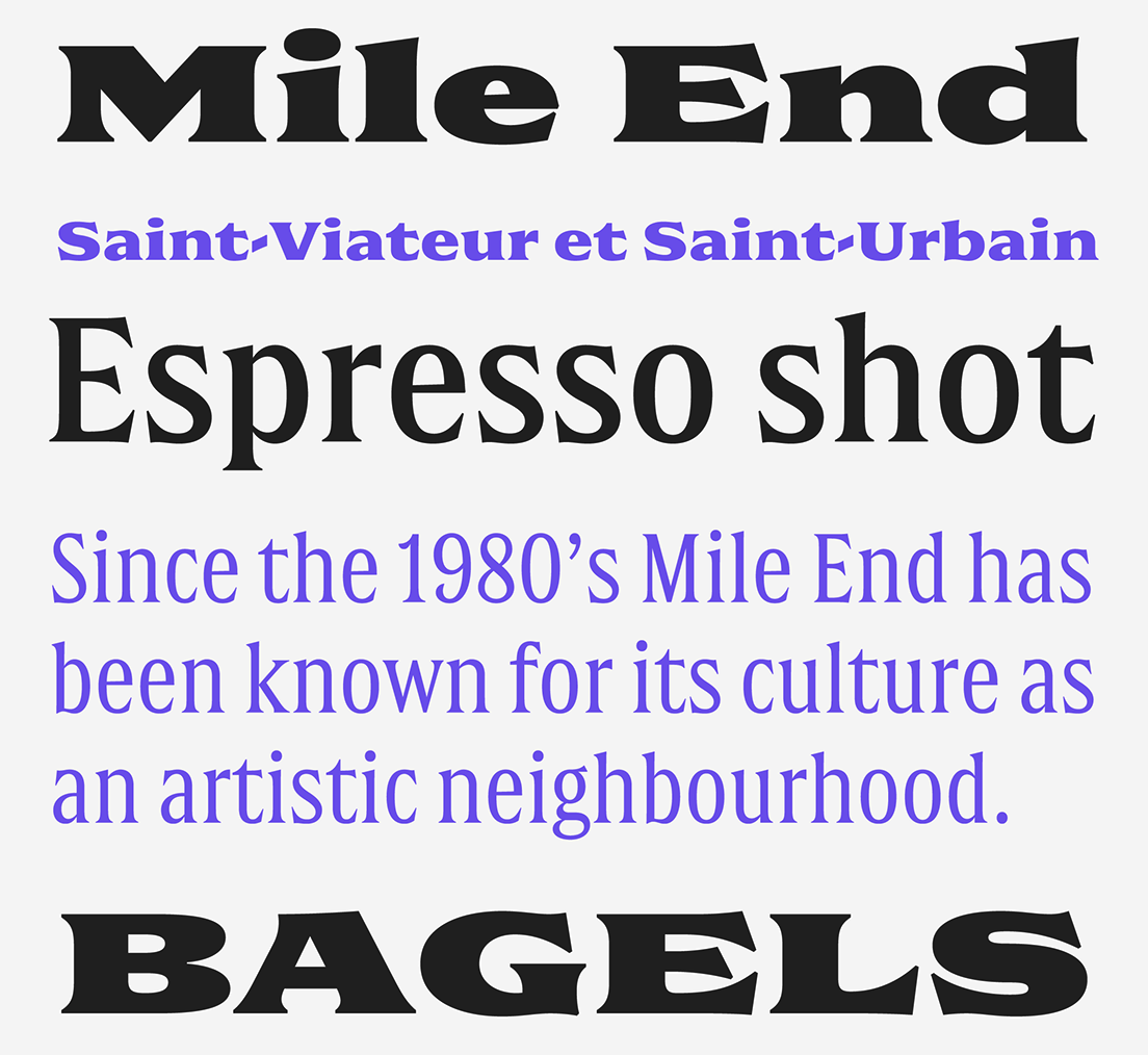
file name: Etienne Aubert Bonn Alexandre Saumier Demers Double 2015e
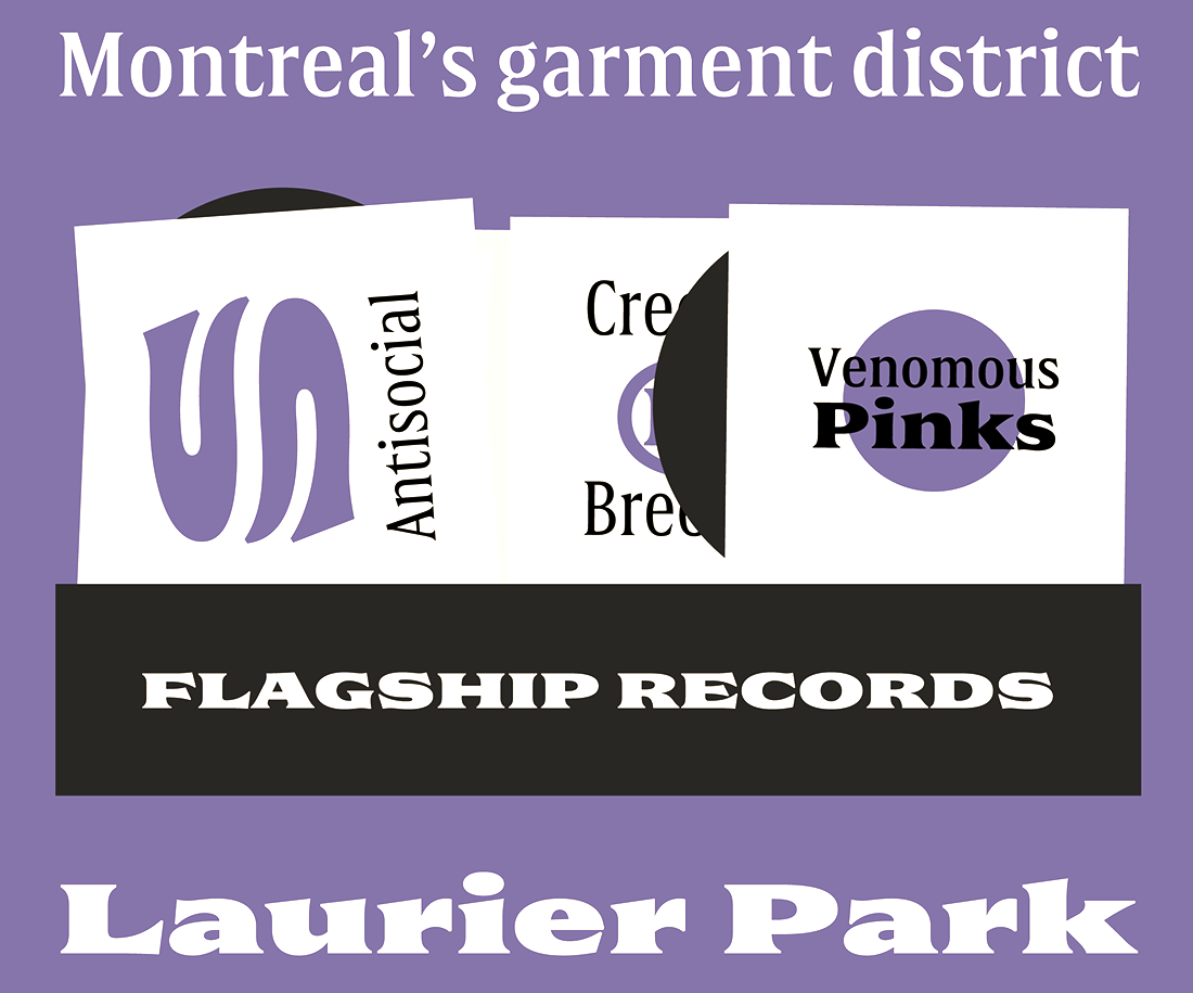
file name: Etienne Aubert Bonn Alexandre Saumier Demers Double 2015f
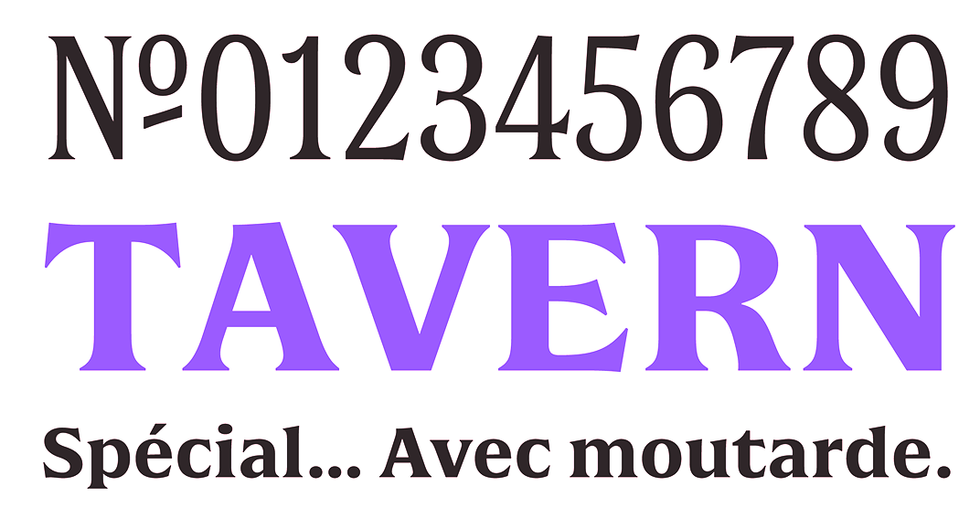
file name: Etienne Aubert Bonn Alexandre Saumier Demers Double 2015g

file name: Etienne Aubert Bonn Alexandre Saumier Demers Double 2015h
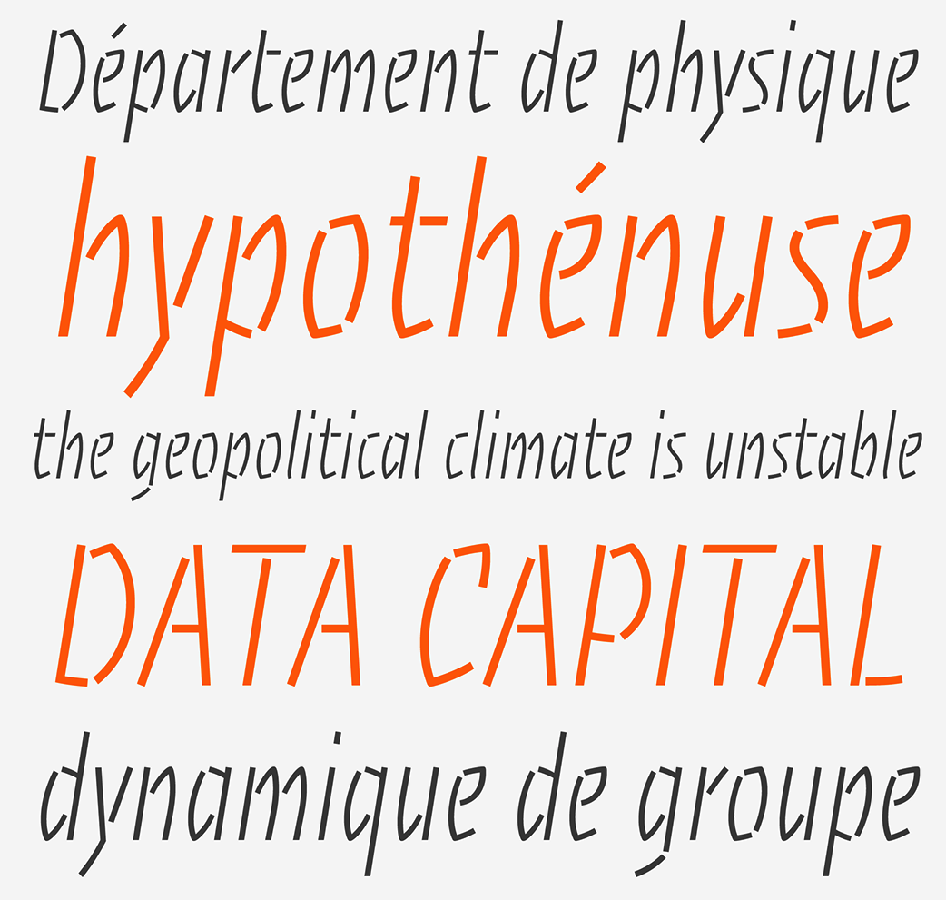
file name: Etienne Aubert Bonn Alexandre Saumier Demers Theorie 2014b
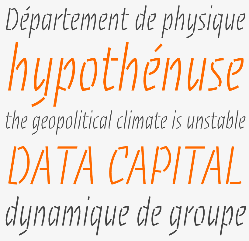
file name: Etienne Aubert Bonn Alexandre Saumier Demers Theorie 2014
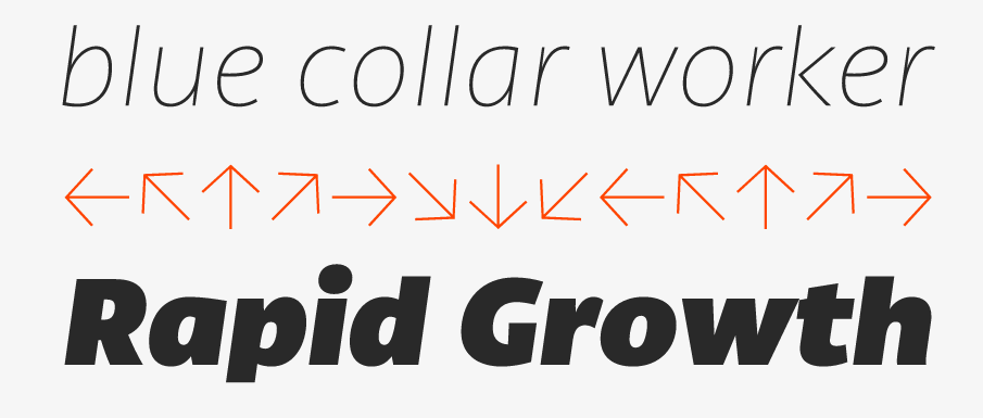
file name: Etienne Aubert Bonn Canal 2015b
file name: Etienne Aubert Bonn Canal 2015c
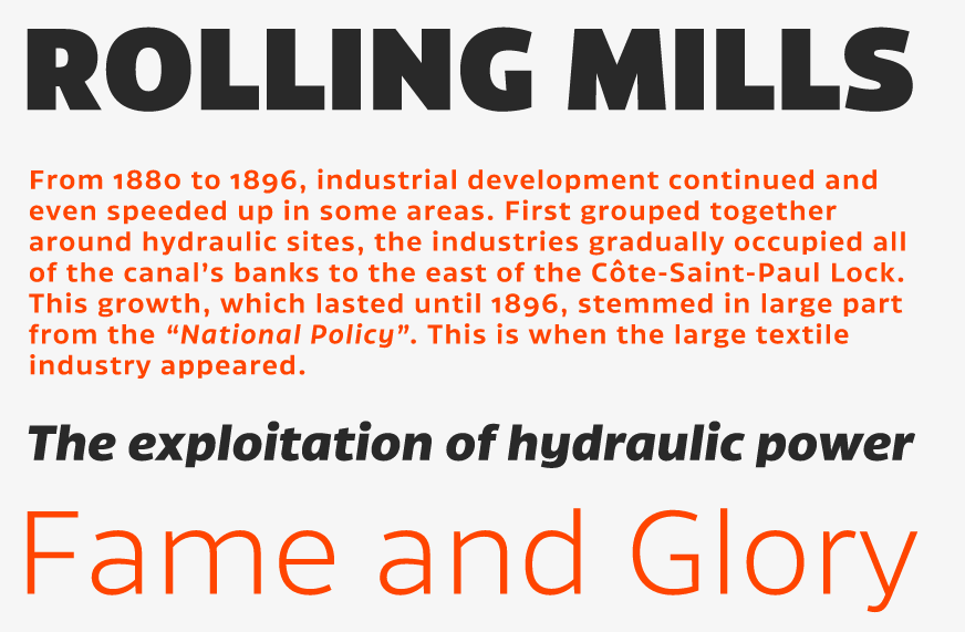
file name: Etienne Aubert Bonn Canal 2015d

file name: Etienne Aubert Bonn Canal 2015e
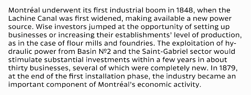
file name: Etienne Aubert Bonn Canal 2015f
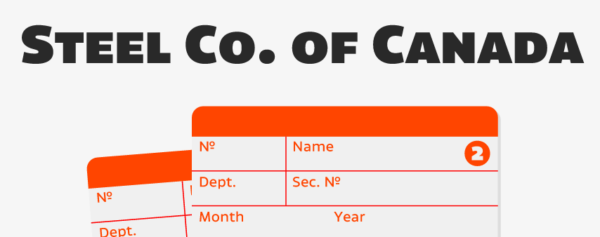
file name: Etienne Aubert Bonn Canal 2015g

file name: Etienne Aubert Bonn Canal 2015h
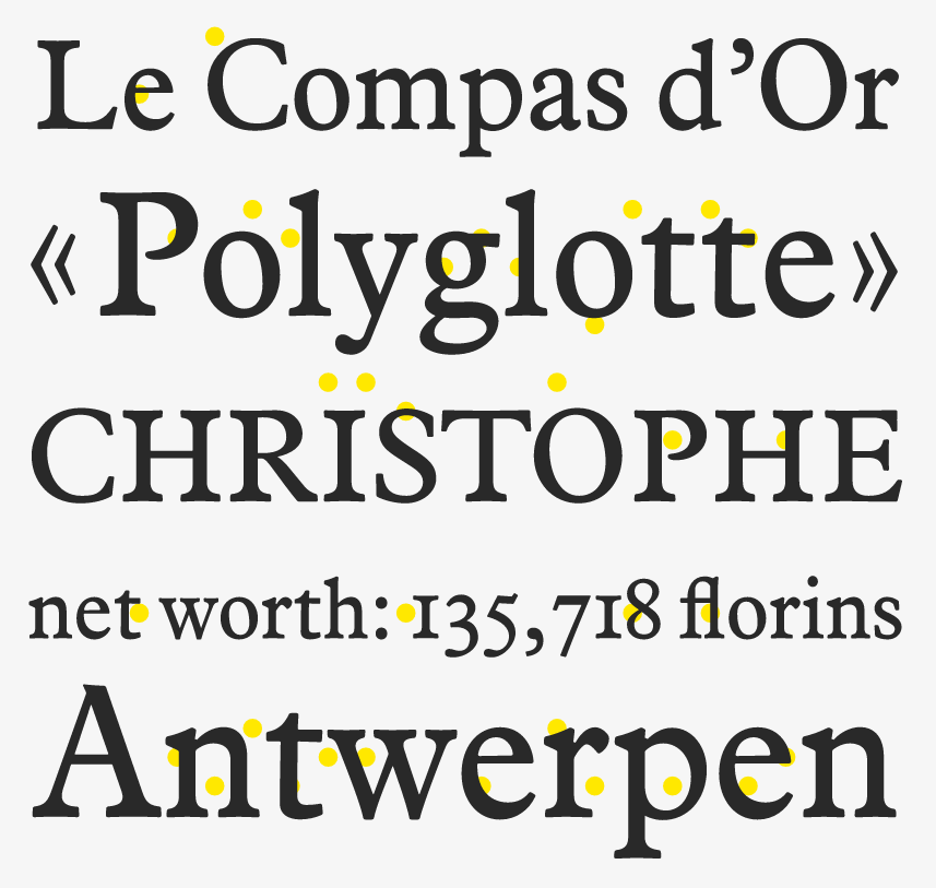
file name: Etienne Aubert Bonn Compass 2013
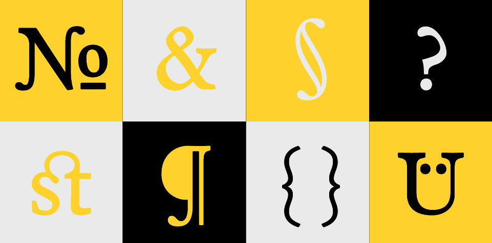
file name: Etienne Aubert Bonn Compass 2013b
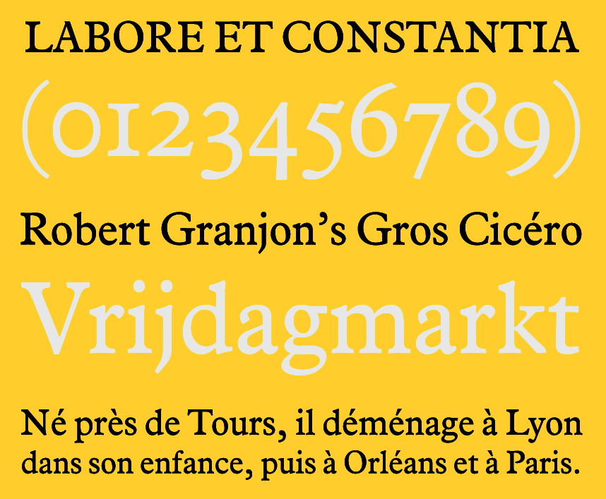
file name: Etienne Aubert Bonn Compass 2013c
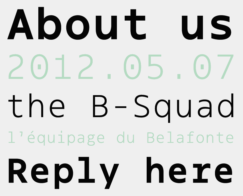
file name: Etienne Aubert Bonn Klaus 2014
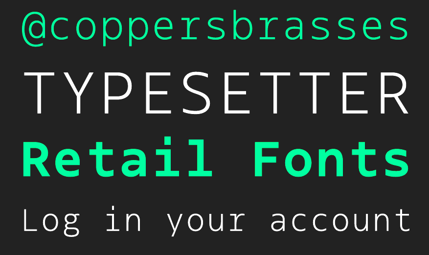
file name: Etienne Aubert Bonn Klaus 2014b
file name: Etienne Aubert Bonn Klaus 2014c
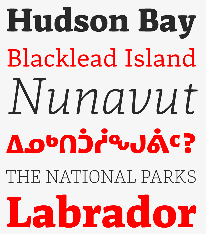
file name: Etienne Aubert Bonn Nurraq 2013
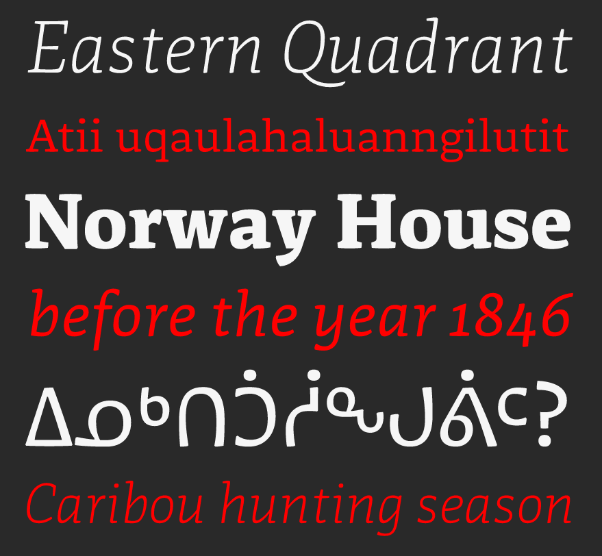
file name: Etienne Aubert Bonn Nurraq 2013b
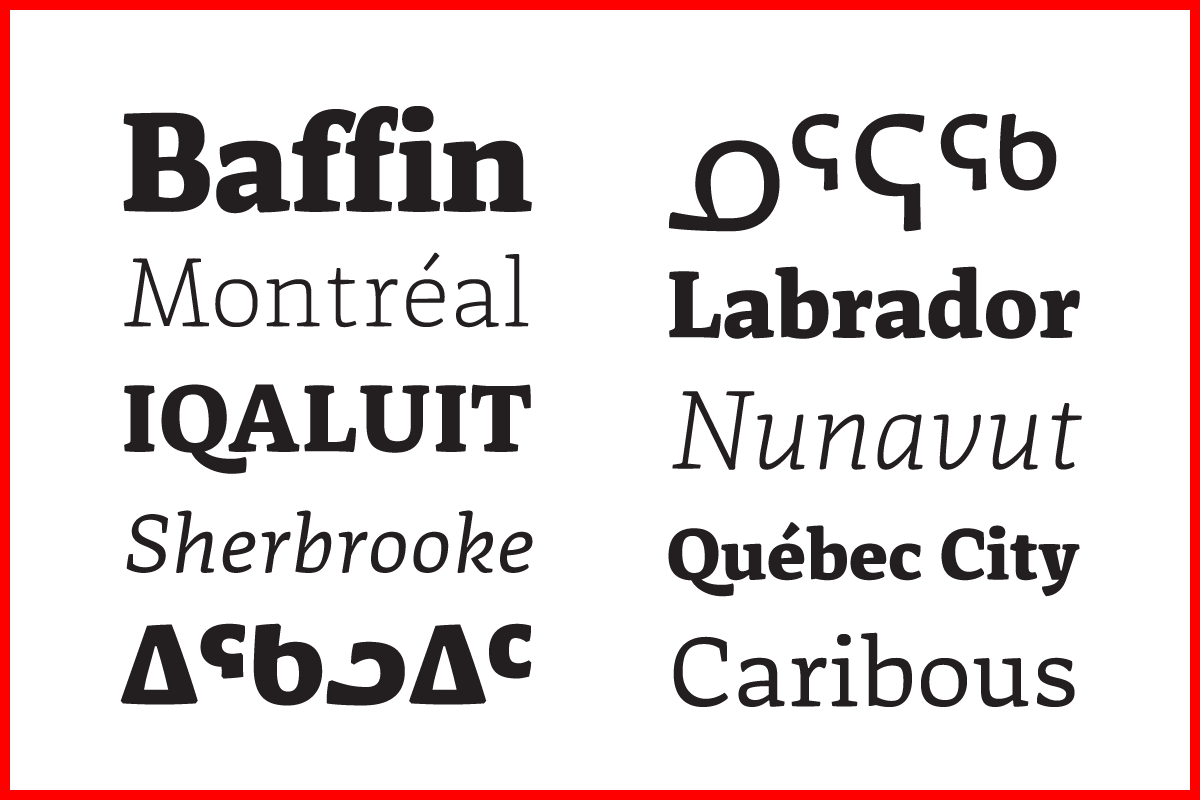
file name: Etienne Aubert Bonn Nurraq
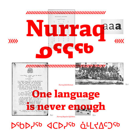
file name: Etienne Aubert Bonn Nurraq

file name: Coppers Brasses Martha 2012c
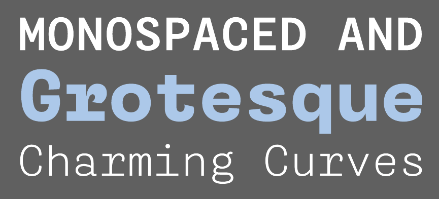
file name: Coppers Brasses Martha 2012d
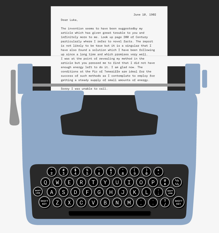
file name: Coppers Brasses Martha 2012
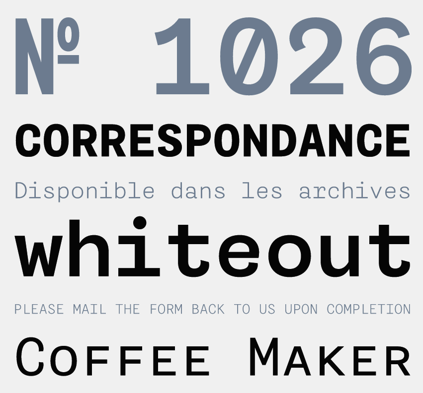
file name: Coppers Brasses Martha 2012b

file name: Coppers Brasses Martha 2012

file name: Coppers Brasses Martha 2012b
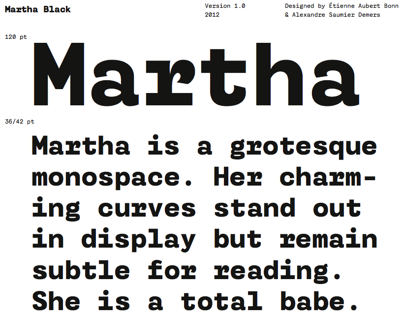
file name: Coppers Brasses Martha Black 2012

file name: Coppers Brasses Martha Black 2012b

file name: Coppers Brasses Martha Black 2012c

file name: Coppers Brasses Martha Light 2012

file name: Coppers Brasses Martha Light 2012d
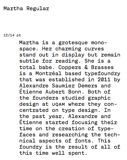
file name: Coppers Brasses Martha Regular 2012d
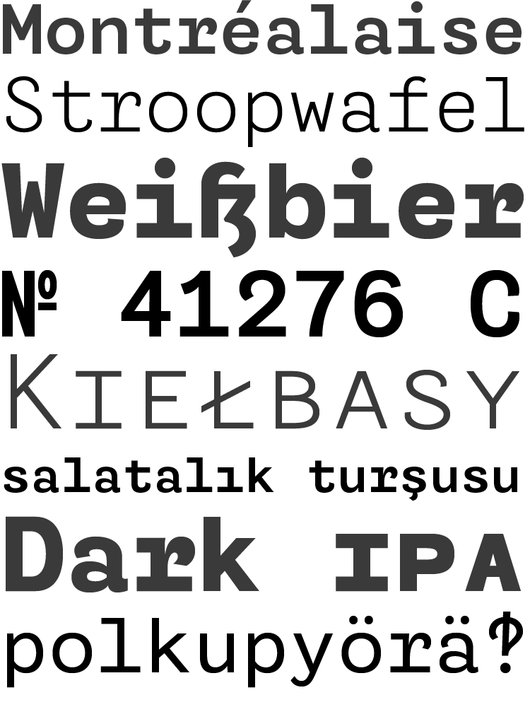
file name: Coppers Brasses Martha 2012e

file name: Etienne Aubert Bonn Freitt 2012
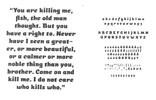
file name: Etienne Aubert Bonn Sardine 2012
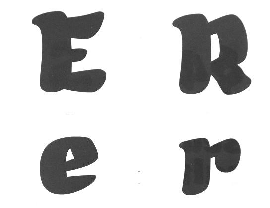
file name: Etienne Aubert Bonn Sardine 2012b
file name: Etienne Aubert Bonn Sardine 2012c

file name: Alexandre Saumier Demers Pic
file name: Etienne Aubert Bonn Alexandre Saumier Demers Pic 2015
| | |
|
Luc Devroye ⦿ School of Computer Science ⦿ McGill University Montreal, Canada H3A 2K6 ⦿ lucdevroye@gmail.com ⦿ https://luc.devroye.org ⦿ https://luc.devroye.org/fonts.html |

