TYPE DESIGN INFORMATION PAGE last updated on Sat Jul 20 14:31:32 EDT 2024
FONT RECOGNITION VIA FONT MOOSE

|
|
|
|
Henning von Vogelsang
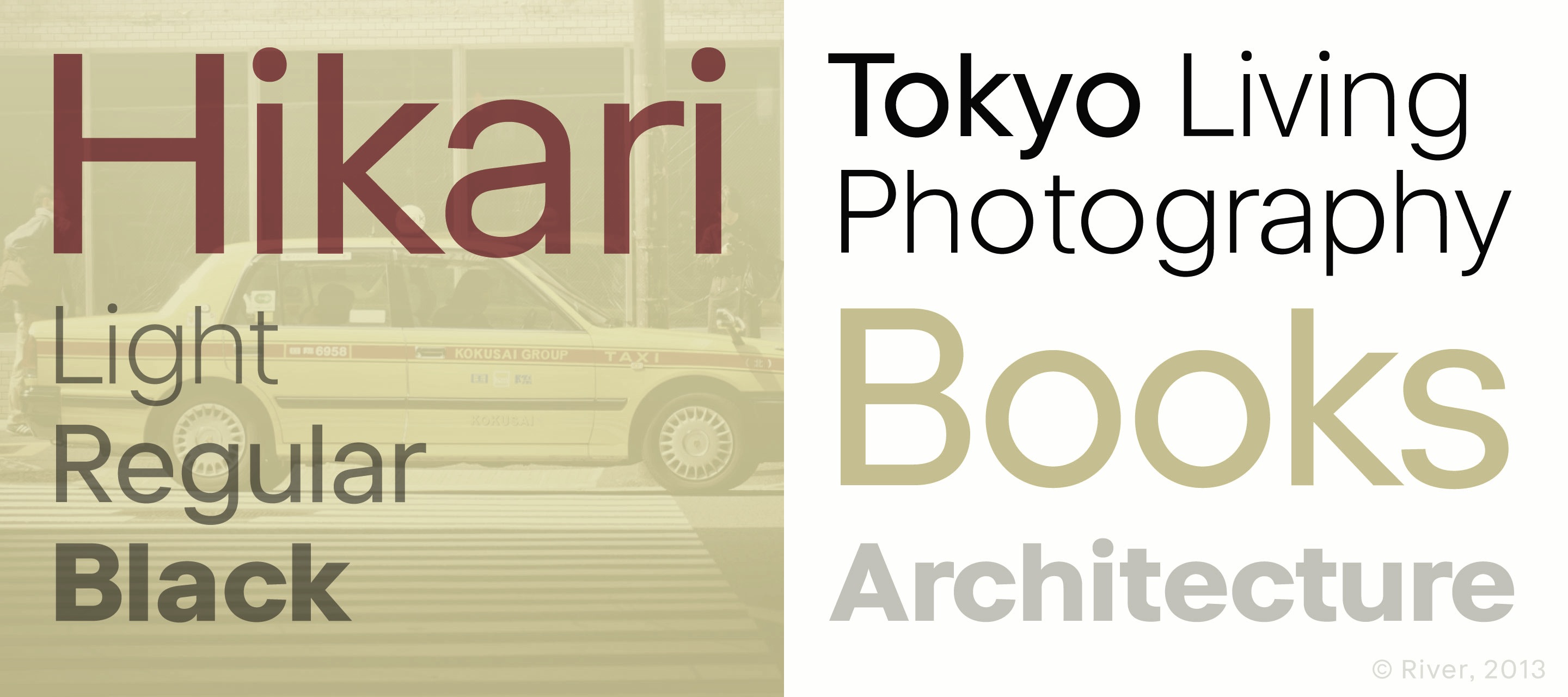
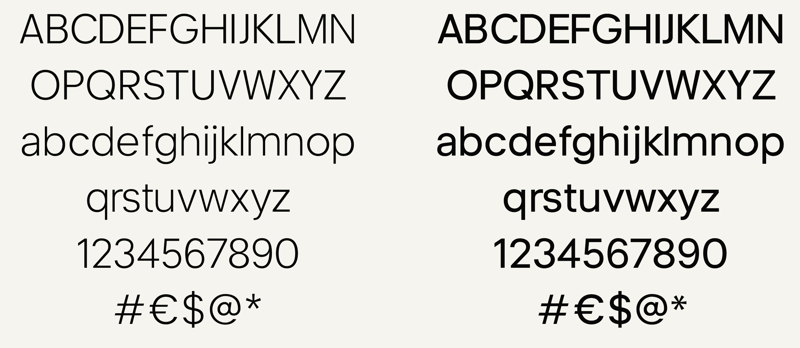
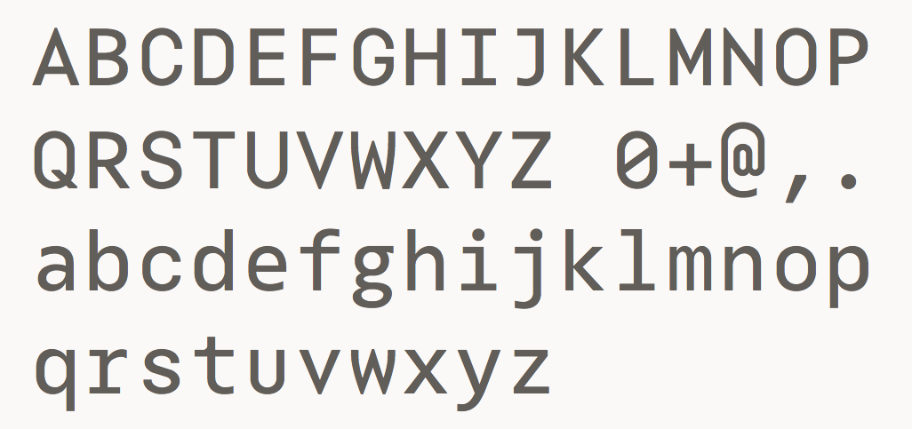
Designer who was based in Zurich and is now in London. In 2013, he started work on the sans family Hikari. He writes: Before the Haas Type Foundry released Helvetica in 1957, constructivist sans serif fonts were classified as Grotesk, a term that reflected the dismissive notion of typesetters in previous times. It was Art Deco and the Bauhaus movement, along with modernist architecture, fresh ideas and stricter shapes in interior design, a style influenced by industrial and technological developments, that made Grotesk fonts more popular over time. Ever since the introduction of Helvetica Neue, classicistic sans serif fonts have been domineered by this Swiss style. Over the last six decades, typesetters, designers and typographers remembered and used other constructivist sans serif styles, like Futura and Neuzeit. In the late 1980s, American classics like Trade Gothic and Franklin Gothic were used again in Advertising, so the American newspaper title style has been a second strong influence on sans serif fonts and Adrian Frutiger’s typeface for the Parisian airport, Frutiger, sparked a rennaissance of humanist sans serif fonts. It seems impossible to reimagine a constructivist or classicistic sans serif without taking one of these previous styles in account. However, its tone of voice can still be different. [..] We interpret new things with the language we learned from existing things. It's interesting to see how typefaces like Helvetica Neue gained popularity in Japan, a country and culture that in the last century stood for discipline, strictness, but also beauty and simplicity in design and architecture. But it was used for English words, an inspill of Western influenced cultural elements, or the Japanese interpretation of those elements. Hikari is a font with a Japanese touch. It is primarily a Latin font with no relations to Hiragana, Kanji or Katagana. And yet, the sense for proportions, a strict architecture and its overall feeling transmits a faint memory of Japanese post war culture assimilating and accumulating Western typography. In 2014, he created the monospaced programming font Bot Mono. |
EXTERNAL LINKS |
| | |
file name: Henningvon Vogelsang Hikari 2013

file name: Henningvon Vogelsang Hikari 2013b
file name: Henningvon Vogelsang Hikari 2013c
file name: Henningvon Vogelsang Hikari 2013d
file name: Henningvon Vogelsang Bot Mono 2014

file name: Henningvon Vogelsang Bot Mono 2014b

file name: Henningvon Vogelsang Bot Mono 2014c
file name: Henningvon Vogelsang Bot Mono 2014d
file name: Henningvon Vogelsang Bot Mono 2014e
| | |
|
Luc Devroye ⦿ School of Computer Science ⦿ McGill University Montreal, Canada H3A 2K6 ⦿ lucdevroye@gmail.com ⦿ http://luc.devroye.org ⦿ http://luc.devroye.org/fonts.html |