TYPE DESIGN INFORMATION PAGE last updated on Sun Jan 25 03:12:10 EST 2026
FONT RECOGNITION VIA FONT MOOSE

|
|
|
|
Matthew Anderson
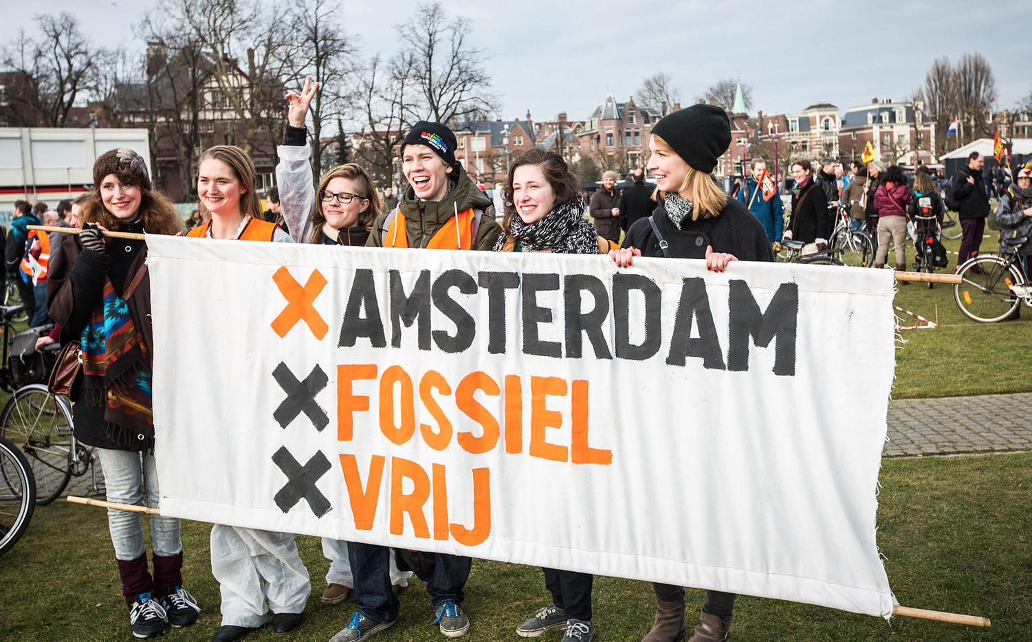
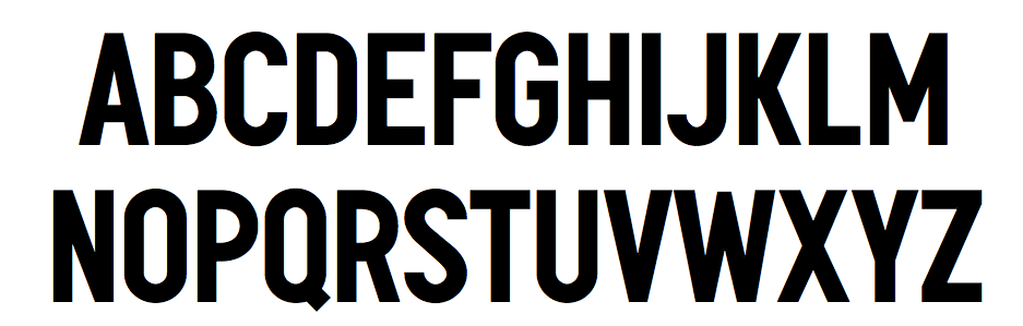
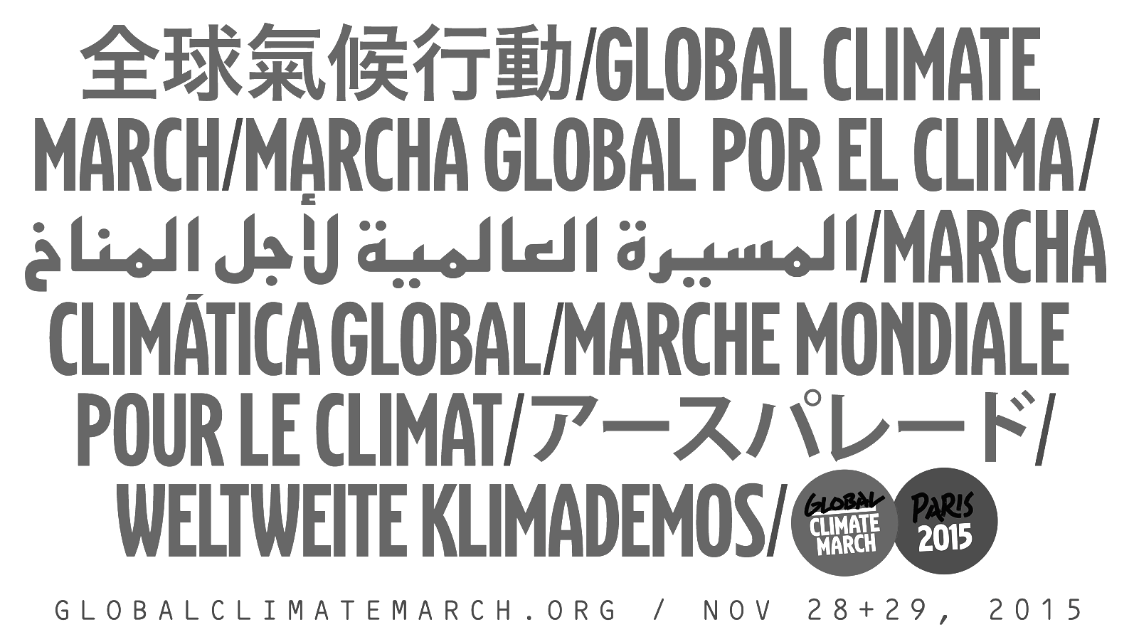
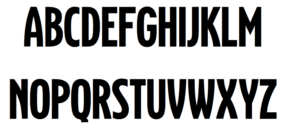
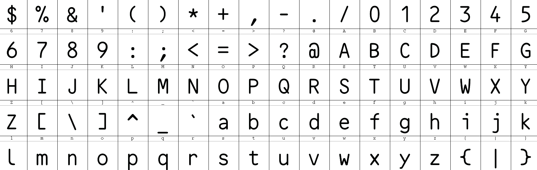
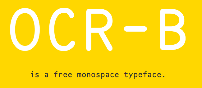
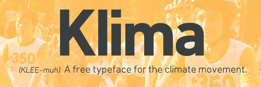
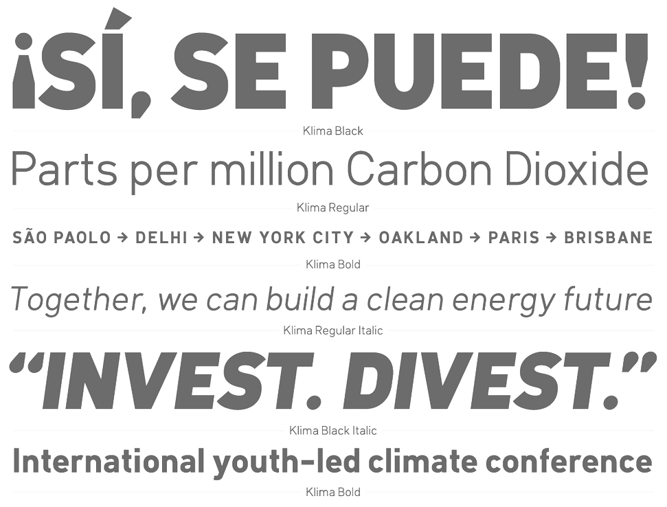
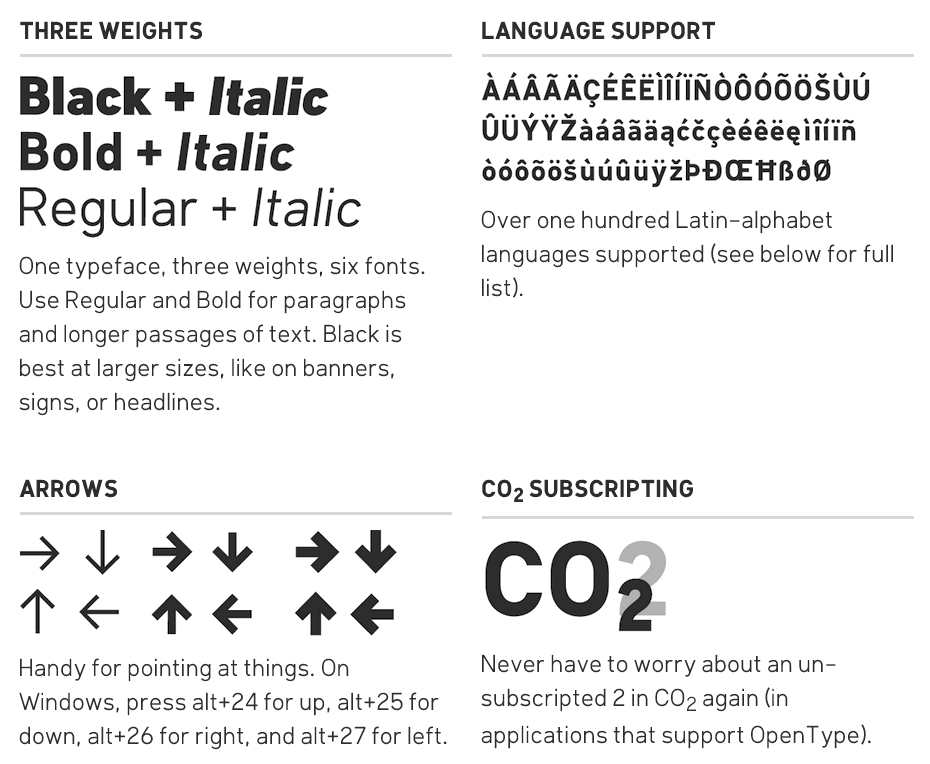
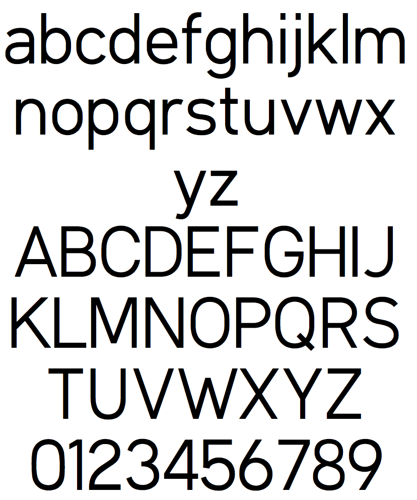
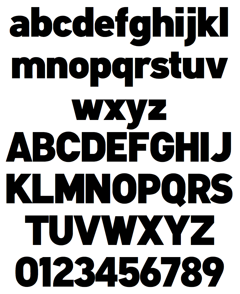
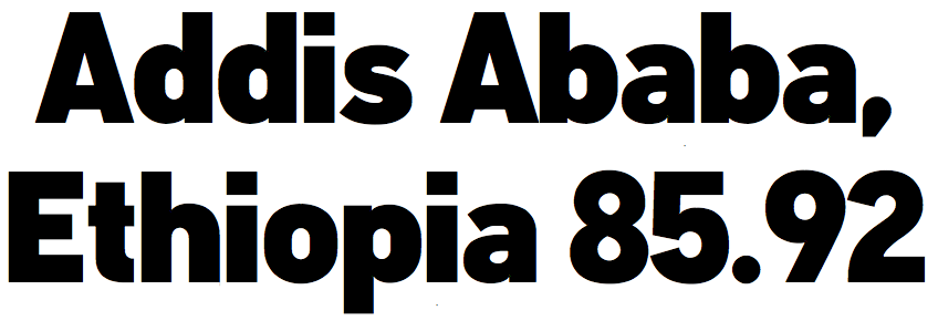
Or Matthew Hinders-Anderson. Climate activist and lead designer for 350.org. His abridged CV in his own words: Born in Columbus, Ohio. Played with Legos. Loved to draw. Played drums in a high school band. Started messing around in Photoshop. Became a vegetarian. Studied green architecture at Western College (Oxford, OH). Discovered that making posters and websites was more fun than building models. Moved to Washington DC to intern at Free Range. Moved to San Francisco to work for 350. Made some good friends. Ate too many burritos. Moved to Brooklyn for the hell of it. In 2014, Matthew created the free sans typeface family Klima for the climate movement: Klima is my version of a more relaxed DIN: slightly wider, with a similar geometric foundation but more plainspoken. In three weights with obliques, free for non-commercial, non-climate denial use. It is exquisite and quite good, except perhaps that the italics are just obliques (slanted romans). In 2015, he made OCR-B, extending Adrian Frutiger's 1968 design towards more languages (by adding accents of all sorts) and making the weight lighter. The all caps sans typeface Graph was used in websites, signs and posters for the 2014 People's Climate March in New York City. It is designed to be a display-oriented companion to Klima. It was inspired by typefaces like DIN 1451 Engschrift, Tungsten and Trade Gothic Bold Condensed. In 2015, Graph was supplemented with Graph Paris in view of the major U.N. climate conference in Paris. It is characterized by the curvy elliptical A, V and W. |
EXTERNAL LINKS |
| | |

file name: Matthew Anderson Graph 2014
file name: Matthew Anderson Graph 2014a
file name: Matthew Anderson Graph 2014b

file name: Matthew Anderson Graph 2014c

file name: Matthew Anderson Graph 2014d
file name: Matthew Anderson Graph Paris 2015
file name: Matthew Anderson Graph Paris 2015b

file name: Matthew Anderson Graph Paris 2015c
file name: Matthew Anderson O C B 2015
file name: Matthew Anderson O C B 2015b

file name: Matthew Anderson Klima 2014
file name: Matthew Anderson Klima 2014b
file name: Matthew Anderson Klima 2014c
file name: Matthew Anderson Klima 2014d
file name: Matthew Anderson Klima 2014f
file name: Matthew Anderson Klima 2014g
file name: Matthew Anderson Klima 2014h

file name: Matthew Hinders Anderson Pic
| | |
|
Luc Devroye ⦿ School of Computer Science ⦿ McGill University Montreal, Canada H3A 2K6 ⦿ lucdevroye@gmail.com ⦿ https://luc.devroye.org ⦿ https://luc.devroye.org/fonts.html |