TYPE DESIGN INFORMATION PAGE last updated on Sat Jun 22 22:26:00 EDT 2024
FONT RECOGNITION VIA FONT MOOSE

|
|
|
|
Matteson Typographics
[Steve Matteson]
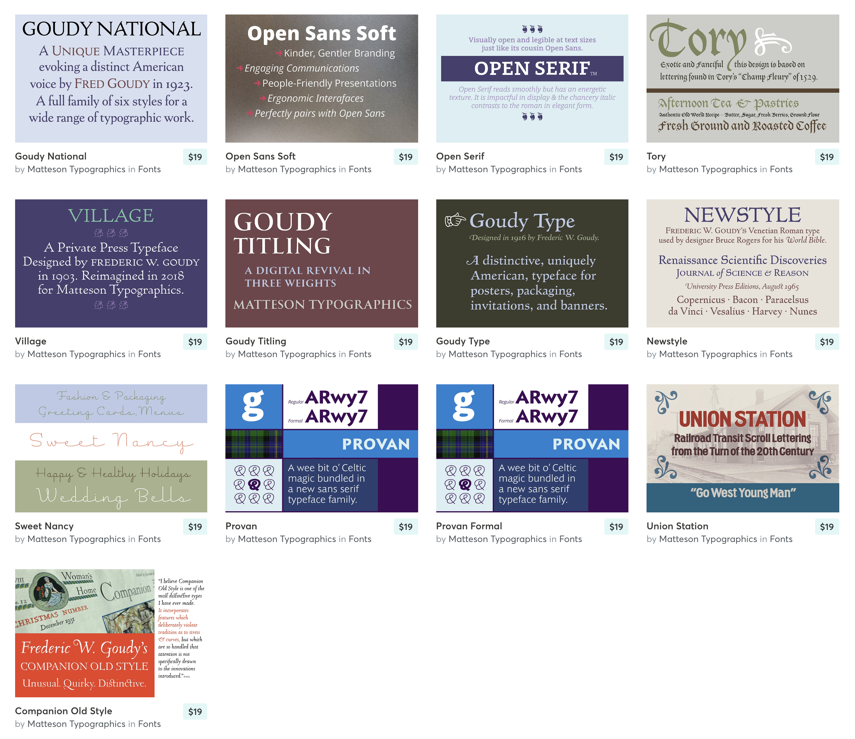
Foundry, est. 2016 by Steve Matteson, the designer of Open Sans, Monotype's Futura Now and branding typefaces for clients such as Toyota, Microsoft and Unilever. His typefaces range from revivals of early letterpress fonts by Fred Goudy to contemporary branding designs. A partial list:
Interview by Laura Busche in 2022. One answer stands out in Laura's piece, when she asked What makes a good typeface, in your opinion? Steve's reply: I see a lot of student work where they will try to make every letter unique. While there is a place for that, the trick in a typeface is to build harmony throughout. If you introduce something that is really disruptive, or not part of the DNA, it looks foreign. People might also stumble on reading it. There is a tendency to say "I want to do a lot of swash caps and flourishes," but you have to think again about what Chuck Bigelow said: is it solving a problem, to have all of these extra features? It may be satisfying to the designer, and there is nothing wrong with that, but when you think of the end-user and how they might put these letters together, it may be very complex. When shopping for type, don’t let tons and tons of alternates necessarily sway you. That might be a lot of frosting with no cake. I think that typography should be such that it sustains the rhythm and contains enough flourish to retain the interest of the reader. There is a fine balance there. |
EXTERNAL LINKS |
| | |


file name: Steve Matteson Companion Old Style 2021 after Frederic Goudy 1927

file name: Steve Matteson Companion Old Style 2021 after Frederic Goudy 1927
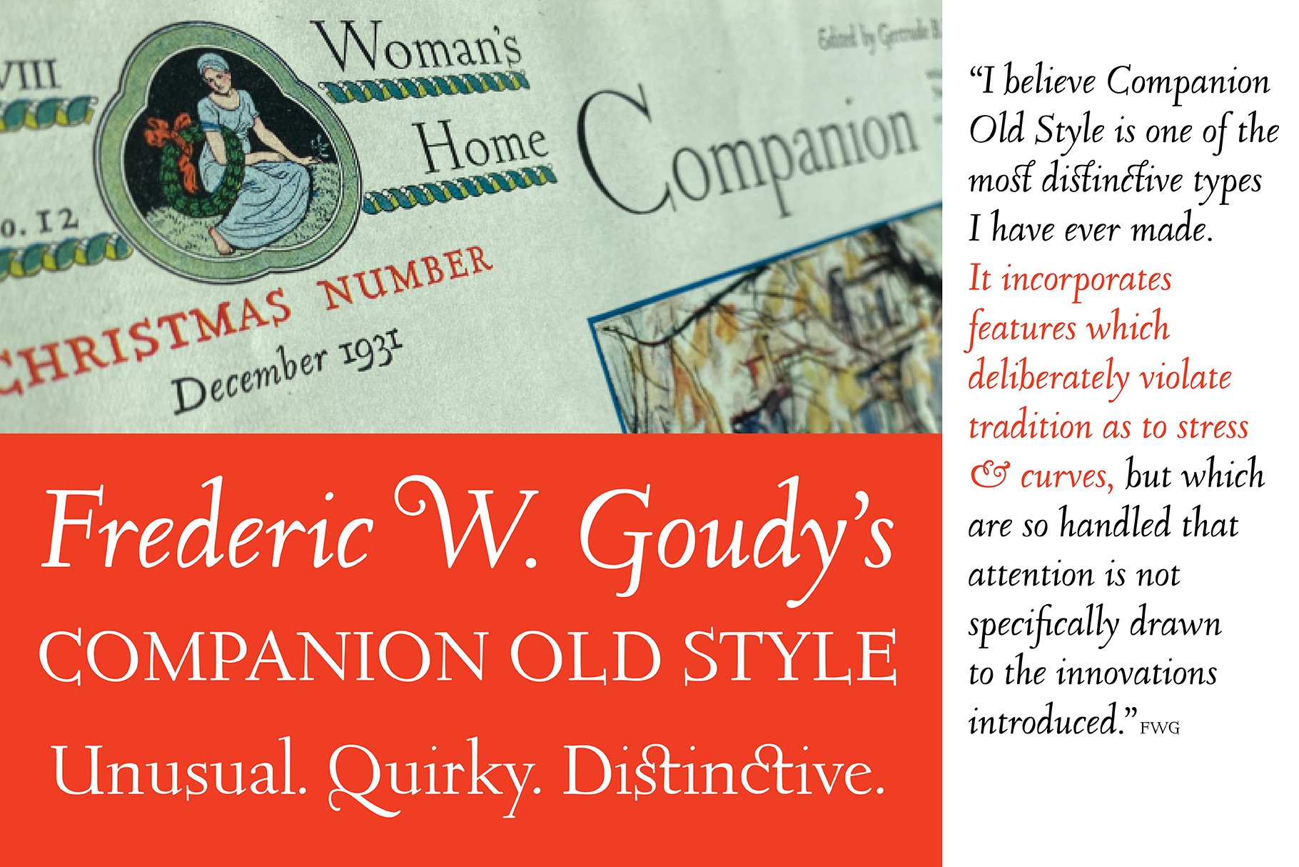
file name: Steve Matteson Companion Old Style 2021 after Frederic Goudy 1927
file name: Steve Matteson Companion Old Style 2021 after Frederic Goudy 1927
file name: Matteson Typographics Catalog 2022
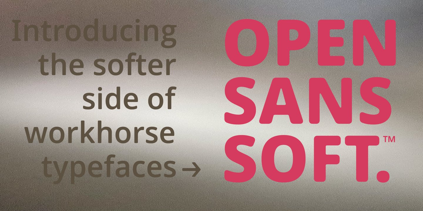
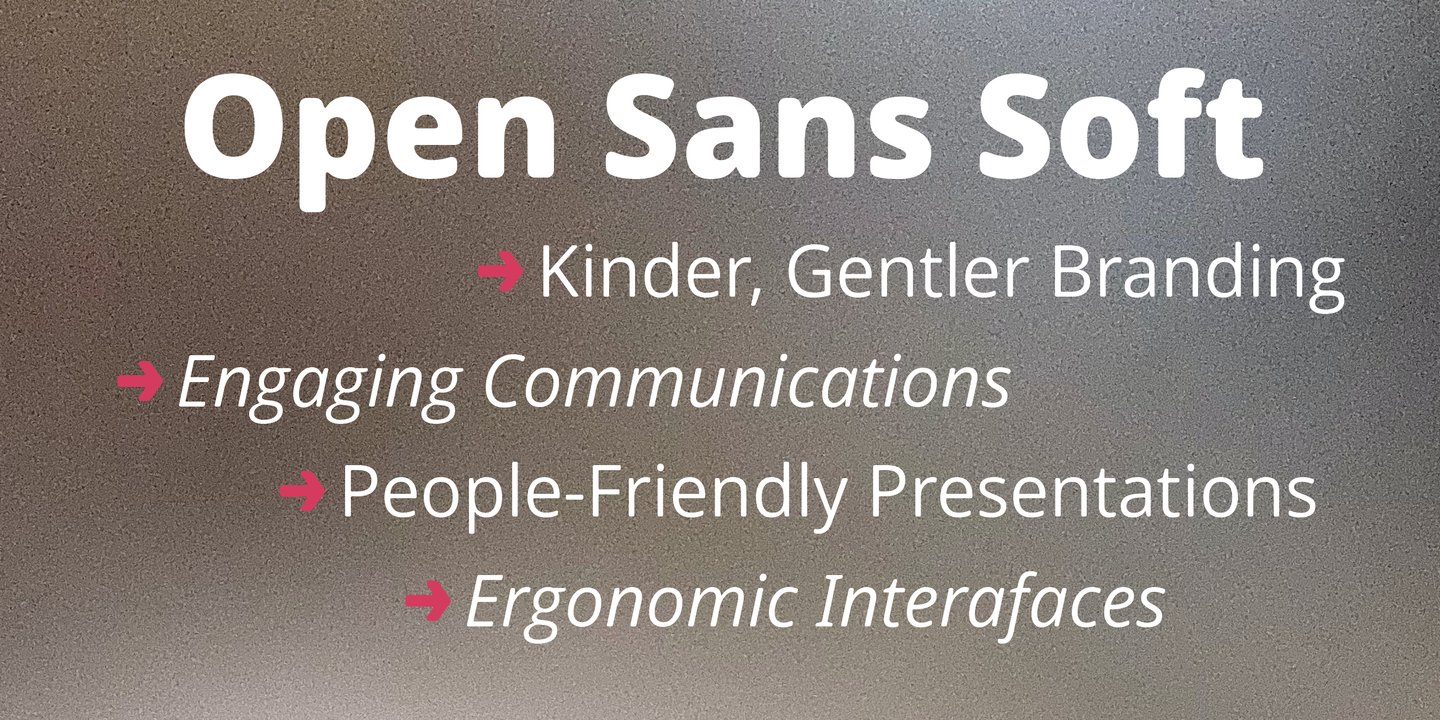
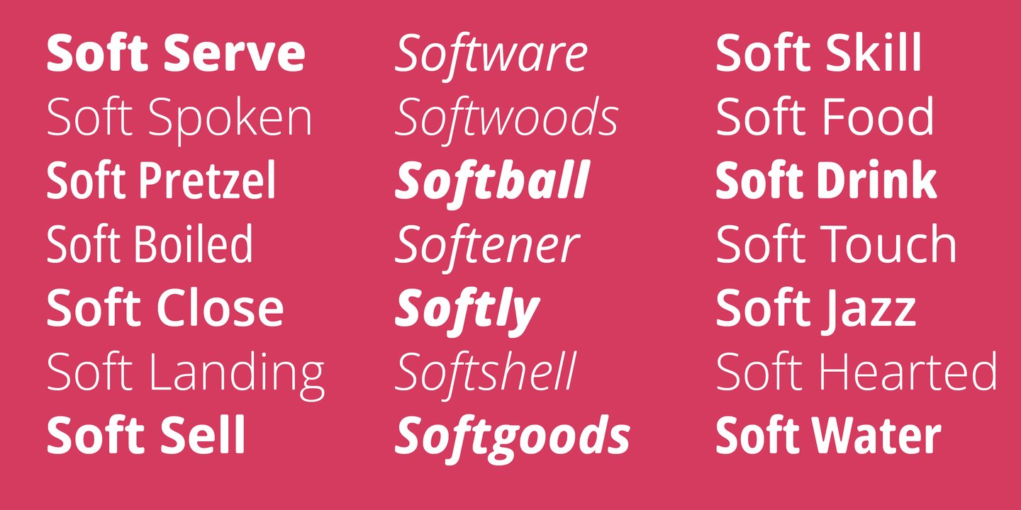
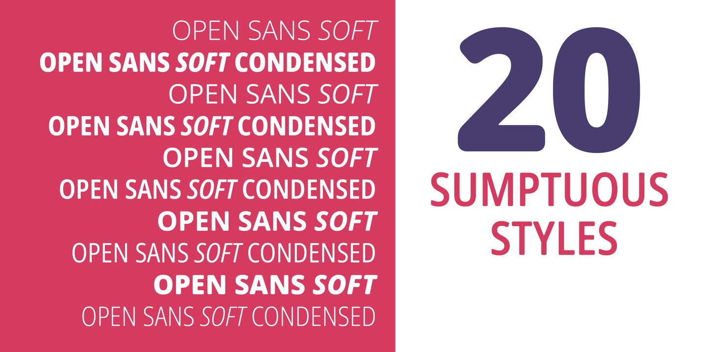
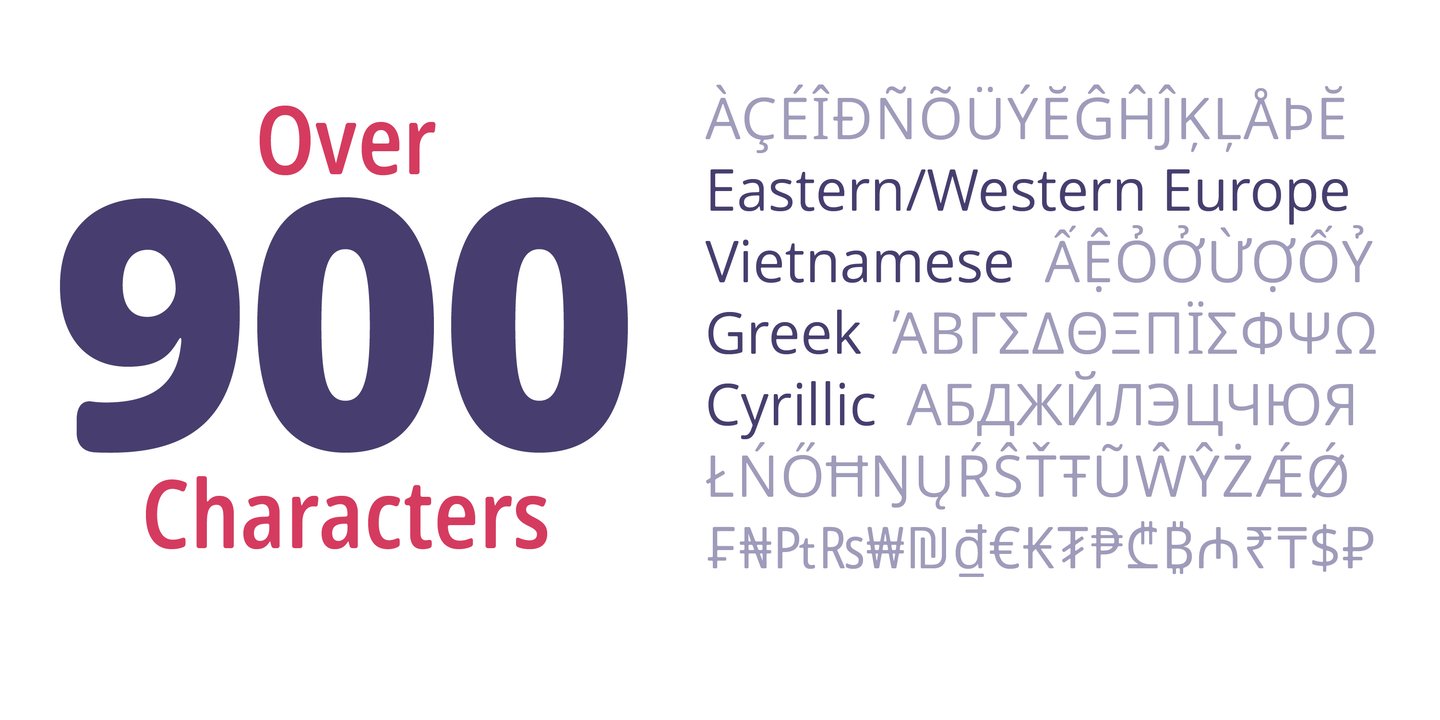
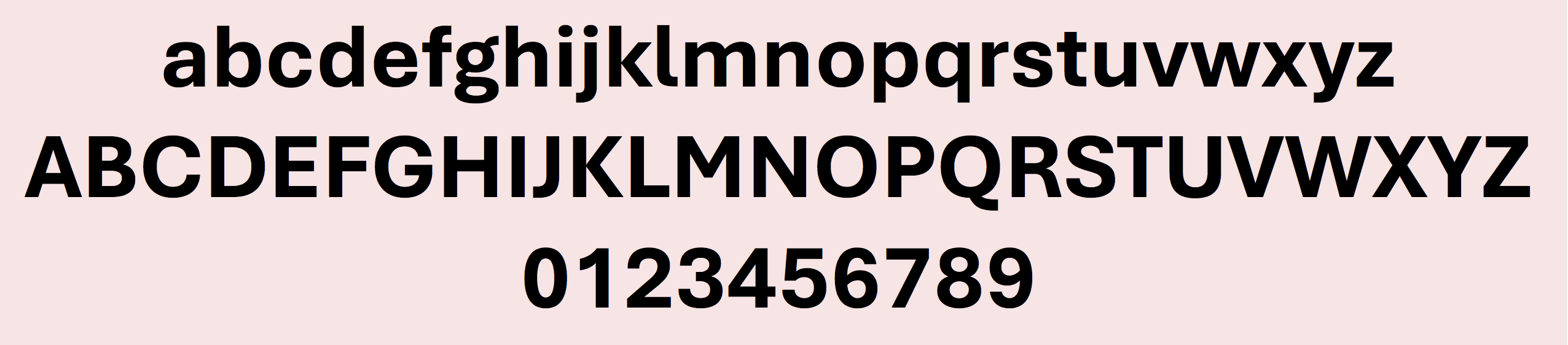
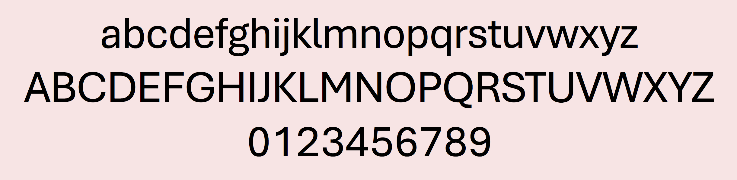
file name: Steve Matteson Open Sans Soft 2021
file name: Steve Matteson Open Sans Soft 2021
file name: Steve Matteson Open Sans Soft 2021
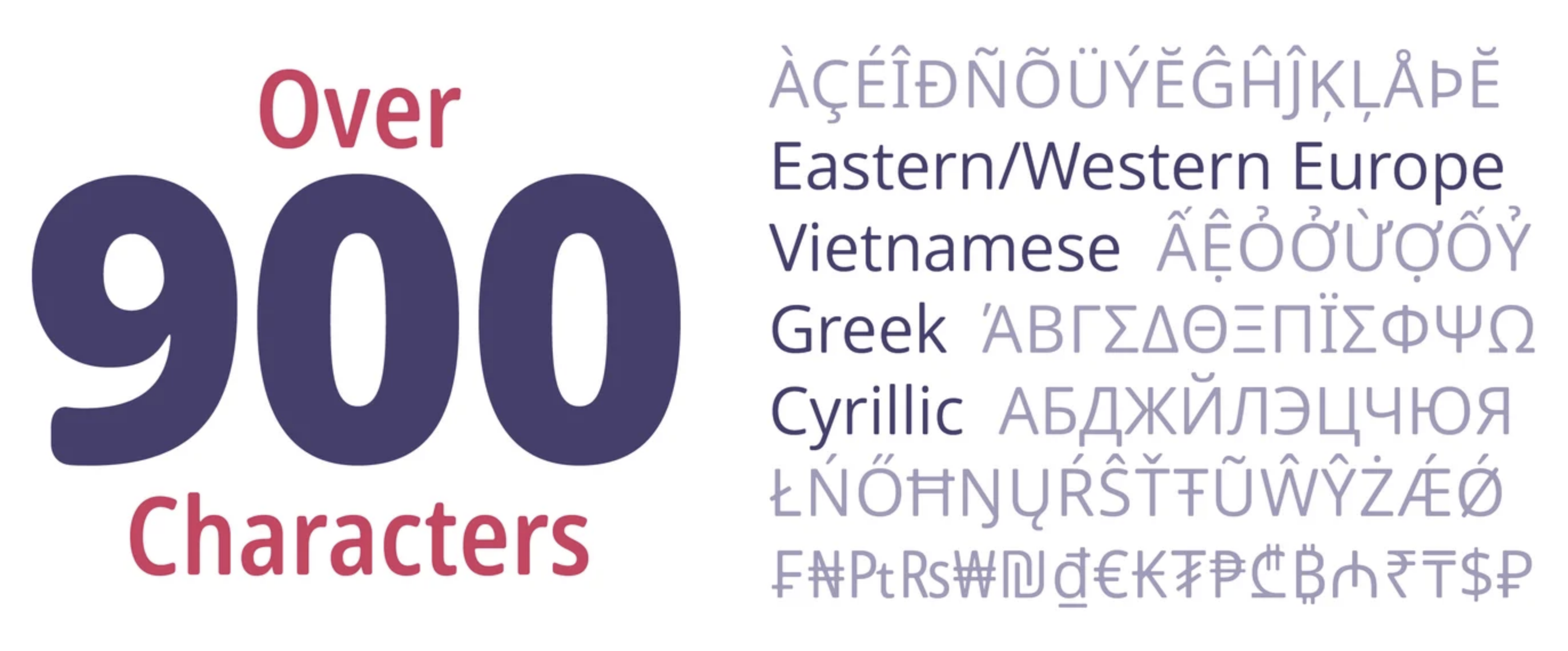
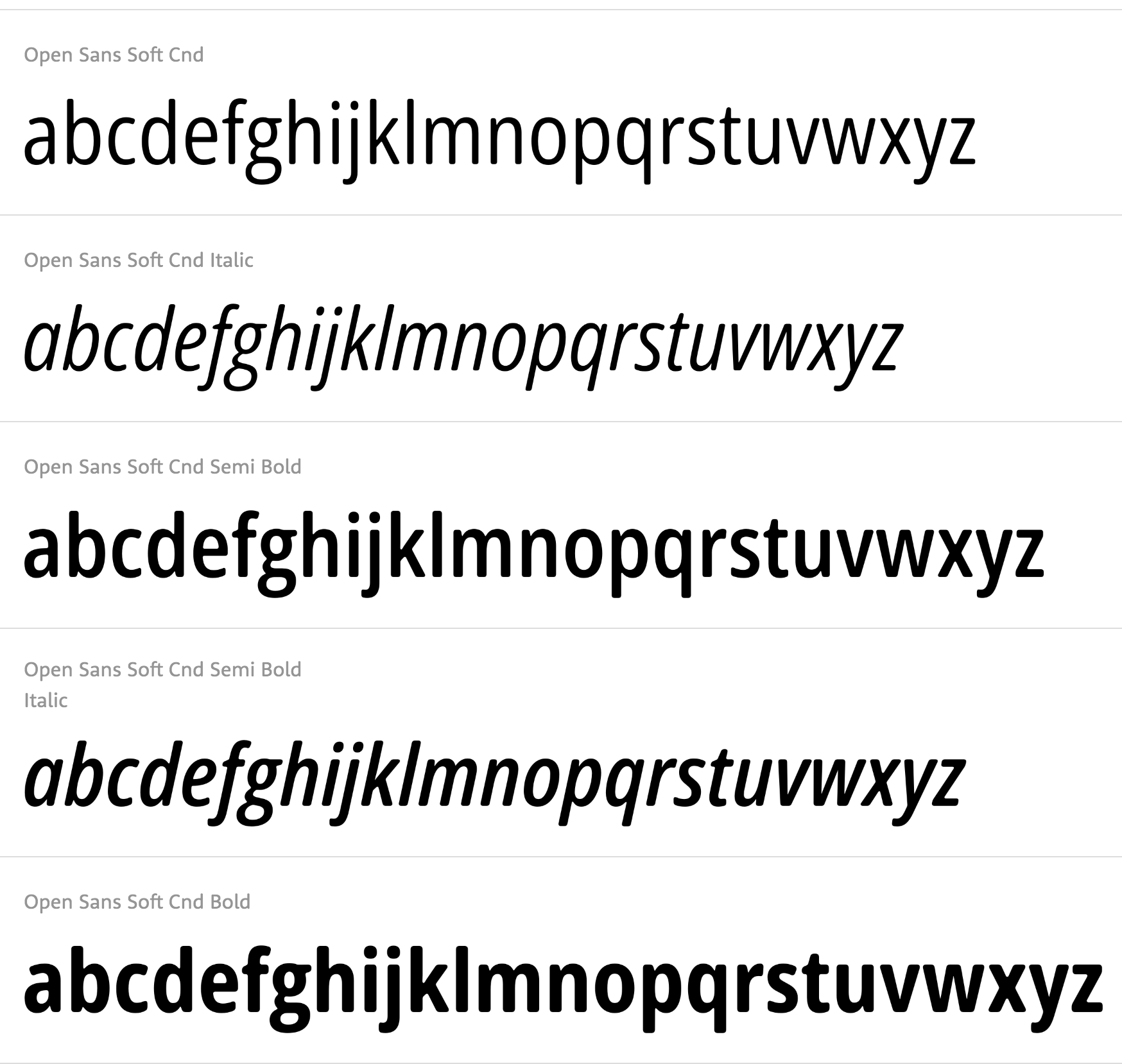
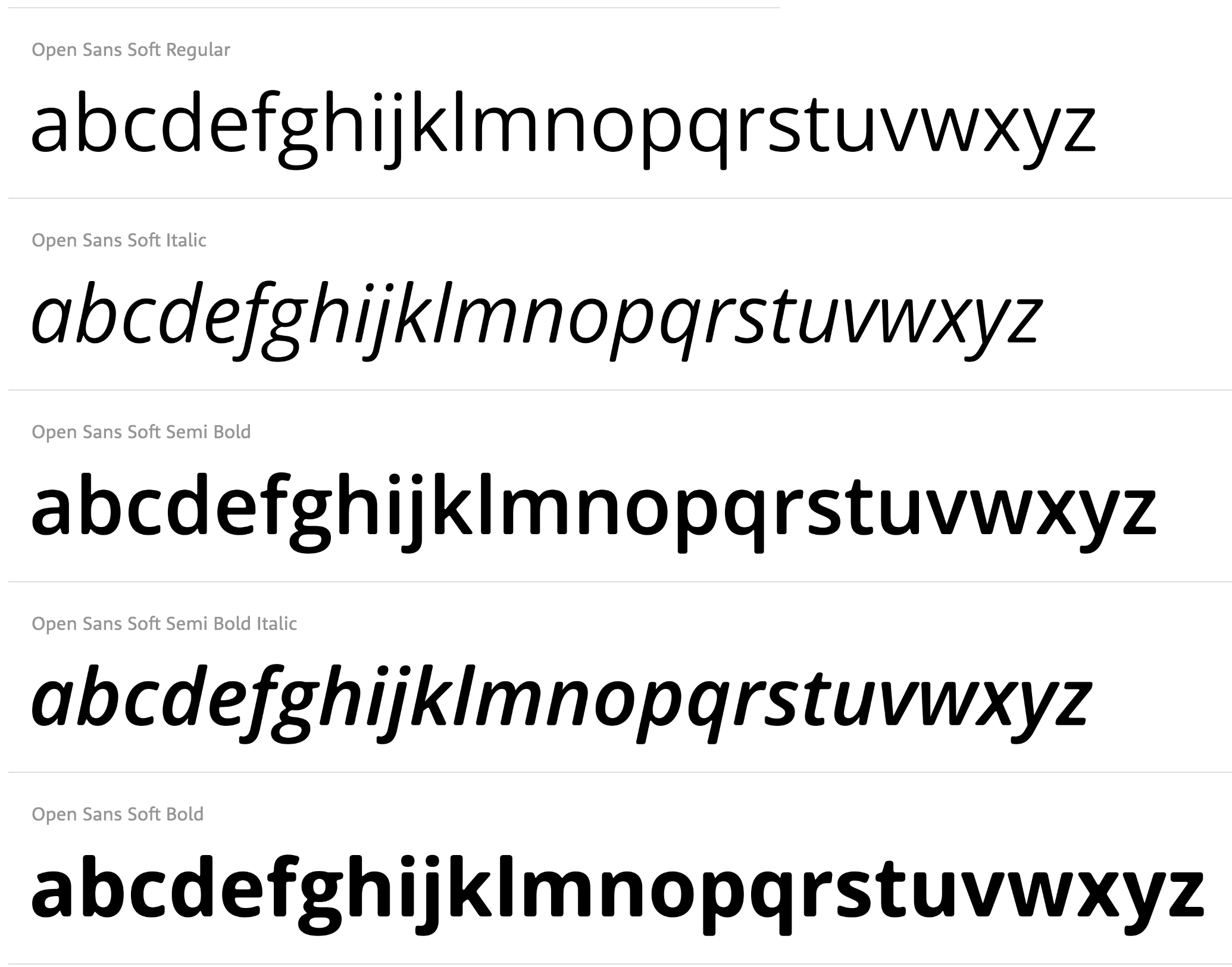
file name: Matteson Typographics Open Sans Soft 2021 1
file name: Matteson Typographics Open Sans Soft 2021 2
file name: Matteson Typographics Open Sans Soft 2021 3
file name: Matteson Typographics Open Sans Soft 2021 4
file name: Matteson Typographics Open Sans Soft 2021 5

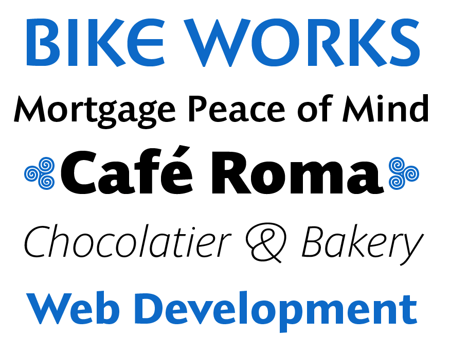
file name: Matteson Typographics Open Sans Soft 2021
file name: Matteson Typographics Provan 2020 2
file name: Matteson Typographics Provan 2020 3
file name: Matteson Typographics Provan 2020 4
file name: Matteson Typographics Provan 2020 5

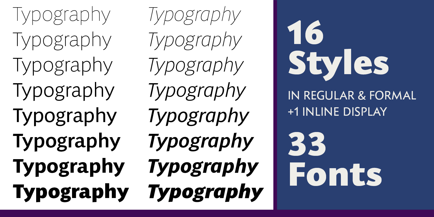
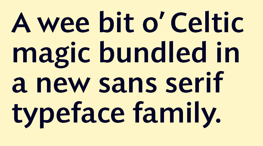
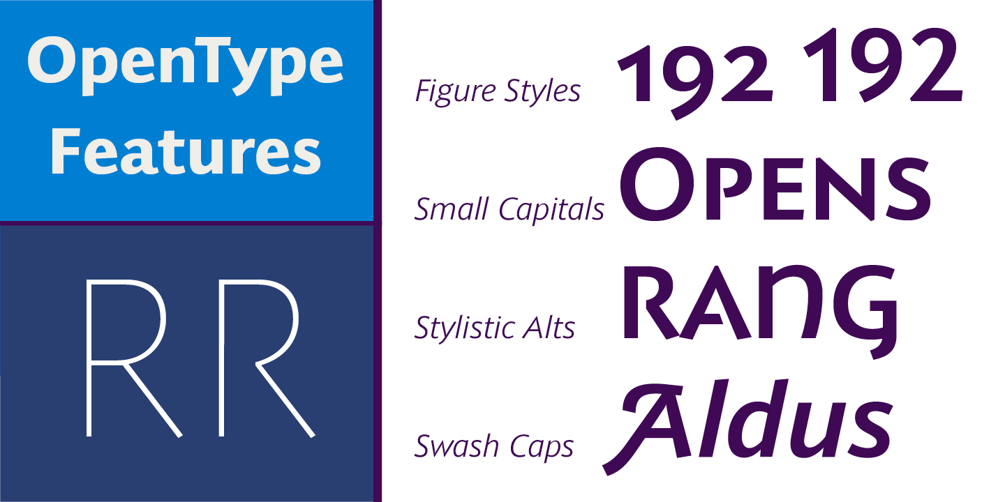
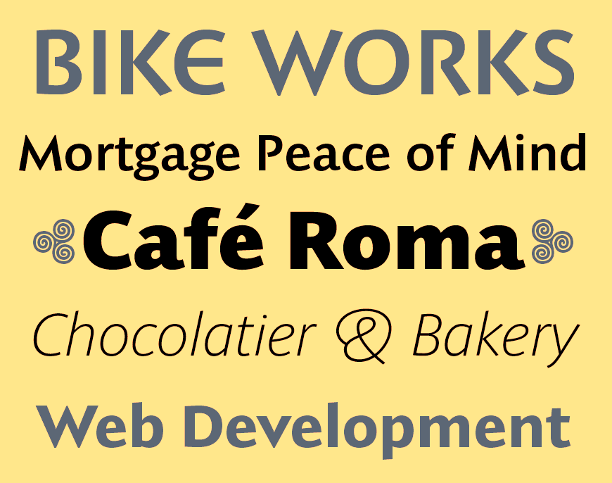
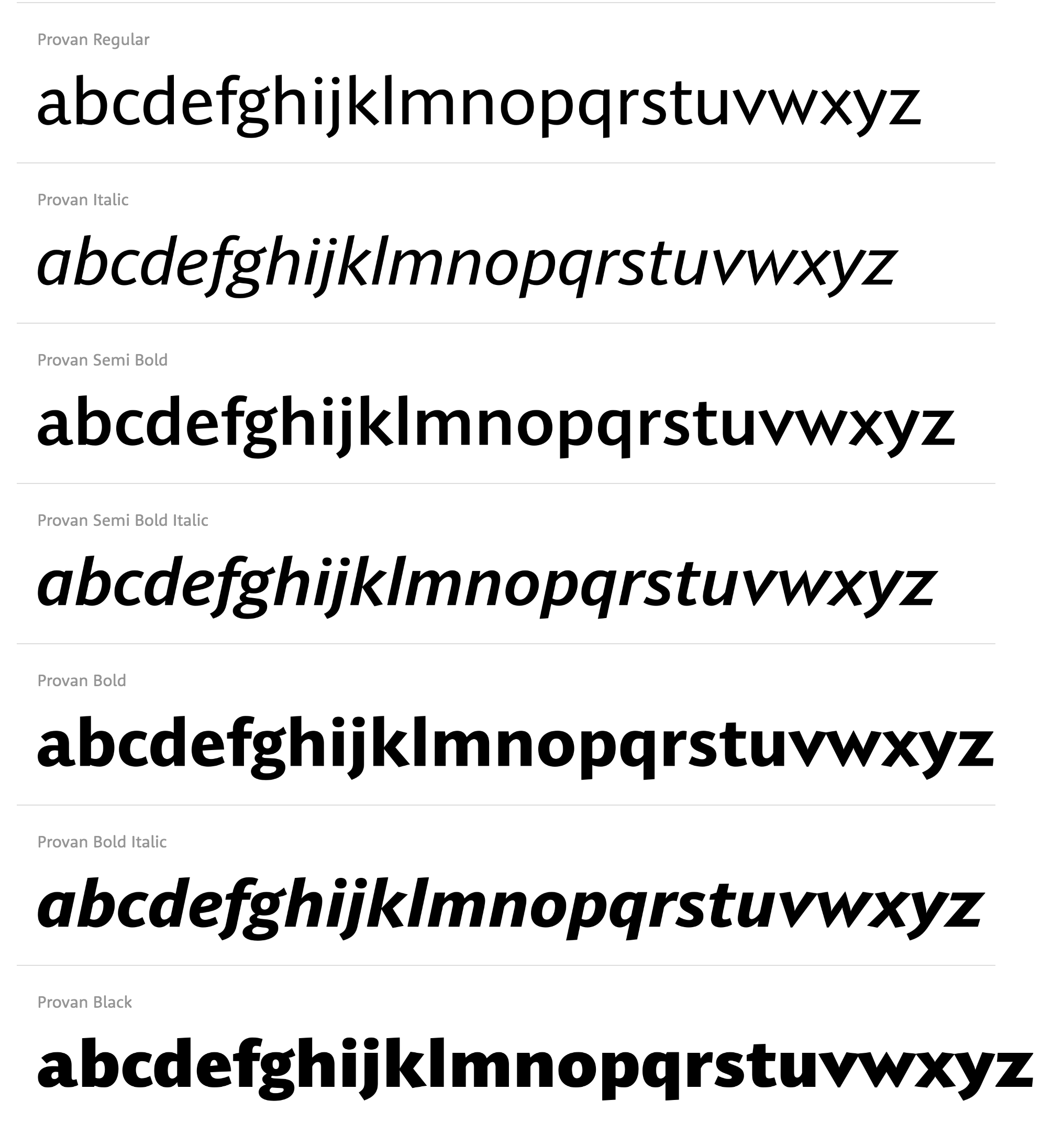
file name: Matteson Typographics Provan 2020
file name: Matteson Typographics Provan Formal 2020 3

file name: Matteson Typographics Provan Formal 2020
file name: Steve Matteson Provan 2020

file name: Steve Matteson Bierstadt 2021
file name: Steve Matteson Bierstadt 2021
file name: Steve Matteson Bierstadt 2021
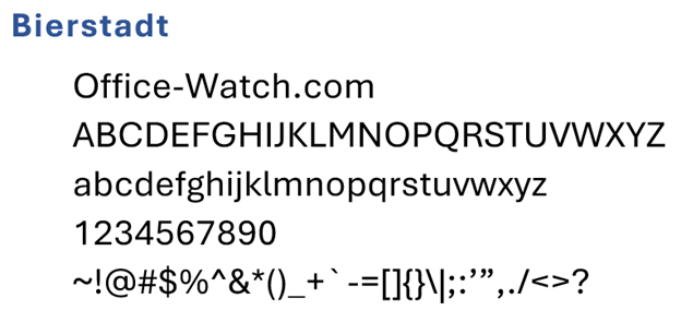
file name: Microsoft Corporation Bierstadt Bold 2020
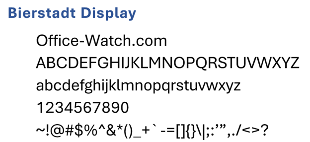
file name: Microsoft Corporation Bierstadt Display 2020
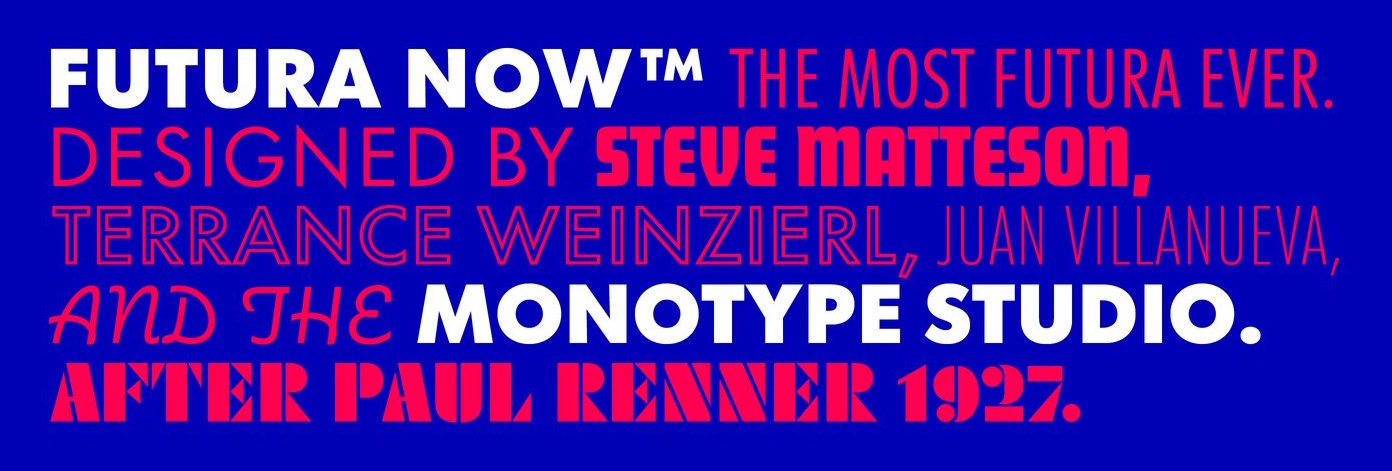
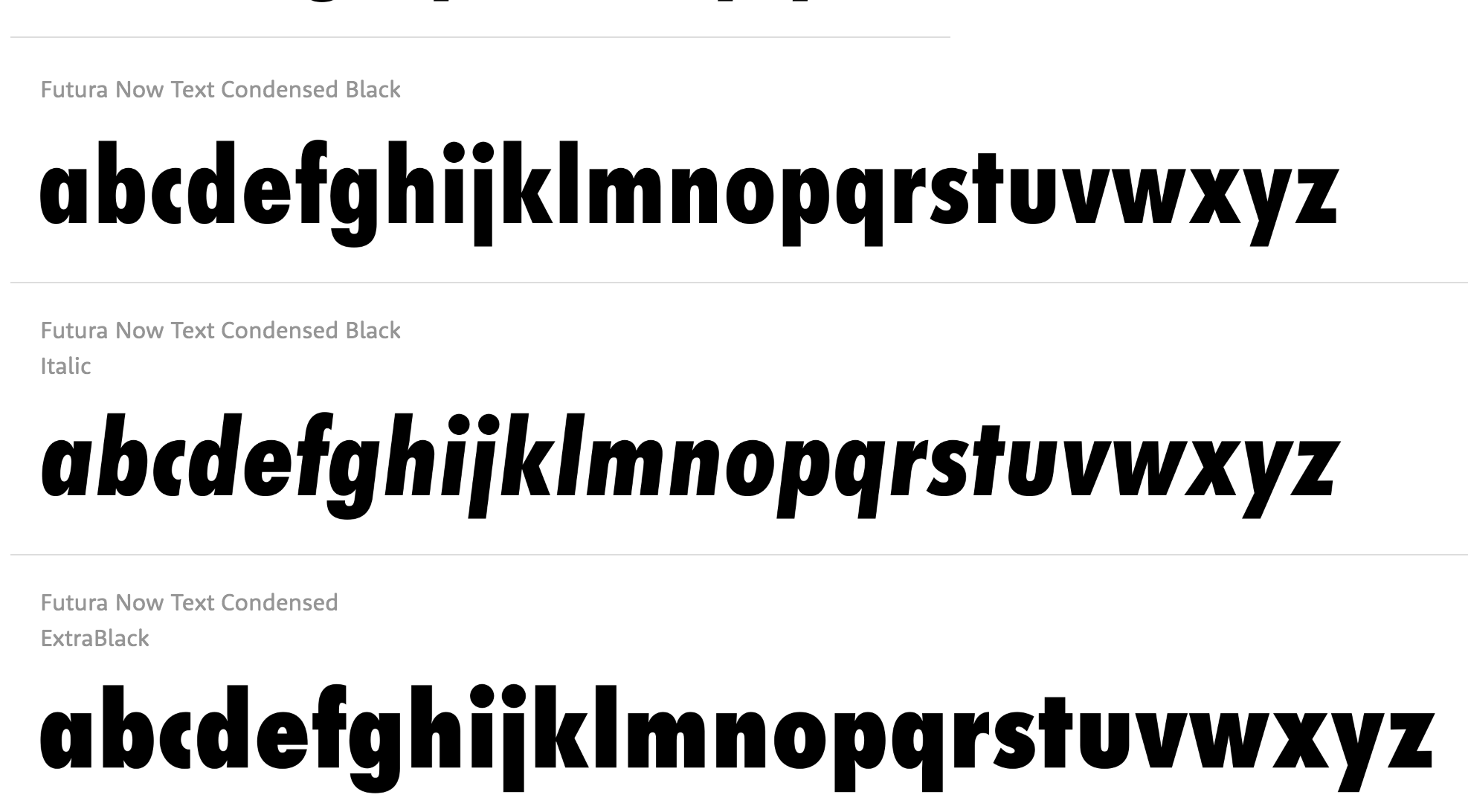
file name: Monotype Futura Now 2020 1
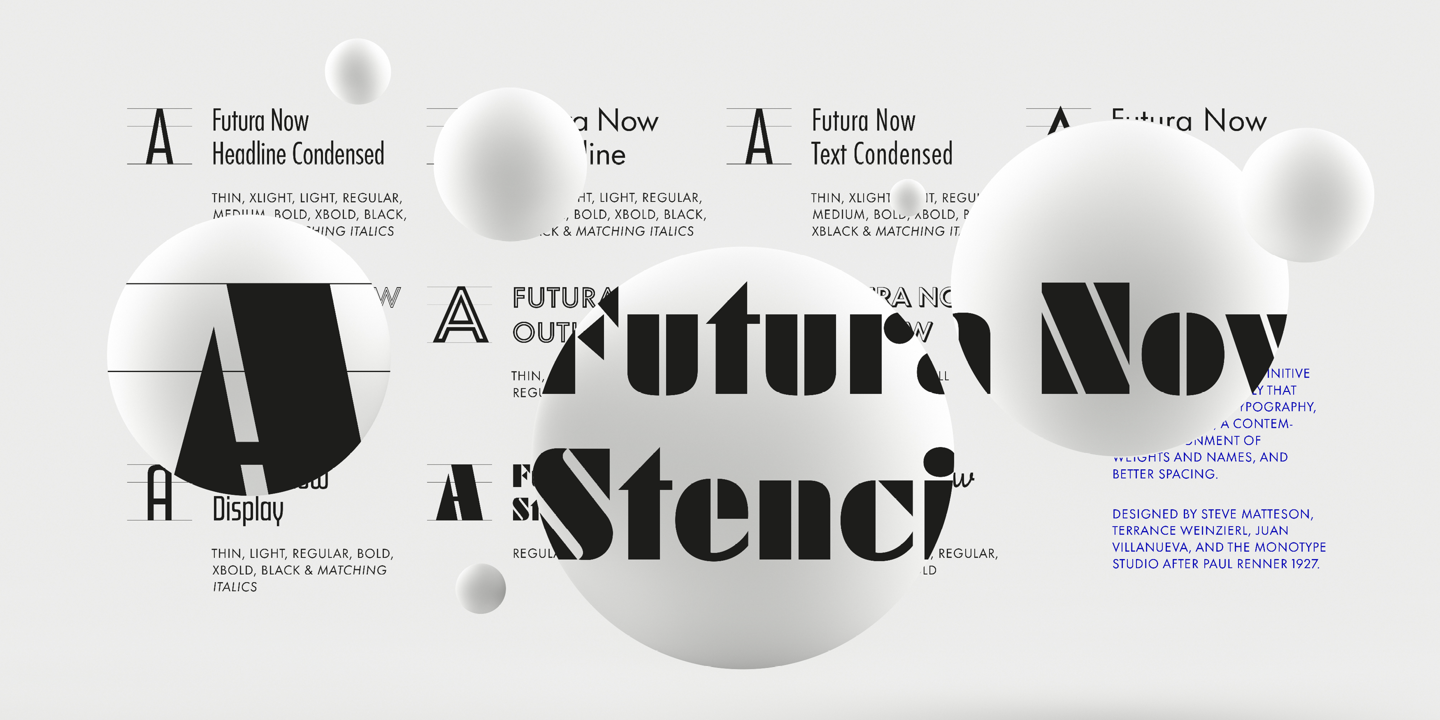
file name: Monotype Futura Now 2020 2
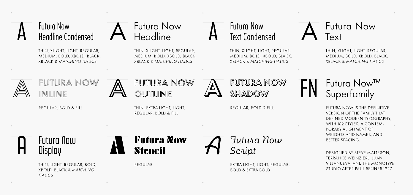
file name: Monotype Futura Now 2020 3
file name: Monotype Futura Now 2020 4

file name: Monotype Futura Now 2020
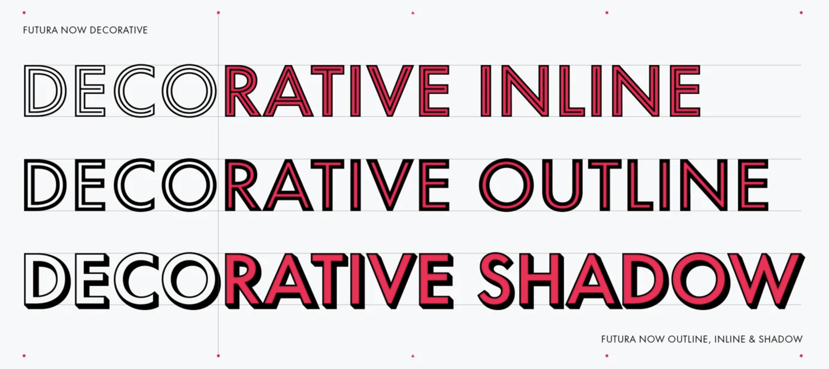
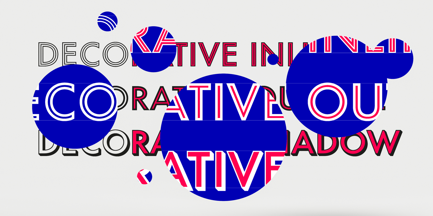
file name: Monotype Futura Now Decorative 2020
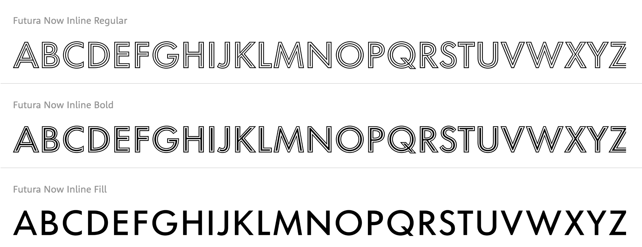
file name: Monotype Futura Now Inline 2020
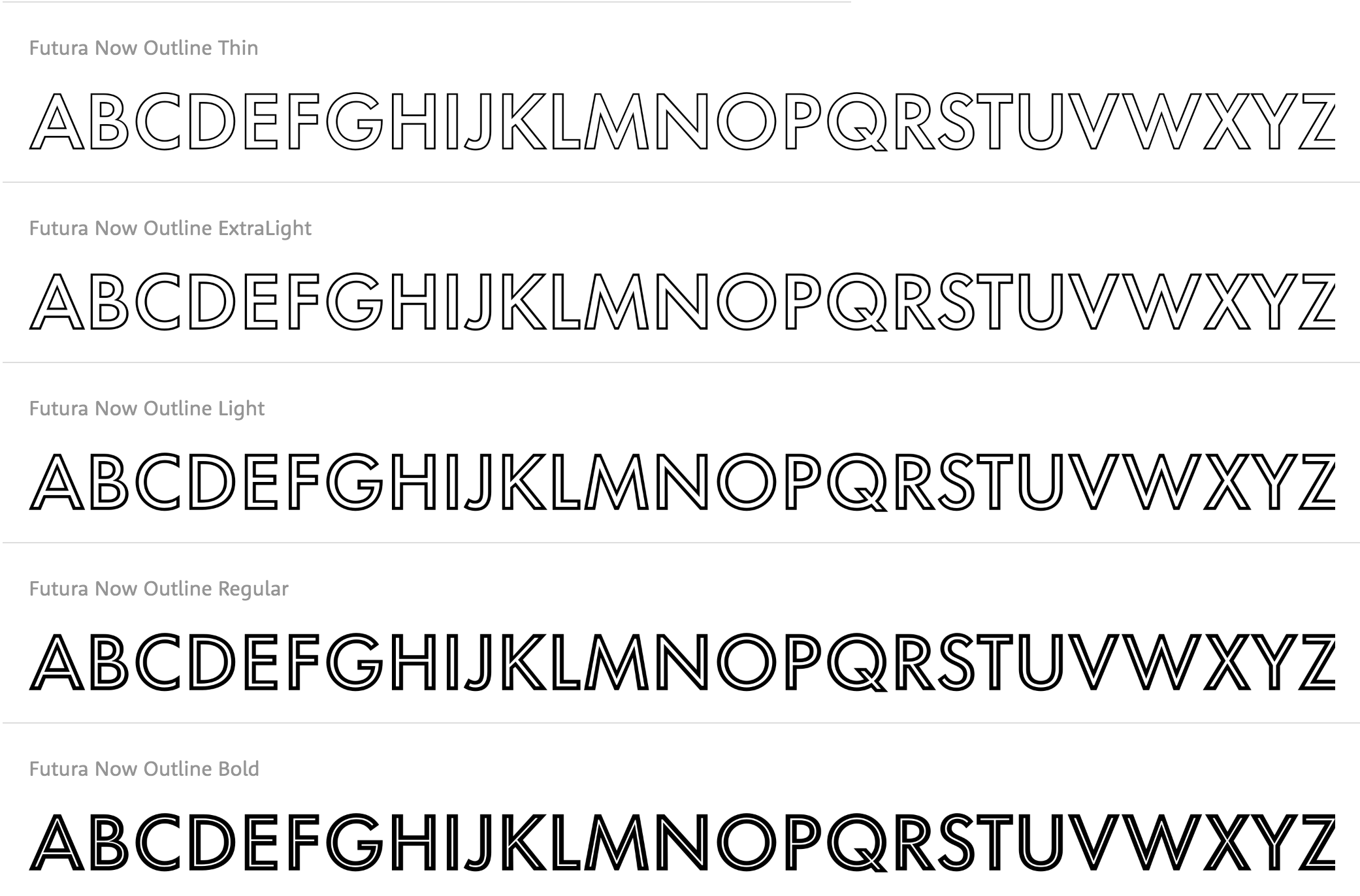
file name: Monotype Futura Now Outline 2020

file name: Monotype Futura Now Script 2020
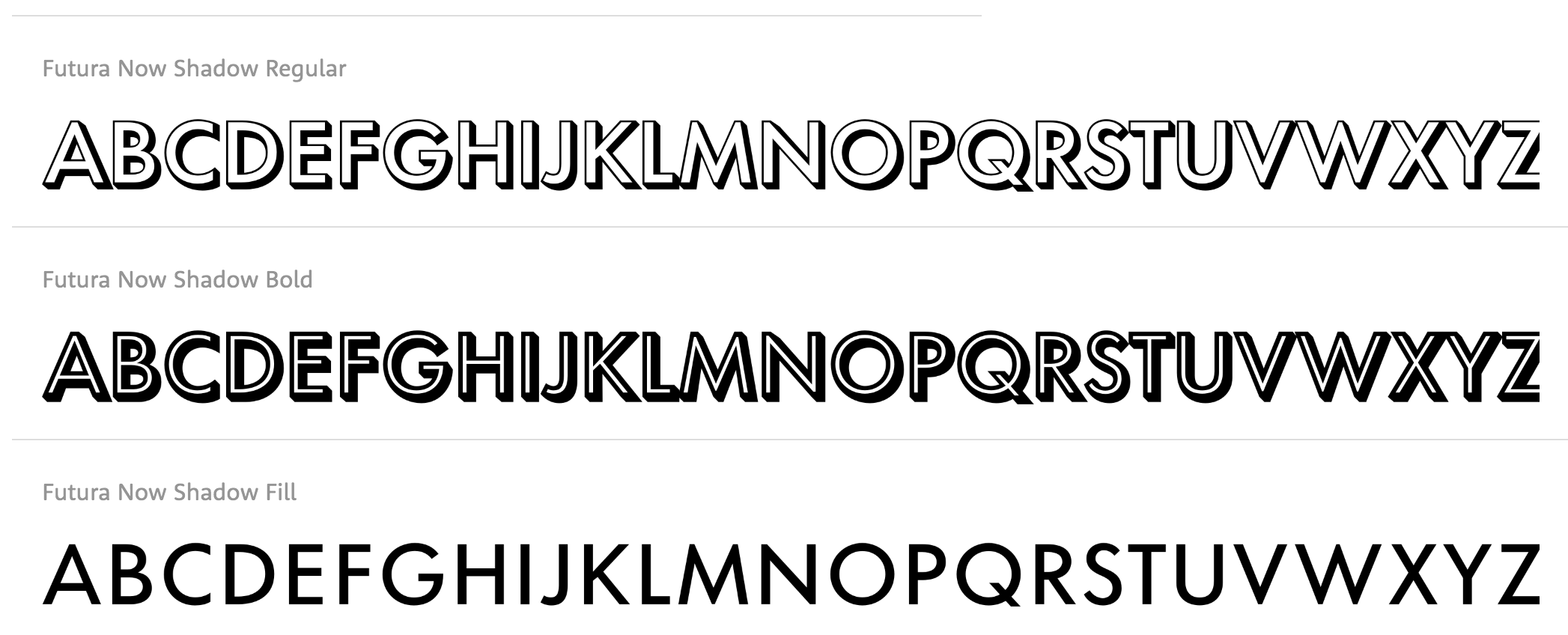
file name: Monotype Futura Now Shadow 2020
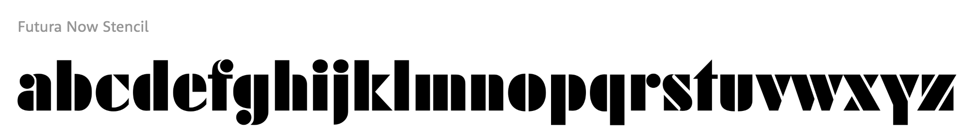
file name: Monotype Futura Now Stencil 2020
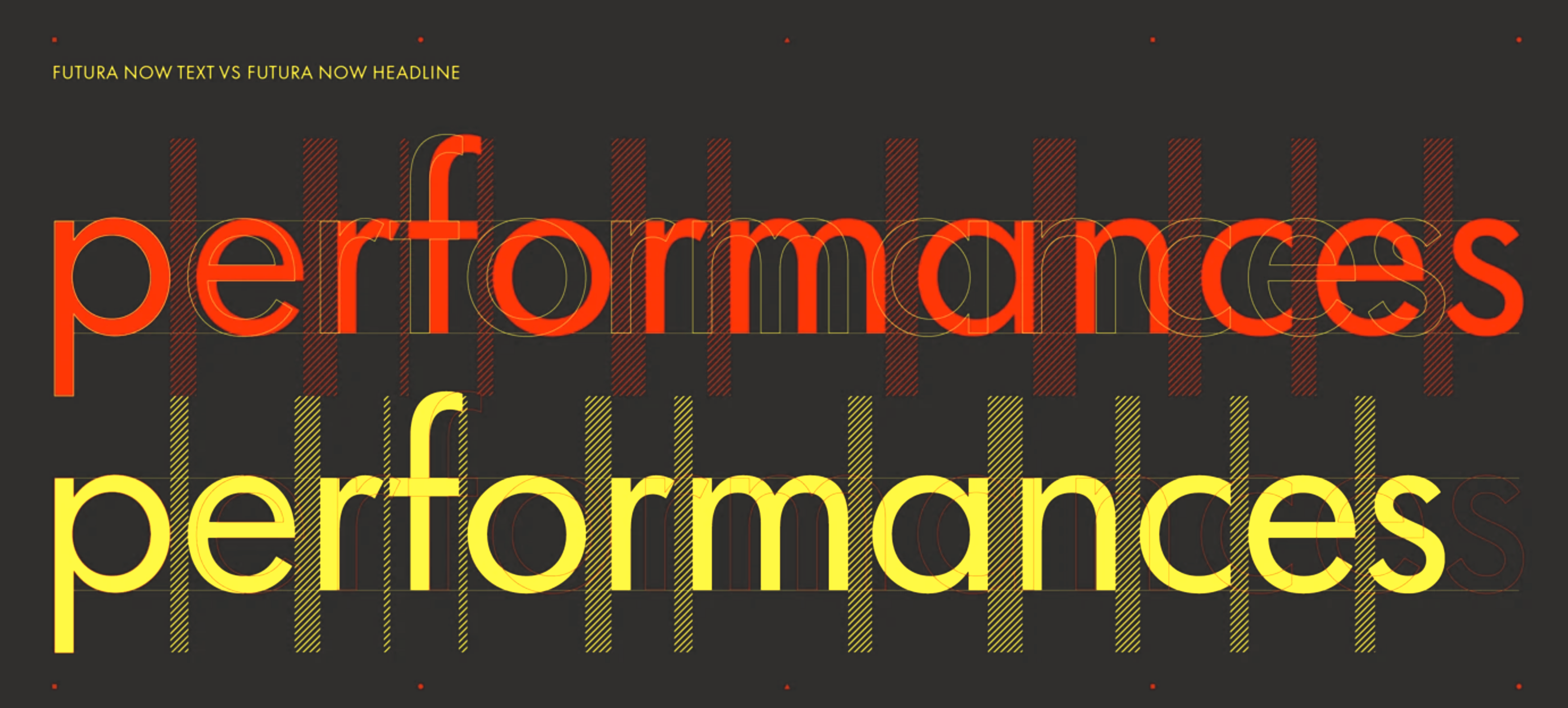
file name: Monotype Futura Now Text Headline 2020
file name: Monotype Futura Now Text 2020
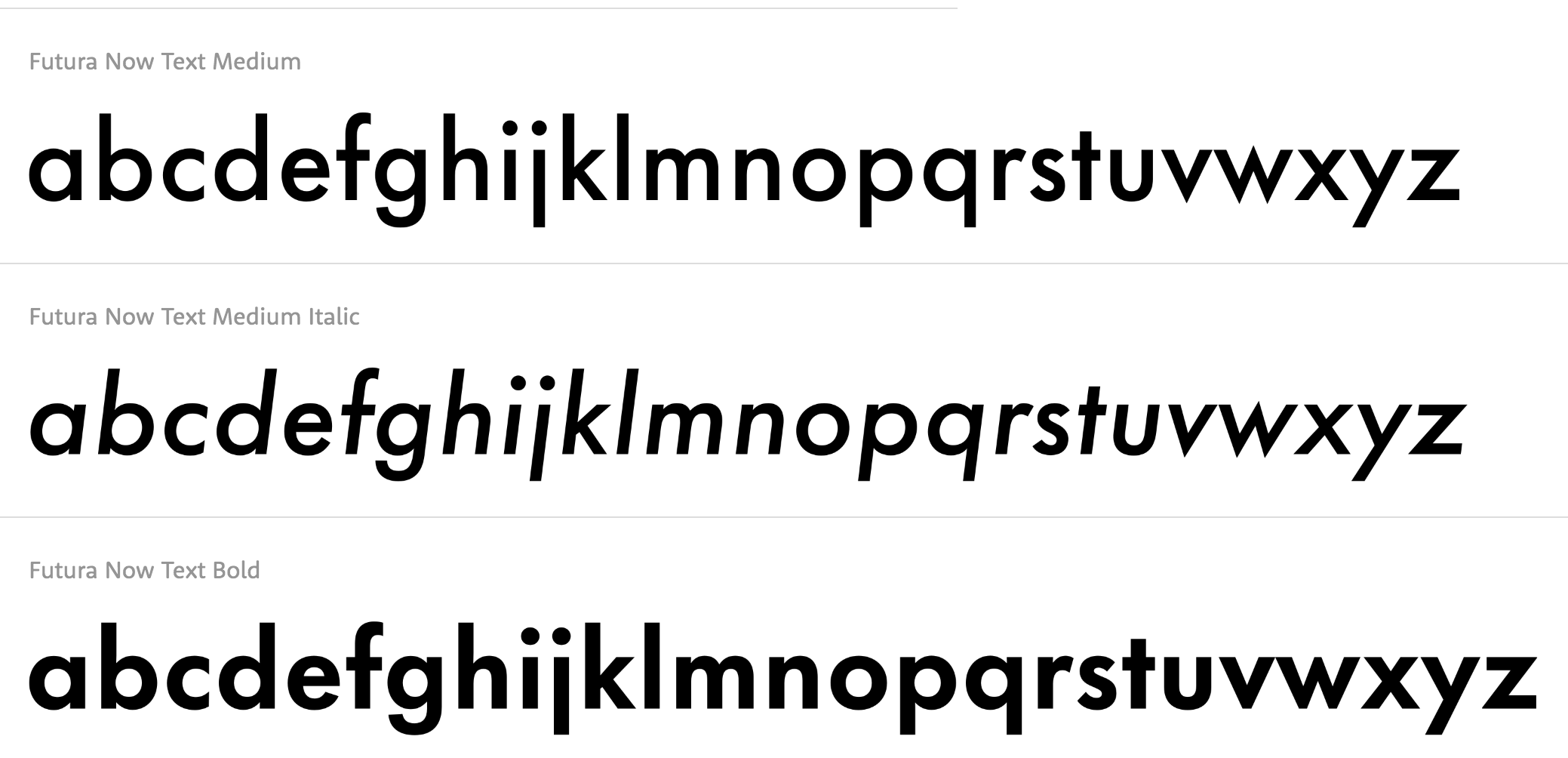
file name: Monotype Futura Now Text 2020
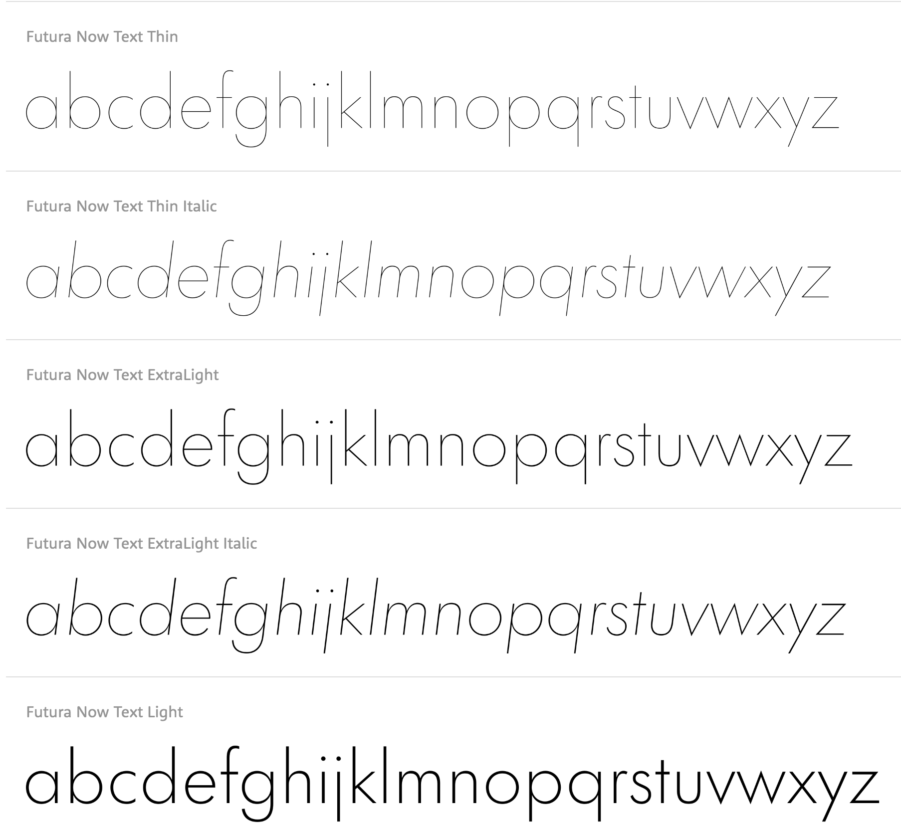
file name: Monotype Futura Now Text 2020
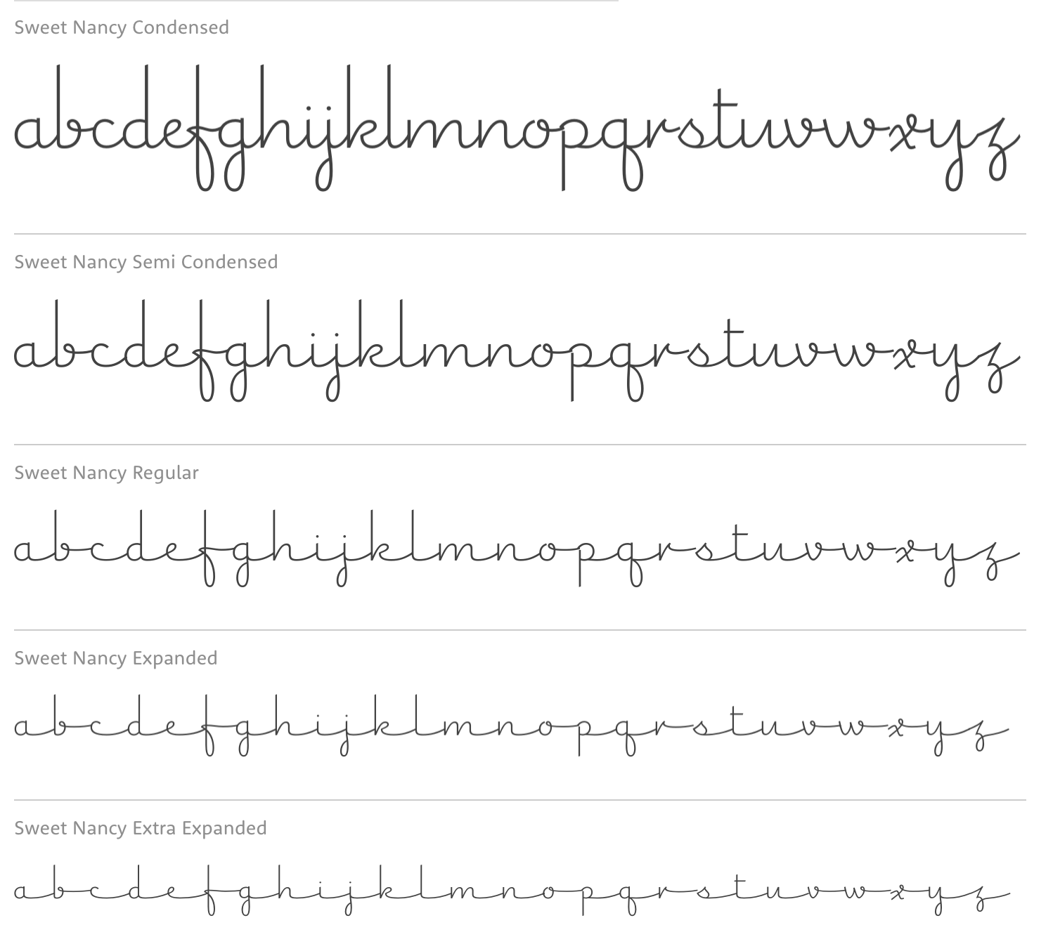
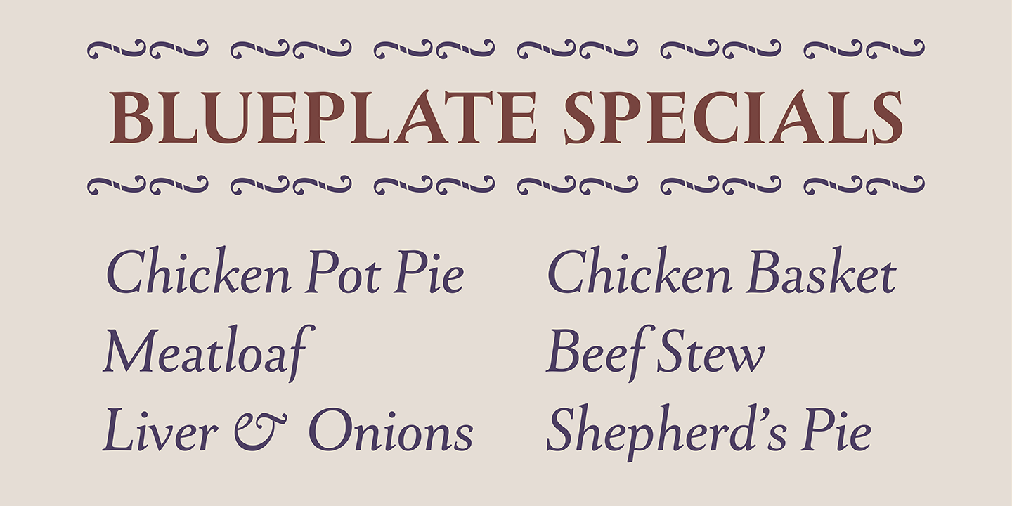
file name: Steve Matteson Sweet Nancy 2018

file name: Matteson Typographics Sweet Nancy 2018 282328 002

file name: Matteson Typographics Sweet Nancy 2018

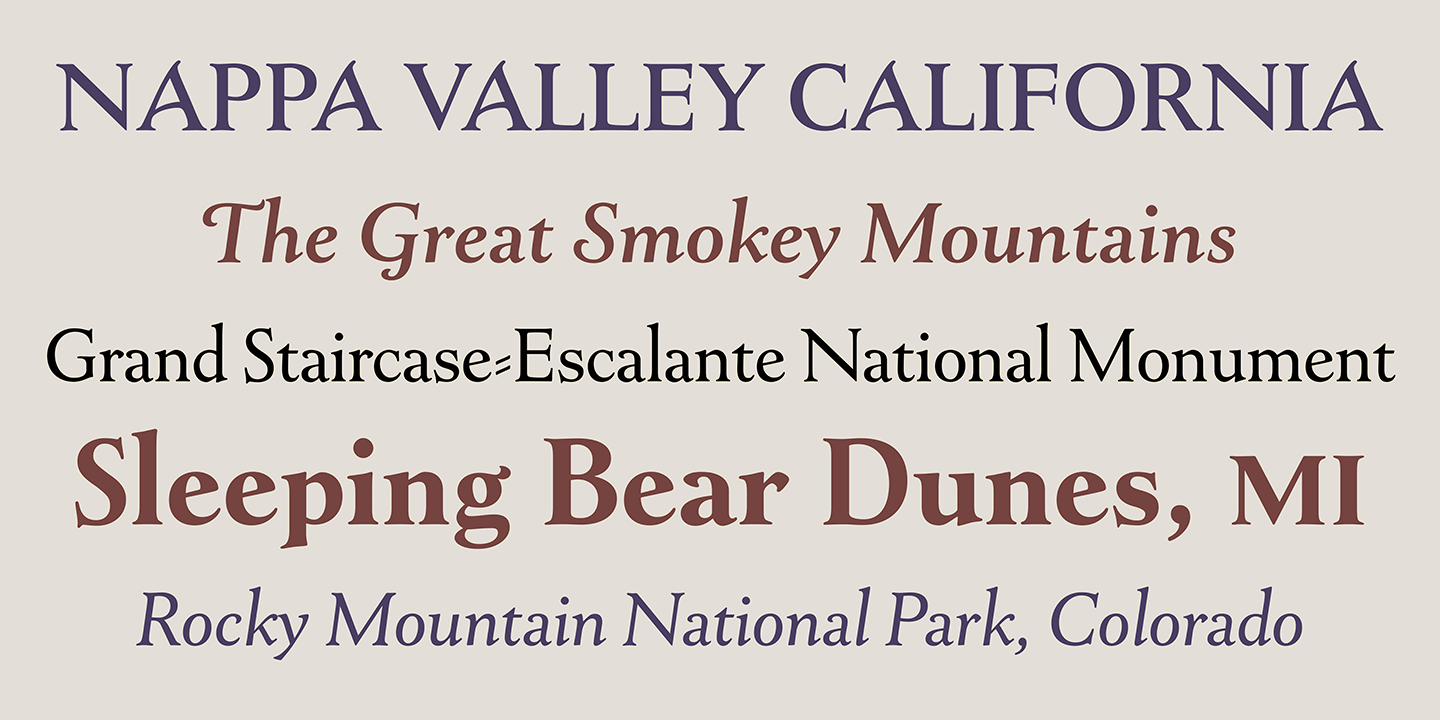
file name: Steve Matteson Union Station 2018

file name: Steve Matteson Union Station 2018 264664

file name: Steve Matteson Union Station 2018 264665
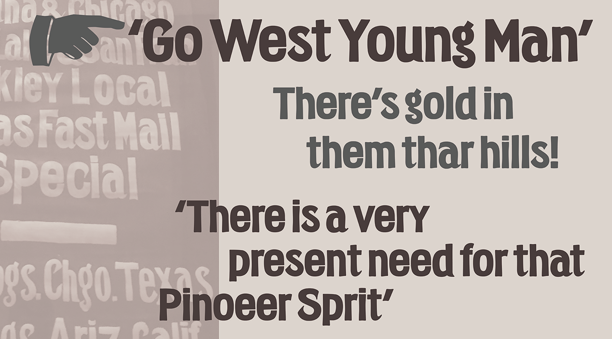
file name: Steve Matteson Union Station 2018 264666
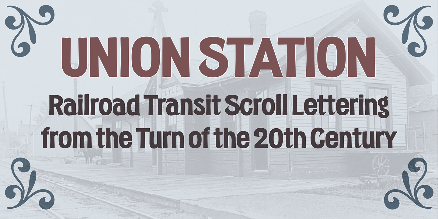
file name: Steve Matteson Union Station 2018 264667

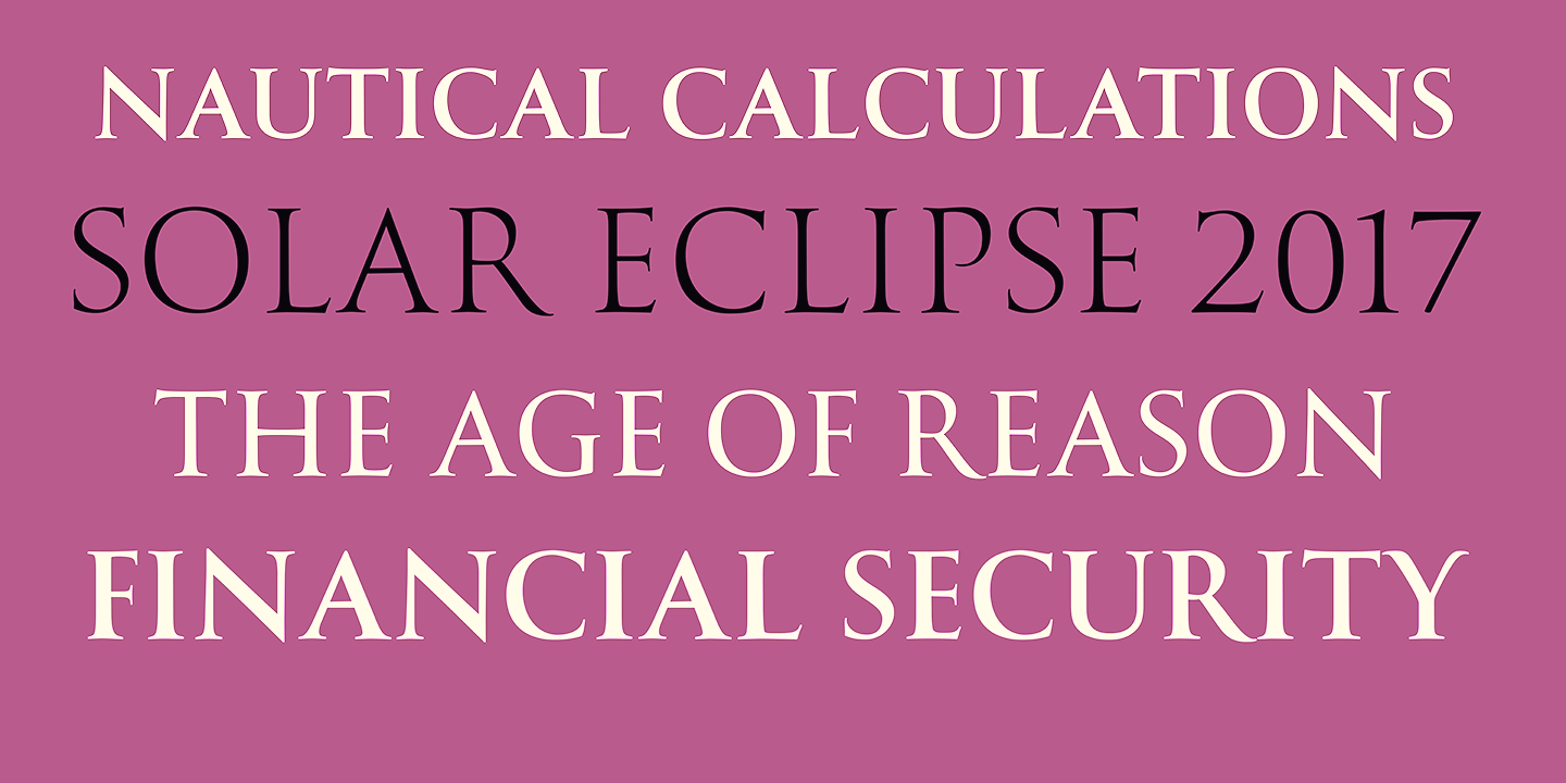
file name: Matteson Typographics Newstyle 2018 258048

file name: Matteson Typographics Newstyle 2018 258049

file name: Matteson Typographics Newstyle 2018 258050
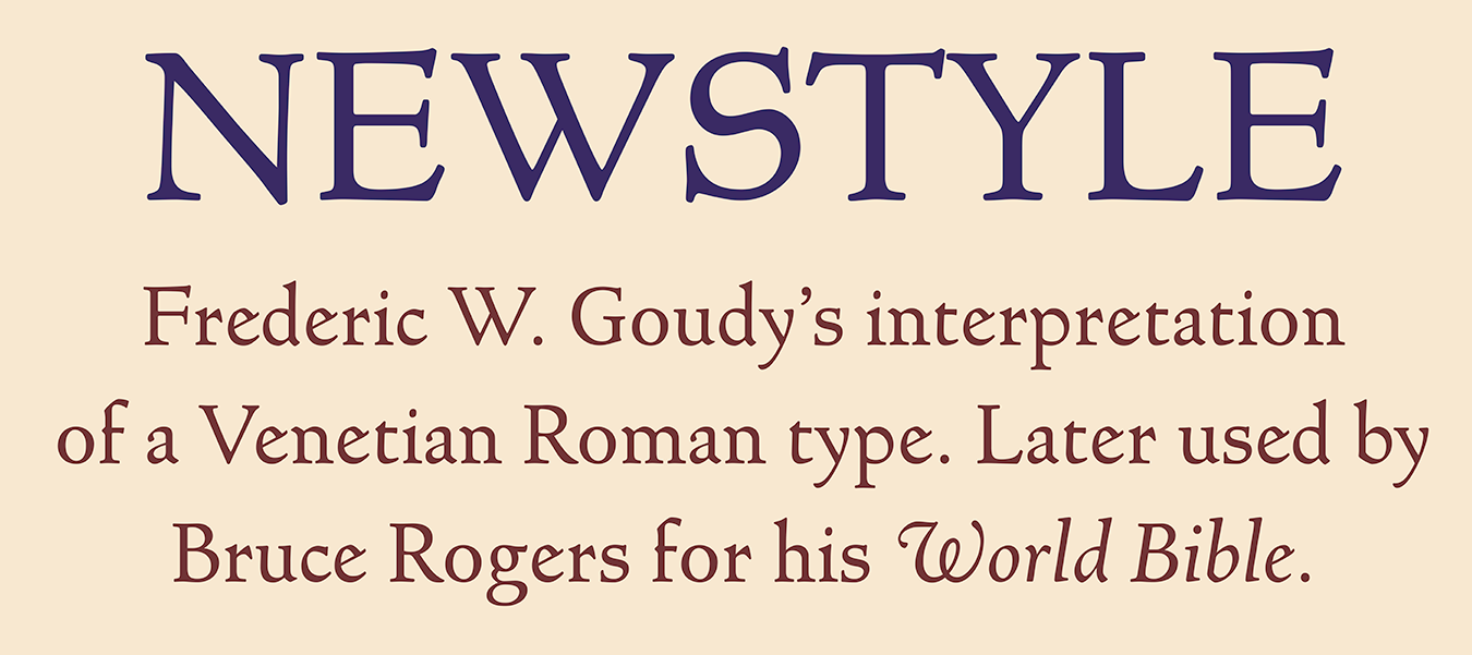
file name: Matteson Typographics Newstyle 2018 258051

file name: Matteson Typographics Newstyle 2018

file name: Matteson Typographics Goudy Type 2018 258043

file name: Matteson Typographics Goudy Type 2018 258044
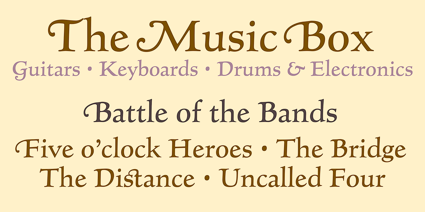
file name: Matteson Typographics Goudy Type 2018 258045
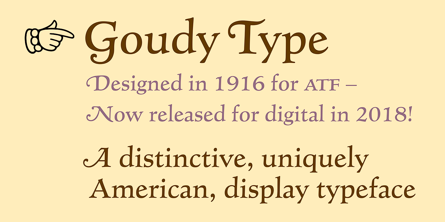
file name: Matteson Typographics Goudy Type 2018 258046

file name: Matteson Typographics Goudy Type 2018
file name: Steve Mateson Goudy Titling 2018 257824

file name: Steve Mateson Goudy Titling 2018 257827

file name: Steve Mateson Goudy Titling 2018
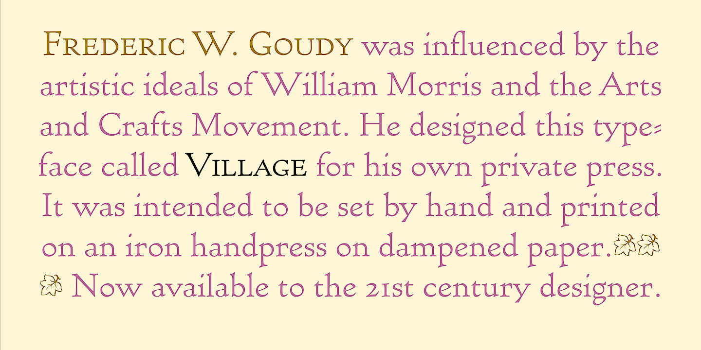
file name: Steve Mateson Village 2018 257829

file name: Steve Mateson Village 2018 257830
file name: Steve Mateson Village 2018 257831
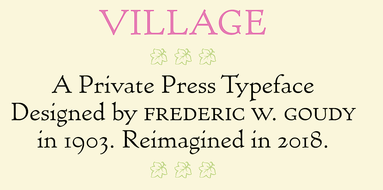
file name: Steve Mateson Village 2018 257832

file name: Steve Mateson Village 2018

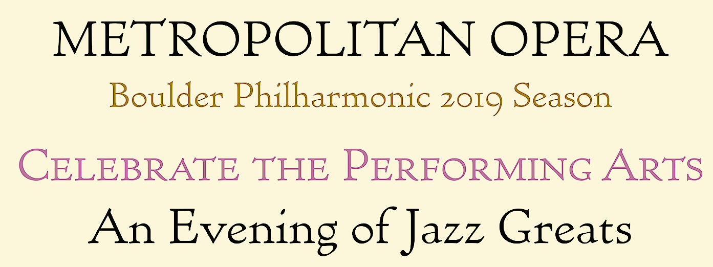
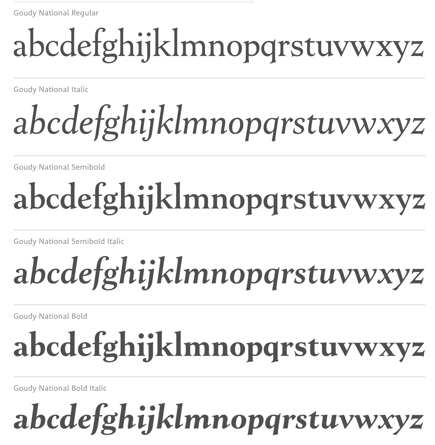
file name: Steve Matteson Goudy National 2018 257269
file name: Steve Matteson Goudy National 2018 257270
file name: Steve Matteson Goudy National 2018 257271
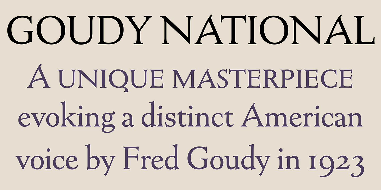
file name: Steve Matteson Goudy National 2018 257296
file name: Steve Matteson Goudy National 2018 after Frederic Goudy National Old Style 1916

file name: Steve Matteson Goudy National 2018
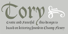
file name: Steve Matteson Tory 2018 after Frederic Goudy Tory Text 1935 257272
file name: Steve Matteson Tory 2018 after Frederic Goudy Tory Text 1935 257273
file name: Steve Matteson Tory 2018 after Frederic Goudy Tory Text 1935 257274
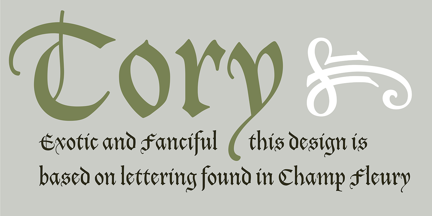
file name: Steve Matteson Tory 2018 after Frederic Goudy Tory Text 1935 257295
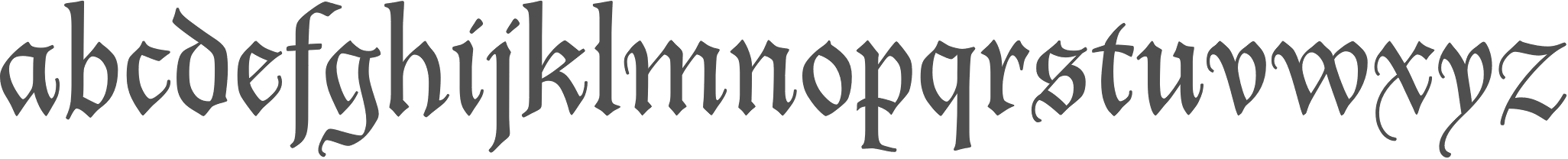
file name: Steve Matteson Tory 2018 after Frederic Goudy Tory Text 1935
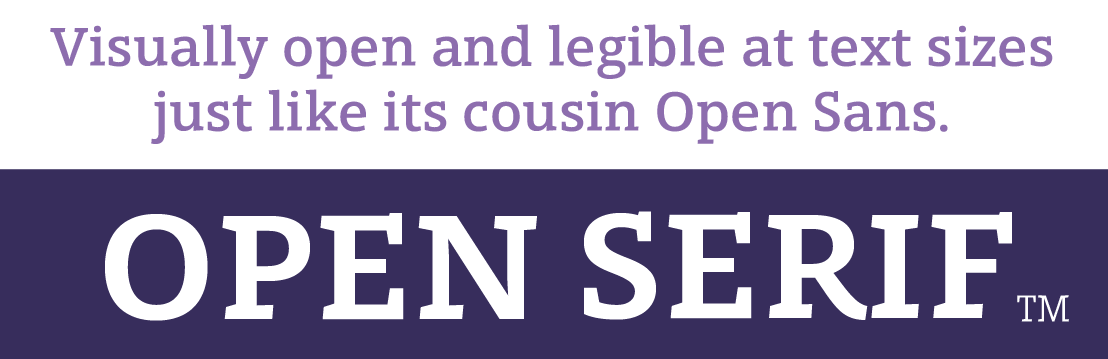
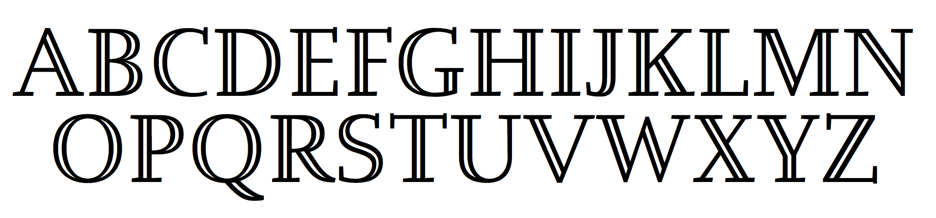
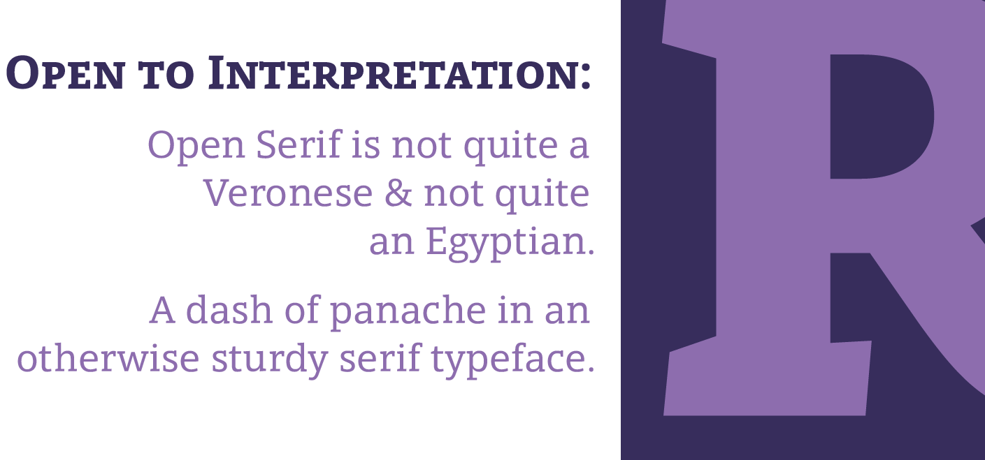
file name: Matteson Typographics Open Serif 2016 213701
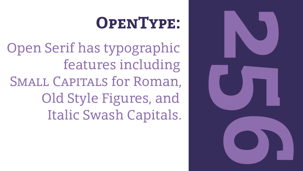
file name: Matteson Typographics Open Serif 2016 213703
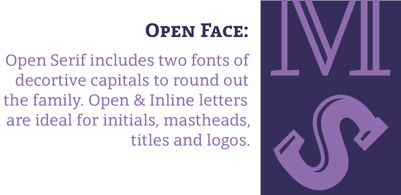
file name: Matteson Typographics Open Serif 2016 213704

file name: Matteson Typographics Open Serif 2016
file name: Steve Matteson Open Serif Open 2016
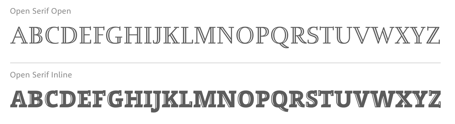
file name: Steve Matteson Open Serif Open Open Serif Inline 2016
file name: Matteson Typographics Open Serif 2016 213702
| | |
|
Luc Devroye ⦿ School of Computer Science ⦿ McGill University Montreal, Canada H3A 2K6 ⦿ lucdevroye@gmail.com ⦿ http://luc.devroye.org ⦿ http://luc.devroye.org/fonts.html |