TYPE DESIGN INFORMATION PAGE last updated on Wed May 6 15:43:45 EDT 2026
FONT RECOGNITION VIA FONT MOOSE

|
|
|
|
|
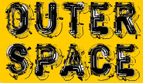
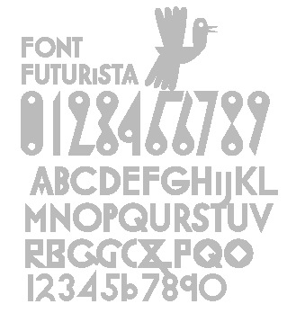
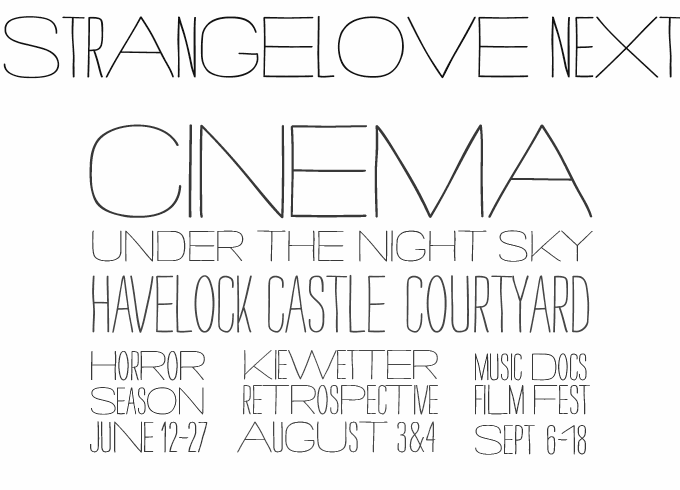
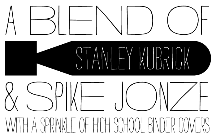
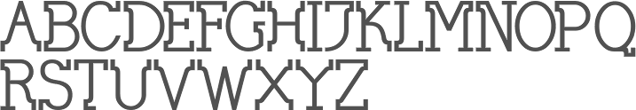
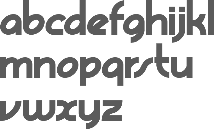
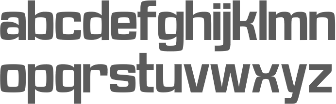
Futurismo | ||
|
|
|
|
SWITCH TO INDEX FILE
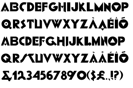
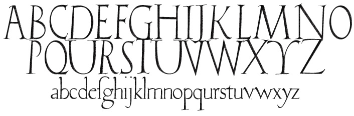
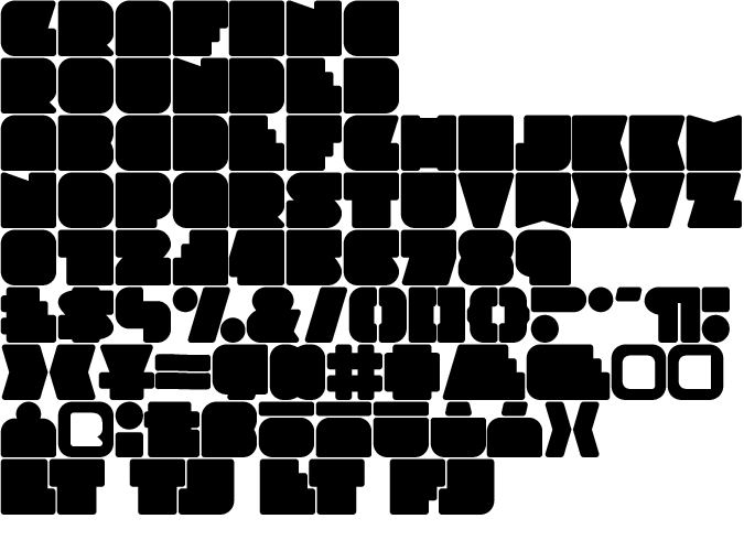
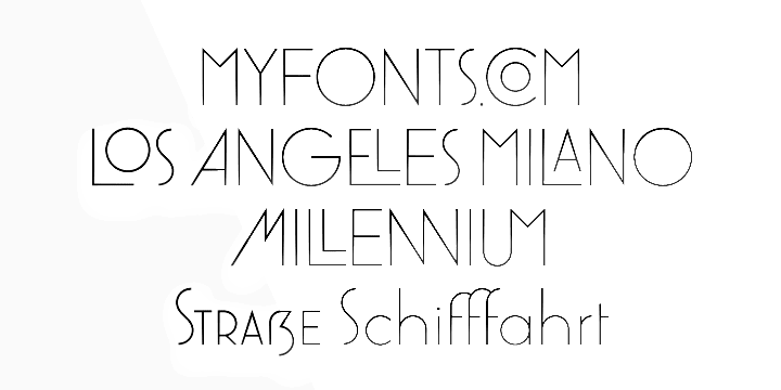
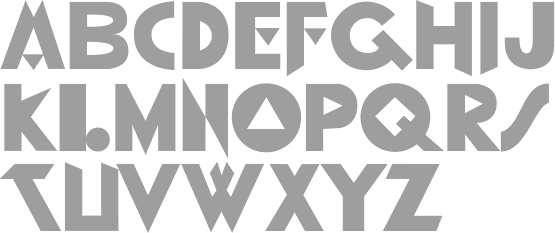
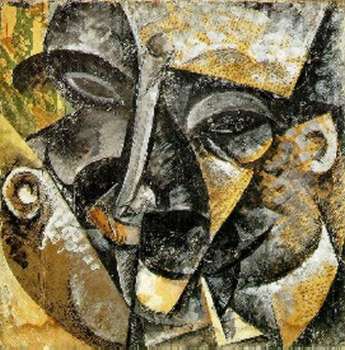
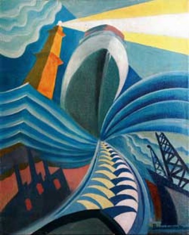
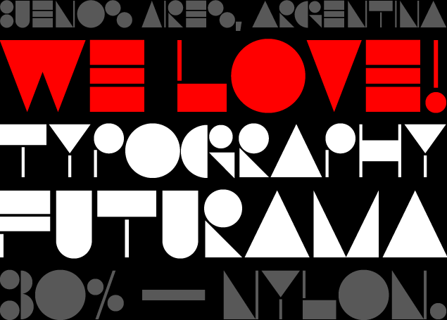
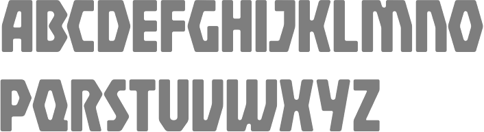
American designer of the very geometric typeface P22 Il Futurismo (1996), which was inspired by the graphic works of artists in the Italian Futurist movement (1908-1943), including Fortunato Depero, Fillippo T. Marinetti, Giacomo Balla, and C.V. Testi. [Google] [MyFonts] [More] ⦿ | |
| |
Antonio Vignali
| |
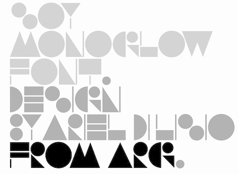
Ariel Di Lisio
| |
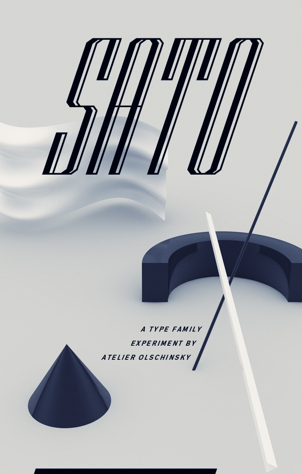
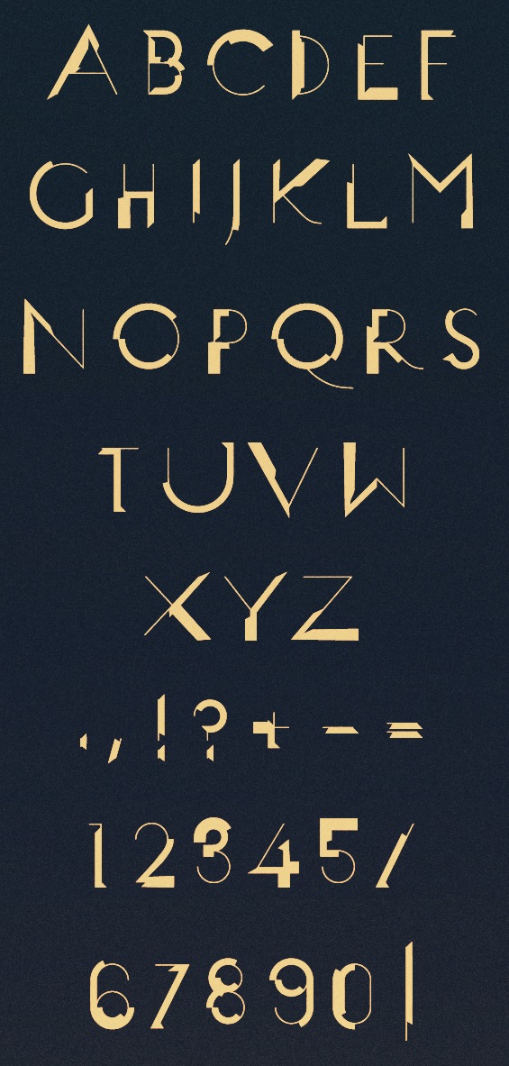
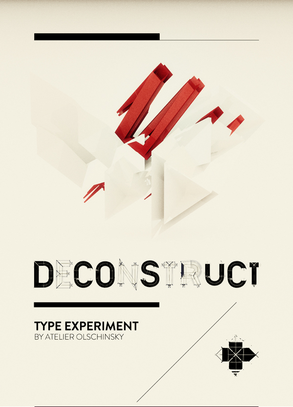
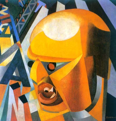
Atelier Olschinsky
|
In 2017, he published the bespoke typeface BirdYard, the free AO Grotesk (with poygonal outlines), free display sans typeface family Matol, the free geometric solid typeface AOX, which comes in Stencil and Regular styles, the free polygonal typeface family AO Mono, and the free monospaced Minimal Mono. Typefaces from 2020: Kaomo (monlinear, monospaced), AO Mono (polygonal). Behance link. [Google] [More] ⦿ |
Exebicha, or Alexander, is Russian. He made the futurismo font Futurism (2011, no downloads), and Calligraphy (2011). [Google] [More] ⦿ | |
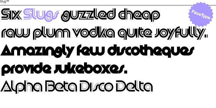
Face Type
|
Facetype's typeface library. See also here. View Marcus Sterz's typefaces. Klingspor link. Behance link. Fontspring link. [Google] [MyFonts] [More] ⦿ |
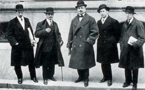
Filippo Tommaso Marinetti
| |
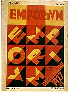
In 1927, he published the monograph Depero Futurista, aka The Bolted Book, because it is famously bound together by two large industrial aluminum bolts. In 2016, a kickstarter movement was started to publish a new facsimile edition of this groundbreaking book. In 1928, Depero moved to New York City, where [acccording to Wikipedia] he experienced a degree of success, doing costumes for stage productions and designing covers for magazines including MovieMaker, The New Yorker and Vogue, among others. He also dabbled in interior design during his stay, working on two restaurants which were later demolished to make way for the Rockefeller Center. He also did work for the New York Daily News and Macy's, and built a house on 23rd Street. In 1930 he returned to Italy. In the 1930s and 40s Depero continued working, although due to futurism being linked with fascism, the movement started to wane. The artistic development of the movement in this period can mostly be attributed to him and Balla. One of the projects he was involved in during this time was Dinamo magazine, which he founded and directed. After the end of the Second World War, Depero had trouble with authorities in Europe and in 1947 decided to try New York again. This time he found the reception not quite as welcoming. In New York, he published So I Think, So I Paint, a translation of his autobiography initially released in 1940, Fortunato Depero nelle opere e nella vita. From the winter of 1947 to late October 1949 Depero lived in a cottage in New Milford, CT. His host was William Hillman, an associate of the then-President, Harry S. Truman. After New Milford, Depero returned to Rovereto. In August 1959 Galleria Museo Depero opened. Depero died in 1960 a bout of diabetes and spending the last two years unable to paint due to hemiparesis. Alan Kegler at P22 created a typeface, P22 Futurismo (1996) and P22 Futurismo Extras, based on Depero's work. P22 link. A second digital typeface is based on his work, Emporium NF by Nick Curtis. It is based on this poster by Fortunato Depero (1927). [Google] [MyFonts] [More] ⦿ | |
Designer at Nebiolo (b. 1908, Pavia, d. 1999, Milan). He was part of a team (with Giancarlo Illiprandi, Bruno Munari, Ilio Negri, Till Neuburg, Luigi Oriani and Pino Tovaglia) that designed the lineale family Forma from 1966-1970 under the direction of Aldo Novarese. Forma was revived by Tankboys as Forma Nova. Sergio Polano writes: Alone master, the Italian visual designer, painter and photographer Franco Grignani, born in Pieve Porto Morone (Pavia) in 1908, trained as architect at the Polytechnic School of Turin (1929-1933); after being part as painter of the late, second futurism, his artistic research came across the European abstract avantgarde movements, and developed a strong interested in the perception psichology of form, that results from the Fifties in his dinamic kind of OpArt, years before it: the mastering of perception rules is expressed by his visual experiments on virtual movement, optical illusion, subperceptions, distortions, moirés, dilatations, flous and so on, applied, with no breaks, from painting to graphic design, through pictures, images, patterns, signs and words. From the Thirties he works in the field of graphic design, collaborating a with Borletti, Breda Nardi, Cremona Nuova, Dompé, Domus, Mondadori, Montecatini, Spi, Triennale; his artistic direction for Alfieri&Lacroix printing firm is particularly interesting, as it shows an exceptional integration of words (wrtitten by himself) and images. Very well known, his trademark for Lambswool is a paradigmatic example of his approach to sign design. For 26 years he has been art director of Pubblicità in Italia, a magazine devoted to Italian advertising and visual design. He wrote many essays on design and arts, and lectured in Europe and USA. [Google] [More] ⦿ | |
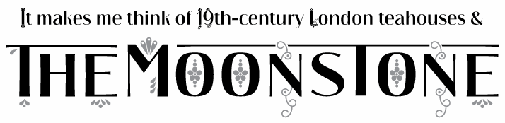
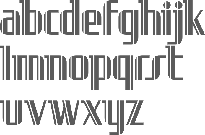
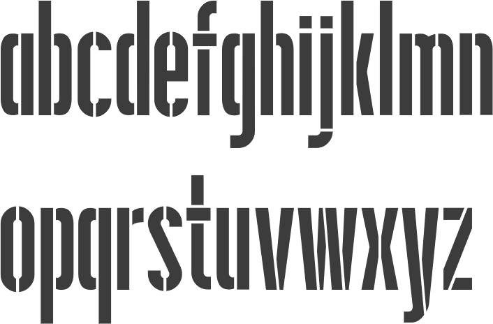
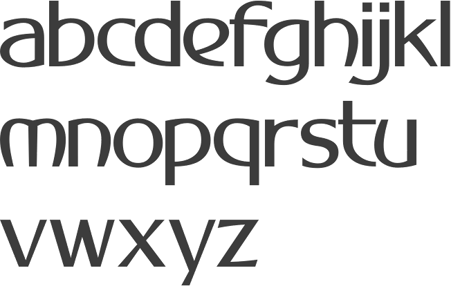
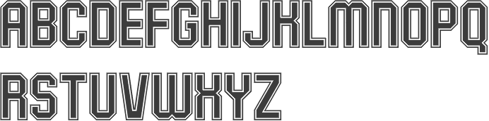
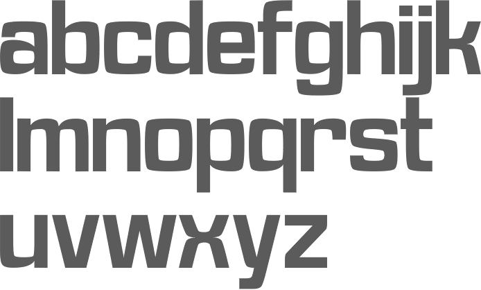
Futurismo
|
|
Hederae Creative (or: Hederae Type Foundry)
|
Typefaces from 2016: Pervinca (a sharp-edged tall-legged display typeface with wedge serifs that is influenced by didones), Chamfort (12-style sans), Carnot (a slightly rounded partially hipster grotesk titling typeface), Lorano (a typeface inspired by the rationalist and minimalist movements), Marinaio (a handcrafted poster typeface family inspired by rubber stamps), Fibon Neue (a 32-style modern sans family with Low contrast), Cuciniere (a fun handcrafted typeface with interlocking ligatures and food icons), Regime Grotesk (influenced by the fascist era in Italy), Scritto Sans, Monique (monospaced and monoline), Abside (a geometric sans), Esther (a handcrafted antiqua), Fibon Sans and Zenzero Grotesk (tribal and unexpected). Typefaces from 2017: Liber Text (a geometric sans with circular ink traps), Liber Grotesque (a futurismo sans influenced by Futura and Avenir). Typefaces from 2018: Montagna LTD (inspired by early twentieth century Italian Arte Nuova and Stile Liberty). [Google] [MyFonts] [More] ⦿ |
Keith Tricker
| |
Italian artist, architect, industrial and graphic designer, 1887-1969. After graduating from the Accademia di Belle Arti of Parma in 1913, he worked as a draughtsman in Milan until World War I. The influence of futurism and Fortunato Depero influenced his later work. He was the chief designer for Olivetti for many years and was responsible for the Olivetti typewriter Lexicon 80 (1948) and the iconic Lettera 22 portable typewriter (1950). Nizzoli's style inspired Nizzoli (2017, Luciano Vergara for Los Andes), a modular, almost sci-fi, sans typeface family. [Google] [More] ⦿ | |
Marcus Sterz
| |
Miami, FL and Athens, Greece-based designer of these free Greek fonts: AF Kypseli Caps, AF Patisia Caps, AF Aphrodite Caps (2018), AF Futurismo GR Caps (2018), AF Greka Fat (2016), AF Patsi Marathon (2016), AF Patsi Cap (2016), AF Creta Fat (2016). [Google] [More] ⦿ | |
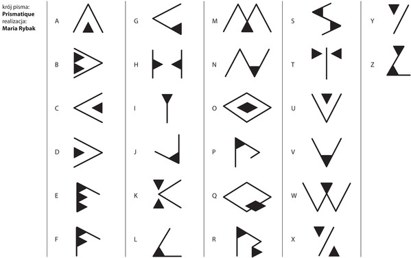
Prismatique (2011) is a noncommercial font inspired by the art deco vase Nanking from 1925---a bit in the Futurismo style. Home page at Verine Design in Lodz, Poland. [Google] [More] ⦿ | |
MyFonts selection for the keyword Futurismo. [Google] [More] ⦿ | |
Negro
|
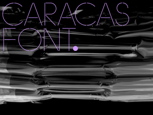
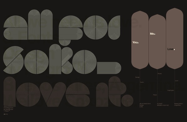
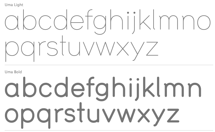
His typefaces from before 2010: Marzo (2008: a hairline vogue typeface commissioned by the Argentinian mag Atypica), Donuts (2008: a layer of round upon a layer of round), Paz (2008: a stylish night club or fashion magazine family---stunning), Lynda (2008: an octagonal/mechanical face), Lunes (2007: art deco), Day (2007: art deco), Friday (2007: art deco), Nigga (2007: an ultra-fat art deco typeface with an experimental edge), Love (2007: a mini-serifed geometric beauty), Santino (2008: trying to bring waves into a simple sans face), Normal (2008: gorgeous, geometric and galant), Mate (2008: a geometric all caps typeface for magazine headlines), Caracas (2008), Soko (2009), Stola (2008), Pink (2008: experimental), Cascabel (2009: a kitchen tile typeface digitized by Alejandro Paul at Sudtipos), James (2009: a bullet hole-themed face), Inlove (2009, Sudtipos: a Lubalin-style poster face designed by Di Lisio and digitized by Alejandro Paul). Typefaces shown in 2010, mostly experimental / geometric / art deco: Destiny, Drimpy, Hongki, Mobile, Moonglow, Normal, Vincent. In 2011, Ariel published the futurismo face Saturna at Sudtipos [and I do not understand HypeForType's claim that it is an exclusve HypeForType font]. Their offices are in Buenos Aires and Caracas. Typefaces from 2012 include Uma (with Alejandro Paul at Sudtipos: a gorgeous two-weight monoline sans family). In 2013, he created the stencil typeface Anima for a housing project in Punta Chica, San Fernando, Argentina. In 2015, he designed the cold sans typeface family Stockholm Type, and the display typeface Roska. In 2015, he set up Nodo Type Foundry in Buenos Aires together with Mexican designer Aldo Arillo. Negro Nouveau link. [Google] [MyFonts] [More] ⦿ |
P22 Type Foundry
|
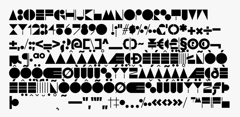
The fonts are: Industrial Design (an industrial look font based on letters drawn by Joseph Sinel in the 1920s---this font is free!), LTC Jefferson Gothic Obliquie (2005, free), Sinel (free), P22Snowflakes (free in 2003 and P22 Snowflakes (retail) in 2020, finishedd by Richard Kegler and Terry Wüdenbachs), Acropolis Now (1995, a Greek simulation typeface done with Michael Want), P22 Albers (1995; based on alphabets of Josef Albers made between 1920 and 1933 in the Bauhaus mold), Arts and Crafts (based on lettering of Dard Hunter, early 1900s, as it appeared in Roycroft books), Ambient, Aries (2004, based on Goudy's Aries), Arts and Crafts ornaments, Atomica, Bagaglio (Flat, 3D; in the style of Il Futurismo), P22 Basel Roman (2020, Richard Kegler: an update of a 2015 typeface, P22 Basel, based on a garalde font used by Johannes Herbst (aka Ioannes Oporinus) in 1543 to publish Andreas Vesalius' On the Fabric of the Human Body (De humani corporis fabrica) in Basel), Bauhaus (Bauhaus fonts based on the lettering of Herbert Bayer), Bifur (2004, Richard Kegler, after the 1929 original by Cassandre), Blackout, P22 Brass Script Pro (2009, Richard Kegler; based on an incomplete script fond in a booklet from Dornemann&Co. of Magdeburg Germany, ca. 1910 entitled Messingschriften für Handvergoldung; for years, P22 and MyFonts claimed that Michael Clark co-designed this, but Michael does not want any credit, as he did only about 20 letters), Cage (based on handwriting and sketches of the American experimental composer John Cage), P22 Casual Script (2011, Richard Kegler, a digitization of letters by sign painter B. Boley, shown in Sign of the Times Magazine), Cezanne (Paul Cezanne's handwriting, and some imagery; made for the Philadelphia Museum of Art), Child's Play, Child's Play Animals, Child's Play Blocks, Constructivist (Soviet style lettering emulating the work of Rodchenko and Popova), Constructivist extras, Czech Modernist (based on the design work of Czech artist Vojtech Preissig in the 20s and 30s), Daddy-o (Daddy-o Beatsville was done in 1998 with Peter Reiling), Daddy-o junkie, Da Vinci, Destijl (1995, after the Dutch DeStijl movement, 1917-1931, with Piet Mondrian inspired dingbats; weights include Extras, P22 Monet Impressionist (1999), Regular and Tall), Dinosaur, Eaglefeather, Escher (based on the lettering and artwork of M.C. Escher), P22 FLW Exhibition, P22 FLW Terracotta, Folk Art (based on the work of German settlers in Pennsylvania), Il futurismo (after Italian Futurism, 1908-1943), Woodtype (two Tuscan fonts and two dingbats, 2004), P22 Woodcut (1996, Richard Kegler: based on the lettering carved out in wood by German expressionists such as Heckel and Kirchner), Garamouche (2004, +P22 Garamouche Ornaments; all co-designed with James Grieshaber), GD&T, Hieroglyphic, P22 Infestia (1995), Insectile, Kane, Kells (1996, a totally Celtic family, based on the Book of Kells, 9th century; the P22 Kells Round was designed with David Setlik), Koch Signs (astrological, Christian, medieval and runic iconography from Rudolf Koch's The Book of Signs), P22 Koch Nueland (2000), Larkin (2005, Richard Kegler, 1900-style semi-blackletter), London Underground (Edward Johnston's 1916 typeface, produced in an exclusive arrangement with the London Transport Museum; digitized by Kegler in 1997, and extended to 21 styles in 2007 by Paul D. Hunt as P22 Underground Pro, which includes Cyrillic and Greek and hairline weights), Pan-Am, Parrish, Platten (Richard Kegler; revised in 2008 by Colin Kahn as P22 Platten Neu; based on lettering found in German fountain pen practice books from the 1920s), P22 Preissig (and P22 Preissig Calligraphic, 2019), Prehistoric Pals, Petroglyphs, Rodin / Michelangelo, Stanyan Eros (2003, Richard Kegler), Stanyan Autumn (2004, based on a casual hand lettering text created by Anthony Goldschmidt for the deluxe 1969 edition of the book "...and autumn came" by Rod McKuen; typeface by Richard Kegler), Vienna, Vienna Round, Vincent (based on the work of Vincent Van Gogh), Way out West. Now also Art Nouveau Bistro, Art Nouveau Cafe and the beautiful ornamental font Art Nouveau Extras (all three by Christina Torre, 2001), the handwriting family Hopper (Edward, Josephine, Sketches, based on the handwriting styles of quintessential American artist Edward Hopper and his wife, Josephine Nivison Hopper, and was produced in conjunction with the Whitney Museum of American Art), Basala (by Hajime Kawakami), Cusp (by James Grieshaber), P22 Dearest (calligraphic, by Christina Torre and Miranda Roth), Dwiggins (by Richard Kegler), Dyrynk Roman and Italic (2004, Richard Kegler, after work by Czech book artist Karel Dyrynk), Gothic Gothic (by James Grieshaber), La Danse (by Gábor Kóthay;), Mucha (by Christina Torre), Preissig Lino (by Richard Kegler), P22Typewriter (2001, Richard Kegler, a distressed typewriter font), the William Morris set (Morris Troy, Morris Golden, Morris Ornaments, based up the type used by William Morris in his Kelmscott Press; 2002), Art Deco Extras (2002, Richard Kegler, James Grieshaber and Carima El Behairy), Art Deco Display, the Benjamin Franklin revival font Franklin's Caslon (2006), Dada (2006) and the Art Nouveau font Salon (bu Christina Torre). In 2006, Kegler added Declaration, a font set consisting of a script (after the 1776 declaration of independence), a blackletter, and 56 signatures. Many of the fonts were designed or co-designed by Richard Kegler. International House of Fonts subpage. Lanston subpage (offerings as of 2005: Bodoni Bold, Deepdene, Flash, Fleurons Granjon, Fleurons Garamont, Garamont, Goudy Thirty, Jacobean Initials, Pabst, Spire). In-house fonts made in 2008 include Circled Caps, the Yule family (Regular, Klein Regular, Light Flurries, Heavy, Klein heavy, Heavy Snow, Inline; all have Neuland influences). Kegler / P22 created a 25-set P22 Civilité family in 2009 based on a 1908 publication from Enshedé, the 1978 English translation by Harry Carter, and a 1926 specimen also from Enshedé. P22 Declaration (Script, Signatures, Blackletter, 2009) is based on the lettering used in the 1776 Declaration of Independence. At ATypI 2004 in Prague, Richard spoke about Vojtech Preissig. Speaker at ATypI 2010 in Dublin, where he presented Making Faces: Metal Type in the 21st Century about which he writes: This film has the dual aim of documenting the almost-lost skill of creating metal fonts and of capturing the personality and work process of the late Canadian graphic artist Jim Rimmer (1931-2010). P22 type foundry commissioned Mr. Rimmer to create a new type design (Stern) that became the first-ever simultaneous release of a digital font and hand-set metal font in 2008. At ATypI 2011 in Reykjavik, he showed Making Faces. Typefaces from 2014: LTC Archive Ornaments (Richard Kegler and Miranda Roth). Typefaces from 2020: Showcard Script (by Terry Wüdenbachs, based on an original of Beaufont at the Hamilton Wood Type Museum, custom designed by the Morgan Sign Machine Company of Chicago). Typefaces from 2021: P22 Glaser Houdini (a layerable family, after Glaser's Houdini from 1964), P22 Glaser Babyteeth. Kegler writes: In 2019, P22 Type Foundry met with Milton Glaser (1929-2020) to initiate the official digital series of typefaces designed by Glaser in the 1960s and 70s. P22 Glaser Babyteeth is the first family released in the series. Milton Glaser's inspiration for his Babyteeth typeface came from a hand painted advertisement for a tailor he saw in Mexico City. He was inspired by that E drawn as only someone unfimilar with the alphabet could have concieved. So he set about inventing a completelly ledgible alphabet consistant with this model. P22 Glaser Babyteeth was based on original drawings and phototype proofs from the Milton Glaser Studios archives. Over the years there have been many typefaces that borrowed heavily from the Glaser designs, but these are the only official Babyteeth fonts approved by Milton Glaser Studio and the Estate of Milton Glaser. The solid and open versions are designed to overlap for two-color font effects and can even be mixed and matched for multi layer chromatic treatments. In 2021, he published the 3d art deco shadow font P22 Glaser Kitchen which is based on Big Kitchen (1976). View Richard Kegler's typefaces. View the IHOF / P22 typeface library. [Google] [MyFonts] [More] ⦿ |
Peter Olschinsky
| |
Richard Kegler
| |
RM WD
|
In 2016, he designed the calligraphic typeface Gerolinda. This OpenType-feature-laden typeface family, at 1900 glyphs per weight for six weights, leaves all other calligraphic typefaces from the past decade in the dust. It is as if the Italian penmen from the renaissance period are being reborn through Antonio's hand. In fact, he intended something very specific---the recreation of an Italian gentlewoman's hand (his own words). One of his projects was inspired by the Italian Futurismo artists in the early 1900s whose style is close to Italian art deco. Typefaces in the project include Italiano Doc (2018), Italiano Fushion Color (2021: the color version of Italiano Fushion) and Italiano Fushion New (2021: all caps). Typefaces from 2018: Ziletti Pop (a layerable pre-psychedelic font influenced by Girolamo Ziletti (1552-1583) in Venice) and Eletric Lady (a light copperplate calligraphic script). In 2020, he published Parmesan Revolution (a didone with mirrored letters, perhaps in the hope of emulating Cyrillic), Venice Revolution, Jannson Map (a wonderful 18th century map font about which Antonio writes: This font is inspired by Johannes Janssonius, well known as Jan Janszoon or Jan Janssonius (b. Arnhem, 1588, d. Amsterdam, 1664), a Dutch cartographer, publisher and engraver who was married to Hondius's daughter. He authored many masterpieces of cartography just like Willem Blaeu and Hondius). [Google] [MyFonts] [More] ⦿ |
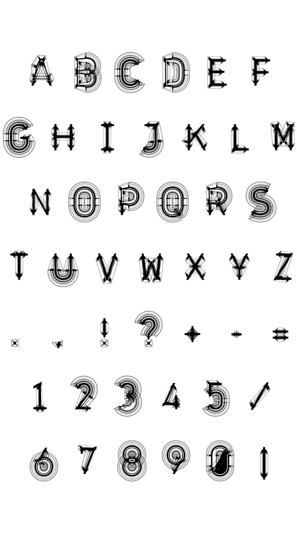
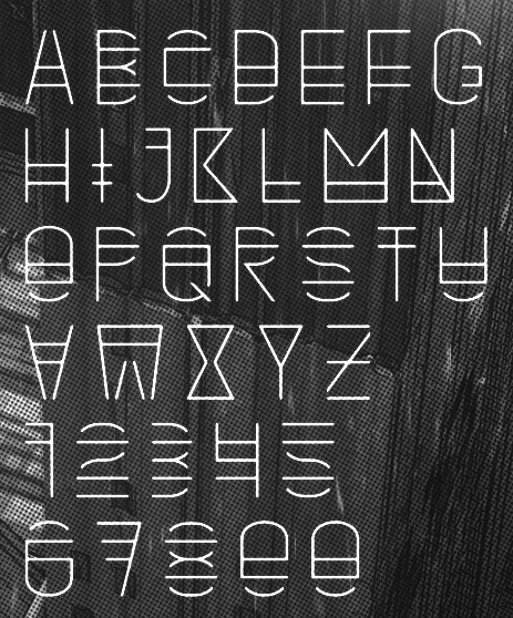
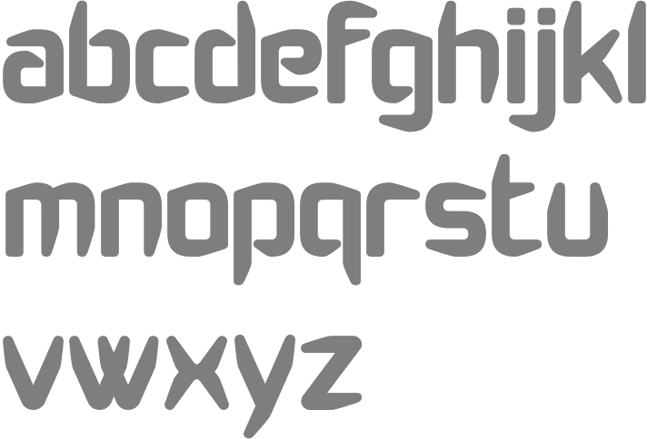
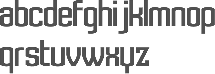
Student at UWE in Bristol, UK. Creator of Jank and Jank Reverse (2011, FontStruct), a pair of futurismo typefaces. [Google] [More] ⦿ | |
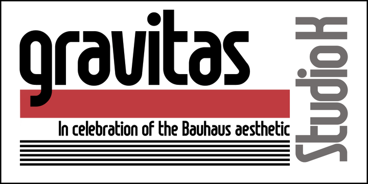
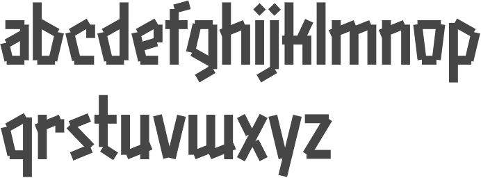
Studio K
|
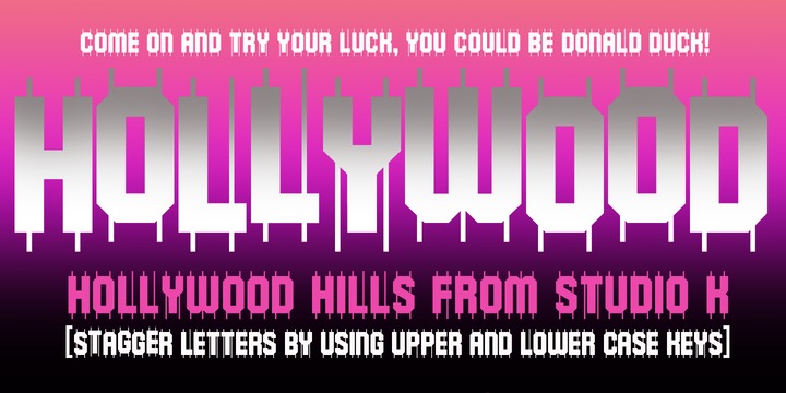
His foundry is Studio K: The foundry specialises in display fonts designed primarily for advertising, publishing, product packaging and signage. He created the wavy typeface Calypso (2011), the techno typeface Charta (2011), the sturdy black typeface Anvil (2011), Jazz Age (2011, art deco), and the brush typeface Pagoda (2011). In 2012, he published Hollywood Hills, Pier Arcade, Graffix, Skeleton Slab, the art deco typeface Tea Dance, the art nouveau typeface Paris Metro, Oscar Bravo (a heavy octagonal typeface), Café de Paris (a stylish retro--futuristic fifties style typeface), Barrowboy, and the stylish Contessa family. Typefaces from 2013: Communiqué (rugged stencil face), Regency (influenced by Americana and Optima, it is a flared very humanist sans), Alma Mater (athletic lettering), Showbiz (inline typeface), Dynatron (retro sci-fi font), Mechanoid (elliptical techno sans), Canterbury (inspired by the shapes of the cathedral), Export Drive (a bold condensed cargo stencil), Soft Rock (bold condensed sans), Red Top, Colossus (an elliptical typeface that is a bit squarer than Microgramma), 4Square (elliptical), Aspidistra (art nouveau), Home Grown. Typefaces from 2014: Belvedere, Joe Cool (a bold masculine headline typeface in the genre of Impact), Gravitas (a Bauhaus / futurismo typeface), Rock Face (sticky tape typeface). Typefaces from 2015: Chenko (2015, a constructivist / brutalist typeface named after Rodchenko), Marazion (a rounded display sans), Castaway, Variety (ransom note font), Nightlife (an amoebic rounded stencil typeface that conjures up neon signs, DNA molecules and jelly beans), Rough Stuff (textured faded stencil typeface), Signpost (a drop shadow version of Red Top). Typefaces from 2016: Cambourne (a luxury goods font advertized as cutting edge retro), Capstan (slab serif), Alonquin (art deco: a typographical tribute to Dorothy Parker and the New Yorker crowd who haunted the Alonquin hotel in its 1920s heyday), Cadenza, Exotica (described by Keith as Old World elegance meets Levantine luxury), Oxbridge (vintage compact titling typeface). Typefaces from 2017: Vagabond (a weathered vintage railroad font), Brando (slab serif). Typefaces from 2018: Stamina (a sports font), Cybernaut. [Google] [MyFonts] [More] ⦿ |
Valerio Dell'Edera
|

 Graphic and brand designer in Turin, Italy. His typefaces include the black geometric sans typeface Filo Black (2021) and the
 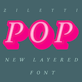 [
[ [
[ Vienna, Austria-based design studio, est. 2002 by Peter Olschinsky and Verena Weiss. They published the type family Ato (2012), which has
  Austrian foundry located in Vienna, est. in 2008 by
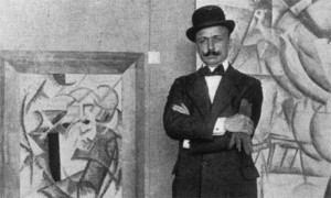
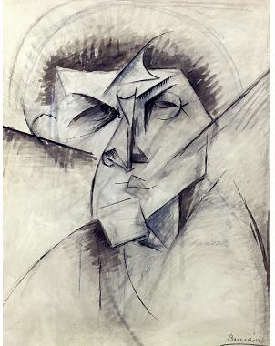
 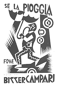 Fortunato Depero (1892-1960) was an Italian futurist painter, writer, sculptor and graphic designer. Born in Fondo/Malosco, Depero grew up in Rovereto serving as an apprentice to a marble worker. On a 1913 trip to Florence that he discovered a copy of the paper Lacerba and an article by one of the founders of the futurism movement, Filippo Tommaso Marinetti. In 1914, Depero moved to Rome and met fellow futurist Giacomo Balla. In 1915, Depero and Balla coauthored the manifesto Ricostruzione futurista dell universo. In the same year he was designing stage sets and costumes for a ballet. In 1919 Depero founded the Casa d'Arte Futurista in Rovereto, which specialised in producing toys, tapestries and furniture in the futurist style. In 1925 he represented the futurists at the Exposition Internationale des Arts Décoratifs et Industriels Modernes (International Exposition of Modern Industrial and Decorative Arts).
  Futurismo (
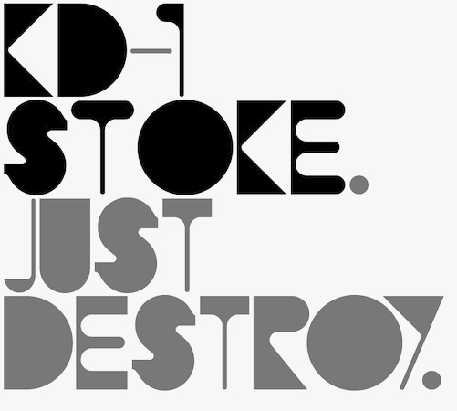
 Talented visual designer in Bari, Italy. Creator of the handcrafted poster typefaces Neretto Sans (2015, thick and black), Organic Tobacco (2015) and Sensi Bold (2015), and the elegant rubber stamp-inspired Marinaio (2015).
  [
[ [
[ Negro is a design site where some commercial fonts can be found, all designed by
 [
[ [
[ Graphic designer designer, b. 1959, Parma, Italy. He studied at the Art Institute in Parma. After graduation in 1983 from the Urbino ISIA Academy, Antonio spent 20 years working as Senior Art Director and Creative Director for various international advertizing agencies in Milan (Pirella Lowe, Armando Testa, Young & Rubicam).
  Keith Tricker (b. 1949) is the Creative Director of a UK advertising agency, and during his career has worked as both a copywriter and art director.
  [
[
|
|
|
|