TYPE DESIGN INFORMATION PAGE last updated on Mon Jun 8 17:29:26 EDT 2026
FONT RECOGNITION VIA FONT MOOSE

|
|
|
|
|
Typefaces related to Oscar Niemeyer | ||
|
|
|
|
SWITCH TO INDEX FILE
Australian designer of Niemeyer (2019), a typeface inspired by Brazilian architect Oscar Niemeyer. [Google] [More] ⦿ | |
Angela Detanico
| |
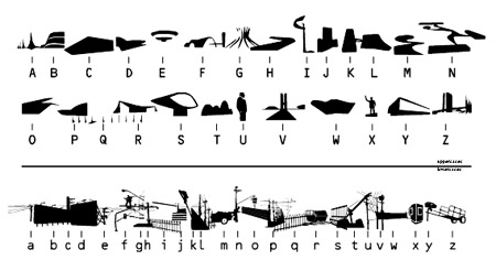
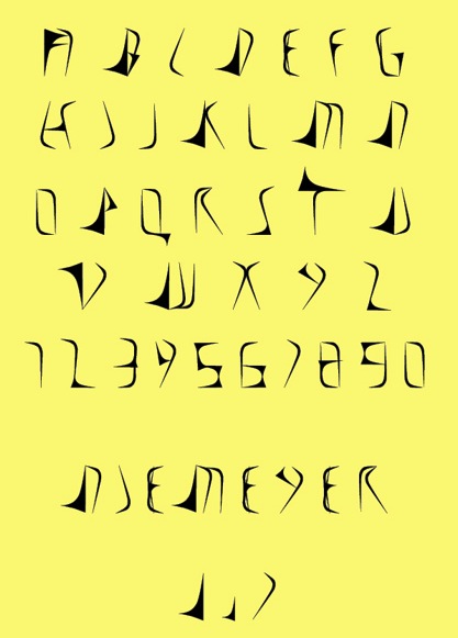
Angela Detanico and Rafael Lain
| Brazilian designers of an architectural dingbat font inspired by Oscar Niemeyer buildings, called Utopia (2006). [Google] [More] ⦿ |
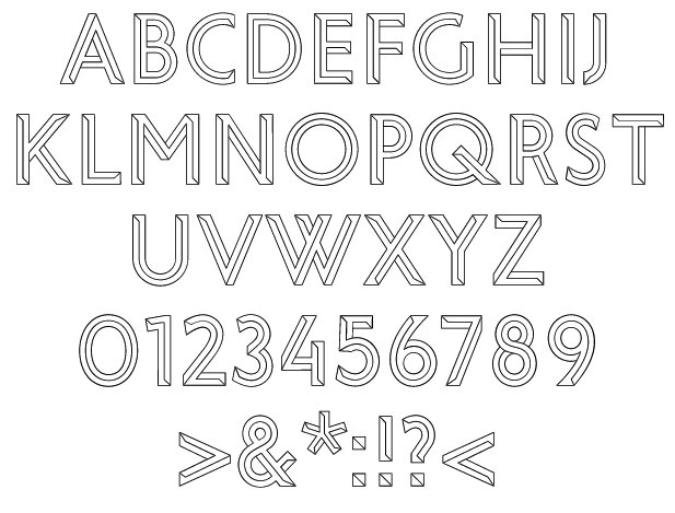
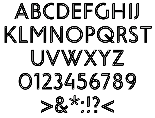
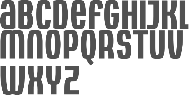
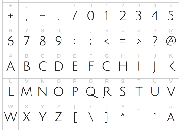
During his studies at UFC in Fortaleza, Brazil, Fernando Castello Branco created Niemeyer (2013), a display typeface that was influenced by Oscar Niemeyer's architecture. [Google] [More] ⦿ | |
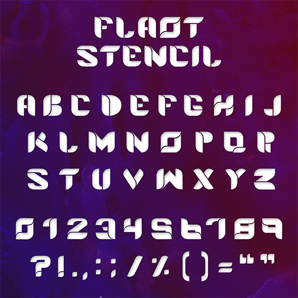
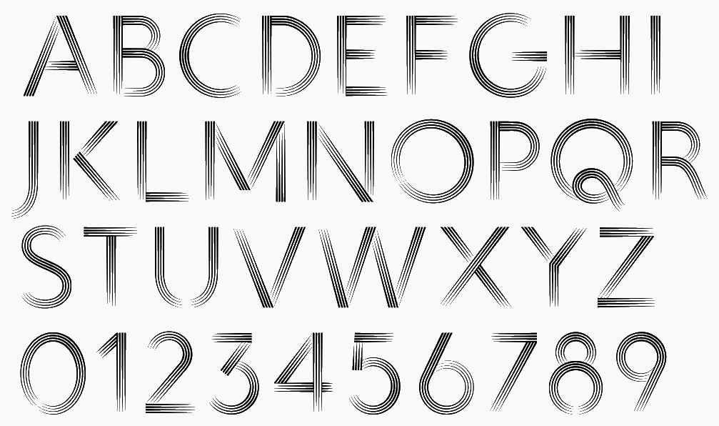
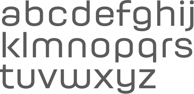
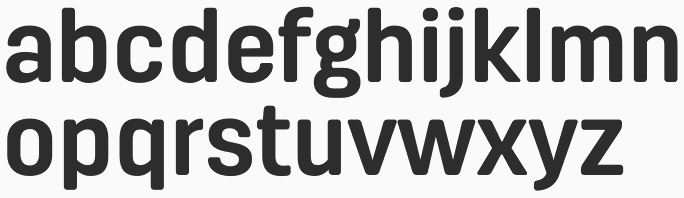
Sao Luis, Brazil (and before that, Vancouver, Canada)-based creator of Flaot Stencil (2013, a modular stencil face), Obvious (2013, a hairline geometric experimental typeface) and Hideseek (2013, a straight-edged experimental typeface). In 2014, he created the ultra-fat typeface Dreew. In 2016, he published Modernista which was inspired by the work of Brazilian Architect Oscar Niemeyer. In 2020, he released Andarillo (a display typeface inspired by vintage travel posters and magazines). Typefaces from 2021: Sarttori (a stylish 6-weight display serif). [Google] [MyFonts] [More] ⦿ | |
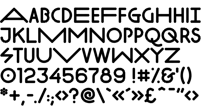
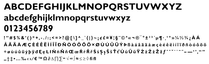
During his studies, J.C. Reis (Guarulhos, Brazil) designed Oscar Sans (2018) to honor famous Brazilian architect Oscar Niemeyer. [Google] [More] ⦿ | |
Johnny Feron
| |
Julia
|
|
Jvne77 Studio
|
|
Luciano Vergara
| |
Mendoza&Vergara
|
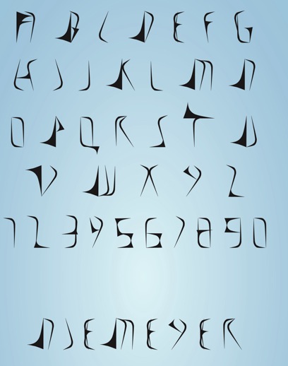
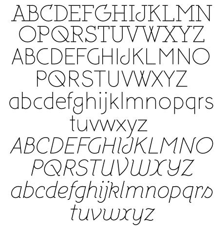
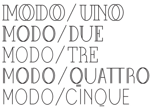
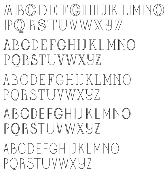
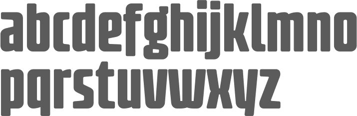
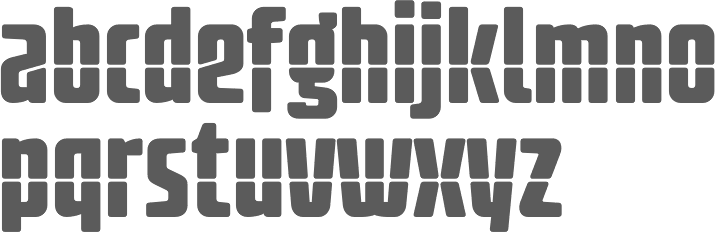
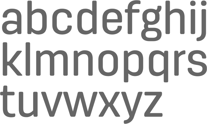
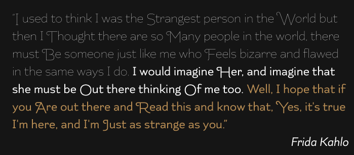
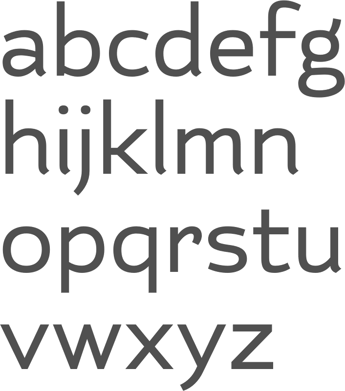
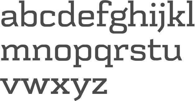
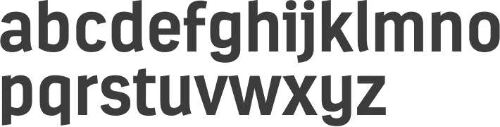
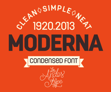
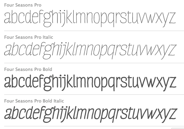
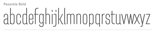
Vergara created these typefaces between 2004 and 2010: the sans typeface Conce (2004), Pepona (2006, T-26, a pixel face), Sketch (2008, T-26), Trauco (2006, T-26, a wonderful display face), Otto (2006, T-26, another pixel face), Roket U (2007, T-26, rounded anthroposophic unicase typeface) and Hisla Negra (2004), the serif typeface Patua (2003; Patua One is free at Google Web Fonts), the pixel typeface Xerif (2004), the pixel typeface Sinaptix (2004), the pixel typeface UNXERIF (2004), the pixel typeface Don Paul (2004, named after Paul Renner), the liquid display typeface Revolución (2006), the pixel family Renex (2004) and the pixel typeface O'Higgins (2003). At Latinotype (which Vergara co-founded with Daniel Hernandez in 2007), he created the dingbat typeface Chilean Bugs (2006) (free at Dafont), as well as Patua (serif), Regia (2008, hairline condensed sans). At FontStruct, he experimented with Flaca (2008). At his Flickr site, check out more commercial typefaces: Fidel (strong sans), Regia and Trasans (two light, even hairline, sans typefaces), Biotech, Working on a short-ascendered sans typeface called Midas (2010). Typefaces from 2011: Biotech, Cachiyuyo (a pixel family), Machi (titling sans), Los Lana Pro (an angular poster face; a stone age font), Fidel Black (a strong rounded sans, +Stencil Black), Patagon (Latinotype: a rounded wood-inspired poster typeface done with Miguel and Daniel Hernandez), Suisside (a humanist sans). Typefaces from 2012: Julius Sans One (Google Web Fonts), Pantano Pro (Pantano is a handmade grunge typeface inspired by the rustic style of Amazonia), Antartida (an 8-style family at Latinotype), Antartida Rounded (a rounded sans family), Kahlo (2012, Latinotype, designed for magazine headlines), Frida (Latinotype: a Latin style hipster sans typeface), Schwager (a steampunk slab serif, followed by Schwager Sans in 2014). Typefaces from 2013: Estandar (a wayfinding sans published by Latinotype; the Regular is free), Estandar Rounded, Moderna Condensed (+Unicase: an organic sans family), Four Seasons (handwritten, with Guisela Mendoza), Pasarela, Kahlo Rounded (Latinotype). Moderna (a monoline organic sans, with unicase styles thrown in). Antartida Rounded Essential (2013) is a rounded sans by Luciano Vergara, done for Los Andes Type. Typefaces from 2014: Estandar Rounded (by Vergara, a rounded sans in 13 styles named after Standard Oil Company), Garden (a playful decorative set of typefaces), Darwin (2014, a 20-font sans family with multiple fathers; see also Darwin Office, 2014, Darwin Pro, 2017, and Darwin Rounded, 2018), DIY Time (hand-printed, with Coto Mendoza at Latinotype). Typefaces from 2015: Nordikka (a headline sans with large x-height and a Scandinavian feel; Latinotype), Styling (a simple almost techno sans family inspired by the aerodynamic curves and elliptical shapes of old cars and airplanes). Corporative Sans, Corporative Sans Rounded and Corportaive are large typeface familes created by the Latinotype Team in 2015. In particular, they were developed by Javier Quintana and Cesar Araya, under the supervision of Luciano Vergara, and Daniel Hernandez. With Bruno Jara, Luciano Vergara designed the angular Jurassic park style typeface Los Lana Niu (2016). In 2016, Mendoza Vergara (Cecilia Mendoza, Coto Mendoza and Luciano Vergara) published the script family Bach and the script/slab pair Matcha at Los Andes. In 2016, Bruno Jara Ahumada, Alfonso Garcia, Luciano Vergara, Daniel Hernandez and the Latinotype Team designed the roman square capital headline typeface family Assemblage. In 2017, Luciano Vergara published Niemeyer as a tribute to Brazilian architect Oscar Niemeyer, and the modular---almost sci-fi---sans typeface family Nizzoli as a tribute to Marcello Nizzoli. He also designed the 28-style Internacional in 2017-2018, following the Swiss grotesque examples. Typefaces from 2018: Alvar (a humanist sans family at Los Andes; italics designed with the help of Alfonso Garcia), Resort (Sans, Script, Ornaments). In 2019, Luciano Vergara and Alfonso Garcia co-designed Moderna Sans at Latinotype. It is an interpretation of American gothics like Alternate Gothic. Typefaces from 2020: Abstract (an eclectic serif family with post-pandemic tensions and existential angst; by Luciano Vergara at Los Andes), Aestetico (Luciano Vergara, Daniel Hernandez and Alfonso Garcia: a 54-style sans family having Formal and Informal subsets of fonts so that the family covers several sans genres), Spock (2020: a 48-style demi-sans demi-slab family by Luciano Vergara, Cesar Araya and Rodrigo Fuenzalida), Neogrotesk. P>Typefaces from 2021: Grotesco (advertized as a South American grotesk; in 20 styles). Klingspor link. Dafont link. Behance link. View Lucian Vergara's typefaces. Fontspring link. [Google] [MyFonts] [More] ⦿ |
| |
During her studies in Lisbon, Talita Kessia designed Niemeyer (2013), a typeface named after Oscar Niemeyer. [Google] [More] ⦿ | |
Valerio Di Lucente
|

 [
[ Julia is Valerio Di Lucente (Italy), Erwan Lhuissier (France) and Hugo Timm (Brazil). They met at the Royal College of Art in London having come from different professional backgrounds in editorial design, web and art direction. The studio Julia was founded in 2008 upon their graduation. Together, they work on books, typefaces, posters, websites, identities and exhibition design. They teach as visiting lecturers at Kingston University. Typefaces:
  Lyon, France-based designer (b. 1977) of these typefaces:
  [
[ MendozaVergara is
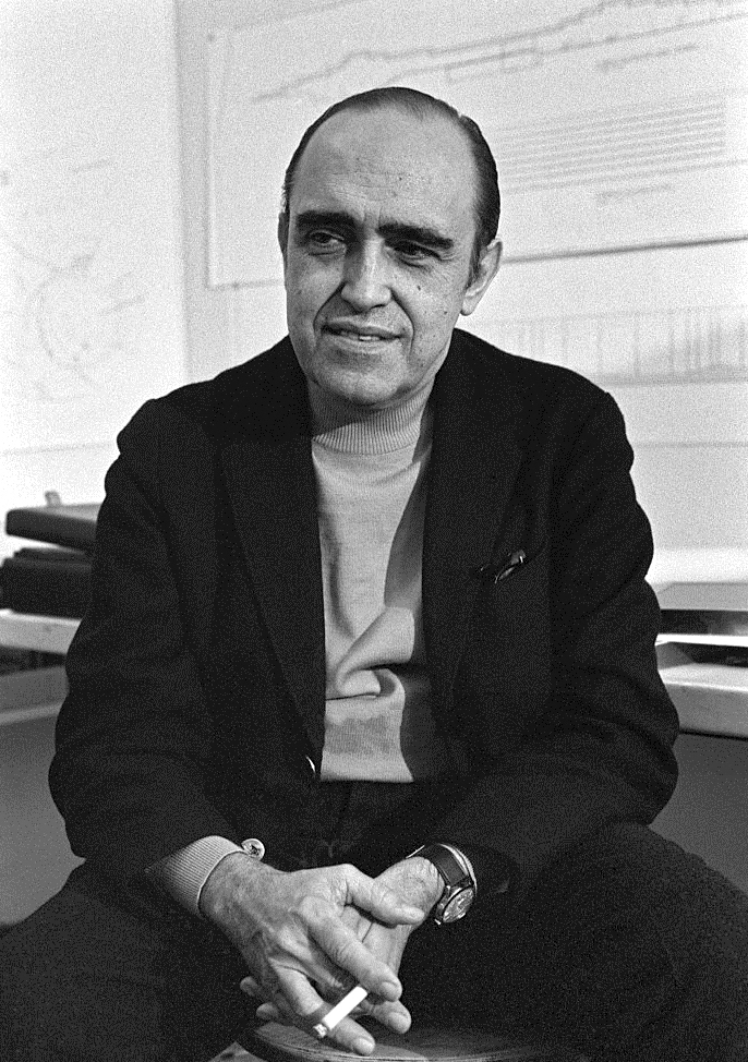
 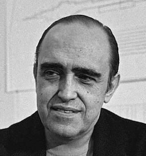 Celebrated Brazilian architect considered to be one of the key figures in the development of modern architecture. Oscar Ribeiro de Almeida Niemeyer Soares Filho (1907, d. 2012, Rio de Janeiro) was best known for his design of civic buildings for Brasilia, a planned city that became Brazil's capital in 1960, as well as his collaboration with other architects on the headquarters of the United Nations in New York. He held socialist and communist views, and was an outspoken atheist. For political reasons, he fled Brazil and could only return home in 1985, after the fall of the right-wing dictatorship. [
 [
[
|
|
|
|