TYPE DESIGN INFORMATION PAGE last updated on Mon Jul 20 20:26:41 EDT 2026
FONT RECOGNITION VIA FONT MOOSE

|
|
|
|
|
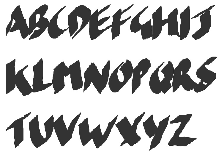
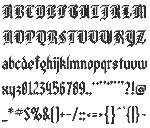
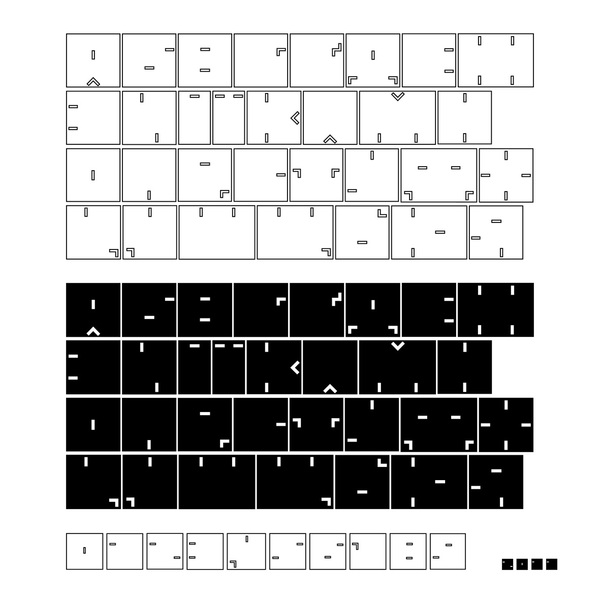
Nihilism | ||
|
|
|
|
SWITCH TO INDEX FILE
| |
Ukrainian advertising agency in Kiev. Its design studio is called BBDO Studio. Its type foundry branch was established 2015. Typefaces include:
| |
Daniel Viberg
| |
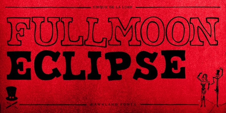
Dawnland
|
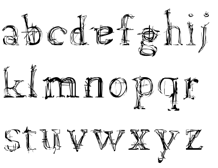
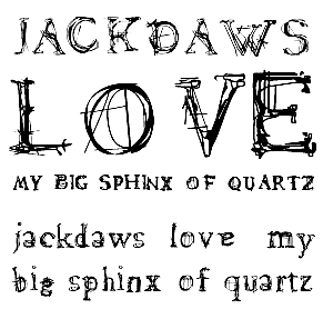
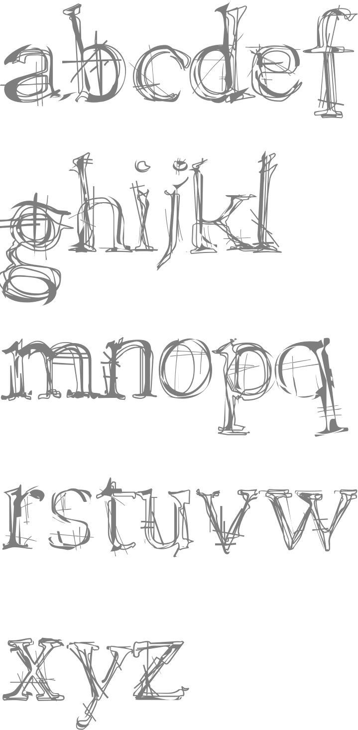
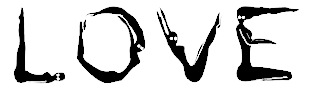
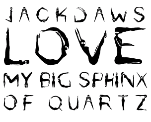
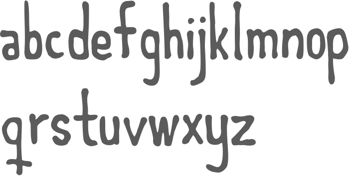
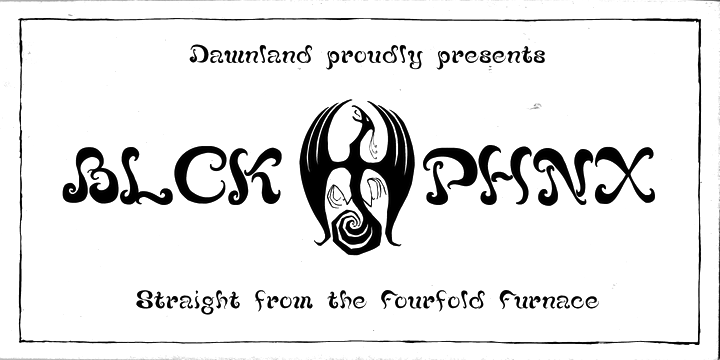
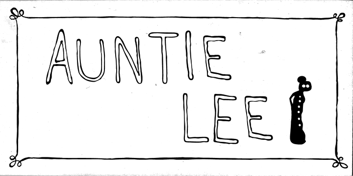
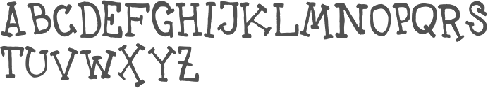
He created the Chaos font series, which comprises Paradox (1999, trembling hand face; +Paradox X, 2011, +Paradox Runa, 2011), Lamenta (1999, scratchy face), Lamenta X (2011), Lilith (2000, initials made with human figures), Nihil (2011, grungy) and Dissonus (2004, a nihilist grunge typeface inspired by the type treatments of Dave McKean as well as the Manson Anti Christ Superstar-artwork). Other typefaces include Victualia (brushy), Aeterna (2011, grunge), Haakke (2011, a children's hand), Awe (hand-printed), Victualia X (2011, a hand-drawn brush font), Chaos 1996 (2011, pen illustrations), Massiva GrotesQ (2012), Lore (2012, blackletter), Nokturnia, Nekromantea, Pandemonia, Meep (2013), Blck Phnx (2013, a lava lamp font), Auntie Lee (2013, hand-printed), Uncle Lee (2013, hand-printed), Ponderous (2013, a poster titling face), Cirque De La Lune (2013, poster lettering), Dulcet (2014, vintage script), Left Hand path (2015, hand-printed), Lost + Forlorn (2017, a punk/horror typeface), Wounds (2018: a scribbly horror font), Murk (2020: an all caps typeface with 26 ghastly creatures). Behance link. Creative Market link. Klingspor link. Dafont link. [Google] [MyFonts] [More] ⦿ |
Erman Yilmaz
| |
Graphic designer, b. 1989, Italy. For a school project at Escuela de Arte in Madrid, he created a font called Dynamich. This is pure experimentation, based on Malevich's paintings. [Google] [More] ⦿ | |
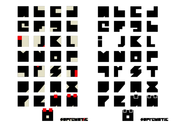
Graphic designer and illustrator from Stockholm. Creator of Suprematic (2008), an ultra-constructivist typeface inspired by the Russian artist Kazimir Malevich and his art form of suprematism. | |
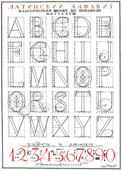
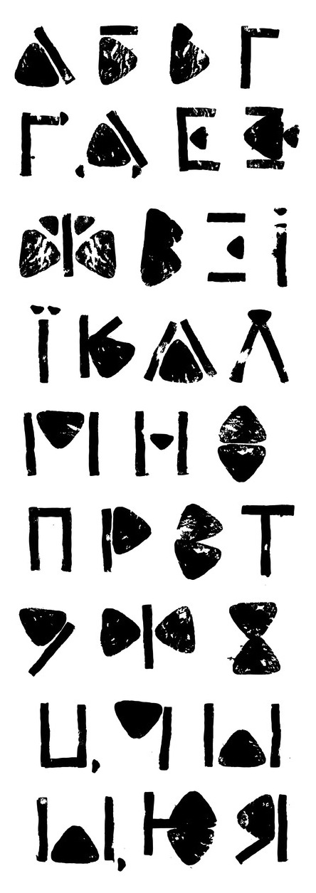
A Russian architect and artist, Iakov Chernikhov was born in 1889 in Pavlograd, Yekaterinenskav Gubernia, Ukraine (now Dnepropetrovskay Oblast). He died in 1951 in Moscow. He studied at the Odessa Art School, a branch of the St. Petersburg Academy of Arts. In 1914, having graduated from the Art School, he moved to St. Petersburg and entered the Academy of Arts. In 1916 Chernikhov transferred from the painting faculty to the architecture department and graduated in 1925. He became a successful architect, and taught at the Leningrad Institute of Transportation Engineers (after 1933 LIIZhT) in the school of architecture (1928-45), at the Industrial Academy (NKTP) in the course for factory and plant construction (1930-32), at the Stalin Transportation Academy (NKPC) (1930-32), and at the Institute of Engineers of Water Transportation (1929-31). He published Fundamentals of Modern Architecture (1929-1930), Construction of Architectural and Machine Forms (1931), and Architectural Fantasies. 101 Compositions (1933). These classics are all about architectural fantasies. The last work of Iakov Chernikhov, which remained uncompleted, was the book An Analysis of the Construction of Classical Typeface (written in 1945-1951). It was published in 1958, seven years after his death. Iakov Chernikhov used for construction of the types some principles taken from the theory of architectural forms having much in common with the type forms that obey the same regularities. Some of his work looks like the early attempts at regularization by Duerer and Tory, or as found in the Romain du Roi. In 2009, Dmitry Yakovlevich Chernikhov (editor), Uta Keil (German translation) and Heike Maria Johennig (English translation) published the Russian / German / English text Graphic masterpieces of Yakov Georgievich Chernikhov : the collecton of Dmitry Yakovlevich Chernikhov (DOM Publishers, Berlin). Wiki page. Scans: I, II, III, IV. Image of his Cyrillic Trajan (1945-1951). [Google] [More] ⦿ | |
Informal Type
|
In 2019, Erman published the self-centered hipster typeface Oddee. Erman explains: Oddee typeface is based on the dissimilarities in personal fashions and the contradictions sparked between two schoolmates, Adolf Loos and Josef Hoffmann, the first of whom is known for his belief in finding no place for the concept of ornamentation in architecture and functional design, while the latter proposes the ornamentation could find a place within design through not being a direct force but being a contributing part to a collective aesthetical value in everyday objects. [Google] [MyFonts] [More] ⦿ |
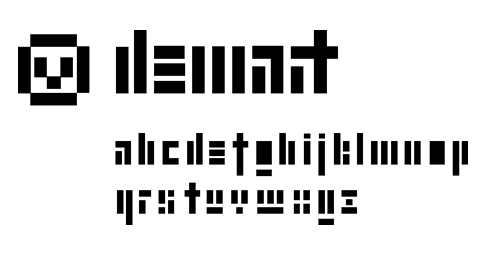
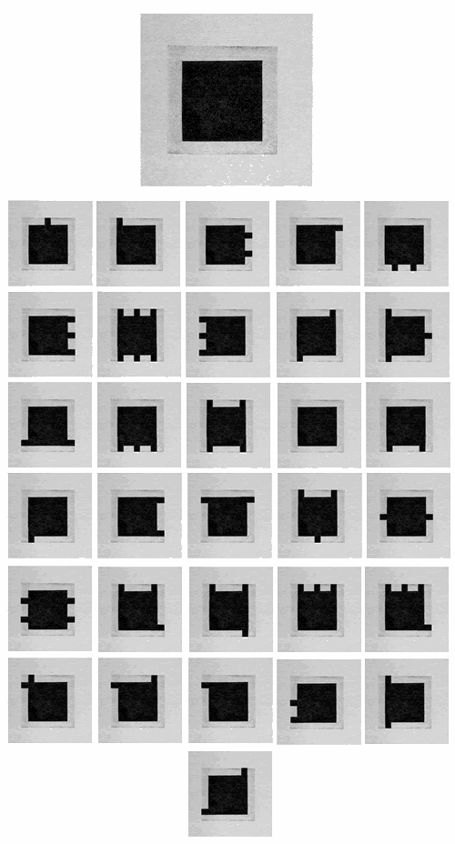
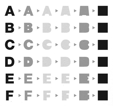
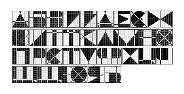
Designer whose Black Square Typeface (2012) is a nihilist experiment, in which each letter is a black square, as in Kazimir Malevich's Black Square painting. Beam (2012) is another typeface experiment. [Google] [More] ⦿ | |
Typefaces based on his work include:
| |
Mandy Levine
| |
As a student in Barcelona, Marc Fernandez designed an experimental typeface in 2016 that reflects the work of Kasimir Malevich. Later in 2016, he designed the text typeface Alego, which is influenced by stone cut types from the 18th century found in Tarragona. [Google] [More] ⦿ | |
| |
Nihilism is the philosophical viewpoint that suggests the denial or lack of belief toward the reputedly meaningful aspects of life. Existential nihilism argues that life is without objective meaning, purpose, or intrinsic value. Moral nihilists assert that there is no inherent morality, and that accepted moral values are abstractly contrived. Exponents of nihilism include Nietzsche and Kierkegaard. [Google] [More] ⦿ | |
Nihilschiz Fonts
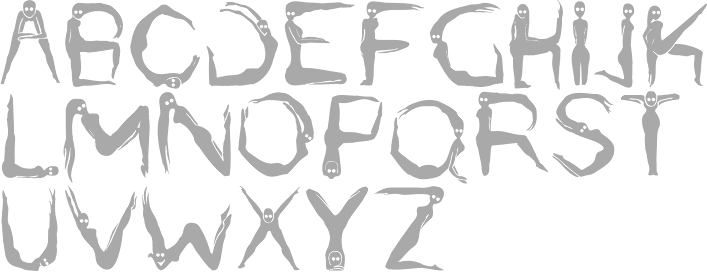
| Mandy Levine (Nihilschiz Fonts, or Nihilist Schizoid Fonts) is the American designer (b. 1988) of the blood-dripping font HoMicIDE EFfeCt (2006) and Nihilschiz Handwriting (2006). She also created Ganz Egal (2007, rubbed out Times), Faith Collapsing (2007, grungy blackletter), Raubtier (2007, blackletter), Voodoo Needles (2007, hand-printed), Homicide Effect (2006, gory font), Staubiges Vergnügen (2006), Thirsty-for-Souls (2006, grunge), AABK (which stands for Aggressive Angry Baby Killer, 2006, grunge), Pyramidhead (2004, destructive face). Home page (which makes my browser crash). Alternate URL. Yet another URL. And another URL. Fontspace link. [Google] [More] ⦿ |
| |
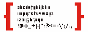
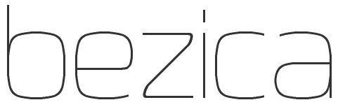
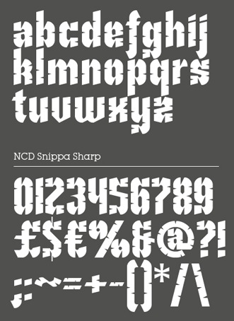
Additions in 2009: The NCD Dot Matrix family (many styles), NCD Grand Theft Autostruct (based on the logo for the Playstation/Xbox computer game "Grand Theft Auto"), NCD Dorky Corners Sans, NCD Amphibian (+Stencil), NCD Blagger (+Stencil), NCD Gigantica2, NCD Gigantica, NCD Brick Stacker, NCD Amoeba family (dot matrix), NCD Deejayon (nice), NCD Blagger (+Stencil), NCD Phusion Bold (octagonaal), NCD PS Magazine (+2) (octagonal), NCD Fabrica 50 (vertical stripes), NCD Scansion, NCD Octangle 20, NCD Neopolicia Harlequin, NCD Reinforcia (piano key, stencilized), NCD White Picket Fence, NCD Autonium Small Caps (not free...). In 2010, he created the NCD Chromica family (athletic lettering typefaces) and NCD Bezica 10 (elliptical), NCD Nu Arc Stencil Linked, NCD Nu Arc Linked Stencil, NCD Edding 5.0 (brush), NCD Patchwork (texture face), NCD Embroidery (+Comp Size), NCD Snippa Sharp (2011), NCD Nufraktura Gothic (2009), NCD Autonium Small Caps. Typefaces from 2012: NCD Black Square, NCD Black Square II. Typefaces from 2013: NCD Neopolicia (+Drop Serif, +Harlequin, +Jump Drop), NCD Grand Theft Autostruct (based on the logo for the Playstation/Xbox computer game "Grand Theft Auto"), NCD Isometrica Horizontal 1 (3d block face), NCD Mooch Squared, NCD Mooch Rounded II. In 2014, his striped octagonal art deco typeface NCD Deconium SC Black Serif Inlines won an award at the FontStruct Inline Font Competition. Other typefaces from 2014 include NCD Reinforcia and NCD Dottica Serif 60. | |
Tolyatti, Russia-based designer of the Cyrillic display typeface Malevich (2018), which is named after suprematist artist Kazimir Malevich. [Google] [More] ⦿ | |
Graphic designer in Krakow, Poland. Her typefaces:
| |
| |
Creative Director in Caracas, Venezuela where he works for a Trade Marketing company called Nexus. He was born in 1973 in Cúcuta, Norte de Santander, Colombia, and is a type designer at the Colombian foundry Andinistas. He co-designed the octagonal typefaces Nikona and Nikona Dual with Carlos Fabián Camargo in 2006: X1 (+Negra), X2 (+Gris), X3 (+Blanca), Stencil (+Dingbats). He writes: The leading thread that typifies this family is its mutant spirit, a result of my personal and typographic interpretation of the three robotic laws created by Asimov in 1940, and reflected many times in sci-fi movies, comics and Japanese anime. [Google] [MyFonts] [More] ⦿ | |
Providence, RI-based co-designer, with Yifan Du, of Nihil (2019), a stencil font based on Baskerville. [Google] [More] ⦿ | |
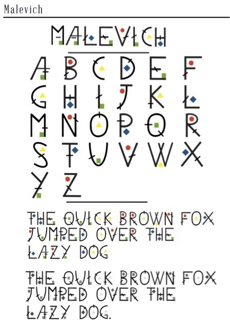
During his studies in Bolton, UK, Tom Davidson created Malevich (2013), a typeface that was inspired by the classic suprematist coloured geometric shapes and lines of Russian artist Kazemir Malevich. [Google] [More] ⦿ | |
Providence, RI-based co-designer, with Suri Huang at the Thode Island school of Design, of Nihil (2019), a stencil font based on Baskerville. [Google] [More] ⦿ |
 St. Petersburg-based Russian designer of
 Istanbul, Turkey-based designer (b. Mersin, 1985) of the sticky tape typeface
  Tolyatti, Russia-based designer of the nihilist Cyrillic typeface Malevich (2019). [
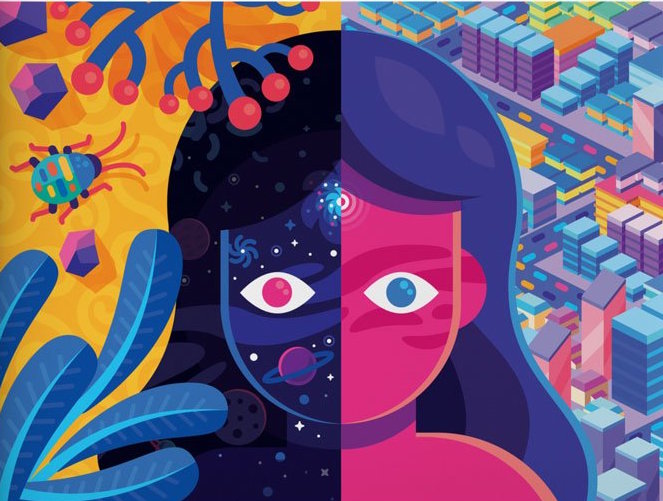
 Born in Kuala Lumpur, Malaysia, in 1987. Graphic designer in Brooklyn, NY, who created Kama (2015), an experimental typeface inspired by the work of Russian suprematist Kazemir Malevich. She also drew great cosmic typographic illustrations for Bullett Magazine in 2015.
  Nippa Downey (DJ Nippa) is the creator in 2008 at FontStruct of these typefaces: NCD Paperclip (2008), NCD Paperclip Closed, the NCD Black Square family (2008, he writes: The Black Square of Kazimir Malevich is one of the most famous creations of Russian art in the last century. The first Black Square was painted in 1915 to become the turning point in the development of Russian avant-garde.), Snake, Snake Rebel, Mooch Rounded II and Mooch Squared II.
  Talented Ukrainian designer. She has interesting
|
|
|
|