| | |
A Gallery of Fiction Magazine Art
[Dick Pape]
|
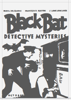 Fonts by Dick Pape based on A Gallery of Fiction Magazine Art (Frank M. Robinson, Collectors Press, Inc, 2006), digitized in 2008: IncrediblePulps-Adventure, IncrediblePulps-Detective, IncrediblePulps-Fantasy, IncrediblePulps-SciFi, IncrediblePulps-Westerns. [Google]
[More] ⦿
Fonts by Dick Pape based on A Gallery of Fiction Magazine Art (Frank M. Robinson, Collectors Press, Inc, 2006), digitized in 2008: IncrediblePulps-Adventure, IncrediblePulps-Detective, IncrediblePulps-Fantasy, IncrediblePulps-SciFi, IncrediblePulps-Westerns. [Google]
[More] ⦿
|
Aesop Fonts
[Dick Pape]
|
Dick Pape created a group of symbol fonts (Aesop's Life, Aesop's Fables A, B and C) which trace the life and times of Aesop. The first font is an overview of Aesop's life while the others illustrate his moral lessons. Dick Pape: The illustrations come from the second Augsburg edition of the Fables of Aesop, translated from Latin into German by Heinrich Steinhöwel in 1479. It is illustrated with 208 woodcuts, cut in the Augsburg style, which is characterized by thick contour lines outlining the figures, a reliance on white space rather than highly detailed embellishment to decorate the image, and little background or landscape to create perspective. The publishing history of the Fables is extensive. Over 150 separate editions were printed between 1465 and 1501. Little is known of Aesop's life, but he is believed to have been a slave who lived during the sixth century BC. He himself did not write down the fables. They became part of the oral tradition of storytelling and were eventually recorded by his contemporaries. The uncomplicated moral lessons that are related in Aesop's Fables have captured the imagination of generations of artists, who have used his stories as a way to teach moral lessons to children of all cultures and nationalities. Download links: i, ii. High Logic forum. [Google]
[More] ⦿
|
American Popular Song Sheet Covers
[Dick Pape]
|
Fonts by Dick Pape based on American Popular Song Sheet Covers: Music Covers-1890, Music_Covers-1891, Music Song Covers - 1899a, Music Song Covers - 1899b, Music Song Covers-1899c, Music Covers 1901-1909, Music_Covers-1910-11. Download here. [Google]
[More] ⦿
|
Andrew Holmes
[Dick Pape]
|
 Andrew Holmes's Calligraphic Art inspired Dick Pape to make six decorative typefaces in 2009, all called Andrew Holmes Art. Download page. [Google]
[More] ⦿
Andrew Holmes's Calligraphic Art inspired Dick Pape to make six decorative typefaces in 2009, all called Andrew Holmes Art. Download page. [Google]
[More] ⦿
|
Aridi Computer Graphics: Digitizations by Dick Pape
[Dick Pape]
|
Aridi Computer Graphics is known for its initial caps and ornamental typefaces and ornaments. In 2008, Dick Pape digitized these typefaces: AridiArabesqueDesignsI, AridiArabesqueDesignsIIIa, AridiArabesqueDesignsIIIb, AridiArabesqueDesignsIIa, AridiArabesqueDesignsIIb, AridiArabesqueDesignsIV, AridiArabesqueFrames, AridiArabesqueMasterpieces, AridiArabesqueMasterpiecesA, AridiArabesqueMasterpiecesB, AridiArabesqueOrnaments, AridiArabicCalligraphyArt, AridiArtNouveauA, AridiArtNouveauB, AridiBusinessGraphics, AridiCalligraphiaA, AridiCalligraphiaB, AridiCalligraphicaI, AridiCalligraphicaII, AridiCrests&Ribbons, AridiElaborateFrames, Aridi Fiesta 1 and 2, AridiInitials1Blister, AridiInitials1Gothic, AridiInitials1Nabel, AridiInitials1Regal, AridiInitials1Spring, AridiInitials1Wind, AridiInitials2Digital, AridiInitials2LubnaHollow, AridiInitials2NapoliHollow, AridiInitials2Romantic, AridiInitials2Royal, AridiInitials2Stone, AridiInitials3Cherubs, AridiInitials3Fantasia, AridiInitials3FantasiaBold, AridiInitials3Masselle, AridiInitials3Rosette, AridiInitials3RosetteRevers, AridiInitials3Victoriana, AridiInitials3Vincente, AridiInitials4Cinderella, AridiInitials4Federal, AridiInitials4Ginger, AridiInitials4Marquesa, AridiInitials4Renaissance, AridiInitials4Tuscani, AridiOldWorldFramesA, AridiOldWorldFramesB, AridiOldWorldFramesC, AridiOldWorldFramesD, AridiOldWorldFramesE, AridiOldWorldFramesF, AridiOldWorldFramesG, AridiOldWorldOrnamentsA, AridiOldWorldOrnamentsB, AridiOrnamentalDesigns, AridiOrnamentalFrames, AridiPrinterOrnamentsD, AridiPrinterOrnamentsSingle, AridiPrinterOrnamentshA, AridiPrinterOrnamentshB, AridiPrinterOrnamentshC, AridiPrinterOrnamentsvA, AridiPrinterOrnamentsvB, AridiRibbons&Banners. Download page. [Google]
[More] ⦿
|
Australian aboriginal art by Dick Pape
[Dick Pape]
|
Dick Pape created these Australian aboriginal art typefaces in 2009: Aboriginal Art (A, B, C). Download here. [Google]
[More] ⦿
|
Bailey Scott Murphy
|
Architect who drew a modern pen alphabet described in 1910 by Lewis Foreman Day as freehand without the use of geometrical instruments. Shown in Foreman Day's Alphabets Old And New For The Use Of Craftsmen (1910), it was made into a digital typeface in 2012 by Dick Pape under the name LFD Freehand 170. [Google]
[More] ⦿
|
Ben Tour
[Dick Pape]
|
 Ben Tour (b. 1977) is a Canadian artist. Ben Tour (1, 2 and 3) are scanbat fonts created in 2009 by Dick Pape, who writes: Canadian-born artist Ben Tour (b. 1977) channels a dark, often haunting sense of humanism in his work. His observations deftly inform his paintings, enabling him to capture the essence of a character, and then distort that view any way he desires. Frenetic lines, swaths of color, and intimate angles all convey a sense that Tour may not only be drawing inspiration from the lives of strangers he observes, but manifesting his own personal experiences as well. The emotional content in each portrait is palpable as this perceived notion of creation and catharsis is paired well with the immediate voyeuristic allure of his characters. Tour has exhibited in galleries from Los Angeles to Miami, Hamburg to New York.
 Download page. [Google]
[More] ⦿
|
Bill, Stark, and Co
|
 In 1850, Horatio and HJeremiah Bill, who had previously worked for Edwin Allen in South Windham, CT, start a wood type manufacturing business in Lebanon, CT, and move to Willimantic, CT, the next year. A few years later, they were joined by Stark, and the company became Bill, Stark, and Co. In early 1854, it is renamed again to H. and J. Bill Co., but closes its doors later that year. Their equipment gets purchased by William Page in 1856 who will start his own successful wood type company, Page&Bassett.
 Its typefaces included Bill Stark Roman Extended (a "fatface"), and Concave Tuscan Condensed (1853). For digitizations, see, e.g., Dick Pape's AWT Bill Stark Concave Tuscan Cond (2013), AWT RIT Conc Tuscan Open Shade (2013) and AWT Vandenburgh Concave Tuscan (2013: this typeface was cut by Vanderburgh Wells but is based on an 1853 design by Bill, Stark & Co). [Google]
[More] ⦿
|
Binny&Ronaldson
[James Ronaldson]

|
In 1796, Archibald Binny (ca. 1762-1838) and James Ronaldson (1769-1841 or 1842) (some say 1768-1842) started the first permanent American type foundry in Philadelphia in 1796, called Binny&Ronaldson. James, a business man from Edinburgh was the financial fhalf of the pair. In 1809 and 1812, they published America's first specimen book. The only complete copy of this book is at the Rare Book and Manuscript Library of Columbia University, and is entitled A specimen of metal ornaments cast at the letter foundery of Binny and Ronaldson (20 pages, printed by Fry and Kammerer, Philadelphia, USA, 1809) and Specimen of printing types from the foundry of Binny & Ronaldson (1812, Philadelphia, Fry and Kammerer, printers). Local download of the 1812 book. James Ronaldson published Specimen of Printing Type, from the Letter Foundry of James Ronaldson, Successor to Binny&Ronaldson; Cedar, Between Ninth and Tenth Streets, Philadelphia (Philadelphia: J. Ronaldson, 1822). Acquired by Johnson&Smith in 1833, it became L. Johnson&Co. in 1843, and finally MacKellar, Smiths&Jordan in 1867. The latter company was the largest typefounder in America when in 1892 it was amalgamated with many others into ATF. About digital typefaces that are derived: MyFonts sells Isabella, a font by ATF/Kingsley that can be traced back to Binny&Ronaldson. It also offers Really Big Shoe NF (Nick Curtis, 2009), which is based on Ronaldson's Oxford. Dick Pape published the free fonts Binny & Ronaldson English Two Line Orn (2010), Binny & Ronaldson Great Primer Two Pica (2010), and Binny & Ronaldson Primer Two Line Orn (2010). [Google]
[MyFonts]
[More] ⦿
|
Branislav S. Cirkovic
[TypoFlat]
|
[More] ⦿
|
Briar Press: Digitizations by Dick Pape
[Dick Pape]
|
Dick Pape digitized these ornamental typefaces in 2009, around the theme of Briar Press: BriarPressBorders&Frames, BriarPressMiscLetters, BriarPressOrnamentsA, BriarPressOrnamentsB. Download here. [Google]
[More] ⦿
|
Buddhist images: Dick Pape
[Dick Pape]
|
 Dick Pape (2008-2010) digitized several Buddhist and religious Tibetan fonts from 2008 until 2010. These include Buddhist Images-Group 5 [from images drawn for the new edition of the Rinchen Terdzod that was undertaken at Shechen monastery, Kathmandu in 2005. The images were mainly drawn by the resident artist of the Tsering Art School, Knochog-la], Buddhist Images-Group 1 [from a collection of images by Cliff Meurer, a student of Lama Tharchin in California], BuddhistImages-Group2 (a and b) [from a collection of images from the Asian Classic Input Program], Buddhist Images-Group 3 [from line drawings made by highly respected local Tibetan artists (Drukpa Kagyu Heritage Project and Drigung Kagyu Publisher's Pecha Images)], Buddhist Images-Group 4 [from a collection of line drawings related to the Kagyu lineage originally scanned and cleaned by Keith Downman].
 Download here. [Google]
[More] ⦿
|
Butterfly Clip Art collection
[Dick Pape]
|
 Dick Pape based the following digitizations on images and typefaces found in the Butterfly Clip Art collection, mostly in 2009: Butterfly A1 Men At Work, Butterfly A1 Professions, Butterfly A2 Heads-Hats, Butterfly A3 Computer Things, Butterfly A4 Office Things, Butterfly A4 Writing Things, Butterfly A5 Cartoon Profession, Butterfly A5 Cartooners A, Butterfly A5 Cartooners B, Butterfly A5 Cartooners C, Butterfly A6 At Work, Butterfly A7 Cartoon Extras, Butterfly A8 Clip Art-A, Butterfly A8 Clip Art-B, Butterfly A8 Clip Art-C, Butterfly A8 Clip Art-D, Butterfly A8 Clip Art-E, Butterfly A9 Animals-A, Butterfly A9 Animals-B, Butterfly A9 Animals-C, Butterfly A9 Animals-D, Butterfly A9 Animals-E, Butterfly A9 Animals-F, Butterfly Alien Cartoons, Butterfly Animal Clips, Butterfly Aquatic Animals, Butterfly Astrological, Butterfly Awards&Trophys, Butterfly Background Ornaments, Butterfly Birds, Butterfly Borders A, Butterfly Borders B, Butterfly Cameras, Butterfly Car Pictures, Butterfly Car Things, Butterfly Cars, Butterfly Cartoon Animals A, Butterfly Cartoon Animals B, Butterfly Cartoon Animals C, Butterfly Cartoon Children A, Butterfly Cartoon Children B, Butterfly Cartoon People, Butterfly Cartoon Words, Butterfly Cartoons A, Butterfly Cartoons B, Butterfly Cartoons C, Butterfly Cartoons in Dress (A, B, C), Butterfly Celebrations, Butterfly Chef Duties, Butterfly Children A, Butterfly Children B, Butterfly Chinese Letters, Butterfly Christmas Decore, Butterfly Christmas People, Butterfly Clip Art Misc 1, Butterfly Clip Art Misc 2, Butterfly Clip Art Misc 3, Butterfly Clip Art Objects, Butterfly Clip Art People, Butterfly Clip Art Sketches 1, Butterfly Clip Art Sketches 2, Butterfly Clip Art Sketches 3, Butterfly Clip Objects 1, Butterfly Clip Objects 2, Butterfly Clip With Faces, Butterfly Clowns A, Butterfly Clowns B, Butterfly Coins Clip, Butterfly Cooking&Food A, Butterfly Cooking&Food B, Butterfly Cooking&Food C, Butterfly Designer Frames A, Butterfly Designer Frames B, Butterfly Designer Ornaments, Butterfly Dinosaurs&Mythicals, Butterfly Dinosaurs-Reptiles, Butterfly Domesticated Animals, Butterfly East Bunny, Butterfly Ethnic, Butterfly European Scenes A, Butterfly European Scenes B, Butterfly Extra Images, Butterfly Extra Things, Butterfly Famous Sights1, Butterfly Famous Sights2, Butterfly Famous Site Seeing, Butterfly Famous Sites, Butterfly Fasteners, Butterfly Flowers A, Butterfly Flowers B, Butterfly Flowers C, Butterfly Flowers Leaves, Butterfly Flowers People, Butterfly Flowers Trees, Butterfly Flowers Wreaths, Butterfly Flying Ships, Butterfly Food - Deserts, Butterfly Food - Drink, Butterfly Food - Meals, Butterfly Food 1, Butterfly Food 2, Butterfly Food Animals 1, Butterfly Food Animals 2, Butterfly Food Clips, Butterfly Foods 3, Butterfly Foods 4, Butterfly Framed Clips, Butterfly Frames, Butterfly Furniture, Butterfly Garden Tools, Butterfly German Street Signs A, Butterfly German Street Signs B, Butterfly German Street Signs C, Butterfly Glass Bottles, Butterfly Glasses, Butterfly Grocery Shopping, Butterfly Hand Tools, Butterfly Hands A, Butterfly Hands B, Butterfly Hands C, Butterfly Holidays A, Butterfly Holidays B, Butterfly Hunting&Fishing, Butterfly Information Signs A, Butterfly Information Signs B, Butterfly Information Signs C, Butterfly Insects, Butterfly Legs, Feet&Faces, Butterfly Love&Marriage A, Butterfly Love&Marriage B, Butterfly Mail Scenes, Butterfly Maps&Flags, Butterfly Miscellaneous Icons, Butterfly Motorcycles, Butterfly Musical Instrument, Butterfly Musicians&Instru, Butterfly New Humans, Butterfly New Years, Butterfly Old Humans, Butterfly People Clips, Butterfly Places Clips, Butterfly Planes, Butterfly Portraits - Adults, Butterfly Portraits - Aged, Butterfly Portraits - Famous, Butterfly Portraits - Men A, Butterfly Portraits - Men B, Butterfly Portraits - Mixed, Butterfly Portraits - Now, Butterfly Portraits - Old, Butterfly Portraits - Women A, Butterfly Portraits - Women B, Butterfly Racing Cars, Butterfly Recreations, Butterfly Recycling Signs A, Butterfly Recycling Signs B, Butterfly Religious Icons, Butterfly Road Signs, Butterfly Ships&Boats, Butterfly Sign Boards, Butterfly Signs A, Butterfly Signs B, Butterfly Silhouette Signs, Butterfly Sketches - Adults, Butterfly Sketches - Couples, Butterfly Sketches - Fashion, Butterfly Sketches - Women, Butterfly Small Signs, Butterfly Sorta Road Signs, Butterfly Sport Accessories, Butterfly Sport Cartoons, Butterfly Sport Dings A, Butterfly Sport Dings B, Butterfly Sport Dings C, Butterfly Sport Silhouettes, Butterfly Sports A, Butterfly Sports Actions A, Butterfly Sports Actions B, Butterfly Sports Actions C, Butterfly Sports B, Butterfly Sports C, Butterfly Sports D, Butterfly Sports E, Butterfly Star Designs A, Butterfly Star Designs B, Butterfly Star Designs C, Butterfly Street Signs A, Butterfly Street Signs B, Butterfly Street Signs C, Butterfly Time Pieces, Butterfly Tool Clips, Butterfly Trains, Butterfly Travel Images A, Butterfly Travel Images B, Butterfly Travel Images C, Butterfly Tribal, Butterfly Trucks and Other, Butterfly Trucks, Butterfly Vacations, Butterfly Vehicles, Butterfly Weapons, Butterfly Wild Animals, Butterfly Winter Sports, Butterfly Young Adults A, Butterfly Young Adults B. Download page. [Google]
[More] ⦿
Dick Pape based the following digitizations on images and typefaces found in the Butterfly Clip Art collection, mostly in 2009: Butterfly A1 Men At Work, Butterfly A1 Professions, Butterfly A2 Heads-Hats, Butterfly A3 Computer Things, Butterfly A4 Office Things, Butterfly A4 Writing Things, Butterfly A5 Cartoon Profession, Butterfly A5 Cartooners A, Butterfly A5 Cartooners B, Butterfly A5 Cartooners C, Butterfly A6 At Work, Butterfly A7 Cartoon Extras, Butterfly A8 Clip Art-A, Butterfly A8 Clip Art-B, Butterfly A8 Clip Art-C, Butterfly A8 Clip Art-D, Butterfly A8 Clip Art-E, Butterfly A9 Animals-A, Butterfly A9 Animals-B, Butterfly A9 Animals-C, Butterfly A9 Animals-D, Butterfly A9 Animals-E, Butterfly A9 Animals-F, Butterfly Alien Cartoons, Butterfly Animal Clips, Butterfly Aquatic Animals, Butterfly Astrological, Butterfly Awards&Trophys, Butterfly Background Ornaments, Butterfly Birds, Butterfly Borders A, Butterfly Borders B, Butterfly Cameras, Butterfly Car Pictures, Butterfly Car Things, Butterfly Cars, Butterfly Cartoon Animals A, Butterfly Cartoon Animals B, Butterfly Cartoon Animals C, Butterfly Cartoon Children A, Butterfly Cartoon Children B, Butterfly Cartoon People, Butterfly Cartoon Words, Butterfly Cartoons A, Butterfly Cartoons B, Butterfly Cartoons C, Butterfly Cartoons in Dress (A, B, C), Butterfly Celebrations, Butterfly Chef Duties, Butterfly Children A, Butterfly Children B, Butterfly Chinese Letters, Butterfly Christmas Decore, Butterfly Christmas People, Butterfly Clip Art Misc 1, Butterfly Clip Art Misc 2, Butterfly Clip Art Misc 3, Butterfly Clip Art Objects, Butterfly Clip Art People, Butterfly Clip Art Sketches 1, Butterfly Clip Art Sketches 2, Butterfly Clip Art Sketches 3, Butterfly Clip Objects 1, Butterfly Clip Objects 2, Butterfly Clip With Faces, Butterfly Clowns A, Butterfly Clowns B, Butterfly Coins Clip, Butterfly Cooking&Food A, Butterfly Cooking&Food B, Butterfly Cooking&Food C, Butterfly Designer Frames A, Butterfly Designer Frames B, Butterfly Designer Ornaments, Butterfly Dinosaurs&Mythicals, Butterfly Dinosaurs-Reptiles, Butterfly Domesticated Animals, Butterfly East Bunny, Butterfly Ethnic, Butterfly European Scenes A, Butterfly European Scenes B, Butterfly Extra Images, Butterfly Extra Things, Butterfly Famous Sights1, Butterfly Famous Sights2, Butterfly Famous Site Seeing, Butterfly Famous Sites, Butterfly Fasteners, Butterfly Flowers A, Butterfly Flowers B, Butterfly Flowers C, Butterfly Flowers Leaves, Butterfly Flowers People, Butterfly Flowers Trees, Butterfly Flowers Wreaths, Butterfly Flying Ships, Butterfly Food - Deserts, Butterfly Food - Drink, Butterfly Food - Meals, Butterfly Food 1, Butterfly Food 2, Butterfly Food Animals 1, Butterfly Food Animals 2, Butterfly Food Clips, Butterfly Foods 3, Butterfly Foods 4, Butterfly Framed Clips, Butterfly Frames, Butterfly Furniture, Butterfly Garden Tools, Butterfly German Street Signs A, Butterfly German Street Signs B, Butterfly German Street Signs C, Butterfly Glass Bottles, Butterfly Glasses, Butterfly Grocery Shopping, Butterfly Hand Tools, Butterfly Hands A, Butterfly Hands B, Butterfly Hands C, Butterfly Holidays A, Butterfly Holidays B, Butterfly Hunting&Fishing, Butterfly Information Signs A, Butterfly Information Signs B, Butterfly Information Signs C, Butterfly Insects, Butterfly Legs, Feet&Faces, Butterfly Love&Marriage A, Butterfly Love&Marriage B, Butterfly Mail Scenes, Butterfly Maps&Flags, Butterfly Miscellaneous Icons, Butterfly Motorcycles, Butterfly Musical Instrument, Butterfly Musicians&Instru, Butterfly New Humans, Butterfly New Years, Butterfly Old Humans, Butterfly People Clips, Butterfly Places Clips, Butterfly Planes, Butterfly Portraits - Adults, Butterfly Portraits - Aged, Butterfly Portraits - Famous, Butterfly Portraits - Men A, Butterfly Portraits - Men B, Butterfly Portraits - Mixed, Butterfly Portraits - Now, Butterfly Portraits - Old, Butterfly Portraits - Women A, Butterfly Portraits - Women B, Butterfly Racing Cars, Butterfly Recreations, Butterfly Recycling Signs A, Butterfly Recycling Signs B, Butterfly Religious Icons, Butterfly Road Signs, Butterfly Ships&Boats, Butterfly Sign Boards, Butterfly Signs A, Butterfly Signs B, Butterfly Silhouette Signs, Butterfly Sketches - Adults, Butterfly Sketches - Couples, Butterfly Sketches - Fashion, Butterfly Sketches - Women, Butterfly Small Signs, Butterfly Sorta Road Signs, Butterfly Sport Accessories, Butterfly Sport Cartoons, Butterfly Sport Dings A, Butterfly Sport Dings B, Butterfly Sport Dings C, Butterfly Sport Silhouettes, Butterfly Sports A, Butterfly Sports Actions A, Butterfly Sports Actions B, Butterfly Sports Actions C, Butterfly Sports B, Butterfly Sports C, Butterfly Sports D, Butterfly Sports E, Butterfly Star Designs A, Butterfly Star Designs B, Butterfly Star Designs C, Butterfly Street Signs A, Butterfly Street Signs B, Butterfly Street Signs C, Butterfly Time Pieces, Butterfly Tool Clips, Butterfly Trains, Butterfly Travel Images A, Butterfly Travel Images B, Butterfly Travel Images C, Butterfly Tribal, Butterfly Trucks and Other, Butterfly Trucks, Butterfly Vacations, Butterfly Vehicles, Butterfly Weapons, Butterfly Wild Animals, Butterfly Winter Sports, Butterfly Young Adults A, Butterfly Young Adults B. Download page. [Google]
[More] ⦿
|
Carol Belanger Grafton
|
 In 1981, Carol Belanger Grafton published Bizarre & Ornamental Alphabets (Dover).
 Dick Pape digitized these ornamental caps typefaces, naming them by page number: BizarreAlphabets-Page108, BizarreAlphabets-Page112, BizarreAlphabets-Page114, BizarreAlphabets-Page116a, BizarreAlphabets-Page116b, BizarreAlphabets-Page117a, BizarreAlphabets-Page117b, BizarreAlphabets-Page121, BizarreAlphabets-Page14, BizarreAlphabets-Page22, BizarreAlphabets-Page24, BizarreAlphabets-Page62, BizarreAlphabets-Page66, BizarreAlphabets-Page74, BizarreAlphabets-Page76, BizarreAlphabets-Page78, BizarreAlphabets-Page92, BizarreAlphabets-Page93Bold, BizarreAlphabets-Page94, BizarreAlphabets-Page95, BizarreAlphabets-Page96-Dusty, BizarreAlphabets-Page98, BizarreAlphabets-Page99. Download here. [Google]
[More] ⦿
|
Clarence Pearson Hornung
[Dick Pape]
|
 Prolific author, b. 1899. His books include the typographically magnificent Handbook of Early Advertising Art, Mainly from American Sources (Dover, 2 volumes). The typeface Lexington is attributed to him, as Mac McGrew writes: Lexington is a font of shaded and decorated letters and figures, drawn for ATF by Wadsworth A. Parker in 1926, from a design by Clarence P. Hornung. It is an ornamental form of roman letter, with curly serifs, and tendrils at the ends of light strokes. It was recast in 1954, and copied in one size by Los Angeles Type.
 The book Early Advertising Alphabets, Initials and Typographic Ornaments (1956), edited by Clarence P. Hornung, led Dick Pape to creates these digital fonts in 2008: AltDeutsch, Amorette1889, ArabesqueDesign, BreiteEgyptienne (2008), BreiteverzierteClarendon, ChiswickPressGothicInitials, EarlyScrollAlphabet, EarlySignboards, EnglandInitials1880, ErhardDatdolt, FlorentineInitials, FlorentineInitialsReverse (2008), GothicChancery1880s, GothicClosedLetter (2009-2010, Lombardic), Hollandisch-Gothic (2010), JudendstilAlphabet (2009), LilyoftheValley, Papillon 1760 [First shown in Paris in 1760, and reprinted by Clarence P Hornung in Dover Pictorial Archive Series: Early Advertising Alphabets, Initials and Typographic Ornaments (1956, Dover Publications). Hornung's images inspired Pape's typeface], Phantasie (2009-2010), Romaine Midolline (2010), RomanPrintShaded (2010, ornamental roman caps), RusticAlphabet, SilhouetteInitials1880, TheTerrorsofNightLife, VerzierteAltGothic, VerzierteGothic, VictoriaGingerbread1890 (2007). Klingspor link. Download here. More direct link to Pape's digitizations. [Google]
[More] ⦿
|
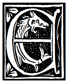
Cloister Initials
|
 A typeface made in 1918 by Frederic Goudy. D.J.R. Bruckner: Goudy allowed that this set of capitals was not, strictly speaking, a typeface. American Type Founders had asked for an alphabet in the style of the large center capital A in The Alphabet, and Goudy drew an entire set for them. He said he had not intended it to be cut, but A.T.F. made matrices and sold the type for a while.
 Digital versions: LTC Goudy Initials (Miranda Roth for Lanston and P22, 2005: based on the original proofs of large sizes of Cloister Initials), Cloister Initials (2006-2007, Group Type), Initials ATF Cloister (Alter Littera, 2012), Goudy Initials (2008: a free font by Dick Pape), PF Goudy Initials (Paratype). [Google]
[More] ⦿
|
Dan X. Solo: Digitizations by Dick Pape
[Dick Pape]
|
Dick Pape based the following digitizations (2008-2010) of blackletter, art deco, Celtic, initial caps, and other ornamental typefaces shown by Dan X. Solo in his Dover books: DXSAlphaMidnight, DXSAlphaTwilight, DXSBeansBold, DXSBlackline (prismatic, art deco), DXSBoboBold, DXSBrusselsInitials, DXSBuckinghamInitials, DXSBust, DXSCharger, DXSCheckmate, DXSCorral, DXSDevon, DXSDevonian, DXSDudleyPNarrow, DXSFatCat, DXSFestival, DXSFrankfortInitials, DXSFuturaInline, DXSGrooviestGothic, DXSGuildhall, DXSHessNeobold, DXSHotline, DXSHuntingtonInitials, DXSJoyceBlack, DXSKupferInitials, DXSLampoon, DXSLeipzigInitials, DXSLeister, DXSLowenbrau, DXSMonogramStencil, DXSMonumentBold, DXSNottinghamInitials, DXSOrbit, DXSOttoHuppInitials, DXSPickfair, DXSPolly, DXSPotsdamInitials, DXSPrismaniaC, DXSPrismaniaP, DXSQuote, DXSRegalBlack, DXSRhythmBold, DXSRickyTick, DXSRoco (art deco), DXSSansSouci, DXSShadyDeal, DXSSheetSteel, DXSSilverShadowBlack, DXSStuttgartInitials, DXSTester, DXSThedaBara (counterless geometric art deco), DXSTulo, DXSTuxedo, DXSUrban (psychedelic), DXSVeronica, DXSWestmorland, DXSWienText, DXSYagiBold.bmp DXSYagiDouble, DXSYorkshireInitials, DXSZany, DXSZephyr. Images: DXSBlackline, DXSBust, DXSDudleyPNarrow, DXSGrooviestGothic, DXSJoyceBlack, DXSMonogramStencil, DXSPrismania'P', DXSRickyTick, DXSRoco, DXSSheetSteel, DXSTulo, DXSUrban, DXSYagiDouble, DXS Alpha Twilight, DXS Brussels Initials, DXS Kupfer Initials, DXS Lowenbrau, DXS Otto Hupp Initials, DXS Theda Bara, DXS Urban. Download page. [Google]
[More] ⦿
|
Dick Pape
[Dick Pape: Clipart DeSign Ultimate Ornaments Mega Pack]
|
 [More] ⦿
|
Dick Pape
[Dick Pape: American Wood Type]
|
[More] ⦿
|
Dick Pape
[Dick Pape: Bizarre & Ornamental Alphabets]
|
 [More] ⦿
|
Dick Pape
[Speedball Text Book]
|
 [More] ⦿
|
Dick Pape
[Dick Pape: February 2013]
|
 [More] ⦿
|
Dick Pape
[Dick Pape: Mayan Signs]
|
 [More] ⦿
|
Dick Pape
[Golden Era Ornaments]
|
 [More] ⦿
|
Dick Pape
[Simple Doodles]
|
[More] ⦿
|
Dick Pape
[Dick Pape: Renji Murata]
|
[More] ⦿
|
Dick Pape
[Dick Pape: Mimbres Pottery]
|
[More] ⦿
|
Dick Pape
[Dick Pape: Eduardo Recife's cartoons]
|
[More] ⦿
|
Dick Pape
[Andrew Holmes]
|
[More] ⦿
|
Dick Pape
[Fonto Fonts (or: Fontologist)]
|
 [More] ⦿
|
Dick Pape
[Dick Pape: British Museum Festival Books Archives]
|
[More] ⦿
|
Dick Pape
[Dick Pape: Dover Pictorial Series]
|
 [More] ⦿
|
Dick Pape
[Dick Pape: Digital Clipart]
|
[More] ⦿
|
Dick Pape
[Dick Pape: Celtic Designs]
|
[More] ⦿
|
Dick Pape
[Dick Pape: Viking Designs]
|
[More] ⦿
|
Dick Pape
[Dick Pape: Octopus Variations]
|
[More] ⦿
|
Dick Pape
[Dick Pape: Tribal Tattoo]
|
[More] ⦿
|
Dick Pape
[Dick Pape: University of South Florida Decorative Letters]
|
[More] ⦿
|
Dick Pape
[Dick Pape]
|
 Dallas, Texas-basedc Dick Pape (b. 1938) has been digitizing images and alphabets for many years. His typefaces include many revivals, all very true to the original images. Early in 2013, we agreed to host his 1,600 fonts on our site. Storage alone is initially of the order of 700 megabytes. Because of the sheer size of the collection, we have a download section, easily accessible for both individual or batch downloads. In addition, we have subpages with discussion, information and images. The typefaces have been partitioned into these groups: Aboriginal Art, Aesop, Aridi, Artville, Ben-Tour, Binny & Ronaldson, Briar Press, British Museum, Buddhist Images, Butterfly, Carbajo, Celtic Designs, DXS-Art Deco Display (alphabets), DXS-Celtic and Medieval, Daniels-Segura, Design Elements, Digital clipart, Dover Publications, FHA, Fonto Fonts, French Alphabets, Go Media, Graffiti Words, Hula Fonts, Hunt Bros 101, Incredible Pulps, Individual Artists, KCK, LFD, LHF Ornaments, Mada Alpha-a-day, Mayan Signs, Mindofone-Other, Misc Alphabets, Misc Silhouettes, Misc Symbols, Moderne-Solo, Music Song Covers, Myth & Fantasy, Neubau, Octopus, Paul Lacroix, Pepin Press, Rattlesnake Jack's Western, Schneidmeister, Sketch Type-HandDrawn, Sonja Steiner-Welz, Soviet Posters, Super Fonts, Traditional Turkish Designs, Trees-silhouettes, Tribal Tattoo, USF Decorative Fonts, ViaFaceDon, Viking Design, Virgin Vectors, Walden Font, Zelek.
 Download here. [Google]
[More] ⦿
|
Dick Pape
[Dick Pape]
|
[More] ⦿
|
Dick Pape
[Dick Pape: Sketch Type]
|
[More] ⦿
|
Dick Pape
[Turkish Designs: Digitizations by Dick Pape]
|
[More] ⦿
|
Dick Pape
[Rattlesnake Jack: Digitizations by Dick Pape]
|
[More] ⦿
|
Dick Pape
[Dick Pape: Design Elements]
|
 [More] ⦿
|
Dick Pape
[Dick Pape: Victorian designs]
|
[More] ⦿
|
Dick Pape
[Dick Pape: Artville]
|
[More] ⦿
|
Dick Pape
[Dick Pape: Via Face Don]
|
[More] ⦿
|
Dick Pape
[Sweet Shoppe Designs]
|
[More] ⦿
|
Dick Pape
[Aesop Fonts]
|
[More] ⦿
|
Dick Pape
[JMT Sausage]
|
[More] ⦿
|
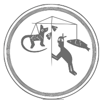
Dick Pape
[A Gallery of Fiction Magazine Art]
|
[More] ⦿
|
Dick Pape
[Virgin Vectors]
|
[More] ⦿
|
Dick Pape
[Karen Culotta Kindrick]
|
[More] ⦿
|
Dick Pape
[Dan X. Solo: Digitizations by Dick Pape]
|
[More] ⦿
|
Dick Pape
[Freeform Letterlike Designs]
|
[More] ⦿
|
Dick Pape
[Butterfly Clip Art collection]
|
 [More] ⦿
|
Dick Pape
[Aridi Computer Graphics: Digitizations by Dick Pape]
|
[More] ⦿
|
Dick Pape
[Hula Fonts]
|
[More] ⦿
|
Dick Pape
[Ben Tour]
|
[More] ⦿
|
Dick Pape
[Briar Press: Digitizations by Dick Pape]
|
[More] ⦿
|
Dick Pape
[Intellecta Design]
|
[More] ⦿
|
Dick Pape
[Buddhist images: Dick Pape]
|
[More] ⦿
|
Dick Pape
[Nathalie Eiswitt]
|
[More] ⦿
|
Dick Pape
[Go Media: digitizations by Dick Pape]
|
[More] ⦿
|
Dick Pape
[Mythological & Fantastic: Digital typefaces by Dick Pape]
|
[More] ⦿
|
Dick Pape
[Neubau Welt]
|
[More] ⦿
|
Dick Pape
[Australian aboriginal art by Dick Pape]
|
[More] ⦿
|
Dick Pape
[Dick Pape: Archive and download page]
|
[More] ⦿
|
Dick Pape
[Silhouette Fonts by Dick Pape]
|
[More] ⦿
|
Dick Pape
[Mada]
|
[More] ⦿
|
Dick Pape
[Clarence Pearson Hornung]
|
 [More] ⦿
|
Dick Pape
[Pepin Press]
|
 [More] ⦿
|
Dick Pape
[Schneidmeister]
|
[More] ⦿
|
Dick Pape
[Kween Fonts]
|
[More] ⦿
|
Dick Pape
[Dick Pape: Initials]
|
 [More] ⦿
|
Dick Pape
[Walden Font: digitizations by Dick Pape]
|
[More] ⦿
|
Dick Pape
[Paul Lacroix: digitizations by Dick Pape]
|
[More] ⦿
|
Dick Pape
[Victor Carbajo]
|
[More] ⦿
|
Dick Pape
[Super Fonts]
|
[More] ⦿
|
Dick Pape
[American Popular Song Sheet Covers]
|
[More] ⦿
|
Dick Pape
[Dick Pape: ornamental typefaces]
|
 [More] ⦿
|
Dick Pape
|
 Dick Pape (Dallas, TX) is digitizing the Dan Solo books one by one, and has digitized many other sources of alphabets and images. He started making fonts ca. 2007. In 2009, he was doing Solo's art deco tome. He is on several font-making forums such as High Logic, and is interested in revivals. "Toto" writes: Dick Pape made hundreds of fonts and here are the links to most of his fonts. This list has not been updated and later additions are found in Rapidshare folders. I've missed some and some links had been deleted by Rapidshare during its migration from .de to .com. Some have also been sent directly to the group, like those based on Mada's alphas. It is hard to tell whether the font has been made by Dick Pape. The only indication that he created the fonts is that the font have "DP" as font vendor and/or has "Digitized by TTD" in the trademark field. Both are not present in some of his fonts. He seems not to want to take credit. He is just a guy who wants to digitize anything he likes. In 2010, he made Bultaco, based on the logotype for Bultaco Motorcycles---see Freehostia.
 Download here. [Google]
[More] ⦿
|
Dick Pape
[Dick Pape: Bubblegum and poster typefaces]
|
[More] ⦿
|
Dick Pape: American Wood Type
[Dick Pape]
|
 In 2013 and 2014, Dick Pape digitized 108 typefaces from the Rob Roy Kelly Collection of American Wood Type. This collection is curated by the Design Division of the Department of Art and Art History at The University of Texas at Austin. The PDF catalog of this collection served as a source for the design and the font names. The typefaces:
 - AWTBill-StarkConcaveTuscanCond.
- AWTConnorTuscanItalian.
- AWTCooleyAntTuscanXXCond, AWTCooleyGrecianXXCondensed.
- AWTDoricRomantic.
- AWTGothicTuscanCondReversed, AWTHWGothicTuscanCondNo3.
- AWTHagarConcaveTuscanShade.
- AWTHamiltonAntTuscanExt, AWTHamiltonAntiqueExt, AWTHamiltonBenFranklin, AWTHamiltonCaslon, AWTHamiltonClarendonExtended, AWTHamiltonClarendonNo2, AWTHamiltonDeVinne, AWTHamiltonGothicExtended, AWTHamiltonGothicLight, AWTHamiltonGothicSpecial, AWTHamiltonJensonOldStyle, AWTHamiltonLatinExtended, AWTHamiltonTrenton, AWTHamiltonTuscanEgyptian, AWTHamiltonUnique.
- AWTHeberWellsTeniersUnique.
- AWTKurilianEureka.
- AWTMorgans-WilcoxDoricCond, AWTMorgansCourier4.
- AWTNebraskaGrecianXCond.
- AWTNesbittGothic, AWTNesbittGothicBold, AWTNesbittGothicRound, AWTNesbittOctagon, AWTNesbittRomanCondensed, AWTNesbittRomanExtended, AWTNesbittRomanExtended, AWTNesbittRomanOrnamented, AWTNesbittRomanXCondensed, AWTNesbittVenetian.
- AWTPage&SetchellNo154, AWTPage-SetchellNo515, AWTPageAldine, AWTPageAldineExpanded, AWTPageAldineOrnamented, AWTPageAntTuscanCond, AWTPageAntTuscanOutlined, AWTPageAntiqueBlack, AWTPageAntiqueCond, AWTPageAntiqueNo7, AWTPageAntiqueTuscan, AWTPageAntiqueTuscanNo1, AWTPageAntiqueTuscanNo8, AWTPageAntiqueXXCond, AWTPageAntiqueXXXCond, AWTPageBelgianCond, AWTPageBeveledNo142, AWTPageCelticOrnamented, AWTPageClarendonExtended, AWTPageClarendonNo1, AWTPageClarendonXXCondensed, AWTPageColumbian, AWTPageConcaveTuscanXCond, AWTPageConcaveTuscanXCondOutline, AWTPageCorinthianNo2, AWTPageEgyptian, AWTPageEgyptianOrnamented, AWTPageFrenchAntique, AWTPageFrenchClarendonCond, AWTPageFrenchClarendonXXX, AWTPageFullFacedGrecian, AWTPageGothicLightFace, AWTPageGothicTuscanNo1, AWTPageGothicTuscanPointed, AWTPageIonic, AWTPageIonicCondensed, AWTPageNo500, AWTPageNo501, AWTPageNo506, AWTPageNo508, AWTPageNo51, AWTPageNo510, AWTPageNo515, AWTPageNorwichAldine, AWTPageOrnamentedAldine, AWTPagePeerlessAntNo129, AWTPagePeerlessCondOldStyl, AWTPagePhanitalianNo132, AWTPageRomanAetna, AWTPageRunic, AWTPageSkeletonAntique, AWTPageTeutonic, AWTPageTuscanCondNo2.
- AWTRITConcTuscanOpenShade.
- AWTTubbsModifiedGothicXXCond.
- AWTVandenburghConcaveTuscan.
- AWTW&WAntiqueTuscan, AWTW&WAntiqueTuscanExpanded, AWTW&WGothicCondOutlined, AWTW&WGothicExtended, AWTW&WGrecianXCondensed, AWTWells&WebbGrecianCondense, AWTWells&WebbTuscanOutlined, AWTWellsAntiqueLight, AWTWellsAntiqueLtExtended, AWTWellsAntiqueXCondensed, AWTWellsGothicTuscanCond, AWTWellsGothicTuscanItalian, AWTWellsPainter'sRoman, AWTWellsRomanExtraBold.
Download here. [Google]
[More] ⦿
|
Dick Pape: Archive and download page
[Dick Pape]
|
All of Dick Pape's fonts can be downloaded here. [Google]
[More] ⦿
|
Dick Pape: Artville
[Dick Pape]
|
Five scanbat sets by Dick Pape from 2011: Artville-Animals, Artville-BusinessStrategies, Artville-EatingOut, Artville-NaturesDesignElements, Artville-OutOnTheTown. Download page. [Google]
[More] ⦿
|
Dick Pape: Bizarre & Ornamental Alphabets
[Dick Pape]
|
 In 1981, Carol Belanger Grafton published Bizarre & Ornamental Alphabets (Dover). Dick Pape digitized these ornamental caps typefaces and named them by page number: BizarreAlphabets-Page108, BizarreAlphabets-Page112, BizarreAlphabets-Page114, BizarreAlphabets-Page116a, BizarreAlphabets-Page116b, BizarreAlphabets-Page117a, BizarreAlphabets-Page117b, BizarreAlphabets-Page121, BizarreAlphabets-Page14, BizarreAlphabets-Page22, BizarreAlphabets-Page24, BizarreAlphabets-Page62, BizarreAlphabets-Page66, BizarreAlphabets-Page74, BizarreAlphabets-Page76, BizarreAlphabets-Page78, BizarreAlphabets-Page92, BizarreAlphabets-Page93Bold, BizarreAlphabets-Page94, BizarreAlphabets-Page95, BizarreAlphabets-Page96-Dusty, BizarreAlphabets-Page98, BizarreAlphabets-Page99.
 Download here. [Google]
[More] ⦿
|
Dick Pape: British Museum Festival Books Archives
[Dick Pape]
|
In 2008-2009, Dick Pape (Texas) created several typefaces based on the British Museum Festival Books Archives: Festival Books Borders, Festival Books Ornaments, Festival Books Initials. He writes: What is a Festival? In Europe in the 16th, 17th and 18th centuries, important events in the life of a princely dynasty, such as marriage, the birth or christening of an heir, a coronation or a funeral, were celebrated by mounting a festival. Festival books are printed accounts of these occasions, issued by or with the approval of court, city or religious authorities. They are often customised with the arms of a princely house, hand-coloured illustrations or a fine binding. The books usually offer eye-witness accounts of a festival, sometimes embellished with moral or philosophical reflections - though at their simplest they may just be a list of names. Festival books do not always provide an accurate record of events. Sometimes prepared in advance of the occasion, sometimes seen from the limited viewpoint of an eye-witness, their accounts are ideal, and even idealised, rather than strictly factual. Download here. [Google]
[More] ⦿
|
Dick Pape: Bubblegum and poster typefaces
[Dick Pape]
|
Dick Pape made the Bubblegum font family in 2011. It includes a Regular, Condensed and Extended version. In 2009, he made the shiny oil spill font Ani Red Jello Alpha. In 2010, he made Carved Box in a squarish fat lettering style. And still in that fat lettering poster style, he created Otter (2010). [Google]
[More] ⦿
|
Dick Pape: Celtic Designs
[Dick Pape]
|
 Dick Pape's digitization of Celtic designs and Celtic alphabets, done in 2009: CelticDesigns-Dark, CelticDesigns-Light, CelticDesignsA, CelticDesignsB, CelticOrnaments, CelticOrnamentsA, CelticOrnamentsB, CelticOrnamentsC, CelticOrnamentsD.
 Download page. [Google]
[More] ⦿
|
Dick Pape: Clipart DeSign Ultimate Ornaments Mega Pack
[Dick Pape]
|
 In 2013, Dick Pape digitized the ornaments in the Clipart DeSign Ultimate Ornaments Mega Pack. The typefaces: CMP AdvancedScrollDesigns1, CMP AdvancedScrollDesigns2, CMP AdvancedScrollDesigns3, CMP AdvancedScrollDesigns4, CMP AdvancedScrollDesigns5, CMP AdvancedScrollDesigns6, CMP CelticDesigns, CMP ChineseFlorals1, CMP ChineseFlorals2, CMP CircleDings, CMP CircleFloralFrames, CMP ClassicFriezeDesigns, CMP ClassicScrolls1, CMP ClassicScrolls2, CMP ClipartDecoWomen, CMP CornerDesigns1, CMP CornerDesigns2, CMP DesignBorders1, CMP DesignBorders2, CMP DesignBorders3, CMP DesignBorders4, CMP EnhancedScrollDesigns, CMP ExquisiteAnimals, CMP ExquisiteBirds, CMP ExquisiteLadies, CMP FancyPanels1, CMP FancyPanels2, CMP FloralDesigns1, CMP FloralDesigns2, CMP FloralDesigns3, CMP FloralDesigns4, CMP FloralDings, CMP FloralFrieze1, CMP FloralFrieze2, CMP FloralPanels1, CMP FloralPanels2, CMP FlowerBaskets, CMP FlowerOrnaments1, CMP FlowerOrnaments2, CMP FlowerOrnaments3, CMP FlowerOrnaments4, CMP FlowerOrnaments5, CMP FlowerOrnaments6, CMP HandDrawnRibbons1, CMP HandDrawnRibbons2, CMP HangingSigns, CMP IndiaDesigns, CMP JapaneseFloralDesigns, CMP Medallions1, CMP Medallions2, CMP MexicanDesigns, CMP ModernDesignElements, CMP ModernScroll1, CMP ModernScroll2, CMP ModernScroll3, CMP OrnamentalBullets1, CMP OrnamentalBullets2, CMP OrnamentalBullets3, CMP OrnamentalBullets4, CMP OrnamentalDings, CMP OrnamentalPanels1, CMP OrnamentalPanels2, CMP OrnamentalPanels3, CMP OrnamentalPanels4, CMP OrnamentalPanels5, CMP OrnamentalPanels6, CMP OrnamentalPanels7, CMP OrnamentalPanels8, CMP RectangleFlorals1, CMP RectangleFlorals2, CMP RenaissanceScrolls, CMP RibbonsWithFlorals, CMP RuleLineDesigns1, CMP RuleLineDesigns2, CMP RuleLineDesigns3, CMP RuleLineDesigns4, CMP RuleLineDesigns5, CMP ScrollDesigns1, CMP ScrollDesigns2, CMP Shields, CMP SignPanels1, CMP SignPanels2, CMP SignShapes, CMP SimpleFloralOrnaments1, CMP SimpleFloralOrnaments2, CMP SimpleFloralOrnaments3, CMP SimpleFloralOrnaments4, CMP SimpleFloralOrnaments5, CMP SimpleFloralOrnaments7, CMP SimpleFloralOrnaments8, CMP SimpleFloralOrnaments9, CMP SimpleRibbons, CMP SnowFlakes, CMP TinyDesignElements1, CMP TinyDesignElements2, CMP TinyDesignElements3, CMP TinyDesignElements4, CMP TinyDesignElements5, CMP TinyDesignElements6, CMP TornParchments, CMP TornParchmentsFloral, CMP UltimateOrnaments6, CMP UrbanDesignElements, CMP WroughtIronDesigns1, CMP WroughtIronDesigns11, CMP WroughtIronDesigns2, CMP WroughtIronDesigns3, CMP WroughtIronDesigns4, CMP WroughtIronDesigns5, CMP WroughtIronDesigns6, CMP WroughtIronDesigns7, CMP WroughtIronDesigns8, CMP WroughtIronDesigns9, CMP WroughtIronDesignsJ.
 Download here. [Google]
[More] ⦿
|
Dick Pape: Design Elements
[Dick Pape]
|
 Dick Pape's digitization of design elements, in 43 truetype fonts called Design Elements. Created in 2010, this is a gold mine of useful dingbats. Typeface design Elements 4g contains chess pieces. My preferred typeface is 6e, which has tens of fists. Font 7a has snow crystals. Number 6a consists of arrows.
 Download here. [Google]
[More] ⦿
|
Dick Pape: Digital Clipart
[Dick Pape]
|
A collection of digital clipart typefaces made by Dick Pape in 2011: DigitalClipart-ATVRiders, DigitalClipart-AbstractCurves, DigitalClipart-AncientEgypt, DigitalClipart-AncientMasks, DigitalClipart-AncientMaya, DigitalClipart-AnimaeFighter, DigitalClipart-AnimalBracelet, DigitalClipart-Bats, DigitalClipart-BiomechanicsDe, DigitalClipart-Butterflies, DigitalClipart-Cats, DigitalClipart-CelticA, DigitalClipart-CelticB, DigitalClipart-CelticC, DigitalClipart-CelticD, DigitalClipart-ClassicTribe1, DigitalClipart-ClassicTribe2, DigitalClipart-Cosmetics, DigitalClipart-CrazyTribals1, DigitalClipart-CrazyTribals2, DigitalClipart-CyberHorses, DigitalClipart-CyberSkulls, DigitalClipart-Cyborgs, DigitalClipart-DesignLizards, DigitalClipart-Dinosaurs, DigitalClipart-Dragons1, DigitalClipart-Dragons2, DigitalClipart-Elly, DigitalClipart-ExtremeSports, DigitalClipart-FantasticWarriors, DigitalClipart-FantasyGirls, DigitalClipart-FantasySkulls, DigitalClipart-FantasyZodiac, DigitalClipart-FlamboyantAni, DigitalClipart-Flowers, DigitalClipart-Flowers2, DigitalClipart-FlowersLeaves, DigitalClipart-FlowersTattoos, DigitalClipart-Football, DigitalClipart-GirlTattoos1, DigitalClipart-GirlTattoos2, DigitalClipart-GirlTattoos3, DigitalClipart-Goblins, DigitalClipart-GraffitiWords, DigitalClipart-HeartsFlowers1, DigitalClipart-HeartsFlowers2, DigitalClipart-HeartsFlowers3, DigitalClipart-HorizontalDragons, DigitalClipart-Hotrods, DigitalClipart-Indians, DigitalClipart-LinesDragons, DigitalClipart-Mascots1, DigitalClipart-Mascots2, DigitalClipart-MonsterFlowers, DigitalClipart-MumsKids, DigitalClipart-MuscleCars, DigitalClipart-MusicalInstruments, DigitalClipart-NightWolves, DigitalClipart-OffRoadSyms1, DigitalClipart-OffRoadSyms2, DigitalClipart-PinupGirls, DigitalClipart-Pirates, DigitalClipart-PiratesSwords, DigitalClipart-Racing1, DigitalClipart-Racing2, DigitalClipart-RussianFolkArt, DigitalClipart-Soldiers, DigitalClipart-SpecialTransports, DigitalClipart-StreetRacing, DigitalClipart-TatFlowers1, DigitalClipart-TatFlowers2, DigitalClipart-TribalBikes1, DigitalClipart-TribalBikes2, DigitalClipart-TribalBracelet, DigitalClipart-TribalDragons, DigitalClipart-TribalPets1, DigitalClipart-TribalPets2, DigitalClipart-TribalPets3, DigitalClipart-TribalPredators, DigitalClipart-TribalRacing, DigitalClipart-TribalZodiac, DigitalClipart-VignetteDragons, DigitalClipart-VignetteHorses, DigitalClipart-Vikings. Download here. [Google]
[More] ⦿
|
Dick Pape: Dover Pictorial Series
[Dick Pape]
|
 The extensive Dover series by Dick Pape contains about 150 typefaces. The typefaces are numbered and carry these names:
 - Dover Ancient Egyptian Designs (2009).
- Dover Art Nouveau Motifs (2010), Dover Art Nouveau Frames (2010).
- Dover Chinese Folk Designs (2010).
- Dover Christmas Designs (2012). Based on Christmas Designs (Dover Publications, 1996).
- Dover Cowboy & Western Clips (2010).
- Dover Early American Motifs (2008). Based on Early American Design Motifs by Suzanne E. Chapman (1974, Dover Publications Inc).
- Dover Floral Motifs (2007-2009) and Dover Floral Designs (2010).
- Dover Japanese Art Deco (2010).
- Dover Japanese Crests (2007). Contains a selection of designs from Traditional Japanese Family Crests for Artists and Craftspeople by Isao Honda, published by Dover Publications.
- Dover Old Fashion Silhouettes (2008).
- Dover Old Time Cuts (2010). Based on Old Time Cuts. Flowered Corners, Ornaments and Things (2010, Dover).
- Dover Ornaments (2007). Mostly art nouveau ornaments, all based on 1517 Permission-Free Designs (1995, Dover).
- Dover Pictura - Art Nouveau (2011).
- Dover Publications, Clarence P. Hornung (2010). See elsewhere.
- Dover Quaint Cuts (2011). Based on In The Chap Book Style by Joseph Crawhall (Dover). Crawhall was active in the 1880s.
- Dover Silhouettes (2009).
- Nature Stencil Designs (2010), Dover Stencil Designs (2010). From Nature Stencil Designs. Animals, birds, flowers (Dover) and Stencil Designs. Flowers, Fish, Fairy Tales, Armadillos, & Other Animals (Dover).
- Dover Victorian Designs (2010). Based on Victorian Designs (Dover).
Download here. [Google]
[More] ⦿
|
Dick Pape: Eduardo Recife's cartoons
[Dick Pape]
|
In his scanbat typeface Eduardo Recife (2007), Dick Pape digitized many of Brazilian artist Eduardo Recife's cartoons. [Google]
[More] ⦿
|
Dick Pape: February 2013
[Dick Pape]
|
 In February 2013, Dick Pape published a number of typefaces grouped together here. Local download page. The typefaces:
 - Blok: A beautiful negative font originally designed by Jarrik Muller for Neo2 magazine in 2011.
- Bogart Heavy: An elegant fat round sans.
- Darabo: An avant-garde typeface.
- DarkHerald (2011): A collection of caps based on Stylus fonts.
- ElegantFloralDesigns:
- FancyRansomInitials (2011).
- GridDrops (2012): Black squares.
- HandDrawnIcons.
- IguanaMedium: A stiff thin slab serif.
- Kabel ABC: A paperclip font.
- Lettres Majuscules Fantasie, Lettres Minuscules Fantasie: Based on Modèles de Lettres D'Art Nouveau (E.A. Ducompex, Imp. Firmin Didot & Cie, Paris), where these caps are called Lettres incrustées dorées.
- Masks2.
- MatchBoxes: match boxes from Finland and Portugal.
- Noel's Thes: "The" refers to the word "The".
- PLM Posters: A beautiful set of travel posters from 1926 called Paris-Lyons-Mediterranée Travel Posters.
- Pre-Roman Carolingian Caps.
- Pre-Romanesque 031, Pre-Romanesque 032, Pre-Romanesque 033, Pre-Romanesque 034, Pre-Romanesque 035.
- Roman Rustic Capitals A, Roman Rustic Capitals B:
- Simple Block Stencil: A Bauhaus-style stencil.
- Speedy.
- Steamboat Shaded: A Western shadow font.
- Union Jack Rough, Union Jack Smooth.
[Google]
[More] ⦿
|
Dick Pape: Graffiti Words
|
Three typefaces called Graffiti Words by Dick Pape (2010). Download page. [Google]
[More] ⦿
|
Dick Pape: Initials
[Dick Pape]
|
 Dick Pape revived hundreds of initial caps typefaces. Some came from collections. The unclassified ones include these fonts from 2009 (unless date specially mentioned): Antique Alphabet, Avante Light (2010, avant garde caps), Babylon Initials (2009), Bird Drawings Alphabet (2008), Boast Feder Bold (2010, horizontally-striped caps), Boast Plain Bold (2010), BoldCameo (2009), Clea Initials (2010, nudes), Command (2010), Dover Old Fashion Alphabet (2010, silhouettes), Fancy Nouveau (2010, art nouveau caps), Floral Initials (2010), Flotner Anthropomorphic (2010), Flower Panels Outline (2010), Flower Panels (2010), Flower Vines (2010), Flowery Alphabet (2010), Framed Alphabet (2010), Frankfurt Stempel-Series 52 (2011), Frankfurt Stempel-Series 55 (2011), Garden Nouveau Initials (2010: great art nouveau initials), Genteliza Hand (2011), Gothic Metal Initials (2008), Goudy Initials (2008), Haas'sche 1925 (2010), Humanistic Alphabet 107 (2011, uncial), Humanistic Alphabet 109 Swash (2011), Humanistic Alphabet 110 (2011), In Bloom Alpha (2010), Iniciales Greco (2010, after Richard Gans, 1922), Initialen Feder Grotesk (2010, after Jakob Erbar's 1908-1910 typeface at Ludwig & Mayer), Lichte Jonisch (2008), Light Me Up (2010), Madeleine (2010), Nelma (2011), New Music (2010), Rankin-Initialen (2010: Celtic), Rosart Initials (2010), Sacon Initials (2010: birds, beasts and flowers by Jacques Sacon, Lyon, 1519), Schmale Jonisch (2008), Schriftgiesserei Series 56 (2013: after D. Stempel, 1915), Victorine Embellished (2010).
 Download here. [Google]
[More] ⦿
|
Dick Pape: Mayan Signs
[Dick Pape]
|
 Dick Pape created the following Indian ornamental typefaces: MayanAffixesA, MayanAffixesB, MayanMainSignsA, MayanMainSignsB, MayanProfiles (2006). All these Mayan symbol typefaces are based on The Mayan Epigraphic Database Project (MED). Furthermore, he created NativeDesigns-MexicoPeru (1, 2 and 3, done in 2009, and credited to Maarten Hesselt van Dinter), NativeDesignsfromIndia.
 Download page. [Google]
[More] ⦿
|
Dick Pape: Mimbres Pottery
[Dick Pape]
|
 In 2009, Dick Pape created the scanbat typeface Mimbres Pottery. He writes: The Mimbres produced what is considered to be the finest ceramic pottery in the southwest United States. Their timeless black and white designs are sampled here. These bowls represent the highest expression of funerary art in the United States.The Mimbres buried their dead with the bowls on the top of their heads and they ceremonially "killed" each bowl with a small hole in the center so the deceased's spirits could rise to another world. The images he used were from Dillion-Tyler, 1975. Download page. [Google]
[More] ⦿
In 2009, Dick Pape created the scanbat typeface Mimbres Pottery. He writes: The Mimbres produced what is considered to be the finest ceramic pottery in the southwest United States. Their timeless black and white designs are sampled here. These bowls represent the highest expression of funerary art in the United States.The Mimbres buried their dead with the bowls on the top of their heads and they ceremonially "killed" each bowl with a small hole in the center so the deceased's spirits could rise to another world. The images he used were from Dillion-Tyler, 1975. Download page. [Google]
[More] ⦿
|
Dick Pape: Octopus Variations
[Dick Pape]
|
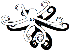 Dick Pape made five fonts called Octopus I through V in 2010 from images shown in 200 Octopus variations.
 Download here. [Google]
[More] ⦿
|
Dick Pape: ornamental typefaces
[Dick Pape]
|
 Ornamental typefaces made in 2008-2010 by Dick Pape: 2 Cute 4 U (+Block), Abstract Alphabet (2009), Aged Ornaments (2009), Ancient Mortises (2008), Angel Alpha (2009), Angelica Alpha (2009), Ani-Red Jello Alpha (2009), Antique Alphabet (2009), Arabesque Design (2009), Art Deco Dingbat Images (2010), Art Deco Frames (2010), AlphabetArt, AndrewHolmesArtA, AndrewHolmesArtB, AndrewHolmesArtC, AndrewHolmesArtD, AndrewHolmesArtE, AndrewHolmesArtF, Angel Alpha, Angelica Alpha, Ani Red Jello Alpha (2009), AvonInitials, BritishAirwaysNumbers, CaFaitDur, CelticDesignDark, CelticDesigns-Light, Continnental, EckenFlowerBorders, GermanGothicManuscript, KafkaFlourishes, LaxtonCommonRevival, NiceOldAlphabet, Portent, RomanoAlphabet, Weissranken-Initialen, Babylon Initials (2009), Bird Drawings Alphabet (2008), Black Buttons (2010, +Bold), Bold Cameo (2009), Bubble Gum (2010, +Condensed, +Extended), Bultaco (2010, after the motorcycle brand), Cardio Black and White (2010, ECG-inspired), Charcoal family (2010, crayon typefaces), Checkerboard (2010), Chinese Flowers (2008), Chiswick Press (2007), Chocolate Type (2011), ChrisGreen (2010), Calligraphia Latina (2010), Dough (2011), Electronic Alphabet (2011), Elo (2010), EstupidoEspezial1, EstupidoEspezial2 (2010, based on the Hoefler Swash variant of OCR_A), TokoFont, Clip People (2010), Clothes Pin Font, Compass Rose (2008), Coptic Letters (2010), Cubes, Cups, Cute Lolo Animals, Dark Herald (2011, Celtic caps), Dave's Glyphs, Design Images, Digital Auto Sampler, Drinking Scenes, Drinking Utensils, DunHuang Art, Eating Signs, EcoLeaf, Eduardo Recife, Eggs And Milk, Eroding Alphabet Italic (2010), Extra Initials, Extra Ornaments, Fantasy Butterflies, Fantasy Dragon FX, Fantasy Monster Skulls, Far Away Places Images, Festival Books Borders, Festival Books Initials, Festival Books Ornaments, Fire Letters, Fire Letters Cameo, Fire Letters Monospaced, Fire Letters Monospaced, Floral Initials, Florentine Initials, Florentine Initials Reverse, Flower Panels, Flower Panels Outline, Flower Vines, Fresh Fish, Funky (2010), Funny Numbers, Furore Mexican (2011), Futorisugi Face, Garden Nouveau Initials, Gill Canterbury Capitals (2011), Give me a break, Gothic Metal Initials, Goudy Initials, Graph Glyphs (2010), Halbfette Egyptienne (2008), Hat Dance Alpha, Haunted Initials (2010), Hellenic Sketch (2010), Hollandisch-Gothic (2008), Holly Alpha, Hula Ribbon, Hula Ribbon 2, Hula Ribbon1, Humanistic Alphabet 106 Italic (2011), Humanistic Alphabet 108 (2011, uncial), India Designs, Irina Batkova HRG (2010, based on Giger's paintings), Japanese Design Parts, Japanese Design Templates A, Japanese Design Templates B, Jugendstil A, Jugendstil B, Kelt Ornaments 1, Kelt Ornaments 2, Kleft Bold (2011, dot matrix face), Lichte Jonisch, Madeleine Shaded (2010), Mayan Affixes A, Mayan Affixes B, Mayan Main Signs A, Mayan Main Signs B, Mayan Profiles, Mc Call's Magazine, Metal Branches (2010), Mimbres Pottery, Moderne-Zelda (2010, after a Dan X. Solo alphabet), Moderne-Zelda Black, More Drinkings Scenes, Mostly Fish, Moto Bykes, Mythological&Fantastic I, Mythological&Fantastic II, Mythological&Fantastic III, Mythological&Fantastic IV, Mythological&Fantastic V, Mythological&Fantastic VI, Mythological&Fantastic VII, Native Designs-Mexico&Peru 1, Native Designs-Mexico&Peru 2, Native Designs-Mexico&Peru 3, New Music, Objects of Nature, Old English Images, Ondawall Versal (2011, Celtic), Panels&Frames, Parapam (2010), Pinto Inline (2010, +Speckled), Random Doodles, RangeMurata, Rankin-Initialen, Really Black Alphabet (2010), Robu Bold (2010), Rons Old Patterns, Rons Old Patterns Bare, Rosart Initials, Rustic Alphabet, Sacon Inititals, Saks (2010, bilined), Schmale Jonisch, Sea Shells of Nature, Shuttershock Vector Demo, Simple Alphabet, Simple China Images, Simple Doodles, Snails&Slugs, Softsquare, Some Guitars, Soviet Founders, Soviet Life Posters I, Soviet Life Posters II, Soviet Life Posters III, Soviet Life Posters IV, Soviet Propaganda Posters, Splish-Splash (2009), Strange Black Blobs, Tauba Auerbach, The Goetia, Tribal Dividers, Tribal Flames, ViaFaceDon Black, ViaFaceDon Black Hats, ViaFaceDon Outline, ViaFaceDon Speckled, Victorine (2010, Tuscan typeface), Viking Design A, Viking Design B, White Buttons Bold (2010), Wood Type Cheltenham Bold (2010), ZEart Designs, Zelek, Zelek Black, Zelek Boldline, Zelek Shadline.
 From 2012: French Onion. Download here. [Google]
[More] ⦿
|
Dick Pape: Renji Murata
[Dick Pape]
|
In 2009, Dick Pape created the scanbat typeface Range Murata. He writes: Renji "Range" Murata (born October 2, 1968 in Osaka) is a Japanese artist and designer, known for his unique style combining Art Deco and Japanese anime elements. He is best known for his conceptual design work on anime series Last Exile and Blue Submarine No. 6. Download page. [Google]
[More] ⦿
|
Dick Pape: Sketch Type
[Dick Pape]
|
Twenty sketch types by Dick Pape: 3dBlockPencil, 3dFlatRibbon, 3dPaperStrips, 3dWatercolor, BrushScript, BrushStrokes, CharcoalChiseled, CharcoalScript, CharcoalSketches, Cookies GothicHollow, LightHollow, PaperStrips, PencilAlphabet, PencilRibbons, Roots, SprayPaint, TwoToneShaded, WatercolorBrush, WatercolorScript. Download here. [Google]
[More] ⦿
|
Dick Pape: Tribal Tattoo
[Dick Pape]
|
Indian symbology fonts made in 2010 by Dick Pape called TribalTattoo-NorthAmerica and TribalTattoo-SouthAmerica. Download here. [Google]
[More] ⦿
|
Dick Pape: University of South Florida Decorative Letters
[Dick Pape]
|
 In 2012, Dick Pape made 26 fonts, one for each letter of the alphabet, called USFDecorativeLetters. Each font contains a selection of decorative capitals. These fonts were inspired by the The Decorative Letters ClipArt gallery, which offers 855 examples of decorative letters in a variety of styles. Originally developed from 204-2012 by the Florida Center for Instructional Technology at the University of South Florida, the ClipArt ETC is a part of the Educational Technology Clearinghouse.
 Download here. [Google]
[More] ⦿
|
Dick Pape: Via Face Don
[Dick Pape]
|
Hans Donner was the designer in the photolettering era of Via Face Don at Mecanorma. A digital version of this alphading family, also called Via Face Don (2012), is due to Dick Pape and can be downloaded here. [Google]
[More] ⦿
|
Dick Pape: Victorian designs
[Dick Pape]
|
 Dick Pape's Victorian designs include the Jack Daniels logo font typefaces Jasper Daniels and Jasper Daniels SC (2011), Lynchburg Script (2011) and Motlow Caps (2011). All are free versions of the Jack Daniels series of custom fonts made by Carlos Segura.
 In 2010, Dick Pape designed the decorative font Rose Wedding. abfonts link. Download page. [Google]
[More] ⦿
|
Dick Pape: Viking Designs
[Dick Pape]
|
Dick Pape made two fonts called Viking Design in 2009, based on symbols created by Courtney Davis. Download here. [Google]
[More] ⦿
|
Dunhuang Art
|
In the book Dunhuang Art: Through the Eyes of Duan Wenjie (1994, New Delhi), the special cave art of Dunhunag, on the silk road in China's Gobi Desert, is discussed. The cluster of 492 caves, the Mogao Caves, contain 45,000 square metres of frescoes and 2,415 stucco statues as shrines to Buddha. Patterns of that art and ceiling decorations were digitized into a font by Dick Pape in 2009, called DunHuang Art. [Google]
[More] ⦿
|
E.A. Ducompex
|
Author of Modèles de Lettres D'Art Nouveau (Imp. Firmin Didot & Cie, Paris). This book of art nouveau alphabets inspired several digital recreations, such as Dick Pape's Lettres Majuscules Fantasie and Lettres Minuscules Fantasie in 2013. Download Pape's fonts here. [Google]
[More] ⦿
|
Ebenezer Webb
[Wells & Webb]
|
[More] ⦿
|
Eugène Samuel Grasset
|
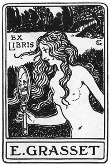 Swiss decorative artist, poster designer of the art nouveau era, and type designer (b. Lausanne, 1841, d. Sceaux, 1917). Grasset worked in Paris during La Belle Epoque.
 He made Étrusque (Fonderie Gustave Peignot&fils, 1900), Grasset (Fonderie Gustave Peignot&fils, 1898-1899), Grasset Initialen (Peignot), Grasset Italiques (Peignot), Grasset Antiqua (1900, Genzsch&Heyse) and Römisch Grasset (1913, Genzsch&Heyse). McGrew: Grasset was designed by Eugène Grasset, French [note: McGrew is wrong...] decorative artist, in 1898 for Deberny&Peignot, French typefounders, and cut by ATF in 1904. It was advertised as a chic, up-to-date typeface of the day, but has mannerisms that later became quite dated. The Monotype cutting in 1912 was modified and reproportioned to fit the early restrictions of that machine, but retains the quaintness of the foundry originals. His ex libris. In 2012, Dick Pape created a few typefaces based on Grasset's alphabets. These include LFD Asian Stencilling 205 (original oriental-looking art nouveau drawings by E. Grasset and M. Verneil) and LFD French Printed Type 189 (this warm serif typeface was used in France for books). In the book Divertimento (Editlivre, Paris), Albert Legault (UQAM, Montreal, Canada) published the decorative art nouveau caps alphabet Eugene Grasset (2015). Klingspor link. [Google]
[More] ⦿
|
Flamme (Bon Aire, Torch)
|
Flamme (or Bon Aire, or Torch) is a flamboyant brush typeface from 1933 (Schelter & Giesecke). We find it at Barco Type as Bon Aire. A revival includes Dick Pape's free font Bon Aire (2011). Commercial versions include the original Flamme (1933, Schelter & Giesecke), Flamme (1993, Alan Meeks, Letraset) and Flamme (1993, Alan Meeks, ITC). [Google]
[More] ⦿
|
Fonto Fonts (or: Fontologist)
[Dick Pape]
|
 Under the name Fonto Fonts, or Fontologist, Dick Pape created some designs that were contributed by unnamed persons. He digitized the designs in 2009 and 2010. These include Ca Fait Dur, Celtic Designs (Dark, Light), ChrisGreen, Continnental (sic), Cubes (a 3d face), Ecken Flower Borders, Effing Type, Estupido Espezial (1 and 2), Futorisugi Face (oriental simulation face), German Gothic Manuscript, Ihlenburg 1884, Kafka Flourishes (2009: my favorite in this set), Laxton Common Revival, Nice Old Alphabet, Portent, Romano Alphabet, Squared Box, Toko Font, Weissranken-Initialen.
 Download here. [Google]
[More] ⦿
|
Frank H. Atkinson
|
 Sign painter from the art nouveau era, who lived in Chicago and worked mostly for Cadillac. His books Sign Painting (1908) and Artkinson's Sign Painting (1915) influenced hand lettering and signpainting for many years afterwards. The following digital fonts are based on his designs:
 - FHA Sign DeVinne (2015, Michael Gene Adkins, James L Stirling).
- FHA Tuscan Roman (2014, Michael Gene Adkins, James L Stirling).
- FHA Nicholson French (2012). An art nouveau typeface digitized by The Fontry.
- FHA Condensed French (2012, by Michael Gene Adkins and James L. Stirling) is based on Frank H. Atkinson's examples.
- FHA French Eccentric (2009), by Frank Smith and Michael Gene Adkins. FHA Eccentric French Normal (2008) is free at Dafont.
- FHA Modernized Ideal Classic (2011) by Michael Gene Adkins and James L. Stirling.
- Bulletin Stub (The Fontry).
- Book Poster (2010). A series of fonts at The Fontry.
- Beauvoir (1993, David Nalle).
- French Plug (2007, HiH).
- Payzant Pen NF (Nick Curtis) is based on an Atkinson design shown in A Show at Sho-Cards: Comprehensive, Complete, Concise (1918).
- Atkinson Eccenteric, Atkinson Boomtown and Atkinson Egyptian, all made by David Nalle at Scriptorium.
- Still by The Fontry: the Broken Poster family (2010). In 2013, Michael Gene Adkins and James Stirling followed this up with the layered system Broken Gothic, which is based on Book Poster as well.
- Dick Pape created these revival fonts in 2009: ArtNouveauSigns, FHA1908ClassicPlug, FHAAdvertisersThickThinPl, FHAAntiqueBlock, FHAAntiqueRoman, FHAArtNouveau, FHAArtNouveauSigns, FHABradley, FHABulletinPlug, FHABulletinRoman, FHAChicagoTuscan, FHAClassicBlock, FHACondensedFrench, FHAEccentricFrench, FHAEccentricRoman, FHAEngrossingText, FHAExtremeFrenchBold, FHAFrenchRoman, FHAFrenchRomanLight, FHAFullClassicRoman, FHAGunningSingleStroke, FHAHalfClassicRoman, FHAModernizedIdealClassic, FHAModifiedAntiqueTuscanRom, FHAModifiedPlug, FHANewYorkRoman, FHANicholsonFrench, FHAPosterBlock, FHARoundBlockThickThin, FHARoundFullBlock, FHAShowCardFrench, FHASignPaintersPlymouth, FHASingleStrokeBlock, FHASingleStrokeTuscan, FHASpikeSpurFrench, FHAStonehouseEgyptian, FHAWesternLightTuscan, FHAWesternRoman, FHAWesternSingleStroke. Download page. [Google]
[MyFonts]
[More] ⦿
|
Franz Stuck
|
 Lettering artist, active ca. 1900. Two of his alphabets, shown in Foreman Day's Alphabets Old And New For The Use Of Craftsmen (1910), inspired Dick Pape to create LFD Penwork 206 (2012) and LFD Roman Capitals 224 (2012).
 In Karten und Vignetten, we find the Modern German Miniscule. [Google]
[More] ⦿
|
Freeform Letterlike Designs
[Dick Pape]
|
Dick Pape based the following digitization on images and typefaces published by Freeform Letterlike Designs: Celtic Designs (A, B), 2009. Download page. [Google]
[More] ⦿
|
George Nesbitt
|
 American wood type designer of the 19th century. His 1838 specimen book of wood typefaces is famous in typophile circles.
 Several of his creations have been digitized: - Fat Face No. 20 (by Dan X. Solo, 2005; based on a didone headline from 1838).
- Penny (by Jordan Davies, 2007; based on a didone headline from 1838).
- Octagon French (a 3d beveled typeface due to George Nesbitt, 1838, revival by Paulo W, Intellecta Design, 2010). In 2020, Jeff Levine revived it as Octagonist.
- His Antique Extended (1838) was revived as a wood type in 1900 by Tubbs & Co.
- A more extensive, and free, collection is provided by Dick Pape (2013) is his AWT or American Wood Type collection. These include AWT Nesbitt Gothic (+Bold, +Round), AWT Nesbitt Octagon, AWT Nesbitt Roman (+Condensed, +XCondensed, +Extended, +Ornamented), and AWT Nesbitt Venetian.
[Google]
[MyFonts]
[More] ⦿
|
Giovanni Battista Braccelli
|
 Giovanni Battista Braccelli (ca. 1600, d. before 1650) was an Italian engraver and painter of the Baroque period, who was active in Firenze. He is best known for his book of prints, Bizzarie di Varie Figure [a variety of human shapes], published in 1624 in Livorno, and dedicated to Don Pietro Medici. It contains wonderful futuristic engravings. Wikipedia: In this book, he engraves baroque experiments recalling Arcimboldo, engaging in a rarified set of conceits. Some of the figures are composed of boxes or raquets or curlicues. He published a second collection of prints entitled Figure Con Instrumenti Musicali E Boscarecci. Finally, he created Alfabeto figurato (1632, Italy), letters made by human forms.
 Link to his human figure alphabet. Digitization of his Bizzarie di varie figure include Bracelli Geometric Human Forms (Dick Pape, 2010). Dick Pape writes: Giovanni Battista Braccelli's Bizzarie di varie figure contains a suite of 50 etchings that celebrate the human figure in geometric forms. (1624) Squares, triangles, circles, and parallelograms take the place of muscle, bone, and tissue, defining the body in a new visual vocabulary. Braccelli's designs are unique in the history of book illustration. They represent a high point in the Mannerist style of etching that flourished in the 17th century. Mannerism incorporated the techniques of the Renaissance but rejected the classical imagery and harmonious style that is the hallmark of much 15th- and 16th-century European art. Braccelli's work had considerable influence on later generations of artists. His figures were adopted, for example, during the 20th century by the Surrealists, who lavished praise on his geometric forms and his ability to invest mechanical images with graceful, human qualities. Some of the etchings portray human emotion, as when figures dance across the page or struggle with one another in mortal combat. [Google]
[More] ⦿
|
Go Media: digitizations by Dick Pape
[Dick Pape]
|
Digital fonts made between 2008-2010 by Dick Pape, based mainly on Go Media sources: GoMedia-Arrows, GoMedia-Banners, GoMedia-Crests, GoMedia-Currency, GoMedia-Doodads, GoMedia-Flocks, GoMedia-GrimeyBrushstrokes, GoMedia-Halftonecircles, GoMedia-Halftones, GoMedia-Heraldry, GoMedia-Paintsplatters, GoMedia-Radial, GoMedia-Scribble, GoMedia-Shields, GoMedia-Skulls, GoMedia-Splatter, GoMedia-Spraypaint, GoMedia-ThinOrnaments, GoMedia-Trees, GoMedia-TribalWings, GoMedia-Tribals, GoMedia-USSkylines, GoMedia-Wings, GoMediaDestroy. Download here. [Google]
[More] ⦿
|
Golden Era Ornaments
[Dick Pape]
|
 Under the heading of Golden Era Ornaments, Dick Pape created the following typefaces containing panels, borders, fists, fleurons and ornaments in 2010-2011: KatalogAmericana1, KatalogAmericana2, KatalogAmericana3, KatalogAmericanaCorners, KatalogAmericanaWords, LHF20SixPanels, LHFAmericanRibbons, LHFAmericanaOrnaments1, LHFBerglingPanels, LHFBroadwayPanels1, LHFBroadwayPanels2, LHFBroadwayPanels3, LHFBroadwayPanels4, LHFCentennialPanels1, LHFCentennialPanels2, LHFCentennialPanels3, LHFCentennialPanels4, LHFConfectionEssentials, LHFCornerSpecimens1, LHFCornerSpecimens2, LHFCornerSpecimens3, LHFEngraversOrnaments, LHFGoldenEraArtElements1, LHFGoldenEraArtElements2, LHFMainstreetOrnaments1, LHFMainstreetOrnaments2, LHFSaratogaOrnaments1, LHFSaratogaOrnaments2, LHFSaratogaPanels1, LHFSaratogaPanels2, LHFSaratogaPanels3, LHFSaratogaPanels4, Ornaments1-ArtNouveau, Ornaments2-Signs, Ornaments3-PanelsRibbons, Ornaments4-PanelsFrames, Ornaments5-Panels, Ornaments6-PrintingOrnaments, SignPainterOrnamentsA, SignPainterOrnamentsB.
 Download page. [Google]
[More] ⦿
|
Hamilton Holly Wood Type Co. (or: Hamilton Manufacturing Company)
[James Hamilton]
|
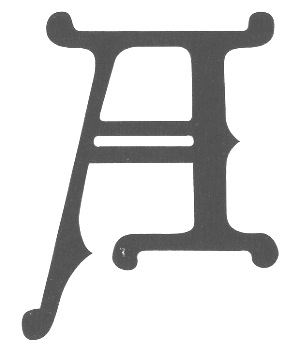 Founded by Edward J. Hamilton as the J. E. Hamilton Hollywood Type Company after the introduction in 1880 of Hollywood type. Located in Two Rivers, Wisconsin, this company was the successor firm to the William H. Page Wood Type Company, Morgans and Wilcox, and Vanderburgh, Wells&Company, and thus possessed most wood type in the USA in 1906. In 1906, they published a specimen book of all the wood-type designs in their possession, and, incredibly, destroyed all the original paper designs and patterns for the individual letters. This brought a heavy blow to the wood type industry. The lithograph dealt it another blow, and wood type became obsolete soon afterwards. Samples of their specimen books are starting to appear on the web. See here and here for samples of pointing hands from the 1901 catalog, and here for fists from their 1900 catalog. About their start: Just after 1880, Max Katz finances the business, and it becomes Hamilton&Katz for a few years. Katz sells out to William Baker, and the name of the firm becomes The Hamilton Co., or Hamilton&Baker. A bit later, Hamilton buys out Baker, to form the Hamilton Manufacturing Company. And then the takeovers start in earnest: in 1891, they buy the William H. Page Wood Type Company, then in 1898 Heber Wells, in 1899 Morgans and Wilcox Mfg Co., and in 1918 Tubbs Mfg Co. Amazingly, the company lasted until 1985, and enjoyed the lion share of the wood type business in the 20th century.
 Hamilton Wood Type Catalog #14 (1899) can now be viewed on-line. Ross Connard's PDF file of that same catalog. Scans from the 1899 catalog: Fist, Page 27, Page 30, Page 35, Page 36, Page 39, Page 65, Page 66, Page 68, DeVinne Condensed, Devinne Double Extra Condensed, Jenson Old Style, Bradley, The Inland, Page 106. Additional typefaces: Ben Franklin (1895, distressed edge font---other fonts in that style include Plymouth, Pabst and Blanchard), Bradley (1900, based on an ATF typeface by Will Bradley), Old Style (1900, after William Caslon IV's Caslon, ca. 1816), Cheltenham (1891, 1900), Cheltenham Black Expanded (1900), Clarendon Condensed (1899, after the original by Bill Stark & Co., 1853), Cooper Black (ca. 1900). DeVinne Condensed (1895), French Clarendon (1890), Antique No7 (1889), Antique Tuscan (1881, after Wells&Webb, 1854), Etruscan No4 (1895). A note on digitizations of the collection. There are two main sources, one commercial, and one free. The commercial revival project of Richard Kegler / P22 is called HWT, or Hamilton Wood Type. The free font project is by Dick Pape, who digitized many of Hamilton's typefaces in his American Wood Type collection. Download page for Dick Pape's fonts. Jeff Levine addded a few revivals of his own. These include Wood Clarendon JNL (2020: after Hamilton Clarendon Condensed, 1899), Wood Sans Narrow JNL (2017), West Fork JNL (2020: after Hamilton's Latin Extended from 1999) and County Clerk JNL (2020: after Gothic Special). References: Wood Type (Hamilton Manufacturing Co., Two Rivers, WI, 1938). [Google]
[More] ⦿
|
Hans Donner
|
Designer in the photoloettering era of Via Face Don at Mecanorma. A digital version of this alphading family, also called Via Face Don (2012), is due to Dick Pape and can be downloaded here. [Google]
[More] ⦿
|
Hans Rudolf Giger
|
 Hans Rudolf Giger (b. 1940, Chur, Switzerland) is a Swiss surrealist painter, sculptor, and set designer. He studied architecture and industrial at the School of Applied Arts in Zurich, class of 1970. His books of paintings, particularly Necronomicon and Necronomicon II (1985) and the frequent appearance of his art in Omni magazine continued his rise to international prominence. In 1998 Giger acquired the Château St. Germain in Gruyères, Switzerland, and it now houses the H. R. Giger Museum, a permanent repository of his work.
 His iconic work influenced several type designs. Foremost among these is the work by Irina Batkova. In 2010, she commissioned Dick Pape to create an ornamental caps called Irina Batkova HRG [free]. Dick Pape created H R Giger Style Font [2010, free]. Rodrigo Araya Salas created Giger Free in 2013. [Google]
[More] ⦿
|
Harry Lawrence Gage
|
 Harry Gage lived in the village of Annisquam on Cape Ann, Massachusetts after he left corporate and academic life in the printing business. He produced a great deal of fine art in his later years---watercolors, designs for commemorative medals, and designs for the Christmas cards that were sent out by the village committee.
 Author of Vel Vet Show Cards (1924). Some of his alphabets can be seen in Thomas Woods Stevens's book Lettering (1916). All of the alphabets in the latter book were digitized by Dick Pape in 2012 and 2013, and are free and downloadable from this site: TWS Heavy Capitals 49, TWS Italian Gothic Caps 80 (Lombardic), TWS Renaissance Alphabet 39, TWS Robinson Caps 23, TWS Roman Caps 13, TWS Slab Capitals 22, TWS The Japanese 32. Futher digitizations of the 1916 alphabets include Jeff Levine's Tenement JNL (2020: of the Cooper Black style alphabet TWS Heavy Capitals 49), Da ABF Mafia's Yoshi Toshi (2003) and David Nalle's Yoshitoshi (2003), both of TWS The Japanese 32. [Google]
[More] ⦿
|
Heber Wells
|
Youngest son of Darius Wells, and, just like his father, a wood type manufacturer in New York. His father's company had fallen into the hands of E.R. Webb, who died in 1864. It was then that Heber Wells, together with Alexander Vanderburgh and Henry Low took over, to form Vanderburgh, Wells&Co. Heber Wells buys out the others some time later, and the company becomes just Heber Wells. It was absorbed by Hamilton in 1898. Digital typefaces based on Heber Wells's work include Mansard ExtraBold (2005, Jordan Davies) and the following typefaces by Dick Pape: AWT Heber Well Teniers Unique (2013), AWT Page No. 851 (2013, after a font by William H. Page from 1878, but essentially the same as Mansard by Heber Wells), AWT Page Roman Aetna (2013, after an 1870 typeface by William Page, which is essentially Painter's Roman by Heber Wells; see also Doric by Morgans & Wilcox). Paul Hunt's HWT Bulletin Script Two (2014) is based upon William Page No. 111-113 and Heber Wells' Bulletin Condensed No. 1. [Google]
[MyFonts]
[More] ⦿
|
Hula Fonts
[Dick Pape]
|
Dick Pape digitized these typefaces in 2009-2010, based on a source called Hula Fonts: Acorn House, BallTerminals, CableScriptCameo, CableScriptRegular (a paperclip family), CableScriptThin, CableScriptThinCameo, CurbDesire, DiscoDeco, EcoLeaf (a piano key typeface), HulaRibbon1 (prismatic), HulaRibbon2, Softsquare. Download page. [Google]
[More] ⦿
|
Hunt Brothers
[Walter Bernard "Ben" Hunt]
|
 Walter Bernard "Ben" Hunt (b. 1888, Greenfield, WI, d. 1970) was an American artist, outdoor educator and author. His books covered native American arts, woodworking, scouting, pioneering, jewelry making, metalworking, and calligraphy. Quoting wikipedia: Hunt was born in Greenfield, Wisconsin and grew up in a log cabin. He attended Milwaukee's South Division High School, but did not graduate, dropping out to become lithographic engraver at the Bruce Publishing Company. Hunt moved to Hales Corners, Wisconsin with his wife, Laura, in 1920. In 1924, Hunt, along with his father-in-law and his brother, Edwin C. Hunt, built a log cabin behind his home. The cabin, a 16x28-foot structure, made of tamarack logs, was the subject of Hunt's first article, How We Built Our Log Cabin. During the late 1930s, Hunt began to study the work of Native American artists. As part of his research, Hunt met with artists and leaders such as Nick Black Elk, Frank Smart (or Chief Gogeoweosh), and James F. "Buck" Burshears. Hunt shared his knowledge of "Indian lore" with Milwaukee's boy scout leaders and, in 1942, Hunt started writing articles for Boy's Life. He became a regular member of its staff, ultimately writing over 1,000 articles. Hunt's work for Boy's Life, led him to serve on the staff of the National Boy Scout Jamboree in 1950, 1953, 1957, and 1960.
 Edwin and Ben Hunt published Fifty Alphabets (1931), Lettering of Today (1935, revised in 1941), 60 Alphabets (1935, Bruce Publishing), and 101 Alphabets (1954, 1958). Several digital typefaces resulted from those publications. Grouped by type designer: - Pablo Mateu: HFF Hunts Deco (2012). Based on an alphabet designed by the Hunt Brothers in Lettering of Today.
- Nick Curtis: Moonshine Script NF (2004). A casual connected script patterned based on 60 Alphabets (Hunt Brothers, Bruce Publishing, 1935).
- Dick Pape created 11 fonts in 2012 that are based on 101 Alphabets, all named HuntBros101Plate followed by a plate number. Plate 02 is a Trajan typeface. Plate 5 is a Trajan face. Plate 6 is an art nouveau face. Plate 7 is a flared caps typeface. Plate 10 is a textured poster typeface. Plate 11 is an ornamental caps face. Plate 13 is a condensed caps face. Plate 14 could be considered as a Mexican vernicular typeface. Plate 18 is an antique italic face. Plate 25 is an upright script. Plate 26 Brush is fifties brush signage at its best. Plate 29 (octagonal), Plate 46 (Celtic), Plate 52 (German expressionist), Plate 54 Blackletter, Plate 56 (Lombardic), Plate 62 (uncial), Plate 63 Script, Plate 65 (Victorian ornamental caps), Plate 66 (Western typeface), Plate 74 (Mexican fiesta font), Plate 68 (Arabic simulation), Plate 71, Plate 76 (architectural lettering), Plate 77 (inline caps) and Plate 83 (stencil face) complete the collection.
Download some typefaces based on the latter publication. Flickr site sith images of 101 Alphabets, courtesy of Diane Zerr. Local download of 101 Alphabets. Download link for Pape's typefaces. [Google]
[More] ⦿
|
Intellecta Design
[Dick Pape]
|
Digitizations by Dick Pape in 2010 based on material from Intellecta Design's Old Time Images: Bruce Miscelania, Clea Initials (2010). Download here. [Google]
[More] ⦿
|
Irina Batkova
|
 Moscow-based illustrator and digital artist.
 In 2010, with the help of Dick Pape, she created an ornamental caps alphabet called HRG that was inspired by the sexy surrealist drawings of Swiss Oscar-winning artist H.R. Giger [wiki]. Behance link. Scans: Logo, illustration, more illustrations, HRG's letter F, HRG's letter E. The full HRG alphabet: A, B, C, D, E, F, G, I, J, K, L, M, N, O, P, Q, R, S, T, U, V, W, X, Y, Z. In 2012, she published Lettercats, an all caps alphabet of cats. Behance link. Another Behance link. [Google]
[More] ⦿
|
Jacques Sacon
|
French typographer in Lyon, b. Romano Canavese, Italy, ca. 1472-1530, also known as Saccon, Sachonus, Zachonus, Zacconi, Zachone, Zachoni, Zacchoni and Zachon. He drew an initial caps alphabet in 1519 that depicted birds, beasts and flowers. Revival in 2010 by Dick Pape as Sacon Initials. In 2011, Marion Chalvin and Raphaële Mouren (Ecole nationale supérieure des sciences de l'information et des bibliothèques, Villeurbanne, Rhône, Université Lumière, Lyon) wrote Jacques Sacon, imprimeur-libraire lyonnais du XVIe siècle: 1497-1529. [Google]
[More] ⦿
|
James Conner's&Sons United States Type Foundry
|
19th century New York-based foundry, also called the United States Type Foundry, Conner&Cooke, James Conner&Son, James Conner&Sons, and James Conner's&Sons. Only a few of its typefaces have been digitized thus far. Among those, we have AWT Connor Tuscan Italian (2013, Dick Pape), Helena Handbasket NF (2005, Nick Curtis) which was modeled after Antique Light (1888). Buffalo Bill (2007, FontMesa) revives a decorative Western style poster font from 1888. Railhead (2007, FontMesa: 4 styles) is a revival of an 1870s type style that was originally available from both Bruce's New York and James Conner's&Sons type foundries. Warp Three NF (2008, Nick Curtis) is a Bank Gothic-style font that borrows its lowercase from Square Gothic (1888, James Conner). Gunsmoke (2010) is a revival of a James Conner's Sons font that has been around the block under different names such as Extended Clarendon Shaded, Original Ornamented and Galena. Ysleta NF (2010, Nick Curtis) revives Conner's Aetna (1888), also known as Painter's Gothic. Conners Corners NF (2010, Nick Curtis) was gleaned from the 1888 specimen books of James Conner's Sons United States Type Foundry. Fists dating from 1888. [Google]
[More] ⦿
|
James Hamilton
[Hamilton Holly Wood Type Co. (or: Hamilton Manufacturing Company)]
|
 [More] ⦿
|
James Ronaldson
[Binny&Ronaldson]
|
[MyFonts]
[More] ⦿
|
Jarrik Muller
|
 Dutch graphic designer in Amsterdam who has many typographic projects and occasionally creates a typeface. His typefaces are experimental and functional. One, called Puzzle, leaves it up to the user to position the sliding letters---quite an ingenious idea. Get Busy (2006) is artsy and futuristic. Escape (2006) is pixelish grunge. Union (2006), Get1 (2006, modular, computerized), Get Free (2007, a free piano key font done for Neo2, the magazine), Softmachine (2009), NB Light (2009, a techno matchstick typeface done with the help of Neubau), 3D (2009), Optical (2007, a futuristic geometric experiment), Contrast (2006), Lovely (2006), Muller Fontein (2006, experimental), Blok (2010, 3d and modular; see also Blok (2013, Dick Pape) which was influenced by Jarrik's Blok), Love (2006), and Volle Vrijheid (2006, very experimental) round out his dossier.
 In 2014, he set up Citype. At Citype, he published the free pixelish typeface Amsterdam. Old URL. Behance link. [Google]
[More] ⦿
|
Jean Joveneaux
|
Author of La lettre dans la peinture et la publicité (1957, Editions Charles Massin, Paris: see also here and here). His Futura Stencil-like Le Pochoir (plate 40) was digitally remade by Toto as Le Pochoir (2011), and also by Jan Gerner as Pochoir (2006). Author also of La lettre dans le décor. An art deco typeface from that book was digitally revived by Toto and Dick Pape in 2011 under the name La lettre dans le décor. Free download here. The alphabets of La lettre dans la peinture et la publicité (1957) include many styles, from art deco to blackletter, Victorian and retro. Joveneaux gave them names, so I will list them in alphabetical order: 1erEmpire, AnDeGrace1320, Antiquites, Aquarium, ArtsGraphiques, BalDeNuit, Bar, BeauxArts, Cafe, CompositionDecorative, Constellation, CoursDeStenotypie, DerniereHeure, EclairageFluorescent, Editorial, ElectroStatique, EnExclusivite, Exposition, Illustration, InitiationSportive, JeuDeDominos, LaGrandeParade, LePochoir, LettresOrnees, Massif, Meubles, ModeDEte1950, Motos, Nouvelle, Ordonnance, OrpheeAuxEnfers, PrestigeDeLaSoie, Promotion52, RealisationsGraphiques, RobesDEte, SalonMai1953, Samedi23Mai1953, TissusTousColoris, TouteUneGammeDeLaines, ZoneInterdite. [Google]
[More] ⦿
|
Jean-Michel Papillon
|
French wood engaver, b. 1698, Paris, d. 1776, Paris. Son of Jean Papillon, the famous manufacturer of fine wallpapers. He was for a long time employed by the Imprimerie Royale as wood engraver. There, he created numerous ornaments. Author of Traité historique et pratique de la gravure en bois (1766, Paris). Chapters cover cutting of the block, inking and printing, monograms, xylography and block books, cutter's tools, and chiaroscuro prints. Digital typefaces that are based on his work include - Papillon 1760 (2007, Dick Pape). A free font. First shown in Paris in 1760, and reprinted by Clarence P. Hornung in Dover Pictorial Archive Series: Early Advertising Alphabets, Initials and Typographic Ornaments (1956, Dover Publications). Hornung's images inspired Pape's typeface.
- Papillon Woodcuts (2013, Jose Jimenez). A commercial font based on the same sample from 1760.
[Google]
[More] ⦿
|
JMT Sausage
[Dick Pape]
|
A piano key typeface made by Dick Pape in 2011, based on a vector alphabet designed by Jakob Nylund (Just My Type). [Google]
[More] ⦿
|
John G. Cooley
|
American wood type designer/manufacturer from the 19th century, whose company started out in 1852 by taking over Edwin Allen in South Windham, CT. In 1864, he partners with Robert Lindsay, sells the South Windham factory, and moves to New York City as John B. Cooley and Co. In 1866, he enters into a partnership with Samuel T. Dauchy to become Cooley&Dauchy. In 1869, however, that company was bought by William Page, who ironically, had been Cooley's employee in 1855-1856. He published Specimens of Wood Type. Examples of their wood types: Antique Tuscan No. 1 (1859). Digital revivals: Jeff Levine's Winnetka JNL (2009) was inspired by Cooley Antique Tuscan Condensed from 1859. Compressed Wood JNL (2020, Jeff Levine) is extrapolated from J.G. Cooley's Roman Triple Extra Condensed Fifty Line. Finally, AWT Cooley Ant Tuscan XX Cond (2013) and AWT Cooley Grecian XX Condensed were released by Dick Pape. [Google]
[More] ⦿
|
John Vinycomb
|
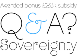 Victorian calligraphic artist, b. Newcastle-upon-Tyne, 1833, d. 1928. John Ward, a printer in Belfast, employed John Vinycomb as the company's artistic director. Vinycomb organized drawing classes at the art studios of Marcus Ward&Sons after normal working hours. These classes were held under the company's auspices and were open to all for the price of a penny a session. Vinycomb was an internationally acknowledged expert in heraldry who was regularly consulted by the British and European royalty and aristocracy. Author of a number of art books such as Fictitious and symbolic creatures in art (Chapman and Hall, 1906) and Fictitious and Symbolic Creatures in Art (1909). He also drew a number of alphabets, such as Italian 14th Century Capitals, Modern Roman french Style, Modern Roman Italics OldStyle, and Modern Sans. The last alphabet was also called a "skeleton" at the time---all letters are of equal stroke width.
 In 2012, Dick Pape created the digital typefaces LFD Thin French 208 and LFD 14th C Italian 75, based on Vinycomb's drawings shown in Alphabets Old And New For The Use Of Craftsmen (1910, Lewis Foreman Day). In 2020, Paul Harpin released LDN Queenstown at London Type. This is a single weight slightly quirky ultra light typeface that takes inspiration from a sketch of an early sans by John Vinycomb. Paul writes: Vinycomb was probably about 120 years ahead of the game, and Queenstown faithfully retains some of the charmingly unusual letterforms of JV's early modern sans serif. Characters of note include a gorgeous pince-nez letter g and a long tailed cap Q, one of four Q alternates. Photo in 1910. [Google]
[More] ⦿
|
Karen Culotta Kindrick
[Dick Pape]
|
Karen Culotta Kindrick's clip art led Dick Pape to make these dingbat fonts in 2008-2010: KCK-BackgroundsA, KCK-BackgroundsB, KCK-BackgroundsC, LeafCollectingClipArtA, LeafCollectingClipArtB, LeafCollectingClipArtC. Download page. [Google]
[More] ⦿
|
Kazimir Severinovich Malevich
|
 A pioneer of geometric abstract art and the originator of the avant-garde suprematist movement, Kazimir Severinovich Malevich was born in 1879 in Kiev, and died in 1935 in Leningrad. In 1915, Malevich laid down the foundations of Suprematism when he published his manifesto From Cubism to Suprematism. After the October Revolution (1917), Malevich became a member of the Collegium on the Arts of Narkompros, the Commission for the Protection of Monuments and the Museums Commission (from 1918 until 1919). He taught at the Vitebsk Practical Art School in Belarus (1919-1922), the Leningrad Academy of Arts (1922-1927), the Kiev State Art Institute (1927-1929), and the House of the Arts in Leningrad (1930). He wrote The World as Non-Objectivity, which was published in Munich in 1926 and translated into English in 1959. In it he outlines his Suprematist theories.
 Typefaces based on his work include: - Malevich (2010, Artem Moiseev).
- NCD Black Square family (2008, by Nippa Downy). Downey writes: The Black Square of Kazimir Malevich is one of the most famous creations of Russian art in the last century. The first Black Square was painted in 1915 to become the turning point in the development of Russian avant-garde..
- Dynamich (2012, by Giuseppe Cacciatore).
- Black Square Typeface (2012, Jekabs Osins). A nihilist experiment in which each letter is a black square, as in Kazimir Malevich's Black Square painting.
- Suprematic (2008). An ultra-constructivist typeface by Henric Eugen Bergström.
- Dick Pape created the scanbat font KazimirMalevichArt2. Download here.
- Tom Davidson's Malevich (2013).
- Kama made in 2015 by Ninze Chen-Benchev.
- Malevich (2015, Olga Tereshenko, BBDO Studio).
- Anafor (2018) by Erman Yilmaz.
[Google]
[More] ⦿
|
Kween Fonts
[Dick Pape]
|
Dick Pape created the created these digital typefaces in 2010, based upon a source called Kween Fonts: Kween's Hand, Kween's Kerls. Not a Kween font, but related to Kween's Hand anyway, is the bouncy script typeface Vince Hand (2010). Download here. [Google]
[More] ⦿
|
Lewis Foreman Day
|
 Lettering artist and author, 1845-1910. His books include Alphabets Old and New: Containing Over One Hundred and Fifty Complete (1902, B.T. Batsford), which has a large number of historic alphabets, initials, blackletter examples, and new alphabets by the author himself. Other books: Alphabets Old And New For The Use Of Craftsmen (1910, B.T. Batsford, London), Lettering in ornament (B.T. Batsford, 1902), The anatomy of pattern (B.T. Batsford, 1895), Penmanship of the XVI, XVII&XVIIIth centuries (1911, B.T. Batsford, London: Local download), and Nature and Ornament (B.T. Batsford, Charles Scribner's Sons, 1892).
 He created numerous pen-drawn alphabets. I am using the descriptive names he used in his own book, Alphabets Old and New: Modern Brush Letters, Blunt Brushwork, Blunt Twisted Brushwork, Japanese Brushwork, Modern Capitals for engraving on metal, Modern Capitals, more Modern Capitals, and yet more Modern Capitals, Modern early Gothic Capitals for engraving on metal, Modern Early Spanish Letters, Modern Foliated Capitals, Modern Gothic Capitals, Modern Minuscule Gothic, Modern Roman Capitals, Modern Roman Italics, Modern Twisted Letters, Numerals (set 1), Numerals (set 2), and Numerals (set 3). In 2012, Dick Pape created a number of typefaces based on alphabets found in Alphabets Old And New For The Use Of Craftsmen (1910). These include LFD14thCItalian75 (drawn by J. Vinycomb), LFD15thCFrenchRelief91, LFDAlphabetUndOrnamente216 (after roman capitals by Otto Hupp), LFDAsianStencilling205 (an art nouveau stencil based on an original by E. Grasset and M. Verneil), LFDBlockCapitals213 (based an alphabet by Walter John Pearce), LFDEngravingonSilver196 (a Foreman Day original designed for engraving on silver), LFDFreehand170 (based on an alphabet by Bailey Scott Murphy, architect), LFDFrenchPrintedType189 (based on a type by E. Grasset), LFDFrenchType209 (a caps typeface by Lewis Foreman Day), LFDIncisedinWood114 (a Foreman Day original Elizabethan lettering aklphabet based on an inscription incised in wood at North Walsham, Norfolk), LFDMetalEngraving187 (another original by Foreman Day, for engraving on metal), LFDModernCaps210 (an original), LFDPainted148 (a sketched typeface that was painted in 1727 on the wooden drug-drawers of an old apothecary's shop and kept in the Germanisches Museum, Nuremberg), LFDPenAlphabet222 (an art nouveau alphabet by Foreman Day), LFDPenwork160 (after an original monstrosity by Walter Crane), LFDPenwork181 (based on an alphabet of Roland W. Paul), LFDPenwork206 (based on lettering by Franz Stuck), LFDQuasiJapanese203 (an oriental art nouveau design by Foreman Day), LFDRomanCapitals224 (based on lettering by Franz Stuck), LFDScriptStencil219 (an oriental art nouveau design by Foreman Day), LFDSquareCut202 (an original pixelish typeface by Foreman Day), LFDThinFrench208 (based on an alphabet by John Vinycomb). [Google]
[More] ⦿
|
M. Moullet
|
 Author of 100 Alphabets Publicitaires Dessinés par M. Moullet (1946, Editions Caboni, Bruxelles). Alphabets from that book include Letters in relief, Fancy Character, Ornamental Antique (art deco), Fancy Antique (multiline art deco), Fancy Antique 2 (a different style altogether), Pochoir (stenciled).
 Some of Moullet's fonts were digitized by Dick Pape in 2011 and 2012 and can be downloaded here. Pape's fonts: FAA3DLettresEnRelief, FAAAllongees, FAAAllongeesBold, FAAAntiqueAllongee, FAAAntiqueGrasse, FAAAntiques, FAAAntiquesGrasses, FAABaroque3DInitiales, FAABlockLettresEnRelief, FAACameoHollow, FAACaracteresdeFantaisie, FAAChevauchantes, FAACubiques, FAAEcossaises, FAAEcritureGrasseEmoussee, FAAEgyptienneGrasse, FAAEgyptiennesEmoussees, FAAFantaisie, FAAFantaisieBlaireau, FAAFantaisieHardi, FAAFantaisieHaut, FAAFantasio, FAAFloralGothiqueInitiales, FAAFrenchMecane, FAAItalianHeavySlab, FAALettresAuCrayonItalic, FAALiberty, FAANormandes, FAANormandesAllongees, FAAOmbreeEnRelief, FAAOnciale, FAAOrientales, FAAPochoir, FAARomainClassique, FAARomainTypographique, FAScenesPaysannes, FAASerifEgyptienne, FAAVetteFantasieAntieke. Download page. Jeff Levine revived some of Moullet's typefaces: Silly Behavior (2019), Old Sport JNL (2018), Relaxation JNL (2017), Peppermill JNL (2017), Script Spot Initials JNL (2017), French Lettering JNL (2017), Martial Arts JNL (2017, an oriental simulation font), Relaxation JNL (2017). [Google]
[More] ⦿
|
M. Verneil
|
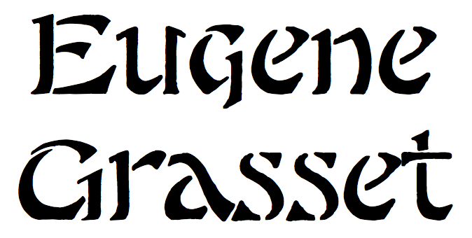 French typographer from the art nouveau era. One of his alphabets was made into a digital typeface by Dick Pape in 2012, LFD Asian Stencilling 205 (original oriental-looking art nouveau drawings by E. Grasset and M. Verneil). [Google]
[More] ⦿
French typographer from the art nouveau era. One of his alphabets was made into a digital typeface by Dick Pape in 2012, LFD Asian Stencilling 205 (original oriental-looking art nouveau drawings by E. Grasset and M. Verneil). [Google]
[More] ⦿
|
Mada
[Dick Pape]
|
 Fonts by Mada, and digitized by Dick Pape in 2008: Alpha-a-day038, Alpha-a-day045, Alpha-a-day046 (2008), Alpha-a-day048, Alpha-a-day049, Alpha-a-day050, Alpha-a-day053, Alpha-a-day058.
 Download here. [Google]
[More] ⦿
|
Max Körner
|
 Max Körner (1883-1963) was a painter and German trademark designer. From 1913 to 1921 he was a teacher of visual design and crafts at the School of Applied Arts in Stuttgart. From 1921 he held a professorship at the State School of Applied Arts in Nuremberg. His 1949 book, Das Neue Schriften Buch is a collection of bold, modernistic examples of the Germanic style. Samples all reside on Flickr either from Indra Kupferschmid or Depression Press, courtesy of Mindofone Fonts.
 In 2012 and 2013, Dick Pape digitized twelve of Körner's alphabets: MaxKornerBlackMouse, MaxKornerBlackletter, MaxKornerBodenseefahrt, MaxKornerFlotteSchreibschrif, MaxKornerHaircutBlock, MaxKornerKraftigeWerbegotik, MaxKornerMachinenbau, MaxKornerModeausstellung, MaxKornerRed&BlackScript, MaxKornerSchablonen-Bold, MaxKornerSpikyAntiqua, MaxKornerStencilCaps. Download here. [Google]
[More] ⦿
|
Mindofone Fonts
|
 Dallas, TX-based creator of the free art deco stencil typeface Glas Deco (2012), which is based on a specimen found in Hoffmanns Schriftatlas: Das Schriftschaffen der Gegenwart in Alphabeten und Anwendungen, Stuttgart 1930. Another download site. View the original.
 Creator of Mexico 86 (2011), a bilined headline typeface that was modeled after the Mexico 1986 World Cup logo font, which in turn was based on Avant Garde Extra Light. Free download at abfonts. Creator of Twin Mo 1 (2012, bilined). In 2013, he/she created Hadley Numerals (based on the numbers originally generated by Gunter Gerhard Lange for his Derby typeface), and Hadley Stencil (based on the letters originally generated by Gret Mengelt-Mergenthaler and Walter Ballmer for their Swiss typeface TEXPO). Free download. North Dallas Forty (2012, free) is based on the custom letters in the original 1979 movie posters and marketing materials for the film North Dallas Forty. In 2011-2012, Dick Pape created a number of free fonts based on designs pointed out to him by Mindofone, and he calls them his Mindofone collection, 86 files strong. They include French Alphabets (FA) and French Advertising Alphabets (FAA). The French Advertising Alphabets were designed by M. Moullet in Brussels in 1946. The FAA series: FAA3DLettresEnRelief, FAAAllongees, FAAAllongeesBold, FAAAntiqueAllongee, FAAAntiqueGrasse, FAAAntiques, FAAAntiquesGrasses, FAABaroque3DInitiales, FAABlockLettresEnRelief, FAACameoHollow, FAACaracteresdeFantaisie, FAAChevauchantes, FAACubiques, FAAEcossaises, FAAEcritureGrasseEmoussee, FAAEgyptienneGrasse, FAAEgyptiennesEmoussees, FAAFantaisie, FAAFantaisieBlaireau, FAAFantaisieHardi, FAAFantaisieHaut, FAAFantasio, FAAFloralGothiqueInitiales, FAAFrenchMecane, FAAItalianHeavySlab, FAALettresAuCrayonItalic, FAALiberty, FAANormandes, FAANormandesAllongees, FAAOmbreeEnRelief, FAAOnciale, FAAOrientales, FAAPochoir, FAARomainClassique, FAARomainTypographique, FAScenesPaysannes, FAASerifEgyptienne, FAAVetteFantasieAntieke. The FA series consists first of all of digitizations that are from a booklet by signpainter Roumond entitled 32 Alphabets Modernes, published in Paris by A. Charayron and Léon Duran, some time in the 1930s. Pape's 32 fonts are FAModerne0369, FAModerne0562a, FAModerne0562b, FAModerne0946aBold, FAModerne0946bBold, FAModerne1367a, FAModerne1367b, FAModerne2021a, FAModerne2021b, FAModerne2491a, FAModerne2491b, FAModerne2491c, FAModerne2491d, FAModerne4441, FAModerne5204, FAModerne5204a, FAModerne5204b, FAModerne5204c, FAModerne6183a, FAModerne6183b, FAModerne6518a, FAModerne6518b, FAModerne6518c, FAModerne6518d, FAModerne7287a, FAModerne7287b, FAModerne7666, FAModerne7798, FAModerne9002a, FAModerne9002b, FAModerne9321a, FAModerne9321b. The other fonts in the FA series are FAAntique2748, FAAntiqueShaded, FACondensedGothic, FACondensedReversedGothic, FAGillSignWritersGuide, FAGothicInitials, FAHerrickSignWriters, FAJeuSubstantoBold, FAPutti, FARoundSans4901, FAThin3394, FATransportReversed4858, FAUltraLight, FAVineInitials, FAWildFlowers. Further typefaces by Dick Pape: Cathedral (2011, a sketched expressionist face, based on Martin Wait), ColorLinesFont (2010, based on work by Anton Gridz), ColorOutLinesFont, FuroreMexicoCameo, FuroreMexicoNormal, FuroreMexicoPlain, FuroreMexicoWide. The Furore series was made in 2011 based on Furore No. 11 The Mexico Issue (Piet Schreuders, Amsterdam, 1978). Dick Pape font download page. [Google]
[More] ⦿
|
Mythological & Fantastic: Digital typefaces by Dick Pape
[Dick Pape]
|
 In 2010, Dick Pape made seven typefaces, all called Mythogical & Fantastic. [Google]
[More] ⦿
In 2010, Dick Pape made seven typefaces, all called Mythogical & Fantastic. [Google]
[More] ⦿
|
Nathalie Eiswitt
[Dick Pape]
|
 Nathalie Eiswitt inspired Dick Pape to create the Escher-like impossible typeface iloseon in 2010.
 Download here. [Google]
[More] ⦿
|
Neubau Welt
[Dick Pape]
|
Neubau Welt (by Stefan Gandl/Neubau, edited by Robert Klanten&Mika Mischler, October 2005) inspired Dick Pape to create these digital fonts in 2008: NeubauWeltA, NeubauWeltB, NeubauWeltC, NeubauWeltD, NeubauWeltE, NeubauWeltF, NeubauWeltG, NeubauWeltH, NeubauWeltI, NeubauWeltJ, NeubauWeltK, NeubauWeltL, NeubauWeltM, NeubauWeltN, NeubauWeltO, NeubauWeltP, NeubauWeltQ, NeubauWeltR, NeubauWeltS, NeubauWeltT, NeubauWeltU, NeubauWeltV, NeubauWeltW, NeubauWeltX, NeubauWeltY, NeubauWeltZ. These fonts are no longer available. [Google]
[More] ⦿
|
Otto Hupp
|
 German type designer, painter, Gutenberg researcher and heraldy specialist, b. Düsseldorf 1859, d. 1947, Oberschleissheim. Mainly specializing in blackletter. His typefaces:
 - At Genzsch&Heyse (Hamburg, München), he did Heraldisch (1910), Hupp-Neudeutsch or Neudeutsche Schrift (1899-1900, see revivals by Gerhard Helzel and Petra Heidorn (2004)), Baltisch (1903, extension of Hupp-Neudeutsch), Numismatisch (1900; revived (?) by P22 as P22 Numismatic), Liturgisch (1906, Klingspor, revived by Dieter Steffmann in 2002, Kristian Sics in 2013, Eugen Kaelin in 1988, as well as by Gerhard Helzel), and Hupp-Gotisch.
- At Rudhardsche Giesserei, Offenbach am Main, which in 1906 became Gebr. Klingspor, he made more blackletter typefaces, such as Hupp-Fraktur (1906-1911), Hupp Fraktur Fett (1910), Hupp Unziale (1909), Heraldisch (1910), Hupp Antiqua (1909: this is a delightful display typeface with religious undertones), Hupp Antiqua Fett (1910), Hupp Schrägschrift (1922; others give the date 1927), and the display fonts Lichte und volle Tam-Tan, Keilschrift and Kegelschrift.
Noteworthy among modern digitizations are Hupp Fraktur (2016, Ralph M. Unger), Hupp Antiqua NF (2006, Nick Curtis) and DXS Otto Hupp Initials (2010, Dick Pape). In 2012, Dick Pape created LFD Alphabet Und Ornamente 216 which is based on Hupp's Modern German version of roman capitals, as seen in Alphabete und Ornamente (Frau Bassermann Nachfolger, Munich). German biography by Wolfgang Hendlmeier from 1985: A, B, C. Scans of his blackletter alphabets: I, II, III, IV, V. Klingspor link. [Google]
[MyFonts]
[More] ⦿
|
Paul Lacroix: digitizations by Dick Pape
[Dick Pape]
|
Based on Manners, Custom and Dress During the Middle Ages and During the Renaissance Period (Paul Lacroix), Dick Pape created these dingbats in 2008: RenaissanceEntertainments, RenaissanceInitialsPartial, RenaissanceObjects, RenaissanceOccupationsA, RenaissanceOccupationsB, RenaissancePeople. Download here. [Google]
[More] ⦿
|
Pepin Press
[Dick Pape]
|
 Dick Pape created many digital fonts in 2009 based on sources at the Pepin Press. We find tens of revivals---many of these are blackletter types and ornamental caps. The list: PepinBacteria&OthersA, PepinBacteria&OthersB, PepinBacteria&OthersC, PepinBacteria&OthersD, PepinBacteria&OthersE, PepinPress-JapaneseDesignA, PepinPress-JapaneseDesignB, PepinPress-JapaneseDesignC, PepinPress-JapaneseDesignD, PepinPress-PatternsA, PepinPress-PatternsB, PepinPress-PatternsC, PepinPress-PatternsD, PepinPressAlphabet-FA179, PepinPressAlphabet-FA182, PepinPressAlphabet-FA198, PepinPressAlphabet-FA283, PepinPressCaps-FA020, PepinPressCaps-FA022, PepinPressCaps-FA024Hollow, PepinPressCaps-FA028, PepinPressCaps-FA030, PepinPressCaps-FA031, PepinPressCaps-FA032, PepinPressCaps-FA035, PepinPressCaps-FA068, PepinPressCaps-FA082, PepinPressCaps-FA085, PepinPressCaps-FA086, PepinPressCaps-FA100, PepinPressCaps-FA101, PepinPressCaps-FA107, PepinPressCaps-FA108, PepinPressCaps-FA109, PepinPressCaps-FA112, PepinPressCaps-FA113, PepinPressCaps-FA114, PepinPressCaps-FA115, PepinPressCaps-FA116, PepinPressCaps-FA118, PepinPressCaps-FA123, PepinPressCaps-FA124, PepinPressCaps-FA125, PepinPressCaps-FA128, PepinPressCaps-FA134, PepinPressCaps-FA135, PepinPressCaps-FA137, PepinPressCaps-FA138, PepinPressCaps-FA139, PepinPressCaps-FA140, PepinPressCaps-FA143, PepinPressCaps-FA144, PepinPressCaps-FA145, PepinPressCaps-FA147, PepinPressCaps-FA148, PepinPressCaps-FA149, PepinPressCaps-FA150, PepinPressCaps-FA151, PepinPressCaps-FA154, PepinPressCaps-FA155, PepinPressCaps-FA156, PepinPressCaps-FA159, PepinPressCaps-FA160, PepinPressCaps-FA161, PepinPressCaps-FA162, PepinPressCaps-FA163, PepinPressCaps-FA168, PepinPressCaps-FA169, PepinPressCaps-FA171, PepinPressCaps-FA172, PepinPressCaps-FA174, PepinPressCaps-FA175, PepinPressCaps-FA177, PepinPressCaps-FA185, PepinPressCaps-FA188, PepinPressCaps-FA189, PepinPressCaps-FA192, PepinPressCaps-FA193, PepinPressCaps-FA196, PepinPressCaps-FA197, PepinPressCaps-FA200, PepinPressCaps-FA203, PepinPressCaps-FA204, PepinPressCaps-FA205, PepinPressCaps-FA213, PepinPressCaps-FA214, PepinPressCaps-FA218, PepinPressCaps-FA219, PepinPressCaps-FA221, PepinPressCaps-FA223, PepinPressCaps-FA226, PepinPressCaps-FA232, PepinPressCaps-FA238, PepinPressCaps-FA239, PepinPressCaps-FA243, PepinPressCaps-FA244, PepinPressCaps-FA245, PepinPressCaps-FA246, PepinPressCaps-FA247, PepinPressCaps-FA250, PepinPressCaps-FA251, PepinPressCaps-FA253, PepinPressCaps-FA254, PepinPressCaps-FA256, PepinPressCaps-FA257, PepinPressCaps-FA258, PepinPressCaps-FA260, PepinPressCaps-FA261, PepinPressCaps-FA262, PepinPressCaps-FA269, PepinPressCaps-FA272, PepinPressCaps-FA273, PepinPressCaps-FA274, PepinPressCaps-FA275, PepinPressCaps-FA279, PepinPressCaps-FA281, PepinPressCaps-FA282, PepinPressCaps-FA287, PepinPressCoffeeService, PepinPressFancy-FA117, PepinPressFancy-FA120, PepinPressFancy-FA126, PepinPressFancy-FA129, PepinPressFancy-FA133, PepinPressFancyDesigns1920, PepinPressFlora, PepinPressOldKitchens, PepinPressOldSteins&Goblets, PepinPressOldTimePackages, PepinPressTeaTime, PepinPressTobacco.
 Download here. [Google]
[More] ⦿
|
Peter Flötner
|
 Artist who probably comes from Thurgau, and who lived roughly from 1485-1546. From 1512 until 1528, he worked in Adold Dauer's shop in Augsburg. He settled later in Nürnberg. Creator of an alphabet (now known as Flötner's Menschenalphabet) in 1534 that shows each letter composed of human figures. He also made a more sexually explicit anthropomorphic alphabet font [see also here and here].
 One of his alphabets was scanned and fonted by "Character" and posted on abf on November 25, 2002. It is called Flotner. For other free fonts, see Flotner Anthropomorphic (2010, Dick Pape) and Menschenalphabet (1997, Ingo Zimmermann). [Google]
[More] ⦿
|
Rattlesnake Jack: Digitizations by Dick Pape
[Dick Pape]
|
Dick Pape made several fonts in 2009 that are based on Rattlesnake Jack's Old West Clip Art Parlour and Font Gallery. These include SignsandSlogans, WesternAccessories, WesternAnimals, WesternBadges, WesternBuildings, WesternGuns WesternPeople, WesternScenes, WesternVehicles. [Google]
[More] ⦿
|
Roland W. Paul
|
 British architect actve ca. 1900, known for his penmanship. His lettering led Nick Curtis to develop a font called Chantilly Lace NF (2005).
 In 2012, Dick Pape made the free font LFD Penwork 181 based on Paul's work. [Google]
[More] ⦿
|
Roman Extended Fatface
|
Fatface refers to a ultra-black didone style, credited to Robert Thorne in England in the early 1800s. It was introduced in wood type by Darius Wells in his 1828 wood speciman catalog, Letter Cutter. Most other early wood type manufacturers mimicked this style. An extended Fatface can be found in the 1838 book by George Nesbitt, First Premium Wood Types Cut by Machinery, where the design is credited to Edwin Allen. Hamilton Wood Type gives a partial list of extended Faftface wood types: - Heber & Wells: Roman Expanded (No. 5150) (Later Hamilton 5150), (and an even wider) Roman Extended (No. 5151) (later Hamilton 5151).
- Wm. H. Page: Roman Extended (No 239).
- Cooley: Roman Extended No.1.
- Allen: Roman Extended.
- Bill Stark & Co.: Roman Extended.
- Knox: Extended Roman.
- Morgans & Wilcox: Roman Extended.
- Tubbs: Roman Extended (No 2028).
Digital versons: - HWT Roman Extended Fatface (2014). By Jim Lyles at Hamilton Wood Type / P22.
- AWT Wells Roman Extrabold (2013, Dick Pape; after an 1828 fat typeface didone by Darius Wells).
[Google]
[More] ⦿
|
Ross F. George
|
 Inventor and patent holder (with W.H. Gordon) of the speedball pen. Lettering artist from Seattle, influenced by W.H. Gordon. W.H. Gordon and Ross F. George wrote Presenting The Speedball Pen With Alphabets, Drawings and Designs Produced With This Wizard of Lettercraft (1915, Seattle, WA; local download). George's alphabets appeared in the Speedball Lettering catalogues, published between 1935 and 1948. The Speedball Text Book series's 8th through 17th editions were published at regular intervals from 1925 until 1956, and have many of his alphabets. Some dates: 8th (1925), 10th (1927), 11th (1929), 12th (1935), 13th (1938). Link related to his art deco alphabets. Some of the alphabets in Speedball Lettering have been digitized. To name a few:
 - Toto's K22 TriLine Gothic (2011) is a free multiline font based on Ross F. George's TriLine Gothic from 1956.
- Jim Parkinson created Wigwag (2003, a display family inspired by Ross George as well as the work of Samuel Welo and Cecil Wade).
- Jason Walcott made Baroque Text JF (2003, a great Fraktur font based on a hand-lettered alphabet drawn by Ross George).
- Nick Curtis added Xanthippe NF (2006, an "exuberant" blackletter face) and Big D NF (2014).
- Garrett Boge revived Free Roman.
- Nick Curtis designed Catty Wumpas NF (2004).
- Nick Curtis created Gnarly Dude NF (2005).
- Nick Curtis created Hacky Sack NF (2009), after Ross George's Stunt Roman.
- Harold Lohner published Milky Way (2001) and MilkyWayTwo (2001).
- Michael Stacey created the brushy typeface ITC Wisteria (1995), an almost exact reproduction of one of George's brush typefaces which appeared in many publications from 1938 until 1952 (see here).
- Heller and Fili give him credit for Chop Suey (1935), an oriental simulation typeface which has found its way into the free font world under several guises.
- Jim Spiece (Spiece Graphics) created the Wild West family Cactus Flower SG.
- Paulo W created Speedball Western Letters (2009), Speedball Metropolitan Caps (2010) and Speedball Metropolitan Poster (2010). Sunamy (2007, Iza W) is a ninja font made after an example of Ross George.
- Nick Curtis made the monoline script typeface Nellie Kay NF (2011).
- The art deco typeface Blue Jay Way NF (2011, Nick Curtis) was also inspired by Ross F. George.
- Big George NF (2011, Nick Curtis) is a fat comic book style typeface that revives another of George's creations from Speedball Text Book.
- Split Caps by George was revived by Nick Curtis as Spread Out NF (2011).
- Nick Curtis's revivals from 2014 include Trading Hoss NF (after D-nib Display) and Twinkletoes NF.
- Dick Pape created these typefaces based on the 17th Edition: Speedball America, Speedball Architects Italic, Speedball Architects, Speedball Block, Speedball Brush Bold Italic, Speedball Built Up Style, Speedball Bulletin Dusted, Speedball Bulletin Heavy, Speedball Bulletin Plain, Speedball Bulletin Squiggley, Speedball Carnival, Speedball Carved Caps, Speedball Cond Bold Italic, Speedball Cond Poster Gothic Bold, Speedball Decorative Initials, Speedball Decorative Ransom, Speedball Draftsman's Art, Speedball Formal Roman, Speedball Free Roman, Speedball Gay Nineties A, Speedball Gay Nineties B, Speedball Line Gothic, Speedball Metropolitan Poster, Speedball Power, Speedball Roman Italic, Speedball Rough, Speedball Slant Script, Speedball Speed D Italics, Speedball Squeezed Headline, Speedball Stencil Italic, Speedball Variation. Download here.
- In 2016, Cosimo Lorenzo Pancini, Andrea Tartarelli, Giulia Ursenna Dorati and Andrea Gaspari co-designed the 1940s vintage brush script typeface Banana Yeti, which is based on an example by Ross George shown in George's Speedball 1947 Textbook Manual.
- Steve Harrison's free fonts: Doolally (2020; Ross F. George, 1938), Dawdling (2020; Ross F. George, 1935), Dawdling Snowflake (2020; Ross F. George, 1935), Bogeyed (2021), Faffinabout (2021).
Examples of his Speedball Text Book alphabets: Speedball Title Display 1 (1927), SpeedballTitle Display 2 (1927), Easter Suggestion (1935), Speedball Title 1 (1938), Speedball Title 2 (1938), untitled lettering (1941), Poster Gothic 5 (1935), Postrie Caps (1938), Roman 2 (1935), Roman 3 (1935), Roman 4 (1935), Roman 7 (1935), Roman 7 (1938), Symphony 1 (1935), Symphony 1 (1952), Symphony 2 (1938), Symphony 2 (1948), Modern 1 (1938), Modern 2 (1941), Modern 2 (1948), Line Gothic (1938), Tri-Line Gothic (1956). [Google]
[MyFonts]
[More] ⦿
|
Roumond
|
 This page has a number of scans from a booklet by signpainter Roumond entitled 32 Alphabets Modernes, published in Paris by A. Charayron and Léon Duran, some time in the 1930s. There are lots of alphabets with art nouveau and art deco influences.
 In 2011-2012, Dick Pape digitized all 32 fonts from that booklet. They can be downloaded here. Pape's 32 fonts are FAModerne0369, FAModerne0562a, FAModerne0562b, FAModerne0946aBold, FAModerne0946bBold, FAModerne1367a, FAModerne1367b, FAModerne2021a, FAModerne2021b, FAModerne2491a, FAModerne2491b, FAModerne2491c, FAModerne2491d, FAModerne4441, FAModerne5204, FAModerne5204a, FAModerne5204b, FAModerne5204c, FAModerne6183a, FAModerne6183b, FAModerne6518a, FAModerne6518b, FAModerne6518c, FAModerne6518d, FAModerne7287a, FAModerne7287b, FAModerne7666, FAModerne7798, FAModerne9002a, FAModerne9002b, FAModerne9321a, FAModerne9321b. [Google]
[More] ⦿
|
Schneidmeister
[Dick Pape]
|
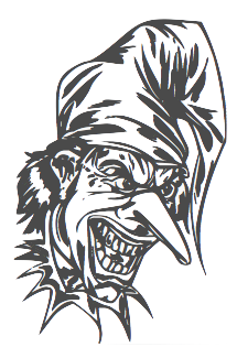 Schneidmeister is a German computer game and toy company. Inspired by images of Shneidmeister, Dick Pape created these digital typefaces in 2009: CelticOrnamentsA, CelticOrnamentsB, CelticOrnamentsC, CelticOrnamentsD, ClownsandJokers, PredatoryInsects, Thundercycles.
 Download here. [Google]
[More] ⦿
|
Silhouette Fonts by Dick Pape
[Dick Pape]
|
Silhouette fonts by Dick Pape, 2008-2010: ButterflyA9Animals-A, ButterflySilhouetteSigns, ButterflySportSilhouettes, DoverSilhouettes-A, DoverSilhouettes-B, DoverSilhouettes-C, DoverSilhouettes-D, DoverSilhouettes-E, DoverSilhouettes-F, DoverSilhouettes-G, DoverSilhouettes-H, PeopleSilhouettes1, PeopleSilhouettes2, PeopleSilhouettes3, PeopleSilhouettes4, Sil-Buildings, Sil-Children, Sil-Hats,Shoes&Gloves, Sil-LivingThings, Sil-Men,Women&Boys, Sil-Music&War, Sil-Plants, Sil-Shirts&Pants, Sil-ThingsAroundTheHouse, Sil-Tools,Cameras,Computers, Sil-Vehicles, Sil-Women, SilhouetteInitials1880, SilhouettedPlants, SilhouettesA, SilhouettesB, Tree Assortment, WorkerSilhouettes7. Download here. [Google]
[More] ⦿
|
Simple Doodles
[Dick Pape]
|
 A 2007 typeface by Dick Pape. Download page. [Google]
[More] ⦿
A 2007 typeface by Dick Pape. Download page. [Google]
[More] ⦿
|
Sonja Steiner-Welz
|
 Author of Von der Schrift und den Schriftarten (Reinhard Welz Vermittler Verlag, Mannheim). These have a history of type and lettering, instructions on lettering (e.g., stroke guide for Antiqua Majuskeln, Lombardische Versalien, and Gotische Majuskeln), some type specimen (mainly German, from the early part of the 20th century), some alphabets, drawn by her, information on the German school scripts, and a German type and lettering glossary: i, ii, iii, iv. It was probably published between 1956 and 1959.
 In 2010-2012, Dick Pape created a number of (mostly caps-only) typefaces based on that book. These include SSWAntiquaPionsel, SSWAntiquaVersalien (a caps set based on Ludovico Vicentino, 1523), SSWCelticAntiquaOutline, SSWFederAntiqua, SSWHollowScript, SSWHolz (Lombardic caps), SSWJensonsAntiqua, SSWLeopoldAntiqua, SSWLombardischeVersalien, SSWMannheimOrnament, SSWPlakatschrift (a useful outline alphabet), SSWRoundPrinting, SSWRusticAlphabet, SSWRusticScript, SSWSchablonenschrift (Bauhaus-style stencil face), SSWUrbanAntiqua-Versal, SSWWoodcuts. Download Pape's fonts here. [Google]
[More] ⦿
|
Speedball Text Book
[Dick Pape]
|
 Ross F. George's Speedball Text Book has inspired many digital typefaces. Its 17th edition published by the C. Howard Hunt Pen Company in 1956 was used by Dick Pape in the design of 31 fonts. Dick Pape tried to select only those alphabets that had not yet been digitized by others.
 The list: Speedball America, Speedball Architects Italic, Speedball Architects, Speedball Block (a warm octagonal typeface), Speedball Brush Bold Italic, Speedball Built Up Style, Speedball Bulletin Dusted, Speedball Bulletin Heavy, Speedball Bulletin Plain, Speedball Bulletin Squiggley, Speedball Carnival, Speedball Carved Caps (beveled face), Speedball Cond Bold Italic, Speedball Cond Poster Gothic Bold, Speedball Decorative Initials, Speedball Decorative Ransom, Speedball Draftsman's Art, Speedball Formal Roman, Speedball Free Roman, Speedball Gay Nineties A (Western face), Speedball Gay Nineties B, Speedball Line Gothic, Speedball Metropolitan Poster, Speedball Power, Speedball Roman Italic, Speedball Rough, Speedball Slant Script, Speedball Speed D Italics, Speedball Squeezed Headline, Speedball Stencil Italic, Speedball Variation. Download here. [Google]
[More] ⦿
|
Super Fonts
[Dick Pape]
|
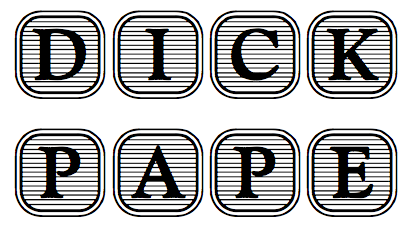 Fonts made in 2009-2011 by Dick Pape based on Super Fonts vector files: Angel Alpha (Super Fonts 032), Super Fonts 001, Super Fonts 002 (art nouveau), Super Fonts 004, Super Fonts 022, Super Fonts 026, Super Fonts 029, Super Fonts 033, Super Fonts 035.
 Download here. [Google]
[More] ⦿
|
Sweet Shoppe Designs
[Dick Pape]
|
Dick Pape digitized a few fonts based on the book Sweet Shoppe Designs by Darcy Baldwin and Megan Turnidge: 2Cute4U Alpha, 2Cute4U Alpha Block. [Google]
[More] ⦿
|
Tauba Auerbach
|
Graphic designer and painter (b. San Francisco, 1981) who created the free hairline octagonal typeface Pomegranate in 2007 for Neo2, a Spanish magazine. She also has many nice typographic posters in her gallery. In 2008, Dick Pape captured some of her work in his scanbat typeface Tauba Auerbach. [Google]
[More] ⦿
|
Thomas Wood Stevens
|
 Early 20th century designer of letters, who was associated with the Carnegie Institute of Technology, Pittsburgh. Author of Lettering (1916, The Prang Company, New York).
 Alphabets from his 1916 book include Art Nouveau Capitals, Italic Capitals, Italic Lowercase, Modern Script Italics, Modern German Italic Capitals, Modern Round Gothic, Uncial (based on a 14th century manuscript), Venetian Modern Capitals, Roman Lowercase, Modern German. PDF file of his 1916 book. Digital remakes include Wood Stevens (2012, Intellecta). In 2012 and 2013, Dick Pape digitized many of the typefaces discussed in Lettering (1916). They are freely downloadable from this site. The typefaces in Dick's collection are attributed as follows: - No artist: TWS Brush Caps 31, TWS Capitals from Coins 15,
- Harry Lawrence Gage: TWS Heavy Capitals 49, TWS Italian Gothic Caps 80, TWS Renaissance Alphabet 39, TWS Robinson Caps 23, TWS Roman Caps 13, TWS Slab Capitals 22, TWS The Japanese 32 [note: see also Yoshi Toshi, 2003, by Da ABF Mafia, and Yoshitoshi, 2003, by David Nalle].
- Norman P. Hall: TWS Heavy Modern 30.
- Oswald Cooper: TWS Long Ascenders 36.
- Ned Hadley: TWS Modern Caps 24, TWS Modern French 25.
- Helen E. Hartford: TWS Modern German Capitals 28.
- Charles H. Barnard: TWS Modern Roman 05.
- F. G. Cooper: TWS Modern Roman Bold 37.
- William A. Dwiggins: TWS Modern Roman Caps 32, TWS Variation on Georgian.
- Guido Rosa: TWS Outline Caps 21.
- George W. Koch: TWS Roman Wide Pen 33.
Commercial revivals include he slab serif Nouveau Lettering JNL (2019, Jeff Levine). [Google]
[More] ⦿
|
Turkish Designs: Digitizations by Dick Pape
[Dick Pape]
|
The ten fonts by Dick Pape under the name Turkish Designs (2008) Contain a selection of designs from Traditional Turkish Designs published by Dover Publications and from 670 Motifs from Iznik Pottery by Azade Akar, 1988. These typefaces have spirals, florals, cloud scrolls, pomegranates, tulips, roses and rosebuds, carnations, irises, hyacinths, cypresses, clusters of leaves (saz), vases and holy water flasks, rumi scrolls (arabesques), sailing ships and galleons, deers, fishes, peacocks, dragons and phoenixes, human figures and, of course, and harpy motifs. [Google]
[More] ⦿
|
Type Founders of Chicago (or: Castcraft)
|
Foundry, est. Chicago in 1936. It moved from Hubbard Street in Chicago to a suburb after a few decades---to Skokie and/or Niles. The name changed to Castcraft [3649 W Chase Ave Skokie, IL 60026], and then to Castcraft Software Inc. It owned a comprehensive library of fonts, all with extended character sets for multi-language typography. OptiFont is a trademark filed in 1990 by Fredric J. Kreiter of Castcraft. Castcraft sold a CD-ROM Type Library Volume 1 at 200 USD. Its entire font collection was sold for 1000 USD. It also made some custom fonts. Most post-1990 fonts have the prefix OPTI. For example, OPTI-Peking is an oriental simulation font. OPTI-Favrile is a copy of Tom Carnase's Favrile (WTC). A visitor warned me that there is absolutely zero security when you order from this outfit, so you are warned--this is a dangerous site! It seems that Manny Kreiter (d. 2005) was the last President&CEO, and that his family (Abe, Harry and Ned Kreiter) have been at it since the days of metal type (1936) starting as Type Founders of Chicago. I found this on their pages: Castcraft has licensing [sic] the entire 20,000 TypeFaces from "Type Films of Chicago" and the entire "Solotype Alphabets" collection. Mike Yanega claims that most of their fonts are clearly not original any more than most of Bitstream's are original, and like them they re-name many of their fonts to avoid copyright issues. Their fonts all appear to be a 'dead collection' of copies of relatively old designs that have already appeared in many other collections from the likes of WSI and SSi. In 2010, John Brandt reports: Castcraft, aka Type Founders of Chicago, moved decades ago from Hubbard St in Chicago to a close-in suburb (Skokie? Niles?) and was still operating within the past few years when I happened to drive by. I failed to find any current incarnation, but they used several names even years ago as a prominent pirate. Besides pirated fonts (Typositor to later, generally poor digital), they were a big metal vendor (I have a partial metal set of Helvetica gifted as they left downtown in the 1970s), and also had a guy (whose name escapes me) who did fabulous high-end signage, from sand-blasted glass to the created-on-building inscribed metal logo for a well-known Michigan Ave mall. Longtime owner Manny Kreiter died in 2005, but whether Boomie or any of the others who may still be around kept it going is unknown. Aside from simply having ANY version of their many offerings, most would consider their collection worthless. Anyone who has a digital "OPTIfont" and a font editor can readily view the problems, including usually several times too many Bezier points within any character. I counted 78 control points on a minimal character, for instance, that should have had less than a dozen. Specimen books include Type Specimens by Neon Type Division Typefounders of Chicago (1962) and Catalog Typefounders of Chicago 1100 South Kostner Chicago (late 1940s?). Listing of Castcraft fonts (compiled by myself). The 802 fonts listed here are all dated between 1990 and 1994. I know there are at least 1,000 digital fonts made by them, so my list is incomplete. Typophile discussion of Castcraft. OPTI Castcraft equivalence list by Philippedada [last update May 2012]. Some download links: i, ii. A revival includes Dick Pape's free font Bon Aire (2011), which revives Castcraft's Bon Aire. OPTI Fonts Archive. List of equivalences of Castcraft names. List of Castcraft typefaces as of July 2014. [Google]
[More] ⦿
|
TypoFlat
[Branislav S. Cirkovic]
|
TypoFlat is a personal and experimental project of interactive designer Branislav S. Cirkovic in Southern California. He created several free vector (EPS) faces such as Drea, Dron, Monk and Superstar (free here), all experimental and/or futuristic. Another URL. Dick Pape digitized these typefaces in 2010---they can be downloaded here. [Google]
[More] ⦿
|
Victor Carbajo
[Dick Pape]
|
 Based on drawings by cartoonist Victor Carbajo (1992-2006), Dick Pape created these dingbats in 2008-2010: CarbajoImages, CarbajoImages1999, CarbajoImages2000-2002, CarbajoImages2005, CarbajoImages2006, Carbajo Musicos, Carbajo Paisajes.
 Download here. Dafont link. [Google]
[More] ⦿
|
Virgin Vectors
[Dick Pape]
|
 The following fonts by Dick Pape (2008-2010) are based on sources from Virgin Vectors: Virgin Vectors Brush Strokes, Virgin Vectors Ornaments A, Virgin Vectors Ornaments B.
 Download page. [Google]
[More] ⦿
|
Walden Font: digitizations by Dick Pape
[Dick Pape]
|
Based on 18th Century Clip Art (Walden Font, Winchester, MA), Dick Pape created these dingbats and scanbats in 2009: OldTimeSailingShips, OldTymeImages, OldTymeImagesB. Download here. [Google]
[More] ⦿
|
Walter Bernard "Ben" Hunt
[Hunt Brothers]
|
[More] ⦿
|
Walter Crane
|
 Walter Crane (1845-1915) was an English artist and book illustrator. Wikipedia states that He, along with Randolph Caldecott and Kate Greenaway, are considered the strongest contributors to the child's nursery motif that the genre of English children's illustrated literature would exhibit in its developmental stages in the latter 19th century. His work featured some of the more colorful and detailed beginnings of the child-in-the-garden motifs that would characterize many nursery rhymes and children's stories for decades to come. Born in Liverpool, he was part of the Arts and Crafts movement. He produced paintings, illustrations, children's books, ceramic tiles and other decorative arts.
 His lettering was at the basis of Crane Titling (2006, Nick Curtis), Crane Gothic (David Nalle, Scriptorium) and Walter Crane (2009, David Nalle, Scriptorium). Example alphabets drawn by him with a quill pen include Modern Gothic Capitals and this set. In 2012, Dick Pape created a digital alphabet called LFD Penwork 160 that is based on Crane's (utterly unattractive) modern gothic capitals. In 2013, Michael Bolen designed BU Scarecrow based on Crane's alphabets. [Google]
[More] ⦿
|
Wells & Webb
[Ebenezer Webb]
|
 Ebenezer Webb was an American wood type designer/manufacturer from the 19th century. Successor of Darius Wells in 1859. Webb died in 1864 and his entire inventory of wood type was bought by Heber Wells, youngest son of Darius. The company was called Wells & Webb. Examples from their 1854 catalog: Antique Tuscan Extended.
 Dick Pape revived many of the Wells & Weber typefaces, including AWT W+W AntiqueTuscan (2013: after a design from 1849-1854), AWT W+W AntiqueTuscanExpanded (2013: after a design from 1854), AWT W+W GothicCondOutline (2013: after a design from 1849), AWT W+W GothicExtended (2013: after a design from 1840), AWT W+W GrecianCondensed (2013: after a design from 1846), AWT W+W GrecianXCondensed (2013: after a design from 1846), AWT Wells+Webb TuscanOutlined (2013: after a design from 1849), AWT Wells AntiqueLight (2013: after a design from 1854), AWT Wells AntiqueLtExtended (2013: after a design from 1854), AWT Wells AntiqueXCondensed (2013: after a design from 1840), AWT Wells GothicTuscanICond (2013: after a design from 1849), AWT Wells GothicTuscanItalian (2013: after a design from 1854), AWT Wells PaintersRoman (2013: after a design from 1870). Jeff Levine's General Merchandise JNL (2020) revives the condensed slab serif Antique X Condensed (ca. 1840, by Wells and Webb). [Google]
[More] ⦿
|
William H. Page Wood Type Company
[William Hamilton Page]
|
 Norwich, CT-based company involved in wood type production. In 1856, William Page (b. Tilton, NH, 1829, d. Mystic, CT, 1906) bought out Horatio and Jeremiah Bill and founded Page and Bassett in South Windham, CT, with his partner James Bassett. In 1857, they moved to Greenville, CT. Some time later Samuel Mowry replaced Bassett as partner, and the company is Page and Co of Greenville, CT. Another name change occurs, to William H. Page&Co. In 1869, Page buys the operation of Colley&Dauchy. Mowry retires a bit later, the company moves to Norwich, CT, and becomes the William H. Page Wood Type Company. A year later, a defection of sorts---Charles Tubbs (an employee since 1860), John Martin and George Keyes leave to set up the American Wood Type Co. In 1881, George Setchell joins the business, and Page and setchell patent the die-cut production method. In 1889, Setchell sells all interests to S.T. Dauchy, who becomes president, only to sell the entire company to Hamilton in 1891. During the Civil War, Page perfected his equipment and became the leading manufacturer of wood type. In 1874, the company published a specimen book of so-called chromatic (wood) type. Henry Lewis Bullen described it this way: This is the most notable of wood type specimens. Page outshone all competitors in imparting a degree of artistry in designing wood type and borders, most of which could be printed in several colors . . . . [It is] a work of unusual excellence, well worth preserving. In 1891, Page's firm was absorbed by the Hamilton Manufacturing Company of Two Rivers, WI.
 Many of his wood types were digitized by Jordan Davies of Wooden Type. Page's fonts include Aetna, Antique No. 4 (revived as HWT Slab in 2013 by Hamilton Wood Type Foundry), Antique Tuscan No 9 (revived by Tom Wallace in 2006), Bindweed (revived by Solotype), Clarendon Condensed, Clarendon Condensed Bold, Clarendon Extended, Clarendon Heavy, Columbian (ca. 1870; revived in 23020 by Jeff N. Levine as Cherrywood JNL, by Dick Pape in 2013 as AWTPageColumbian), Concave Tuscan X, EgyptianTwo (2005), French Antique, French Clarendon (XXX Condensed No. 117), French Semi, Gilbey, Gothic Tuscan Round, Hamilton, Minnesota, Norwich Aldine ML (1872, digitized by Tom Wallace in 2010 under the same name), Number 154, Page No. 508, Peerless 131 Bold, Rigney, Skeleton Antique, Teutonic, Tuscan Italian Round, Unique Wood, William Page 500, William Page 506. In 2013, John Bonadies (MPress Interactive) started making digital typefaces based on Page's models. They published MPI Aldine Extended (based on a 1872 wood type by William H. Page), MPI Antique (slab serif), MPI French Clarendon (based on wood type from 1865 by William H. Page), MPI French Antique (a typical far West saloon font based on wood type by William H. Page, 1869), MPI Egyptian Ornamented (a western typeface based on a 1870 wood type by William H. Page), MPI Arcadian (based on a 1870 design by William H. Page), MPI Tuscan Extra Condensed (based on William H. Page wood type from 1872), MPI Norwich Aldine Reversed (from a 1872 original). Also in 2013, Dick Pape embarked on a large process of digitization of wood types at the Rob Roy Collection of the University of Texas. His digital fonts are free and are bundled under the label American Wood Type, or AWT. Revivals by Dick Pape of fonts due to William Page include AWTPage&SetchellNo154, AWTPage-SetchellNo515, AWTPageAldine, AWTPageAldineExpanded, AWTPageAldineOrnamented, AWTPageAntTuscanCond, AWTPageAntTuscanOutlined, AWTPageAntiqueBlack, AWTPageAntiqueCond, AWTPageAntiqueNo7, AWTPageAntiqueTuscan, AWTPageAntiqueTuscanNo1, AWTPageAntiqueTuscanNo8, AWTPageAntiqueXXCond, AWTPageAntiqueXXXCond, AWTPageBelgianCond, AWTPageBeveledNo142, AWTPageCelticOrnamented, AWTPageClarendonExtended, AWTPageClarendonNo1, AWTPageClarendonXXCondensed, AWTPageColumbian, AWTPageConcaveTuscanXCond, AWTPageConcaveTuscanXCondOutline, AWTPageCorinthianNo2, AWTPageEgyptian, AWTPageEgyptianOrnamented, AWTPageFrenchAntique, AWTPageFrenchClarendonCond, AWTPageFrenchClarendonXXX, AWTPageFullFacedGrecian, AWTPageGothicLightFace, AWTPageGothicTuscanNo1, AWTPageGothicTuscanPointed, AWTPageIonic, AWTPageIonicCondensed, AWTPageNo500, AWTPageNo501, AWTPageNo506, AWTPageNo508, AWTPageNo51, AWTPageNo510, AWTPageNo515, AWTPageNorwichAldine, AWTPageOrnamentedAldine, AWTPagePeerlessAntNo129, AWTPagePeerlessCondOldStyl, AWTPagePhanitalianNo132, AWTPageRomanAetna, AWTPageRunic, AWTPageSkeletonAntique, AWTPageTeutonic, AWTPageTuscanCondNo2. Revivals by Nick Curtis: Page Five Fifteen NF (2015), Rockwall NF (2015, after Aldine and Aldine Extended), Hunky Dory NF (2014, a circus font after William H. Page's wood type Doric, ca. 1850), Sodbuster NF (2014, after Gothic Dotted), Tuscalooza NF (2014, after the 1872 typeface Tuscan Extended), Bandiera Del Legno NF (2014: this Tuscan wood type revives Gothic Tuscan Condensed Reversed), Belgique NF (2014: a revival of the (Western) wood type French Clarendon XXX Condensed No. 117), Skelett Antiken NF (2014, after Clarendon XX, 1959). In 2020, Mark Simonson reworked, extended and modernized Aetna in his 30-style text and display typeface family Etna. FontShop link. Digital typefaces based on W.H. Page's work. View revivals of William Hamilton Page's typefaces. [Google]
[MyFonts]
[More] ⦿
|
William Hagar
|
New York-based typefounders who published their work in Specimen of printing types and ornaments, from the type and stereotype foundry of William Hagar (New York, 1850). William Hagar was born in 1798 in Rutland, VT. He moved to New York in 1816 where he worked with Elihu White at the White Type Foundry. In 1823, he took over George B. Lothian's part of the foundry of Lothian&Pell to form Hagar&Pell, who were the first to introduce Scotch to American printersi (Hagar had asked David Bruce Jr. to cut the punches for the lightface series). This company was dissolved in 1830. Hagar's Scotch never sold well---the first successful Scotch family was credited to James Conner, who had bought the original punches and a few more cuts by Edwin Starr. In 1835 Hagar returned to typefounding to buy an interest in the foundry of his friend, Elihu White. This became White&Hagar. White died in 1836, and Hagar continued until 1839. From 1840 until 1842 he was a partner of George B. Lothian, who had a legendary temper. The company William Hagar was established a bit later thanks to the purchase by Caleb Bartlett, Hagar's friend, of the machinery of James Conner who had financial problems. In 1845 Hagar purchased his partner's interests, and he was the sole owner until 1852 when he sold the foundry to his sons, William and John. He died in 1863. The business declined due to the inexperience of the children and the mounting competition and would later become ATF. In 1887, the business was sold to three other New York typefounders. Among digital revivals of its typefaces, we cite Apple Pie (2009, William Hagemann, FontMesa), an extension of an ornate Bodoni all caps typeface by Hagar, ca. 1850. See also AWT Hagar Concave Tuscan Shade (2013, Dick Pape. [Google]
[More] ⦿
|
William Hamilton Page
[William H. Page Wood Type Company]
|
 [MyFonts]
[More] ⦿
[MyFonts]
[More] ⦿
|

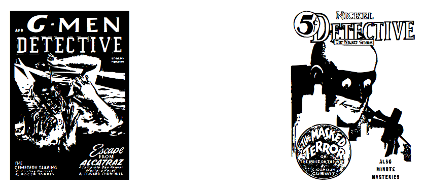
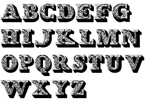
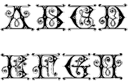
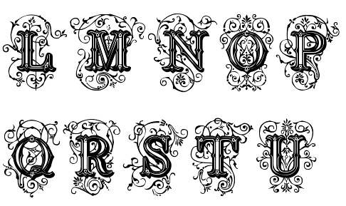
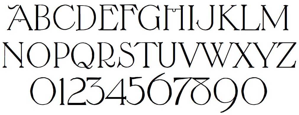
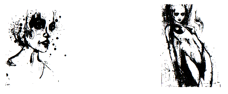
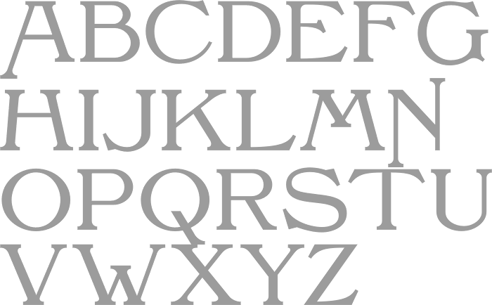
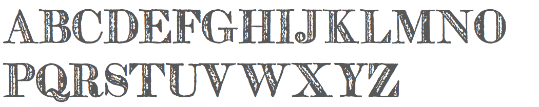
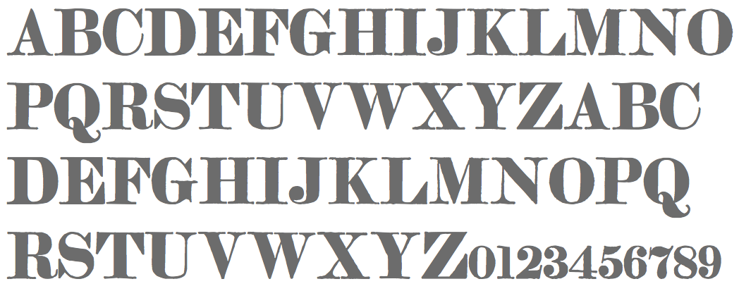
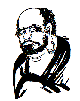
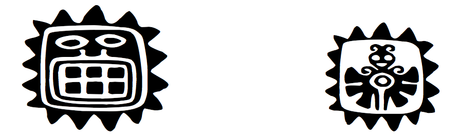
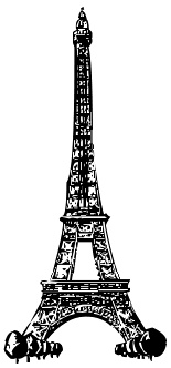
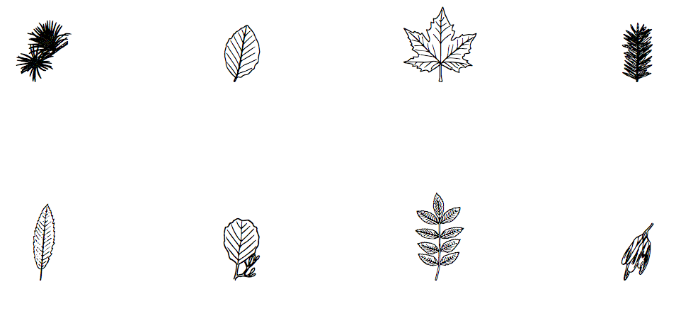
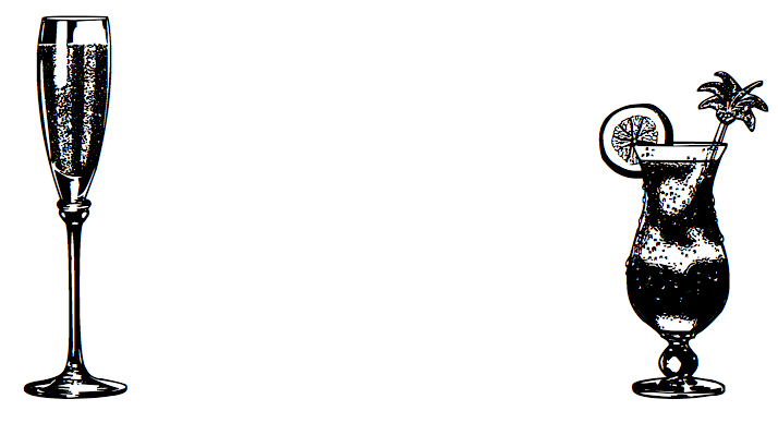
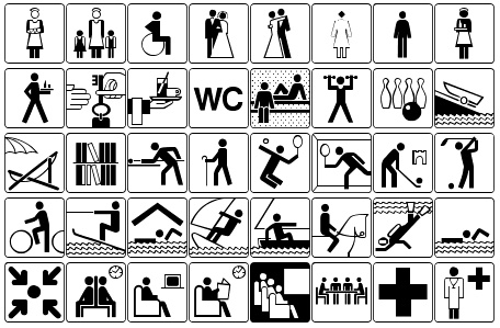
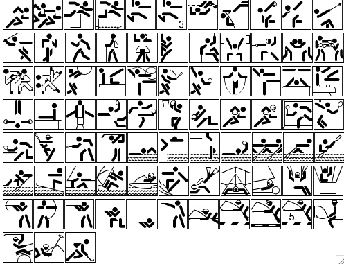
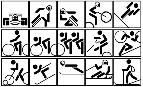
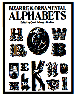
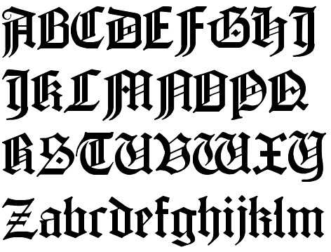
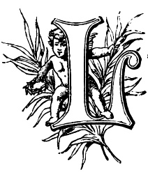
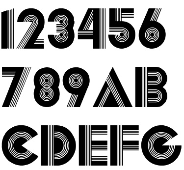
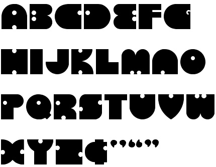
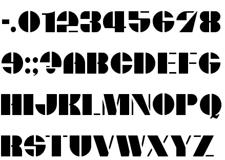
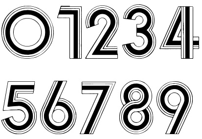
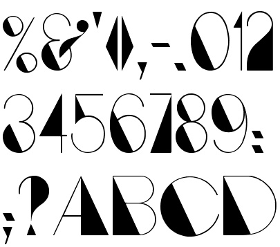
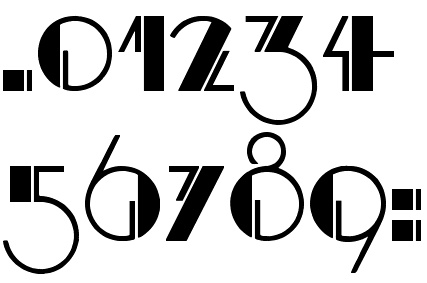
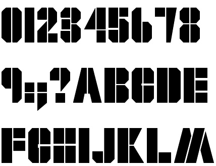
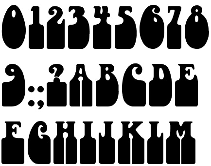
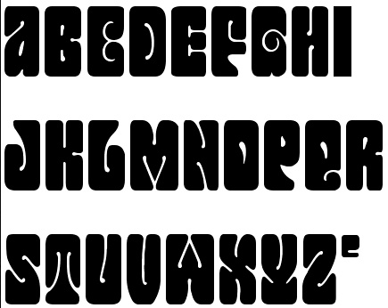
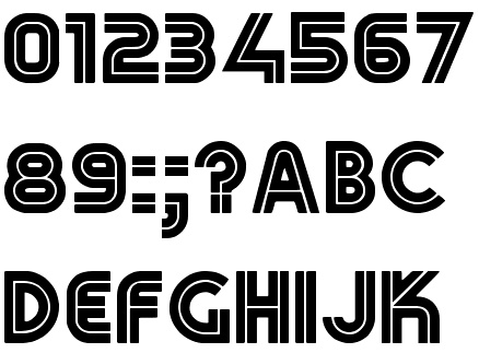
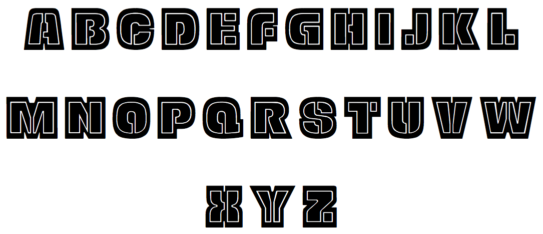
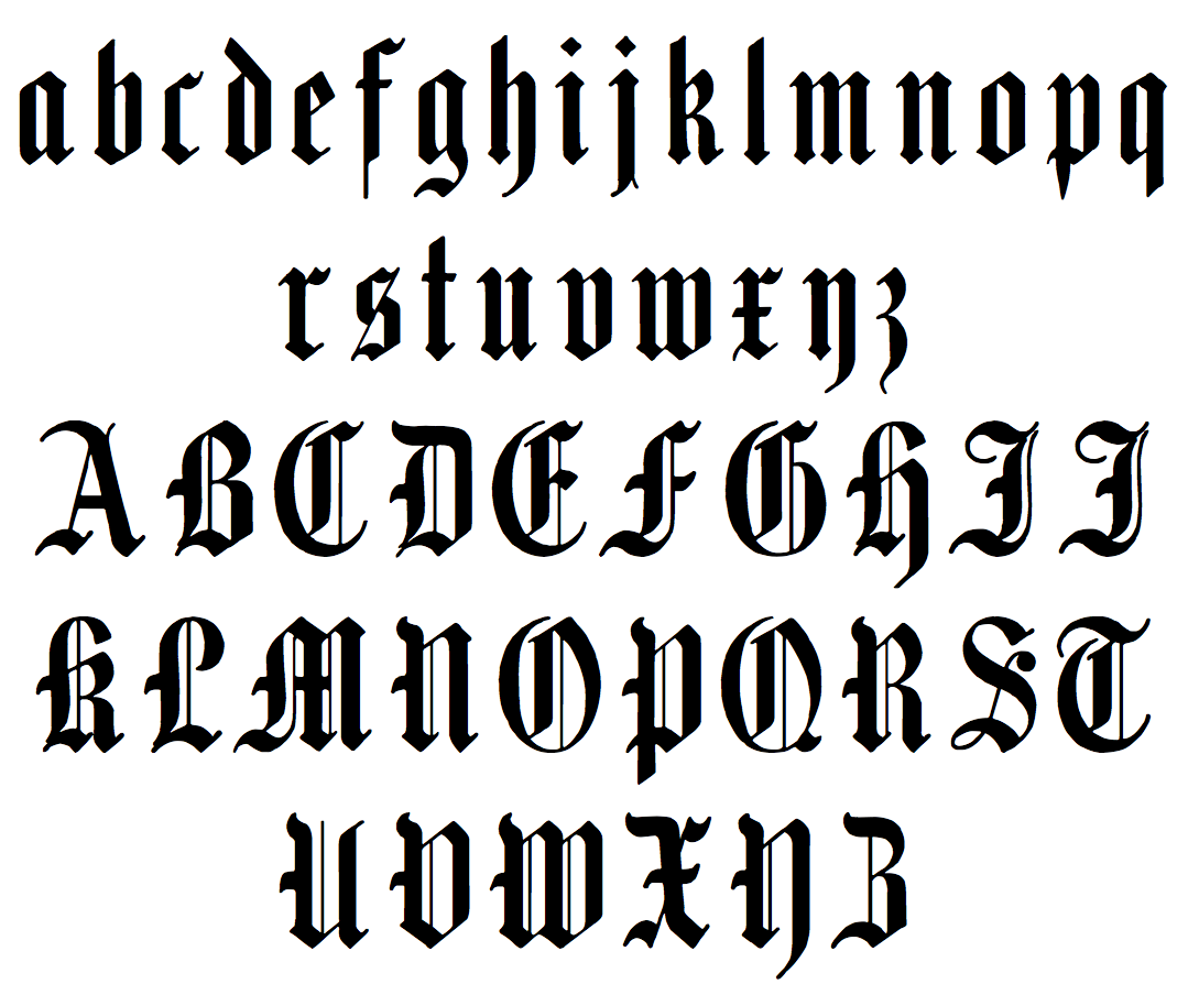
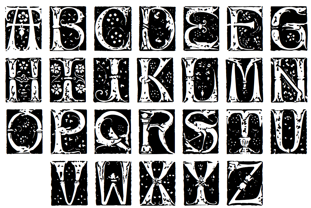
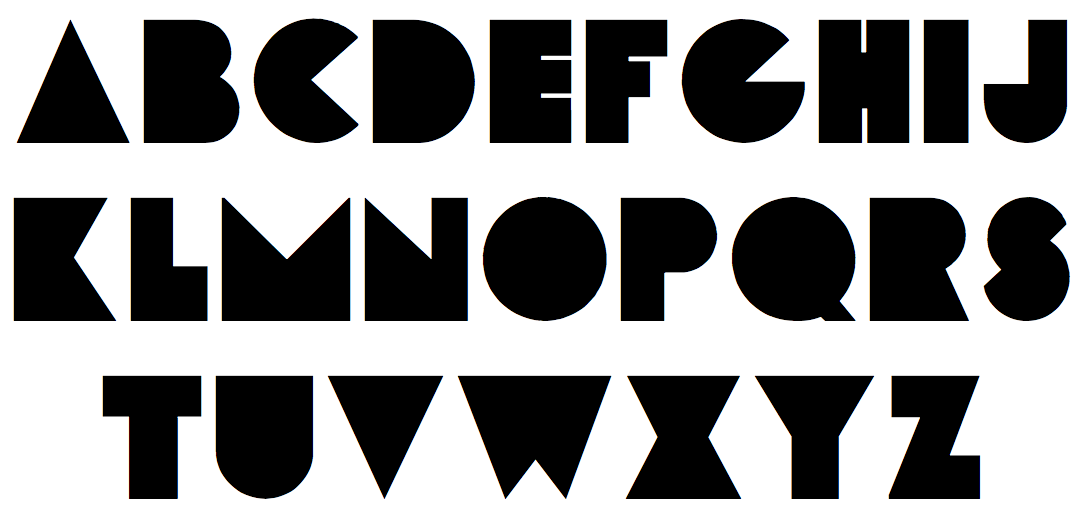
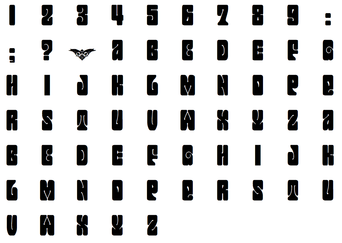
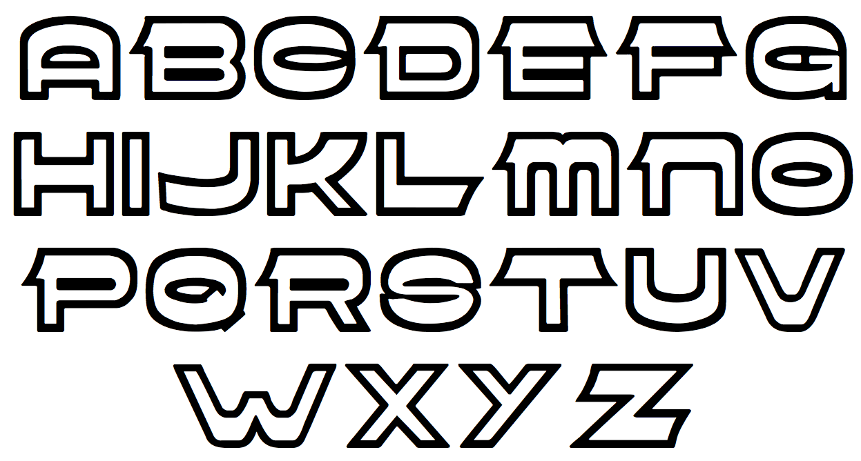
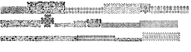
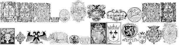
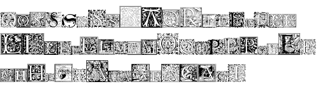
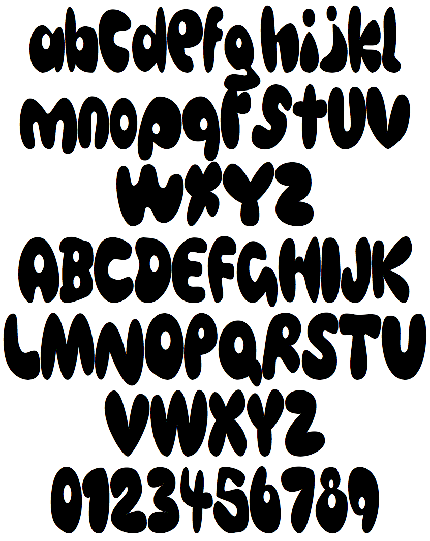
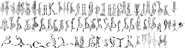
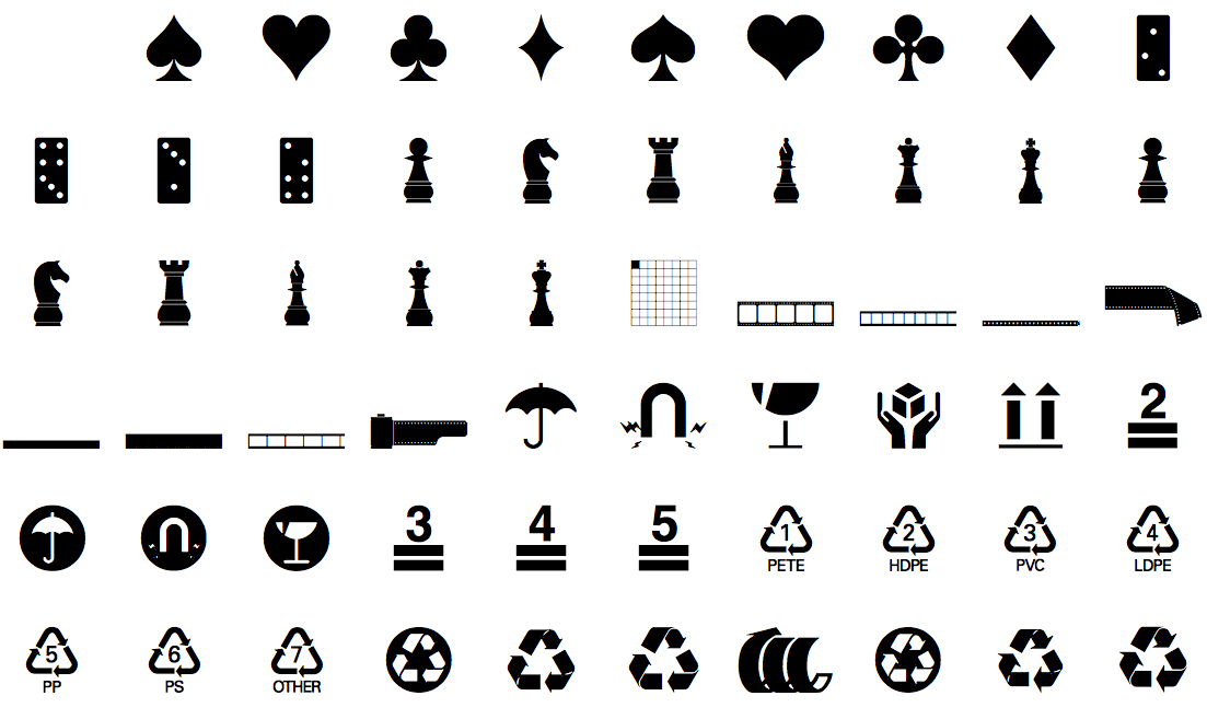
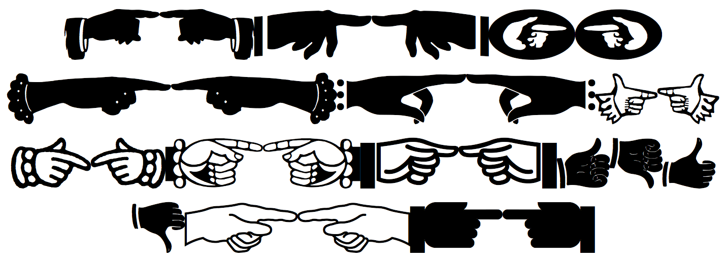
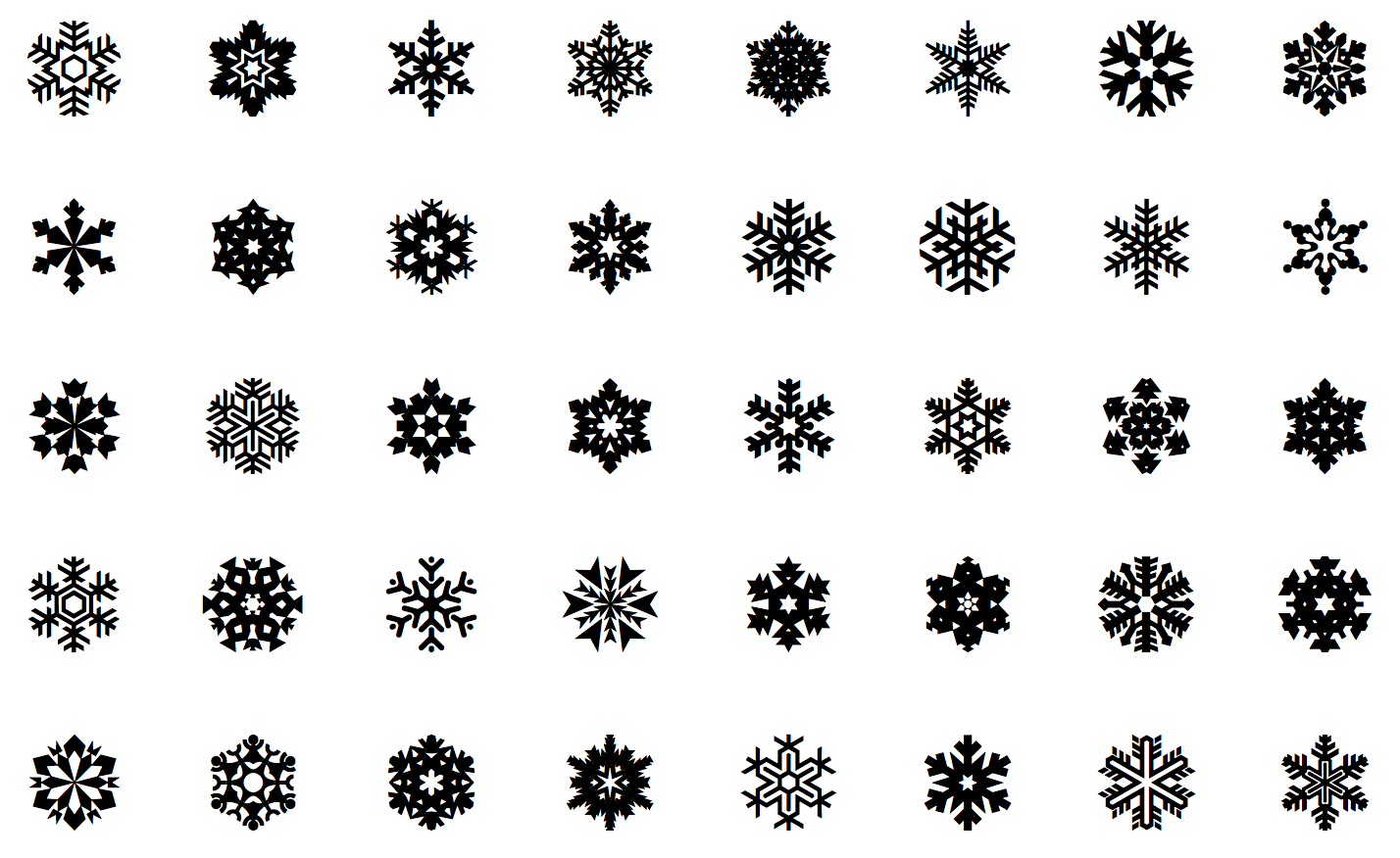
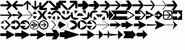
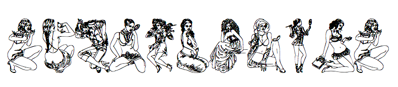
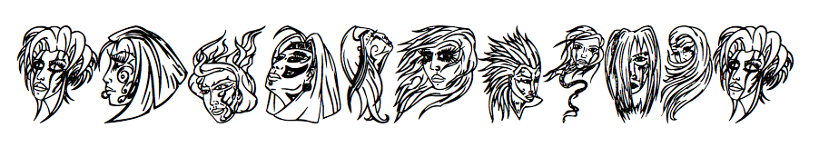
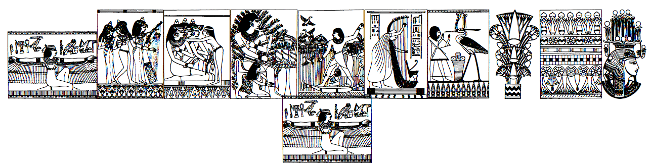
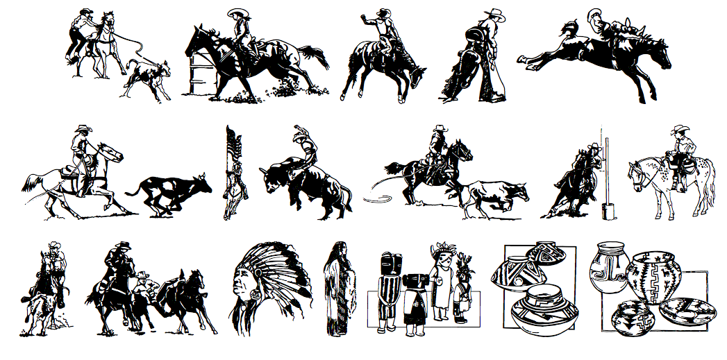
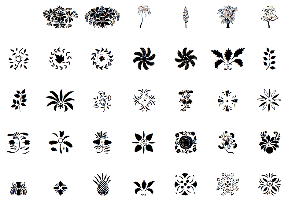
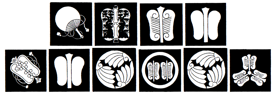
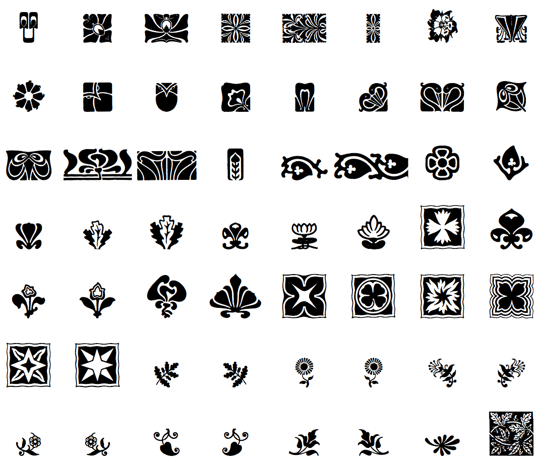
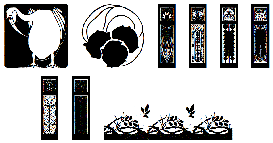
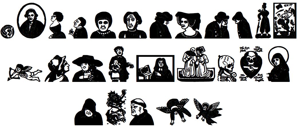
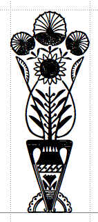
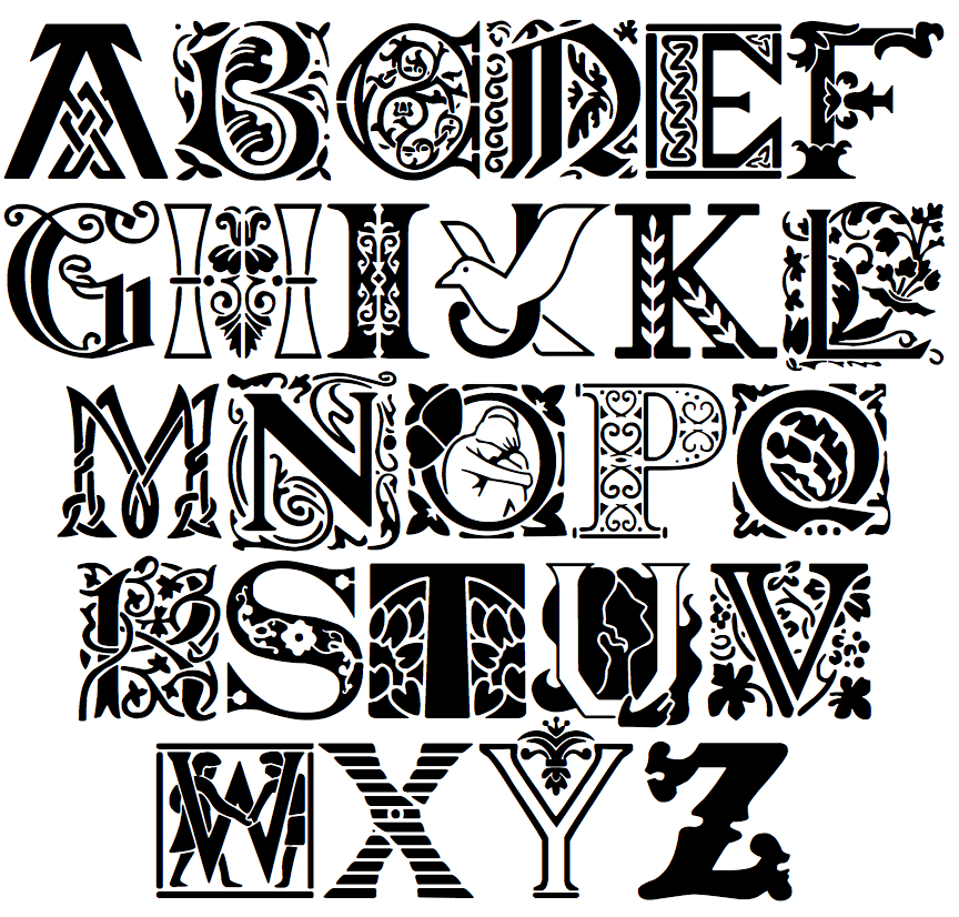
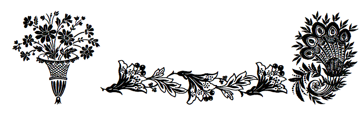
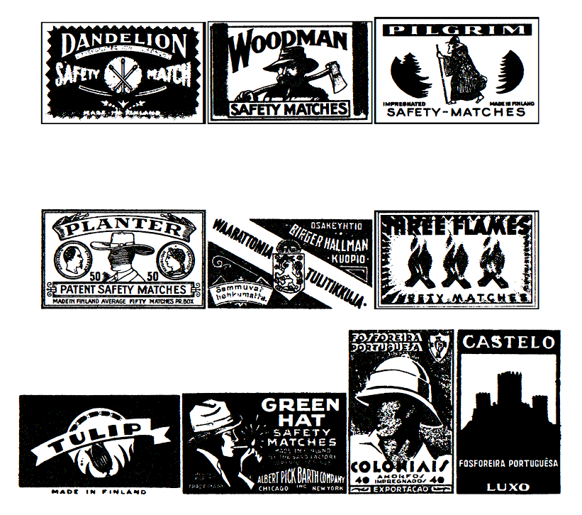
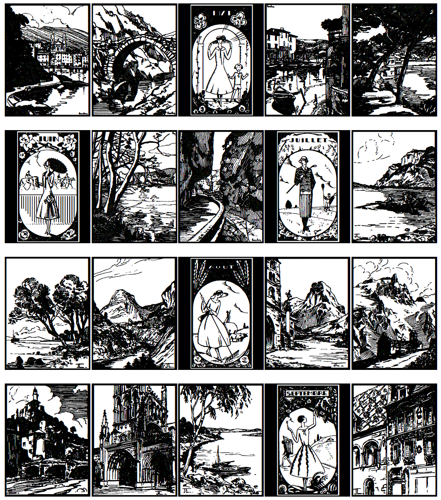
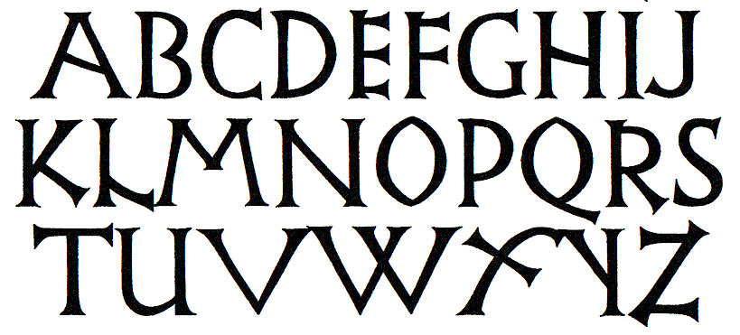
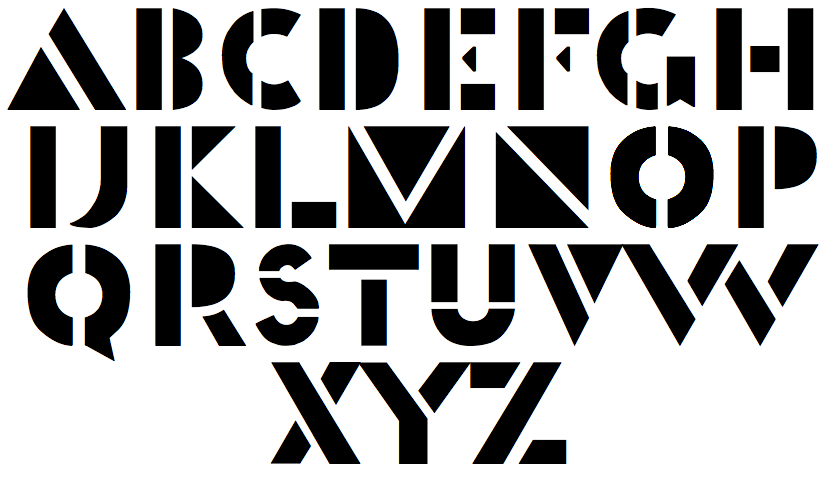
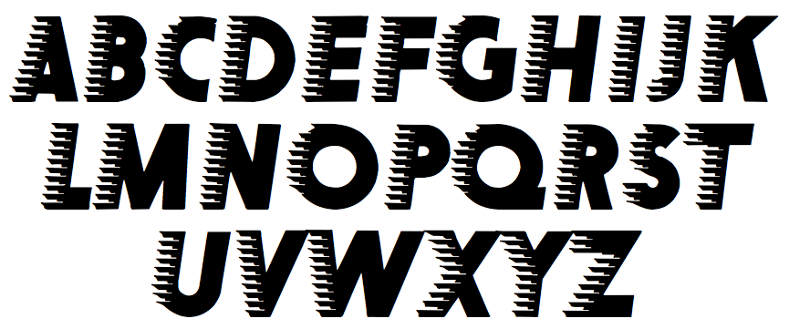
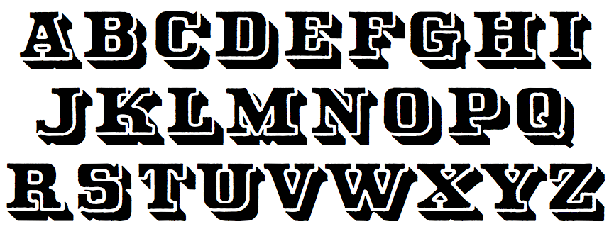
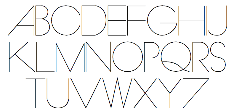
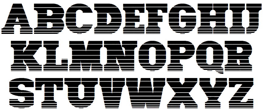
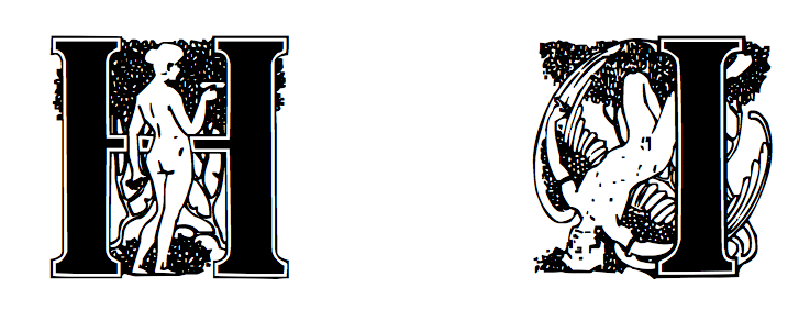
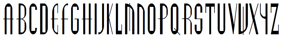
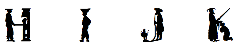
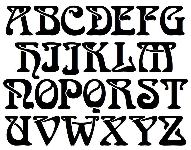
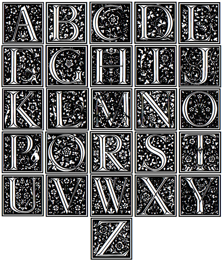
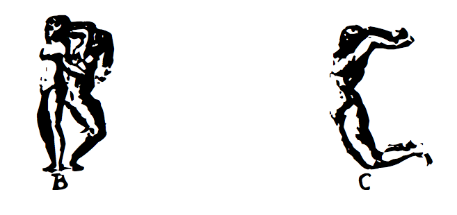
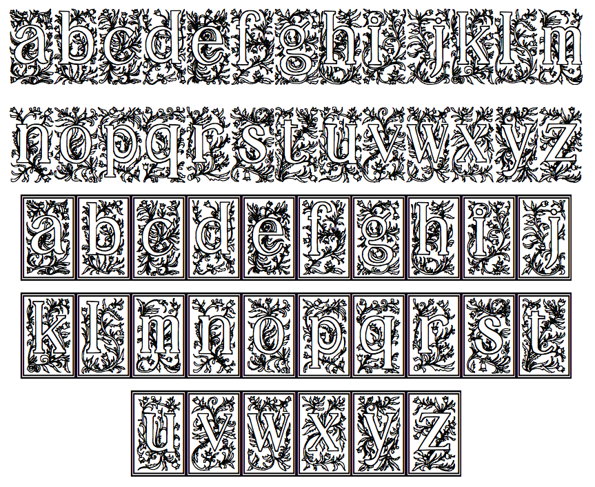
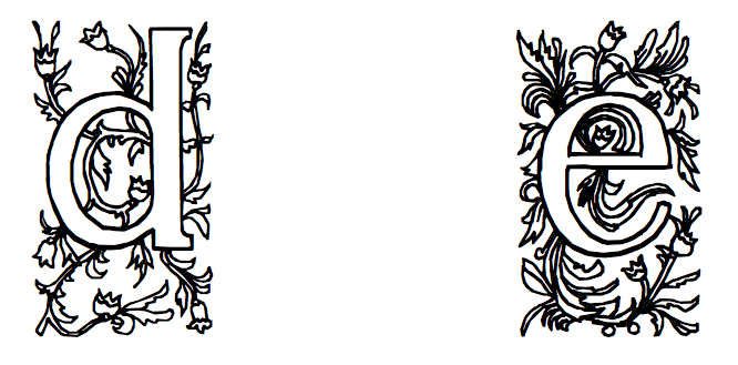
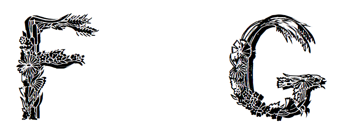
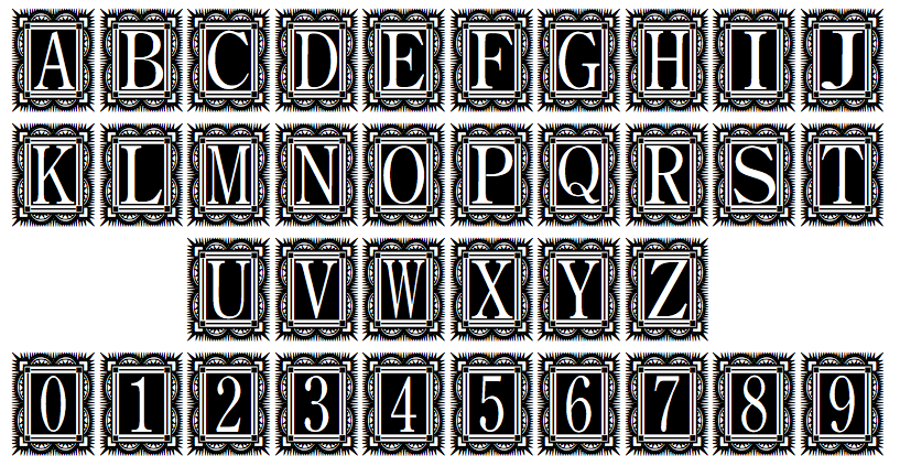
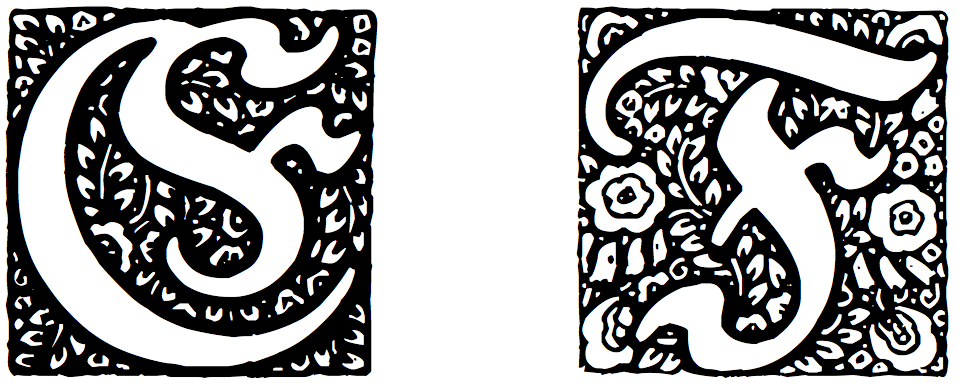
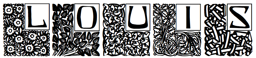
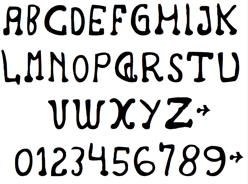
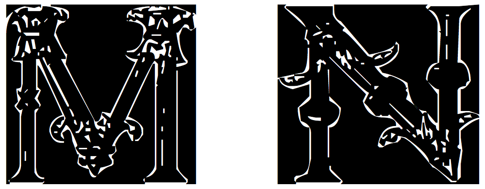
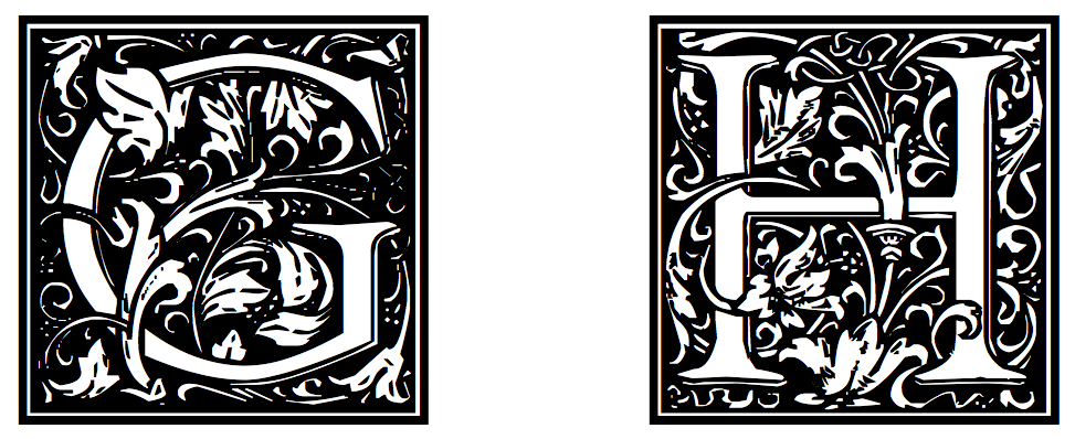
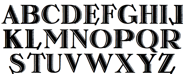
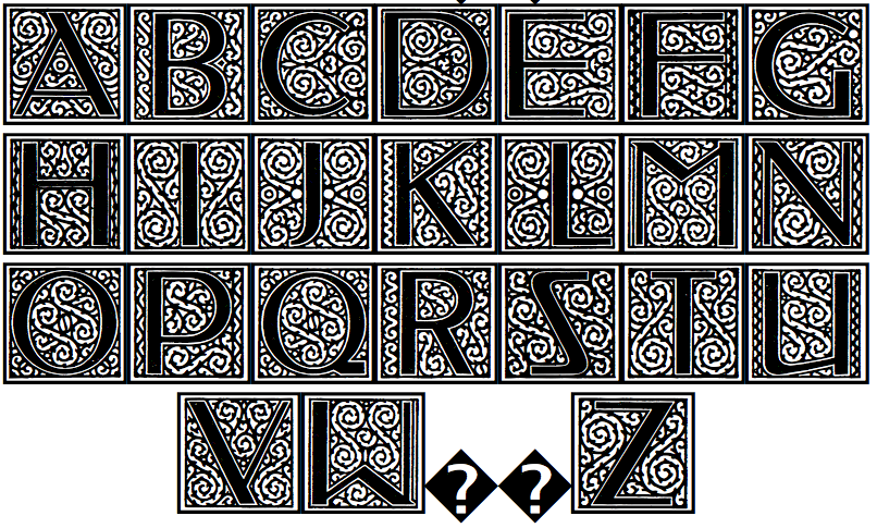
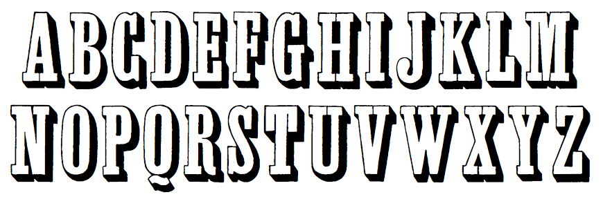
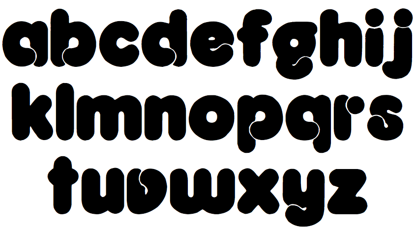
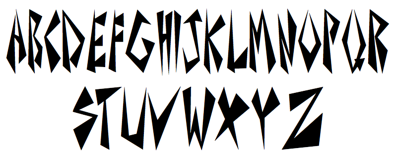
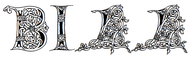
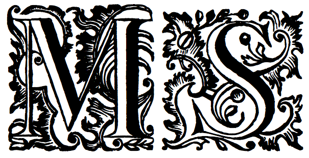
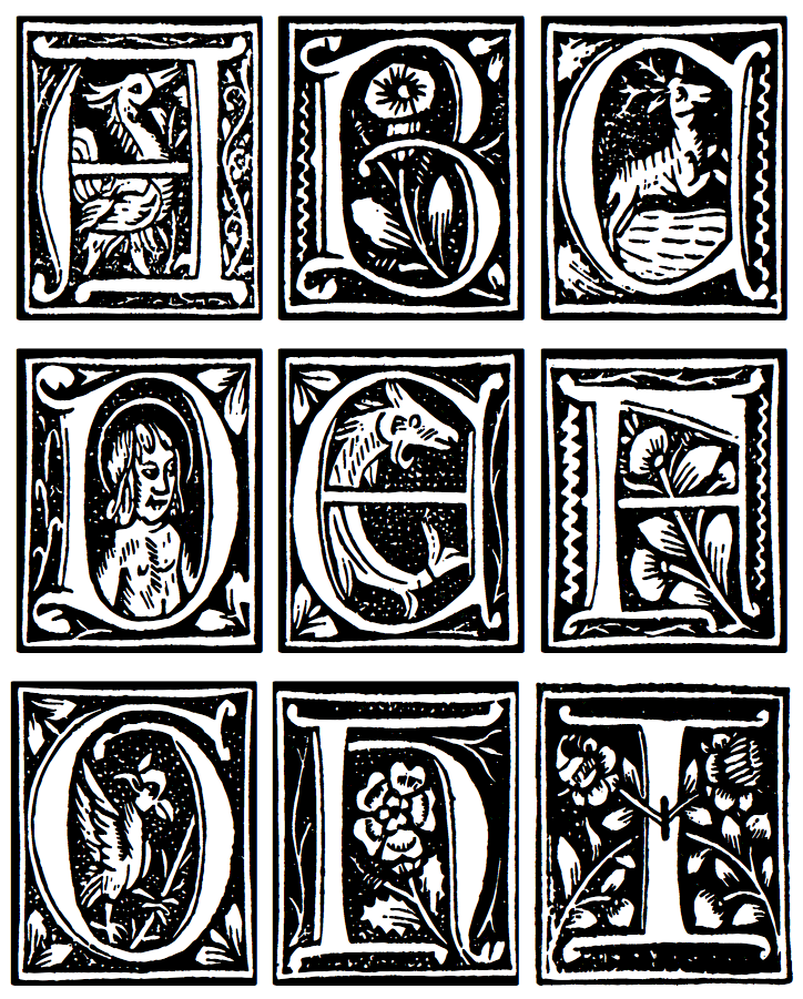
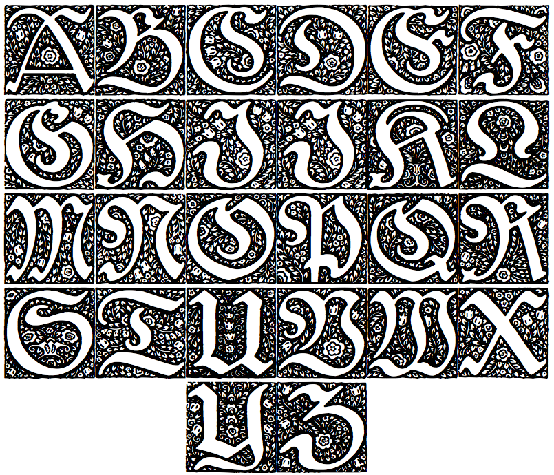
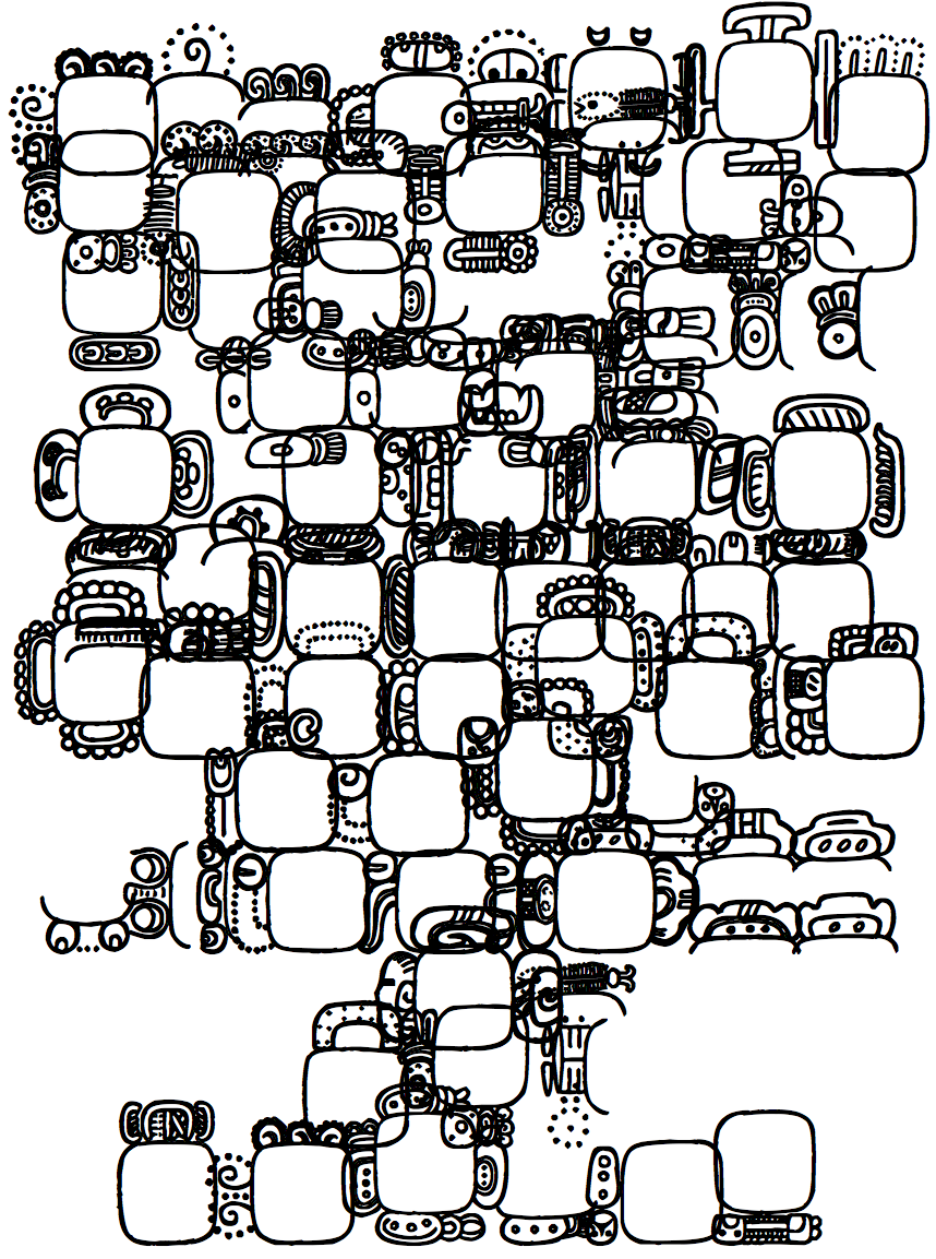
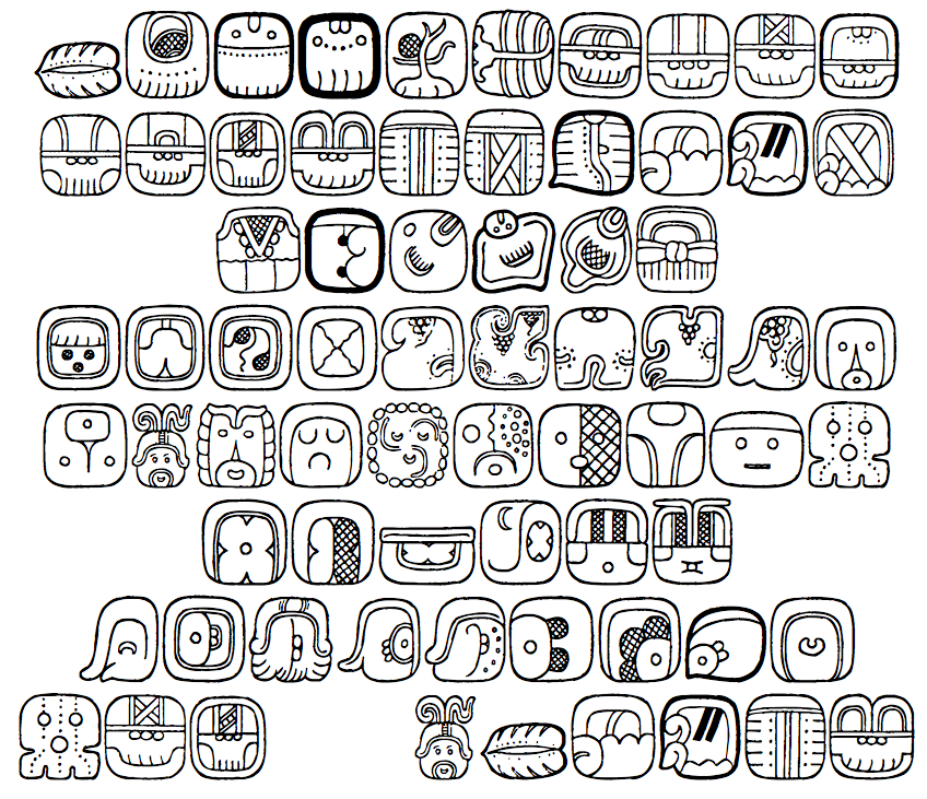
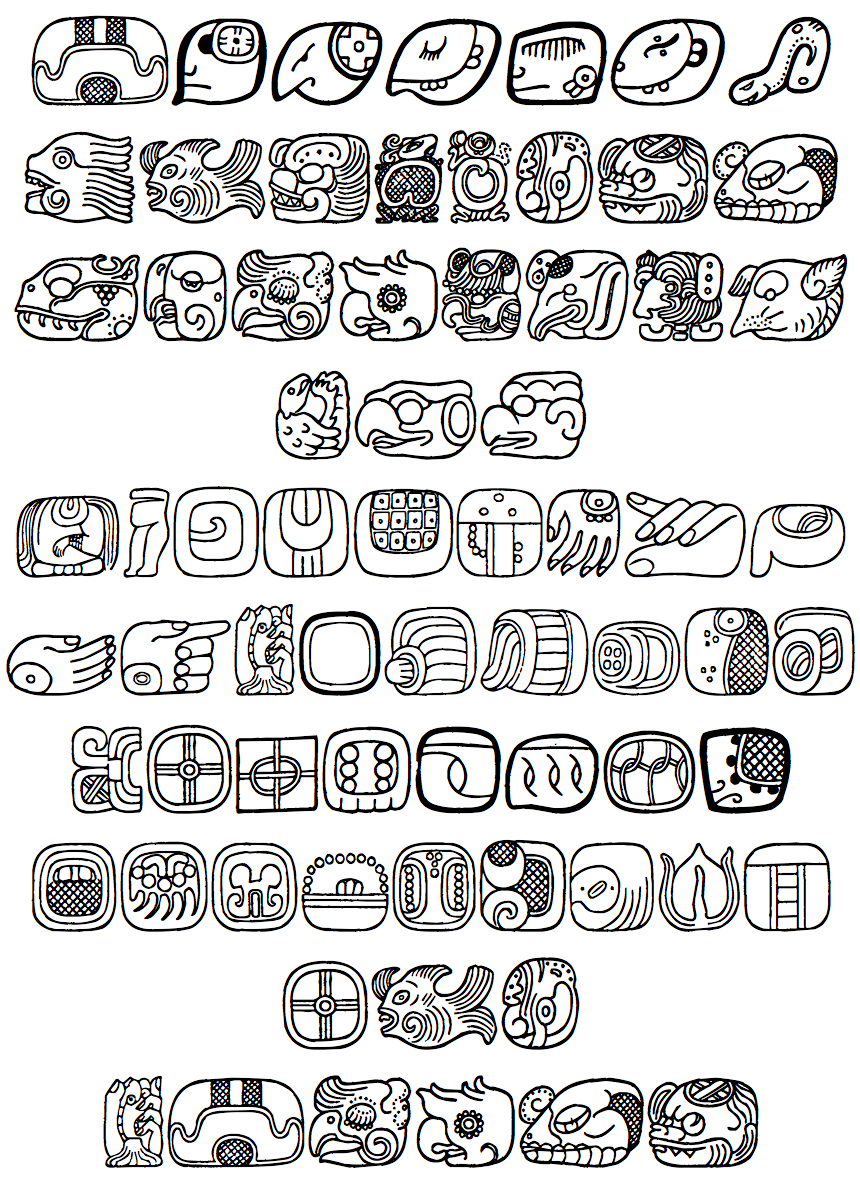
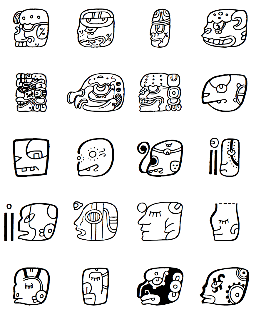
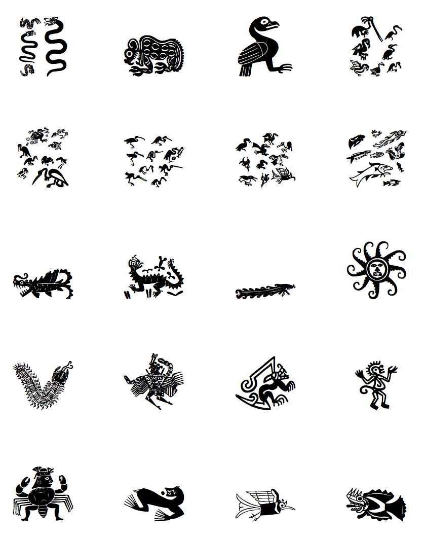
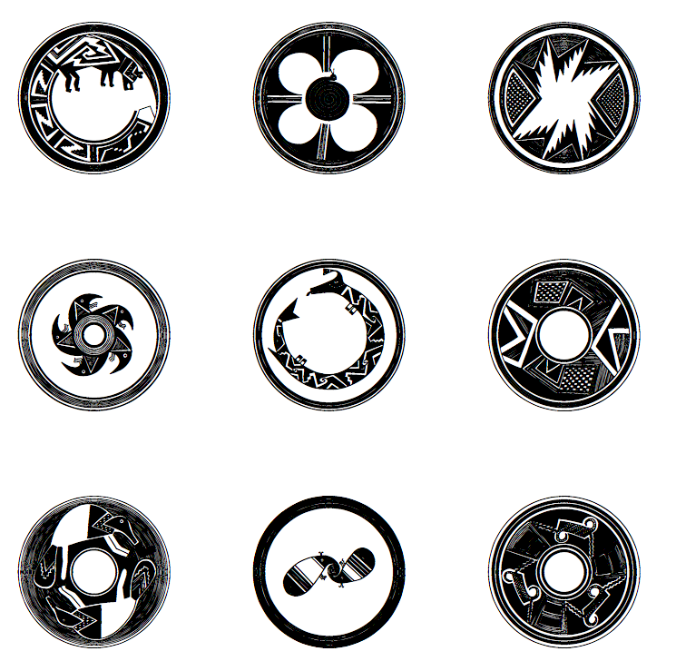
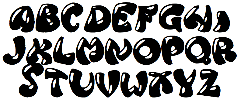
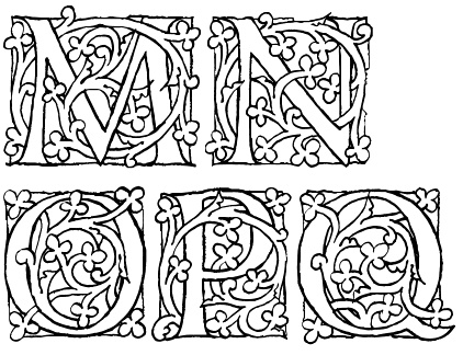
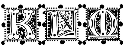
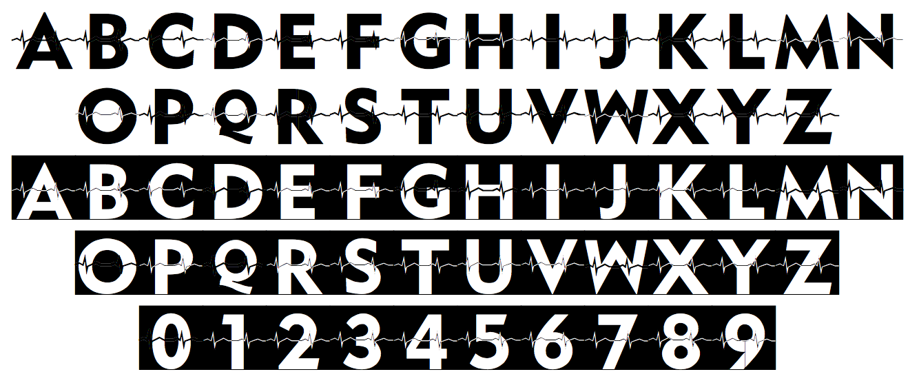
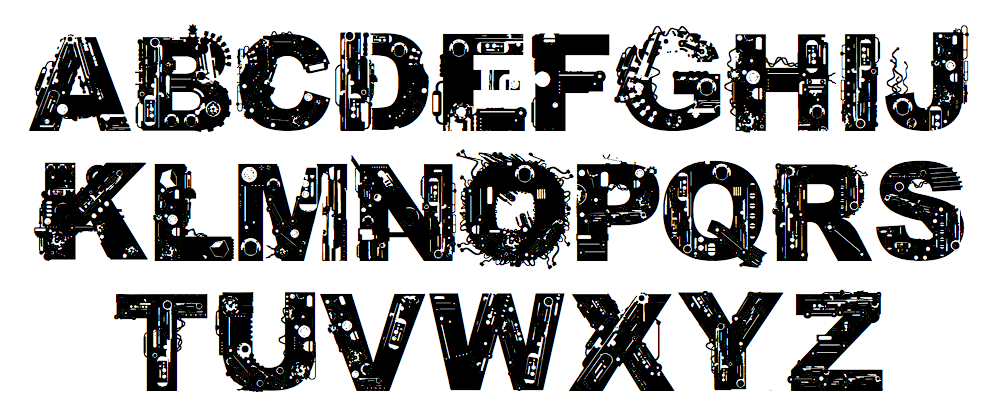
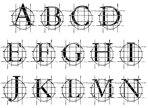
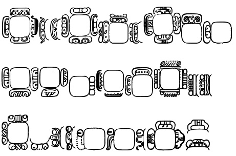
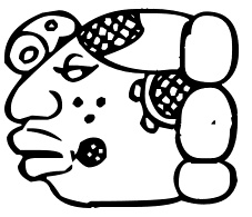
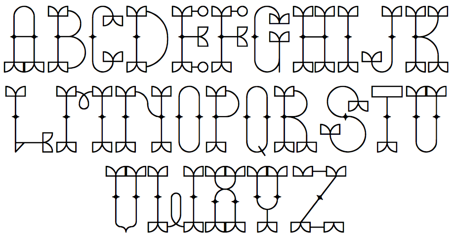
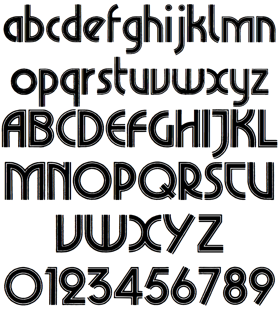
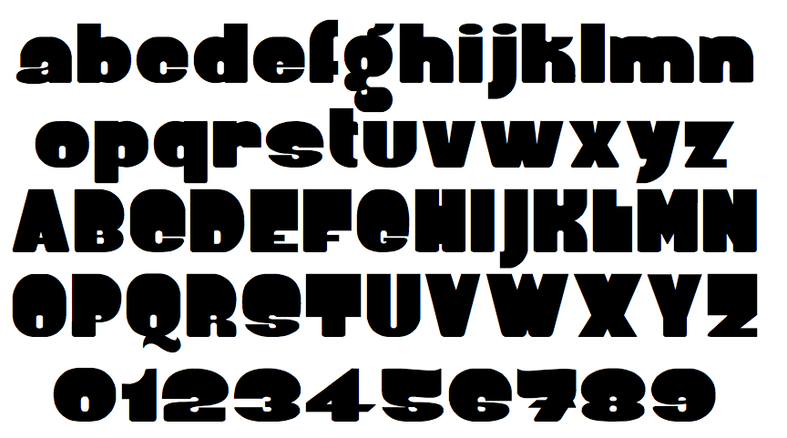
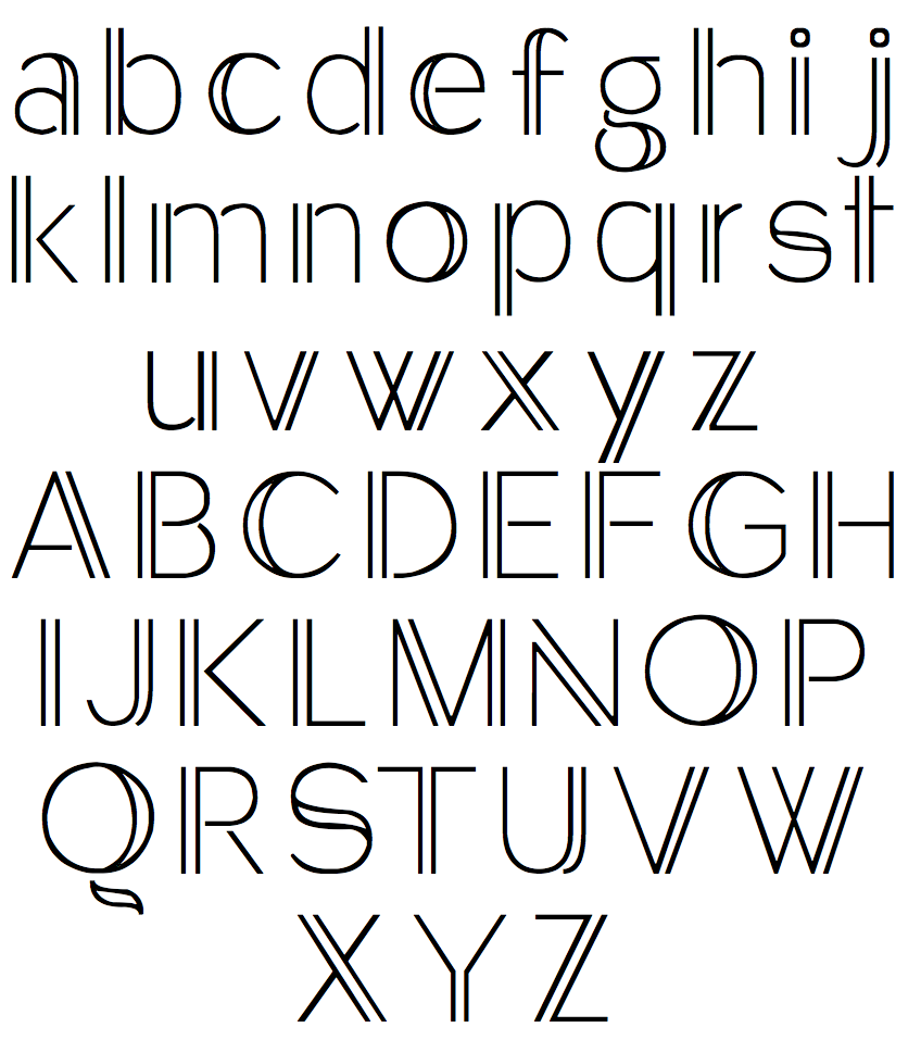
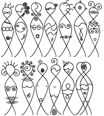
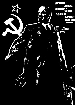
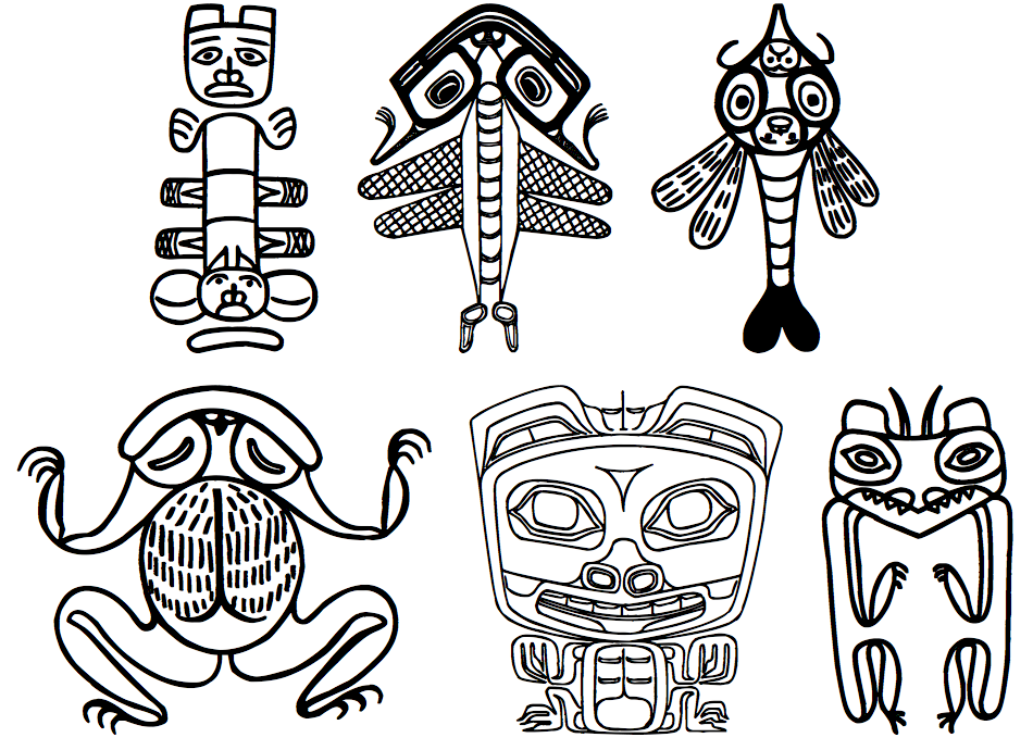
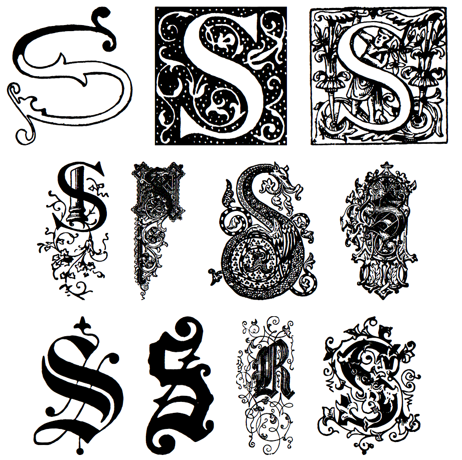
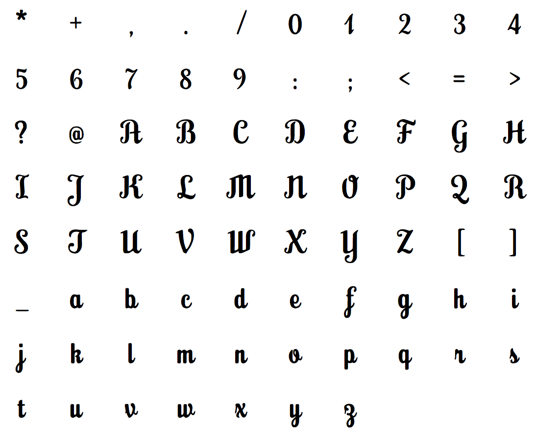
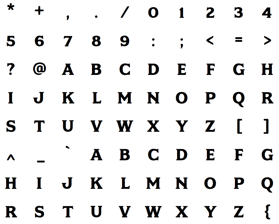
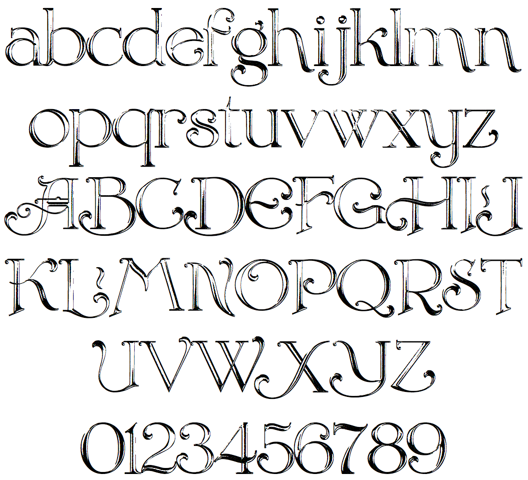
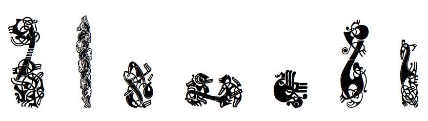
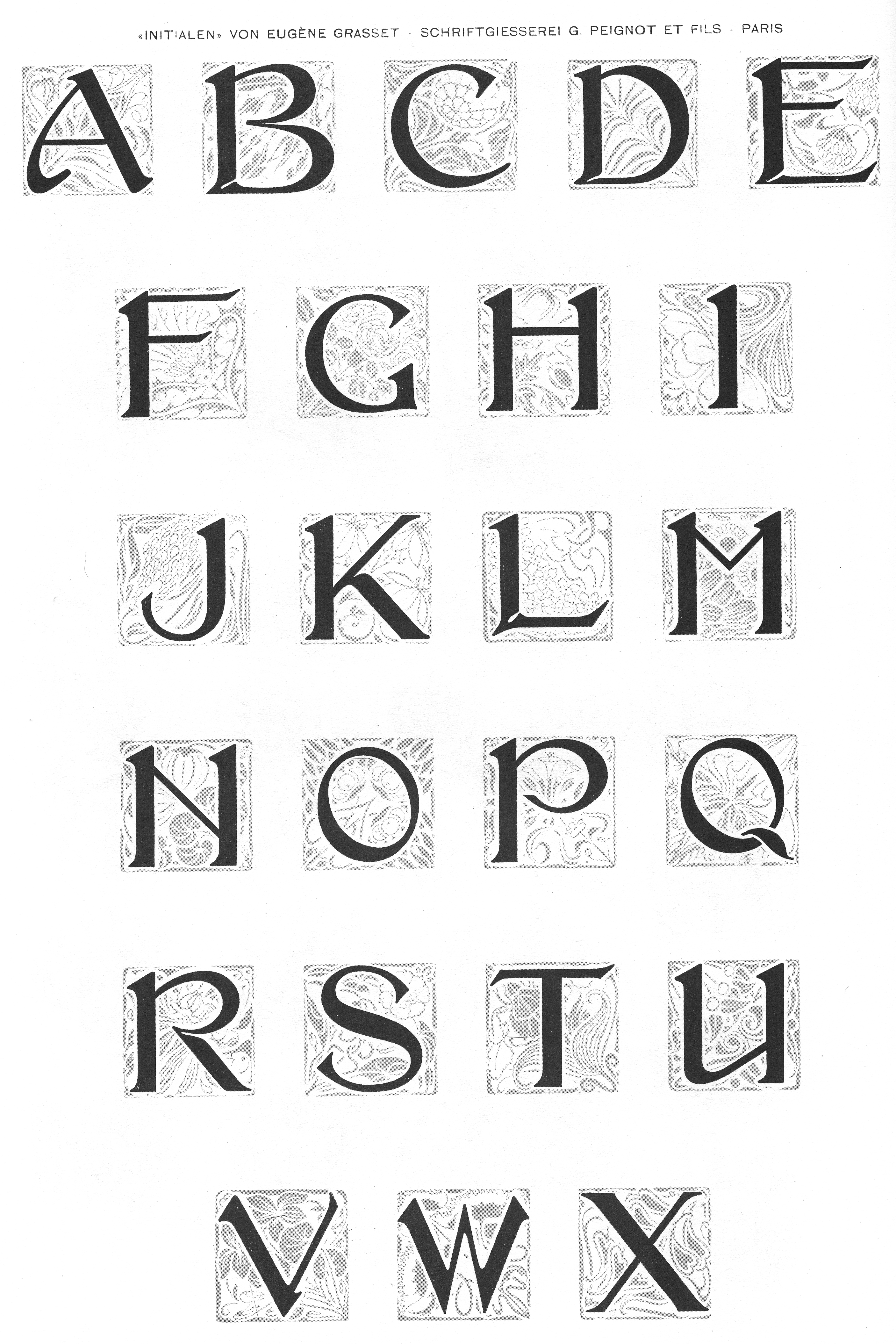
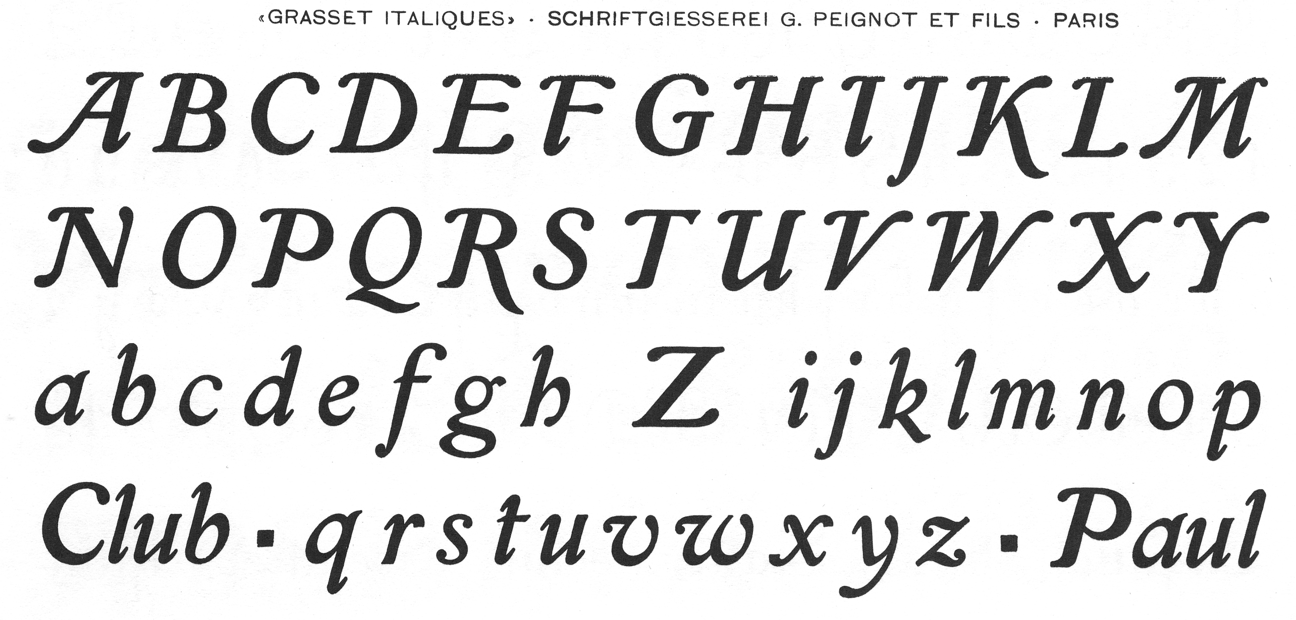
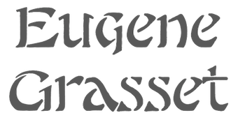
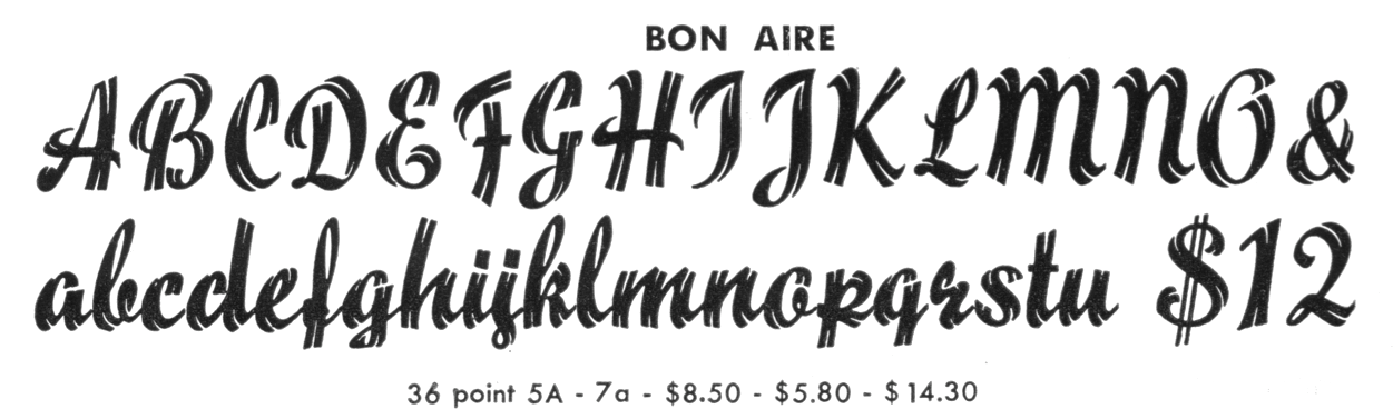
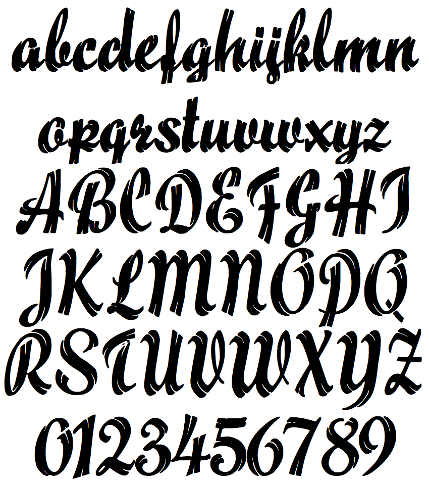
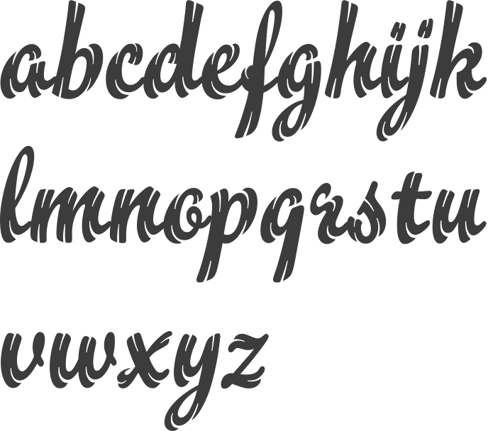
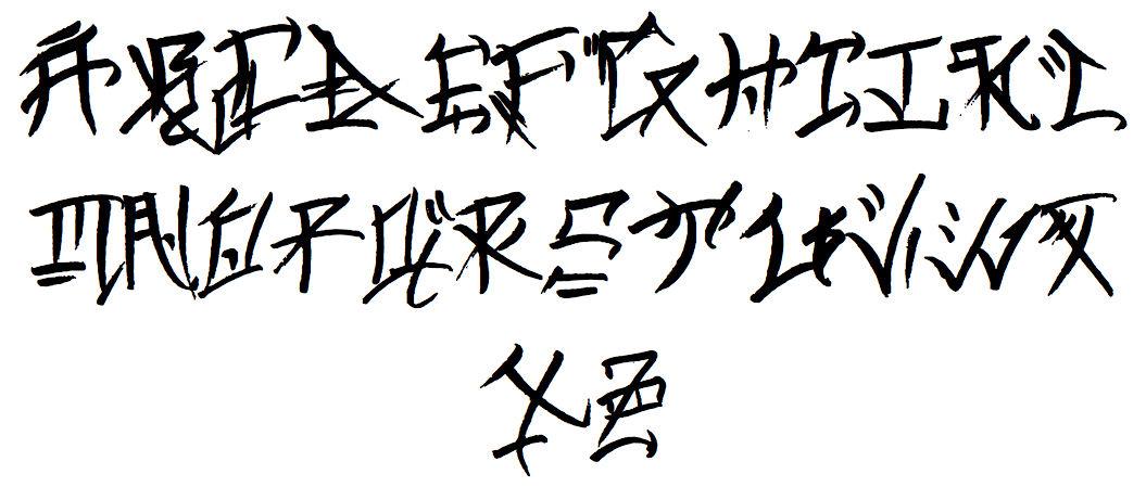
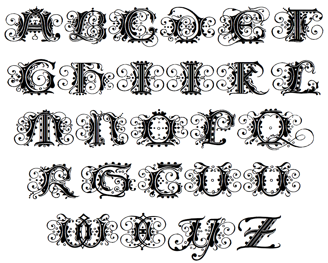
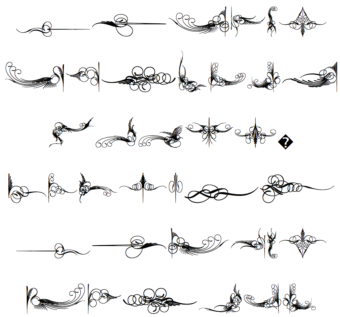
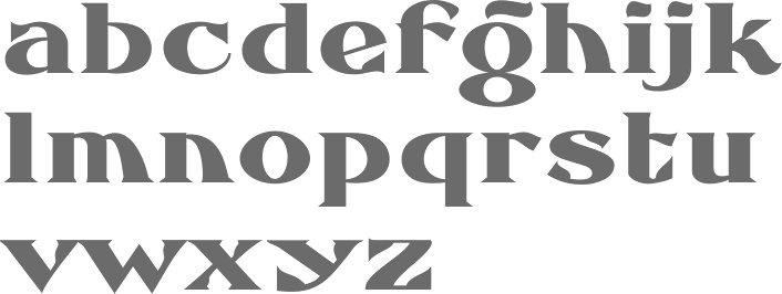
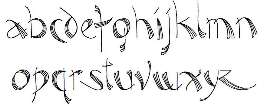
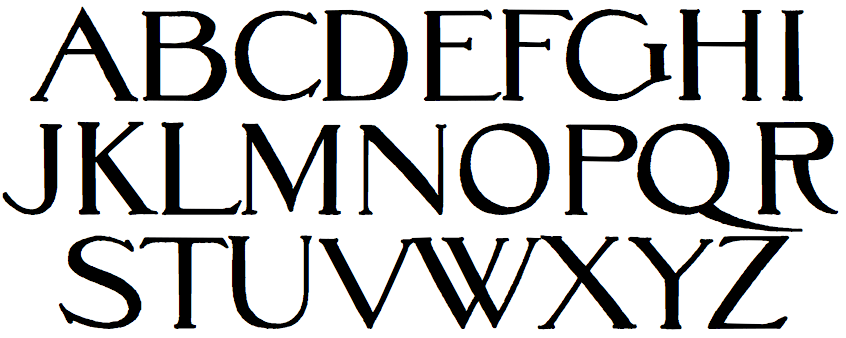
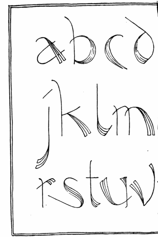
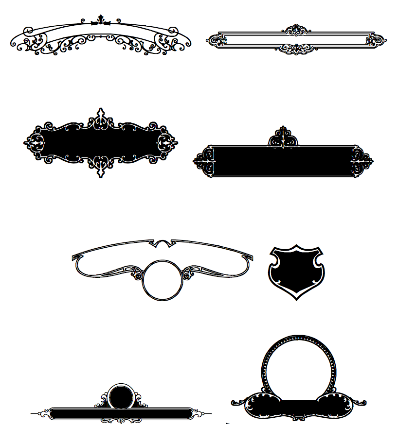
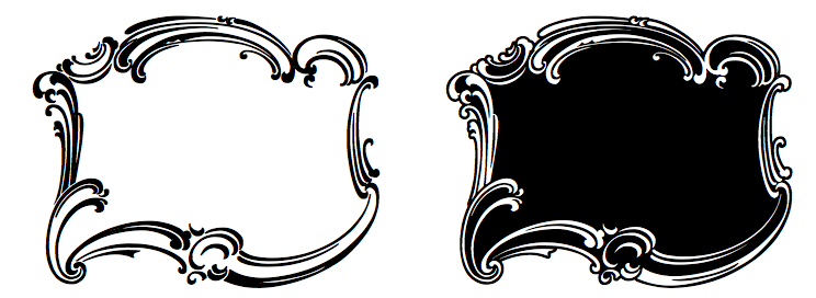
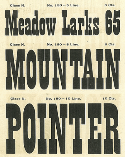
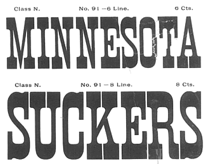
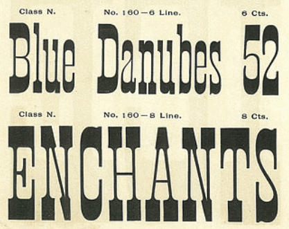
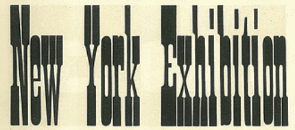
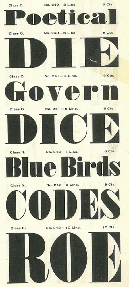
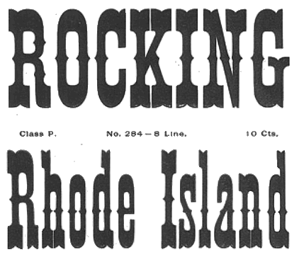
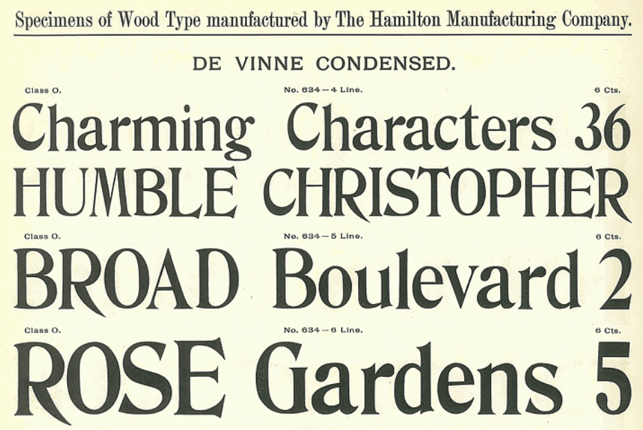
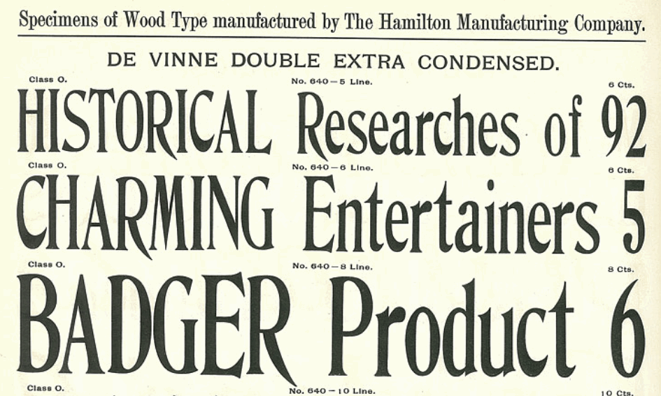
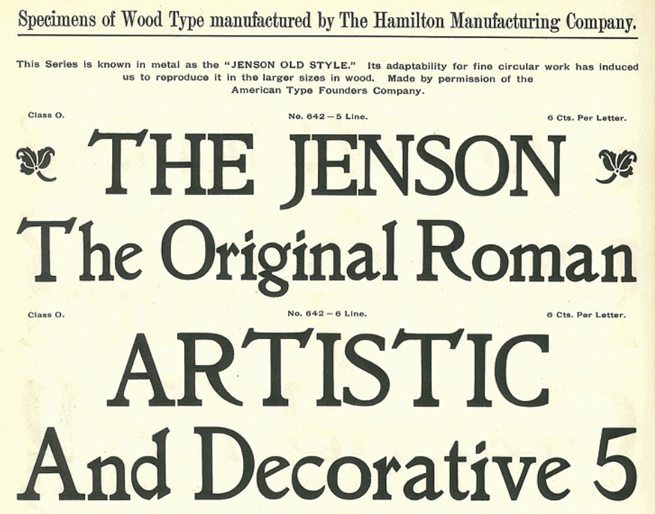
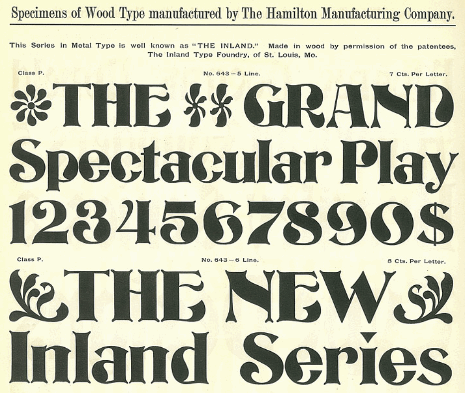
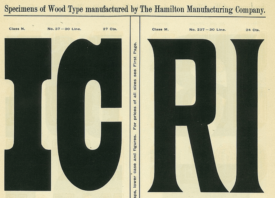
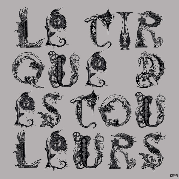
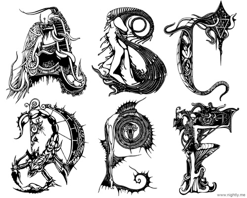
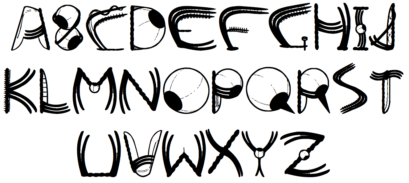
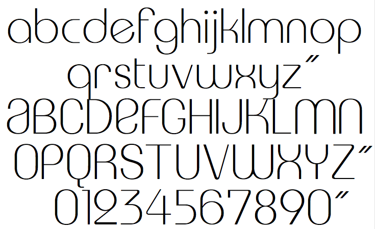
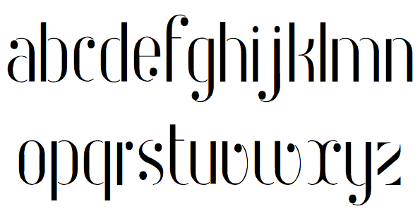
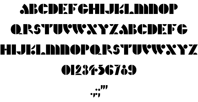
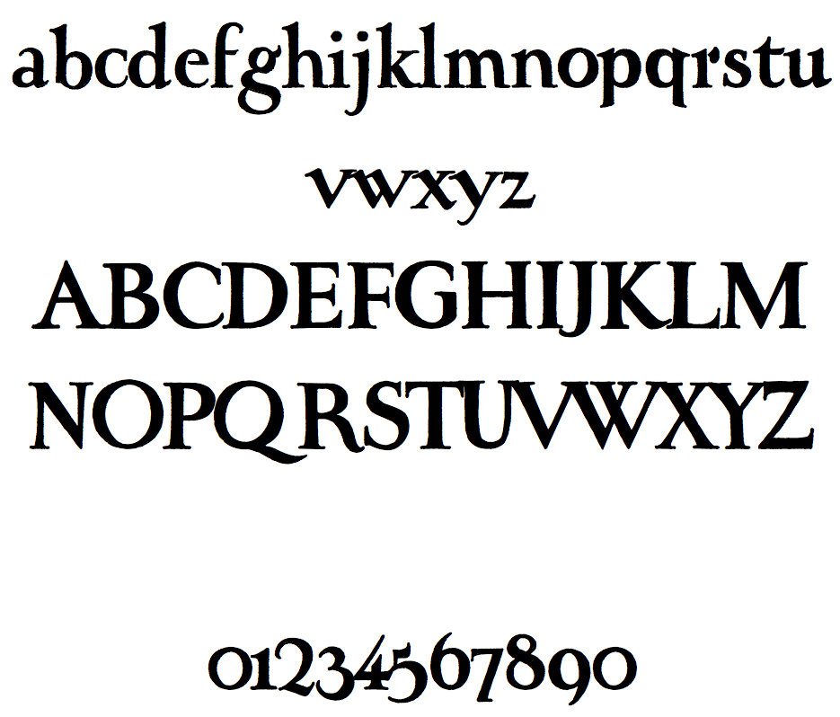
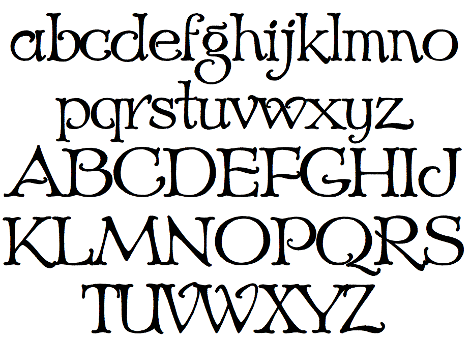
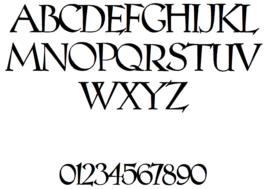
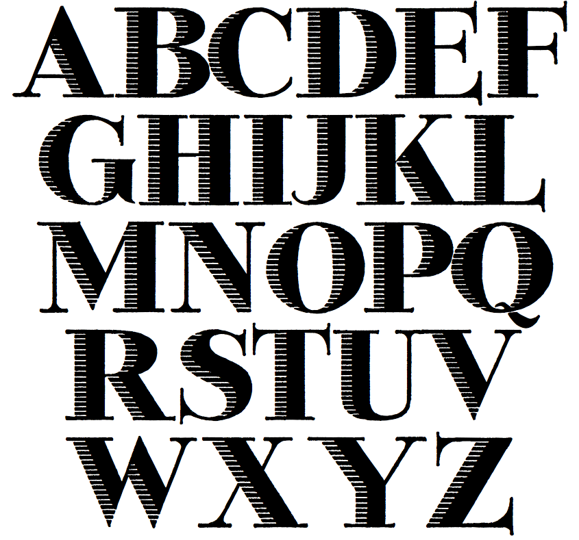
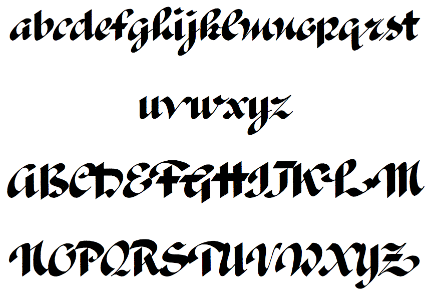
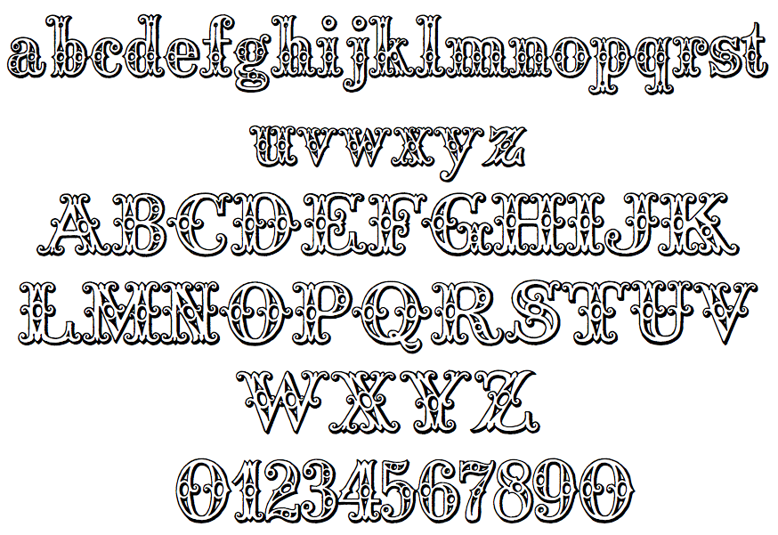
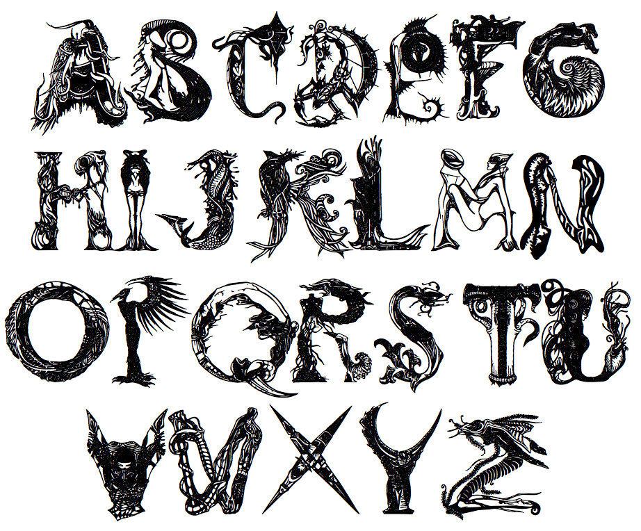
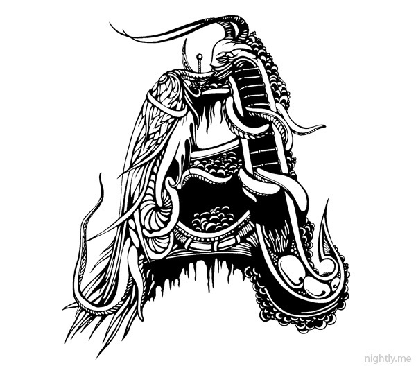
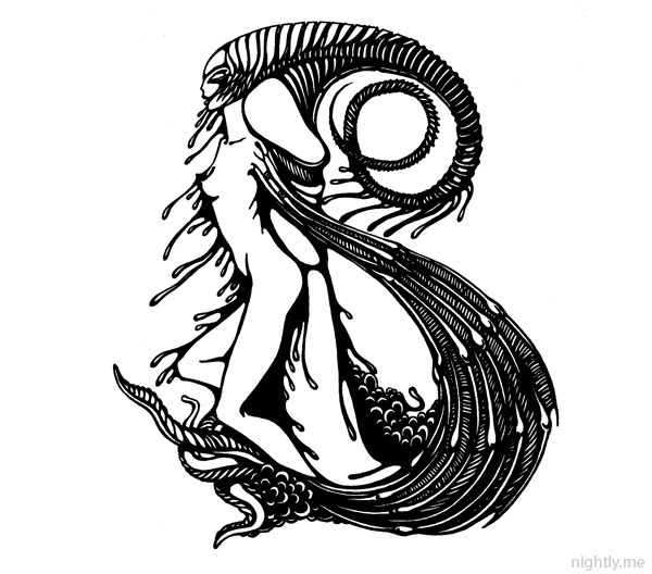
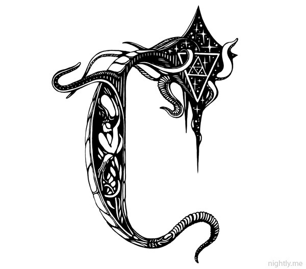
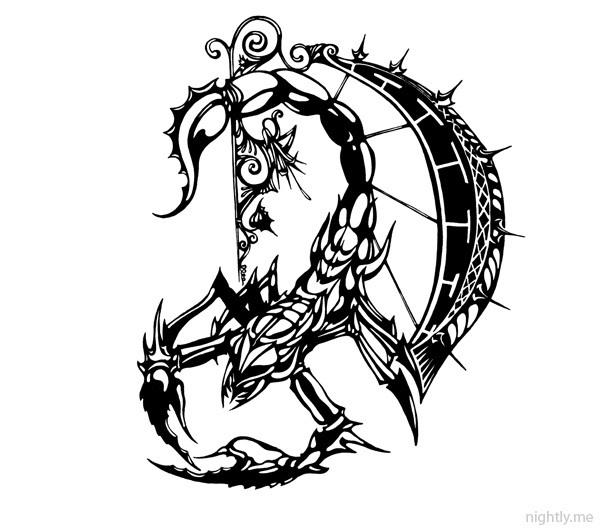
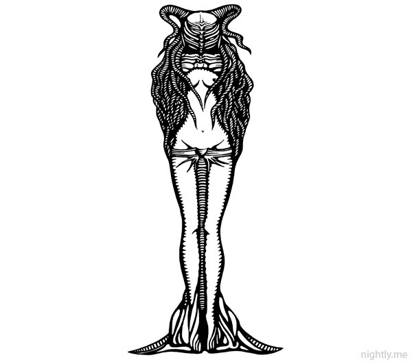
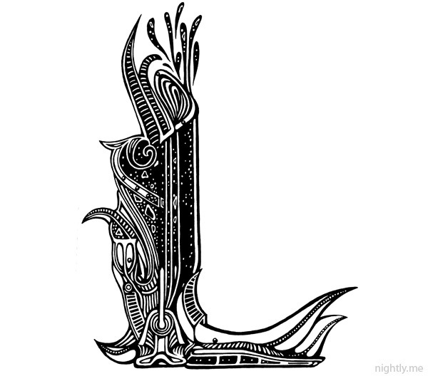
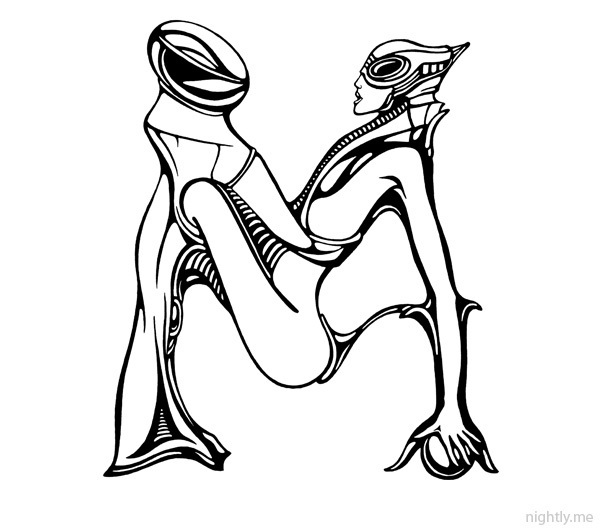
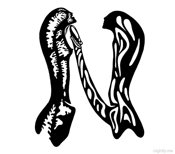
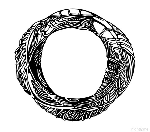
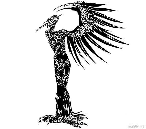
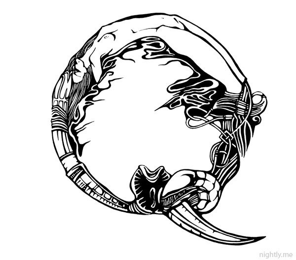
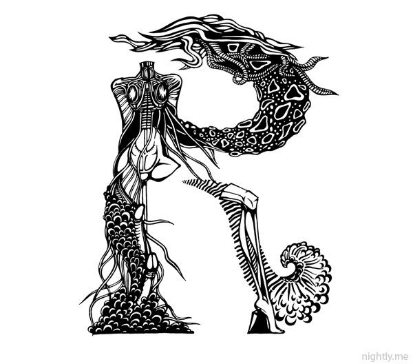
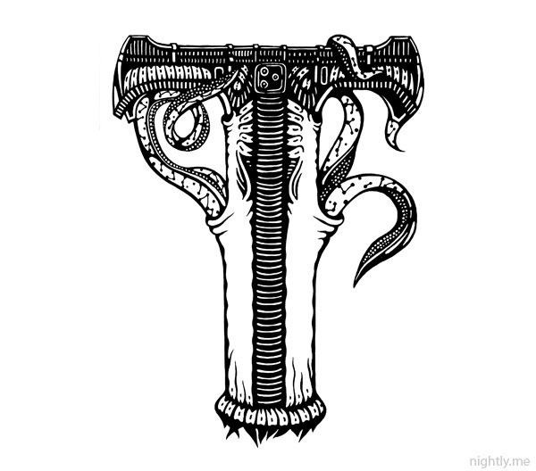
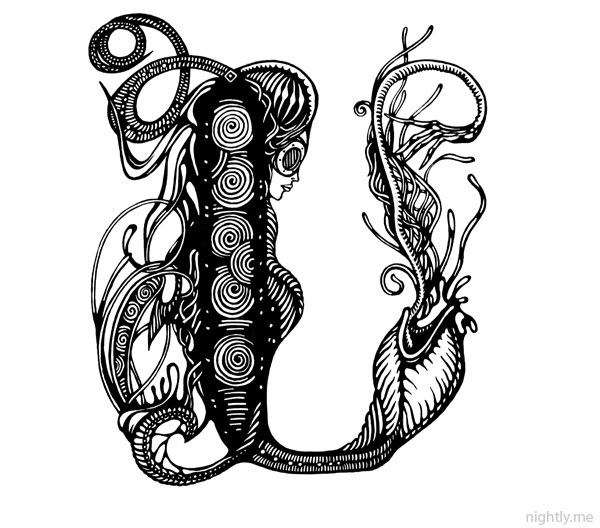
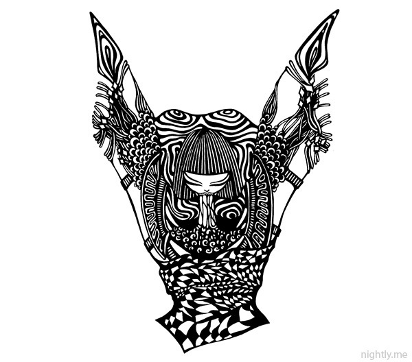
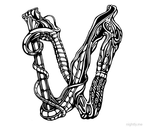
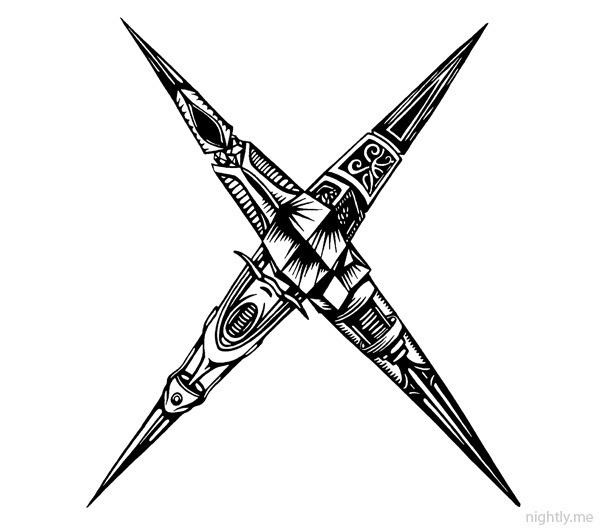
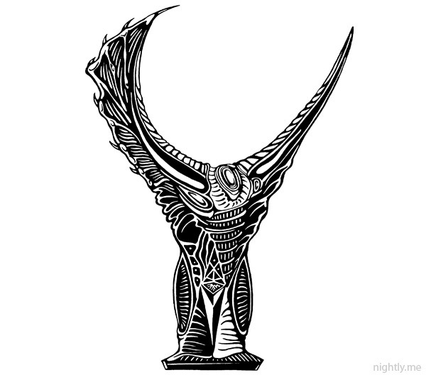
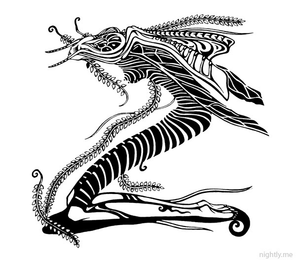
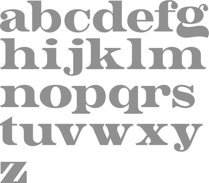
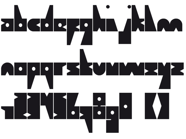
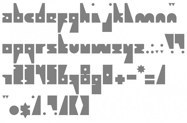
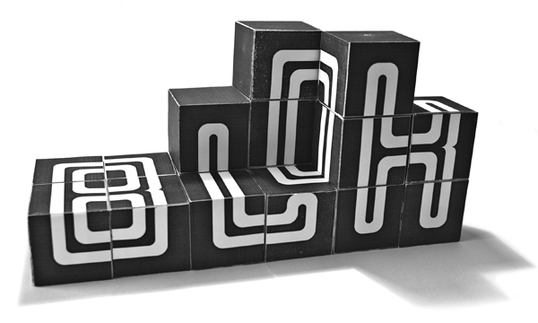
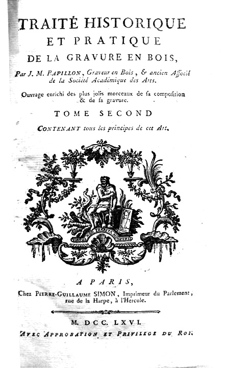
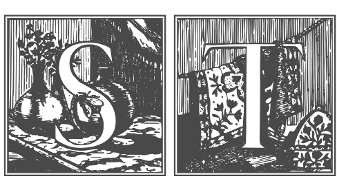
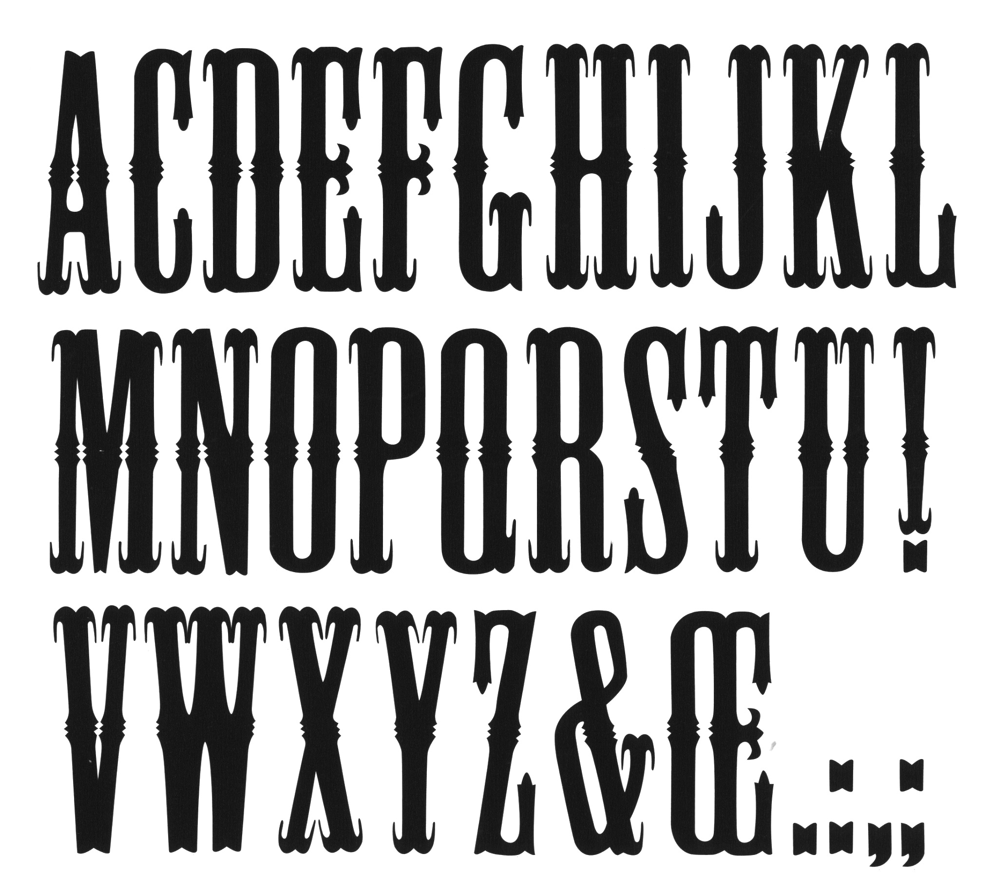
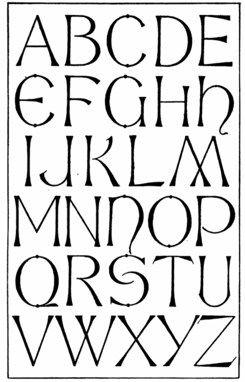
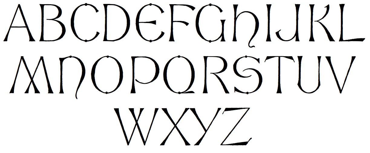
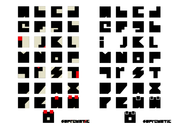
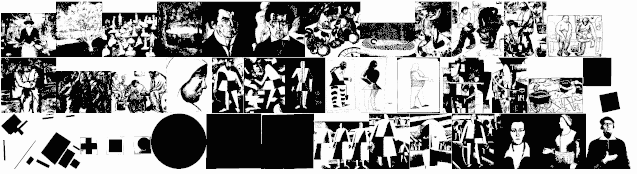
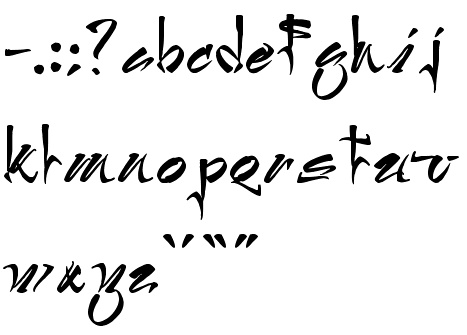
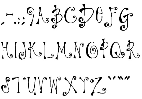
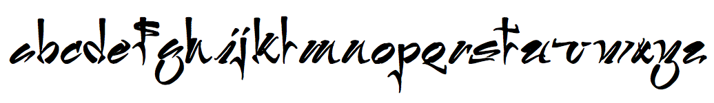
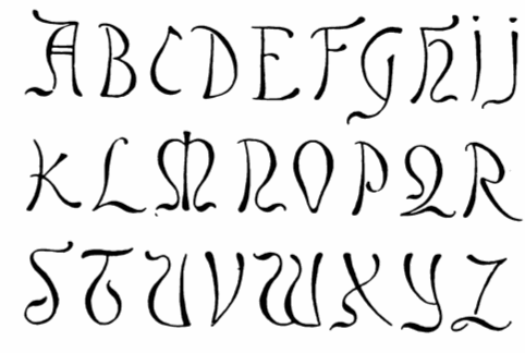
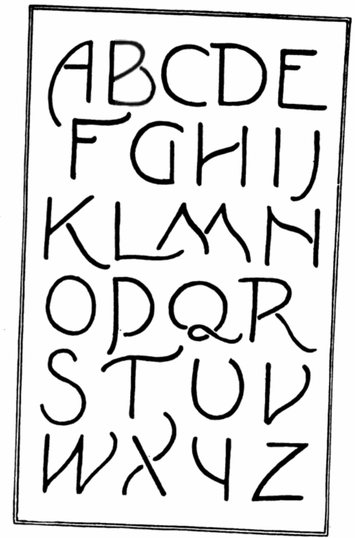
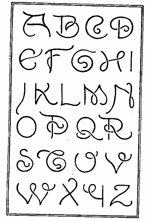
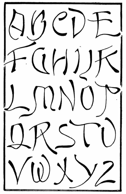
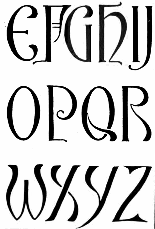
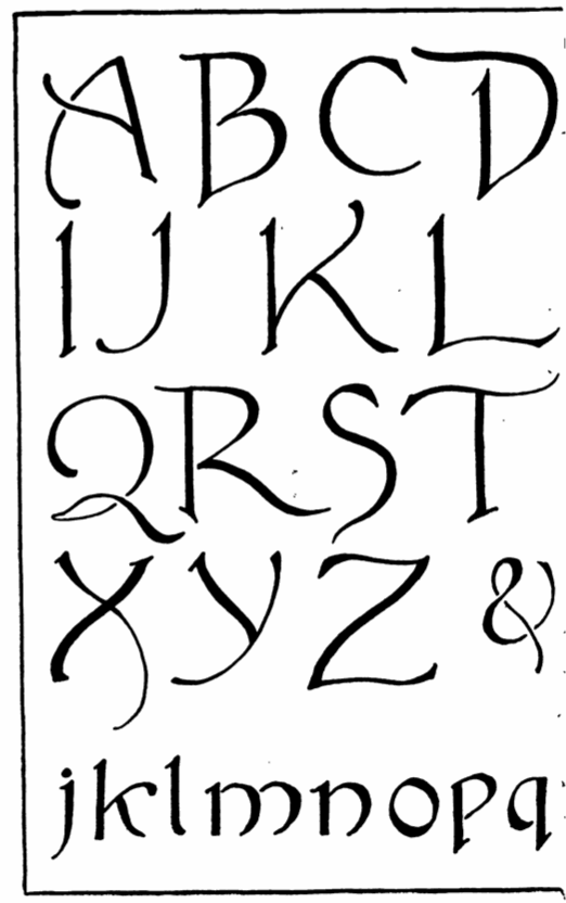
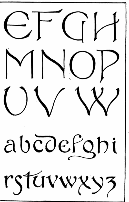
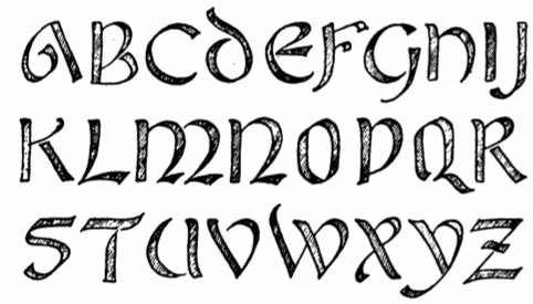
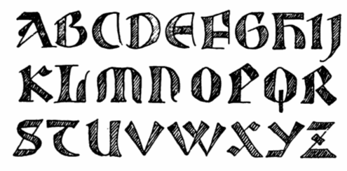
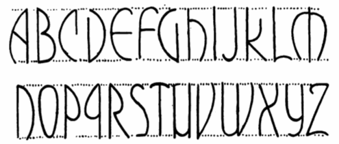
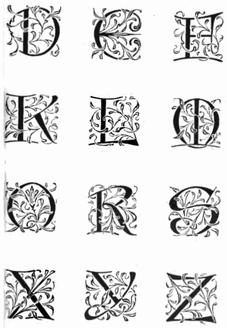
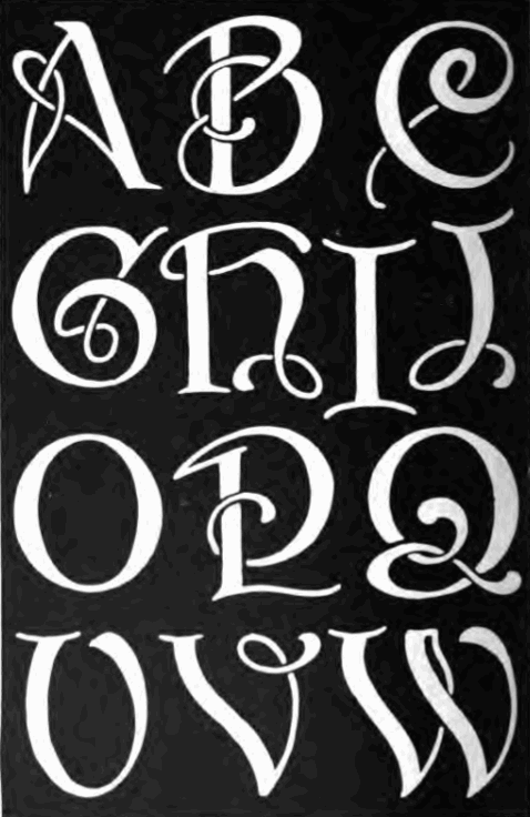
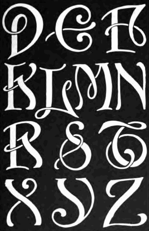
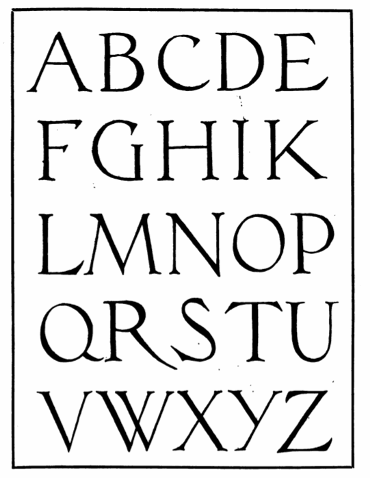
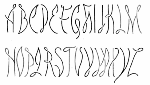
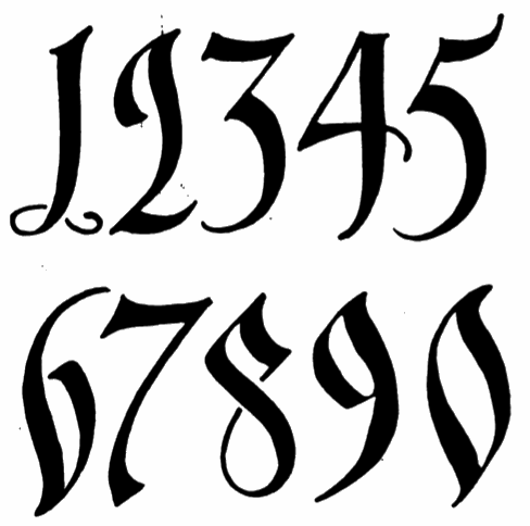
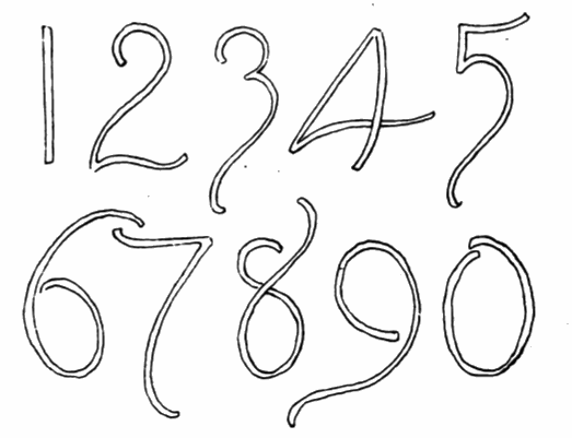
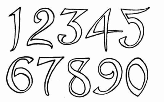
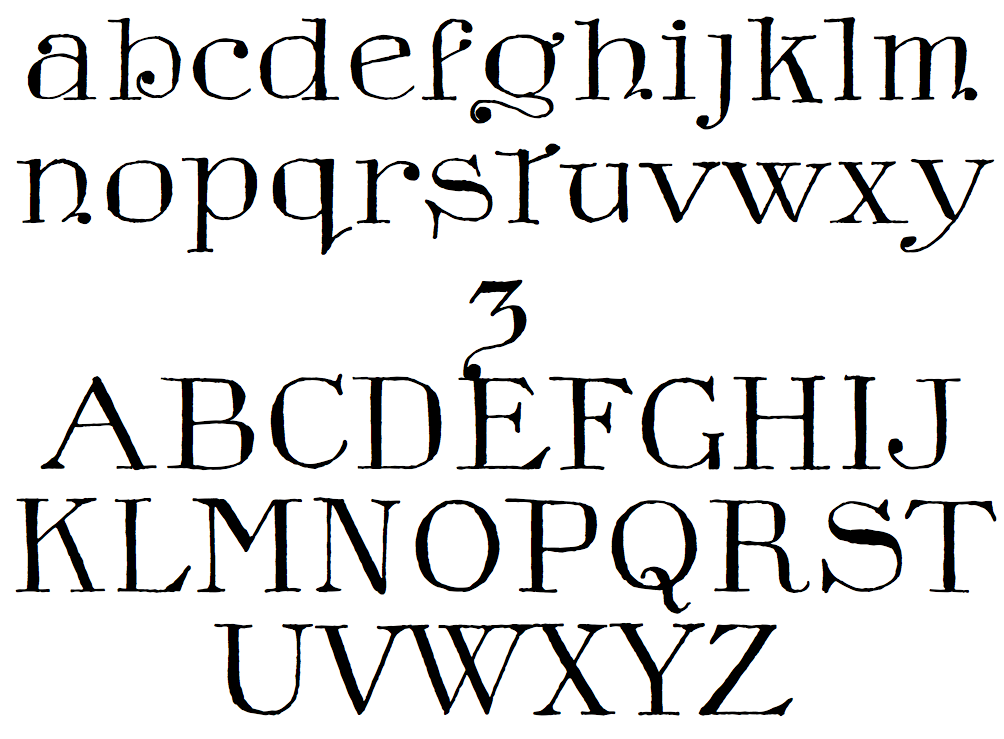
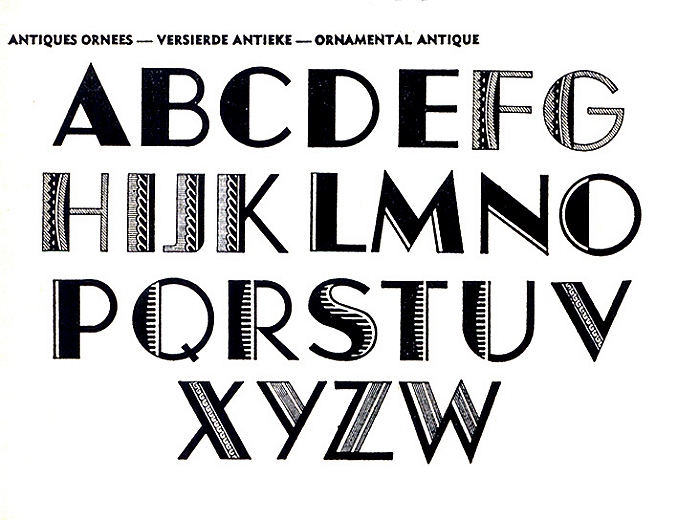
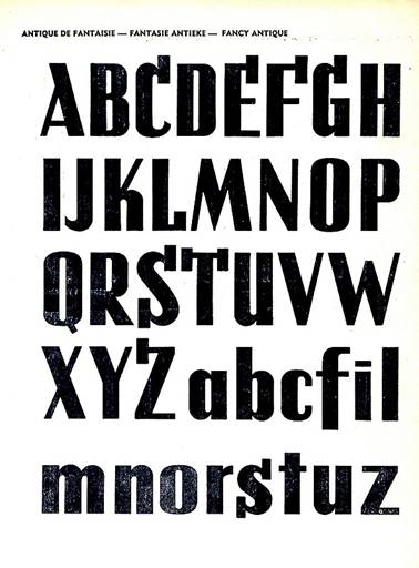
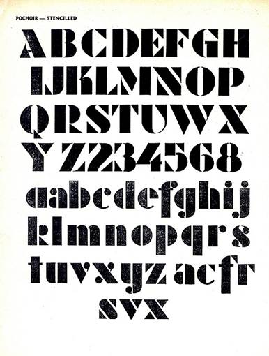
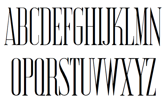
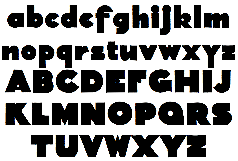
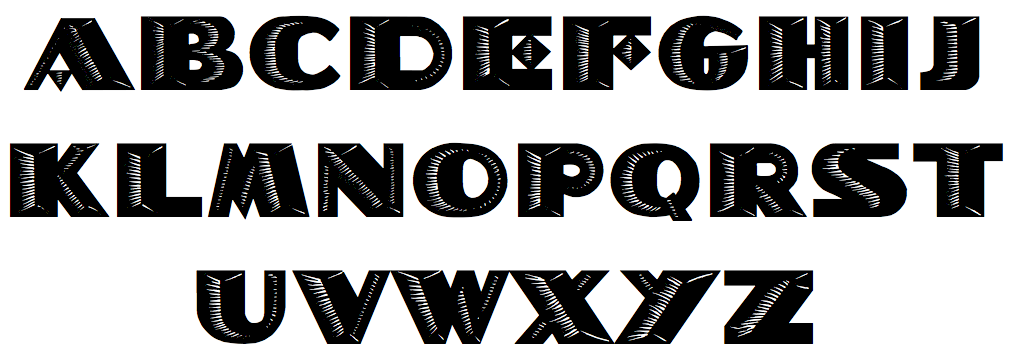
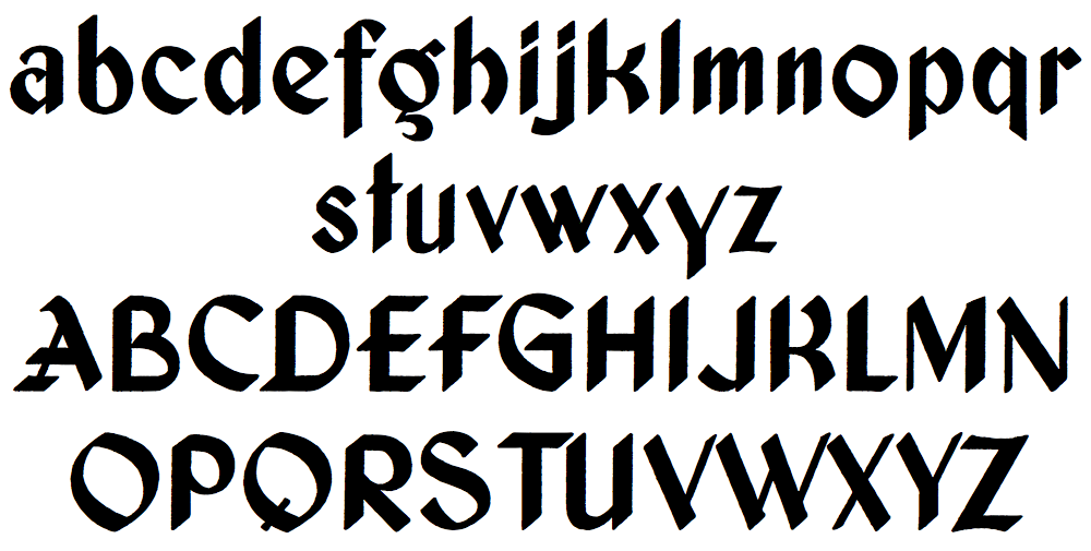
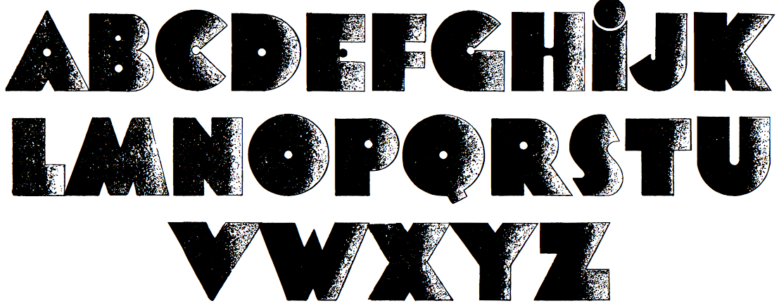
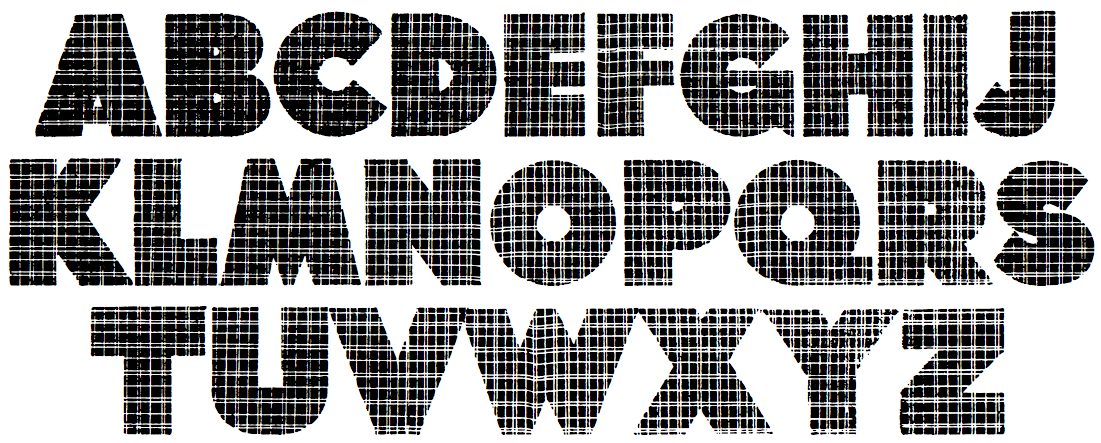
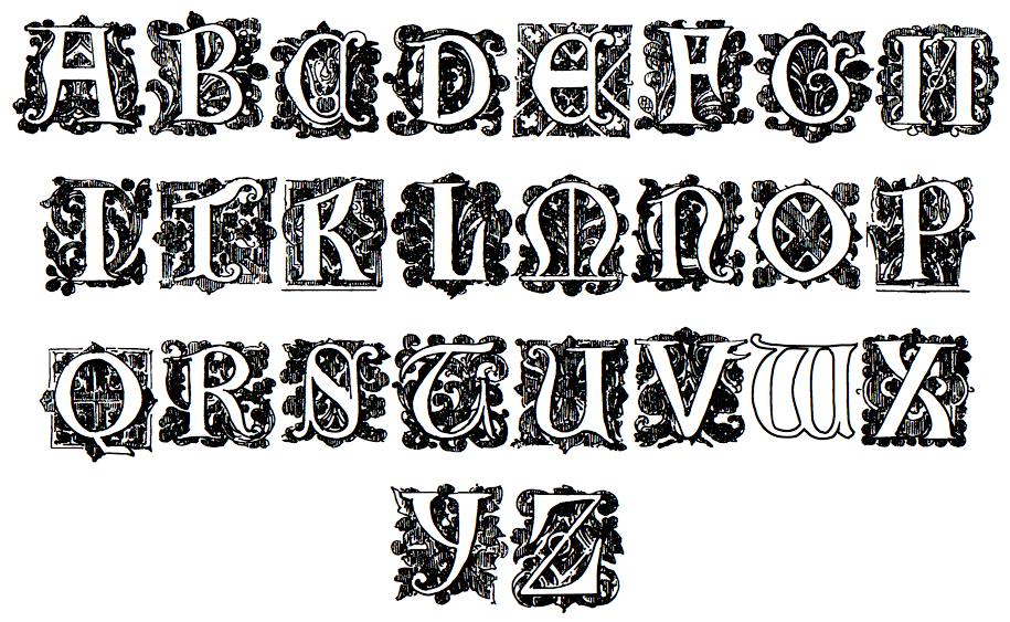
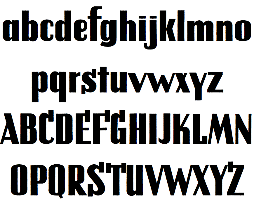
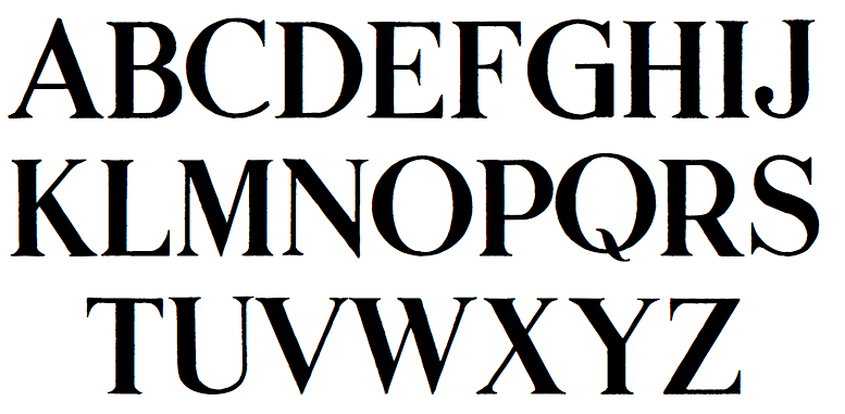
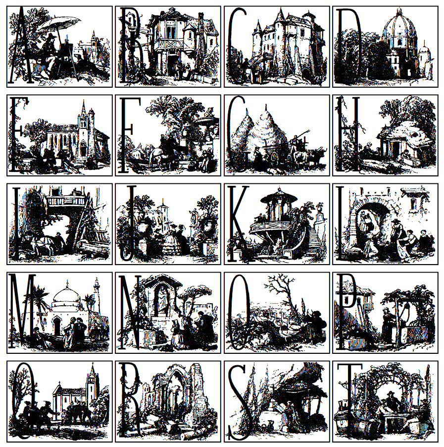
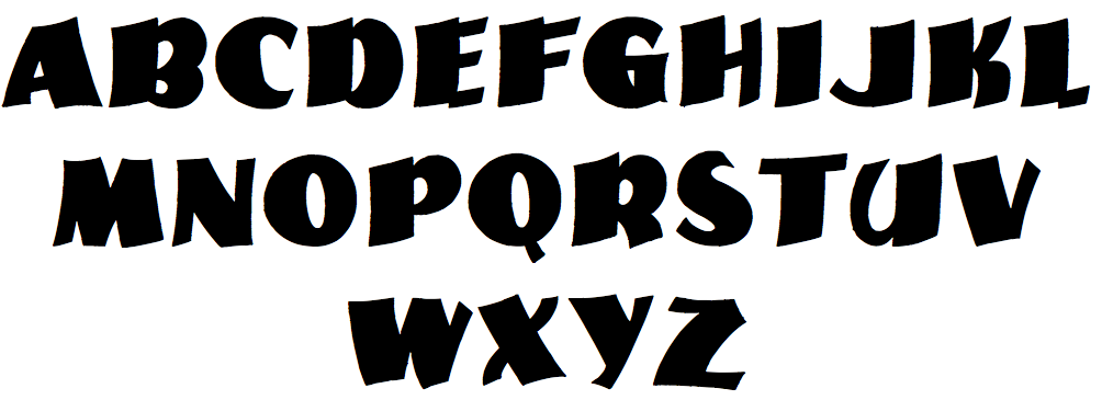
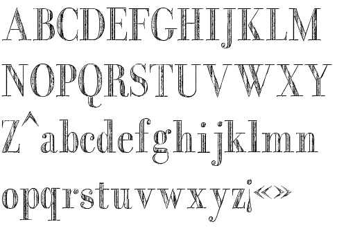
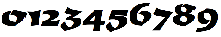
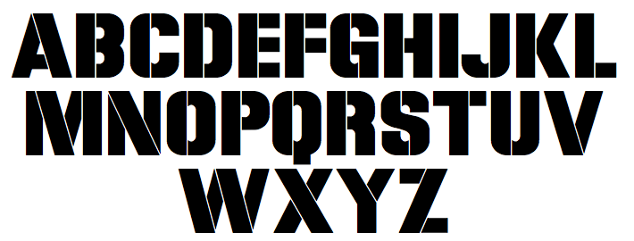
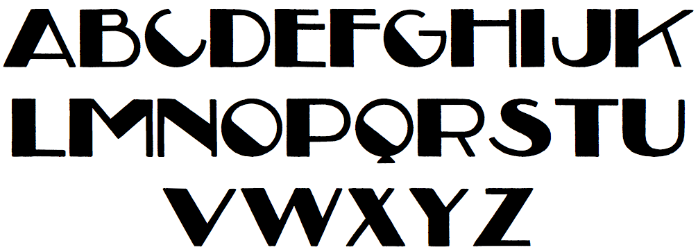
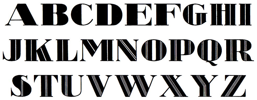
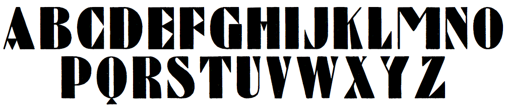
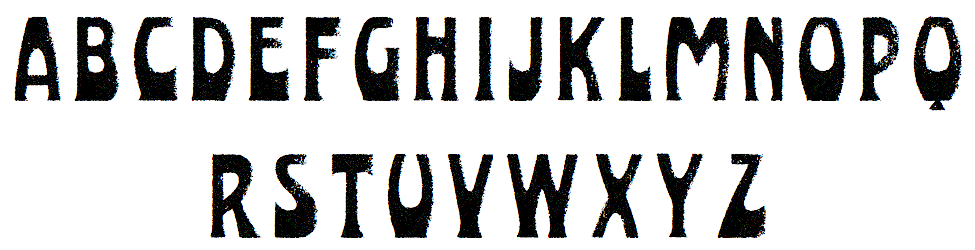
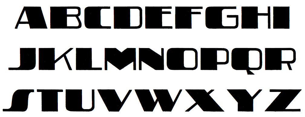
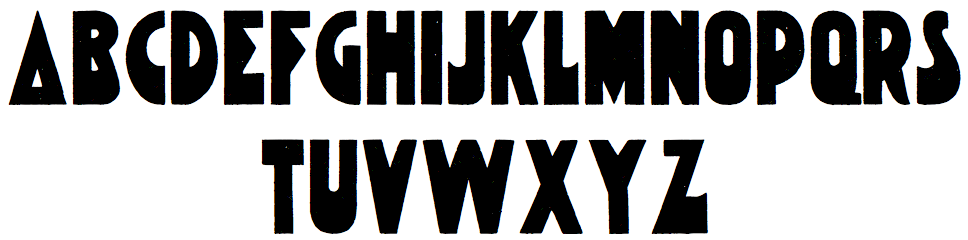
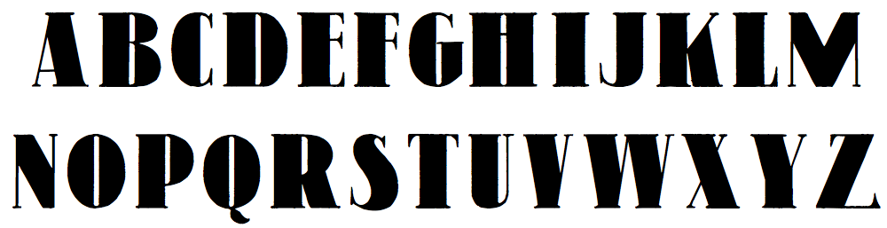
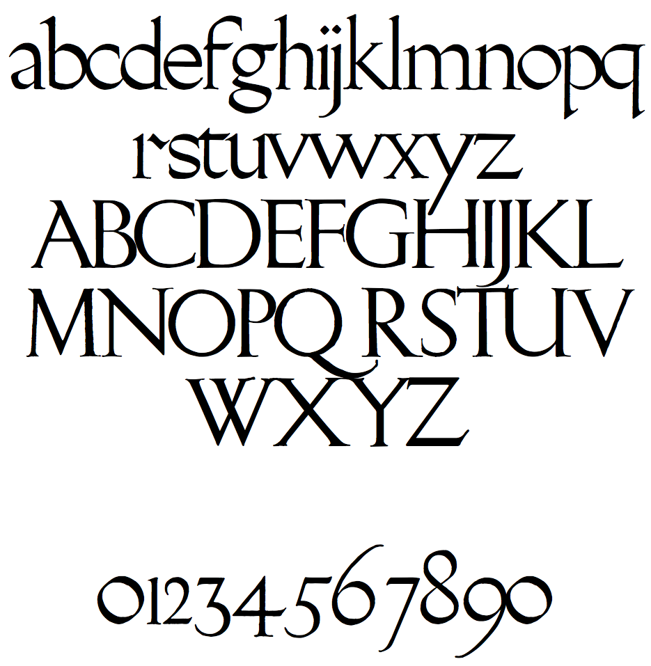
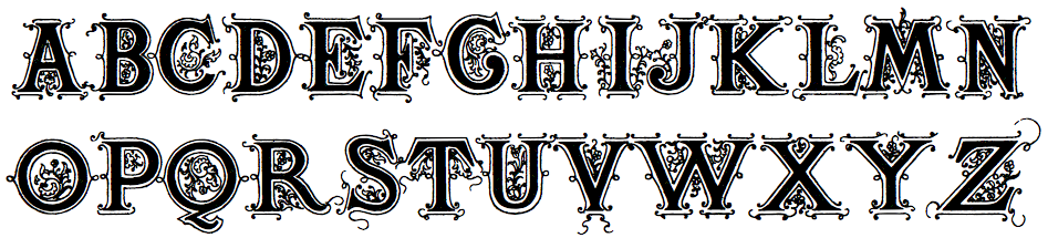
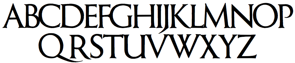
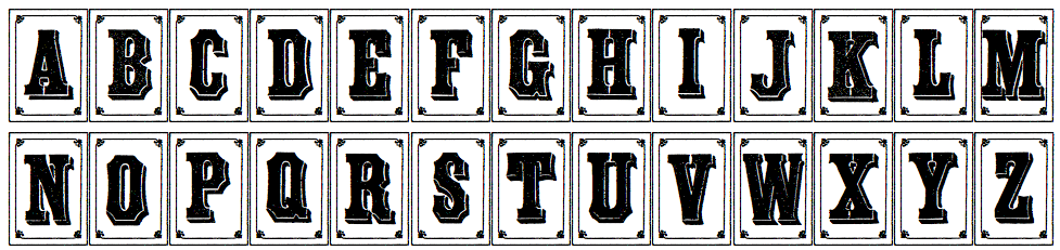
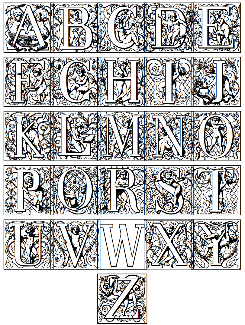
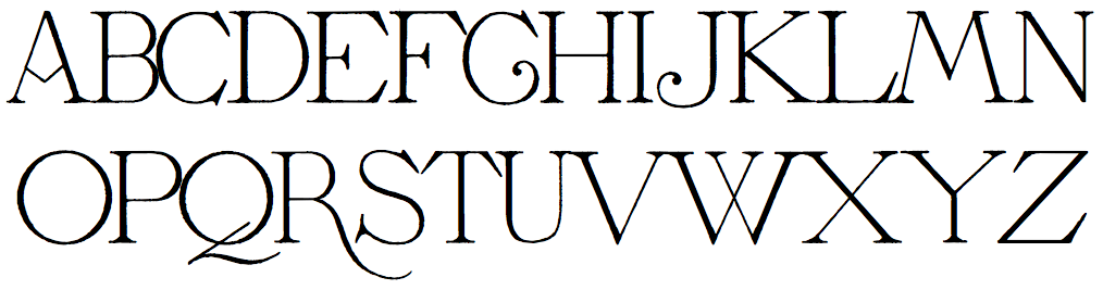
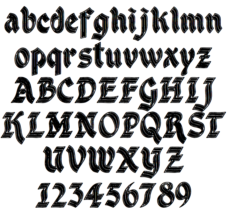
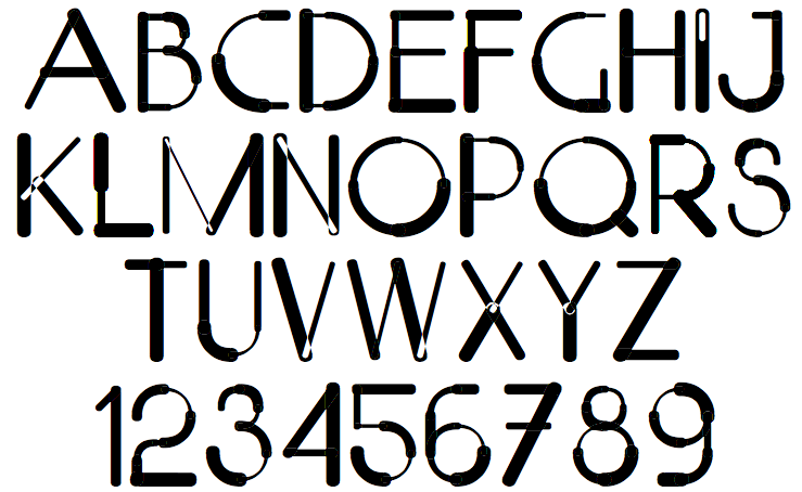
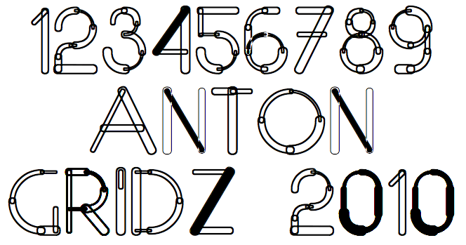
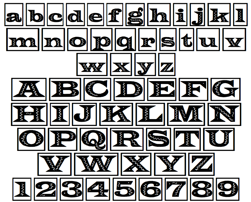
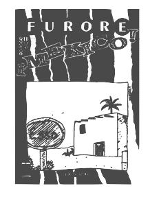
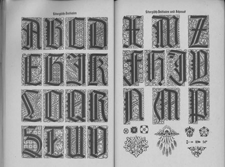
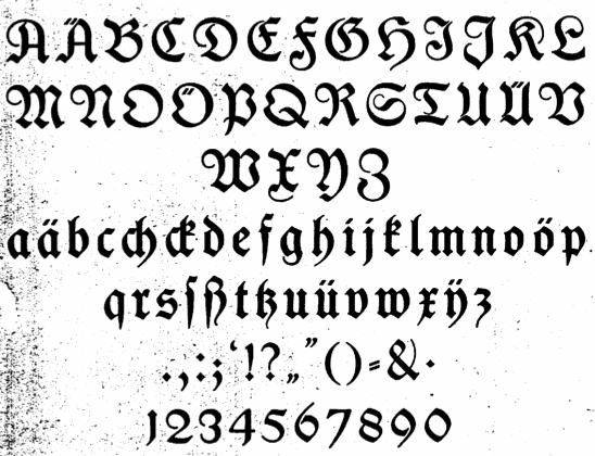
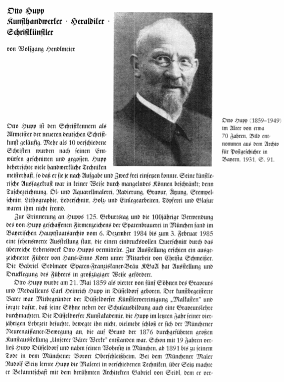
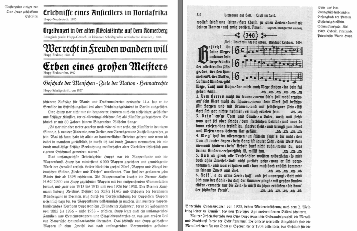
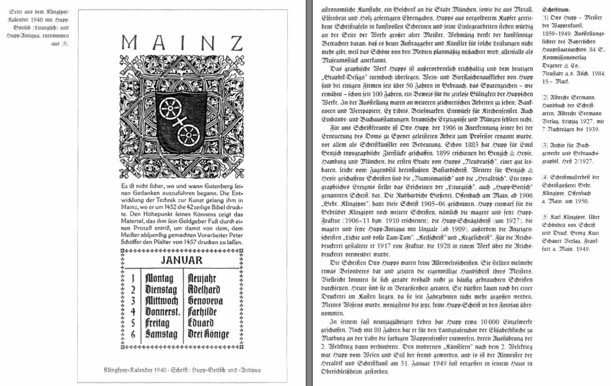
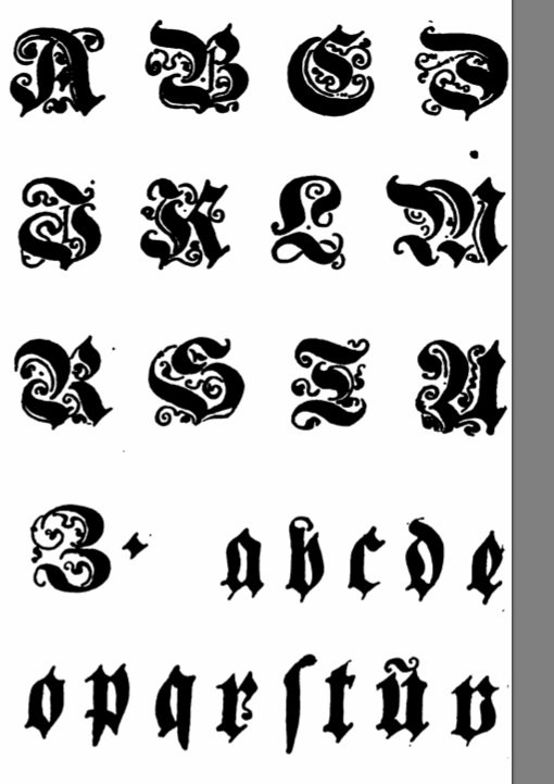
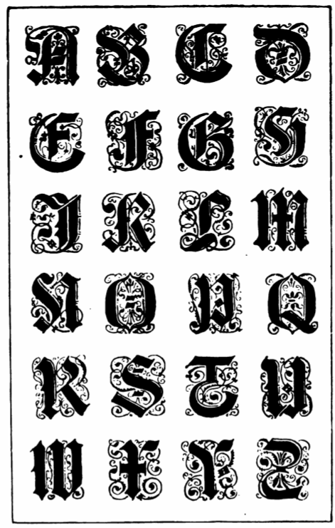
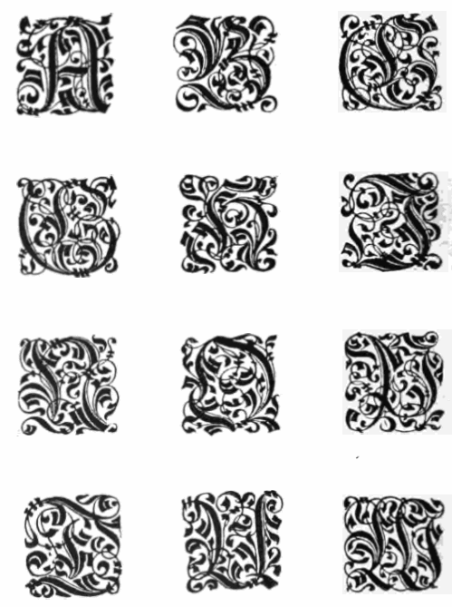
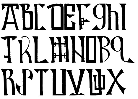
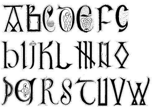
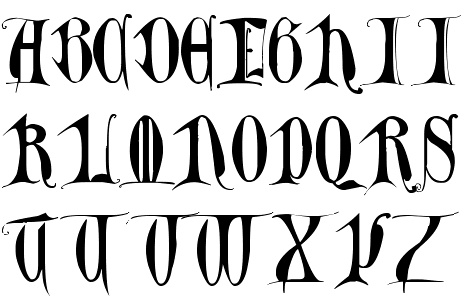
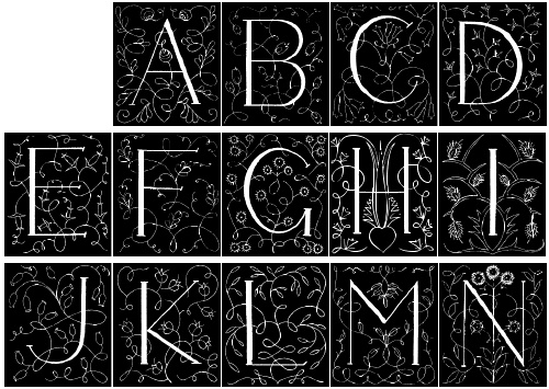
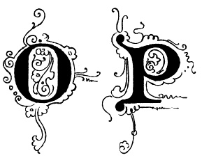
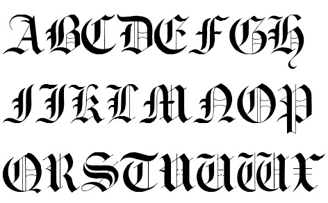
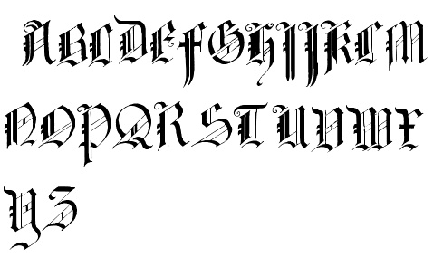
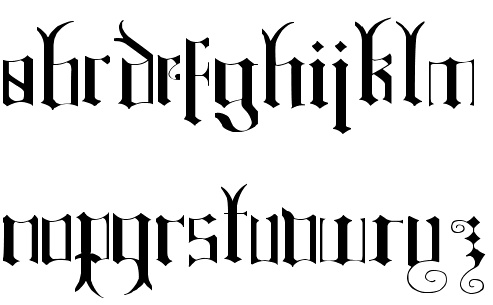
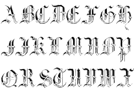
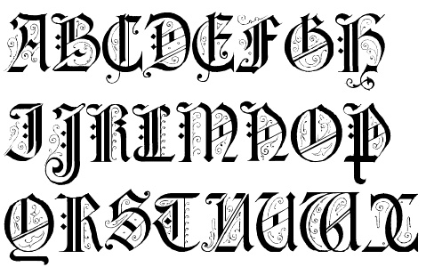
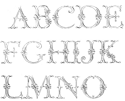
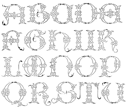
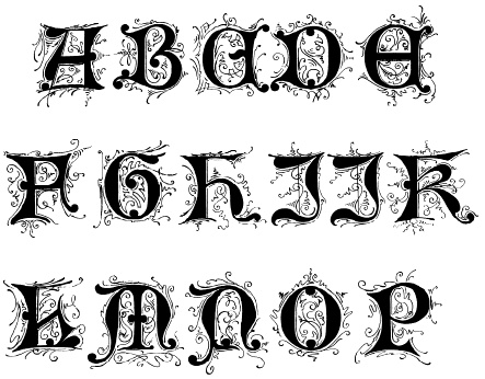
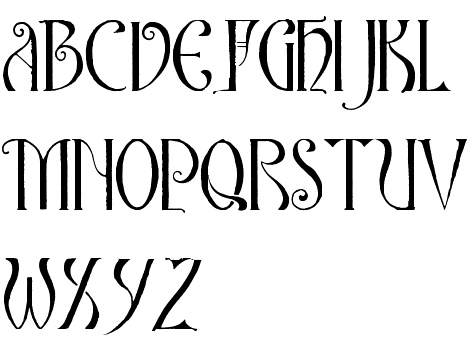
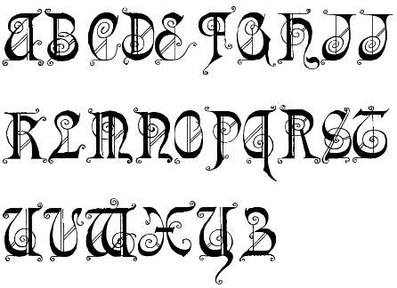
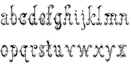
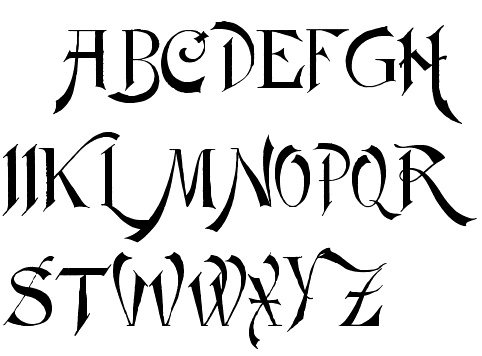
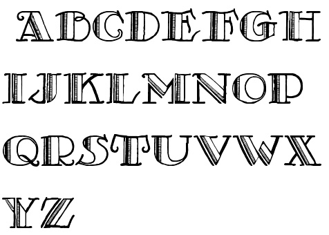
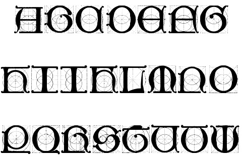
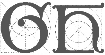
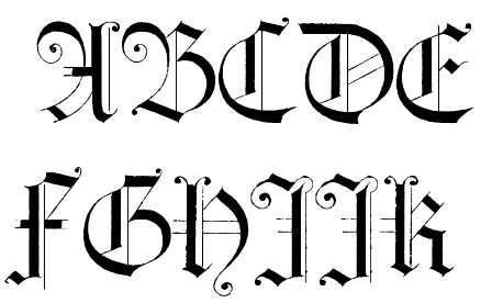
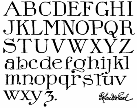
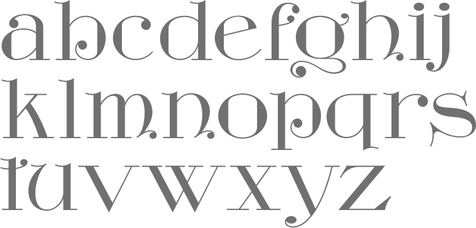
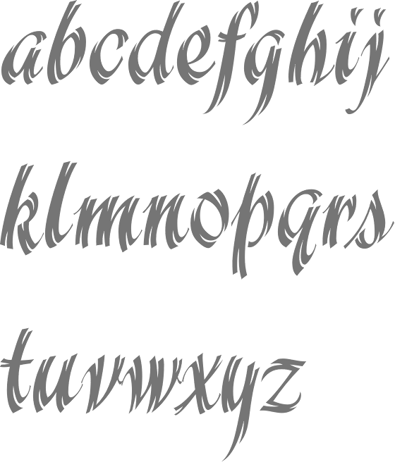
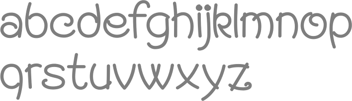
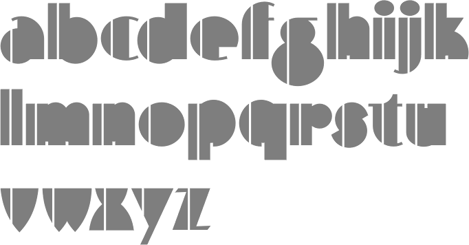
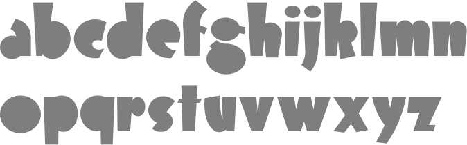
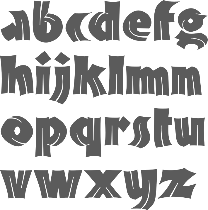
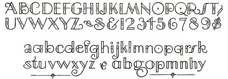
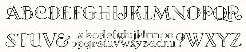
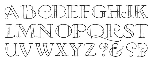
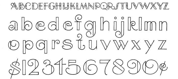
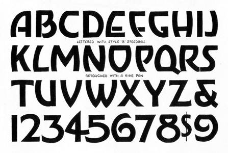
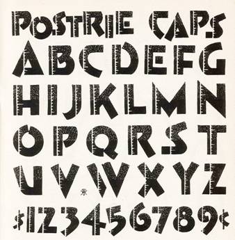
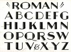
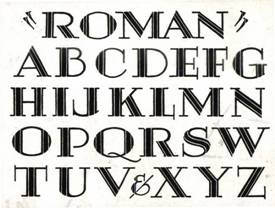
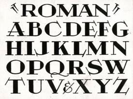
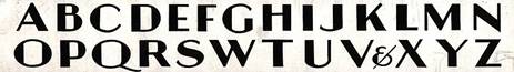
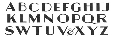
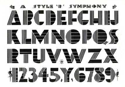
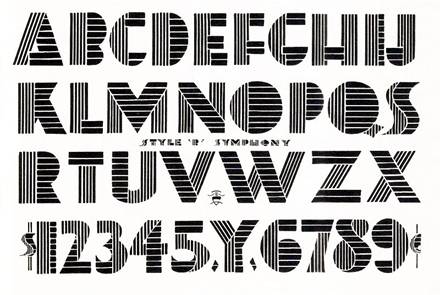
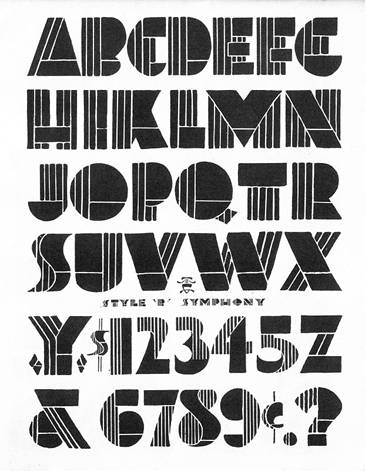
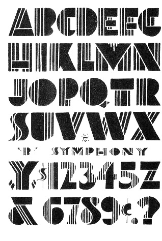
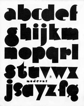
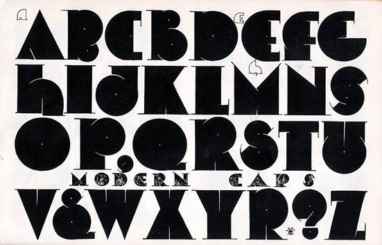
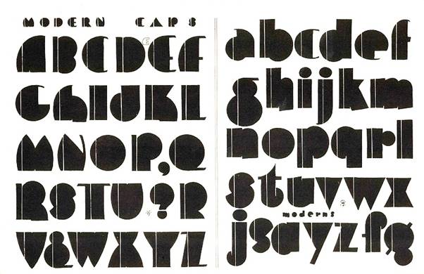
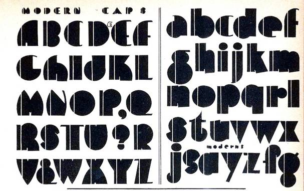
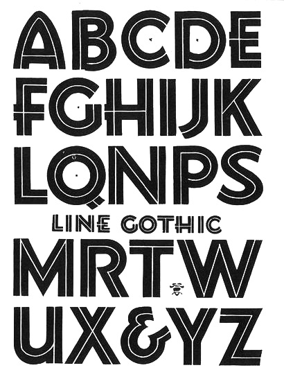
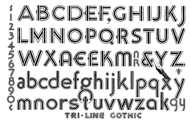
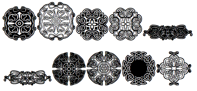
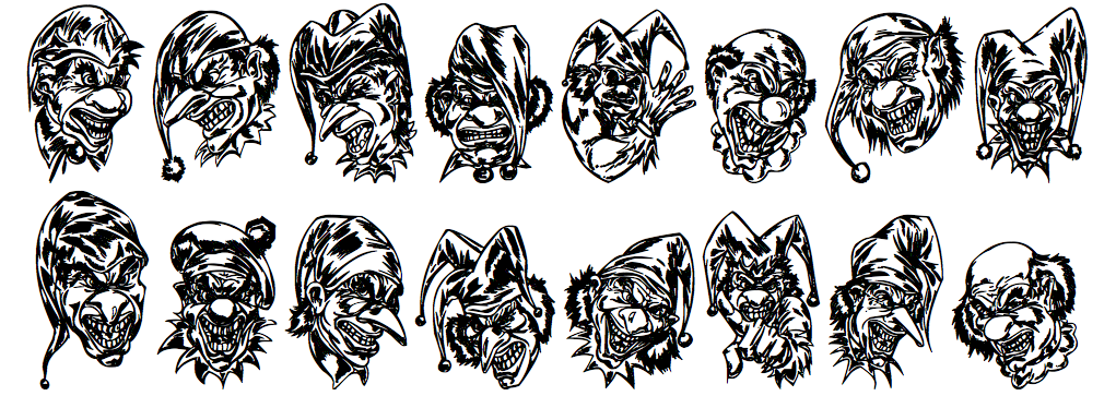
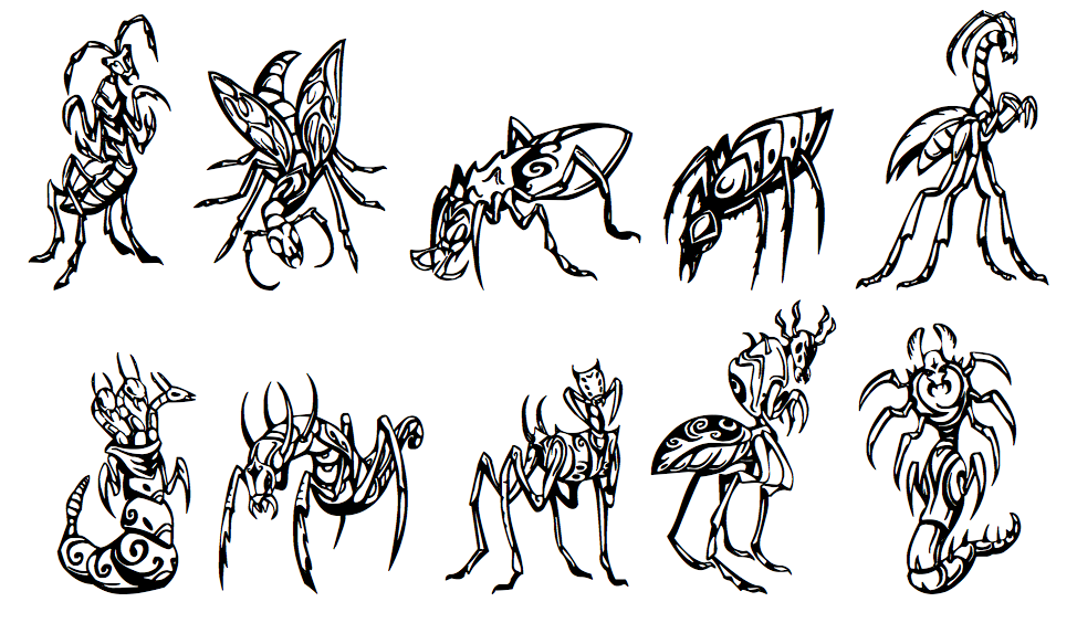
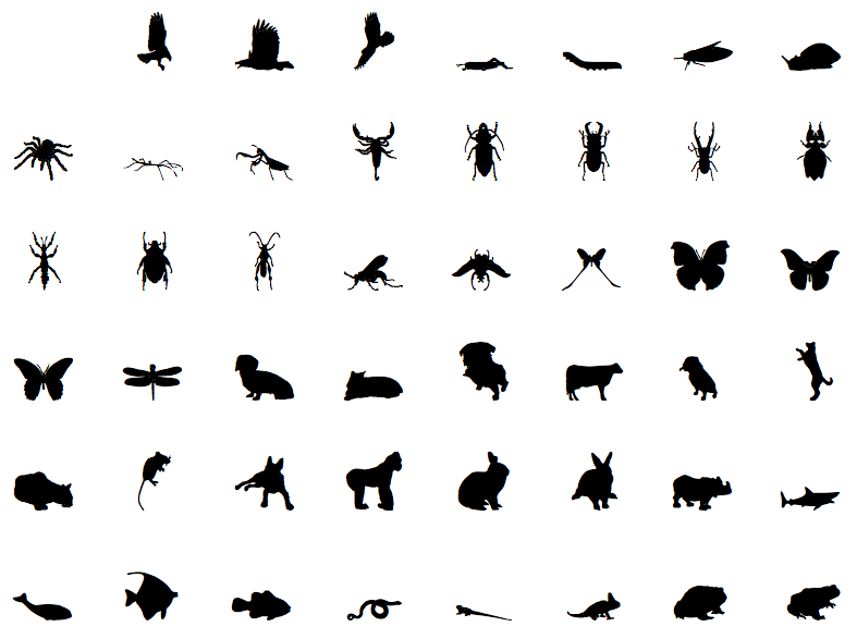
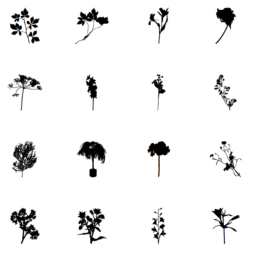
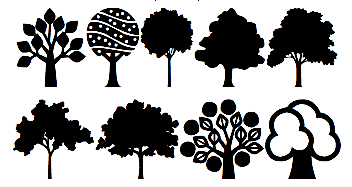
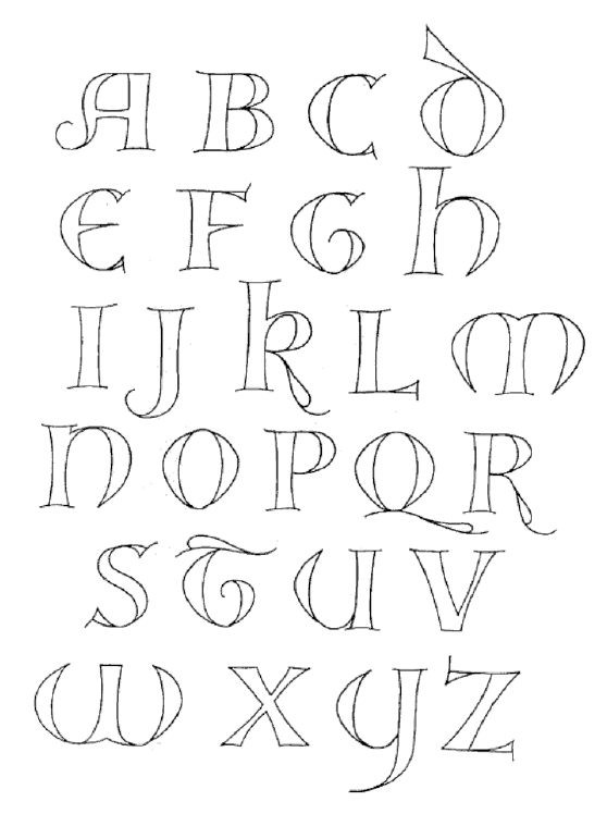
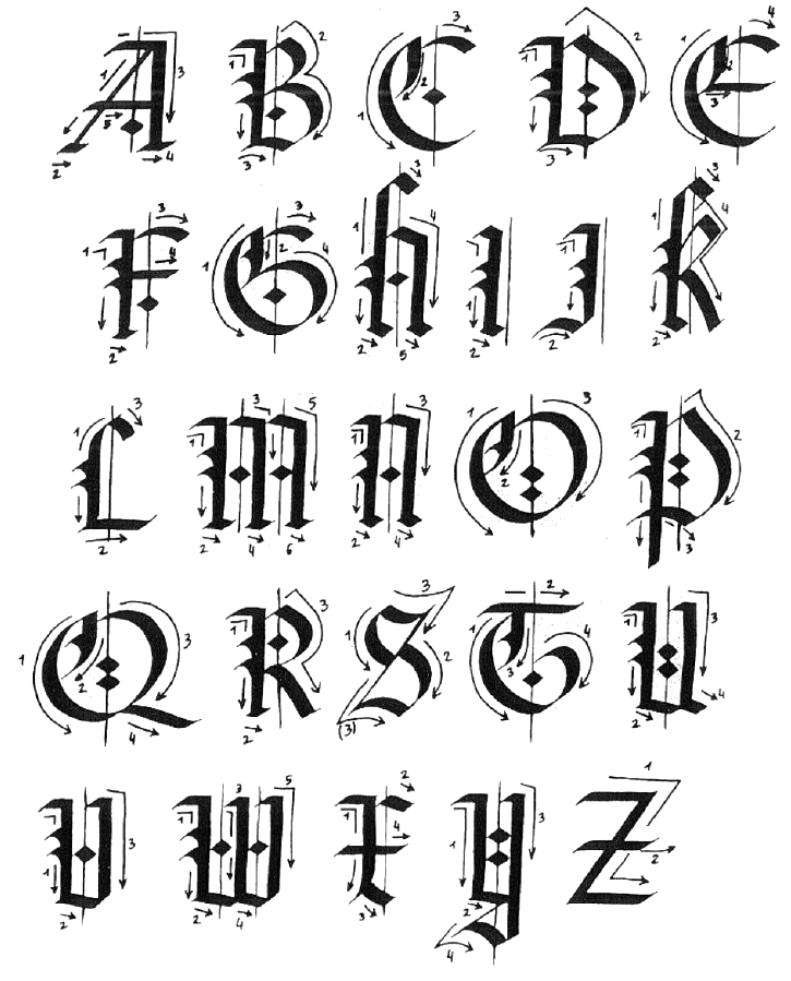
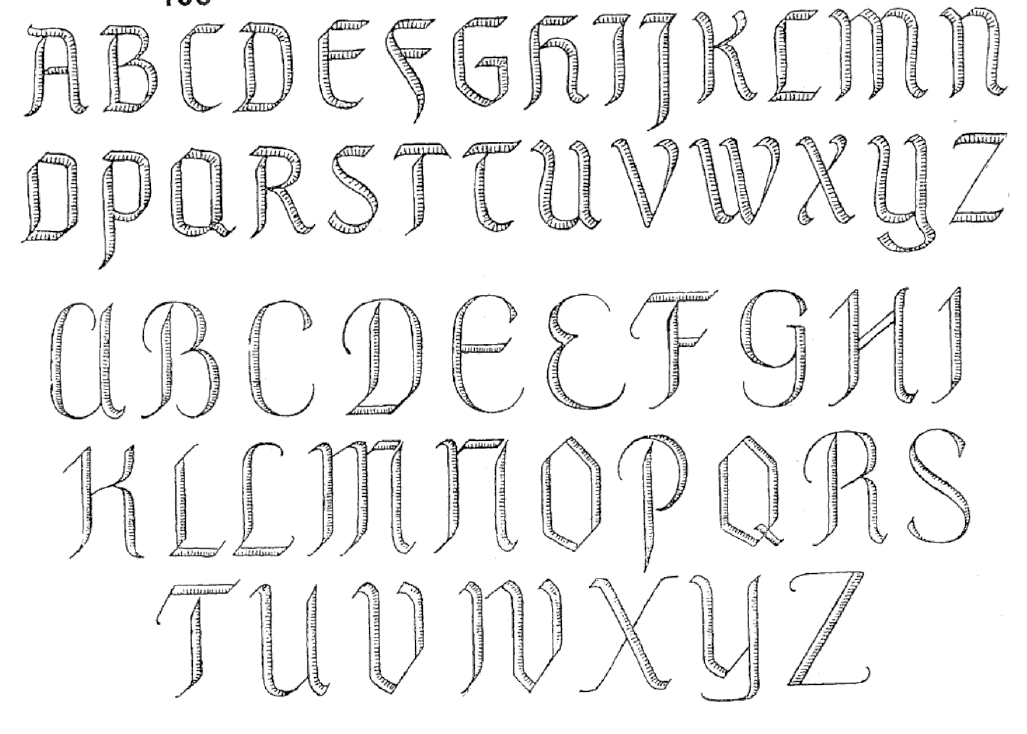
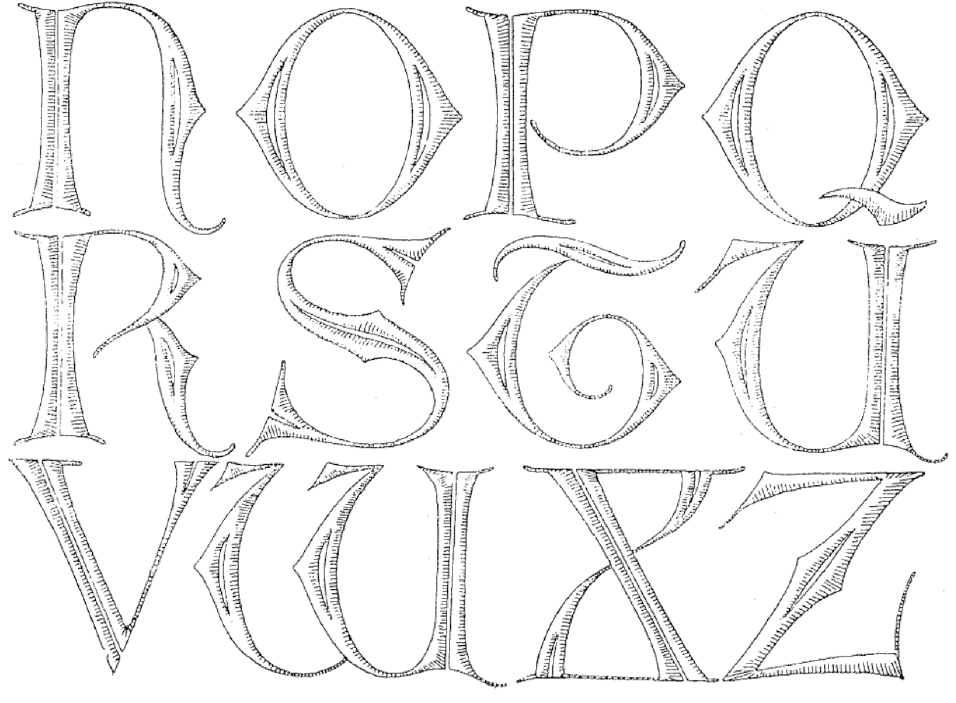
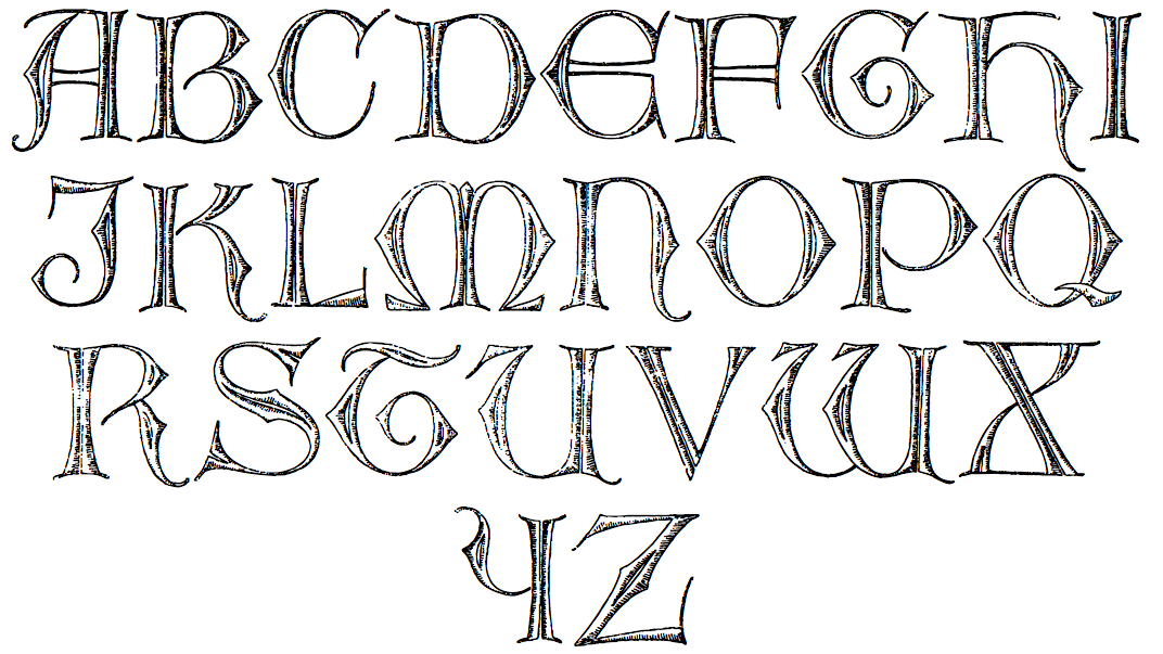
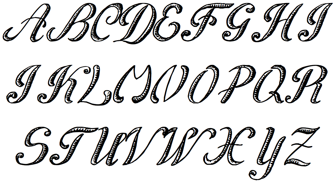
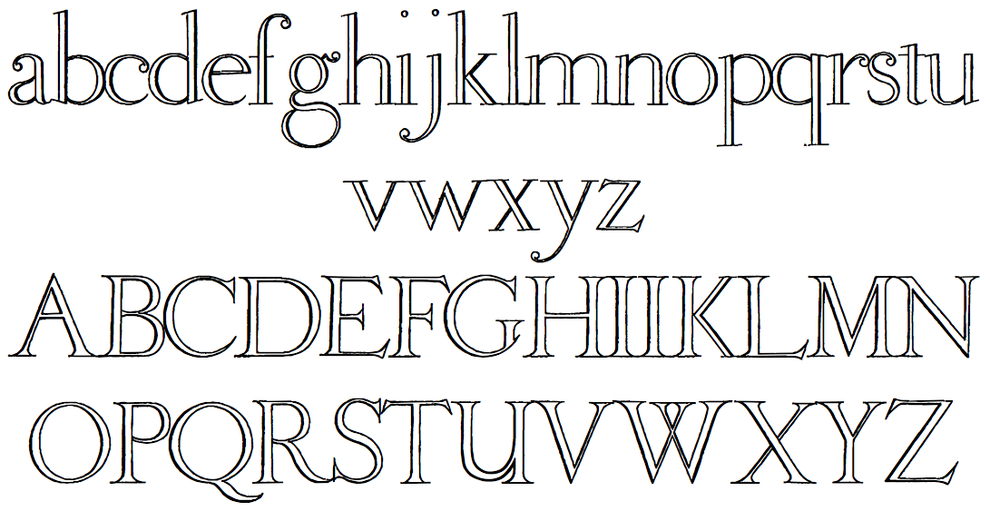
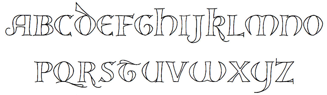
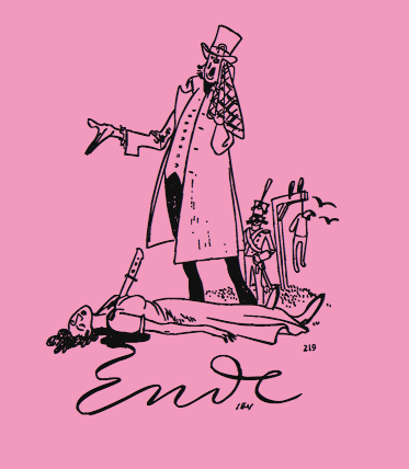
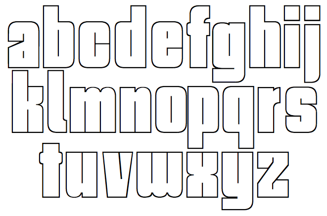
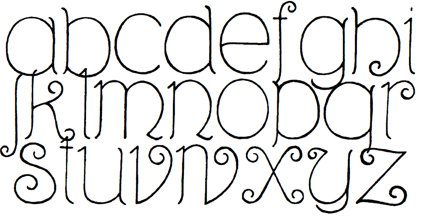
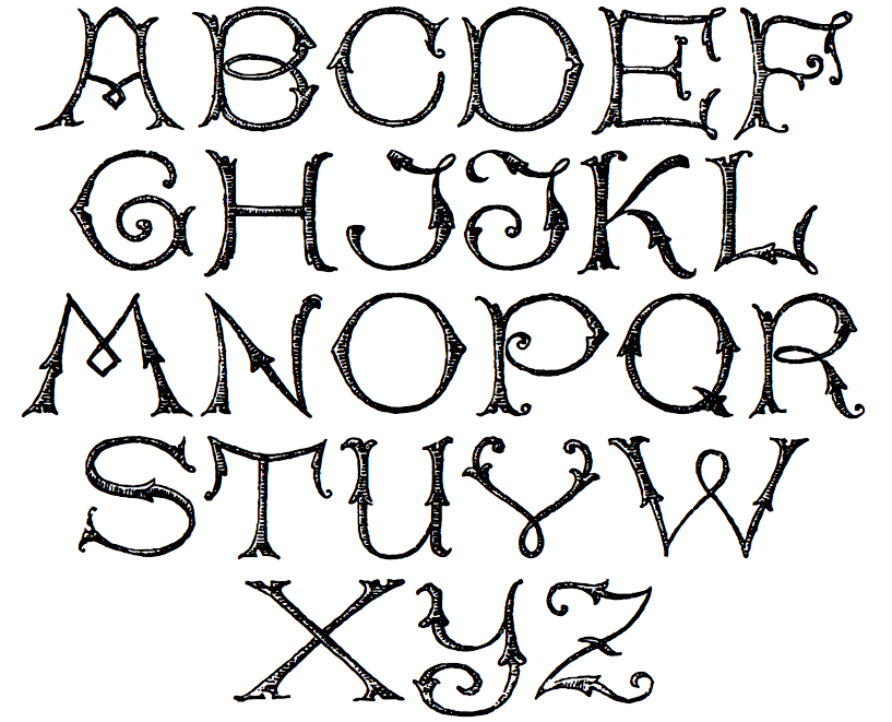
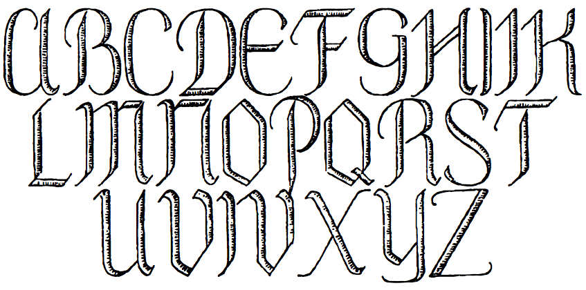
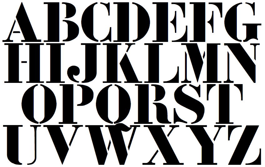
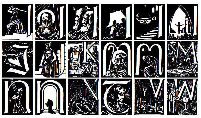
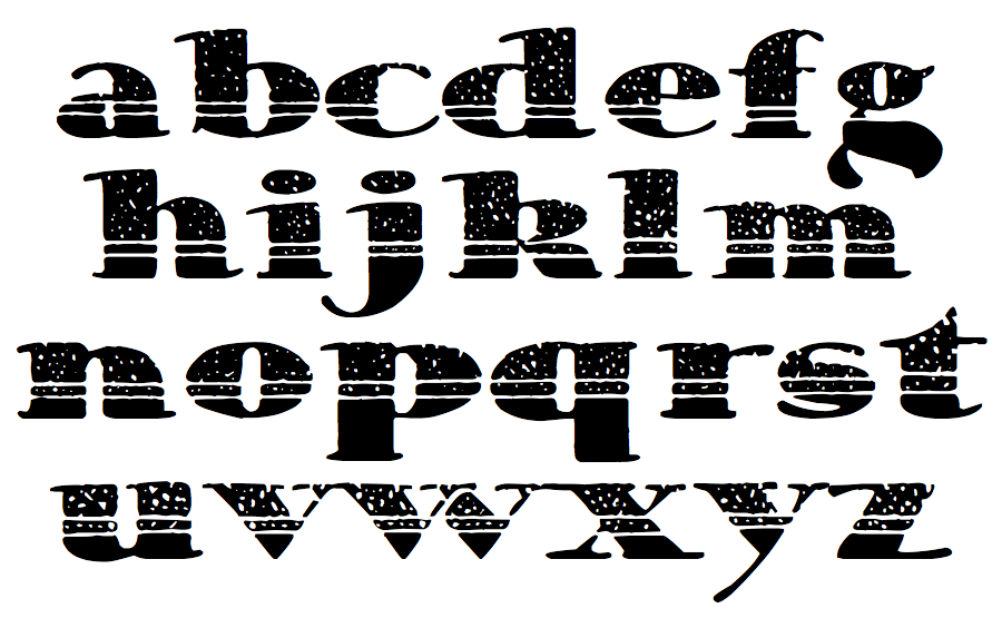
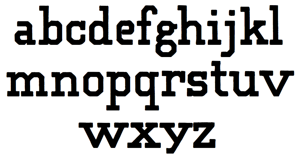
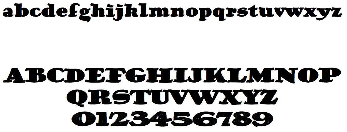
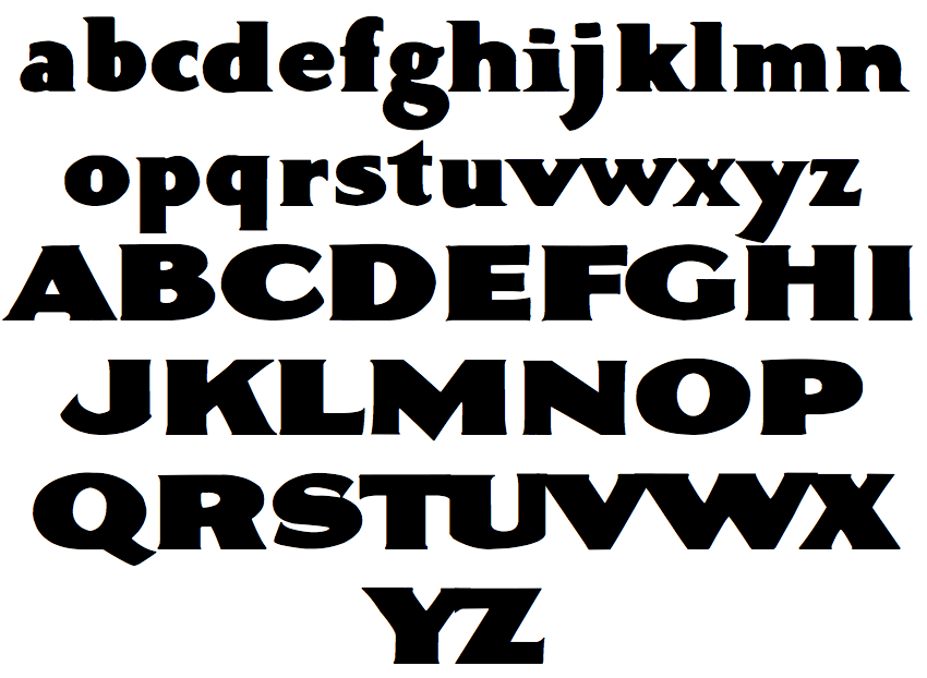
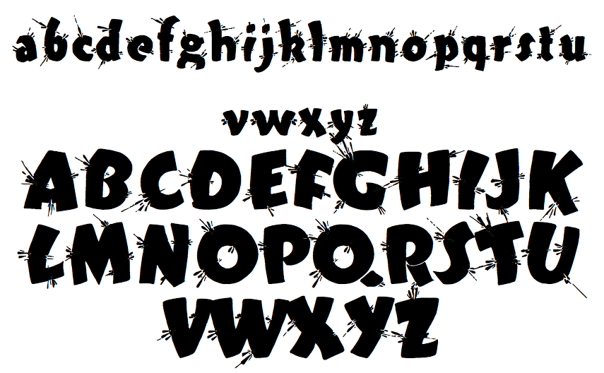
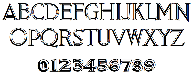
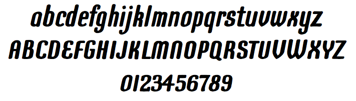
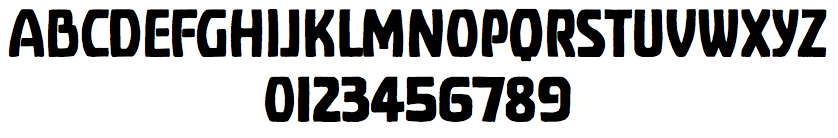
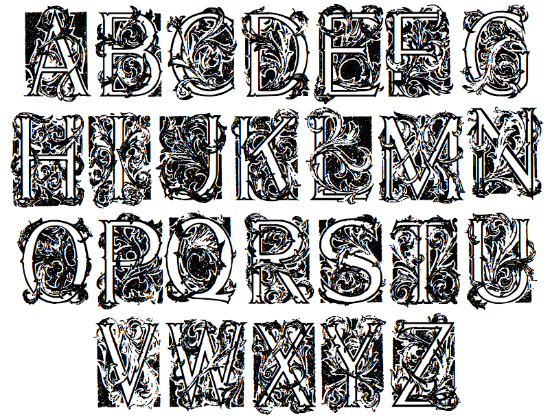
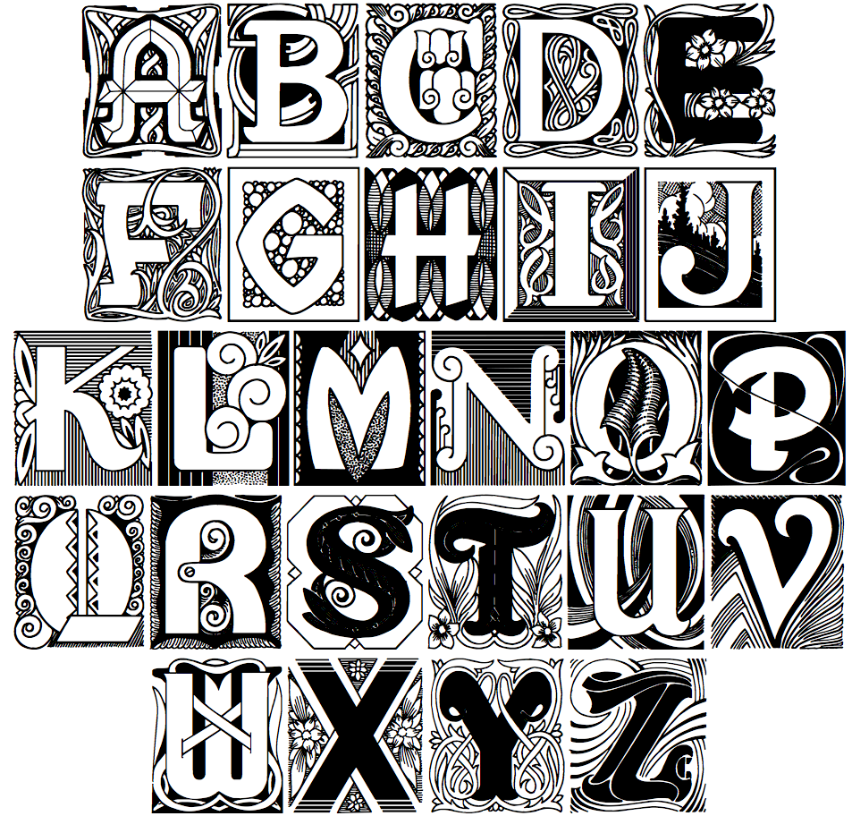
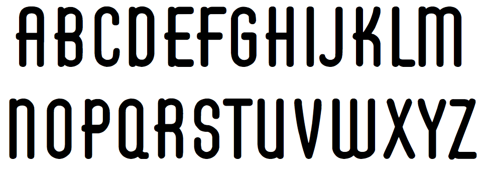
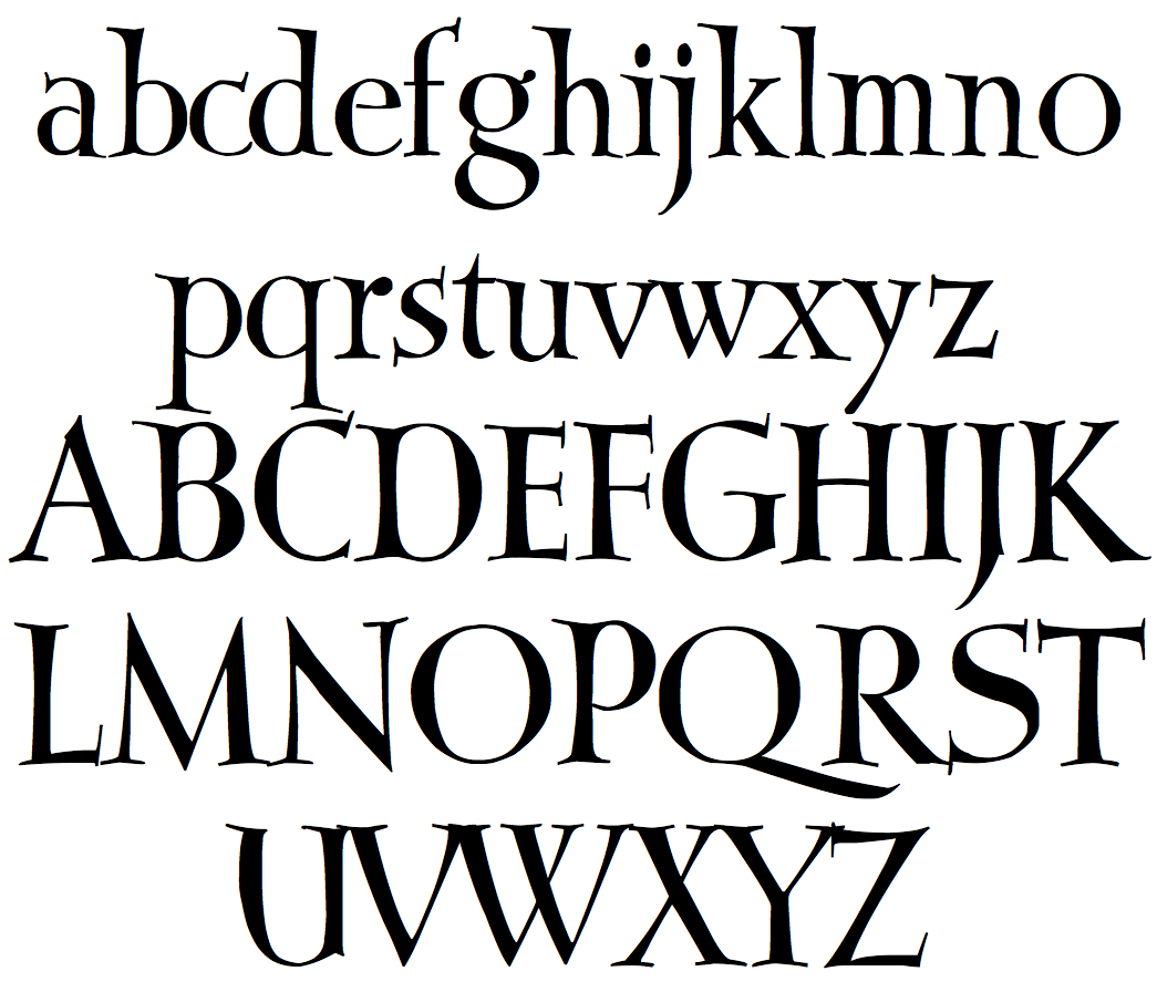
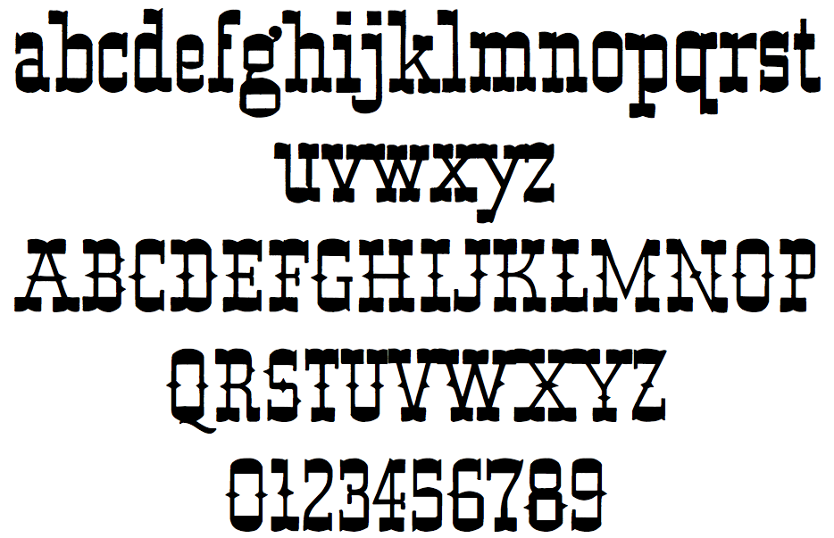
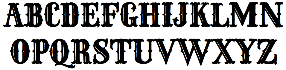
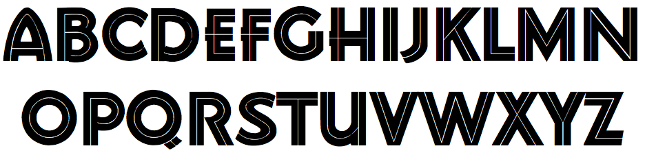
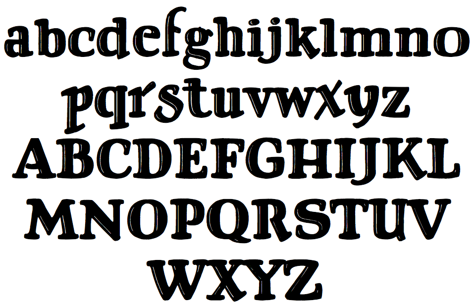
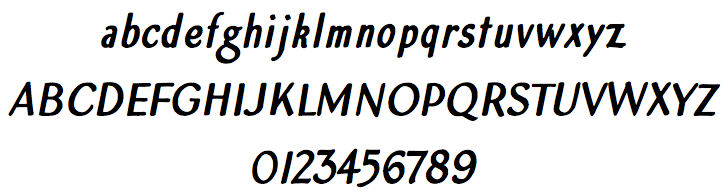
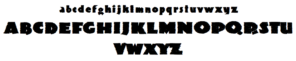
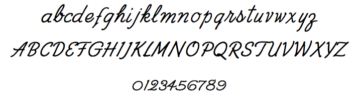
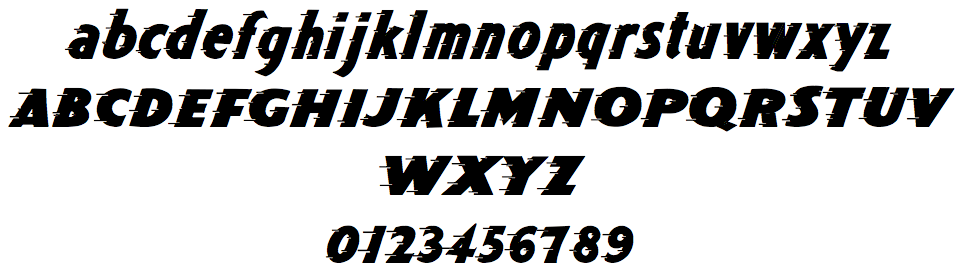
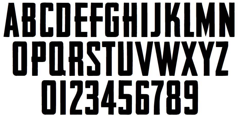
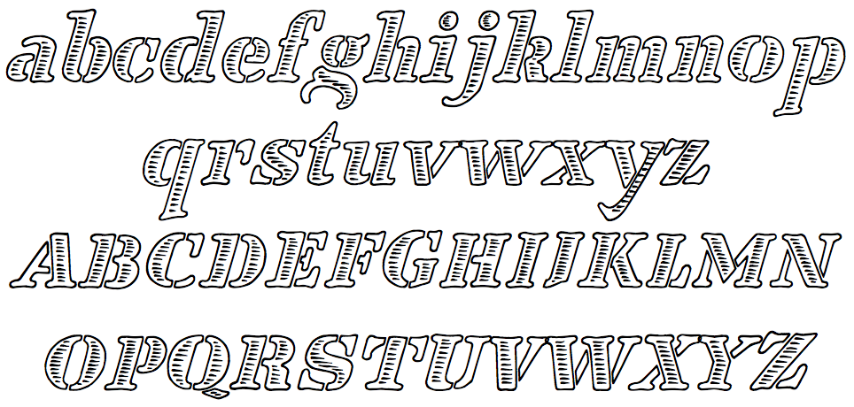
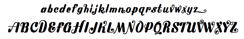
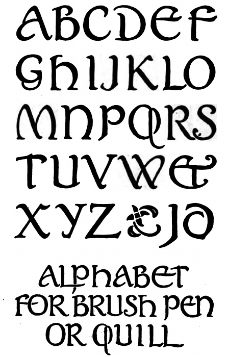
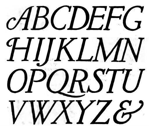
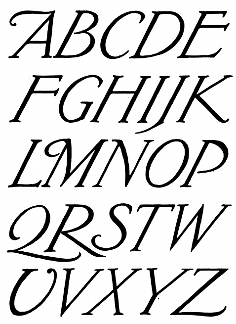
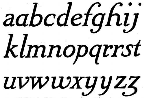
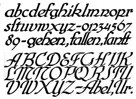
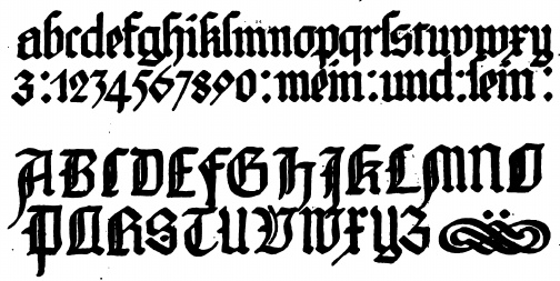
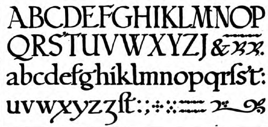
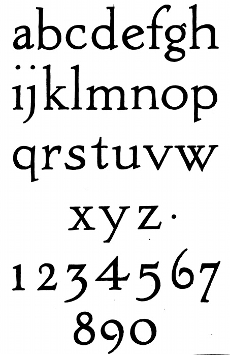
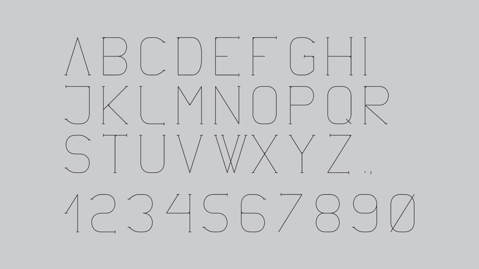
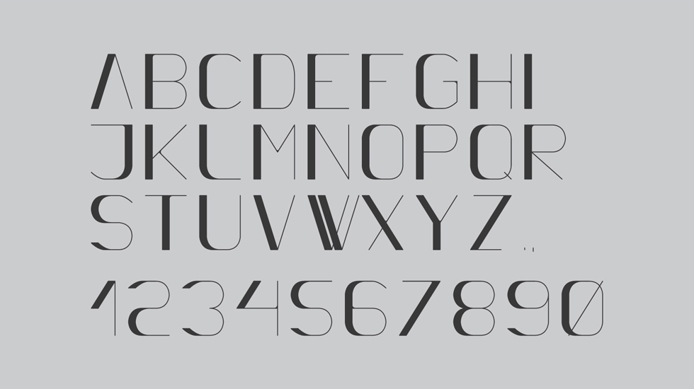
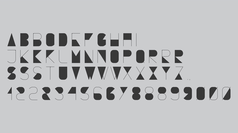
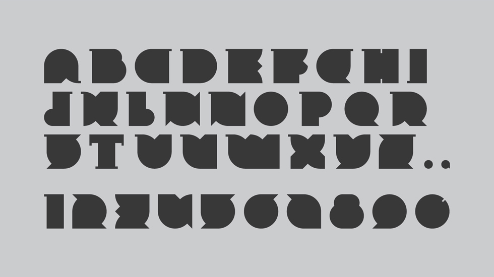
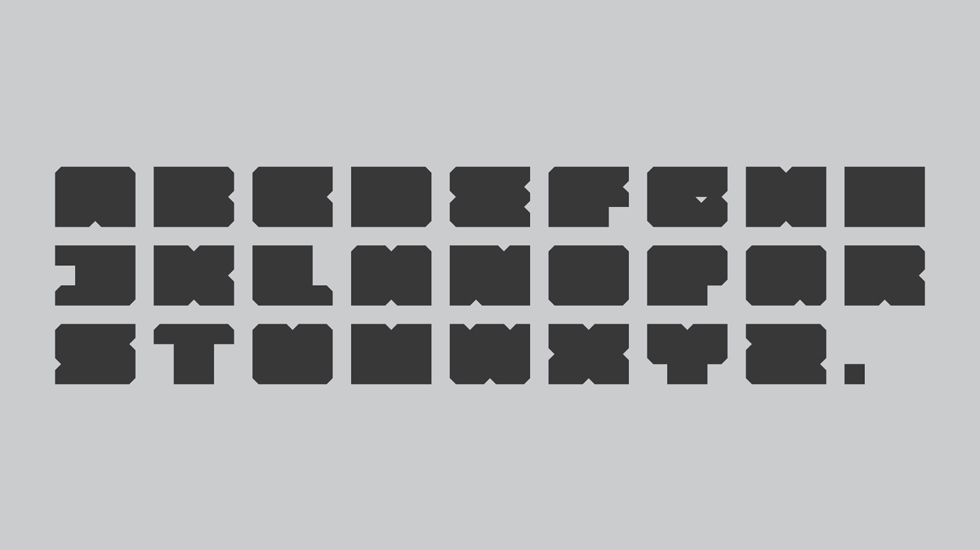
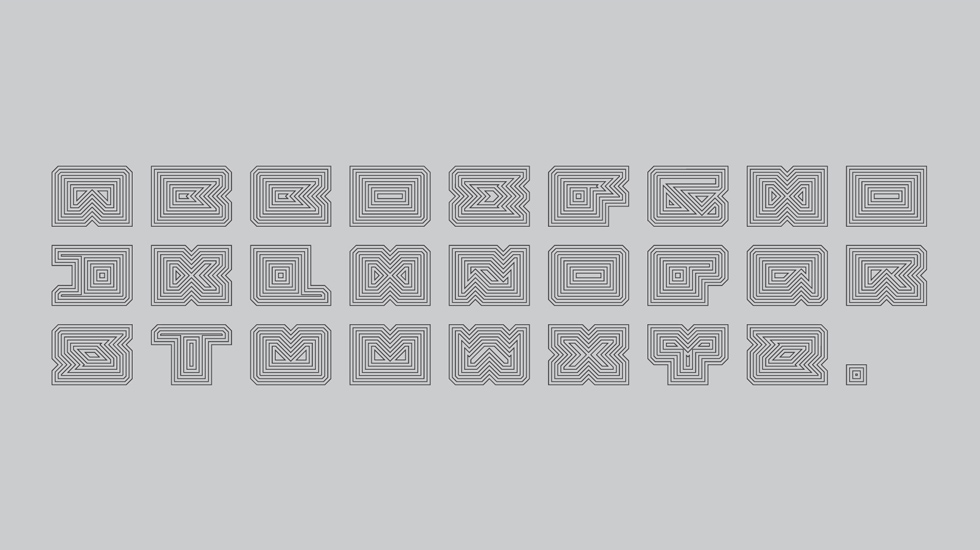
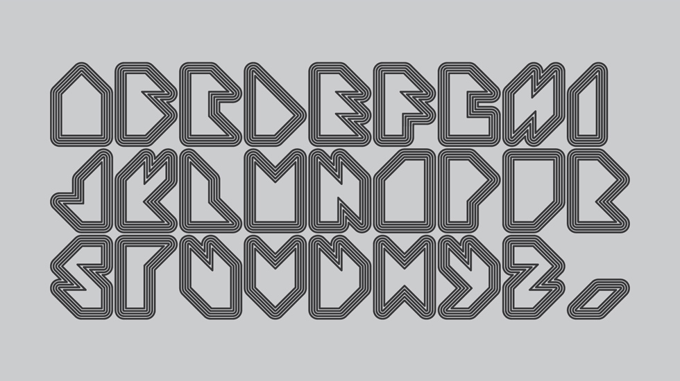
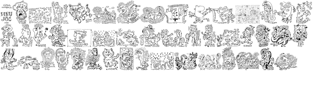
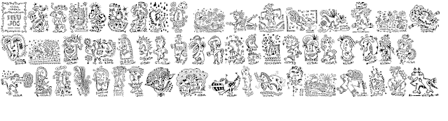
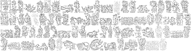
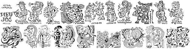
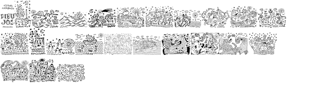
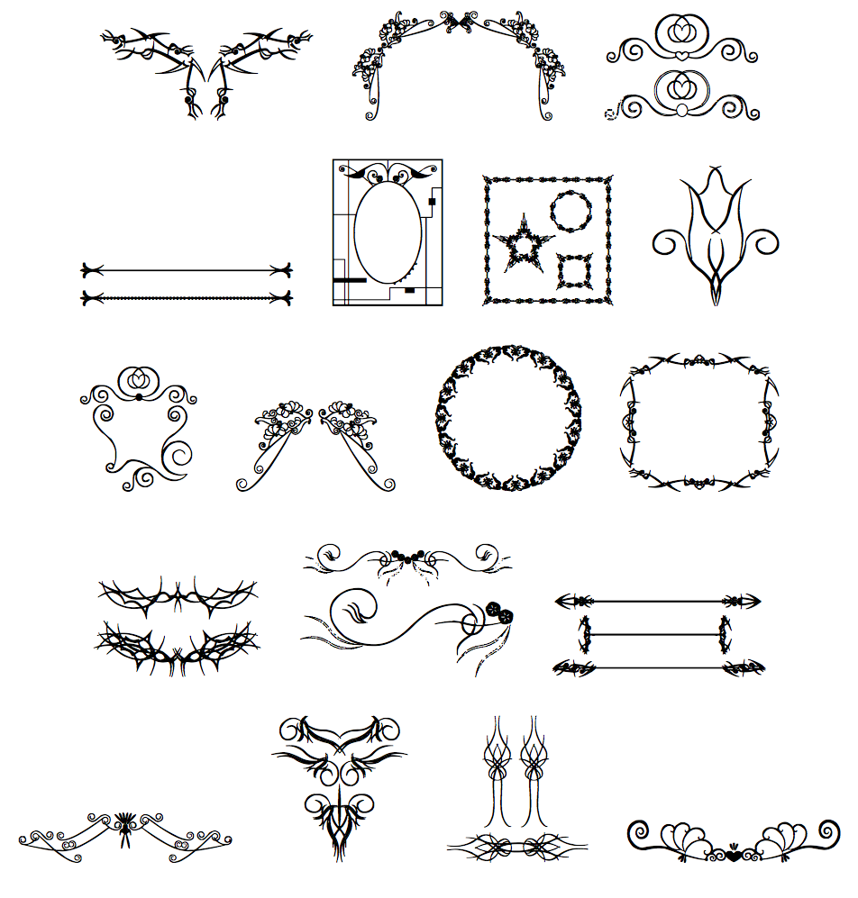
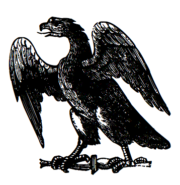
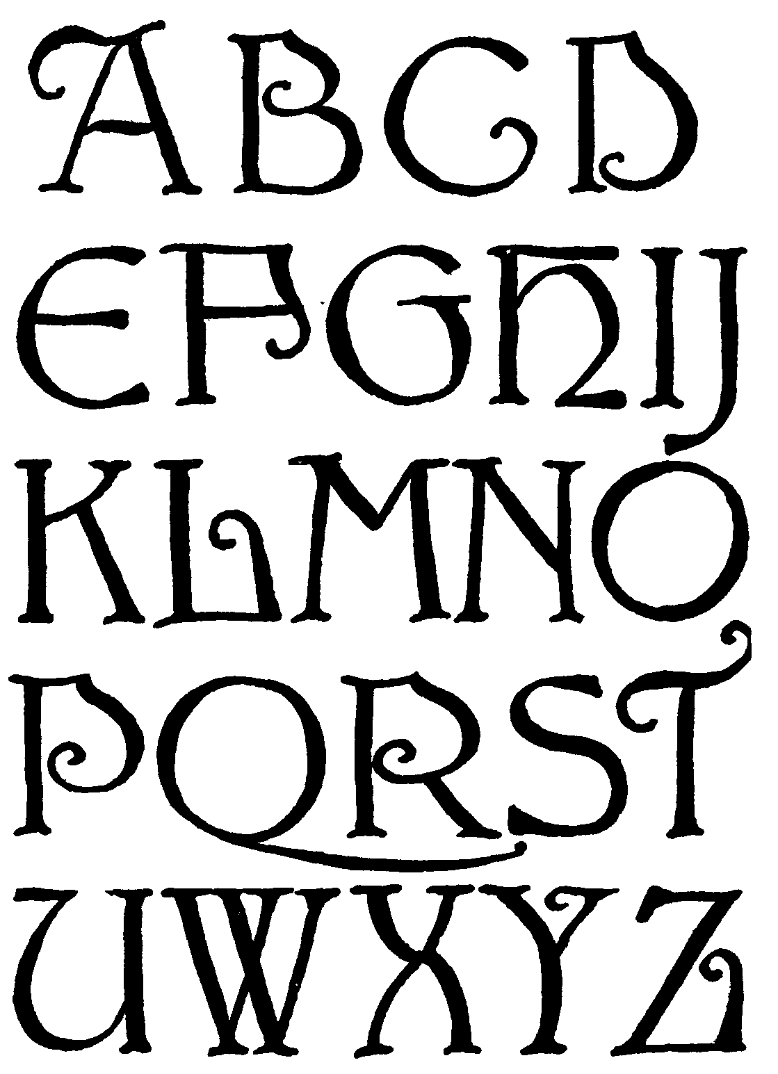
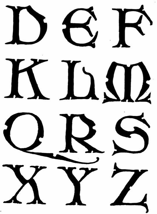
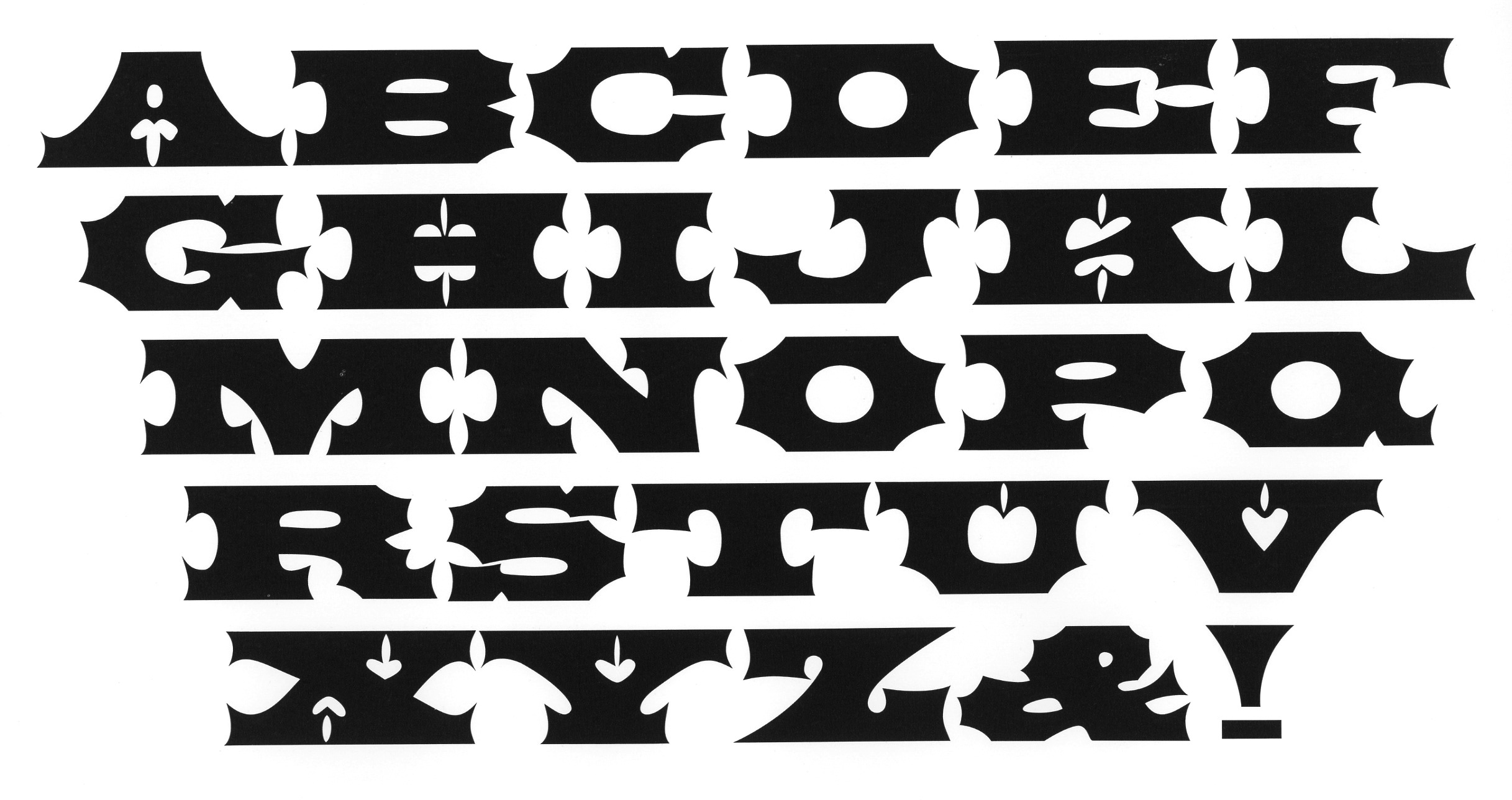
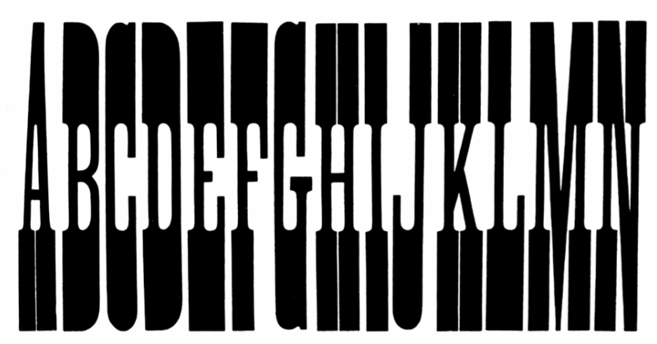
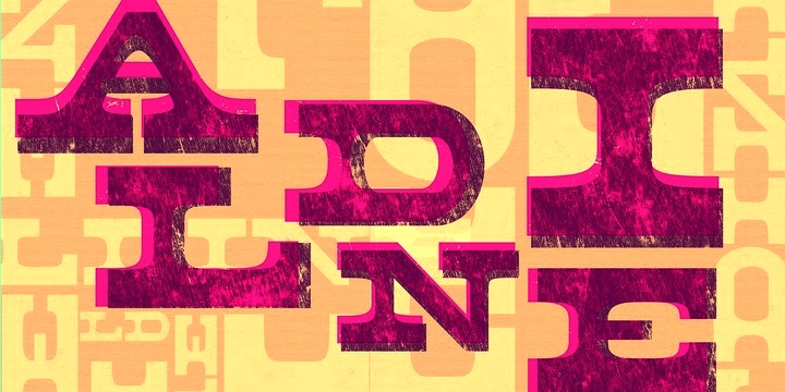
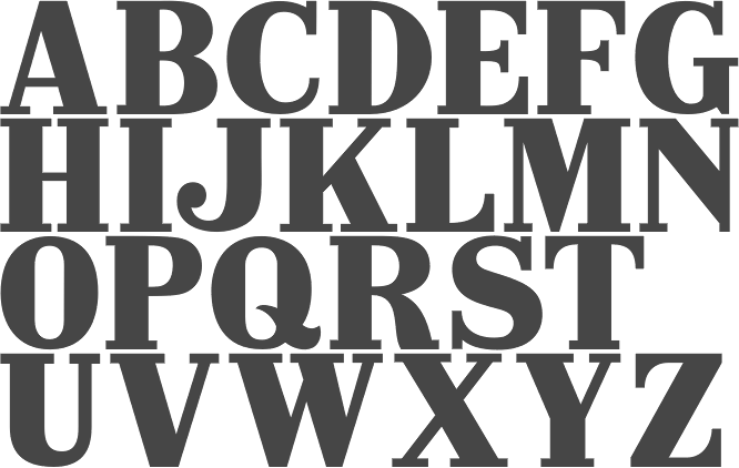
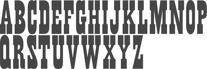
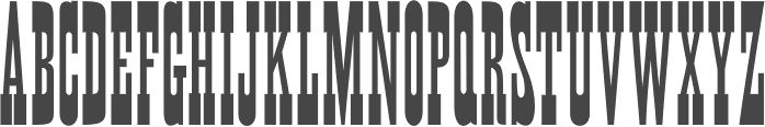
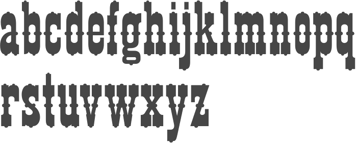
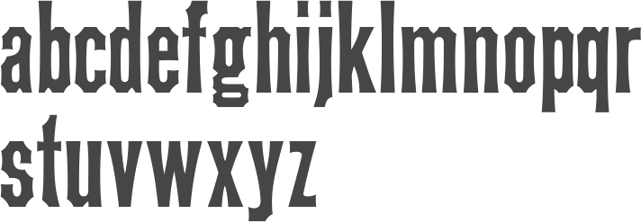
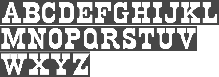