TYPE DESIGN INFORMATION PAGE last updated on Mon Mar 9 16:07:16 EDT 2026
FONT RECOGNITION VIA FONT MOOSE

|
|
|
|
|
Type scene in Alaska | ||
|
|
|
|

SWITCH TO INDEX FILE
Anchorage, AK-based designer of the heavy vernacular brush typeface masni (2018). [Google] [More] ⦿ | |
Creator (b. 1999, Alaska) of the hand-printed typeface Andrea Unedited (2013) and the grungy font Bubbleubble Kicks Some Ass (2013). In 2014, she created Annie Max. Aka Andrea Vandever, Andrea Angst and Andrea Cumberbatch. Home page. [Google] [More] ⦿ | |
Arkansas-based designer (b. 1986) of the handcrafted 3d outline typeface Oh Ashy (2006). [Google] [More] ⦿ | |
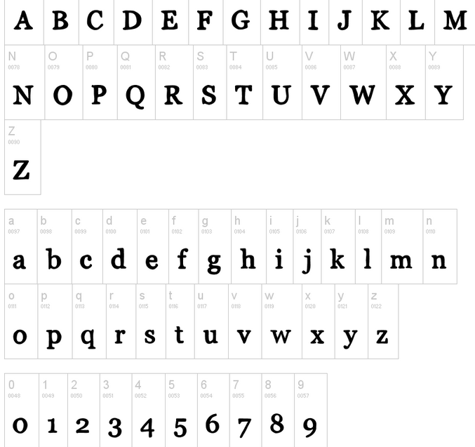
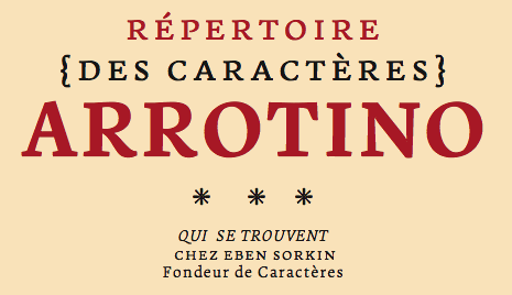
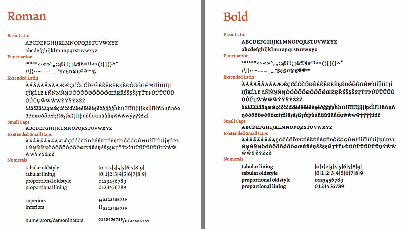
Eben Sorkin
| |
Essqué Productions
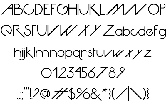
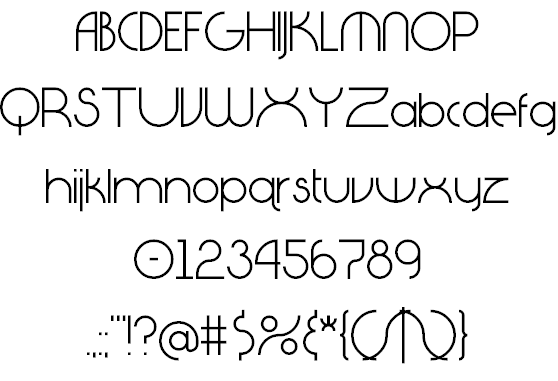
| Stephen Knouse (Essqué Productions) is the Alaskan designer in Wasilla (b. 1976) of several free fonts. These include the display typeface Petal Glyph (2007), Avante Go (2008, avant-garde) and Avante Return (2008, avant-garde). He also created the free comic book fonts Happy Sans (2009, beatnik style) and Happy Serif (2008), Diagano (2012, monoline avant-garde sans), the trekkie typeface Dark Future (2011), and Neon 80s (2010, a rounded sans in the style of VAG Round but more so a faux neon font). Spyced (2012) evokes Arabian nights, lava lamps, and Indian mystery. In 2014, Stephen designed Geo Grid 9 (a kitchen tile font) and Tall & Lean. In 2016, he added the octagonal trekkie font Commander Edge. Typefaces from 2021: Power Talks (a bold tuxedoed art deco sans for Latin, Hebrew, Greek and Cyrillic). Dafont link. Fontspace link. Devian tart link. Creative Market link. Behance link. [Google] [MyFonts] [More] ⦿ |
Free font for Inupiat (Alaska natives) called Inupiaq (1999), created by the Institute of Social and Economic Research, University of Alaska Anchorage. [Google] [More] ⦿ | |
Jason Huebsch
| |
Ninitchik, AK-based designer of the sturdy condensed headline sans typeface Hubris (2016). Behance link. [Google] [More] ⦿ | |
KidsFonts
| TraceFont, NealFont and ColorFont by Teresa Knezek from Fairbanks, AK. Truetype for PC and Mac. Shareware. See also here. [Google] [More] ⦿ |
Mikko Sumulong
| |
Mix Fonts
|
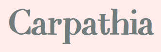
Creator of Trippy Tarot (a handcrafted liquid serif font) (2022), Mix Blimp (emulating a painted script) (2021), Mix Label (a fat finger font) (2021), Catchphrase (a hand-crafted text typeface) (2021), Loopy Lola (2021), Mix String Cheese (a fat finger font) (2021), Mix Modern (a 5-style sans) (2021), Sassitude (2020: a fat finger font), Adorkable (2019), Marker (2018), Before (2018), Pinta (2018: hand-painted), Drybrush (2018), Festival (2018), Striped & Solid (2018), Hjarta (2018: doodled and sketched), Upright (2018), Plump (2018), Sueno (2018: a monoline script), Mix Palmer (2018: a fat finger font), Blimp (2018), Mix Doodle (2018), Mix Directions (2018: arrows), Somn (2017), Mix Scribble (2017), Mix Modern (2017), Mix Tumble (2017), Mix Zakka (2017), Mix Old Girl (2017, script), Mix Underground (2017), Mix Sonatina (2016), Mix Sonata (2016), Mix Skye (2016), Mix Giants (2016), Mix Java (2016), Mix Turvy (2016), Mix Grungy (2016), Mix Amie (2016), Mix Motley (2016), Mix Mini Caps (2016), Mix Narrow (2016), Mix Wander (2016), Mix Caravelle (2016, brush script), Mix Abuzz (2016, brush script), Mix Redux (2016), Mix Sonnet (2016), Mix Yonder (2016, brush font), Mix Brush (2016), Mix Ornare (2016), Mix Klunker (2016), Mix Stitch (2013-2016), Mix Rego (2016), Mix Freo (2016), Mix Quixotic (2015), Mix Jib (2015), Mix Fickle (2015), Mix Kitsch (2015), Mix Plump (2015), Mix Punch Out (2015), Mix Lean (2015), Mix Pisa (2015), Mix Duple (2015, bilined), Mix Swift (2015), Mix Bamboo (2015), Mix Brescia (2015, a handcrafted blackboard bold font), Mix CD (2015), Mix Carpathia (2015), Mix Giants (2015), Mix Squiggle (2015), Mixbrush (2015), Mix Connect Dots (2014), Mix Partial (2014), Mix Modern Outline (2014), Mix Spotted (2014), Mix Striped (2014), Mix Outline (2013), Mix Shaded (2013), Mix Cut Outs (2013), a paper cut out typeface, Mix Narrow, and Mix Serif (2013, a weathered typeface). Designer of the free fonts Mix Comic, MixCrosshatch, MixDemiSans, MixNarrowSerif, MixTitanica, all hand-traced designs or sketched typefaces made with iFontmaker in 2014. Dafont link. Creative Market link. [Google] [MyFonts] [More] ⦿ |
Petty Wage Fonts
| Jason Huebsch (b. 1979) lives in Alaska. At Devian Tart, he designed Eatrocks (1999, avant-garde), Whatever (1999, handwriting), Dick Lucas (handwriting). [Google] [More] ⦿ |
Sorkin Type (was: Eyebytes)
|
Fontspace link. Fontsquirrel link. FontStruct link. Klingspor link. Dafont link. Eben spent February and March 2011 learning how to carve letters in stone from Lida Cardozo at the Cardozo Kindesley workshop, Cambridge UK, and collaborating with Lida on the typeface Pulle. The photographer photographed (in 2011, by Ralph Herrmann). |
Stephen M. Knouse
| |
Teresa Knezek
|

 [
[ Aka Mikomix, her real name is Michelle Karla Sumulong, b. Anchorage, Alaska. Mikko grew up in Antipolo City in the Philippines, went to college back in Anchorage, Alaska, lived in New York City, took a two-year break in Alaska, and now resides in Manila / BGC in the Philippines.
  Eben Sorkin obtained an MA in typeface design from
|
|
|
|