| | |
Adam Cruz

|
 Type designer associated with Delaware-based House Industries. His typefaces at House Industries include:
 - The fat slab serif face Goliath (2011), designed with Vincent Pacella and Ben Kiel based on Film No. 6206 in the PhotoLettering archive.
- West Barnum Ultra (2011, with Ben Kiel). Based on a Plinc original by Dave West (film no. 5494 in the original Photo-Lettering archive).
- Plinc Swiss Interlock (with Christian Schwartz). Based on originals by Photo Lettering Inc.
[Google]
[MyFonts]
[More] ⦿
|
Alex J. Purdy
|
Alex Purdy is a visual communicator and illustrator, and type enthusiast, who lives in Delaware. He graduated from the University of the Arts in Philadelphia, earning his BFA graphic design in 2003. He made nice hand-drawn fonts (images only on his web page: lightning stencil, illuminati font, flim flam, puzzle stencil, old school wifi), and created many modular/octagonal fonts (computer destroy, prick, impalia, boxcutter, bubble deco,&plasmasoft). His illustrated caps font called Hypertype, done with Luke Ramsey in 2008, is a piece of art. [Google]
[More] ⦿
|
Alive Fonts
[Allen Mercer]
|
 Allen graduated from Delcastle Vocational and Technical High and continued his education at Temple University's Tyler School of Art. Upon returning from studying abroad in 1993, he was invited to partner in founding House Industries. After graduating from Tyler with honors in 1994, Allen became House Industries' third stockholder. Allen Mercer is chief operator, design technician and janitor of Alive Fonts located in Petofibanya Hungary. Alive Fonts is specialized in handrafted typography. As a previous partner at House Industries, he created fonts such as Funhouse, the Street Van collection and the infamous House Gothic. In 1998 Allen gave up his partnership with House Industries to become a full-time Christian missionary with his wife Sharon in Hungary. Allen has been handcrafting fonts for over 20 years.
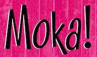
 At House Industries he designed fonts such as HouseFly, Horatio, Funkhouse, Kathouse, Chophouse, Treehouse, Roundhouse (1995), Funhouse, Randumhouse (1995). In 2011, he digitized Dave West's cartoon font Plinc Kerpow for House Industries. At Alive Fonts, est. 2013, he published Moka (2017, casual), Andras (2013), Cica (2013, a psychedelic typeface), and Ovoda (2013, a ball-terminal-themed sans). [Google]
[MyFonts]
[More] ⦿
|
Allen Mercer
[Alive Fonts]
|
 [MyFonts]
[More] ⦿
[MyFonts]
[More] ⦿
|
Andy Cruz
[House Industries]
|
 [MyFonts]
[More] ⦿
[MyFonts]
[More] ⦿
|
Ben Kiel
|
 Graduate of the type design program at the University of Reading, who joined House Industries (Wilmington, DE) in 2006 to work as a typeface designer, director, and developer. He also worked with Ken Botnick at emdash. He runs Typefounding, a typeface design and production studio in St. Louis, Missouri. He teaches at Washington University in St. Louis and the Type@Cooper certificate program at Cooper Union, and has taught at the Maryland Institute College of Art and the University of Delaware. He is a partner at XYZ Type with Jesse Ragan.
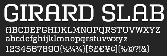
 He designed Katje and Cimarron (2005, University of Reading, a serif family with support for Latin and Greek). Speaker at ATypI 2006 in Lisbon on Python scripts for FontLab and RoboFab. Image. In 2011, Vincent Pacella, Ben Kiel and Adam Cruz created the fat slab serif face Goliath, based on Film No. 6206 in the PhotoLettering archive. West Barnum Ultra, designed by Dave West and digitized by Ben Kiel&Adam Cruz in 2011, was film no. 5494 in the original Photo-Lettering archive. At House Industries, he redesigned the iconic Rea Irvin lettering for The New Yorker in September 2013. The typefaces are named New Yorker Irvin and New Yorker Neutraface. In 2012 at House Industries he revived the Photo Lettering Inc font Worthe Numerals, which pushed fat didone to its limits. Still at House Industries, Christian Schwartz, Mitja Miklavcic and Ben Kiel co-developed Yorklyn Stencil. Cortado Script (2014) was designed by Jesse Ragan and Ben Kiel. It was inspired by Swedish illustrator's Cecilia Carlstedt's hand-painted lettering. It follows one year after a similar signage script typeface, Carlstedt Script (2013), also co-designed by Jesse Ragan and Ben Kiel---it was a custom signage typeface for Aldo Shoes. In 2015, Mark van Bronkhorst set up TypoBrand LLC in Berkeley, CA. As part of TypoBrand, he published several typefaces that are modern digital reinterpretations of ATF typefaces. The collection is published by TypoBrand LLC under the names ATF Type or American Type Founders Collection. Ben Kiel co-designed, sometimes with others, classics such as ATF Alternate Gothic (2015), ATF Brush (2015), ATF Egyptian Antique (an expansion of Schraubstadter's Rockwell Antique by Mark van Bronkhorst, Igino Marini, and Ben Kiel), ATF Railroad Gothic (2016), ATF Garamond (2015), ATF Headline Gothic (2015), ATF Livermore Script (by Mark van Bronkhorst, Igino Marini, and Ben Kiel), ATF Poster Gothic (2015) and ATF Wedding Gothic (2015). At XYZ Type, Ben Kiel co-designed Cortado Script in 2013 with Jesse Ragan and designed the sans typeface Grep (2017). In 2019, Ben Kiel participated in the development of ATF Franklin Gothic (Mark van Bronkhorst, Igino Marini, and Ben Kiel). A broad and multi-weight interpretation of Morris Fuller Benton's classic from 1905, Franklin Gothic, which only had bolder weights. For the lighter styles, the designers were inspired by Benton's Monotone Gothic. Girard Sky (2019) is based on Alexander Girard's original typeface for his redesign of Braniff Airways. Working with the original drawings for the photoset typeface found in the Girard archive, the design was revived as part of the Alexander Girard collection. Followed by Girard Slab (2019). Typefaces from 2020: Ballast (Future Fonts: a condensed slab serif). [Google]
[MyFonts]
[More] ⦿
|
Bill Dettering
|
He worked at SWFTE in Hockessin, Delaware. His CV states: "Cofounder and Vice President of Research and Development. Created Glyphix font software, the first ever on-the-fly font generator for DOS based systems, which sold over 50,000 copies. Executed 10 different product releases and library of 100 scalable fonts. SWFTE has since been bought by Expert Software." [Google]
[More] ⦿
|
Bodoni's books
|
Adam Koster from Oak Knoll in Delaware describes three of Bodoni's publications: - "FREGI E MAJUSCOLE INCISE E FUSE DA GIAMBATTISTA BODONI, DIRETTORE DELLA STAMPOERIA REALE". Parma, Italy: 1771. First edition of Bodoni's first type specimen book. It contains a preface by Bodoni describing the types and ornaments used in the earlier part of his career showing his admiration for the rococo style of Fournier, whom he copied in a flattering manner. "Granted that the most agreeable features of the book are copied, this "specimen" of 1771 is one of the most tasteful and charming volumes of its kind in existence. Each page is surrounded with borders, of which scarcely one is bad, or scarcely two alilke. The types are old style, but their delicacy shows current tendencies, being especially true of the italic. The book is enormously instructive to compare with Bodoni's great, chilly masterpieces, the "Oratio Dominica" and the "Manuale Tipografico" of 1818" (Updike, Printing Types, Vol. I, p.184). Illustrated with more than 400 type ornaments and several pages of capitals...Majuscole ornate e CARATTERI Moderni. Giambattista Bodoni (1740-1813) had recently (1768) been appointed director of the Duke of Parma's private press, the Stamperia Reale, on his way to becoming the most celebrated printer in Europe, and a leader in the development of the modern letter form. " If (Bodoni) was careful in his choice of paper, he relied still more on his type and from 1771 onwards issued a series of typographic manuals, which show the love and labour that he was continuously lavishing on the fashioning and perfecting of this weapon...there is something peculiarly satisfying in the thought of this man through all the vicissitudes of one of the most stormy periods of European history, heedless of changes of regime, cheerfully, unswervingly and successfully pursuing his artistic ideals (Brooks, preface, xi)." With the Borghese family coat of arms gilt-stamped on front boards. The Borghese family, originally from Siena and later from Rome, produced one pope, Paul V, several cardinals, many prominent citizens, and were noted patrons of the arts and letters.
- "Epithalamia exoticis linguis reddita. Parmae Ex Regio Typographeo", 1775. With engraved title page vignette, head- and tail-pieces and historiated initals after Ferrari. Considered one of Bodoni's finest type specimen books, it contains the alphabets of twenty-five exotic languages, including Tibetan, Phoenician and Coptic. Has a poem by Conte Della Torre di Rezzonico.
- "MANUALE TIPOGRAFICO." Two volumes. Parma, Italy: 1818. Bodoni's most substantial and famous type specimen. (Brooks 1216, Updike, Printing Types, II, pp. 169-171). This last specimen to be issued by Bodoni, "with a Discorso by his widow and Prefazione by Bodoni, appeared in 1818, five years after his death. It was completed under the care of his widow and Luigi Orsi, who was for twenty years foreman to Bodoni. Signora Bodoni, writing to M. Durand, of Metz, from Parma (November 14, 1817), says: 'The Manuale Tipografico in two volumes on papier-velin-the only kind of paper used for it-is not yet completed, but it will be, without fail, at the beginning of the coming year. I dare to believe that book-lovers will thank me for having published a volume which is so very important to Typography. The reception which it will have, will make up for the trouble it has cost me (although Bodoni has left the blocks or models for it) and the considerable expense which I shall have had to incur before it is finished. Also, in view of the fact that but 290 copies are struck off, I cannot dispose of them at less than 120 francs, without any reduction. M. Rosaspina has engraved au burin the portrait after one which the celebrated Appiani... painted in oils, which is a striking likeness.'" (Updike II, p.169) The first volume contains a discourse by Vendova Bodoni and a preface by G.B. Bodoni and is followed by the Latin type specimens. Twenty-six separate typefaces are described, each displayed in several different point sizes and most with specimens in Roman and italic. The display of the individual specimens in so many variations is particularly dramatic, the specimens for majuscole alone comprise 108 variations. The second volume displays thirty-four non-Latin type specimens including: Greek, Hebrew, Arabic, Armenian, Cyrillic, Tibetan, and many others. Many of these span multiple pages and present type in varying sizes. The Greek and Russian typefaces are the most comprehensive, with many pages devoted to large and impressive variations. This section is followed by specimens of 1036 decorative borders (Fregi), each designed to work with specific Bodoni typefaces, specimens of ornaments and rules, and specimens symbols for algebra, chemistry, astronomy, and music notation. Several of these are contained on large folding plates.
[Google]
[More] ⦿
|
Christian Dexter
|
 Wilmington, DE-based designer in 2019 at Avondale Type Co of ATC Anais (a headline didone) and ATC Nasty (gooey). Other typefaces include ATC Bramford (2019) and AG Mercury Sans (2019).
 In 2021, he released ATC Monarch (a rhombic medieval display typeface0 at Avondale. [Google]
[More] ⦿
|
Christina Caasi
|
During her studies at Delaware Technical Community College, Christina Caasi (Dover, DE) created an untitled lava lamp typeface (2014). [Google]
[More] ⦿
|
CNESS
|
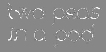
Senior at the University of Delaware studying Visual Communications. He/she designed the playful modular typeface Pea Pod (2010). [Google]
[More] ⦿
|
Cruz Fonts
[Ray Cruz]
|
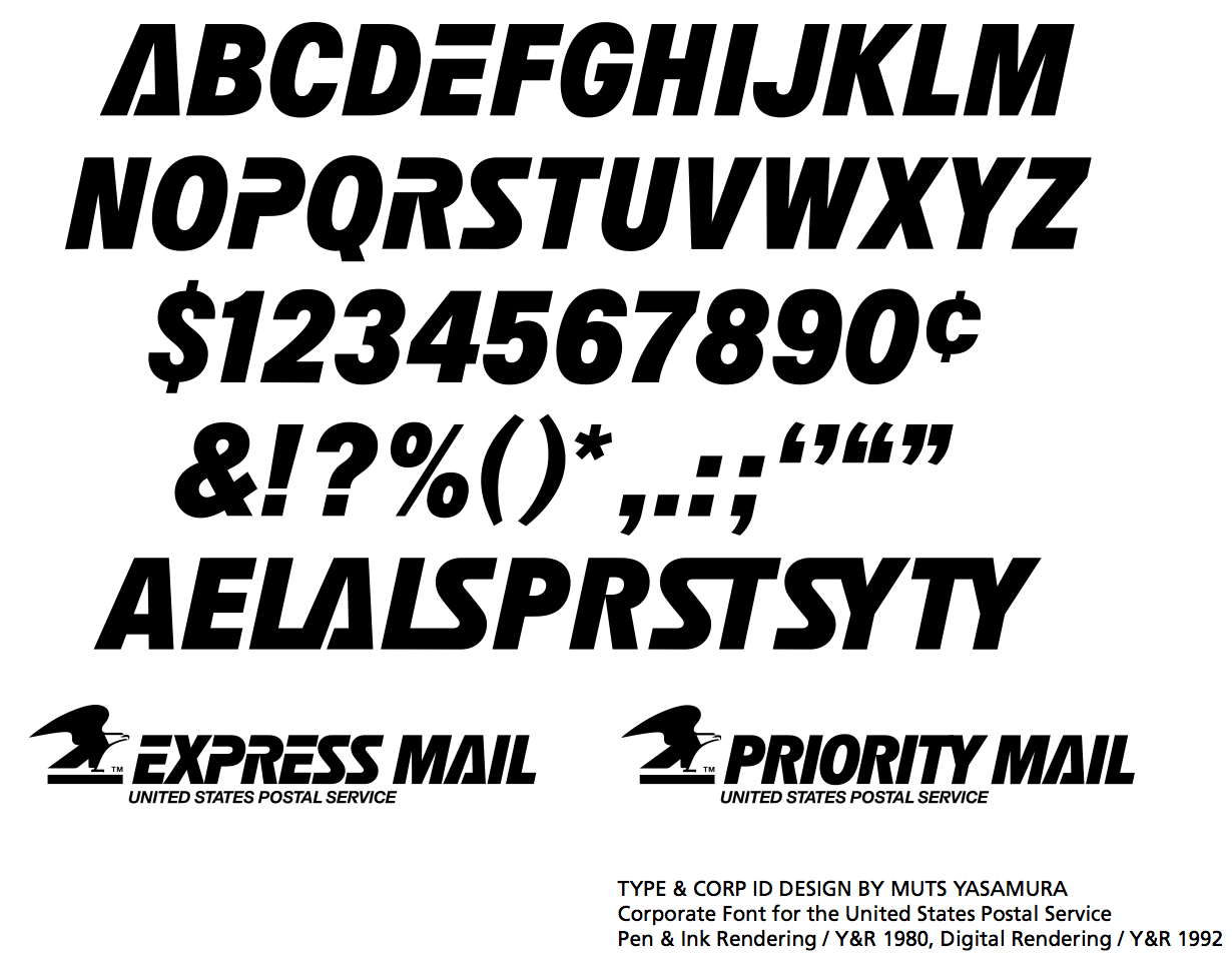
 Cruz Fonts was established in Oakland, NJ, in 2004 by Ray Cruz (Ramon Cruz), who was a designer of custom lettering and custom typefaces to major ad agencies, publishers and corporate clients in the New York City area for almost 30 years. Ray Cruz (b. Ponce, Puerto Rico, 1943) died at his home in Lewes, Delaware, in 2025. His obituary read: Ray Cruz, beloved husband, father, grandfather, celebrated graphic artist, and military veteran, died peacefully at his home in Lewes, Delaware, on March 26, 2025. He was 81. Born in Ponce, Puerto Rico, on August 31, 1943, Ray was a lifelong student and teacher of design. A graduate of New York City's High School of Art & Design, he honed his craft in several of the city's top custom lettering studios before rising to prominence in the graphic arts world. His career spanned more than five decades, during which he left a lasting mark on advertising, publishing, package design, and corporate identity. In the 1980s, Ray was commissioned to create corporate typefaces and logos for the United States Postal Service—iconic designs still seen on mail trucks today. After co-founding and leading Cruz & Slowik Associates, Ray served as Type Director at the renowned Young & Rubicam advertising agency, his sharp typographic eye elevated countless national campaigns. His work earned him more than 30 awards from the Type Directors Club, AIGA, ADC, and other respected art associations. Ray was also a dedicated educator, serving as an adjunct professor at Parsons School of Design, FIT, Kean University's Robert Busch School of Design, County College of Morris, and Marywood College. He believed in a "Learn by Doing" approach, favoring hands-on exploration. His students remember him not only for his technical knowledge but for his passion, clarity, and mentorship. He was a member of several professional organizations including the Type Directors Club, Society of Typographic Aficionados (SoTA) and the Association Typographique Internationale (ATypI). Ray lived for two things: graphic arts and his family. He was also an active and energetic man who loved the gym, tennis, skiing, boating, fishing, music, and working with wood---pursuits that reflected his creativity, craftsmanship, and love for the outdoors. He is survived by his wife, Janet; his sons David and wife Jamie Lynn, Jamie and wife Hermilyn; and their sons, Daniel and wife Melany and Matthew and wife Marilyn. He is also survived by his grandchildren Avery, Hyland, Ardyn, Talyn, and Cornelia. He is reunited with two grandchildren, Reign and Parker, and his mother, Carmen, in peace.
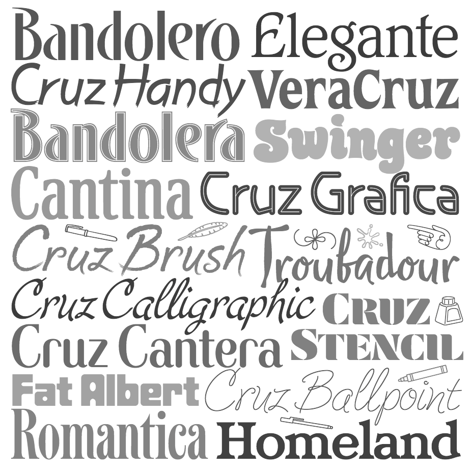
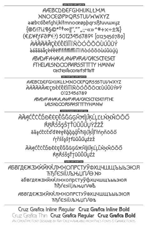
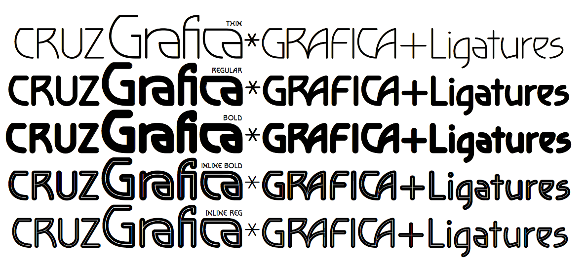
 Cruz created many display typefaces for Agfa/Monotype, Bitstream, Phil's Fonts and Garage Fonts. Presently Ray Cruz is working as Type Director at Y&R NY, and is an adjunct professor at FIT and Kean University teaching type design. Bio at Garagefonts. His oeuvre: - Garagefonts: Cruz Grafica (1999), Cruz Grafica Inline, Troubadour.
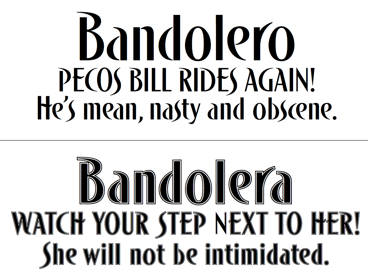
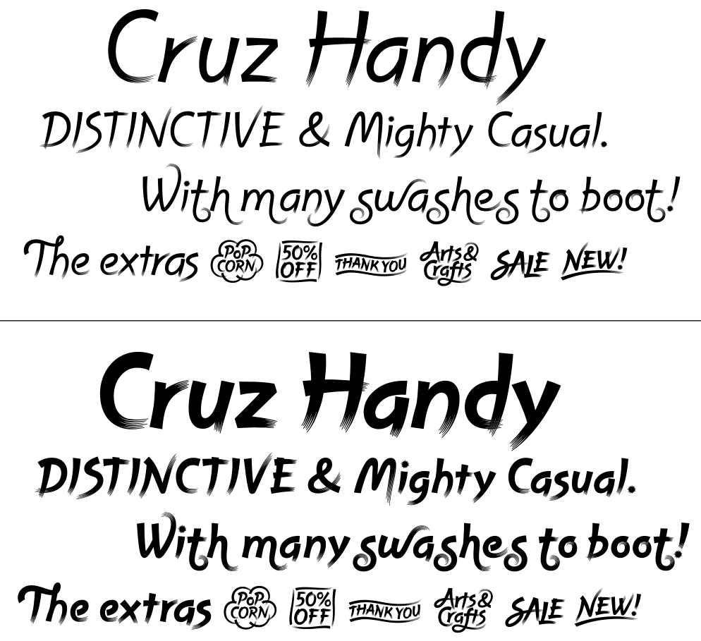
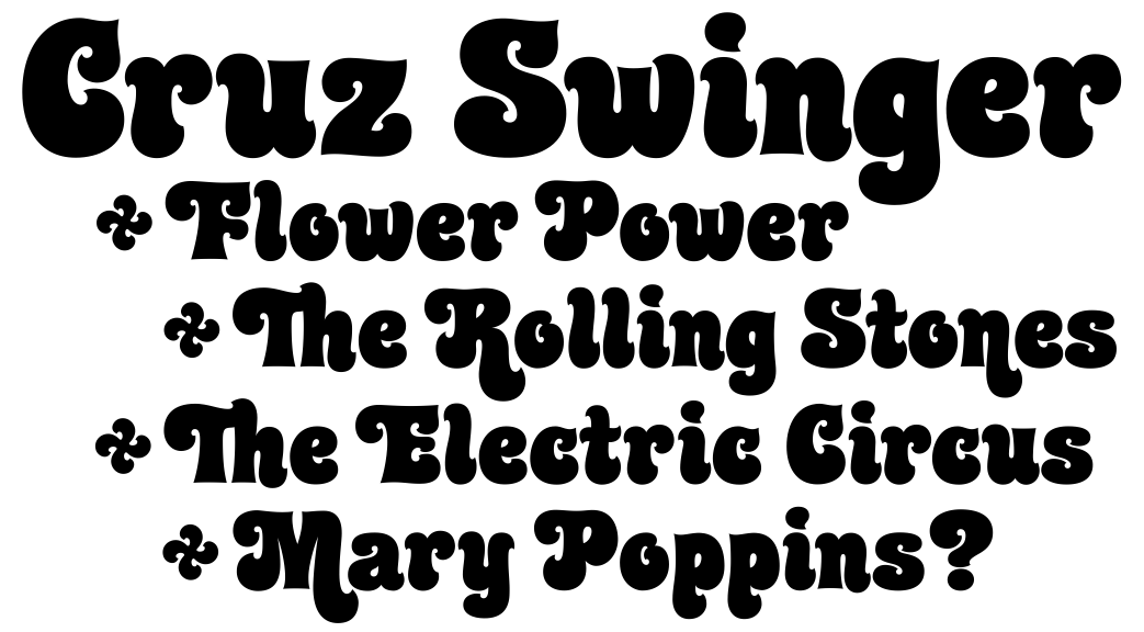
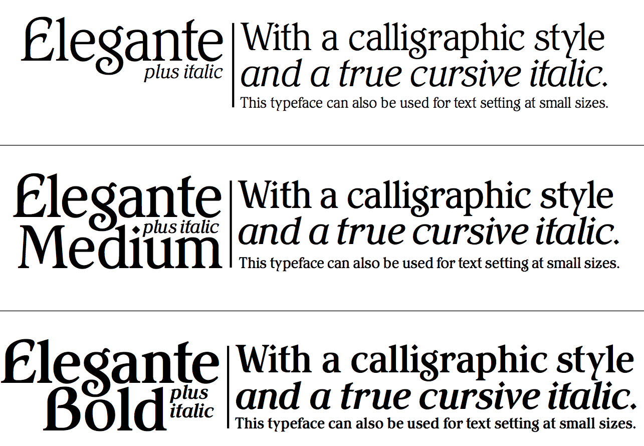
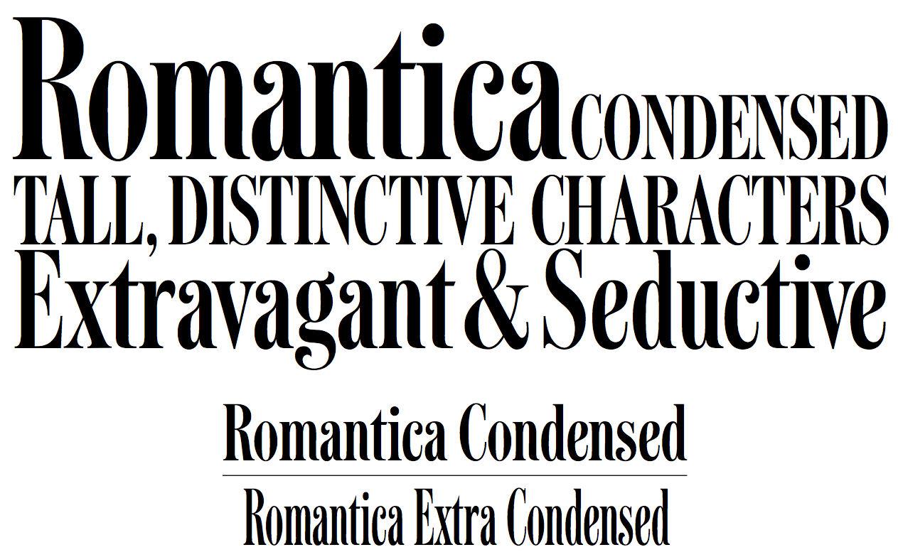
- Agfa/Monotype: Bandolera, Bandolero, Cruz Handy (2001) and Cruz Swinger. Swinger, in fact, was produced in film type for the John Schaedler Studio in New York in the 1970s. Also, Elegante, Romantica (didone).
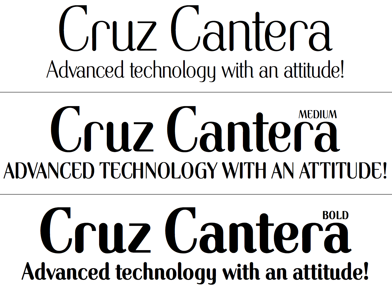
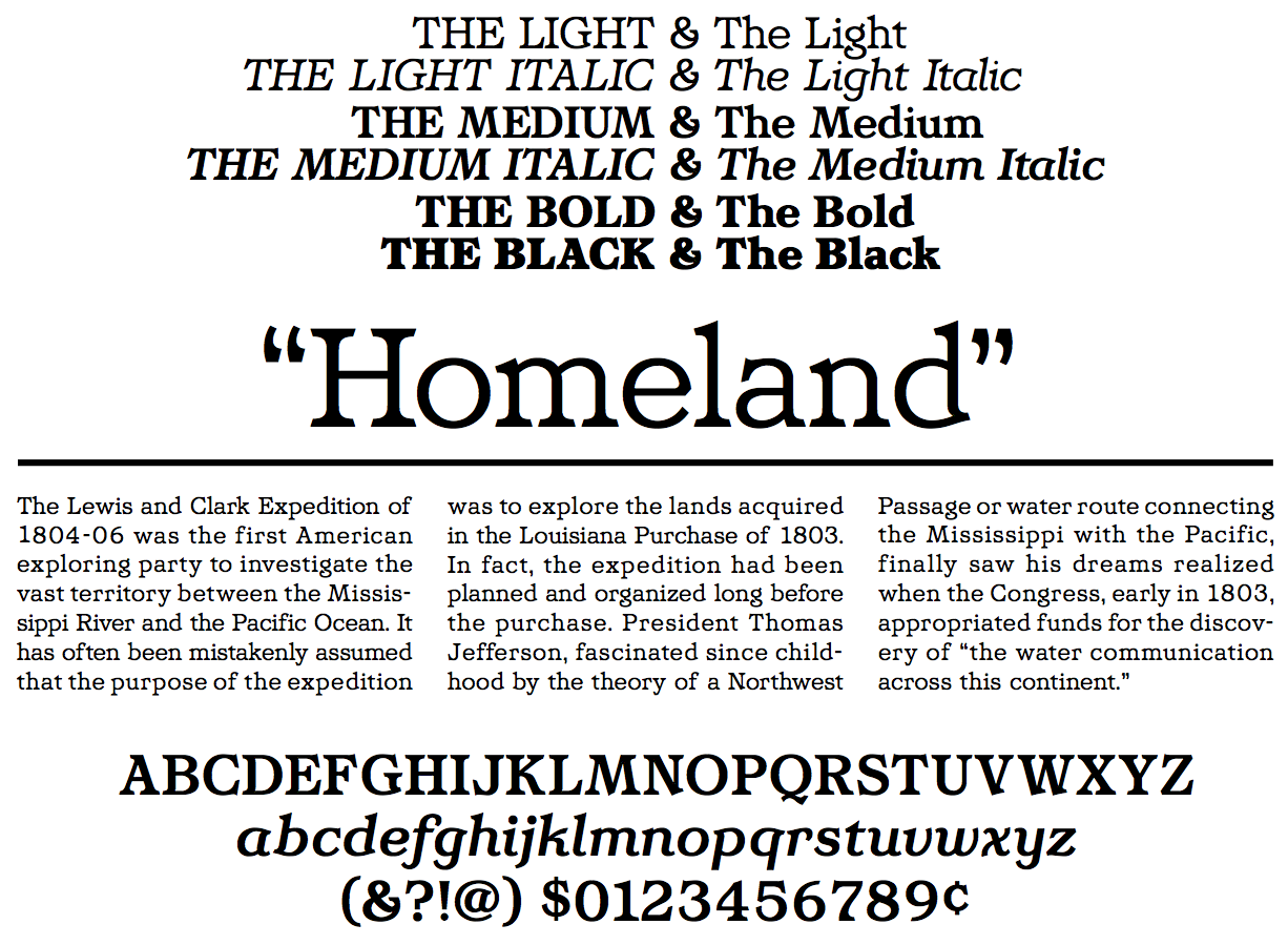
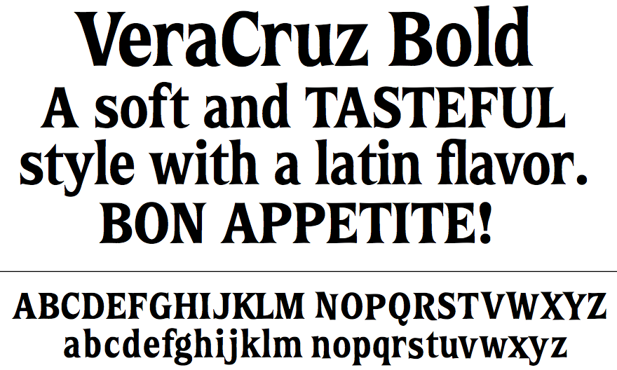
- Bitstream: CruzCanteraBT (2003, a stylish informal sans family), Homeland BT (2004, a text typeface with a large x-height), Vera Cruz (2003, a playful display serif), and Fat Albert (2004).
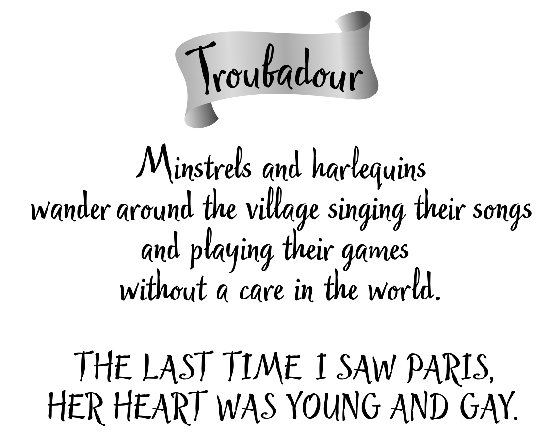
- Cruz Fonts: Satchmo (2016), Cruz Handy (2004), Troubadour (2004), Cruz Stencil (2012), Cantina, Bandolero, Cruz Swinger (fat semi-psychedelic signage face), Bandolera, Romantica Pro (2013, a condensed didone), Dot Script (2013, dot matrix face), Cruz Script Pro (2013: original from 2005), Bouncing Checks Layers (2014, octagonal and layered; includes 40 dingbats by Seymour Chwast).
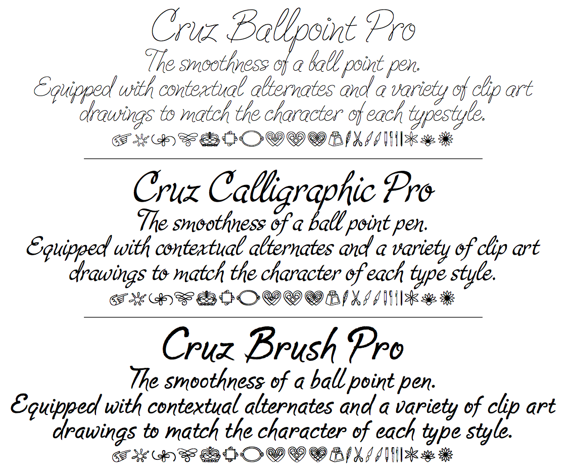
- P22: P22 Cruz Ballpoint, P22 Cruz Calligraphic, P22 Cruz Brush.
- BarracudaPlain.
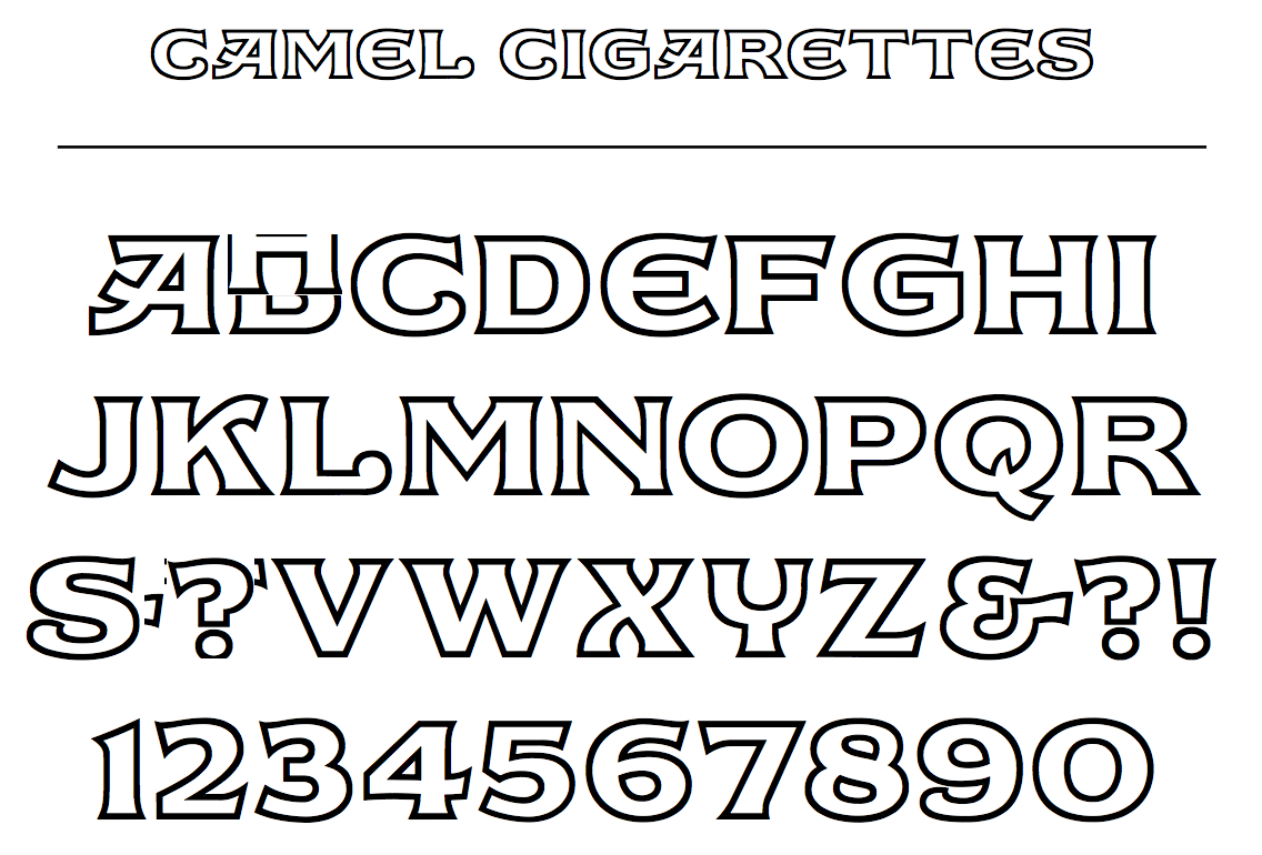
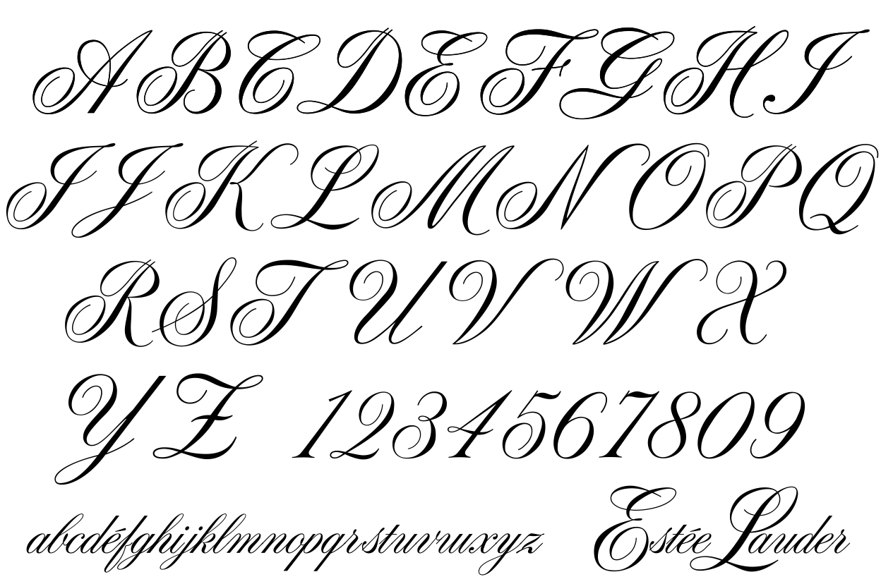
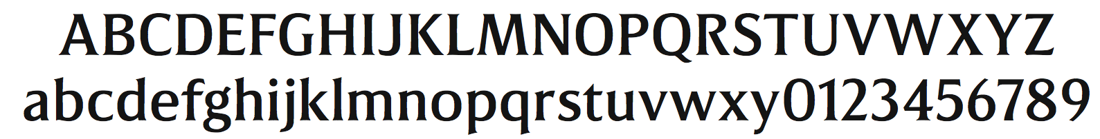
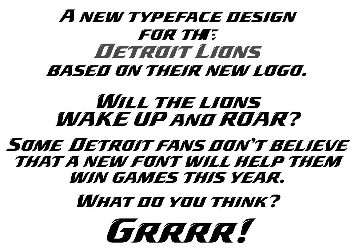
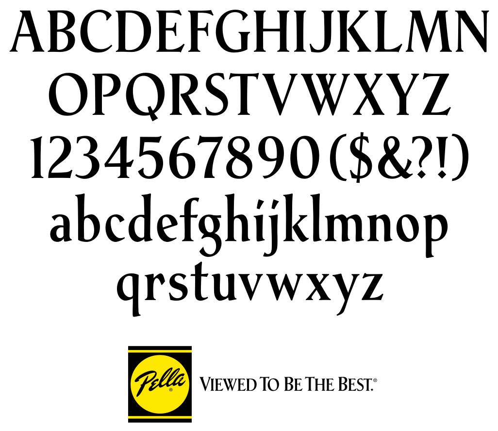
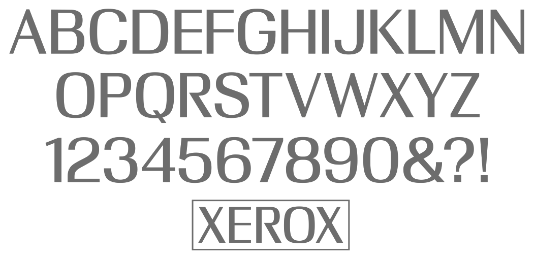
- Custom typefaces for Camel Cigarettes, Estee Lauder (1994), New York Life Insurance, The NFL Detroit Lions, Pella Windows, USPS, and Xerox.
Bio at Garagefonts. P22 link. FontShop link. PDF catalog. View Ray Cruz's typefaces. Klingspor link. [Google]
[MyFonts]
[More] ⦿
|
Derek Long
|
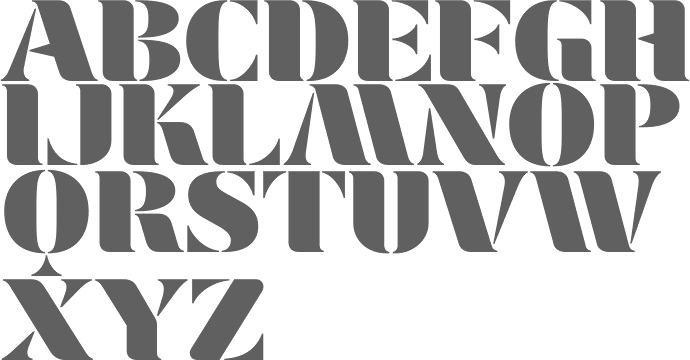
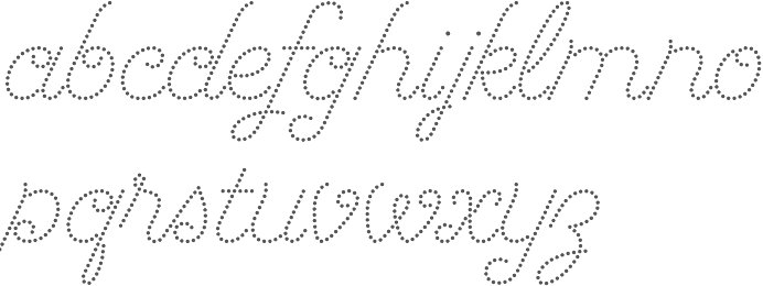
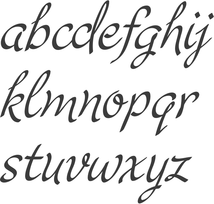
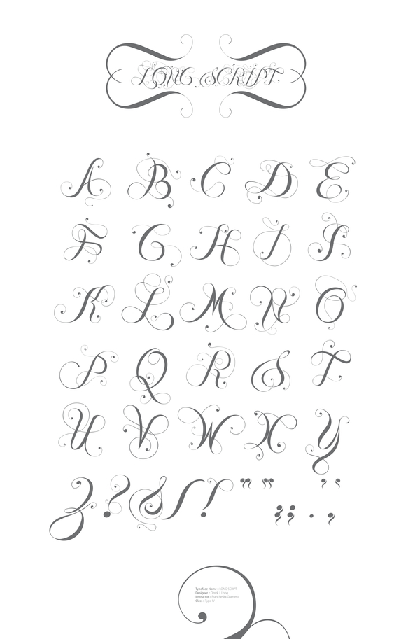
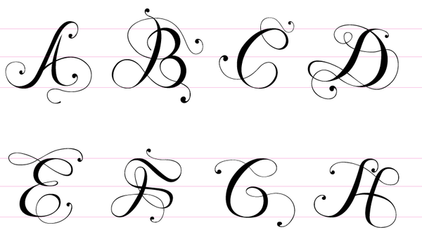
 Derek Long (b. Wilmington, DE) made the high-contrast ball-terminal calligraphic typeface Long Script (2011) in his Advanced Typography class at the Corcoran College of Art + Design. Now based in Washington, DC. Behance link. [Google]
[More] ⦿
Derek Long (b. Wilmington, DE) made the high-contrast ball-terminal calligraphic typeface Long Script (2011) in his Advanced Typography class at the Corcoran College of Art + Design. Now based in Washington, DC. Behance link. [Google]
[More] ⦿
|
Digit
|
From G.A. Glaister's Encyclopedia of the Book, this definition of a printer's digit: the printer's symbol [pointing hand]. This type ornament has a long history, the printed outline of a hand being used as a paragraph mark by, among other early printers, Huss at Lyons in 1484 in the edition of Paulus Florentinus's Breviarum totius juris canonici he printed with Johannes Schabeler. As with other typographic conventions this was taken from scribal practice, carefully drawn hands pointing to a new paragraph being found in early 12th century (Spanish) manuscripts. It is also known as a fist, hand, or index. The full reference: Geoffrey Ashall Glaister, Encyclopedia of the Book, 2nd Edition, with a new introduction by Donald Farren (New Castle, DE and London: Oak Knoll Press and The British Library, 2001), 141. [Google]
[More] ⦿
|
Eric Stafford
|
From the University of Delaware, Eric Stafford designed a broken experimental typeface and Mushu (a flowing script face), both in 2010. [Google]
[More] ⦿
|
Ethan Paul Dunham
[Fonthead Design]
|
[MyFonts]
[More] ⦿
|
Expert Software
|
Sells a 2000 font (TT and T1) CD called Fantastic Fonts for 13USD. Plus 300 truetype handwriting fonts for 13USD. And 300 funky fonts for 13USD. Font Magician (13USD) lets you create special effects. Kid's Fonts (300 truetype fonts) for 13USD. Based in Rockland, DE. Footnote: Expert Software is one of the world's largest font cloners. I doubt that they ever made an original font. For example, under the label Ly's Media, they renamed all the WSI "Hand-Plain" series LEHN001 through LEHN283, and sold them once again. It is a real mess. Download that collection here. [Google]
[More] ⦿
|
Fonthead Design
[Ethan Paul Dunham]
|
 FontHead Design (Wilmington, DE) sells cool fonts designed by Ethan Dunham (b. 1972, Glens Falls, NY), who now heads Fontspring. A partial list: Mother Goose (2008), Allise, GoodDogCool, Fontheads (dingbats), Randisious, Greyhound (1997, an arts and crafts face), Rochester, Samurai, AsimovSans, Gurnsey20, Scrawl, BadDog, Holstein, SlackScript, Bessie, SloppyJoe (gone?), Blearex, HandSkriptOne, SmithPremier, BlueMoon, HolyCow, SororityHack, Bonkers, HotCoffeeFont, SpillMilk, BraveWorld, Isepik, Sputnik, Brolga, TekStencil, Carnation, Mekanek (1995), Teknobe (1995), Merlin, Toucan Grunge (gone?), Tycho, TypewriterOldstyle, MotherGoose, Croissant, Democratika (now Americratika--I think Emigre forced FontHead to change the name), Noel (1996-1997, Lombardic all caps face, with an open version added), LillaFunk (gone?), Margo Gothic (gone?), Toddler (gone?), NoelBlack, WashMe, Diesel, Orion, Gritzpop, Pesto, BattleStation, CircusDog, Dandelion, DraftHand, Flowerpot, Navel, ShoeString, Stiltskin, ZipSonik. Plus JohnDoe, and old typewriter font. Free fonts: Font Heads (dings), Smith Premier, Vladimir, Tycho, Typewriter Oldstyle, ScareCrow, Millennia, SpillMilk, GoodDog, Holstein, Red Five. All formats, Mac and PC. In the comic font series, look for Stan Lee (now Comic Talk), FH Excelsior (now Titlex), Grimmy (now Flim Flam), and Kirby (now Grit).
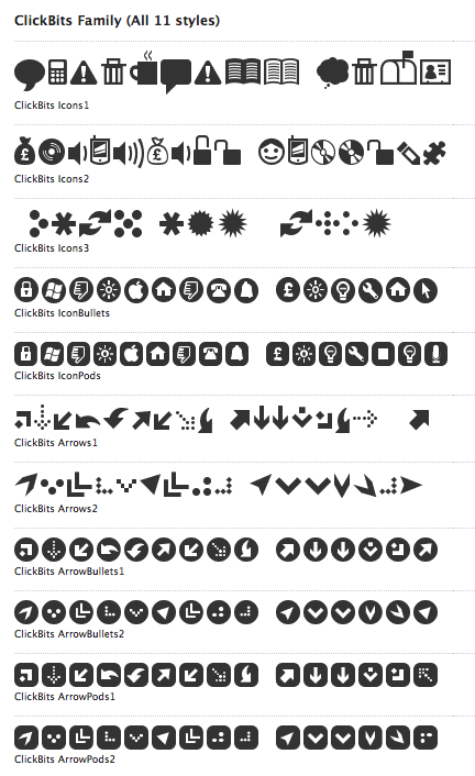
 Dafont link. Fonts created in 1999: AppleSeed, Caterpillar, Chinchilla, ChinchillaBlack, ChinchillaDots, CrowBeak, CrowBeakLight, CyberMonkey, DanceParty, DingleHopper, FourScore, FourScoreTitling, Hopscotch, HopscotchPlain, Ladybug, Leaflet-Regular, LeafletBold, LeafletLight, ReadOut, ReadOutSuper, Smoothie, Swizzle, TwoByFour, VeryMerry. Made in 2001: ButterFinger, ButterFingerSerif, CatScratch, Catnip, FighterPilot, FrenchRoast, Handheld, HandheldItalic, HandheldRaised, HandheldRaisedItalic, HandheldRound, HandheldRoundItalic, Kingdom, OldGlory, Quadric, QuadricSlant. MyFonts page. In 2006, several dingbats fonts were added, such as the ClickBits Arrow series and the ClickBits Icon series. In 2008, he created InfoBits Things and InfoBits Symbols, Abigail, Assembler, Click Clack, Drawzing (children's font, crayon or chalk style), El Franco (grunge), Good Dog New (hand-printed), Helion (futuristic), Lead Paint (brush), Schema (architectural lettering), Skizzors (paper cut font), Tachyon (2008, techno, futuristic). Free font download. This place has Allise, Americratika, AppleSeed, AsimovSans, Asterix-Blink-Italic, Asterix-Blink, Asterix-Italic, Asterix-Light-Italic, Asterix-Light, Asterix, BadDog, BattleStation, Beckett, Bessie, BlackBeard, Blearex, BlueMoon, Bonkers, BraveWorld, Brolga, BrownCow, Carnation, CatScratch, Caterpillar, Chinchilla, ChinchillaBlack, ChinchillaDots, CircusDog, CornDog (2004), Croissant, CrowBeak, CrowBeakLight, CyberMonkey, DanceParty, Dandelion, Dannette-Outline, Dannette, DayDream, Democratika, Diesel, DingleHopper, DoomsDay, DraftHand, Flowerpot, Font-Heads, FourScore, FourScoreTitling, FunkyWestern, Goliath, GoodDog-Bones, GoodDog-Cool, GoodKitty, Greyhound, Grimmy, Gritzpop, GritzpopGrunge, Gurnsey20, HandskriptOne, Holstein-Bold, Holstein, HolyCow, Hopscotch, HopscotchPlain, HotCoffeeFont, HotTamale, Isepik, JohnDoe, JollyJack, Keener, Klondike-Bold, Klondike, Ladybug, Leaflet-Regular, LeafletBold, LeafletLight, LillaFunk, Log Jam (+Inline), MargoGothic, MarvelScript, MatrixDot-Condensed, MatrixDot, Mekanek, Merlin, Millennia, Mondo-Loose, MotherGoose, Navel, Network, Noel, NoelBlack, Oatmeal, Orion, Pesto, Randisious, ReadOut, ReadOutSuper, RedFive, Rochester, Samurai, Scarecrow, Scrawl, ShoeString, ShoeStringRound, SlackScript, SloppyJoe, SmithPremier, Smock, Smoothie, SororityHack, SpaceCowboy, SpillMilk, Sputnikk, StanLee-Bold, StanLee-BoldItalic, StanLee-Regular, Stiltskin, Submarine, Swizzle, TekStencil, Teknobe, Torcho, ToucanGrunge, TwoByFour, Tycho, Typewriter2, TypewriterOldstyle, VeryMerry, Vladimir, WashMe, Watertown-Alternate, Watertown-Black, Watertown-Bold, Watertown, ZipSonik-Italic, ZipSonik, ZipSonikSketch-Italic, ZipSonikSketch. Font Squirrel carries ElliotSix (simple handwriting), GoodDog (children's hand) and Millennia (squarish). In fact, in 2009-2010, Ethan Dunham became a very active web font persona, offering a commercial web font service, Fontspring, and a free font service, Fontsquirrel. Klingspor link. Creative Market link. [Google]
[MyFonts]
[More] ⦿
|
FT Content Provider
|
This strange 100-font family dating from 1992-1993, and available from the University of Delaware, has the following trademarked names: ft, ft1, ft10, ft11, ft12-Medium, ft13, ft14, ft15, ft16-Gothic, ft17i-Italic, ft17n, ft18, ft19-CondensedRegular, ft2, ft20, ft21, ft22-Normal, ft23, ft24-Extra-condensedMedium, ft25, ft26, ft27, ft28, ft29, ft3, ft30-Medium, ft31, ft32-Bold, ft33, ft34-Bold, ft35-Semi-expandedBold, ft36, ft37, ft38, ft39-Normal, ft4, ft40-Roman, ft41-Black, ft42, ft43b-Bold, ft43n, ft44-Bold, ft45, ft46, ft47, ft48, ft49-Bold, ft50-Plain, ft51, ft52-Normal, ft53, ft54, ft55, ft56, ft57-Normal, ft58, ft59, ft5b-Bold, ft5i-Italic, ft5n, ft60-Book, ft61-Normal, ft62, ft63, ft64, ft65, ft66-Bold, ft67, ft68-Normal, ft69-BoldItalic, ft7-normal, ft71, ft72-Cyrillic, ft73, ft74, ft75, ft76, ft77, ft78, ft79, ft80, ft81-Normal, ft82, ft83, ft84-Semi-expandedSemiBold, ft85, ft86-Plain, ft87, ft88-Normal, ft89-Bold, ft8b-Bold, ft8r-Roman, ft9, ft90, ft91-Normal, ft92-Bold, ft93, ft94, ft95, fts1, fts11, fts12, fts13, fts2, fts3, fts4, fts5, fts6, fts7, fts8, fts9-Normal. I have the impression that these were strategically renamed fonts. [Google]
[More] ⦿
|
House Industries
[Andy Cruz]
|
 Foundry located in Yorkly, DE. House Industries is run by Rich Roat and Andy Cruz with designer Ken Barber as Typography Director. Originally founded in 1993 by principals Andy Cruz and Rich Roat, House Industries has grown into a studio which sells unique display typography, illustration and design services, and, most recently, clothing and accessories. Fonts sell for 50 USD per face, and about 175 USD for ten. Many of the typefaces are grungy or special effect fonts, and all font names have the word "house" in them, as in the graffiti font Phathouse. Custom font service available. Alternate URL. Free fonts: United Stencil, House Slant, SpaceAgeRound.
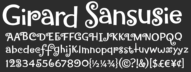
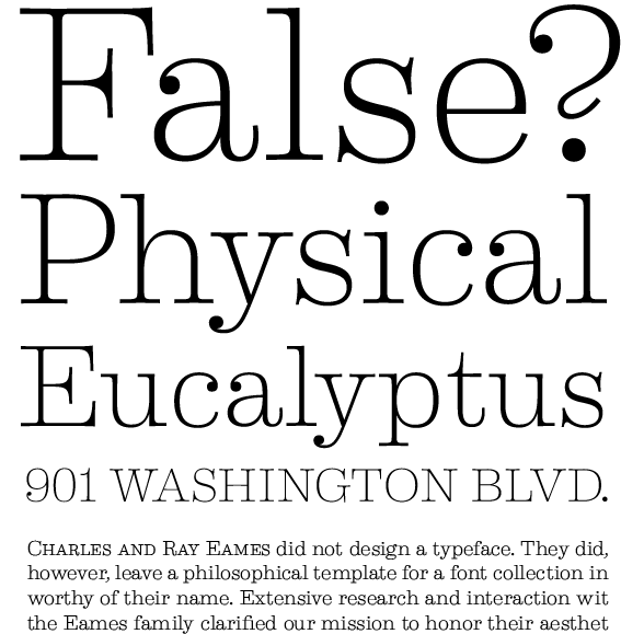
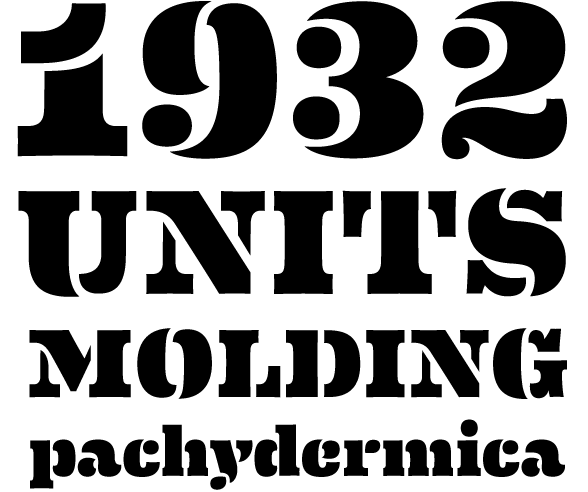
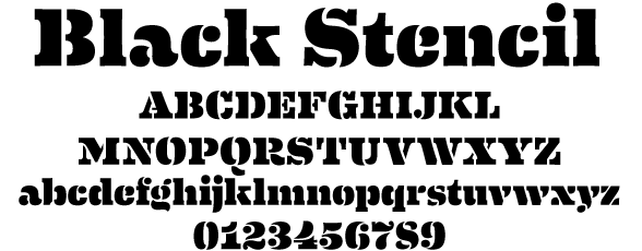
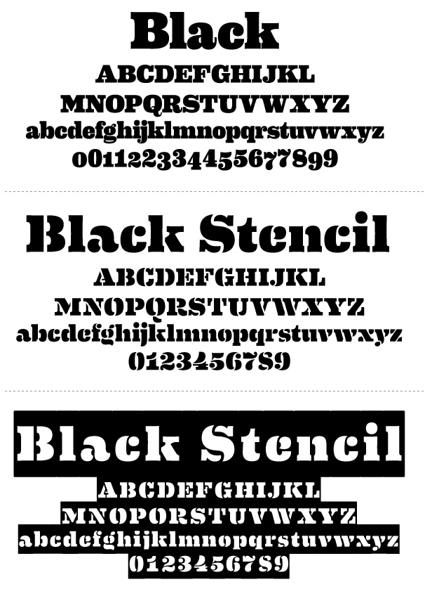
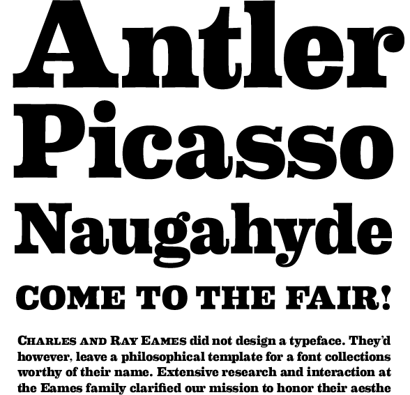
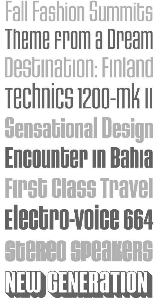
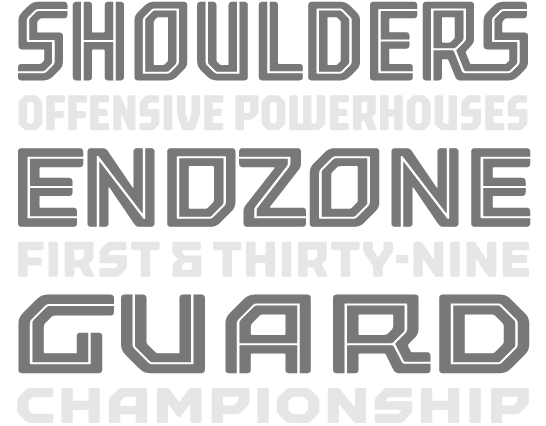
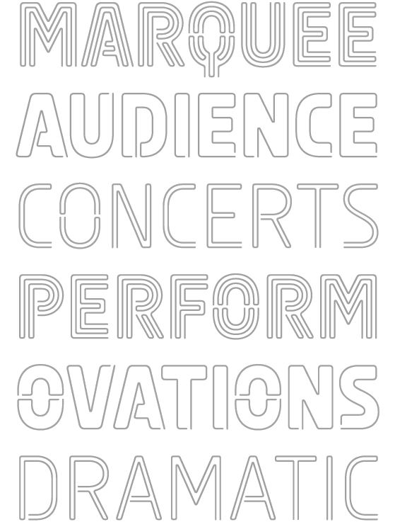
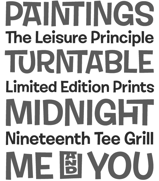
 Type designers: Andy Cruz (Warehouse, Roughouse), Allen Mercer, Ken Barber, Jeremy Dean, Kristen Faulkner, Nicole Michels, David Coulson, Tal Leming, Ben Kiel. The early typefaces by House include United Sans (octagonal and stencil), Neutra (2002, a 30-weight stylish architectural sans family named after architect Richard Neutra), Global Font (renamed to Bullet), the Chalet Milan, Cologne, Hong Kong, Los Angeles, Paris, New York, London and Tokyo font families (in versions called 60s, 70s and 80s), Chalet Silhouettes, the Simian font collection (2001: OrangUtan, Chimpanzee, Gorilla, Sacred Scroll). In 2003, they released the Shag Collection, which includes Shagbats, Exotica, Mystery and Lounge. Andy Cruz designed Roughouse (1993) and Printhouse (1994), and co-designed Spookhouse and HauntedHouse in 1996 with David Coulson. House published House (2004, Gestalten Verlag), a 240-page specimen book. Also in 2004, they released five typefaces based on the lettering of Ed Benguiat: Ed Interlock (1400 ligatures), Ed Roman (animated bounce), Ed Script, Ed Gothic andi Bengbats. In 2005, they started digitizing the PhotoLettering collection, which they had acquired in 2003. This was done in partnership with Christian Schwartz and Erik van Blokland. They published Holiday Gothic, Holiday Sans and Holiday Script in the same year. In 2006, the 105-font family United was published. The six-weight Luxury family, also done in 2006, contains three serif text weights called Luxury Text, as well as three display typefaces, called Platinum (art deco), Gold, and Diamond (all caps with triangular serifs). They were designed by Christian Schwartz and Dino Sanchez. In 2007, we welcome Burbank, a large casual and quirky sans family, and Blaktur, a blackletter typeface which an award for display typeface at TDC2 2008. The lively signpainting typefaces Studio Lettering Sable, Studio Lettering Slant and Studio Lettering Swing also won awards in that competition. Show and Tell is their blog. In 2009, the low-to-zero contrast Alexander Girard family was published. It consists of Girard Sky, Girard Script, Girard Display, Girard Sansusie and Girard Slab in many weights and styles. It was created by Laura Meseguer based on the lettering used to announce the textile designs that Alexander Girard did for Herman Miller in 1955. Additions in 2010 include Eames Century Modern (+Poster Numerals, Cover Numerals, Thin, Ornaments, Stencil, +Black Stencil), a 26-style family of medium-to-low contrast modern typefaces in the Clarendon mode that feature nifty tricks on the ligature side---jointly developed by Erik van Blokland and House Industries type designers Andy Cruz and Ken Barber. Blacktur is a blackletter family. In 2012, House Industries was busy digitizing typefaces from the Photo-Lettering collection. Some of the typefaces in that collection have the prefix Plinc or PLINC in the name. This included typefaces such as Worthe Numerals (fat didone numbers) and Norton Tape (by Kimberly Winder; based on the stencil paperfold typeface Norton Tape by S.E. Norton). Among typefaces added in 2013 and 2014, we note Velo Serif designed by House Industries, Christian Schwartz, Mitja Miklavcic and Ben Kiel. At MyFonts: Velo Serif Text and Velo Serif Display. In 2016, they published Municipal Cast. Municipal (a font family inspired by the beefy iron letterforms on manhole covers; by Ken Barber, Quentin Schmerber of Production Type, Teja Smrekar, and Ben Kiel), which was released in 2020. In 2021, House Industries started selling its fonts through MyFonts. [Google]
[MyFonts]
[More] ⦿
|
Howard Berlin
|
Aka Dr. HumBug, retired professor from Delaware Technical&Community College. He had a popular free language font site, which he closed down ca. 2005. He resides in Wilmington, DE, and published a book on monetary units (bank notes and coins) in 2006. [Google]
[More] ⦿
|
International Type Founders (ITF)
|
Company incorporated in Delaware. Markets fonts from Garagefonts, Letter-Perfect, Polytype, Maverick Designs, Christian Schwartz Design, Phil's Fonts, TypeArt, Font Bureau, T-26, Red Rooster, Fontek, NIMX, Font Boy, Lanston, Page Studio Graphics, Arthur Baker Designs, P22, RT: Russian Type foundry, Castle Systems, Type Revivals, Galapagos. "International TypeFounders Inc., is a coalition of over 50 unique, small independent foundries featuring the work of dozens of designers who bring over 3,000 of their typefaces together from one central source." Alternate URL. Contact: Steve Jackaman. [Google]
[More] ⦿
|
Jess Collins
|
 Type designer associated with House Industries in Delaware. His typefaces:
 - At House Industries, Jess Collins and Mitja Miklavic revived Ed Benguiat's great fat face didone typeface (Benguiat) Montage in 2018.
- In 2011, he digitized Bubble Gum, a bubblegum / cartoon font first designed by Dave West in the late 1960s. House Industries sells it since 2021 as Plinc Bubblegum (2021).
[Google]
[MyFonts]
[More] ⦿
|
Oak Knoll Bookstore: Typography
|
Oak Knoll Books, 414 Delaware Street, New Castle, DE 19720. This store has a lot of rare old type books. [Google]
[More] ⦿
|
Photo-Lettering Inc
|
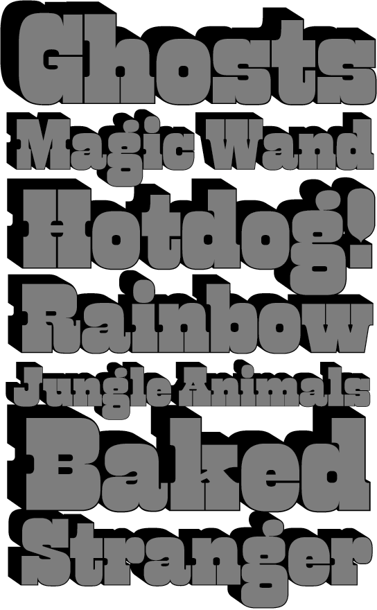
 A subsidiary/part of House Industries in Yorklyn, DE. I quote: Photo-Lettering was a mainstay of the advertising and design industry in New York City from 1936 to 1997. PLINC, as it was affectionately known to art directors, was one of the earliest and most successful type houses to utilize photo technology in the production of commercial typography and lettering. It employed such design luminaries as Ed Benguiat and sold type drawn by the likes of Herb Lubalin, Milton Glaser and Seymour Chwast as well as countless other unsung lettering greats. The company is best known by most of today's graphic designers for its ubiquitous type catalogs. Physically, the collection takes up about 1500 cubic ft (42 cubic meters) of space and consists of film negatives and positives of most of the 6500 fonts produced in the company's 55 years. There are also countless patterns, cartouches, borders and dingbats, all of which have been preserved in film negative form. Each negative is approximately 28 in (71 cm) by 5 in (13 cm) high. House Industries, a Yorklyn, Delaware-based independent type foundry, purchased the entire physical assets of Photo-Lettering in April of 2003. Through a partnership with Ken Barber, Christian Schwartz and Erik van Blokland, House Industries is carefully digitizing select alphabets from the collection and plans to offer them through a modern web-based interface. The Photo-Lettering interface has allowed us to reach beyond the rigid confines of typography to offer extended features such as layering, color control and multiple master interpolation over six axes. With some of the most talented minds in display typography behind this new display lettering system, users of the system will enjoy the same refined typography as the original Photo-Lettering customers.
 A snapshot of their production, as of mid 2012, in alphabetical order: - Atrax. A Mexican simulation typeface.
- Aztec. A videogame typeface.
- Banjo Playbill. A tear drop typeface.
- PL Barclay Outline.
- BenguiatBuffalo. By Ed Benguiat.
- BenguiatCaslon, BenguiatCaslonOutline, BenguiatCaslonPlain. By Ed Benguiat.
- BillSeeWhimsy.
- PL Brazilia (sans).
- Brickhouse.
- PL Britannia.
- Brixen.
- BrodovitchAlbro.
- Bubblegum, Bubblegum Drop.
- Carlyle Eventide. A 3d titling face.
- CarusoRoxy.
- Chicamakomiko.
- CopelandMilo. A connected script by L.H. Copeland.
- CopelandTrilliumFills, CopelandTrilliumOutline. A beveled prismatic typeface by L.H. Copeland.
- DARegatta. A flared didone.
- DAmicoGothic. A casual flared typeface.
- DavisonBaroque. A Western / Tuscan typeface.
- ExotiqueJSplit.
- FederalReserve.
- FederalTwelveDiagonal, FederalTwelveHorizontal. These are engraved copperplate typefaces.
- PL Fiorello (squarish sans).
- Galaxy Didot (based on a didone typeface by C.E. Coryn).
- Goliath. A fat Egyptian typeface with a wood style flavor.
- HanoverBold. A nice Fraktur typeface.
- HaslerCircus. A Tuscan circus font.
- HenrionBA. A beveled typeface with several layers.
- HouseGothicWide. A shaded unicase typeface.
- Housebroken. A two-layer stencil caps face.
- PL Latin.
- Mierop Inline. A bilined art deco typeface.
- Millstein Flourish. A beautiful tall-descender typeface.
- PL Modern Heavy Condensed.
- Neutra Inline, Neutra Thin. Neutra Thin is a phenomenal geometric hairline sans.
- Norton Slapstick. A wood simulation typeface by S.E. Norton.
- Norton Tape. A stencil paper-fold typeface by S.E. Norton.
- Quaint. After an ornamental typeface from 1938 by Paul Carlyle and Guy Oring.
- Quicksilver.
- Quintet. A calligraphic connected script
- Raymund Circus (+Inline, +Outlined).
- Smidgen. A signage face.
- Sodachrome.
- StanSlope.
- SuperstarScript. A bubblegum typeface.
- SwissInterlock.
- SwissTwoTone. A display sans with two layers.
- Tiki Palms.
- TimesSquare. A dot matrix typeface.
- Tuggle. An oil slick typeface.
- Voodoo House.
- PL Westerveldt. A sans revived by Monotype.
- WestBarnumUltra, WestBarnumUltraDrop. A fat Egyptian typeface by Dave West.
- WestBehemoth, WestBehemothItalic. Egyptian typefaces by Dave West.
- WestEmperorScript. A fat didone by Dave West.
- WestThud. A fat signage typeface by Dave West.
- West Elephant. By Dave West.
- West Italiano. A didone by Dave West.
- West Kerpow. A comic book typeface by Dave West, late 1960s. This was digitized in 2011 by Allen Mercer at House Industries as Plinc Kerpow.
- Worthe Numerals. Fat didone numerals revived by Ben Kiel at House Industries in 2012.
[Google]
[More] ⦿
|
Rachel Berninger
|
FontStructor from Wilmington, DE, who made Peephole (2011). She studies graphic design at York College of Pennsylvania. [Google]
[More] ⦿
|
Rachel Campbell
|
Newark, DE-based graphic designer. During her studies at York College of Pennsylvania, Rachel Campbell designed a pixel typeface called Petit Pois (sic) (2013, FontStruct). [Google]
[More] ⦿
|
Randi Meredith
|
Web designer in Delaware. Behance link. She drew an alphabet---not a font---based on lace patterns called Dollies (2010). [Google]
[More] ⦿
|
Ray Cruz
[Cruz Fonts]
|
 [MyFonts]
[More] ⦿
[MyFonts]
[More] ⦿
|
Rich Roat
|
Ronald R. "Rich" Roat (Hockessin, DE, 1965-2017) was the cofounder (with Andy Cruz) of House Industries 1993, a few years after Rich and his partner Andy Cruz met when Rich was running a desktop service bureau and Andy was at a Wilmington ad agency. House Industries is based in Wilmington, Delaware. Obituary. an article entitled Missing Rich Roat. Before House Industries, Rich was the main designer and developer of the font knockoff outfit, Swfte International, which started ca. 1985, was sued by Adobe and four other companies in 1993 for font piracy, and was sold to Expert Software in 1995. [Google]
[MyFonts]
[More] ⦿
|
Tal Leming
[Type Supply]
|
 [MyFonts]
[More] ⦿
[MyFonts]
[More] ⦿
|
Type Supply
[Tal Leming]
|
 Tal Leming is a graphic designer, type designer and letterer who lived in Wilmington, DE, but moved his stakes to Baltimore, MD. He graduated from Louisiana State University in 1997. As a Python scripting guru, he worked with Letterror and House Industries on projects using FontLab and Robofab. An avid RoboFog scripter, he joined Erik van Blokland and Just van Rossum to initiate the RoboFab project in 2003. After graduation in 1997 from the Louisiana State University Graphic Design program, he worked as a designer at two agencies in south Louisiana. In September of 2001, Tal joined the House Industries staff as a designer in the Type Development, Product Promotions and Python Systems Implementation Department. He worked on the Ed Benguiat collection, for example.
 In 2005, he left House and started his own company eventually called Type Supply. Type Supply designs typefaces for corporations and publications. Their typefaces: - Baxter. An informal typeface used as a casual typeface in MyPublisher's BookMaker software. Commissioned by Christian Schwartz.
- Bullet (House). Bullet is based on a bit of lettering drawn by Ken Barber for the House Industries Pop Art package.
- Burbank (2006-2007, House Industries), a bouncy signage, animation, and package lettering family, about which Christian Schwartz writes: Well-drawn one-off display typefaces are easy to find, especially bouncy sans serifs. Complete suites of typefaces in this genre, however, are nearly impossible to find, especially families that are crafted with as much care as Burbank. I really appreciate seeing the attention to detail that usually goes into serious text family put into a family primarily intended for display use.
- House Gothic 23. Tal Leming writes: The family was originally designed by Allen Mercer for use on the company's commissions, most notably the legendary promotions for Custom Papers Group. In 1995, House released the family to the public with modest success, but it was largely relegated to the back of House's catalogs. House went through a bit of a sans serif obsession in the early 2000s and decided that it was time to give House Gothic its time in the spotlight. Rich Roat asked me to polish up House Gothic and make it a bit more usable. I completely reworked Allen's original drawings, making the letterforms work better in headlines, added accented glyphs, reorganized the styles and more. Once that was done, I added completely new Extended and Text styles. The family more than doubled its size into 23 total fonts and was rechristened House Gothic 23.
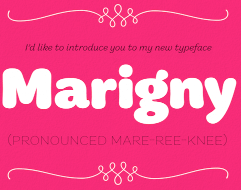
- Marigny (2014). He writes about this pleasant casual roundish typeface: Marigny, designed by Tal Leming, is a casual typeface that was drawn with serious typography in mind. It has the same basic proportions as classical oldstyle typefaces (think of Garamond and friends) and these give it a similar typographic rhythm to one that we have known for several hundred years. The hand-rendered forms transform this familiar texture into something very warm and pleasant. In a way, dipping into a block of text set in Marigny is like putting on your favorite pair of comfortable slippers.
- Mission and Control. An athletic lettering family commissioned by Reebok for their 2008 NFL Sideline and NHL Center Ice collections.
- Ohm (2009). A neon type family.
- Queue and Queue Mono (2021). A sans typeface family.
- Runway (House). Runway is an ode to House's sans serif obsession of the early 2000s.
- Shag Lounge. a signage family: When I was working at House Industries, we decided that we should develop a font kit inspired by the work of Josh "Shag" Agle. Josh hadn't done much lettering work so we asked him to send us samples of lettering that he liked. Many of the things he sent featured whimsical, hand-cut lettering from the 1960s. We were really into this as well, so that formed the starting point for Shag Lounge. The typeface evolved into an amalgamation of a neo-grotesque style sans serif and hand-cut lettering.
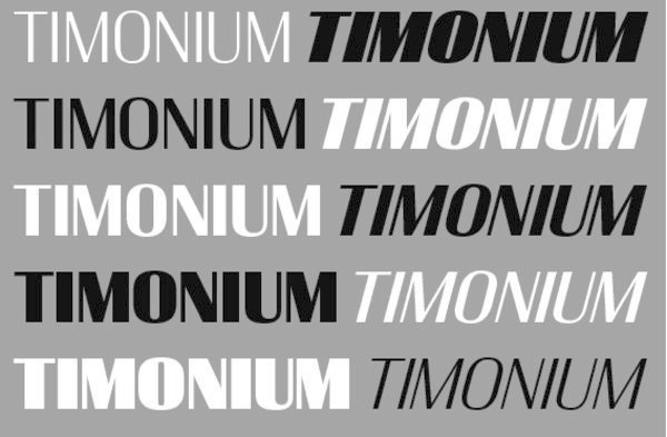
- Timonium (2012) can be bought from Type Supply.
- Torque. An octagonal family with a great inline style. Torque (2009) began its life as an amalgamation of an American athletic lettering style and classic space lettering styles. There were also references to the video games, laser games and 1980s pre-teen sci-fi action movies of my youth.
- United Ark. A military stencil face: Clint Schultz hired me to create a custom version of United for use on props in a Paramount feature film. The main goal of the project was to perfectly match stenciled lettering seen in a film released 27 years earlier. How exciting was it to make a typeface for a sequel to a classic film that I grew up with? Very, very, very, very exciting. This font is not, and will never be, available for relicensing, so please don't ask.
- United. House industries commissioned me to develop the United family as an homage to stereotypical U.S. Military lettering styles. [...] United has become quite popular since its release and it has been seen just about everywhere from NFL coverage on FOX to the New York Times editorial page.
- Balto (2007-2014) is a large American Gothic family.
- In 2016, Tal Leming created 90 Minutes, a typeface that is exclusive licensed to the United States Soccer Federation in perpetuity. He writes: I wanted to introduce some more American typographic and lettering influences. We have a rich history from Morris Fuller Benton's iconic work to the impactful lettering on Works Progress Administration posters to the bluntness of wood type on letterpressed event posters. I wanted to subtly reference these to make the typeface as distinctively American as possible. The typeface her 37 unique styles partitioned over three families, 90 Minutes Display, 90 Minutes Kit (a set of styles developed exclusively for use on uniforms, taking into account FIFA regulations), and 90 Minutes Text (drawn specifically for use in small sizes, paragraphs and tables of statistics).
- Stoneleigh. A fashion mag Caslon revival done for Martha Stewart Living. Stoneleigh is licensed exclusively to Martha Stewart Living through October 2019.
- Smoosh (2015-2020). A super-compressed high-contrast typeface with thorny serifs designed to work in very big sizes.
- Iota (2021). A geometric sans family that he made only because of his fear of not being innovative. And not because every other foundry is making its own geometric sans. But he could not resist throwing in some distractions that make Iota a geometric with a tantrum.
- Epoxy (2022). An experimental sans with odd shapes.
At ATypI 2008 in St. Petersburg, his talk (shared with Ken Barber) was entitled Pac-Man fever, quantum mechanics and the design of digital type. Tal Leming's personal web site. Village link. Author of Letters. [Google]
[MyFonts]
[More] ⦿
|
Typography Workshop
|
Interesting pages at the University of Delaware on letterspacing and other typographic matters. [Google]
[More] ⦿
|
