| | |
Aaron Scamihorn
|
 Aka Ron Lewhorn, a graphic designer, typographer and photographer in Indianapolis. Behance link. Creator of a piecewise linear octagonal counterless fat face, CockBlock (2009). [Google]
[More] ⦿
Aka Ron Lewhorn, a graphic designer, typographer and photographer in Indianapolis. Behance link. Creator of a piecewise linear octagonal counterless fat face, CockBlock (2009). [Google]
[More] ⦿
|
About fonts (Indiana U)
|
Intro to fonts for students. [Google]
[More] ⦿
|
Alyssa Marie Stetson
|
Carmel, IN-based designer of the modular typeface Alyssa Sans (2015). Behance link. [Google]
[More] ⦿
|
American Applied Arts
|
Indianapolis-based group which made or owned the font BigEd-Sr (1994). [Google]
[More] ⦿
|
American Greetings Corporation
[Courtney Kent Rhodes]
|
In 1996, the American Greetings Corporation company issued a number of mostly script and blackletter fonts, whose names all start with CAC. These can now be found on many font archives. A partial list: CACCamelot, CACChampagne, CACFuturaCasual, CACFuturaCasualBold, CACFuturaCasualBoldItalic, CACFuturaCasualMedItalic, CACKrazyLegs, CACKrazyLegsBold, CACLaskoCondensed, CACLaskoEvenWeight, CACLeslie, CACLogoAlternate, CACMoose, CACNormHeavy, CACOneSeventy, CACPinafore, CACSaxonBold, CACShishoniBrush, CACValiant, Care-Bear-Family, ShishoniBrush. Founded in 1906 and based in Cleveland, American Greetings Corporation no longer develops or sells fonts. Some web sites report that AGC, in cooperation with AGI, published these fonts in 2011: Erin B Regular, Handwriting, Hucklebuc, Lady Script, Lasko Medium, Lovebirds, Milli, Moonstruck, Otto Matic Sans Regular, Pigpen Two Plain, Sage Script Regular, Wild Bill Bold. Six of the CAC fonts were designed and produced by graphic designer and Vietnam veteran Courtney Kent Rhodes (b. 1949, Rochester, IN) from Westlake, OH, who worked for AGC from 1988 until 2003. He is a graduate of Indiana University, class of 1977, and is principal of Courtney Rhodes Design since 1980. Dafont link [removed]. Archive of most of the CAC fonts. [Google]
[More] ⦿
|
American Type Corporation
|
Small foundry in Greenfield, IN, operating in the mid 1990s. Production includes Hey Stupid (by Edwin Utermohlen), Cyberotica (1994, a liquid typeface by Barry Deck), and Hermes. Brian Horner made the grunge typefaces Treat Type, Mega, Mego, and Unicronica, the rounded typeface Bubba, and the monoline sans typeface Urchin, all in 1995 and 1996. [Google]
[More] ⦿
|
Anastassia Zukova
|
Based in Insdianapolis, IN, Anastassia Zukova created the bold modular typeface Indiana (2014). Behance link. [Google]
[More] ⦿
|
Andrew Markle
[Andrews&Halsted Typeworks (or: Halsted Typeworks)]
|
[More] ⦿
|
Andrew Weber
|
Andrew Weber (Azzurro 360) is the designer of Andrew's Handwriting (2007, handwriting). Born in 1987, he lives in Indiana and Ohio. [Google]
[More] ⦿
|
Andrews&Halsted Typeworks (or: Halsted Typeworks)
[Andrew Markle]
|
Indianapolis, IN-based Andrew Markle (Andrews&Halsted Typeworks) designed the sans typeface A&H Hadley (2010). Other commercial typefaces include A&H Bern Sans CT (2010), A&H Hadley Inconsolata MT (2010), A&H Hadley ExtraBold (2010), A&H Hadley Bold (2010), A&H Stella (sans), A&H Kerrigan Light, and A&H Kerrigan Book. Graphicriver link, where we learn that Halsted Typeworks is located in Evanston, IL. There we also find the 2011 typefaces Indianapolis Slab Serif, Madeleine, Payton, Addison, Gabriel Script, A&H Bjorn, A&H Teagan Script, A&H Taidghin Sans, A&H Alexander (+Sans, +Sans Light, +Serif, +SerifBold, +SerifLight), A&H Stella, AH Ansleigh, AH Greyson, A&H Parker (+Light), and &A&H Celeste. [Google]
[More] ⦿
|
Anna Oakes
|
As a student at Ball State University in 2016, Muncie, IN-based Anna Oakes designed the grungy stencil typeface AWOL. Behance link. [Google]
[More] ⦿
|
Art and Fonts by Sean (aka The BlackBox)
[Sean Moldenhauer]
|
Free fonts by Sean Moldenhauer of Michigan City, Indiana, a graduate of the Art institute of Chicago who apprenticed with Donna Karen. Sean has beautiful Japanese calligraphic prints (shodo style) as well as fonts based on carefully researched historical typefaces. Examples: JapaneseZenSampler1 (2001), TheTombwinterandspring1 (1997, "heavily inspired by the incised letters from the tomb of Henry III, Westminster Abbey, about 1272"), Thorns (1997), VampyresGarden (1997, initial caps inspired by a copy of the Romant de la Rose from the beginning of the 16th century), HoursintheRain (1997), SevenWavessighsSalome (1997, caps). Very nice gothic and medieval style creations. He showcases great Arab, Japanese and Chinese calligraphy. [Google]
[More] ⦿
|
Autumn Gochenaur
|
Graphic designer in Shipshewana, IN, who created the didone typeface Klassy in 2015. [Google]
[More] ⦿
|
Bassa font
|
Free font Bassa by the Bassa Vah Association, 1998, at Varnie Karmo's home page. Bassa is used in Liberia. [Google]
[More] ⦿
|
Bihidryed -- BT's font design page
[Brandon Thomas]
|
Bihidryed is a small truetype (mainly grunge) font archive. It also carries Brandon Thomas's own grunge (freeware/shareware) creations such as Malcontent, Speartooth, BongBlastedAliens and BongBlastedAliensDay7. Brandon lives in Indianapolis. [Google]
[More] ⦿
|
Bob Ostrander
[Fonts Ink]
|
[More] ⦿
|
Brandon Thomas
[Bihidryed -- BT's font design page]
|
[More] ⦿
|
Brian Horner
|
Indianapolis-based graphic designer. Creator of the grunge typefaces Mego (1996), Unicronica (1996), Personnage (1996), Treat Type (1995), and Mega (1995) at American Type Corp. Home page. Other typefaces include Bubba (1995, rounded comic book style), Holocausthaton (grunge), Orphan (grunge), Urchin (1996, monoline geometric sans), Message Board, Soy (grunge) and Thrift. Maboroshi (2010) is a hand-drawn typeface. Jumble Jumble was done in 2009. Pictorial catalog. [Google]
[More] ⦿
|
Bruce Rogers

|
 Albert Bruce Rogers was a celebrated American type and book designer (b. 1870, Linnwood, IN, d. 1957, New Fairfield, CT). A graduate from Purdue in 1890, he worked in book design. It was not until 1901 that he cut his first typeface, Montaigne, a Venetian style typeface named for the first book it appeared in, a 1903 limited edition of The Essays of Montaigne. In 1912, Rogers moved to New York City where he worked both as an independent designer and as house designer for the Metropolitan Museum of Art. It was for the Museum's 1915 limited edition of Maurice de Guérin's The Centaur that he designed his most famous type-face, Centaur (1914). Like Montaigne, it was based on the Venetian typefaces of Nicolas Jenson. Wikipedia: Rogers considered this typeface to be a substantial improvement on his early Montaigne, both because his design had matured and because, on the advice of Frederic Goudy, he had employed Robert Wiebking as the punch-cutter, and Rogers used Centaur extensively for the rest of his career. The Centaur was produced by Rogers in Dyke Mill at Carl Rollins' Montague Press and is now one of the most collectible books ever printed.
 In subsequent years, he designed books for Mount Vernon Press, and Harvard University Press, and served as typographic advisor at Lanston Monotype. To produce the Oxford Lectern Bible for Oxford University Press, an italic complement to Centaur was needed. Wikipedia: As he did not feel capable of designing the sort of chancery typeface that he thought appropriate, Rogers chose to pair Centaur with Frederic Warde's Arrighi, a pairing retained to this day. Rogers died in New Fairfield, CT, and donated his books and papers to Purdue University, where they are in the Beinecke Rare Book and manuscript Library. His typefaces: - Montaigne (1901, privately cast). Punches cut by John Cumming. Mac McGrew: Montaigne was designed by Bruce Rogers in 1901, and privately cast for the Riverside Press in Cambridge, Massachusetts. It was derived from one page printed in the noted type of Nicolas Jenson, and made in one size only, approximately 16-point, with punches cut by John Cumming of Worcester. Massachusetts. Compare Jenson, Cloister, Centaur, Eusebius.
- Centaur (original) (1914). Development continued until 1931. Privately cast by Barnhart Brothers&Spindler. Matrices cut by Robert Wiebking of the Western Type Foundry. Centaur is a modern version of Nicolas Jenson's Venetian typeface Centaur. There are many digital age descendants of Centaur. Bitstream got that ball rolling with Venetian 301 (Cyrillic version by Dmitry Kirsanov, Paratype, 2006), and SoftMaker has its Cambridge Serial (2010). Type families called Centaur exist at Adobe, Monotype and Linotype. Related typefaces, but without Centaur's flaring, include Phinney Jenson (Tom Wallace) and Nicolas Jenson SG (Spiece Graphics). See also Centurion, Centus (URW), Coelacanth (2014, a free 36-style typeface family by Ben Whitmore), and Arrighi Italic .
- Centaur (Monotype) (1929, Monotype Ltd. and Mackenzie&Harris). Matrices re-cut for machine composition by British Monotype. Further developments based on or related to this typeface: LTC Metropolitan (Lanston; with Frederick Warde; also called Metroplitan Oldstyle; digital version by Lanston/P22), Poster (1918-1919), Goudy Bible (1947, designed with the collaboration of Sol Hess for Lanston Monotype). Mac McGrew: Centaur was designed by Bruce Rogers in 1914, based on the beautiful roman type first used by Nicolas Jenson in 1470, and a refinement of Mon- taigne (q.v.), designed a decade earlier by Rogers. Centaur was first cut by Robert Wiebking of BB&S as a private type for the Museum Press of the Metropolitan Museum of New York. In 1929 it was recut under the joint sponsorship of Lanston Monotype and Monotype Corporation, England, but issued only by the latter. Some critics have called it the best recutting of the Jenson letter. Arrighi (q.v.) was cut as an italic companion to Centaur. Compare Cloister, Eusebius, Italian Old Style, also Jenson. Discussion of Centaur by Don Hosek. About Centaur Monotype (1929), and its digital version, Dean Allen writes: Like Bembo, released for the Monotype machine the same year, Centaur was an exceptionally beautiful and eminently readable revival of Renaissance type. Unfortunately, the producers of the digital version made a common mistake: the shapes are based on the most basic starting point of Bruce Rogers designs. These designs were intended for metal type that would press into paper, the ink spreading as it absorbed into the fibre. The resulting printed shapes had a good deal more visual force than the original designs. The process was total: design anticipating application. This version of Centaur suffers from the perfection of the process of digital design and offset printing: the original shape is printed coldly intact, and thus its very difficult to set a well-made page in Centaur. In 2014, Jerry Kelly and Misha Beletsky coauthored The Noblest Roman (RIT Cary Graphic Ars Press) on the history of Centaur types by Bruce Rogers. The blurb: The history of the Centaur type, likely the most important American typefeace ever designed, has been recounted untold times in very general terms, following the official version of events, purported by its designer in several publications. Yet, as the new research by Jerry Kelly and Misha Beletsky shows, there is a number of gray areas to the story. The new data, culled from archival documents, some unpublished, as well as from a variety of published sources presents this important design and its history in a new light.
- LTC Fleurons Rogers (2005, P22 / Lanston) is a digital font based on fleurons drawn by Rogers.
Linotype link. FontShop link. Klingspor link. [Google]
[MyFonts]
[More] ⦿
|
Cassandra Marie Boler
|
Indianapolis-based designer of the avant-garde typeface Ooops (2011). [Google]
[More] ⦿
|
Charis Rountree
|
Highland, IN-based designer of the brush script typeface Moonbeam Script (2017). Creative Market link. [Google]
[More] ⦿
|
Christofer Goodwin
|
Indianapolis, IN-based freelance designer. In 2012, Christofer created the Favicon Font. Behance link. [Google]
[More] ⦿
|
Claire Daisey
|
Claire Daisey (Muncie, IN) created the experimental typeface Sharp Edge (2013) that plays with negative spaces. [Google]
[More] ⦿
|
Conrad X. Shinn
|
 Aka Cobb Shinn (b. 1887, Fillmore, IN, d. 1951). His story is told by Jeff Levine, who designed a series of cartoon character dingbat fonts inspired by Cobb shinn: Conrad X. "Cobb" Shinn (Sept. 4, 1887- Jan. 28, 1951) was a Fillmore, Indiana-born post card illustrator who sold a series of successful novelty postcard lines which included (among others) Charlie Chaplin, automobiles and the Dutch culture in the beginning years of the 20th Century. After serving in World War I, Shinn found the market for novelty postcards dwindling, and he also lent his artistic skills to cartoon features and illustrating many children's books [including his own, under the nickname Uncle Cobb] which taught easy step-by-step drawing methods. Some time in the 1920s, he eventually migrated into the field of supplying electrotypes and stereotypes of stock cuts of photos and line art to the printing trade. In the days of letterpress printing, this was the forerunner of paper clip art and its successor, electronic clip art. Purchasing many of his designs from journeyman artists of the time, the diversity of Cobb Shinn's stock cuts library grew with the passing years, reflecting changing times, styles and topics. Some of the illustrators whose signed works were presented in Shinn's CUTalogs [as he called his stock cuts catalogs] include Mary Clemmitt, Louis H. Hippe, E.C. Klinge, Nelson White, Harvey Fuller, Bess Livings, Lois Head, Harvey Peake and Van Tuyl. Upon his passing in 1951, it's not known how long the Indianapolis-based company existed before finally closing its doors. One of the more popular series of cartoons were the line illustrations of men and women affectionately called little big head guys by many modern fans of these cuts because the heads of the characters were drawn somewhat larger than the rest of their bodies. Levine's font that shows these charming charcaters is Shinn Kickers JNL (2014). [Google]
[More] ⦿
Aka Cobb Shinn (b. 1887, Fillmore, IN, d. 1951). His story is told by Jeff Levine, who designed a series of cartoon character dingbat fonts inspired by Cobb shinn: Conrad X. "Cobb" Shinn (Sept. 4, 1887- Jan. 28, 1951) was a Fillmore, Indiana-born post card illustrator who sold a series of successful novelty postcard lines which included (among others) Charlie Chaplin, automobiles and the Dutch culture in the beginning years of the 20th Century. After serving in World War I, Shinn found the market for novelty postcards dwindling, and he also lent his artistic skills to cartoon features and illustrating many children's books [including his own, under the nickname Uncle Cobb] which taught easy step-by-step drawing methods. Some time in the 1920s, he eventually migrated into the field of supplying electrotypes and stereotypes of stock cuts of photos and line art to the printing trade. In the days of letterpress printing, this was the forerunner of paper clip art and its successor, electronic clip art. Purchasing many of his designs from journeyman artists of the time, the diversity of Cobb Shinn's stock cuts library grew with the passing years, reflecting changing times, styles and topics. Some of the illustrators whose signed works were presented in Shinn's CUTalogs [as he called his stock cuts catalogs] include Mary Clemmitt, Louis H. Hippe, E.C. Klinge, Nelson White, Harvey Fuller, Bess Livings, Lois Head, Harvey Peake and Van Tuyl. Upon his passing in 1951, it's not known how long the Indianapolis-based company existed before finally closing its doors. One of the more popular series of cartoons were the line illustrations of men and women affectionately called little big head guys by many modern fans of these cuts because the heads of the characters were drawn somewhat larger than the rest of their bodies. Levine's font that shows these charming charcaters is Shinn Kickers JNL (2014). [Google]
[More] ⦿
|
Courtney Kent Rhodes
[American Greetings Corporation]
|
[More] ⦿
|
Dennis Y. Ichiyama
|
Professor Dennis Y. Ichiyama teaches in the School of Visual&Performing Arts at Purdue University in West Lafayette, Indiana. From 2000 until 2010, he researched wood type. His current research is on American wood type manufacturer Wm Page and Chromatic Wood Type. Speaker at ATypI 2010 in Dublin. He was involved in the making of the documentary about wood type simply called Typeface---for example, he designed a poster for it. [Google]
[More] ⦿
|
Devon Mikolajczak
|
Graphic designer currently working one her Bachelor's at the Art Institute of Indianapolis. Behance link. At school, she designed a thin smooth monoline face in 2011. [Google]
[More] ⦿
|
Elle Hey
|
Fort Wayne, IN-based designer of a circle-based typeface in 2015. Behance link. [Google]
[More] ⦿
|
Elyse Van Fleet
|
Graphic designer in Muncie, IN, who spent some time in Australia. Her typeface Kings Cross (2010) was based on the King's Cross neighborhood on Sydney, Australia. It reflects the train line, the odd shape of the streets, and the destinations of the area. Behance link. Home page. [Google]
[More] ⦿
|
Emilee Burnett
|
Goshen, IN-based designer of the handcrafted typeface Swoop (2016). [Google]
[More] ⦿
|
ENLIVEN design
[Todd Michael Bushman]
|
From Bloomington, IN, Todd Michael Bushman's shareware fonts: Misfit, Element, Cipher, Nigma, 20/20. Dafont link. [Google]
[More] ⦿
|
Erin Snodgrass
|
Jeffersonville, IN-based creator of Sweater Weather (2014), a cross stitch emulation typeface. This typeface was developed during her studies at Indiana University. Other work includes a hipsterized version of Century Gothic (2014). [Google]
[More] ⦿
|
Fonts Ink
[Bob Ostrander]
|
Free Madison Avenue font by Bob Ostrander of Fonts Ink (1992). Page by Cristina Kruse. Fonts Ink's fonts: FIBoxBB, FIKey1, FIKey2 (keyboard fonts, 1992), Madison-Avenue, US-Bats. Alternate site. Elite (1992-1993) is also due to Ostrander. [Google]
[More] ⦿
|
Gabriel Beatty
[Wolf's Rain]
|
[More] ⦿
|
Gary McGraw
[Letter Spirit]
|
[More] ⦿
|
Gatis Cirulis
[RAWTYPE]
|
[More] ⦿
|
Good Craft Supply Co
[Jared Shofner]
|
Art director in Anderson, IN, involved in branding and lettering. As Good Craft Supply, he designed the vintage display sans typeface Copper Etched (2016) and the letterpress emulation typeface Historical Press (2016). Creative Market link. [Google]
[More] ⦿
|
Gregorian Chant home page
|
Music Department at Princeton: instructions on where to get fonts for Gregorian chants. The Gregorian Chant Font (Mac, PC): StMeinrad and its auxiliary, StMeinradAux, contain the symbols necessary to reproduce Gregorian chant. About 40USD. All is run by St. Meinrad Archabbey, St. Meinrad, IN. [Google]
[More] ⦿
|
GreyWolf WebWorks (was DarkSide Productions)
[Rich Gast]
|
 Now also known as GW3. Original TrueType fonts by Rich Gast from West Lafayette, IN: Abduction, AbductionCyr, AngieBareFoot, AngieGroovin, AngieImpressing, AngiePierced, AngieTanLines, BigTenMania, BlackWolf, BoilermakerSpecial (dingbats by email: 8 Purdue and Big Ten logos), BrocaineDecade (grunge), CannabisSativa (3 cannabis leaves), ChainLetter, DrawnandQuartered (stencil font), EchoDeco (vertically striped art deco face), ExpletiveDeleted, Frazzed, GravitySucks, GreyWolf, GroundZero, Hypmotizin, Kingbats43 (dingbat font with 6 Richard Petty related pics), KissTheSky, LeeBeeSchwarz (1998, Fraktur font), LoisAnn (elegant!), LongCoolGrandma, LongCoolMother, LongCoolWoman, LongCoolWoman8338, Makisupa, MystikOrbs, PepRally, PheanisWickey, PlatinumHubCaps (Western font), PlatinumHubCapsPolished, PlatinumHubCapsSolid, PlatinumHubCapsSpoked, PointedlyMad, PointedlyMadSmallCaps, ShadowTag, ShineOn, SpitShine, StixnStonz, SwedieCruel, Verticalization, WhiteWolf, XactoBlade (a futuristic stencil font), ZZZTop, ChristmasLightsIndoor, ChristmasLightsOutdoor, Demonized, Dusharnbi (Sinhala), FuturexVoyager, Primo, PrimoBright, SpitShine, Suncatcher, SuncatcherFill, TouristTrap, EagleGTII (1999), YouRookMarbelous, Molly Rose.
 Dafont link. Fontspace link. [Google]
[More] ⦿
|
Hallie Craven
|
During her graphic design studies in Bloomington, IN, Hallie Craven created Spacey (2015). [Google]
[More] ⦿
|
Harry Hagan
[St. Meinrad Fonts]
|
[More] ⦿
|
Houkama Design
[Mark Carter]
|
Mark Carter (Houkama Design) (b. 1985) is the Indiana-based designer of the scratchy handwriting typeface HXC (2004). Alternate URL. [Google]
[More] ⦿
|
Ian Bartlett
|
Bloomington, IN-based designer of the straight-edged oriental simulation typeface Chinatown (2016). [Google]
[More] ⦿
|
Ingrimayne Type (was: The Bovine Rebellion)
[Robert Schenk]
|
 Ingrimayne Type was established in 1988 by Robert Schenk to sell his fonts via the web and via CDs such as the No-Hype Type CD (2500 typefaces in trueType and PostScript, with mostly original typefaces). Robert Schenk (b. 1946, Minnesota) lives in Rensselaer, IN. Before Ingrimayne, Schenk's type was distributed by Wayzata Technology. Free fonts at his site included Red Letter, Zirkle, Sallonext, Zarrow, Serpent.
 Specimen book. Alternate URL. Dingbat fonts: XPhyngern (1990, pointing fingers), XPointedDesert and XSimpleHands (1994, more fists), Schneeflaken (two snow fonts, now available as XSchneeFlaken), ComputerBugz (nice butterflies, now available as XCompuTerBuggz), Galaxies (around the theme of the sun and stars), GlitzyFlash (1990), Grandecort (1994), LeakOrLeach (1995), Baumfuss (1990), LeafMeAlone (leaves), StarsAndStripes, StarPieces, Fingers, SimpleHands, PointedDesert, IngyDing (1996, 3 dingbat fonts in the style of Zapf Dingbats; in 2010 overhauled into one 1400-ornament monster face, Ingy Ding MCD, containing smilies, arrows, Zapfian ornaments, dice, chess pieces, fists, weather dingbats, and so forth), IngyDingLeftovers. A list of fonts: - A: Aabced-Bold-Italic, Aabced-Bold, Aabced-Italic, Aabced-Regular, Aabced, AabcedBold, AabcedBoldItalic, AabcedExtraBold, AabcedItalic, AabcedRoman, AabcedXBold-Bold, AabcedXBold, Abagail-Regular, AbagailJackson, AccruedInterest, AcornSwash-Regular, AcornSwash, AcornSwashAltern-Regular, AcornSwashAltern, AcornSwashRoman, Accrued Interest, Albert Betenbuch (blackletter), AlbertBetenbuchExtrude, AllSmiles, AmericanMorseCodeIT, AnarckWarp, Anarckhie, AnarckhieBold, AnarckhieBoldItalic, AnarckhieDecayed, AnarckhieItalic, AnarckhieJiggled, AnarckhieRagged, AnarckhieShadow, AndrewAndreasBold, AndrewAndreasPlain, AndrewAndreasXBold, Andrew Andy College (athletic lettering), AndrewAndyStencil, AndrewAndyStencilBold, AndyEight, AntsyPantsy, ArgentBobSquish, Argenta, ArgentaBobbWig, ArgentaBobbed, ArgentaBold, ArgentabObbed, Asterx-Regular, Asterx, Auldroon-Regular, Auldroon (blackletter), AndrewAndyKactus, AntsyPantsy.
- B: Baker Half (2004, an experimental hexagonally designed family), Balboat-Regular, BalboatBold, BalboatPlain, Bannetters (2021: letters for tilted banners), Barefoot, BaumSquiggle, Baumfuss-Regular, Baumfuss, BaumfussTwo-Regular, BaumfussTwo, Bear Anark (2021: a 10-style slab serif), BearButteTBold, BearButteTBoldItalic, BearButteTItalic, BearButteTPlain, BearButteTSpecial, BeastlyFont, Bene, BeneCryptExtrude, BeneCryptine-Regular, BeneCryptine (blackletter), BeneCryptineDistorted, BeneScriptine-Regular, BeneScriptine (blackletter), BetterEuroika, BetterEuroikaBold, BetterEuroikaBoldItalic, BetterEuroikaHybrid, BetterEuroikaHybridBold, BetterEuroikaItalic, BetterIngriana, BetterIngrianaBold, BetterIngrianaBoldItalic, BetterIngrianaHybrid, BetterIngrianaHybridBold, BetterIngrianaItalic, BetterKamp, BetterKampBold, BetterKampBoldItalic, BetterKampItalic, BetterTypeRightBold, BetterTypeRightBoldItalic, BetterTypeRightItalic, BetterTypeRightMedium, BetterTypeRightPlain, BetterTypeRightThin, BetterTypeRightThinItalic, BetterTypeRiteSpec, BetterTypeRiteSpecBold, Big-Regular, BigBottom, Big Stripes Mono (2021), Bigtop-Regular, Bigtop, Bilevel, Billowed (2022), BiteOfApple, Bizaro, BizaroRES, Blockboys, Bluster Left, BobsExtraPictures, BobsStandardChess, Bouncer (2019), Bowling, Bright Ideas (2020: lightbulb alphadings), BringInTheFrowns, Brrrrr-Regular, Brrrrr, BuggyFont, BumberShoot.
- C: Caltic (2020), CemeteryWalk (2018), Cennerik-Bold, Cennerik-Regular, Cennerik, CennerikBold, CennerikEBold, CennerikExtraBold, CennerikPlain, CennerikSpiked, CennerikXBold-Bold, ChainLetterOne, ChainLetterTwo, CheckMateRES, ChessNut, ChessNutTwo, Chessterton, ChesstertonTwo, Circlet, Ckornoments (2020), Close Together (2020), CoffeeMug, Coffinated (2020: letters boxed into coffins), CompassOne, CompuTerBuggz, ConcavWarp, ConcavexCaps, ConcavexCapsWave, ConcavexStepper, CoughingNails, Court-Regular, CourtGesture, CourtJesterFrizzy, CrippledFont, CuthbMangle, CuthbeNick, Cuthbert.
- D: DavidBurry, DavidFarewell, DavidFarewellBold, David Farewell Stencil, Dear John, Demotte-Bold, Demotte-Regular, Demotte, DemotteBold, DemotteWarp, Dinner-Regular, Dinner, DinoTracks (2021), Dottie, DrivEddie, Dschoyphul.
- E: EdsDream, EdwardEdwinBold, EdwardEdwinPlain (1994, copperplate script), Eggad (2020), Eldroon, Erkball, ErkballBold, Euroika-Bold-Italic, Euroika-Bold, Euroika-Italic, Euroika-Regular, EuroikaBold, EuroikaBoldItalic, EuroikaItalic, EuroikaKamp, EuroikaKampBold, EuroikaKampBoldItalic, EuroikaKampItalic, EuroikaRoman, Euroika, Eyebel, EyebelBold, EyebelRuff.
- F: FabFours (2015, patterned typeface), Fangs ALot (2022), FansiPensle (1990, connected signage script), FansiPensleBold, FansiPenslePlain, FansiPensleTwo, FansiPensleTwoBold (1990), FansiPensleTwoPlain, Febdrei, FebdreiBold, Federhozen-Bold-Italic, Federhozen-Italic, Federhozen-Regular, Federhozen, FederhozenBold, FederhozenBoldItalic, FederhozenItalic, FederhozenPlain, FeggoliteDancing, FeggoliteDancingItalic, FeggoliteHatched, FeggoliteKeyed, FeggoliteMonoBold, FeggoliteMonoPlain, FeggoliteRuffled, Fezdaz, Fishhook, FiveOhOne, FiveOhTwo, FlagDayFour, FlagDayOne, FlagDayThree, FlagDayTwo, Fly High, FlyHighBold, FlyHighBoldItalic, FlyHighItalic, ForTheBirds, FourJuly, FourJulyG, FourJulyH, Framo-Regular.
- G: GLitzy, GLitzyBarbed, GLitzyPlain-Regular, GLitzyStripe, GLitzyVStriped, Galexica-Bold-Italic, Galexica-Bold, Galexica-Italic, Galexica-Regular, Galexica, GalexicaBold, GalexicaBoldItalic, GalexicaExtraBold, GalexicaItalic, GalexicaMono-Bold, GalexicaMono-Regular, GalexicaMono, GalexicaMonoBold, GalexicaMonoPlain, GalexicaPlain, GalexicaXBold-Bold, GlitzyCurl-Regular, GlitzyCurl, GlitzyFlash-Regular, GlitzyFlash, GlitzyJewel-Regular, GlitzyJewel, Gothamburg (blackletter), GothamburgBold, GothamburgShadowed, GothicHorror, GothicRock, GranCanaries, GrancMitSripes, GrandecortBold, GrandecortHoly, GrandecortMedium, GrandecortShadow, GretchenHelloBold, GretchenHelloPlain, Grundee.
- H: Hammered, HandanaBold, HandanaPlain, HandmadeFont, HeartMatrixed, Hermainita, HermainitaBold, HermainitaPlain, Hexonu (2020: hexagonal), HeyPumkin, HippityDippityBold, HippityDippityInline, HippityDippityPlain.
- I: IanSegoe, IggoliteMono, IngBurried, IngDingLeftover, Ingone, IngoneSaw, IngoneShadow, IngrianEuroikHybrid, IngrianEuroikHybridBold, IngrianEuroikaH, IngrianEuroikaHBold, IngrianEuroikaHBoldItalic, IngrianEuroikaHItalic, Ingriana, IngrianaBold, IngrianaBoldItalic, IngrianaCasual, IngrianaCasualBold, IngrianaCasualBoldItalic, IngrianaCasualItalic, IngrianaCasualPlain, IngrianaExtraBold, IngrianaItalic, IngrianaPlain, IngyArrows, IngyArrowsTwo, IngyDingThree, IngyDings, Ingy Star Tilings (2019), InsideLetters, InternationalMorseCodeIT, IrritationOne, IrritationTwo.
- J: JabcedHy, JabcedHyBold, JabcedHyBoldItalic, JabcedHyItalic, JasperSqueeze, JasperSqueezeBold, JasperSqueezeBoldItalic, JasperSqueezeEB, JasperSqueezeEBItalic, JasperSqueezeItalic, JenneriCurved, Jennerik, JennerikBold, JennerikExtraBold, JennerikInfml-Bold, JennerikInfml, JennerikInfmlBold, JennerikInfmlExtraBold, JennerikInfmlPlain, JennerikInfmlXBold, JennerikRoman, Jester, JesterRES (Tuscan), JesterTwo (Tuscan), Jestres, JetJanBoldItalicGray, the Jet Jane family [JetJaneButton, JetJaneMonoBold, JetJaneMonoBoldItalic, JetJaneMonoCapsBold, JetJaneMonoCapsPlain, JetJaneMonoCapsThin, JetJaneMonoItalic, JetJaneMonoPlain, JetJaneMonoThinBook, JetJaneMonoThinItalic].
- K: KampFriendshipBold, KampFriendshipBoldItalic, KampFriendshipItalic, KampFriendshipPlain, KampIngrianaH, KampIngrianaHBold, KampIngrianaHBoldItalic, KampIngrianaHItalic, KampIngrianaHybrid, KampIngrianaHybridBold, KampRipple, Karlisbad, KiddyChessFont, KlipJoint, Knaudens-Regular, Knaudens, Kneebls, KneeblsBold, KneeblsExtruded, KneeblsPlain, KneeblsRuffled, KneeblsThin, KnewFont, KnewFontBold, KnewFontJagged, KnewFontPlain, KnewFontWaisted, KnewFontWaistedBold, KnightMares, KolSpotted, KolStriped, KolkFizzy, Kolkman-Bold, KolkmanDimly, KolkmanGray, KolkmanShatter, KolkmanStriped, Kwalett (2020), Kwersity, KwersityBold, KwersityWider, KwersityWiderBold, Kwodsity, KyhotaBarbed, KyhotaOne, KyhotaTwo.
- L: LaserTrain, LaserTrainBold, LastBigFling, LastBigFlingBold, LastMinuteChess, Laudens, LeakorLeach, LeakorLeachLeft, LeefMeAlone, LeefMeAloneHoles, LeekorLeech, Lentzers (2020), Letrinth, LetterTrain-Regular, LetterTrain, LetterTrainBold, LetterTrainBoldItalic, LetterTrainItalic, LetterTrainPlain, Lettergical (1994, blackletter with Lombardic capitals), LettergicalWave, LetunicalBold, LetunicalInline, LetunicalNormal, LetunicalShadow, LetunicalWarp, Library-Italic, Library-Regular, Life After College (2008, athletic lettering family), LineDrive, LineDriveBold, LineDriveOutlined, LineDrivePlain, LineDriveShadow, Lopsickles (a Hobo-style top-heavy font) (2021).
- M: MITuscan, MMCheckered, MMDrawings, MMPattern, Mangaled, Masheen (1990, octagonal font), MasheenBold, MasheenConvicted, MasheenFlag, MasheenIIID, MasheenOutlined, MatthewTwo, MattsFastFont, MedicineShelf, MedievalGunslinger, MedievalGunslingerShadow, Metavoria (2021: playful), Minimalist-Regular, Minimalist, Minniesoda, MinniesodaBold, Modsten-Bold, Modsten-Regular, Modsten (stencil, 1990), ModstenBold, ModstenRoman, MoreTexture, MousyFont, MushmellowBold, MushmellowCactus, MushmellowOutline, MushmellowPlain, MuskitosCaps, MuskitosCapsShadDown, Myhota, MyhotaBarbed, MyhotaBold, MyhotaHatched, MyhotaHatchedBold, MyhotaPlain, MyhotaWithSpikes.
- N: NailsNStaples, NairobiNormal, NeedALilly, NerdishHex, NerdishHexBold, Neu Altisch (blackletter), NeuAltischBold, NeuAltischGray, NeuAltischPlain, NeuAltischShadLeft, NeuAltischShadow, NeuAltischWormEaten, NeuropolMedium, NewLaudens, NewLibrary, NewLibraryItalic, NewNerdShadowed, NewNerdishBold, NewNerdishPlain, NewNerdishThin, NoPainRight, NoPainRightBold, NopainLeft, NopainLeftBold.
- O: OakParkAve, OakParkAvePlain, OakParkBlvdPlain, OakParkExtruded, OakParkSpeckled, OakParkSquaRe, OakParkZiggy, OakParksTripped, Old Harold Ree (1992, a modification of PhederFract, which was a calligraphic fraktur typeface also by Schenk), OldHaroldReeBold, OldHaroldReePlain, Onyon (1997).
- P: PastedWarp, PattyDay, PawnShop, Pedestrian, PencilFat, PencilIn, PencilOut, PensleCaligraf-Bold, PensleCaligraf-Regular, PensleCaligraf, PensleCaligrafBold, PensleCaligrafPlain, PeterPierreBold, PeterPierreCondensed, PeterPierrePlain, PeterPierreXBold, Pheder Frack (blackletter), PhederFrackBold, PhederFrackDtsh, PhederFrackDtshBold, PhederFrackDtshThin, PhederFrackPlain, PhederFrackShadowed, PhederFrackThin, PhrackCack, PhrackSle, PhrackSleBold, PhrackSlePlain, Phraxtured (blackletter), PhraxturedDeutsch, PhraxturedPlain, PhraxturedShadowed, Phyngern, Pigknot, PigknotBold, PlainPensle, PlainPensleBold, PlainPensleBoldItalic, PlainPensleItalic, PlainPenslePlain, PlainPensleXBold, PlainPensleXBoldItalic, Porker, PorkerGrey, Poultry Sign (2020), PutMyFootDown, Pzytupid.
- Q: Qualettee, QualetteeBold, QualetteeMedium, Quatsity (2020), Quidic, QuidicHatched, QuidicHoley, QuidicItalic, QuidicRoman, QuidicShotUp, Quirtly, Qwatick (1992), QwatickBold, QwatickPlacard.
- R: Ranger (1996, octagonal), RangerWider, Rankensteen, Rataczak-Regular, RataczakBold, RataczakBoldItalic, RataczakCandied, RataczakCondItalic, RataczakCondPlain, RataczakExtraBold, RataczakItalic, RataczakRoman, RataczakSwash, Rauchens, Razephu, Red-Regular, RedLetter, Renslaer, RoomingHouse, Rosary, RosaryBold, RoundUp, RoundUpBold, RoundUpShadow, RoundWhy (2019: Western), RoundWhyBold, RummageSaleOne, Rumpled, RundigPencilBold, RundigPencilMedium, RundigPencilNormal, Rundigsburg (1994), RundigsburgBold, RundigsburgMedium, RundigsburgPlain, RundigsburgShadowLeft, RundigsburgShadowRight.
- S: SafetyPinned, Salloon, SalloonAStripe, SalloonCracked, SalloonHStripe, SalloonStripeBottom, SalloonStripeEnds, SalloonStripeMiddle, SalloonStriped, Saloon-Regular, SaloonExt, SaloonFrilled, Samsheriff (2020), Sansduski Mono (2022), Sansduski (squarish) (2022), Sansville, SansvilleBold, SarahfSlob, SarahfSlobItalic, SchneeFlaken, SchneeFlakenTwo, Screwged, Sdrawkcab-Regular, Sdrawkcab, Seasick, SeasickBold, SeasickMirror, SeasickMirrorBold, SeasonsGreetings, SeederChess, SeederChessSmall, Sergury, Serpent-Regular, ShadyCharacters, Sihmittree (2019), ShirlyUJest, SimpleChessFont, Sirpent, SJURecord (2019: blackletter), Skagwae, SkagwaeMono, Skigway, SkwareDots, SlimpiSquares, Slippery Fishes (2022), SmokeHausShadow, SmokeHaus (1998), SmokeHouseRough, SmokeHouseShatter, SmokeHouseWave, Snuggels (2020; hexagonal), Spicandspan, SquiggleRES, SquiggleRESBold, Stamper, Substance, SusiScript, SusiScriptBold, SusiScriptPlain, Swanville-Regular, Swanville, Swirlity, SwirlityBold, SwirlityScript, SwirlityText.
- T: Tape Up (2022: a tape font), Tescellations (2012), Tessie Letters (2019), Tessie Some More (2020), Tessie Dingies (2012), TOCinRings, TRGrunge, Tacky (2005), Talloween, TapedUp, Teapot (1999), Teethee, TessieSpinners, TessieMiscellaneous (2018), TessieMoreStuff (2018), TessieXtraBirds (2018), TessieMoreBirds, TessieAnimals, TessieBugs (2019), TessieOddsNends (2019), TessieStandingBirds (2018), TessieFlyingBirds (2018), TessiePuzzlePieces (2018), TexturesOne, TiedUp, Tieroh, TierohBold, TierohSans, TierohSansBold, Tinkerer, TiredOfCourier (1992, + Bold, +BoldItalic, +Italic, +Plain, +Thin, +ThinItalic), ToothBrush, TootsieBold, TuskcandyBold, TuskcandyInline, TuskcandyPlain, Twigglee-Regular, Twigglee (1990, inspired by the hand lettering on the plates in a 19th century book on ornaments by Owen Jones), TwiggleeBold, TwiggleePlain, TwiggleeWarped, TwoTonedStoned.
- U: UUeirdieBold, UUeirdieRoman, UUeirdieWarp, Undulate (a wavy typeface) (2021), Undulated (2021), Unikled, UnikledBold, UnikledPlain, UnikledSpotted, UnivoxAtomLight, UpsideDown, UrbanScrawl.
- V: ValManGal, Valenteena, ValenteenaBroken, ValentinaContour, Valentine-Regular, Valgal, ValgalBold, Vglee, Vinetters (2020), VunderScriptBold, VunderScriptPlain.
- W: WalcomeOne, WalcomeOneBold, Watchmaker, WatchmakerBold, WaterCloset, WaterWorksCaps (1992), WaterWorksCaps-Bold, WaterWorksCaps-Regular, WaterWorksCapsBold, WaterWorksCapsPlain, Weaving (2022), WeirdChessFont, Wetetque (1991, an all caps multiline family), WetetqueBold, WetetquePlain (1991), Whichit, WhichitBold, WhichitTwo, WhichitTwoBold, Woven (2022), WrenchedLetters, WurstCactus, WurstHassen, WurstchenDotted, WurstchenOutlined, WurstchenSplatted, WyomingMacroni, WyomingMacroniPegged, WyomingMacroniShadRight, WyomingMacroniShadowed, Wyoming Pastad (1994, Western slab face), WyomingPastadShadLeft, WyomingPastadShadowed, WyomingSpaghettiBold, WyomingSpaghettiPlain, Wyoming Strudel (Far West type).
- X: XBobsExtraPictures, XBobsStandardChess, XChessNut, XChessNutTwo, XChesstertonTwo, XCompuTerBuggz, XGalaxies, XGalaxyOne, XIngDingLeftover, XIngyArrows, XIngyArrowsBetween, XIngyArrowsTwo, XIngyDingIII, XIngyDingTwo, XIngyDings, XInterntnlMorseCodeIT, XKiddyChessFont, XKnightMares, XLaserTrainBold, XLaserTrainPlain, XLastMinuteChess, XLeef Me Alone (leaf dingbats), XMMCheckered, XMMDrawings, XMMPattern, XMattsAnimalsOne, XMoreTexture, XPatColumRow, XPatCzeckerz, XPawnShop, XPhyngern (fists), XPointedDesert, XRoomingHouse, XSchneeFlaken (1995), XSchneeFlaken, XSchneeFlakenTwo, XSeederChess, XSeederChessSmall, XSimpleHands, XStarPieces, XStarsAndStripesOne, XStarsAndStripesTwo, XStellaStern, XStellaSternBright, XSternStellaNight, XTexturesOne, Xahosch, Xaltid, XaltidBold, XaltidPlain. The X fonts are predominantly dingbats.
- Y: YahoschBold, YahoschMedium, YahoschPlain, YahoschWormy, Yassitf (2019: a sans), YngreEBStripe, Yngreena, YngreenaBold, YngreenaBoldItalic, YngreenaExtraBold, YngreenaItalic, YngreenaPlain, Youbee, YoubeeBold, YoubeeBoldItalic, YoubeeItalic, YoubeeShadow.
- Z: Zarrow-Regular, Zarrow, ZcriptBold, ZcriptPlain, Zebraw, ZebrawOS, Zigzaggy (2021), ZimpleBlack, Zimric (2020), ZirkStressed, ZirkleOne-Bold, ZirkleOne-Regular, ZirkleOne, ZirkleOneBold, ZirkleOneRoman, ZumbelsburgBold, Zumbelsburg (blackletter, 1996).
Klingspor link. Dafont link. Abstract Fonts link. View Robert Schenk's typefaces. View Ingrimayne's typeface library. [Google]
[MyFonts]
[More] ⦿
|
J. Randall Harris
[Just My Type]
|
 [MyFonts]
[More] ⦿
[MyFonts]
[More] ⦿
|
Jacob deCastro
[Nimblesketch]
|
[More] ⦿
|
Jared Shofner
[Good Craft Supply Co]
|
[More] ⦿
|
Jennifer Helms
|
Noblesville, IN-based designer of Torn Type (2014), a typeface that is inspired by VHS tapes. [Google]
[More] ⦿
|
Jeremy Steiner
|
Graphic design student at The Art Institute of Indianapolis, 2011. Creator of the experimental typeface Rocco (2011)--think Rockwell marries Didot. He also made the tattoo / blackletter typeface Feral Wolf (2011). [Google]
[More] ⦿
|
Jessica Lakes
|
Muncie, IN-based creator of the music-inspired display typeface Fermata (2013). [Google]
[More] ⦿
|
Jessie
|
Indiana-based designer of Chinese Calligraphy (2006), an oriental simulation typeface. [Google]
[More] ⦿
|
Jessie Riley
|
Jessie Riley (Upland, IN) made the hand-printed typeface Parnassus in 2011. This typeface was inspired by the German expressionists. [Google]
[More] ⦿
|
JFS Fonts
[John F. Sherman]
|
Graphic designer who teaches at Notre Dame University in Indiana. His typeface Felicitas (2003, JFS Fonts) is based on the lapidary typeface Perpetua (1929) by Eric Gill. [Google]
[More] ⦿
|
Jim Lyles
|
 Type designer (b. 1955, Indiana) who lives in Michigan City, IN. While living in NYC, he began working for Mergenthaler Linotype, learning the craft of letter drawing and typeface design. For the next 32 years, Jim worked in the Type group at both Linotype and Bitstream. When Monotype acquired Bitstream early 2011, Jim chose to go solo by founding Stiggy & Sands together with Brian Bonislawsky. He is also a partner at BluHead Studio, where he digitizes old photo fonts by Joseph Churchward. Jim is also active in Stuart Sandler's Filmotype project, where he has resurrected several typefaces, including Filmotype Reef and Filmotype Jade.
 At Bitstream, he did in-house work, and had his signature on Candy Bits (1996, an M&M simulation font), Prima Sans (1998), Prima Serif (1998), Prima Sans Monospace (Bitstream, with Sue Zafarana, 1998) and Bitstream Vera (2003). According to Lyles, Bitstream Vera is actually a detuned Bitstream Prima. Gnome asked that we modify some of the characters in the monospace, particularly for coding legibility. We added a center dot to the zero and modified the lcase l to distinquish it from the figure one. Although I designed Vera (Prima), it was actually Sue Zafarana who adapted it to a mono version, at times a very challenging task. The Vera fonts are also here. Vera Sans is at the basis of Menlo (2009), a Snow Leopard system font, about which Apple writes: Apple's Menlo is based upon the Open Source font Bitstream Vera and the public domain font Deja Vu. He revived some Filmotype fonts from the 1950s: Filmotype Jade (2012, based on an original connected script typeface from 1955), Filmotype Reef (2011), Filmotype MacBeth (2007), and Filmotype Austin (2009, brush face). In 2012, he created a gracious upright script face, Stalemate, which can be downloaded from Google Web Fonts. The upright connected script Grand Hotel (2012, Google Web Fonts, with Brian Bonislawsky for Astigmatic) finds its inspiration from the title screen of the 1937 film "Cafe Metropole" starring Tyrone Power. The free Rum Raisin was published at Astigmatic One Eye. Stiggy & Sands is the American type foundry of Brian Bonislawsky and Jim Lyles, est. 2013. Their first commercial typefaces, all jointly designed, are Luckiest Guy Pro (a fat comic book font based on vintage 1950s ads) and Marcellus Pro (a flared roman inscriptional typeface with both upper and lower case, originally published in 2012 by Astigmatic; CTAN link). At Hamilton Wood Type, he designed HWT Roman Extended Fatface (2014), which is based on 19th century didone wood styles. In 2016, Brian J. Bonislawasky and Jim Lyles published the rugged octagonal mega typeface family Tradesman and the techno typeface Offroad at Grype. In 2018, he published the connected script typeface Michiana Pro at BluHead Studio. Another MyFonts link. Klingspor link. P22 link. [Google]
[MyFonts]
[More] ⦿
|
Jim Pingle
|
Jim Pingle was born and raised in Fort Wayne, Indiana, then moved to Paoli, IN, and finally to Orleans, IN. Creator of Interdimensional, the Sliders font (of TV fame). The font is freely downloadable. Alternate site. Dafont link. Abstract Fonts link. [Google]
[More] ⦿
|
Jim Spiece
[Spiece Graphics]
|
 [MyFonts]
[More] ⦿
[MyFonts]
[More] ⦿
|
Joey Stephen Maul
|
 Born in Bedford, IN, in 1959, Joey runs Joey Maul in Paoli, IN. Creator of the ultra-fat Duro (2008), Finelight (2009), Smitty (2009), Quatrus (2009, pixel), Rainsong (2010, a display font inspired by the art and symbols of the Native Americans), Bunkhouse (2009, mechanical/octagonal), Tranzit (2009, rounded architectural drawing face), Ampmosphere (2010, music instruments), Spring #7 (2011), Applbitz (2011, a pixel family), and the techno typeface Crubster (2009). [Google]
[MyFonts]
[More] ⦿
Born in Bedford, IN, in 1959, Joey runs Joey Maul in Paoli, IN. Creator of the ultra-fat Duro (2008), Finelight (2009), Smitty (2009), Quatrus (2009, pixel), Rainsong (2010, a display font inspired by the art and symbols of the Native Americans), Bunkhouse (2009, mechanical/octagonal), Tranzit (2009, rounded architectural drawing face), Ampmosphere (2010, music instruments), Spring #7 (2011), Applbitz (2011, a pixel family), and the techno typeface Crubster (2009). [Google]
[MyFonts]
[More] ⦿
|
John F. Sherman
[JFS Fonts]
|
[More] ⦿
|
John McClure
|
Brownsburg, IN-based designer of Oliver (2011), for which a grid and circles formed the basis. [Google]
[More] ⦿
|
Jon Cartagena
|
 Graphic designer and videographer from Indianapolis, Indiana. In 2017, Jon published the spurred all caps typeface Wrought. [Google]
[MyFonts]
[More] ⦿
Graphic designer and videographer from Indianapolis, Indiana. In 2017, Jon published the spurred all caps typeface Wrought. [Google]
[MyFonts]
[More] ⦿
|
Jon Morrison
|
Indianapolis-based designer of the sturdy display typeface IG Motor Gothic Bold (2012) and the paper fold typeface Metal Fab (2013). Behance link. [Google]
[More] ⦿
|
Jonathan Hall
|
Indianapolis, IN-based creator of Bubbles (2016). Behance link. [Google]
[More] ⦿
|
Joseph Spicer
|
Owensville and/or Vincennes, IN-based art student (b. 1985) and designer of the Courier-like Shavian font Shaw Mono (2004), ChordBoxes (2010, to create chord diagrams), Bee Skep (2004, for Deseret), Box Puzzle Font (2010), Litterae Ignotae (2010: A Lingua Ignota (Latin for unknown language) was described by the 12th century abbess of Rupertsberg, Hildegard of Bingen, who apparently used it for mystical purposes. To write it, she used an alphabet of 23 letters, the litterae ignotae), Seftos Nandor (2004, for an artificial language called Lower Geldorian), Sëftos Parathenia (2005, also in the Seftos script), this decorative serif (2006, experimental), Alberne Handlung (2007, a narrow all-caps Latin and Cyrillic face), Swartsbok (2007, a nice gothic font), Lumaro (2007, in the style of Times-Roman), Duck Hunt (2004, fat display face, based on the lettering of the title of the game), Anquietas (2004, "the Ancient alphabet from Stargate"), Gothic Book (2005), and Dadh Ath (2004, containing the Ath characters used to write Baronh created by Morioka Hiroyuki and used in Sekai no Monshou). Spicer now lives in Terre Haute, IN. Another web page. [Google]
[More] ⦿
|
Just My Type
[J. Randall Harris]
|
 Just My Type is a type foundry that was founded in 2012 by J. Randall (or Randy) Harris (b. 1947, Marion, IN) in Tucson, AZ. Harris is a graphic and type designer who has been making typefaces since 1997. He teaches at the Art Institute of Tucson. His typefaces from 2013: Megatropolis (a stackable deco font system), Historic Warehouse (Victorian).
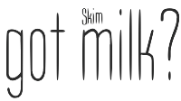
 Typefaces from 2012: Happenstance (a lovely retro-futuristic script), Illuminations Woodcut, Yule Love It (Christmas time dingbats), Gawain (based on the hand of Gawain Douglas), Oaxaca (a Mexican look face), Boxy Code, Channel B (a rounded monoline sans), Curves, Puzzle, Dempsey (based on the writing of Tucson film teacher, media artist and programmer, Vikki Dempsey), Chilespice, Strata, Deco Donut, Jiminy (a comic book face), Invites (a roundish upright script that intends to recreate the 1920s spirit), Hunky Chunky (an obese poster face), the hand-printed typeface Carissa, Got Milk, Cutting Corners, Astro (retro-futurustic), Dix (2012: a slabby wood style typeface inspired by the poster for the 1929 film Redskin, and a desire to create a black Edwardian font with an offbeat serif), and the monoline rounded stripped-down sans typeface family Laszlo (2012: the name is an homage to Laszlo Moholy-Nagy of Bauhaus fame). Kolega (2012) is a constructivist typeface family that consists of Kolega, Kolega Tall, and Kolega Podrobska (fake comrade). Steampipe (2012) is an ironwork, Jules Verne, wrought iron and time machine font. Los Muertos (2012) is a Halloween font. Typefaces from 2013: Megatropolis (a stackable deco font system). In 2014, he created the art deco typeface HG Welles, which was originally designed for a privately-published luxury edition of The Time Machine. Behance link. J Randall Harris Design link. Home page. [Google]
[MyFonts]
[More] ⦿
|
Karen Ackoff
|
Designer of the delicate font Russell at Alphabets Inc., and of Russell Oblique (1994, Adobe). Karen Ackoff has a BFA in Illustration from the Philadelphia College of Art and an MFA in Medical Illustration from the Rochester Institute of Technology. She has worked as Scientific Illustrator at the National Museum of Natural History, Smithsonian Institution in Washington, DC. She presently teaches and coordinates the Graphic Design program at Indiana University South Bend. She is available for freelance commercial artwork and fine arts commissions. Klingspor link. [Google]
[MyFonts]
[More] ⦿
|
Katheryn Poling
|
During her studies in Fort Wayne, IN, Katheryn Poling designed the neon tube typeface Prism (2017). [Google]
[More] ⦿
|
Kelly Turner
|
Kelly graduated in 2011 from Ball State University, and lives in Greenfield, IN. Her first typeface is Lollipop (2011). [Google]
[More] ⦿
|
Kenny Redman
|
Designer from Indiana. He created the grunge typefaces 321 Perfect (2013) and 321 Impact (2007). Dafont link. Fontsy link. Fontspace link. [Google]
[More] ⦿
|
Kimberly Gerhart
|
Muncie, IN-based designer of the techno typeface Baby Alien (2014). [Google]
[More] ⦿
|
Kinetic Plasma Fonts (was: Cannot Into Space Fonts)
[Robert Jablonski]
|
 Cannot Into Space Fonts is the free font studio of Robert Jablonski (b. 1991), who is based in Indiana. Before this studio, Robert used to make fonts at FontStruct under the alias Rabbid Bahh. Mew Too (b. 1991, Indiana) is co-lead designer for Cannot Into Space Fonts. Jasper (b. 1996) joined in 2015.
 The fonts include first and foremost the large geometric sans typeface family Nordica (2014) and the large grotesque family Hussar (2014). Other typefaces: Warszawa (2016: a wide display sans), Camo3 (2016, camouflage pattern fonts), Armata (2016, sans), Bolshevik (2016, constructivist), Rabbid Highway Sign II (2015, a sans, followed by IV in 2016), Rocketfuel (2015, by Mew Too), Charger (2015, a sans by Jasper; see also the 2016 typeface Charger Pro), Kabina (2015), Just Breathe (2015), Polan Stronk (2015), Apple Storm (2015), Numb Bunny (2015), Hi (2015, with Mew Too), Hussar Motorway (2015, an arrow font), Hussar Szturm (2015), Hussar Print (2015), Happy Time (2015, transitional; done with Mew Too and forked from TeX Gyre Termes), Distraught (2015), Curly Kue (2014), Filament (2014), Thicker Than (2014), BigWriter (2014), SuplexDriver (2014), Loogie Hawk (2014), Squared Hand (2014), Polan Writings (2014), Waterfire (2014), RDJ Hand (2014, a pixel typeface), Bwahh (2014, FontStruct font), DinKursivschriftEng, DinKursivschriftGhostEng, DinKursivschriftLeftEng, PolanCannotInto (2014, +DIN, +Shqip), PolskiDINKursivschrift (2014), Rabbid-Highway-Sign (2014, FontStruct font). Typefaces from 2015: Warsaw Gothic (a modification of a font by The League of Movable Type, 2009), Sztylet Bold (not a "Cannot Into Space Fonts" font, this heavy geometric sans is a derivative of Hussar by "Crazy Dave" at Plus One Fonts), Trueno (by "Jasper"; an extensive sans family based on Julieta Ulanovsky's Montserrat (2014)), Passageway (based on an Ascender design from 2010), Fog Sans (a derivative of Intel's Clear Sans from 2012), Asimov (a derivative of Roboto), Rocketfuel, Be Happy (a smiley doodle font by Mew Too), CSF Camouflage Kit (dingbats), Stormning Aesir (an outlined version of Stormning, with Mew Too), Blink (a condensed sans in nine styles, by Mew Too), DIN Kursivschrift (an update of the earlier font), Stormning (a Norse runic font co-designed with Mew Too; followed in 2016 by Ny Storming), Analytik, Through The Black, Ruined Serif, Warp Storm, Give A Hoot (2016: sans family). Special mention: Hussar Techniczy (2015), Hussar Ekologiczny (2015), Hussar Paneuropjskich (2015, a hacker font). In Jablonski's own words, it is an April Fool's day joke font. We were inspired to make it by Erik Spiekermann's April Fool's day joke font "FF Mt", which was a disemvoweled version of Meta, and by "Lato Saves Billions", by Lukasz Dziedzic and Adam Twardoch, a Miniaturized version of Lato. Hussar Paneuropjskich (Polish for Paneuropean) is a "universal European font". Designs made with FontStruct: Bwahh, Rabbid Highway Sign, Handwriting series, Waterfire, Numbbunny, Squarish, Proton, Jag Elskar Dig (I Love You), Applestorm, BigWriter, Squared Hand, Gib Font Plox, Blanket, Dictator, Krieg Font, Thicker Than..., HoneyBee, Just Breathe, Reckless Catfish, Tape, Polanwritings, Filament Serie, Curlykue, Børk Börk, Loogie Hawk, Take Off, Piccolo, Suplexdriver, Kabina, Polanstronk, Subtitle, CiSf OpenHand, Mewtoo Hand, Distorted series, I Like Turtles, Analytik, Koop, Carwash, Anarchic Type, Messed Up, Drag You Down, Blindside, Through The Black, Warpstorm, Ruined Serif, Distraught, Photofail, Sprayer, PlasticEraser. Typefaces from 2016: Ember, Retroscape (a pixel typeface made with FontStruct). Typefaces from 2018: Hussar Motorway (arrows), Anxiety, Mew Too Catdings. Typefaces from 2019: Connection II (pixel font). Fontspace link. FontStruct link. Dafont link. Open Font Library link. One Drive link to download all his fonts at once. [Google]
[More] ⦿
|
Kurt Vonnegut
|
 American author, b. Indianapolis, 1922, d. New York City, 2007. Ardent supporter of the American Civil Liberties Union and a critical pacifist intellectual. He once wrote Write to please just one person. If you open a window and make love to the world, so to speak, your story will get pneumonia.
 The Vonnegut Font (Paulo W, 2013) is a left-leaning script that may be based on Vonnegut's handwriting. [Google]
[More] ⦿
|
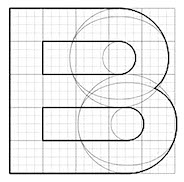
Letter Spirit
[Gary McGraw]
|
A project in cognitive sciences at the University of Indiana, headed by Gary McGraw, John Rehling and Douglas Hofstadter, and active from about 1992 until 1994. A lot of it is captured in McGraw's PhD thesis. They state: "The specific focus of Letter Spirit is the creative act of artistic letter-design. The aim is to model how the 26 lowercase letters of the roman alphabet can be rendered in many different but internally coherent styles. The program addresses two important aspects of letterforms: the categorical sameness possessed by letters belonging to a given category (e.g., `a') and the stylistic sameness possessed by letters belonging to a given style (e.g., Helvetica). Starting with one or more seed letters representing the beginnings of a style, the program will attempt to create the rest of the alphabet in such a way that all 26 letters share that same style, or spirit." Fonts created in this manner include Standard square, Double Backslash, Hint Four, Zigzag, Snout, Bowtie, Weird Arrow, Sabretooth, Sluice and Flournoy Ranch. [Google]
[More] ⦿
|
Lindsay Yoder
|
During her studies, Lindsay Yoder (Muncie, IN) designed the pixel typeface Rigid Script (2014). [Google]
[More] ⦿
|
Mark Carter
[Houkama Design]
|
[More] ⦿
|
Markie Dossett
|
Indianapolis, IN-based creator of Pipes (2015), a 1970s pattern font. She also created the squarish typeface Spotlight (2013). [Google]
[More] ⦿
|
Mary McEldowney
|
Bloomington, IN-based creator of Light Typeface (2015). [Google]
[More] ⦿
|
Mason DeGraff
|
Indianapolis, IN-based designer of the tall thin sans typeface Igloo (2016), for which he took Roboto as a model. Behance link. [Google]
[More] ⦿
|
Matt Fisher
|
Matt Fisher studies at the University of Saint Francis, and lives in Fort Wayne, IN. His first font is called Fisher Price (2010). Is his name Matt Thomas? [Google]
[More] ⦿
|
Megan Broyles
|
In 2016, Megan Broyles (Noblesville, IN) extrapolated the four letters CODA on a Led Zeppelin album cover to a full-fledged multiline art deco typeface. From 2013 until 2017, she studied at Ball State University. In 2018, she moved to New York to work for The Participation Agency. [Google]
[More] ⦿
|
Megan Hunt
|
Megan Hunt (Hunt Family Design, Jeffersonville, IN) created these handcrafted typefaces in 2017: Flour, Rebecca, Meringue, Lemon Cake. She also designed Dapper (2017) and the striped typeface Dashing (2017). Behance link. [Google]
[More] ⦿
|
Michael Manning
|
 Michael Manning, a graphic designer in Louisville, KY (was: New Albany, IN), has a BA degree from Indiana University. He created the sketched typeface Stitch and the plump sans typeface Coastal in 2013. In 2016, he designed Burnillo Display. [Google]
[More] ⦿
Michael Manning, a graphic designer in Louisville, KY (was: New Albany, IN), has a BA degree from Indiana University. He created the sketched typeface Stitch and the plump sans typeface Coastal in 2013. In 2016, he designed Burnillo Display. [Google]
[More] ⦿
|
Michael Mitzman
|
 Designer and art director originally from Indianapolis who woeks in New York City since 2010. His typefaces include Wax (2014: a heavy techno typeface) and Keystone (2014: designed for a pitch for a vodka brand). [Google]
[More] ⦿
Designer and art director originally from Indianapolis who woeks in New York City since 2010. His typefaces include Wax (2014: a heavy techno typeface) and Keystone (2014: designed for a pitch for a vodka brand). [Google]
[More] ⦿
|
Mike Stowe
|
Mike Stowe is a graphic/sign artist&owner of Signs Unlimited in Granger, Indiana. At Letterhead Fonts, he designed Old Blackletter (25 USD) and Argentine. [Google]
[More] ⦿
|
Monkey Business
|
Indianapolis, IN-based creator of NFL (2009), a headline sans patterned after the letters used by the NFL. [Google]
[More] ⦿
|
Nib-Type
[Onur Fatih Yazicigil]
|
Onur Yazicigil was born and raised in Konya, Turkey, and currently lives in Istanbul. He received his BFA in Graphic Design from Bilkent University in Ankara, Turkey and MFA in Visual Communication Design from Purdue University, Indiana, USA. Currently he teaches Graphic Design and Information Design classes at Sabanci University in Istanbul. Onur's design and research interests include book and poster design, information design, type design and history, and calligraphy and lettering. He designed Lokum Sans, a humanist sans typeface for display purposes, that is also legible in text sizes. At Google Web Fonts, one can download his Duru Sans (2011, Sorkin Type), which was used in the proceedings and other publications of the International Symposium on Electronic Arts. His thesis was entitled Humanist San-serif versus Grotesque San-serif. Typedia link. Google plus link. In 2009, he set up Nib Type. In 2011, he cofounded ISType (Istanbul Typography Conference), which he has been directing since its foundation. Alternate URL. Speaker at ATypI 2011 in Reykjavik, where his talk is entitled The lack of Latin typographic heritage and type design in Turkey and at ATypI 2014 in Barcelona, where his talk was entitled Setting up Latin typography in Turkey. A conversation with Onur Yazicigil. [Google]
[MyFonts]
[More] ⦿
|
Nick Rodriguez
|
Graduate of Indiana University Bloomington in 2012. FontStructor who made the engraved-look typeface Inny (2012). FontStruct link. Aka nick64. [Google]
[More] ⦿
|
Nimblesketch
[Jacob deCastro]
|
Jacob deCastro (Nimblesketch, Indianapolis, IN) designed these handcrafted typefaces in 2014-2015: Meridian Serif, Elevation, Mast, Upside, Quickly. Creative Market link. [Google]
[More] ⦿
|
Onur Fatih Yazicigil
[Nib-Type]
|
[MyFonts]
[More] ⦿
|
Paige Howard
|
During her studies at Institute for Digital Intermedia Arts in Muncie, IN, Paige Howard created the multilined typeface Fluidity (2015). [Google]
[More] ⦿
|
Philip A. Johnson
|
Graphic designer and musician from Carmel, IN. He created the monoline condensed geometric typeface Dodo Sans (2011). [Google]
[More] ⦿
|
RAWTYPE
[Gatis Cirulis]
|
Gatis Cirulis (Rawtype, Latvia) is a graphic designer and illustrator who does projects for individuals and companies in Central Europe and the USA. He specializes in logos, identity, illustration, publication, drawing, painting, lettering, book arts web design. He was art director at McCann Latvia but is now located in Bloomington, IN, where he was Letterpress Type Shop Graduate Assistant at Indiana University Bloomington. He currently lives in Las Cruces, NM. His typefaces: - The BDSM-inspired all caps alphabet Bound (2009). Example glyphs: A, B, BDSM, C, C, PS. Poster.
- Aker (2010). An erotic all caps alphabet.
- Karo (2010). A free geometric font.
- Frank (2010). A blackletter face.
- Ray Five (2010). A font based on letters that were projected onto the walls of a dark room.
[Google]
[More] ⦿
|
Rich Gast
[GreyWolf WebWorks (was DarkSide Productions)]
|
[More] ⦿
|
Robert Bringhurst
|
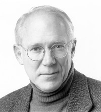 Author of The Elements of Typographic Style (1992), by many considered as the best book in typography ever written. Revisions were done in 1996, 2004, 2005 and 2008 [review, web, lecture]. Interview with Delve Withrington. He is also a prize-winning poet.
 Other books by him include A Short History of the Printed Word (1999, with Warren Chappell). 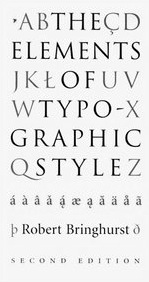 Biography, from which I quote: Robert Bringhurst was born in Los Angeles in October 16, 1946 and spent his years growing up in the border provinces and states between Western Canada and the United States. He acquired a BA from Indiana University in 1973 and an MFA from the creative writing program at UBC in 1975, where he later taught. Bringhurst collaborated with West Coast artist Bill Reid on a book of Raven Myths, and Bringhurst later wrote a book about Reid's sculpture. Bringhurst is known not only as a poet but also in the fields of typography, linguistics, art history and Native studies. He received the Macmillan Prize for Poetry in 1975 and currently resides in Vancouver. He has some memorable type quotes, such as this one: By all means break the rules, and break them beautifully, deliberately, and well. That is one of the ends for which they exist. Biography, from which I quote: Robert Bringhurst was born in Los Angeles in October 16, 1946 and spent his years growing up in the border provinces and states between Western Canada and the United States. He acquired a BA from Indiana University in 1973 and an MFA from the creative writing program at UBC in 1975, where he later taught. Bringhurst collaborated with West Coast artist Bill Reid on a book of Raven Myths, and Bringhurst later wrote a book about Reid's sculpture. Bringhurst is known not only as a poet but also in the fields of typography, linguistics, art history and Native studies. He received the Macmillan Prize for Poetry in 1975 and currently resides in Vancouver. He has some memorable type quotes, such as this one: By all means break the rules, and break them beautifully, deliberately, and well. That is one of the ends for which they exist.
Discussions of The Elements of Typographic Style: The typophiles [John Savard: Sounds like The Elements of Typographic Style is the masterwork it was acknowledged to be, but one that has to be taken with a grain of salt. It is a rich mine of information, but it does not set the bounds for all that can be done in typography], Sam Potts [ETS's position on typography after all isn't so different from saying the best movies were made in the 40s in Hollywood and so we, today, should be making black and white movies to uphold the tradition. Imagine a filmmaking manual that argued for this.], Mark Simonson, Maurce Meilleur. In 2016, he published Palatino: The Natural History of a Typeface: This book provides a detailed and sumptuously illustrated history of the evolution of all members of the Palatino tribe: foundry Palatino, Linotype Palatino, Michelangelo, Sistina, Aldus, Heraklit, Phidias, American Palatino, Enge Aldus, Linofilm Palatino, Zapf Renaissance, PostScript Palatino, Palatino Nova, Aldus Nova, and Palatino Sans. It includes new specimens of the foundry and Linotype faces printed by hand directly from the metal, as well as hundreds of color illustrations documenting the artistry and care expended in creating these components of our typographic heritage. He spoke at ATypI 2008 in St. Petersburg and at ATypI 2010 in Dublin. [Google]
[MyFonts]
[More] ⦿
|
Robert Jablonski
[Kinetic Plasma Fonts (was: Cannot Into Space Fonts)]
|
 [More] ⦿
|
Robert M. Givens
|
President and CEO of Monotype Imaging in 2006. His CV says: In 1986, he co-founded the OEM type software business at Compugraphic Corp. In 1989, when Agfa-Gevaert Inc. merged with Compugraphic, Givens headed an expanded division of the OEM type group as vice president and general manager as part of the U.S. operation. Under his leadership, the OEM type business grew into a worldwide force in the design and development of fonts and font technologies for printer manufacturers, software developers and creative professionals. In 1998, Givens led the merger of Agfa Corp.s Typographic Systems Division and Monotype Typography, a company with a rich history of more than 100 years in font development. The combined organization became Agfa Monotype Corp. In 2004, Givens spearheaded the management-led initiative to separate from Agfa. In November, 2004, TA Associates, a leading private equity and buyout firm, became the majority share owner of the new company, Monotype Imaging Inc. Givens is on the board of directors of Monotype Imaging. He holds a bachelors degree from Millikin University in Decatur, Ill. and a masters degree in higher education from Indiana University. In 2006, Monotype Imaging absorbed Linotype and China Type. [Google]
[More] ⦿
|
Robert Schenk
[Ingrimayne Type (was: The Bovine Rebellion)]
|
 [MyFonts]
[More] ⦿
[MyFonts]
[More] ⦿
|
Roger W. Roberson
|
 American designer, b. 1939, Saint Louis, MO, d. 2013, Lexington, KY. He also lived in Wildwood, Florida and Rushville, Indiana. Creator of the typewriter typeface Letter Gothic for IBM between 1956 and 1962, which was inspired by Optima. Poster by Ashley Donahue (2013).
 Later versions of the font: Letter Gothic (Agfa), Letter Gothic (Linotype), Letter Gothic 12 Pitch (Bitstream), Letter Gothic L (URW++, 1993). The non-monospaced version of Letter Gothic is called New Letter Gothic, which was digitized and Cyrillized by Gayaneh Bagdasaryan in 1999 at Paratype. In fact, at Paratype, LetterGothic Baltic, LetterGothic Central European, LetterGothic Cyrillic Asian, LetterGothic Cyrillic International, LetterGothic Cyrillic Old Russian, LetterGothic Multi Lingual, LetterGothic Turkish and LetterGothic Western were digitized based on Roberson's work by Gayaneh Bagdasaryan. Same goes for New Letter Gothic Baltic, New Letter Gothic Central European, New Letter Gothic Cyrillic Accented, New Letter Gothic Cyrillic Asian, New Letter Gothic Cyrillic International, New Letter Gothic Cyrillic Old Russian, New Letter Gothic Multi Lingual, New Letter Gothic Turkish, New Letter Gothic Western. [Google]
[MyFonts]
[More] ⦿
|
Rolf F. Rehe
|
Typographer, designer and journalist educated at Indiana University, where he has been teaching typography since 1995. He has been graphic design consultant since 1981. Author of two books: Typography and Newspaper Design and Typography: How make it clear. His company Design Research International has offices in Vienna (Austria) and Florida (USA). At ATypI 2004 in Prague, he spoke about Newspaper type. [Google]
[More] ⦿
|
Ross Burwell
|
 Chiacgo, IL- (was: Fort Wayne, IN)-based brand and graphic designer. Ross created some geometric typefaces, using mostly lines and pieces of circles: Karbon (2009), Aluum (2009), and Titan (2009). Other designs: Gluum (2010), Nove (2010), Orange (2010), This Is In (2010), Untitled (2010).
 In 2016, Firebelly Design, Will Miller and Ross Burwell, all located in Chicago, co-designed the corporate identity font Flor Mono. Home page. Behance link. [Google]
[More] ⦿
|
Ross Frazier
|
Bloomington, IN-based designer of Deco Alphabet (2012). Behance link. He also found and letterpress-printed a Bodoni-style typeface found in the Hamilton Wood Type Museum. [Google]
[More] ⦿
|
Sarah Hoppes
|
Muncie, IN-based student-designer of a script typeface (2017). [Google]
[More] ⦿
|
Sarah Seitz
|
Located in Decatur, IN, Sarah Seitz designed a number of typographic posters in 2013 under the name Typographic Storybook. [Google]
[More] ⦿
|
Sarah Stroup
|
Web designer and developer in Terre Haute, IN. She created Default Icons in 2012, a font that has many useful arrows and other web symbols. [Google]
[More] ⦿
|
Scott Boehner
|
Designer (b. 1985) from South Bend, IN. Creator of Dot Curve (2009) and Space Odin (2009) at FontStruct. He also made the shadow font Spleen Machine (2010). Blog. [Google]
[More] ⦿
|
Sean Moldenhauer
[Art and Fonts by Sean (aka The BlackBox)]
|
[More] ⦿
|
Spiece Graphics
[Jim Spiece]
|
 James R. Spiece (b. 1946, Wabash, IN) attended Culver Military Academy and graduated from Wabash High School in 1964. Jim attended Indiana University and graduated with a B.S. in 1969 after serving two years in the US Army stationed in Germany. Based in Fort Wayne, IN, he liked to revive old type designs. Ji died in 2021 in Green Valley, AZ. Obituary.
 The typefaces made Jim Spiece: - Adonis Old Style SG (2004): a connected upright script modeled after a little stationery and greeting card typeface developed for American Type Founders in 1930 by Willard T. Sniffin.
- Anthology SG (2005).
- Arched Gothic Condensed: another Victorian type, developed around 1885 by the James Conners&Son Foundry (New York).
- Ark Monogram SG: Ark is a combination monogram set based on the ATF Virkotype designi from the 1930s.
- Asteroid Primo SG (2009).
- Astoria Antique (2003): 19th century style ornamental face.
- Aviator SG (1995), aka Ventura Slim, based on an old 1930s lettering style popularized by Carl Holmes in his book.
- Bernhard Brushscript SG: based on an extremely heavy informal script was created in the early 1920s by Lucian Bernhard.
- Bernhard Gothic SG
- Beverly Shores Script SG (2004).
- Birdlegs SG (1991).
- Cactus Flower SG (2006): a Wild West family based on lettering by Ross F. George.
- California Poster SG (1996).
- Centric Geo SG (1996) and Centric Serif SG (1996). These are squarish slab typefaces.
- Concerto Rounded SG: revival of some 1920s Lucian Bernhard lettering.
- Edison Swirl: A frilly Victorian blackletter typeface based on a design by Hermann Ihlenburg from ca. 1900.
- El Castillo SG (2008): an old style newsprint family.
- Epicerie One&Two SG (2008): a signage family.
- Eva SG. Eva Antiqua SG is an exquisite family based on the 1922 Klingspor model by German designer Rudolf Koch (known as Koch Antiqua or Locarno). It also includes Eva Paramount SG, which is a revival of a 1928 typeface, also flared, by Morris Fuller Benton called ATF Paramount. The Castcraft incarnation is called OPTI Eve.
- Frisco Antique Display SG (2004): based on a woodtype display typeface from the 1880s by Bruce Type Foundry.
- Gable Antique Condensed (2002): based on a Bauer Type Foundry art nouveau face.
- Gambit Nouveau SG (2004): art nouveau.(2004): art nouveau.
- Grand Slam SG (2002): based on an old cardwriting style known as Poster Gothic.
- Headline Helpers One SG and Headline Helpers Two SG (2009). Followed by Headline Helpers Three SG (2017), Headline Helpers Four SG (2017), Headline Helpers Five SG (2017).
- Hollywood Deco SG (1994): based on a Willard T. Sniffin deco-inspired original from 1932.
- ITC Blair (1997). Blair has its roots in the Inland Type Foundry, ca. 1900.
- ITC Deli Deluxe and ITC Deli Supreme (1999)
- ITC New Winchester
- Ironman SG (2002): art deco poster font.
- Kingsbury Condensed SG (1992): 1930s style art deco face.
- Kolinsky Sable SG (2004): a brush display typeface due to Charles P. Bluemlein, 1944.
- Little Brown Frog SG (2007).
- Melrose Modern SG (2005): art deco family.
- Memorandum SG (1992): a sans text family.
- Metropolis SG: revival of a long-legged 1932 classic design by W. Schwerdtner for the Stempel Foundry.
- In 1895, Julius Schmohl and Max Rosenow published an upright script with BBS. This ronde typeface was originally known as Oliphant and renamed Advertisers Upright Script in 1925. In 2014, Spiece Graphics created a digital version of it, Milroy Upright SG.
- Mingo Gothic SG (1991-1992).
- Narcissus SG (Open and Solid): Narcissus Open is a heavy typeface designed by Walter Tiemann in 1921 for the Klingspor Foundry in Germany.
- Newport Classic Basic SG and Newport Classic SG: based on an extra condensed art deco typeface designed by Willard T. Sniffin for American Type Founders in 1932.
- Nicolas Jenson SG: a large text family about which Spiece writes: It was the original work of fifteenth century designer Nicolas Jenson that formed the basis for this roman serif style developed by Ernst Detterer in 1923. Similar in spirit to other early twentieth century revivals such as Centaur, Cloister Old Style, and Italian Old Style, Nicolas Jenson is distinguished by its pristine and delicate nature. A gifted young apprentice to Detterer, Robert Hunter Middleton, greatly expanded the family. And by 1929, bold, italic, and open were part of the Ludlow Foundry's beautiful Nicolas Jenson Series. It was reintroduced under a new name, Eusebius, in 1941.
- Nova Script Recut One SG (2011): based on Nova Script (1937, George F. Trenholm).
- Pacific Clipper SG (1991): a mix between Koch's kabel and ATF's Novel Gothic (1929, Morris Fuller Benton and Charles H. Becker).
- Panorama SG (1995): art deco family, based on an old 1930s lettering style popularized by Carl Holmes is his wonderful book on the subject.
- Quaint Gothic: Arts&Crafts face.
- Replica Rough SG (2018). A grungy typeface.
- Samson Classic SG: a heavy display typeface based on a 1940 design by Robert Hunter Middleton for the Ludlow Foundry.
- San Remo Casual SG: a fifties style connected script.
- Sheridan Gothic SG: an art nouveayu face, ca. 1910, known as Grant Antique.
- Speedway SG (1992-1993): connected upright 1950s diner script.
- Stellar Classic SG (1997): Stellar was originally designed by by Robert Hunter Middleton in 1929 as a serifless roman well before Hermann Zapf's Optima, released in 1958.
- Stratosphere SG (1993).
- Telepod SG (2002): based on an old Speedball lettering style and has a very retro look.
- Thumbnail Text SG (2005).
- Travel Kit SG (2004): art deco.
- Tribunus SG: roman Trajanus style family, originally designed in 1939 by Warren Chappell for Stempel.
- Tweed SG (1992): handlettering.
- Ultramodern Classic SG: a marquee lettering font family in the style of Broadway. Based on a 1928 design by Douglas C. McMurtrie, Aaron Borad, and Leslie Sprunger.
- Valentina SG (1991-1992): a plump comic book style script.
- Veranda Poster SG: derived from a European art supply manufacturer's logotype done in the Vienna (Wien) Austria style, which was used by artists such as Julius Klinger and Willy Willrab in the 1920s.
- Wellsbrook Initials SG: based on the 1920s work at Bauer of the German graphic designer Emil Rudolf Weiss.
- Zinc Italian SG (2002): 19th century style curly ornamental face, aka Zinco in the Victorian era. Based on Zinco (1891, Hermann Ihlenburg for Mackellar, Smith & Jordan).
MyFonts link. Klingspor link. View Jim Spiece's typefaces. Listing of Jim Spiece's fonts. [Google]
[MyFonts]
[More] ⦿
|
St. Meinrad Fonts
[Harry Hagan]
|
Truetype fonts for Gregorian chants made and sold by Harry Hagan, OSB, Liturgical Music Office, Saint Meinrad Archabbey, St. Meinrad, IN 47577-1010. There is a free demo font. The full fonts are called MeinradA, B and C. For standard music notation, they offer "Melody" for sale. Alternate URL. [Google]
[More] ⦿
|
Stephen Rapp
|
 American calligrapher, letterer, and type designer (b. 1953, Indianapolis, IN) located in Lakewood, OH, and/or Kent, OH. As a lettering artist for American Greetings since 2000, he has designed and developed numerous proprietary fonts. He specializes in beautiful script typefaces. Stephen's commercial fonts can be found in both Veer and P22/IHOF collections. Creator of these fonts:
 See also here. MyFonts link. Klingspor link. Behance link. Creative Market link. [Google]
[MyFonts]
[More] ⦿
|
Steven L. Wood
|
MSDWT Manuscript is a slant print truetype children's handwriting font for both Macintosh and Windows. Shareware by Steven L. Wood at the Light of the World Ministries, Inc, Indianapolis. Comment: well, as Steven says, this font is far from finished. It has a Courier-Italic look, but needs major work still. See also here. Runs Math Dittos. Another URL. [Google]
[More] ⦿
|
Steven Williams
|
Based in Indianapolis where he teaches at the Art Institute of Indianapolis and runs Burnish and Press, Steven Williams's first font is a very geometric modular experimental typeface called Willstack (2011). His second font is Cubi V (2011), which was inspired by sculptor David Smith. His third typeface is an unnamed round squarish font (2011). In 2015, he designed the ironwood typeface Westfield Greek, and in 2018 he added Patio Shop. [Google]
[More] ⦿
|
Todd Michael Bushman
[ENLIVEN design]
|
[More] ⦿
|
Tony Vernon
|
Indianapolis, IN-based designer of Curvetica (2017). Behance link. [Google]
[More] ⦿
|
Tyler Rountree
|
Indiana-based designer of the handcrafted typeface Mountain Goat (2017). Creative Market link. [Google]
[More] ⦿
|
Wolf's Rain
[Gabriel Beatty]
|
Indiana-based designer (b. 1987) of the font called Wolf's Rain (2005-2007). Devian tart link. Dafont link. [Google]
[More] ⦿
|
Wyatt Ward
|
Fort Wayne, IN-based designer of IBM3161 (2016). He writes: This is a monospaced bitmap font from IBM's 1985 ASCII Display Station (terminal), the IBM 3161. [It] includes versions for a multitude of devices and platforms. This font is huge, containing tens of thousands of pixelized glyphs, including full coverage of Chinese, Japanese and Korean. [Google]
[More] ⦿
|
Zac Neulieb
|
 Student at Purdue University, West Lafayette, IN. Honey Badger (2011) is a slab serif, woodblock-inspired typeface. Metis (2011) is a high-contrast geometric typeface around the theme of semi-circles. [Google]
[More] ⦿
Student at Purdue University, West Lafayette, IN. Honey Badger (2011) is a slab serif, woodblock-inspired typeface. Metis (2011) is a high-contrast geometric typeface around the theme of semi-circles. [Google]
[More] ⦿
|
Zachary West
|
During his studies at the Art Institute of Indianapolis, Jamestown, IN-based Zaxhary West designed a curly typeface (2016). [Google]
[More] ⦿
|

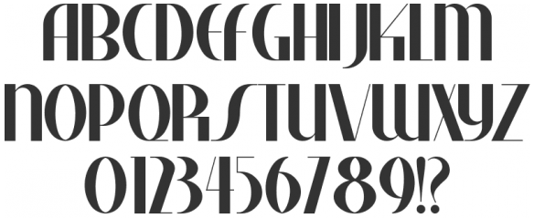
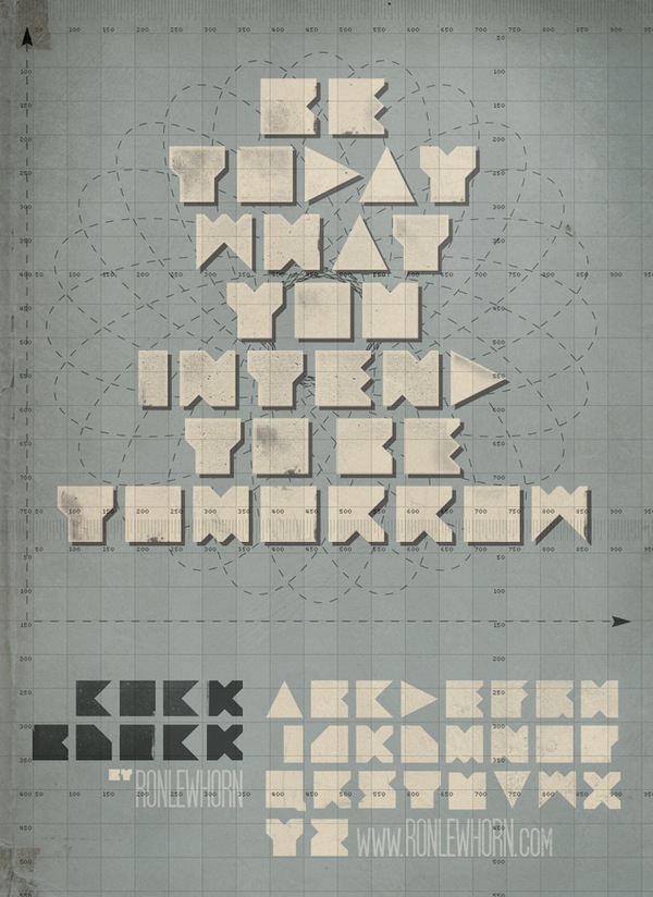
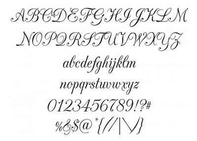
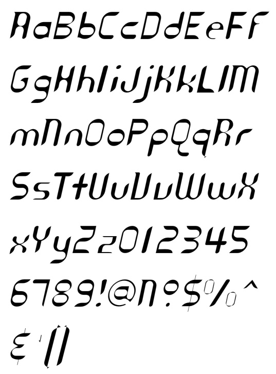
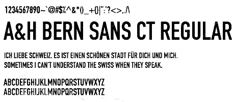
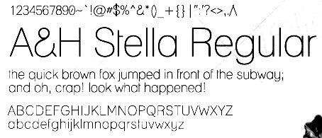
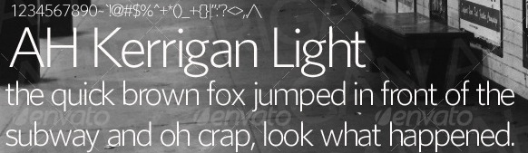
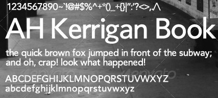
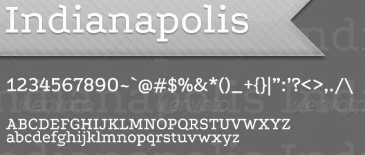
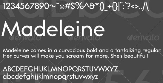
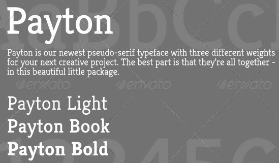
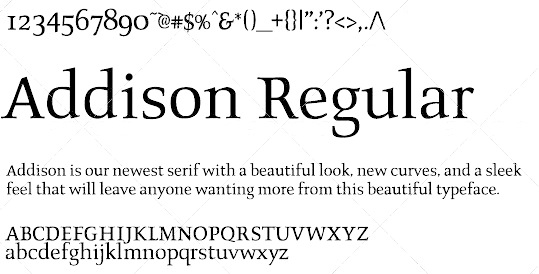
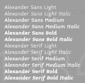
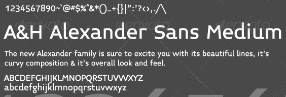
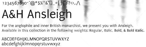
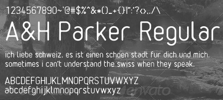
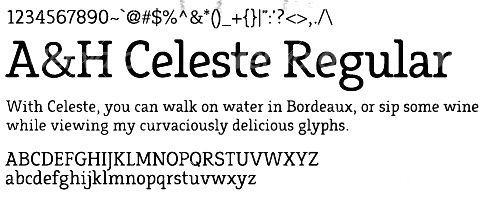
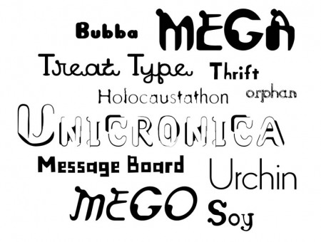
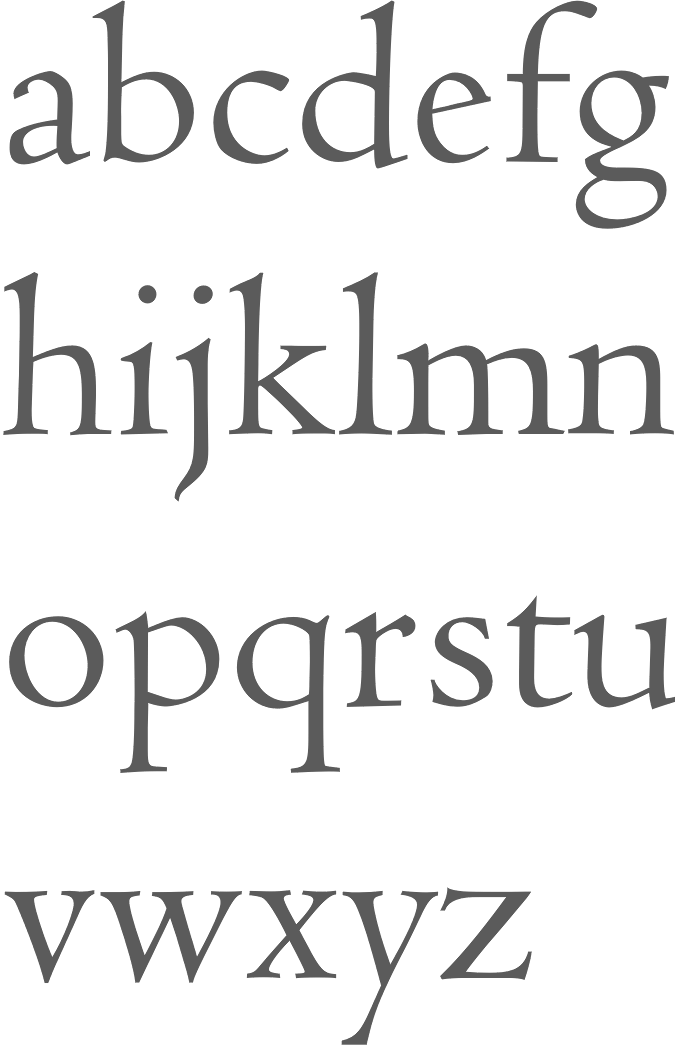
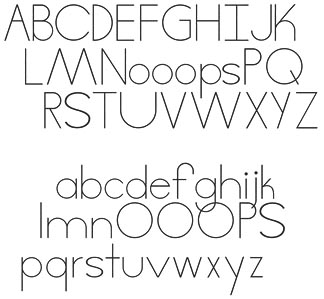
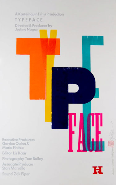
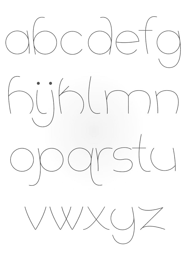
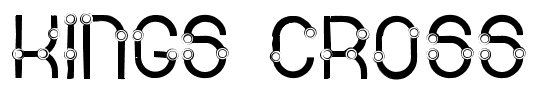
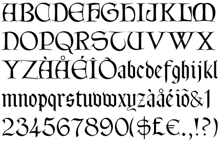
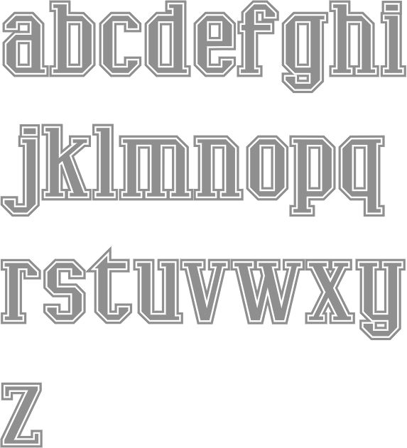
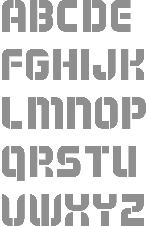
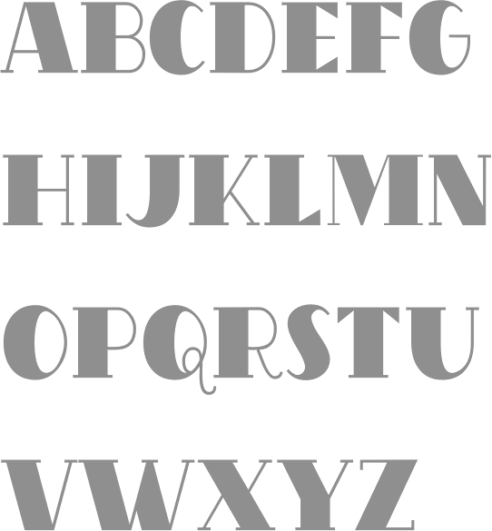
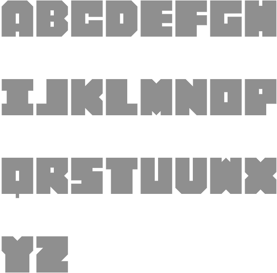
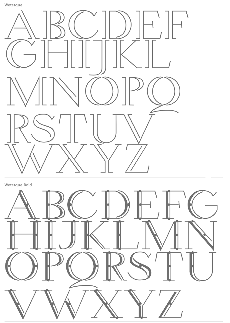
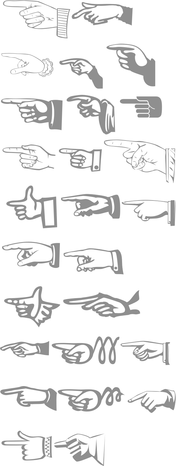
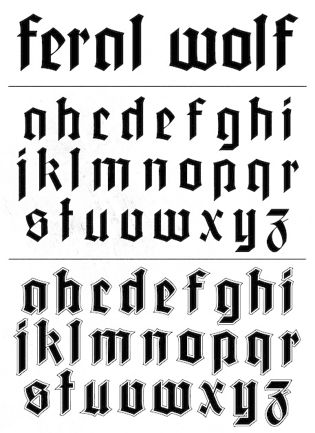
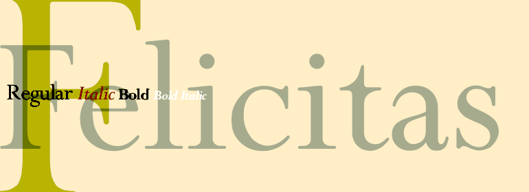
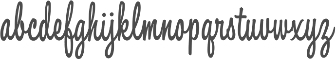
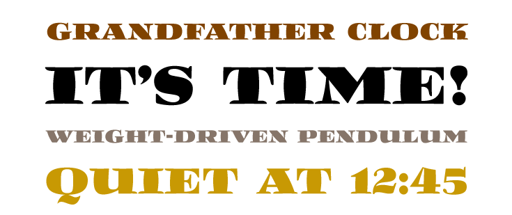
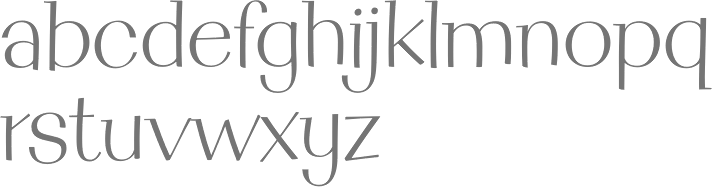
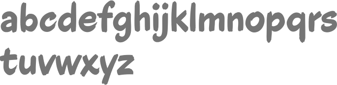
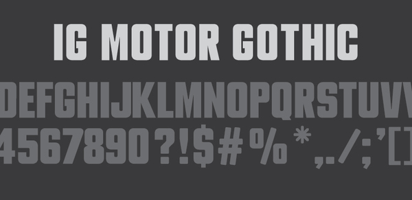
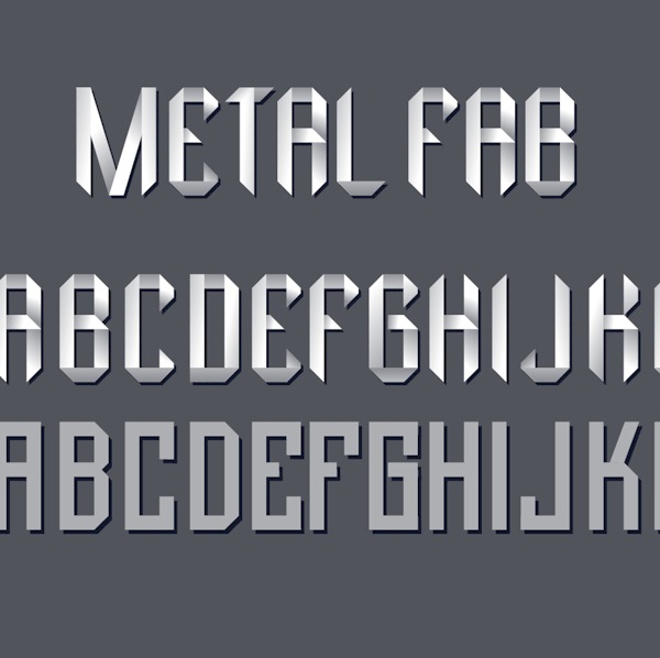
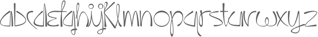
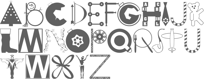
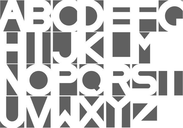
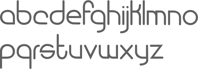
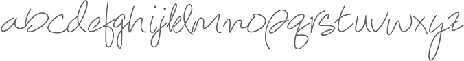
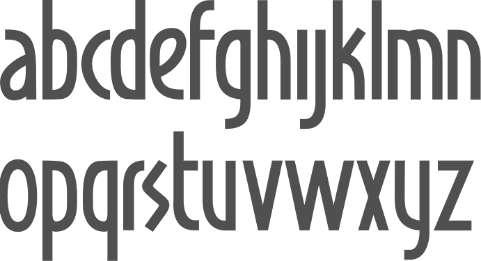
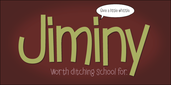
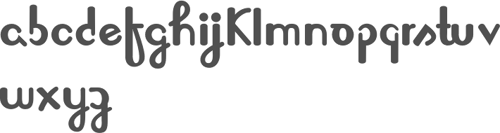
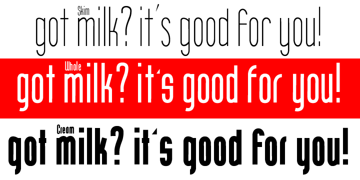
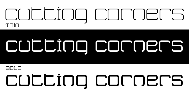
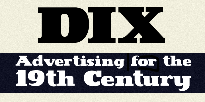
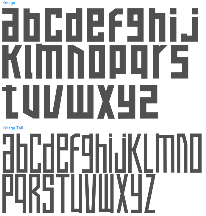
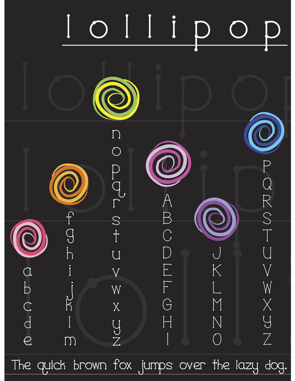
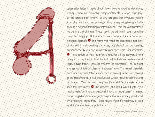
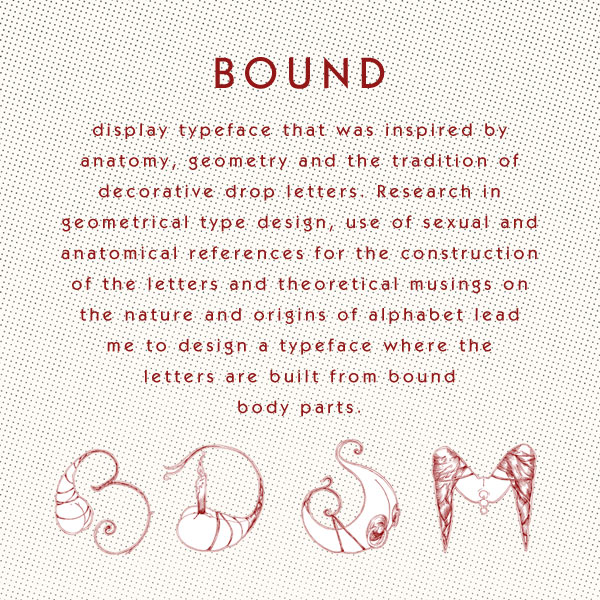
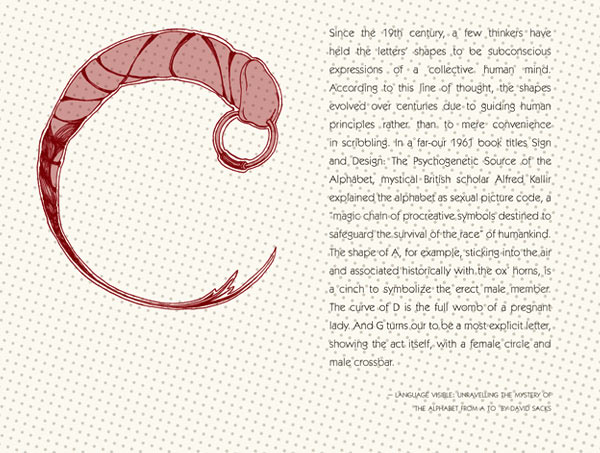
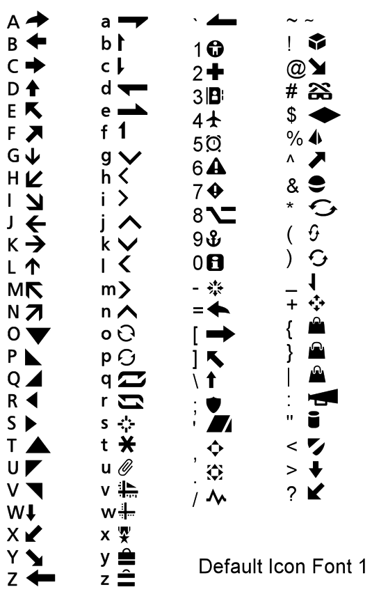
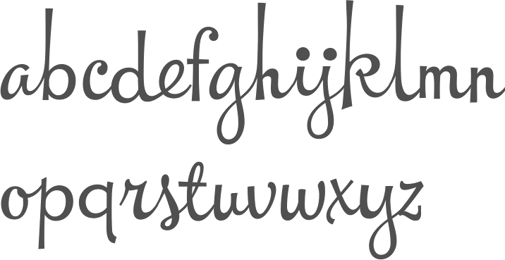
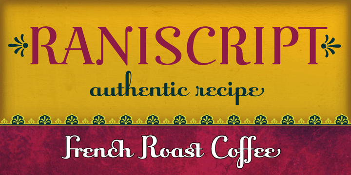
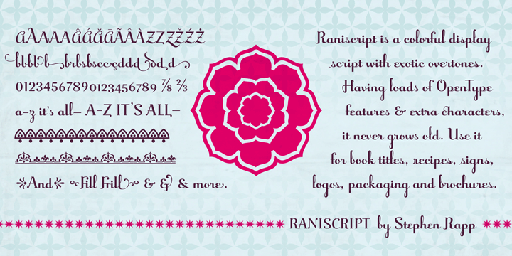
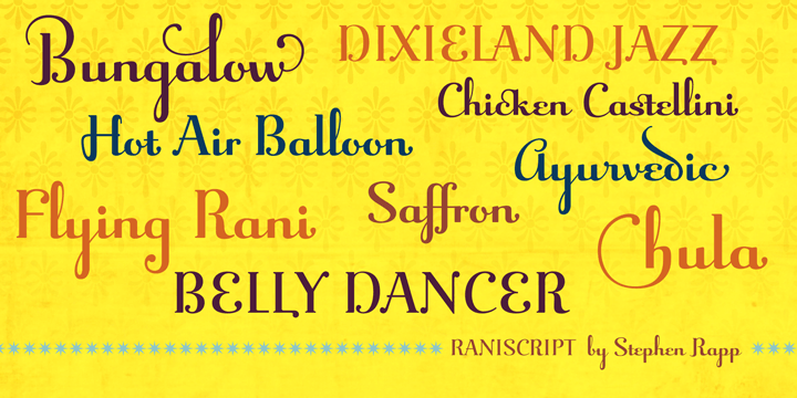