TYPE DESIGN INFORMATION PAGE last updated on Mon Mar 9 16:07:58 EDT 2026
FONT RECOGNITION VIA FONT MOOSE

|
|
|
|
|
Type scene in Louisiana | ||
|
|
|
|
SWITCH TO INDEX FILE
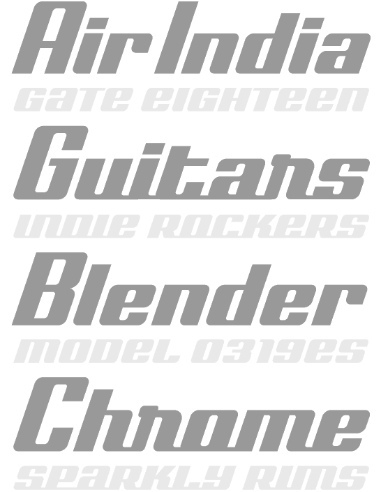
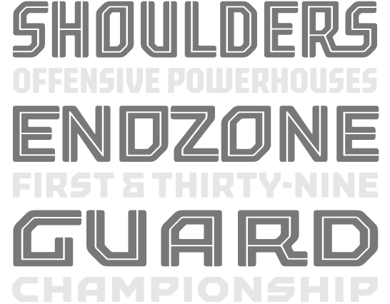
Lebanese designer who created Beantown (2004, an athletic lettering font), Staubach (2004, an athletic lettering typeface based on the lettering of the Dallas Cowboys), Wagner Modern (2011), Kroftsmann (2004, on octagonal face), Kavelry (2004, based on the Kemper Insurance logo), 4th and inches (2008, rounded octagonal; based on the proprietary font used by Russell Athletic, makers of sports apparel as used by Georgia Tech BKB, Washington State, Alabama State, Tennessee State, Mississippi Valley State, and many others in college football), and PopWarner (2004, a Bank Gothic lookalike), Wagner Zip Change (grotesque), Richardson Fancy Block. Creator of some free soccer team lettering alphabets in 2010: Louisville, Puff Script, Red Raiders, Richardson Fancy Block, Wagner Zip-Change (based on grotesque signage letters), ACMilan2009, ASRoma, ChampionsLeague, England2007, MLSUniform, RealMadrid2009. About his GeauxXPDF typeface (2010), he writes: I had extracted a nearly complete set on this one a few years back, except for J and Z which I created on my own. As best I can tell, it only exists as an upper case font without most punctuation, so I created that too to make it more useable. I don't know how much LSU [Louisiana State University] paid for this design, but to me it always looked like something that Larabie or Iconian would have given away. He also extracted HDRadioAlphabet from a rounded Arial typeface he found on HD radio. His UScoreRGK (2012) is a blocky angular font used on-screen by Fox Sports. LCD Display (2012) is a 28-segment LED font. UA Terrafont (2012) was based upon the vector art in this PDF file. In 2013, he published the athletic lettering family High School USA and the octagonal typeface UA Cadet. See also here. Dafont link. Fontspace link. Another URL. [Google] [More] ⦿ | |
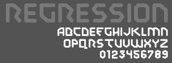
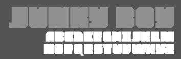
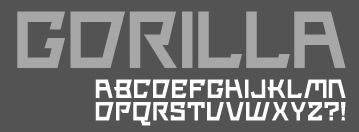
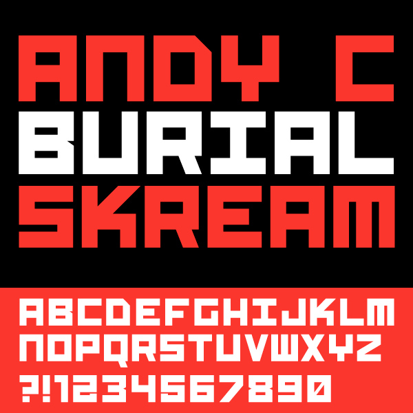
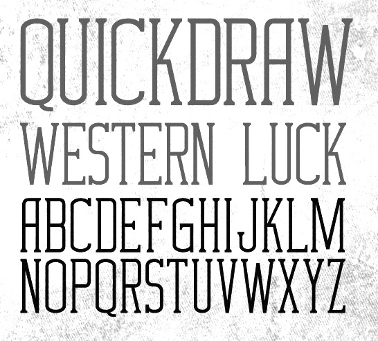
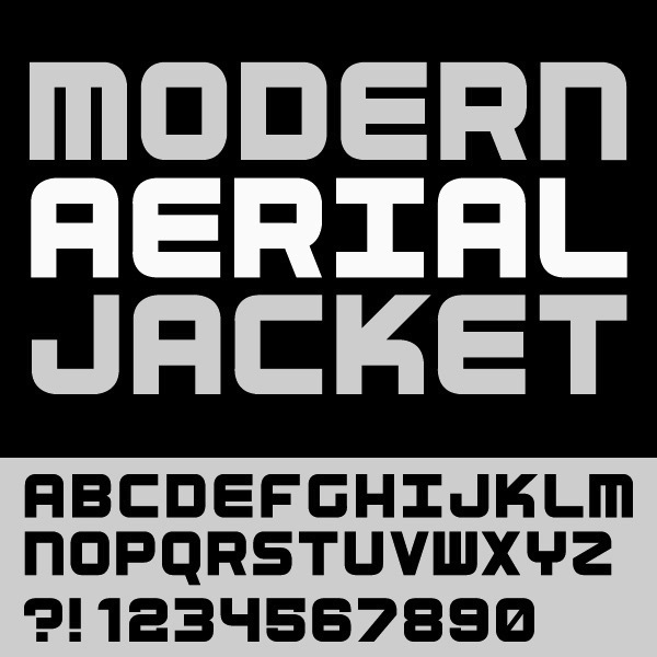
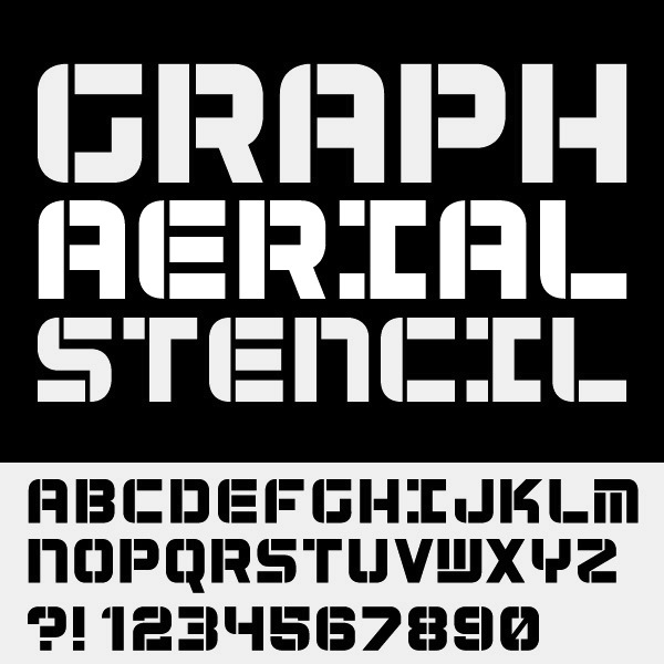
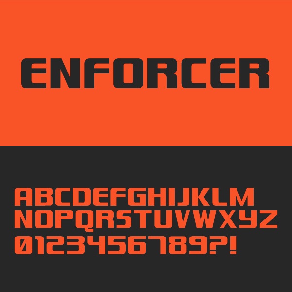
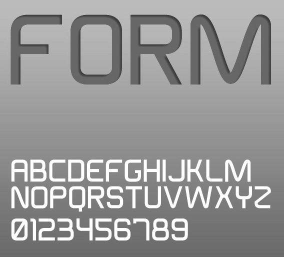
Art director in San Antonio, TX (and before that, Metairie, LA), who designed a few display typefaces in 2011: Eclipse, Eclipped, Regression (octagonal), JUNKY boy (ultra-fat, counterless), Gorilla (straight-edged). Russian propaganda poster art led to Burial (2013), Quickdraw (2013, Western), Aerial (2013) and Aerial Stencil (2013). He also made techno / sports typefaces Enforcer (2013) and Form (2013, techno sans). Typefaces from 2016: Matter, Form (techno), Hospital, Craze (sharp-edged, free), Foray (squarish), Hospital (squarish style), Hydjakids. Typefaces from 2017: Triton (sports font), Carson (beatnik font), Tomahawk (hipster style). Typefaces from 2018: Pirlo (techno), Spartan (an octagonal font and military stencil), Scoreline (athletic lettering). | |
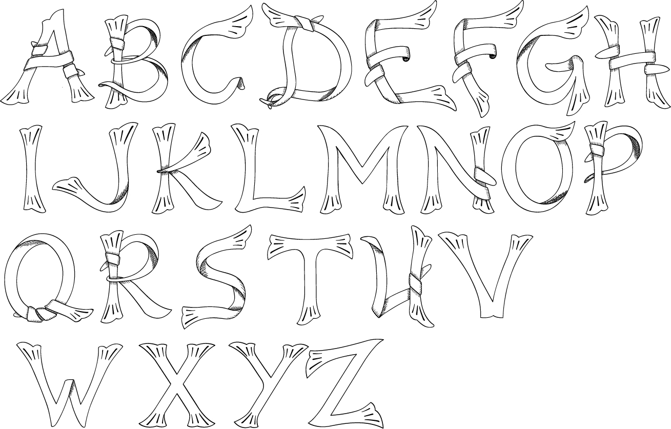
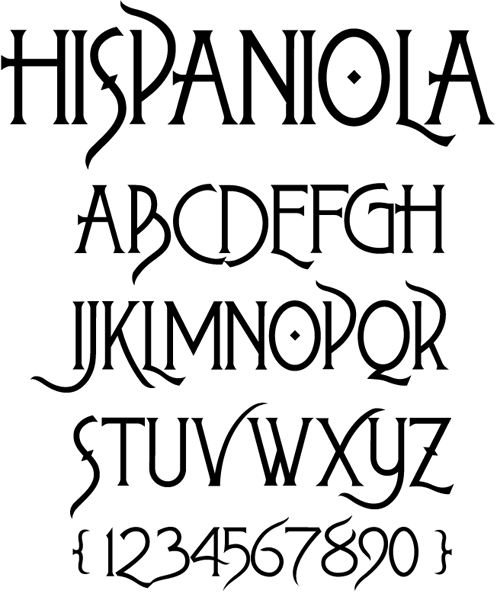
He created a frilly caps face inspired by the style of lettering in old copperplate etchings from the 1700-1800s in 2007. His second typeface, Hispaniola is a swashbuckler typeface introduced here (2007) and discussed here. [Google] [More] ⦿ | |
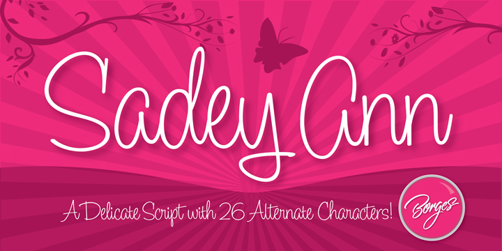
Borges Lettering (was: CBdO Fonts Foundry)
|
He also sells through Font Bros and Letterhead. Klingspor link. View the typeface library of Charles Borges. Fontspring link. Interview in 2013. View Charles Borges's typefaces. Adobe link. [Google] [MyFonts] [More] ⦿ |
New Orleans, LA-based designer of Revival (2015), a free typeface created for the 2015 AIGA conference held in New Orleans. Revival Modern is a modular all caps typeface. Revival Gothic is derived from it by removing all non-essential strokes. Behance link. [Google] [More] ⦿ | |
Charles Borges de Oliveira
| |
Charles Ramsey (Seattle, WA) created Folding (2012, an octagonal typeface). Charles was raised in New Orleans. Behance link. [Google] [More] ⦿ | |
Baton Rouge, LA-based designer (b. 1988) of Watchers (2014), OCD Narrow (2014: OCD stads for obsessive compulsive syndrom), and Sex Pistols (2007, grunge sans ransom note face). Typefaces from 2020: Villain (hand-drawn, perhaps for Halloween). Typefaces from 2021: Blackleather (a blackletter typeface), Cathedral Display (all caps, with gothic church shapes). [Google] [MyFonts] [More] ⦿ | |
Baton Rouge, LA-based designer of the free all caps typeface family Assurant Beta (2018). [Google] [More] ⦿ | |
Cornelius (aka Samurai Lincoln) is the New Orleans-based designer of Slacker (2004, handwriting). Home page. [Google] [More] ⦿ | |
Born in Birmingham, AL, in 1984, he graduated with a BFA in graphic design from Auburn University in 2007 and and MFA in graphic design from Lousiana Tech University in 2011. Fontspace link. Creator of the sci-fi / techno typeface Ganymede Takeover (2011). [Google] [More] ⦿ | |
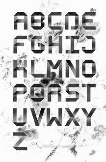
Mandeville, LA-based designer of a Piet Mondrian alphabet in 2014, during her studies at LSU. [Google] [More] ⦿ | |
Shreveport, LA-based designer of the typeface Gropius Bauhaus (2015). [Google] [More] ⦿ | |
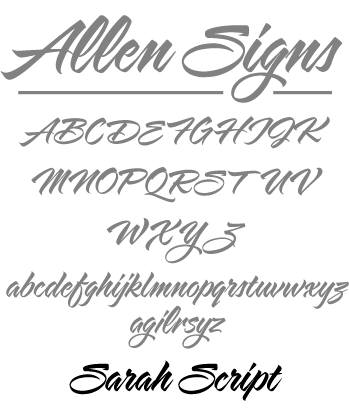
Alexandria, LA-based designer of the Zydeco family (lunatic handwriting, Thirstype). Helso designed Stroke (a great handwriting family, Thirstype), Other designs may be found at T-26 (such as TECHNOIRE-Fuse), Plazm, Thirstype, Prototype Experimental Foundry. At FORDESIGN, his own company, he made LovingTheAlien (1996). At Prototype Experimental Foundry, he published Ghetto Prince (calligraphic grunge) and Spumoni. Note: Spumoni is a trademark of Letterperfect Design (it is the name of a 1990 font by Garrett Boge), so Randy Ford might be violating a trademark here. [Google] [MyFonts] [More] ⦿ | |
Born in 1983 in Arlington, VA, Giselle is a first year student of music composition at LSU in Baton Rouge, LA. She designed the Boston bull terrier dingbat font Boston Love (2006). Yet another home page. [Google] [More] ⦿ | |
Dallas, TX-based designer (b. Louisiana) of the marker fonts Sharpie Fumes Sans (2016) and Sharpie Fumes Mono (2016). Creative Market link. [Google] [More] ⦿ | |
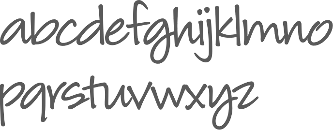
Student in Louisiana, b. 1996. Creator of the fat finger typeface Maybe But Not Always (2011) and of the hand-printed Paper Girl (2013). Dafont link. [Google] [More] ⦿ | |
Shreveport, LA-based designer (b. 1990) of Cheeto-ese (2006, handwriting). [Google] [More] ⦿ | |
Herzberg Design
|
|
Graphic design student from Baton Rouge, LA, who is making a Bodoni Semi-serif (2003). [Google] [More] ⦿ | |
| |
Louisiana-based designer of the bold monoline rounded sans typeface Roldon (2019). [Google] [More] ⦿ | |
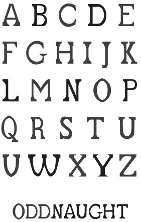
As a student, Josh Pellegrin (Houma, LA) created Odd Naught in 2012. [Google] [More] ⦿ | |
Lake Charles, LA-based designer of Pornography Font (2015). The name is mysterious, as there is nothing pornographic about this font at all. [Google] [More] ⦿ | |
| |
During her studies at McNeese State University, Kelly Lavergne (Lake Charles, LA) designed the blocky typeface Blok (2017). [Google] [More] ⦿ | |
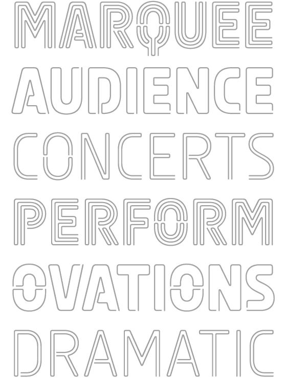
New Orleans, LA-based graphic designer who created several themed alphabets in 2017, including Steampunk, Marquee, Horror, Gatsby, Backspace, and Adventure. Behance link. [Google] [More] ⦿ | |
Ruston, LA-based designer of the hairline sans display typeface Fleural (2014). [Google] [More] ⦿ | |
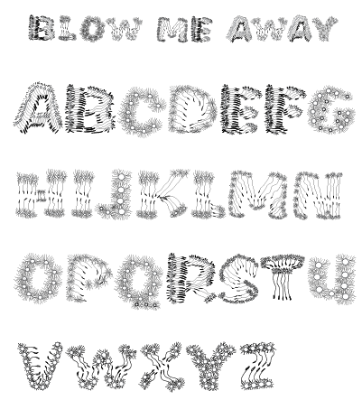
Graphic designer in Louisiana. She created the caps typeface Blow Me Away (2011). [Google] [More] ⦿ | |
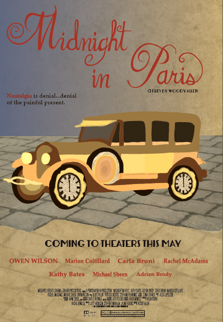
Hammond, LA-based creator of a nice typographic movie poster for the Woody Allen film Midnight in Paris (2012). [Google] [More] ⦿ | |
Lisa Holtzman is the personal foundry of Santa Monica, CA-based calligrapher Lisa Holtzman. She created the brushy typeface Babaloo Basic (2011). [Google] [MyFonts] [More] ⦿ | |
Louisiana-based designer of the handcrafted typeface You Are Just My Type (2015). [Google] [More] ⦿ | |
American designer of the interesting font NotCaslon (1995) at Emigre. [Google] [MyFonts] [More] ⦿ | |
Marty Bee is a designer and medical illustrator in Sulphur, LA. He has designed both free and commercial typefaces. His commercial fonts are available from Plazm and T-26: Slumgullion (1993, a party headline font), Flowerchild, CropCircles, Gargantua, SonofStarmanA, StarmanPict. At Plazm, he did Cibola (1995, nice dingbats), Wet and Wilde (1994) and Three Rivers (1994), for example. Some more fonts: Wildside (1994, angular and gothic), Cheap Motel, Halloweenies, Flowerchild, Sangreal (1994, gothic), Scaredycat, SidTheSpider, Slasher (2000), Slumgullion (1993, ornamental caps), Space Cowboy, Stiletto (2000), Saguaro (2000, angular), Cactus Pete, MyShoes, Tropicana (1994, chiseled look), Trapping, Galleon, Goblin Moon (scary), Ghost Bayou (blood drip face), Big Bubba, Lafitte (2000, a didone display face), Daytripper, Contraband (grungy), Fat (1994, oriental simulation face), Fat Sushi, Beatnik, Kerouac (1994, a Kafkaesque face), PostModern Oblique (2000), PricklyPear (2000, angular and angry), AtomicSushi. The font WheresMarty by an unknown designer is named after the world-wide search for Marty. Where are you, Marty? Free fonts at Fontspace: Freakout, Frankenstein, Atomic Sushi (1999, oriental simulation face), Manzanita (1990), Hill William (2011, brush face), Kris Kris (2000, gothic; an even sharper and more condensed version of Stiletto), Porpoise (1994, pixelish). FontShop link. Moorstation link, where one can also find Calypso (1997, after Excoffon's Calypso, 1958), which Marty claims as not done by him. The Calypso typeface at that site was made by Martin Pfeiffer, in fact. Klingspor link. [Google] [MyFonts] [More] ⦿ | |
Creative media designer in Baton Rouge, LA, who created Frankie (2014), a typeface inspired by the architecture of Frank Lloyd Wright. [Google] [More] ⦿ | |
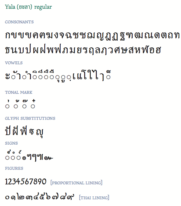
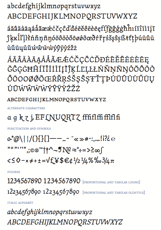
As a student, she designed the upbeat text typeface Acadie and the Thai typeface Yala. She explains: Acadie regular and italic are drawn with reference to the broad-edged pen. A model of inspiration was Christoph Noordzij's typeface, Collis. It maintains a good performance in long texts with subtle calligraphic fluidity. To enhance liveliness and avoid a static monolinear stroke, Acadie utilizes higher contrast with a tall x-height to show an energetic visual impression on a page. About Yala: Yala regular is also created with reference to the broad-edged pen. Precedents examined are Adobe Thai, Sukothai (Linotype) and other angular typefaces printed in 1930 letterpress editions. The design of Yala creates an even color suitable for long texts and even diacritical positioning. Resisting a monolinear stroke similar to Cordi New (Microsoft), a higher contrast design favorable to a handwritten form is developed. Additional scans of Acadie: i, ii, iii. In 2010, she drew Apartment Type, a set of objects. Behance link. [Google] [More] ⦿ | |
During her studies, Ruston, LA-based Mashall Smith created the arts and crafts typeface Flapper (2016). [Google] [More] ⦿ | |
Matthijs Herzberg
| |
Thibodaux, LA-based student-designer of the decorative caps typeface Easy As ABC (2017). [Google] [More] ⦿ | |
Tal Leming
| |
During her studies in Baton Rouge, LA, Terrencia Polk designed the custom typeface Courthouse (2015). [Google] [More] ⦿ | |
Type Supply
|
In 2005, he left House and started his own company eventually called Type Supply. Type Supply designs typefaces for corporations and publications. Their typefaces:
At ATypI 2008 in St. Petersburg, his talk (shared with Ken Barber) was entitled Pac-Man fever, quantum mechanics and the design of digital type. Tal Leming's personal web site. Village link. Author of Letters. [Google] [MyFonts] [More] ⦿ |
TypeCon 2011 took place in New Orleans from July 5-10, 2011, at the Royal Sonesta. Dedicated web page. Speakers: Lynne Baggett, Ed Benguiat, William Berkson, David Berlow, John D. Berry, Scott Boms, Veronika Burian, Aaron Carambula, Nancy Sharon Collins, Viviana Cordova, Bill Davis, Carolina de Bartol, Luke Dorny, John Dowling, John Downer, Angela Driscoll, Carol Fillip, Lorrie Frear, Mehmet Gözetlik, Will Hill, Jessica Hische, Otmar Hoefer, Amelia Hugill-Fontanel, Mark Jamra, John Jennings, Kenneth Jones, Akira Kobayashi, Jenny LeBlanc, Gerry Leonidas, Ian Lynam, Grahame Lynch, Erik Marinovich, Ricardo Martins, Erin McLaughlin, Vince Mitchell, Anita Nottingham, Sharon Oiga, Ketty Miranda Orozco, Leonard Otillio, Dr. Kayanna Pace, David Peacock, Thomas Phinney, Rafael Díaz Rey, Nancy Rorabaugh, Anthony Rozak, David Rozak, Yvette Rutledge, José Scaglione, Juliet Shen, Neil Summerour, Guy Villa, Brian Warren, Jim Wasco, Marcin Wichary, and Onur Yazicgil. Reports and pictures. Flickr page. Pictures by Frank Rolf. Twitter page. Applied Arts Magazine: Missives from the Field at TypeCon 2011. InvadeNOLA: TypeCon2011 Recap. Felt & Wire: TypeCon Lagniappe. Uppercase Magazine: TypeCon2011 Recap #1. Uppercase Magazine: TypeCon2011 Recap #2. Uppercase Magazine: TypeCon2011 Recap #3. Uppercase Magazine: TypeCon2011 Recap #4. Uppercase Magazine: TypeCon2011 Recap #5. Flickr: TypeCon (and New Orleans) Photos by Scott Boms. Flickr: TypeCon (and New Orleans) Photos by Andy van der Raadt. Flickr: TypeCon (and New Orleans) Photos by Corey Holms. [Google] [More] ⦿ | |
Columbus, OH-based designer (b. 1979) of Victor's Pixel Font (2005). Alternate URL. Yet another URL. [Google] [More] ⦿ | |
| |
Creator of the free typeface Davy Crockett (2015), a great titling display type that is genetically related to the fat face didones. In 2016, he designed Highground (Bold, Stencil), a typeface he started during his studies in 2016 at Type@Cooper West. He writes: The early stages of Highground were inspired by Nicholas Jenson's Rotunda. [...] Highground is a fun typeface for your punk band to make shitty posters to hang on electrical poles around town. [Google] [MyFonts] [More] ⦿ |
 Blake Young (from Tupelo, MS) has a Bachelor of Fine Arts from the University of Mississippi in Studio Art and Graphic Design, class of 2005. He continued his studies at the Savannah College of Art and Design and received a Master of Fine Arts in Graphic Design in 2008. He currently lives in New Orleans where he works as an art director.
 The
The  [
[ Aka BaronHerzberg. Illustrator, letterer and type designer, who was born in the Netherlands, moved to New Orleans in 2013, and set up Herzberg Design, a commercial type foundry, in 2019. His typefaces include:
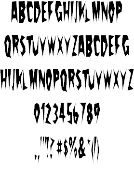
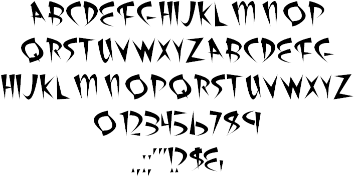
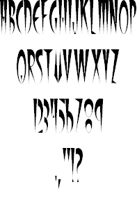
  Creator at Louisiana State University of the angst-inspiring sketchy typeface
  Calligrapher and letterpress artist Kathryn Podorsky runs
  Mary Louise earned a BFA in graphic design and painting from Louisiana State University. She also earned a MFA from the School of the Art Institute of Chicago in Visual Communications. Now based in Louisiana, she graduated from the type design program at the
  [
[ [
[ Tal Leming is a graphic designer, type designer and letterer who lived in Wilmington, DE, but moved his stakes to Baltimore, MD. He graduated from Louisiana State University in 1997. As a Python scripting guru, he worked with Letterror and House Industries on projects using FontLab and Robofab. An avid RoboFog scripter, he joined Erik van Blokland and Just van Rossum to initiate the
  Graphic designer in Baton Rouge, LA. She created the fresh display typeface Pinch in 2014, perhaps referring to pinches of mini-serifs.
  Winston Scully is a type designer, lettering artist, and graphic designer living and working in San Francisco, California. He graduated from Southeastern Louisiana University, worked for a while in branding and packaging from Baton Rouge, LA, and studied at Type@Cooper West in San Francisco, before setting up
|
|
|
|