| | |
Alison Argento
[Dear Alison]

|
 [MyFonts]
[More] ⦿
[MyFonts]
[More] ⦿
|
Amy Dietrich
|
 American designer, b. 1967, California. Married to Ken Russell, who runs Atlantic Fonts in Camden, ME.
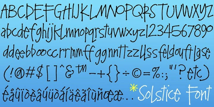
 At Atlantic Fonts, she designed the hand-printed typefaces Kinglet (2012, curly), Honey Bee (2011), Once (2010) and Clue (2010). In 2013, Amy published the playful poster typefaces Trail Map (2013) and Merci. Farmstand (2013) is a hand-printed typeface that is accompanied by the dingbat font Farmstand Goodies. Wheat (2013) is a stylish rough-edged script face. Eeeek (2013) is a Halloween dingbat typeface. Solstice (2013) is hand-printed. Typefaces from 2014: Shoebox, Reading (bouncy typeface), Lion (an African-themed typeface), Suntea (a children's book script), Fini (cartoon font), Fini Things (girly dingbats), Catbird (whimsical). Typefaces from 2015: Goby (a great children's book font with fun sea life dingbats called Goby Graphic), Laughing Gull (a fun cartoonish font), Digby (Atlantic Fonts). Typefaces from 2016: Sanderling(children's script), Dinghy (beatnik style) and Dinghybats, Storyboard (a primitve painter's font), Quince (a handcrafted typeface), Kiwi (a juice bar font accompanied by the dingbat font Kiwi Fruits). Typefaces from 2017: Meow (a children's script), Answer (handcrafted, unicase), Peapod (a textured patterned all caps typeface). Typefaces from 2018: Junglegym, Turmeric. Typefaces from 2019: Pattycake (a children's book font), Espadrille (a mixed case monoline display sans), Galavant (a cartoon font with interlocking letters), Seaglass. Typefaces from 2020: Darcy (a wonderful beatnik typeface), Parula (hand-drawn with lots of oomph due to its energetic line variations). Typefaces from 2021: MollyO (a scrapbook script), Rabbet (a fat finger font). Old URL under the name Amy Dietrich Russell. [Google]
[MyFonts]
[More] ⦿
|
Andrew Nendel
|
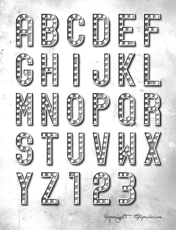
Evansville, IL-based designer of Urban Block (2013) and Marquee Lights (2013). [Google]
[More] ⦿
|
Ashley Longenecker
|
Graphic designer in Portland, ME, who created the display typeface Orbeaux (2014) for a course at Rocky Mountain College of Art + Design. [Google]
[More] ⦿
|
Atlantic Fonts
[Ken Russell]
|
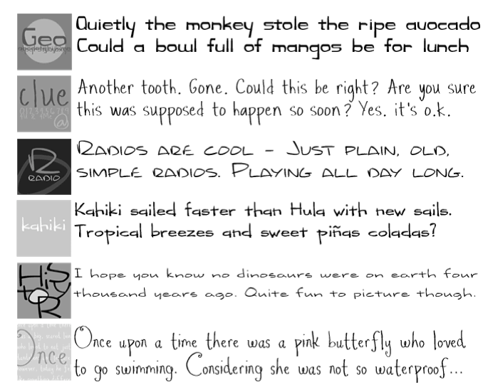
 Atlantic Fonts in Camden, ME, is the foundry of type designer Ken Russell (b. 1962, CA). His typefaces are mostly hand-printed. In 2010, he published Sync, Radio, Kahiki, Clue, Once (curly), Episodian (retro techno), Rewire, and History. In 2011, he added the fat funky typeface Earthling, Orange Cat (hand-printed poster face), and the fun typefaces Gruyere, Mountain Goat (comic book style) and Monarch AF.
 Typefaces from 2013: Rowboat, Judlebug (a children's book script). Typefaces from 2014: Atlantic Doodles, Began (elliptical futuristic wide sans), Steamboat (semi-calligraphic ribbon style script). Typefaces from 2015: Hightide (hand-lettered script). Klingspor link. [Google]
[MyFonts]
[More] ⦿
|
Brian Davies
|
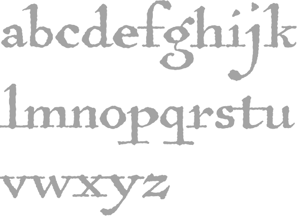
His beautiful font Kashmir (an arts and crafts style font) was created in 1992 as a tribute to Led Zeppelin. Brian was a software designer at Northwestern's Institute of Learning Sciences. His address is listed in the text file as Box 46 CT, Bowdoin College, Brunswick ME 04011. Download link. [Google]
[More] ⦿
|
Brian Willson
[Three Islands Press (was: The Type Quarry)]
|
 [MyFonts]
[More] ⦿
[MyFonts]
[More] ⦿
|
Bruce Kennett
|
Bruce Kennett is a designer of books and exhibits, photographer, writer, and teacher. He studied calligraphy and book design with Austrian artist Friedrich Neugebauer, and later translated Neugebauer's book The Mystic Art of Written Forms. Kennett also served as manager and book designer at Maine's Anthoensen Press. His client list ranges from the Folger Shakespeare Library and the Grolier Club to L.L.Bean and the Mount Washington Observatory. Author of W. A. Dwiggins: A Life in Design (2017, Letterform Archive, San Francisco). Bruce Kennett discovered the work of W. A. Dwiggins in 1972 and has drawn inspiration from it ever since, writing articles, essays, and lecturing widely about the man and his many talents. Bruce has been working steadily on this book since 2003. The publisher's blurb: W. A. Dwiggins: A Life in Design offers an engaging and inspiring overview of the designer's wide-ranging creative output and lasting impact on the graphic arts. Bruce Kennett's careful research, warm prose, and inclusion of numerous personal accounts from Dwiggins's friends and contemporaries portray not only a brilliant designer, but a truly likable character. The texts---five essays and two works of fiction, plus a title page and colophon---are set on the Linotype in Dwiggins's Caledonia, Electra, Eldorado, Metro, and the very rare Falcon, accompanied by an assortment of Caravan ornaments. Twenty-two illustrations, hand-lettered titles, and decorated initials (all made from original Dwiggins pen-and-ink artwork in the files of Boston Public Library) accompany the text, reproduced via high-quality copper photoengravings. His other books include a foreword in Dorothy Abbe's William Addison Dwiggins: Stencilled Ornament and Illustration (2015). [Google]
[More] ⦿
|
Caitlyn Parker
|
During her studies, Caitlyn Parker (South Berwick, ME) created the ultra-black slab serif typeface Riblets (2014). She also created Indian Cheif (sic) (2014). [Google]
[More] ⦿
|
Daniel Gamage
|
 Portland, ME-based designer of the free polka dotted typerface Tilastia (2015).
 In 2017, he designed the monospaced typeface family Alloca Mono. Even though it has hipster elements, it could be used as a programming font. Behance link. [Google]
[MyFonts]
[More] ⦿
|
Dear Alison
[Alison Argento]
|
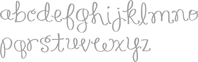
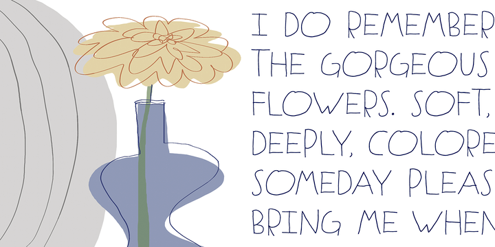
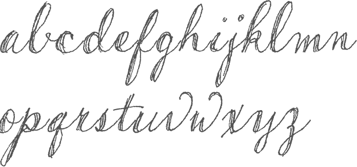
 Travel writer based in Cherry Hill, NJ. Designer (b. Augusta, ME, 1977) of the children's scribble font Urly Lurnin (2008), and of Smiley (2008, comic book face), and of the informal handwriting fonts Pickled Sans (2008), Slim Pickens (2008), Smokehouse (2008) and Gladly Mailed (2008).
 Bender Script (2008) is a brush script developed from an incomplete script drawn by Charles Chas Bluemlein. Barnstormer Script (2010) is a sign painter typeface. Gonte (2013) is a sketchbook script typeface. Saskya (2015) is a rough chancery script. Glade (2015) is a formal calligraphic copperplate script in five widths. In 2016, she designed the architectural lettering typeface Robard, the brush script typeface Beckford Script and the ballpoint pen script Generous Hospitality. Typefaces from 2020: Postale (a monoline gas pipe sans). [Google]
[MyFonts]
[More] ⦿
|
Donovan Mooney
|
At Maine College od=f Art in Portland, ME, Donovan Mooney designed the sans typeface Moon Face (2018). Behance link. [Google]
[More] ⦿
|
Edwin L. Brown
|
American penman, b. Camden, ME, 1869, d. Rockland, ME, 1958. He studied at Rockland Commercial College in Rockland, ME, 1887-1888. In 1888, he met penman A.R. Dunton who employed him to assist in engrossing the diplomas of the Boston Public Schools. He entered in a partnership with his penmanship teacher, H.A. Howard in 1902 until Howard's death in 1952. Howard & Brown had a thriving engrossing and designing business that covered all of the United States and Canada. [Google]
[More] ⦿
|
Etcetera Type Company (or: ETC; was: Finck Font Co)
[Tyler Finck]
|
 Graphic designer and musician (b. 1982) at the New York studio AWP who grew up in Maine and is currently based in Ithaca, NY. In 2018, he founded Etcetera Type Company, which is based in Spencer, NY.
 His typefaces: - The fat counterless caps typefaces Blackout and Blackout Midnight (2008). Blackout Sunrise (2013) is an outlined face and Blackout 2am is a reversed font. Blackout Noon followed in 2014. Free download of Blackout at the League of Movable Type.
- Ostrich Sans (2011). This typeface comes in many weights, including a beautiful Ostrich Sans Inline and a hairline. In 2016, this was followed by the layered monoline sans typeface family Ostrich Proper (+Inline).
- Knewave (2011, Google Web Fonts). A brush signage face. League of Movable Type link.
- Porter Sans (2013). A large wide headline type family. It has a free inline outline weight. Later additions include Porter Sans Ink (2014) and Porter Rough (2016). Porter FT, which includes new rounded styles, was added in 2017.
- Elm (2013). Hand-printed.
- Lickety Split (2013). A crayon or brush face.
- Almost (2013). A poster typeface.
- Guilder (2011-2013). A free typeface family with an inline thrown in.
- Ithaca Sans (2013).
- Fartlek Sans (2014). A handcrafted poster typeface.
- Katahdin (2014). A free font.
- Upstater (2014). A a classical American gothic with shaded and layered styles.
- Grandstander (2014). A comic book face. Grandstander Classic (2017). In 2020, Grandstander became a free Google font---and a two-axis variable font was added for the occasion.
- Boo City (2014). A pixel face.
- Didactic Display (2014). A grungy typeface.
- Upstater Ink (2014). A grungy typeface.
- Finck32A (2014).
- Saturnight (2014). A heavy brush typeface.
- Typocopia (2014). A letterpress emulation typeface.
- Taurus Mono (2014). An outline font.
- Southpaw (2014). A nice informal hand.
- Chawp (2014). A crayon face.
- Mr. Brunch (2014). A brush face.
- Gluten FT (2014).
- Flabbergast (2015). A didone.
- Korsque (2015). A layered typeface.
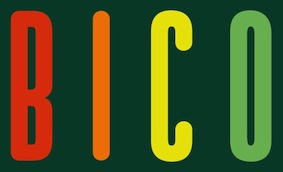
- Bico (2015). A rounded condensed organic typeface.
- Ichabod (2016). An antiqued serif typeface.
- Altitude Condensed (2016).
- Imbue (2016). A condensed didone poster typeface (also called a skyline typeface) at Google Fonts. See also Imbue FT (2017). ETC Imbue (2019) is a variable font version of Imbue with a variation in optical size from Text to Display.
- Retrograde (2016). A monoline and monospaced organic sans.
- Plainview (2016). A squarish and fat typeface.
- Nonesuch (2016). A condensed sans.
- Juju (2016). An octagonal layered typeface family.
- Atiga (2017).
- Mr Brunch FT (2017). A children's book font.
- League Mono (2017). A free font.
- ETC Gluten (2018). An organic font family.
- ETC Epilogue (2018). A variable sans font. Github link. Google Fonts link. Prologue (2020) is a reworking of ETC Epilogue.
- ETC Anybody (2018-2020). A 72-style variable font with weight, width and slant axes. Free at Google Fonts. He writes: Anybody is a big family that combines an affinity for Eurostile plus a heavy dose of 90s inspiration. It's flexible enough to adapt to a variety of situations. From UltraCondensed to ExtraExpanded, type set in Anybody can take up a tiny amount of horizontal space or so much space that you'll need several lines. Its high x-height and low cap height help exaggerate extreme widths and weights. Github link.
- Furrow (2018). A grungy sans.
- Cease (2018). A squarish techno typeface.
- ETC Trispace (2019). A variable font with weight and width axes, based on League Mono.
- ETC Tourney (2019). A variable octagonal font, playing on the theme of outline versus inline. Free Google Fonts download (2020-2021). Github link.
- Struthio (2019). A rounded sans.
- Birdo (2020). An inline typeface.
- Gluten (2021). A free script font family at Google Fonts.
Alternate URL, called The League of Movable Type. Typedia link. Kernest link. League of Movable Type link. Creative Market link, Klingspor link. Dafont link. Home page. Creative Market link. Abstract Fonts link. Google Plus link. YWFT link. Old home page. Behance link. Github link. [Google]
[MyFonts]
[More] ⦿
|
Fallen Angel
|
Art student from Maine, b. 1988. Creator of the star-enhanced handwriting font Virginia's Stars (2007). Home page and blog. [Google]
[More] ⦿
|
Greyletter
[Neil Patel]
|
 Greyletter is Neil Patel's type foundry in Portland, Maine, est. 2009. It morphed into Tetradtype in 2016. Neil Patel is a semiconductor process engineer who was introduced to type design by his wife, a graphic designer. His typefaces:
 - Pinion Display (2010). A Victorian display face.
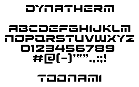
- Dynatherm (2013). A custom sci-fi stencil font for Cartoon Network's Toonami programming block.
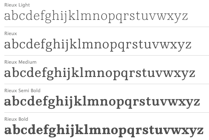
- Rieux (2013). Neil writes: Named after the steadfast doctor from Albert Camus' The Plague, Rieux is an even-tempered slab-serif that is confident without being cocky and approachable without being casual. The aesthetic of Rieux is inspired by the industrial age. While the design is not directly derived from typefaces of that era, the shapes of letter-forms are informed by images of over-sized steel machines and the monolithic brick buildings that housed them.
- Grafton Titling (2014). A classical lapidary titling typeface.
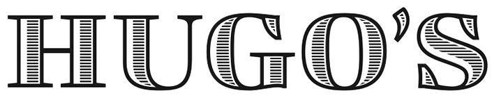
- Custom fonts: Inside Voice (2014, for IDEXX Laboratories), Hugo's (2014: a logotype for Hugo's in Portland).
- Texttile (2014). A system of heavy sans titing typefaces for chromatic overlays and simulating textile textures.
[Google]
[MyFonts]
[More] ⦿
|
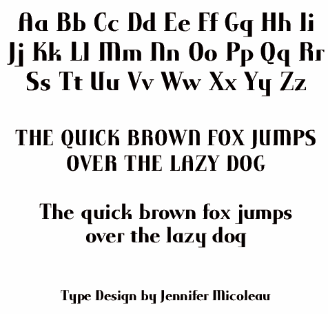
Jennifer Micoleau
|
Designer and sculptor in Portland, ME, who designed some typefaces in 2010. [Google]
[More] ⦿
|
Jonathan Novak
|
Portland, ME-based designer of the counterless polygonal typeface 60lb Text (2015, with Neil Patel). Behance link. [Google]
[More] ⦿
|
Kaitlyn Hebden
|
Kaitlyn Hebden (Wells, ME) first studied at the University of Redlands in Redlands, CA, and then at the University of New South Wales in Sudnay, Australia. She designed the multicolored all caps typeface Liquid Bass during her studies in Sydney in 2015. [Google]
[More] ⦿
|
Kate Fagerstrom
|
Student of graphic design at the Maine College of Art, born in New Jersey. Behance link. Her ball terminal logotype called Fagerstrom (2010) shows a lot of innate talent. [Google]
[More] ⦿
|
Ken Russell
[Atlantic Fonts]
|
[MyFonts]
[More] ⦿
|
Kristen DeVico
|
During her studies at Maine Colle of Art (MECA), Portland, ME-based Kristen DeVico designed the monoweight slab serif typeface Liko (2017). [Google]
[More] ⦿
|
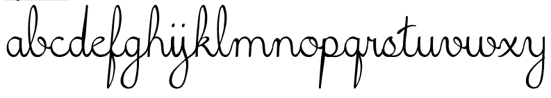
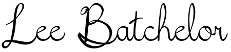
Lee Batchelor
|
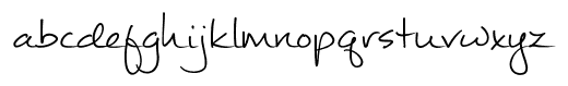
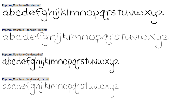
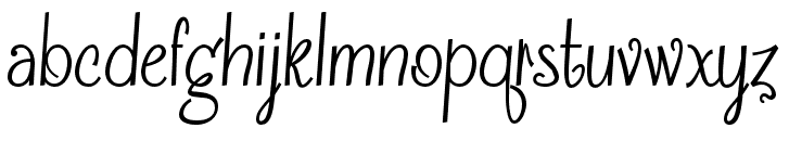
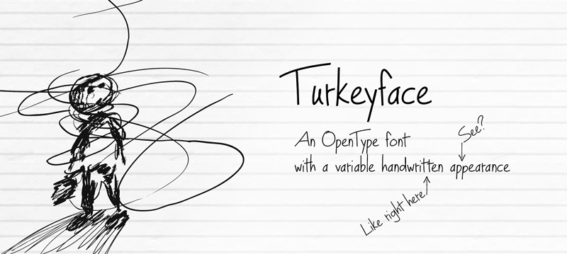
Maine-based photo editor, designer, and web guy. Creator of the upright connected (school) script font Fifth Grade Cursive (2011), Smotth Papyrus (a smooth version of papyrus), the cleanly hand-printed Mathilde (2012) and Popcorn Mountain (2012). In 2013, he created Frosting For Breakfast (script face), Turkeyface, Mathilde (script face), Que Rompa (an extreme-contrast poster face: the full family is commercial), Pretty City Kitties, Mousedrawn, and the gorgeous technical handwriting typeface #1 Ichiro. Dafont link. [Google]
[More] ⦿
|
Mark Jamra
[Type Culture]
|
[MyFonts]
[More] ⦿
|
Meredith Lindsey
|
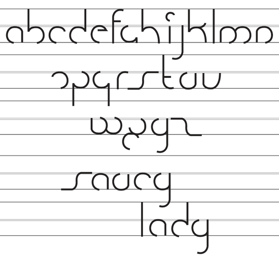
Wells, ME-based creator of Saucy Lady (2011). [Google]
[More] ⦿
|
Neil Patel
[Greyletter]
|
 [MyFonts]
[More] ⦿
[MyFonts]
[More] ⦿
|
Neil Patel
[Tetrad Type]
|
[MyFonts]
[More] ⦿
|
Nick Polifroni
[Remedy 667]
|
[MyFonts]
[More] ⦿
|
Nicole Holmes
|
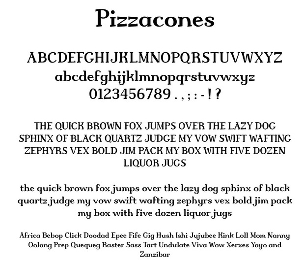
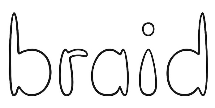
Graphic Design student at the Maine College of Art in Portland, ME, who grew up in Connecticut. She created Pizzacones (2013) and Braid (2012). Behance link. [Google]
[More] ⦿
|
Remedy 667
[Nick Polifroni]
|
 Nick Polifroni (Remedy 667) is an American illustrator and designer, b. 1980, who lived in Belleville, MI, and Falmouth (Portland), ME. He specializes in horror fonts. Creator of the scratchy font Orange Book (2007), the sans typefaces Asymek (2011) and Glasket (2011), the grungy Fueled by Schlitz (2011), the grungy Boxpot (2011), and the display typeface Absender (2011).
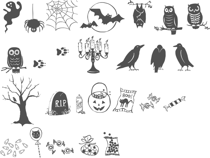
 Grunge and display fonts from 2018: Screature (a horror font), Instant Sinner, Vampliers (a horror font), Zine Time, Hamburger Hop. In 2020, he released Drakoala, Hell Builder, Indurske, Skate Bait, Franklinstein, Scrungy, Afraid of the Dark, Leach, Printing Black 95, Burger Witch, Union Street, Boiler Room, Birthday Massacre, Poesan Ghost, Odictums, Radio Fake, and Flying Sausage. Typefaces from 2022: Barth (a wavy horror font), Barth. Creative Fabrica link. [Google]
[MyFonts]
[More] ⦿
|
Sarah McLean
|
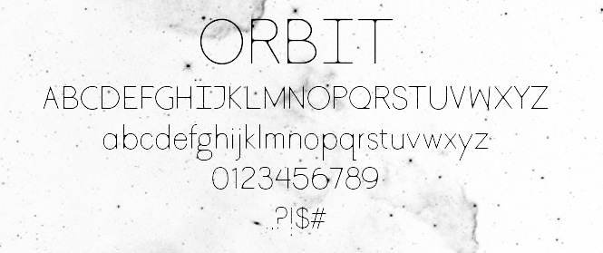
Graphic designer in Portland, ME, who created the thin display typeface Orbit (2013). Behance link. [Google]
[More] ⦿
|
Stephanie Henry
|
During her studies at Maine College of Art, Stephanie Henry (Portland, ME) designed the didone typeface Mary (2018). [Google]
[More] ⦿
|
Tetrad Type
[Neil Patel]
|
American type foundry, est. 2016, by Neil Patel. Partner of JamraPatel, a studio focusing on multi-script type systems and run jointly by Mark Jamra and Neil Patel. In 2016, Neil patel published Rieux, Text Tile, and Grafton Titling. These typefaces are transfers from Neil Patel's typefaces at Greyletter in Portland, Maine, est. 2009. His typefaces: - Pinion Display (2010). A Victorian display face.
- Dynatherm (2013). A custom sci-fi stencil font for Cartoon Network's Toonami programming block.
- Rieux (2013). Neil writes: Named after the steadfast doctor from Albert Camus' The Plague, Rieux is an even-tempered slab-serif that is confident without being cocky and approachable without being casual. The aesthetic of Rieux is inspired by the industrial age. While the design is not directly derived from typefaces of that era, the shapes of letter-forms are informed by images of over-sized steel machines and the monolithic brick buildings that housed them.
- Grafton Titling (2014). A classical lapidary titling typeface.
- Custom fonts: Inside Voice (2014, for IDEXX Laboratories), Hugo's (2014: a logotype for Hugo's in Portland).
- Texttile (2014). A system of heavy sans titing typefaces for chromatic overlays and simulating textile textures.
Speaker at ATypI 2018 in Antwerp on the topic of a multi-script type system for Africa. [Google]
[MyFonts]
[More] ⦿
|
Three Islands Press (was: The Type Quarry)
[Brian Willson]
|
 Brian Willson (b. 1951, New Haven, CT), grew up in Austin, TX, and obtained a degree in radio, TV and film from the University of Texas in 1979. Since 1980, Willson has lived in coastal Maine, where for 15 years he worked as a writer and journalist, in both broadcast and print media, and was managing editor of National Fisherman magazine for one year. In the mid 1990s, he left the magazine business to devote his full time to Three Islands Press (3IP), a digital design and publishing company he founded in Rockland in 1989. He has been designing type since 1993. Three Islands Press (or 3IP, or The Type Quarry) used to offer 10 dollar shareware fonts. They went commercial and are now located in Rockland, ME. 3IP Type Foundry also enjoys the contributions of type designers Patricia Lillie and Lars Bergquist. Their fonts:
 - Abigail Adams (2014). An epistolar script based on he hand of Abigail Smith Adams, first Second Lady and second First Lady of the United States.
- American Scribe: 2003, after the handwriting of Timothy Mattack, who penned America's Declaration of Independence.
- Antiquarian (2010): based on the titles and captions and place labels on a page I have of Henri Abraham Chatelain's Atlas Historique.
- Antiquarian Scribe (2010): based on the body text in an 18th century atlas by Henri Abraham Chatelain.
- Attic Antique: old pitted characters.
- Austin Pen (2018): Stephen F. Austin (1793-1836) is considered by many the father of Texas for leading the first Anglo-American colony into the then-Mexican territory back in the 1820s. A few years later, while on a diplomatic mission to Mexico City, Austin was arrested on suspicion of plotting Texas independence and imprisoned for virtually all of 1834. During this time he kept a secret diary of his thoughts and musings. Austin Pen is my interpretation of Austin's scribblings in this miniature prison journal.
- Bonnycastle (2015). Based on the charts of Sir Richard Henry Bonnycastle (1791-1847), an English officer and military engineer who served in the War of 1812 and ultimately settled in Canada.
- Bonsai.
- Botanical Scribe (2013, a warm copperplate script): "The Raphael of Flowers" is what they called Pierre-Joseph Redouté a couple hundred years ago. The Belgian native became famous in France, where he painted floral watercolors for both Marie Antoinnette and Empress Josephine. But what cemented his legacy was his perfection of a stipple engraving technique that brought his art to the masses. Botanical Scribe is modeled after the neat, cursive hand-inscribed legends on these antique prints. Because it simulates handlettering, the font retains a warm, organic quality not seen in fancy modern scripts while remaining both elegant and legible.
- Broadsheet
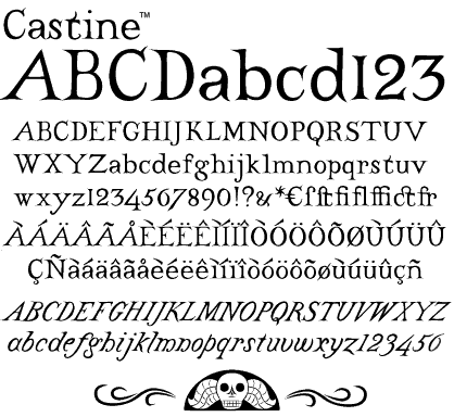
- Castine (1998).
- Cedar Street
- Chromosome (1995): a label-tape gun font.
- Dingos: free.
- Douglass Pen (2011): inspired by the handwriting of Frederick Douglass, who was born an American slave but died a distinguished 19th century statesman, orator, and abolitionist leader. He also had fine penmanship. Douglass Pen is modeled chiefly after Douglass's handwritten account of John Brown's 1859 raid on Harpers Ferry, VA.
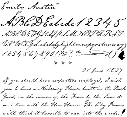
- Emily Austin (2001) is modeled after the penmanship of Emily Margaret Austin (Bryan) Perry, an early Texas colonist along with her brother, Stephen F. Austin, for whom the state capital was named. Specimens were letters dating from 1837 until 1851, the year of her death at 56. It is a beautiful historic handwriting font.
- Geographica (2016), Geographica Hand (2017), Geographica Script (2017). He writes: Thomas Jefferys (ca. 1710-1771) was the best-known map engraver in 18th-century England, chiefly because he won (and hyped) the title Geographer to King George III. Jefferys was more an engraver/publisher than a geographer, really, since he mostly relied on the cartographic materials of others. Geographica is a four-style serif text-type family modeled after the neat hand-lettered place names and peripheral text on Jefferys's maps. Geographica is characterized by long serifs and ample x-height, and comes with a set of unique cartographic ornaments. Geographica Script is a roundhand calligraphic typeface influenced by the maps of Emanuel Bowen (1694-1767).
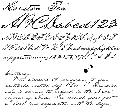
- Houston Pen (after the handwriting of Sam Houston.
- Horsefeathers.
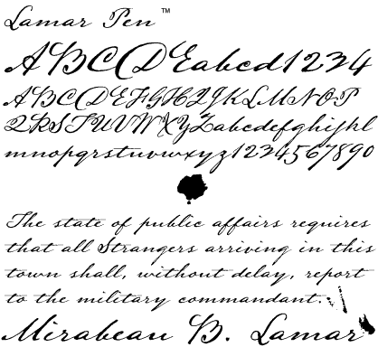
- Lamar Pen: 2003, after the handwriting of poet Mirabeau B. Lamar, ca. 1830s.
- Marydale. Willson wrote: While working at National Fisherman magazine several years ago, I admired the hand-lettering of the production director, Marydale Abernathy, and suggested she let me model a font after her penmanship. She drew out the alphabet, I launched Macromedia (then Altsys) Fontographer, and (to shorten a long story) I ended up developing my first typeface. For the heck of it, I released it first as shareware, then as a full-featured typeface and, astonishingly, it took off.
- Military Scribe (2015). Military Scribe is modeled after the compact utilitarian script on the mid- to late-1770s muster rolls of the (British) Tenth Regiment of Foot.
- Oak Street
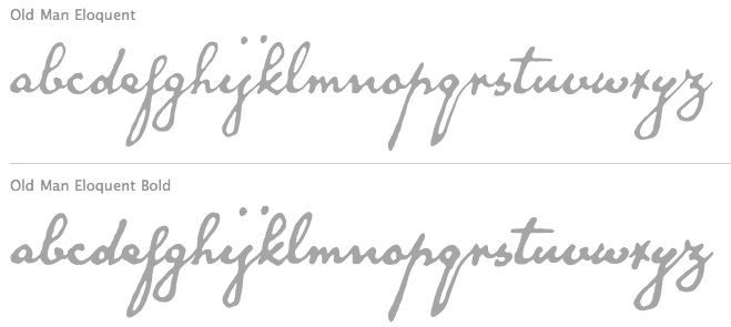
- Old Man Eloquent (2010): a connected script based on an 1810 sample of the handwriting of John Quincy Adams.
- Professor
- Pumpkinseed
- Remsen Script.
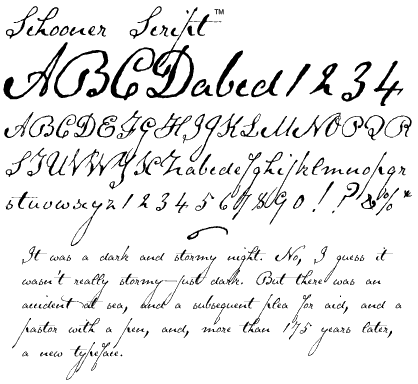
- Schooner Script: after the 1825 handwriting of pastor Samuel Clarke of Princeton, MA.
- Sluggo.
- Speed Bump
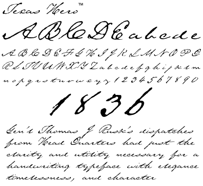
- Texas Hero: after the hand of Thomas J. Rusk, 1836.
- Terra Ignota (2013). Based on the handlettering on Amerique Septentrionale, a 1650 map by French cartographer Nicolas Sanson.
- Treefrog (1993): beautiful unevenly inked handwriting style, inspired by the quirky inkpen doodlings of Philip D. Cyr, a graphic designer who lives in Arizona.
- Viktorie (2007, handwriting).
Alternate URL. MyFonts link. Alternate URL. alternate site. Agfa-Monotype page. Fonts sold by Mindcandy. Creative Market link. FontShop link. Klingspor link. View Brian Willson's typefaces. [Google]
[MyFonts]
[More] ⦿
|
Tom Puckett
|
Tom Puckett (Cape Elizabeth, ME) designed the quirky Hotcakes Slim and Bulky (2003) and the "scary" typefaces Boneyard Normal and Casual (2003) [Google]
[More] ⦿
|
Tyler Finck
[Etcetera Type Company (or: ETC; was: Finck Font Co)]
|
 [MyFonts]
[More] ⦿
[MyFonts]
[More] ⦿
|
Tyler Jamieson Moulton
[Tyler Moulton]
|
Portland, ME-based graphic designer specializing in Infographics, data visualization, and type design who studied at Maine College of Art. Creator of the squarish typeface Elevator Sans (2020) and the experimental display typeface Usul Slab (2020). In 2021, he released the dot matrix font Cartesian. [Google]
[MyFonts]
[More] ⦿
|
Tyler Moulton
[Tyler Jamieson Moulton]
|
[MyFonts]
[More] ⦿
|
Type Culture
[Mark Jamra]
|
 Advertised as Mark Jamra's Portland, ME-based digital type foundry and an academic resource. There is an extremely useful research directory, a great jump point for learning about type and its history. The site also has useful articles such as Jamra's article on optical image support and his article on form and proportion in a typeface. Mark Jamra (b. 1956) lives in Portland, Maine, where he designs type and teaches letterform and graphic design at the Maine College of Art. He did postgraduate work at the Basel School of Design, Switzerland, 1980-83, then worked for URW in Hamburg (where he lived for 12 years), and set up Jamra Design there. He left Germany in 1995. Fonts by Jamra:
 View Mark Jamra's typefaces. Brief bio. Speaker at ATypI 2006 in Lisbon. FontShop link. Speaker at ATypI 2018 in Antwerp on the topic of a multi-script type system for Africa. [Google]
[MyFonts]
[More] ⦿
|

