TYPE DESIGN INFORMATION PAGE last updated on Mon Mar 9 16:08:18 EDT 2026
FONT RECOGNITION VIA FONT MOOSE

|
|
|
|
|
Type scene in Montana | ||
|
|
|
|

SWITCH TO INDEX FILE
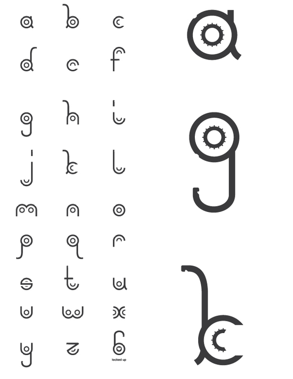
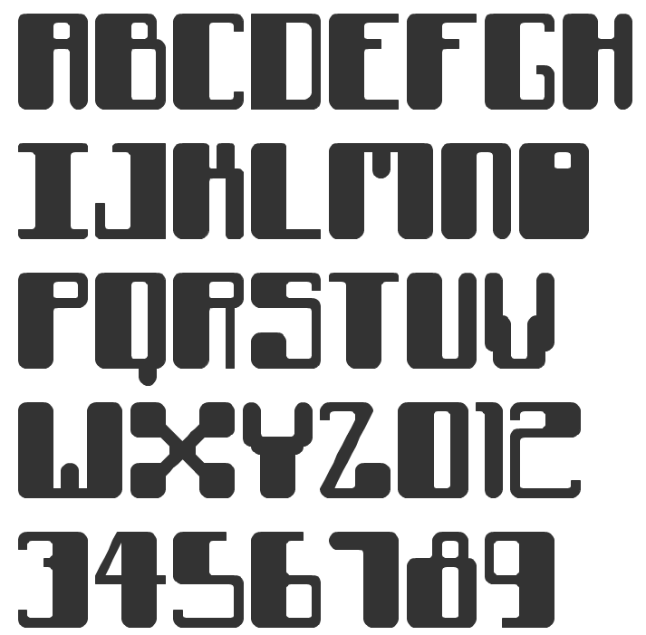
Andrew Lockhart (b. Sandy, OR) runs Andrew Lockhart Design in Montana, where he is a student at Montana State University. As a FontStructor, he made Thick Round, Sport Classic (athletic lettering face), Thin Stripe, Bold Stripe, and Stripe Bold in 2010. Locked Up (2010) is based on a vector image of a combination lock. Home page. Behance link. [Google] [More] ⦿ | |
Bill designed Busted (2008, Canada Type: grunge family) and the luxurious families Didot Headline (2009, Canada Type) and Didot Display. From 2009 until 2011, he cooperated with Patrick Griffin at Canada Type on a monumental revival of Alessandro Butti's Semplicità typeface---the new family is called Semplicità Pro. The designers write: Bill and I spent some time looking closely at Futura, the instant popularity of which in the late 1920s triggered Butti's design. This was for the most part a pleasant process of rehashing what constitues a geometric typeface, musing over the fundamental phallacy of even having such a classification in type while in reality very little geometry is left after the application of the optical adjustments inherently needed in simplified alphabet forms, trying to understand how far such concepts can go before entering into minimalism, and scoping the relativity between form simplicity and necessary refinement. Mostly academic, but very educational and definitely worth the ticket. [...] For an answer to Futura, Semplicità was certainly quite adventurous and ahead of its time. It introduced aesthetic genetics that can be seen in popular typefaces to this very day, which is to say eighty years later. Though some of that DNA was too avant-garde for the interwar period during which Semplicità lived out its popularity, much of it remains as an essential aesthetic typographers resort to whenever there is call for modern, techno, or high-end futuristic appeal. The most visibly adventurous forms at the time were the f and t, both which having no left-side crossbar, with the f's stem also extended down to fully occupy the typeface's descender space. Aside from those two letters, Semplicità's radical design logic and idiosyncracy become more apparent when directly compared with Futura. [...] Futura attempted to go as far as geometry could take it, which ultimately made it too rigid and considerably hurt its viability for text setting. Renner himself acknowledged some of its flaws, and even proposed alternate fucntionality treatments, with a more humanist aproach applied to some forms, all of which went nowhere because Futura's momentum and revenue were deemed undisruptable by some- thing so trivial as aesthetic or functionality. William Dwiggins' Metro design, a direct descendent of the Renner's design, went almost diametrically the opposite way of Futura, with the deco facets considerably magnified and the geometry toned down. Butti decided a design that finds the middle ground in that aesthetic tug of war was probably a better idea than either extreme. In 2016, Patrick Griffin and Bill Troop co-designed Bunyan Pro, which is the synthesis of Bunyan, the last face Eric Gill designed for hand setting in 1934 and Pilgrim, the machine face based on it, issued by British Linotype in the early 1950s---the most popular Gill text face in Britain from its release until well into the 1980s. [Google] [MyFonts] [More] ⦿ | |
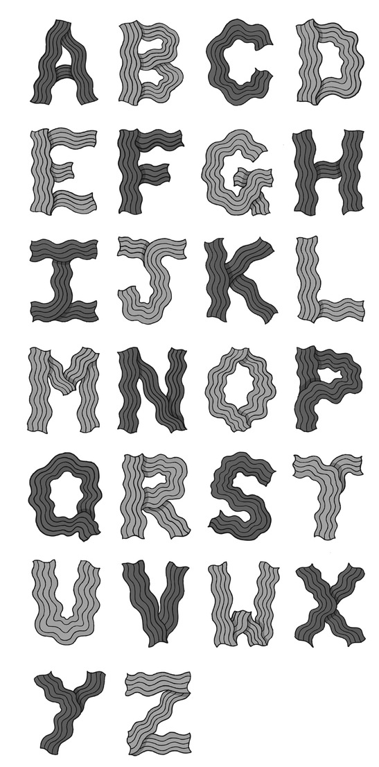
Freelance illustrator and graphic designer living in Missoula, MT. He created the Wavy Gravy display typeface (2012). [Google] [More] ⦿ | |
Missoula, MT-based designer of the multiline typeface Kelly (2018). [Google] [More] ⦿ | |
Edward McKnight Kauffer (b. 1890, Great Falls, MT; d. 1954) was an American artist and graphic designer who lived for much of his life in the United Kingdom. He worked mainly in poster art, but was also active as a painter, book illustrator and theatre designer. He studied at the Art Institute of Chicago (1912/1923) and moved to London in 1914. He is known for the 140 posters that he produced for London Underground, and later London Transport, covering diverse styles---from abstract, futurist, cubist and vorticist to impressionist and art deco. He returned to New York City in 1940 where his main client was American airlines between 1947 and 1954. Type designs that were influenced by his poster lettering:
| |
Goldcreek, MT-based designer of the handcrafted typeface Awarness (sic) (2016). [Google] [More] ⦿ | |
While studying at the University of Montana, Genna Boyer created the fat finger typeface Lemonade Stand (2013). [Google] [More] ⦿ | |
Bozeman, MT-based designer, as a student at MSU, of the all caps sans headline typeface Robust Elegance (2017), the North African emulation typeface Tamazight (2017), and the geometric solid typeface Geometric Art Deco (2017). Behance link. [Google] [More] ⦿ | |
Student at the University of Montana. Creator of the hand-printed typeface Heather Shibahn (2012). [Google] [More] ⦿ | |
Jackrabbit Creative
|
Typefaces from 2016: Vintage Number Pack (numerals for dollar bills), Melvin (sans). Creative Market link. Another Creative Market link. Gumroad link. [Google] [More] ⦿ |
Montana-based designer at Apostrophic Laboratory, of Extasy Dings in 2000. She co-designed KimonoGeo-Italic, KimonoGeo, Kimono-Italic, KimonoKong-Italic, KimonoKong, and Kimono with Apostrophe. Obsolete URL. [Google] [More] ⦿ | |
Kitaleigh Boutique
|
Typefaces from 2018: KL Tinker, Love Rawr, Planks, Match Box, Buffalo Jane, Reindeer Goals, Gingerbread, Lovemug, Grandma's Cookies. [Google] [More] ⦿ |
Fontstructor who made My Orchard (2012, a fattish modular typeface). Aka Sunburned Surveyor. Home page. Landon is a land surveyor in California and Nevada and lives in Stockton, CA, after graduating from the Flathead Valley Community College in Montana. [Google] [More] ⦿ | |
Lakeside, MT-based designer of a free handcrafted typeface, handCrafted Maddy, in 2015. Home page. Dafont link. [Google] [More] ⦿ | |
After studying the illustrations, cartographies, and penmanship of Lord of the Rings author, J.R.R. Tolkien, Chicago-based Madison Apple (b. Whitefish, Montana) created a detailed script font based on his handwriting called Legendiarum (2015). It was developed during his studies at Columbia College Chicago. [Google] [More] ⦿ | |
| |
Nikita Grimes
| |
Phil Bracco
| |
Pink Broccoli
|
In 2012, Bracco published Mister Rii PB. In 2013, Phil Bracco designed Screwby (offbeat retro style that started out as a digitization of the film typeface Surf by Lettergraphics) and Contraption (an octagonal typeface family that started out as a digitization of a film typeface called Intrigue by Lettergraphics). Typefaces from 2014: Wonderbear PB (a cartoon typeface based on the title screens and comic books of the Hair Bear Bunch), Sackem PB (Bracco explains: Sackem started as a digitization of a singular film typeface called Benman Jumbo by Lettergraphics. From there, this mechanical typeface was expanded into a giant family of playful widths and obliques: from the condensed Slim style to the original Jumbo style). Typefaces from 2015: Beaucoup PB (Beaucoup started as a digitization of a film typeface called Bippie by Facsimile Fonts), Luckmeister PB (offbeat, retro and cartoonish, from the vintage record cover, Music from MR. Lucky, composed and conducted by Henry Mancini), Good Grief PB (which started out as a digitization of a film typeface called Carmel by Letter Graphics), MardiKrewe PB (funky psychedelic letters, described by Phil as delightfully insane; it started as a digitization of a film typeface called MardiGras by Lettergraphics). Typefaces from 2016: Cat Burglar PB (inspired by the titling of a 1961 Looney Tunes cartoon called "The Pied Piper of Guadalupe"), Birthday Wish PB (beatnik style), Flawless Flygirl PB (beatnik style), Jus Hangin PB (children's script inspired by the lettering on the cover of the 1999 Counting Crows album "This Desert Life"). Typefaces from 2017: Roadie PB. Typefaces from 2018: Roadie PB, Chilidog PB, Cattleprod PB, Varmint PB (an offbeat flared serif font inspired by the titling of the early 1970s Yosemite Sam & Bugs Bunny comics from Gold Key), Nudity PB (a revivo the film font Ad Shadow by LetterGraphics as a layerable font), Wintermint (a revival and extension of the flared almost psychedelic typeface Lori by LetterGraphics). Nudity PB, Wintermint, Patsy PB (beatnik style). Typefaces from 2019: Ridiculous PB (beatnik), Troubled PB, Blackhole PB (a digitization of a bullethole psycjedelic film typeface known as Circue Solid by LetterGraphics), Stacked Deck PB (a retro font), Mushmouth PB (based on Lettergraphics' cartoon font Albert), Rackem PB (a beatnik font that started as a digitization of a film typeface known as Eightball by LetterGraphics). Typefaces from 2020: Jughead PB (inspired by Cooper Black and Archie Comics). Typefaces from 2021: Uncanny Cat PB (a beatnik font), Goondocks PB (octagonal; a faithful recreation of the titling font from 1985 film, The Goonies), Friday Freak PB (a beatnik all caps typeface inspired by the 1976 Disney movie Freaky Friday), Soulfinger PB (a psychedelic and beatnik hybrid). |
Robyn Phillips
| |
| |
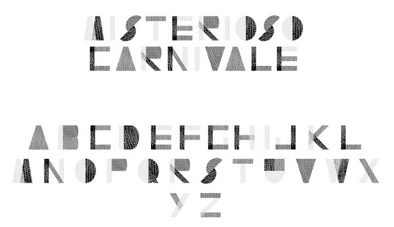
Bozeman, MT-based graphic design student who created the collage-style typeface Misterioso Carnivale (2012). [Google] [More] ⦿ | |
Missoula, MT-based designer (b. 1979) of CrimsonVermillionHandwriting (2008) and Wicked Witch (2008). [Google] [More] ⦿ | |
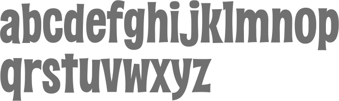
Scott Soker runs Smoke Signal Design in Poplar, MT. Scott designed War Club Typeface (2014), a rounded spurred handcrafted typeface family with regular, rough and textured styles. He specializes in handcrafted lettering. [Google] [More] ⦿ | |
| |
Converts your signature to a TrueType font for 10USD. Free sample font. Also free, the signatures of four presidents: Signature-AbrahamLincoln, Signature-GeorgeWashington, Signature-JohnFKennedy, Signature-JohnAdams. Initials are freely converted. Based in Glasgow, Montana. [Google] [More] ⦿ | |
Skeldale House Treasures
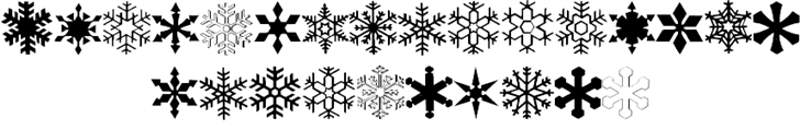
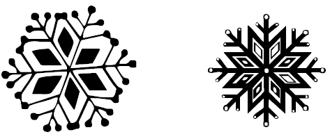
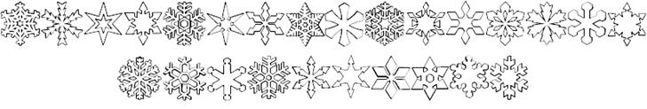
| This site used to have shareware dingbats by Missi (Robyn Phillips from Cascade, Montana). For a short while, it was a commercial site featuring 246 fonts on one CD for 49USD. And some time after that, it shut down altogether. However, the fonts will forever be floating around in cyberspace. Fontspace link. The font names start with Ryp or ryp, and with that prefix omitted, we have: Abctrain, Animal, Aquatic, Bars 1, Birds 1, Buildings, Butterfly 1+2, Button 1-4, Caps Fonts (60 typefaces !), Cartoon Bugs, Cats 1 + 2, Children 1-3, China Art (11 typefaces), Christmas 1-4, Christmas Bells, Christmas Caps, Deco 1-20, Element 1+2, Evil 1, Facets 1, Fat 1, Fiesta 1+2, Floral 1-11, Frames 1+2, Geometrics, Greek Vases 1+2, Halloween 1, Hats 1+2, Hearts 1, Jewels 1-4, Keys 1+2, Kokopelli Flute, Ladies Hats 1+2, Leaves 1, Lighthouse 1, Nature 1, Nymphic, Old Wood Cuts 1-6, 10-14, Old World Art 1-4, Ornate 1-7, Pipes 1+2, Quilt 1-10, Real Bugs, Ropes 1+2, Santa 1+2, Scarey, Snowflake 1-8 (image of Snowflake 1 and of Snowflake 3), Silhouette 1-20, Thanksgiving, Transportation 1-3, Trees, Victorian 1-3. Dafont link. [Google] [More] ⦿ |
Typefaces from 2017: Oh Livey, Tilly, Girl Crush, Hey Girl, Carley and Co, Flower Child, Sweet Mia (calligraphic brush), Willow Bloom (calligraphic brush), Sookie, May Wilde (brush script). Typefaces from 2018: Ciera (watercolor SVG font), Spring Rain (SVG brush font), Sophia Reign (signature font duo), River Jade (signature font). | |
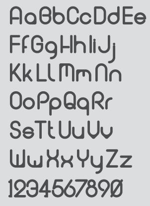
Bozeman, MT-based designer of the monoline circular sans typeface Otter (2014). Behance link. [Google] [More] ⦿ | |
Cargo Collective link. [Google] [More] ⦿ | |
| |
Tyler Thorney
|


 Northwest Montana-based designer Tyler Thorney created the hand-drawn typefaces Sandman, Hickory Slab, Atlas Sans and Atlas Slab in 2014. In 2015, he designed Death To Stock, Dagwood (brush typeface), Tiger Lily (a handcrafted serif typeface), Hastings (Fill & Stencil), Jackalope, Milktooth and Moonshine.
  Or Kitaleigh Nikita Grimes, b. Montana. Dickinson, TX-based designer of the beautiful condensed handcrafted typeface KL Emily (2017). Other handcrafted typefaces by her from 2017 include Gingerbread, Coffee Beans, Goldfish Tale, Awkward Octo, Coconut Milk, Glitter In My Veins, Crazy Day, Pumpkin Patch, Donut Shoppe, Playbook, Hello Sweetheart, Cobwebs, Bonfires (connected monoline script), Beaches (a handcrafted sans), Pumpkin Spice, Kidergarten (child script), Pajama Jam, Back To School, School Haze, Rah Rah Rah, Road Trip, Faux Tales, Liberty, Sweet Berries, Salt+Lime, Milk+Cookies, Mermaid Tails, Unicorn Wishes, You+Me, Prickly Pear, Sweet Pineapple, Raydiant, Twinning, Lily Pop, Salty Kisses, Sunny Beach, Cassette Tape, Freedom Rings Monogram, Monomaid Monogram, KL Emily, KL Cassidy, KL Frances, KL Cupid and KL Gabe.
  Bozeman, MT-based designer of these mostly vintage typefaces: Eastport (2015), Aloha Friday (2015), Frigate (2015), Whydah (2015), Betty Bop (2015), Munster (2015). [
 [
[ Foundry located in Westbury, NY, and run by Phil Bracco (b. 1981, Big Horn, MT), a graduate of the Pratt Institute. Creator of the festive signage fonts Charming Charlie PB (2009), Hip Hopper PB (2008, inspired by the lettering on an art poster by Patrick Owsley for the cartoon character Hoppity Hooper),
 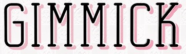 For a school project, Sam Lustig (Bozeman, MT) created the stackable display typeface Gimmick (2015).
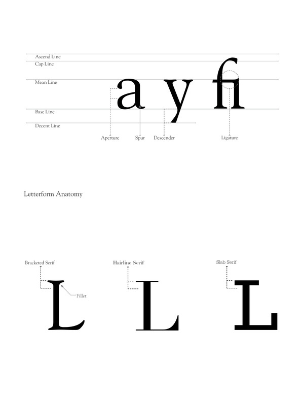
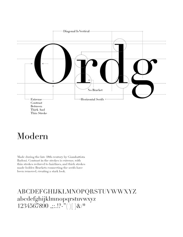
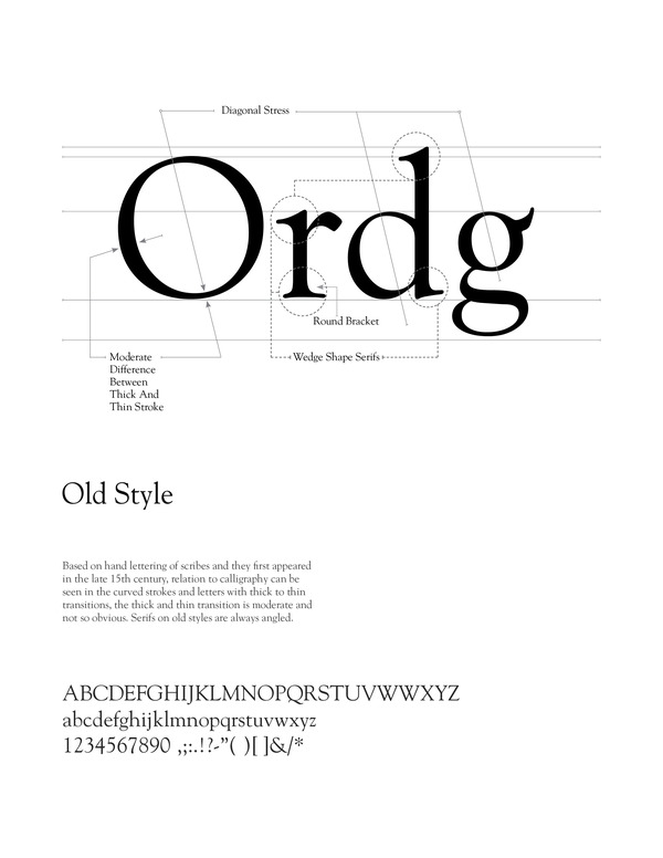
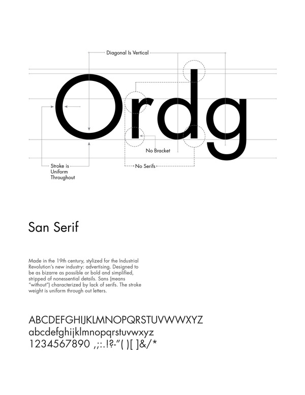
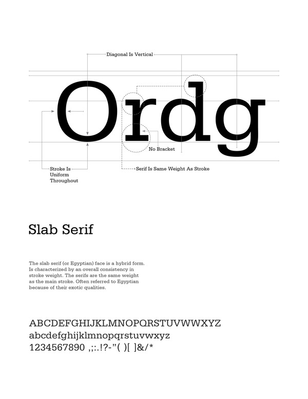
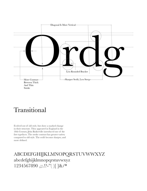
 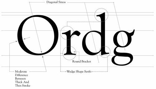 Graphic designer in Bozeman, MT. He created some nice posters that explain the different features of typefaces as well as the classification of types:
  Great Falls, MT and Amsterdam, The Netherlands-based designer of the brush typefaces April Blossom (2016), Januar (2016), December Sparks (2016) and October Storm (2016), the script typefaces De Novembre (2016) and Sweet September Script (2016, beatnik style), Minty March (2016), July Kissed (2016, curly brush script), Dear June (2016), the brush script typefaces August Rain (2016), Bongiorno (2016), Willow (2016) and Olive Sky (2016). He also created the handcrafted February Love (2016), Jamie Woods (2016).
 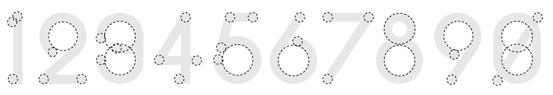 Designer at The University of Montana's University Center in Missoula, MT. He created the arc-based geometric typeface
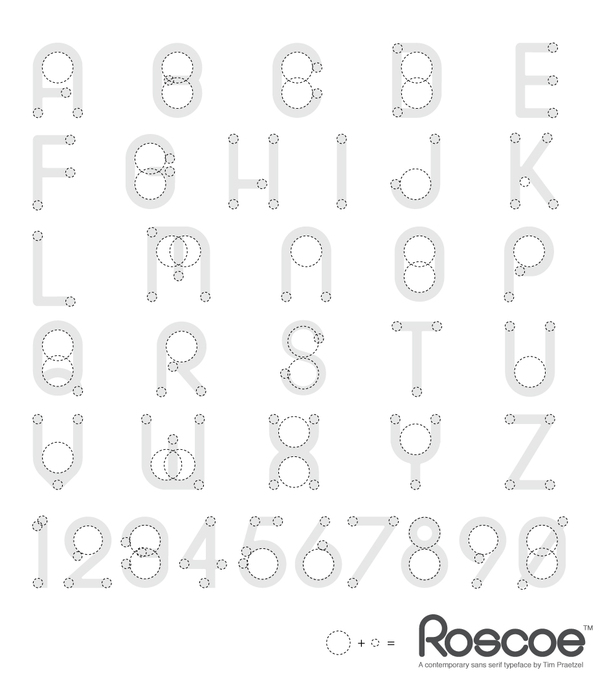
  Tina Smith is an independent art director and designer in New York City who specializes in typography-driven branding, editorial design, and art direction. She has worked on brand identities, campaigns, editorial design, films, websites and packaging for Google, The New York Times, and Target. She also has an independent practice of lettering and type design. She holds a BFA in Graphic Design from Montana State University and studied at The Cooper Union in 2018 and 2019. Her typefaces:
![[continued]](ShaunCoke--AnatomyII.jpg)
|
|
|
|