TYPE DESIGN INFORMATION PAGE last updated on Mon Jun 8 17:38:02 EDT 2026
FONT RECOGNITION VIA FONT MOOSE

|
|
|
|
|
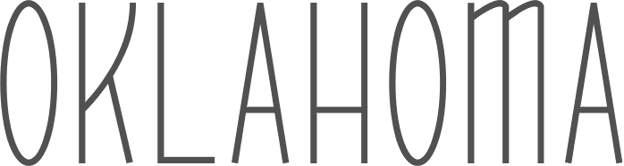
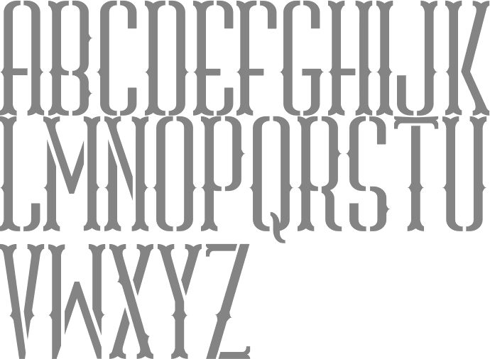
Type scene in Oklahoma | ||
|
|
|
|
SWITCH TO INDEX FILE
As a student in Oklahoma City, Abi Roe designed the display typeface Celtic Structure (2017). [Google] [More] ⦿ | |
Aka Agent Sp1ff. Tulsa, OK-based designer (b. 1982) of the pixel font SP1ff (2020). [Google] [More] ⦿ | |
Albatross (or: Font Deals)
|
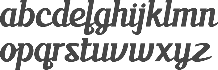
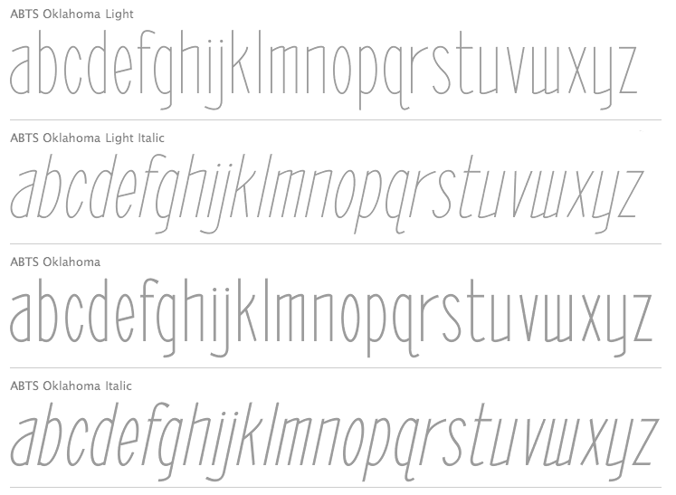
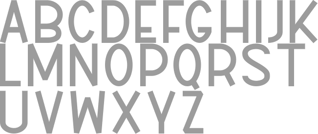
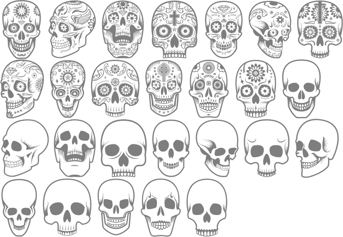
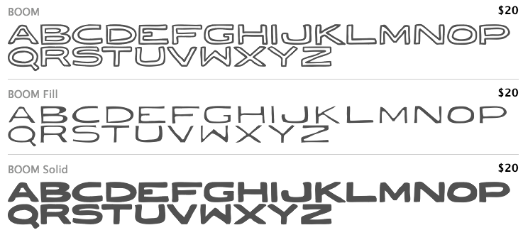
Typefaces from 2008 include the informal outline typeface Tire Shop, the informal 3d shadow typeface Blox (2008), the 3-d wood typeface Baja California, the stunning four-style family called BB Petie Boy (which includes an ornamental caps style, a grunge style, a blackboard style and a sketch style), Fusty Saddle, 23rd Street (a graffiti font) and Whiteboard Modern. In 2009, he followed up with Oil Change (3d, hand-drawn). In 2011, he created the futuristic family Naughty Astronaut (+Cowboy), the Western typeface ABTS Gunsmoke, the connected retro script typeface ABTS Milk, ABTS Feather Pen, ABTS Oklahoma (retro deco), ABTS Aviator (2011, art deco caps face), and ABTS Day of the Dead (ornamental skulls, Mexican style), ABTS Crestwing (an inline caps face), Helios Pro. Typefaces from 2013 include Boom (a comic book typeface family, with hand-drawn Boom Symbols). Typefaces from 2014: Signyard (a retro overlay font family that evokes motel signage), Microbrew (letterpress emulation in many increasingly grungy styles, accompanied by Ornaments and Banners), Sparhawk (a 3d layered display font), Castor One (wood and letterpress style), Altus (a hand-drawn elliptical sans, +Altus Extras: ornaments). Typefaces from 2015: Corinth Ornaments, Auburn (brush script), Microbrew Unicase, Corinth (hand-drawn geometric sans with letterpress influences). Typefaces from 2016: Moraine (a weathered letterpress emulation typeface family), Microbrew Soft. Typefaces from 2019: Blakstone (a letterpress emulation family), Hanscum (vintage, handcrafted and letterpress-inspired). Creative Market link. Dafont link. Creative Market link. In 2011, he started Font Deals. [Google] [MyFonts] [More] ⦿ |
During her studies, Weatherford, OK-based Audrey Little designed the script typeface Little Lady (2015). [Google] [More] ⦿ | |
Bannigan Artworks
|
Home page on Celtic Art. Agfa/Monotype sells Hallock, Celtic-BA and Celtic Knots. At MyFonts, we find the Keltic caps typeface Medieval Caps BA (2006), Left Hand BA (2007) and Art Nouveau 2 BA (2007). Archibald BA (2009) is inspired by the art nouveau lettering of Archibald Knox (1864-1933), a designer for Liberty&Co. from the Isle of Man. In 2014, he created Arts and Crafts Sans BA. In 2015, Todd published Circle BA. |
BittBox (or: BB Free Fonts)
| Run by Oklahoma City-based Jay Hilgert, this site is dedicated to free clipart and vector art. He has made a stunning four-style family called BB Petie Boy (2008), which includes an ornamental caps style, a grunge style, a blackboard style and a sketch style. Dafont link. He also made the stunning Western display typeface Fusty Saddle (2008), the worn Tire Shop (2008), Blox (2008), and Conglomerfont (2008, based on letters solicited from designers all over the world). [Google] [More] ⦿ |
Enid, OK-based designer of Hajime Script (2016). [Google] [More] ⦿ | |
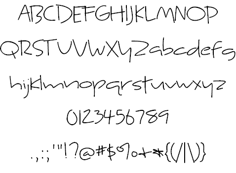
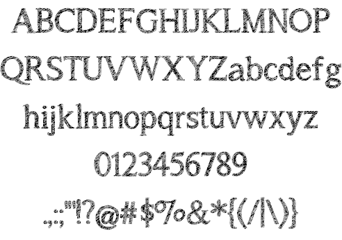
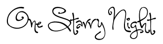
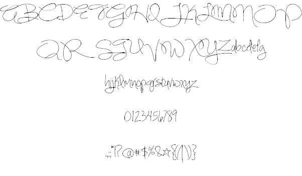
Her typefaces: Ambition + Ink (a hand-printed font), Aerwyna (2021: a fairytale font), Shirebourn (2021), Crickhollow (2021), Farmhouse Rooster (2020), Airbender (2020), The Old Forest (sketched, eerie) (2020), Lingonberry Marmalade (2020), Little Miracles (2020), Brandybuck (2020), Poundcake (2020), Haunted Woods (2019: +Corroded, +Inline), Moonbright (2019, +Inline), Wildemount (2019), Farm to Market (2019, +Fancy), Hodgepodgery 3D (2019), Love Monster ketched (2019), Love Monster Skinny (2019), Heartwrecked (2019: brush font), Bang Whack Pow Outline (2019: cartoon font), Fishfingers Outline, Cuddlebugs Outline (2019), Hodgepodgery Outline (2019), Aberforth Outline (2019), Melisande Sharp (2019), Wildemount Rough (2019), Perfectly Scrathy (sic) (2019: a sketched font), Dusty Velvet (2019), Aberforth (2019: unicase), Aberforth Tiles (2019: white on black), Aberforth Rough (2019), Sugar + Spice (2018, +HandSans), Beautiful Things (2018), Christmas Sprouts (2018), Hodgepodgery (2018), The Road Ahead (2018), Submarine Beach (2018), The Brooklyn Smooth (2018), Skydancer (2018), Wildemount (2018), Just Alice (2018), Uptown Market (2018), Raspberry Moonshine (2018), Avacado & Lime (2018), Ambition & Ink (2017), The Brooklyn (2017, sans), Shorthalt (2017), Alphabetized Cassette Tapes (2017), Geektastic (2017), Letters for Learners (2017), Asparagus Sprouts (2017), Lovegood (2017), Georgina (2017, script), Meatloaf (2017, 3d), Honeyquick (2017), Market Fresh (2016), Beautiful Mess (2016), Another Birdhouse (2016), Velvet Heart (2016), Unrulyness (2016), Meadowbrook (2016), Simple Joys (2016), Yellow Umbrella (2016, beatnik style), Charbroil (2016), Perfectly Amicable (2016: a sans), Hickory Jack (2016: a connected script), Small Town Skyline (2016), Brilliant (2015), Morningtype (2015, sans), September Mornings (2015), Sassy Molassy (2015), Peas & Carrots (2015), Notepaper Airplanes (2015), Gingersnaps (2015: a curly font), Retrofitted (2015), When It Rains (2015), Love Monster (2015), Cashew Apple Ale (2015, +Bold), Tinue Road (2015), Generally Speaking (2015, hand-printed), Wedding Chardonnay (2015, a ronde), Huffleclaw (2015), Sandbox Melodrama (2015, children's hand), Faerytale Woods (2015), Dandelion (2015), Hazelnut Water (anthroposophic), McKenna (2015), Whatever It Takes (2015), Something Blue (2015), Blueberry Oatmeal (2015), Always Forever (2014), Where Stars Shine the Brightest (2014), A Song For Jennifer (2014, sketched typeface), Cuddlebugs (2014), Sweetly Broken (2014), Hazel Grace (2014, a wonderful curly script), Hazelnut Water (2014, +Lite), Jasmine Reminiscentse (sic) (2014: a connected script), Virginia Sky (2014), Something Blue (2014), Cheddar Jack (2014), Sandbox Melodrama (2014), Ingrained (2013, textured typeface), Garden Fresh Tomatoes (2013), Something In Your Eyes (2013), Faerytale Woods (2013), Dark Roast (2013, a connected script), Jennifer Lynne (2013), Retrofitted (2013), Whiz Bang (2013), Fish Fingers (2013), Something in your eyes (2013), Enough For Me (2013), Organic Fridays (2013, funky; +Lined, +Italic), Orange Juice (2013, hand-printed shadow face), Apple Cider Daydreams (2012), McKenna (2012, hand-printed), Just Kidding (2012, outlined and hand-printed), My Grandpa's Farm (2012), Café And Brewery (2012, thin sans), Whatever It takes (2012, hand-printed), Albatross (2012, grungy), Deus Etched Machina (2012: a sketched typeface), Gingersnaps (2012, curlified text), Kyne Morgan (2012), A song for Jennifer (2011), Night of the fireflies (2011), Cinnamon Cake (2011), One Starry Night (2011, curly letters), Dandelion in the Spring (2011), Simply Glamorous (2011, script), Second Breakfast (2011, hand-printed), Skinny Jeans (2011), Sweet Home Oklahoma (2011), Sweetly Broken (2011), Light Up The World (2011), Of Wildflowers and Wings (2011), Joy Like Sunshine Through My Windowpane (2011), When It Rains (2011, grunge), Peyton Jennifer (2011, an informal hand-printed sans), Appleberry (2011, sketch font), Irish Spaghetti (2011, hand-printed), Alphabetized Cassette Tapes (2011), The Beautiful Ones (2011, grungy), Contempo Jungle Minuet (2011), The Unseen (2011), Sophomore Yearbook (2011, hand-printed), Jelly Bean Sandwich (2010), English Essay (2010), Jazz Essay (2010, connected hand), A Sensible Armadillo (2010), Double Scratch (2009, Fontcapture), Writing Stuff (2009, Fontcapture) and Just Act Casual (2009, Fontcapture), Yesterday Again (2011), Illuminate (2011, a sketch font), Vanilla Twilight (2011), Where Stars Shine The Brightest (2011), Attack of the Cucumbers (2010), Awakening (2010). Fontspace link. Dafont link. Creative Market link. Abstract Fonts link. [Google] [MyFonts] [More] ⦿ | |
Cassie Stegman studied design at Oklahoma State University and lives in Stillwater, OK. She created the elegant bilined typeface Stick Up For Yourself (2011). [Google] [More] ⦿ | |
Tulsa, OK-based designer of the stencil typeface Somnia (2018) and the free typeface Grandpa's Letters (2019). [Google] [More] ⦿ | |
Graphic designer in Tulsa, OK, who created Grounder (2014, a spurred typeface) and Boomtown Deco (2014, art deco). [Google] [More] ⦿ | |
Chris Skillern
| |
American designer in Oklahoma City (b. 1993) who designed the rough-edged brush typeface Dare (2012). [Google] [More] ⦿ | |
FontStructor who made the free Escher-style font Penrose (2014, a school project at the University of Tulsa, OK). Aka xtinamber. [Google] [More] ⦿ | |
Dana De Cicco
| |
Ponca City, OK-based designer of the display typeface Notch (2016). [Google] [More] ⦿ | |
Tulsa, OK-based designer who used Fontifier to create the handwriting font Times New Rawcksman (2004---dead link). [Google] [More] ⦿ | |
| |
Flycatcher Design
| Michael Gilliam (Flycatcher Design, Shawnee, OK) created the hand-drawn typefaces Sweetheart, Mischief, Nomad (heavy brush), Borderland, Hemingwar (poster typeface: +Stencil), Milk Stout, Billow (thick watercolor brush script), Celestial (another thick watercolor brush script), Bistro Sans & Serif (+Inline: a stackable partly sketched typeface family), Adrift, Campfire Stories (brush font family), and Flycatcher in 2015. Typefaces from 2016: Lunar Eclipse (letters with missing pieces), Forever Summer, Twenty Nine (script font), Einstein (thin connected script), Honeycomb (connected script). Typefaces from 2017: Twinkle Star, Tehika (signature script), Hearth+Home, Rockstar, Kiwi Refresher, Lushmore, Academy House (brush script), Katastrophe (connected script), Safirestone. Typefaces from 2018: Kentucky (signature script), Rancho (spurred and Tuscan), Brooklyn Script (for signage), The Hustle (a condensed headline sans), Hopscotch, Forsaken (font for skateboarders), Floral Thunder (Sans, and monoline Script), Dear Sasha (monoline script), Ringstown (brush script), Rawkstone (font duo). [Google] [More] ⦿ |
35USD utility for Windows (from ca. 2001) that makes all characters of a truetype font into individual "bmp" files. Free partially functional demo (numbers 0-9 only). By Webcatering in Stillwater, OK. [Google] [More] ⦿ | |
Fontry West
|
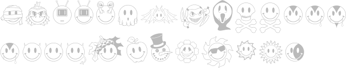
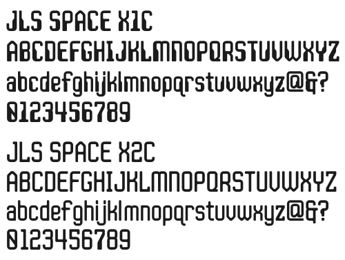
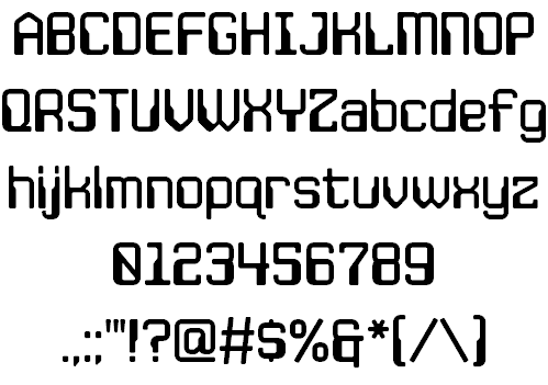
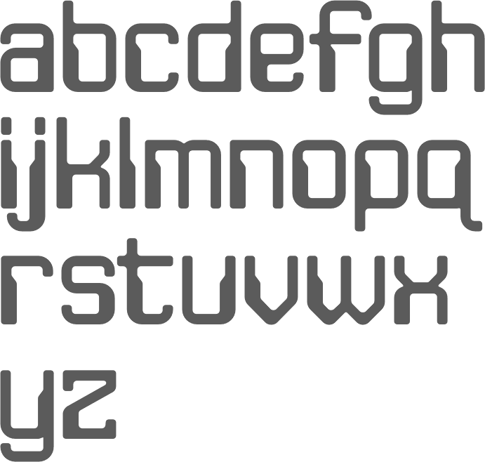
In 2009, James Stirling started a serious digitization program of the art deco fonts of Alf R. Becker (based mostly on his Signs of the Times series), and made ARB 70 Modern Poster, ARB 93 Steel Moderne, ARB 44 Chicago Modern, ARB08ExtremeRomanAUG-32CASNormal (2009; the original is from 1932), and ARB 67 Modern Roman. The grunge typeface JLS OverKill Grunge (2009) is free. JLS Smiles (2010) is a family of typefaces consisting of smilies / emoticons. FHA Modernized Ideal Classic (2011, with Michael Gene Adkins) is based on a demonstraton alphabet from Frank H. Atkinson's Atkinson Sign Painting (1908). Typefaces from 2012 include FHA Condensed French (with Michael Gene Adkins), JLS Space X1C (LED style), JLS Space X2C, JLS Space Gothic, JLS Data Gothic. Typefaces from 2014: FHA Tuscan Roman (2014, Michael Gene Adkins, James L Stirling). In 2015, Stirling designed JLS Main Square Frames (corners, rules and frames for vintage ads and monograms). Typefaces from 2018: FTY Overkill Condensed. Dafont link. FontShop link. Fontspring link. View James Stirling's typefaces. [Google] [MyFonts] [More] ⦿ |
Pencil artist from Norman, OK (b. 1984) who designed the curly typeface GloriaNumberOne (2004), the hand-printed typeface March Nouveau (2006), Descenders (2006, art nouveau face), April Nouveau (2006), Jaws of Life (2006, artsy billboard face), Konnectors (2006), Rebubbled (2006), Eggheadz (2006), Untitled Comic Font (2006, contains Cyrillic characters), Hexangular (2006), Gloriental (2006, oriental simulation), ApplePear (2009) and Gloria's Hand 1 (2005). Alternate URL. [Google] [More] ⦿ | |
Edmond, OK-based designer of the neo deco typeface Flare (2017). [Google] [More] ⦿ | |
Edmond, OK-based designer of Sunburst 3D (2015). Behance link. [Google] [More] ⦿ | |
Author of A Catalog of Maya Hieroglyphs (1962, University of Oklahoma Press). It is a catalogue of most of the glyphs known up to the time of its publication. [Google] [More] ⦿ | |
Jacoby Type Co
| Katie Jacoby is a graphic designer based in Oklahoma. In 2021, she designed the 6-style geometric display typeface Jacoby Modular. [Google] [MyFonts] [More] ⦿ |
James L. Stirling
| |
Tulsa, OK-based designer of Suprnova (2014) and a few other typefaces. [Google] [More] ⦿ | |
Jay Hilgert
| |
Jay Hilgert
| |
At the University of Central Oklahoma, Jesse Warne (Oklahoma City, OK) designed Hefner Geometric Sans (2016). [Google] [More] ⦿ | |
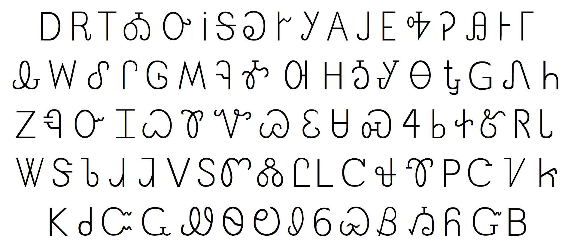
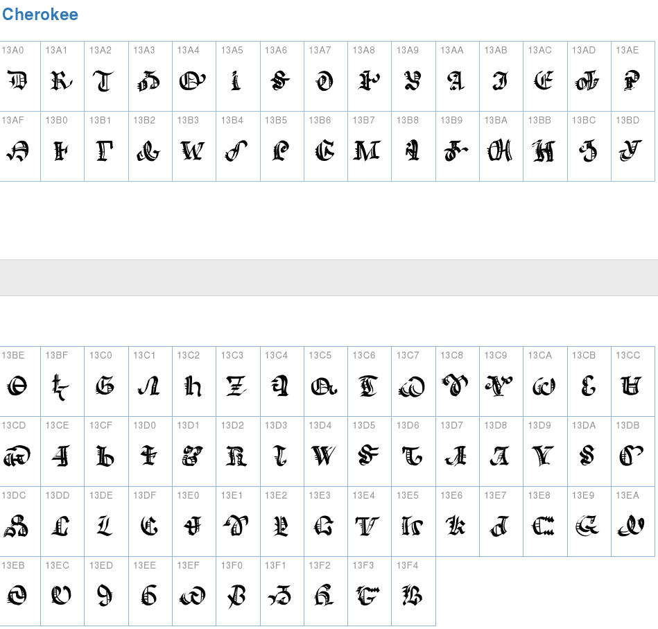
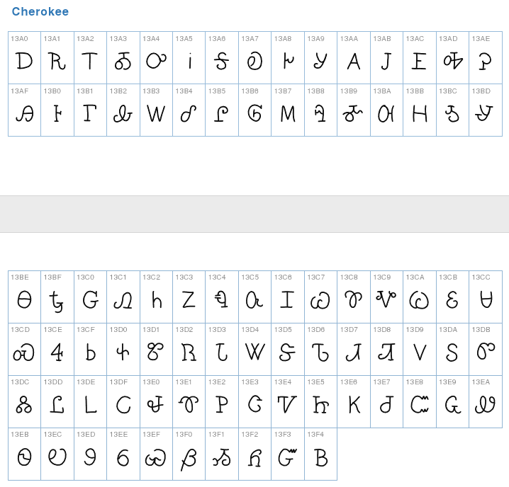
Cherokee font designer from Gore, OK, who spoke at ATypI 2011 in New Orleans. He wrote this on typophile (excerpts only): As font makers you have noticed that much of what we use today, as a designed font, is pretty bad when it comes to some of the very rough looking uneven font designs. It is a very complex issue when it comes to the Cherokee orthography in the community. Cherokees take great pride in our writing system. It is true that many in the eastern band of Cherokees do not read and write cherokee but some do. And it is also true that at one time some people at the museum over there proposed the idea of changing our syllabary writing system in to a alphabet. This was quickly dismissed and did not go over very well and we should just leave it at that. Many more people here in Oklahoma Cherokee Nation and United Keetoowah Band read and write in Cherokee. Roy Boney and I were very honored to speak to so many font designers that work on so many languages. Roy and I worked with many advanced speakers from our community and that work at Cherokee Nation to find out what advanced speakers look for in a writing system for each character. We developed a very thin font that was made in fontlab. It is not really that professionally made but it has many needed things in it. Most languages around the world have font styles for many different needs, printed type, signs, web, fun, ads and so on as you all know, but we do not have this for our own language at this time, when we need it the most. Many in the community do not question why we dont have more fonts. In fact many get defensive when we first talk about new fonts a few years ago thinking we where trying to change the language or proposing something like what the museum over and eastern band wanted. Roy and I believe that if we are going to continue to have a language for our community it must have all the power and strength that different fonts can offer.. We started realizing we needed to be on the computers and cell phones then after we got on that we realized that we needed more fonts. This idea is starting to be understood by some of our elders when we start to show them why we want to do this or have it done. It is always important to work with the community that reads and writes the language that you are designing for. Most languages have enough material out there so that that is not needed but in smaller language groups it is important to talk to people before starting your design work. Much of the problems with the present fonts is that people did not at least have the community it was made for, have look at it, before the release. The Cherokee Type face was made for a printing press and all of our fonts still look like they are for that same purpose. Sequoyah in his time wrote with print from the style influenced from the printing press also, even after he made the cursive style too. His main reason was to create a writing system that would allow his people to communicate in written form. If he was round today, I believe he would be designing fonts and having others to design some for all these technologies that are constantly coming out (and have different requirements) for Cherokee people to use and communicate with each other. So if anyone needs more information about cherokee handwriting for fonts feel free to email me. We have collected handwriting samples and old documents that might help a font designer with the information they are looking for. Designer of some Cherokee fonts in 2012, including a blackletter version, CherokeeOldEnglish, and a hand-printed version called Cherokee Handone. [Google] [More] ⦿ | |
Justen Renyer (Stillwater, OK) designed the ultra-fat typeface Arrigo in 2013. [Google] [More] ⦿ | |
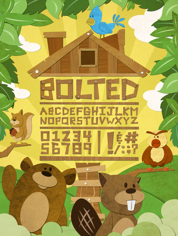
Kael Little from Edmond, OK, created the vector format typeface Bolted (2012) for children. [Google] [More] ⦿ | |
Karen Kenworthy
| |
Karen's Font Explorer v1.2
| Free PC utility (font viewer) by Karen Kenworthy (Broken Arrow, OK). [Google] [More] ⦿ |
Katie Jacoby
| |
Owasso, OK-based designer of fun logotypes such as the one used in her Bomb Ass poster (2014). [Google] [More] ⦿ | |
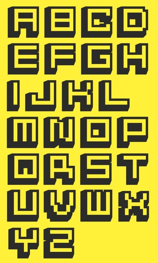
Laney Fisher is from Houston, TX. While studying at Oklahoma State University in Stillwater, OK, Laney created Pixelated Typeface (2013: a pixel font with shadows). [Google] [More] ⦿ | |
Swedish type designer, calligrapher and graphic designer, b. 1939, who lives in Skane, Denmark. He created RunaSerif (for Miles, 1995: inspired by the forms of ancient Viking runes, this typeface won the Nordic Typeface Competition in Copenhagen), Crane (1995, Agfa), Renasci (1997, based on old Danish inscriptions, mainly in churches), ZiP (Agfa Creative Alliance), and Hansson Stencil (Mecanorma). CV (in Swedish). | |
Loftis&Ball
|
|
Edmond, OK-based designer of the mechanical style typeface Reflection (2016), which was finished for a school project at the University of Central Oklahoma. [Google] [More] ⦿ | |
Mark Harris (Thousand Oaks, CA) studied typography at UCLA. Designer in 1998 of Crumudgeon (sic) and CrumudgeonDeceased (for Bayer), and of TwoVooDoo. At Garagefonts, he published Lelk (2000, a cute irregular font), Bone Spurs (1998) and GF Cheebop (1998). At T-26, he published the dingbat font Form (1997). FontShop link. [Google] [MyFonts] [More] ⦿ | |
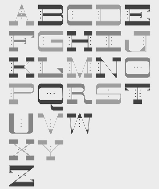
As a student at the University of Tulsa, OK, Catoosa, OK-based Mary Stegall designed a modular typeface (2016). [Google] [More] ⦿ | |
Michael Gene Adkins
| |
Michael Gilliam
| |
As a student, Stillwater, OK-based Molly Richardson designed the stylish handcrafted typeface Delirious (2017). Behance link. [Google] [More] ⦿ | |
At the University of Central Oklahoma, Oklahoma City-based Naomi Serna designed the thin curly display typeface Stimmena (2015). [Google] [More] ⦿ | |
Natalia Nichols (Studio Kasumi, Edmond, OK) designed the free copperplate typeface Sovngarde in 2017. Behance link. [Google] [More] ⦿ | |
The two free truetype fonts found here (Font-10 and Font-23) prove that Oklahoma has a long way to go in its design of roadway sign symbol typefaces. [Google] [More] ⦿ | |
During his studies at Oklahoma State University, Edmond, OK-based Paul Nichols designed the handcrafted typeface Culiar (2016). [Google] [More] ⦿ | |
Wagoner OK-based designer of Raygun Typeface (2017). [Google] [More] ⦿ | |
River City Rubber Works
| River City Rubber Works (Haysville, KS) is a company that designs and manufactures art rubber stamps and images. The business began in 1994 as a greeting card company called Spirit Works Greetings. River City Rubber Works was created as a division of that company in 1997. MyFonts sells its fonts, such as River City Sandwriting (2009). The designer is Dana De Cicco (b. Oklahoma). She got interested in fonts as a student at Oklahoma State University, where she graduated with a BFA with an emphasis in drawing and painting. In 1994 she and her partners founded Spirit Works Greetings. Klingspor link. [Google] [MyFonts] [More] ⦿ |
For a school project at Oklahoma State University in Stillwarer, OK, Sabrae Precure created the fat modular poster typeface Forth (2014). [Google] [More] ⦿ | |
Salty Goat
| South Carolina (and before that, Tulsa, OK)-based designer. Creator of the font family called Fluid (2006). See also here. In 2017, he designed these handcrafted typefaces: Skinny Willow, Maleficent Marquee, Journal Entry, Look What I Made (school script). Creative Market link. [Google] [More] ⦿ |
FontStructor who made Kricket (2014) during her studies at The University of Tulsa, OK. FontStruct link. [Google] [More] ⦿ | |
Scott Craig
| |
Sean Ball
| |
Born in southeastern Oklahoma, Talor Goad now works as a designer for Gardner Design in Wichita, KS. His typeface Alexis (2011, free at Lost Type) is a take on the Italian woodstyle. It was fontified by Nathan Williams. Cargo Collective link. [Google] [More] ⦿ | |
The Fontry
|
Since 2009, they have been producing various digitizations of alphabets designed by Alf R. Becker in the 1930s and 1940s. Gene Adkins designed ARB-187 Moderne Caps AUG-47 (2013, didone), ARB 85 Modern Poster JAN-39 (2011, after Modern Poster Script, 1939), ARB-70 (1995), ARB-67 (1998), ARB-66 Neon (2010, +Block, +Line), ARB-44 (1995), ARB-96 Jitter Display DEC-39 (1999), SCRIPT1 ARB-85 Poster Script Normal (2000), ARB-66 Neonline Block, ARB114 Hillbilly Roman JUN-41 Normal (1999), ARB-187 Moderne Caps AUG-47 CAS family (2009, a beautiful didone display face), the ARB 08 Extreme Roman AUG-32 CAS family (2009), ARB-218 Big Blunt (2010), ARB-218 Neon Blunt. Another product is the Wild Bunch Pak #3: Danthr Skal, Kastaka, Gas Bumps, Skrawl 613, Sharrpe Gothik, Levo Fraz, Kommerce, Stellar Spice, Infected Hurt. Wild Bunch Pak #2 (50 USD) has Marbles&Strings, Keetoowah, Peppermint, Ghixm (2008: a retrospective of the horror comics and movie posters of the 1960s and the 1970s), Klash, all outline fonts. In Wild Bunch Pak #1, look for Toxia. Race Pak #1 contains 5 chiseled fonts, including ARB67, Brannt Chiseled, Excursions, JLS Ultra, and Race Checkers. 50 USD. There are also Greek Pak #1 (12 Greek fonts for 25 USD, including GRK Orbit, GRK Universe City, GRK Albert, and GREK Bodnaut) and Signfaces Narrow Pak #1. At Garagefonts, Wild Larra, Wild Ruts, Wild Toxia, Wild Nobody families (1999), Jackport (2014, athletic lettering and Western typeface family). Adkins also designed the commercial font First Vision at GarageFonts in 1998. Review at &Type. List of the fonts on his CD. MyFonts sells FTY Garishing Worse (2011---there is a free version at Dafont), SCRIPT1 Team (2010), SCRIPT1 Toon (2010), SCRIPT1 Voodoo Script (1999-2009, signage script), What Sound Pounds (2009), WILD3InfectedHurtNormal (2010), WILD1 Firstvision (1997), WILD1 Larra (1997, grunge), WILD1 Nobod (1997, grunge), WILD1 Ruts (1997), WILD1 Toxia (1997) and the blackletter typefaces Ironhorse and Ironrider (2007), revivals of classic wood type typefaces. FontShop link. Some fonts are inspired by sign painter Frank H. Atkinson. These include the Broken Poster series done in 2010, FHA Modernized Ideal Classic (2011), and FHA Nicholson French (1999-2014: art nouveau). In 2008, The Fontry published the Greek Font Set, Copper Penny DTP (after Copperplate Gothic, but with lower case included), Droeming (an eerie family) and Earth A.D. (more eerie stuff, metallic, and with sharp serifs). It then generated a break-away subfoundry that carries fonts solely designed by James Stirling, Fontry West. Fontry West is located in Tulsa, OK. At MyFonts, these Fontry West fonts can be bought: Iron, WILD1 Firstvision, WILD1 Larra, WILD1 Nobody, WILD1 Ruts, WILD1 Toxia, WILD2 Ghixm, Greek Font Sets 1 and 2 (not Greek, only Geek-ish, made for fraternity use), and a large Comic Fanboy set which includes glyphs painted with stars and stripes (CFB1 American Patriot, CFB1 Captain Narrow, CFB1 Shielded Avenger, all made by Adkins). The CFB1AmericanPatriot family (2009), and the SCRIPT1 Rager Hevvy family (2009) are free here. JLS Overkill (2009, Bloque, Stencil, Grunge, Champion [athletic lettering], Hammer) is a sturdy family covering everything from SUV-strength stencils to grunge stencils and macho slab serif headline typefaces. After Disaster (2008), FHA Eccentric French Normal (2008, wood type after an alphabet created by Frank H. Atkinson in 1908), WHATSOUNDPOUNDS?Normal (2009) are free at Dafont. Sinder (2010) is a grunge face. FTY Konkrete (2010) is constructivist, and has a beveled weight. FTY Strategycide (2010-2018) is a similar severe headline sans family. Sinder (2010) and Demon Sker (2011) are free grunge typefaces. American Purpose (2011) is a grotesk family. American Purpose Casual and American Purpose Stripe (2011) are follow-ups. Garishing Worse (2011) is a casual bold face. Sharpe Gothik (2011) is hand-drawn. American Captain (2011, a manly retro squarish propaganda headline face; see also American Captain Patrius 02 FRE). Deathe Maach (2012) is a sturdy 6-style display family. Avengeance (2012) is a techno typeface. FHA Condensed French (2012, by Michael Gene Adkins and James L. Stirling) and FHA Nicholson French (1999-2014, art nouveau) are based on Frank H. Atkinson's examples. Typefaces from 2013: FHA Broken Gothic (a layered chiseled family done with James Stirling, based on Broken Poster by Frank H. Atkinson), FTY SKRADJHUWN (a flared family), Iron Man of War (with layering effects, +001Rivet), Iron Man of War 2 NCV, RACE1 Brannt (prismatic, beveled, art deco), FTY Skorzhen (mini-spurred), FTY Speedy Casual, FTY Skradjhuwn NCV (comic book family). Typefaces from 2014: FHA Tuscan Roman (2014, Michael Gene Adkins, James L Stirling), FTY Varoge Saro Noest. Typefaces from 2015: FHA Sign DeVinne (after a popular sign painting design by Frank H. Atkinson named after DeVinne). Typefaces from 2016: FTY Delirium (+Neon), Delirium NCV. Typefaces from 2017: FTY Galactic VanGuardian. Typefaces from 2021: Fty Old Sport (a slab serif athletic lettering font family, one of the best in this genre). Typefaces made by Fontry West. Typefaces by Mike Adkins. Fontspace link. Klingspor link. Dafont link. Abstract Fonts link. Creative Market link. [Google] [MyFonts] [More] ⦿ |
Todd M. Hallock
| |
Tulsey Type
| Chris Skillern is a type designer, musician, and casual cartoonist from Tulsa, Oklahoma, and a citizen of the Cherokee Nation. Chris has a special interest in working with the Cherokee syllabary. Graduate of TypeWest, class of 2021. He writes about his graduatuin typeface Meli: Inspired by my daughter and derived from playful experimentation with the flat brush, Meli is a slightly unconventional type family for children's books that consists of three distinct styles intended to be used together: a lively, brushy, pseudo-sans display style, a friendly and more restrained serif text face, and a text italic. [...] Meli is a multi-script type family that supports both the Latin alphabet and the Cherokee syllabary. [Google] [More] ⦿ |
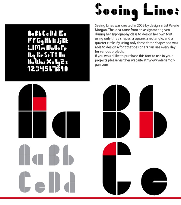
Digital artist in Collinsville, OK, who created Seeing Lines (2009, stencil font) and an unnamed decorative typeface (2013). Graduate of Rogers State University, 2012. [Google] [More] ⦿ |

 Albatross is Jay Hilgert's foundry in Oklahoma City, OK, est. 2008. Before Albatross, Jay Hilgert ran
  Based in Perry, OK, Bannigan Artworks was founded in 1998 by
  Type designer, aka
  Locust Grove, OK-based lettering artist who designed the
  Fontry West is located in Tulsa, OK. At MyFonts, these Fontry West fonts can be bought: Iron, Toxcons (2008, skulls), WILD1 Firstvision, WILD1 Larra, WILD1 Nobody, WILD1 Ruts, WILD1 Toxia, WILD2 Ghixm, WILD2 Keetoowah (2008). Its type designer is James L. Stirling, who cofounded the Watts, Oklahoma-based design and lettering studio
  [
[ Founded in 2008 by Oklahoma State graduates, Loftis&Ball is a design studio in Stillwater, OK.
  [
[ The Fontry is a Watts, OK, based outfit, est. 1992 by
|
|
|
|