| Text typefaces: |
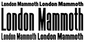
Sans typefaces:  Gaultier (Mateusz Machalski). An exploratory modern hybrid of a serifless Garamond and Gill Sans. Gaultier (Mateusz Machalski). An exploratory modern hybrid of a serifless Garamond and Gill Sans.  Oldschool Grotesk (William Montrose at Kilotype). Oldschool Grotesk (William Montrose at Kilotype).  Söhne (KLIM: Kris Sowersby). A multigenerational descendant of of Akzidenz Grotesk, close to perfection. Absolutely awesome. Söhne (KLIM: Kris Sowersby). A multigenerational descendant of of Akzidenz Grotesk, close to perfection. Absolutely awesome.  Ahimsa (Luis Bandovas). A humanist sans family. Ahimsa (Luis Bandovas). A humanist sans family. 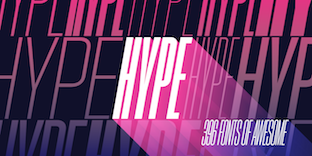 Hype (Neil Summerour). A total of 396 typefaces from ultra-condensed to wide, and hairlane to ultra-black. Hype (Neil Summerour). A total of 396 typefaces from ultra-condensed to wide, and hairlane to ultra-black. 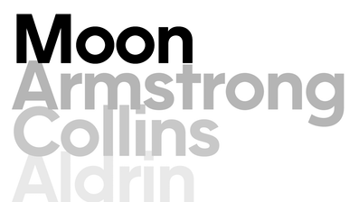 F37 Moon. A 14-style geometric sans with no concessions. F37 Moon. A 14-style geometric sans with no concessions.  Hurme FIN (Hurme Design). Hurme FIN (Hurme Design). 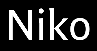 Niko (Ludwig Uebele). Niko (Ludwig Uebele).  Marsden (Jason Vandenberg). Marsden (Jason Vandenberg). ![]() Passenger Sans (Diana Ovezea and Samo Acko). Passenger Sans (Diana Ovezea and Samo Acko).  Mazzard (Oleh Lishchuk, Pepper Type). A geometric grotesque in three x-heights and 54 styles. Mazzard L, the small x-height subfamily, is especially striking. See also Mazzard Soft. Mazzard (Oleh Lishchuk, Pepper Type). A geometric grotesque in three x-heights and 54 styles. Mazzard L, the small x-height subfamily, is especially striking. See also Mazzard Soft.  Montreux Grotesk (Roch Modrzejewski). A modern slightly geometric take on Helvetica, in 132 styles. Montreux Grotesk (Roch Modrzejewski). A modern slightly geometric take on Helvetica, in 132 styles.  Marlin Geo (Michael Hagemann). A 63-style geometric take on Helvetica, enhanced by many opentype features, and a direct competitor of Helvetica Now. Marlin Geo (Michael Hagemann). A 63-style geometric take on Helvetica, enhanced by many opentype features, and a direct competitor of Helvetica Now.  Corsa Grotesk (Alexander Nedelev). Inspired by Avenir. Corsa Grotesk (Alexander Nedelev). Inspired by Avenir.  Klein (Francesco Canovaro and Andrea Tartarelli). Klein (Francesco Canovaro and Andrea Tartarelli).  Sigmund (Mateusz Machalski) and Sigmund Pro (2022). Very loosely based on the 1975 Polish traffic sign font Drogowskaz by Marek Sigmund. Sigmund (Mateusz Machalski) and Sigmund Pro (2022). Very loosely based on the 1975 Polish traffic sign font Drogowskaz by Marek Sigmund.  Graphit (2019). By Livius Dietzel and Tom Hossfeld at Lit Design Studio, a Bauhaus geometric. Graphit (2019). By Livius Dietzel and Tom Hossfeld at Lit Design Studio, a Bauhaus geometric.  Noah (2019). By Svet Simov, Radomir Tinkov and Stan Partalev. Noah (2019). By Svet Simov, Radomir Tinkov and Stan Partalev.  Sole Sans. An extensive newspaper sans by Luciano Perondi and Riccardo Olocco, published by CAST. Sole Sans. An extensive newspaper sans by Luciano Perondi and Riccardo Olocco, published by CAST. |
Rounded sans typefaces:  Promo (Mateusz Machalski). Promo (Mateusz Machalski).  Hatchway (Romulo Gobira). Monospaced, with delightful interlocking glyphs. Hatchway (Romulo Gobira). Monospaced, with delightful interlocking glyphs. |
Type systems:  Role (Slab, Serif, Sans, Soft). By Matthew Carter, Shotaro Nakano and Kunihiko Okano at Morisawa. Role (Slab, Serif, Sans, Soft). By Matthew Carter, Shotaro Nakano and Kunihiko Okano at Morisawa.  Monterchi (Cosimo Lorenzo Pancini, Andrea Tartarelli and Maria Chiara Fantini at Zetafonts). Monterchi (Cosimo Lorenzo Pancini, Andrea Tartarelli and Maria Chiara Fantini at Zetafonts).
|
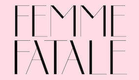
Art deco typefaces:  Replete Sans (Alejandro Paul, Sudtipos). A seven-style typeface inspired by early 20th century lettering on metropolitan buildings all over the world. Replete Sans (Alejandro Paul, Sudtipos). A seven-style typeface inspired by early 20th century lettering on metropolitan buildings all over the world.  Molitor (Mathieu Cortat). A joyful sans typeface family with art deco roots. Molitor (Mathieu Cortat). A joyful sans typeface family with art deco roots.  Disalina (Maciej Wloczewski). Disalina (Maciej Wloczewski).  KD Pempo (Zhalgas Kassymkulov). KD Pempo (Zhalgas Kassymkulov). |
| Hipster typefaces: |
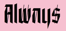
| Script typefaces: |
| Calligraphic typefaces: |
Brush typefaces:  Grafema LC (Todor Georgiev and Jacklina Jekova at Letter Collective). A calligraphic flatbrush font family in 16 styles. Grafema LC (Todor Georgiev and Jacklina Jekova at Letter Collective). A calligraphic flatbrush font family in 16 styles. |
Sketched, Layered or Poster typefaces:  Rono (Jan-Christian Bruun). Rono (Jan-Christian Bruun).
|
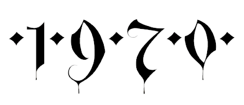
| Blackletter typefaces: |
Dingbats and ornaments:  Heneczek Pro (Damian and Dominika Langosz). The arrows and fists in this didone family! Heneczek Pro (Damian and Dominika Langosz). The arrows and fists in this didone family!
|
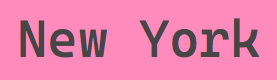
| Programming fonts: |
Garalde typefaces:  Galien (Black Foundry). More than just a garalde, a major gallic enhancement. Galien (Black Foundry). More than just a garalde, a major gallic enhancement. 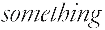 JJannon (François Rappo, Optimo). JJannon (François Rappo, Optimo).
|
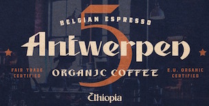
Display typefaces: ![]() Blacker Pro (Cosimo Lorenzo Pancini and Andrea Tartarelli). In the evil serif genre. A substantial update of Blacker. Blacker Pro (Cosimo Lorenzo Pancini and Andrea Tartarelli). In the evil serif genre. A substantial update of Blacker. 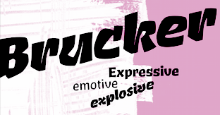 Brucker (Jeremy Tankard). Brucker (Jeremy Tankard). ![]() Ayer Poster Angular (Miguel Reyes). Part of his larger Ayer typeface family at Commercial Type. Ayer Poster Angular (Miguel Reyes). Part of his larger Ayer typeface family at Commercial Type. 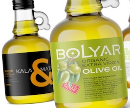 FM Bolyar Sans Pro (Jordan Jelev and Vassil Kateliev). FM Bolyar Sans Pro (Jordan Jelev and Vassil Kateliev).  Naoko (Emilie Rigaud). Naoko (Emilie Rigaud).  Plaax (Damien Gautier). Plaax (Damien Gautier).  Hyper (Anita Jürgeleit). Hyper (Anita Jürgeleit). ![]() Gigantic (Dave Rowland). Gigantic (Dave Rowland).  Neue Machina (Vasjen Katro / Baugasm and mathieu Desjardins). Neue Machina (Vasjen Katro / Baugasm and mathieu Desjardins).  PVC (Hélène Marian for Production Type). PVC (Hélène Marian for Production Type).  Valent (Jimbo Bernaus and Tea Sokac). Valent (Jimbo Bernaus and Tea Sokac).  PF Mellon (Panos Vassiliou). PF Mellon (Panos Vassiliou). |
Slab serif typefaces:  Söhne Mono (KLIM: Kris Sowersby). Part of Söhne, a descendant of of Akzidenz Grotesk. Söhne Mono (KLIM: Kris Sowersby). Part of Söhne, a descendant of of Akzidenz Grotesk. 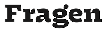 Fragen (Lucas Descroix). Fragen (Lucas Descroix).  Galeria (Bruno Jara for Latinotype). Galeria (Bruno Jara for Latinotype).  Breton (Daniel Hernandez and Rodrigo Fuenzalida). Breton (Daniel Hernandez and Rodrigo Fuenzalida). |
| Copperplate: |
Wood type revivals: i Etna (Mark Simonson). An extension and modernization of William H. Page's Aetna (1874). Etna (Mark Simonson). An extension and modernization of William H. Page's Aetna (1874).  Catalpa (José Scaglione, Veronika Burian, Azza Alameddine). This hairline-to-ultra black typeface family has its roots in wood type, and blossoms as headline type. Catalpa (José Scaglione, Veronika Burian, Azza Alameddine). This hairline-to-ultra black typeface family has its roots in wood type, and blossoms as headline type. ![]() F37 Judge (Rick Banks). F37 Judge (Rick Banks).  Podium Sharp (Mateusz Machalski). Not exactly a revival, but a monstrous 234-style family with genetic origins in several old Polish wood types. Podium Sharp (Mateusz Machalski). Not exactly a revival, but a monstrous 234-style family with genetic origins in several old Polish wood types. |
| Letterpress emulation: |
Didone typefaces:  Palio (Olcar Alcaide). Palio (Olcar Alcaide).  Schorel (2019). A 54-style Scotch roman. Not a didone, but a useful addition to the Scotch roman genre. Schorel (2019). A 54-style Scotch roman. Not a didone, but a useful addition to the Scotch roman genre. 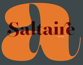 Saltaire (2019). By Nick Cooke. Saltaire (2019). By Nick Cooke.  Freight Big Compressed Pro (2019, a sturdy rational newspaper masthead and book cover typeface by Robby Woodard and Phil's Fonts). Freight Big Compressed Pro (2019, a sturdy rational newspaper masthead and book cover typeface by Robby Woodard and Phil's Fonts).  Tectonic (Rodrigo Lopez Fuentes). Tectonic (Rodrigo Lopez Fuentes).  London Fatface (Paul Harpin). London Fatface (Paul Harpin).  CAL Bodoni Casale (Dave Lawrence, California Type Foundry). CAL Bodoni Casale (Dave Lawrence, California Type Foundry).  ATC Anais (Christian Dexter for Avondale Type Co). Anorganic and orgasmic pleasures with nyctophobic fat didones. ATC Anais (Christian Dexter for Avondale Type Co). Anorganic and orgasmic pleasures with nyctophobic fat didones.  Couturier Poster (Diego Maldonado). Couturier Poster (Diego Maldonado). |
| Fashion mag typefaces: |
Revivals: ![]() Alloy Slab Heavy (Andree Paat). A liberal revival of George Bruce's Great Primer Antique (1848). Alloy Slab Heavy (Andree Paat). A liberal revival of George Bruce's Great Primer Antique (1848). 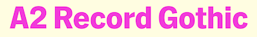 A2 Record Gothic (Henrik Kubel at A2). Finally, a grand revival of Robert H. Middleton's Record Gothic (1927, Ludlow). A2 Record Gothic (Henrik Kubel at A2). Finally, a grand revival of Robert H. Middleton's Record Gothic (1927, Ludlow).  Caslon Ionic (Paul Barnes and Greg Gazdowicz at Commercial Type). Caslon Ionic (Paul Barnes and Greg Gazdowicz at Commercial Type).  Dejanire (Ramiro Espinoza at Re-Type). A revival and improvement of a typeface by Claude Lamesle, 1742. Dejanire (Ramiro Espinoza at Re-Type). A revival and improvement of a typeface by Claude Lamesle, 1742. ![]() Acier (Jean-Baptiste Levée). A bi-colored revival of Cassandre's Acier (1930). Levée had earlier revived this in 2010. Acier (Jean-Baptiste Levée). A bi-colored revival of Cassandre's Acier (1930). Levée had earlier revived this in 2010.  Schneidler Latein (Lena Schmidt). After F.H. Ernst Schneidler's Schneidler Latein (1916-1921). Schneidler Latein (Lena Schmidt). After F.H. Ernst Schneidler's Schneidler Latein (1916-1921). 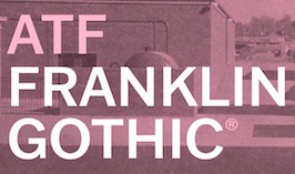 ATF Franklin Gothic (Mark van Bronkhorst, Igino Marini, Ben Kiel). Based on Morris Fuller Benton's Franklin Gothic (1905), with lighter styles inspired by Benton's Monotone Gothic. ATF Franklin Gothic (Mark van Bronkhorst, Igino Marini, Ben Kiel). Based on Morris Fuller Benton's Franklin Gothic (1905), with lighter styles inspired by Benton's Monotone Gothic. 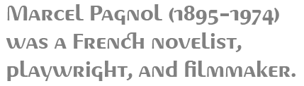 Pagnol (Jean-Renaud Cuaz). After A.M. Cassandre's famous Peignot from 1937. Pagnol (Jean-Renaud Cuaz). After A.M. Cassandre's famous Peignot from 1937.  Radar (Marta Sanchez Marco at Type-o-Tones). A revival of the 1930s font Grotesca Radio (Carl Winkow). Radar (Marta Sanchez Marco at Type-o-Tones). A revival of the 1930s font Grotesca Radio (Carl Winkow).  Hellen (Genilson Lima Santos). A revival of Koch Antiqua (1922). Hellen (Genilson Lima Santos). A revival of Koch Antiqua (1922).  Orplid Pro (Ralph M. Unger). A revival and layerable extension of Hans Bohn's Bauhaus typeface Orplid (1929). Orplid Pro (Ralph M. Unger). A revival and layerable extension of Hans Bohn's Bauhaus typeface Orplid (1929). ![]() Bremer Presse (Dorothée Schraudner). This revives Willy Wiegand's antiqua that he made for his Bremer Presse ca. 1912. Bremer Presse (Dorothée Schraudner). This revives Willy Wiegand's antiqua that he made for his Bremer Presse ca. 1912.  Skope (Jose Manuel Uros). Skope (Jose Manuel Uros). |
Stencil typefaces:  Rekall (2019, Bold Monday). Rekall (2019, Bold Monday). 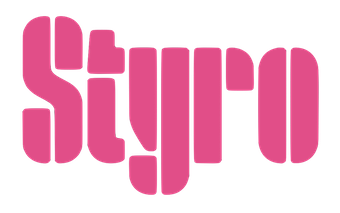 Styro (2019, Aarya Purohit). Styro (2019, Aarya Purohit).  Sväng (Claes Nordenstam for Letters of Sweden). Based on his 1976 original, Quickstep. Sväng (Claes Nordenstam for Letters of Sweden). Based on his 1976 original, Quickstep.  Majora Stencil (Luis Bandovas). Majora Stencil (Luis Bandovas).  Buum (Ondrej Chory). Buum (Ondrej Chory). |
Variable fonts:  TT Interfaces (TypeType). Later renamed TT Interphases. TT Interfaces (TypeType). Later renamed TT Interphases. 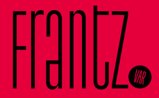 TT Frantz (Vika Usmanova). Experimental, refreshing, with a variable waistline height. TT Frantz (Vika Usmanova). Experimental, refreshing, with a variable waistline height.  ETC Imbue (Etcetera Type Company). With variation in optical sizes. ETC Imbue (Etcetera Type Company). With variation in optical sizes.  PF Grand Gothik (Parachute). A large grotesque typeface family with three subfamilies and a variable font option. PF Grand Gothik (Parachute). A large grotesque typeface family with three subfamilies and a variable font option.  Antonia (Typejockeys). Antonia (Typejockeys).  Denso (Dino dos Santos and Pedro Leal). Denso (Dino dos Santos and Pedro Leal).  TT Trailers (Vika Usmanova). TT Trailers (Vika Usmanova).  Grafier (Alex Slobzheninov). Grafier (Alex Slobzheninov). |
Multilingual typefaces: 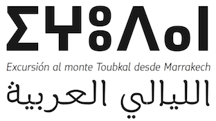 Tuqbal Pro (2015-2019) by Andreu Balius and Juan Luis Blanco at Type Republic. This family covers Latin, Arabic and Tifinagh in a consistent manner. Tuqbal Pro (2015-2019) by Andreu Balius and Juan Luis Blanco at Type Republic. This family covers Latin, Arabic and Tifinagh in a consistent manner.  Inscribing Song (Archer Zuo). Inscribing Song (Archer Zuo). 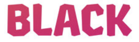 Chikki (Kimya Gandhi at Mota italic). For Latin and Devanagari. Chikki (Kimya Gandhi at Mota italic). For Latin and Devanagari.  Dunkel Sans (Minjoo Ham). An obese poster typeface for Latin and Hangul, carefully balanced across both scripts. Dunkel Sans (Minjoo Ham). An obese poster typeface for Latin and Hangul, carefully balanced across both scripts. 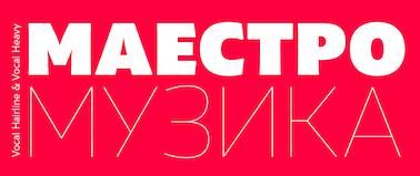 Vocal (Ani Dimitrova). Vocal (Ani Dimitrova).
| Wonderful, adorable, refreshing typefaces:  Arkit Bomb (Erasmo Ciufo, CAST). Arkit Bomb (Erasmo Ciufo, CAST).  Moranga (Sofia Mohr). Inspired by Cooper. Moranga (Sofia Mohr). Inspired by Cooper.  Nero Alto (Mateo Broillet). Nero Alto (Mateo Broillet).  Hatton (Mathieu Desjardins and Two Times Elliott). Eclectic and with the signature hipster t. Hatton (Mathieu Desjardins and Two Times Elliott). Eclectic and with the signature hipster t.  Hagrid (Cosimo Lorenzo Pancini). In the crypto-typographic genre. Hagrid (Cosimo Lorenzo Pancini). In the crypto-typographic genre.  Akut (Pedro Leal, DS Type). Pure angular joy. Akut (Pedro Leal, DS Type). Pure angular joy. ![]() Sneakers Max (Neil Summerour). Sneakers Max (Neil Summerour). 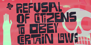 Pieches (Erica Jung and Ricardo Marcin). Based on Paul Peter Piech's political and social posters. Pieches (Erica Jung and Ricardo Marcin). Based on Paul Peter Piech's political and social posters. 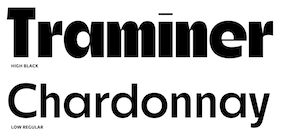 Roba (Franziska Weitgruber). Roba (Franziska Weitgruber).  Pamplemousse (DC Scarpelli). Pamplemousse (DC Scarpelli). 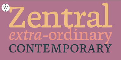 Zentral (Robbie de Villiers). Zentral (Robbie de Villiers).  P22 Schneeberger (Tracy Sabin). P22 Schneeberger (Tracy Sabin).  Harpagan (Mateusz Machalski). Harpagan (Mateusz Machalski). |
[


 This is my own selection of the best free typefaces published in 2019, grouped by category.


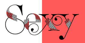
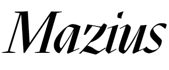 Mazius Review (Alberto Casagrande at