TYPE DESIGN INFORMATION PAGE last updated on Thu Apr 16 22:24:51 EDT 2026
FONT RECOGNITION VIA FONT MOOSE
|
|
|
|
Antique Olive
[Roger Excoffon]
Antique Olive is a brash humanist sans-serif typeface designed in 1959 by French type designer Roger Excoffon for an Air France logo. It was released at Fonderie Olive (Marseille, France) as a retail typeface in 1962 with further development occurring until 1968. In addition to a basic weight, Antique Olive was produced in medium, condensed, wide, bold, condensed bold, extra bold (known as Antique Olive Compact), and ultra bold (known as Nord). Its almost reverse stress disqualifies Antique Olive from use as a body typeface. It was effectively used, e.g., in the Sesame Street credits from 1969 until 1983. Digital revivals:
Digital typefaces influenced by Antique Olive:
|
EXTERNAL LINKS |
| | |

file name: Linotype Antique Olive after Roger Excoffon 1962

file name: Linotype Antique Olive after Roger Excoffon 1962

file name: Linotype Antique Olive after Roger Excoffon 1962

file name: Stempel Antique Olive

file name: Roger Excoffon Antique Olive Roman 1963

file name: Roger Excoffon Antique Olive 1962 poster by Sandra Pulido 2019

file name: Roger Excoffon Antique Olive 1962 Poster by Melina Mac Farlane 2015

file name: Anton Moglia Paysage 2020

file name: Anton Moglia Paysage 2020

file name: Anton Moglia Paysage 2020

file name: Anton Moglia Paysage 2020

file name: Anton Moglia Paysage 2020

file name: Anton Moglia Paysage 2020

file name: Anton Moglia Paysage 2020

file name: Anton Moglia Paysage 2020

file name: Anton Moglia Paysage 2020

file name: Kia Tasbihgou Propos 2018

file name: Christian Schwartz Zizou 2011

file name: Chester Jenkins Jeremy Mickel Aero 2011

file name: Chester Jenkins Jeremy Mickel Aero 2011b

file name: Chester Jenkins Jeremy Mickel Aero 2011c

file name: Chester Jenkins Jeremy Mickel Aero 2011d

file name: Chester Jenkins Jeremy Mickel Aero 2011e

file name: Chester Jenkins Jeremy Mickel Aero 2011f

file name: Lena Douani Teelay Sans 2017

file name: Lena Douani Teelay Sans 2017b

file name: Chester Jenkins Jeremy Mickel Aero 2011

file name: Chester Jenkins Jeremy Mickel Aero 2011b

file name: Chester Jenkins Jeremy Mickel Aero 2011c

file name: Chester Jenkins Jeremy Mickel Aero 2011d

file name: Chester Jenkins Jeremy Mickel Aero 2011e

file name: Chester Jenkins Jeremy Mickel Aero 2011f

file name: Gary Elfring Antique Olive Heavy 1992

file name: U R W Antique Olive after Roger Excoffon

file name: Alan Meeks Chalfont Roman 2020 370830

file name: Alan Meeks Chalfont Roman 2020

file name: Alan Meeks Chalfont 2014 164289

file name: Alan Meeks Chalfont 2014 180298

file name: Alan Meeks Chalfont 2014 180299

file name: Alan Meeks Chalfont 2014 180300

file name: Alan Meeks Chalfont 2014

file name: Typofonderie Prosaic Std 2020 1

file name: Typofonderie Prosaic Std 2020 2

file name: Typofonderie Prosaic Std 2020 3

file name: Typofonderie Prosaic Std 2020 5

file name: Typofonderie Prosaic Std 2020

file name: Aurelien Vret Prosaic 2017

file name: Aurelien Vret Prosaic 2017a

file name: Aurelien Vret Prosaic 2017

file name: Aurelien Vret Prosaic 2017

file name: Aurelien Vret Prosaic 2017b

file name: Aurelien Vret Prosaic 2017c

file name: Aurelien Vret Prosaic 2017d

file name: Aurelien Vret Prosaic 2017e

file name: Aurelien Vret Prosaic 2017f

file name: Aurelien Vret Prosaic 2017g

file name: Aurelien Vret Prosaic 2017h

file name: Aurelien Vret Prosaic 2017i

file name: Aurelien Vret Prosaic 2017j

file name: Aurelien Vret Prosaic 2017k

file name: Aurelien Vret Prosaic 2017l

file name: Aurelien Vret Prosaic 2017m

file name: Aurelien Vret Prosaic 2017o

file name: Aurelien Vret Prosaic 2017p

file name: Aurelien Vret Prosaic 2017q
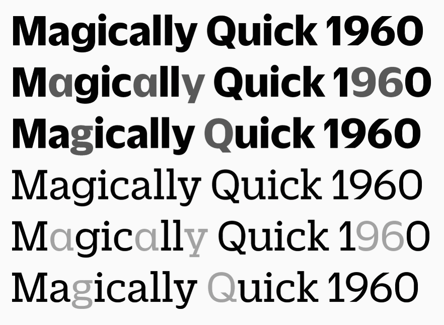
file name: Christian Schwartz Miguel Reyes Duplicate 2013
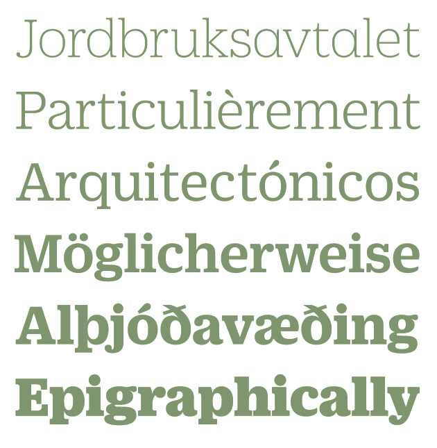
file name: Christian Schwartz Miguel Reyes Duplicate Ionic 2013
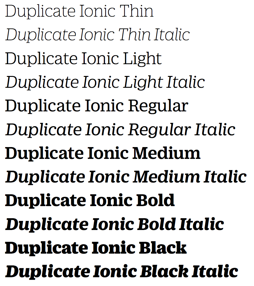
file name: Christian Schwartz Miguel Reyes Duplicate Ionic 2013b
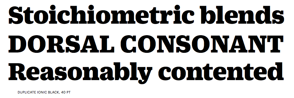
file name: Christian Schwartz Miguel Reyes Duplicate Ionic 2013d
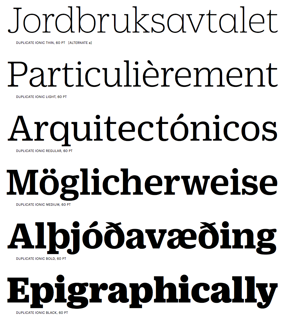
file name: Christian Schwartz Miguel Reyes Duplicate Ionic 2013f

file name: Christian Schwartz Miguel Reyes Duplicate Ionic 2013h

file name: Christian Schwartz Miguel Reyes Duplicate Ionic N Z Z Sonntag 2013
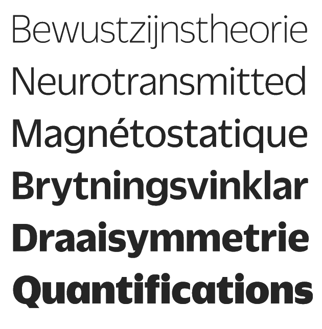
file name: Christian Schwartz Miguel Reyes Duplicate Sans 2013

file name: Christian Schwartz Miguel Reyes Duplicate Sans 2013c

file name: Christian Schwartz Miguel Reyes Duplicate Sans 2013e
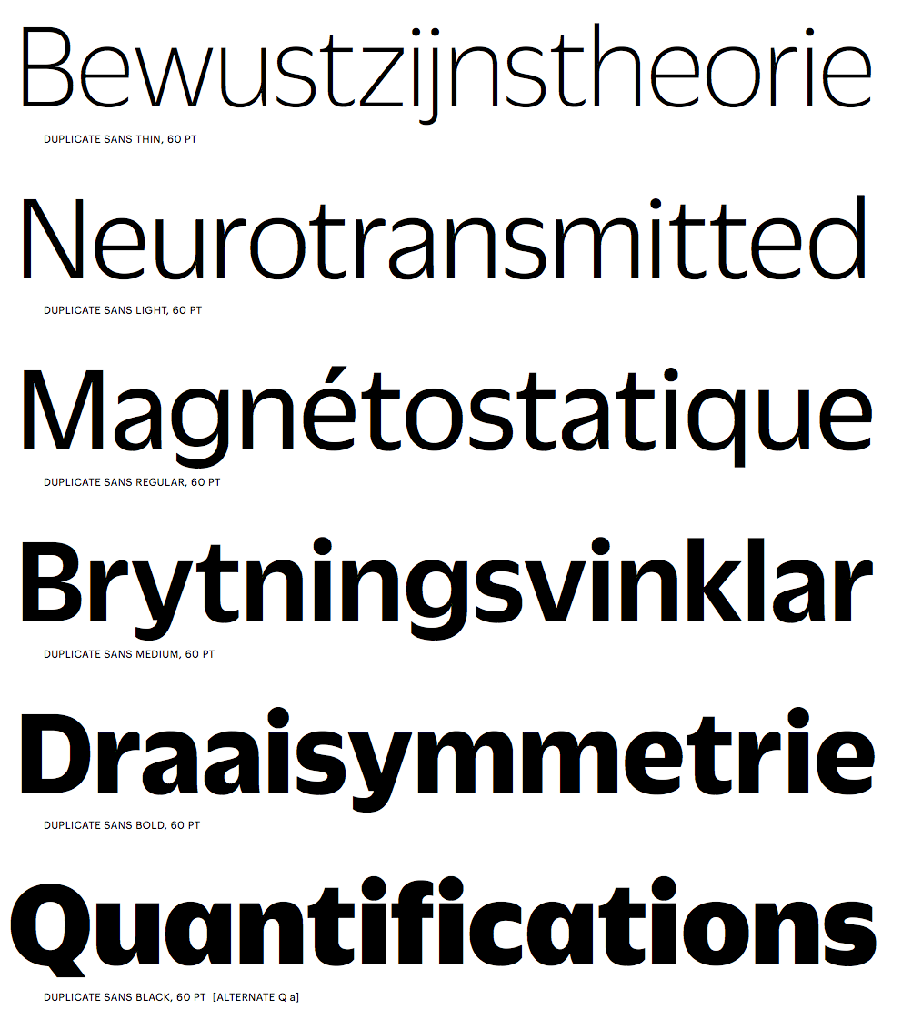
file name: Christian Schwartz Miguel Reyes Duplicate Sans 2013g
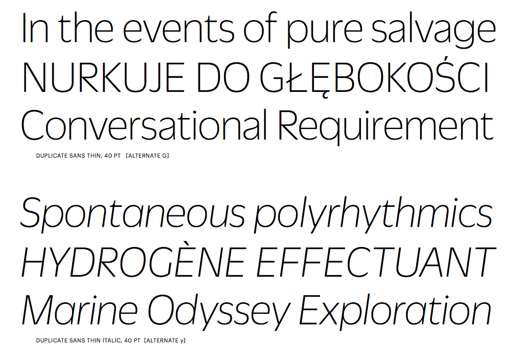
file name: Christian Schwartz Miguel Reyes Duplicate Sans 2013i
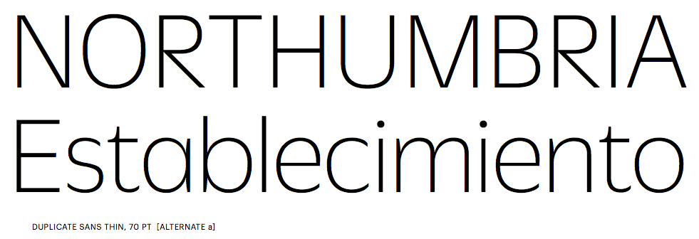
file name: Christian Schwartz Miguel Reyes Duplicate Sans 2013j

file name: Christian Schwartz Miguel Reyes Duplicate Slab 2013b
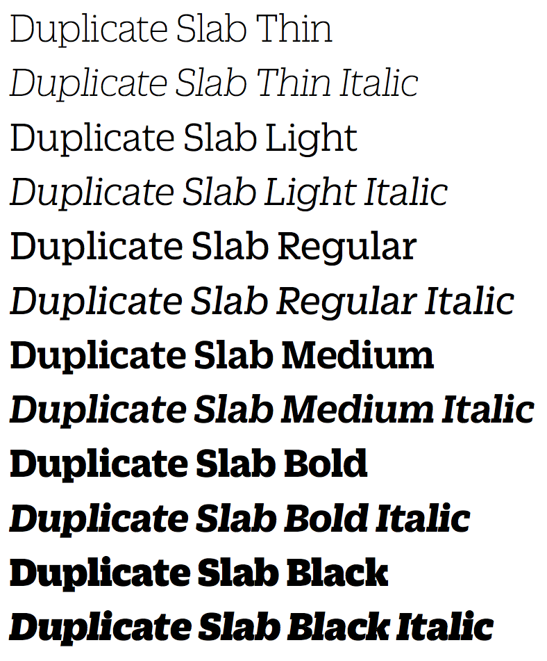
file name: Christian Schwartz Miguel Reyes Duplicate Slab 2013d

file name: Christian Schwartz Miguel Reyes Duplicate Slab 2013f
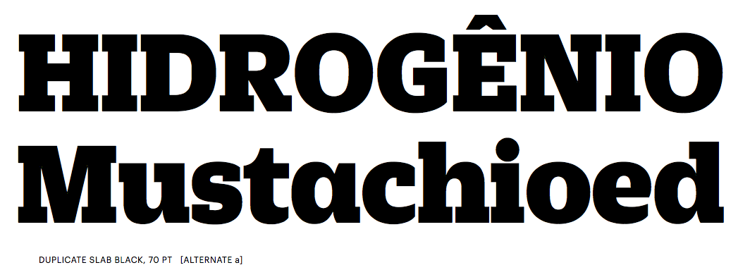
file name: Christian Schwartz Miguel Reyes Duplicate Slab 2013g
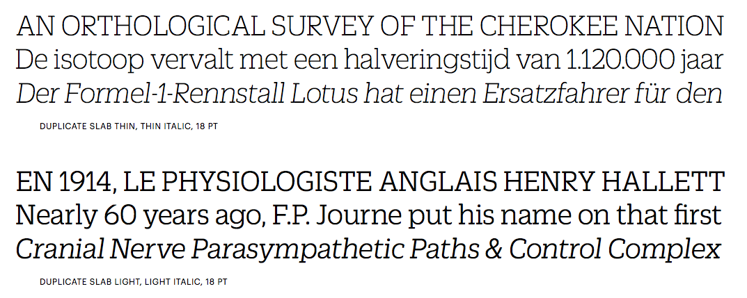
file name: Christian Schwartz Miguel Reyes Duplicate Slab 2013i

file name: Christian Schwartz Miguel Reyes Duplicate Slab 2013k

file name: Sybille Hagmann Utile 2020

file name: Sybille Hagmann Utile 2020

file name: Sybille Hagmann Utile 2020

file name: Sybille Hagmann Utile 2020

file name: Sybille Hagmann Utile Display 2020

file name: Sybille Hagmann Utile Display 2020
| | |
|
Luc Devroye ⦿ School of Computer Science ⦿ McGill University Montreal, Canada H3A 2K6 ⦿ lucdevroye@gmail.com ⦿ https://luc.devroye.org ⦿ https://luc.devroye.org/fonts.html |

