TYPE DESIGN INFORMATION PAGE last updated on Wed Oct 28 10:29:22 EDT 2026
FONT RECOGNITION VIA FONT MOOSE

|
|
|
|
Blanchard
A typeface described by McGrew as follows: Blanchard is one of the many display letters with irregular edges pro- duced around the turn of the century for use where strength, boldness, and an effect of solidity were wanted. The roman and italic were issued by Inland Type Foundry in 1900, with other versions added the following year. Curiously, only the italic and condensed forms seem to have survived long enough to be included in ATF's inventory of matrices when numbers were assigned. Compare Ben Franklin, Buffalo, Roycroft. Blanchard was revived in 2013 by Paulo W as Blanchard Inland and by Matthew McGehee in 2026 as Sunday Gaul. McGehee adds more details: It was remarkably popular in French printing during the early twentieth century. Originally issued by the Inland Type Foundry of St. Louis in the late nineteenth century, the design crossed the Atlantic under several names, including Morland from Caslon and, later, Cleveland from La Fonderie Typographique Française. The name Sunday Gaul comes from the typeface's prominent use in Le Gaulois du dimanche, the Sunday supplement of the Paris newspaper Le Gaulois. Blanchard first appeared there as a headline face in June 1906 and was soon used throughout the publication for headlines, advertisements, and illustration captions. With the supplement's redesign of December 21, 1907, it became the basis of its distinctive masthead. |
EXTERNAL LINKS |
| | |
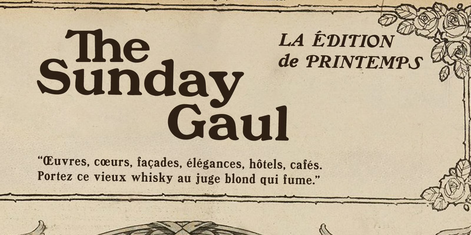
file name: Matthew Mc Gehee Sunday Gaul 2026 after Inland Type Blanchard 1900
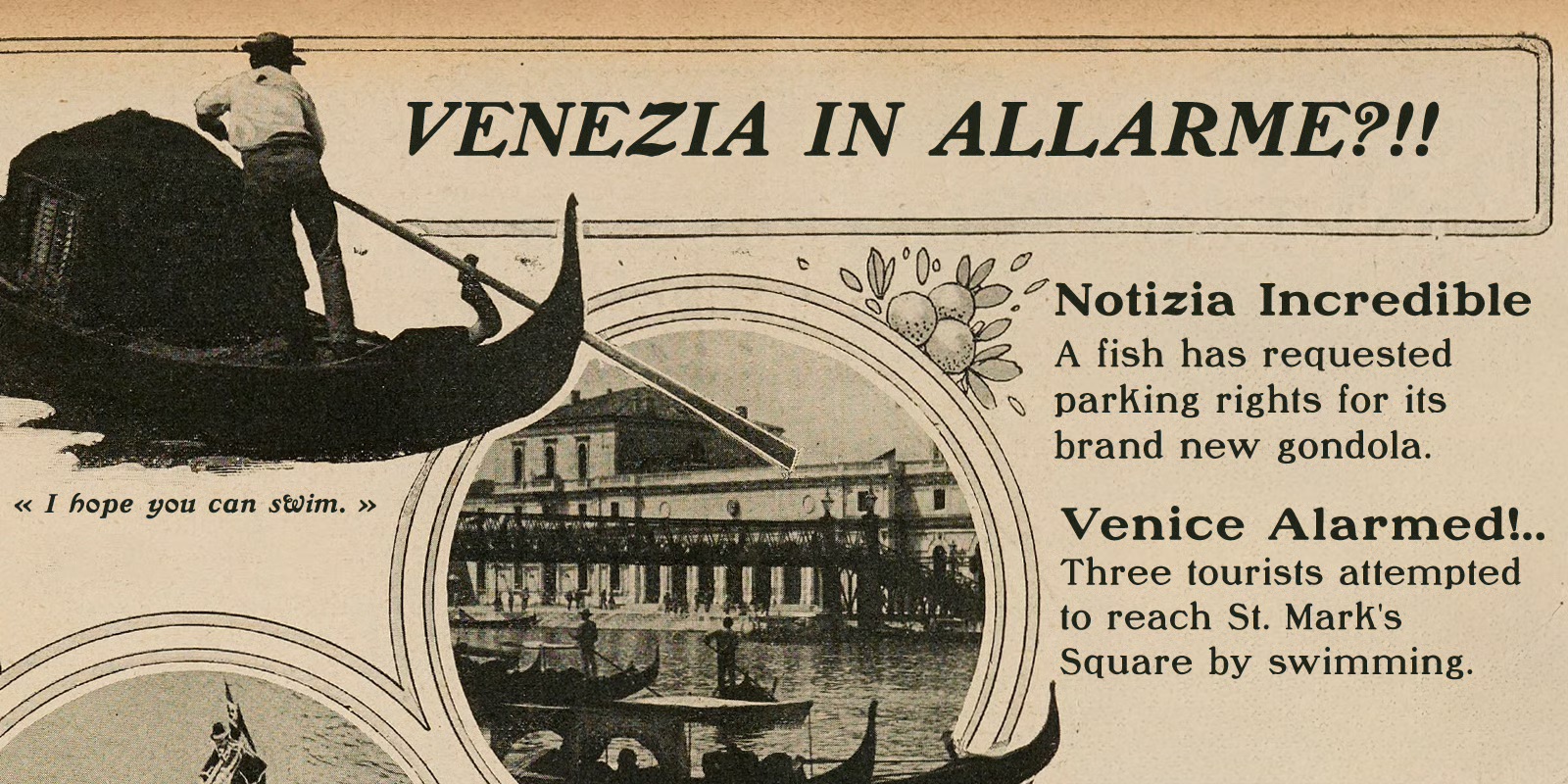
file name: Matthew Mc Gehee Sunday Gaul 2026 after Inland Type Blanchard 1900

file name: Matthew Mc Gehee Sunday Gaul 2026 after Inland Type Blanchard 1900
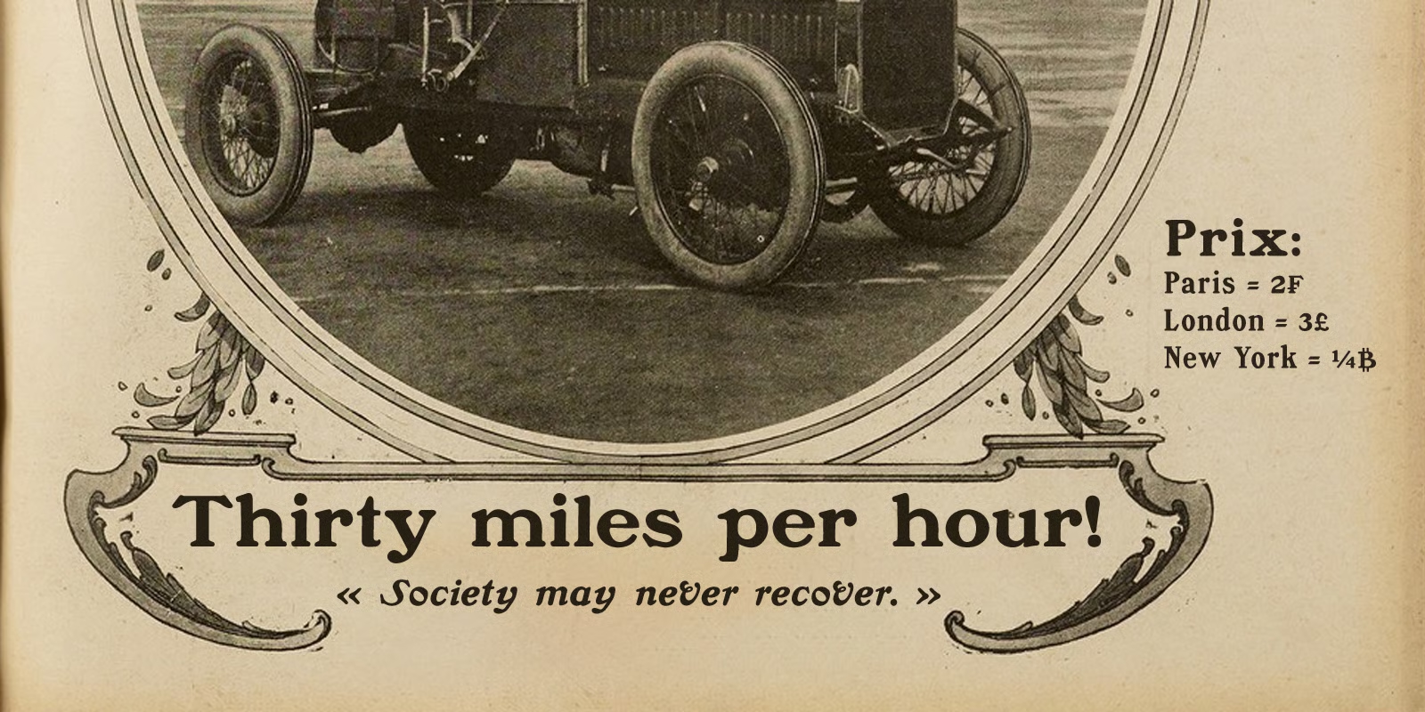
file name: Matthew Mc Gehee Sunday Gaul 2026 after Inland Type Blanchard 1900

file name: Matthew Mc Gehee Sunday Gaul 2026 after Inland Type Blanchard 1900
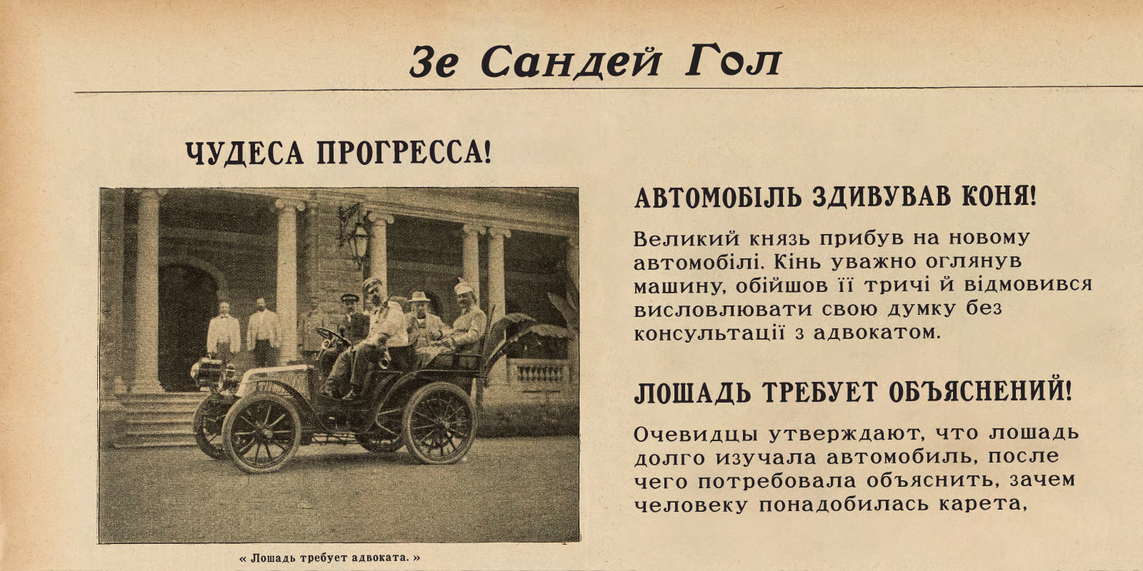
file name: Matthew Mc Gehee Sunday Gaul 2026 after Inland Type Blanchard 1900
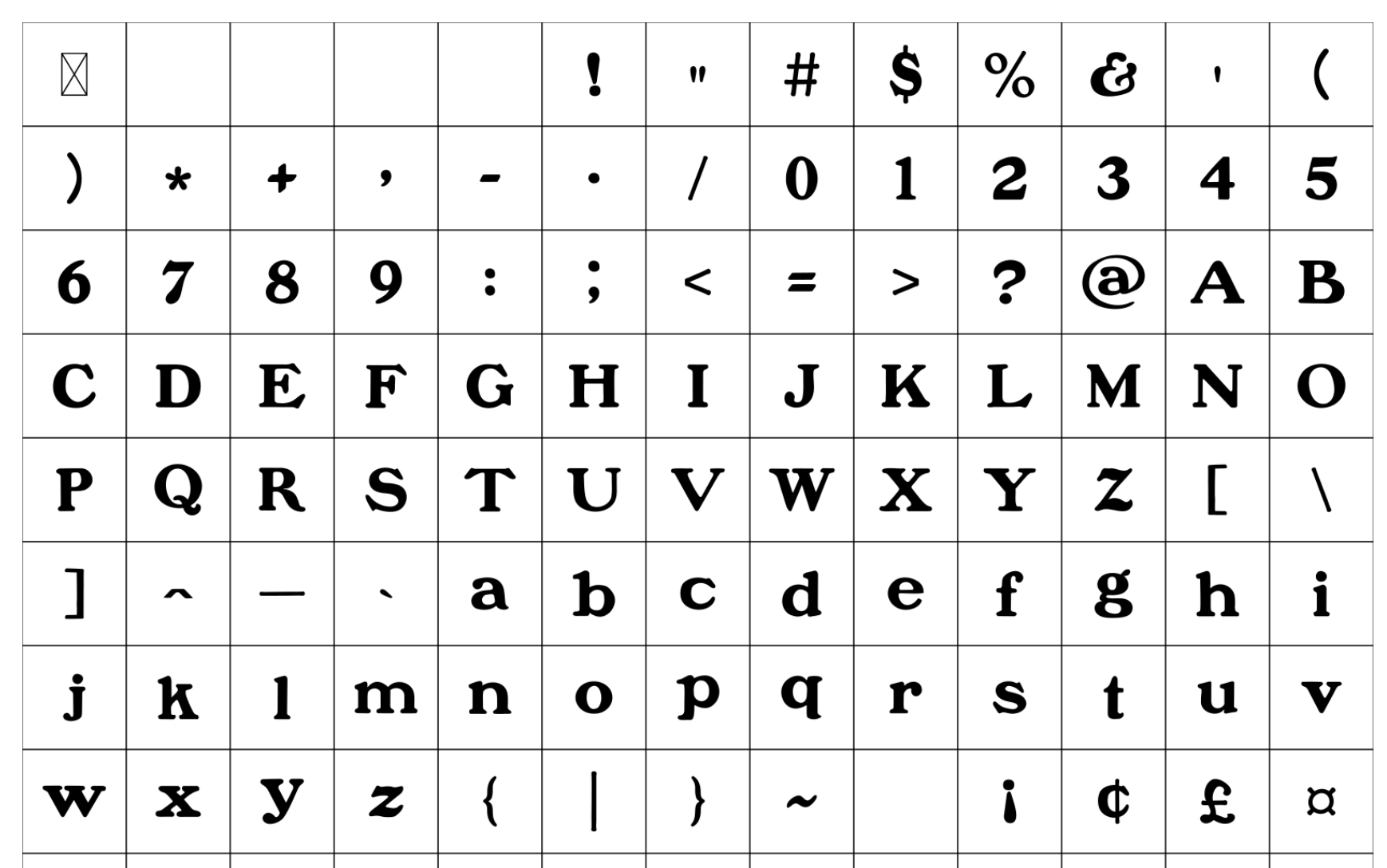
file name: Matthew Mc Gehee Sunday Gaul 2026 after Inland Type Blanchard 1900
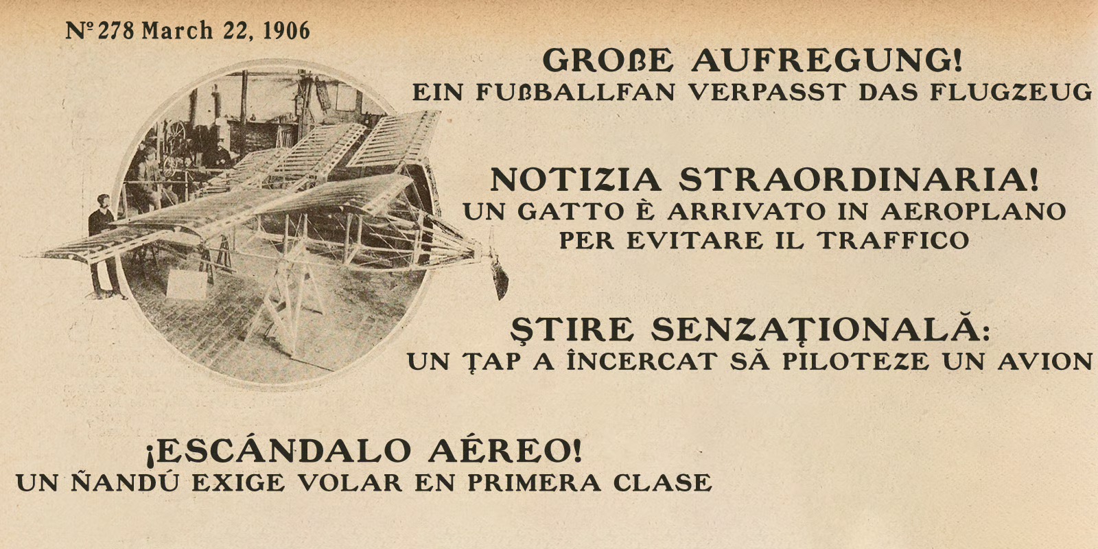
file name: Matthew Mc Gehee Sunday Gaul 2026 after Inland Type Blanchard 1900
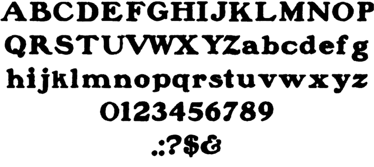
file name: Paulo W Blanchard Inland 2013
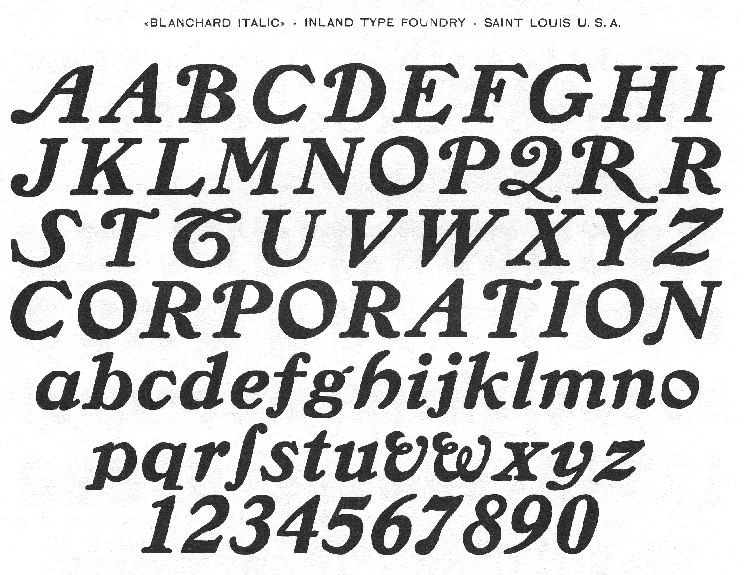
file name: Inland Blancharditalic
| | |
|
Luc Devroye ⦿ School of Computer Science ⦿ McGill University Montreal, Canada H3A 2K6 ⦿ lucdevroye@gmail.com ⦿ https://luc.devroye.org ⦿ https://luc.devroye.org/fonts.html |