TYPE DESIGN INFORMATION PAGE last updated on Thu Apr 16 21:58:33 EDT 2026
FONT RECOGNITION VIA FONT MOOSE
|
|
|
|
Rochester Institute of Technology's School of Printing graduate who lived in California and in Holland, MI, and now resides in Louisville, Colorado. He was a disciple of Chuck Bigelow and Kris Holmes. MyFonts page on him. In 1990, he started work at Monotype in Palo Alto to create the Windows truetype core fonts Arial, Times New Roman and Courier New. He stayed with Monotype and then Agfa/Monotype until 2003 (when he was probably fired, but that is only an unreliable guess), directing type development from the design office in Palo Alto, CA. Bio at Agfa/Monotype. He has directed branding projects such as Agilent Technology's corporate sans serif and Microsoft's corporate font family 'Segoe'. At the same time, he was involved in producing bitmaps and outline fonts for cell phones and TV set top environments. He has worked extensively designing Greek, Cyrllic, Thai, Hebrew and Arabic alphabets to satisfy the requirements of customers such as IBM, Microsoft, Nokia, Sun and Sybase. In 2004, he co-founded Ascender Corporation in Northbrook, IL, where he remained Type Design Director until Ascender was bought by Monotype, where he now heads the type design team (12 people in all, as of 2013). CBC interview in 2012. Fontspace link. FontShop link. At ATypI 2011 in Reykjavik, he spoke on typefaces for Android OS. His typefaces:
Klingspor link. Fontspace link. View Steve Matteson's typefaces. |
EXTERNAL LINKS |
| | |

file name: Steve Matteson Pic

file name: Steve Matteson Pic
file name: Monotype Futura Now 2020 1
file name: Monotype Futura Now 2020 2
file name: Monotype Futura Now 2020 3
file name: Monotype Futura Now 2020 4

file name: Monotype Futura Now 2020
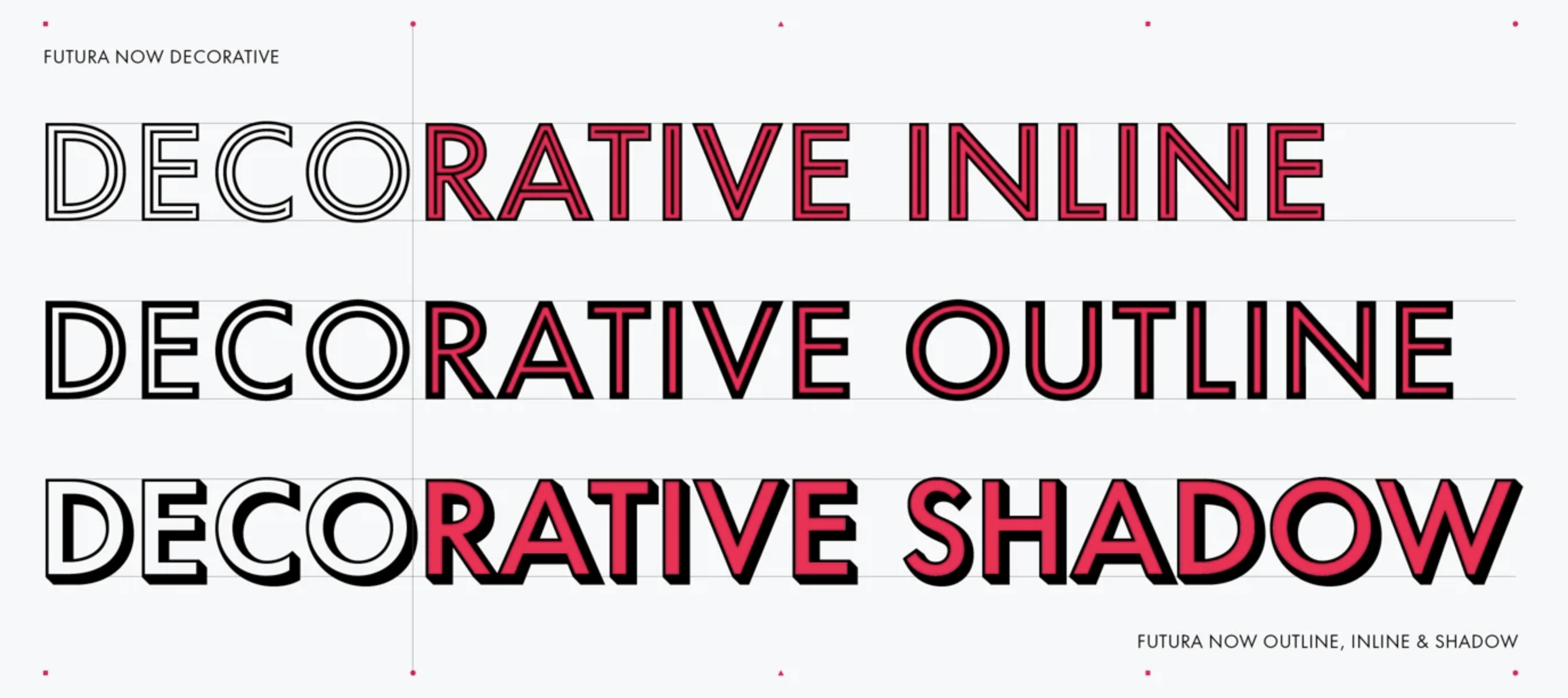
file name: Monotype Futura Now Decorative 2020
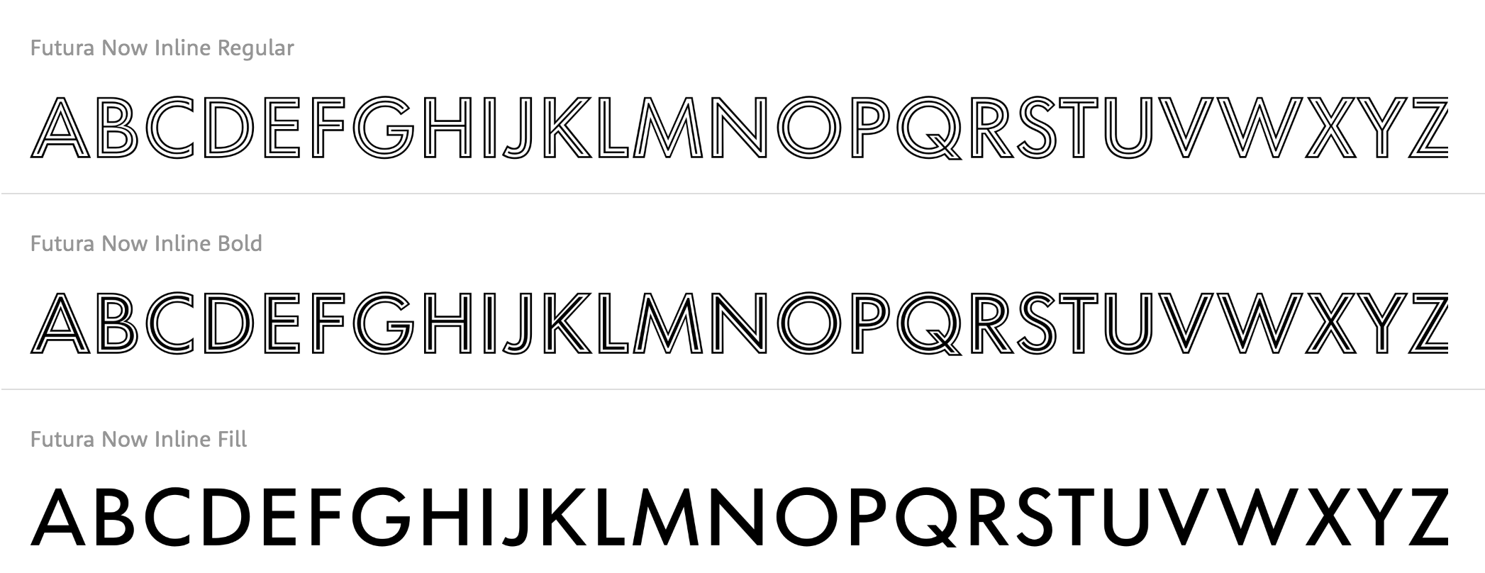
file name: Monotype Futura Now Inline 2020
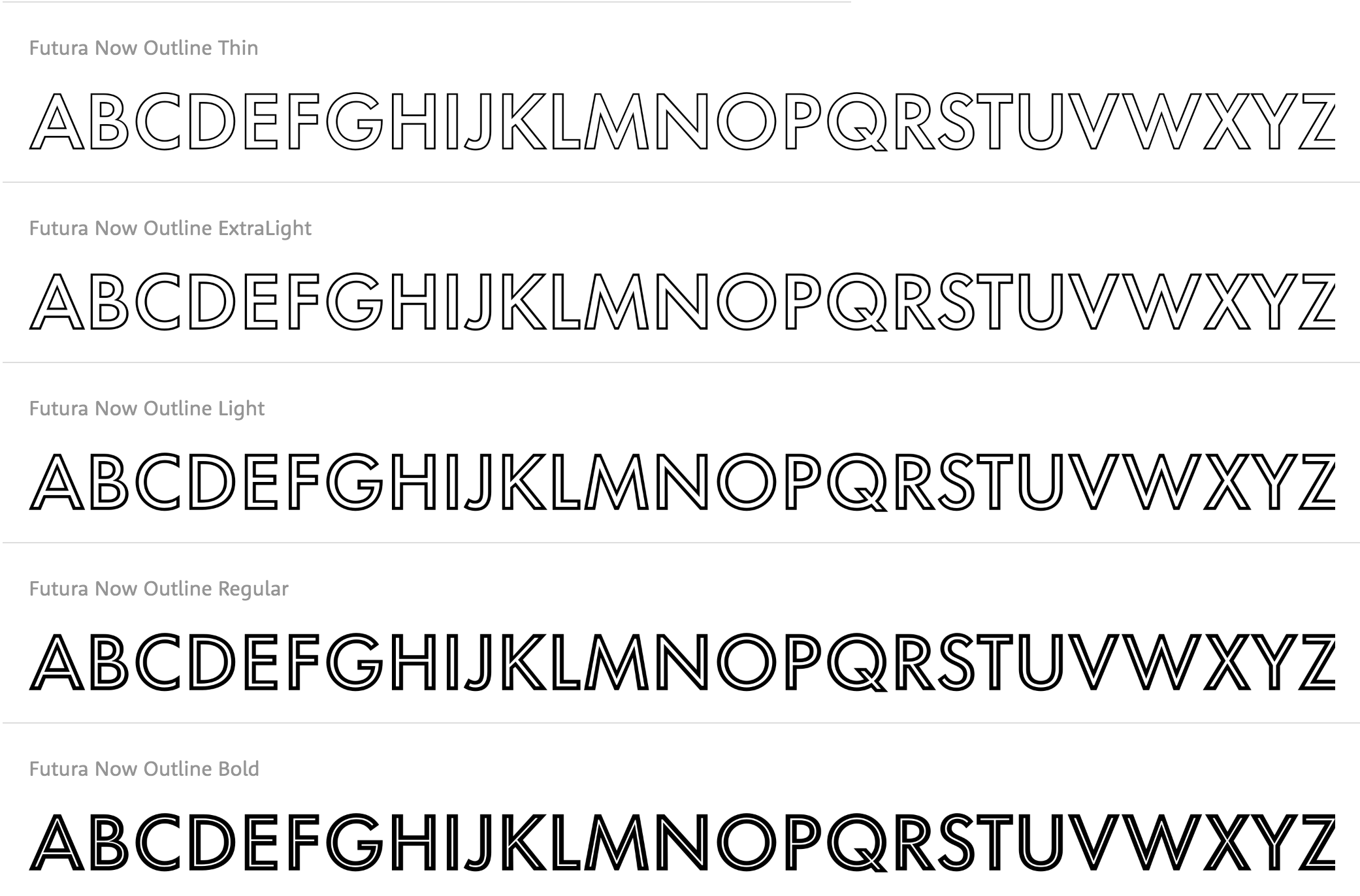
file name: Monotype Futura Now Outline 2020
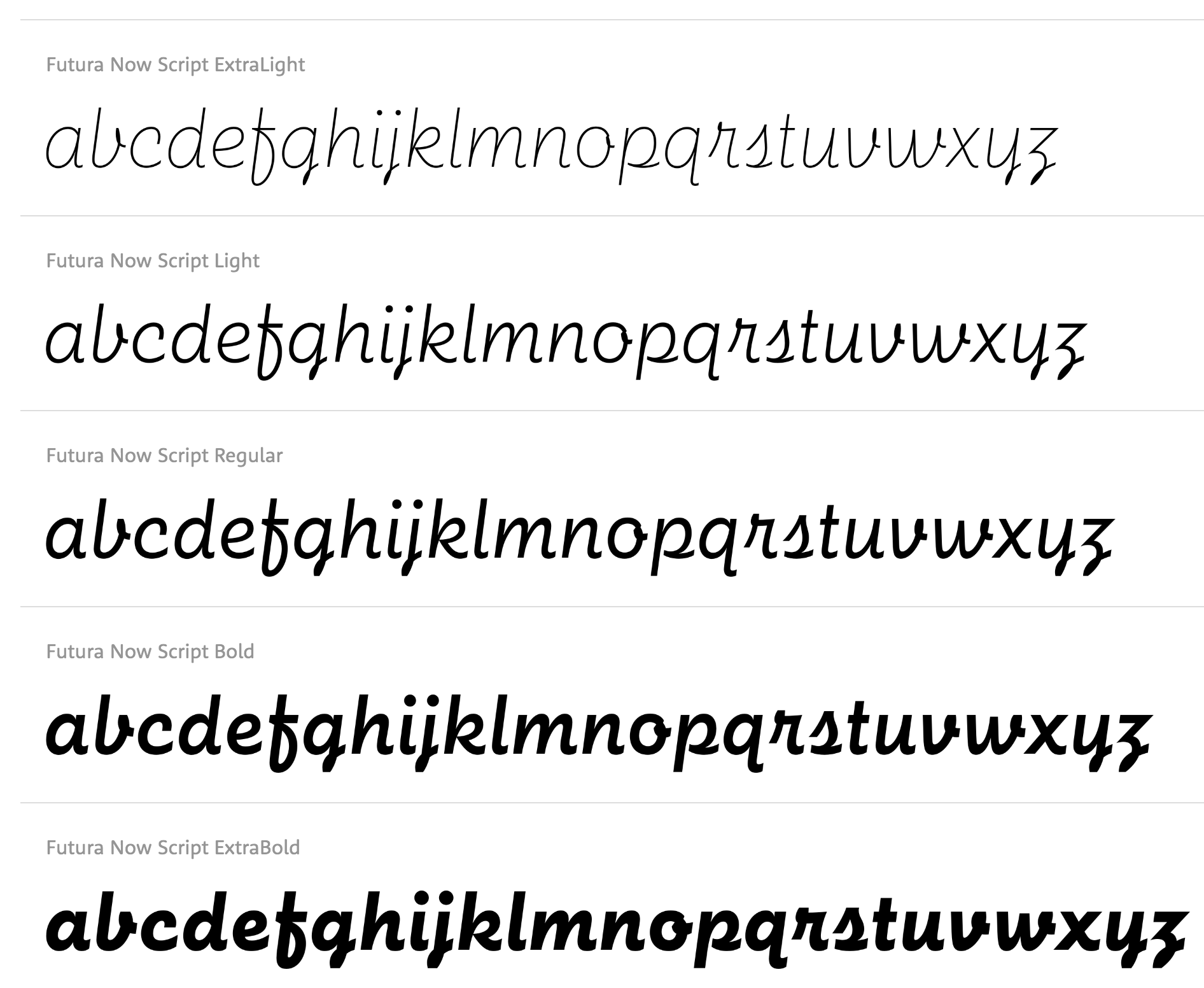
file name: Monotype Futura Now Script 2020
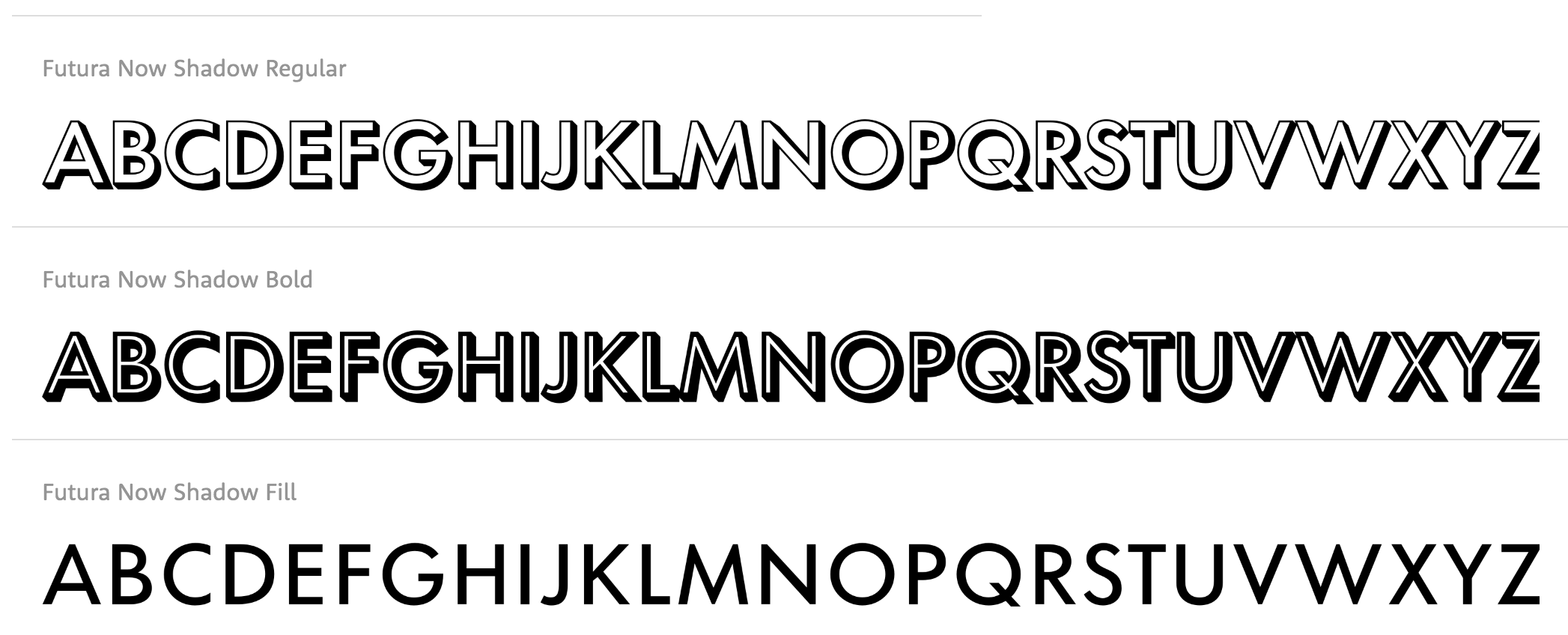
file name: Monotype Futura Now Shadow 2020

file name: Monotype Futura Now Stencil 2020
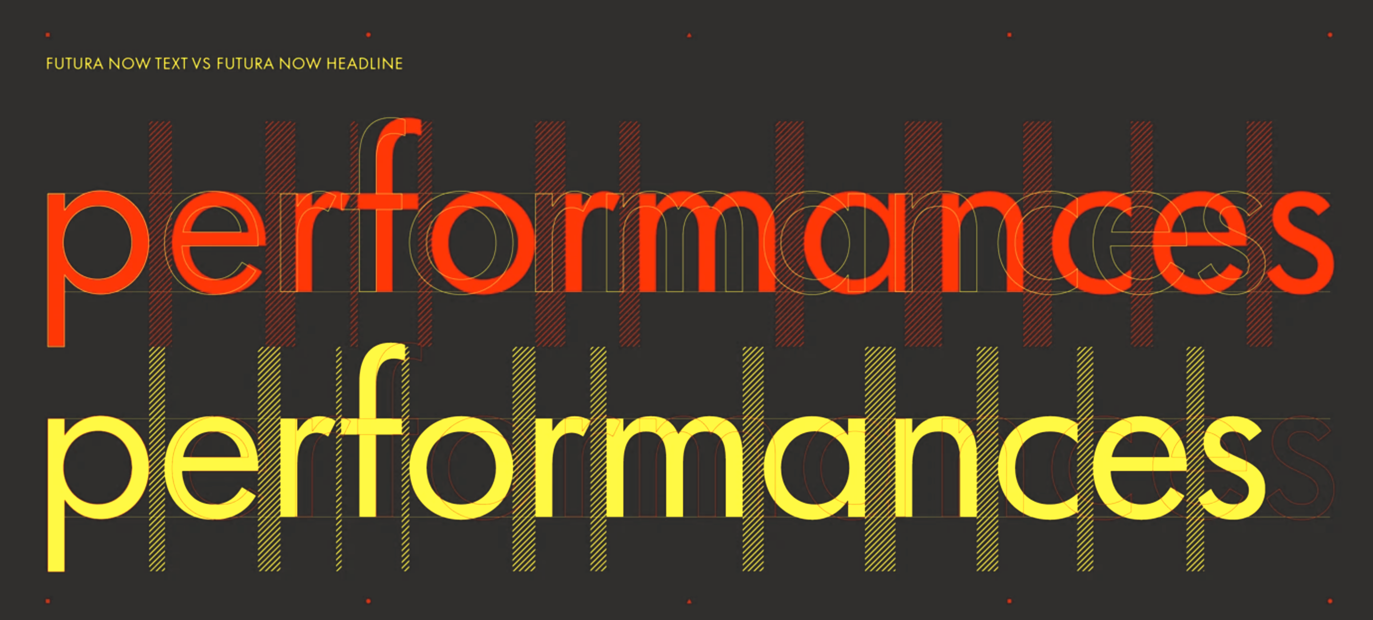
file name: Monotype Futura Now Text Headline 2020
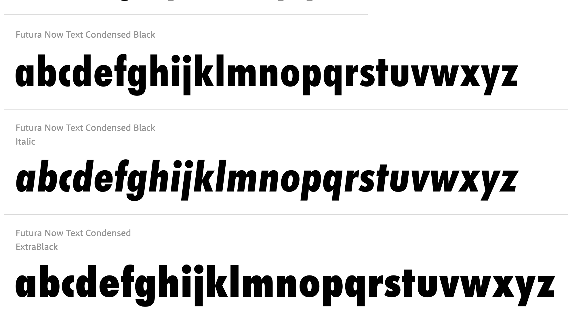
file name: Monotype Futura Now Text 2020
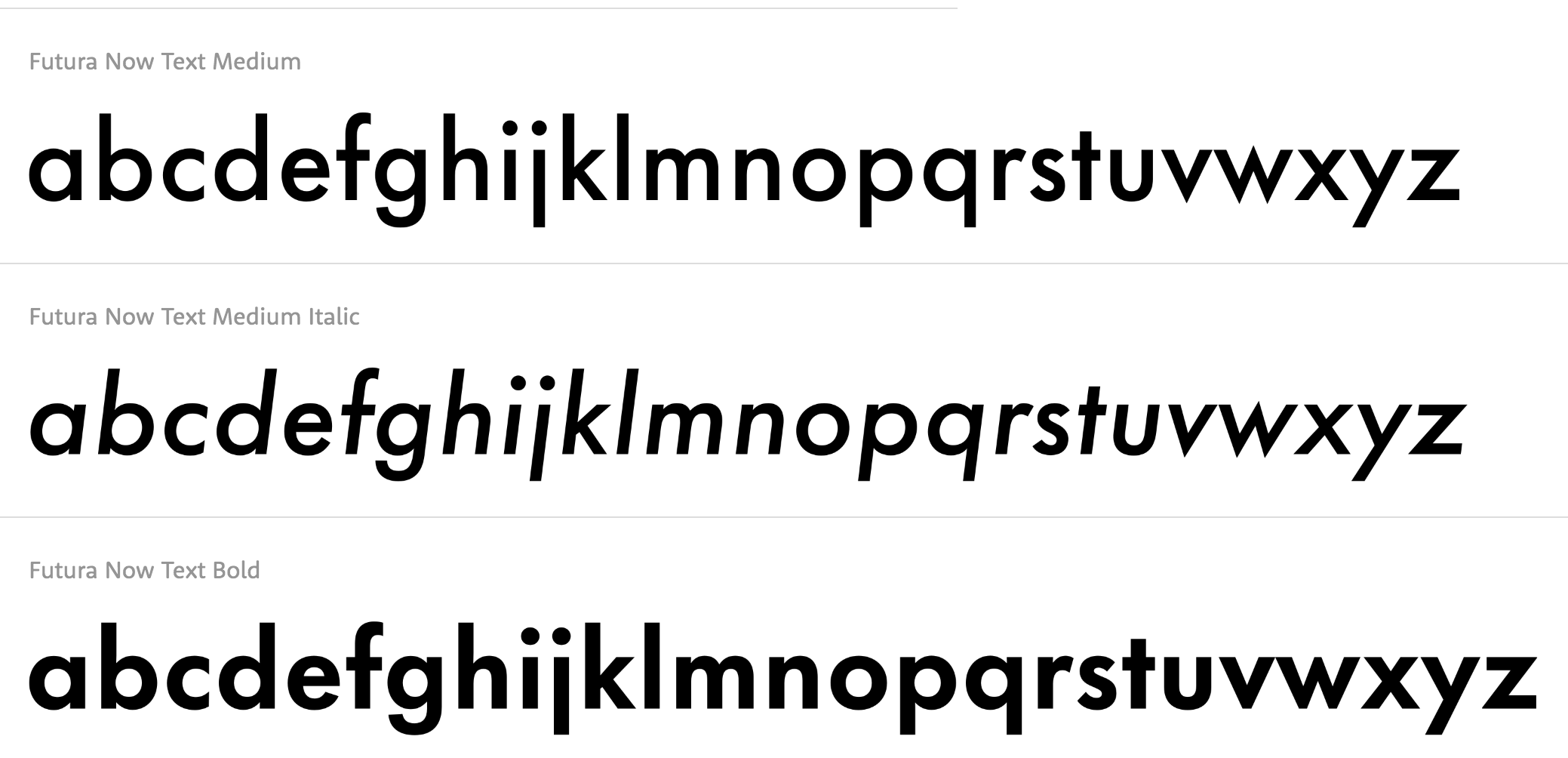
file name: Monotype Futura Now Text 2020
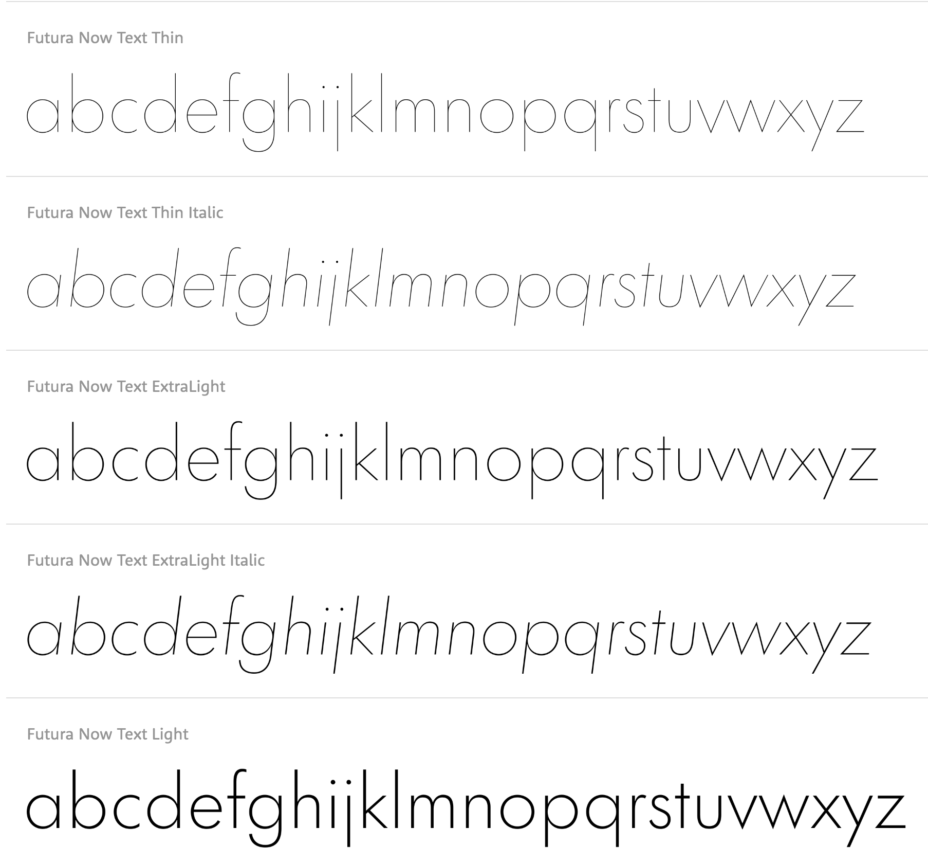
file name: Monotype Futura Now Text 2020

file name: Monotype Carnero 2019 297363 002

file name: Monotype Carnero 2019 297364 002

file name: Monotype Carnero 2019

file name: Steve Matteson Tipperary e Text Semibold 2012 2013

file name: Steve Matteson Droid Serif 2009

file name: Steve Matteson Droid Serif Bold 2009

file name: Steve Matteson Andale Mono 1995
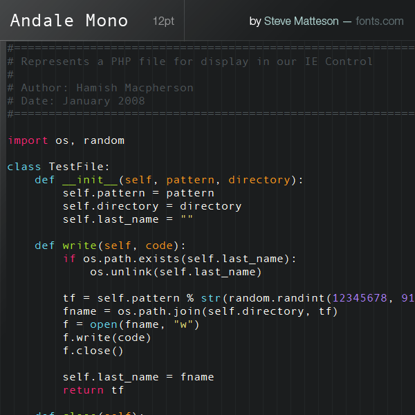
file name: Steve Matteson Andale Mono

file name: Steve Matteson Andale Mono

file name: Steve Matteson Segoe T V 1997 2004
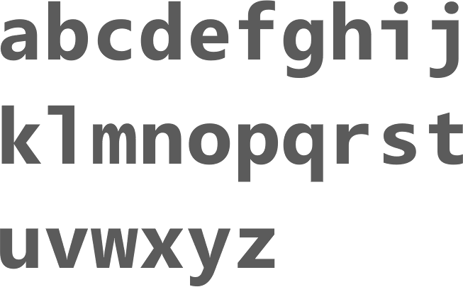
file name: Steve Matteson Segoe Mono Bold 2012
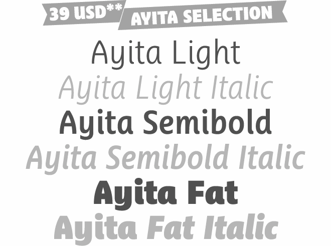
file name: Jim Ford Steve Matteson Ayita 2006

file name: Steve Matteson Chicory 2006

file name: Steve Matteson Chicory 2006b
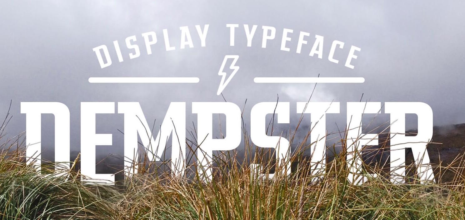
file name: Jim Ford Steve Matteson Dempster 2016b
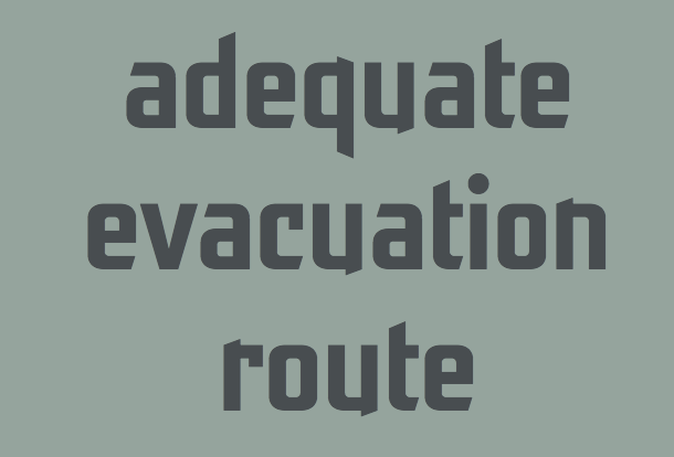
file name: Jim Ford Steve Matteson Dempster 2016 215504
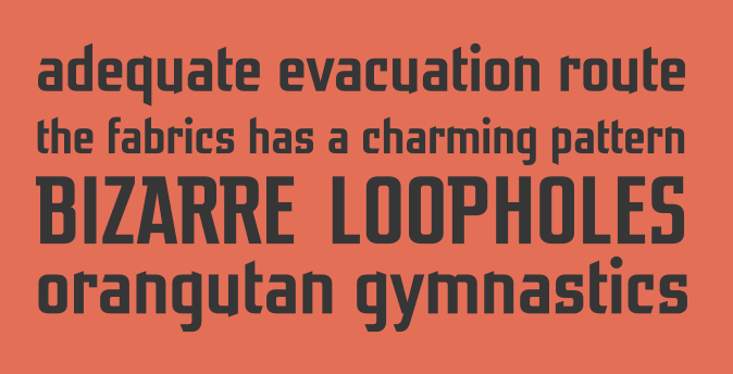
file name: Jim Ford Steve Matteson Dempster 2016 215505
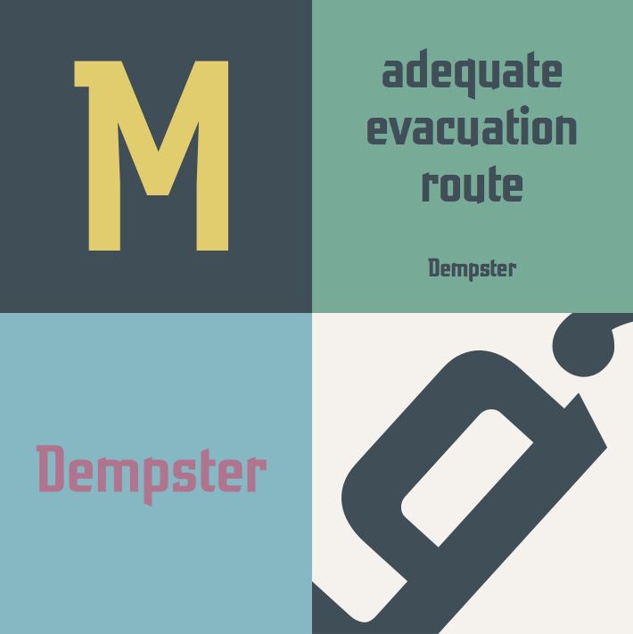
file name: Jim Ford Steve Matteson Dempster 2016 215505

file name: Jim Ford Steve Matteson Dempster 2016

file name: Steve Matteson Pescadero Pro 2006

file name: Steve Matteson Pescadero Pro 2006b

file name: Steve Matteson Cousine 2011

file name: Steve Matteson Kootenay 2012 Pic

file name: Steve Matteson Kootenay 2012

file name: Steve Matteson Carl Crossgrove Curlz

file name: Steve Matteson Carl Crossgrove Curlz Pro 1995 Poster by Afiq Lezz 2018

file name: Steve Matteson Carl Crossgrove Curlz Pro 1995

file name: Steve Matteson Carl Crossgrove Curlz Pro 1995 Based on a Poster by Tiny Flores 2015

file name: Curlz M T

file name: Monotype Steve Matteson Tom Grace Vag Rounded Next 2018

file name: Monotype Steve Matteson Tom Grace Vag Rounded Next 2018 261443

file name: Monotype Steve Matteson Tom Grace Vag Rounded Next 2018

file name: Monotype Steve Matteson Tom Grace Vag Rounded Next 2018 261442

file name: Monotype Steve Matteson Tom Grace Vag Rounded Next 2018 261442

file name: Monotype Steve Matteson Tom Grace Vag Rounded Next 2018 261444

file name: Monotype Steve Matteson Tom Grace Vag Rounded Next 2018

file name: Steve Matteson Goudy Ornate

file name: Steve Matteson Ascender Sans Mono 2005

file name: Steve Matteson Massif 2006 2011

file name: Steve Matteson Massif 2006 2011b

file name: Steve Matteson Massif 2006 2011 Poster by Bill Dawson 2015

file name: Steve Matteson Miramonte Pro Bold 2006

file name: Steve Matteson Miramonte Pro Bold 2006b

file name: Steve Matteson Miramonte Pro Bold 2006c

file name: Steve Matteson Miramonte Pro 2006 after Stanislav Marso Marsuv Grotesk 1960

file name: Steve Matteson Miramonte Pro 2006 after Stanislav Marso Marsuv Grotesk 1960b

file name: Steve Matteson Miramonte Pro 2006 after Stanislav Marso Marsuv Grotesk 1960c

file name: Steve Matteson Amanda

file name: Steve Matteson Andy

file name: Steve Matteson Ashley Crawford

file name: Steve Matteson Blueprint

file name: Steve Matteson Dujour

file name: Steve Matteson Endurance

file name: Steve Matteson Endurance Pro 2004

file name: Steve Matteson Ascender Endurance Pro Condensed 2009

file name: Steve Matteson Ascender Endurance Pro Condensed Bold 2009

file name: Steve Matteson Facade Condensed

file name: Steve Matteson Fineprint

file name: Steve Matteson Lebeau

file name: Dave Bailey Delve Withrington Overpass 2011

file name: Dave Bailey Delve Withrington Overpass 2011b

file name: Dave Bailey Delve Withrington Overpass 2011c

file name: Red Hat Overpass 2011
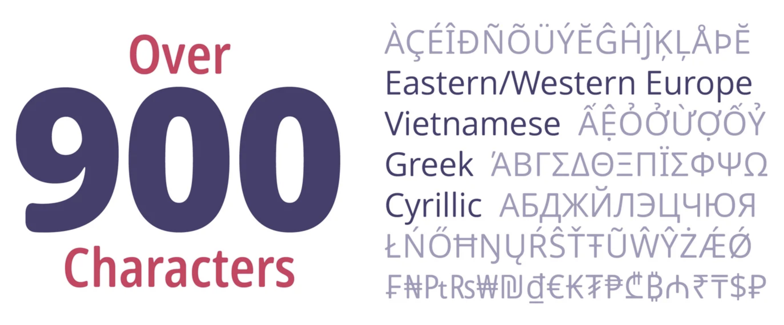
file name: Steve Matteson Open Sans Soft 2021
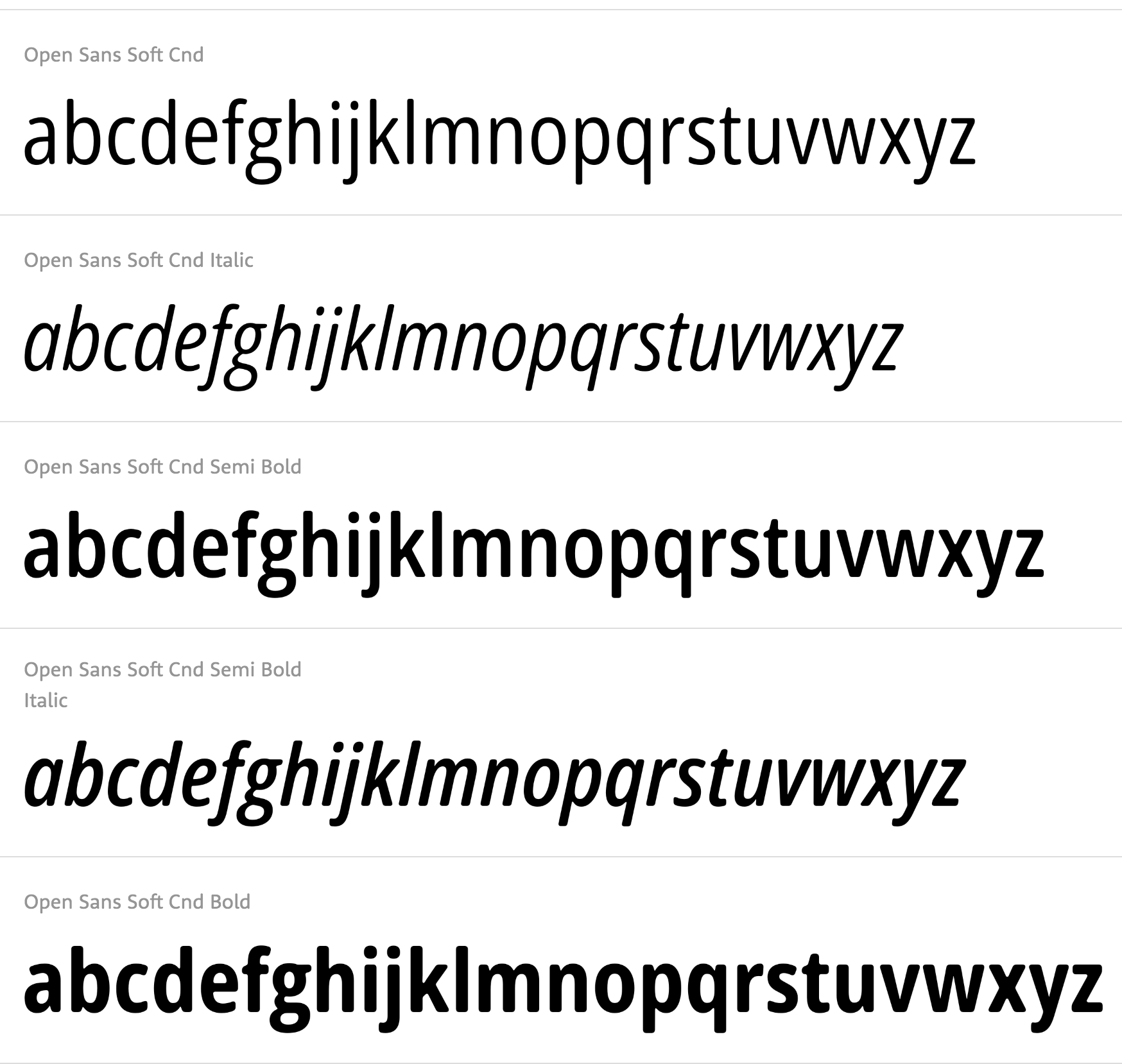
file name: Steve Matteson Open Sans Soft 2021
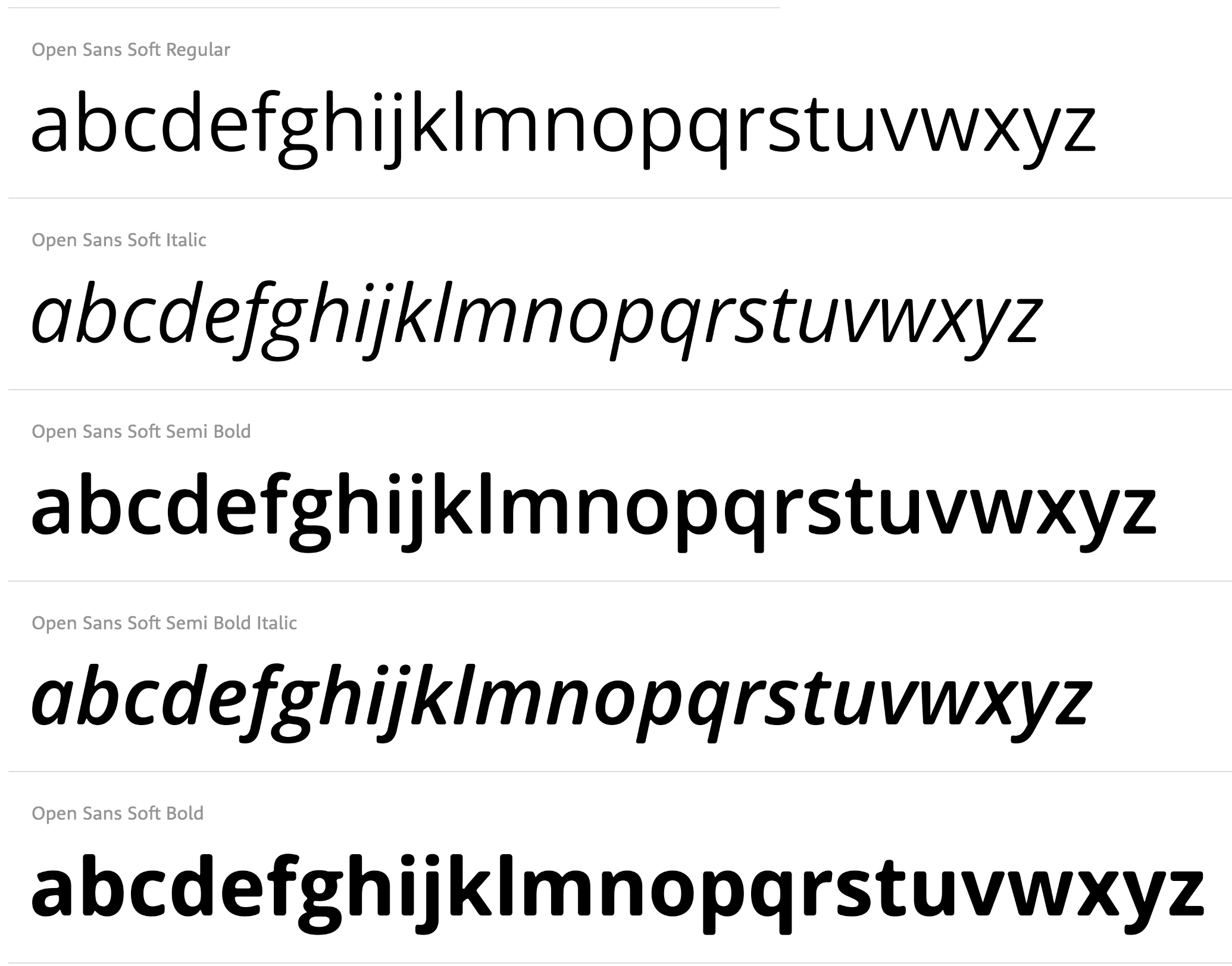
file name: Steve Matteson Open Sans Soft 2021
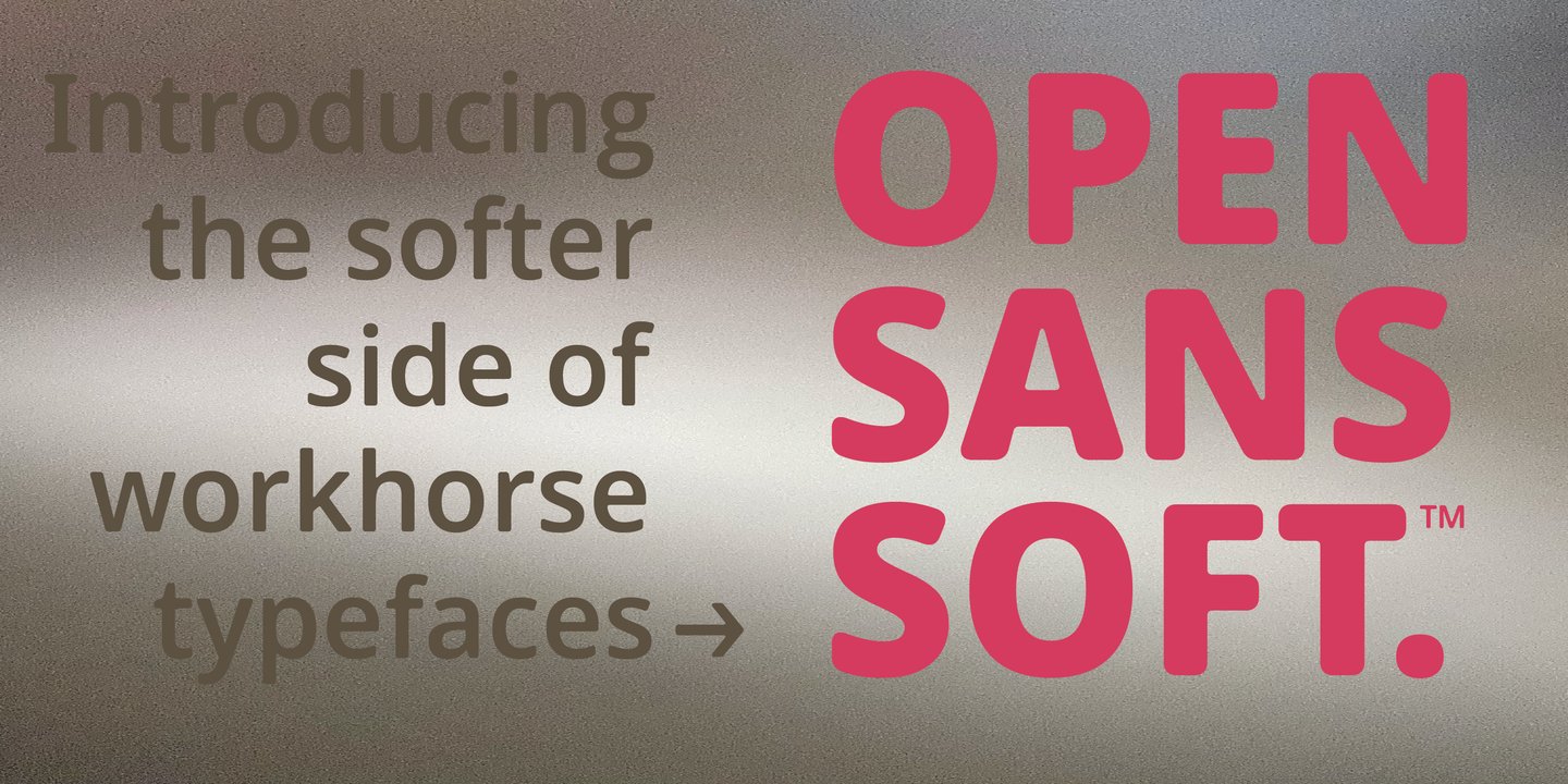
file name: Matteson Typographics Open Sans Soft 2021 1
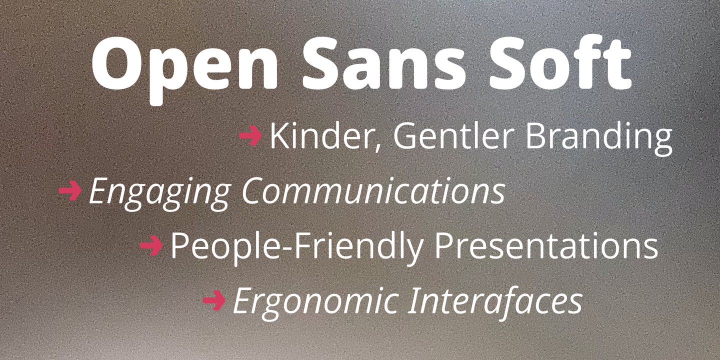
file name: Matteson Typographics Open Sans Soft 2021 2
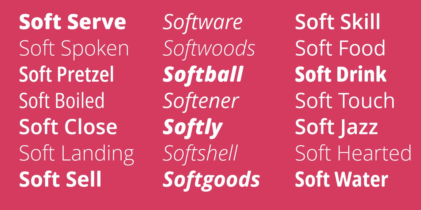
file name: Matteson Typographics Open Sans Soft 2021 3
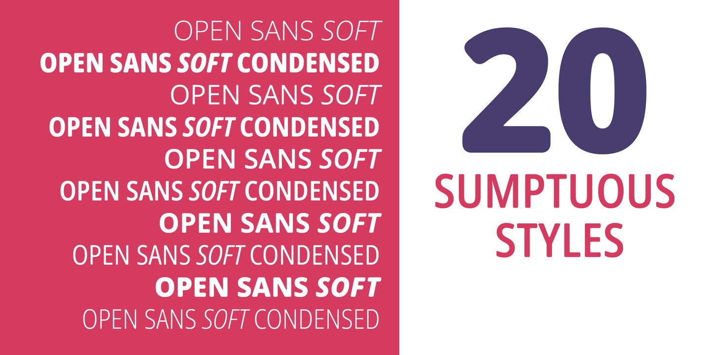
file name: Matteson Typographics Open Sans Soft 2021 4
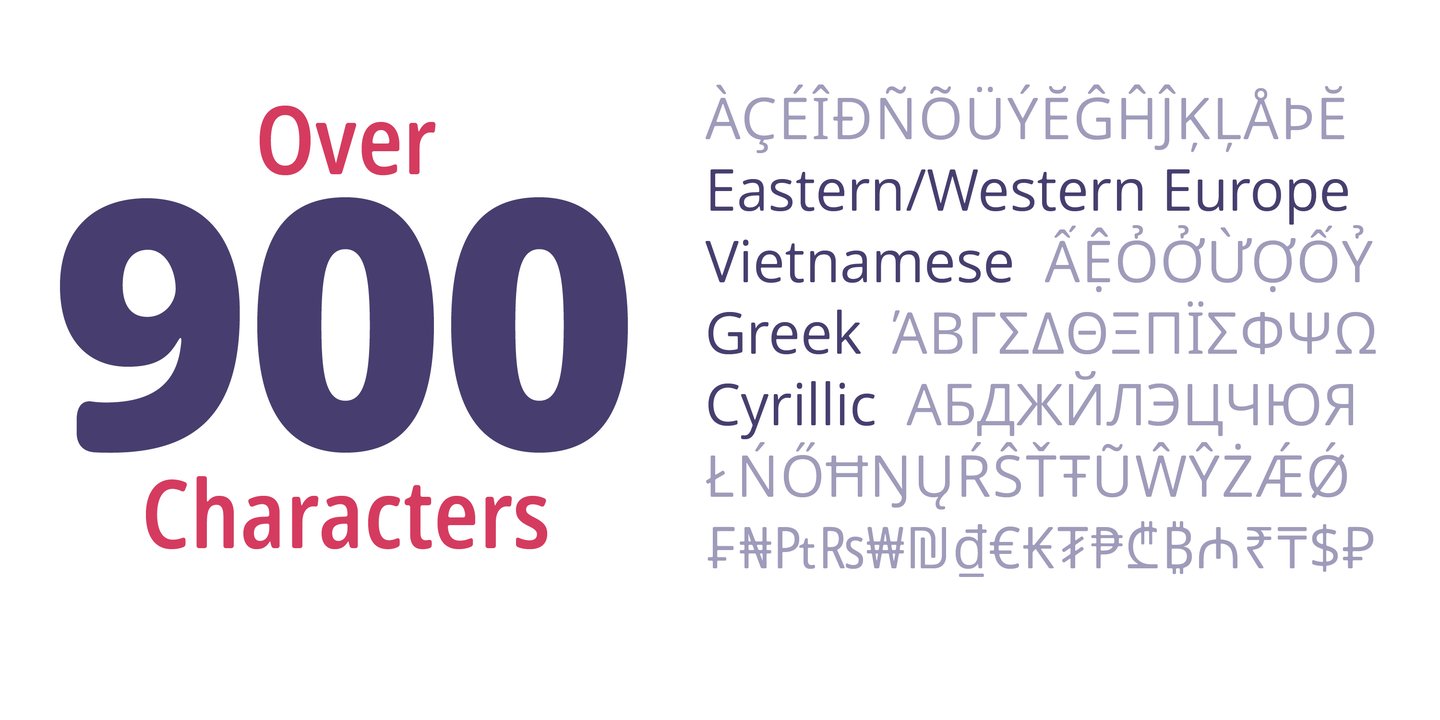
file name: Matteson Typographics Open Sans Soft 2021 5

file name: Matteson Typographics Open Sans Soft 2021

file name: Steve Matteson Open Sans Poster by Alejandra Saldana 2012

file name: Steve Matteson Open Sans Poster by Alejandra Saldana 2012a

file name: Steve Matteson Open Sans Poster by Alejandra Saldana 2012b

file name: Steve Matteson Open Sans Poster by Alejandra Saldana 2012f

file name: Google Web Fonts Open Sans 2016 218135

file name: Google Web Fonts Open Sans 2016 218136

file name: Google Web Fonts Open Sans 2016

file name: Steve Matteson Open Sans 2010 2011d

file name: Steve Matteson Open Sans 2010 2011e

file name: Steve Matteson Open Sans 2010 2011 Poster by Veronica Marileo

file name: Steve Matteson Open Sans 2012 Labour Party Poster 2015

file name: Steve Matteson Liberation Mono 2007

file name: Steve Matteson Liberation Mono 2007b

file name: Steve Matteson Liberation Sans 2007

file name: Steve Matteson Liberation Serif 2009

file name: Steve Matteson Liberation Serif 2009b Poster by So What

file name: Steve Matteson Lindsey

file name: Steve Matteson Pericles

file name: Steve Matteson Pericles Pro 2005 after Robert Foster 1934

file name: Steve Matteson Pericles Pro 2005 after Robert Foster 1934b

file name: Steve Matteson Truesdell 1994

file name: Steve Matteson Truesdell 1994a

file name: Steve Matteson Truesdell 1994b

file name: Steve Matteson Truesdell 1994c

file name: Steve Matteson Truesdell

file name: Steve Matteson Dujour 2005

file name: Steve Matteson Arimo 2010

file name: Steve Matteson Arimo 2010 2012

file name: Steve Matteson Tinos Bold 2010 2012

file name: Steve Matteson Tinos 2010

file name: Steve Matteson Titanium 2006

file name: Steve Matteson Titanium Motors 2012

file name: Steve Matteson Titanium Motors 2012c

file name: Monotype Gill Floriated Caps 1995 after Eric Gill 1937

file name: Steve Matteson Mayberry Pro Semi Bold

file name: Steve Matteson Bertham Pro 2009

file name: Steve Matteson Bertham Pro based on Frederic Goudy Bertham

file name: Steve Matteson Bertham Pro 2009 30542

file name: Steve Matteson Bertham Pro 2009a

file name: Steve Matteson Friar Pro 2009

file name: Steve Matteson Friar based on Frederic Goudy Friar

file name: Steve Matteson Goudytype based on Frederic Goudy Goudytype 1921

file name: Steve Matteson Kennerley Bold Openface

file name: Steve Matteson Newstyle based on Frederic Goudy Newstyle 1920
| | |
|
Luc Devroye ⦿ School of Computer Science ⦿ McGill University Montreal, Canada H3A 2K6 ⦿ lucdevroye@gmail.com ⦿ https://luc.devroye.org ⦿ https://luc.devroye.org/fonts.html |


