TYPE DESIGN INFORMATION PAGE last updated on Thu Jul 16 06:47:08 EDT 2026
FONT RECOGNITION VIA FONT MOOSE

|
|
|
|
Paul Hickson
British designer who was first associated with Red Rooster, and who co-founded London Type in 2017. Designer of these typefaces, mainly done at Red Rooster:
|
EXTERNAL LINKS |
| | |


file name: Pat Hickson Paul Hickson L D N Garamond 2020

file name: Pat Hickson Paul Hickson L D N Garamond 2020

file name: Pat Hickson Paul Hickson L D N Garamond 2020

file name: Pat Hickson Paul Hickson L D N Garamond 2020

file name: Pat Hickson Paul Hickson L D N Garamond 2020

file name: Pat Hickson Paul Hickson L D N Garamond 2020

file name: Pat Hickson Paul Hickson L D N Garamond 2020

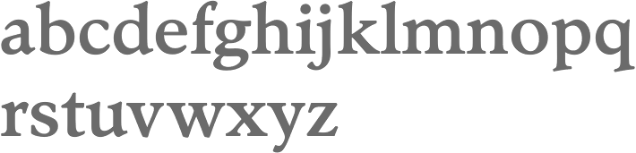
file name: Paul Hickson L D N Garamond 2020

file name: Paul Hickson L D N Garamond 2020

file name: Paul Hickson L D N Garamond 2020

file name: Paul Hickson L D N Garamond 2020

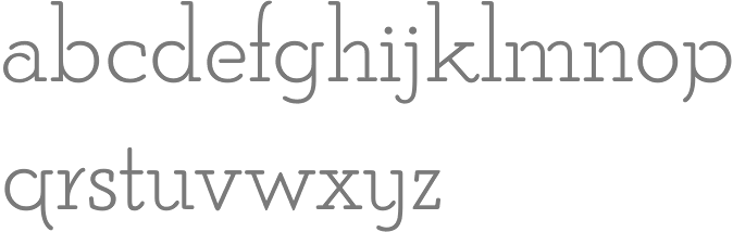
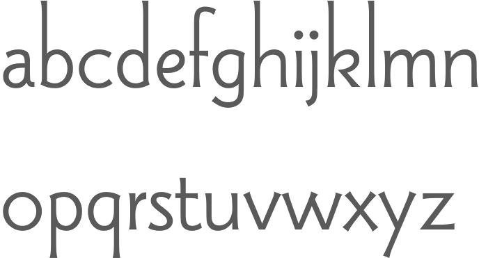
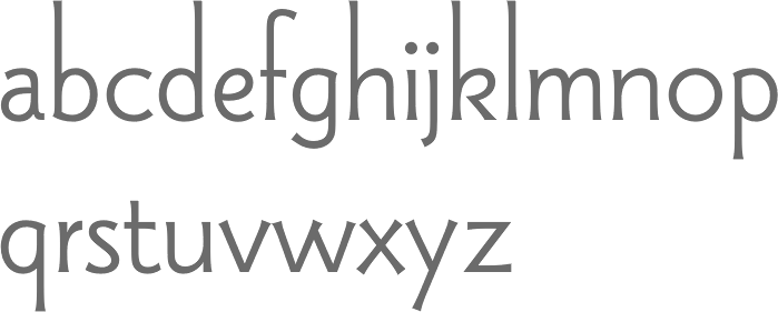
file name: Pat Paul Hickson L D N Merton Sans 2019

file name: Pat Paul Hickson L D N Merton Sans 2019

file name: Pat Paul Hickson L D N Merton Sans 2019

file name: Pat Paul Hickson L D N Merton Sans 2019

file name: Pat Paul Hickson London Belgravia 2019

file name: Pat Paul Hickson London Belgravia 2019

file name: Pat Paul Hickson London Belgravia 2019

file name: Pat Paul Hickson London Belgravia 2019

file name: Paul Pat Hickson L D N Piccadilly 2019

file name: Paul Pat Hickson L D N Piccadilly 2019

file name: Paul Pat Hickson L D N Piccadilly 2019

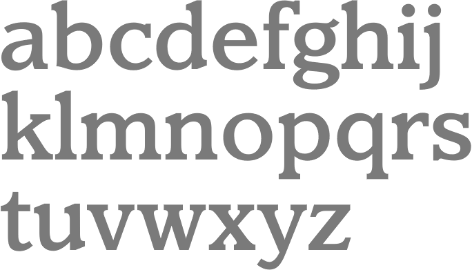
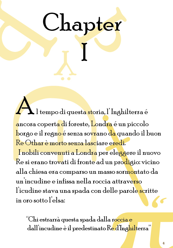
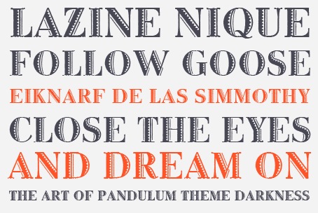
file name: Paul Hickson London Bloomsbury Old Style 2019

file name: Paul Hickson London Bloomsbury Old Style 2019

file name: Paul Hickson London Bloomsbury Old Style 2019

file name: Paul Hickson London Bloomsbury Old Style 2019
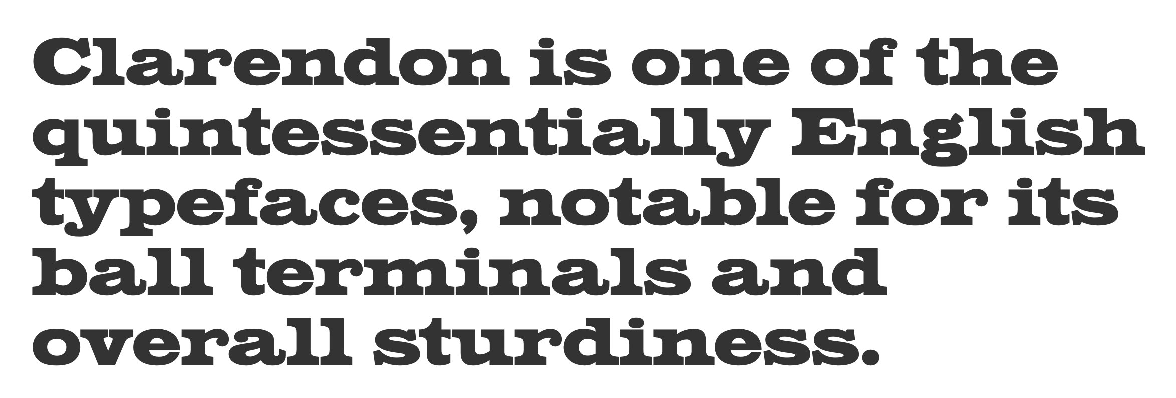
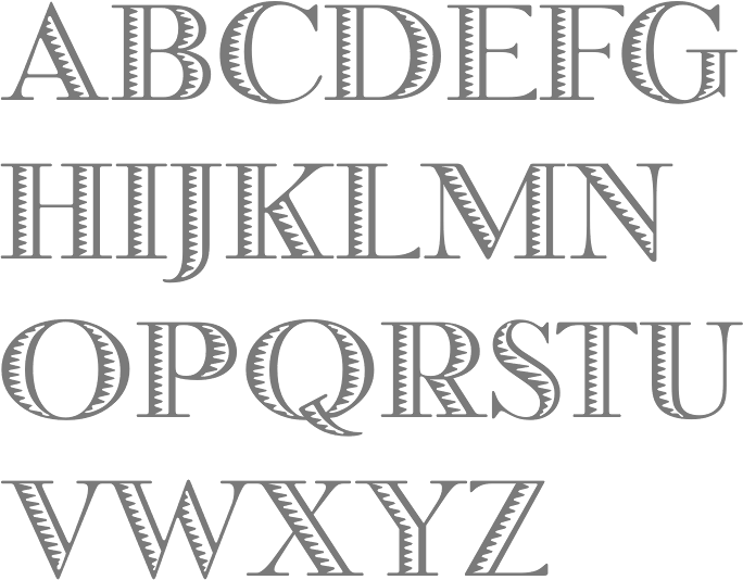
file name: Paul Hickson London Clarendon Poster 2019

file name: Paul Hickson London Clarendon Poster 2019
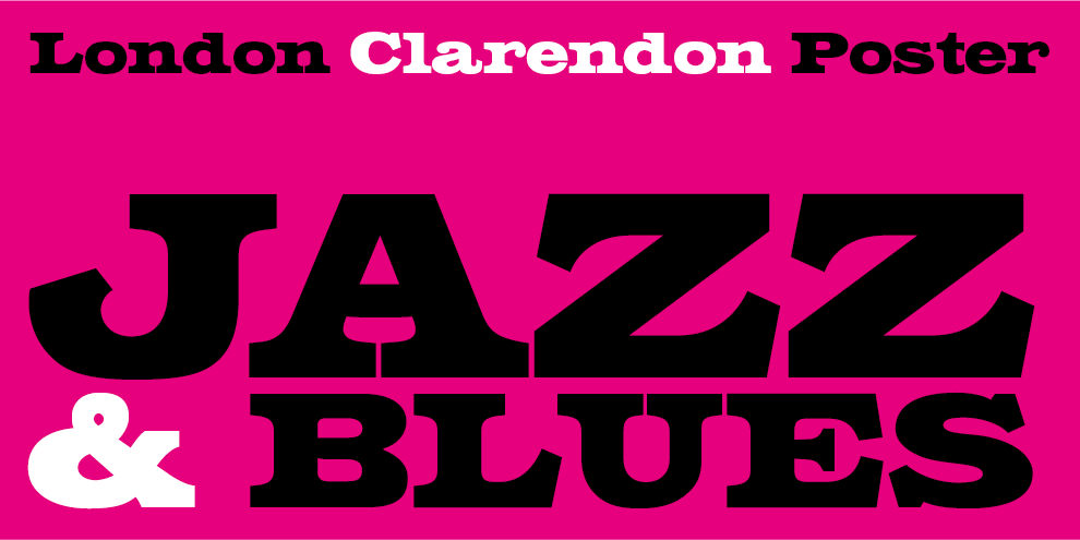
file name: Paul Hickson London Clarendon Poster 2019

file name: Paul Hickson London Clarendon Poster 2019
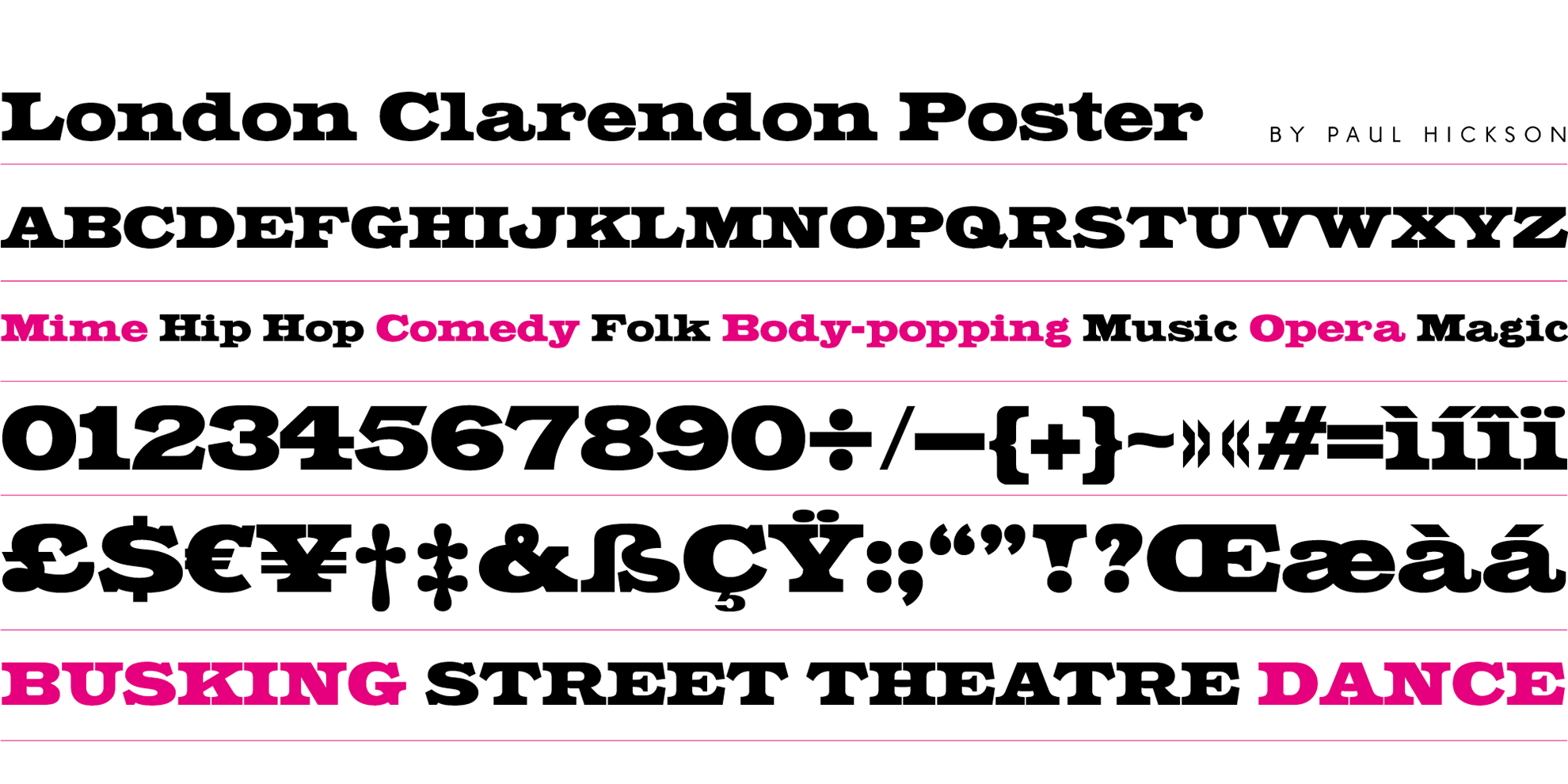
file name: Paul Hickson London Clarendon Poster 2019
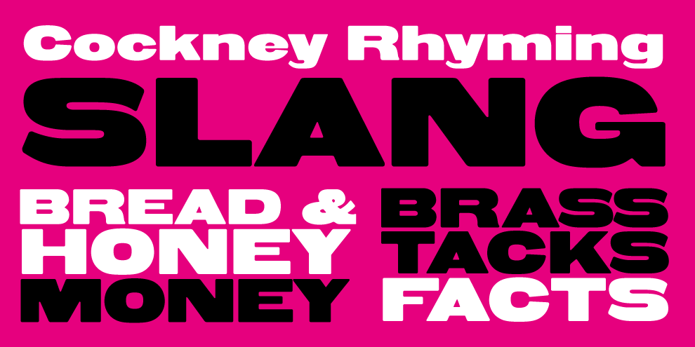
file name: Paul Hickson London Whitechapel 2019
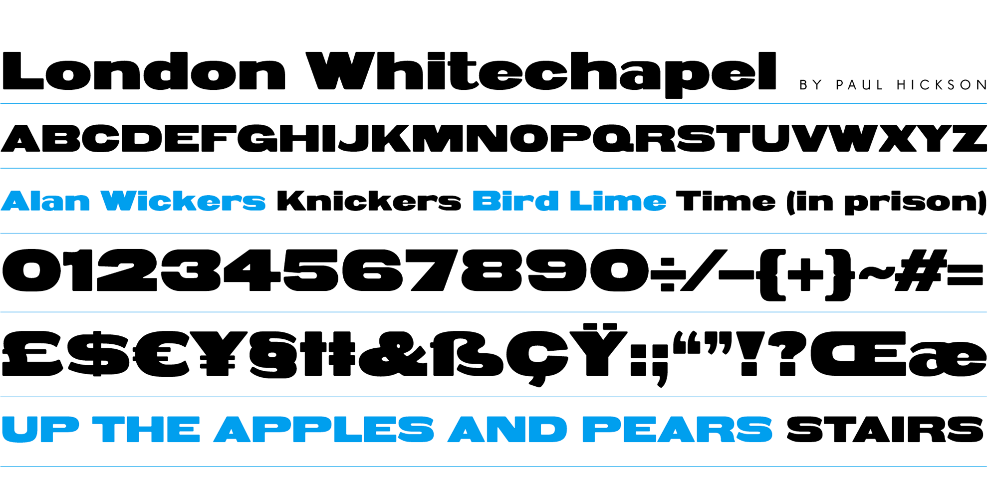
file name: Paul Hickson London Whitechapel 2019
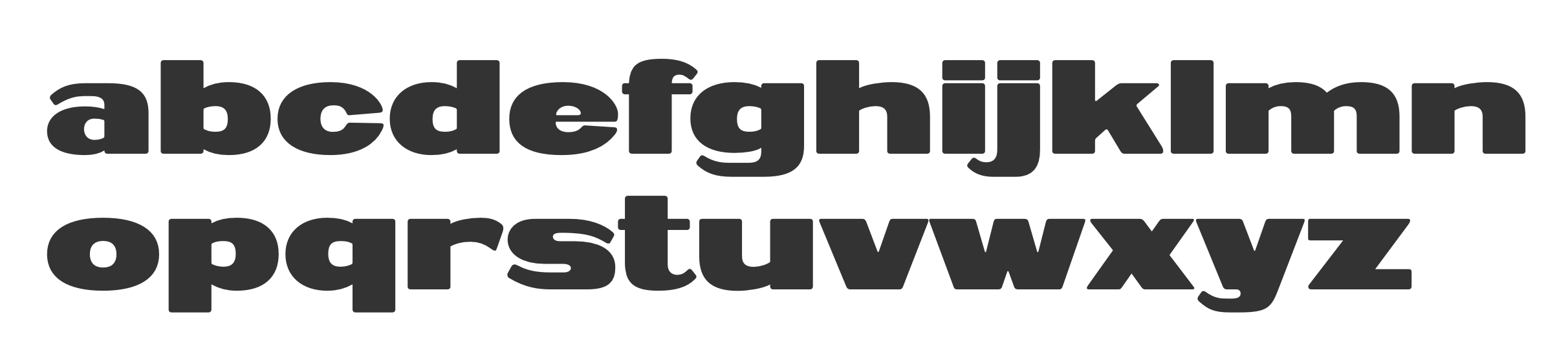
file name: Paul Hickson London Whitechapel 2019
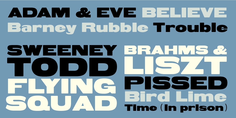
file name: Paul Hickson London Whitechapel 2019

file name: Paul Hickson Les Usherwood Claremont R R

file name: Les Usherwood Paul Hickson Equestrienne R R
file name: Les Usherwood Paul Hickson Stanhope R R Medium
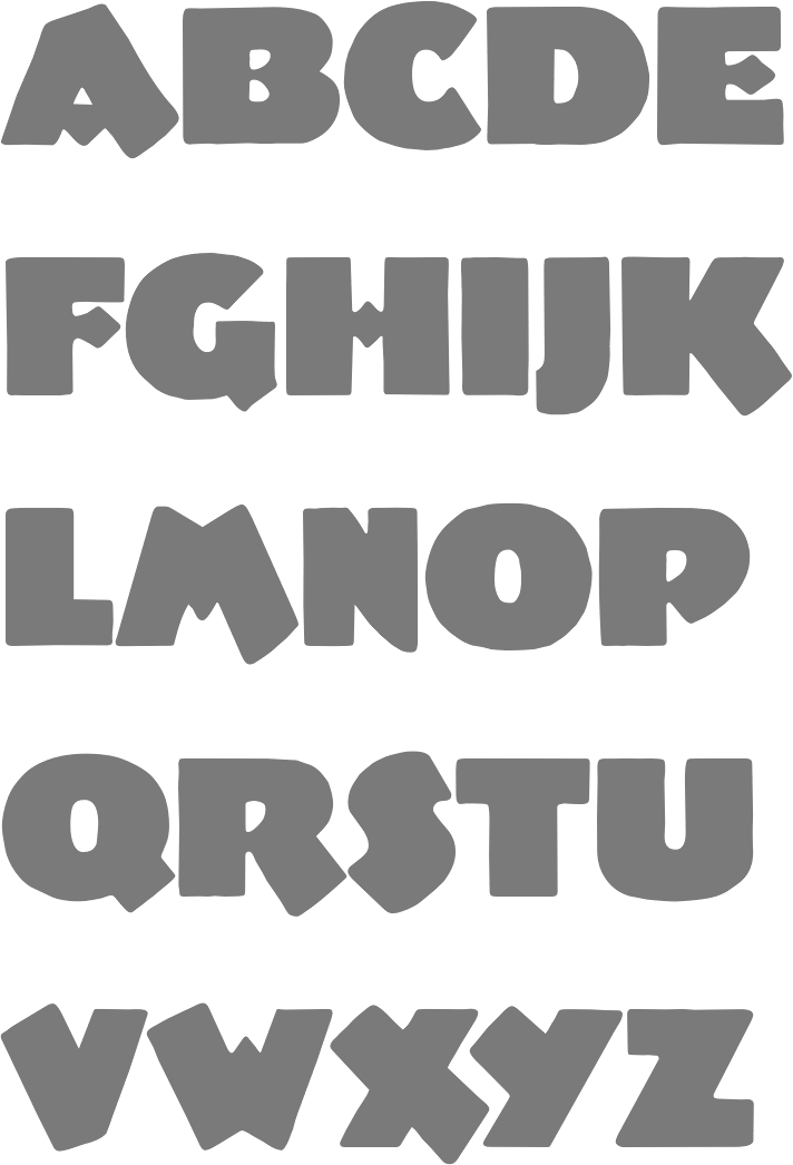
file name: Paul Hickson Poor Richard R R Monoline
file name: Paul Hickson Poor Richard Poster0 by Alessandra Magrini
file name: Paul Hickson Honduras R R
file name: Paul Hickson Messe Grotesk

file name: Paul Hickson Wade Sans Light 1990
file name: Paul Hickson Wade Sans Light
file name: Paul Hickson Wade Sans Light 1990
file name: Paul Hickson Wade Sans Light 1990d

file name: Pat Hickson Venezuela 2000 after Albert Auspurg Vesta 1926
file name: Pat Hickson Venezuela 2000 after Albert Auspurg Vesta 1926b
file name: Pat Hickson Venezuela 2000 after Albert Auspurg Vesta 1926c

file name: Pat Hickson Venezuela 2000 after Albert Auspurg Vesta 1926d

file name: Paul Hickson Venezuela R R based on Albert Auspurg Vesta 1926
file name: Paul Hickson Messe Grotesk 1997
file name: Paul Hickson Rivoli Initials 1994 after Willard T Sniffin 1928
| | |
|
Luc Devroye ⦿ School of Computer Science ⦿ McGill University Montreal, Canada H3A 2K6 ⦿ lucdevroye@gmail.com ⦿ https://luc.devroye.org ⦿ https://luc.devroye.org/fonts.html |