TYPE DESIGN INFORMATION PAGE last updated on Thu Apr 16 21:59:08 EDT 2026
FONT RECOGNITION VIA FONT MOOSE
|
|
|
|
National Old Style and Nabisco
[Frederic William Goudy]
Two Goudy fonts, from 1916 and 1921, respectively. Goudy wrote about them, as reported in A Half-Century of Type Design and Typography: 1895-1945, Typophiles Chap Books XIV, 1946 at pages 99 and 110:
Mac McGrew: National Oldstyle was designed by Frederic W. Goudy for ATF in 1916. It is based on lettering he had done about fifteen years earlier for National Biscuit Company, hence the name. It was moderately popular for a while for publication and advertising display work, and for titles for silent motion pictures. Compare Nabisco. Mac McGrew on Nabisco: Nabisco was designed by Frederic W. Goudy in 1921 as a private type for National Biscuit Company, based on hand-lettering of the company name he had done about twenty years earlier. As he had in the meantime drawn National Oldstyle (q.v.) for ATF, based on the same lettering, this typeface is consciously different although retaining the same general characteristics. Several sizes were cut by Robert Wiebking. The baking company was pleased. and used it frequently for several years. For a revival of National Oldtsyle, see National Oldstyle NF (2014, Nick Curtis). For a revival and extension to bold, semibold and italics, see Goudy National (2018, Steve Matteson. |
EXTERNAL LINKS |
| | |

file name: Frederic Goudy Nabisco 1921

file name: Frederic Goudy Nabisco 1921

file name: Frederic Goudy National Old Style 1916

file name: Frederic W Goudy National Oldstyle 1916

file name: Frederic W Goudy National Oldstyle 1916b

file name: Frederic W Goudy National Oldstyle 1916c

file name: Frederic W Goudy National Oldstyle 1916d

file name: Frederic W Goudy National Oldstyle 1916e

file name: Frederic W Goudy National Oldstyle 1916f

file name: Frederic W Goudy National Oldstyle 1916g

file name: Nick Curtis National Oldstyle N F 2014

file name: Steve Matteson Goudy National 2018 257269

file name: Steve Matteson Goudy National 2018 257270

file name: Steve Matteson Goudy National 2018 257271
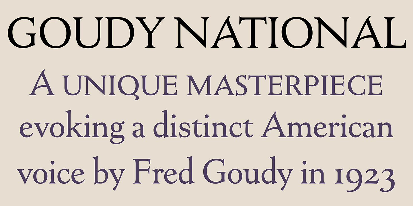
file name: Steve Matteson Goudy National 2018 257296
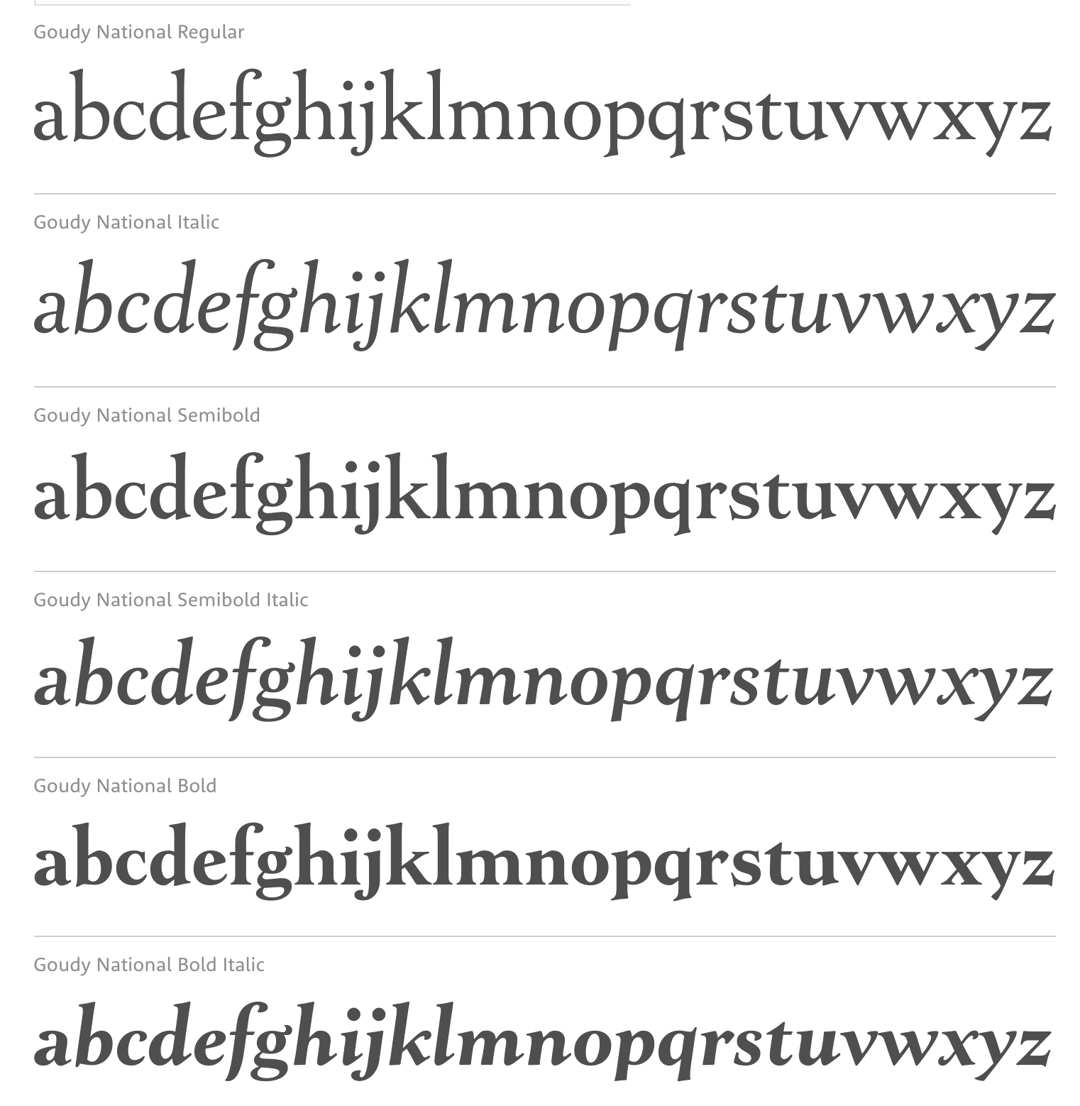
file name: Steve Matteson Goudy National 2018 after Frederic Goudy National Old Style 1916

file name: Steve Matteson Goudy National 2018
| | |
|
Luc Devroye ⦿ School of Computer Science ⦿ McGill University Montreal, Canada H3A 2K6 ⦿ lucdevroye@gmail.com ⦿ https://luc.devroye.org ⦿ https://luc.devroye.org/fonts.html |

