TYPE DESIGN INFORMATION PAGE last updated on Fri Dec 13 00:42:30 EST 2024

SEARCH THIS SITE:

IMAGE SEARCH:

FONT RECOGNITION VIA FONT MOOSE

LUC DEVROYE


ABOUT


William Addison Dwiggins

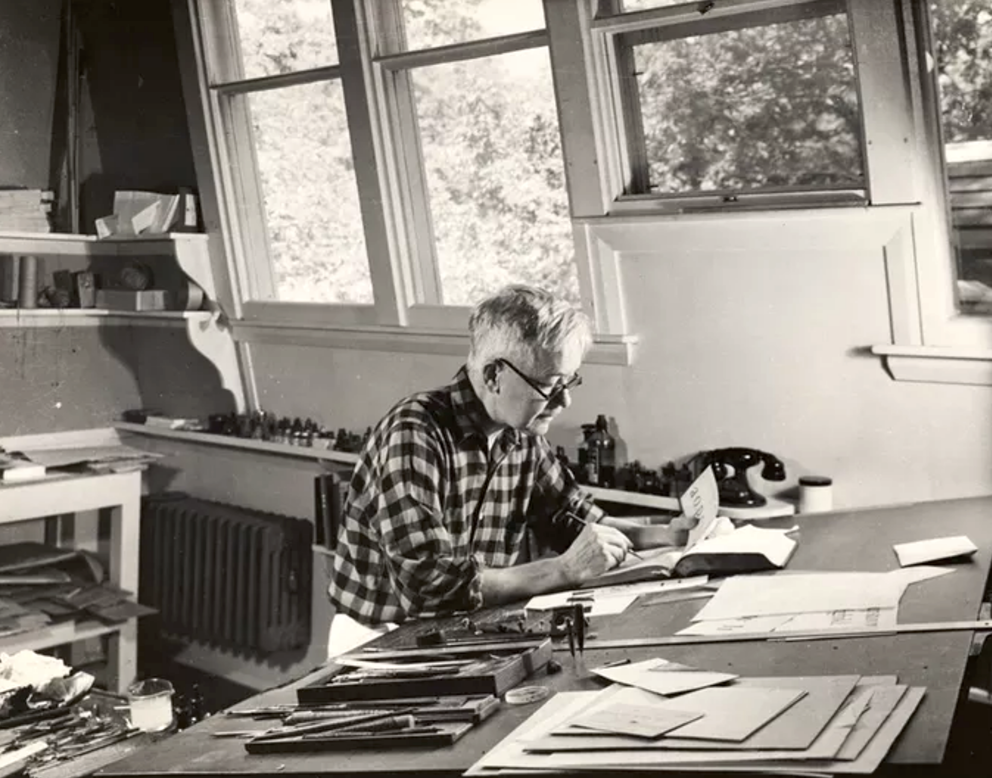
Martinsville, Ohio-born illustrator, calligrapher, typographer, book designer, author, type designer and puppeteer, 1880-1956 (Hingham, MA). Pic (1955). All his typefaces were designed for the Mergenthaler Linotype Company, where he worked for 27 years. He also was Acting Director of the Harvard University Press, 1917-1918. In 1919, he founded the Society of Calligraphers, Boston, and was in fact an accomplished calligrapher, who drew many ornaments and designed many jackets. Dwiggins studied lettering under Goudy in Chicago while a student at Frank Holme's School of Illustration. When Goudy moved to Hingham, Dwiggins followed and was to work there for the rest of his life. As a puppeteer, he often used the pseudonym Dr. Hermann Puterschein. His papers:

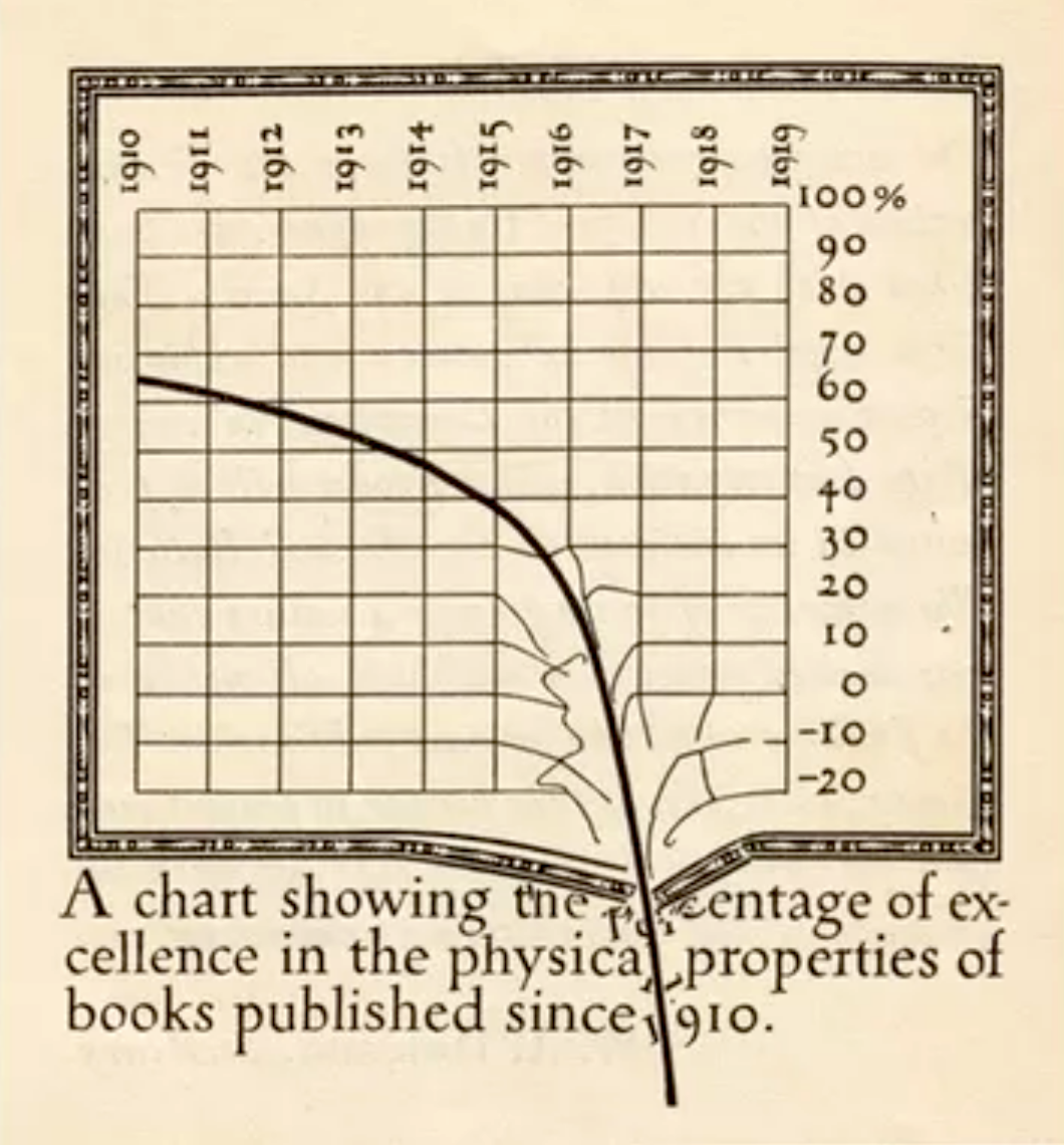
  • Some why's and wherefore's of the shapes of roman letters (1919), a short essay full of quotes, some good, but mostly derogatory, regarding the main text types in vogue at the time, such as Century, Caslon, Cheltenham, Pabst, Cadmus and Scotch.
  • WAD to RR, a letter about type design, Department of Printing and Graphic Arts, Harvard College Library, Cambridge, MA, 1940. In this letter to a friend, RR, entirely written in a beautiful hand, he explains how to make type.

His typefaces:

  • Arcadia (1943-1947). Mac McGrew: Arcadia was an experimental typeface designed by William A. Dwiggins for Mergenthaler in 1943-47, used in Some Random Recollections, by Alfred A. Knopf for the Typophiles as Chapbook XXII in 1949.
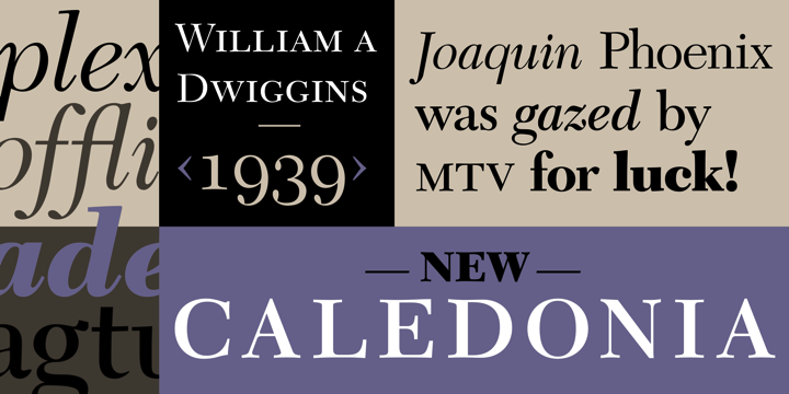
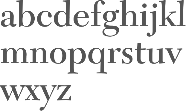
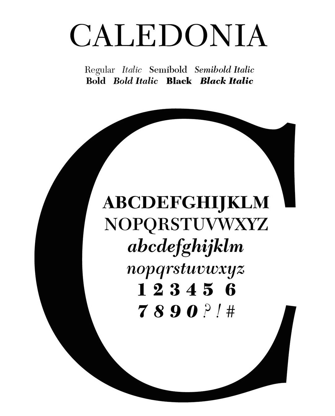
  • Caledonia (1938-1939). Known as Transitional 511 at Bitstream, New Caledonia at Adobe, and New Caledonia at Linotype. See C651 Roman on the SoftMaker MegaFont XXL CD, 2002. Nicola Caleffi complains that New Caledonia and BT 511 are too weak and miss old style figures.

    Mac McGrew: Caledonia and Caledonia Italic were designed by William A. Dwiggins for Linotype in 1938, with Caledonia Bold and Bold Italic added two years later. A Bold Condensed version was produced by Lino for newspaper head- line use. Caledonia has been described as a modernization of Scotch Roman (and Caledonia is the ancient name for Scotland), but it is more than that. It also shows the influence of the Bulmer typeface, with a large portion of Dwiggins' individuality. He describes the typeface as having a "liveliness of action. [...] quality is in the curves---the way they get away from the straight stems with a calligraphic flick, and in the nervous angle on the under side of the arches as they descend to the right." Being designed specifically for the Linotype and its mechanical limitations, rather than being adapted from a foundry face, Caledonia Italic is particularly successful, and the whole family has become very popular. In text sizes, short descenders may be cast on nominal body sizes, while the more handsome long descenders (not made for italics) require one point larger body size. Compare Baskerville, Bulmer, Scotch.

  • Caravan Borders (1938). Four fonts available at Linotype (1976).
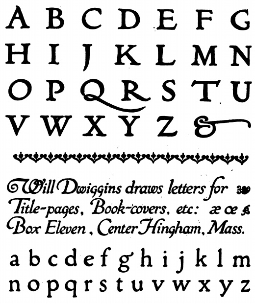
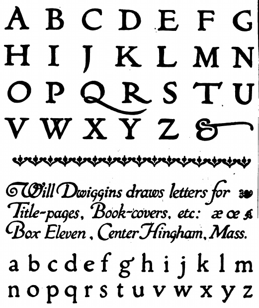
  • Charter (1946). Mac McGrew: Charter was an experimental, special-purpose typeface designed by William A. Dwiggins for Mergenthaler between 1937 and 1942. An upright script, only the lowercase and the few other characters shown were completed. For tests, these were combined with Electra caps. It was used in a limited edition book, The Song Story of Aucassin and Nicolete, designed and printed in 1946 by S. A. Jacobs at the Golden Eagle Press, Mt. Vernon, New York, with Electra small caps in place of regular caps. Between 2010 and 2018, Cristobal Henestrosa developed the titling typeface Royal Charter, a digital revival of Charter. With the help of Oscar Yanez, this became a retail typeface at Sudtipos called Mon Nicolette.
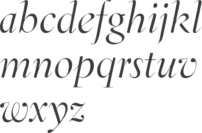
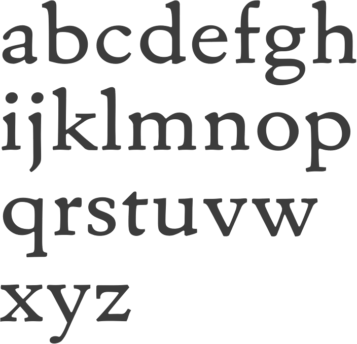
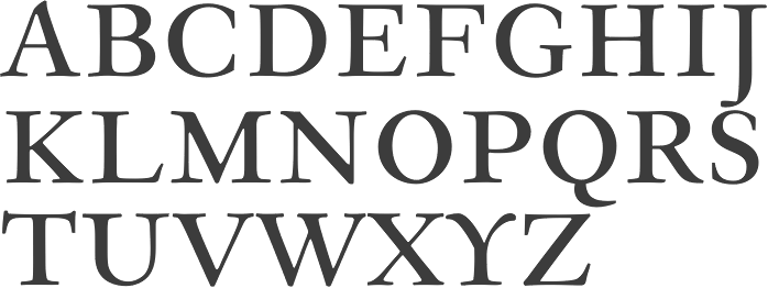
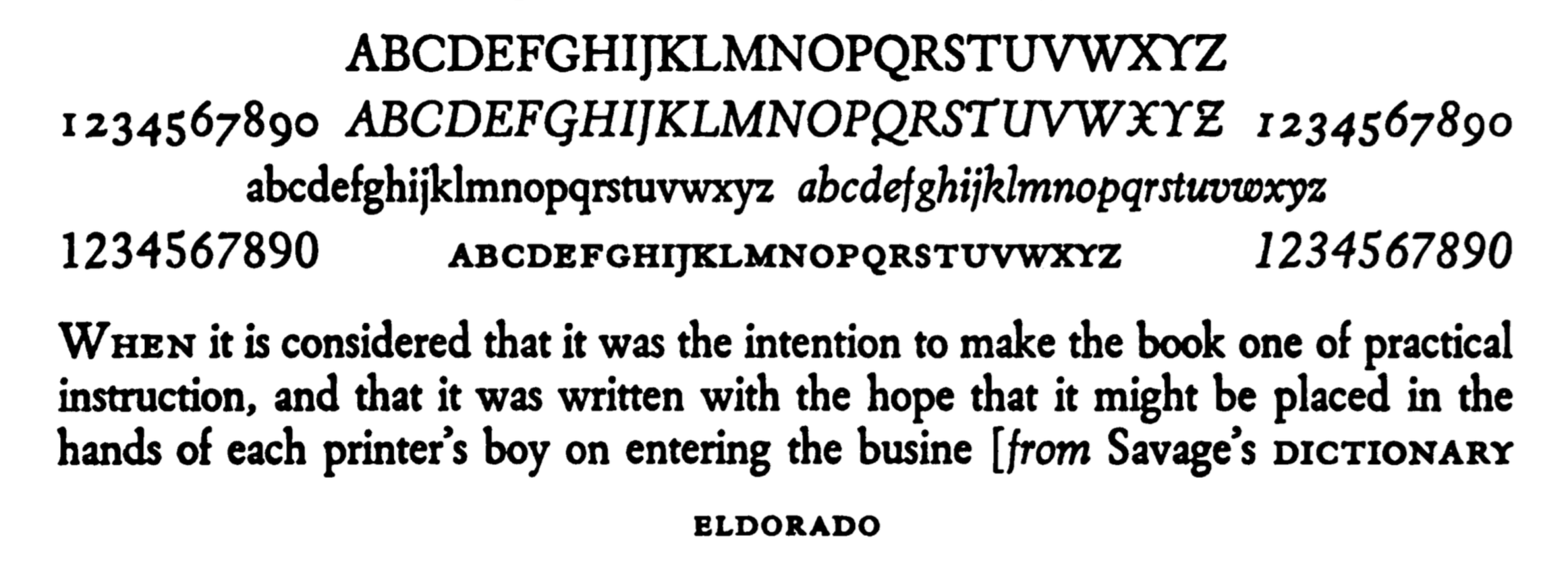
  • Eldorado (1953). Berry, Johnson and Jaspert give an earlier date, 1951. Created after a 16th century early roman lowercase by Jacques de Sanlecque the elder. Revived in 1993 at Font Bureau as Eldorado by David Berlow, Jane Patterson, Tobias Frere-Jones, and Tom Rickner. Mac McGrew: Eldorado is a contemporary roman designed by W. A. Dwiggins for Linotype about 1950, based on early Spanish models. The lowercase is compact, with a small x-height and long ascenders. Several italic letters have cursive or decorative forms; also notice the cap Y, with curved, serifless arms.
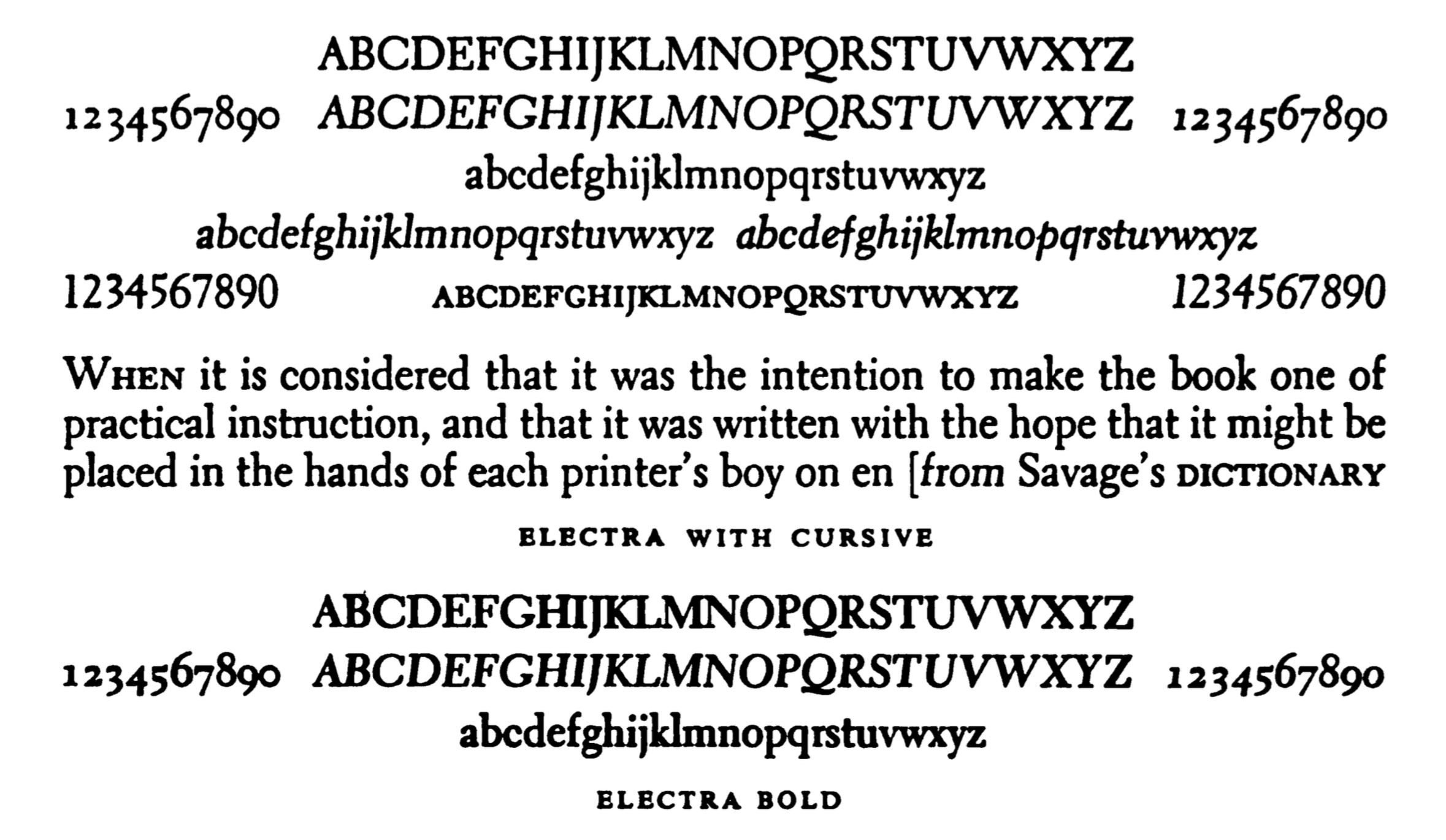
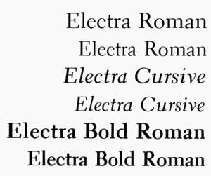
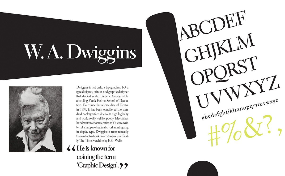
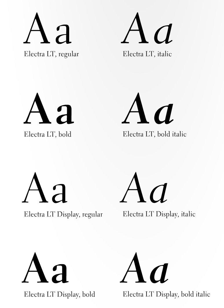
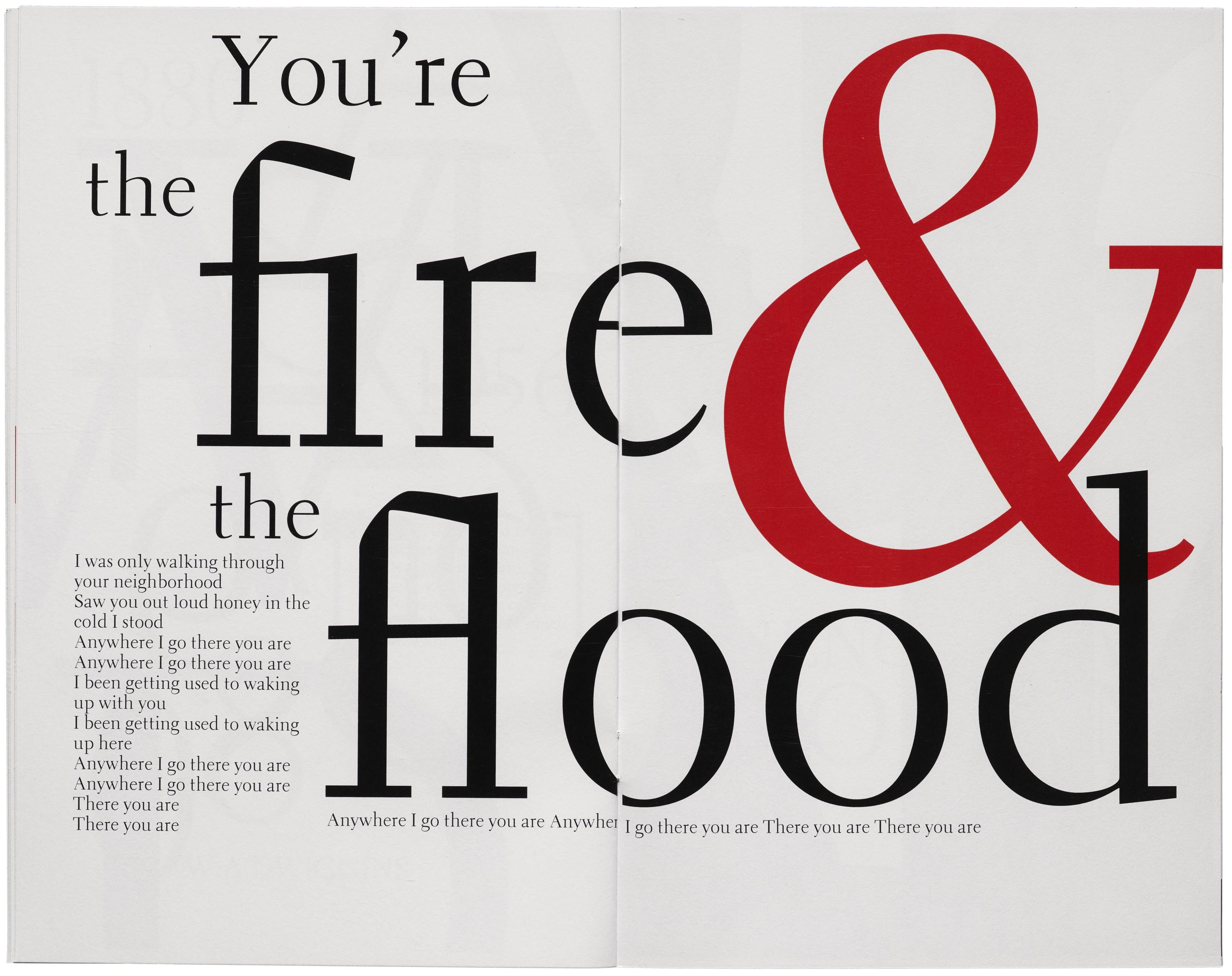
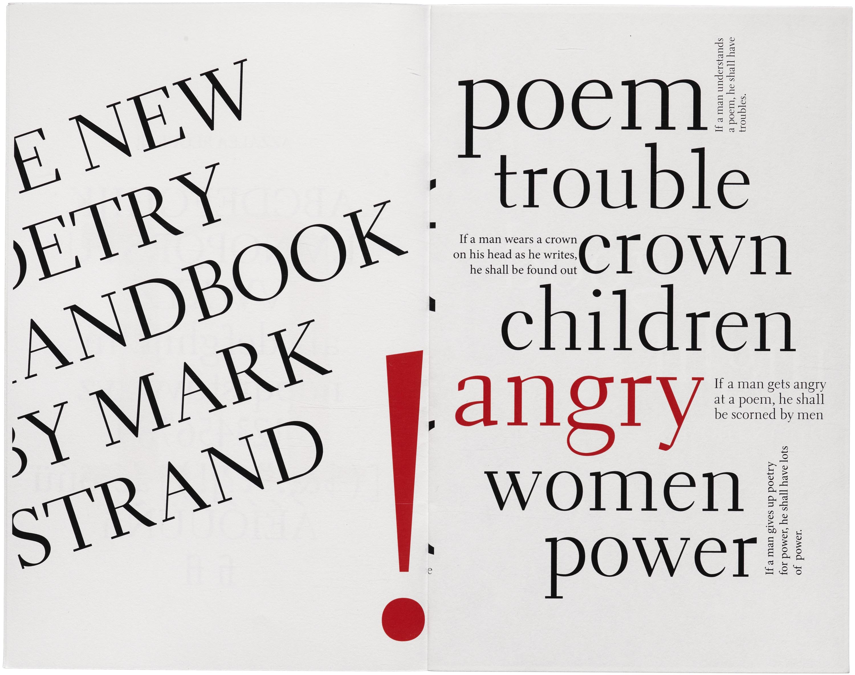
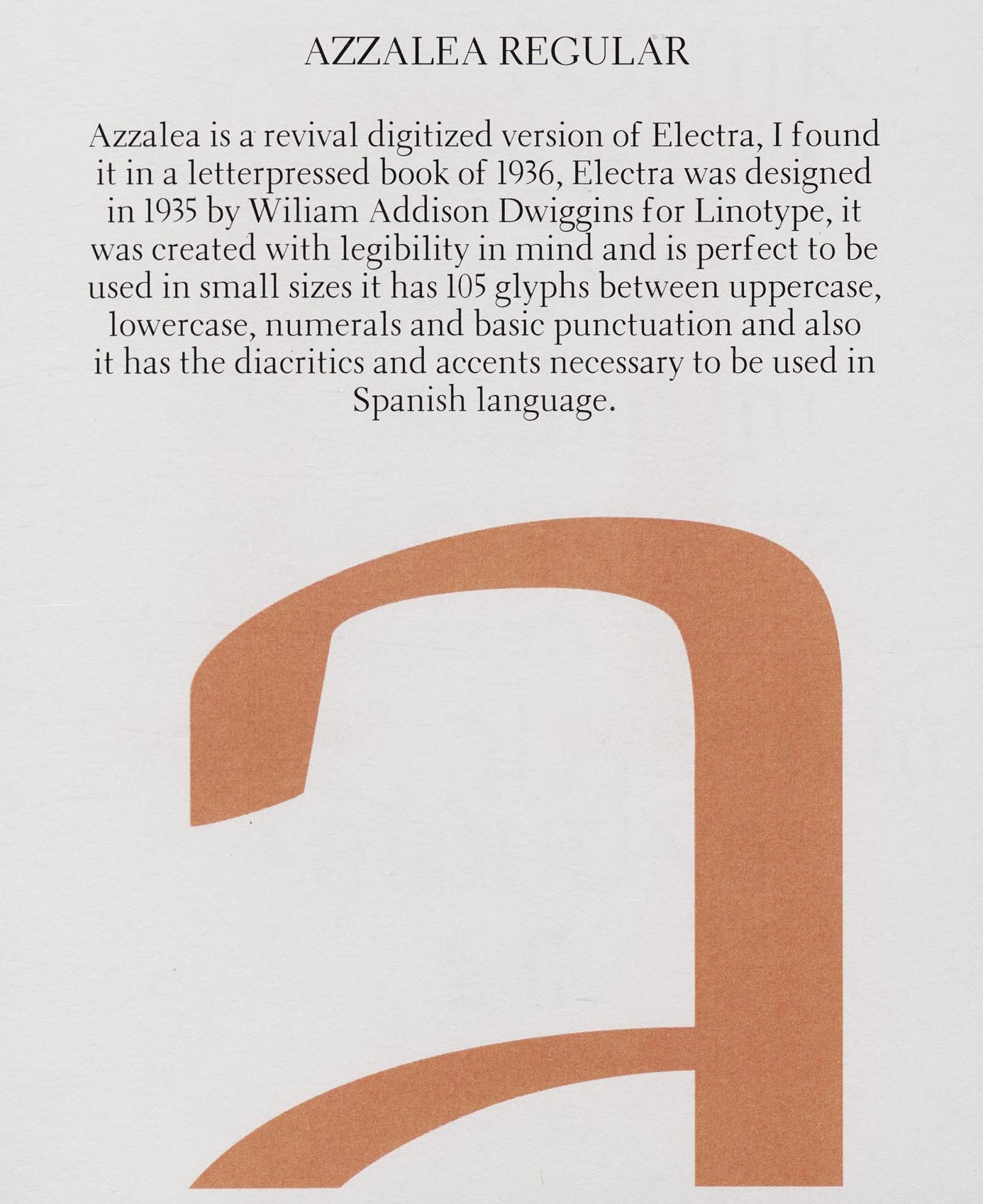
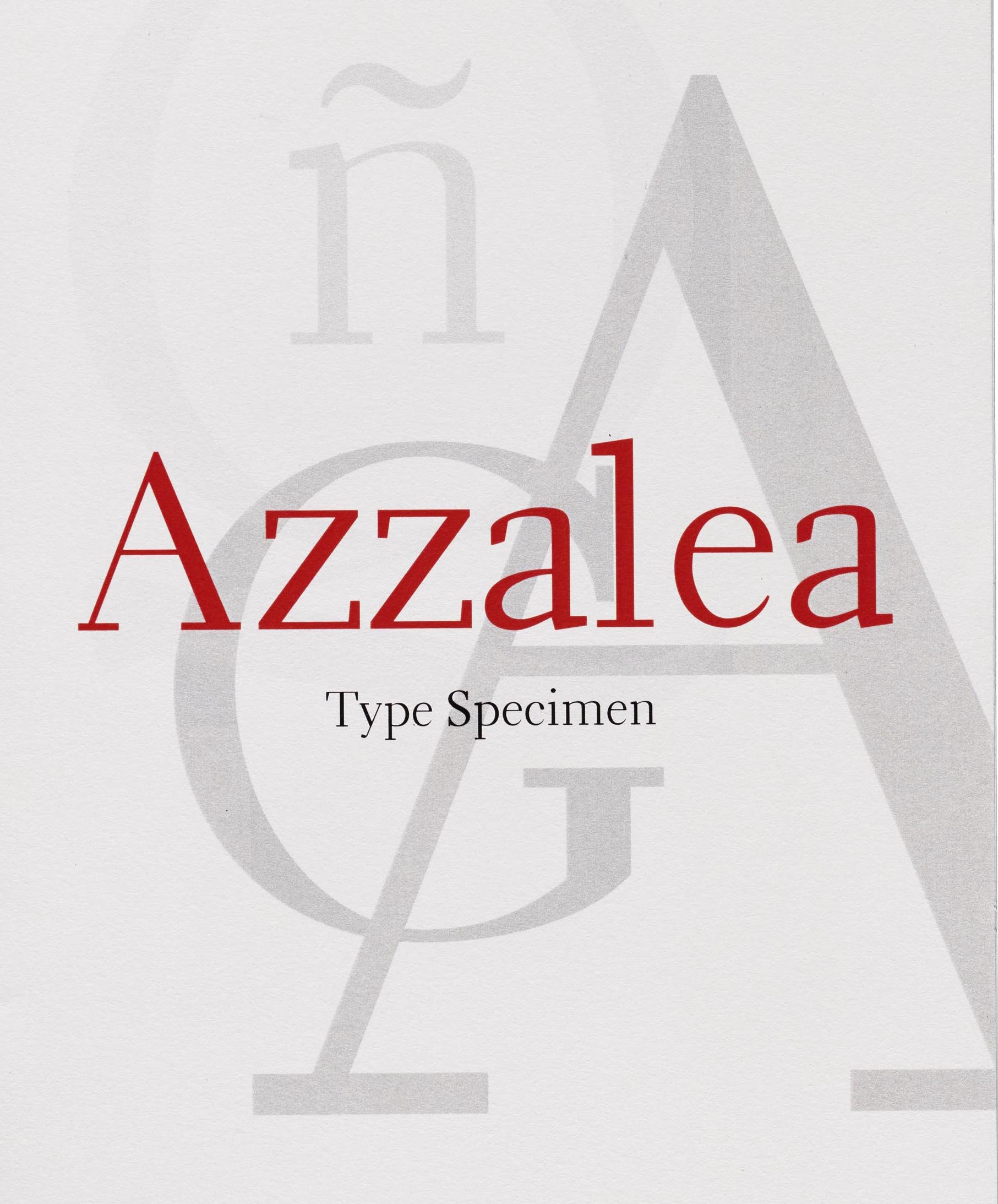
  • Electra (1934-1935), a text typeface with a distinctive Q but otherwise unobtrusive glyph shapes. Known as Transitional 521 at Bitstream. Mac McGrew: Electra is a contemporary modern typeface designed by W. A. Dwiggins for Linotype. The light weight was drawn in 1935, the bold a few years later. Aside from its readability and distinctive character, Electra is distinguished by a choice of italic forms. Electra Italic is really a sloped roman, while Electra Cursive, released in 1944, is more nearly a conventional italic form; only the lowercase is different. Like a number of the better Linotype typefaces, Electra also has a choice of short descenders, which will cast on the nominal body, or long descenders, which must be cast one point larger. Compare Fairfield. A digital revival was done by Jim Parkinson in 2010: Parkinson Electra. Parkinson did another revival in 2017, Aluminia, exclusively for use in Bruce Kennett's 2017 book on W.A. Dwiggins. In 2018, Laura Garcia attempted a revival while studying at Type West.
  • Experimental 267D.
  • Falcon (published in 1961) is an experimental font at Mergenthaler Linotype. Mac McGrew: Falcon was designed during World War II for Linotype by William A. Dwiggins and released in 1961. It seemed to him, he said, "to hit the middle ground between mechanical exactitude and the flow and variety of a written hand-suggesting some of that flow and variety but controlling it, so the letter can be repeated."
  • Hingham (1937-1943). Mac McGrew: Hingham was an experimental newspaper face, originally called Newsface, designed between 1937 and 1943 by William A. Dwiggins, for improved readability. Only the 7-point size was cut by Mergenthaler, and it was used only for tests.
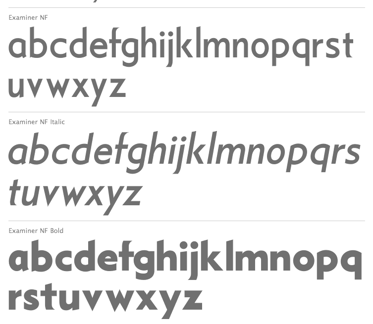
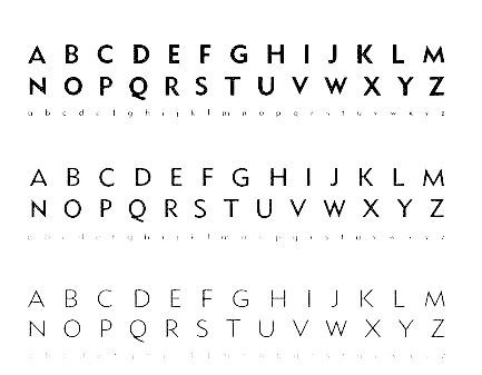
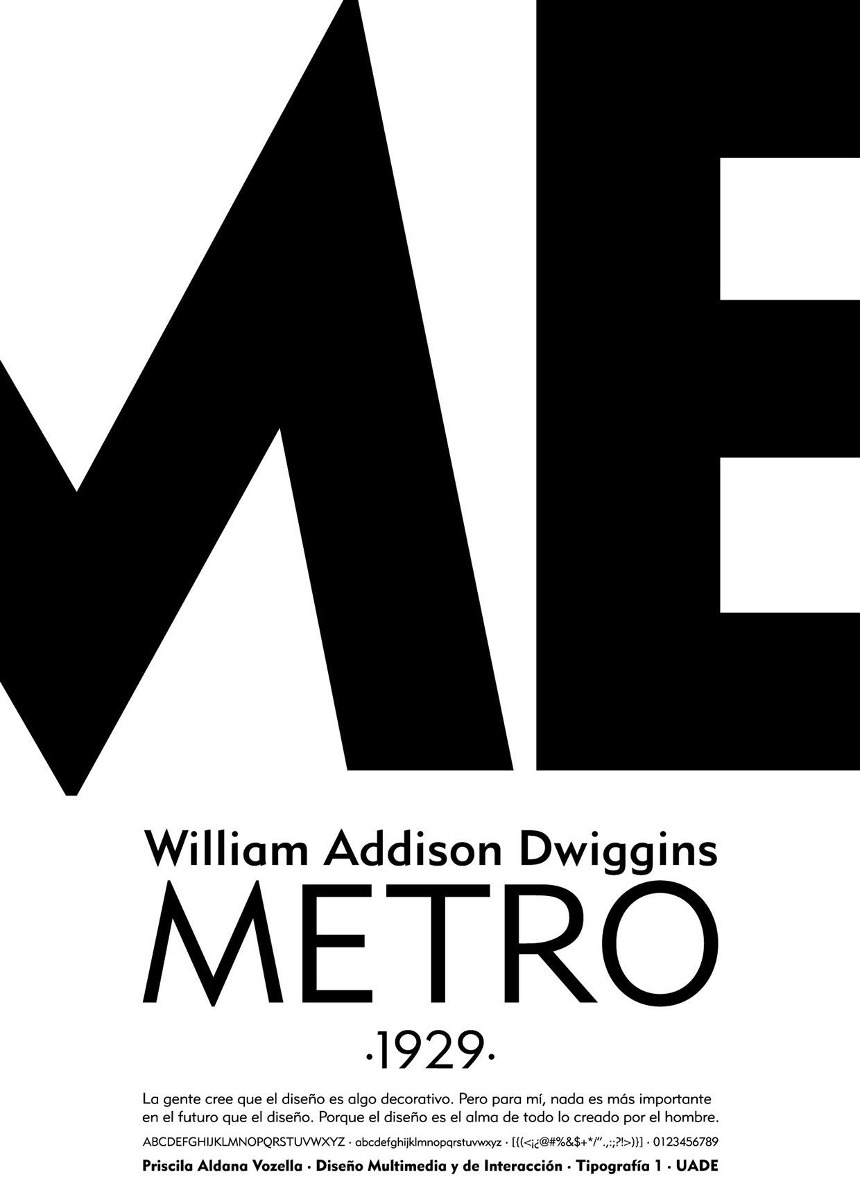
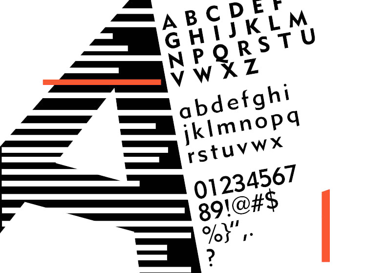
  • Metro (1929-30). This famous sans serif family was published by Linotype in 1936-1937. It is also called Metroblack, and sometimes dated 1928. In digital format, it is known as Geometric 415 at Bitstream, and Metro Office, Metro #2, Metrolite, Metromedium and Metroblack at Linotype. It is DH Sans at FontHaus. It was revived as Examiner NF by Nick Curtis (2009). It lives another life as Grosse Pointe Metro at Group Type. Mac McGrew: Metrolite and Metroblack were designed by William A. Dwiggins and introduced by Linotype in January 1930, as the first American typefaces to join the trend to sans serif started by Futura and Kabel. These typefaces are less mechanical than the European imports, and were promoted as being less monotonous and illegible. The first two weights were soon followed by Metrothin and Metromedium. In 1932 several characters were redesigned; thereafter the series was promoted as Metrothin No.2, Metrolite No.2, Metromedium No.2, and Metroblack No.2, including the redesigned characters, but the original characters were available as extras. Metrolite No.2 Italic was shown in 1935, along with Lining Metrothin and Lining Metromedium, which are like the small caps of the regular typefaces. Italics for Metromedium No.2 and Metroblack No.2 were shown in 1937. Metrolite No.4 Italic and Metrothin No.4 Italic are essentially the same design but narrower, for mechanical purposes. Unique Capitals are made for some sizes of Metrothin and Metromedium. Alternative figures are made as follows: Gothic No. 39, for Metrothin No.2, similar to Spartan Light. Gothic No. 40, for Metrolite No.2, similar to Spartan Medium. Gothic No. 41, for Metroblack No.2, similar to Spartan Black. Gothic No. 42, for M etrothin No.2, similar to Kabel Light. Gothic No. 43, for Metrolite No.2, similar to Kabel Medium. Gothic No. 44, for Metromedium No.2, similar to Kabel Bold. Gothic No. 45, for Metroblack No.2, similar to Sans Serif Extra Bold.
  • Stuyvesant (1942-1947). Mac McGrew: Stuyvesant and Stuyvesant Italic were designed in 1942-47 by William A. Dwiggins, inspired by a quaint Dutch type cut by J. F. Rosart about 1750, and used in 1949 in The Shelby Letters, from the California Mines, 1851-1852, published by Alfred Knopf. An entirely different Stuyvesant, a novelty design, was made by Keystone before 1906, perhaps before 1900.
  • Tippecanoe (1944-1946). McGrew writes: Tippecanoe was an experimental typeface designed in 1944-46 by William A. Dwiggins for Mergenthaler, on the Bodoni-Didot theme. It was used in a book by Elizabeth Coatsworth, a friend of Dwiggins, The Creaking Stair, published in 1949 by Coward-McCann. Compare Louvaine Bold [by Morris Fuller Benton]..
  • Winchester (1944). Revived as ITC New Winchester by Jim Spiece. Mac McGrew: Winchester Roman and Winchester Uncial with their italics were completed in 1944 by William A. Dwiggins, the Uncial being an experiment aimed at making the English language easier to read by eliminating some of the ascenders and descenders typically used in this language. Italic caps and other characters were drawn in 1948 but not cut. Although made on Linotype matrices by Mergenthaler, fonts of hand type were cast and used only by Dwiggins and Dorothy Abbe beginning in 1950 at the Puterschein-Hingham Press, where they were partners until his death in 1956. In the specimen shown here, the uncial f appears in both italic alphabets. A regular italic f was cut but apparently not cast.
  • He worked with multiple typewriter manufactures including Underwood, Remington Rand, and IBM, but none of them were finished. He left a number of intriguing drawings which are now kept at the Boston Public Library. In his Dossier, Toshi Omagari combined these materials to make a cohesive monospaced typeface family: the upright was taken from a drawing of monospaced lowercase for an unknown client, and the italic was from the work he did for Underwood which he called Aldine.

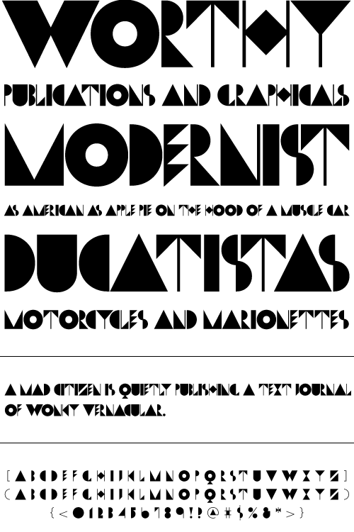
Matt Desmond created Dwiggins Deco in 2009 and writes: This typeface was originally designed in 1930 by W.A. Dwiggins as the cover for the book "American Alphabets" by Paul Hollister. Only the 26 letters of the alphabet were included on the cover, so the rest of the numbers, punctuation, symbols, and accented characters have been crafted in a matching [art deco] style. A free version called Dwiggins Initials KK was designed in 2012 by John Wollring. Noteworthy also is Stefan Hattenbach's Dwiggins Script (2018), developed together with Glenn Sjökvist.

Books about Dwiggins include Bruce Kennett's W.A. Dwiggins A Life in Design (2017, Letterform Archive).

Linotype link. FontShop link. Klingspor link. MyFonts link. Bio by Nicholas Fabian. Flickr picture group for Dwiggins.

View digital typefaces based on the work of Dwiggins. View W.A. Dwiggins's typefaces.

EXTERNAL LINKS
William Addison Dwiggins
 [Designer info]
Monotype link
Dafont page
Klingspor Museum page
MyFonts search
Monotype search
Fontspring search
Google search

INTERNAL LINKS
Type designers ⦿ Type designers ⦿ Dingbats (original) ⦿ Experimental type ⦿ Type scene in Ohio ⦿ Type scene in Illinois ⦿ Type scene in Massachusetts ⦿ Modern style [Bodoni, Didot, Walbaum, Thorowgood, Computer Modern, etc.] ⦿ Uncial typefaces ⦿ Art deco typefaces ⦿ Caslon ⦿ Frederic William Goudy ⦿ Cheltenham ⦿ Morris Fuller Benton ⦿ Scotch Roman ⦿ Typewriter fonts ⦿


file name: Nick Curtis Examiner N F 2009 after Dwiggins Metro 1930s
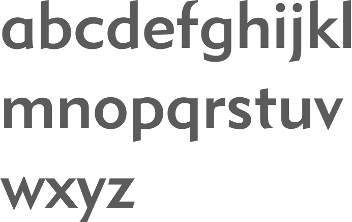

file name: Bitstream Geometric415 Medium after William Addison Dwiggins Metro 1929
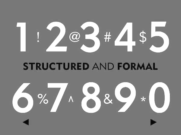

file name: William Addison Dwiggins Metro 1929 Poster by Cody Lewis 2014
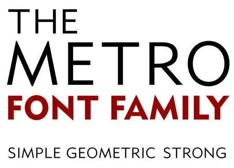

file name: William Addison Dwiggins Metro 1929b

file name: William Addison Dwiggins Metro 1929c

file name: William Addison Dwiggins Metro 1929 Poster by Priscilla Vozella 2014

file name: William Addison Dwiggins Metro 1929 Poster by Lullu Makhaye 2017

file name: William A Dwiggins New Caledonia 1939f

file name: William A Dwiggins New Caledonia Semi Bold 1939

file name: W A Dwiggins Caledonia 1938 Poster by Michelle Uzomba 2015

file name: William A Dwiggins Roman Alphabet

file name: William A Dwiggins Roman Capitals


file name: William Addison Dwiggins Eldorado 1946 Font Bureau 1997


file name: William Addison Dwiggins Experimental No223 Newsface Hingham 1937 1943


file name: William Addison Dwiggins Experimental No249 Falcon 1961


file name: William Addison Dwiggins Falcon 1961

file name: David Berlow Jane Patterson Tobias Frere Jones Tom Rickner Eldorado Display Italic 1993 1994


file name: David Berlow Jane Patterson Tobias Frere Jones Tom Rickner Eldorado Display Roman 1993 1994

file name: David Berlow Jane Patterson Tobias Frere Jones Tom Rickner Eldorado Micro Roman 1993 1994

file name: David Berlow Jane Patterson Tobias Frere Jones Tom Rickner Eldorado Text Light S C 1993 1994

file name: William Addison Dwiggins Eldorado 1951

file name: William Addison Dwiggins Electra 1935


file name: William Addison Dwiggins Electra Bold 1935

file name: W A Dwiggins Electra 1934

file name: W A Dwiggins Electra 1935 Poster by Ashley Shepard 2014


file name: W A Dwiggins Electra 1935 Poster by Ashley Shepard 2014b

file name: W A Dwiggins Electra 1935 Poster by Angela Cannavo 2015
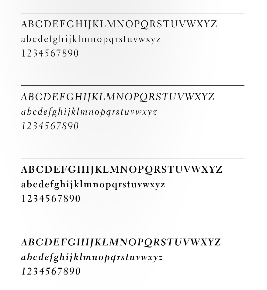

file name: W A Dwiggins Electra 1935 Poster by Angela Cannavo 2015a
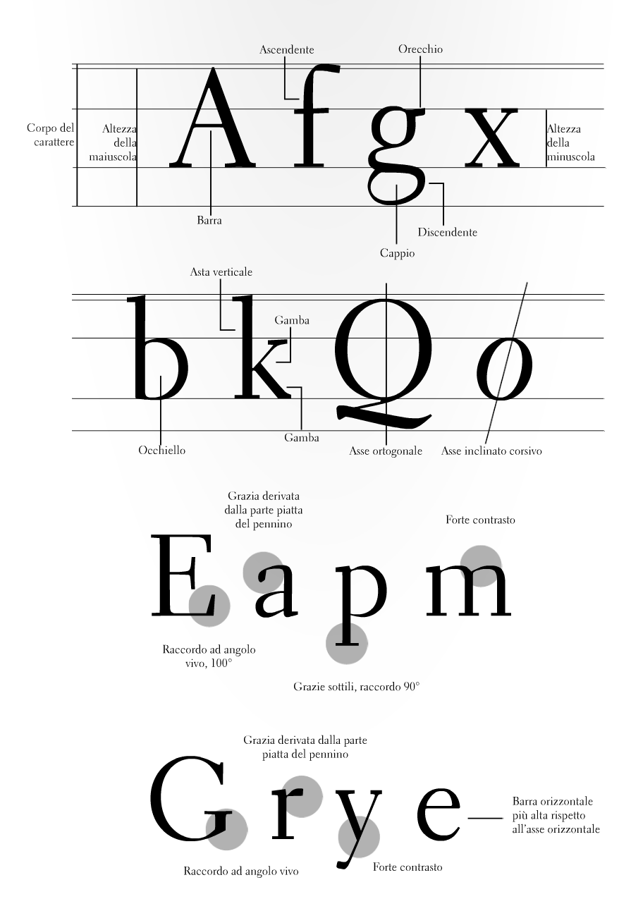

file name: W A Dwiggins Electra 1935 Poster by Angela Cannavo 2015b


file name: W A Dwiggins Electra 1935 Poster by Angela Cannavo 2015c


file name: W A Dwiggins Electra 1935 Poster by Angela Cannavo 2015d
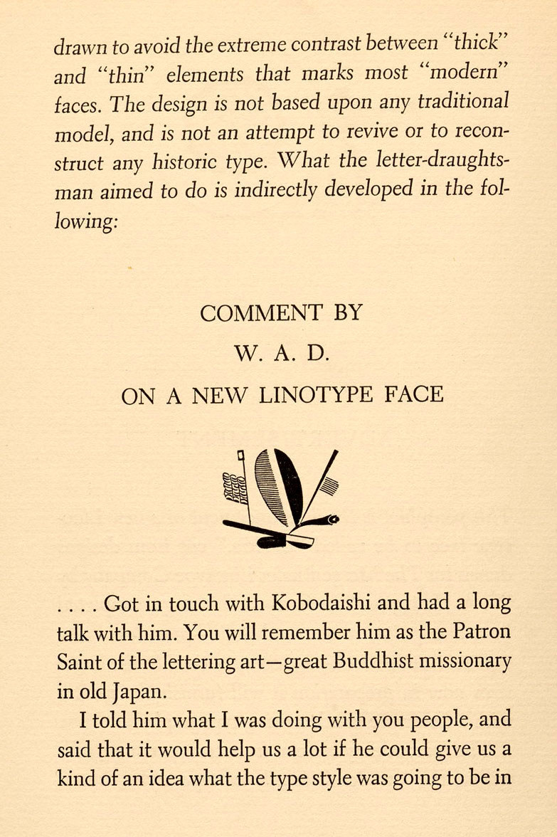

file name: W A Dwiggins Electra
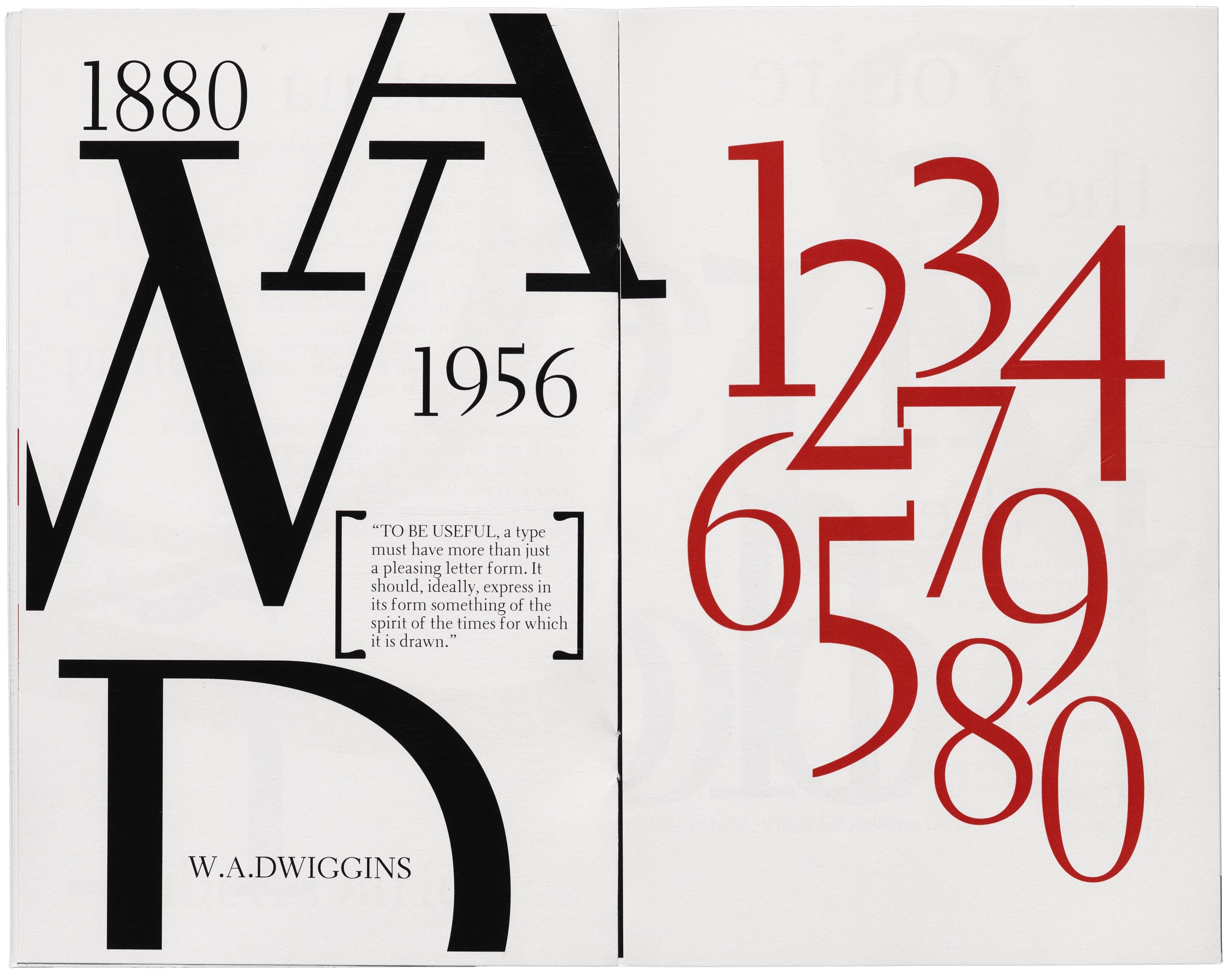

file name: Laura Garcia Azzalea 2018 after W A Dwiggins Electra 1935
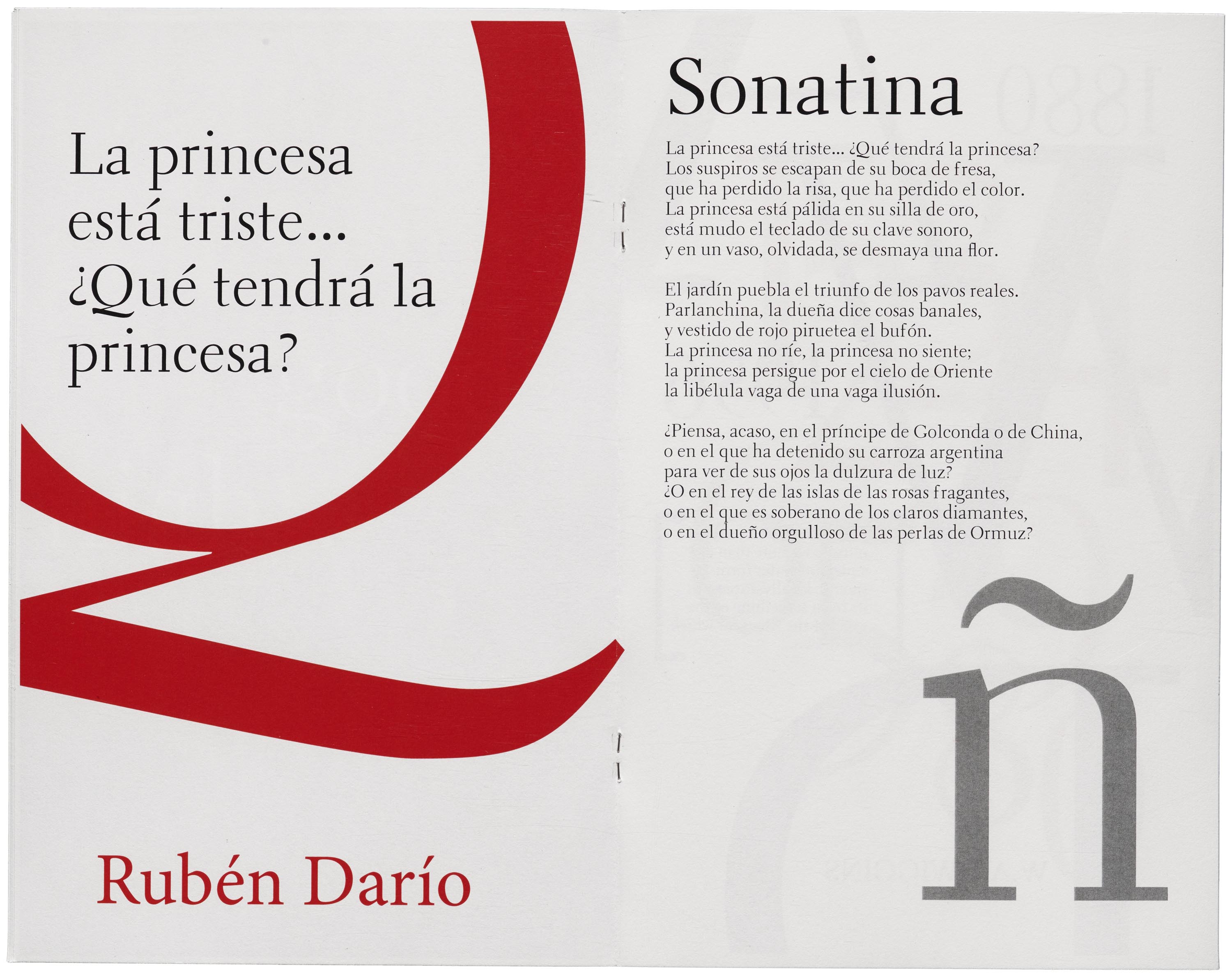

file name: Laura Garcia Azzalea 2018 after W A Dwiggins Electra 1935
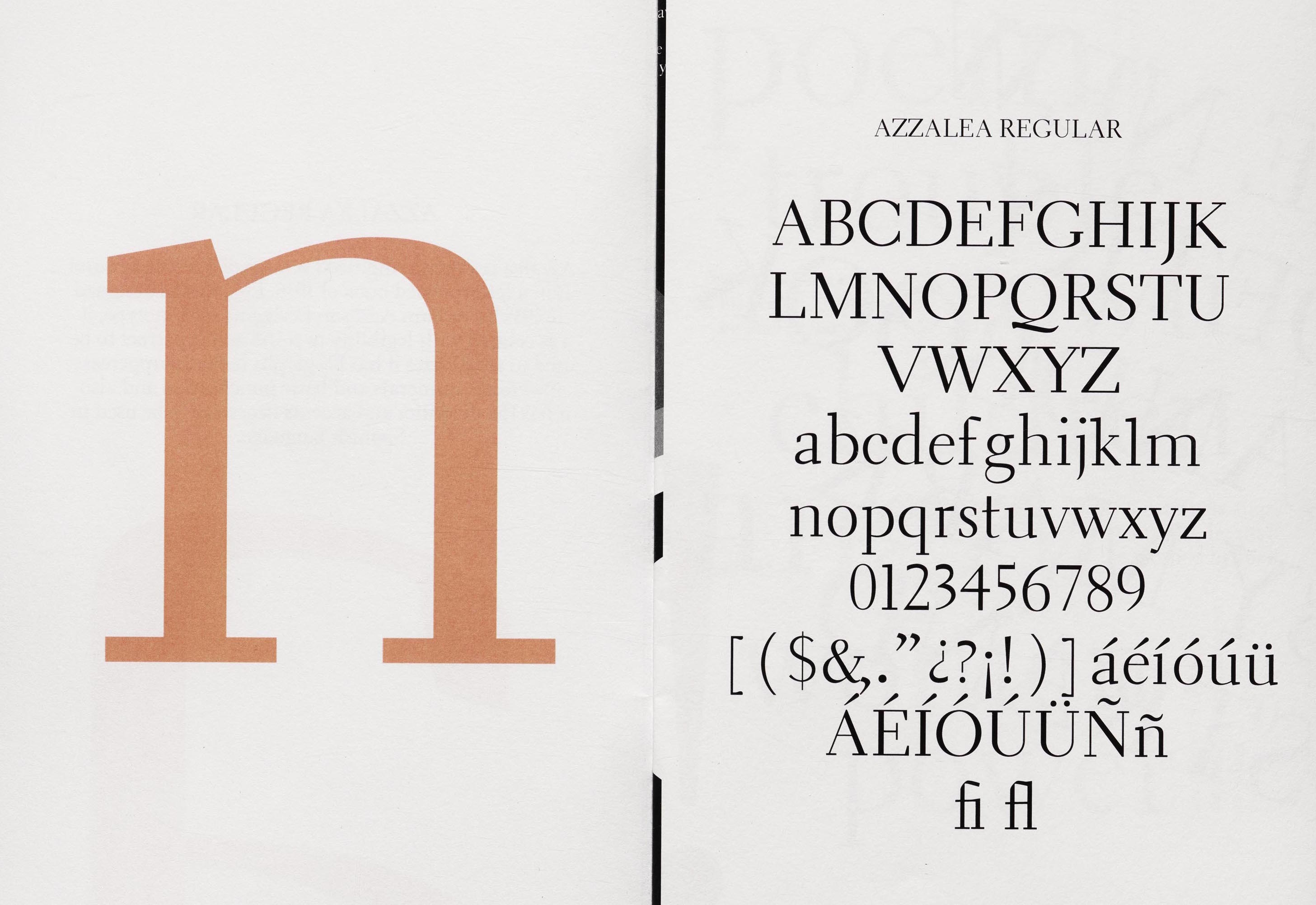

file name: Laura Garcia Azzalea 2018 after W A Dwiggins Electra 1935
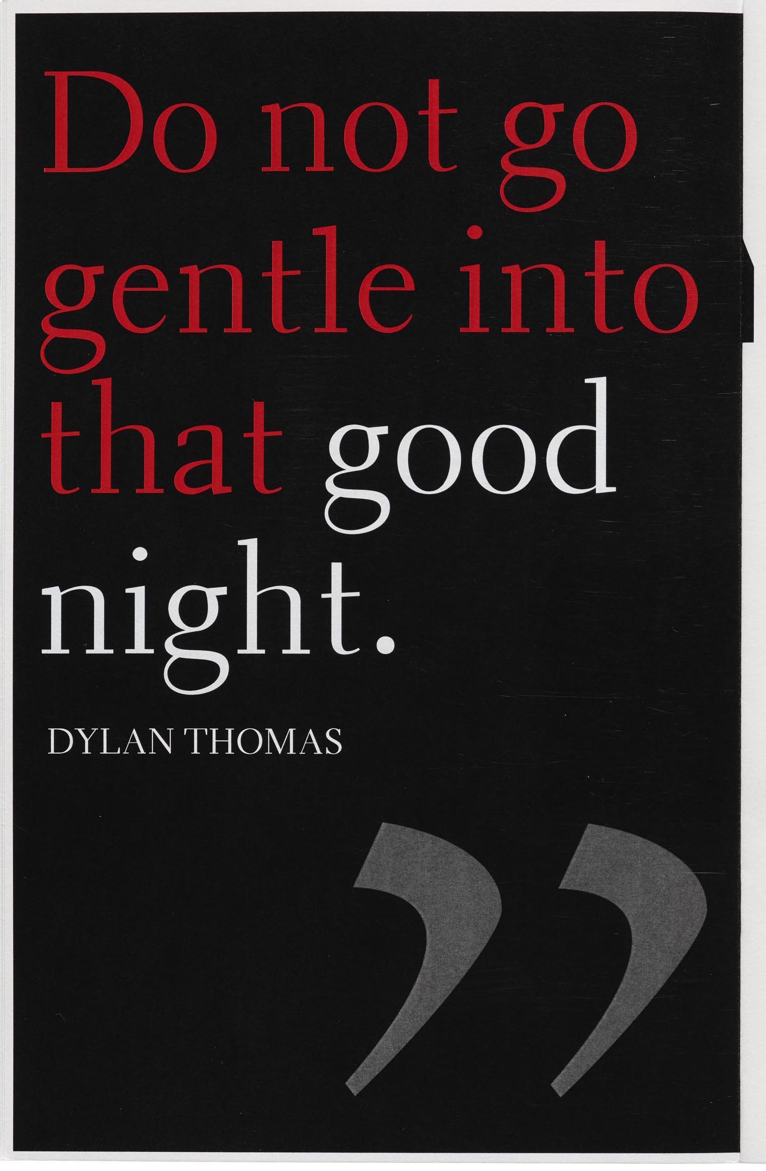

file name: Laura Garcia Azzalea 2018 after W A Dwiggins Electra 1935
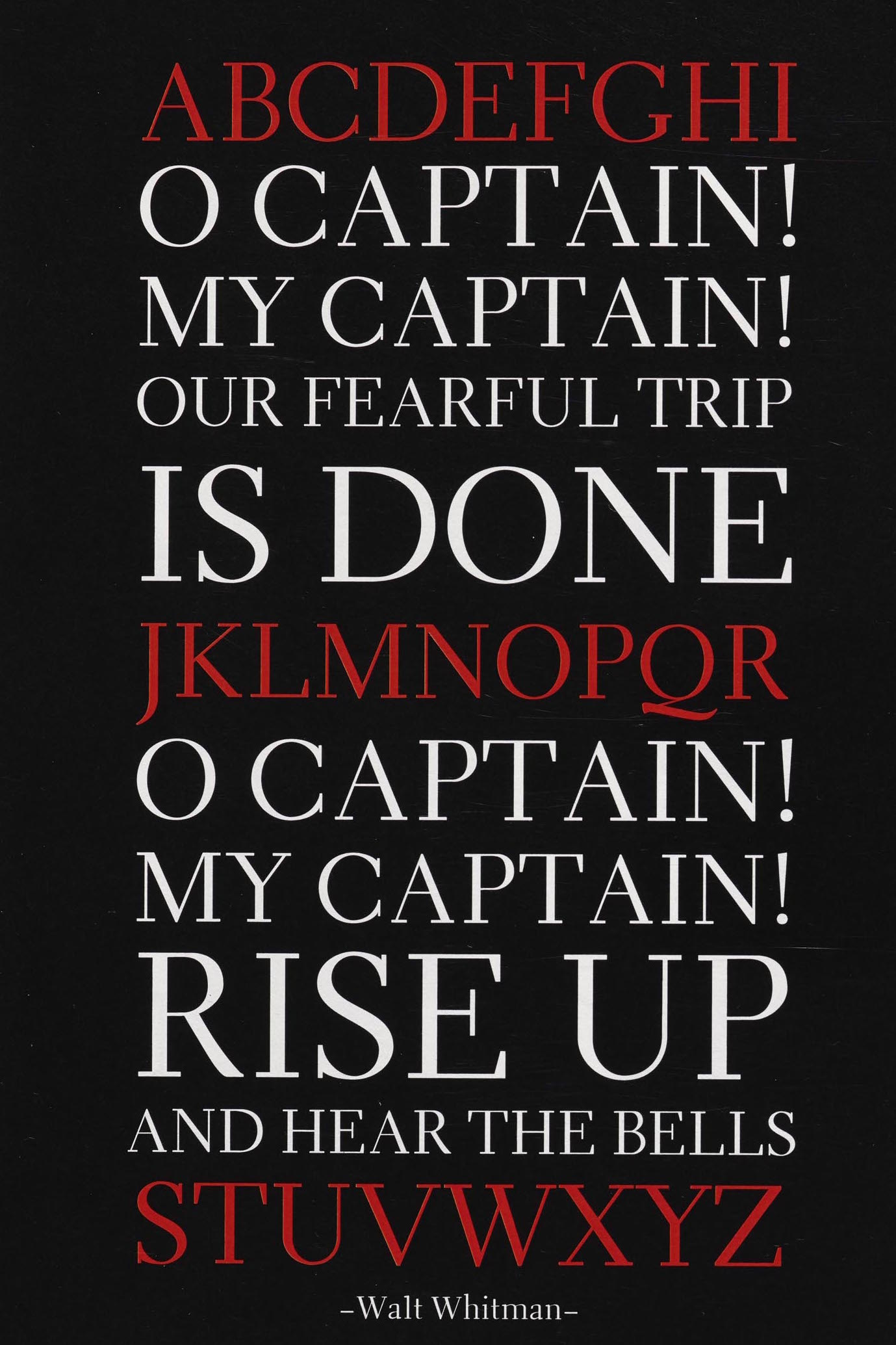

file name: Laura Garcia Azzalea 2018 after W A Dwiggins Electra 1935

file name: Laura Garcia Azzalea 2018 after W A Dwiggins Electra 1935

file name: Laura Garcia Azzalea 2018 after W A Dwiggins Electra 1935

file name: Laura Garcia Azzalea 2018 after W A Dwiggins Electra 1935

file name: Laura Garcia Azzalea 2018 after W A Dwiggins Electra 1935
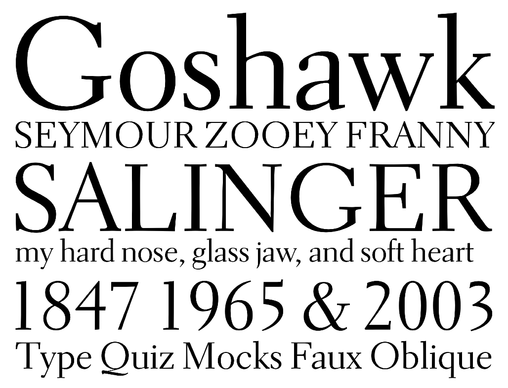

file name: Jim Parkinson Parkinson Electra 2010 based on W A Dwiggins Electra
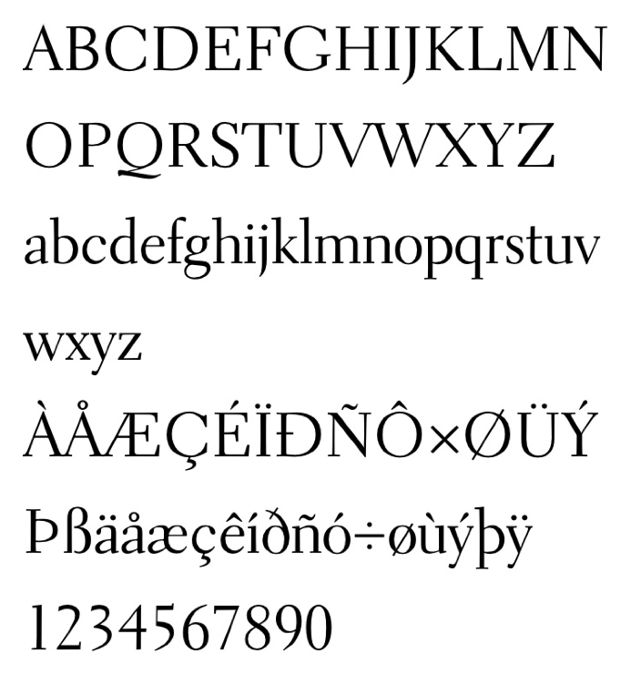

file name: Jim Parkinson Parkinson Electra 2010 based on W A Dwiggins Electra
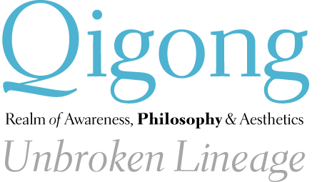

file name: Jim Parkinson Parkinson Electra 2012 based on W A Dwiggins Electra
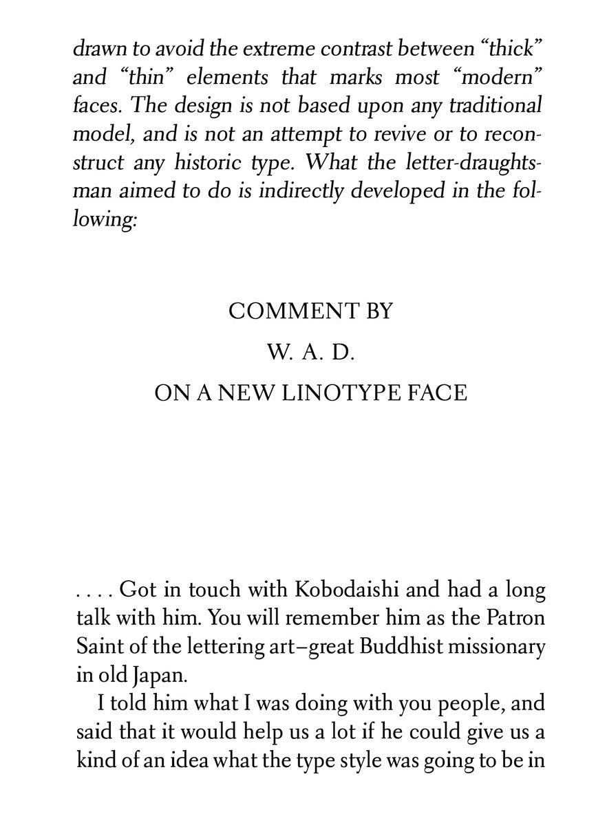

file name: Jim Parkinson Aluminia 2017 based on W A Dwiggins Electra
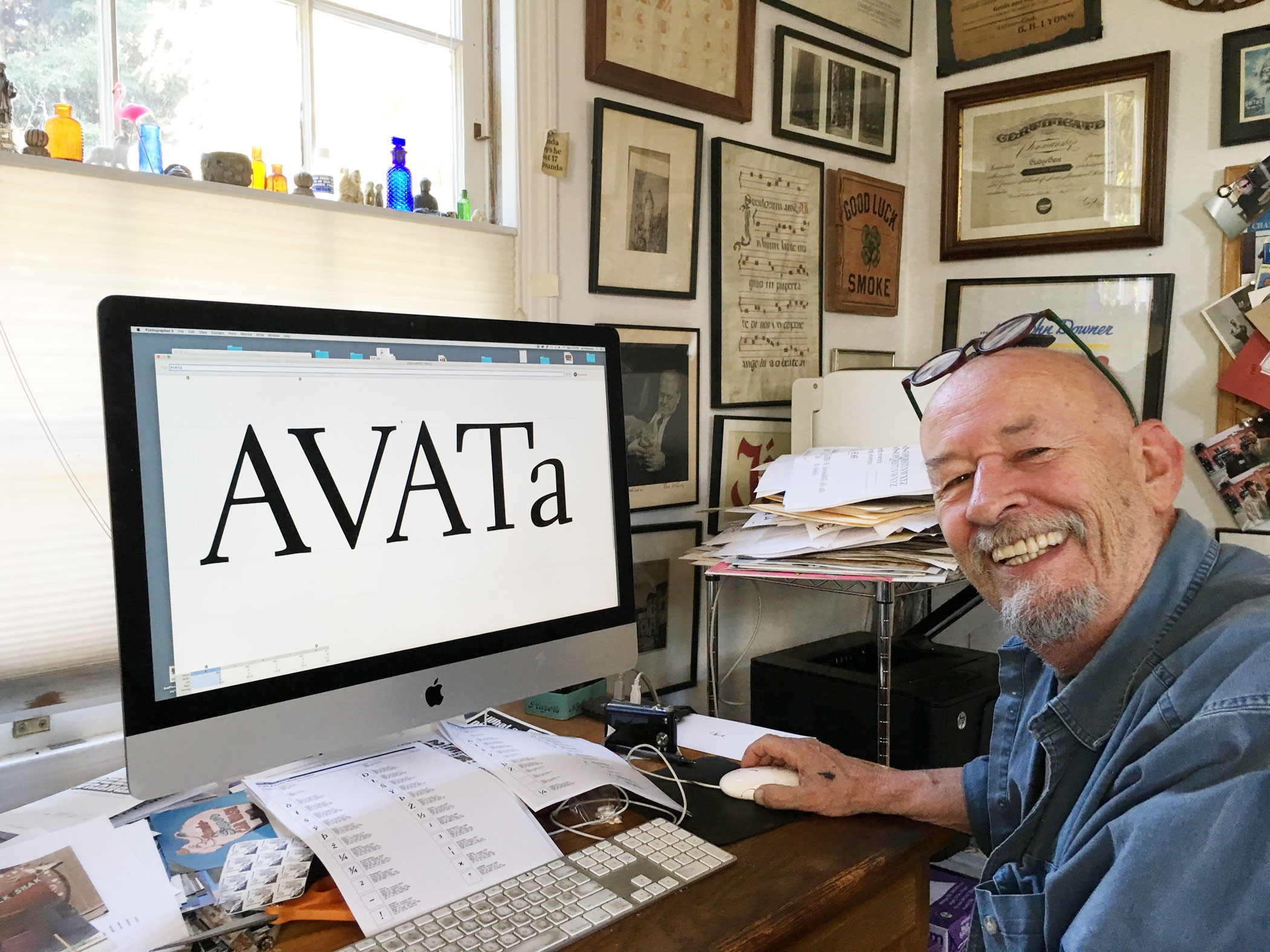

file name: Jim Parkinson working on Aluminia 2017


file name: William Addison Dwiggins Experimental No221 Brochure Arcadia 1943 1947


file name: William Addison Dwiggins Experimental No265 Arcadia Oldface 1943 1947
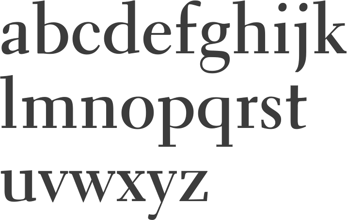

file name: Bitstream Tilde Transitional521
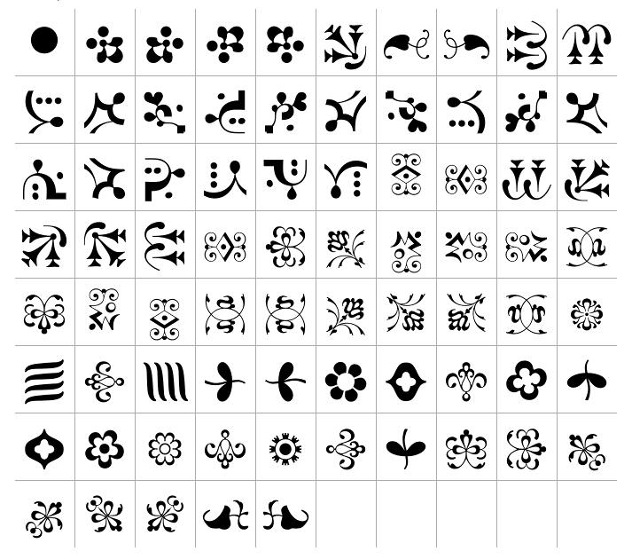

file name: W A Dwiggins Caravan One Linotype 1938 1976
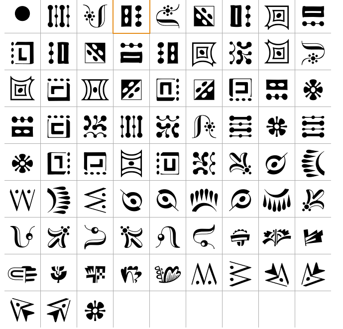

file name: W A Dwiggins Caravan Three Linotype 1938 1976

file name: M A D Type Dwiggins Deco 2009


file name: John Wollring Dwiggins Initials K K 2012


file name: John Wollring Dwiggins Initials K K 2012b

file name: W A Dwiggins chart 1919

file name: William A Dwiggins Labels for Limited Editions Club 1936

file name: W A D Dwiggins In His Studio ca1940


file name: W A Dwiggins 1941 pic by Robert Yarnall Richie
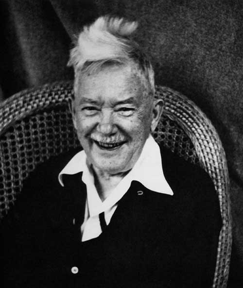

file name: W A Dwiggins Pic 1955
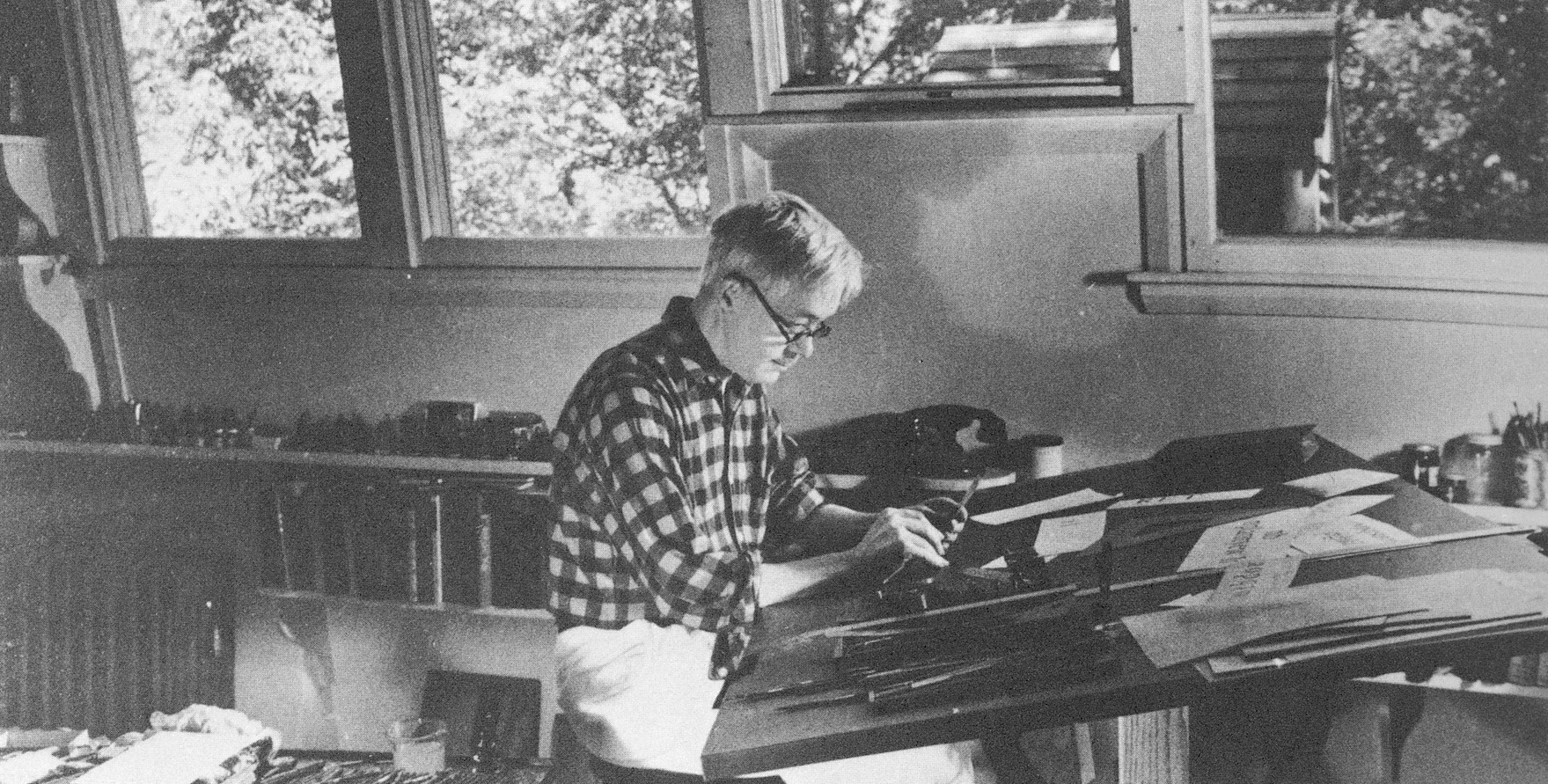

file name: W A Dwiggins Picture by Robert Yarnell Ritchie
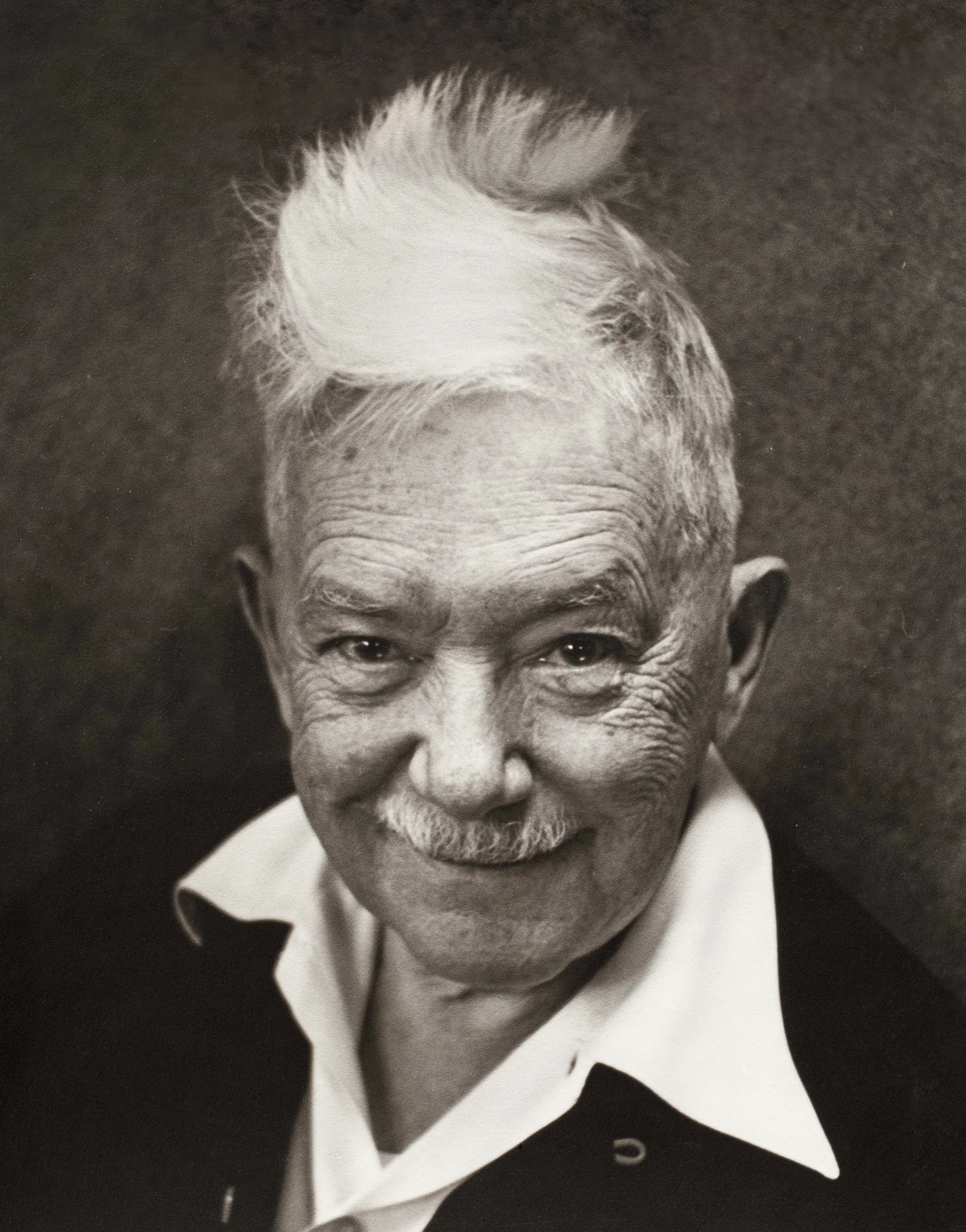

file name: W A Dwiggins Pic


Luc Devroye ⦿ School of Computer Science ⦿ McGill University Montreal, Canada H3A 2K6 ⦿ lucdevroye@gmail.com ⦿ https://luc.devroye.org ⦿ https://luc.devroye.org/fonts.html