TYPE DESIGN INFORMATION PAGE last updated on Thu Apr 16 21:59:19 EDT 2026
FONT RECOGNITION VIA FONT MOOSE
|
|
|
|
Dutch type designer born in Baarn in 1960, who works in Arnhem and Warsaw. Showcase of his most popular typefaces. Type designs:
Interview at Typotheque. MyFonts interview. To understand Majoor, read his article My type design philosophy. At ATypI 2004 in Prague, he spoke about his experiences as a designer and type designer in Poland. The text José Mendoza y Almeida (Martin Majoor and Sébastien Morlighem, introduction by Jan Middendorp, 2010, Bibliothèque typographique) describes Mendoza's contributions to type design. Majoor's Flickr page. Speaker at ATypI 2010 in Dublin. At ATypI 2018 in Antwerp, he spoke on the history of Telefont. His type design blog. Klingspor link. FontShop link. |
EXTERNAL LINKS |
| | |

file name: Martin Majoor Nexus Mix Pro Bold 2011

file name: Martin Majoor Nexus Mix Pro Bold Italic 2011

file name: Martin Majoor Nexus Mix Pro Italic 2011

file name: Martin Majoor Nexus Mix Pro Regular 2011

file name: Martin Majoor Nexus Sans Pro Bold 2011

file name: Martin Majoor Nexus Sans Pro Bold Italic 2011

file name: Martin Majoor Nexus Sans Pro Italic 2011

file name: Martin Majoor Nexus Sans Pro Regular 2011

file name: Martin Majoor Nexus Serif Pro Bold 2011

file name: Martin Majoor Nexus Serif Pro Bold Italic 2011

file name: Martin Majoor Nexus Serif Pro Italic 2011

file name: Martin Majoor Nexus Serif Pro Regular 2011

file name: Martin Majoor Nexus Typewriter Pro Bold 2011

file name: Martin Majoor Nexus Typewriter Pro Bold Italic 2011

file name: Martin Majoor Nexus Typewriter Pro Italic 2011

file name: Martin Majoor Nexus Typewriter Pro Regular 2011

file name: Martin Majoor F F Nexus Sans Pro 2004

file name: The Questa Project Questa Sans 2017 237705

file name: The Questa Project Questa Sans 2017 237707

file name: The Questa Project Questa Sans 2017

file name: The Questa Project Questa Serif 2017 237712

file name: The Questa Project Questa Serif 2017

file name: The Questa Project Questa Slab 2017 237728

file name: The Questa Project Questa Slab 2017

file name: Martin Majoor Questa Sans 2010

file name: Martin Majoor Jos Buivenga Questa 2014 poster by Weili Zhong 2018

file name: Martin Majoor Jos Buivenga Questa 2014h

file name: Martin Majoor Jos Buivenga Questa 2014 Poster by Camila Valencia 2015

file name: Martin Majoor Jos Buivenga Questa 2014 Poster by Camila Valencia 2015b

file name: Martin Majoor Jos Buivenga Questa 2014 Poster by Camila Valencia 2015c

file name: Martin Majoor Jos Buivenga Questa 2014 Poster by Camila Valencia 2015d

file name: Martin Majoor Jos Buivenga Questa 2014

file name: Martin Majoor Jos Buivenga Questa 2014b

file name: Martin Majoor Jos Buivenga Questa 2014

file name: Martin Majoor Jos Buivenga Questa Grande 2014

file name: Martin Majoor Jos Buivenga Questa Grande 2014b

file name: Martin Majoor Jos Buivenga Questa Regular 2014

file name: Martin Majoor Jos Buivenga Questa Sans 2014

file name: Martin Majoor Jos Buivenga Questa Sans 2014b

file name: Martin Majoor Jos Buivenga Questa Slab 2014

file name: Martin Majoor Jos Buivenga Questa Slab 2014b

file name: Martin Majoor Questa 2014

file name: Martin Majoor Questa Black 2014

file name: Martin Majoor Questa Grande Regular 2014

file name: Martin Majoor Questa Grande Regular 2014b

file name: Martin Majoor Questa Sans Medium 2014

file name: Martin Majoor Scala Skeleton 1991

file name: May Clare Butler Scala Poster 2012

file name: Martin Majoor F F Scala 1990 poster by Ugur Genis 2017

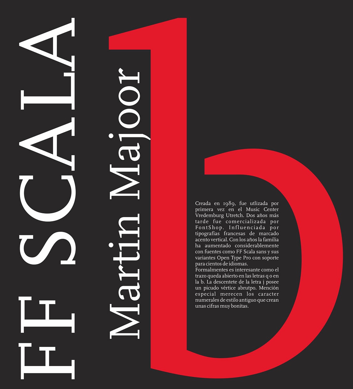
file name: Martin Majoor F F Scala 1989 Poster by Marina Morales 2015

file name: Martin Majoor Scala 1991 Poster by Salvatore Cannata 2014

file name: Martin Majoor Scala 1991 Poster by Salvatore Cannata 2014b

file name: Martin Majoor Scala 1991 Poster by Salvatore Cannata 2014c

file name: Martin Majoor Scala 1991 Poster by Salvatore Cannata 2014h

file name: Martin Majoor F F Scala 1989 Poster by Valeria Ferreira Da Silva 2014

file name: Martin Majoor F F Scala 1990 Poster by Gabriel Bulhoes 2015b

file name: Martin Majoor Pic

file name: Martin Majoor Scala Jewel 1991 Poster by Salvatore Cannata 2014

file name: Martin Majoor Scala Hands 1991 Poster by Salvatore Cannata 2014

file name: Martin Majoor F F Scala Hands

file name: Martin Majoor F F Scala Sans Hands

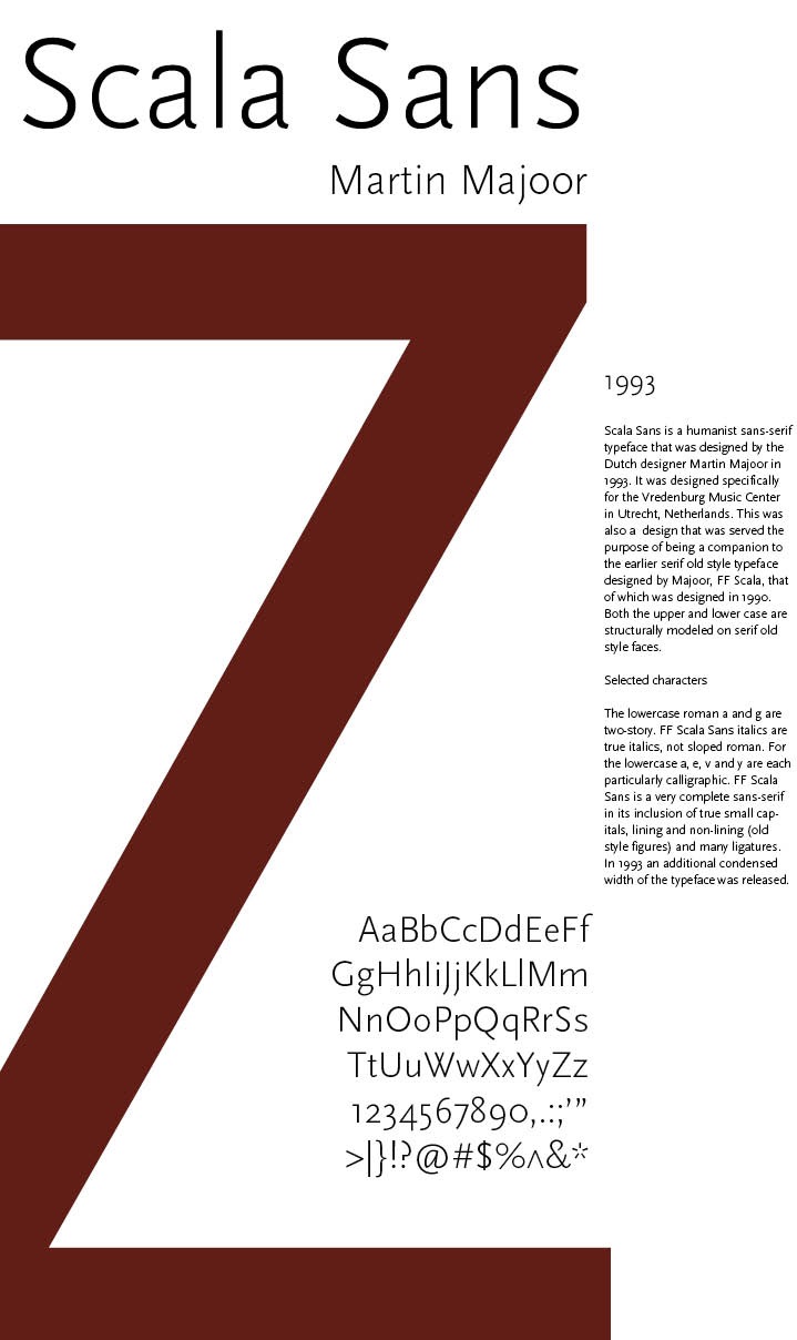
file name: Martin Majoor F F Scala Sans Pro Regular 1993 2003

file name: Martin Majoor F F Scala Sans Pro Regular 1993 2003 Poster by Angela Harrington 2015

file name: Martin Majoor F F Scala Sans Pro Regular 1993 2003 Poster by Jennifer Faucett 2015

file name: Martin Majoor F F Scala Sans Pro Regular 1993 2003 Poster by Jennifer Faucett 2015b

file name: Martin Majoor F F Scala Sans Pro Regular 1993 2003 Poster by Jennifer Faucett 2015c

file name: Martin Majoor F F Scala Hands 1998

file name: Martin Majoor F F Scala Hands 1998b

file name: Martin Majoor F F Scala 1990 Poster by Leanne Leilani Aranador 2015

file name: Martin Majoor F F Seria Sans 2000

file name: Martin Majoor F F Seria Sans 2000b

file name: Martin Majoor Jos Buivenga Pic Photo by Ron Steemers 2016

file name: Martin Majoor A Typ I 2018

file name: Martin Majoor Jos Buivenga Pic

file name: Martin Majoor A Typ I 2018 photo by Matchael Bundscherer

file name: Martin Majoor A Typ I 2018 photo by Matchael Bundscherer

file name: Martin Majoor Pic

file name: Martin Majoor Pic
| | |
|
Luc Devroye ⦿ School of Computer Science ⦿ McGill University Montreal, Canada H3A 2K6 ⦿ lucdevroye@gmail.com ⦿ https://luc.devroye.org ⦿ https://luc.devroye.org/fonts.html |


