TYPE DESIGN INFORMATION PAGE last updated on Thu Apr 16 21:59:24 EDT 2026
FONT RECOGNITION VIA FONT MOOSE
|
|
|
|
LucasFonts (and: FontFabrik)
[Lucas de Groot]
Luc(as) de Groot (b. 1962, Noordwijkerhout, The Netherlands) studied at the Royal Academy of Fine Arts in Den Haag and worked from 1989-1993 as a freelancer at the design bureau Premsela Voonk. From 1993 until 1997, he was with Meta Design in Berlin as typographic director in charge of many corporate design projects. In 1997, he set up FontFabrik and in 2000 LucasFonts in Berlin. He creates retail and custom fonts, and made his reputation with his humongous font family Thesis. Originally, he published most of his retail fonts with FontFont, but his "FF" fonts were withdrawn from FontFont in 1999, and renamed with LF instead of FF, where LF stands for LucasFonts. His most popular typefaces include Thesis (the superfamily that includes TheSans, TheSerif, TheMix and The Antiqua), Calibri (a default font at Microsoft), Sun, Taz and Corpid. He is also well-nown for his Anisotropic Topology-Dependent Interpolation theory which roughly states that a 50% interpolation is not the optical middle between two weights. He teaches type design at the University of Applied Sciences in Potsdam, Germany. His typefaces:
DeGroot designed custom fonts for newspapers such as Folha de S.Paulo, Le Monde, Metro, Der Spiegel, taz.die tageszeitung, Freitag and Jungle World. In addition, he created corporate type for international companies such as Sun Microsystems, Bell South, Heineken, Volkswagen and Miele. Speaker at many international conferences. At ATypI 2015 in Sao Paulo, he spoke about his Folha Sao Paulo newspaper typeface. In 2021, LucasFonts joined Type Network. FontShop link. Klingspor link. I Love Typography link. View the typeface library at Lucasfonts. View Lucas de Groot's typefaces. |
EXTERNAL LINKS |
| | |

file name: Lucas De Groot Pic

file name: Lucas De Groot Calibri 2007

file name: Lucas De Groot Calibri 2007

file name: Lucas De Groot Calibri Bold 2006

file name: Lucas De Groot Calibri Bold 2006b

file name: Lucas De Groot Fluent Calibri Bold 2017

file name: Calibri Replacement Candidates 2021 Bierstadt Grandview Seaford Skeena Tenorite

file name: Calibri Replacement Candidates 2021 Bierstadt Grandview Seaford Skeena Tenorite

file name: Calibri Replacement Candidates 2021 Bierstadt Grandview Seaford Skeena Tenorite

file name: Calibri Replacement Candidates 2021 Bierstadt Grandview Seaford Skeena Tenorite

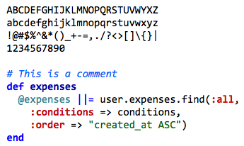
file name: Lucas De Groot Consolas 2005

file name: Consolas Sample

file name: Lucas De Groot Consolas

file name: De Groot Corpid

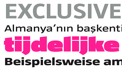
file name: Lucas De Groot Koning Display 2021

file name: Lucas De Groot Koning Display 2021

file name: Lucas De Groot Koning Display 2021

file name: Lucas De Groot Koning Display 2021

file name: Lucas De Groot Koning Display 2021

file name: Lucas Fonts Koning Display 2019

file name: Lucas Fonts Koning Display 2019

file name: Lucas Fonts Koning Display 2019

file name: Lucas Fonts Koning Display 2019

file name: Lucas Fonts Koning Display 2019

file name: Lucas Fonts Koning Display 2021 1

file name: Lucas Fonts Koning Display 2021 2

file name: Lucas Fonts Koning Display 2021 3

file name: Lucas Fonts Koning Display 2021 4

file name: Lucas Fonts Koning Display 2021 5

file name: Lucas Fonts Koning Display 2021

file name: Lucas De Groot L F Spiegel

file name: Lucas Fonts Spiegel Sans 2021 1

file name: Lucas Fonts Spiegel Sans 2021 2

file name: Lucas Fonts Spiegel Sans 2021 3

file name: Lucas Fonts Spiegel Sans 2021 4

file name: Lucas Fonts Spiegel Sans 2021 5

file name: Lucas Fonts Spiegel Sans 2021

file name: Lucas De Groot Spiegel Sans 2021

file name: Lucas De Groot Sun 2021

file name: Lucas Fonts Sun 2021 1

file name: Lucas Fonts Sun 2021 2

file name: Lucas Fonts Sun 2021 3

file name: Lucas Fonts Sun 2021 4

file name: Lucas Fonts Sun 2021 5

file name: Lucas Fonts Sun 2021

file name: Lucas De Groot Sun Condensed

file name: Lucas Fonts Floris 2021 1

file name: Lucas Fonts Floris 2021 2

file name: Lucas Fonts Floris 2021 3

file name: Lucas Fonts Floris 2021 4

file name: Lucas Fonts Floris 2021

file name: Lucas De Groot Floris 2021

file name: Lucas De Groot Floris 2021

file name: Lucas De Groot Thesis 1994 1999 poster by Matias Curti 2013

file name: Lucas De Groot Thesis 1994 1999 poster by Matias Curti 2013b

file name: Lucas Fonts The Antiqua 2021 1

file name: Lucas Fonts The Antiqua 2021 5

file name: Lucas Fonts The Antiqua 2021

file name: Lucas De Groot The Antiqua

file name: Lucas De Groot The Antiqua 1997

file name: Lucas De Groot The Antiqua 1997

file name: Lucas Fonts Qua Text 2021 1

file name: Lucas Fonts Qua Text 2021 2

file name: Lucas De Groot Qua Text 2021

file name: Lucas Fonts Qua Text 2021 3

file name: Lucas Fonts Qua Text 2021 4

file name: Lucas Fonts Qua Text 2021 5

file name: Lucas Fonts Qua Text 2021

file name: Lucas Fonts The Sans 2021 1

file name: Lucas Fonts The Sans 2021 4

file name: Lucas Fonts The Sans 2021 5

file name: Lucas Fonts The Sans 2021

file name: Lucas De Groot The Sans C4 2017

file name: Lucas De Groot The Sans 1994 Poster by Carolina Moreira 2016

file name: Lucas De Groot Grundfos The Sans O T B 2007

file name: Lucas Fonts The Sans Mono 2021 1

file name: Lucas De Groot The Sans Mono 2021

file name: Lucas De Groot The Sans Mono 2021

file name: Lucas Fonts The Sans Mono 2021 2

file name: Lucas Fonts The Sans Mono 2021 3

file name: Lucas Fonts The Sans Mono 2021 4

file name: Lucas Fonts The Sans Mono 2021 5

file name: Lucas Fonts The Sans Mono 2021

file name: Lucas Fonts The Sans Typewriter 2021

file name: Lucas Fonts The Sans Typewriter 2021

file name: Lucas Fonts The Sans Typewriter 2021 1

file name: Lucas Fonts The Sans Typewriter 2021 2

file name: Lucas Fonts The Sans Typewriter 2021 4

file name: Lucas Fonts The Sans Typewriter 2021 5

file name: Lucas Fonts The Sans Typewriter 2021

file name: Lucas Fonts The Serif 2021 1

file name: Lucas Fonts The Serif 2021 5

file name: Lucas Fonts The Serif 2021

file name: Lucas De Groot The Mix C4 2017

file name: Lucas Fonts The Mix 2021 1

file name: Lucas Fonts The Mix 2021 5

file name: Lucas Fonts The Mix 2021

file name: Lucas De Groot The Mix

file name: Lucas De Groot The Mix C4 2017

file name: Lucas Fonts The Mix Mono 2021 1

file name: Lucas Fonts The Mix Mono 2021 2

file name: Lucas Fonts The Mix Mono 2021 3

file name: Lucas Fonts The Mix Mono 2021 4

file name: Lucas Fonts The Mix Mono 2021 5

file name: Lucas Fonts The Mix Mono 2021

file name: Lucas De Groot The Mix Mono 2021

file name: Lucas De Groot The Mix Mono 2021

file name: Lucas De Groot The Stencil 2021

file name: Lucas De Groot The Stencil 2021

file name: Lucas De Groot The Stencil 2021

file name: Lucas De Groot The Stencil 2021

file name: Lucas De Groot The Stencil 2021

file name: Lucas De Groot The Stencil 2021

file name: Lucas Fonts L F Taz 2021 1

file name: Lucas Fonts L F Taz 2021 2

file name: Lucas Fonts L F Taz 2021 3

file name: Lucas Fonts L F Taz 2021

file name: Lucas De Groot Taz 2002 2014

file name: Lucas De Groot Taz 2002 2014b

file name: Lucas De Groot Taz 2002 2014d
file name: Lucas De Groot Taz I I I Condensed

file name: Lucas De Groot Taz Wide 2014

file name: Lucas De Groot L F Taz Condensed 2021

file name: Lucas De Groot L F Taz Condensed 2021

file name: Lucas De Groot L F Taz Hair 2021

file name: Lucas De Groot A Typ I2018 photo by Michael Bundscherer

file name: Lucas De Groot A Typ I2018 photo by Michael Bundscherer

file name: A Typ I2015 Lucas De Groot Photo by Luke Garcia Andre Hawk

file name: A Typ I2015 Lucas De Groot Photo by Luke Garcia Andre Hawk
| | |
|
Luc Devroye ⦿ School of Computer Science ⦿ McGill University Montreal, Canada H3A 2K6 ⦿ lucdevroye@gmail.com ⦿ https://luc.devroye.org ⦿ https://luc.devroye.org/fonts.html |


